PROJECT OVERVIEW
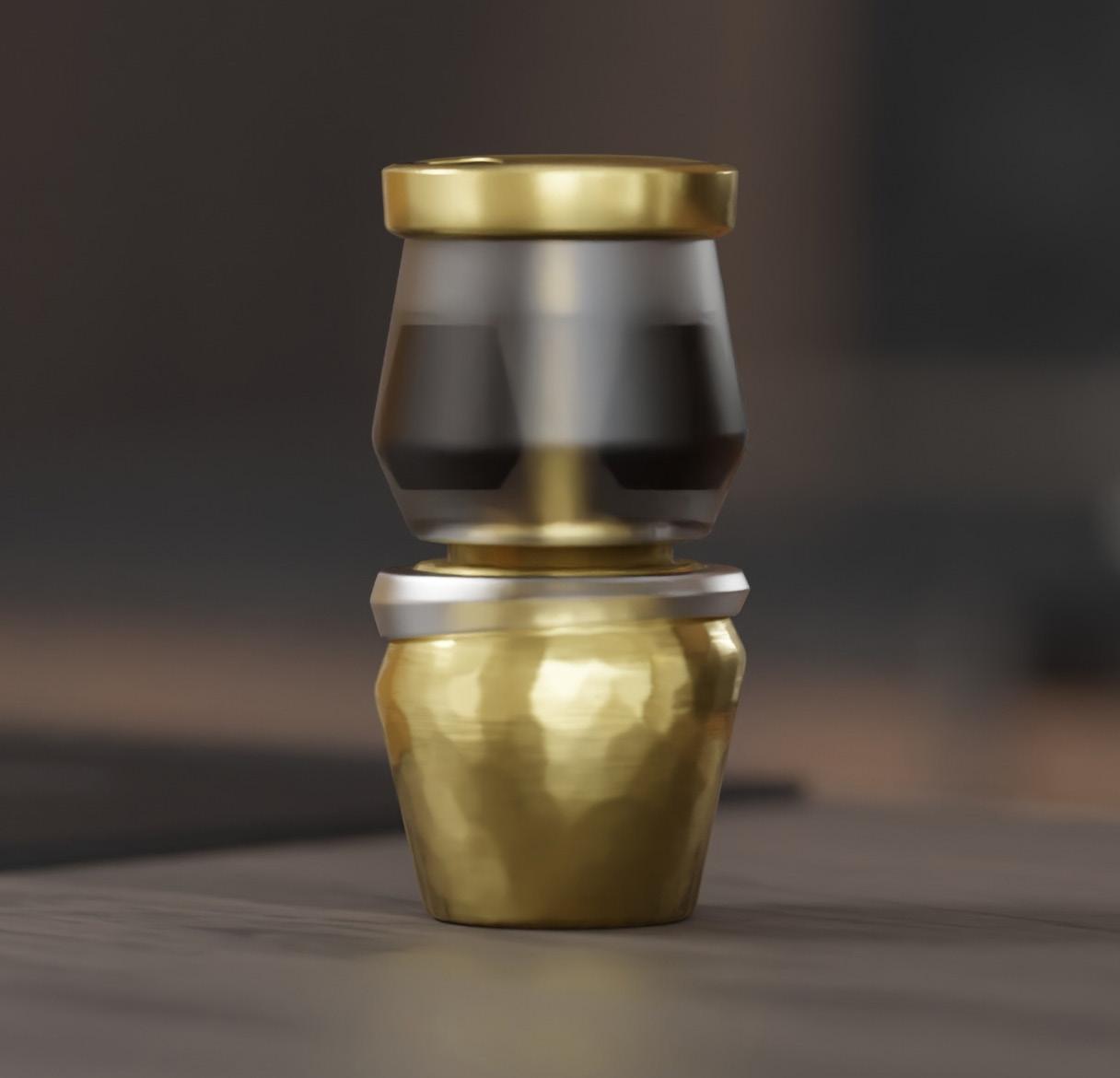
To create a synthesis of luxurious and functional packaging of concept for the Bialetti Moka Express pot, our team at Naba came up with. This concept was developed in collaboration with the prestigious Louis Vuitton brand and represents an elegant blend of design creativity. The package attempts to generate an aesthetic integration that represents the essence of both companies through careful design decisions, providing the Bialetti Moka Express pot with an upgraded and exclusive presentation.
The major purpose of this packaging attempt is to establish a strong emotional connection with the audience, execute an exceptional unboxing experience, and implant a unique feeling of collecting a Moka pot of unparalleled exclusivity.
PURPOSE OF PACKAGING
1. Protection
a)Physical Protection
b)Contamination Prevention
2. Preservation
3. Information Communication
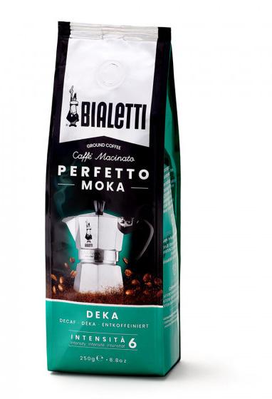
4. Brand Recognition
5. Promotion and Marketing
6. Convenience
7. Security and Tamper-Evidence
8. Environmental Considerations
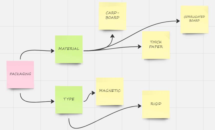
1. Primary Packaging
2. Secondary Packaging
3. Tertiary Packaging
4. Aseptic Packaging
5. Flexible Packaging
6. Rigid Packaging
7. Sustainable Packaging
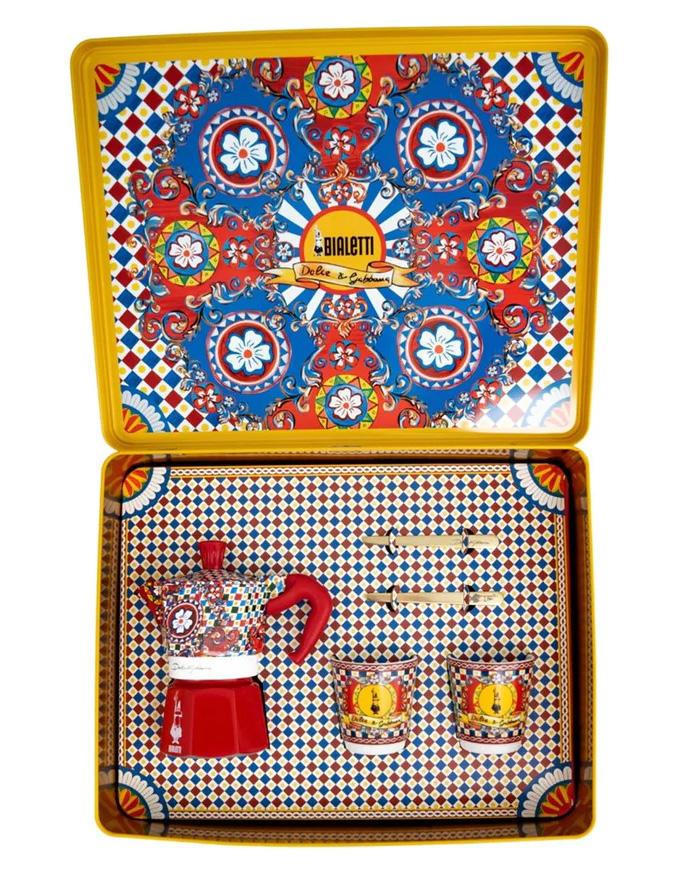
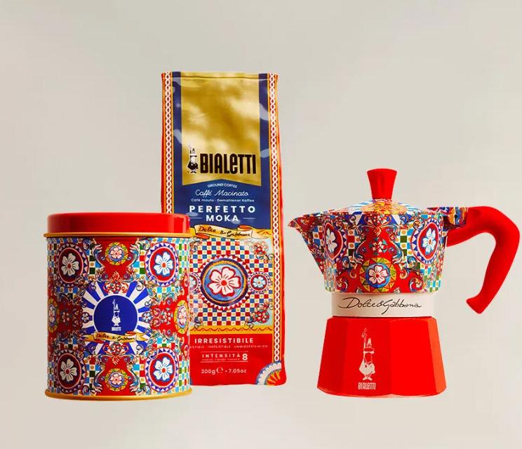
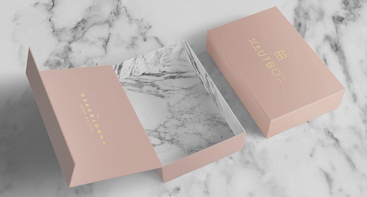
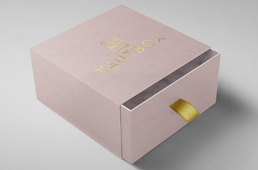
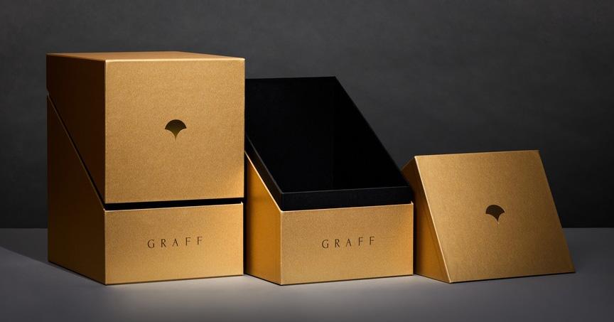
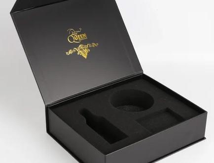
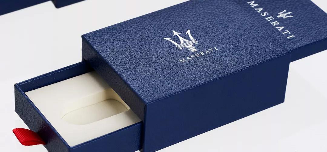
8. Luxury Packaging
9. Child-Resistant Packaging

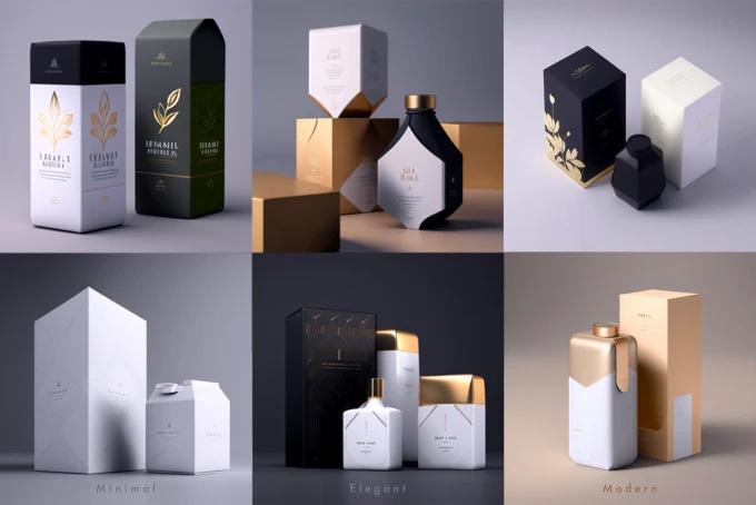
1. High-Quality Materials
2. Elegant Design
3. Customization
4. Branding Integration
5. Embossing and Debossing
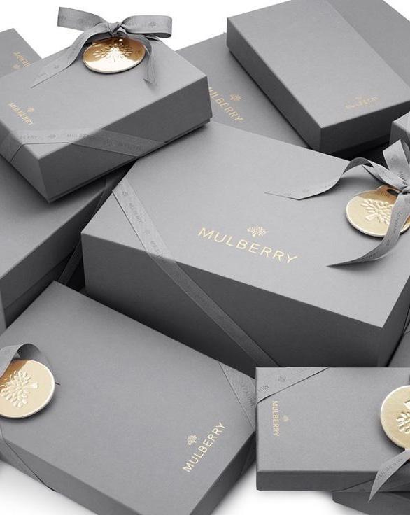
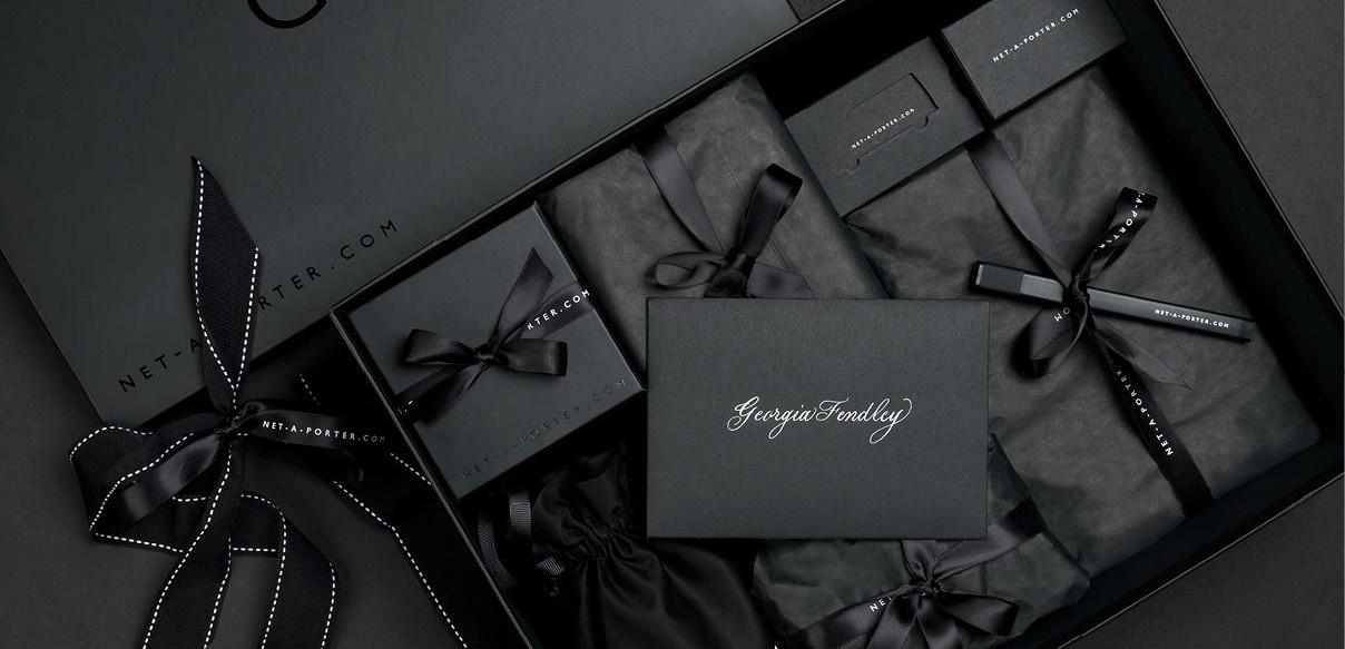
LUXURIOUS PACKAGING
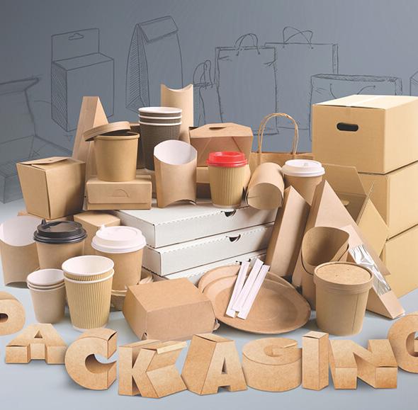
TYPES OF PACKAGING
10. Corrugated Boxes
6. Special Finishes
7. Rigid Boxes 8. Ribbons and Closures 9. Interior Packaging 10. Limited Editions 11. Emotional Appeal 12. Sustainability 13. Collaborations
DESIGN IDEAS
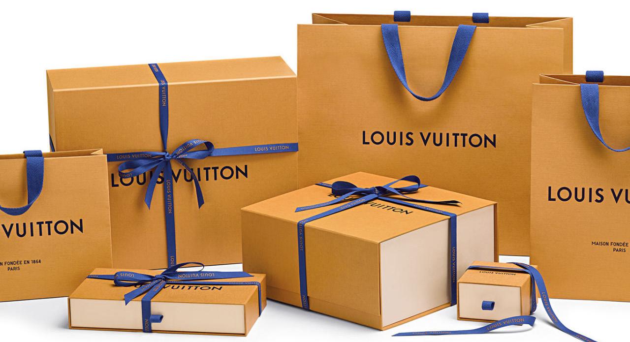
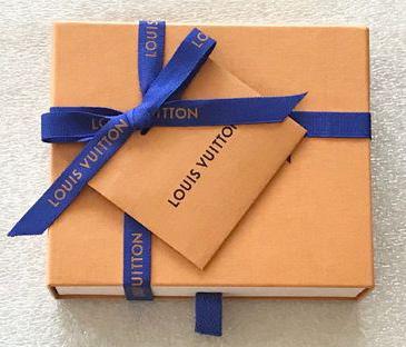
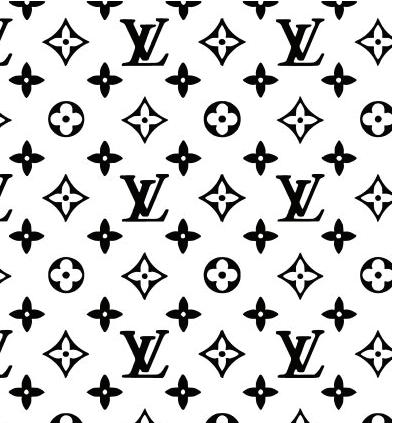
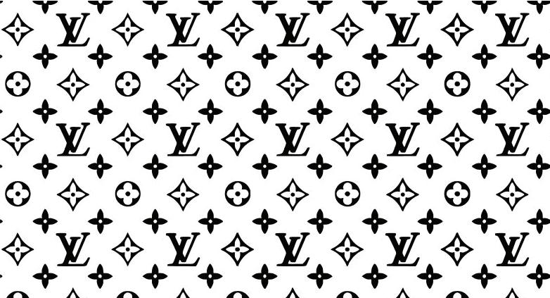
Existing elegant Louis Vuitton packaging with logos of both the companies in black
Existing elegant Louis Vuitton packaging with logos of both the companies in blue (the original color of lv packaging.
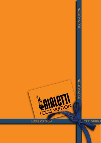
A try to make packaging not look unicolor by adding blue strips on the sides of the box, with the logos in black.
A try to make packaging not look unicolor by adding blue strips on the sides of the box, with the logos in blue.
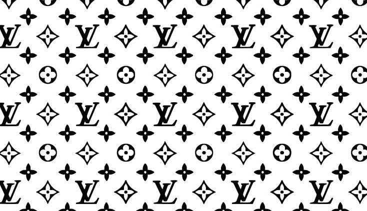
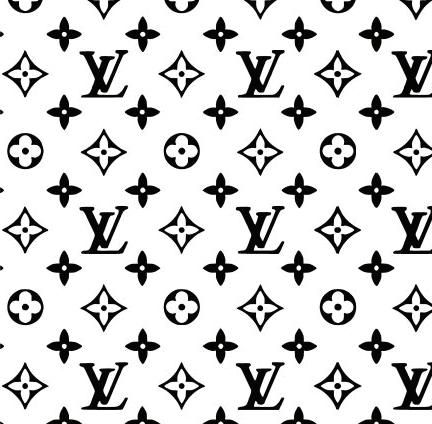
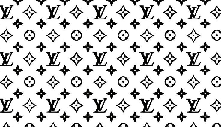
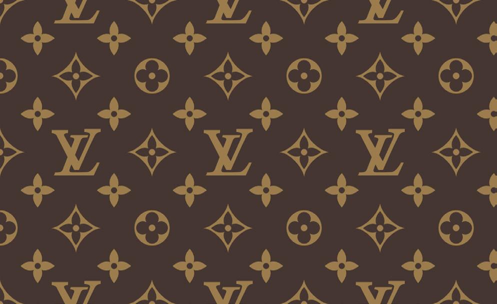
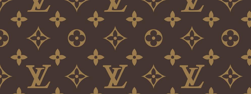
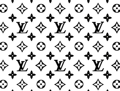
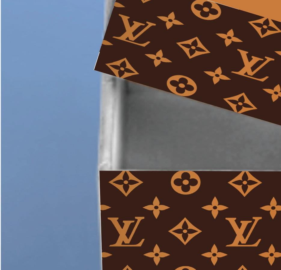
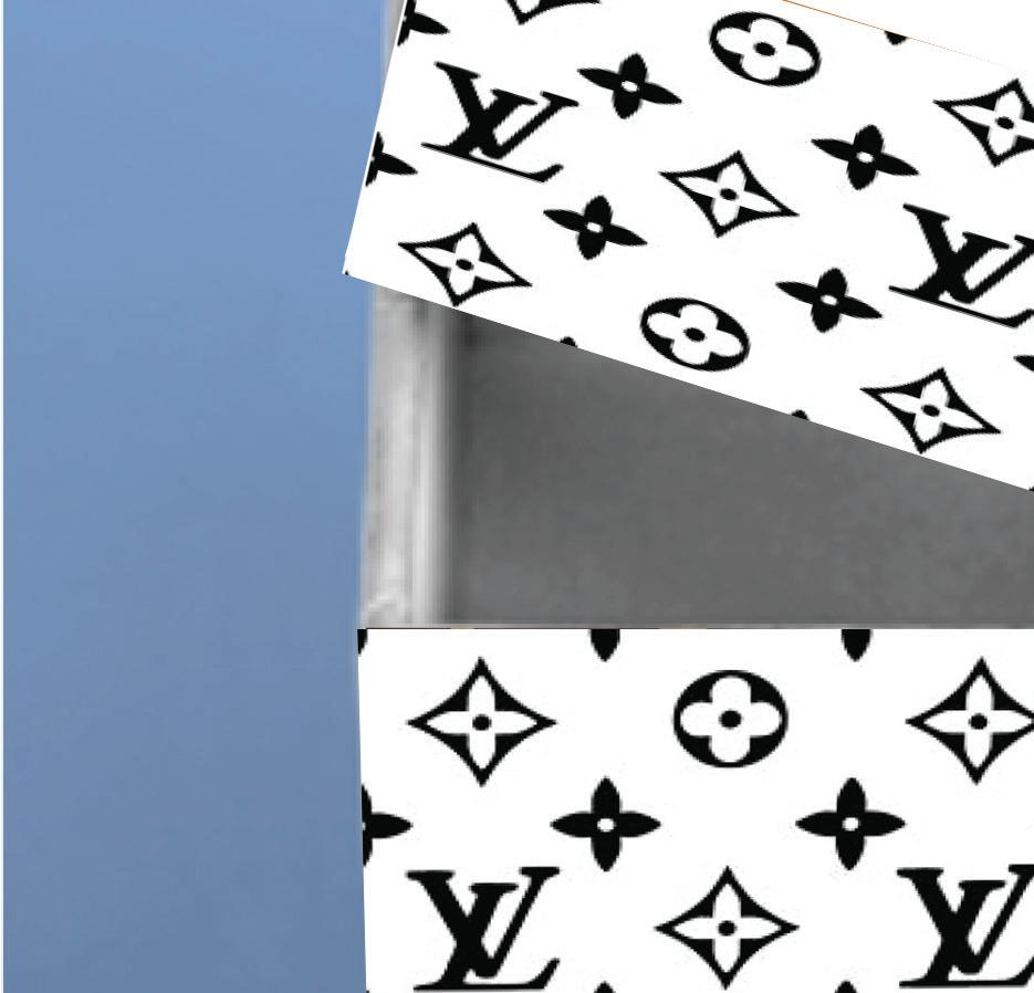
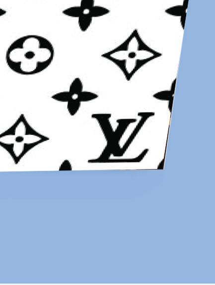
A try to integrate LV pattern in black and white with logo of Bialetti on it. A rectangle with contrasting color is added so that the bialetti logo is legible.
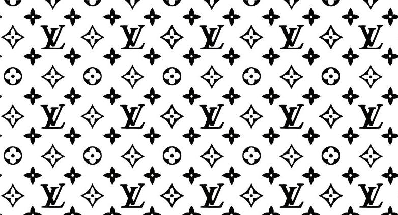
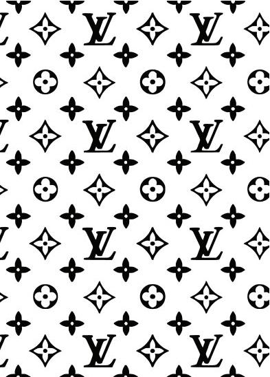
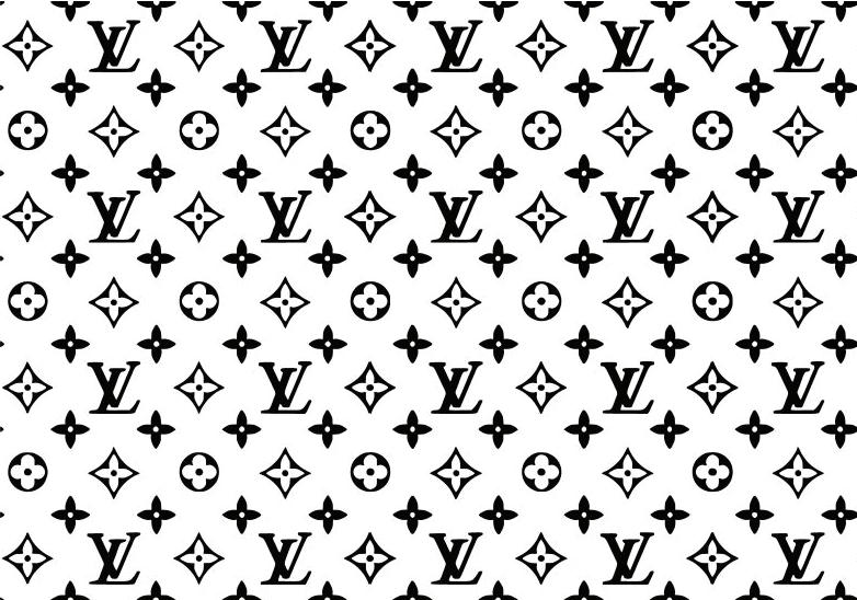
A try to integrate LV pattern in black and white with logo of Bialetti on it. A rectangle with contrasting color is added so that the bialetti logo is legible.
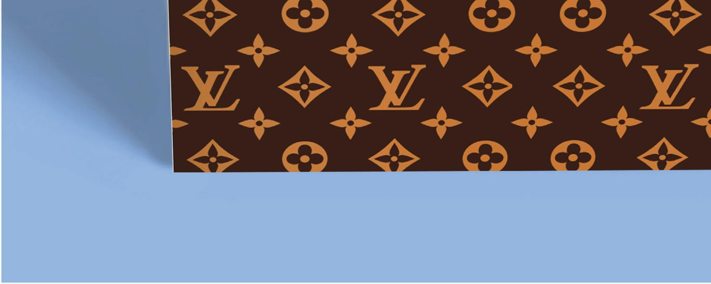
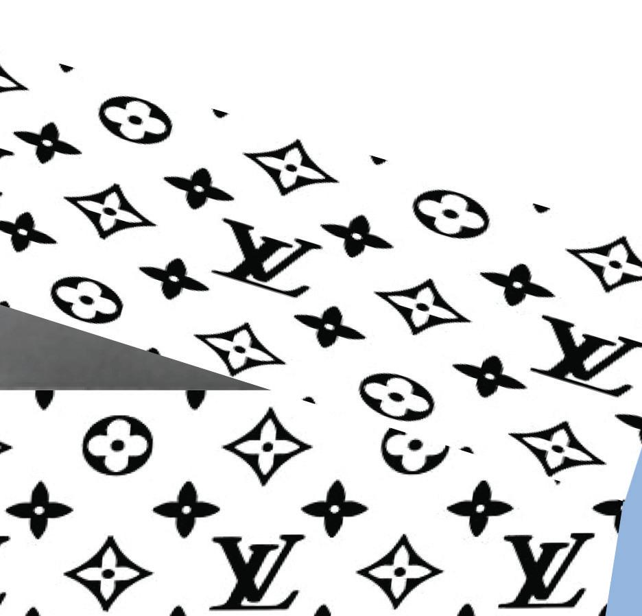
In the above packaging while folding the box the orientation of LV pattern was odd henceforth it is corrected here and it felt that rectangle was blocking the visual appeal of bialetti logo hence the bialetti logo is tried in the offset of the stroke
In the above packaging while folding the box the orientation of LV pattern was odd henceforth it is corrected here and it felt that rectangle was blocking the visual appeal of bialetti logo hence the bialetti logo is tried in the offset of the stroke
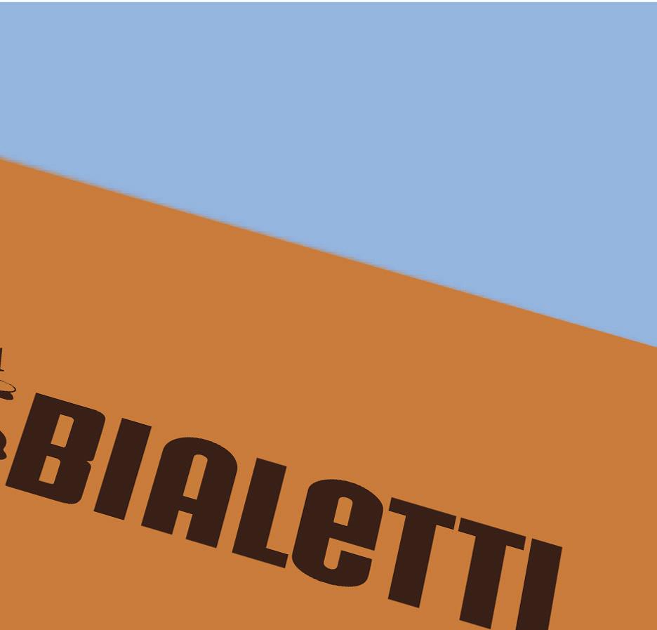
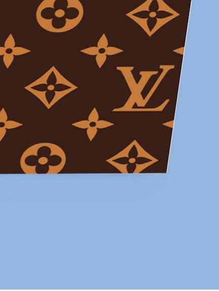
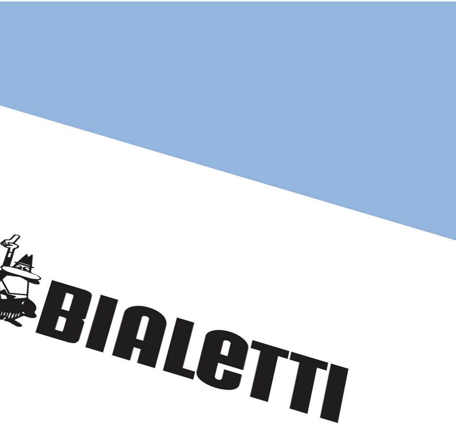
As the offset stroke did not look that elegant, here the whole top is in contrast with the bialetti logo so that it is emphasized.
As the offset stroke did not look that elegant, here the whole top is in contrast with the bialetti logo so that it is emphasized.
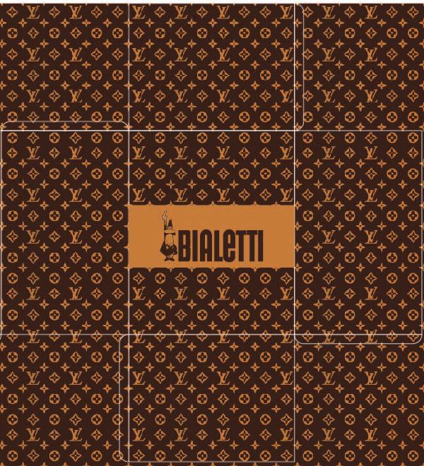
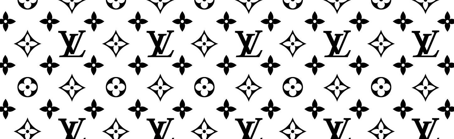
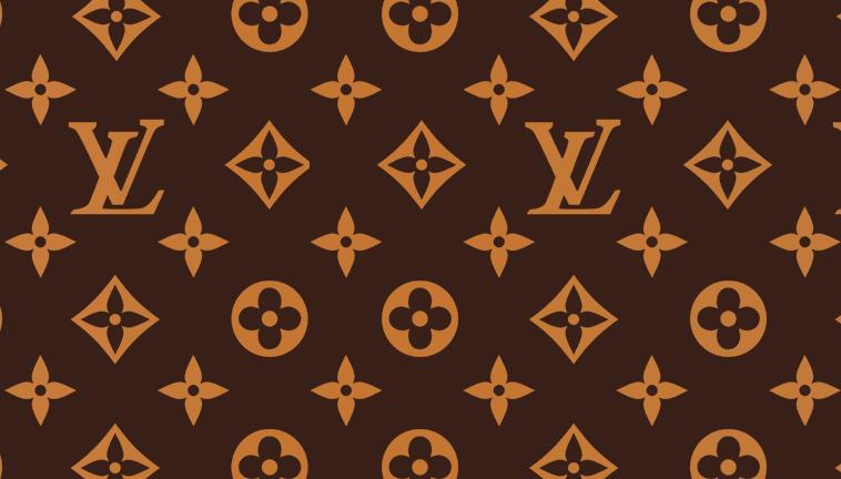
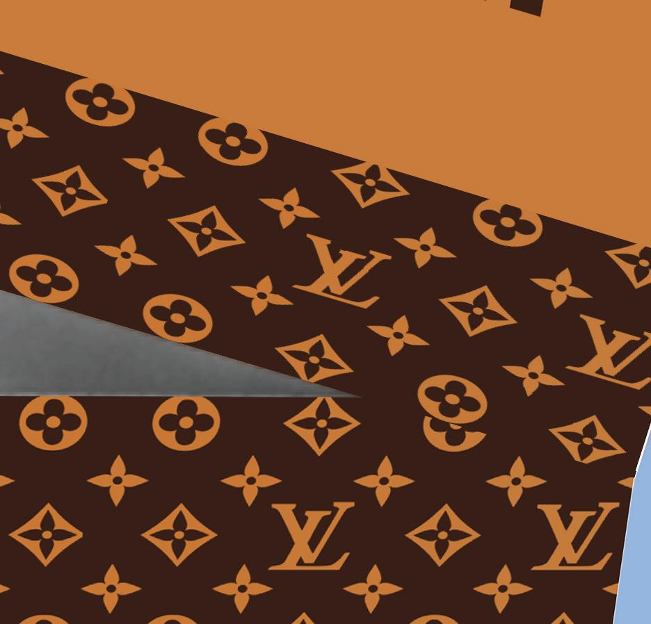
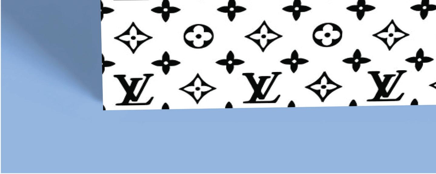
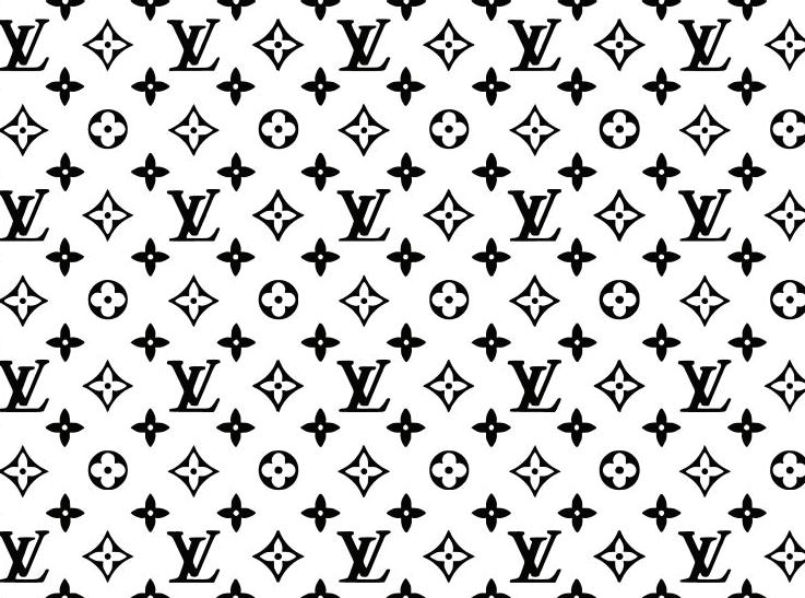
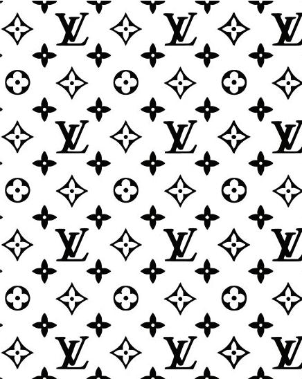
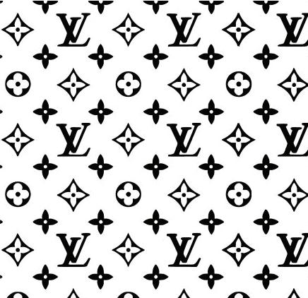
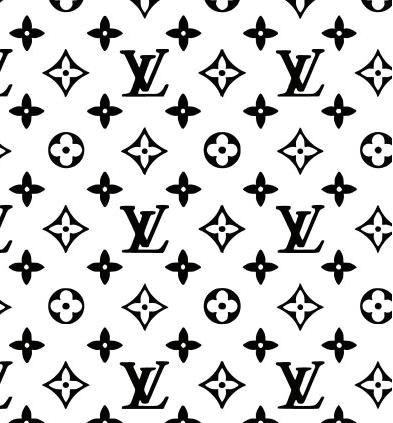
A try to integrate exclusive LV pattern with logo of Bialetti on it. A rectangle with contrasting color is added so that the bialetti logo is legible.
A try to integrate exclusive LV pattern with logo of Bialetti on it. A rectangle with contrasting color is added so that the bialetti logo is legible.
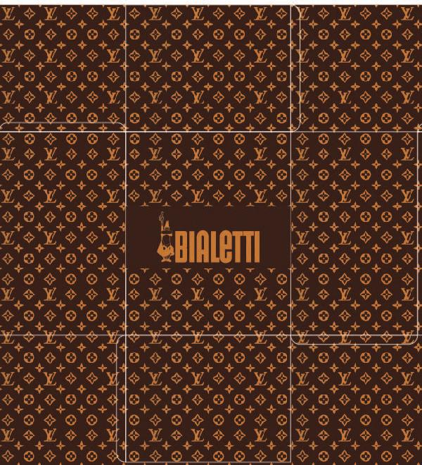
In the above packaging while folding the box the orientation of LV pattern was odd henceforth it is corrected here and it felt that rectangle was blocking the visual appeal of bialetti logo hence the bialetti logo is tried in the offset of the stroke
In the above packaging while folding the box the orientation of LV pattern was odd henceforth it is corrected here and it felt that rectangle was blocking the visual appeal of bialetti logo hence the bialetti logo is tried in the offset of the stroke
As the offset stroke did not look that elegant, here the whole top is in contrast with the bialetti logo so that it is emphasized.
As the offset stroke did not look that elegant, here the whole top is in contrast with the bialetti logo so that it is emphasized.