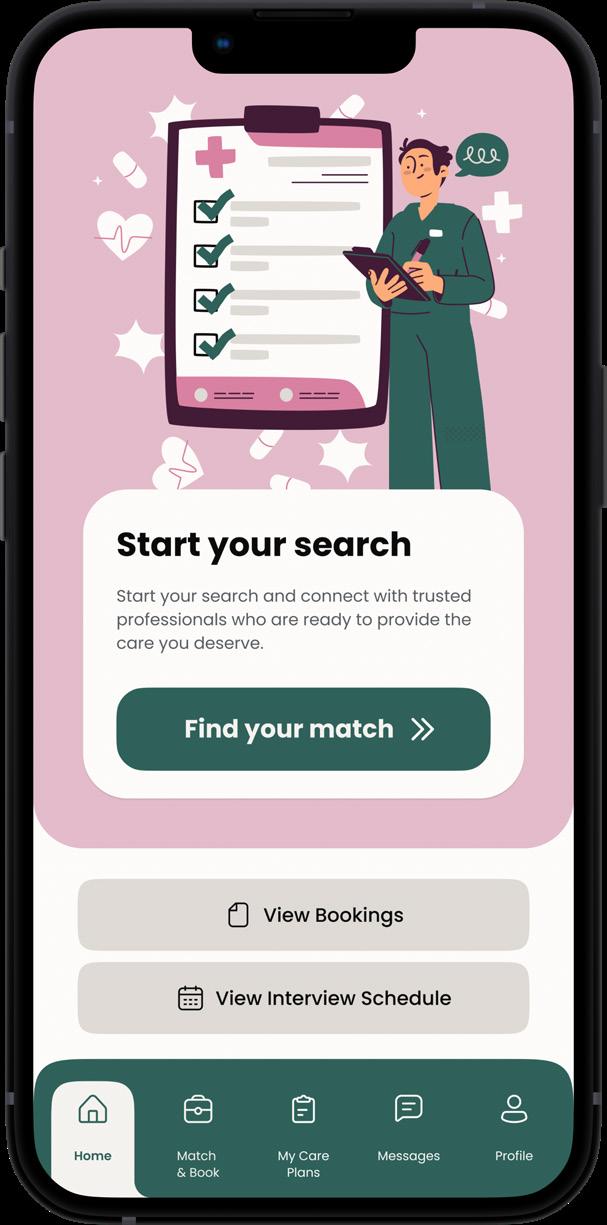
I’m a designer who thrives at the crossroads of creativity and problem-solving. My journey began in architecture, where I learned to approach challenges with a keen eye for detail and an understanding of how spaces shape human experiences. Over time, I found myself drawn to exploring broader systems—how people, technology, and environments interact in
unexpected ways. This curiosity led me into graphic design and UX, where I apply the same principles of empathy and thoughtful design to craft solutions that are both functional and meaningful. I’m always seeking ways to make complex problems feel simpler, more accessible, and impactful.
Amritha TV
About me & my journey as a designer
‘Form follows function’, a simple three word statement that I came across during my undergraduate studies, became the defining philosophy that guided my design practice, shaping my approach to my work in all forms of design.
As I reflect on my journey in college, I realise that architecture is, at its core, another form of user experience design. The two fields focus on creating meaningful interactions—be it in the physical realm or the digital world. This realisation pushed me towards the field of user experience design, where I can combine the problem solving ability I learned through space design with my graphic design skills to craft user-centred solutions.
Experience
Freelance Graphic Designer
Worked on branding design for a wedding hall, social media graphics
SA Architects
Position -Architectural Intern
Worked on architectural design, technical drawings, client meetings & presentations
TechQuila
Position - Graphic Designer and Social Media Manager
Ideated and designed social media branding & identity, executed social media marketing campaigns
Madras Inherited
Position - Graphic Design Intern
2020-2021
Designed the ‘Madras Calendar’, illustrated for the social media account, fulfilled inhouse graphic design needs
Teach for India
Position - Volunteer Teacher
Assisted Teaching Fellow with teaching English and Mathematics for under-privileged students in Chennai.
Extra - Curriculars
THE PSBB TIMES
Editor in Chief, Newsletter of PSBB
THE GUINDY TIMES
Deputy Director of Design
2017 - 2018 2019-2020
Electives
Vernacular Architecture
The course delved deep into the history, culture, context of various architectural styles across India.
Graphic & Product Design
The course went into history of graphics, print making techniques, product design and industrial design technology, process and execution.
Understanding Madras
The course took a deep dive into the history and birth of the city, the formation of different parts of the city, the architectural context, the current urban issues faced by its residents and the possible threats to the city.
Education
Google UX Design
WebD School of Design
Certificate Course | 2024
SAP, Anna University
Skills
CrediQ: Empowering beginner users with the knowledge and skills to manage their credit
the idea process
Problem:
Young adults are introduced to credit systems without a clear understanding of how they work, the impact of late payments, or how credit scores affect their financial future.
One of the projects I had been working on in the past year is about trying to fill a gap in the existing solutions for financial literacy and personal finance management. The goal of this project was to uncover how we can make ‘credit’ as a concept accessible to beginners and enable them to build long term habits for future gains.
For many, learning about credit is a crucial step toward financial independence. It can be an overwhelming and confusing topic, particularly for beginners, and I wanted to design a platform that simplifies the information and makes it easier for people to understand and navigate a complex subject.
the solution
Why this happens
This happens because financial literacy is rarely part of curriculums in formal education systems, leaving young adults unprepared to handle real-world financial responsibilities.
Solution
a dashboard that enables users to learn about credit and credit management by promoting learning by doing.
Research
User Interviews
Defining the scope
Supervised by: ---
Ideating Solutions
Wireframes
What excited me about this project is the chance to create something that feels approachable and supportive rather than intimidating. This project is deeply personal to me because it aligns with my core belief that design should solve real problems and make a positive impact.
user interviews
Group 1 : Young Adults (Age 22 - 30)
“I don’t really understand what affects my credit score or how it’s calculated. It feels like a black box.”
“I’m overwhelmed by all the complex terms in my credit report like APR or Credit Utilisation. I find online explanations too complex and need something simpler I don’t know where to start.”
“I know my credit score is important, but I’m not sure how to improve it or what I should do to actually make a difference”
Group 2 : Middle aged (Age 30 - 51)
“I don’t have time to dive deep into learning about credit, but I want quick, easy tips I can apply to improve my score. Information online is usually too detailed and has alot of irrelevant information.”
“I have a few credit cards and loans, but keeping track of al the due dates and balances is a hassle. I wish there was a simple way to see everything”
“‘m not sure how to dispute things on my credit report when something looks wrong. The process feels complicated.”
insights: insights:
Beginners do not know what factors influence their credit score and how to manage these factors
Beginners feel overwhelmed by the complexity of credit reports, credit scores and the multitude of factors that influence them.
Users struggle to know what actions to take to improve their credit score or health in real time.
Older users have multiple credit accounts to manage, making it much more challenging without good fundamental knowledge.
Users face the risk of missing payments or utilisation alerts due to managing multiple accounts across different organisations
Users lack the time for detailed information reading
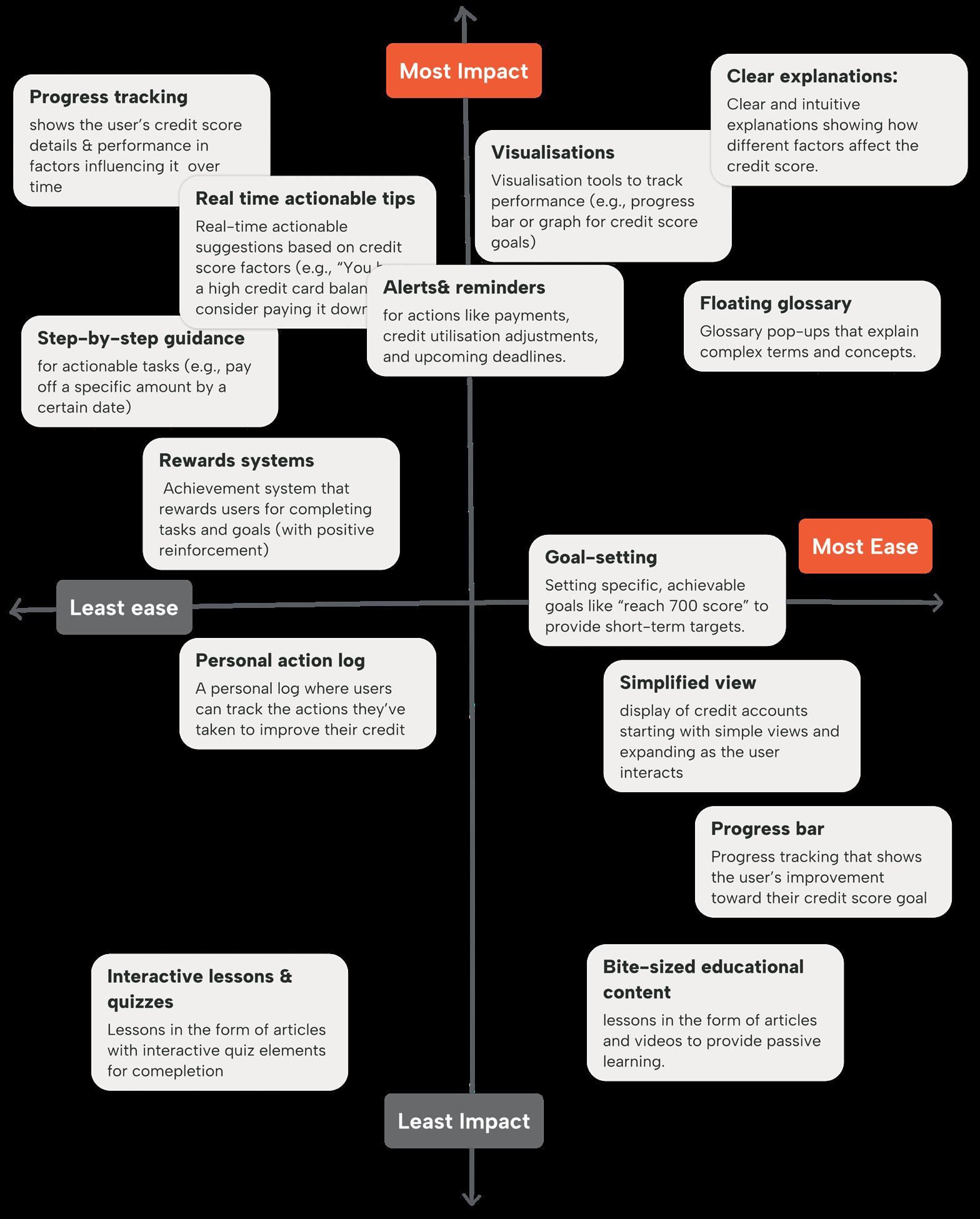
pain points to address:
Going through the user interview responses, I discovered the following pain points as the main problems to address, and hrouped them into appropriate categories based on the type of problem and most suitable intervention.
challenges in understanding
Confusion about credit scores
Many users don’t understand what makes up their credit score and how to improve it, nor do they understand what influences it.
Difficulty in learning about credit
Credit-related education is dry & hard to follow for beginners, leading to a lack of engagement and understanding.
Unclear credit terms and jargon
Credit-related terms and jargon are confusing, leading users to misinterpret information or make uninformed decisions.
action anddecision-making barriers
Overwhelm due to complexity
Data from many accounts, transactions, and credit factors can feel overwhelming to beginners.
Fear of making mistakes
Beginners are hesitant to take action due to the fear of making mistakes that could affect their credit score
Uncertainty about next steps
Users do not know what specific actions to take to improve their credit score or financial health in general.
motivation and engagement issues
Lack of accountability & progress tracking
Without a system to track their efforts and see tangible progress, users may lose sight of their goals
Missed opportunities for credit improvement
Users often don’t take immediate action when they receive alerts about their credit status, such as payment reminders or utilisation
Accountant Engineer Doctor
Manager
ideating solutions wireframing
After brainstorming interventions that aligned with my design objectives, I used affinity diagrams to identify the most effective ideas for execution.
Object-oriented navigation
Intent: Outcome:
To allow users to segregate date based on type of credit account, learn about credit based on each type of credit & manage
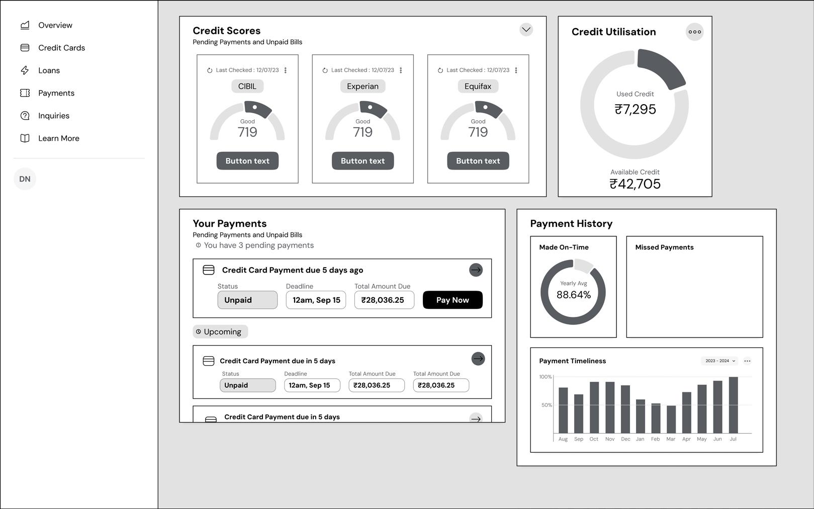
Cluttered ‘home screen’ dashboard with no clear purpose or call to action, leading to confusion
Main dashboard : Initial wireframe
Intended function: Problems:
1. To provide an overview of current credit health & all related factors
2. To act as a one-stop location for all immediate actions & notifications
1. No clear hierarchy in elements
2. Over-cluttered dashboard serving no specific purpose
3. Lack of clarity in navigation & user flow
updated navigation: based on task rather than object
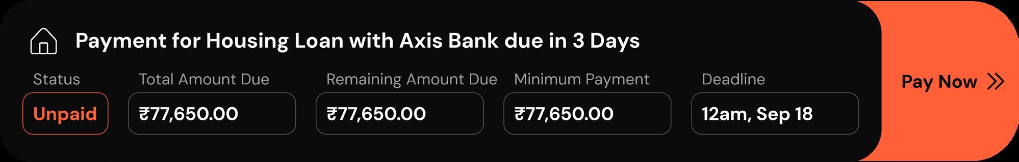
New user flow:
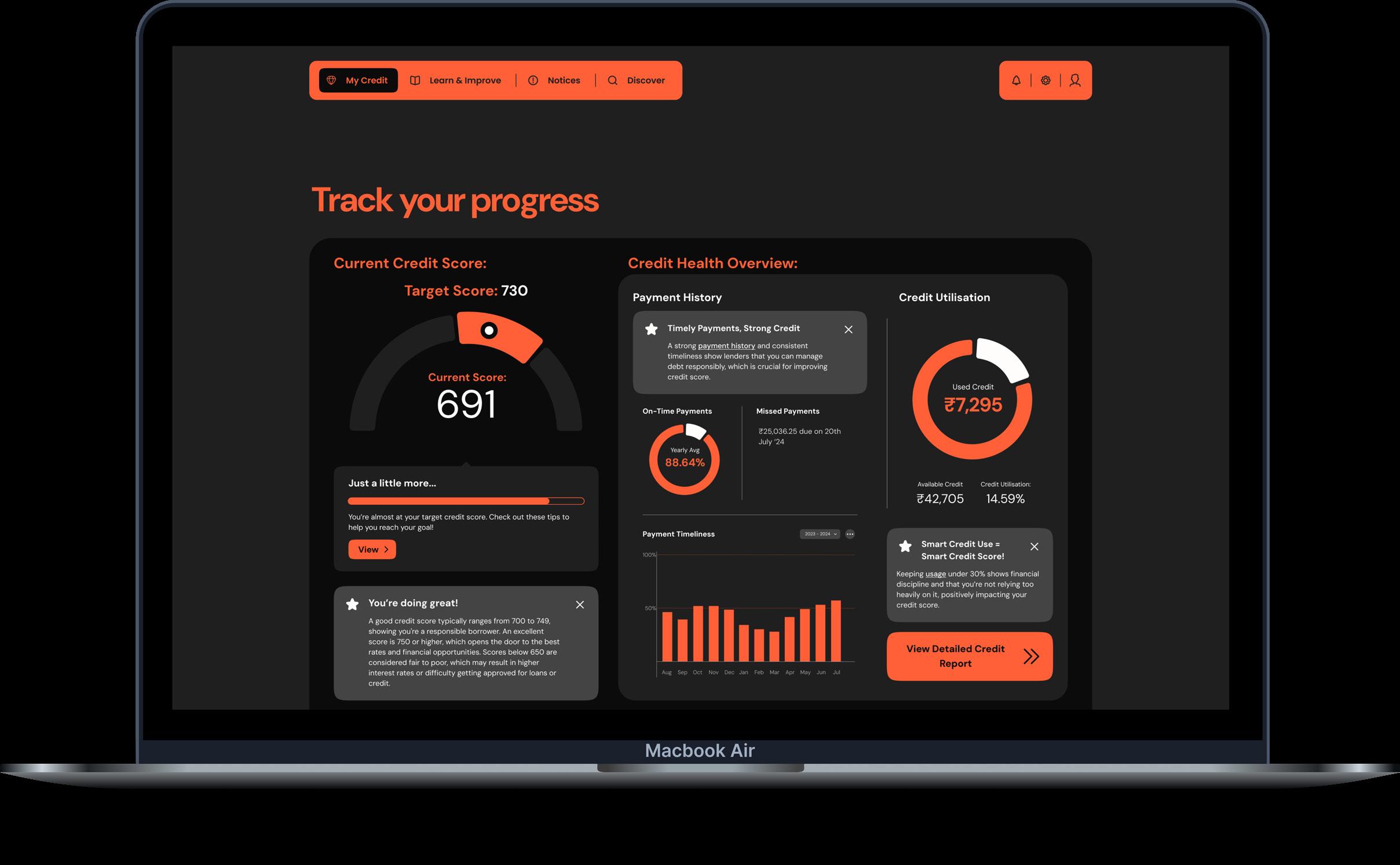
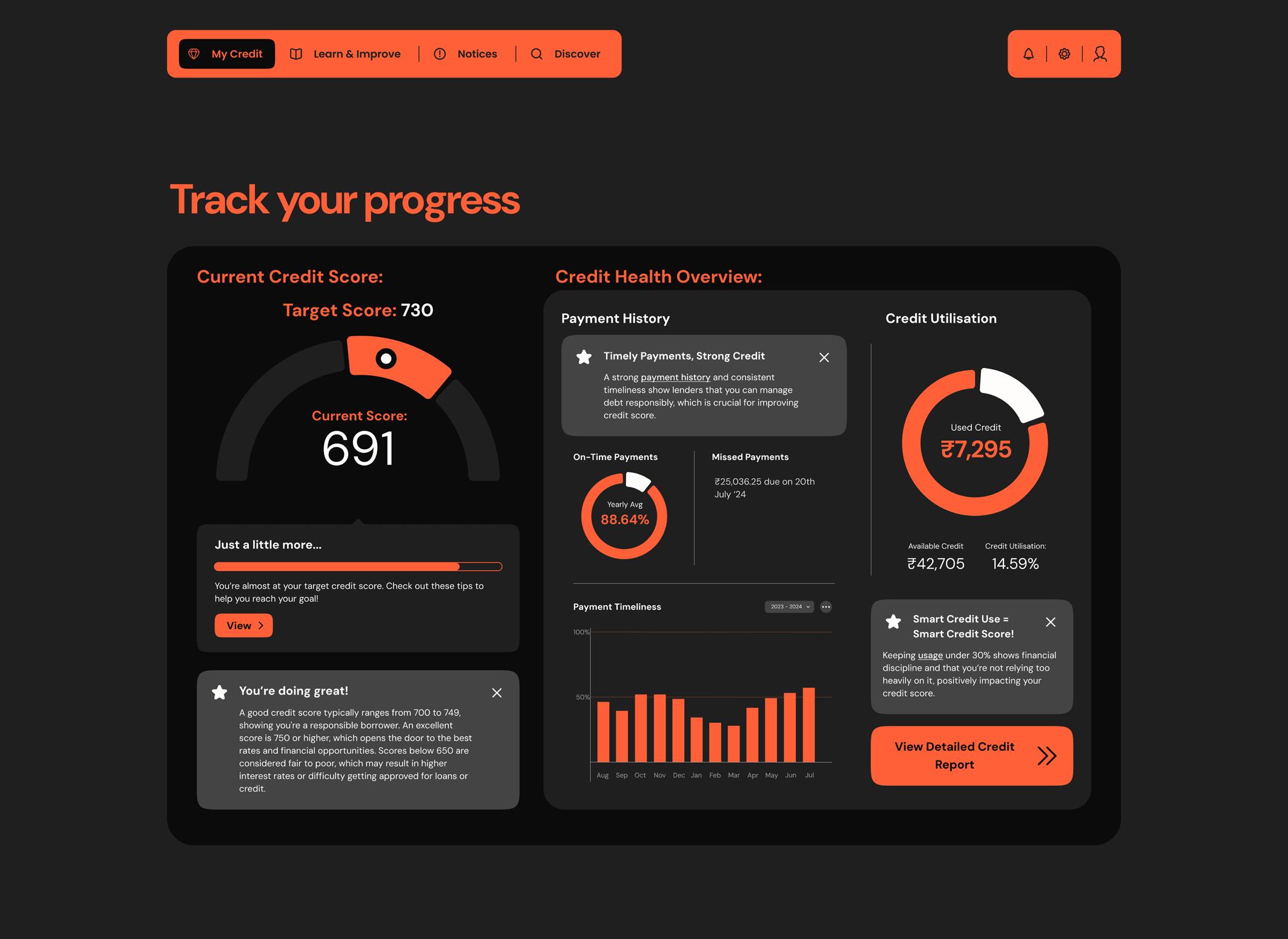
1. Track your progress
- View progress towards credit score goal
- Monitor markers such as credit utilisation, payment timeliness
2. Maintain your credit health
- alerts and actionable CTAs that facilitate actions that could be taken in real time to improve credit health
3. Your credit accounts
- list of different credit accounts & their statuses
- clickable for more details
Arranged based on ‘Progressive Disclosure’
Intended function:
1. to display all details related to credit cards
2. to act as a central dashboard for managing all credit card related actions & information
1. No clear hierarchy in elements
Intended function:
1. Alerts for immediate action to maintain credit health
2. Set reminders to ensure ontime payments
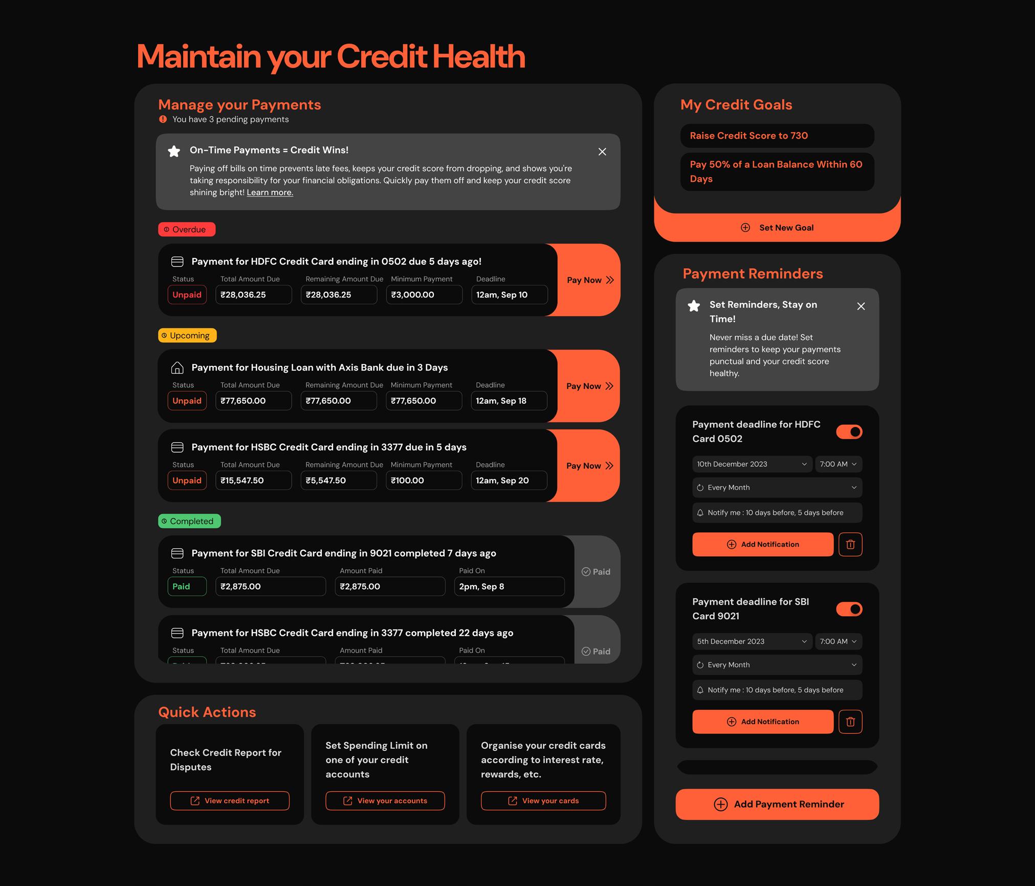
3. Tooltip glossary explaining concepts every step of the way - purpose conveyed clearly through bold CTAs - clear visual hierarchy What works: Problems:
2. Over-cluttered dashboard serving no specific purpose
‘Maintain your credit health’ section
Payment alert
“Set reminder” feature
displaying all relevant details with clear CTA add, edit, remove reminders for payments for credit cards, etc
simple terms, beginner friendly navigation quick, actionable step for improving credit health
Displaying complex data while minimising cognitive overload
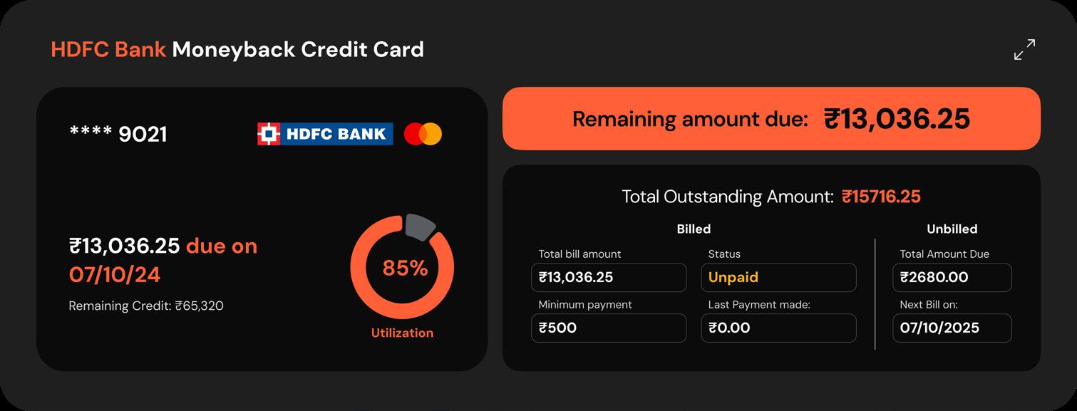
What does it do?
Provides users with quick view of important data about their credit card, emphasising on the most relevant and immediately actionable data
Why?
This feature allows users to have a grasp on the performance of all their credit cards without having to spend too long scanning for relevant information.
Prominent display of most important data displaying utilization rate and due date for next payment: highlighting most important actions to be taken
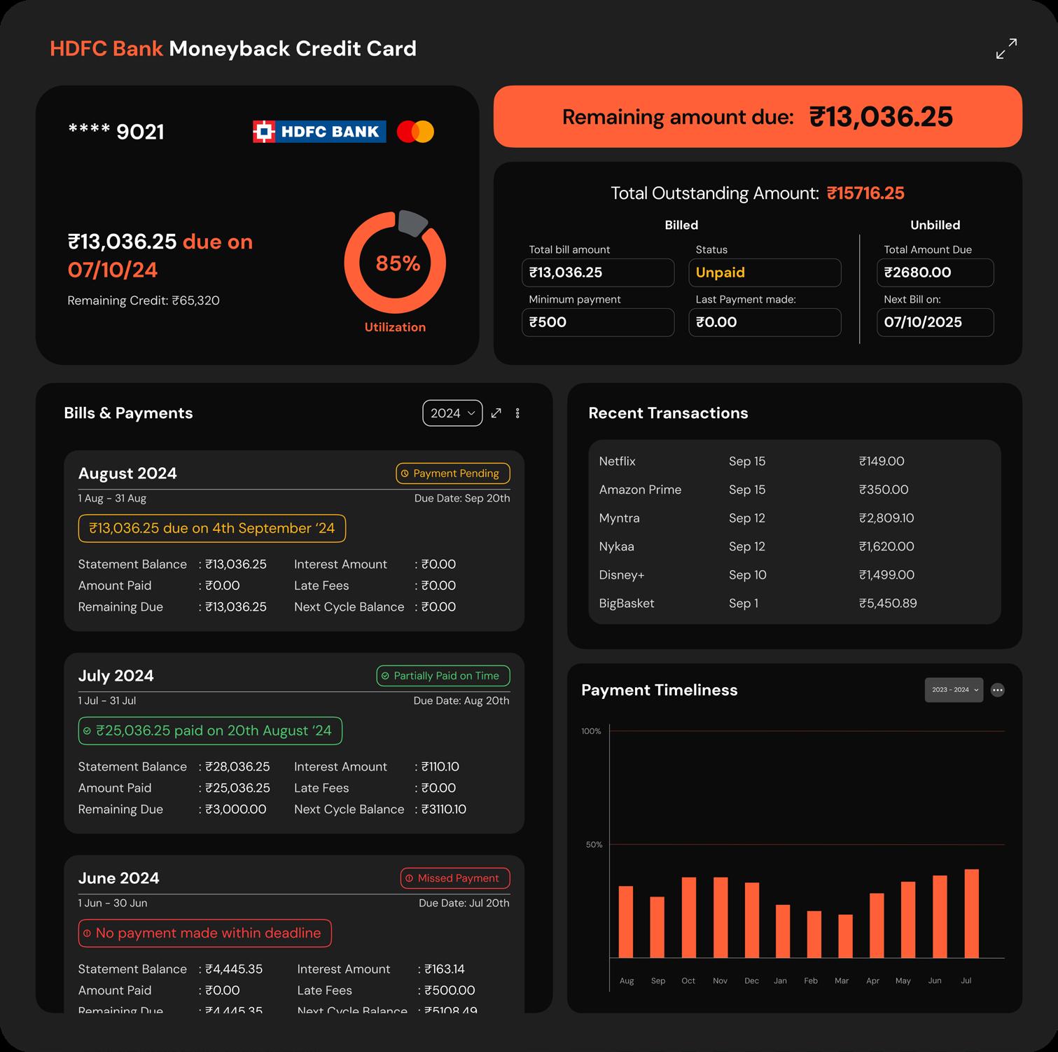
Card Card Detailed View
Progressively disclosing more information to reduce overwhelm & confusion
takeaways
This project was about learning about credit as a complete novice myself and trying to distill it down to its essentials so that other beginners like myself could approach the subject with more confidence and clarity. progressive disclosure
What does it do?
Provides users witha detailed view of all relevant information regarding managing their credit card finances
Why?
This feature provides in depth information on a particular credit card in a simple, clear and digestible way. Also can be used to compare performance of different credit accounts and take actions accordingly.
The value of empathy: Understanding that many users might feel anxious or confused about credit made me focus on designing an environment that felt safe, approachable, and non-judgmental.
Importance of simplicity: I learned that when addressing a topic as complex as credit, it’s crucial to break down information in a way that’s easily digestible for users who may have little to no prior knowledge
Education & Engagement: I learned to incorporate interactive elements that keep users engaged while they learn, making the process both informative and enjoyable
next steps
Explore gamifying the learning experience: Introducing small quizzes, progress trackers, or even a simulation of real-world credit scenarios could help users apply what they’ve learned
User testing & feedback: Conducting user testing with beginners who are unfamiliar with credit will help me identify any pain points or areas where the information could be made clearer
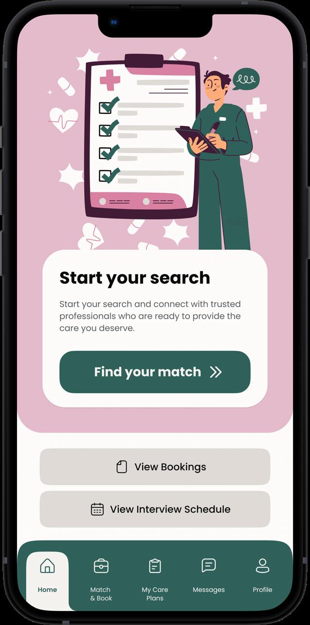
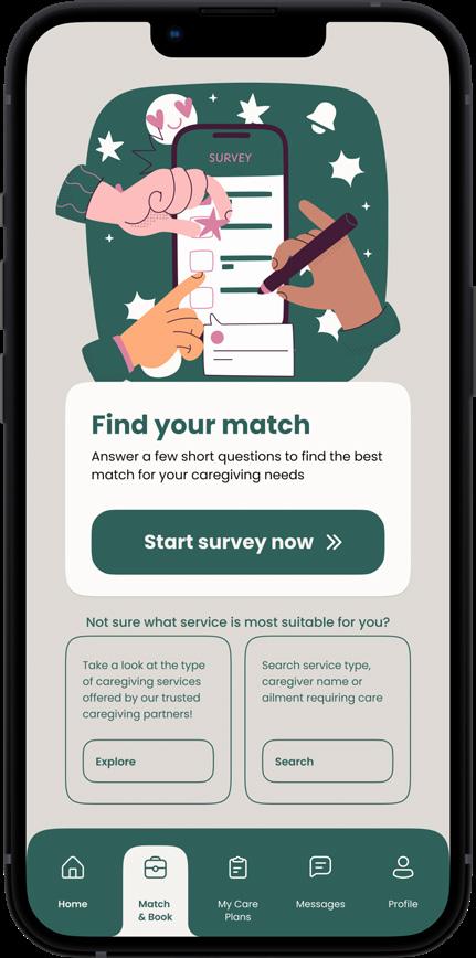
The problem:
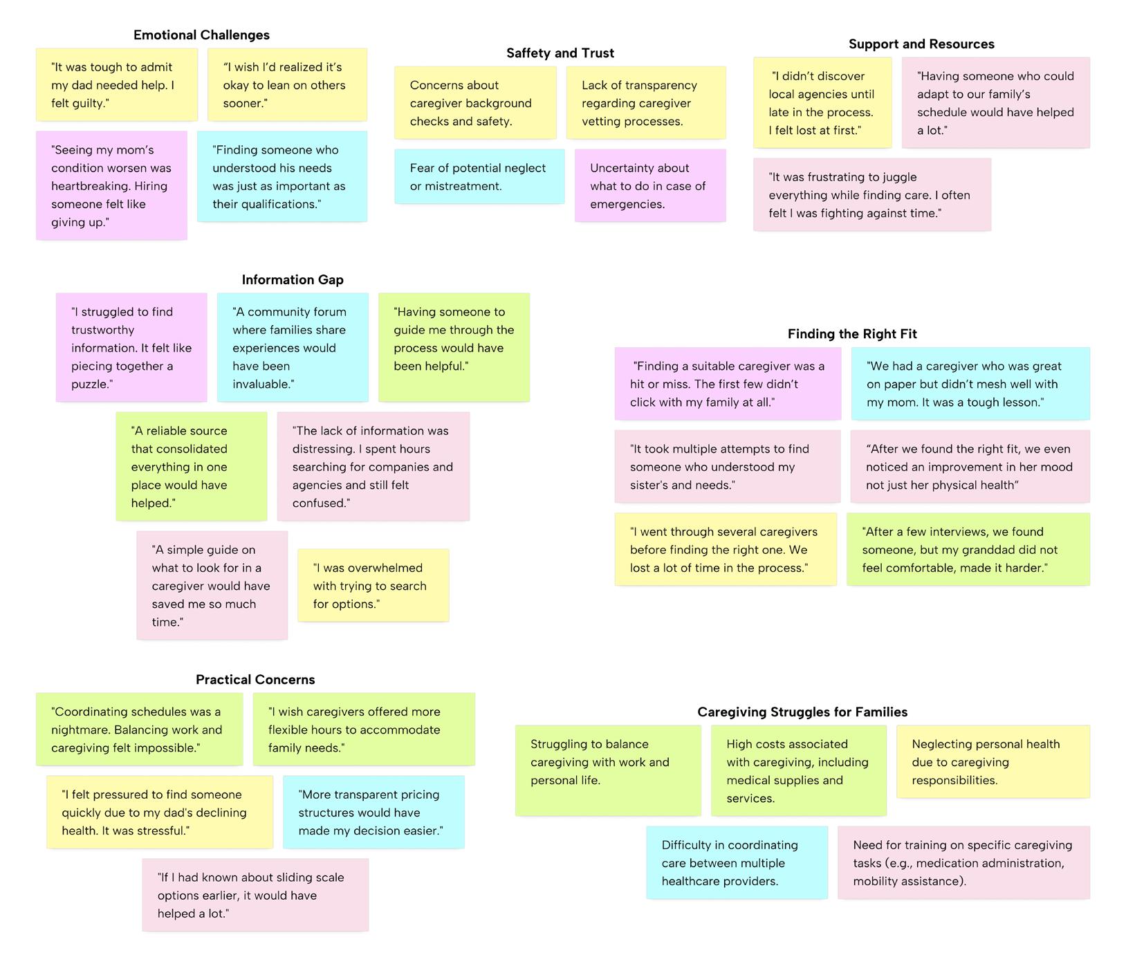
Witnessing my family struggle to find a skilled and reliable at-home caregiver for my disabled grandmother was a tough challenge. We reached out to several agencies , and asked many of our friends and acquaintances for recommendations, but each caregiver we hired brought a mix of hope and disappointment. It took hiring three different caregivers before we could find the right fit , both for my grandmother and for us as a family. Families struggle to find trustworthy, qualified caregivers for extended at-home care
This experience highlighted a question in caregiving that needed an answer
Issues we faced during this time:
Lack
60% of my interviewees struggled to even find caregivers to review and hire.
To better understand the problem, I conducted interviews with 9 participants who had family members that required care and assistance with basic needs. They ranged from young professionals to middle aged children of senior parents.
The questions included:
1. Have you or your family member ever needed another person to take care of basic needs?
2. What made you decide to take the aid of a caregiver in looking after the patient?
3. How did you find the caregiver you ended up hiring?
4. What were the setbacks during this time that made it difficult for the patient to be cared for?
5. What was the experience like before, during and after hiring the caregiver?
“The absence of a centralised resource made it feel like a game of chance”
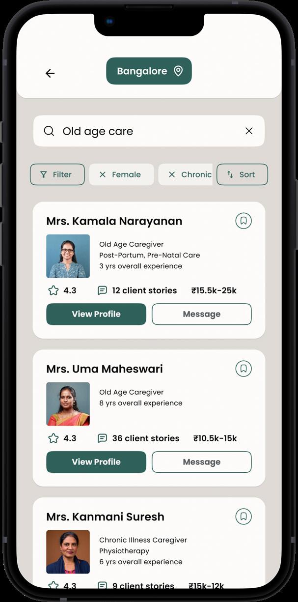
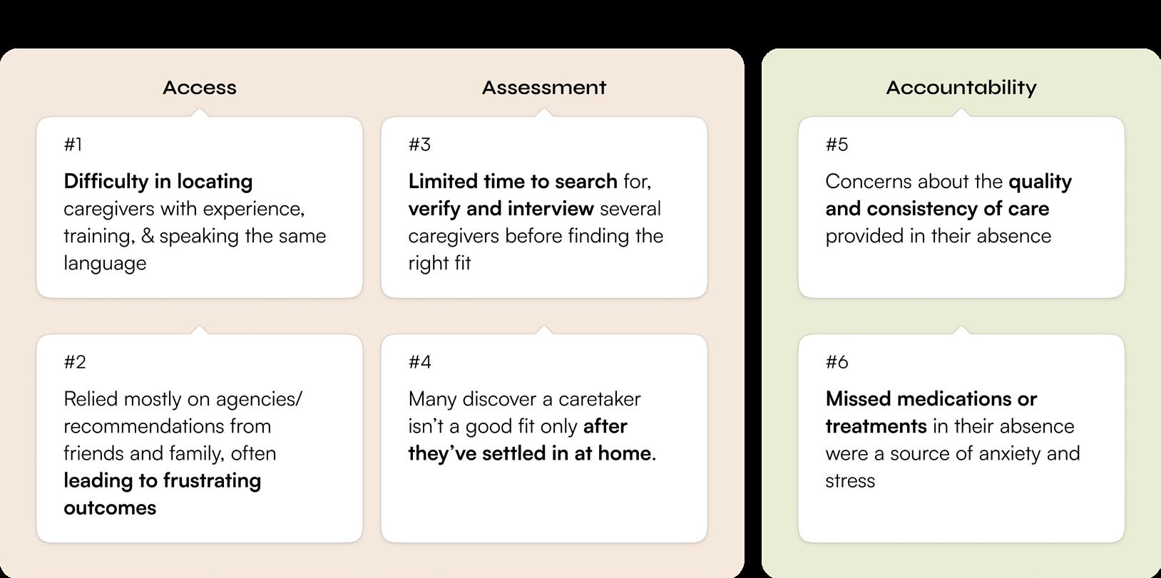
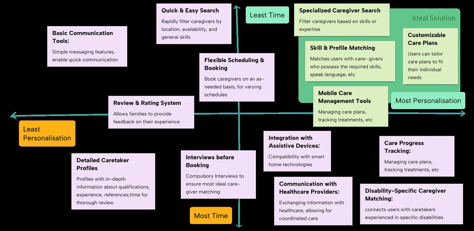
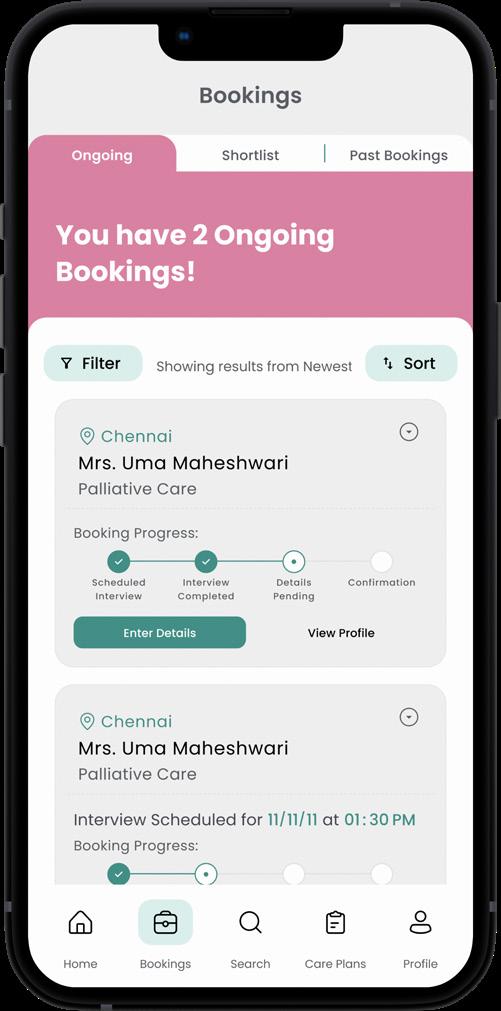
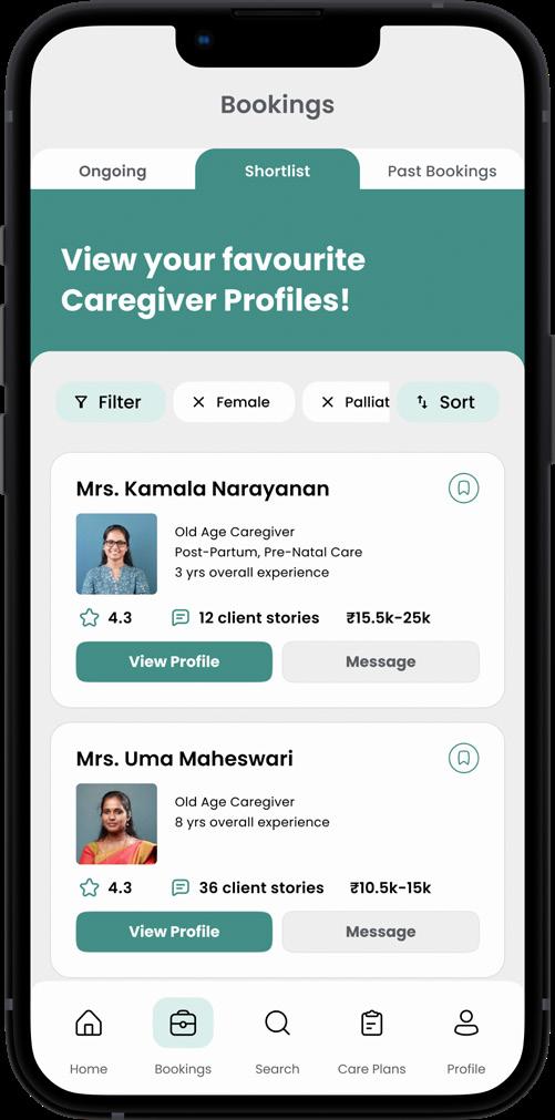
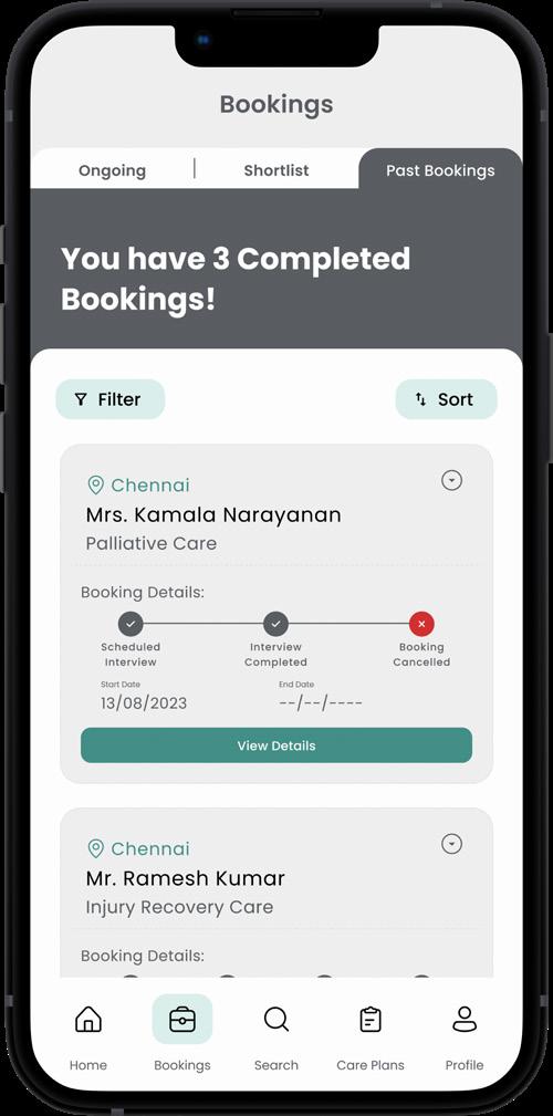
The affinity mapping revealed the following trends in the challenges faced by families, which could be classified into three major themes: Access, Assessment, and Accountability. These are divided into two phases in the caregiver booking process: pre-booking and post-booking.
Defining the design goal
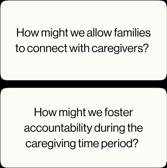
Lack of access and accountability is standing in the way of families discovering their perfect caregiver and having an anxiety-free caregiving experience.
This begged the questions:
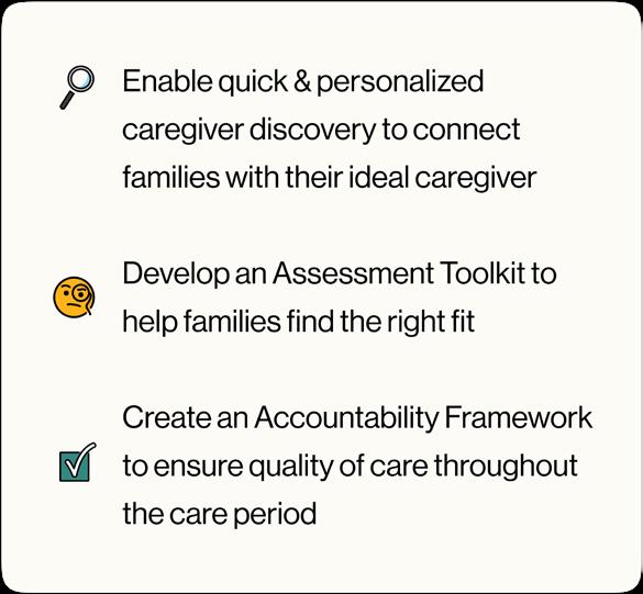
By converting insights into practical recommendations, I established a clear set of design objectives to define the intended outcomes.
Image by: Amritha TV
Design development
Once I brainstormed interventions that aligned with my design objectives, I used a solutions matrix to zero in on the most effective ideas for execution. The most important factors for most users were lack of time to find suitable options and finding a match that suits their unique needs. Keeping this in mind, I narrowed down the solutions based on the least time taken and the most anmount of personalisation possible.
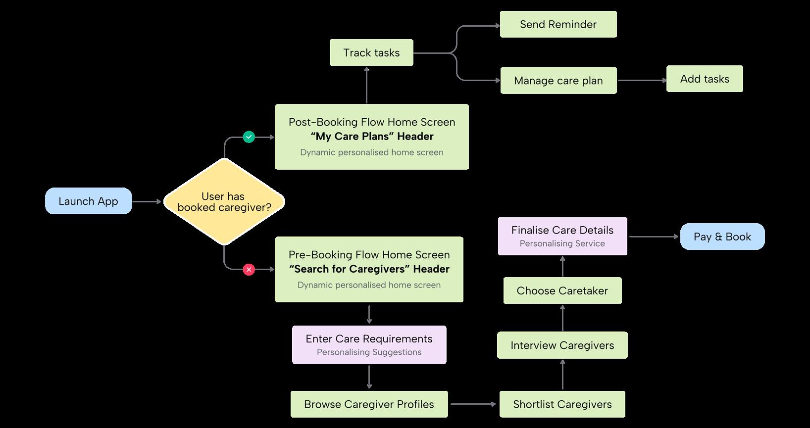
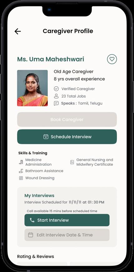
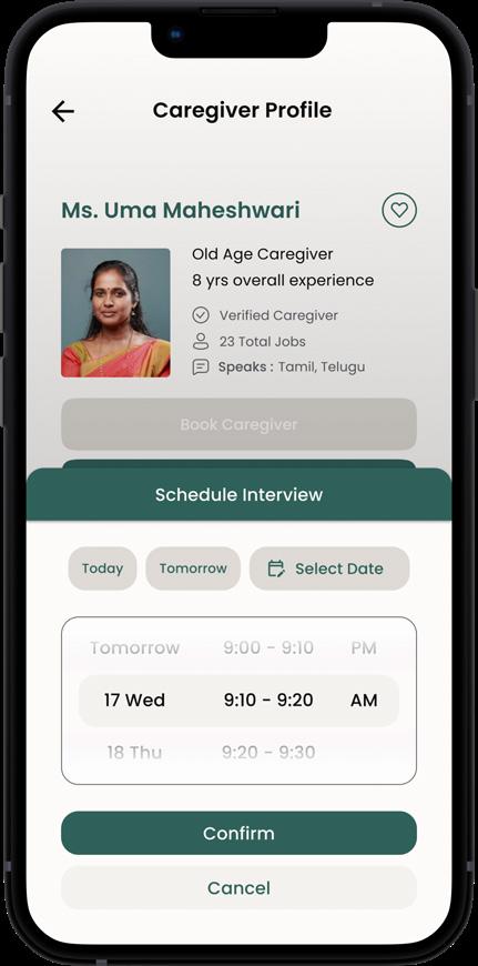
Designing an intuitive and user-friendly experience
The main user flow had to account for two parallel paths, the first branch aimed towards simplifying the search and booking of the most suitable caregiver, while the second focused on maintaining accountabili-
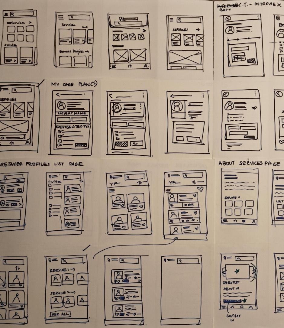
Ideating screens - sketching & crazy 8’s to narrow down ideas
User testing & feedback
After converting the sketches into wireframes, I conducted user testing with a handful of participants to identify problem areas that require attention. The following pages showcase this process.
Image by: Amritha TV
Image by: Amritha TV
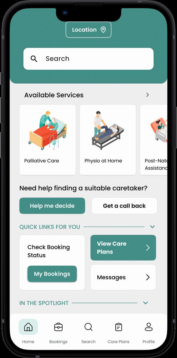
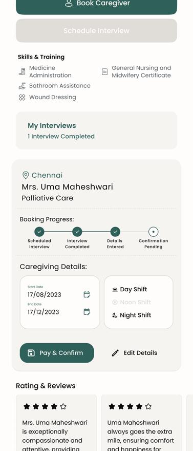
Home screen: Prototype I
Purpose:
In the first prototype, the home screen acted as a single central point to access several different functions, from searching for services to monitoring ongoing services.
User Feedback:
Lack of clarity
It wasn’t clear to users exactly what the purpose of the home screen was.
Cluttered
Users reported feeling overwhelmed by all the elements in the home screen
Confusing navigation
Users reported feeling confused about what they should do to get started with the booking process
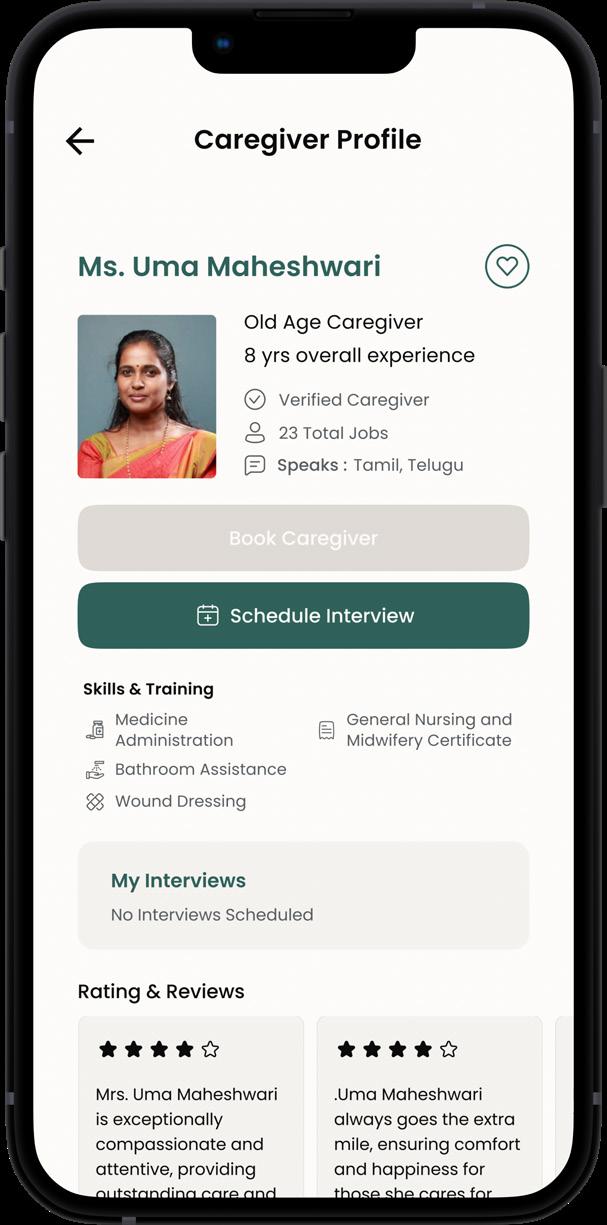
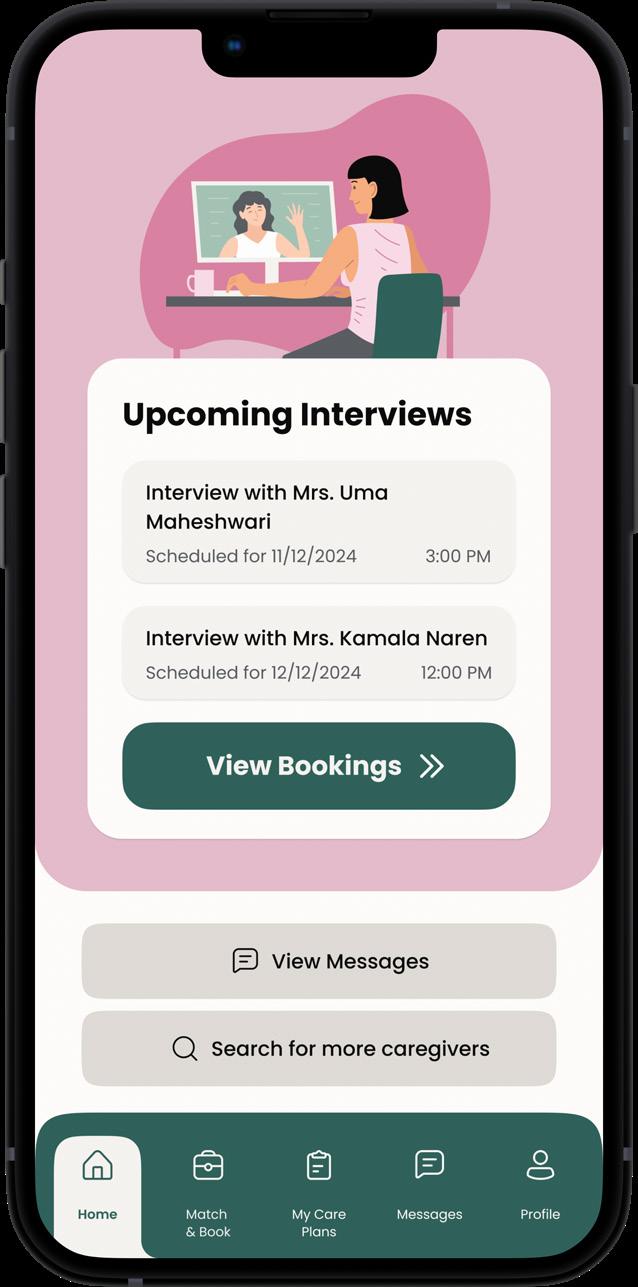
Home screen: Final design - Personalised home screen based on phase of booking
Depending on where the user is in their booking journey, their priotities change between
1. Finding a caregiver
2. Contacting caregivers, and 3. Tracking caregiver activity.
Keeping this in mind, and the problems raised during the user testing, the home screen was redesigned to be personalised to users in different phases.
This was done to ensure that there is clarity while navigting through the appThe intention is that the home screen does not become redundant and instead aids in navigation.
Pre-booking phase
Key developments in design: A personalised home screen
During booking, before confirmation
Prominent CTA to convey the purpose of the screen & inform the user about how to get started with completing their desired task
Secondary Actions vary according to each phase of booking depending on the priority of actions during that phase
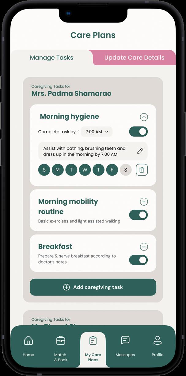
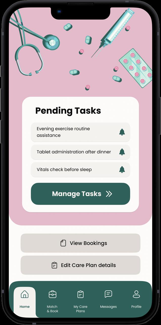
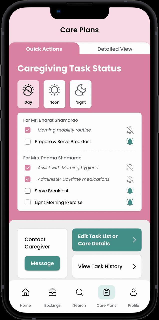
Post-booking, during caregiving
Task tracker
The task tracker, an important feature for users that have completed the booking process, is now available in the home screen.
This allows users to immediately have an overview on pending tasks and act accordingly
More efficient task management
To allow users to view tasks based on shift, and send reminders when tasks weren’t completed. CTAs were added for editing tasks or for messaging caregivers.
Initial prototype
Splitting tasks between shifts created an unnecessary extra step before accessing the most important data
Editing tasks was not easily accessible
No clear Call to action in the page, making the purpose unclear
Final design
Bottom navigation: first iteration
User Feedback:
Users weren’t sure what pages the icons represented. The flow between the pages felt broken
Several users did not find value in the “bookings” page or the “search” page
Design Intent: Why it didn’t work:
In the first prototype, the nav bar was designed with the main 5 pages being home screen, ‘search’ screen, bookings, care plans & profile.
The users didn’t find all the pages to be valuable to their experience, so their purpose was re-assessed and the screens were redesigned. in this process, the nav bar naturally chanded ot the newer iteration.
Bottom navigation: final design
Tasks can be ‘on’ or ‘off’ depending on whether they are required to be doneeasy to change based on caregiving need changes
Clear CTA for adding tasks, editing or deleting tasks and for disabling/enabling
Tasks were organised based on the person receiving care rather than shift for easy navigation and clarity
Updated menu items: Updated menu items:
The ‘bookings’ and ‘search’ screens were replaced with the consolidated ‘match & book’ screen for optimum navigation
A ‘messages’ page was added for quick & easy communication with caregivers
Labels for each item
What didn’t work
Key learnings & takeaways:
Designing an app for booking caregivers taught me many important lessons. First, user-centered design is crucial. The app needed to serve both caregivers and users with different needs, so simplicity was key.
Simplicity Over Complexity: I learned that simplicity is powerful. In a caregiving app, users must navigate easily and quickly. The more intuitive the design, the more likely it is to be successful, especially for users who may not be tech-savvy.
Iterative Process is Crucial: I discovered that designing an app is never “finished.” It’s a continual process of testing, feedback, and refinement. Even in theory, thinking through iterative improvements allowed me to see potential gaps and opportunities for optimization.
Booking Information page
SnapWord: empowering individuals with learning disabilities to develop phonemic awareness
In 2021, at the peak of the Covid-19 quarantine my mother, a kindergarten teacher, struggled to teach her students the fundamentals of reading, writing and the English language in the brand new medium, the digital world. She found it especially hard to ensure that she reached the special children in her class requiring extra attention.
I remember watching her scour her own personal library as well as the internet, searching for the right kind of tools and resources that would make the subject accessible and engaging to her students. This set the tone for my investigation into how I could make literacy education more accessible for individuals.
process
Understanding phonemes and phonology
Quantifying learning difficulties
the problem the solution
Individuals with learning disabilities struggle with phonemic awareness, making it difficult for them to grasp the basic sounds that form words.
15-20% of school-aged children in India have some form of learning disability (Chacko, 2017). However, the actual prevalence might be higher due to underreporting and misdiagnosis.
30-40% of students with learning disabilities in India face challenges with spelling due to deficits in auditory discrimination and phoneme-grapheme mapping (Chacko, 2017) 35%
implications
Without phoneme awareness, students may be mystified by the print system and how it represents the spoken word
Phoneme awareness issues and other phonological problems are predictors of poor reading and spelling development in the future
Readers with phonological processing weaknesses also tend to be the poorest spellers
Designed by Amritha TV
Supervised by Yuvaraj
yuvaswamy88@gmail.com
Researching accesible education
Ideating final solution
Exploring learning and play
why this project
I’ve always been driven by the desire to solve real problems through design, and this project feels like a deeply personal way to make a meaningful impact. Working on an educational toy for students with learning disabilities allows me to directly address the challenges they face in a creative, hands-on way.
The goal is to provide an inclusive learning tool that not only supports educational growth but also fosters confidence and independence in students with learning challenges. By incorporating engaging, hands-on activities, the toy encourages active participation and enhances cognitive development.
Research:
1. White paper research & literature review
2. Interview with expert on learning disabilities
3. Interviews with teachers
Why is phonemic awareness crucial? Inferences:
What are phonemes?
A phoneme is the smallest unit of sound in speech.
Background:
The english language has 44 phonemes. The number of phonemes in a word is not dependent on its speling.
The word ‘cat has 3 phonemes
What constitutes phonemic awareness?
the ability to identify the sound of /d/ in the words dog, dish, and mad
the ability to separate the phoneme from others before they can understand what the letter d represents in each of those words
how phonemic awareness facilitates reading
facilitating growth in printed word recognition
attending to unfamiliar words and comparing them with known words
repeating and pronouncing words correctly encoding words accurately so that they can be retrieved & used
Students who lack phoneme awareness may not even know what is meant by the term sound.
If asked to give the first sound in the word dog, they are likely to say “Woof-woof!”
How can we make phonemic awareness more accessible and engaging for individuals with learning disabilities?
Difficulties
in developing phonemic awareness
Teaching phonemic awareness to individuals with learning disabilities (LD) presents unique challenges. These difficulties stem from specific cognitive, auditory, and processing deficits associated with various types of learning disabilities.
difficulties for the individuals with learning disabilities
Co-occuring disabilities
Like ADHD, dyslexia, or speech-language impairments
Sequencing Challenges
Problems with organizing sounds in the correct order for blending or segmenting
Low motivation & confidence
Discouraged due to repeated difficulties and a history of struggle
Limited language skills
Struggle with recognizing or producing sounds due to weak oral language abilities
difficulties for the educators responsible for their learning
Need for Differentiation
Challenges in adapting teaching methods to meet diverse needs
Engagement Challenges
Issues maintaining student interest & motivation, for those with low confidence.
Lack of one-onone support
Difficulty finding time or resources to provide one-onone instruction
Resource Limitations
Lack of access to teaching tools, assistive technologies, or other supports
Accessible teaching & learning methods
Combines visual, auditory, tactile, and kinesthetic elements to reinforce learning.
Why
Engages multiple senses, improves retention.
Makes abstract ideas concrete & accessible.
Integrating game-like elements into educational activities.
Increases motivation, makes learning fun, and reduces anxiety about failure
Learning through hands-on projects that solve real-world problems.
Connects lessons to real-world applications
Promotes active participation and hands-on engagement.
Using artistic expressions to teach academic subjects.
Stimulates creativity and helps retain information through emotional engagement.
Tools and software that support specific learning needs, like speech-to-text software
Breaks barriers by tailoring tools to specific needs.
Offers autonomy, letting learners work at their own pace.
Multisensory approach
Gamification
3. Project Based Learning 4. Art and Music Integration 5. Assistive Technology
ideation & design development
How can we create a resource that allows the users to gain autonomy in their own learning?
What is the role of play in learning?
How can we enable discouraged individuals approach learning with enthusiasm and curiosity again?
Can a teaching aid go beyond learning and improve confidence?
How can we leverage interactions and sensory inputs to enhance individuals’ engagement and curiosity?
questions that drove the ideation process
How can the abstract concept of phonemes be made accessible to individuals with LD’s?
How can we enable discouraged individuals approach learning with enthusiasm and curiosity again?
How can literacy education be gamified ?
How can the abstract concept of phonemes be made accessible to individuals with LD’s?
learning toy: defining the goals & what the final solution must accomplish
In 2021, at the peak of the Covid-19 quarantine my mother, a kindergarten teacher, struggled to teach her students the fundamentals of reading, writing and the English language in the brand new medium, the digital world. She found it especially hard to ensure that she reached the special children in her class requiring extra attention.
Interaction goals: Education goals:
Provide a multi-sensory experience: sight, sound, touch
Pose a challenge and provide a sense of accomplishment on overcoming the challenge
Enable users to learn and encode the symbol and sound connections. eg. that ‘d’ represents the sound /d/
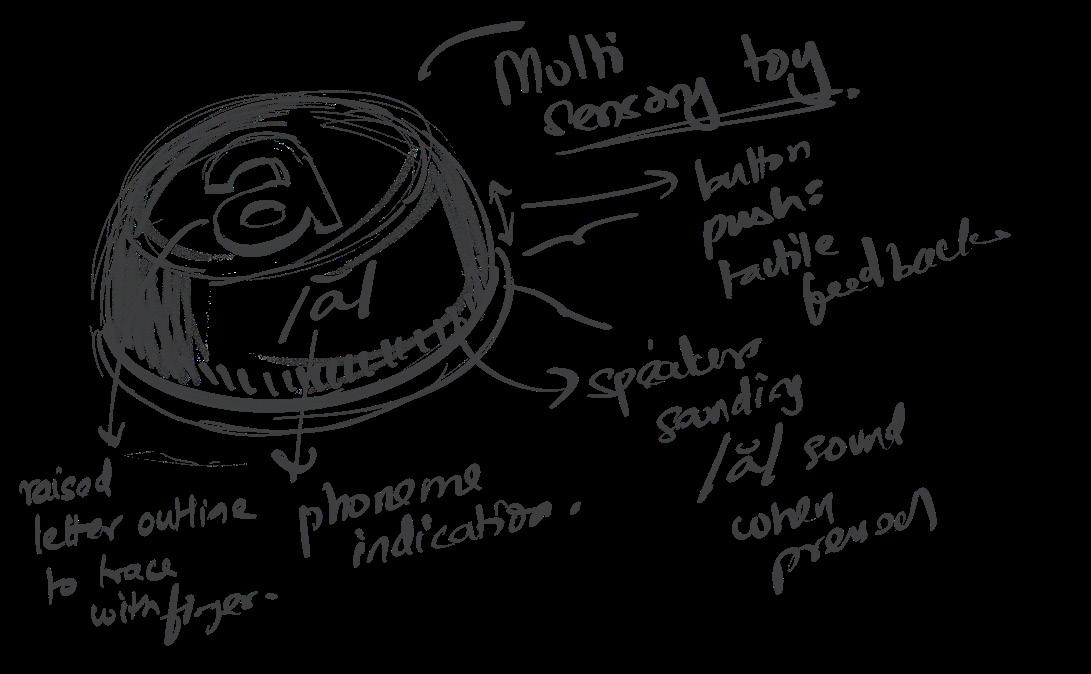
idea iterations
idea 1: individual buttons
Why it doesn’t work:
A single alphabet can have different phonemic pronounciations depeneding on the context. One button per alphabet does not account for contextual differences. Useful to simply memorise the sound associated with a phoneme but not useful for building reading skills like word formation on top of that
Allow users to be able to practice joining phonemes to create words
Screen displays a word to be spelled out, along with the speaker sounding out the word to help user draw connection.
The user is supposed to then spell out the same word in the keyboard in the correct order, which is followed by affirming or negating feedback sounds
Why it doesn’t work:
How it works: requires base level phonemic understanding to pick the right letters in the first place
facilitates word building and symbol mapping but can lead to dependence on starter word
idea 2: keyboard-type toy
Speaker sounds out the phoneme of each letter as well as word
Screen displaying word being to be spelled out raised/embossed surface to add sensory experience
Arrange blocks together in the right order to form words
When arranged correctly, the blocks ‘snap’ together by magnetic force, and lets out a positive sound of affirmation, followed by the phonemes, and then the word
Colour coded blocks
Based on the level and the list of words, the blocks are split into groups. For example, for CVC words they are: starting consonant, vowel, and ending consonant.,
When arranged in incorrect order, the magnets repeal each other, or, a “buzz” sound and vibration is let out to inform users that the order is incorrect, followed by a message such as “try again!”
Sets decided by level
The set of blocks are decided based on the level of literacy of the students. For beginners, three letter words of the CVC format are the most easily approachable.
Features:
1. Raised alphabet button
Users can trace their finger along the shape of the letter for an additional sensory input, and pressing the button lets out the sound of all possible phonemes on each press
Senses engaged: touch, sound
Outcomes: encoding grapheme, learning the sounds associated with the alphabets
2. Magnetic faces
Users can place blocks together in different orders to create words. The blocks snap together by the magnetic plates to form the words, followed by audio feedback for correct or incorrect words.
Senses engaged: touch, sound, sight
Outcomes: feeling of accomplishment, learning to encode phonemes and words
Key learnings & takeaways:
I’ve always been driven by the desire to solve real problems through design, and this project was a deeply personal way to make a meaningful impact. This project is especially meaningful to me because it taps into my passion for creating accessible solutions to complex problems.
Cross-Disciplinary Complexity: The design process required understanding and expertise across various fields—education, psychology, user experience, and product design.
Contextual Awareness: Understanding that children with learning disabilities may have diverse needs was key in the design process. It wasn’t just about making the toy accessible but also about adapting it to specific learning challenges.
Designing Healing Spaces: Creating Therapeutic Inpatient Rooms for IMH, Kilpauk
Driven by my passion for mental health advocacy, I designed a ward that supports healing and empowers recovery. My focus was on creating a space where patients feel safe, respected, and makes it easier for them to rehabilitate into society. This project seeks to address the often overlooked, yet crucial, aspect of mental healthcare: the environment in which care is provided.
By designing an inpatient psychiatric ward, we have the opportunity to create a space that significantly impacts the well-being of patients during a vulnerable time.
The design prioritizes reducing stress through calming elements like natural light and biophilic features. An inpatient psychiatric ward must serve as a sanctuary for patients, providing not just safety, but also an environment conducive to recovery.
Designing an inpatient psychiatric ward is my way of contributing to a space where people are at their most vulnerable, and I want to create an environment that not only supports their recovery but also respects their dignity.
Chennai, Tamil Nadu
muthuashwin@annauniv.edu
Project Scopre: Campus planning. 60 acre site. Presenting the inpatient room design process & outcomes.
the problem
Individuals from low-income backgrounds in Tamil Nadu do not have access to quality mental health care.
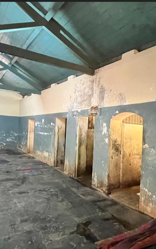
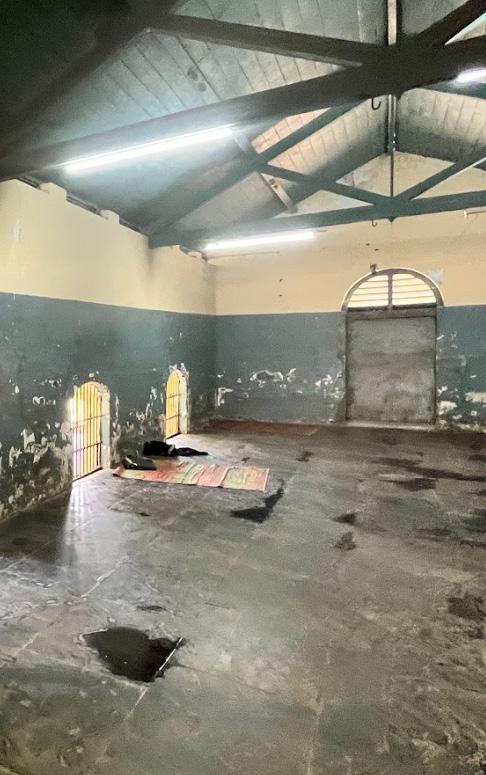
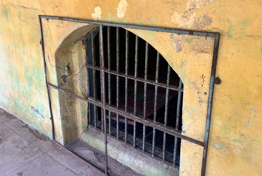
Why the current inpatient ward doesn’t meet the requirements of its users:
Insufficient lighting & ventilation
Alienating interior layout devoid of warmth or empathy
Lack of proper sanitation & maintenance of living quarters
Barren rooms with no furniture, just a straw mat
No privacy from fellow patients in the ward, no private away spaces
Unplanned & wasted open space that could help heal patients
Jail like windows at floor level with no curtain for privacy
Restrooms with no doors, no privacy or dignity for the suffering patients
General Inpatient Ward, IMH Kilpauk
1. White paper research & literature review
3. Field visits to IMH, Kilpauk
4. Interviews with nurses & doctors methodologies:
2. Field visits to psychiatric centres
research objective: inferences:
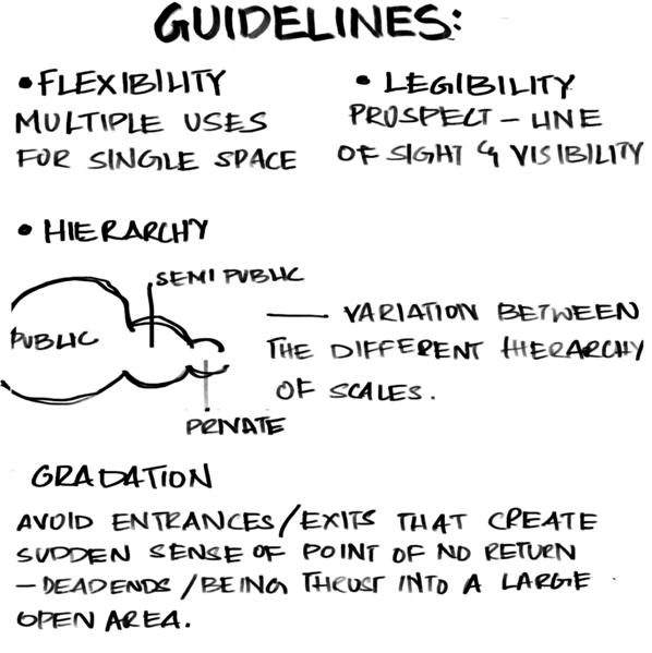
What does a mentally ill patient need from their environment in order to heal and maintain health?
Spatial needs of an institutionalised mentally ill individual:
Patient’s enrichment needs:
Access to healthy physical activity and a range of recreation activities
Access to healthy outdoos & sensory experiences
Sense of belonging, community & peer support
Familiar & normalised treating environment
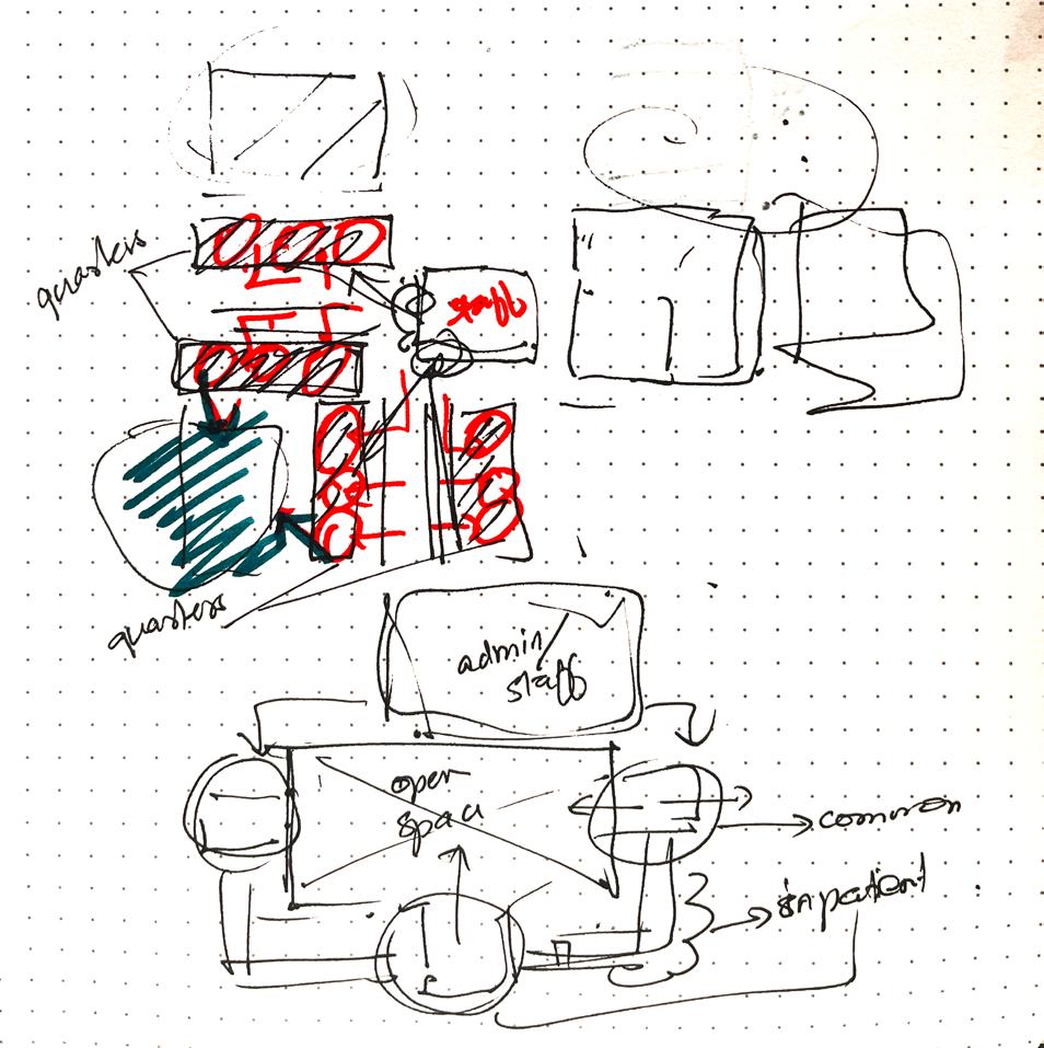
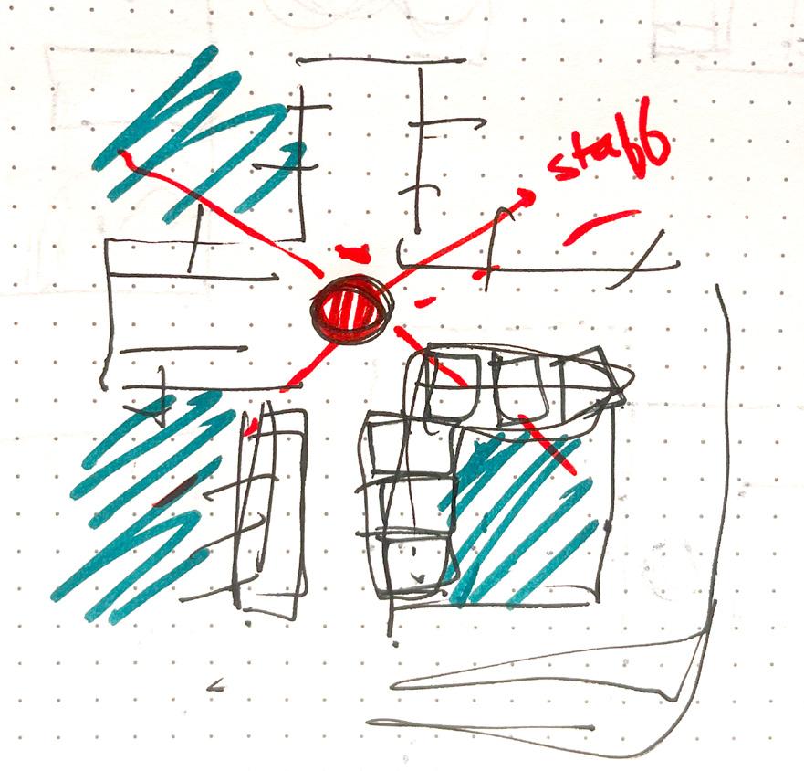
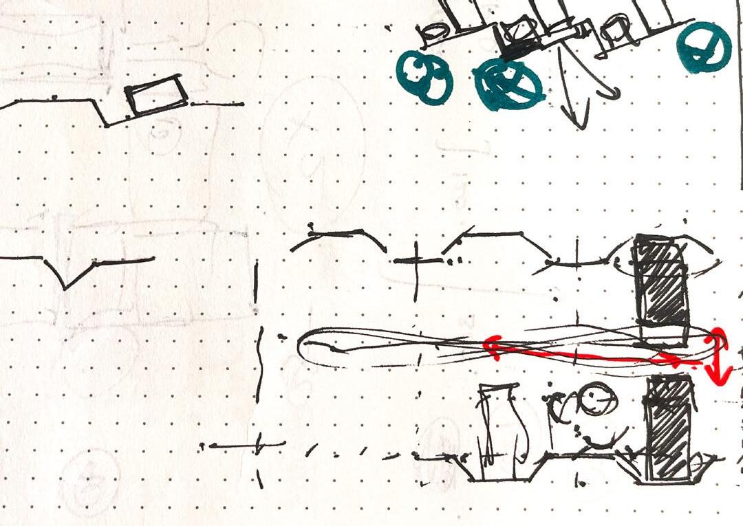
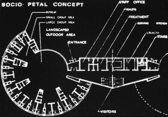
“What if there was a courtyard inside the room”?
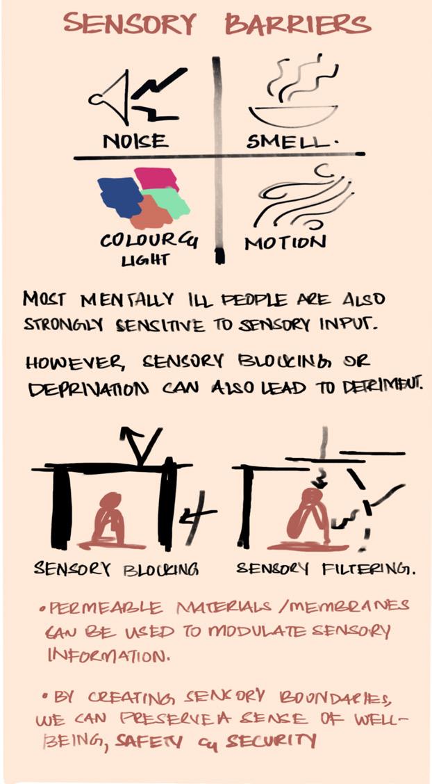
The concept that heavily influenced my design approach was the socio-petal concept. This concept was introduced by Kiyoshi Izumi, a Japanese architect and designer, who emphasized the relationship between spatial configurations and human behavior. In sociopetal spaces, the design encourages connection, interaction, and communication by creating settings that naturally bring people together.
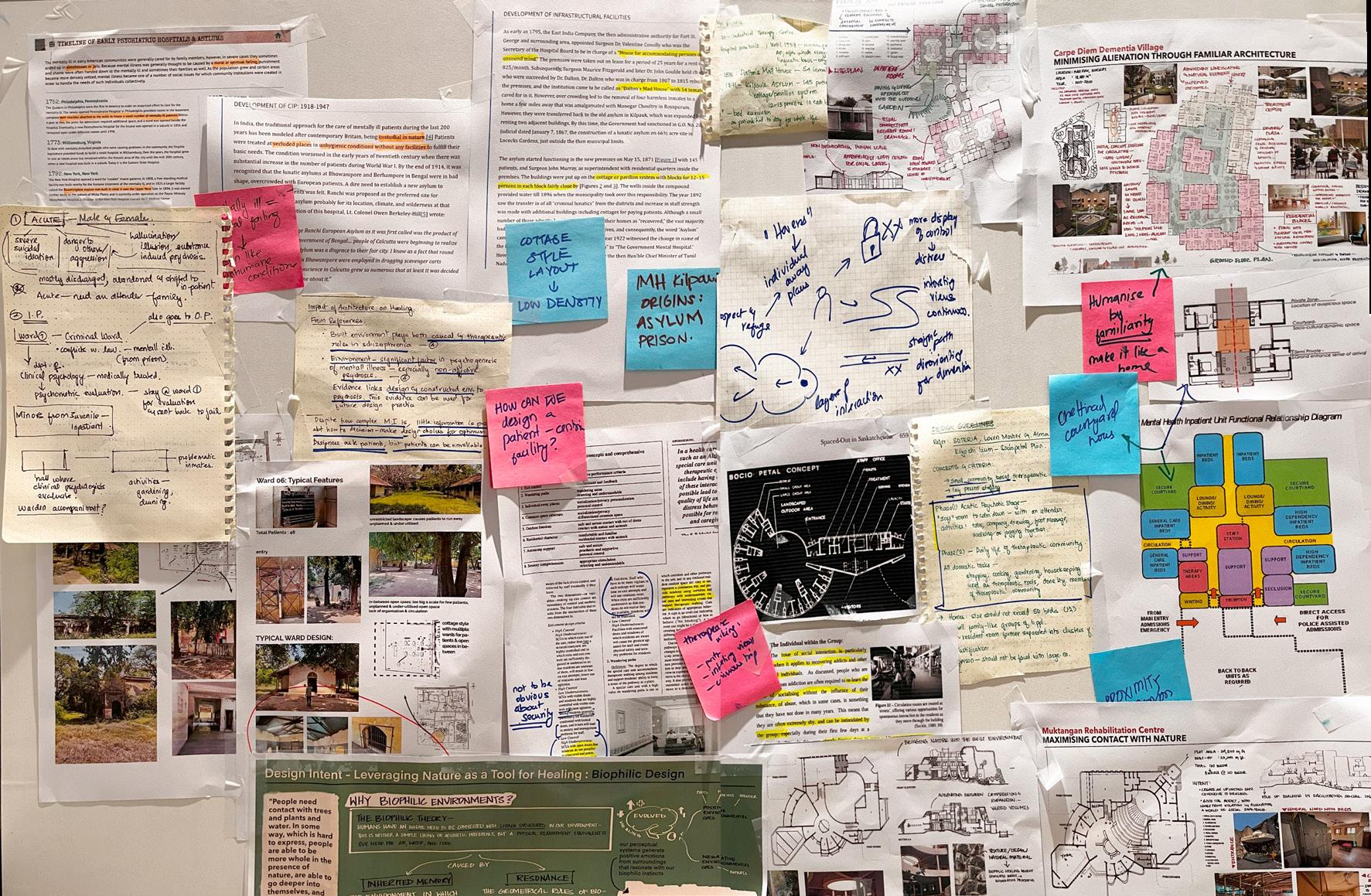
Guiding ideas for my design:
courtyards individual away spaces
sociopetal design gradation in interaction breaking up the linear prospect & refuge
maximise contact with nature minimise
sense of confinement reduce alienation with familiarity break up interactions into levels
Overcrowding, poor lighting and alienation are often factors that negatively impact recovery outcomes for inpatients. These factors must be dealt with in a sensitive manner for best outcomes.
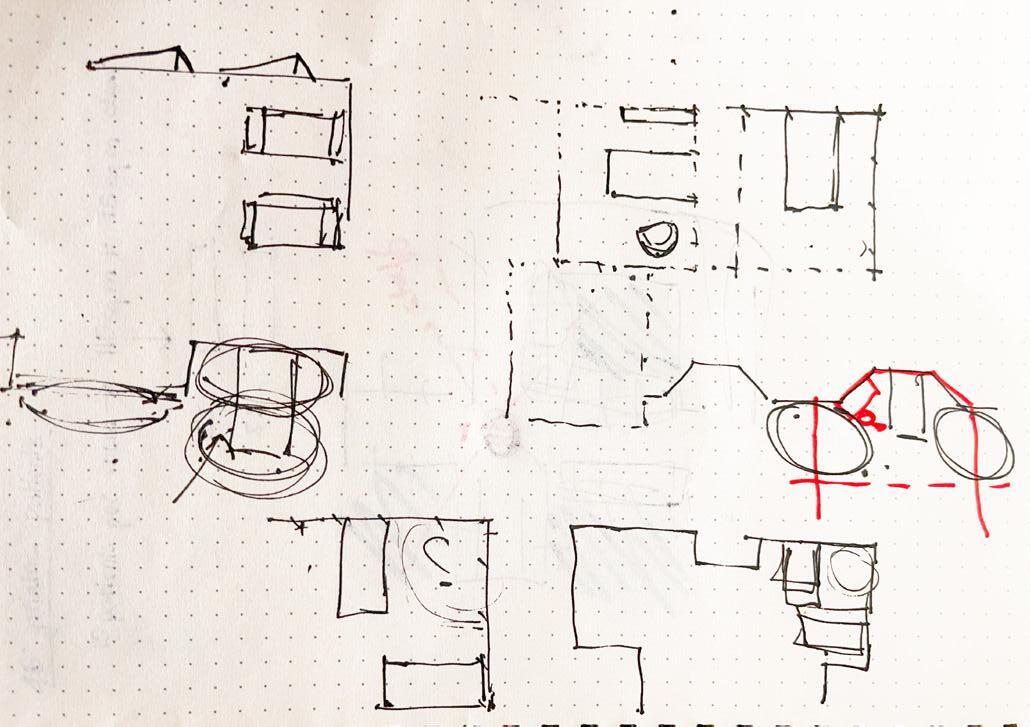
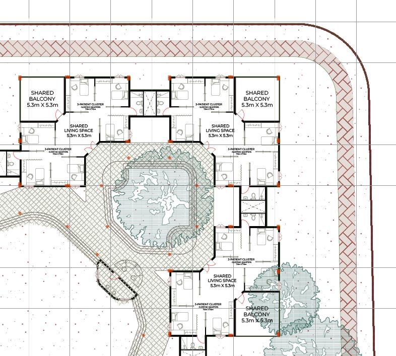
The driving principle behind the design of the inpatient rooms was the idea of juxtaposing privacy and individual away spaces with communal and social spaces, promoting interaction. The interaction is divided into levels to allow patients to transition smoothly from complete privacy to more open-ness.
First level of interaction:
The patient within their own space, between them and their living quarter
Second level of interaction:
Among the three patients sharing a half-room. According to studies, this is the most ideal number for an inpatient facility to avoid negative effects of overcrowding
Third level of interaction:
Among two half-rooms that come together to form one full room, with a balcony space and a courtyard like space becoming the hub of interaction between two halves. This pattern repeats itself throughout the design
Fourth level of interaction:
Three rooms come together to form one cluster of 18 patients, sharing an outdoor courtyard together, completing one unit of inpatient facility. 2 supervisors monitor every unit of 18 patients, following government guidelines.
Graphic design works
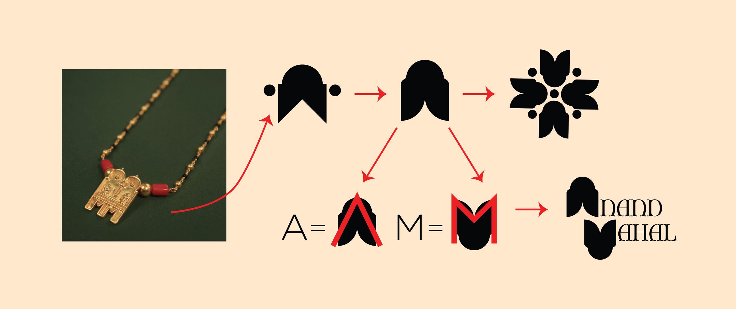
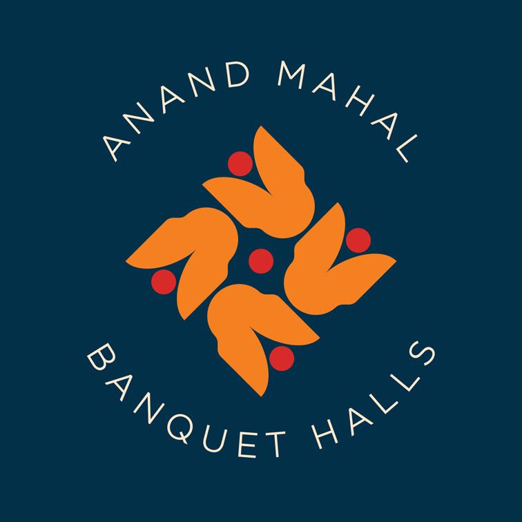
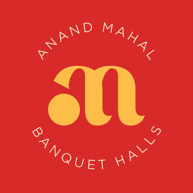
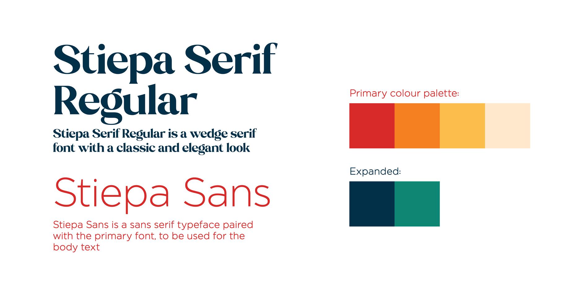
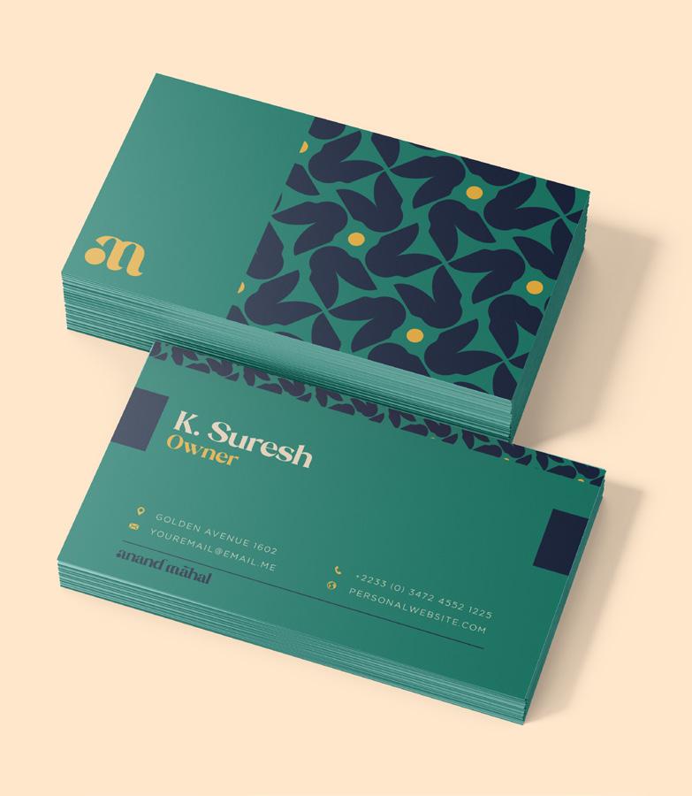
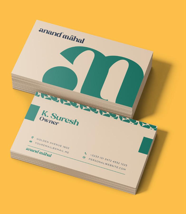
In this branding project for a South Indian wedding hall, my task was to encapsulate the rich traditions and vibrant celebrations while infusing a modern touch.
I was required to incorporate traditional motifs, warm color palettes, and contemporary fonts to create a logo that symbolized unity and festivity. The goal was to resonate with a diverse clientele by seamlessly blending tradition with a touch of modern sophistication.
The expectation was to deliver a visual identity that captured the essence of South Indian weddings, striking a balance between heritage and elegance. The design aimed to seamlessly blend tradition with modernity.
Process:
Designed by Amritha TV
Client: Mr. Umapathy umapathy21309@gmail.com
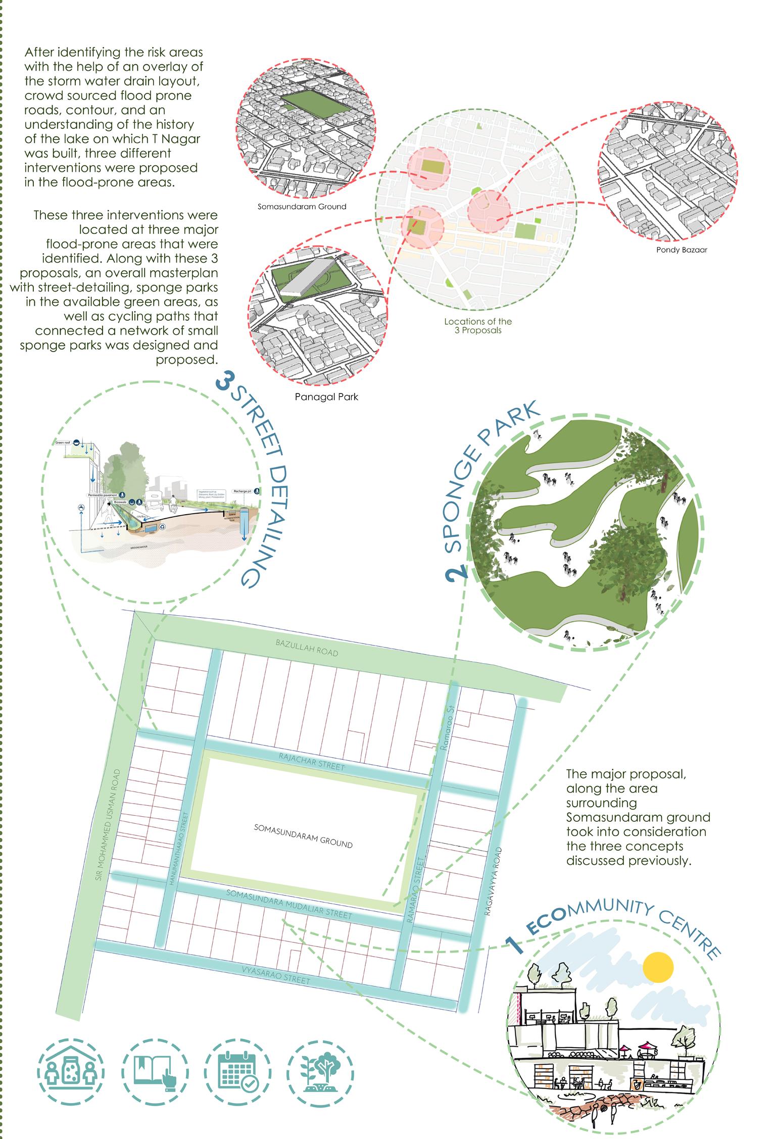
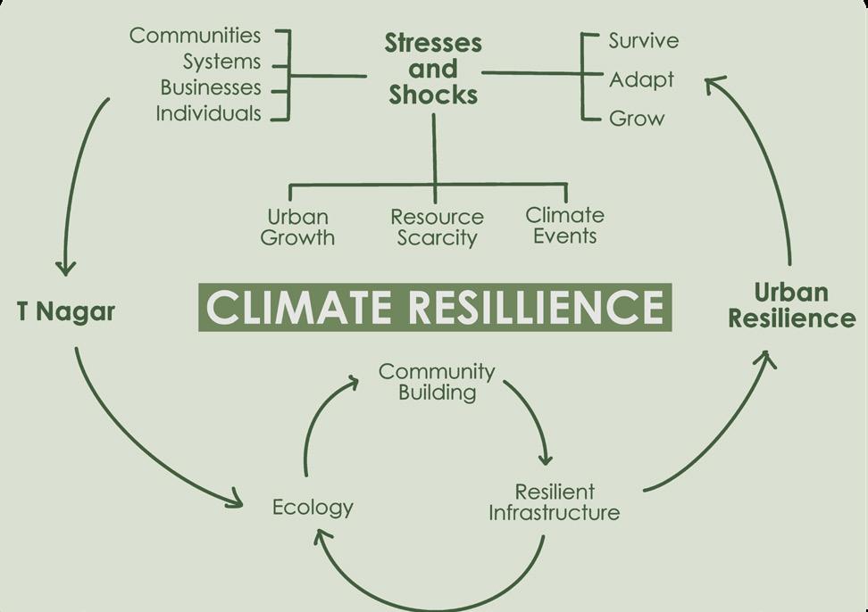
Building Resilience in T Nagar: Adapting to Urban Climate Events and Flood Risks
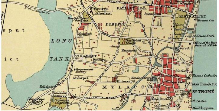
In my final year of architectural school my team of nine members was tasked with studying one of Chennai’s busiest commercial and residential hubs, T Nagar, and providing nature based solutions to promote the climate resillience of the urban pocket. Our study of the area began with extensive fieldwork, which included mapping land use, understanding traffic flow, interviewing residents and business owners, and analyzing local climate data.
Undergraduate Semester Project, Urban Design Studio
Chennai, Tamil Nadu
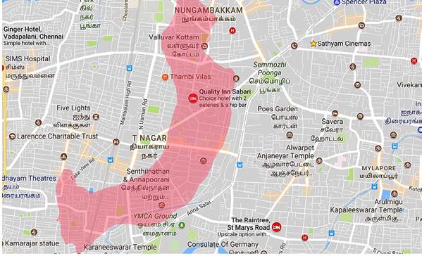
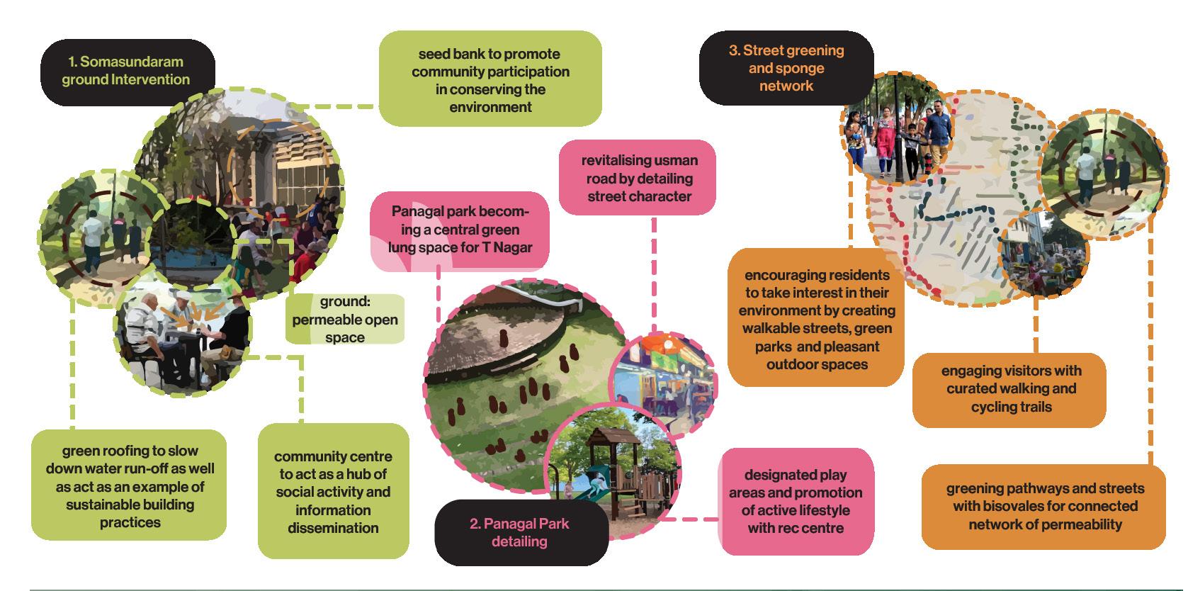
Areas of intervention
Designed by Amritha TV
Supervised by Dr. P. Meenakumari
meku67@yahoo.co.in
Field visits
Mapping studies 2. Surveys & Interviews of users
Literature studies
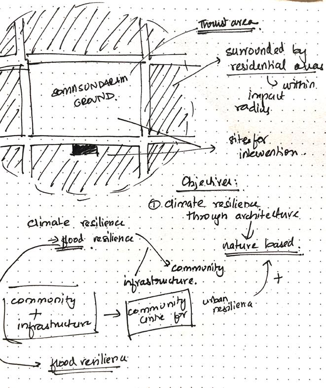
From this research, we identified one key problem: the repeated water-logging and flooding problem faced by the residents, primarily because of a lack of permeable surfaces due to extensive concrete cover and inefficient drainage. As noted by Satterthwaite (2013), urban resilience can’t be achieved through infrastructure alone; it requires active community participation. This formed the foundation for our investigation into how we could make T Nagar flood-resilient through human-centered, nature-based solutions.
After identifying the risk areas with the help of an overlay of the storm water drain layout, crowd sourced flood prone roads, contour, and an understanding of the history of the lake on which T Nagar was built, three different interventions were proposed in the flood-prone areas.
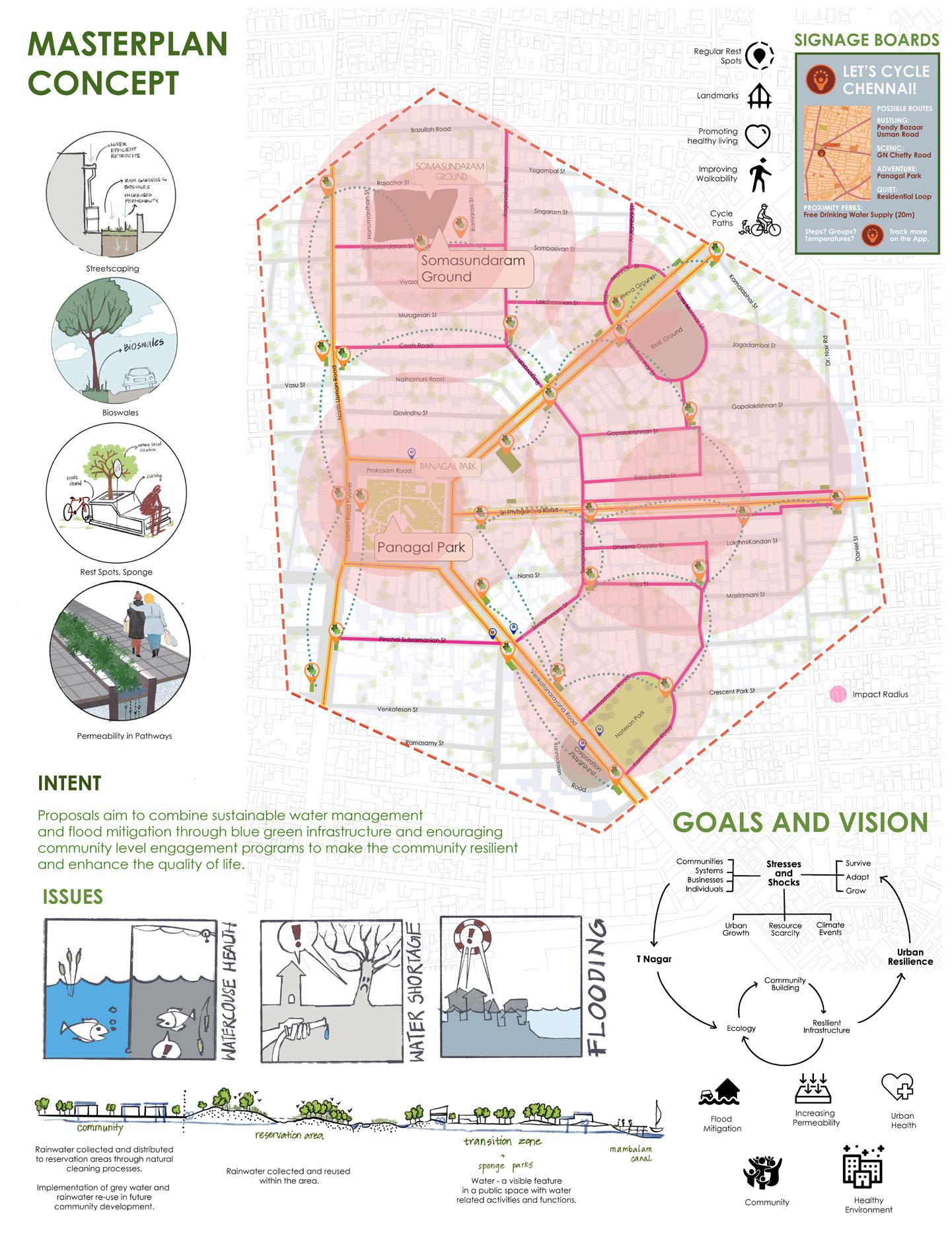
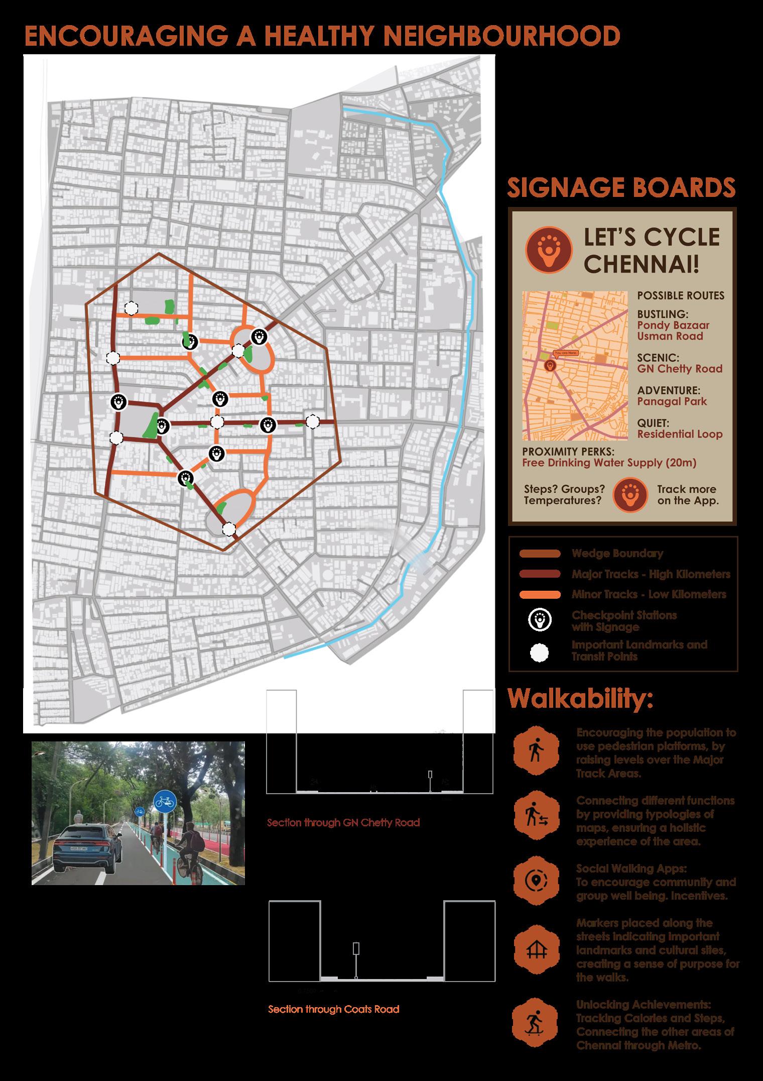
These three interventions were located at three major flood-prone areas that were identified. Along with these 3 proposals, an overall masterplan with street-detailing, sponge parks in the available green areas, as well as cycling paths that connected a network of small sponge parks was designed and proposed.
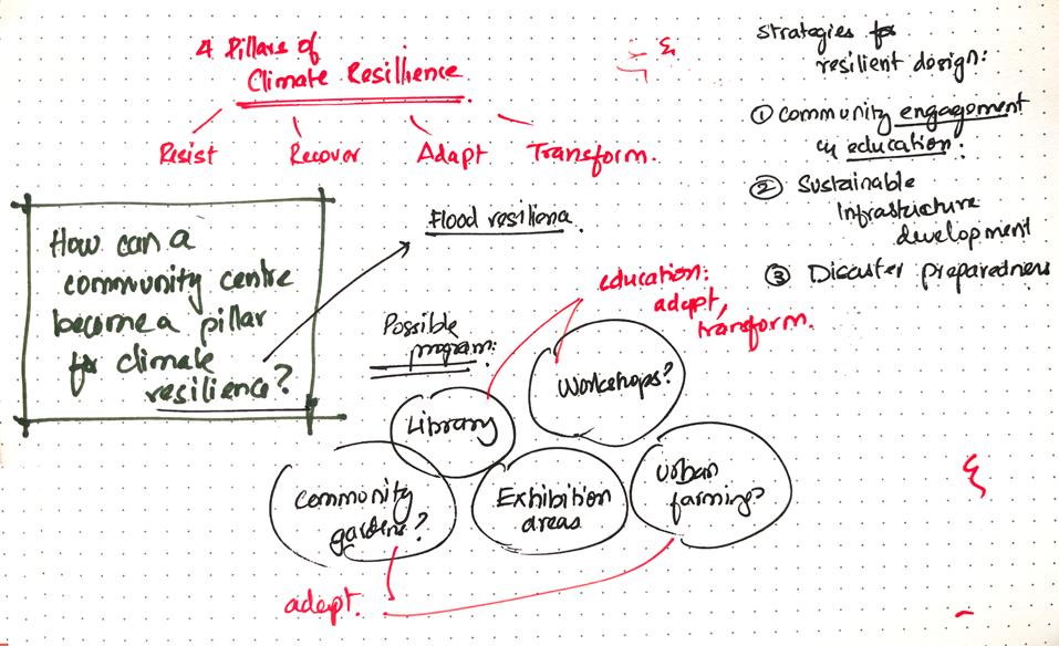
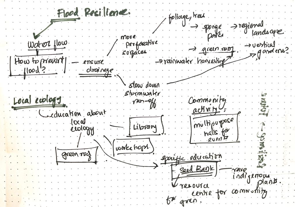
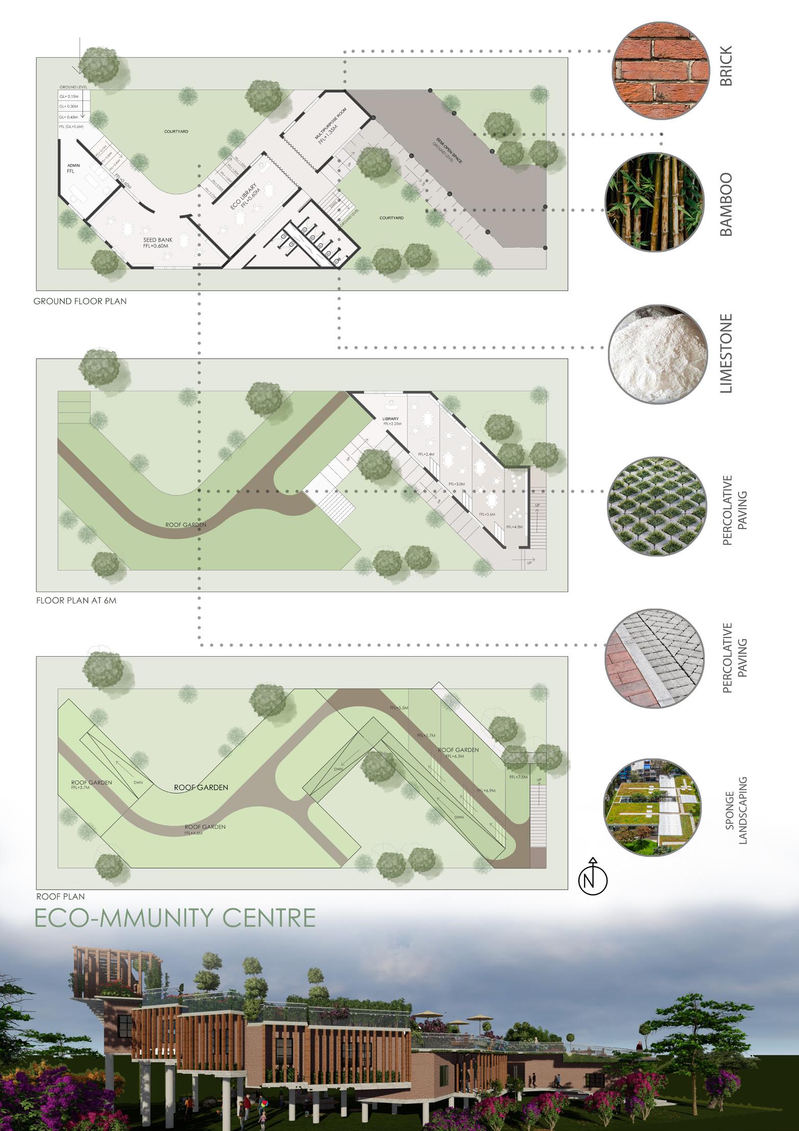
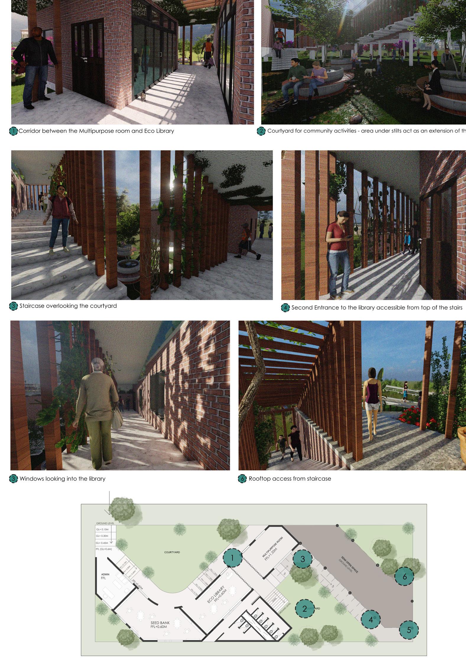
The community center design integrated flood-resilient features like elevated structures and green roofs to manage stormwater and reduce flood risk.
A seed bank provided a valuable resource for the community to restore ecosystems and preserve biodiversity. Flexible, multipurpose spaces ensured the center met both emergency needs and educational goals, becoming a lasting symbol of sustainability and resilience.
Image By: Amritha TV, Prarthana B, Varsha G
Image By: Amritha TV
Image By: Amritha TV
Image By: Amritha TV
Image By: Prarthana B
3D Renders By: Prarthana B
community: a holisticpproach to resilience
Extensive study into the urban fabric of T Nagar, the climate events faced by its residents and all the factors that ultimately play a part in this aspect, such as drainage systems and patterns, the condition of the canal, study of T Nagar’s watershed, rainfall data and the patterns surrounding flooding in Chennai as a whole culminated in the multi-faceted approach we took to the reform we proposed for T Nagar’s built environment.
While most of the proposals did focus on climate resilience and sustainability, one major question that guided our design process the entire journey was, “What about the community?” Aside from our understanding of the importance of human experience in the urban environment, we realised during the course of our study that urban resilience is impossible without the people in the urban areas. Prioritising them is a must.
We quickly ran headlong into the limits of spatial design when we set out to propose an architectural intervention for what were so clearly systemic problems. The problems weren’t just in the spaces people occupied but in the invisible threads that connected them: the relationships between people and their environment, between what they did and where they lived.
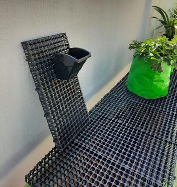
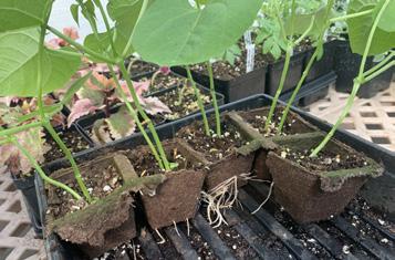
So, we abandoned the idea of an architecture-only solution. Instead, we created something alive, playful, and entirely unexpected. A walking route app turned the landscape into a story and the journey into a game, teaching users about the ecology on their doorstep. Alongside it, we introduced a vertical gardening starter kit—a small and simple invitation to grow, to take ownership, and to transform.
Vertical gardening starter kit
By encouraging residents to grow plants in small, vertical spaces, the kit promotes green infrastructure, which helps absorb rainwater and reduces runoff. When adopted collectively, these gardens create a network of vegetation that mitigates the urban heat island effect and improves soil permeability, lowering the risk of flash flooding.
Proposed contents of the starterkit:
- These form the framework for the garden:
- Stackable planters or wall-mounted pockets.
- Modular systems for easy expansion.
- Hooks, screws, brackets, or adhesive strips
&
Watering System: Drip irrigation or self-watering reservoirs Drainage Tray: Collects excess water to prevent messes Potting soil or soilless mix (lightweight and nutrientrich).
assembly and installation instructions, Tips on sunlight, watering, and fertilization for included plants.