

Overview
Started career in the Bay Area
Worked at Apple with Steve Jobs
Product design at Frog.
Founded product design agency in San Francisco
14+ years in product design.
I focus on making complex products clear and usable without oversimplifying functionality. Clarity inside complexity.
Honesty – Direct, clear communication.
Respect – Collaboration & trust.
Hard Work – Doing great work, taking ownership.
I like competition, problem-solving, and pushing myself.
I’m drawn to challenges that demand strategy, adaptability, and grit.
Strength training
Photography
Playing Ice hockey
Sports with my kids
Watching F1
Surfing & paddle-boarding
Reading History

Enabling flexible workflow & decisionmaking for risk assessment.
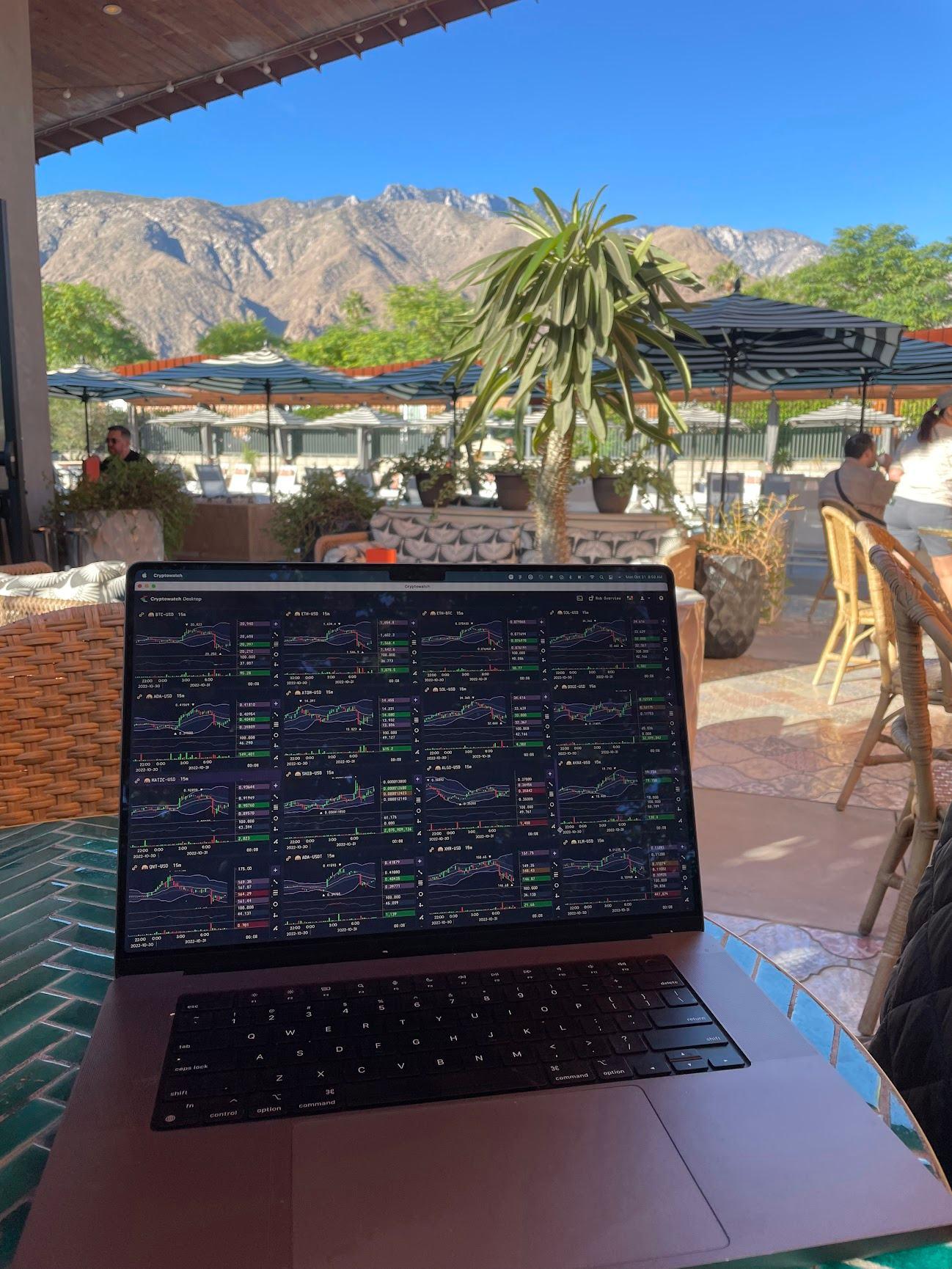
Real-time financial trading & data performance.


Underwriters lacked a single, efficient platform to assess risk, model outcomes and align with business goals.
No unified workbench—teams relied on emails, PDFs, and outdated software that didn’t integrate. Underwriters would cycle through dozens of disconnected data sources
Manual workflows slowed decision-making, leading to inefficiencies and missed business opportunities.
AI had potential, but existing systems made it hard to use effectively in day-to-day workflow.
This set the stage for a product design approach grounded in real-world workflows and business alignment.
I joined Federato when the product was still in ideation.
I led the end-to-end product design—from early discovery and prototyping to building a design system, defining UX architecture, and implementing feedback from major insurance carriers.
I worked closely with founders, engineering, and users to ensure what we built was both technically feasible and grounded in real-world use.
I shaped a product experience the company could rally around—a system that turned fragmented underwriting into confident, decision-making.

The Opportunity
As the sole product designer, I saw this as more than a UI problem—it was a opportunity to improve decision-making.
Underwriting wasn’t just slow, it was misaligned with portfolio and business goals.
Decisions were made in silos, no unified view of data. AI tools seemed tacked-on.
I saw an opportunity to design a system that would shift underwriting from reactive to strategic, real-time decisionmaking.


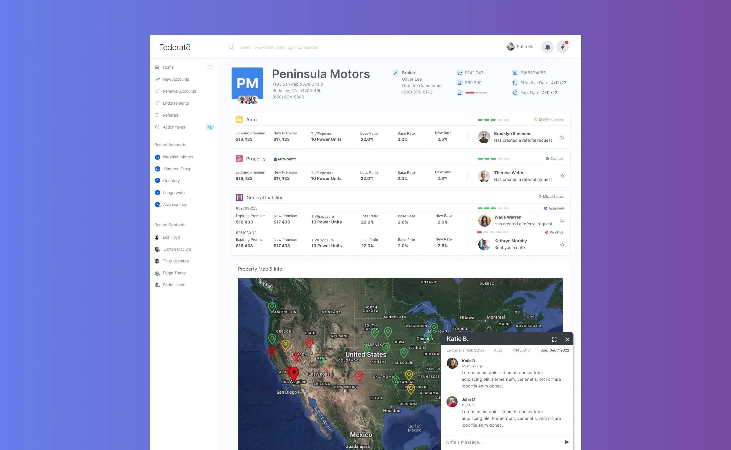
One Central Underwriting Platform
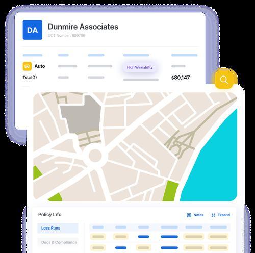
Replaces fragmented tools (emails, PDFs, and disconnected systems) with a single, real-time decision-making workbench.
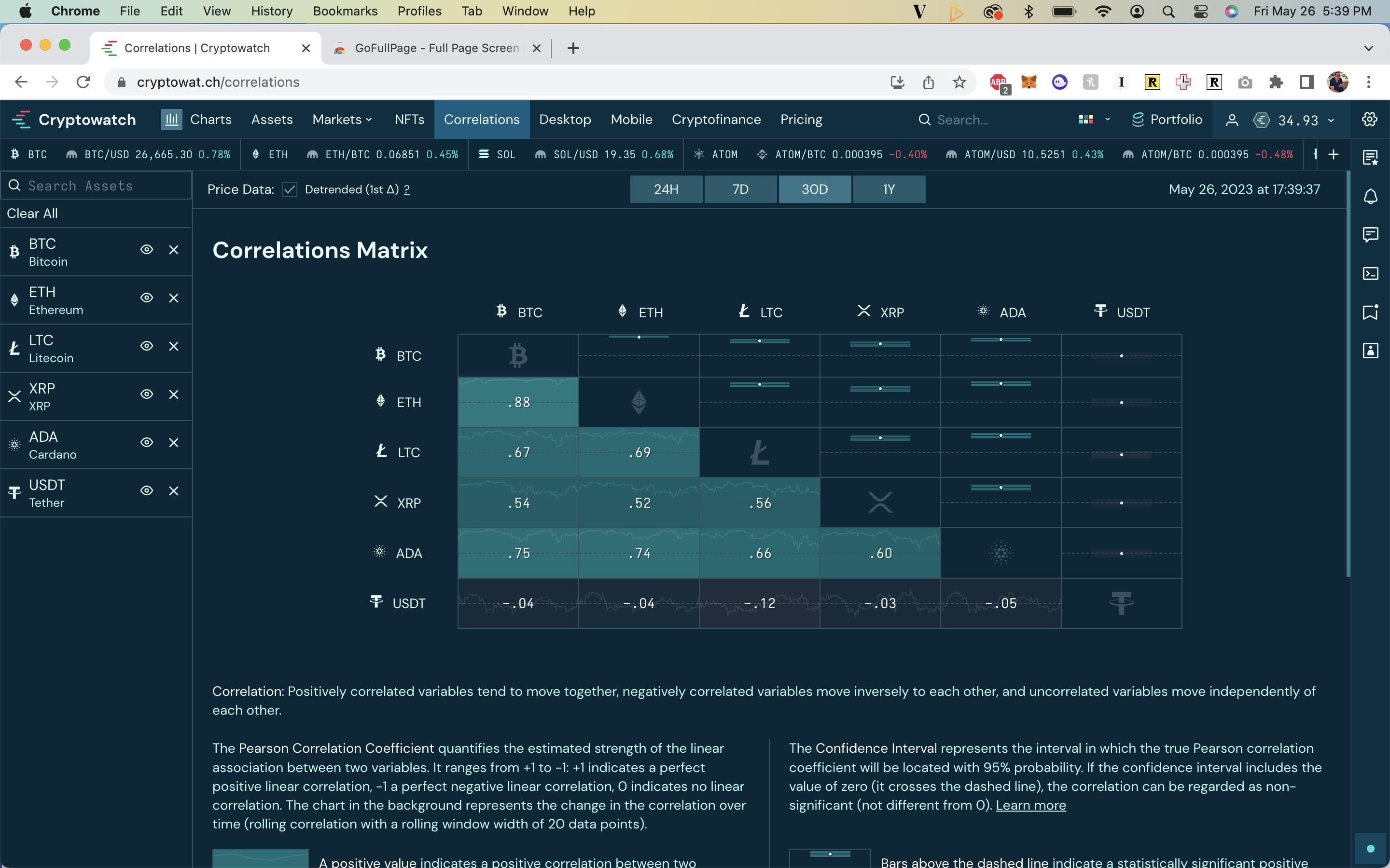
Integrated, Real-Time Risk Visibility
Combines historical, third-party, and live portfolio data into a cohesive experience, delivering insights exactly when and where they’re needed.
Assistive AI, User-Controlled
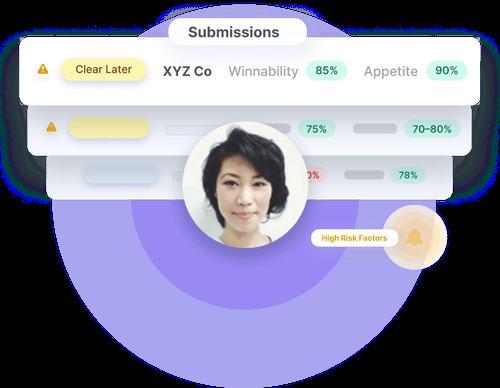
Surfaces risk and winnability scores based on real-time appetite and business goals, while keeping underwriters fully in control of decision-making.
Design for Scale
Supports diverse teams, risk models, and workflows— configurable without engineering involvement, and performant even under heavy data loads.

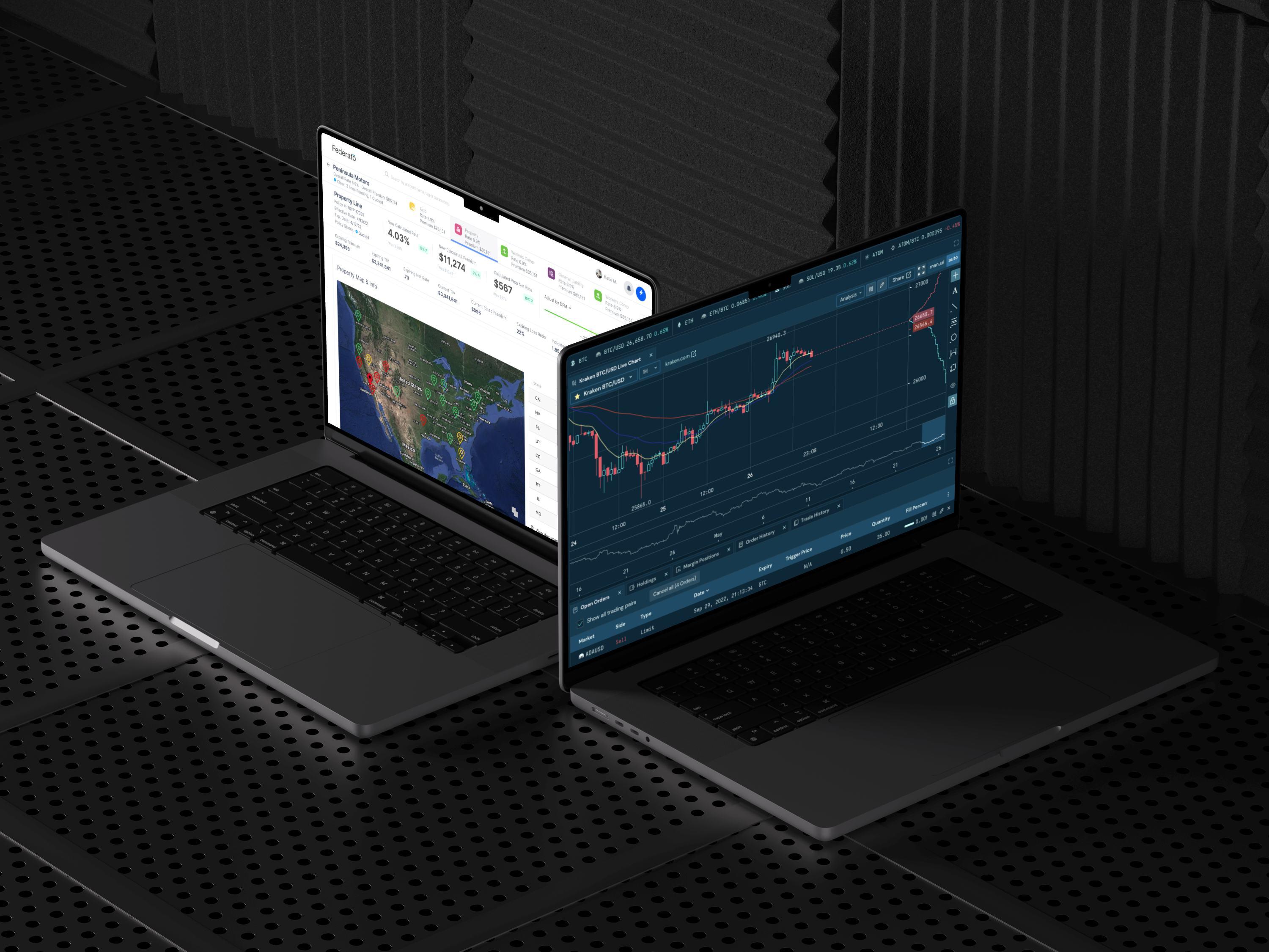
Federated Data Graph: Aggregates diverse data sources, including internal guidelines and third-party data, into a unified platform, reducing the need for multiple systems.


Configurable Rules Engine: Allows business users to update guidelines without extensive IT involvement, ensuring adaptability and reducing IT costs
AI-Driven Decision Support: Evaluates submissions in realtime against organizational appetite and winnability, prioritizing underwriters’ focus on high-value tasks

UX Strategy
I drove the UX strategy around three pillars: contextual insight, minimal friction, and using AI to support, not replace decisions.
Single Pane of Glass: Provide underwriters with all necessary tools and information in one expandable, streamlined interface from start to finish.
Real-Time Guidance: Surface contextual insights & guidelines during underwriting, reducing time spent searching for information.
User-Centric Design: Developed with direct input from experienced underwriters, ensuring workflows align with realworld needs.


Underwriters were losing focus jumping between views to find data.
I designed expandable panels to surface supporting info— without leaving the task view.
Panels open inline, layer data without clutter, and maintain orientation.
Result: Faster decisions, less context-switching, and users felt in control.
Each client had different terminology, logic, and risk rules.


I designed modular components that could adapt per carrier, without destroying the design.
Enabled scale without custom UIs for every client.
Term: Feb 5th, 2021 - Feb 5th, 2022 Term: Feb 5th, 2021 - Feb 5th, 2022


AI is important for risk assessment, but underwriters wanted to stay in control.
I designed indicators and contextual prompts, not autosorting or hidden logic.
Collaborated with engineering to debounce updates and keep the UI calm.


AI/ML served as guidance, not replacement, users stayed in control.
Early in the process, we ran usability tests with underwriters— walking through risk evaluations using clickable mockups and simulated data.


These tests revealed friction in our initial progressive disclosure model, users felt like they were losing context when going through their process.

Annette M.
Design pivot: expandable panels
Based on this feedback, I pivoted toward expandable panels, giving users quick access to third party data without leaving their workflow.

U
Iteration was continuous—I tested design updates across multiple underwriter teams, refining layout, terminology, and the way AI-driven insights were surfaced.
Call with broker notes

Annette M.
Difficult Renewal May 28, 2021 Jan8, 2021
3

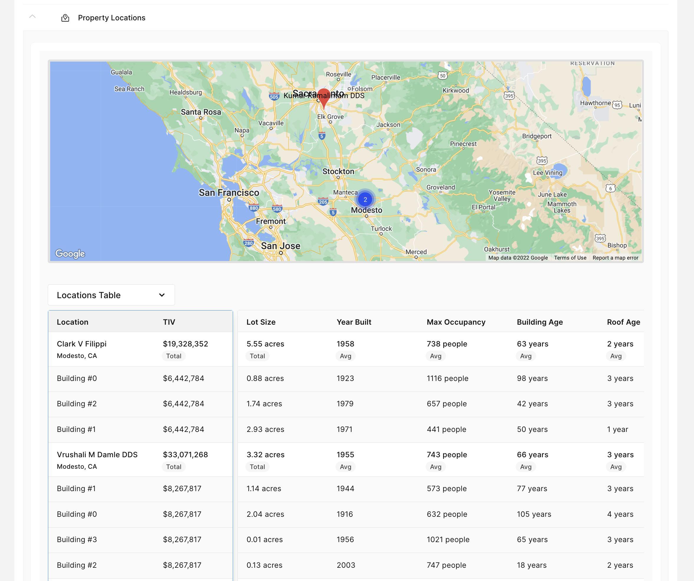
Proper ty Map

Underwriters moved from static PDFs and disconnected tools to a unified platform, cutting triage time significantly.
Higher confidence in decisions
Real-time visibility into risk, guidelines, and business appetite led to clearer, more defensible underwriting choices.
Flexible interface and contextual AI guidance made it intuitive to adopt, even for users with legacy habits.
Managers could adjust rules and risk logic without going through engineering—making the system more agile.
I learned that adaptability is just as important as consistency—especially when you’re designing for organizations with radically different workflows, data models, and vocabularies.
To support that, I designed a system of atomic components that could flex to each carrier’s needs. It allowed the platform to speak multiple “dialects” while maintaining visual and structural cohesion. This experience deepened my belief in systems thinking.
In high-stakes, data-heavy environments, a UX must flex across unknowns: new data inputs, evolving risk rules, and changing business logic.

be presenting the 2020 Benefits plans at the All Hands next week. All individuals responsible for answering questions during the Q&A session have been reached out to. If you’v...


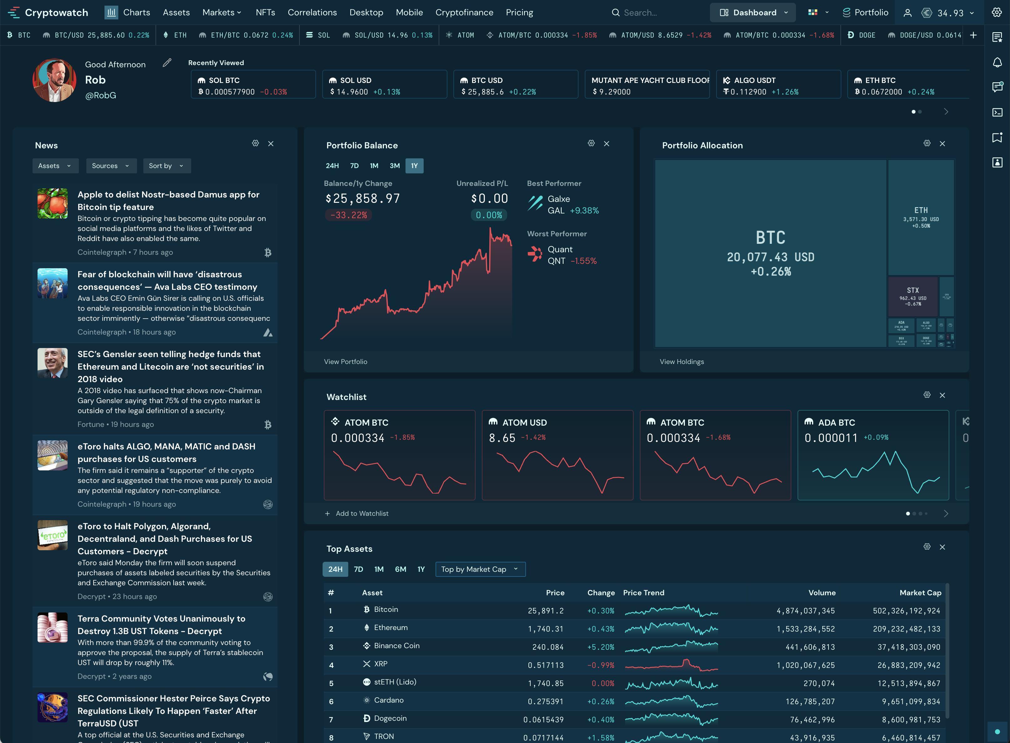

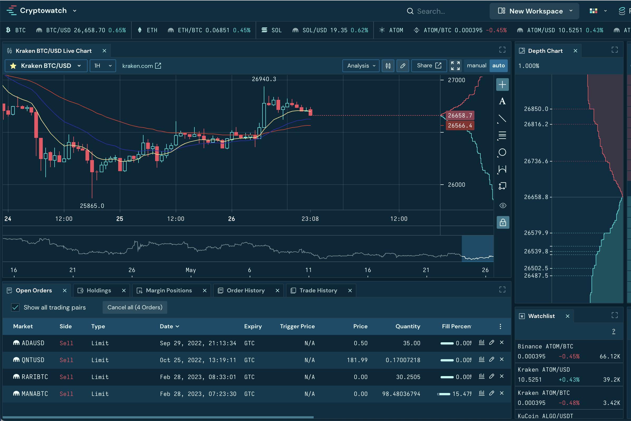
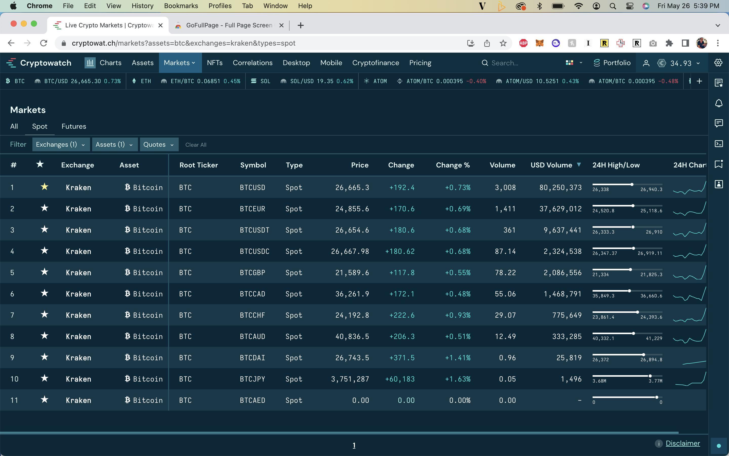
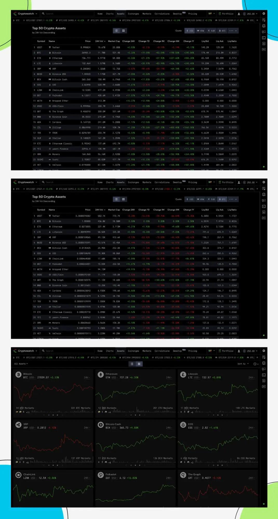
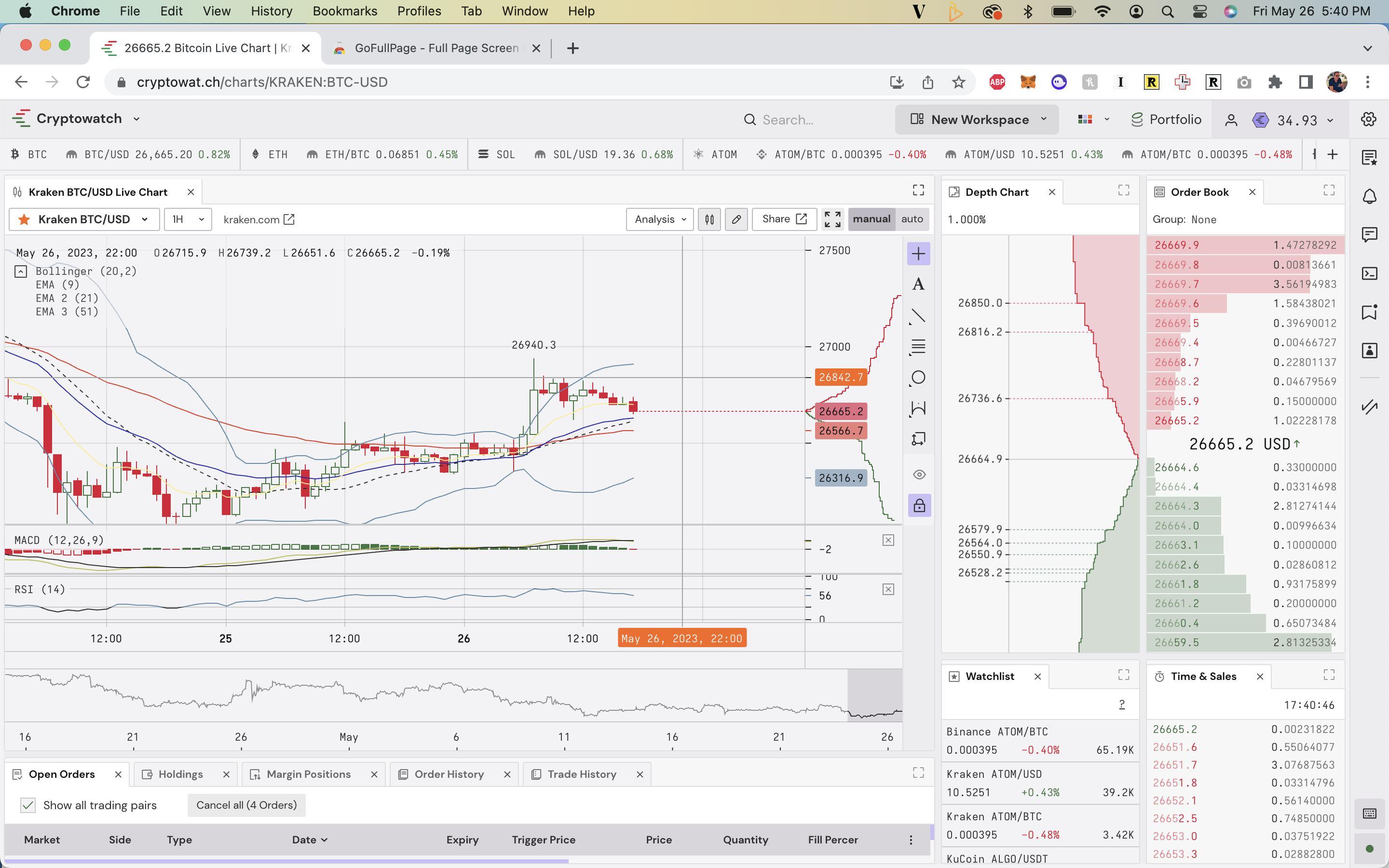
Many trading tools struggle under real-time data loads— users experienced lag, layout flicker, and missed updates.
Cluttered visual hierarchy made it difficult to scan market depth or spot opportunities at speed.
Traders were using multiple external tools and browser workarounds to supplement gaps in the platform.
Solutions didn’t adapt well to advanced workflows like hotkey-driven execution, multi-screen layouts, or advanced trading environments.
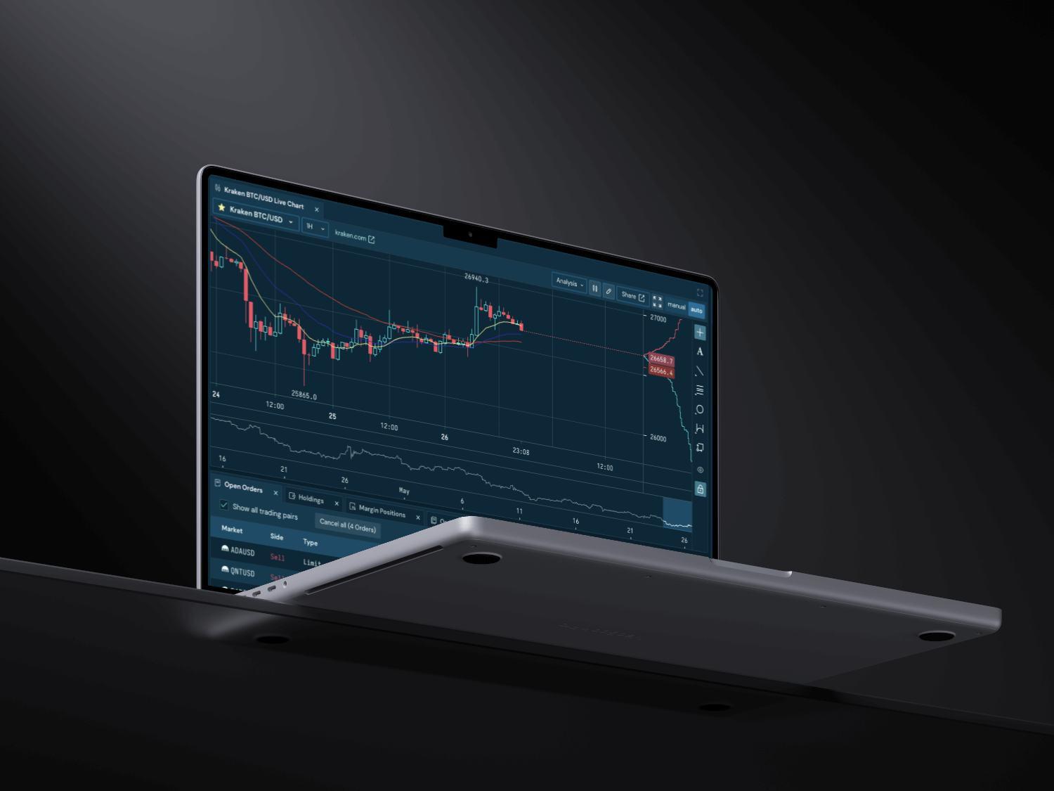
I led Kraken’s design overhaul across web, desktop, and mobile, balancing a full redesign with feature releases across all endpoints.
Collaborated tightly with engineering to ensure the UI was optimized for low-latency execution and data refresh.
Managed competing priorities: delivering near-term improvements without losing sight of the long-term vision for the platform.

Opportunity
High-frequency and institutional traders needed a platform that matched the speed and clarity of their mental model: no lag, no clutter, just focus.
The existing UI felt generic. Users wanted something that felt like it was built for them—a tool that spoke their language both functionally and emotionally.
By rethinking the design around speed and personalization, we had the opportunity to turn Kraken into a product traders could deeply rely on—and even be excited to use.
The Solution
Redesigned to deliver instant feedback, minimal latency, and input models tailored to high-frequency trading needs— speed, custom layouts, and no unnecessary prompts.
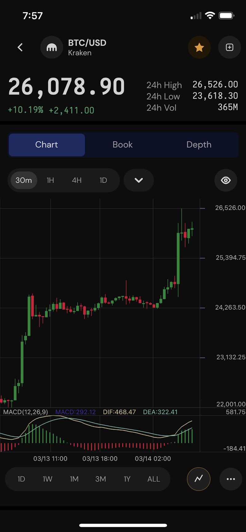
A design system for web, desktop, and mobile—with appropriate interaction patterns for each. Desktop supported advanced trading modes; mobile prioritized notifications, news and quick action.
Created an experience that felt personal and precise. The interface spoke to the trader as a tool they could depend on under pressure.
A unified design system worked across endpoints while adapting to varied contexts—ensuring consistency without sacrificing performance or usability.
Used Rust for its performance, supporting low-latency transactions and a high-throughput order engine.
Live market data streamed via WebSockets—updated instantly across views with minimal lag or jitter.
Cross-Platform
React for web and desktop, Swift for mobile—shared design system ensured consistent performance across platforms.
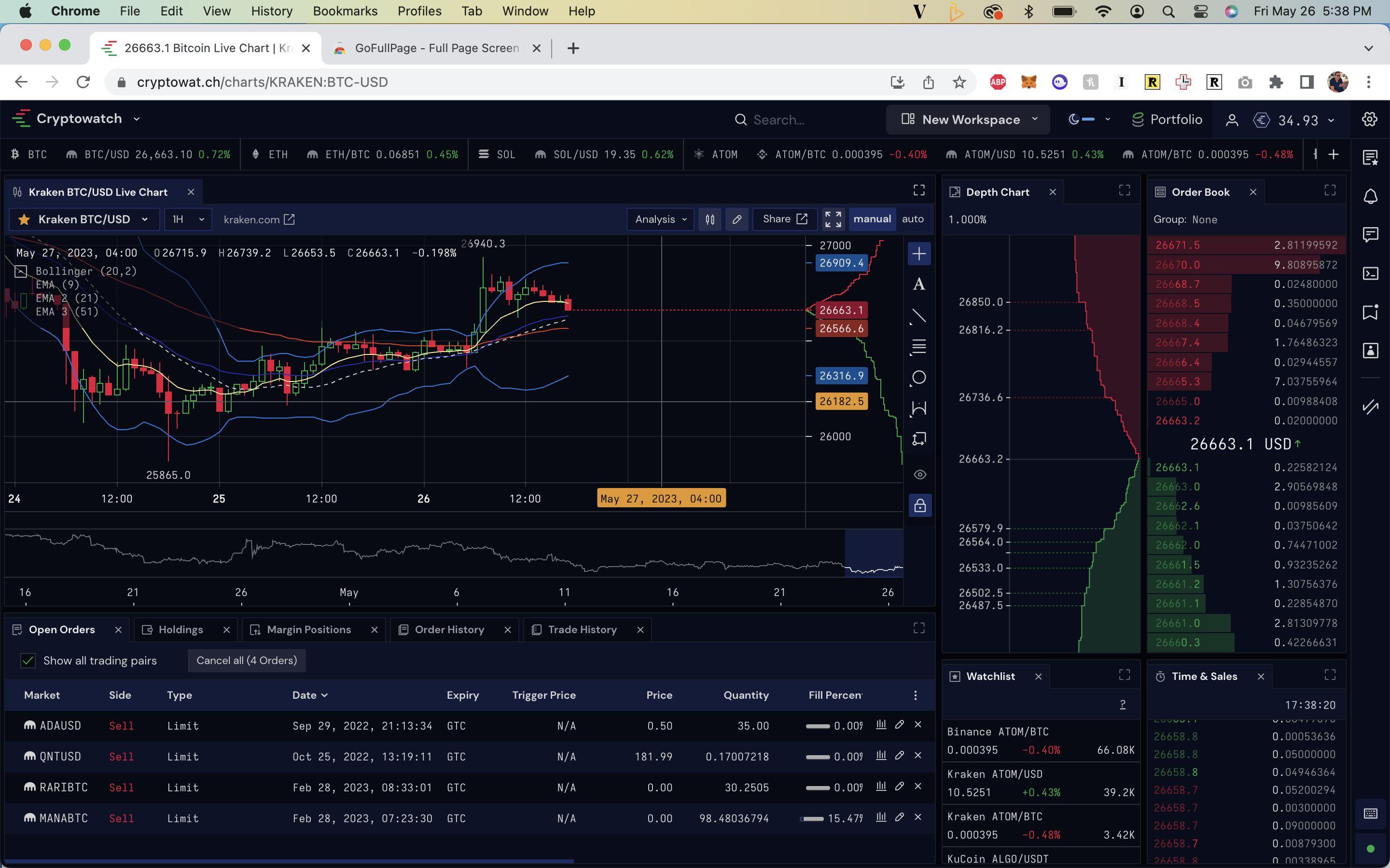
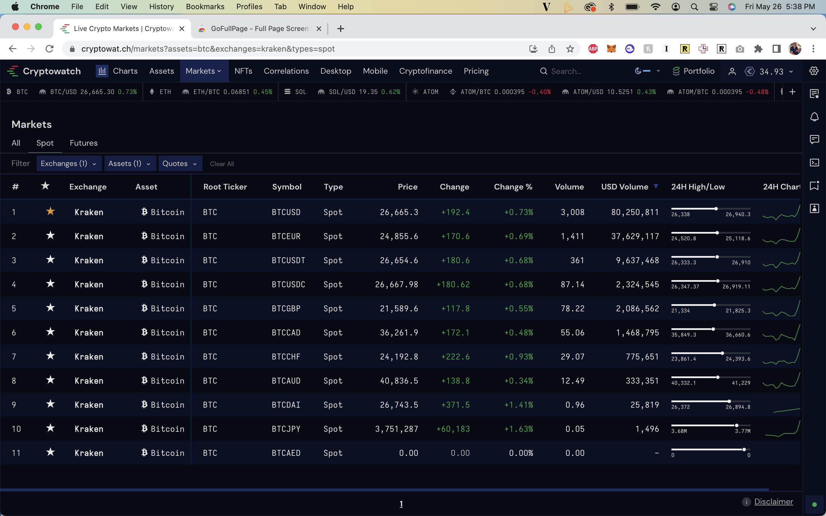
Designed with traders’ preference for dense displays in mind.
Typography, spacing, and layout were focused on to maximize clarity without sacrificing aesthetics.
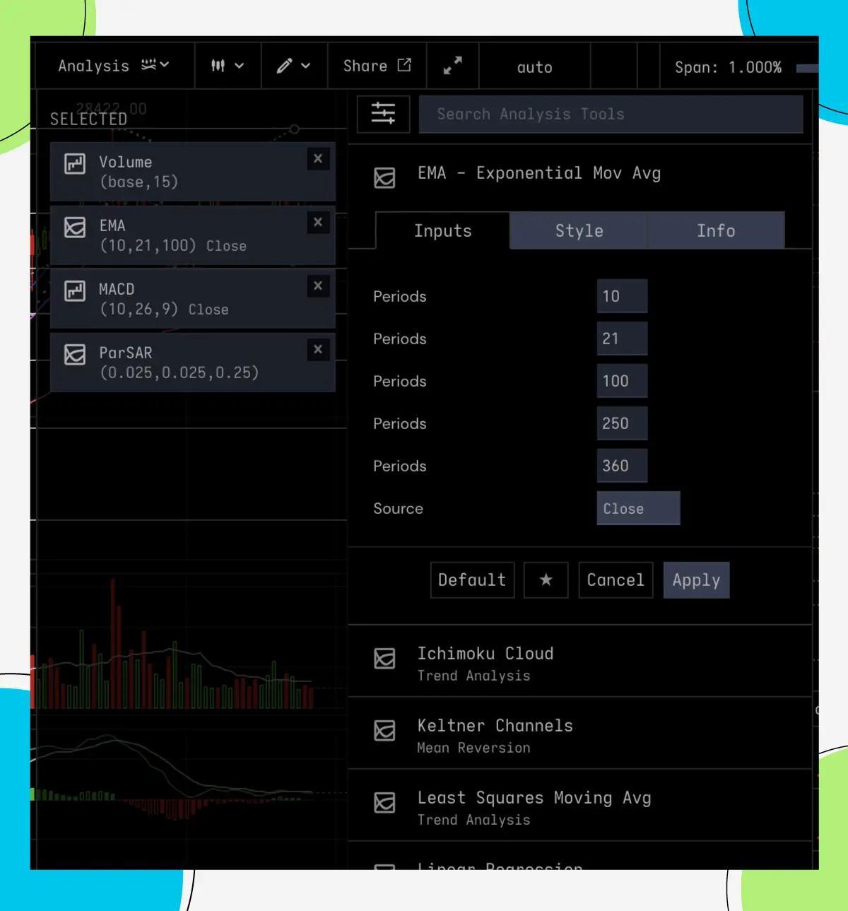
The interface was built from modular panels and flexible UI primitives—allowing traders to customize their workspace
As users moved panels, the interface dynamically prioritized key content, removing less critical data without hiding context.
We tested new features and designs based on user feedback, ensuring that each release aligned with traders’ evolving needs.
Direct feedback from traders pointed to the need for more trading options. This led to the introduction of ladder trading, enabling traders to place orders directly from a price ladder, improving speed and flexibility.
Users wanted more control. We responded by expanding customization options—presets for layouts, widgets, and workflows that could be tailored to individual needs while maintaining the integrity of the trading experience.

$300B+ in Trading and a
Volume Through the Platform
The redesign supported over $300 billion in trading volume, handling real-time demand at scale.
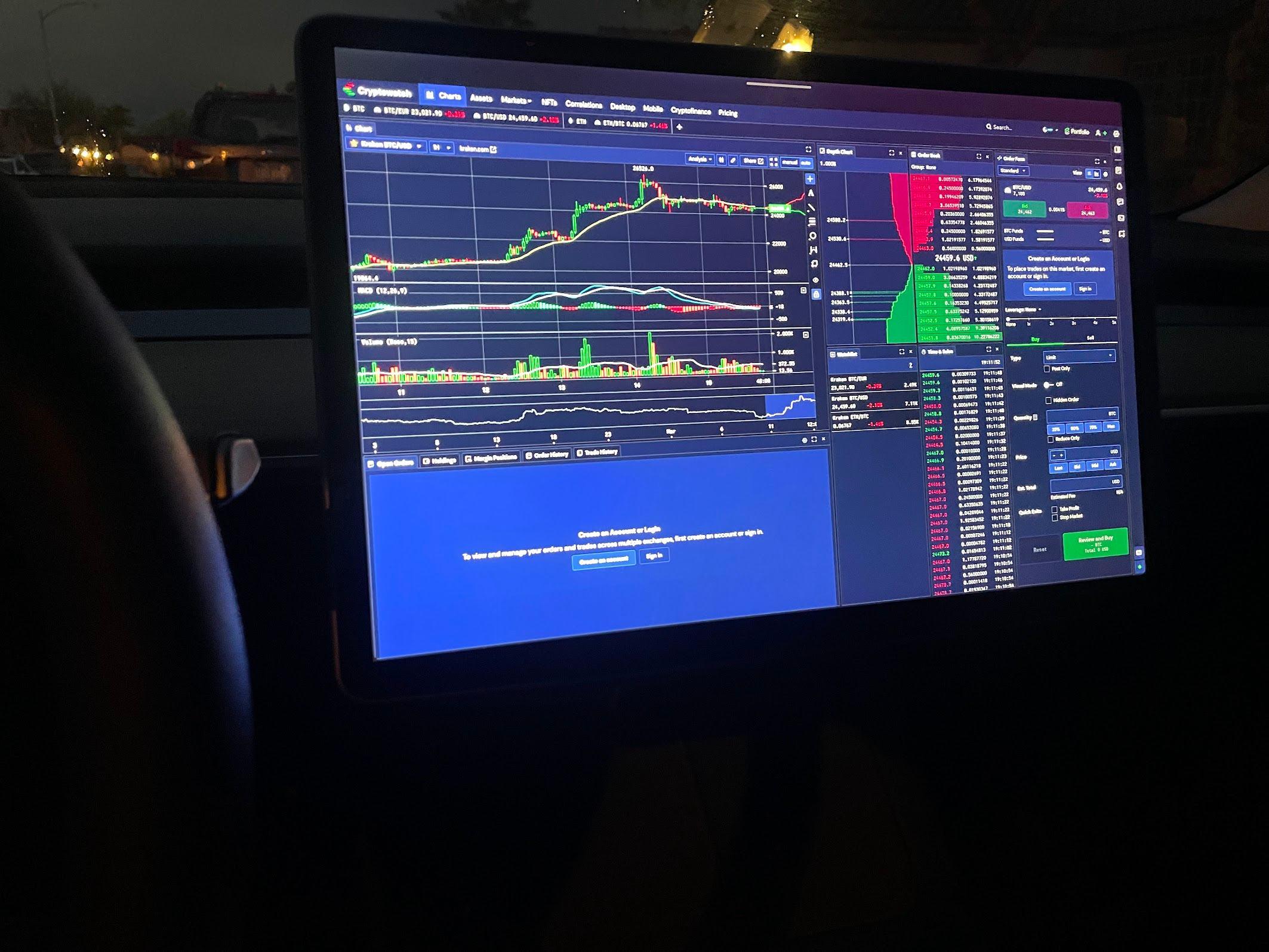
Traders Became Advocates
Users organically began tweeting screenshots of their custom layouts—from trading desks, TVs, even from inside Teslas—turning the product into something they were proud to show off.
User-Driven Growth & Features
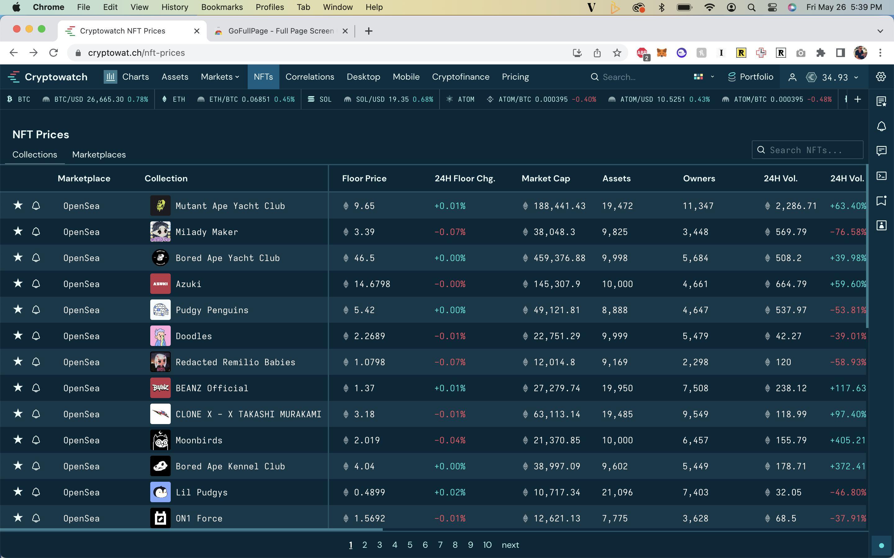
This wave of enthusiasm led to the creation of a layoutsharing marketplace, enabling users to exchange presets and build community around their setups.
Simplicity Isn’t Always Minimalism
I’ve carried the Steve Jobs mantra: “Simplify, simplify, simplify” throughout my career. But for power users, simplicity often means clarity inside complexity, not removing features.
Complex Can Still Feel Good
I learned how to make information-dense displays feel alive, readable, and even emotionally resonant, when designed with intention and empathy for the user.
Designing for Identity and Control
When users feel ownership, like customizing and tweeting their setups—you’ve gone beyond functional into trust and affinity.
https://www.robertcreative.com/