Platforms and Pavilions:
the railway station in design and culture
Valance fret pattern added to footbridge: Taplow, 1871.
Bottom: A station with awning valance in Turkey, 1983.
Top: Lahinch, Ireland, 1887.
Topsham (added to original canopy edges after 1861)
Culham circa 1856
Penge East 1863
Great Malvern cast iron 1862
Barcombe Mills 1858
East Ham 1858
Acton Central (N&SWJR) 1853; (NLR) entrance (cast iron)
Marton 1851
Acton Central (N&SWJR) 1853; (NLR) platform (timber)
Thornhill after 1850
Robertsbridge after 1851
Roydon after 1900
Slow and fast food on the platform: buffets, shops,
and vending machines
Provision of refreshment and retail on station platforms is as old as the railways. Mobile traders, trolleys, kiosks, bookstalls, newsagents, cafés, buffets, and vending machines are all solutions for selling drinks, food, and goods on railway platforms. Railway catering, associated with locations as spectacular as the Midland Grand Hotel, St Pancras Station, London and the now-mythical experience of a stale, processed ‘British Rail sandwich’, is a history still to be fully studied.
Between these extremes were hundreds of small places on platforms at which to buy food and drink during a rail journey. John Betjeman recalled seeing ‘AFTERNOON TEAS A SPECIALITY’ in glazed letters on Edwardian station café windows. 43 Refreshment room staff attended railway company training schools equipped with a fullsize demonstration buffets and bars, and functioning equipment for practical instruction.
By 1939, 767 ‘refreshment, dining and tea rooms’ were available to travellers. 44 That same year Great Western Railway sold 18,000 cups of tea and 1670 meals per day. Bigger stations operated buffets in buildings and kiosks, often licensed to sell alcohol too. Special free tickets were issued to visitors who wished to dine at the station without travelling on the railway.
A typical station tearoom, the focus of key scenes in films like ‘Brief Encounter’ (1945), presented to the customer stacks of ceramic cups and crockery on bar counters, heaps of stainless steel or nickel-plated cutlery marked with the railway company monogram, bowls of white sugar with occasional clusters tinged tea or coffee brown, and bread and pastry products. Slabs of chocolate, boxes of chocolates, colourful confectionery, and wrapped segments of cake promised pocket-sized consumables to
Above: At Melton Constable, about 1910, Mrs Field and Miss Morgan operate the station’s Tea Room.
Opposite: Selling food to train travellers at Bobadilla railway station, Spain, early twentieth century.
Signs at Stations
Signs at railway stations have two purposes. For passengers on trains, nameboards of different sizes and formats display the station name to communicate the location. For passengers at stations – and visitors to the station – signs on platforms give directions to the available facilities and identify the facilities. Early railway platforms were not so well provided with typographical communications: passengers were expected to navigate the simple provisions or be directed by the teams of workers. The expense of providing signs, and perhaps the assumption that it would be obvious that an object as large as a railway station could be readily located, meant
that some platforms were identified by a single name sign painted onto on suitable building or a large board. Quickly routes lengthened; travellers covered greater distances to unfamiliar areas. Platforms needed name signs for arriving passengers. Most railway companies provided ‘running-in’ nameboards at significant stations and at junctions where passengers would need early notice of their need to change trains. Very early station developments had a limited number of nameboards, often hand painted by signwriters. The Great Western Railway, and its successor the Western Region of British Railways, used large nameboards to which were fixed
Above: Hand-painted sign at Highbridge, 1890s.
individual letters cut from timber or cast in metal. Entire cast iron nameboards were available as durable but expensive alternatives. Metal sheets with a vitreous enamel coating, a manufacturing technique exploited for commercial advertising, suited the manufacture of station nameboards and smaller direction and information signs: these were also used. The art of the enameller proceeded from signwriters’ skills, endowing nameboards with bold serifed or grotesque (sans serif) alphabets. Plainer works presented only the characters in light or dark hues –chocolate or ultramarine blue with cream or white as a
contrast. More ambitious efforts added three – dimension shadow effects in one or more shades. Choice of colours was deterined by the availability of enamels and their resistance to sunlight and dirt.
Between the large boards, the station name appeared as a section or ‘tablet’ of the glass lanterns of oil and gas lamps, rendered in etched or pressed opal glass, vitreous enamel, or on printed paper labels.
After amalgamation of railway operators in 1923, the Great Western Railway maintained its existing signs and made new signs to similar patterns. We have already
Left : Station name painted directly onto timber building at Marston Gate, opened 1860. Right : Ornate cast metal letters made by Macfarlane’s of Glasgow. These imparted sophistication and rusticity to stations on the Mid-Suffolk Light Railway and the Weston, Clevedon and Portishead Railway.
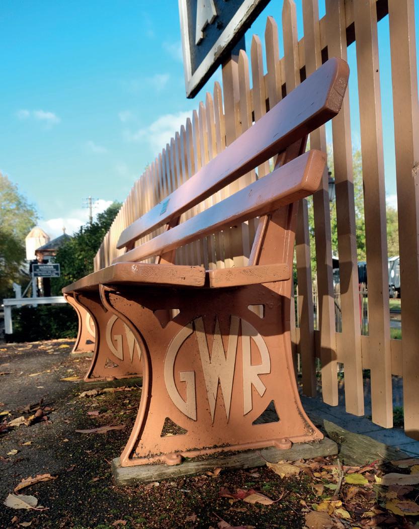
Seating
Waiting for a train, especially on platforms where services may be infrequent or irregular, seating with or without shelter is an essential basic comfort. Limited space in station buildings, closed station rooms, or good weather, all suggest the need for somewhere to sit. Platform furniture made before the widespread use of concrete and folded metal sheet took two forms: cast iron supports for hardwood seat and back supports, and all-timber benches. However well made and treated with preservatives, timber rotted faster than iron oxidised, so iron was the preferred material for seat parts touching the ground.
On page 61 we saw how railway operators were major consumers of metal objects for many aspects of the platform environment. We have also seen how the fabricators of metal fittings and fixtures for railway stations demonstrated almost unlimited invention in their appropriation of architectural ornament for awning columns and brackets, nameboards and other signs, and lamp standards. This creativity –an artistic licence which entertained visitors to the 1851 ‘Great Exhibition’, and by the early twentieth century offended design critics because of its free use without functional purpose – found a
Caledonian Railway Company initials incorporated into cast-iron bench ends.
particularly florid expression in the fashioning of components for seating in public parks, promenades, open spaces, and on railway platforms. Some railway companies combined stylised monograms of their initials: for example C.R. for Caledonian Railway, L.T.S.R. for London, Tilbury and Southend Railway. Over time the monograms were modernised to reflect wider tastes in typography and industrial design, with the ‘GWR’ roundel being a notable product of pre-1939 branding. Continuing the emulation of naturalistic
Top row : Furness Railway squirrel and grapes motif; South Eastern Railway with SER in metal letters attached to frame at each end. Bottom row : Nature imitated in cast iron by the Great Western Railway; Modernist brand logotype for the Great Western Railway on bench seat support, 1934.
Platforms and Pavilions: the railway station in design and culture
The railway platform is both beginning and ending, familiar and strange. At first the platform may seem a banal necessity, rarely noticed except when we are waiting or delayed. Design of the station environment gives a sense of place and character, intangible qualities created from surface textures, architecture, form, style, materials, details, colours, signs, information, facilities, lighting, furnishings, and equipment, and the landscape of the station itself in its local context. Study of the platform as the central focus of the station is a record of innovation in design for people and transport and looks to the future as railways remain central to work and leisure. To better understand these essential railway structures and look to the future of railway passenger places, this book studies the railway platform and its associated buildings, colour schemes, signs, furniture and equipment, lighting, and environment including station gardens. The platform is every passenger’s place in the two-hundred-year narrative of the railway industry.

£29.95