

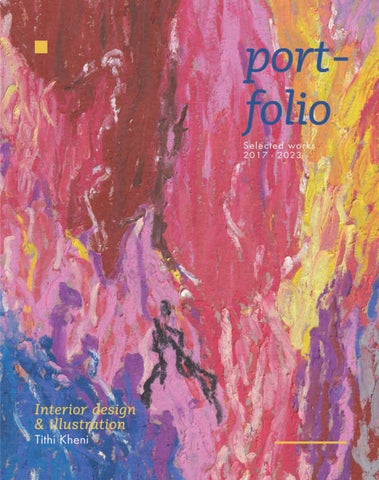


I'm a freelance designer and illustrator with a passion for everything from interior design to hand-drawn and digital illustrations. My favorite part of designing is the process itself—experimenting with spaces and concepts.I draw inspiration from nature, history, and architecture, exploring different styles and mediums to bring my ideas to life.
When I'm not designing, I love spending my time with my dog, enjoying and catching up on movies. I'm also passionate about art journaling and love exploring different textures and sketching the world around me.
Some of my favorite projects have been designing spa hotel,Hill house, Papdrdom, developing the brand for Miro Ceramics, and making digital illustrations, as well as sketches.
Adaptive resue
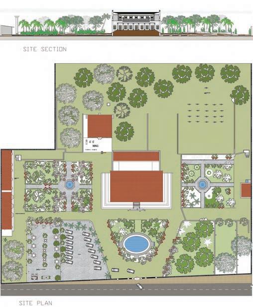
Botawala House is situated near the beach in Surat city. Originally constructed in 1902 by the Botawala family, prominent in the import and export business, the house remains a gathering place for over 50 family members during Diwali and other festivals annually.
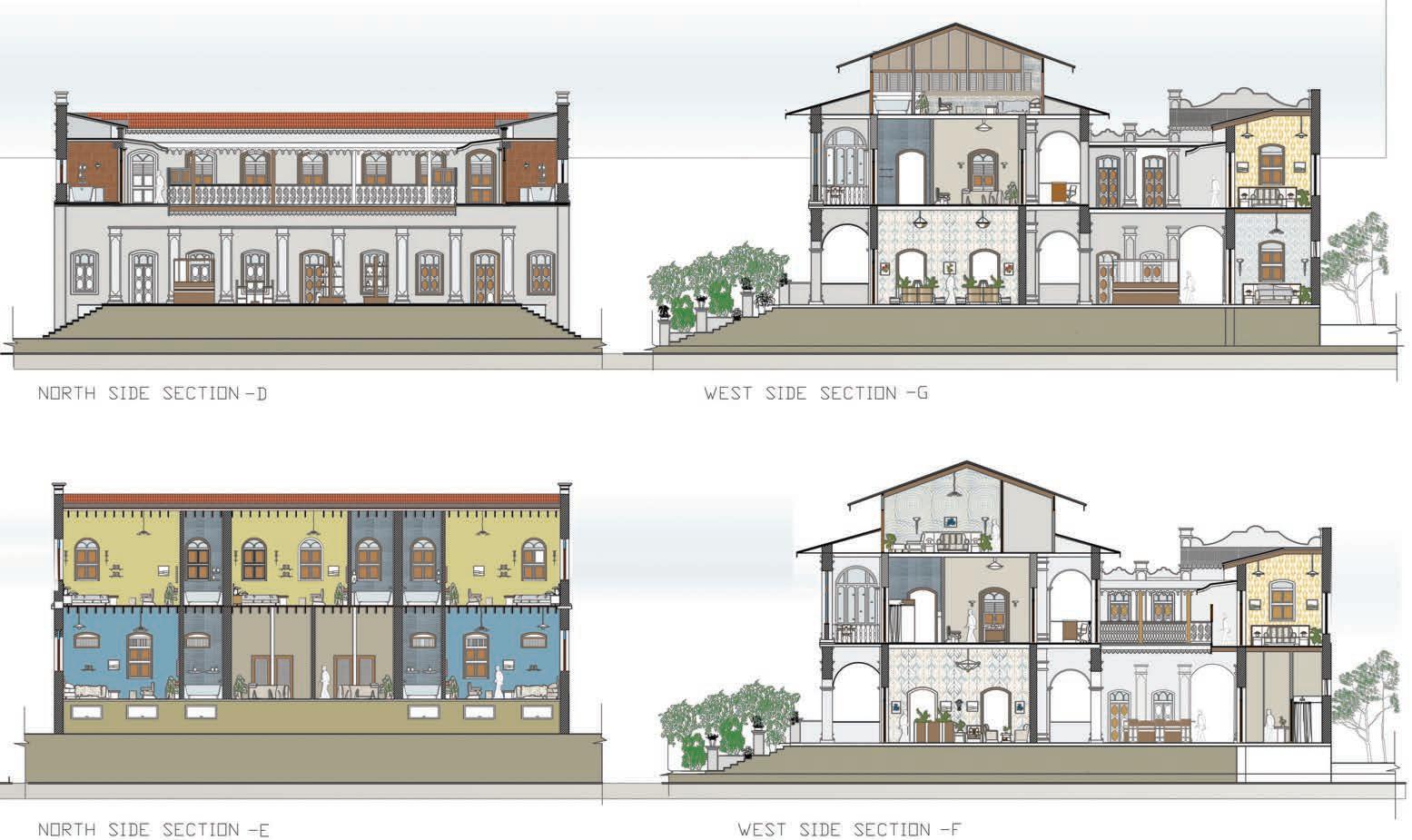
I was presented with an opportunity to select a project fitting for this site, and the natural surroundings inspired me to design a weekend spa hotel. Such facilities are scarce in Surat, offering a unique chance to innovate. The design integrates the existing landscape, which includes twin lotus ponds on the east and west sides, an outdoor kitchen, and a horse stable.
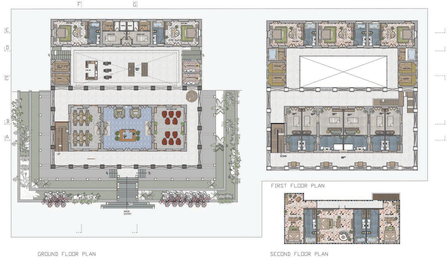
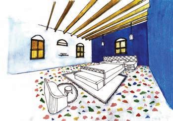
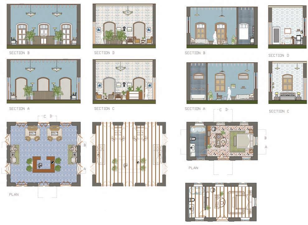
The main building, an elegant fusion of Mughal and Roman architectural styles, features a large courtyard and spans three floors. It boasts towering ceilings, light-colored rooms, beautifully arched doors with colored glass, and expansive balconies that enhance its timeless charm. Surrounding the house, trees over 20 years old and native flora including mango and coconut trees contribute to a serene environment.
The hotel is designed as a retreat from urban life, providing guests a place to disconnect and rejuvenate amidst nature. It offers a variety of experiences from day visits for relaxation to stays that include group activities. The main building hosts most activities, while an outdoor café, accessible to all, fronts the hotel. Behind the hotel is an activity area for guests, and the kitchen is strategically placed outside the main building to ensure privacy. There's also a small play area for children, enhancing the family-friendly atmosphere of the hotel.
This carefully curated blend of historical architecture, thoughtful modern design, and comprehensive amenities makes the Botawala House Spa Hotel a distinguished and desirable destination for those seeking a rejuvenating retreat intertwined with cultural richness and architectural beauty.
SITE: BOTAWALA HOUSE, DUMAS BEACH, SURAT, GUJARAT, INDIA




Paper is an indispensable material in our daily lives, serving purposes from writing to packaging. However, its production can significantly contribute to climate change. Traditionally, papermaking was a small-scale industry, mainly done by hand. Handmade paper offers a sustainable solution to these environmental challenges by utilizing materials like banana plant fiber, textile waste, and wheat fibers in the recycling process. Products derived from handmade paper are not only eco-friendly but also durable, suitable for various everyday applications.
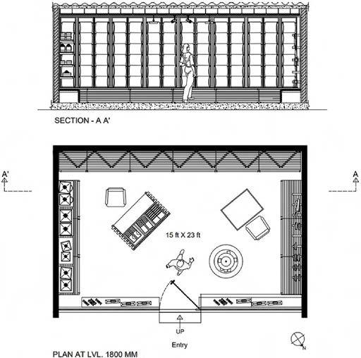
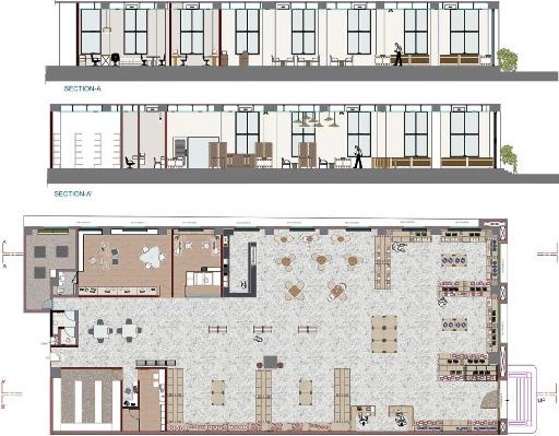
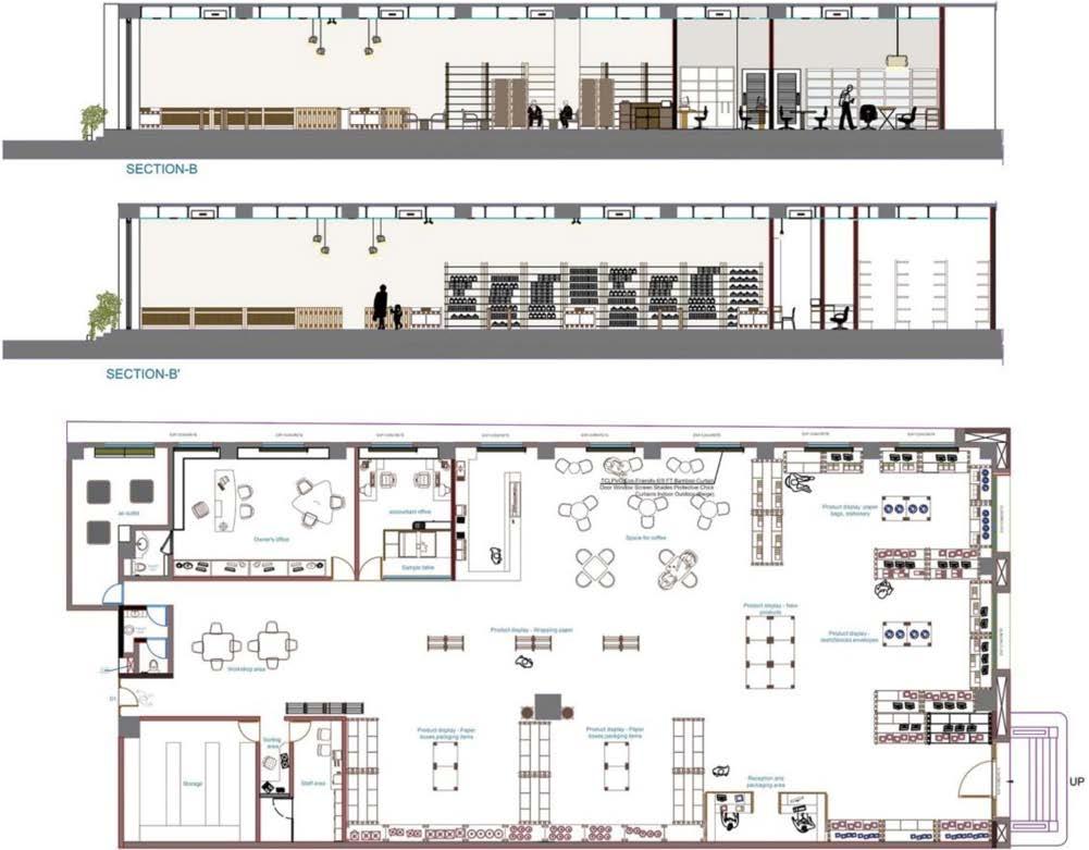
Established seven years ago, Paperdom is a company dedicated to promoting organic products, a commitment reflected in its store, which opened two years ago. The store's interior design and elements echo its eco-conscious ethos, employing recyclable materials extensively. Display furniture, predominantly crafted from cardboard tubes and wood, exemplifies this sustainable approach. Creative and functional frames showcase gift paper, while work areas for gift wrapping and cutting are ingeniously designed with intersecting tubes and bolts. The space is thoughtfully divided to ensure efficient circulation, enhancing functionality.
Paperdom's product range predominantly comprises recycled paper-based items, including gift wrapping paper, diaries, sketchbooks, notebooks, pencils, shopping bags, envelopes, and utility boxes. Each product incorporates various paper types, such as cotton paper, banana paper, bark paper, crushed paper, marbled/metallic-printed paper, seed paper, and tie-dye paper, offering customers a diverse selection of eco-friendly options.
Company Name: Paperdom
Location: Surat, India
In the case study, the existing store's interior leans towards functionality. However, to enhance customer experience and itors, it's essential to strike a balance between creativity and effective strategy is to enable customers to interact firsthand ucts. While the current setup may require assistance from self-service options can offer a more engaging experience.

towards creativity over and attract more visand practicality. One firsthand with the prodfrom staff, integrating experience.
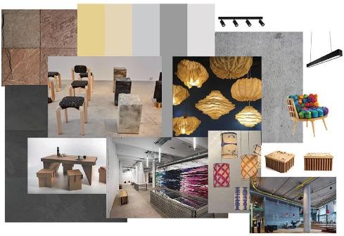
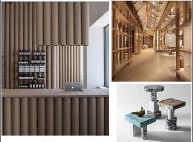
Introducing paper as a material for furniture not only embodies innovation but also aligns perfectly with the core concept of our product. By leveraging paper in furniture design, we aim to showcase its versatility and sustainability, echoing the ethos of our brand.
While traditional materials have long dominated the furniture industry, the utilization of paper presents a compelling alternative. Beyond its aesthetic appeal, paper offers a lightweight yet durable solution, making it an environmentally friendly choice.Embracing paper as a primary material underscores our commitment to sustainability
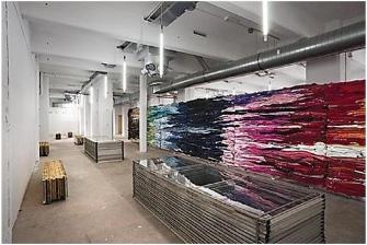
In the case study, the existing store's interior leans towards creativity over functionality. However, to enhance customer experience and attract more visitors, it's essential to strike a balance between creativity and practicality. One effective strategy is to enable customers to interact firsthand with the products. While the current setup may require assistance from staff, integrating self-service options can offer a more engaging experience.
To meet this objective, my client proposes a hybrid approach where customers can browse products independently while still having access to assistance from staff when needed. This model ensures that every customer receives prompt attention and guidance throughout their shopping journey.
Commercial design
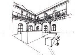
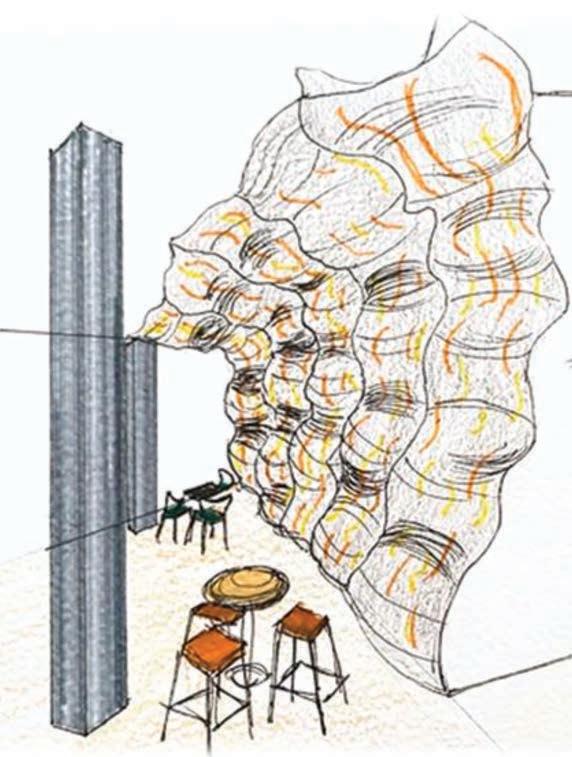
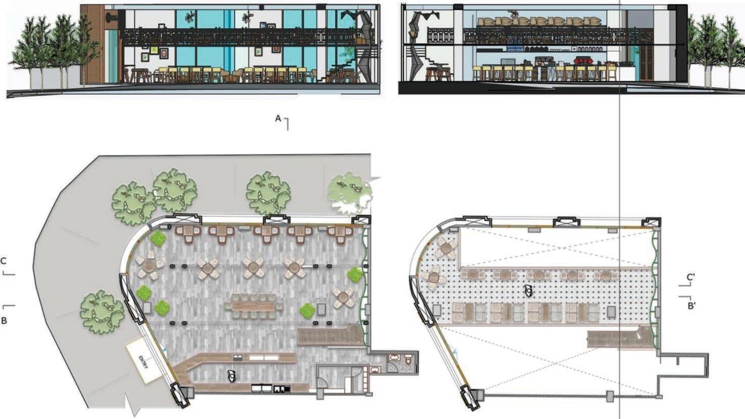
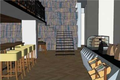
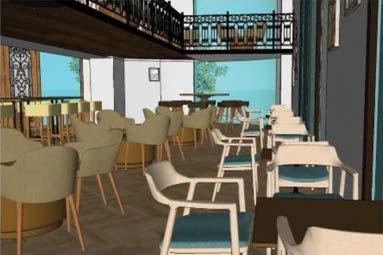
Designing a Starbucks café for a small city in India offers a thrilling opportunity to infuse the essence of the Starbucks concept while delving deeper into the dynamics of commercial spaces. Situated in a location with ample space, the project invites exploration into volumetric experimentation, particularly with the introduction of a mezzanine level. The fundamental aim of the design revolves around seamlessly dividing the expansive interior, not physically, but visually, thereby enhancing the spatial experience.
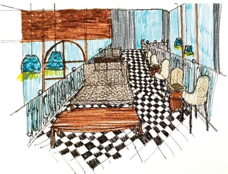
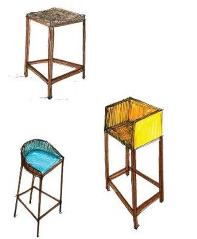
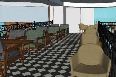
The café is envisioned to cater to diverse customer preferences, accommodating both those seeking a cozy dine-in experience and others opting for quick takeaways. With a variety of seating options, patrons can choose to gather in groups for lively conversations or find solace in solitary work. The strategic placement of the mezzanine floor in the heart of the space creates intimate pockets for different seating arrangements, fostering a dynamic social environment.
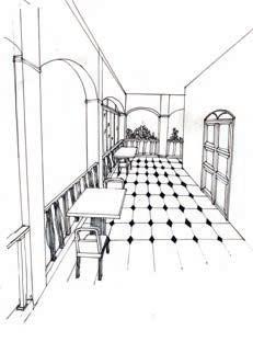
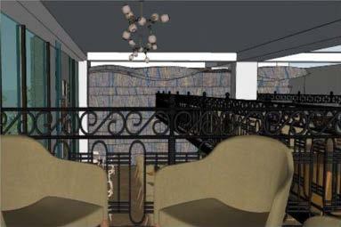
Emphasizing functionality without compromising aesthetics, the floor plan meticulously balances the needs of seated customers with the circulation requirements for those on the go. The mezzanine floor, adorned with classic black and white tiles and complemented by wooden furniture, exudes a timeless charm. The structure at the rear wall, crafted from jute fabric with subtle design elements, adds a touch of rustic elegance. Utilizing a metal frame, the fabric is stretched to create a wave-like illusion, casting captivating interplays of texture, light, and shadow.
In essence, this Starbucks café transcends the traditional coffee shop experience by embracing innovative design concepts while staying true to the brand's identity. It serves as not only a space for indulging in premium beverages but also as a destination where patrons can immerse themselves in a captivating sensory journey.


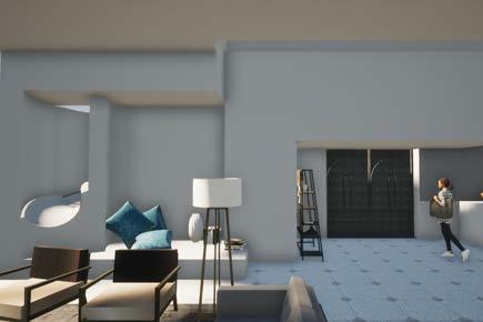
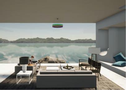
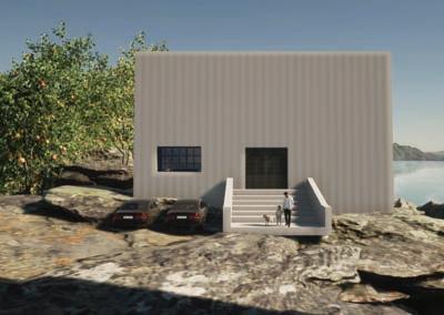
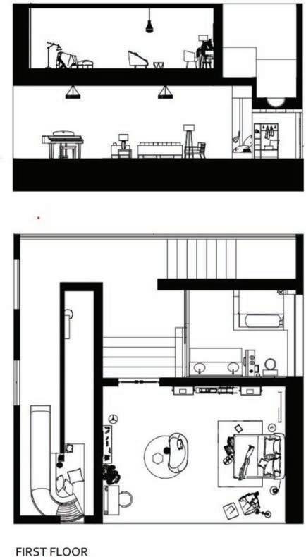
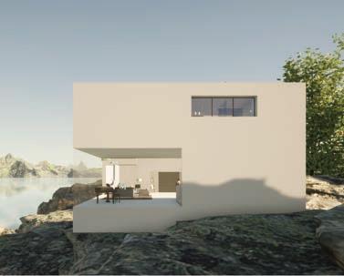
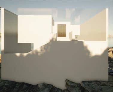
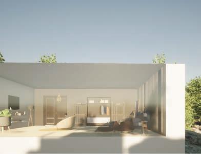
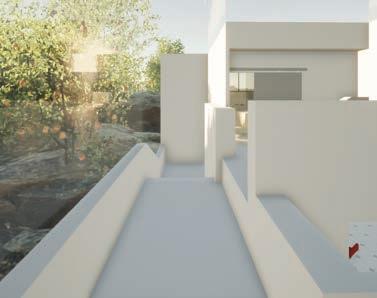
Perched atop a cliff, Hill House boasts a breathtaking sea view in the front and is enveloped by the serene beauty of the surrounding hills. This project holds a special significance for me as it was my inaugural design endeavor in school. Tasked with creating our dream home in any location, I chose to craft a dwelling intimately connected to nature—a sanctuary for solitude and reconnection.
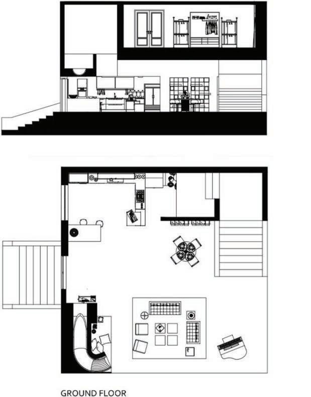
Beginning with a simple one-meter cubic form, I embarked on a journey of exploration, shaping and refining the spaces within through various exercises with strings and other geometric elements. The resulting design embodies simplicity and harmony, offering a warm embrace of nature's embrace.
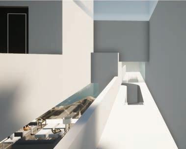
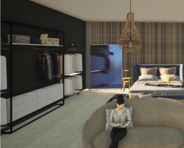
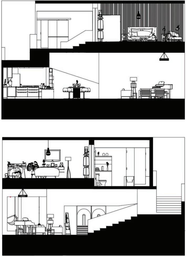
The interior of the house is characterized by high ceilings and skylights, fostering an intimate connection with the outdoors and infusing the space with a sense of homeliness. Natural materials are employed throughout, further enhancing the residence's organic aesthetic.
Upon arrival, guests are greeted by a grand staircase leading to the entrance, which is secluded from the rest of the property. The living room, strategically positioned to capture stunning hillside vistas, seamlessly transitions into an open kitchen illuminated by a skylight. A unique feature of the living space is a slide connecting the ground floor to the first floor, adding an element of whimsy and playfulness.
Both the ground floor and the first floor offer unobstructed views of the sea, allowing residents to bask in the beauty of the water and revel in spectacular sunsets bathed in natural light. Hill House epitomizes the fusion of simplicity, elegance, and a profound connection to the natural world—a true haven for those seeking solace and rejuvenation.
Graphic design
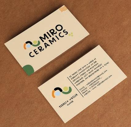
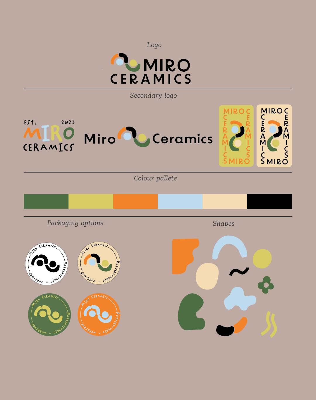
For Miro Ceramics, a studio specializing in the unique pottery art of nerikomi, the brand design captures the vibrant and layered essence of this craft. Nerikomi, also known globally by various names such as neriage in Japan, agateware in England, and millefiori in Italy, involves a fascinating process of color and creation.
Miro Ceramics Brand Identity:
Reflecting the fun and colorful artistry of nerikomi, Miro Ceramics’ brand identity is a celebration of color and creativity. The logo and branding elements feature a spectrum of overlapping hues, representing the myriad of patterns possible with nerikomi. This visual identity is designed to be as dynamic and playful as the pottery itself, inviting patrons to explore the depth and joy of nerikomi pottery, one beautifully patterned piece at a time.
This brand not only highlights the artistic process but also invites curiosity and engagement, encouraging everyone to appreciate the intricate layers and vibrant storytelling inherent in every piece of Miro Ceramics.
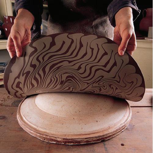
Nerikomi :
Nerikomi is a traditional Japanese technique that starts with the artist carefully stacking colored clays. This method allows for the creation of intricate patterns within the clay itself. Once the desired stack of colored clay is prepared, it can be shaped on a potter's wheel or molded by hand into diverse forms, from functional ware to decorative art pieces.
The nerikomi process offers a canvas of endless possibilities, where each slice through the clay reveals new patterns, mimicking the surprise and beauty of natural agates or the detailed layers of a millefiori glass. This method's beauty lies in its simplicity and the magical reveal of patterns that emerge as the clay is worked and finally fired.
 15 I Paperdom 25 I Miro ceramics
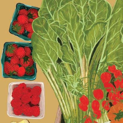
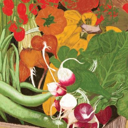
The poster for the Kitchener Farmers Market is a vibrant celebration of community, tradition, and abundance. At its center is a captivating digital illustration showcasing a bountiful basket overflowing with an array of colorful vegetables, showcasing the diverse and fresh produce available at the market. Each vegetable is meticulously rendered, radiating with vivid hues and inviting textures, evoking a sense of wholesome goodness.
Amidst the vegetables, artisanal cheeses and other delectable products are artfully arranged, highlighting the market's commitment to quality and variety. From artisanal cheeses to homemade preserves, the poster captures the essence of the market as a haven for locally sourced, artisanal delights.
Set against a backdrop that hints at the market's rich history and deep roots within the community of Kitchener, Ontario, Canada, the illustration is infused with warmth and nostalgia. The bustling atmosphere of the market is subtly suggested through glimpses of bustling stalls and friendly faces in the background, underscoring the sense of camaraderie and connection that permeates the market every Saturday.
Overall, the poster serves as a vibrant invitation to experience the Kitchener Farmers Market—a cherished tradition where residents and visitors alike can come together to savor the best of local produce, support small-scale farmers and artisans, and revel in the spirit of community.
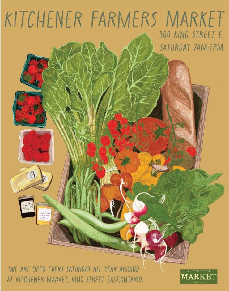
27 I Farmer’s market poster
Digital illustrations
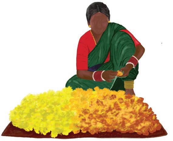
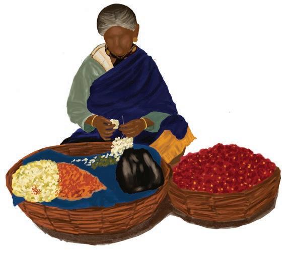
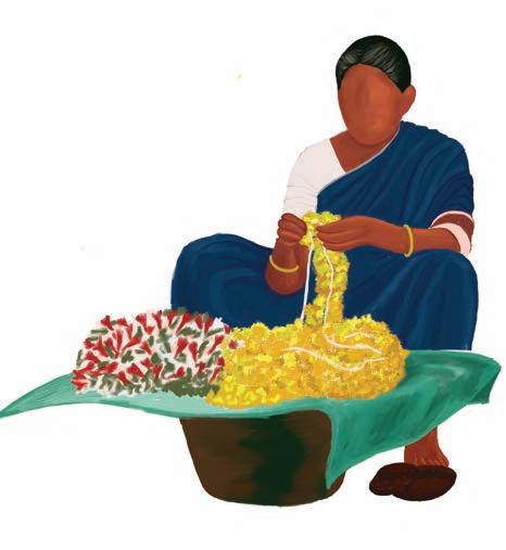
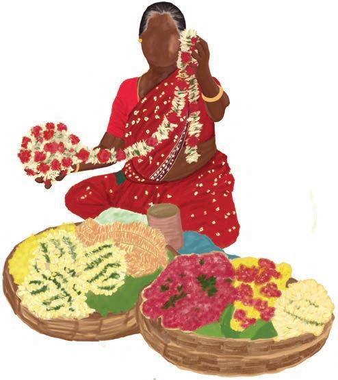
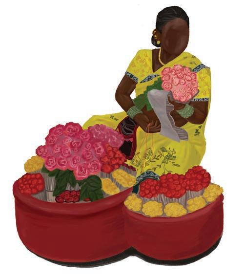
Drawing upon the cherished memories of my childhood spent with my grandmother, I have crafted this piece as a homage to those precious moments we shared amidst the colorful chaos of the local flower market. Twice a week, we would embark on a journey to this floral haven, a ritual that formed the backdrop of my upbringing and ignited my passion for art and flowers.
As I reminisce, I am transported back to the sights and sounds of my youth—the vibrant hues of marigolds, jasmine, and roses, the rhythmic chants of the sellers, and the kaleidoscope of floral arrangements adorning every corner. But it is the women vendors, with their nimble fingers weaving intricate garlands and delicate hair accessories, who truly captivate my imagination.
Inspired by my grandmother's fondness for these floral adornments, I have painstakingly recreated the scene, infusing it with a sense of nostalgia and wonder. Each figure in my illustration is a testament to the timeless artistry and cultural significance of flower-selling in India, a tradition passed down through generations with love and pride.
Through my artwork, I strive to capture not just moments, but the emotions and connections they evoke. , the warmth of familial bonds, and the enduring beauty of nature's bounty. As you gaze upon these Indian flower sellers, may you too be transported to a world where every bloom tells a story, and every moment is infused with the magic of childhood wonder. Whether it's the vibrant chaos of a bustling market or the delicate intricacies of a floral arrangement, I revel in uncovering the extraordinary in the ordinary, reminding us all to pause, appreciate, and find wonder in the world around us.


Sketches
Hand-drawn iluustration
Alongside colorful illustrations, you'll find my ink sketches. They're snapshots of my walks through Toronto's beautiful neighborhoods. I'm drawn to the beauty of everyday scenes—buildings, shops, and street corners. These sketches reflect my love for conceptual design and illustration. With simple lines, I capture the character of each place, inviting you to stroll alongside me through the city streets.
Drawn to the beauty in the everyday, I find inspiration in the streets I walk, the buildings I pass, and the intricate details that tell stories of lives lived and moments shared.
Using ink as my medium of choice, I seek to capture the essence of my surroundings with simplicity and elegance. Each stroke of the pen brings to life the character and charm of the buildings that line the streets, revealing the unique personalities of the people who inhabit them.
From quaint shops to towering skyscrapers, every structure holds a tale waiting to be told. And in the moments where streets intersect and paths diverge, I find myself drawn to vintage buildings and their surrounding scenery, where history and modernity coexist in perfect harmony.
Through my sketches, I invite you to join me on a journey through these streets, to pause and appreciate the beauty that surrounds us, hidden in plain sight. For in the simplicity of black ink on paper, lies a world of wonder waiting to be discovered.
Thanks for being here and supporting a young designer and an artist !
