
process document march 2021 - may 2021

Streetwear Inspired by chicken shops in Peckham, to what’s happening in Harajuku, and from 1970s corporate logos to Smithfield Market, these eclectic influences are translated into streetwear with an irreverent wit and cheeky outlook. Not wanting to take themselves too seriously, founders Adelaide Sasey and Jake French both grew up int Peckham and met at Harris Academy, their local primary school. They still like to bunk off on a sunny afternoon, and have a refreshing take on the fashion world.
To create a visual identity for a fashion brand, as well as a look book and a gif to accompany brand.
3 the brief our scenario
4
making sense of it all What stood out from the scenario was the inspiration: Harajuku, Peckham chicken shops, Smithfield Market, 1970s corporate logos; they were all so different. This made it clear from the start that the streetwear brand wasn’t going to be generic grey tracksuits, but one that was new and refreshing. Having two founders made it possible to realistically combine the varying inspiration. Using 99Designs.com, I dived into who these people were, from their demographics, to how they met, and to their goals and aspirations. I immediately knew that the founders were going to be from Peckham, as it is a dynamic area that is culturally rich and visually dynamic. Expanding on the clients made me, and my group, see the clients as real people, and how these real people would have wanted their brand to be. expanding the scenario


5 developing the client profileswho are the clients?

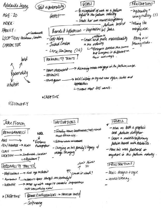
6 the clients
Brand inspiration: Jaded CouldGolfwangLondonBeMaria Adelaide Sasey
Adelaide is a Studio Intern at paria /FARZANEH and a freelance graphic designer. Born and raised in Peckham, she attended Harris Academy, where she met her good friend Jake French. Growing up in South London, being of Jamaican and Nigerian heritage and going on a once-ina-lifetime trip to Harajuku, Japan, she admires culture - how cultures differ and are similar, and how it carries through into how people dress. In her free time, she takes on street photography and graphic design, loving designs and imagery that are niche.
7
Jake is a freelance graphic designer and photographer. He moved to Peckham when he was 12 and attended Harris Academy. He met Adelaide in his GCSE Art & Design class, and they have been good friends ever since. His family have a tradition of collecting memorabilia, which he has picked up. He collects vinyl records and comic books. His other hobbies and interests include skating and skate culture, travel, fashion and graphic design. He loves vintage and retro logos, like those from the 1970s as they echo the memorabilia that his family have collected.
Brand inspiration: Noah Clothing Golf JadedWangLondon jake french
researchcompetitor
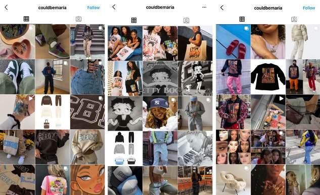
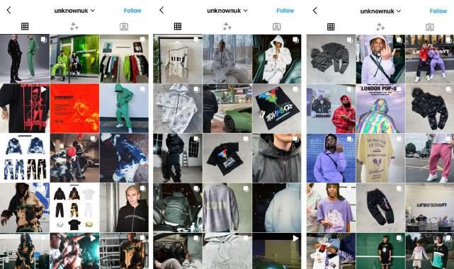
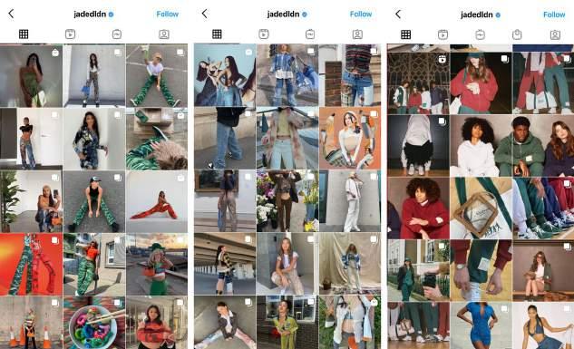
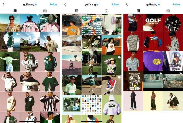
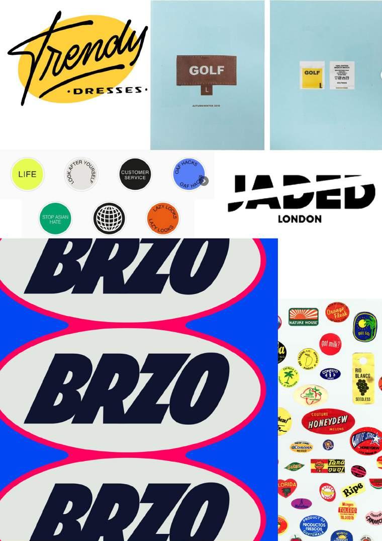
Looking at the inspiration mentioned, Lizzie also recognised that our brand wasn’t going to be a neat, clean-cut brand like Nike or Adidas, but more like Unknown London and Cortiez. Other initial brands included: Lazy Oaf, Stussy and Golfwang. Each brand had a different vibe but had a hint of 90s street style and pops of colour. Using these criteria, I found Jaded London, Could Be Maria and Noah Clothing. What stood out to me with these brands were the colours, patterns and graphics, which elevated the generic streetwear/street style clothing into something distinctive. Could Be Maria (CBM) was a great brand to get inspiration from, as they are very urban, and incorporate nostalgic graphics into trendy streetwear silhouettes, hence why they were a brand Adelaide was inspired
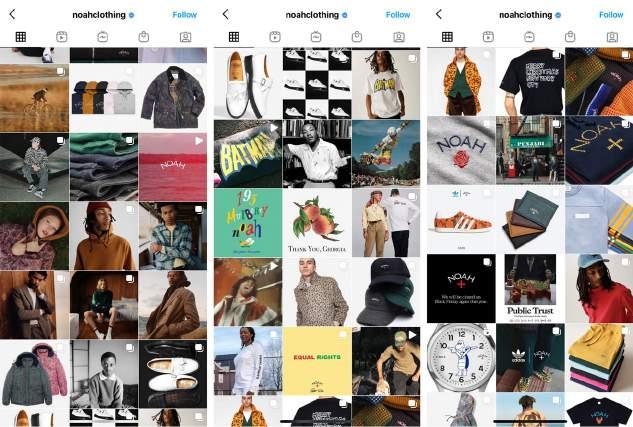
Jaded London also has a clear target audience of young adults, which would be the same as their brand.
9 by. What I liked about Jaded London was how eclectic their clothing was, which is a nod to Jake’s inventiveness, Adelaide’s Harajuku inspiration and their shared taste for originality.
inspirationphotography
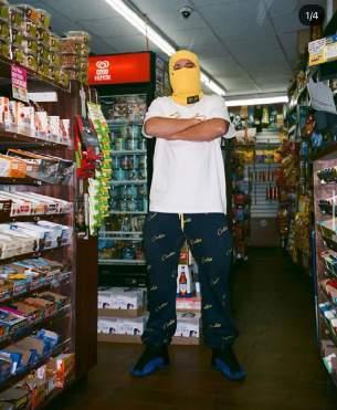
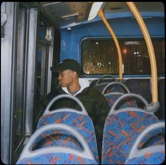
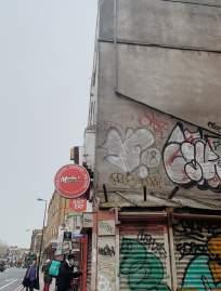
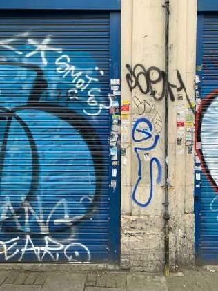
With inspiration from the secondary research and the ones mentioned in the scenario, members of my group started to find images for photography style. The images seemed to be taken on film but were simple, in terms of posing (direct portraits). But the backgrounds, setting and styling were rough and urban, featuring corner shops, tracksuits, the TfL – the images had a strong feel to them.

researchphotographer
@narcography
@mylowe_ on Instagram
Looking at specific photographers for inspiration, we found Narcography and Milo Black on Instagram. Milo Black’s use of lighting, angles and indirect poses made his photography edgy, whilst Narcography had a softer approach of capturing culture and emotions using film. Both Milo Black and Narcography not only focused on capturing portraits but also objects and surrounding, which added to the building up of the mood of their photography. on Instagram
11


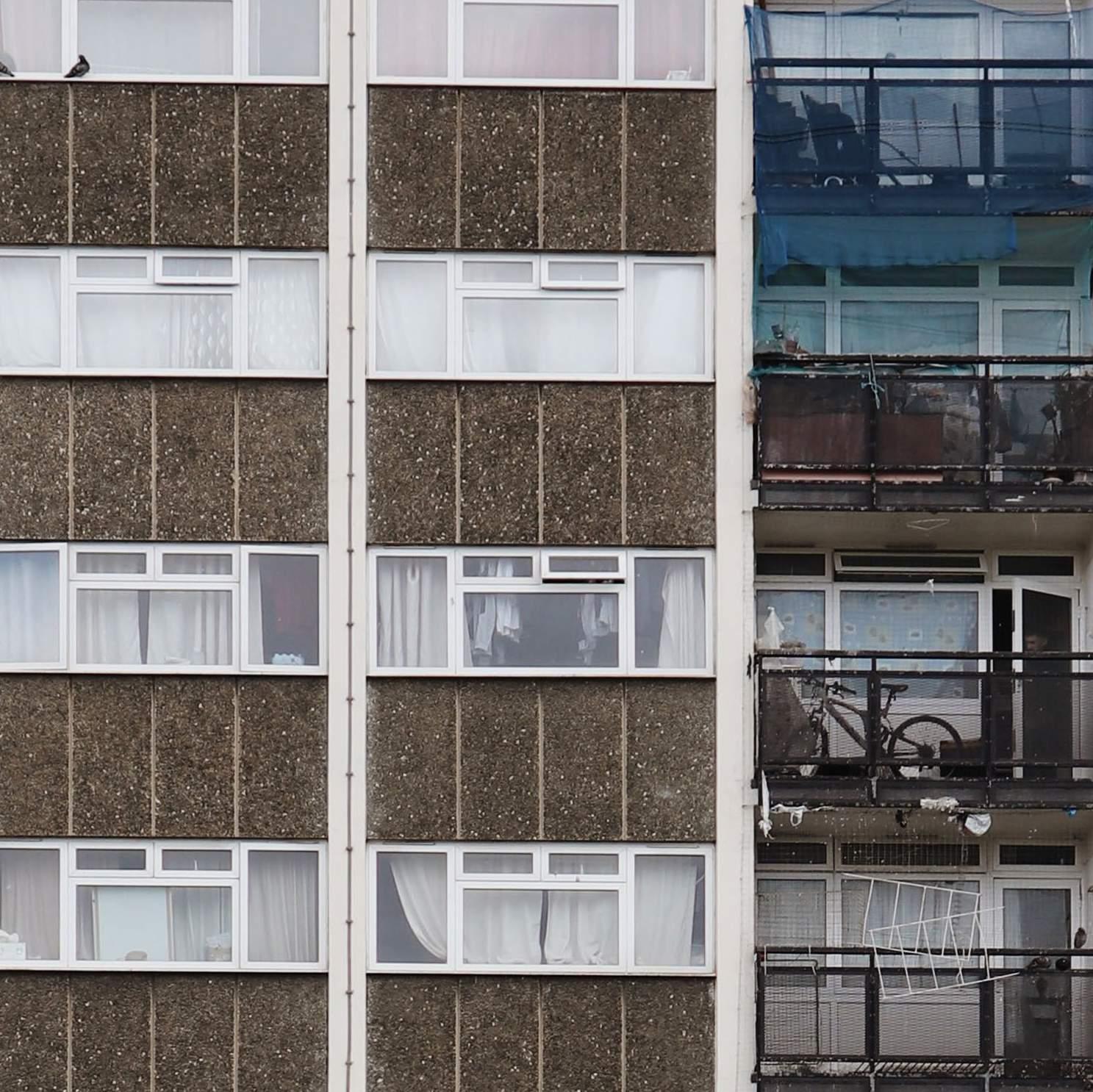
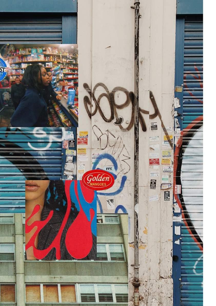
Lizzie’s mood board for Lazy Oaf creating the mood board As a group, we decided that we would create a mood board each and then come together to show and discuss how they could be developed further. In a previous workshop, Lizzie created a great mood board for Lazy Oaf, and I used that as inspiration for my image selection and composition. I liked how the flowers pulled the mood board together, so I looked for an equivalent for our brand - fruit stickers! These were a great addition because they reflected the Smithfield Market inspiration and Jake’s hobby in collecting vintage memorabilia. It also links to Peckham, where there are many whole food shops. Besides the clothes and styling, I also looked for images that echoed urban London, particularly Peckham- estate blocks, corner shops, store shutters. The images all seemed to be taken on film or edited to look that way, which added a softness to the images. Image selection was made easier on Adobe Bridge, but I had to continually remind myself that the mood board needs to communicate the feel of the brand.
12

13 Mood board notes Saved images on Pinterest
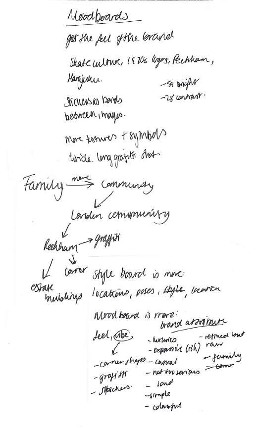
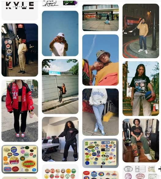

14 moodboardsindividual Coming back together, we selected Lizzie’s and my mood board as the ones more in line with the direction. From this point, we delegated tasks; I was to develop and complete the mood board. We shared our images and I just combined elements from Lizzie’s mood board with mine, including the landscape orientation. Lizzie’s moodboard
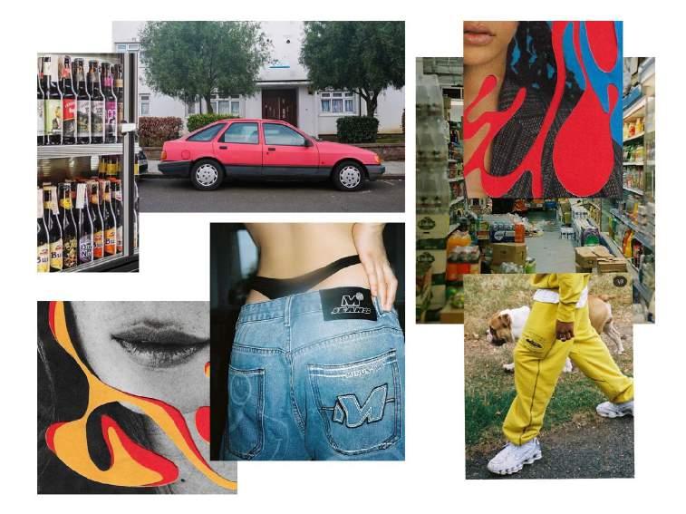
My moodboard
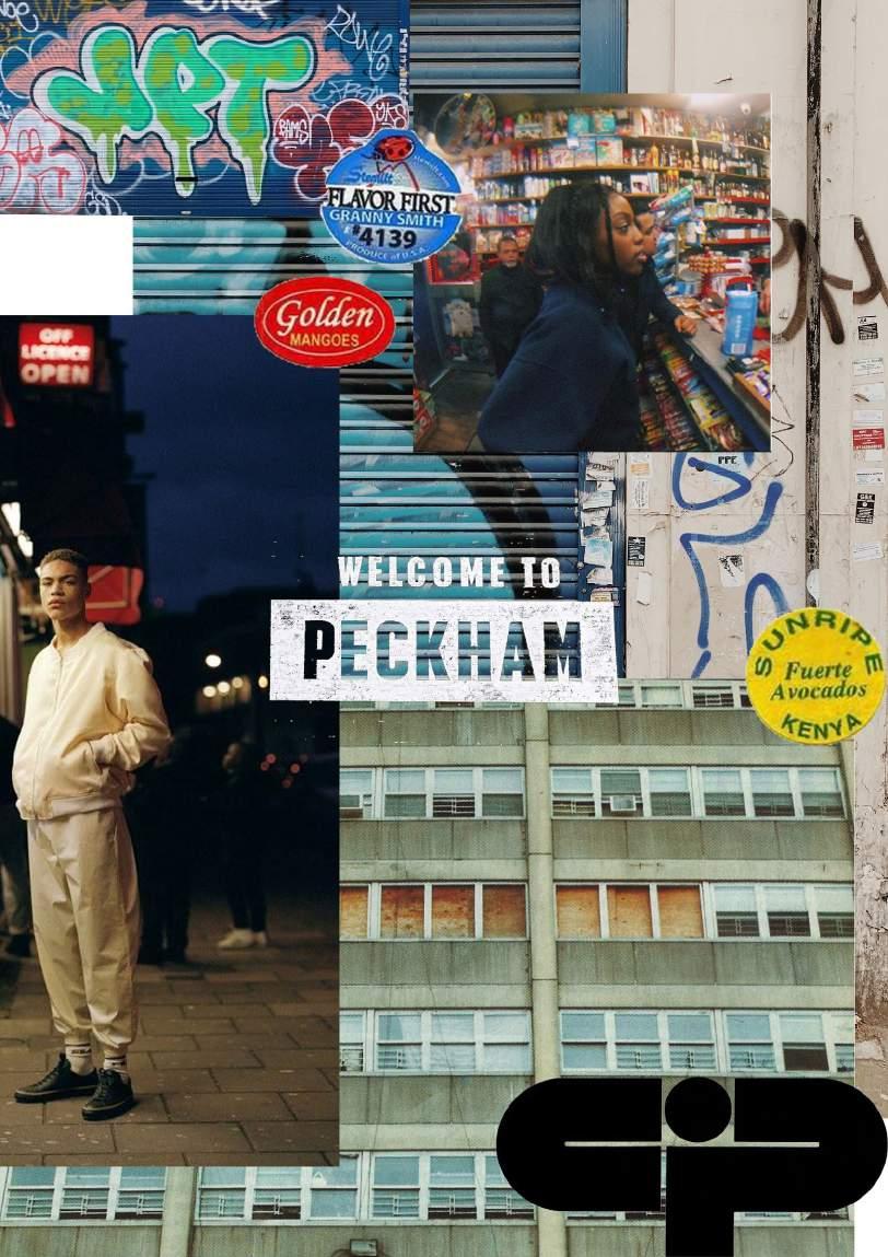
moodboardfinal
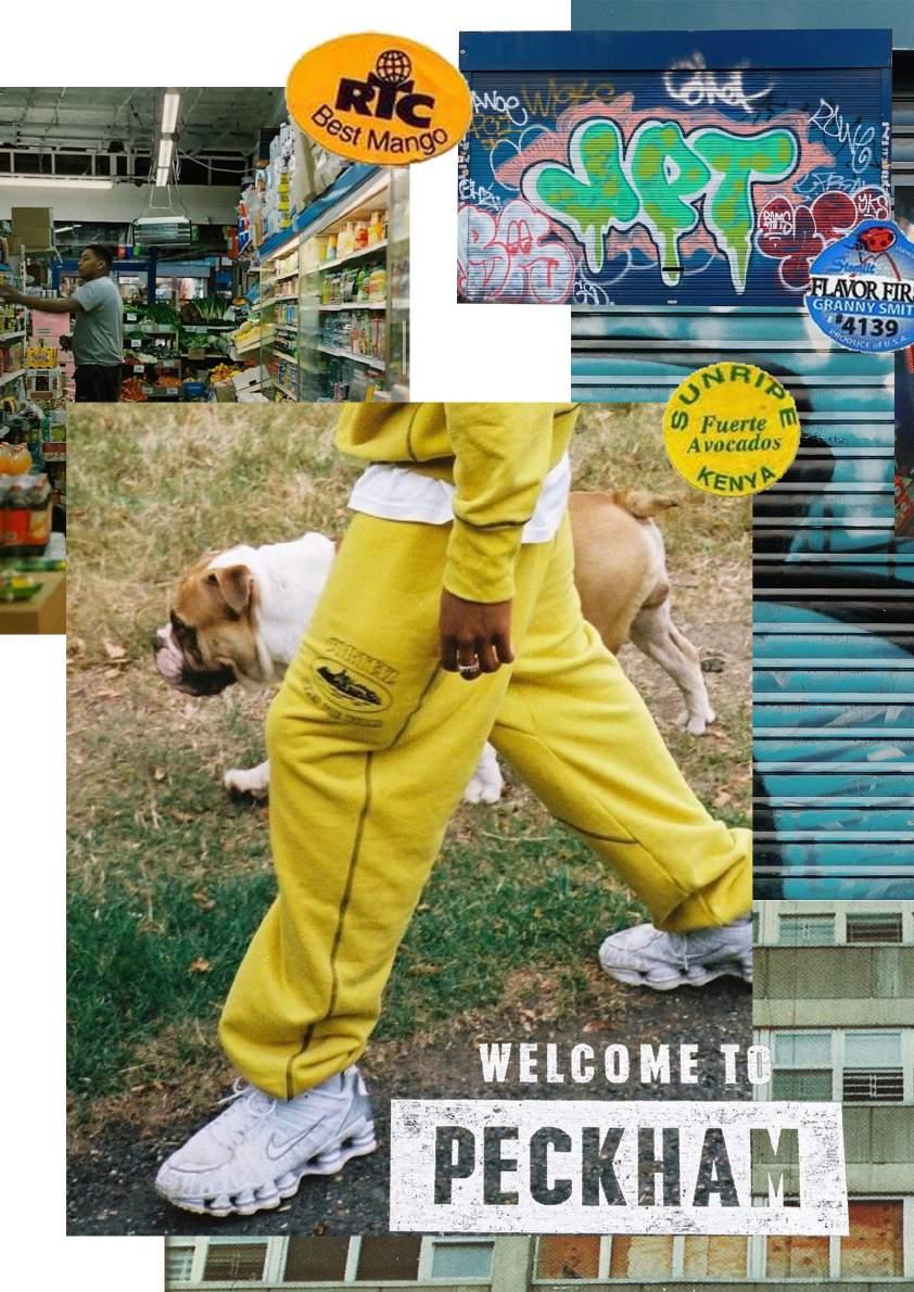
Adopting Lizzie’s landscape orientation into the final mood board allowed for more images to be placed and have more space around them (not be too crowded). The images she used added to the feel of the brand and also matched the stickers I already used. The fruit stickers and image composition create a handcrafted element to communicate the authenticity of the brand.
styleboard

The style board focuses more on the photographic style, poses, clothes styling and locations; it can be (and is) used as a reference for planning and running photoshoots.
By Lizzie

Developing the names
creating the brand name We were given an activity to come up with brand names that fit 8 categories: Descriptive, Evocative/suggested, Invented, Acronym, Geographical, Founder/eponym, Portmanteau or hybrid, and Translation. Baldeesh was churning out names and came up with “arside” or “arrsde”. It could be interpreted as “arse”, so we used R instead. My top 3 names were RYE London (which was my favourite), F.Sans and Frasey: Rye Lane is in Peckham, where Adelaide and Jake are from; F.Sans sounds like a typeface, which relates to the clients’ background in graphic design; and Frasey just had an energy to it, the energy commonly connected with

‘RYE LDN’ and ‘R.Side’ were our top 3 names as a group, and despite our questionnaire, we naturally started to use RSide. It just fit with the style we developed, so that was our final name. names as a group questionnaire, carried out on Padlet
ryeFraseyldnr.side Final
Our
21 London or any buzzing city. This activity was great as it pushed me (in fact, all of us) to think outside of the box and just create names without being overly critical. I will definitely use this method in future projects if ‘Frasey’,needed.

Evan wanted to show how widespread and inclusive RSide were to be by creating personas that were two completely different personalities and people. “We wanted to show how we would appeal to those who are trying to find their voice, people who are more introverted, and people who are more extroverted.” created by Evan
22 personasaudience


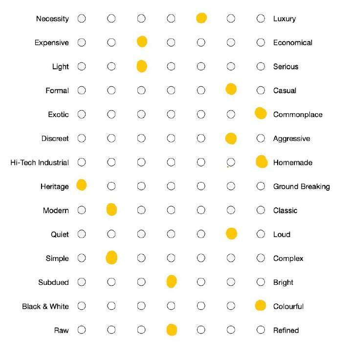
attributesbrand We came up with the attributes based on the mood board, style board, audience personas and the clients’ profiles: Adelaide and Jake are creative people. They wanted to create clothes that were different and unique, so the brand was more of a luxury than a necessity. Looking at the visuals provided by the mood board, RSide is colourful but in-between subdued and bright. Depending on the person wearing their clothes, it (the brand) can be quiet or loud.
23
24 ‘welcomeunapologeticfearlessdiverseedgyqualityvintagecommunityfamilytorside’‘dropby’‘howareyoudoing?’tone-of-voice These are some words and phrases we came up with that we felt captured the spirit of RSide. We wanted it to be all about community; that community being a family, as Peckham (and South London) has a strong community aura to it. It’s also really diverse, unapologetic and edgy. We wanted RSide’s tone of voice to reflect Peckham, as well as Adelaide and Jake’s roots.
25
manifesto
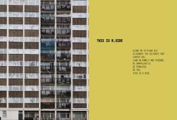
Blend in to stand out. Celebrate the cultures that shaped you. Lean on family and friends. Be unapologetic. Be fearless. Be you. This is r.side. THIS IS r.side
Initial manifesto: “The heart of our brand is celebrating the cultures that create our community. Blend in to stand out. Our foundations are built and inspired from family and friends. We have created a diverse range of vibrant and staple pieces, handmade by our team. Our pieces are sustainable, unique, timeless and high-quality. Designed to represent the culture and upbringing of our young, unapologetically, fearless community in London. “
This manifesto was quite wordy and too polite. We cut it down to this final one: it’s punchier, straight to the point and focuses more on the brand’s values. It also has quite a warm tone that’s inviting, relating to community and family.
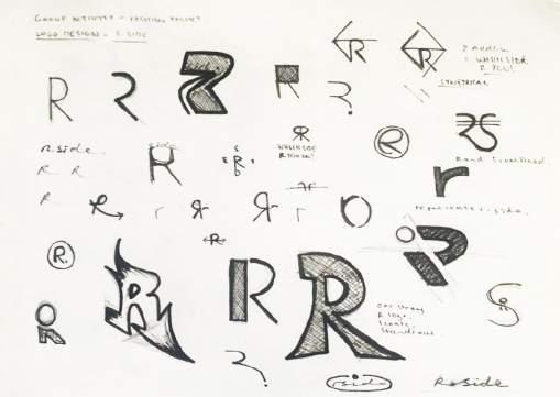
designinglogo As we normally did as a group, we went away to come up with ideas for our wordmark. When designing the logos/wordmarks, I referred to the brand attributes as criteria. Alongside sketches, I found the typefaces Thunderhouse Pro and Mono45 Headline, that I felt fit the brand’s voice and style. I personally liked how Thunderhouse Pro looked for the wordmark, but we all had varying ideas that we all saw potential in. From the word marks we liked collectively, we each selected ones that we wanted to develop: I chose two designs by Evan – the handwritten/script one and the cropped “R” one.
26
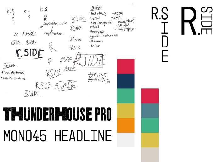
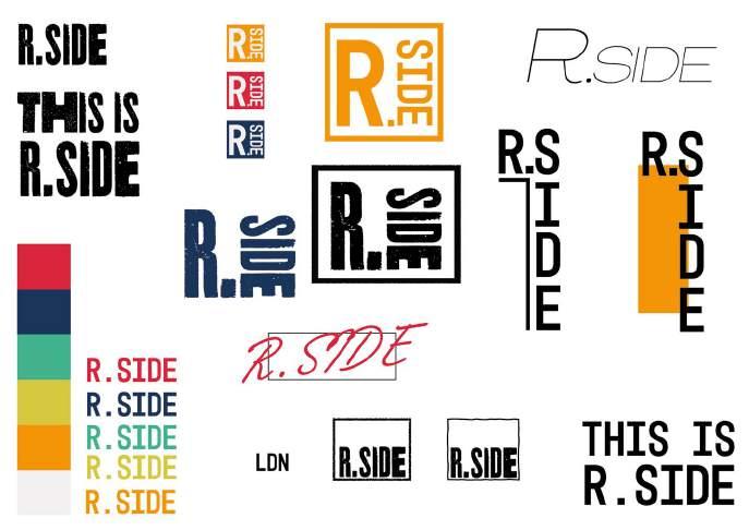
27 Sketches by Evan Wordmark ideas by Lizzie Wordmark ideas we liked collectively

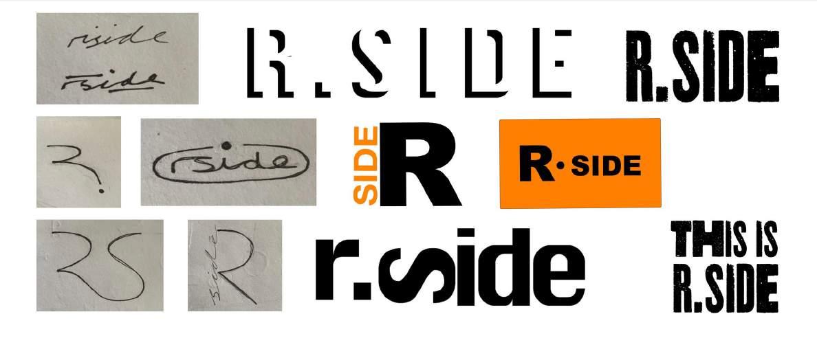

thedevelopingwordmark
I developed the wordmarks on the right using some word marks from our competitors’ research, and Pinterest saves, as inspiration. I, as well as my group, liked the first wordmark as well as the last one. But as cool as the first word mark looked, it wasn’t the best for the brand: when creating a wordmark/logo, you want it to be recognisable and clear; the splicing doesn’t allow it to be that. It looks good, but it wasn’t the most effective. Even the handwritten wordmark at first glance isn’t the clearest, but once you see RSide, you can’t unsee it. So, we went with the handwritten wordmark.
28
29 Developed word marks


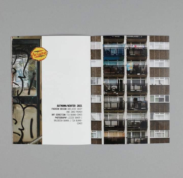
30 Completed visual identity
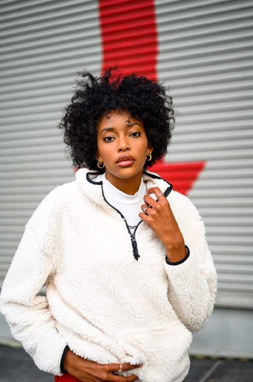
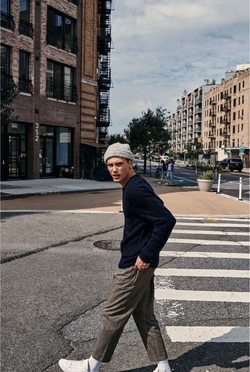
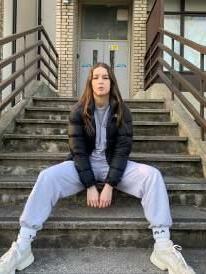
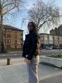
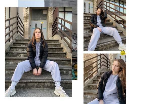
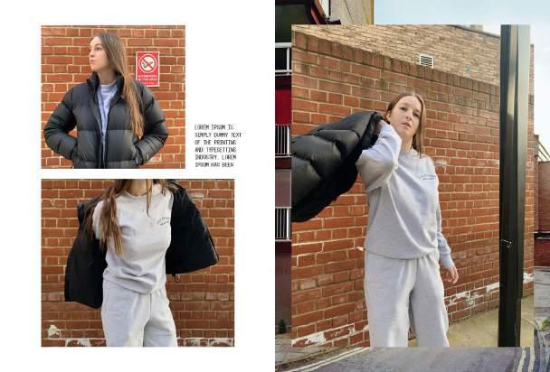
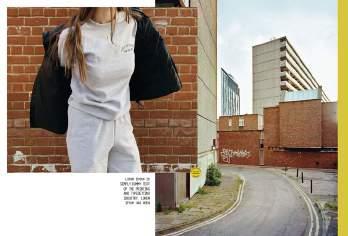
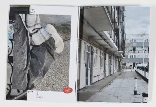
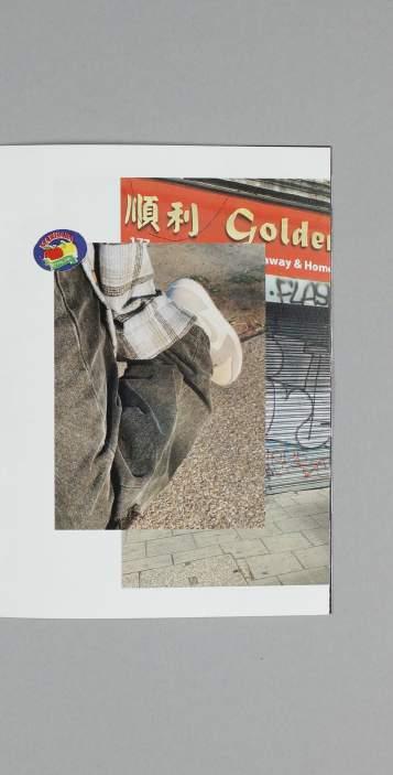
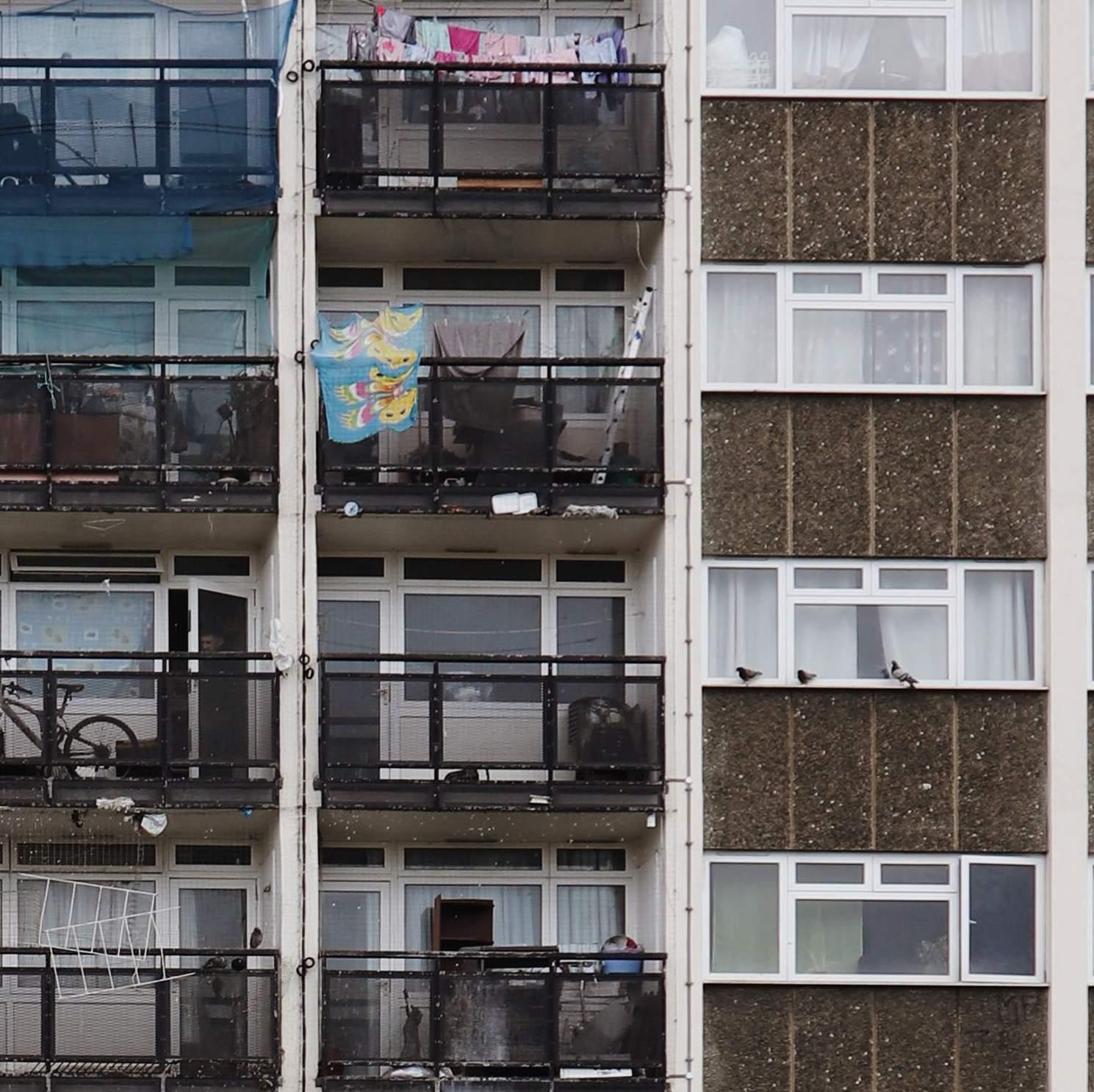
photography + art direction I did a recce shoot with my flatmate, and these were originally just going to be used for reference. I showed her the mood and style board and she picked out an outfit that (perfectly) fit the style. We didn’t shoot for long, but we got 3/4 good images that I used when designing my lookbook. In addition to these, I went around my local area (Camberwell) and took pictures of the estate blocks and other architec ture, and anything else that I felt fit the mood and style of the brand.


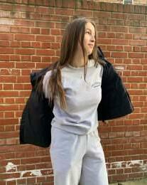
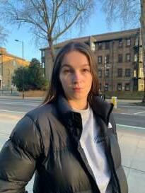
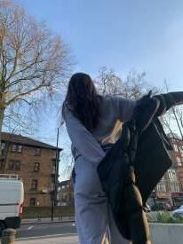
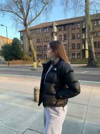


Some photos taken by Baldeesh Initial selection of images
32
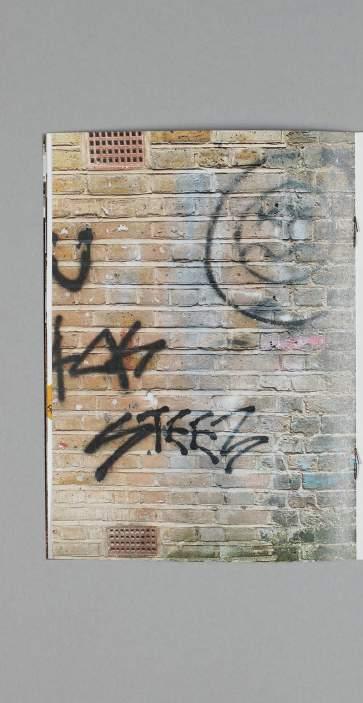
An selectioninitial of images on Adobe Bridge. I liked the indirect poses and ones that showed off more of the style than the clothes. Tried to arrange them so that the colour flows from image to image. These are some images taken by Baldeesh, on our shared Padlet. Her images were loud, edgy and eclectic, but fit the “curriculum” of having graffiti as a background.
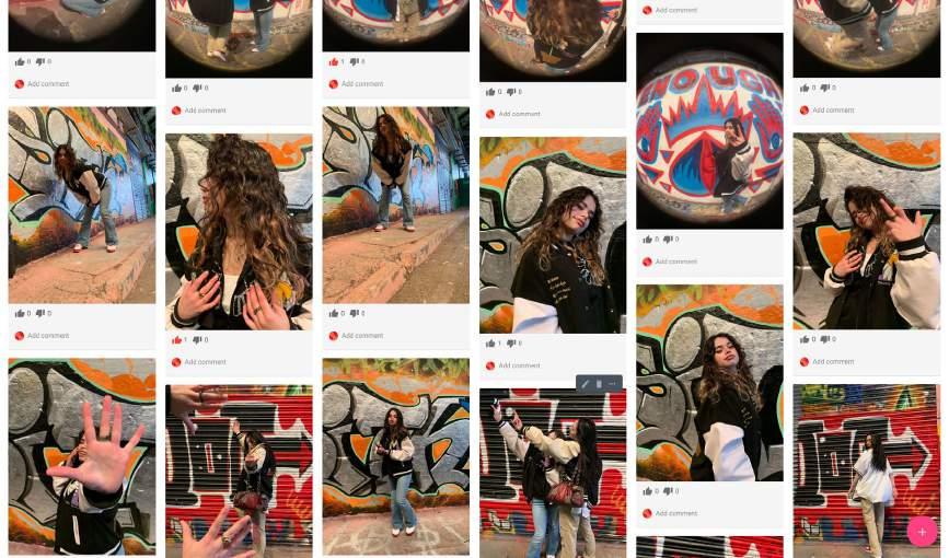

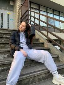
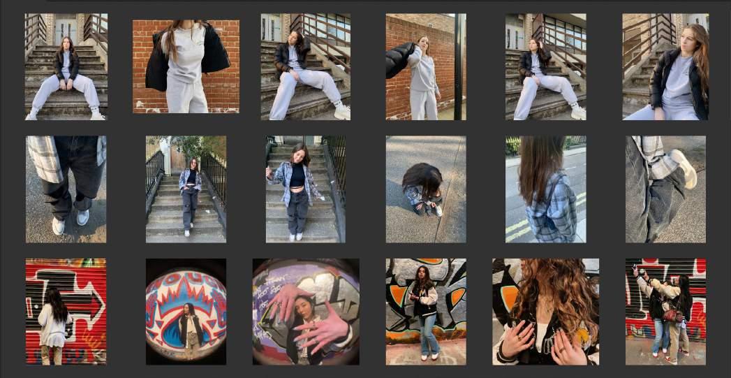
33 Another selection of images, some taken by Lizzie (second row) Unedited Edited Another selection, including images taken by Lizzie, where I focused more on the images with subjects. I really liked the film effect of the images we used on our mood board and style board, so I found a filter on VSCO called M5 which added warmth to the images.

34
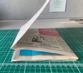
creating the look book As the photography differed in style, I came up with the concept of “different sides in one”, which was explored in the audience personas. “Two books put together by Coptic binding. different sections and styles to reflect the duality/multifaceted nature of RSide. Everyone has their own side. The glossy paper covers will meet in the middle as a signifier of a different “Concertinasection”foldout format. This will allow for a continuous image sequence. I like this idea because I feel that our mood board and style board perfectly evoked who RSide is, and I want that to happen with this. A continuous mood board. On the flip side will be the “other side”; someone else’s side. The look book can be read both upside down and right-side up.” Concertina prototypeCoptic binding prototype Quotes taken from my Padlet


35 Sketchbook notes - developing ideas for look book

First few spreads I designed My initial idea of a look book was a book of images showcasing the brand’s clothes. I just thought it would be as simple as composing the images on a spread in an interesting way. This was my approach to my first draft. I wanted to evoke movement and I thought that was by using multiple images of different poses and angles, but this made the first few pages quite tedious to look at, especially the second spread. During a 1-1 with my tutor (Katy Oswald) I started to look at the image individually – is it communicating the mood I’m going for? If I wanted movement, I had to choose dynamic images, rather than repeating similar ones.
LOOK DEVELOPMENTBOOK


This is the second draft, where I started exploring the different sections. I stuck with the most two dynamic images of the six. Even though the lookbook was more about communicating the mood of the brand, I also wanted to show the clothing, so these images were great: a full-body image and one focusing on the top half. To make the concept and setting of the brand (or the collection) more clear, I brought forward the background/location Asimages.much as I liked it, the narrative was both not clear and choppy. I also had the issue of repeating similar images. There also wasn’t much balance in the document: some sections had two model images and two background images, another had 4 model images and some background shots, so it didn’t feel entirely cohesive.
37


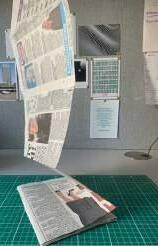
I put the images into the concertina format to solve the issue with the narrative of the lookbook, but it became clear that it was two very different concepts. I was excited to explore this format for the look book, but the supposed complexity of printing it put me off. The layout that I created also wasn’t the same as my initial design idea. One side was supposed to be a certain style and the other side a different one. But I may have had too many folds and not enough imagery to make it
Thiswork.experiment did inspire me to keep the idea of images carrying onto the next page and to be used as a connector between two images.
One oneside of the concertina format. In InDesign, this would be one long page.
38


Mock print out of look book
LOOK productionBOOK
39 Went back to basics and followed the rule: model, background, prop repeat. There was only so much I could do digitally so I printed a mock version to see what was missing and if it worked as a book. This helped a lot with looking at proportions, and I felt that the look book was going in the right direction from this point, so I continued working on this version of the look book until it was completed.


40 lookcompletedbook

41
42 evaluation
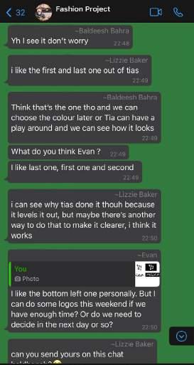
I enjoy working in groups, and I was blessed with a harmonious group for this project. Our communication was good; we could comfortably talk about what we liked, disliked and what we’d like to see done differently. Everyone played a major role in the development of the project and my final outcome: Lizzie’s composition style was my main influence when creating the mood board; Evan came up with the final wordmark, which I developed digitally; and Baldeesh’s photoshoot helped me develop concepts for my look book. This project did remind me that I shouldn’t get too attached to the work I create. I don’t think my work is the best or better than, but I would create a piece of work that I thought was quite good, and then everyone else thought differently. It shows you that there’s always room for development and that not everyone sees things the same way you do, which is okay. Despite working well together, I would say that we weren’t very consistent with our catch-up sessions to plan for photoshoots. Half of my group were relatively busier than me and another member, as they were balancing university and work, so it was understandable. But I do feel that if we met up and organised a proper photoshoot, the images would have come out with a clearer narrative and style, matching our mood and style board better. working in a group We mainly communicated on Whatsapp and Blackboard Collaborate when we were all available for a group call. On Whatsapp, we’d share our work for feedback which we would later post onto our group Padlet.


43
I’m really satisfied with my lookbook, and I’m glad I was able to print it using LCC’s facilities. It is saddle stitch bound and 190 mm in height, 140 mm in width. I used Strathmore
Writing Wove Bright White 90 gsm for the pages and GF Smith Max, White Matt 100 gsm for the cover, all from GF Smith. I wanted two different paper types to imitate a magazine like Time Out London, to reflect the casual and inclusive attitude of the brand. As I look over it with fresh eyes, I can see that the concept of the different sides is evident, and it flows into each other really well due to the colour and images I used. I really like the front and inside cover; it sets the mood of the brand. If I were to be critical, it would have been nice if the outcome echoed the mood board and style board more. More vibrant colours, eclectic streetwear like the yellow tracksuit, more streetwear, photos that “document” someone doing everyday things, like going to the corner shop, walking their dog. If this was a real brand and Adelaide and Jake asked me to design a lookbook for another season, I would take this approach.
Really explore RSide’s roots. the final outcome - the look book Planning the photoshoot and sticking to it was much more difficult than I expected. I realised how photoshoots truly need a dedicated day and time to make sure its fruitful. I thought that fashion photography would have been easy, as photography is a hobby of mine. However, I’m more used to landscape and architecture photography (hence why the images of scenery came out well), where I’m by myself and the subject/object is static. But in fashion photography, I CHALLENGES
Mood board - colourful, and mixture of settings Style board - streetwear rich


44 had to take into account the model, how they were feeling, making sure they posed how I wanted to or evoke the mood I was going for. You need a lot of patience, hence why I realised you need to dedicate a day or time for a shoot. If I were to do a similar project, I would take the images using a DSLR or a film camera, as the viewfinder would allow me to isolate what I’m seeing (surroundings outside of the camera) from what the lenses are seeing, making me focus more on the shot. It’s also just a different experience when compared to taking photos on an iPhone (which I used primarily; images like the one on the right was taken on a mirrorless camera).
46 by tia buana-cokes Year 1 | Graphic Branding & Identity