
3 minute read
Very Peri Is Pantone’s Color of the Year


VeryPeri
is Pantone’s Color of the Year

By Dani Messick, House and Home Feature Writer
A versatile periwinkle blue with violet-red undertones is the color on the scene this year. The Pantone Color Institute announced its Pantone Color of the Year known as “Very Peri,” and it’s anything but ordinary. It’s a periwinkle shade they say blends the faithfulness and constancy of blue with the energy and excitement of red.
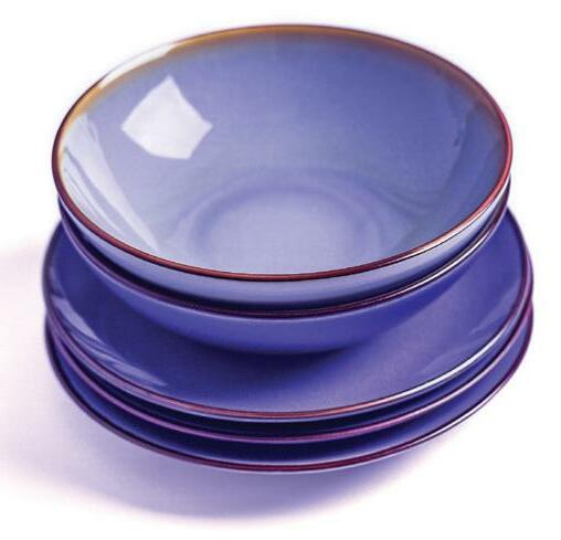
Shutterstock.com
“We are living in transformative times,” the company’s press release says. “PANTONE 17-3938 Very Peri is a symbol of the global zeitgeist of the moment and the transition we are going through. As we emerge from an intense period of isolation, our notions and standards are changing, and our physical and digital lives have merged in new ways. Digital design helps us to stretch the limits of reality, opening the door to a dynamic virtual world where we can explore and create new color possibilities. With trends in gaming, the expanding popularity of the metaverse and rising artistic community in the digital space PANTONE 17-3938 Very Peri illustrates the fusion of modern life and how color trends in the digital world are being manifested in the physical world and vice versa.”
The company says the color feels futuristic, while also retaining the classical memory of traditional blue tones.
“Very Peri is an enthusiastic blue hue whose whimsicality lends itself to unpredictable color harmonies and spontaneous color statements,” the press release said. “Due to the unique attributes of the color, it takes on a distinct appearance depending on the material it’s applied to, from metallics to natural fibers. It makes a statement when used in shimmery eye shadows as well as in homes, where it can be used to make one-of-a-kind color combos.
As implied, the color actually looks different depending on the medium on which it’s used. For a futuristic look, try metal medium. For trendy vintage look, consider using it on wood furniture. The possibilities are almost endless. Very Peri pairs well with white, beige, pink, and green. It can also be paired with orange or yellow if you’re bold enough. Beware, though, that Very Peri’s tint changes depending on the lighting- a feature of it’s unique color-coding. Thanks to its red undertones, Very Peri can achieve a yellowish tinge under warm lighting so plan accordingly.
In homes and clothing, the way to use it as accents and accessories. A lamp, candles, or even necklaces are all options. If you’re looking for bolder representation, an accent wall or even a piece of statement furniture in Very Peri is sure to be the envy of the year’s design aficionados. Introduce the color for temporary usage this year with bedspreads, curtains, and rugs.
The color is available to software designers and multimedia through www.pantone.com/ connect.
Pantone specializes in the language of color - that is, they work to develop color consistency across all platforms for graphics, fashion and product design. The Pantone Color Institute provides customized color standards, brand identity, color consulting and trend forecasting. To determine the color of the year, Pantone’s color experts use various methods to determine trends. They look at the entertainment industry, films in production, traveling art collections, up-and-coming artists, fashion, design, travel, lifestyle and socio-economic conditions. They also reference new technologies, materials, textures, and effects impacting color, as well as social media and even sporting events.
“The Pantone Color of the Year reflects what is taking place in our global culture, expressing what people are looking for that color can hope to answer,” said Laurie Pressman, vice president of the Pantone Color Institute. “Creating a new color for the first time in the history of our Pantone Color of the Year educational color program reflects the global innovation and transformation taking place. As society continues to recognize color as a critical form of communication and as a way to express and affect ideas and emotions and engage and connect, the complexity of this new red-violet-infused blue hue highlights the expansive possibilities that lie before us.”
Very Peri will be added into the Pantone Fashion, Home + Interiors Color System, the most widely used and recognized color standards system for fashion, textile, home and interior design.
For more information, visit www.pantone.com. n


