SLAY Basketball | Brand Book


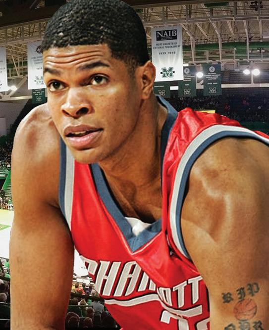

Branding is more than a logo or a tagline – it’s based on perception. It’s the communication of values, characteristics, and unique attributes of your organization - it’s a complete story. The brand book holds all of the chapters to that story. It’s a living document that will evolve over time as the brand matures. At its core, the book identifies the SLAY Basketball’s key attributes, brand story and creative identity marks. The brand book sets distinct guidelines for maintaining the SLAY Basketball brand identity throughout various aspects of the organization.
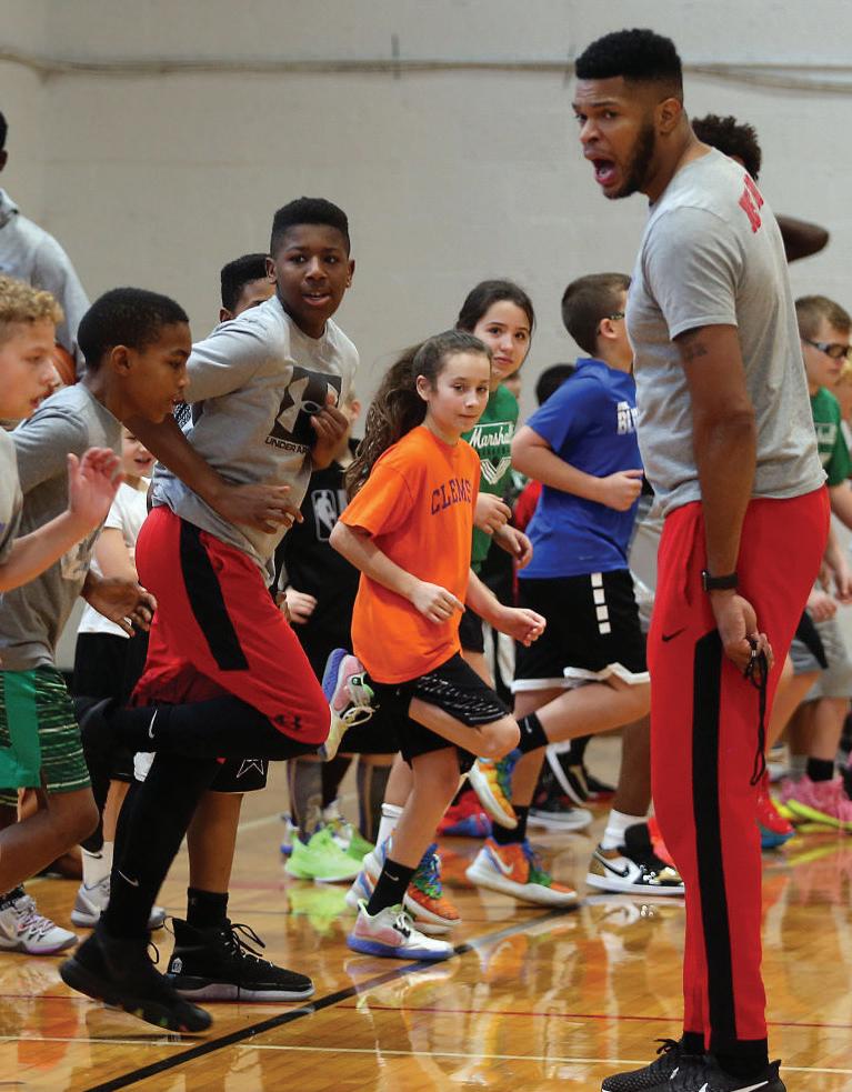
Archetypes are familiar characters that fictitiously represent a brand. They help define the brand and breath life into it. Each archetype has its own set of characteristics, values, attitudes and behaviors.
PROMISE: Where there’s a will, there’s a way.
CORE DESIRE: To prove worth through difficult action

GOAL: To exert mastery in a way that improves the world
FEAR: Weakness, letting people down or quitting
STRATEGY: Become as competent as possible
The hero archetype often presents itself in the form of a leader. The brand exists to help athletes and provide elite training to develop strength and discipline in basketball. The marketing of the hero brand will often include bold phrases and images to convey powerful messaging.
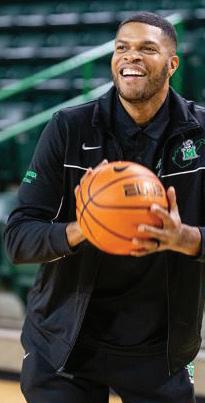
The SLAY Basketball brand wants to challenge you, to inspire you to pursue achievement, no matter what it takes. Images incorporating strong colors and bold shapes are frequently used in the hero’s marketing efforts.

Brand attributes are similar characteristics to what a person can have. These are fundamental characteristics identified by the SLAY Leadership team as fundamental traits of great athletes. These attributes are an inherent part of the SLAY Basketball brand. These attributes help define message tone, style and more.


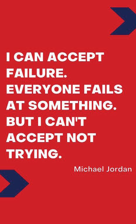
The brand story highlights SLAY Basketball’s target audience and key differentiators in a short marketing narrative that can be used on the website, in promotional advertising and more.
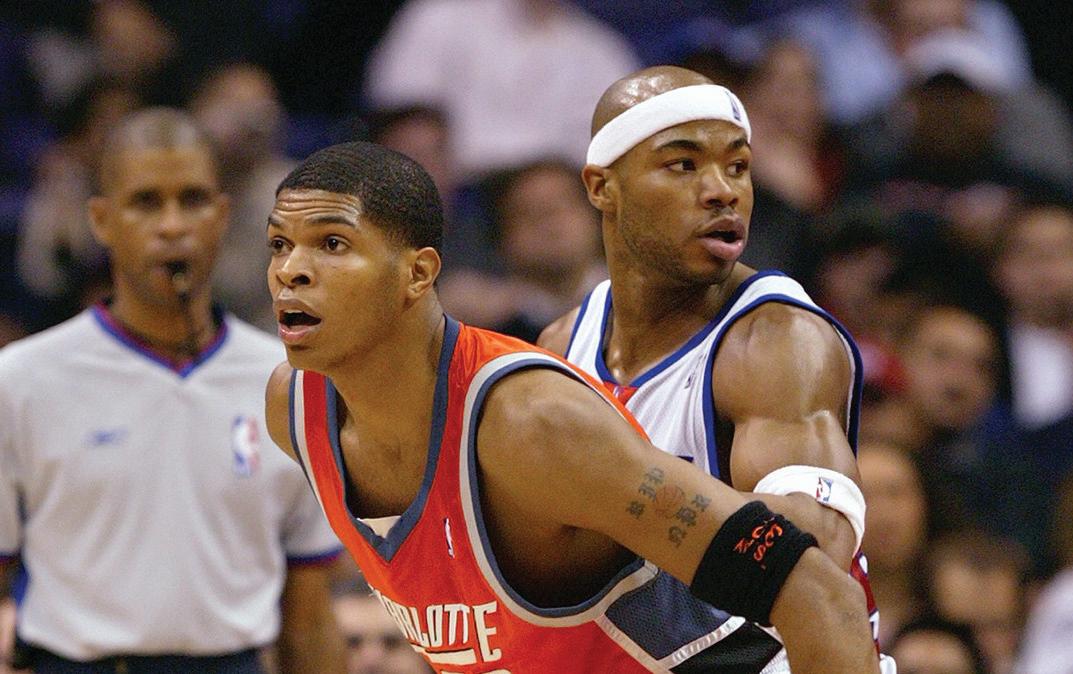
At SLAY Basketball, we believe great athletes are made not born. Through dedication and training, an athlete can go from good to great. That’s the SLAY way. It’s our mindset, the way we train and the way we play.
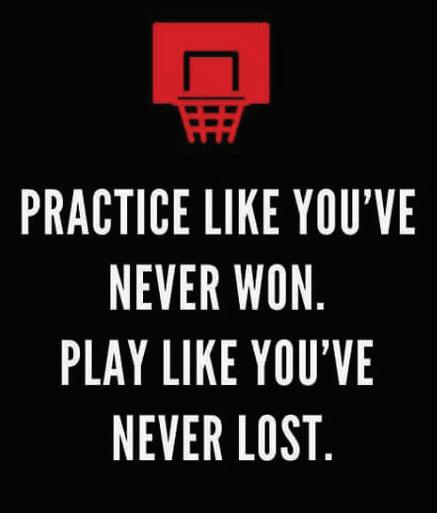
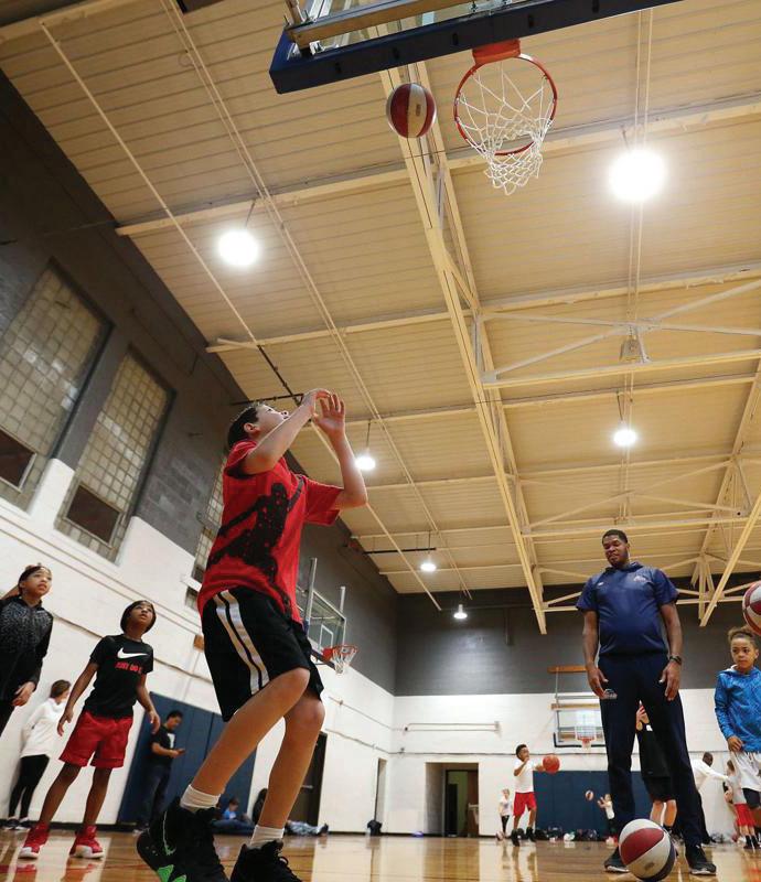
SLAY Basketball is an elite training program dedicated to providing industry leading training methods to take athletes from good to great.
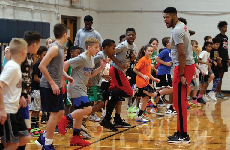
The SLAY Way™ is the way do business, the way we teach others and the way we perform as athletes.

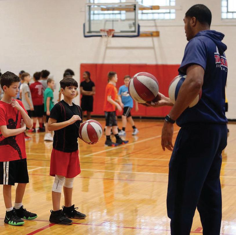
Primary Logo - The Maiden logo uses a font drawn specifically for the Town and is meant to respresent the three pillars that Maiden was founded on; fellowship, entrepreneurship and sportsmanship.
This logo should be used for marketing and promotional materials, such as swag, ad campaigns, and posters. This logo may also be used for official city business materialsm such as letterhead, business cards, and presentations.
Secondary Logos - The “M” icon is a shortened version of the primary logo. This icon can be used in the colors Varisty Navy or Squash. One version displays an established date, however, either icon may be used.
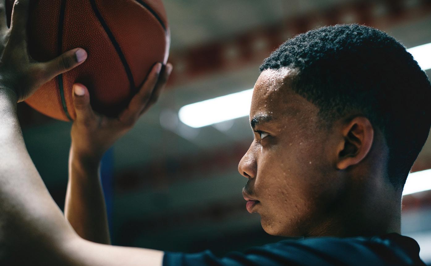
Stay Ready: Going from “good to great” to takes dedication and preparation. We come prepared and ready to work. Lead by example: We are leaders. We model the behavior we want to see in our colleagues and teams. Act with courage: We persevere through adversity. We face our fears and stare down the potential for failure. We trust our training and refuse to let doubt or opposition sway us.
ATTENTION - The logo should never be used in any way other than the previously specified applications. Use of any stylized, animated, hand drawn or other versions of an unofficial logo is not permitted. This undermines the logo system and brand consistency.
You get what you put in: We believe great athletes are made. The effort we put into coaching and the effort our athletes put into training positively impacts that outcome.
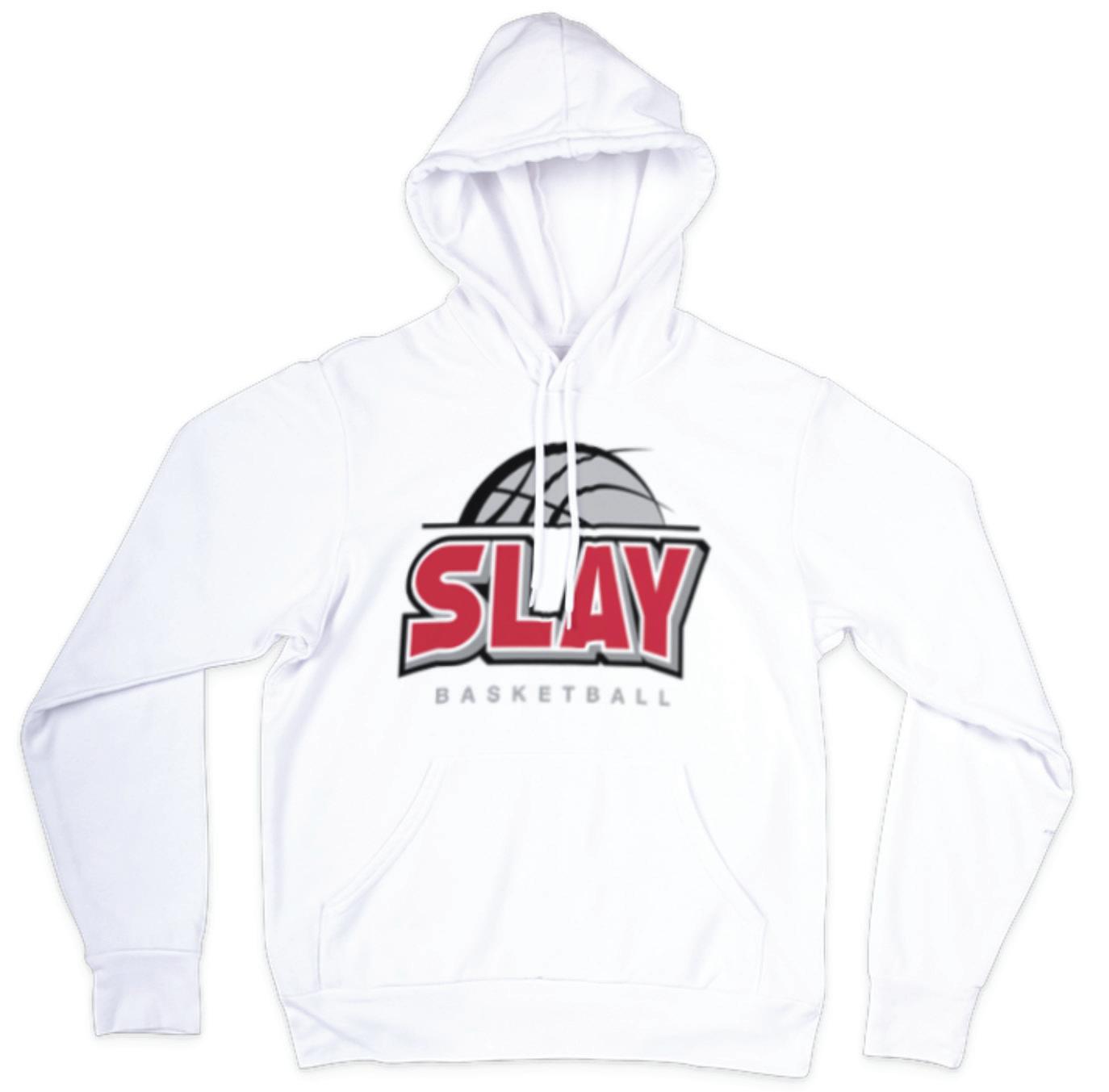
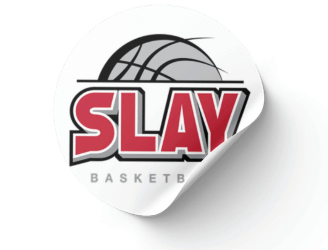
Primary Logo - The SLAY Basketball logo features a font illustrated specifically for the word, SLAY with a simple line illustration of a basketball.
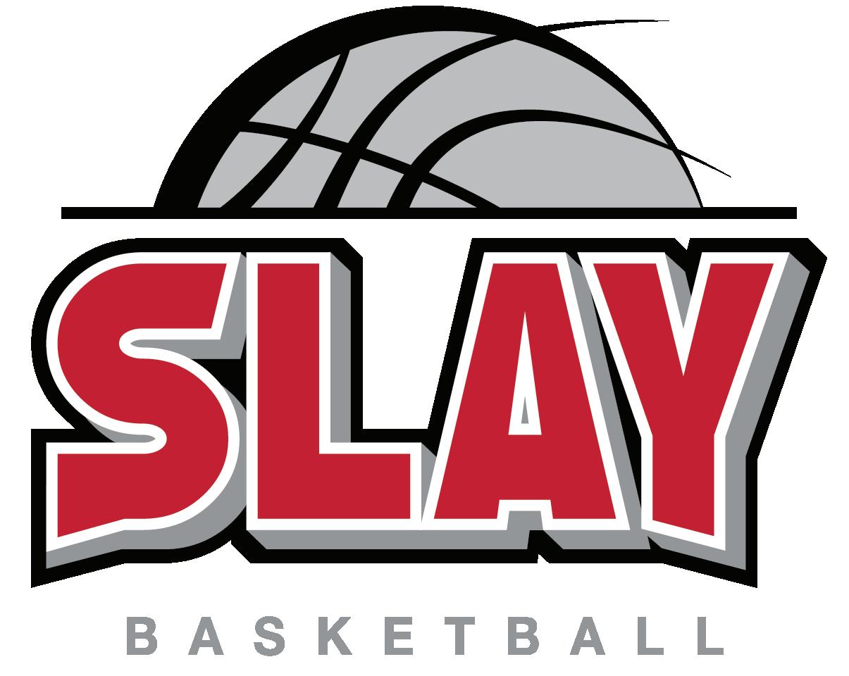
This logo should be used for marketing and promotional materials, such as promotional items, marketing and advertising campaigns, and posters. This logo may also be used for official business materials such as letterhead, business cards, and presentations.
ATTENTION - The logo should never be used in any way other than the previously specified applications. Use of any stylized, animated, hand drawn or other versions of an unofficial logo is not permitted. This undermines the logo system and brand consistency.
Primary Logo
The logo should not distorted, stretched, rotated, or flipped in any way. The logo should not be displayed in any unofficial colors or any combination of colors outside of the official logo colors.
There are several approved colors for use in digital designs that allow newly created content to remain consistent with the overall SLAY basketball branding. Ready Red is the main brand color and should always stand front and center in visual communications. To accent and support the primary color, use black, white and/or gray.
The primary colors used in the SLAY logo are Ready Red and Slay Gray .
Aside from the primary logo colors, secondary colors could be used to create online promotional graphics or environmental graphics.
PANTONE
ABCDEFGHIKLMNOPQRSTUVWXYZ
abcdefghiklmnopqrstuvwxyz
ABCDEFGHIKLMNOPQRSTUVWXYZ
abcdefghiklmnopqrstuvwxyz
abcdefghiklmnopqrstuvwxyz
01234567890!@$%
Fonts are used to visually reinforce the brand story in all official marketing and communications from SLAY Basketball.
The clear, legible and easily accessible font, Lato, should be used in all body (Lato Regular) and headings (Lato Black).
The body fonts are clear, clean design that allow for legibility at almost any size and its wide range of styles give it the stamina to thrive in bodies of text as well as in display settings.
League Spartan, Bebas Neue and Summer Lovin are design fonts that should only be used in limited design elements, which includes emphasis text found in a creative setting (e.g. website, prospectus, marketing materials).
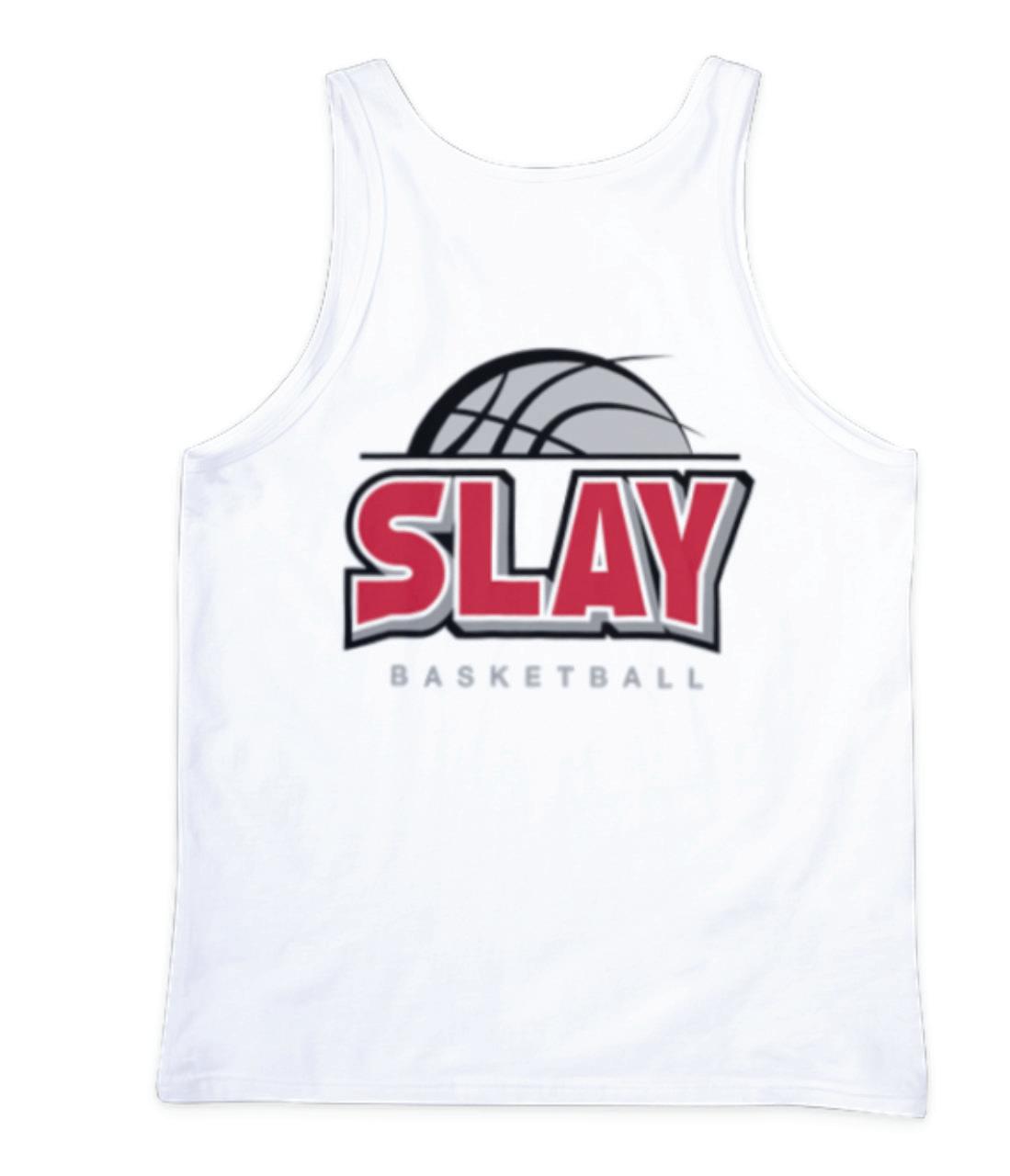
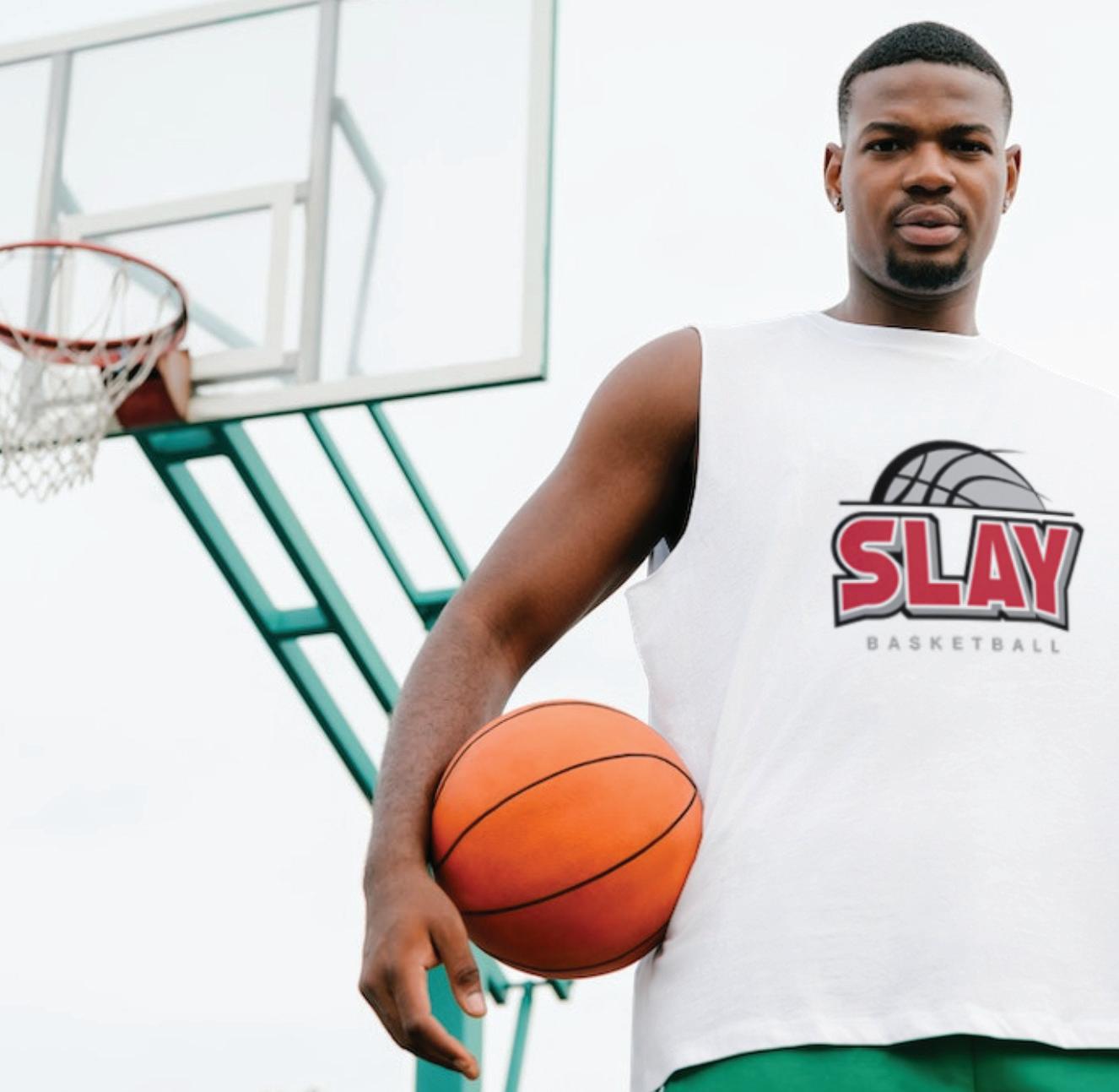

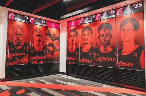
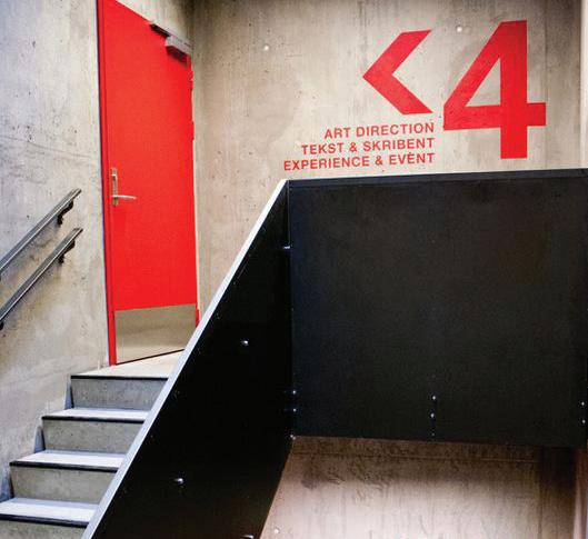
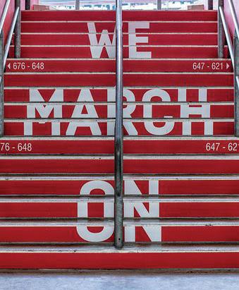
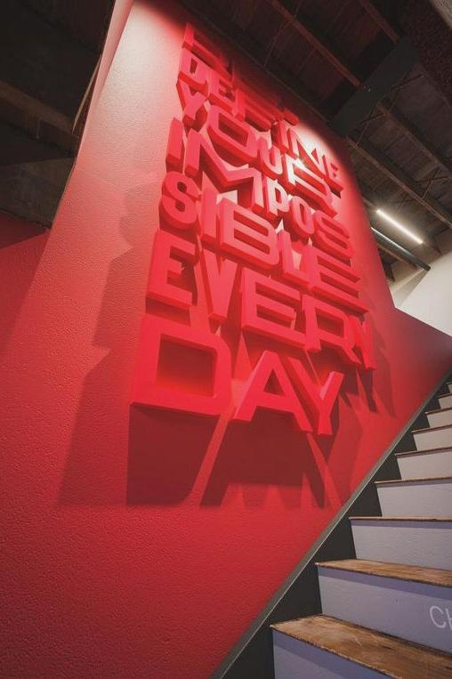
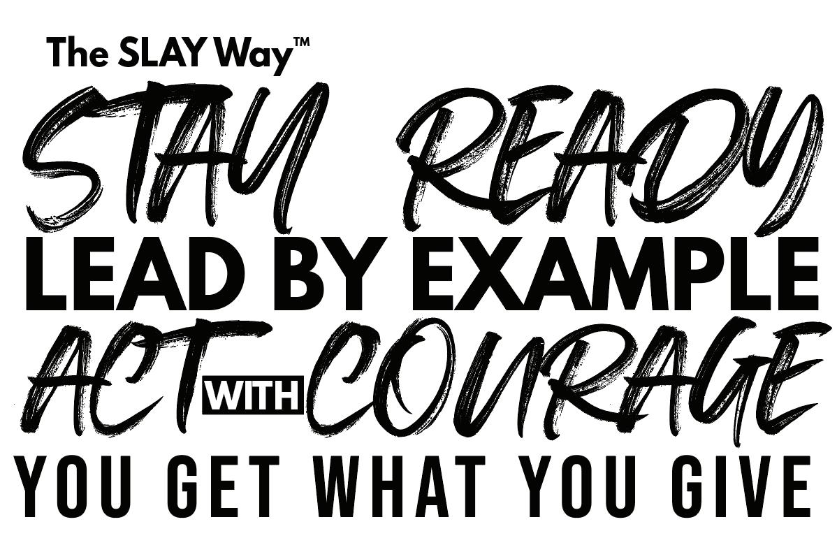
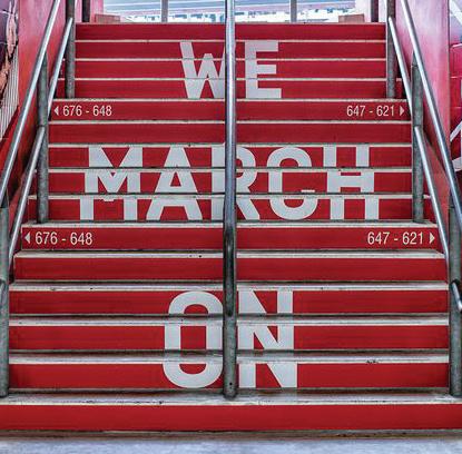
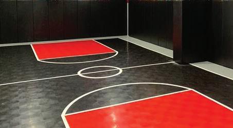
At SLAY Basketball, we use environmental graphics to tell our story, to encourage and to inspire our coaches, athletes and guests. We celebrate our athletes by showcasing their achievements. We celebrate our history by showcasing stories from our founder's success in basketball and we reinforce the values of the SLAY Way using bold typography on the walls and on our courts.

The SLAY Basketball brand was proudly developed by HAVEN Creative agency. For additional branding, design or marketing support, please reach out to us.
