


This project was the first one i ever did using photoshop:
For this project, we had to change the color of different element in the picture. I first started to chose a picture, then i used the letter format.
> I went to workspace/photography. then i went to file open downloads then changed the image size and pressed “comand 0”. then used the lasseau tool ( L ) and drew a portion of the object and ajusted the layer using hue and saturation to change the color.
> i traced the contour of the object with the pen tool using shift to add, and to erase we used option. We tried to change the colors of the selected object and learned that the hue and saturation is used to to adjust the colors.
> the darkness black is to make it brighter or white to make it lighter.the saturation is for how much intensity of the color you want in an object.
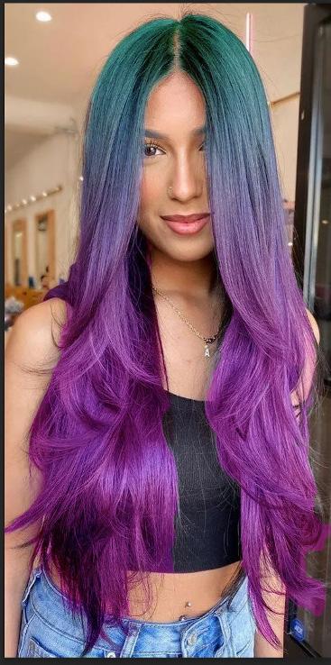
To adjust an imperfect mask:

“We learned to change hair color and background by using the Quick Selection tool:
1) Adjusting the brush size and options (+/-) helped refine the selection.
2) Quick Selection and Brush tools were used to remove unwanted elements.
3) Hue/Saturation allowed us to pick hair colors, with black and white indicating inactive and active areas in the mask.”
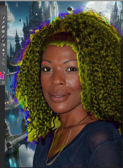
1) double-click on it to enter Select and Mask.
2) Use a small brush to refine it, then click OK. To change the background, crop it, unlock and duplicate the mask.
3) then drag it onto the new background layer. Copy an image from Google, paste, and edit.

Vectors:
1) I chose an image which is the hand and then I used the direct selection tool and drag to make sure my hand was selected. It was a hard process to keep the same chape trying to use the tool to make the curve.
2) on the layers I deselected the hand and then double clicked on the square with a round inside tool and then I changed the background with the cookie tool using a solid color.
3) I used the brush tool and put some colors in the background and then I used the filters on the right to change the color of the hand.
4) I added images I found on google and my project was over
5) I saved it as a pdf and submitted it on canvas
I really enjoyed this project, because i found it bot as challenging as i thought, and i could express my creativity. I also put the instruction clearly which also makes it easier for me to remember.

1) first click on my first layer, I use the quick selection tool we can also use the lasso tool. I then selected the part I want to change the texture of.
2) I click on layer mask the box with a round inside, I looked for pictures I liked on google for exemple a zebra skin, I copied the image, then went to photoshop images and then Edit and paste.
3) It made a new layer, with the Move tool I move my texture I can use also the warp tool
4) I then unlink the layer mask, I then select and drag this mask in my new layer and then I had my texture. Then I click in the top of the layer window I change the selection into vivid lights or other. I did that for 6 different texture


To do this project I started by analyzing the wall the professor chose for me, I seemed complicated but I was not going to give up:
1) I crated a new layer and on the top I put sample into all layer.
2)I used the clone stamp tool, I selected couple bricks from different places to make it look real, while holding option and then I just dragged and covered the dors I used the brackets to make my brush smaller. I used the soft round brush and I put the hardness low.
3) once my wall was all covered of bricks I had to make a graffiti.
4) by watching a youtube video I made my graffity I used the blending option chose my colors and then I dragged my graffiti with the move tool to my wall and then I hided the background so we could see my graffiti better.















Tracing project:
<3 We used Us letter print. You copy and paste, double click on later and put template
Add a layer and trace with the pen tool.
<3 I turned off the stroke color and decided to trace. Used direct selection point to delete the points i didn’t want. I select it before erasing it
To close the tracing you have to to use the direct selection tool and click out of the shape

<3 I clicked on the dot on the right of the layers
Commend s to save, 1 did it again and used different tools. I drew with the pen tool then I stopped as soon as I finished a shape and use the Eyedropper Tool to change the color.
<3 l used the add anchor point tool to add an anchor point, then with the direct selection tool I select and on the top of the curve it and change the color to black. Once I created my shape I then send to back.

<3 1. Documents needs to be 1000x1000pixel
<3 2. Create a shape go to file copy edit save edit copy
<3 3. Shift and option paste in place when you move it you hold the shift
<3 4. To to the top it aligns the shapes together
<3 5. Commend shift v to paste
<3 6. Shape builder
<3 7. So you create a round you copy and paste by going to edit then paste in place then you change the size with the selection tool.
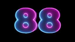
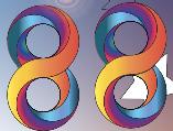
<3 8. Once I did this, I did the same with multiple circles and then once I had my first round of the number 8 I copy and paste and rotate to 180 degrés
<3 9. I use the Shape Builder tool to add shapes together
<3 10. Once I did that, I just have to open the gradient panel and change the colors to make it look good
<3 11. I then created a square and put it on the back 1
<3 2. Then I copied and pasted my 8 and then added shapes with the shape tool, and I also added the flare tool because u thought it was cool.
<3 13. I then saved my file and exported it for screen to make it a pdf.



Create a Logo:
1. I start by making a round shape with a withe background, then I changed the stone color to back and made it width profile
2. Then I chose a croissant picture on the internet, with the pen tool I traced it and changed the fill color and the stoke color.
3. I traced and change the color of my croissant, my first shape was created
4. I started tracing my pain au chocolat it was harder but I zoomed in and went shape by shape.
5. For the pain au chocolat i had to do it again I first traced with my pen tool then used the eye dropper tool to select a color and then used the selection tool to color it.
6. Click the anchor and then use the handle bars or switch to a core point to smooth out points and press command anchor tool holding command clicking anchor point and you move the handle bars
7. I decided to repeat the same process for the Eiffel tower and the coffee cup.



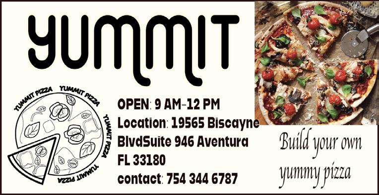
OPEN: 9 AM-12 PM Location: 19565 Biscayne Blvd Suite 946 Aventura FL 33180 contact: 754 344 6787
This pizza is made with the love you deserve



1. I used the pen tool to draw shapes of my pizza i used the direct selection tool to group my shapes together
2. Then I group my shapes together and the pizza was almost done then I decided to add additional toppings to my pizza to make it look better
3. I then used the type on a path tool to type around my pizza
4. I then used the pen tool and curvated shapes to make the pizza sauce
5. I went to window and used text to vector to create shapes
6. I then created art boards with the right sizes
7. And then I added information on my page with pizza pictures on the left
8. Then I saved my files and submitted my assignment



I don’t know what’s my favorite movie but I want to create my own poster and my own movie about summer.
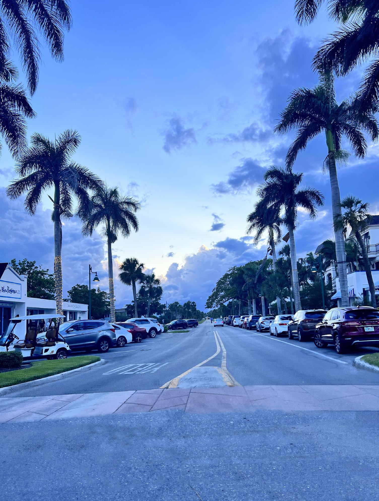
1. I used photoshop to edit the side walk of my picture, I decided to cut the trees and edit the sidewalk
2. I used the clone stamp tool and the healing tool
3. I saved my picture and went to in design then pressed files place and imported my photoshop picture
4. I then chose my actors.
5 And went on adobe illustrator to paste my actors and edit them.
6. I chose pictures on the Internet and then cropped them as well as removing the background
7. I then selected my images and saved them on my desktop, with the DST I moved my images
June 2nd 2024
8. Then I also decided to use adobe illustrator to make my logo or to trace a object
9. Once I did that I had to use the type tool to wright my scripts
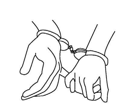
10. On adobe illustrator I decided to draw hands that are coughed together
11. I used the pen tool to draw now I just have to add typography
12. I used illustrator for the hands I used photoshop for the picture and I used in design for the typography


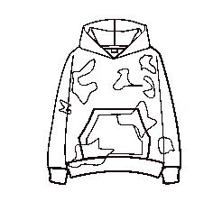



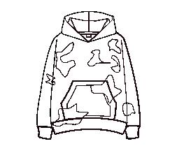
We started designing two art boards, facing challenges but managing.
I then crafted an advertising trifold for sweaters.
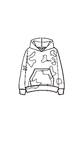
Designing the sweater in Adobe Illustrator and the background with gradients.
Shapes were made in Illustrator, then transferred to InDesign.
Images sourced from Google, modified in Photoshop, then inserted into InDesign. Text, shapes, and background colors adjusted for each trifold page.
Completed project using Adobe suite.
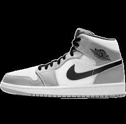
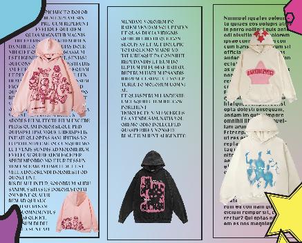

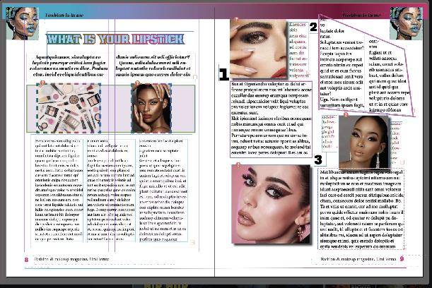

We began by sketching our ideas.
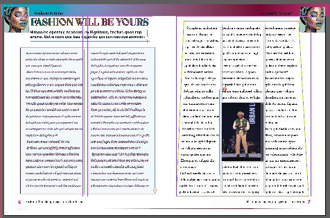
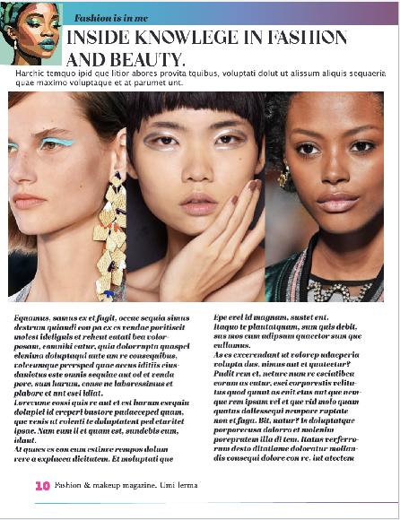
then utilized InDesign to create multiple pages, utilizing A-Patent for efficiency.Text boxes, shapes, gradients, and swatches were employed, with the line tool for detailing.
Special characters were inserted via right-click. Adobe Illustrator was used for logo creation, then inserted into InDesign. Paragraph and character styles were adjusted, with t
ext frames and column rules applied. Lastly, the cover and summary pages were completed, including image editing in Photoshop, culminating in a creatively challenging yet satisfying project.
