SAGE Publishing, 2021
Chapter 2: The Organization and Graphic Presentation of Data Test Bank
Multiple Choice
1. The sum of all proportions in a frequency distribution should sum to ______.
A. 0
B. 1
C. 100
D. N
Ans: B
Learning Objective: 2-2: Calculate proportions and percentages
Cognitive Domain: Comprehension
Answer Location: Proportions and Percentages
Difficulty Level: Easy
2. What is the major difference between frequency distributions for nominal and ordinal variables?
A. number of actual events or occurrences
B. number of possible events or occurrence
C. difference of number of actual events or occurrences from number of possible events or occurrence
D. the order in which the categories are listed
Ans: D
Learning Objective: 2-3: Compare and contrast frequency and percentage distributions for nominal, ordinal, and interval–ratio variables
Cognitive Domain: Knowledge
Answer Location: Frequency Distributions for Ordinal Variables
Difficulty Level: Easy
Frankfort-Nachmias, Social Statistics for a Diverse Society, 9e SAGE Publishing, 2021
3. In a sample of 250 respondents, females account for three fifths of all observations in the sample. What is the total number of males in the sample?
A. 100
B. 150
C. two fifths
D. three fifths
Ans: A
Learning Objective: 2-2: Calculate proportions and percentages
Cognitive Domain: Application
Answer Location: Proportions and Percentages
Difficulty Level: Easy
4. A table showing the frequency at or below each category for a variable of interest is referred to as a ______.
A. frequency distribution
B. difference distribution
C. cumulative frequency distribution
D. cumulative difference distribution
Ans: C
Learning Objective: 2-1: Construct and analyze frequency, percentage, and cumulative distributions
Cognitive Domain: Knowledge
Answer Location: Cumulative Distributions
Difficulty Level: Easy
5. Which of the following is not a proportion?
A. 0.0 B. 0.5 C. 1.0 D. 1.5
SAGE Publishing, 2021
Ans: D
Learning Objective: 2-2: Calculate proportions and percentages.
Cognitive Domain: Comprehension
Answer Location: Proportions and Percentages
Difficulty Level: Medium
6. In a sample of 310 people, 186 completed only high school, 24 completed only some college, 93 completed a two-year or four-year college, and 7 attended graduate school. What proportion of the sample does not have a two-year or four-year college degree?
A. 0.27
B. 0.15
C. 0.32
D. 0.81
Ans: C
Learning Objective: 2-2: Calculate proportions and percentages
Cognitive Domain: Application
Answer Location: Proportions and Percentages
Difficulty Level: Medium
7. What is the formula for a proportion?
A. p = f/N
B. p = N/f
C. p = (f/N) 100
D. p = (f/100) N
Ans: A
Learning Objective: 2-2: Calculate proportions and percentages.
Cognitive Domain: Knowledge
Answer Location: Proportions and Percentages
Difficulty Level: Easy
8. A relative frequency obtained by dividing the frequency in each category by the total number of cases and multiplying by 100 is a __.
A. count
B. frequency
C. proportion
D. percentage
Ans: D
Learning Objective: 2-2: Calculate proportions and percentages.
Cognitive Domain: Knowledge
Answer Location: Proportions and Percentages
Difficulty Level: Easy
9. A rate based on the total population is referred to as a(n) ______ rate.
A. actual
B. determinant
C. whole
D. crude
Ans: D
Learning Objective: 2-2: Calculate proportions and percentages
Cognitive Domain: Knowledge
Answer Location: Rates
Difficulty Level: Easy
10. A rate is usually expressed as a ______.
A. count
B. frequency
C. multiple of the sample size
D. multiple of some power of 10
SAGE Publishing, 2021
Ans: D
Learning Objective: 2-2: Calculate proportions and percentages.
Cognitive Domain: Comprehension
Answer Location: Rates
Difficulty Level: Easy
11. Which of the following is not a rate?
A. the number of female births per 1,000 women in ages from 25 to 29
B. the number of deaths to infants between the ages of 0 and 1 per 100,000 population
C. the number of violent crimes committed in U.S. cities between 2005 and 2007
D. the number of second marriages per 100,000 adults of marriageable age
Ans: C
Learning Objective: 2-2: Calculate proportions and percentages
Cognitive Domain: Comprehension
Answer Location: Rates
Difficulty Level: Medium
12. About 13% of survey respondents in a sample reported that they do not attend religious services regularly. About what proportion of respondents did not attend religious services regularly?
13
0.13
87
D. 0.87
Ans: B
Learning Objective: 2-2: Calculate proportions and percentages
Cognitive Domain: Comprehension
Answer Location: Proportions and Percentages
Difficulty Level: Easy
A.
B.
C.
Frankfort-Nachmias, Social Statistics for a Diverse Society, 9e SAGE Publishing, 2021
13. The sum of all frequencies in a frequency distribution should sum to ______.
A. 0
B. 1
C. 100
D. N
Ans: D
Learning Objective: 2-3: Compare and contrast frequency and percentage distributions for nominal, ordinal, and interval–ratio variables
Cognitive Domain: Comprehension
Answer Location: The Construction of Frequency Distributions
Difficulty Level: Easy
14. In a sample of 6,000 respondents, men account for 35% of all observations in the sample. What is the total number of females in the sample?
A. 1,500
B. 200
C. 3,900
D. 4,000
Ans: C
Learning Objective: 2-2: Calculate proportions and percentages
Cognitive Domain: Application
Answer Location: Proportions and Percentages
Difficulty Level: Medium
15. A proportion is a ______.
A. relative frequency obtained by dividing the total number of cases by the frequency in each category
B. relative frequency obtained by dividing the frequency in each category by the total number of cases
C. number representing the total number of cases in a population
D. distribution showing the frequency at or below each category of the variable
Frankfort-Nachmias, Social Statistics for a Diverse Society, 9e
SAGE Publishing, 2021
Ans: B
Learning Objective: 2-2: Calculate proportions and percentages.
Cognitive Domain: Knowledge
Answer Location: Proportions and Percentages
Difficulty Level: Easy
16. A cumulative percentage distribution shows the ______.
A. percentage at or above each category of the variable
B. total number of cases in a population
C. percentage at or below each category of the variable
D. total frequency of all variables
Ans: C
Learning Objective: 2-1: Construct and analyze frequency, percentage, and cumulative distributions
Cognitive Domain: Knowledge
Answer Location: Cumulative Distributions
Difficulty Level: Easy
17. Inspecting the title and checking the sources are basic principles of ______.
A. studying for an exam
B. reading a statistical table
C. determining research question
D. calculating a rate
Ans: B
Learning Objective: 2-4: Construct and interpret a pie chart, bar graph, histogram, the statistical map, line graph, and time-series chart
Cognitive Domain: Comprehension
Answer Location: Reading the Research Literature: Access to Public Benefits
Difficulty Level: Easy
18. What is the formula for a percentage?
A. p = f/N
B. p = N/f
C. p = (f/N)100
D. p = (N/f)100
Ans: C
Learning Objective: 2-2: Calculate proportions and percentages
Cognitive Domain: Knowledge
Answer Location: Proportions and Percentages
Difficulty Level: Easy
19. A graph showing the differences in frequencies or percentages among the categories of a nominal or an ordinal variable, and for which the “pieces” sum to 100% of the total frequencies, is referred to as a ______.
A. bar graph
B. pie chart
C. frequency polygon
D. histogram
Ans: B
Learning Objective: 2-4: Construct and interpret a pie chart, bar graph, histogram, the statistical map, line graph, and time-series chart
Cognitive Domain: Knowledge
Answer Location: The Pie Chart
Difficulty Level: Easy
20. A graph showing the difference in frequencies or percentages among the categories of a nominal or an ordinal variable, and in which the categories are displayed as rectangles of equal width with their height proportional to the frequency or percentage of the category, is referred to as a ______.
A. bar graph
B. pie chart
Frankfort-Nachmias, Social Statistics for a Diverse Society, 9e SAGE Publishing, 2021
C. frequency polygon
D. histogram
Ans: A
Learning Objective: 2-4: Construct and interpret a pie chart, bar graph, histogram, the statistical map, line graph, and time-series chart
Cognitive Domain: Knowledge
Answer Location: The Bar Graph
Difficulty Level: Easy
21. A graph showing the differences in frequencies or percentages among the categories of an interval–ratio variable, and in which the categories are displayed as contiguous bars with width proportional to the width of the category and height proportional to the frequency or percentage of that category, is called a ______.
A. bar graph
B. pie chart
C. frequency polygon
D. histogram
Ans: D
Learning Objective: 2-4: Construct and interpret a pie chart, bar graph, histogram, the statistical map, line graph, and time-series chart.
Cognitive Domain: Knowledge
Answer Location: The Histogram
Difficulty Level: Easy
22. A graph showing the differences in the frequencies or percentages among the categories of an interval–ratio variable, and in which the points are used to represent the frequencies of each category and placed above the midpoint of the category and then joined by a straight line, is referred to as a
A. bar graph
B. pie chart
C. line graph
D. histogram
SAGE Publishing, 2021
Ans: C
Learning Objective: 2-4: Construct and interpret a pie chart, bar graph, histogram, the statistical map, line graph, and time-series chart
Cognitive Domain: Knowledge
Answer Location: The Line Graph
Difficulty Level: Easy
23. Which of the following is NOT true about time-series charts?
A. Time, usually measured in months or years, is placed on the horizontal axis.
B. The height of the bars is proportional to the frequency or percentage of observations
C. Frequencies or percentages are usually placed along the vertical axis.
D. The values across the various time points are joined by a line.
Ans: B
Learning Objective: 2-4: Construct and interpret a pie chart, bar graph, histogram, the statistical map, line graph, and time-series chart
Cognitive Domain: Comprehension
Answer Location: The Time-series Chart
Difficulty Level: Easy
24. Which of the following graphic devices is most appropriate for displaying nominal or ordinal data?
A. a histogram
B. a frequency polygon
C. a bar graph
D. a pie chart
Ans: C
Learning Objective: 2-4: Construct and interpret a pie chart, bar graph, histogram, the statistical map, line graph, and time-series chart.
Cognitive Domain: Comprehension
Answer Location: The Bar Graph
Difficulty Level: Easy
25. Which graphic device is best suited for comparing how an interval–ratio variable is distributed across two or more groups or time periods?
A. a histogram
B. a pie chart
C. a line graph
D. a time-series chart
Ans: C
Learning Objective: 2-4: Construct and interpret a pie chart, bar graph, histogram, the statistical map, line graph, and time-series chart.
Cognitive Domain: Comprehension
Answer Location: The Line Graph
Difficulty Level: Easy
26. The most common distortions in graphical representations occur when the ______.
A. data are wrong
B. sources are not cited properly
C. distance along one of the axes is altered
D. device is inappropriately used
Ans: C
Learning Objective: 2-4: Construct and interpret a pie chart, bar graph, histogram, the statistical map, line graph, and time-series chart.
Cognitive Domain: Comprehension
Answer Location: A Closer Look 2.2: A Cautionary Note: Distortions in Graphs
Difficulty Level: Medium
27. In a , the bars that represent the categories of a variable are spaced so that one bar is not directly next to another; whereas in a , the bars actually touch one another.
A. bar graph; histogram
B. histogram; bar graph
SAGE Publishing, 2021
C. frequency polygon; bar graph
D. bar graph; frequency polygon
Ans: A
Learning Objective: 2-4: Construct and interpret a pie chart, bar graph, histogram, the statistical map, line graph, and time-series chart
Cognitive Domain: Knowledge
Answer Location: The Bar Graph | The Histogram
Difficulty Level: Easy
28. A survey of 3,055 respondents asked whether or not anyone had been widowed. Eighty persons responded “yes.” What percentage of respondents have never been widowed?
A. 2.69
B. 80.00
C. 97.31
D. 2,975
Ans: C
Learning Objective: 2-2: Calculate proportions and percentages.
Cognitive Domain: Application
Answer Location: Proportions and Percentages
Difficulty Level: Easy
29. A survey of 8,100 respondents asked whether or not the respondent was married between the years of 2013 and 2018. Eighty percent responded “yes.” Which of the following graphic devices would best display this information?
A. time-series chart
B. frequency distribution
C. bar graph
D. histogram
Ans: C
SAGE Publishing, 2021
Learning Objective: 2-4: Construct and interpret a pie chart, bar graph, histogram, the statistical map, line graph, and time-series chart.
Cognitive Domain: Analysis
Answer Location: The Bar Graph
Difficulty Level: Medium
30. Imagine one of your colleagues is constructing a histogram to graph results of the survey question “Which state do you live in?” What is the concern with your colleague’s approach?
A. It is unlikely that the slices of the pie sum to 100%.
B. The colleague has used an inappropriate graphic device.
C. The colleague has not ensured that the frequencies at each time point sum to N
D. The bars representing the categories are likely not as contiguous as they should be.
Ans: B
Learning Objective: 2-4: Construct and interpret a pie chart, bar graph, histogram, the statistical map, line graph, and time-series chart.
Cognitive Domain: Comprehension
Answer Location: The Histogram
Difficulty Level: Medium
31. Imagine one of your colleagues is constructing a pie chart to graph results of the survey question “What kind of pet do you have?” What should be your first response upon reviewing their work?
A. to note whether the “slices” of the pie sum to 100%
B. to suggest that he or she has in fact used an inappropriate graphic device
C. to ensure that the frequencies at each time point sum to N
D. to check whether the bars representing the categories are contiguous as they should be
Ans: A
Learning Objective: 2-4: Construct and interpret a pie chart, bar graph, histogram, the statistical map, line graph, and time-series chart.
Cognitive Domain: Comprehension
Answer Location: The Pie Chart
Difficulty Level: Medium
SAGE Publishing, 2021
32. Imagine one of your colleagues is constructing a histogram to graph results of data collected on respondents’ occupational prestige score, a score that can take on any nonzero value. What should be your first response upon reviewing the work?
A. to note whether the “slices” of the pie sum to 100%
B. to suggest that he or she has in fact used an inappropriate graphic device
C. to ensure that the frequencies at each time point sum to N
D. to check whether the bars representing the categories are contiguous as they should be
Ans: D
Learning Objective: 2-4: Construct and interpret a pie chart, bar graph, histogram, the statistical map, line graph, and time-series chart.
Cognitive Domain: Comprehension
Answer Location: The Histogram
Difficulty Level: Medium
33. Imagine one of your colleagues is constructing a pie chart to graph results of data collected on respondent’s occupational prestige score, a score that can take on any nonzero value. What should be your first response upon reviewing the work?
A. to note whether the “slices” of the pie sum to 100%
B. to suggest that your colleague has used an inappropriate graphic device
C. to ensure that the frequencies at each time point sum to N
D. to check whether the bars representing the categories are contiguous as they should be
Ans: A
Learning Objective: 2-4: Construct and interpret a pie chart, bar graph, histogram, the statistical map, line graph, and time-series chart
Cognitive Domain: Comprehension
Answer Location: The Pie Chart
Difficulty Level: Medium
34. Which of the following statements is TRUE about bar charts?
SAGE Publishing, 2021
A. Time, usually measured in months or years, is placed on the vertical axis.
B. The height of the bars is proportional to the frequency or percentage of observations.
C. Frequencies or percentages are usually placed along the vertical axis
D. The changes in the variable must always increase over time.
Ans: B
Learning Objective: 2-4: Construct and interpret a pie chart, bar graph, histogram, the statistical map, line graph, and time-series chart.
Cognitive Domain: Knowledge
Answer Location: The Bar Graph
Difficulty Level: Medium
35. Which of the following graphic devices is NOT appropriate for interval–ratio level data?
A. histogram
B. frequency polygon
C. time-series chart
D. pie chart
Ans: D
Learning Objective: 2-4: Construct and interpret a pie chart, bar graph, histogram, the statistical map, line graph, and time-series chart.
Cognitive Domain: Comprehension
Answer Location: Graphic Presentation of Data
Difficulty Level: Easy
Short Answer
1. Fill in the empty cells in the following table
Completed graduate school 62 Ans:
Learning Objective: 2-2: Calculate
Cognitive Domain: Application
Answer Location: Proportions and Percentages
Difficulty Level: Easy
2. Fill in the empty cells in the following table.
and percentages.
Learning Objective: 2-2: Calculate proportions and percentages.
Cognitive Domain: Application
Answer Location: Proportions and Percentages
Difficulty Level: Medium
SAGE Publishing, 2021
Frankfort-Nachmias, Social Statistics for a Diverse Society, 9e
SAGE Publishing, 2021
3. Fill in the empty cells in the following table.
2 Languages
3+ Languages Ans:
2 Languages
3+ Languages
Learning Objective: 2-1: Construct and analyze frequency, percentage, and cumulative distributions. | 22: Calculate proportions and percentages.
Cognitive Domain: Application
Answer Location: Proportions and Percentages | Cumulative Distributions
Difficulty Level: Medium
4. Fill in the empty cells in the following table.
Frankfort-Nachmias, Social Statistics for a Diverse Society, 9e SAGE Publishing, 2021
Learning Objective: 2-1: Construct and analyze frequency, percentage, and cumulative distributions. | 22: Calculate proportions and percentages.
Cognitive Domain: Application
Answer Location: Proportions and Percentages | Cumulative Distributions
Difficulty Level: Medium
5. Fill in the empty cells in the following table.
Learning Objective: 2-1: Construct and analyze frequency, percentage, and cumulative distributions. | 22: Calculate proportions and percentages
Cognitive Domain: Application
Answer Location: Proportions and Percentages | Cumulative Distributions
Difficulty Level: Medium
6. Consider the table below obtained from the U.S. Bureau of the Census, Statistical Abstract of the United States, 2003. If the total number of military reserve personnel is 129,047, how many Blacks and Latinos are in the military reserve?
Military Reserve Personnel by Race, 2002
SAGE Publishing, 2021
Ans: 30,713
Learning Objective: 2-2: Calculate proportions and percentages
Cognitive Domain: Application
Answer Location: Proportions and Percentages
Difficulty Level: Medium
7. Using the following information from the U.S. Census Bureau, calculate both the number and percentage of non-White military reserve personnel.
Military Reserve Personnel by Race, 2002
The total number of military reserve personnel is 129,047.
Ans: 34,585; 26.8%
Learning Objective: 2-2: Calculate proportions and percentages.
Cognitive Domain: Application
Answer Location: Proportions and Percentages
Difficulty Level: Medium
8. Using the following information from the U.S. Census Bureau, calculate both the number and percentage of non-Asian military reserve personnel.
Military Reserve Personnel by Race, 2002
SAGE Publishing, 2021
The total number of military reserve personnel is 129,047.
Ans: 126,079; 97.7%
Learning Objective: 2-2: Calculate proportions and percentages.
Cognitive Domain: Application
Answer Location: Proportions and Percentages
Difficulty Level: Medium
9. Construct a cumulative frequency distribution using the following information. Begin with Whites and work through the table in the order of the racial categories listed. Military Reserve Personnel by Race, 2002
The total number of military reserve personnel is 129,047.
Ans:
Military Reserve Personnel by Race, 2002
Frankfort-Nachmias, Social Statistics for a Diverse Society, 9e
SAGE Publishing, 2021
Learning Objective: 2-1: Construct and analyze frequency, percentage, and cumulative distributions.
Cognitive Domain: Application
Answer Location: Cumulative Distributions
Difficulty Level: Medium
10. Using the following information from the U.S. Census Bureau, how many military reserve personnel are White, Black, or Latino?
Military Reserve Personnel by Race, 2002
The total number of military reserve personnel is 129,047.
Ans: 125,716
Learning Objective: 2-2: Calculate proportions and percentages
Cognitive Domain: Application
Answer Location: Proportions and Percentages
Difficulty Level: Medium
11. Fill in the empty cells in the following table.
Homosexuals Should Have the Right to Marry, 2006
Disagree
Ans:
Homosexuals Should Have the Right to Marry, 2006
Social Statistics for a Diverse Society, 9e
SAGE Publishing, 2021
Learning Objective: 2-1: Construct and analyze frequency, percentage, and cumulative distributions.
Cognitive Domain: Application
Answer Location: Cumulative Distributions
Difficulty Level: Hard
12. According to this table, what proportion of respondents neither agree nor disagree?
Homosexuals Should Have the Right to Marry, 2006
Ans: 0.131
Learning Objective: 2-2: Calculate proportions and percentages
Cognitive Domain: Application
Answer Location: Proportions and Percentages
Difficulty Level: Easy
13. According to this table, how many respondents stongly agree or strongly disagree?
Homosexuals Should Have the Right to Marry, 2006
Frankfort-Nachmias, Social Statistics for a Diverse Society, 9e
SAGE Publishing, 2021
Ans: 1,002
Learning Objective: 2-2: Calculate proportions and percentages
Cognitive Domain: Application
Answer Location: Proportions and Percentages
Difficulty Level: Easy
14. Refer to the table below and construct a cumulative frequency distribution. Start with those who strongly disagree and work your way down through the remaining categories.
Homosexuals Should Have the Right to Marry, 2006
Ans:
Homosexuals Should Have the Right to Marry, 2006
Strongly disagree 1982
Frankfort-Nachmias, Social Statistics for a Diverse Society, 9e
SAGE Publishing, 2021
Learning Objective: 2-1: Construct and analyze frequency, percentage, and cumulative distributions.
Cognitive Domain: Application
Answer Location: Cumulative Distributions
Difficulty Level: Easy
15. According to the table below, what percentage of people do not disagree in some capacity or another?
Homosexuals Should Have the Right to Marry, 2006
48%
Learning Objective: 2-1: Construct and analyze frequency, percentage, and cumulative distributions.
Cognitive Domain: Application
Answer Location: Proportions and Percentages
Difficulty Level: Easy
16. Explain how cumulative frequency distributions are obtained. What do they allow us to do?
Ans: They are obtained by adding to the frequency in each category the frequencies of all the categories below it. They allow us to locate the relative position of a given score in a distribution.
Learning Objective: 2-1: Construct and analyze frequency, percentage, and cumulative distributions.
Cognitive Domain: Knowledge
Answer Location: Cumulative Distributions
Difficulty Level: Easy
Frankfort-Nachmias, Social Statistics for a Diverse Society, 9e
SAGE Publishing, 2021
17. Consider the information in the table below. Construct a pie chart for Blacks in the sample.
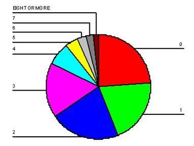
Learning Objective: 2-4: Construct and interpret a pie chart, bar graph, histogram, the statistical map, line graph, and time-series chart.
Cognitive Domain: Application
Answer Location: The Pie Chart
Difficulty Level: Easy
18. Considering the information provided in the table below, do a greater percentage of Whites or Blacks have five or more children?
Ans: Blacks
Learning Objective: 2-2: Calculate proportions and percentages.
Cognitive Domain: Application
Answer Location: Proportions and Percentages
Difficulty Level: Medium
19. Would a bar chart or a histogram be more appropriate for displaying the data presented in the table below? Why?
Frankfort-Nachmias, Social Statistics for a Diverse Society, 9e SAGE Publishing, 2021
8+ 16 11
Ans: The number of children can be considered an interval–ratio-level variable, therefore a histogram would be more appropriate.
Learning Objective: 2-4: Construct and interpret a pie chart, bar graph, histogram, the statistical map, line graph, and time-series chart.
Cognitive Domain: Analysis
Answer Location: The Histogram
Difficulty Level: Medium
20. Construct either a bar chart or a histogram, depending on which is more appropriate in this case, for displaying the data presented in the table below
SAGE Publishing, 2021
Learning Objective: 2-4: Construct and interpret a pie chart, bar graph, histogram, the statistical map, line graph, and time-series chart.
Cognitive Domain: Application
Answer Location: The Bar Graph
Difficulty Level: Medium
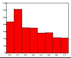
21. What other type of graph could be used to display the information in the chart below?
Ans: Histogram
Learning Objective: 2-4: Construct and interpret a pie chart, bar graph, histogram, the statistical map, line graph, and time-series chart
Cognitive Domain: Analysis
Answer Location: The Histogram
Difficulty Level: Medium
22. Presented below is a chart and a portion of the data for 550 respondents that were used to construct it. What is another type of graph that you can use to display this information? Construct this graph using the data below with the frequencies placed along the vertical axis.
Learning Objective: 2-4: Construct and interpret a pie chart, bar graph, histogram, the statistical map, line graph, and time-series chart.
Cognitive Domain: Analysis
Answer Location: The Bar Graph
Difficulty Level: Medium
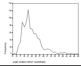
23. Considering the information in the table below, what would happen to the percentage of respondents age 20 if we removed the data for all respondents who were first married at age 21 from the sample?
Ans: The percentage would increase.
Learning Objective: 2-2: Calculate proportions and percentages
Cognitive Domain: Comprehension
Answer Location: Proportions and Percentages
Difficulty Level: Easy
24. Considering the information in the table below, what proportion of respondents were first married at the ages of 24 and 25?
Ans: 0.21
Learning Objective: 2-2: Calculate proportions and percentages
Cognitive Domain: Application
Answer Location: Proportions and Percentages
Difficulty Level: Hard
25. Which graphic device would be most appropriate to display information about the following statement? “The increase of unplanned Cesarean Deliveries in the United states has increased to 34% since 2005.”
Ans: A time-series chart
Learning Objective: 2-4: Construct and interpret a pie chart, bar graph, histogram, the statistical map, line graph, and time-series chart.
Cognitive Domain: Analysis
Answer Location: The Time-Series Chart
Difficulty Level: Medium
26. Which graphic device would be most appropriate to display information about “The sex ratio at birth that is, the ratio of the number of males to the number of females is 1.05 in the United States”?
Ans: A bar graph or pie chart
Learning Objective: 2-4: Construct and interpret a pie chart, bar graph, histogram, the statistical map, line graph, and time-series chart
Cognitive Domain: Analysis
Answer Location: The Bar Graph | The Pie Chart
Difficulty Level: Medium
27. Which graphic device would be most appropriate to display information about “Adults that live in the northeast have greater sense of job satisfaction than those in the southwest”?
Ans: Histogram
Learning Objective: 2-4: Construct and interpret a pie chart, bar graph, histogram, the statistical map, line graph, and time-series chart.
Cognitive Domain: Analysis
Answer Location: The Histogram
Difficulty Level: Medium
28. Explain why the following statement is true: “When constructing a pie chart, the frequencies associated with each category must sum to N. Likewise, if working with proportions or percentages, these must sum to 1.0 or 100% respectively.”
Ans: Students should discuss the calculation of relative frequencies and show why these must sum to 1.0 and 100% respectively.
Learning Objective: 2-2: Calculate proportions and percentages | 2-4: Construct and interpret a pie chart, bar graph, histogram, the statistical map, line graph, and time-series chart.
Cognitive Domain: Comprehension
Answer Location: The Pie Chart | Proportions and Percentages
Difficulty Level: Medium
29. The following graph depicts the number of respondents by racial group, where 1 = White, 2 = Black, and 3 = other. Explain why this choice of graphic is or is not appropriate for these data.
Frankfort-Nachmias, Social Statistics for a Diverse Society, 9e
SAGE Publishing, 2021
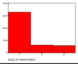
Ans: A histogram is not appropriate for nominal data.
Learning Objective: 2-4: Construct and interpret a pie chart, bar graph, histogram, the statistical map, line graph, and time-series chart
Cognitive Domain: Comprehension
Answer Location: The Histogram
Difficulty Level: Medium