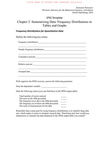
With regard to the SPSS exercise, answer the following questions:
State the dependent variable: ________________________
State the following values (you can find these in the SPSS output table):
Total number of scores entered _____
The score at the 50th percentile _____
The frequency at or above the 80th percentile _____
The frequency at or below the 80th percentile _____
The scale of measurement for the data _____
Remember that a main goal for using frequency distributions is to simplify large data sets, which makes it easier to interpret research data. That being said, how would you characterize or interpret the data displayed in the SPSS output table you created?
Instructor Resource Privitera, Statistics for the Behavioral Sciences, 3rd edition SAGE Publishing, 2018
Frequency Distributions for Categorical Data
Define the following key terms:
Simple frequency distribution _______________________________________ _______________________________________________________________
State the following values (you can find these in the SPSS output table):
Total number of scores entered _____
The number of categories _____
The category in the 50th percentile _____ The scale of measurement for the data
Remember that a main goal for using frequency distributions is to simplify large data sets, which makes it easier to interpret research data. That being said, how would you characterize or interpret the data displayed in the SPSS output table you created?
Instructor Resource
Privitera, Statistics for the Behavioral Sciences, 3rd edition SAGE Publishing, 2018
Remember that a main goal for using graphs is to simplify large data sets, which makes it easier to interpret research data. That being said, how would you characterize or interpret the data displayed in the SPSS output graphs you created?
For your own reference, state which display is easiest for you to read. Please pick only one. There is no right or wrong answer here. It is simply worth recognizing the type of display that makes most sense to you.
Print out each graph (the histogram, bar chart, and pie chart) and submit it with this template.
31. The 91,373 nineteen-year-old men likely represent a sample of all 19-year-old men in a much larger population.
32. Rating scale data are often treated as interval scale data because the data have no true zero and it is assumed that data on these scales are equidistant.
ChApter 2
1. Step 1: Find the real range. Step 2: Find the interval width. Step 3: Construct the frequency distribution.
2. Grouped data are distributed in intervals; ungrouped data are not.
3. A percentile rank.
4. To ensure that a single score cannot be counted in more than one interval.
5. (a) No. (b) Yes.
6. Ungrouped data sets with only a few different scores and qualitative or categorical variables.
7. Rule 1: A vertical rectangle represents each interval, and the height of the rectangle equals the frequency recorded for each interval. Rule 2: The base of each rectangle begins and ends at the upper and lower boundaries of each interval. Rule 3: Each rectangle touches adjacent rectangles at the boundaries of each interval.
8. Midpoint; upper boundary.
9. When the data are discrete. Histograms are only used with continuous data.
10. Discrete/categorical data.
11. (a)
(b) Interval: 8–12.
12. (a)
(b) Yes, the rat did press the center lever the most.
13. The intervals overlap at the upper and lower boundaries, which might lead to some scores being counted in more than one interval.
14. Three errors are (1) the intervals overlap, (2) the class width for each interval is not equal, and (3) the distribution includes an open interval.
15. No, the data should remain ungrouped because the data are categorical.
16. The upper boundaries are 3, 6, 9, 12, 15, and 18.
17. The lower boundaries are 35, 46, 57, and 68.
18. The interval width for each interval is 3.
19. (a)
(b) Two dreams
20. Sixty children qualify for the new cognitive behavioral therapy.
21. (a)
22. (a) 13, 17, 32, 32, 32, 40, 41, 49, 66, and 68. (b) Ten scores.
23. (a) A bar chart or pie chart if distributing the letters grades along the x-axis. A histogram or frequency polygon if distributing the numeric values on a 4.0 grading scale. (b) A bar chart or pie chart distributing the frequencies for each behavioral therapy. (c) A bar chart or pie chart. (d) A histogram or frequency polygon.
24. (a) Histogram. (b) Bar chart. (c) Histogram. (d) Bar chart.
25. A = 8, B = 3, C = 12
26. (a) A = 78, B = 86, C = 68, D = 13. (b) Yes, this was a difficult test because half the class would fail.
31. The interval of 60–79 has the largest portion of students. (20% of students fall in this interval).
32. The percentile point for the 50th percentile is 74.5.
33. (a) Real range = 56. (b) 30%.
34. (a) While more men earned a bachelor’s degree in psychology in 1970–1971, women earn more than three times the number of bachelor’s degrees in psychology as of 2005–2006. (b) Ungrouped data, because years are not distributed consecutively.
35. (a) Women. (b) Women.
(a) (b)
36. (a) A relative percent distribution. (b) Ungrouped, because the data are distributed in categories.
37. (a) A relative percent distribution. (b) About 742 adults worldwide.
38. (a) A pictorial frequency distribution. (b) Yes, these data reflect the distribution of wealth by country, so it is meaningful to “map” the distribution of these data because the data are distributed by country.
ChApter 3
1. (a) N. (b) n. (c) m. (d) M or X .
2. Measures of central tendency are statistical measures used to locate a single score that is most representative or descriptive of all scores in a distribution.
3. The median.
4. A population mean is the mean for a set of scores in an entire population, whereas the sample mean is the mean for a sample, or subset of scores from a population.
5. Five characteristics of the mean are as follows: (1) Changing an existing score will change the mean; (2) adding a new score or completely removing an existing score will change the mean, unless that value equals the mean; (3) adding, subtracting, multiplying, or dividing each score in a distribution by a constant will cause the mean to change by that constant; (4) the sum of the differences of scores from their mean is zero; and (5) the sum of the squared differences of scores from their mean is minimal.
6. The weighted mean equals the arithmetic mean when the sample sizes or “weights” for a set of scores are the same or equal.
7. The mode is used with other measures of central tendency for any modal distribution and for nominal data.
8. Data that are skewed and ordinal data.
9. Data that are normally distributed on an interval or ratio scale of measurement.
10. (a) Median. (b) Mean. (c) Mean.
11. Mean = 4, median = 2, mode = 0.
12. (a) College students: mean = 25, median = 18, mode = 21. Parents: mean = 14, median = 18, mode = 21. (b) Because both distributions are skewed, the median would be the appropriate measure of central tendency. This might be misleading, though, because the median indicates that texting was the same between groups (the median was 18 in both samples), even though differences exist in regard to the mean.
13. The mean because the data are distributed normally.
SPSS in Focus: Frequency Distributions for Quantitative Data
Exercise 2.1 Answer Key
With regard to the SPSS exercise, answer the following questions:
State the dependent variable: Number of absences
State the following values (you can find these in the SPSS output table):
Total number of scores entered 100
The score at the 50th percentile 5
The frequency at or above the 80th percentile 22
The frequency at or below the 80th percentile 80
Explain why the frequencies at or above and at or below the 80th percentile do not sum to 100.
The frequencies at or above and at or below the 80th percentile do not sum to the total number of scores entered (N = 100), because the frequency at the 80th percentile (2) is counted in both percentile ranges.
Remember that a main goal for using frequency distributions is to simplify large data sets, which makes it easier to interpret research data. That being said, how would you characterize or interpret the data displayed in the SPSS output table you created?
The data indicate that half the students at this school were absent from school 5 or fewer times in a given school year, and one-fourth missed 0 or 1 day of school (25 out of 100 students missed only 0 or 1 day of school).
SPSS in Focus: Frequency Distributions for Categorical Data
Exercise 2.2 Answer Key
With regard to the SPSS exercise, answer the following questions:
Answer each of the following questions about coding data in SPSS.
Are categories displayed as numbers or words in data view? Numbers Are categories displayed as numbers or words in the SPSS output table? Words
State the dependent variable: Texting efficiency (Always, Sometimes, Never)
State the following values (you can find these in the SPSS output table): Total number of scores entered
The number of categories
The category in the 50th percentile
Remember that a main goal for using frequency distributions is to simplify large data sets, which makes it easier to interpret research data. That being said, how would you characterize or interpret the data displayed in the SPSS output table you created?
The largest frequency of texting in class was among those who never (N) looked at the keys. So those who efficiently text, were more often observed texting during class.
SPSS in Focus: Histograms, Bar
Charts, and Pie Charts
Exercise 2.3 Answer Key
With regard to the SPSS exercise, answer the following questions:
For the histogram, state the:
Dependent variable
Amount of calories per meal
Scale of measurement of the dependent variable Ratio
For the bar chart and pie chart, state the:
Dependent variable
Frequency in each health category
Scale of measurement of the dependent variable Ratio
Remember that a main goal for using graphs is to simplify large data sets. This goal makes it easier to interpret research data. That being said, how would you characterize or interpret the data displayed in the SPSS output graphs you created?
Most meals (as measured by number of calories) were unhealthy. This is evident both in terms of the number of calories (shown in the histogram) and the frequency of meals in each health category (shown in the bar chart and pie chart).
For your own reference, state which display is easiest for you to read. Please pick only one. There is no right or wrong answer here. It is simply worth recognizing the type of graphical display that makes the most sense to you.
SUGGESTION FOR USING THIS QUESTION IN CLASS: You can record responses of students for this question and distribute it in a frequency distribution for categorical data, and then create a bar chart from it. When you show students the results in class, this often leads to rather interesting conversation and opinions with regards to the “best” way for displaying data. So this little exercise can reinforce previous lectures, as well as gauge student interest. This is something to consider for your classes if you find the time. This exercise typically requires about 10 to 15 minutes of class time; maybe more time when student participation is high.
Instructor Resource
Privitera, Statistics for the Behavioral Sciences, 3rd edition SAGE Publishing, 2018
State whether each of the following research examples is best summarized as grouped or ungrouped data. Explain your answer.
1. The time (in seconds) it takes 100 children to complete a cognitive skills game.
2. The number of single mothers with 1, 2, 3, or 4 children.
3. The number of teenagers who have experimented with smoking (yes, no).
4. The age (in years) of freshman students in a local college.
5. The handedness (right- or left-handed) of gifted children.
6. The number of symptoms of stress (ranging between 0 and 12 symptoms) experienced by 180 war veterans.
7. The number of calories in school lunches in a sample of 32 local middle schools.
8. The number of hours of sleep (per night) in a sample of 60 patients being treated for depression.
9. The marital status (single, married, divorced) in a sample of 96 individuals reporting high levels of life satisfaction.
10. The number of traffic violations ticked during a 3-month period in one of four high-crime communities.
State whether a cumulative frequency, relative frequency, relative percent, cumulative relative frequency, or cumulative percent is most appropriate for describing the following situations. For cumulative distributions, indicate whether these should be summarized from the top down or from the bottom up.
11. The frequency of businesses with at least 20 employees.
12. The frequency of college students with less than a 3.0 GPA.
Instructor Resource Privitera, Statistics for the Behavioral Sciences, 3rd edition SAGE Publishing, 2018
13. The percentage of women completing 1, 2, 3, or 4 tasks simultaneously.
14. The proportion of pregnancies performed in pubic or private hospitals.
15. The percentage of alcoholics with more than 2 years of substance abuse.
16. The proportion of Americans earning $30,000 at most.
17. The frequency of hospital visits (per year) in a sample of diabetics.
18. The proportion of elderly patients consuming at or above 1,400 calories per day.
19. The percentage of athletes training at or below 6 hr per week.
20. The percentage of men in one of six physically demanding occupations.
1. Grouped data. The time it takes to complete a cognitive skills game would be grouped into class intervals; the frequency of children would be distributed in each interval.
2. Ungrouped data. Single mothers with 1, 2, 3, or 4 children would be listed in classes; the frequency of mothers would be distributed in each class.
3. Ungrouped data. Experimenting with smoking (yes, no) would be listed in classes; the frequency of teenagers would be distributed in each class.
4. Grouped data. The age of freshman students in a local college would be grouped into class intervals; the frequency of freshmen would be distributed in each interval.
5. Ungrouped data. Handedness (right- or left-handed) would be listed in classes; the frequency of gifted children would be distributed in each class.
6. Grouped data. The number of symptoms of stress would be grouped into class intervals; the frequency of war veterans would be distributed in each interval.
7. Grouped data. The number of calories in school lunches would be grouped into class intervals; the frequency of schools would be distributed in each interval.
8. Grouped data. The number of hours of sleep (per night) would be grouped into class intervals; the frequency of patients would be distributed in each interval.
9. Ungrouped data. Marital status (single, married, divorced) would be listed in classes; the frequency of individuals would be distributed in each class.
Instructor Resource Privitera, Statistics for the Behavioral Sciences, 3rd edition SAGE Publishing, 2018
10. Ungrouped data. The names of the four high-crime communities would be listed in classes; the number of traffic violations ticked would be distributed in each class.
11. Cumulative frequency (from the top down).
12. Cumulative frequency (from the bottom up).
13. Relative percent.
14. Relative frequency.
15. Cumulative percent (top-down).
16. Cumulative relative frequency (bottom-up).
17. Relative frequency.
18. Cumulative relative frequency (top-down).
19. Cumulative percent (bottom-up).
20. Relative percent.
Instructor Resource Privitera, Statistics for the Behavioral Sciences, 3rd edition SAGE Publishing, 2018
1. Construct a simple frequency distribution for grouped and ungrouped data.
2. Determine whether data should be grouped or ungrouped.
3. Identify when it is appropriate to distribute the cumulative frequency, relative frequency, relative percent, cumulative relative frequency, and cumulative percent.
4. Identify percentile points and percentile ranks in a cumulative percent distribution.
5. Construct and interpret graphs for distributions of continuous data.
6. Construct and interpret graphs for distributions of discrete data.
7. Construct frequency distributions for quantitative and categorical data using SPSS.
8. Construct histograms, bar charts, and pie charts using SPSS.
Learning Objectives 1–2 Suggestions. Sections 2.1, 2.2, and 2.5 are a great reference for these learning objectives. Students often need to see why concepts are needed. It is useful to begin by showing them how summarizing data graphically can make patterns in data clearer. The example in Section 2.1 explains why researchers summarize data graphically and in tables. The construction of a simple frequency distribution is summarized in three steps. You should use these steps in your classes. The example in the chapter intentionally includes an outlier so you can easily illustrate open classes in addition to discussing boundaries, intervals, and classes.
In support of Learning Objective 2, the first 10 questions in the Summarizing Frequency Distributions Exercise give students situations in which they must decide whether data should be grouped or ungrouped.
Learning Objectives 3-4 Suggestions. Sections 2.2 and 2.3 are great references for meeting this learning objective. Learning Objectives 3 and 4 build on the previous learning objective in that
Instructor Resource Privitera, Statistics for the Behavioral Sciences, 3rd edition SAGE Publishing, 2018
students must decide how to summarize frequency data. The example in the book illustrates the different ways that students will see frequency distributions summarized in research articles. This section also explains why and when these different distributions are used (a decisionfocused discussion).
The last ten questions of the Summarizing Frequency Distributions Exercise are included to support these learning objectives. It is a great resource to work through with students or to assign as homework. It will help students see different examples in which they make decisions pertaining to summarizing grouped and ungrouped data. You should also consider including Section 2.6 (Research in Focus) in your classroom discussions. This section gives students a context for how frequency distributions for grouped and ungrouped data are used to summarize demographic information in published articles. This is a simple read that helps them see how frequency distributions can make a lot of information easily and quickly accessible to the reader.
Learning Objective 5 Suggestions. Section 2.9 is a great reference for meeting this learning objective. Each heading works through an example and gives students a step-by-step approach for constructing the graphs. Again, I suggest using the problems and examples in this chapter during class. I have found this sort of participant modeling in class to be helpful to students of all learning styles. Students often have questions as they read. If you work through the examples in their readings, you can essentially help them answer their own questions.
Learning Objective 6 Suggestions. Section 2.10 is a great reference for meeting this learning objective. Again, each heading works through an example and gives students a step-by-step approach for constructing the graphs. It will again be useful to work through the same examples worked through in the book. But again, it is best to cover material in your comfort zone, so this is just a suggestion. As part of this talk, you may want to read and discuss the research described in Section 2.11. This section brings Learning Objectives 5 and 6 together and helps students recognize that “not all graphs are created equally,” so to speak.
Learning Objectives 7–8 Suggestions. These learning objectives are taught in Sections 2.4, 2.7, and 2.12. Refer to the templates for SPSS given for this chapter. These templates are designed to complement any lab assignment you want to give (even one not from the book) for constructing frequency distributions and graphs using SPSS. Also, SPSS exercises are included in the study guide for each SPSS in Focus section. I strongly recommend that you assign an exercise to students or do it together with students in class, if students are required to use the study guide with this book.
Additional suggestion. Please refer to the SPSS template for histograms, bar charts, and pie charts. The last question in that template asks students the following: “For your own reference, state which display [histogram, bar chart, or pie chart] is easiest for you to read. Please pick only one. There is no right or wrong answer here. It is simply worth recognizing the type of display that makes most sense to you.”
In class, you can record the responses to this question, distribute them in a frequency distribution for categorical data, and then create a bar chart for the same data. When you show students the
Instructor Resource Privitera, Statistics for the Behavioral Sciences, 3rd edition SAGE Publishing, 2018
results in class, this often leads to interesting conversations and opinions with regard to the “best” way to display data. So this little exercise can reinforce previous lectures as well as gauge student interest. This is something to consider for your classes if you find the time. This exercise requires about 10 to 15 min of class time (sometimes more if class participation is high).
Summarizing Data Frequency Distributions in Tables and Graphs Chapter 2
Chapter Outline
•Frequency and Frequency Distribution
•Simple Frequency Distribution
•Frequency Distribution for Grouped Data
•Steps to Summarize Grouped Data
•Cumulative Frequency
•Relative Frequency
•Relative Percent
•Cumulative Relative Frequency and Cumulative Percent
•Percentile Points and Ranks
•Frequency Distribution for Ungrouped Data
•Graphing Distributions: Continuous Data
•Graphing Distributions: Discrete and Categorical Data
Distribution
•Frequency—describes the number of times or how often a category, score, or range of scores occurs
•Frequency distribution—a summary displays for a distribution of data
Simple Frequency Distribution
•Simple frequency distribution—summary displays for:
•The frequency of scores falling within defined groups or intervals (grouped data) in a distribution
•Generally more clear
•The frequency of each individual score or category (ungrouped data) in a distribution
Grouped Data
•Grouped data—set of scores distributed into intervals, where the frequency of each score can fall into any one interval
•Interval—discrete range of values within which the frequency of a subset of scores is contained
Data
•Step 1: Find the real range
•The real range is one more than the difference between the largest and smallest value in a list of data
•Step 2: Find the interval width
•The interval width is the range of scores in each interval
•Divide real range by the number of intervals chosen
•Round quotient to the nearest whole number
•Step 3: Construct the frequency distribution
•The same number of intervals as Step 2
•Step 1: Find the real range
•The range is
• 175 − 0 = 175.
•The real range is
•175 + 1 = 176
Data
Data (cont.)
•Step
2: Find the interval width
•Number of intervals is 10
•Choose between 5 and 20 intervals
•Interval width is real range divided by the number of intervals: 176/10 = 17.6
•Round to 18
•Step 3: Construct the frequency distribution
•Rules for a simple frequency distribution:
•Each interval is defined
•Each interval is equidistant
•No interval overlaps
•All values are rounded to the same degree of accuracy measured in original data
•Check:
•Total counts in distribution equals total counts made
Cumulative Frequency
•Distributes the sum of frequencies across a series of intervals
•Add from the bottom up:
•Discuss in terms of “less than, ”“at or below” a certain value, or “at most”
•Add from the top down:
•Discuss in terms of “greater than, ”“at or above” a certain value, or “at least”
•
Cumulative Frequency
“Bottom up”
•Add frequencies beginning from the bottom and working up
•Top frequency equals total number of measures recorded
Relative Frequency
•Distributes the proportion of scores in each interval
•Equals the frequency in an interval divided by the total frequency count
•Often used to summarize large data sets
Example 2.2: The relative frequency of scores in each interval (shaded column).
•Distributes the percent of scores in each interval
•Multiply each relative frequency by 100
•The sum of relative percent equal to 100%
Example 2.3: The relative percent of scores each interval (shaded column).
Cumulative Relative Frequency
•Distributes the sum of relative frequencies across a series of intervals
•Can be summarized from bottom up or top down
•The total sum of relative frequencies is equal to 1.0
Example 2.4: A bottom-up cumulative relative frequency table with calculations shown in column four.
Cumulative Percent
•Distributes the sum of relative percents across a series of intervals
•Presented from bottom up; also called a percentile rank
•Total cumulative percent equal to 100%
Example 2.5: A cumulative percent of scores from bottom up (shaded); also called percentile ranks.
Percentile Points and Ranks
•Identify individual rank by converting a frequency distribution to a cumulative percent distribution
•Percentile point—value of a score on a scale below which a specified percentage of scores in a distribution fall
•Percentile rank—percentage of scores with values that fall below a specified score in a distribution
Percentile Points and Ranks
•Finding Percentiles
•Step 1: Identify the interval
•Step 2: Identify the real range for the interval
•Real limits: 0.5 less than lower limit; 0.5 greater than upper limit
•Real range is 1 point greater than observed range
•Step 3: Find the position of the percentile point within the interval
•Distance of percentile from the top of the interval
•Divide distance from the top by total range width of percentages
•Multiply fraction by width of real range
•Step 4: Identify percentile point
•Subtract position of percentile point from the top of the real interval
Percentile Points and Ranks
•Enter name of measure into Variable View tab
•Enter values into Data View tab
•Select Descriptive Statistics and Frequencies under Analyze option (menu bar)
•In dialog box, select variable to move into “Variable(s):” box
•Select OK, or Paste and click Run
Ungrouped Data
•Ungrouped data—a set of scores or categories distributed individually, where the frequency for each individual score or category is counted
•Ungrouped when the number of different scores is small, and for qualitative or categorical variables
•To distribute, skip to final step for constructing a frequency distribution
•Intervals are not constructed
Examples With Ungrouped Data
A list of the number of naps that children younger than age 3 take per day (left side), and the frequency distribution for these same data (right side).
Privitera, Statistics for the Behavioral Sciences, 3e, SAGE Publishing, 2018.
Continuous Data
•Histograms—summarize the frequency of continuous data that are grouped
•To construct, follow three rules:
•Rule 1: Vertical rectangle represents each interval, and the height of the rectangle equals the frequency recorded for each interval
•Rule 2: Base of each rectangle begins and ends at the upper and lower boundaries of each interval
•Rules 3: Each rectangle touches adjacent rectangles at the boundaries of each interval
The Histogram
Continuous Data (cont.)
•Frequency polygons—summarize the frequency of continuous data at the midpoint of each interval (dot-and-line)
•Midpoint is calculated by adding the upper and lower boundary of an interval and then dividing by 2
•Ogive—summarizes the cumulative percent of continuous data at the upper boundary of each interval (dot-and-line)
Continuous Data (cont.)
•Stem-and-leaf display—graphical display where each individual score from original set of data are listed
•Common digits shared by all scores are listed to left (stem) and remaining digits for each score listed to right (leaf)
•Stem—first digit(s); Leaf—last digit(s)
•Displays actual scores instead of frequencies
The Stem-and-Leaf Display
and Categorical Data
•Bar chart—summarizes the frequency of discrete and categorical data in whole units or categories
•Each category is represented by a rectangle
•Rectangles do not touch along the x-axis
and Categorical Data (cont.)
•Pie chart— summarizes the relative percent of discrete and categorical data into sectors
•Sector—represents the relative percent of a particular category