Solutions for Business Analytics 3rd Us Edition by Camm
Chapter 2
Descriptive Statistics
Solutions:
1. a. Quantitative
b. Categorical
c. Categorical
d. Quantitative
e. Categorical
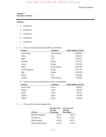
2. a. The top 10 countries according to GDP are listed below.
Country
b. The top 5 countries by GDP located in Africa are listed below.
3. a. The sorted list of carriers appears below.
Blue Box Shipping is providing the best on-time service in the current year. Rapid Response is providing the worst on-time service in the current year.
b. The output from Excel with conditional formatting appears below.
c. The output from Excel containing data bars appears below.
d. The top 4 shippers based on current year on-time percentage (Blue Box Shipping, Cheetah LLC, Smith Logistics, and Granite State Carriers) all have positive increases from the previous year and high on-time percentages. These are good candidates for carriers to use in the future.
4. a. The relative frequency of D is 1.0 – 0.22 – 0.18 – 0.40 = 0.20.
b. If the total sample size is 200 the frequency of D is 0.20*200 = 40. c. and d.
5. a. These data are categorical.
b.
c. The most frequent most-visited-website is google.com (GOOG); second is yahoo.com (YAH).
6. a. Least = 12, Highest = 23
b.
c. The distribution is slightly skewed to the left.
7. a.
b. The cellular phone providers had the highest number of complaints.
c. The percentage frequency distribution shows that the two financial industries (banks and collection agencies) had about the same number of complaints. Also, new car dealers and cable and satellite television companies also had about the same number of complaints.
8. Percent Frequency Distribution:
Histograms:
Where do you live now?
What do you consider the ideal community?
a. Most adults are now living in a city (32%).
b. Most adults consider the ideal community a small town (30%).
c. Changes in percentages by living area: City –8%, Suburb –1%, Small Town +4%, and Rural Area +5%.
Suburb living is steady, but the trend would be that living in the city would decline while living in small towns and rural areas would increase.
a – d.
12. a.
b. The distribution is slightly skewed to the right.
c. The most common score for students is between 1400 and 1600. No student scored above 2200, and only 3 students scored above 1800. Only 4 students scored below 1200.
13. a. Mean = �������������� � =15 or use the Excel function AVERAGE.
To calculate the median, we arrange the data in ascending order: 10 12 16 17 20
Because we have n = 5 values which is an odd number, the median is the middle value which is 16 or use the Excel function MEDIAN.
b. Because the additional data point, 12, is lower than the mean and median computed in part a, we expect the mean and median to decrease. Calculating the new mean and median gives us mean = 14.5 and median = 14.
14. Without Excel, to calculate the 20th percentile, we first arrange the data in ascending order: 15 20 25 25 27 28 30 34
The location of the pth percentile is given by the formula �� = � ���(�+1)
For our date set, ��� = �� ���(8+1)=1.8. Thus, the 20th percentile is 80% of the way between the value in position 1 and the value in position 2. In other words, the 20th percentile is the value in position 1 (15) plus 0.80 time the difference between the value in position 2 (20) and position 1 (15). Therefore, the 20th percentile is 15 + 0.80*(20-15) = 19.
We can repeat the steps above to calculate the 25th, 65th and 75th percentiles. Or using Excel, we can use the function PERCENTILE.EXC to get:
25th percentile = 21.25
65th percentile = 27.85
75th percentile = 29.5
15. Mean = �������������������������������� �� =59.727 or use the Excel function AVERAGE.
To calculate the median arrange the values in ascending order
53 53 53 55 57 57 58 64 68 69 70
Because we have n = 11, an odd number of values, the median is the middle value which is 57 or use the Excel function MEDIAN.
The mode is the most often occurring value which is 53 because 53 appears three times in the data set, or use the Excel function MODE.SNGL because there is only a single mode in this data set.
16. To find the mean annual growth rate, we must use the geometric mean. First we note that
3500=5000
where x1, x2, … are the growth factors for years, 1, 2, etc. through year 9.
Next, we calculate �� = �(��)(��) (��
So the mean annual growth rate is (0.961144 – 1)100% = -0.38856%
17. For the Stivers mutual fund,
18000=10000
Next, we calculate
So the mean annual return for the Stivers mutual fund is (1.07624 – 1)100 = 7.624%.
For the Trippi mutual fund we have: 10600=5000
So the mean annual return for the Trippi mutual fund is (1.09848 – 1)100 = 9.848%.
While the Stivers mutual fund has generated a nice annual return of 7.6%, the annual return of 9.8% earned by the Trippi mutual fund is far superior.
18.
Alternatively, we can use Excel and the function GEOMEAN as shown below:
a. Mean = ∑ �� � ��� � = ����� �� =26.906
b. To calculate the median, we first sort all 48 commute times in ascending order. Because there are an even number of values (48), the median is between the 24th and 25th largest values. The 24th largest value is 25.8 and the 25th largest value is 26.1. (25.8 + 26.1)/2 = 25.95 Or we can use the Excel function MEDIAN.
c. The values 23.4 and 24.8 both appear three times in the data set, so these two values are the modes of the commute times. To find this using Excel, we must use the MODE.MULT function.
d. Standard deviation = 4.6152. In Excel, we can find this value using the function STDEV.S. Variance = 4.61522 = 21.2998. In Excel, we can find this value using the function VAR.S.
e. The third quartile is the 75th percentile of the data. To find the 75th percentile without Excel, we first arrange the data in ascending order. Next we calculate �� = � ���(�+1)=��� = �� ���(48+1) = 36.75.
In other words, this value is 75% of the way between the 36th and 37th positions. However, in our date the values in both the 36th and 37th positions are 28.5. Therefore, the 75th percentile is 28.5. Or using Excel, we can use the function PERCENTILE.EXC.
19. a. The mean waiting time for patients with the wait-tracking system is 17.2 minutes and the median waiting time is 13.5 minutes. The mean waiting time for patients without the wait-tracking system is 29.1 minutes and the median is 23.5 minutes.
b. The standard deviation of waiting time for patients with the wait-tracking system is 9.28 and the variance is 86.18. The standard deviation of waiting time for patients without the wait-tracking system is 16.60 and the variance is 275.66.
e. Wait times for patients with the wait-tracking system are substantially shorter than those for patients without the wait-tracking system. However, some patients with the wait-tracking system still experience long waits.
20. a. The median number of hours worked for science teachers is 54.
b. The median number of hours worked for English teachers is 47.
c.
e. The box plots show that science teachers spend more hours working per week than English teachers. The box plot for science teachers also shows that most science teachers work about the same amount of hours; in other words, there is less variability in the number of hours worked for science teachers.
21. a. Recall that the mean patient wait time without wait-time tracking is 29.1 and the standard deviation of wait times is 16.6. Then the z-score is calculated as, � = �� ��� ��� =0.48.
b. Recall that the mean patient wait time with wait-time tracking is 17.2 and the standard deviation of wait times is 9.28. Then the z-score is calculated as, � =
As indicated by the positive z–scores, both patients had wait times that exceeded the means of their respective samples. Even though the patients had the same wait time, the z–score for the sixth patient
in the sample who visited an office with a wait tracking system is much larger because that patient is part of a sample with a smaller mean and a smaller standard deviation.
c. To calculate the z-score for each patient waiting time, we can use the formula � = �� � � or we can use the Excel function STANDARDIZE. The z–scores for all patients follow. Without Wait-Tracking
No z-score is less than -3.0 or above +3.0; therefore, the z–scores do not indicate the existence of any outliers in either sample.
22. a. According to the empirical rule, approximately 95% of data values will be within two standard deviations of the mean. 4.5 is two standard deviation less than the mean and 9.3 is two standard deviations greater than the mean. Therefore, approximately 95% of individuals sleep between 4.5 and 9.3 hours per night.
b. � = � �� �� =0.9167
c. � = � �� �� = 075
23. a. 615 is one standard deviation above the mean. The empirical rule states that 68% of data values will be within one standard deviation of the mean. Because a bell-shaped distribution is symmetric half of the remaining values will be greater than the (mean + 1 standard deviation) and half will be below (mean – 1 standard deviation). In other words, we expect that 0.5*(1 - 68%) = 16% of the data values will be greater than (mean + 1 standard deviation) = 615.
b. 715 is two standard deviations above the mean. The empirical rule states that 95% of data values will be within two standard deviations of the mean, and we expect that 0.5*(1 - 95%) = 2.5% of data values will be above two standard deviations above the mean.
c. 415 is one standard deviation below the mean. The empirical rule states that 68% of data values will be within one standard deviation of the mean, and we expect that 0.5*(1 - 68%) = 16% of data values will be below one standard deviation below the mean. 515 is the mean, so we expect that 50% of the data values will be below the mean. Therefore, we expect 50% - 16% = 36% of the data values will be between the mean and one standard deviation below the mean (between 414 and 515).
d. � = ��� ��� ��� =1.05
e. � = ��� ��� ��� = 110
24. a.
b. There appears to be a negative linear relationship between the x and y variables.
c. Without Excel, we can use the calculations shown below to calculate the covariance:
Or, using Excel, we can use the COVARIANCE.S function.
The negative covariance confirms that there is a negative linear relationship between the x and y variables in this data set.
d. To calculate the correlation coefficient without Excel, we need the standard deviation for x and y: �� =5.43,�� =11.40. Then the correlation coefficient is calculated as:
0.97
Or we can use the Excel function CORREL.
The correlation coefficient indicates a strong negative linear association between the x and y variables in this data set.
25. a. The scatter chart indicates that there may be a positive linear relationship between profits and market capitalization.
b. Without Excel, we can use the calculations below to find the covariance and correlation coefficient:
Or using Excel, we use the formula = COVARIANCE.S(B2:B32,C2:C32) to calculate the covariance, which is 131804978.638. This indicates that there is a positive relationship between profits and market capitalization.
c. In the Excel file, we use the formula =CORREL(B2:B32,C2:C32) to calculate the correlation coefficient, which is 0.8229. This indicates that there is a strong linear relationship between profits and market capitalization.
26. a. Without Excel, we can use the calculations below to find the correlation coefficient:
6.2
7.5 8.42 0.6852 2.0893 0.4695 4.3650 1.4315
Or we can use the Excel function CORREL.
The correlation coefficient indicates that there is a moderate positive linear relationship between jobless rate and delinquent loans. If the jobless rate were to increase, it is likely that an increase in the percentage of delinquent housing loans would also occur.
27. a. Using the Excel function COUNTBLANK we find that there is one blank response in column C (Texture) and one blank response in column F (Depth of Chocolate Flavor of the Cup). With further investigation we find that the value of texture for respondent 157 is missing, and the value of Depth of the Chocolate Flavor of the Cup for respondent 199 is missing.
b. To help us identify erroneous values, we calculate the Average, Standard Deviation, Minimum and Maximum values for each variable.
We can immediately spot some surprising values in Column C (Texture) and column E (Sweetness). Further examination identifies: the value of Texture for respondent 68 is 6666, which is outside the range for this variable; the value of sweetness for respondent 72 is 997, which is outside the range for this variable; the value of Sweetness for respondent 85 is 0.67, which is outside the range for this variable and is not an integer. Additional examination of the other responses shows that the value of Taste for respondent 90 is 8.4, which is not an integer, and the value of Creaminess of filling for respondent 197 is 120, which is outside the range for this variable.
Jobless Rate (%)
28.
a. Using the Excel function COUNTBLANK we find that one observation is missing in column B and one observation missing in column C. Additional investigation shows that the missing value in column B is for year 2016 for the Phillies and the missing value in column C is for year 2016 for the Marlins. Review of major league baseball attendance data that are available from a reliable source shows that the Phillies’ attendance in 2016 was 1,915,144, which is consistent with the value of the Phillies’ attendance for the observation with the missing value of season. This supports our suspicion that the value of season for this observation is 2016. Review of major league baseball attendance data that are available from a reliable source shows that the Marlins’ 2016 attendance was 1,712,417. (Note that we use the reference ESPN.com, at http://www.espn.com/mlb/attendance as of May 14, 2017, as our reliable data source for comparison.)
b. To help us identify erroneous values, we calculate the average, standard deviation, minimum and maximum values for Season and Attendance (Note that we use the reference ESPN.com, at http://www.espn.com/mlb/attendance as of May 14, 2017, as our reliable data source for comparison.).
# Missing Values: 1 1
Average: 2,0042,651,944.64
StandardDeviation: 1242,333,151.88
Minimum: 214-3,365,256.00
Maximum: 2,01626,426,820.00
We immediately identify that there is an erroneous value for Season as all values should be between 2014 and 2016, but the minimum value is 214. We also identify that the minimum and maximum values for Attendance appear questionable. Review of major league baseball attendance data that are available from a reliable source shows that the Cubs’ attendance in 2014 was 2,652,113, which is consistent with the value of the Cubs’ attendance for the observation with the missing value of season. This supports our suspicion that the value of season for this observation is 2014.
The value for attendance for the Giants in 2016 is -3,365,256, which is unrealistic. Review of major league baseball attendance data that are available from a reliable source shows that the Giants’ 2016 attendance was 3,365,256.
The value for attendance for the Cubs in 2013 is 26,426,820, which is unusually large. Review of major league baseball attendance data that are available from a reliable source shows that the Cubs’ 2013 attendance was 2,642,682.
We can also sort the data in Excel by Team Name to help us identify attendance values that seem outside the norm for that team. Additional analysis of individual attendance values shows the following.
The value for attendance for the Royals in 2011 is 172,445, which is unusually small. Review of major league baseball attendance data that are available from a reliable source shows that the Royals’ 2011 attendance was 1,724,450.
The value for attendance for the Marlins in 2014 is 9,732,283, which is unusually large compared to other season attendance values for the Marlins. Review of major league baseball attendance data that are available from a reliable source shows that the Marlins’ 2014 attendance was 1,732,283.
The value for attendance for the Marlins in 2015 is 752,235, which is unusually small compared to other season attendance values for the Marlins. Review of major league baseball attendance data that are available from a reliable source shows that the Marlins’ 2015 attendance was 1,752,235.
The value for attendance for the Orioles in 2014 is 22,464,473, which is unusually large. Review of major league baseball attendance data that are available from a reliable source shows that the Orioles’ 2014 attendance was 2,464,473.
Chapter 2
Descriptive Statistics
Case Problem: Heavenly Chocolates Website Traffic
1. Descriptive statistics for the time spent on the website, number of pages viewed, and amount spent are shown below.
The mean time a shopper is on the Heavenly Chocolates website is 12.8 minutes, with a minimum time of 4.3 minutes and a maximum time of 32.9 minutes. The following histogram demonstrates that the data are skewed to the right.
The mean number of pages viewed during a visit is 4.8 pages with a minimun of 2 pages and a maximum of 10 pages A histogram of the number of pages viewed indicates that the data are slightly skewed to the right.
Histogram of Time (min)
Histogram of Pages Viewed
The mean amount spent for an on-line shopper is $68.13 with a minimum amount spent of $17.84 and a maximum amount spent of $158.51. The following histogram indicates that the data are skewed to the right.
of Amount
2. Summary by Day of Week
Histogram
The above summary shows that Monday and Friday are the best days in terms of both the total amount spent and the averge amount spent per transaction. Friday had the most purchases (11) and the highest value for total amount spent ($945.43). Monday, with nine transactions, had the highest average amount spent per transaction ($90.38). Sunday was the worst sales day of the week in terms of number of transactions (5), total amount spent ($218.15), and average amount spent per transaction ($43.63). However, the sample size for each day of the week are very small, with only Friday having more than ten transactions. We would suggest a larger sample size be taken before recommending any specific stratgegy based on the day of week statistics.
3. Summary by Type of Browser
Chrome was used by 27 of the 50 shoppers (54%). But, the average amount spent spent by customers who used Chrome ($61.36) is less than the average amount spent by customers who used Firefox ($76.76) or some other type of browser ($74.48). This result would suggest targeting special promotion offers to Firefox users or users of other types of browsers. But, before recommending any specific strategies based upon the type of browser, we would suggest taking a larger smaple size.
4. A scatter diagram showing the relationship between time spent on the website and the amount spent follows:
The sample correlation coefficient between these two variables is .580. The scatter diagram and the sample correlation coefficient indicate a postive relationship between time spent on the website and the total amount spent. Thus, the sample data support the conclusion that customers who spend more time on the website spend more.
5. A scatter diagram showing the relationship between the number of pages viewed and the amount spent follows:
The sample correlation coefficient between these two variables is .724. The scatter diagram and the sample correlation coefficient indicate a postive relationship between time spent on the website and the number of pages viewed. Thus, the sample data support the conclusion that customers who view more website pages spend more.
6. A scatter diagram showing the relationship between the number of pages viewed and the time spent on the website follows:
The sample correlation coefficient between these two variables is .596. The scatter diagram and the sample correlation coefficient indicate a postive relationship between the number of pages viewed and the time spent on the website.
Summary: The analysis indicates that on-line shoppers who spend more time on the company’s website and/or view more website pages spend more money during their visit to the website. If Heavenly Chocolates can develop an attractive website such that on-line shoppers are willing to spend more time on the website and/or view more pages, there is a good possiblity that the company will experience greater sales. And, consideration should also be given to developing marketing strategies based upon possible differences in sales associated with the day of the week as well as differences in sales associated with the type of browser used by the customer.
Descriptive Statistics
Chapter 2
Overview of Using Data: Definitions and Goals
Overview of Using Data: Definitions and Goals (Slide 1 of 5)
• Data:The facts and figures collected, analyzed, and summarized for presentation and interpretation.
• Variable:A characteristic or a quantity of interest that can take on different values.
• Observation:A set of values corresponding to a set of variables.
• Variation:The difference in a variable measured over observations.
• Random variable/uncertain variable: A quantity whose values are not known with certainty.
Overview of Using Data: Definitions and Goals (Slide 2 of 5)
Table 2.1: Data for Dow Jones Industrial Index Companies
Overview of Using Data: Definitions and Goals (Slide
4 of 5) Table 2.1: Data for Dow Jones Industrial Index Companies (cont.)
Overview
of Using Data: Definitions and Goals (Slide 5 of 5) Table 2.1: Data for Dow Jones Industrial Index Companies (cont.)
Types of Data
Population and Sample Data
Quantitative and Categorical Data
Cross-Sectional and Time Series Data
Sources of Data
Types of Data (Slide 1 of 5)
Population and Sample Data:
• Population:All elements of interest.
• Sample: Subset of the population.
• Random sampling: A sampling method to gather a representative sample of the population data.
Quantitative and Categorical Data:
• Quantitative data:Data on which numeric and arithmetic operations, such as addition, subtraction, multiplication, and division, can be performed.
• Categorical data: Data on which arithmetic operations cannot be performed.
Types of Data
(Slide 2 of 5)
Cross-Sectional and Time Series Data:
• Cross-sectional data: Datacollected from several entities at the same, or approximately the same, point in time.
• Time series data:Data collected over several time periods.
• Graphs of time series data are frequently found in business and economic publications.
• Graphs help analysts understand what happened in the past, identify trends over time, and project future levels for the time series.
Types of Data (Slide 3 of 5)
Figure 2.1: Dow Jones Index Values Since 2006
Types of Data
(Slide 4 of 5)
Sources of Data:
• Experimental study:
• A variable of interest is first identified.
• Then one or more other variables are identified and controlled or manipulated so that data can be obtained about how they influence the variable of interest.
• Nonexperimental study or observational study:
• Makes no attempt to control the variables of interest.
• A survey is perhaps the most common type of observational study.
Types
of Data (Slide 5 of 5)
Figure 2.2: Customer Opinion Questionnaire Used by Chops City Grill
Restaurant
Modifying Data in Excel
Sorting and Filtering Data in Excel
Conditional Formatting of Data in Excel
Modifying
Data
in
Excel
(Slide 1 of 14)
Table 2.2: 20 Top-Selling Automobiles in United States in March 2011
Modifying Data in Excel (Slide
2 of 14)
Table 2.2: 20 Top-Selling Automobiles in United States in March 2011 (cont.)
Modifying Data in Excel (Slide
3 of 14)
Table 2.2: 20 Top-Selling Automobiles in United States in March 2011 (cont.)
Modifying Data in Excel (Slide 4 of 14)
Figure 2.3: Data for 20 Top-Selling Automobiles Entered into Excel with Percent Change in Sales from 2010
Modifying Data in Excel (Slide 5 of 14)
Sorting and Filtering Data in Excel:
• To sort the automobiles by March 2010 sales:
• Step 1: Select cells A1:F21.
• Step 2: Click the Data tab in the Ribbon.
• Step 3: Click Sort in the Sort & Filter group.
• Step 4: Select the check box for My data has headers.
• Step 5: In the first Sort by dropdown menu, select Sales (March 2010).
• Step 6: In the Order dropdown menu, select Largest to Smallest.
• Step 7: Click OK.
Modifying
Data in Excel (Slide 6 of 14)
Figure 2.4: Using Excel’s Sort Function to Sort the Top-Selling Automobiles Data
Modifying Data in Excel (Slide 7 of 14)
Figure 2.5: Top-Selling Automobiles Data Sorted by Sales in March 2010 Sales
Modifying Data in Excel (Slide 8 of 14)
Sorting and Filtering Data in Excel (cont.):
• Using Excel’s Filter function to see the sales of models made by Toyota:
• Step 1: Select cells A1:F21.
• Step 2: Click the Data tab in the Ribbon.
• Step 3: Click Filter in the Sort & Filter group.
• Step 4: Click on the Filter Arrow in column B, next to Manufacturer.
• Step 5: If all choices are checked, you can easily deselect all choices by unchecking (Select All). Then select only the check box for Toyota.
• Step 6. Click OK.
Modifying Data in Excel (Slide 9 of 14)
Figure 2.6: Top Selling Automobiles Data Filtered to Show Only Automobiles Manufactured by Toyota
Modifying Data in Excel (Slide 10 of 14)
Conditional Formatting of Data in Excel:
• Makes it easy to identify data that satisfy certain conditions in a data set.
• To identify the automobile models in Table 2.2 for which sales had decreased from March 2010 to March 2011:
• Step 1: Starting with the original data shown in Figure 2.3, select cells F1:F21.
• Step 2: Click on the Home tab in the Ribbon.
• Step 3: Click Conditional Formatting in the Styles group.
• Step 4: Select Highlight Cells Rules, and click Less Than from the dropdown menu.
• Step 5: Enter 0% in the Format cells that are LESS THAN: box.
• Step 6: Click OK.
Modifying Data in Excel (Slide 11 of 14)
Figure 2.7: Using Conditional Formatting in Excel to Highlight Automobiles with Declining Sales from March 2010
Modifying Data in Excel (Slide 12 of 14)
Figure 2.8: Using Conditional Formatting in Excel to Generate Data Bars for the Top-Selling Automobiles Data
Modifying Data in Excel (Slide 13 of 14)
Conditional Formatting of Data in Excel (cont.):
• Quick Analysis button appears just outside the bottom-right corner of a group of selected cells.
• It provides shortcuts for Conditional Formatting, adding Data Bars, and other operations.
Relative Frequency and Percent Frequency Distributions
Frequency Distributions for Quantitative Data
Histograms
Cumulative Distributions
Creating Distributions from Data (Slide 1 of 18)
Frequency Distributions for Categorical Data:
• Frequency distribution:A summary of data that shows the number (frequency) of observations in each of several nonoverlapping classes.
• Typically referred to as bins, when dealing with distributions.
Creating
Distributions from Data (Slide 2 of 18)
Table 2.3: Data from a Sample of 50 Soft Drink Purchases
Coca-Cola
Creating
Distributions from Data (Slide 3 of 18)
Table 2.4: Frequency Distribution of Soft Drink Purchases
• The frequency distribution summarizes information about the popularity of the five soft drinks:
• Coca-Cola is the leader.
• Pepsi is second.
• Diet Coke is third.
• Sprite and Dr. Pepper are tied for fourth.
Creating Distributions from Data (Slide 4 of 18)
Figure 2.10: Creating a Frequency Distribution for Soft Drinks Data in Excel
Creating Distributions from Data (Slide 5 of 18)
Relative Frequency and Percent Frequency Distributions:
• Relative frequency distribution:A tabular summary of data showing the relative frequency for each bin.
• Percent frequency distribution:Summarizes the percent frequency of the data for each bin.
• Percent frequency distribution is used to provide estimates of the relative likelihoods of different values of a random variable.
Creating
Distributions from Data (Slide 6 of 18)
Table 2.5: Relative Frequency and Percent Frequency Distributions of
Soft Drink Purchases
Creating Distributions from Data (Slide 7 of 18)
Frequency Distributions for Quantitative Data:
• Three steps necessary to define the classes for a frequency distribution with quantitative data:
1.Determine the number of nonoverlapping bins.
2.Determine the width of each bin.
3.Determine the bin limits.
Creating
Distributions from Data (Slide 9 of 18)
Table 2.7: Frequency, Relative Frequency, and Percent Frequency
Distributions for the Audit Time Data
Creating Distributions from Data (Slide 10 of 18)
Figure 2.11: Using Excel to Generate a Frequency Distribution for Audit Times Data
Creating Distributions from Data (Slide
11 of 18)
Histograms:
• Histogram: A common graphical presentation of quantitative data.
• Constructed by placing the variable of interest on the horizontal axis and the selected frequency measure (absolute frequency, relative frequency, or percent frequency) on the vertical axis.
• The frequency measure of each class is shown by drawing a rectangle whose base is the class limits on the horizontal axis and whose height is the corresponding frequency measure.
Creating Distributions from Data (Slide 12 of 18)
Figure 2.12: Histogram for the Audit Time Data
Creating Distributions from Data (Slide 13 of 18)
Figure 2.13: Creating a Histogram for the Audit Time Data Using Data Analysis
Creating Distributions from Data (Slide 14 of 18)
Figure 2.14: Completed Histogram for the Audit Time Data Using Data
Creating Distributions from Data (Slide
15 of 18)
Histograms (cont.):
• Histogramsprovide information about the shape, or form, of a distribution.
• Skewness: Lack of symmetry.
• Skewness is an important characteristic of the shape of a distribution.
Creating Distributions from Data (Slide 16 of 18)
Figure 2.15: Histograms Showing Distributions with Different Levels of Skewness
Creating Distributions from Data (Slide 17 of 18)
Cumulative Distributions
• Cumulative frequency distribution: A variation of the frequency distribution that provides another tabular summary of quantitative data.
• Uses the number of classes, class widths, and class limits developed for the frequency distribution.
• Shows the number of data items with values less than or equal to the upper class limit of each class.
Creating
Distributions from Data (Slide 18 of 18)
Table 2.8: Cumulative Frequency, Cumulative Relative Frequency, and Cumulative Percent Frequency Distributions for the Audit Time Data
Measures of Location
Mean (Arithmetic Mean)
Median Mode
Geometric Mean
Measures of Location (Slide 1 of 13)
Mean/ArithmeticMean:
• Averagevalueforavariable.
• Themeanisdenotedby .x
• n=samplesize.
• 1x = value of variable x for the first observation.
• 2x = value of variable x for the second observation.
• ix = value of variable x for the ithobservation.
Measures of Location (Slide 2 of 13)
Table 2.9: Data on Home Sales in a Cincinnati, Ohio, Suburb
Measures of Location (Slide 3 of 13)
Computation of Sample Mean:
• Illustration: Computation of the mean home selling price for the sample of 12 home sales.
138,000254,000456,250 12 2,639,250 219,937.50
Measures of Location (Slide 4 of 13)
Median:
• Median: Value in the middle when the data are arranged in ascending order.
• Middle value, for an odd number of observations.
• Average of two middle values, for an even number of observations.
Measures of Location (Slide 5 of 13)
Computation of Sample Median:
• Illustration: When the number of observations are odd,
• Consider the class size data for a sample of five college classes: 46 54 42 46 32
• Arrange the class size data in ascending order: 32 42 46 46 54
• Middlemost value in the data set = 46.
• Median is 46.
Measures of Location (Slide 6 of 13)
Computation of Sample Median:
Illustration: When the number of observations are even:
• Consider the data on home sales in Cincinnati, Ohio, Suburb (Table 2.9).
• Arrange the data in ascending order:
• Median = average of two
Measures of Location (Slide 7 of 13)
Mode:
• Mode: Value that occurs most frequently in a data set.
• Consider the class size data: 32 42 46 46 54
• Observe: 46 is the only value that occurs more than once.
• Mode is 46.
• Multimodal data: Data contain at least two modes.
• Bimodal data: Data contain exactly two modes.
Measures of Location (Slide 8 of 13)
Figure 2.16: Calculating the Mean, Median, and Modes for the Home Sales Data using Excel
Measures of Location (Slide 9 of 13)
Geometric Mean:
• Geometric mean: A measure of location that is calculated by finding the nth root of the product of n values
• Used in analyzing growth rates in financial data.
• Sample geometric mean:
Measures of Location (Slide 10 of 13)
Table 2.10: Percentage Annual Returns and Growth Factors for the Mutual Fund Data:
• Illustration: Consider the percentage annual returns and growth factors for the mutual fund data over the past 10 years.
• We will determine the mean rate of growth for the fund over the 10-year period.
• Geometric mean of the growth factors: 10 1.3351.029.
• Conclude that annual returns grew at an average annual rate of
1.0291100% or 2.9%.
Measures of Location (Slide 13 of 13)
Figure 2.17: Calculating the Geometric Mean for the Mutual Fund Data Using Excel
Measures of Variability
Range
Variance
Standard Deviation
Coefficient of Variation
Measures of Variability (Slide 1 of 10)
Table 2.11: Annual Payouts for Two Different Investment Funds
Measures of Variability (Slide 2 of 10)
Table 2.11: Annual Payouts for Two Different Investment Funds (cont.)
Measures of Variability (Slide 3 of 10)
Figure 2.18: Histograms for Payouts of Past 20 Years from Fund A and Fund B
Measures of Variability (Slide 4 of 10)
Computation of Range:
Range:
• The range can be found by subtracting the smallest value from the largest value in a data set.
• Illustration: Consider the data on home sales in a Cincinnati, Ohio, suburb.
• Largest home sales price: $456,250.
• Smallest home sales price: $108,000.
Range = Largest valuemallest value
• Drawback: Range is based on only two of the observations and thus is highly influenced by extreme values.
Measures of Variability (Slide 5 of 10)
Variance:
• Variance is a measure of variability that utilizes all the data.
• It is based on the deviation about the mean, which is the difference between the value of each observation (xi) and the mean.
• The deviations about the mean are squared while computing the variance.
•
Measures of Variability (Slide 6 of 10)
Table 2.12: Computation of Deviations and Squared Deviations About the Mean for the Class Size Data
• Computation
Measures of Variability (Slide 7 of 10)
Standard Deviation:
• Standard deviation is the positive square root of the variance.
• Measured in the same units as the original data.
• For population, 2 .
Measures of Variability (Slide 8 of 10)
Figure 2.19: Calculating Variability Measures for the Home Sales Data in Excel
Measures of Variability (Slide 9 of 10)
Coefficient of Variation:
• The coefficient of variation is a descriptive statistic that indicates how large the standard deviation is relative to the mean.
• Expressed as a percentage.
Measures of Variability (Slide 10 of 10)
Computation of Coefficient of Variation:
Illustration:
Analyzing Distributions
Percentiles
Quartiles z-Scores
Empirical Rule Identifying Outliers Box Plots
Analyzing Distributions (Slide 1 of 15)
Percentiles:
• A percentile is the value of a variable at which a specified (approximate) percentage of observations are below that value.
• The pth percentile tells us the point in the data where:
• Approximately p percent of the observations have values less than the pth percentile.
• Approximately 100 p percent of the observations have values greater than the pthpercentile.
Analyzing Distributions (Slide 2 of 15)
Illustration:
• To determine the 85th percentile for the home sales data in Table 2.9:
1.Arrange the data in ascending order:
2.Compute
3.The interpretation
is that the 85th percentile is 5% of the way between the value in position 11 and value in position 12.
Analyzing Distributions (Slide 3 of 15)
Illustration (cont.):
• To determine the 85th percentile for the home sales data in Table 2.9.
• The value in the 11th position is 298,000.
• The value in the 12th position is 456,250.
• $305,912.50 represents the 85th percentile of the home sales data:
Analyzing Distributions (Slide 4 of 15)
Quartiles:
• Quartiles: When the data is divided into four equal parts:
• Each part contains approximately 25% of the observations.
• Division points are referred to as quartiles.
first quartile, or 25th percentile.
second quartile, or 50th percentile (also the median).
third quartile or 75th percentile.
• The difference between the third and first quartiles is often referred to as the interquartile range, or IQR.
Analyzing Distributions (Slide 5 of 15)
z-Scores:
• The z-score measures the relative location of a value in the data set.
• Helps to determine how far a particular value is from the mean relative to the data set’s standard deviation.
• Often called the standardized value.
Analyzing Distributions (Slide 6 of 15)
z-Scores (cont.):
• If 12 , , , isasampleof observations: n xxxn K
Analyzing Distributions (Slide 7 of 15)
Table 2.13: z-Scores for the Class Size Data
• For class size data, 44and 8. xs
• For observations with a value mean, -score0.z
• For observations with a value mean, -score0.z
Analyzing Distributions (Slide 8 of 15)
Figure 2.20: Calculating z-Scores for the Home Sales Data in Excel
Analyzing Distributions (Slide 9 of 15)
Empirical Rule:
• When the distribution of data exhibits a symmetric bell-shaped distribution (as shown in Figure 2.21), the empirical rule can be used to determine the percentage of data values that are within a specified number of standard deviations of the mean.
• For data having a bell-shaped distribution:
• Approximately 68% of the data values will be within 1 standard deviation.
• Approximately 95% of the data values will be within 2 standard deviations.
• Almost all the data values will be within 3 standard deviations.
Analyzing Distributions (Slide 10 of 15)
Figure 2.21: A Symmetric Bell-Shaped Distribution
Analyzing Distributions (Slide 11 of 15)
Identifying Outliers:
• Outliers: Extreme values in a data set.
• They can be identified using standardized values (z-scores).
• Any data value with a z-score less than –3 or greater than +3 is an outlier.
• Such data values can then be reviewed to determine their accuracy and whether they belong in the data set.
Analyzing Distributions (Slide 12 of 15)
Box Plots:
• A box plot is a graphical summary of the distribution of data.
• Developed from the quartiles for a data set.
Figure 2.22: Box Plot for the Home Sales Data
Analyzing Distributions (Slide 13 of 15)
Figure
2.23:
Box Plots Comparing Home Sale Prices in Different Communities
Analyzing Distributions (Slide 14 of 15)
Figure 2.24: Box Plot Created in Excel for Home Sales Data
Analyzing Distributions (Slide 15 of 15)
Figure 2.25: Box Plots for Multiple Variables Created in Excel
Measures of Association Between Two Variables
Scatter Charts
Covariance
Correlation Coefficient
2.14: Data for
Measures of Association Between Two Variables (Slide 2 of 11)
Scatter Charts:
• A scatter chart is a useful graph for analyzing the relationship between two variables.
• The scatter chart in Figure 2.26 is an example of a positive relationship, because when one variable (high temperature) increases, the other variable (sales of bottled water) generally also increases.
• The scatter chart also suggests that a straight line could be used as an approximation for the relationship between high temperature and sales of bottled water.
Measures of Association Between Two Variables (Slide 3 of 11)
Figure 2.26: Chart Showing the Positive Linear Relation Between Sales and High Temperatures
Measures of Association Between Two Variables (Slide 4 of 11)
Covariance:
• Covariance is a descriptive measure of the linear association between two variables:
• Population covariance
Measures of Association Between Two Variables (Slide 5 of 11)
Table 2.15: Sample
Covariance Calculations for Daily High Temperature and Bottled Water Sales at Queensland
Amusement Park
Measures of Association Between Two Variables (Slide 6 of 11)
Figure 2.27: Calculating Covariance and Correlation Coefficient for Bottled Water Sales Using Excel
Measures of Association Between Two Variables (Slide 7 of 11)
Figure 2.28: Scatter Diagrams and Associated Covariance Values for Different
Variable Relationships
(a)
s Positive:
xy
(x and y are positively linearly related)
s Approximately 0: (x and y are not linearly related) (c)
xy
xy
s Negative: (x and y are negatively linearly related)
Measures of Association Between Two Variables (Slide 8 of 11)
Correlation Coefficient:
• The correlation coefficient measures the relationship between two variables.
• Not affected by the units of measurement for x and y.
Measures of Association Between Two Variables (Slide 9 of 11)
Interpretation
of Correlation Coefficient:
r value
Relationship between the x and y variables < 0 Negative linear Near 0 No linear relationship > 0 Positive linear
Measures of Association Between Two Variables (Slide 10 of 11)
Computation of Correlation Coefficient:
Illustration:
• To determine the sample correlation coefficient for bottled water sales at Queensland Amusement Park:
• There is a very strong linear relationship
Measures of Association Between Two Variables (Slide 11 of 11)
Figure 2.29: Example of Nonlinear Relationship Producing a Correlation
Coefficient Near Zero
Data Cleansing
Missing Data
Blakely Tires Identification of Erroneous Outliers and other Erroneous Values
Variable Representation
Data Cleansing (Slide 1 of 11)
Missing Data:
• Data sets commonly include observations with missing values for one or more variables.
• In some cases missing data naturally occur; these are called legitimately missing data.
• Generally, no remedial action is taken for legitimately missing data.
• In other cases missing data occur for different reasons; these are called illegitimately missing data.
• The primary options for addressing such missing data are:
1.To discard observations (rows) with any missing values.
2.To discard any variable (column) with missing values.
3.To fill in missing entries with estimated values.
4.To apply a data-mining algorithm that can handle missing values.
Data Cleansing (Slide 2 of 11)
Missing Data
(cont.):
• Missing completely at random (MCAR): The tendency for an observation to be missing the value for some variable is entirely random; whether data are missing does not depend on either the value of the missing data or the value of any other variable in the data.
• Missing at random (MAR): The tendency for an observation to be missing a value for some variable is related to the value of some other variable(s) in the data.
• Missing not at random (MNAR): The tendency for the value of a variable to be missing is related to the value that is missing.
• Imputation: The systematic replacement of missing values with values that seem reasonable.
Data Cleansing (Slide 3 of 11)
Blakely Tires:
• A U.S. producer of automobile tires wants to learn about the conditions of its tires on automobiles in Texas.
• The data obtained includes the position of the tire on the automobile, age of the tire, mileage on the tire, and depth of the remaining tread on the tire.
• Begin assessing the quality of these data by determining which (if any) observations have missing values (see Figure 2.30).
Data Cleansing (Slide 4 of 11)
Figure 2.30: Portion of Excel Spreadsheet Showing Number of Missing Values for Variables in TreadWear Data
Data Cleansing (Slide 5 of 11)
Blakely Tires (cont.):
• Sort all of Blakely’s data on Miles from smallest to largest value to determine which observation is missing its value of this variable.
Figure 2.31: Portion of Excel Spreadsheet Showing TreadWear Data
Sorted on Miles from Lowest to Highest Value
Data Cleansing (Slide 6 of 11)
Figure 2.32: Portion of Excel Spreadsheet Showing TreadWear Data
Sorted from Lowest to Highest by ID Number
Data Cleansing (Slide 7 of 11)
Identification of Erroneous Outliers and other Erroneous Values:
• Examining the variables in the data set by use of summary statistics, frequency distributions, bar charts and histograms, z-scores, scatter plots, correlation coefficients, and other tools can uncover data-quality issues and outliers.
• Many software ignore missing values when calculating various summary statistics.
• If missing values in a data set are indicated with a unique value (such as 9999999), these values may be used by software when calculating various summary statistics.
• Both cases can result in misleading values for summary statistics.
• Many analysts prefer to deal with missing data issues prior to using summary statistics to attempt to identify erroneous outliers and other erroneous values in the data.
Data Cleansing (Slide 8 of 11)
Figure 2.33: Portion of Excel Spreadsheet Showing the Mean and Standard Deviation for Each Variable in the TreadWear Data
Data Cleansing (Slide 9 of 11)
Figure 2.34: Portion of Excel Spreadsheet Showing the TreadWear Data
Sorted on Life of Tires (Months) from Lowest to Highest Value
Data Cleansing (Slide 10 of 11)
Figure 2.35: Scatter Diagram of Tread Depth and Miles for the TreadWear Data
Data Cleansing (Slide 11 of 11)
Variable Representation:
• In many data-mining applications, it may be prohibitive to analyze the data because of the number of variables recorded.
• Dimension reduction is the process of removing variables from the analysis without losing crucial information.
• A critical part of data mining is determining how to represent the measurements of the variables and which variables to consider.
• Often data sets contain variables that, considered separately, are not particularly insightful but that, when appropriately combined, result in a new variable that reveals an important relationship.