1. Fill in the blank. When creating a scatterplot, one should use the _______________ axis for the explanatory variable if a regression line is to be fit to the data.
2. Fill in the blank. A study is conducted to determine if one can predict the yield of a crop based on the amount of yearly rainfall. The variable _______________ is the response variable in this study.
3. Fill in the blank. A researcher is interested in determining if one could predict the score on a statistics exam from the amount of time spent studying for the exam. The variable _______________ is the explanatory variable in this study.
4. Fill in the blank. The Environmental Protection Agency records data on the fuel economy of many different makes of cars. They are interested in determining if one could predict the mileage of the car (in miles per gallon) from the weight of the car (in lbs.). The variable _______________ is the response variable in this study.
5. Fill in the blank. The owner of a winery collects data on competing wineries every year. He would like to predict the gross sales (in number of cases) from the size of the wineries (in acres). The variable _______________ is the explanatory variable in this study.
6. Fill in the blank. A scatterplot is a graphical tool for displaying the relationship between two __________ variables measured on the same individuals.
7. A researcher measured the height (in feet) and volume of usable lumber (in cubic feet) of 32 cherry trees. The goal is to determine if the volume of usable lumber can be estimated from the height of a tree. The results are plotted below:

Fill in the blank. The variable _______________ is the response variable in this study.
8. A researcher measured the height (in feet) and volume of usable lumber (in cubic feet) of 32 cherry trees. The goal is to determine if the volume of usable lumber can be estimated from the height of a tree. The results are plotted below:
Select all descriptions that apply to the scatterplot.
A) There is a positive association between height and volume.
B) There is a negative association between height and volume.
C) There is an outlier in the plot.
D) The plot is skewed to the left.
E) Both A and C
9. The graph below is a plot of the fuel efficiency (in miles per gallon, or mpg) of various cars versus the weight of these cars (in thousands of pounds).

The points denoted by the plotting symbol × correspond to pick-up trucks and SUVs. The points denoted by the plotting symbol correspond to automobiles (sedans and station wagons). What can we conclude from this plot?
A) There is little difference between trucks and automobiles.
B) Trucks tend to be higher in weight than automobiles.
C) Trucks tend to get poorer gas mileage than automobiles.
D) The plot is invalid. A scatterplot is used to represent quantitative variables, and the vehicle type is a qualitative variable.
E) Both B and C
10. Volunteers for a research study were divided into three groups. Group 1 listened to Western religious music, Group 2 listened to Western rock music, and Group 3 listened to Chinese religious music. The blood pressure of each volunteer was measured before and after listening to the music, and the change in blood pressure (blood pressure before listening minus blood pressure after listening) was recorded.
What could we do to explore the relationship between type of music and change in blood pressure?
A) See if blood pressure decreases as type of music increases by examining a scatterplot.
B) Make a histogram of the change in blood pressure for all of the volunteers.
C) Make side-by-side boxplots of the change in blood pressure, with a separate boxplot for each group.
D) All of the above
11. Volunteers for a research study were divided into three groups. Group 1 listened to Western religious music, Group 2 listened to Western rock music, and Group 3 listened to Chinese religious music. The blood pressure of each volunteer was measured before and after listening to the music, and the change in blood pressure (blood pressure before listening minus blood pressure after listening) was recorded.
A scatterplot of change in blood pressure (mmHg) versus the type of music listened to is given below:

What do we know about the correlation between change in blood pressure and type of music?
A) It is negative.
B) It is positive.
C) It is first negative then positive.
D) None of the above
12. To examine the relationship between two variables, the variables must be measured from the same _______.
A) cases
B) labels
C) units
D) values
13. Variables measured on the same cases are _______ if knowing the values of one of the variables gives you information about the values of another variable that was not known beforehand.
A) transformed B) categorical C) associated D) quantitative
14. A variable that explains or causes change to another variable is called a(n) _______ variable.
A) independent B) dependent C) response
15. Two variables are ______ if knowing the values of one of the variables gives one information about the other variable.
A) associated B) lurking C) confounded
16. We are interested in determining if students who graduate from larger universities receive greater starting salaries than students who graduate from smaller universities. We collected data from 50 small universities and 50 large universities to examine this relationship. This is an example of ________
A) exploratory data analysis.
B) benchmarking. C) data mining.
17. True or False. A categorical variable can be added to a scatterplot.
A) True B) False
18. The scatterplot below displays data collected from 20 adults on their age and overall GPA at graduation.

True or False. The scatterplot shows a strong relationship. A) True B) False
19. The scatterplot below displays data collected from 20 adults on their age and overall GPA at graduation.
True or False. If you switched the variables on the x and y axis, the relationship between the two variables would appear much stronger.
A) True
B) False
20. The scatterplot below displays data collected from 20 adults on their age and overall GPA at graduation.
True or False. There appear to be outliers in the data set.
A) True
B) False
21. Which type of transformation may help change a curved relationship into a more linear relationship?
A) Log
B) Arcsin
C) Reciprocal
D) Cubed-root
22. Transformations are used to ______.
A) make curved relationships more linear
B) make data more normal
C) change the scale of measurements
D) All of the above
23. True or False. To use a log transformation, all values must be positive.
A) True
B) False
24. The “direction” in scatterplots refers to the _________ direction.
A) horizontal and vertical
B) positive and negative
C) left and right
D) None of the above
25. Scatterplot “smoothing” is used to determine the ______ of the data.
A) direction
B) form
C) variation
D) None of the above
26. Scatterplots can be used to determine ______ relationships between variables.
A) linear
B) quadratic
C) cubic
D) All of the above
E) None of the above
27. When trying to explain the relationship between two quantitative variables, it would be best to use a _______.
A) density curve
B) scatterplot
C) boxplot
D) histogram
28. True or False. Scatterplots can be used to explain the relationship between one categorical variable and one quantitative variable.
A) True
B) False
29. Which of the following statements about a scatterplot is/are TRUE?
A) It is always necessary to identify one of the two variables as the explanatory variable and the other as the response variable.
B) On a scatterplot we look for overall patterns showing the form, direction, and the shape of the relationship.
C) Because a scatterplot requires the values of two quantitative variables, it is never possible to add one or more categorical variables to the graph.
D) Both A and B are true statements.
E) None of the above statements are true.
30. Which of the following statements is/are FALSE?
A) A scatterplot is a useful graphical tool for displaying the strength of the relationship between two quantitative variables.
B) The only relationship that a scatterplot can usefully display is linear with no outliers.
C) If above-average values of two quantitative variables and below-average values of the same two quantitative variables tend to occur together, the two variables are positively associated.
D) An individual value that deviates from the overall pattern displayed on a scatterplot is called an outlier.
E) A categorical variable can be added to a scatterplot by using a different color or symbol for each category.
31. Fill in the blank. Explanatory variables are also called ___________ variables.
32. Fill in the blank. Response variables are also called ____________ variables.
33. True or False. Time plots are special scatterplots where the explanatory variable, x, is a measure of time.
A) True
B) False
34. You can describe the overall pattern of a scatterplot by the _____.
A) form, direction, and strength
B) Normal distribution
C) number of points in the plot
D) None of the above
35. When examining a scatterplot for form, you are looking to see if _____.
A) the points in the scatterplot show a straight line pattern
B) the points in the scatterplot show a curved relationship
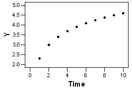
C) there are clusters in the scatterplot
D) None of the above
E) A, B, C
36. When examining a scatterplot for direction, you are looking to see if __________.
A) high values of the two variables in the scatterplot tend to occur together
B) high values of one variable tend to occur with low values of the other variable
C) there is a positive association
D) there is a negative association
E) All of the above
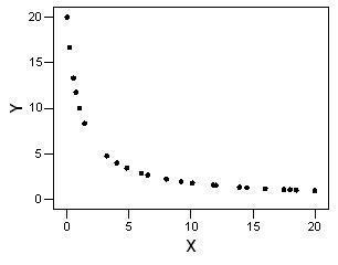
F) A and C only
G) B and D only
37. When examining a scatterplot for strength, you are looking to see _______.
A) how close the points in the scatterplot follow a line
B) how close the points in the scatterplot follow a curve
C) All of the above
D) None of the above
38. When looking for relationships between two quantitative variables, you are looking for ___________.
A) linear relationships
B) nonlinear relationships
C) All of the above
D) None of the above
39. An outlier is ______.
A) a point in a scatterplot that follows the same pattern as the other points
B) a point in a scatterplot that does not follow the same pattern as the other points
C) All of the above
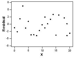
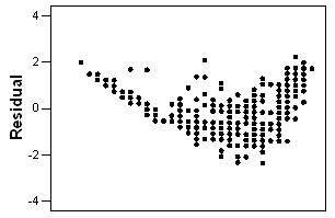
D) None of the above
40. Two variables are positively associated when _______.
A) above-average values of one tend to accompany above-average values of the other and vice versa
B) above-average values of one tend to accompany below-average values of the other, and vice versa
C) both variables have an outlier
D) None of the above
41. If you have two quantitative variables, one way to study them is to use a ______.
A) scatterplot
B) two-way table
C) None of the above
42. When the explanatory variable is categorical and the response variable is quantitative, what type of plot would be appropriate?
A) Boxplot
B) Time plot
C) Scatterplot
43. Malaria is a leading cause of infectious disease and death worldwide. It is also a popular example of a vector-borne disease that could be greatly affected by the influence of climate change. The scatterplot shows total precipitation (in mm) in select cities in West Africa on the x axis and the percent of people who tested positive for malaria in the select cities on the y axis in 2000.
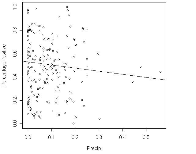
True or False. There is a strong linear relationship between percentage of people who tested positive for malaria and precipitation.
A) True
B) False
44. Malaria is a leading cause of infectious disease and death worldwide. It is also a popular example of a vector-borne disease that could be greatly affected by the influence of climate change. The scatterplot shows total precipitation (in mm) in select cities in West Africa on the x axis and the percent of people who tested positive for malaria in the select cities on the y axis in 2000.
True or False. There are influential points in the scatterplot. A) True B) False
45. Malaria is a leading cause of infectious disease and death worldwide. It is also a popular example of a vector-borne disease that could be greatly affected by the influence of climate change. The scatterplot shows total precipitation (in mm) in select cities in West Africa on the x axis and the percent of people who tested positive for malaria in the select cities on the y axis in 2000.
Precipitation is the __________ variable.
A) independent
B) dependent
C) response
D) explanatory
E) A and B
F) A and D
46. Malaria is a leading cause of infectious disease and death worldwide. It is also a popular example of a vector-borne disease that could be greatly affected by the influence of climate change. The scatterplot shows total precipitation (in mm) in select cities in West Africa on the x axis and the percent of people who tested positive for malaria in the select cities on the y axis in 2000.
Percent tested positive for malaria is the __________ variable. A) independent B) dependent C) response D) explanatory E) B and C F) A and B
47. Malaria is a leading cause of infectious disease and death worldwide. It is also a popular example of a vector-borne disease that could be greatly affected by the influence of climate change. The scatterplot shows total precipitation (in mm) in select cities in West Africa on the x axis and the percent of people who tested positive for malaria in the select cities on the y axis in 2000.
The correlation between precipitation and percent who tested positive for malaria is probably close to _____.
A) 1
B) 0
C) Can't tell.
48. Malaria is a leading cause of infectious disease and death worldwide. It is also a popular example of a vector-borne disease that could be greatly affected by the influence of climate change. The table below is a summary from a linear regression that uses dewpoint (°C) to predict malaria prevalence in West Africa.

Fill in the blank. The equation of the least-square regression line is __________.
49. Malaria is a leading cause of infectious disease and death worldwide. It is also a popular example of a vector-borne disease that could be greatly affected by the influence of climate change. The table below is a summary from a linear regression that uses dewpoint (°C) to predict malaria prevalence in West Africa.
Fill in the blank. The correlation coefficient, r, is ___.
50. Malaria is a leading cause of infectious disease and death worldwide. It is also a popular example of a vector-borne disease that could be greatly affected by the influence of climate change. The table below is a summary from a linear regression that uses dewpoint (°C) to predict malaria prevalence in West Africa.
True or False. There is a strong correlation between dewpoint and malaria prevalence in West Africa.
A) True
B) False
51. Malaria is a leading cause of infectious disease and death worldwide. It is also a popular example of a vector-borne disease that could be greatly affected by the influence of climate change. The table below is a summary from a linear regression that uses dewpoint (°C) to predict malaria prevalence in West Africa.
True or False. There is a negative association between dewpoint and malaria prevalence in West Africa.
A) True
B) False
52. Answer true or false to the following statements.
A) The correlation, r, is always positive.
B) The correlation, r, is always negative.
C) The correlation, r, is a number between –100 and 100.
D) The correlation, r, measures the shape of a scatterplot.
53. Which one of the following statements is TRUE?
A) When calculating the correlation, r, it is important to make sure y is the explanatory variable and the x is the response variable.
B) When calculating the correlation, r, it is important to make sure x is the explanatory variable and the y is the response variable.
C) None of the above
54. Which one of the following statements is TRUE?
A) The correlation, r, measures the strength of the linear relationship between two quantitative variables.
B) The correlation, r, measures the strength of the linear relationship between two categorical variables.
C) The correlation, r, measures the strength between one quantitative variable and one categorical variable.
55. Positive linear relationships are represented by values of the correlation, r, that are ____.
A) greater than zero
B) less than zero
C) zero
56. Negative linear relationships are represented by values of the correlation, r, that are ____.
A) greater than zero
B) less than zero
C) zero
57. The lack of a linear relationship between two quantitative variables is represented by the correlation, r, with values ________.
A) greater than zero
B) less than zero
C) equal to zero
D) equal to 1 or –1.
58. A college newspaper interviews a psychologist about a proposed system for rating the teaching ability of faculty members. The psychologist says, “The evidence indicates that the correlation between a faculty member's research productivity and teaching rating is close to zero.” What would be a correct interpretation of this statement?
A) Good researchers tend to be poor teachers and vice versa.
B) Good teachers tend to be poor researchers and vice versa.
C) Good researchers are just as likely to be good teachers as they are bad teachers. Likewise for poor researchers.
D) Good research and good teaching go together.
59. A student wonders if people of similar heights tend to date each other. She measures herself, her dormitory roommate, and the women in the adjoining rooms and then she measures the next man whom each woman dates. Here are the data (heights in inches):
Women 64 65 65 66 66 70
Men 68 68 69 70 72 74
Determine whether each of the following statements is true or false.
A) If we had measured the heights of the men and women in centimeters (1 inch 2.5 cm the correlation coefficient would have been 2.5 times larger.
B) There is a strong negative association between the heights of men and women because the women are always smaller than the men they date.
C) There is a positive association between the heights of men and women.
D) Any height above 70 inches must be considered an outlier.
60. Determine whether each of the following statements regarding the correlation coefficient is true or false.
A) The correlation coefficient equals the proportion of times that two variables lie on a straight line.
B) The correlation coefficient will be +1.0 if all the data points lie on a perfectly horizontal straight line.
C) The correlation coefficient measures the strength of any relationship that may be present between two variables.
D) The correlation coefficient is a unitless number and must always lie between –1.0 and +1.0, inclusive.
61. A study found a correlation of r = –0.61 between the gender of a worker and his or her income. Determine whether each of the following conclusions regarding this correlation coefficient is true or false.
A) Women earn more than men on the average.
B) Women earn less than men on the average.
C) An arithmetic mistake was made. Correlation must be positive.
D) This measurement makes no sense; r can only be measured between two quantitative variables.
62. Determine whether each of the following statements regarding the correlation coefficient is true or false.
A) The correlation coefficient is a resistant measure of association.
B) –1 < r < 1.
C) If r is the correlation between x and y, then –r is the correlation between y and x
D) If r is the correlation between x and y, then 2r is the correlation between 2x and y.
63. As Swiss cheese matures, a variety of chemical processes take place. The taste of matured cheese is related to the concentration of several chemicals in the final product. In a study of cheese in a certain region of Switzerland, samples of cheese were analyzed for lactic acid concentration and were subjected to taste tests. The numerical taste scores were obtained by combining the scores from several tasters. A scatterplot of the observed data is shown below:

What is a plausible value for the correlation between lactic acid concentration and taste rating?
A) 0.999
B) 0.7
C) 0.07
D) –0.7
64. Consider the following scatterplot of two variables x and y:

What can we conclude from this graph?
A) The correlation between x and y must be close to 1 because there is nearly a perfect relationship between them.
B) The correlation between x and y must be close to –1 because there is nearly a perfect relationship between them, but it is not a straight-line relation.
C) The correlation between x and y is close to 0.
D) The correlation between x and y could be any number between –1 and +1. Without knowing the actual values, we can say nothing more.
65. The scatterplot below represents a small data set. The data were classified as either type 1 or type 2. Those of type 1 are indicated by x's and those of type 2 by o's.

What do we know about the overall correlation of the data in this scatterplot?
A) It is positive.
B) It is negative because the o's display a negative trend and the x's display a negative trend.
C) It is near 0 because the o's display a negative trend and the x's display a negative trend, but the trend from the o's to the x's is positive. The different trends will cancel each other out.
D) It is impossible to compute for such a data set.
66. A scatterplot of a variable y versus a variable x produced the scatterplot shown below. The value of y for all values of x is exactly 1.0.

What do we know about the correlation between x and y?
A) It is +1 because the points lie perfectly on a line.
B) It is either +1 or –1, because the points lie perfectly on a line.
C) It is 0 because y does not change as x increases.
D) None of the above
67. In a skills competition involving many different events, two particular contestants were tied on each and every event, always getting the identical score. For the competition, the correlation between the scores of these two contestants is
A) impossible to determine without knowing the actual scores.
B) 0.
C) –1.
D) inappropriate because the variable “event” is categorical.
E) 1.
68. The length and width for a sample of products made by a certain company are plotted below:

The correlation between length and width is calculated to be r = 0.827.
In the plot, notice that length is treated as the response variable and width as the explanatory variable. Suppose we had taken width to be the response variable and length to be the explanatory variable. What would be the correlation between width and length in this case?
A) 0.827
B) –0.827
C) 0.000
D) Any number between 0.827 and –0.827, but we cannot determine the exact value.
69. The length and width for a sample of products made by a certain company are plotted below:
The correlation between length and width is calculated to be r = 0.827.
Suppose we removed the point that is indicated by a ☼ from the data represented in the plot. What would the correlation between length and width then be?
A) 0.827
B) Larger than 0.827
C) Smaller than 0.827
D) Either larger or smaller than 0.827; it is impossible to say which.
70. Match the four graphs labeled A, B, C, and D, with the following four possible values of the correlation coefficient: –0.9, –0.7, 0.4, 0.95. Assume all four graphs are made on the same scale.


71. The British government conducts regular surveys of household spending. The average weekly household spending on tobacco products and spending on alcoholic beverages for each of 11 regions in Great Britain were recorded. A scatterplot of spending on tobacco versus spending on alcohol is given below:

What is the most plausible value for the correlation between spending on tobacco and spending on alcohol?
A) 0.99
B) 0.8
C) 0.08
D) –0.8
72. The British government conducts regular surveys of household spending. The average weekly household spending on tobacco products and spending on alcoholic beverages for each of 11 regions in Great Britain were recorded. A scatterplot of spending on tobacco versus spending on alcohol is given below:
Determine whether each of the following statements is true or false.
A) The observation in the lower-right corner of the plot is influential.
B) There is clear evidence of a negative association between spending on alcohol and spending on tobacco.
C) The equation of the least-squares regression line for this plot would be approximately y = 10 – 2x.
D) If we measured the spending in dollars instead of pounds, the correlation coefficient would decrease because a dollar is worth less than a pound.
73. An experiment is conducted to study the bonding strength of adhesives that contain varying amounts of a particular chemical additive. Wafers of a specified material are glued together using the adhesive with each amount of additive, allowed to set for 24 hours, and then the strength needed to separate the wafers is determined. It is reported that the correlation between strength required and amount of additive was 0.86 pounds-force per square inch.
This report is ___________ because correlation _________________.
A) incorrect; is unitless
B) correct; is positive
C) incorrect; should be negative here
D) None of the above
74. Consider the following scatterplot:

The correlation between the two quantitative variables, x and y, was determined to be 0.68.
Determine if each of the following statements is true or false.
A) Because the correlation is positive, we know that high values of one of the variables are always associated with high values of the other variable.
B) The result is surprising because the plot seems to suggest there may be a negative association between the variables.
C) Correlation is inappropriate here because the relationship between the variables does not appear to be linear.
D) To get a better idea of the true relationship, the values of the observations should be standardized before calculating r.
75. Which of the following best describes correlation?
A) Correlation measures the strength of the relationship between two quantitative variables whether or not the relationship is linear.
B) Correlation measures how much a change in the explanatory variable causes a change in the response variable.
C) Correlation measures the strength of the relationship between any two variables.
D) Correlation measures the strength of the linear relationship between two quantitative variables.
E) Correlation measures the strength of the linear association between two categorical variables.
76. Correlation is a measure of the direction and strength of the linear (straight-line) association between two quantitative variables. The analysis of data from a study found that the scatterplot between two variables, x and y, appeared to show a straight-line relationship and the correlation was calculated to be –0.84. This tells us that
A) there is little reason to believe that the two variables have a linear association relationship.
B) all of the data values for the two variables lie on a straight line.
C) there is a strong linear relationship between the two variables with larger values of x tending to be associated with larger values of the y variable.
D) there is a strong linear relationship between x and y with smaller x values tending to be associated with larger values of the y variable.
E) there is a weak linear relationship between x and y with smaller x values tending to be associated with smaller values of the y variable.
77. In a study of 1991 model cars, a researcher computed the least-squares regression line of price (in dollars) on horsepower. He obtained the following equation for this line.
price = –6677 + 175 × horsepower
Based on the least-squares regression line, what would we predict the cost to be of a 1991 model car with horsepower equal to 200?
A) $41,677
B) $35,000
C) $28,323
D) $13,354
78. The correlation, r, is a number between _______.
A) 0 and 1
B) 1 and 100
C) –1 and 1
D) None of the above
79. Suppose you are examining the relationship between two quantitative variables, and the relationship appears to show a curve. Therefore, you use a log transformation of the data to form a more linear relationship between the two variables. How would the transformation affect the correlation, r?
A) r should be lower once the data are transformed.
B) r should be higher once the data are transformed.
C) There would be no change in r once the data are transformed.
80. When examining scatterplots to determine the correlation, r, the explanatory variable should be on ____ axis.
A) the x B) the y C) either
81. The scatterplot below displays data collected from 20 adults on their age and overall GPA at graduation.
How would removing the outliers located at the points (23, 1.00) and (50, 3.00) affect the correlation, r?
A) r would not change. B) r would likely increase. C) r would likely decrease.
82. The scatterplot below displays data collected from 20 adults on their age and overall GPA at graduation.
After removing the outliers located at the points (23, 1.00) and (50, 3.00) the correlation, r, is likely ____.
A) positive
B) negative
C) zero
D) one
83. The scatterplot below displays data collected from 20 adults on their age and overall GPA at graduation.
The correlation, r, would likely reveal _______ between the two variables.
A) a strong correlation
B) a weak correlation
C) no relationship
D) a curved relationship
84. Before using the correlation, r, you should do which of the following?
A) Look at the scatterplot of the data to determine if the relationship appears linear.
B) Look at a histogram to be sure your data are approximately normal.
C) Look at a stemplot to determine if the data are symmetric.
D) All of the above
85. The measurement units for the correlation, r, are determined from ______.
A) the variable on the x axis
B) the variable on the y axis
C) either variable on the x axis or y axis
D) None of the above
86. Which plot helps you visualize the value of the correlation, r?
A) Histogram
B) Boxplots
C) Scatterplots
D) Density curves
87. True or False. The correlation, r, is positive if the relationship between two quantitative variables is strong.
A) True
B) False
88. True or False. The correlation, r, is negative if the relationship between two quantitative variables is weak.
A) True
B) False
89. Which of the following is/are NOT resistant to outliers?
A) Mean
B) Median
C) r
D) Standard deviation
E) A, C, and D
90. Suppose you are examining the correlation between two quantitative variables and the correlation, r, is very small. However, you expected it to be larger. What could you do?
A) Examine the data to determine if there are any outliers that could be removed. If so, remove the outliers and recalculate r.
B) Change the units of measurement to something else (e.g., convert data measured in inches to centimeters.)
C) Plot the data on a smaller scale.
D) None of the above
91. The equation for calculating the correlation, r, between two quantitative variables, x and y, is _________.

D) None of the above
92. It is not appropriate to use the correlation, r, when _____.
A) your data are not normal
B) the relationship between two quantitative variables is not linear
C) the relationship between two quantitative variables is linear
D) you have transformed your data
93. Which of the following is true about the range of r2
A) Ranges between –1 and 1
B) Ranges between 0 and 1
C) Ranges between 0 and 100
D) Ranges between –100 and 100
94. Colorectal cancer (CRC) is the third most commonly diagnosed cancer among Americans (with nearly 147,000 new cases), and the third leading cause of cancer death (with over 50,000 deaths annually). Research was done to determine whether there is a link between obesity and CRC mortality rates among African Americans in the United States by county. Below are the results of a least-squares regression analysis from the software StatCrunch
Simple linear regression results:
Dependent Variable: Mortality.rate
Independent Variable: Obesity.rate
Mortality.rate = 13.458199 – 0.21749489 Obesity.rate
Sample size: 3098
R (correlation coefficient) = –0.0067
R-sq = 4.5304943E-5
Estimate of error standard deviation: 111.20661

What fraction of the variation in mortality rates is explained by the least-squares regression?
A) 0
B) 1
C) –0.0067
D) 13.45
95. Colorectal cancer (CRC) is the third most commonly diagnosed cancer among Americans (with nearly 147,000 new cases), and the third leading cause of cancer death (with over 50,000 deaths annually). Research was done to determine whether there is a link between obesity and CRC mortality rates among African Americans in the United States by county. Below are the results of a least-squares regression analysis from the software StatCrunch
Simple linear regression results:
Dependent Variable: Mortality.rate
Independent Variable: Obesity.rate
Mortality.rate = 13.458199 – 0.21749489 Obesity.rate
Sample size: 3098
R (correlation coefficient) = –0.0067
R-sq = 4.5304943E-5
Estimate of error standard deviation: 111.20661
What is the equation to predict mortality rates from obesity rates?
A) Mortality.rate = 13.458199 – 0.21749489 Obesity.rate
B) Obesity.rate = 13.458199 - 0.21749489 Mortality.rate
C) Mortality.rate = 13.458199 + 0.21749489 Obesity.rate
D) Mortality.rate = 13.458199 – 0.0067 Obesity.rate
96. Colorectal cancer (CRC) is the third most commonly diagnosed cancer among Americans (with nearly 147,000 new cases), and the third leading cause of cancer death (with over 50,000 deaths annually). Research was done to determine whether there is a link between obesity and CRC mortality rates among African Americans in the United States by county. Below are the results of a least-squares regression analysis from the software StatCrunch
Simple linear regression results:
Dependent Variable: Mortality.rate
Independent Variable: Obesity.rate
Mortality.rate = 13.458199 – 0.21749489 Obesity.rate
Sample size: 3098
R (correlation coefficient) = –0.0067
R-sq = 4.5304943E-5
Estimate of error standard deviation: 111.20661
The correlation between obesity rates and mortality rates is ______.
A) very strong
B) very weak
C) moderately strong
D) moderately weak
97. Colorectal cancer (CRC) is the third most commonly diagnosed cancer among Americans (with nearly 147,000 new cases), and the third leading cause of cancer death (with over 50,000 deaths annually). Research was done to determine whether there is a link between obesity and CRC mortality rates among African Americans in the United States by county. Below are the results of a least-squares regression analysis from the software StatCrunch
Simple linear regression results:
Dependent Variable: Mortality.rate
Independent Variable: Obesity.rate
Mortality.rate = 13.458199 – 0.21749489 Obesity.rate
Sample size: 3098
R (correlation coefficient) = –0.0067
R-sq = 4.5304943E-5
Estimate of error standard deviation: 111.20661
The explanatory variable is _______.
A) obesity rates
B) mortality rates
C) slope
D) intercept
98. Colorectal cancer (CRC) is the third most commonly diagnosed cancer among Americans (with nearly 147,000 new cases), and the third leading cause of cancer death (with over 50,000 deaths annually). Research was done to determine whether there is a link between obesity and CRC mortality rates among African Americans in the United States by county. Below are the results of a least-squares regression analysis from the software StatCrunch
Simple linear regression results:
Dependent Variable: Mortality.rate
Independent Variable: Obesity.rate
Mortality.rate = 13.458199 – 0.21749489 Obesity.rate
Sample size: 3098
R (correlation coefficient) = –0.0067
R-sq = 4.5304943E-5
Estimate of error standard deviation: 111.20661
The response variable is ______.
A) obesity rates
B) mortality rates
C) slope
D) intercept
99. The least-squares regression line always passes through the point ____.
A) (0,0)
B)
C) (median of x, median of y)
D) None of the above
100. True or False. The explanatory and response variable can be interchanged in regression as in correlations.
A) True
B) False
101. Least-squares regression can be used for prediction between explanatory and response variables that have a _______ relationship.
A) linear
B) quadratic
C) cubic
D) All of the above
102. Before performing a least-squares regression analysis, you should ______.
A) examine a scatterplot of your data to look for the type of relationship between your data
B) examine your data for possible outliers
C) make sure your explanatory variable has a normal distribution
D) All of the above
E) Only A and B
103. The least-squares regression line is the line that ___________.
A) makes the sum of the squares of the vertical distance of the data points from the line as small as possible
B) makes the sum of the squares of the horizontal distance of the data points from the line as small as possible
C) makes the sum of the squares of the vertical distance of the data points from the line as large as possible
D) makes the sum of the squares of the vertical distance of the data points from the line zero
104. Is age a good predictor of salary for CEOs? Sixty CEOs between the age of 32 and 74 were asked their salary (in thousands). The results of a statistical analysis are shown below:

Simple linear regression results:
Dependent Variable: SALARY
Independent Variable: AGE
SALARY = 242.70212 + 3.1327114 AGE
Sample size: 59
R (correlation coefficient) = 0.1276
R-sq = 0.016270384
Estimate of error standard deviation: 220.64246

Is age a good predictor of salary?
A) Yes, the intercept is high.
B) Yes, the correlation is high.
C) No, the intercept is too low.
D) No, the correlation and r2 is low.
105. Is age a good predictor of salary for CEOs? Sixty CEOs between the age of 32 and 74 were asked their salary (in thousands). The results of a statistical analysis are shown below:
Simple linear regression results:
Dependent Variable: SALARY
Independent Variable: AGE
SALARY = 242.70212 + 3.1327114 AGE
Sample size: 59
R (correlation coefficient) = 0.1276
R-sq = 0.016270384
Estimate of error standard deviation: 220.64246
Suppose a CEO is 57 years old. What do you predict his/her salary to be?
A) Over $400,000
B) Between $100,000 and $400,000
C) Under $100,000
D) None of the above
106. Is age a good predictor of salary for CEOs? Sixty CEOs between the age of 32 and 74 were asked their salary (in thousands). The results of a statistical analysis are shown below:
Simple linear regression results:
Dependent Variable: SALARY
Independent Variable: AGE
SALARY = 242.70212 + 3.1327114 AGE
Sample size: 59
R (correlation coefficient) = 0.1276
R-sq = 0.016270384
Estimate of error standard deviation: 220.64246
Suppose you wanted to predict the salary of the CEO of Facebook, Mark Zuckerberg, based on the information here. How well do you think your prediction would be assuming Mr. Zuckerberg was 23 when he started Facebook and became CEO?
A) The prediction would be accurate and around $300,000.
B) The prediction would require extrapolation and therefore would not be accurate.
C) The prediction would be accurate and around $240,000.
D) None of the above
107. Is age a good predictor of salary for CEOs? Sixty CEOs between the age of 32 and 74 were asked their salary (in thousands). The results of a statistical analysis are shown below:
Simple linear regression results:
Dependent Variable: SALARY
Independent Variable: AGE
SALARY = 242.70212 + 3.1327114 AGE
Sample size: 59
R (correlation coefficient) = 0.1276
R-sq = 0.016270384
Estimate of error standard deviation: 220.64246
How do you interpret the intercept for this problem?
A) A CEO at birth is expected to make around $242,000.
B) A CEO at 100 years old is expected to make around $555.00
C) The intercept is not useful for this problem.
D) None of the above
108. Is age a good predictor of salary for CEOs? Sixty CEOs between the age of 32 and 74 were asked their salary (in thousands). The results of a statistical analysis are shown below:
Simple linear regression results:
Dependent Variable: SALARY
Independent Variable: AGE
SALARY = 242.70212 + 3.1327114 AGE
Sample size: 59
R (correlation coefficient) = 0.1276
R-sq = 0.016270384
Estimate of error standard deviation: 220.64246
By observing the scatterplot, what were you expecting the correlation to be?
A) The correlation would be strong based on the scatterplot.
B) The correlation would be weak based on the scatterplot.
C) The correlation would be close to 1.
D) None of the above
109. Is age a good predictor of salary for CEOs? Sixty CEOs between the age of 32 and 74 were asked their salary (in thousands). The results of a statistical analysis are shown below:
Simple linear regression results:
Dependent Variable: SALARY
Independent Variable: AGE
SALARY = 242.70212 + 3.1327114 AGE
Sample size: 59
R (correlation coefficient) = 0.1276
R-sq = 0.016270384
Estimate of error standard deviation: 220.64246
What are possible reasons for a correlation around .13 for this problem?
A) Age is a very strong predictor of CEO salary.
B) Age is not a good predictor and something else may be a better a predictor
C) There is not enough data to accurately estimate the correlation.
D) The range of ages is too small.
110. Is age a good predictor of salary for CEOs? Sixty CEOs between the age of 32 and 74 were asked their salary (in thousands). The results of a statistical analysis are shown below:
Simple linear regression results:
Dependent Variable: SALARY
Independent Variable: AGE
SALARY = 242.70212 + 3.1327114 AGE
Sample size: 59
R (correlation coefficient) = 0.1276
R-sq = 0.016270384
Estimate of error standard deviation: 220.64246
What percent of the variation in CEO salaries is explained by age alone?
A) Around 1.6%
B) Around .016%
C) Around .12%
D) Around 12%
111. In the National Hockey League, a good predictor of the percentage of games won by a team is the number of goals the team allows during the season. Data were gathered for all 30 teams in the NHL and the scatterplot of their Winning Percentage against the number of Goals Allowed in the 2006/2007 season with a fitted least-squares regression line is provided:

The least-squares regression line and 2 r were calculated to be Winning Percent (%) = 116.95 – 0.26 Goals Allowed 2 r = 0.69
Which of the following provides the best interpretation of the slope of the regression line?
A) If the Winning Percent increases by 1%, then the number of Goals Allowed decreases by 0.26.
B) If a team were to allow 100 goals during the season, their Winning Percent would be 90.95%.
C) If Goals Allowed increases by one goal, the Winning Percent increases by 0.26%.
D) If the Winning Percent increases by 1%, then the number of Goals Allowed increases by 0.26.
E) If Goals Allowed increases by one goal, the Winning Percent decreases by 0.26%.
112. In the National Hockey League, a good predictor of the percentage of games won by a team is the number of goals the team allows during the season. Data were gathered for all 30 teams in the NHL and the scatterplot of their Winning Percentage against the number of Goals Allowed in the 2006/2007 season with a fitted least-squares regression line is provided:
The least-squares regression line and 2 r were calculated to be Winning Percent (%) = 116.95 – 0.26 Goals Allowed 2 r = 0.69
Fill in the blank. The Montréal Canadians team allowed 251 goals in 2006/2007. Using the least-squares regression line, the prediction of the team's Winning Percent would be _________%.
113. In the National Hockey League, a good predictor of the percentage of games won by a team is the number of goals the team allows during the season. Data were gathered for all 30 teams in the NHL and the scatterplot of their Winning Percentage against the number of Goals Allowed in the 2006/2007 season with a fitted least-squares regression line is provided:
The least-squares regression line and 2 r were calculated to be Winning Percent (%) = 116.95 – 0.26 Goals Allowed 2 r = 0.69
For the Winning Percent and Goals Allowed least-squares regression analysis above, which of the following statements is/are TRUE?
A) About 69% of the variation in the variable Goals Allowed can be explained by the least-squares regression of Winning Percent on Goals Allowed.
B) About 69% of the variation in the variable Winning Percent can be explained by the least-squares regression of Winning Percent on Goals Allowed.
C) If the correlation between Winning Percent and Goals Allowed were calculated it would be 0.83.
D) A and C are true.
E) B and C are true.
114. In a statistics course, a linear regression equation was computed to predict the final exam score from the score on the midterm exam. The equation of the least-squares regression line was
ˆ y = 10 + 0.9x
where y represents the final exam score and x is the midterm exam score. Suppose Joe scores a 90 on the midterm exam. What would be the predicted value of his score on the final exam?
A) 81
B) 89
C) 91
D) Cannot be determined from the information given. We also need to know the correlation.
115. In a study of cars that may be considered classics (all built in the 1970s), the least-squares regression line of mileage (in miles per gallon) on vehicle weight (in thousands of pounds) is calculated to be mileage = 45 – 7.5 × weight
The mileage for a small Chevy is predicted to be 22 miles per gallon. What was the weight of this car?
A) 172.5 lbs
B) 3067 lbs
C) 8933 lbs
D) Cannot be determined from the information given.
116. John's parents recorded his height at various ages between 36 and 66 months. Below is a record of the results:
Which of the following is the equation of the least-squares regression line of John's height on age? (Note: You do not need to directly calculate the least-squares regression line to answer this question.)
A) Height = 12 × (Age)
B) Height = Age/12
C) Height = 60 – 0.22 × (Age)
D) Height = 22.3 + 0.34 × (Age)
117. John's parents recorded his height at various ages between 36 and 66 months. Below is a record of the results:
John's parents decide to use the least-squares regression line of John's height on age to predict his height at age 21 years (252 months). What conclusion can we draw?
A) John's height, in inches, should be about half his age, in months.
B) The parents will get a fairly accurate estimate of his height at age 21 years, because the data are clearly correlated.
C) Such a prediction could be misleading, because it involves extrapolation.
D) All of the above
118. Determine whether each of the following statements is true or false.
A) The least-squares regression line is the line that makes the square of the correlation in the data as large as possible.
B) The least-squares regression line is the line that makes the sum of the squares of the vertical distances of the data points from the line as small as possible.
C) The least-squares regression line is the line that best splits the data in half, with half of the points above the line and half below the line.
D) The least-squares regression line always passes through the point ( x , y ), the means of the explanatory and response variables, respectively.
119. The correlation coefficient between two variables x and y is r = 0.121. What conclusion can we draw?
A) Because the correlation is so low, the relationship between x and y is not very strong, thus there is no use in studying this relationship.
B) Because the correlation is so low, we only know that the linear relationship between x and y is not very strong, but there may be a different relationship between the two variables. We need to first look at a scatterplot.
C) The correlation between x and y is low, but that does not matter. We can still use least-squares regression to calculate an equation of the form ˆ y = ax + b
D) None of the above
120. Many high school students take either the SAT or the ACT. However, some students take both. Data were collected from 60 students who took both college entrance exams. The average SAT score was 912 with a standard deviation of 180. The average ACT score was 21 with a standard deviation of 5. The correlation between the two variables equals 0.817.
To predict the SAT score from a student's ACT score, what is the equation of the least-squares regression line?
A) ˆ y = 0.3027 + 0.0227x
B) ˆ y = 294.348 + 29.412x
C) ˆ y = 156 + 36x
D) Cannot be determined from the information given.
121. Many high school students take either the SAT or the ACT. However, some students take both. Data were collected from 60 students who took both college entrance exams. The average SAT score was 912 with a standard deviation of 180. The average ACT score was 21 with a standard deviation of 5. The correlation between the two variables equals 0.817.
What fraction of the variation in the values of the SAT scores is accounted for by the linear relationship between SAT and ACT scores?
A) 66.7%
B) 81.7%
C) 90.4%
D) Cannot be determined from the information given.
122. Recall that when we standardize the values of a variable, the standardized value has a mean of 0 and a standard deviation of 1. Suppose we measure two variables x and y on each of several subjects. We standardize both variables and compute the least-squares regression line of y on x for these standardized values. Suppose the slope of this least-squares regression line is –0.44. What conclusion can we draw?
A) The intercept will be 1.0.
B) The intercept will also be –0.44.
C) The correlation will be 1.0.
D) The correlation will be –0.44.
123. Below is a scatterplot of the world-record time for women in the 10,000-meter run versus the year in which the record was set. Note that time is in seconds and the data are for the period 1965 to 1995.

Based on this plot, what conclusion can we draw?
A) By 2015, the world-record time for women will be well below 1500 seconds.
B) About every decade, the world-record time will decrease by at least 100 seconds.
C) About every decade, the world-record time will decrease by about 50 seconds.
D) None of the above
124. A researcher at a large company has collected data on the beginning salary and current salary of 48 randomly selected employees. The least-squares regression equation for predicting their current salary from their beginning salary is ˆ y = –2532.7 + 2.12x.
The current salaries had a mean of $32,070 with a standard deviation of $15,300. The beginning salaries had a mean of $16,340 with a standard deviation of $5970. What is the correlation between current and beginning salary?
A) r = 0.390
B) r = 0.506
C) r = 0.827
D) Cannot be determined from the information given.
125. A researcher at a large company has collected data on the beginning salary and current salary of 48 randomly selected employees. The least-squares regression equation for predicting their current salary from their beginning salary is ˆ y = –2532.7 + 2.12x.
Mr. Joseph Keller started working for the company earning $22,000. What do you predict his current salary to be?
A)
$39,560.22
B) $44,107.30
C) $46,640.00
D) $49,172.70
126. A researcher at a large company has collected data on the beginning salary and current salary of 48 randomly selected employees. The least-squares regression equation for predicting their current salary from their beginning salary is ˆ y = –2532.7 + 2.12x.
Mrs. Kathy Jones started working for the company earning $19,000. She currently earns $40,000. What is the residual for Mrs. Jones?
A) $1187.30
B) $2252.70
C) $2812.70
D) Cannot be determined from the information given.
127. Which of the following statements about least-squares regression involving two quantitative variables, x and y, is/are TRUE?
A) A change of one standard deviation in x corresponds to a change of r standard deviations in y.
B) The least-squares regression line always passes through the point ( x , y ).
C) The square of the correlation, 2 r , is the fraction of the variation in the values of y that is explained by the least-squares regression of y on x
D) The least-squares regression line of y on x is the line that makes the sum of the squares of the vertical distances of the data points from the line as small as possible.
E) All of the above are true.
128. Data were obtained from the A&W Web site for the total fat in grams and the protein content in grams for various items on their menu. Some summary statistics are also provided:

The slope of the least-squares regression line for total fat on protein is ______.
A) –0.998
B) 1.005
C) 0.962
D) 2.170
E) 0.966
129. Data were obtained from the A&W Web site for the total fat in grams and the protein content in grams for various items on their menu. Some summary statistics are also provided:
The intercept for the least-squares regression line of total fat on protein is __________.
A) –0.998
B) 1.005
C) 0.962
D) 2.170
E) 0.966
130. Data were obtained from the A&W Web site for the total fat in grams and the protein content in grams for various items on their menu. Some summary statistics are also provided:
Additional data on total fat and protein were found for two additional A&W menu items. These were:
The scatterplot for the set of eight A&W menu items is provided:
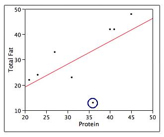
The circled data point on the scatterplot is for the Grilled Chicken Sandwich. Which of the following statements about the circled data point on the scatterplot is/are TRUE?
A) This point would likely be considered an outlier.
B) The residual associated with this data point will have a negative value.
C) This point may be considered influential but that depends on how much it affects
the plot of the residuals.
D) Only A and B are true.
E) A, B, and C are true.
131. Using least-squares regression, it is determined that the logarithm (base 10) of the population of a country is related to the year by the following equation:
log(population) = –13.5 + 0.01 × (year)
Based on this equation, what will the (approximate) population of the country in the year 2016 be?
A) 6.56
B) 706
C) 2,006,000
D) 3,630,780
E) None of the above
132. A scatterplot of a response variable y versus an explanatory variable x is given below:
Determine whether each of the following statements is true or false.
A) There is a monotonic relation between x and y.
B) There is a nonlinear relationship between x and y
C) There is a very strong positive correlation between x and y, because there is an obvious relation between these variables.
D) None of the above
133. Which of the following scatterplots would indicate that y is growing linearly over time?


134. Give a definition for extrapolation.
135. What does r2 measure?
136. A(n) ____ is an observation that is substantially different from the other observations.
A) outlier
B) lurking variable
C) confounding variable
D) None of the above
137. True or False. Correlation and regression are resistant against outliers.
A) True
B) False
138. A researcher wishes to determine whether the rate of water flow (in liters per second) over an experimental soil bed can be used to predict the amount of soil washed away (in kilograms). The researcher measures the amount of soil washed away for various flow rates, and from these data calculates the least-squares regression line to be
Amount of eroded soil = 0.4 + 1.3 × (flow rate)
What do we know about the correlation between amount of eroded soil and flow rate?
A) r = 1/1.3
B) r = 0.4
C) It would be positive, but we cannot determine the exact value.
D) It would either be positive or negative. It is impossible to say anything about the correlation from the information given.
139. A researcher wishes to determine whether the rate of water flow (in liters per second) over an experimental soil bed can be used to predict the amount of soil washed away (in kilograms). The researcher measures the amount of soil washed away for various flow rates, and from these data calculates the least-squares regression line to be
Amount of eroded soil = 0.4 + 1.3 × (flow rate)
One of the flow rates used by the researcher was 0.3 liters per second and for this flow rate the amount of eroded soil was 0.8 kilograms. These values were used in the calculation of the least-squares regression line. What is the residual corresponding to these values?
A) 0.01
B) –0.01
C) 0.5
D) –0.5
140. Researchers studied a sample of 100 adults between the ages of 25 and 35 and found a strong negative correlation between the amount of vitamin C an individual consumed and the number of pounds the individual was overweight. Which of the following can we conclude?
A) This is strong, but not conclusive evidence that large amounts of vitamin C inhibit weight gain.
B) If the amount of vitamin C consumed and the number of pounds overweight for each individual in this study were plotted on a scatterplot, the points would lie close to a negatively sloping straight line.
C) If a larger sample of adults between the ages of 25 and 35 had been studied, the correlation would have been even stronger.
D) All of the above
141. The least-squares regression line is fit to a set of data. One of the data points has a positive residual. Determine whether each of the following statements is true or false.
A) The correlation between the values of the response and explanatory variables must be positive.
B) The point must lie above the least-squares regression line.
C) The point must lie near the right edge of the scatterplot.
D) The point must be influential.
142. Determine whether each of the following statements regarding residuals is true or false.
A) The sum of the residuals is always 0.
B) A plot of the residuals is useful for assessing the fit of the least-squares regression line.
C) The value of a residual is the observed value of the response minus the value of the response that one would predict from the least-squares regression line.
143. A response variable y and explanatory variable x were measured on each of several subjects. A scatterplot of the measurements is given below:
Which of the following is a plot of the residuals for the above data versus x? A)


144. A researcher studies the relationship between the Math SAT score plus Verbal SAT score and the grade point average (GPA) of college students at the end of their freshman year. In order to use a relatively homogeneous group of students, the researcher only examines data of high school valedictorians (students who graduated at the top of their high school class) who have completed their first year of college. The researcher finds the correlation between total SAT score and GPA at the end of the freshman year to be very close to 0. Which of the following would be a valid conclusion from these facts?
A) Because the group of students studied is very homogeneous, the results should give a very accurate estimate of the correlation the researcher would find if all college students who have completed their freshman year were studied.
B) If we had studied all college students who have completed their freshman year, the correlation would be even smaller than that found by the researcher. By restricting the study to valedictorians, the researcher is examining a group that will be more informative than those students who have completed only their freshman year.
C) The researcher made a mistake. Correlation cannot be calculated (the formula for correlation is invalid) unless all students who completed their freshman year are included.
D) None of the above
145. When exploring very large sets of data involving many variables, which of the following is TRUE?
A) Extrapolation is safe because it is based on a greater quantity of evidence.
B) Associations will be stronger than would be seen in a much smaller subset of the data.
C) A strong association is good evidence for causation because it is based on a large quantity of information.
D) None of the above
146. Consider the scatterplot below:

What do we call the point indicated by the plotting symbol O?
A) A residual
B) Influential
C) A z-score
147. In 1990, data were collected for each of the 50 states on the infant mortality rate and the percent of 18-year-olds who graduated from high school. Infant mortality rate is measured as the number of deaths per 1000 residents. The scatterplot of the data is presented below:
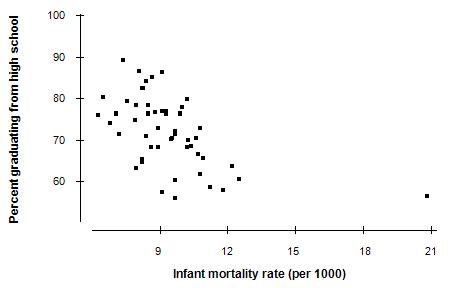
The correlation between the two variables is r = –0.54. If the data were collected for each county in the United States instead of the 50 states, what would the value of the correlation r be?
A) Exactly the same
B) Smaller
C) +0.54 (The magnitude is the same, but the sign should change.)
D) Much higher and probably much closer to 1 because there are many more counties than states
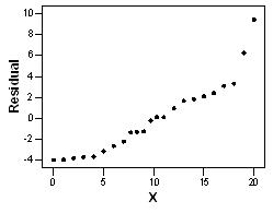
148. Four different residual plots are shown below. Which plots indicate that the linear model is not appropriate?


A) i and iii
B) iii and iv
C) i and iv
D) ii and iii
149. Every four years, during the Winter Olympic Games, debates arise over whether figure skating judges are completely fair. The correlation coefficient between the scores given by the French judge and the Romanian judge is, as expected, positive: r = 0.75. Answer each of the following questions regarding this correlation coefficient with yes, no, or can't tell.
A) Does the Romanian judge tend to give higher scores than the French judge?
B) Does the French judge tend to give higher scores than the Romanian judge?
C) If the Romanian judge gives high marks, does the French judge tend to give high marks as well?
D) Is there a very strong linear relationship between the scores given by these two judges?
150. True or False. Plots of the residuals versus fits should show a linear pattern if the regression line is a good fit for your data.
A) True
B) False
151. Fill in the blank. Influential outliers are usually in the _____ direction on a scatterplot.
152. True or False. Influential outliers are easy to detect because the residuals will always be very large compared to the residuals of the other observations.
A) True
B) False
153. An electronics store is handing out a survey to their clients who buy a smartphone. Some of the questions on the survey ask the clients to rate the smartphone on ease of use, appearance, price, etc. Another question asks for the client's age. From all the different ratings on the survey, a total assessment score is calculated. The correlation between this total assessment score and age of the client is –0.165. The store owner can legitimately conclude which of the following?
A) Older clients seem to not like smartphones.
B) There is a negative linear relationship between age and assessment score.
C) Age does not help much in predicting assessment score.
D) None of the above. We really need to look at a scatterplot of the data first.
154. Exploring extremely large data sets in hopes of finding patterns is called _______.
A) exploratory data analysis
B) extrapolation
C) data mining
D) None of the above
155. Correlation based on averages will tend to be ______ correlations based on individuals. A) higher than B) lower than
C) the same as
156. It is known that not exercising may lead to poor health. However, it is possible that people who are already in poor health do not have the ability or energy to exercise. This example is one of ________________.
A) causation
B) common response
C) confounding
D) None of the above
157. The scatterplot illustrates data from a basic statistics class. Students in the class were asked to provide the amount of time (in hours) they spent studying for the first exam. The professor then made a scatterplot to present the relationship between the number of hours a student studied and the score (from 0–100 with 100 being the best score) that the student received on the first exam. How would you interpret this scatterplot?

A) Students who studied the least amount of time received the highest grades. Therefore, they should not study long on a statistics exam if they want to receive a high grade.
B) Students who studied the most received the highest grades. Therefore, they should study several hours to receive the highest exam scores.
C) The correlation is likely a nonsense correlation caused by a lurking variable. Students who received higher scores likely did not need to study as much because they were doing better in the course than students who received lower scores.
D) None of the above.
158. Correlations caused by lurking variables are called ______.
A) nonsense correlations
B) association correlations
C) reverse correlations
D) None of the above.
159. Give an example of a lurking variable that might explain the nonsense correlation between time spent studying for an exam and grade received on the exam based on the scatterplot.
A) The lurking variable is “Current grade in the class.” Students performing well in the class may not need to study long for exams.
B) The lurking variable is “Study hours.” The longer students study for the exam, the lower the grade they will receive on the exam.
C) The lurking variable is “The Exam.” Students should be given different exams based on the amount of time they spent studying.
D) There are no lurking variables. Students should not study long for exams if they want to receive a high grade.
160. Finding patterns in truly large databases, such as tracking all Google searches over a year from everyone who used the search engine, requires the use of ________.
A) exploratory data analysis (EDA)
B) regression analysis
C) data mining
D) None of the above.
161. Data mining requires the use of ________.
A) efficient algorithms
B) the field of computer science
C) automated tools that can produce results from vague queries
D) All of the above.
162. Data were collected on 33 professional singers and 33 students at a local university. The singers were asked how much time they spend commuting to their performances, and students were each asked how much time they spend commuting to campus. Interpret the results based on the scatterplot.
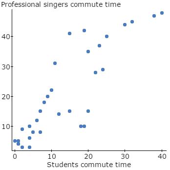
A) There is a strong positive relationship. The more time the students commute, the more time the professional singers commute.
B) There is no relationship between the two variables.
C) This is likely a nonsense correlation. There is a lurking variable explaining this strong positive relationship.
D) Both variables are measured on different cases. Therefore we cannot study this relationship using the method shown.
163. A study of the salaries of full professors at a small university shows that the median salary for female professors is considerably less than the median male salary. Further investigation shows that the median salaries for male and female full professors are about the same in every department (English, physics, etc.) of the university. Which phenomenon explains the reversal in this example?
A) Extrapolation
B) Simpson's paradox
C) Causation
D) Correlation
164. The California Department of State Police keeps track of the number of points received for various traffic violations by drivers. The department is interested in examining the relationship between the number of points received and the insurance premium. Some information on the point category and the insurance premium category is given below:
Which distribution is displayed in the above table?
A) The joint distribution of premium category and point category
B) The marginal distribution of point category
C) The conditional distribution of premium category given point category
D) The conditional distribution of point category given premium category
165. The 94 students in a statistics class are categorized by gender and by the year in school. The numbers obtained are displayed below:
What proportion of the statistics students in this class are sophomores?
A) 0.105
B) 0.202
C) 0.302
D) 19
166. The 94 students in a statistics class are categorized by gender and by the year in school. The numbers obtained are displayed below:
in school
What proportion of the statistics students in this class are male?
A) 0.065
B) 0.105
C) 0.33
D) 31
167. The 94 students in a statistics class are categorized by gender and by the year in school. The numbers obtained are displayed below:
in school
The data are going to be summarized by computing the conditional distributions of year in school for male and female students. What would be the entry for male sophomores?
A) 0.065
B) 0.105
C) 0.33
D) 2
168. A student organization is trying to decide whether or not to offer more movies on campus. They want to determine whether this idea will appeal to members of both genders. A random sample of 1000 students was asked if they were in favor of more movies on campus. The results by gender are shown in the table below:
Opinion
Gender In favor No opinion Opposed
What proportion of the sampled students is in favor of more movies on campus?
A) 0.33
B) 0.5
C) 0.555
D) 0.6
169. A student organization is trying to decide whether or not to offer more movies on campus. They want to determine whether this idea will appeal to members of both genders. A random sample of 1000 students was asked if they were in favor of more movies on campus. The results by gender are shown in the table below:
Opinion
Gender In favor No opinion Opposed
What proportion of the sampled females is in favor of more movies on campus?
A) 0.33
B) 0.5
C) 0.555
D) 0.6
170. A student organization is trying to decide whether or not to offer more movies on campus. They want to determine whether this idea will appeal to members of both genders. A random sample of 1000 students was asked if they were in favor of more movies on campus. The results by gender are shown in the table below:
Opinion
Gender In favor No opinion Opposed
What proportion of the sampled males is in favor of more movies on campus?
A) 0.33
B) 0.5
C) 0.555
D) 0.6
171. A student organization is trying to decide whether or not to offer more movies on campus. They want to determine whether this idea will appeal to members of both genders. A random sample of 1000 students was asked if they were in favor of more movies on campus. The results by gender are shown in the table below:
Opinion
Gender In favor No opinion Opposed
To answer the original question regarding whether or not to offer more movies on campus, which distribution should the student organization study?
A) The joint distribution of gender and opinion
B) The marginal distribution of gender
C) The conditional distribution of gender given opinion
D) The conditional distribution of opinion given gender
172. Prior to graduation, a high school class was surveyed about their plans after high school. The table below displays the results by gender: Plans
If the data are going to be summarized by computing the marginal distribution of plans after high school, what would be the entry for “4-year college”?
A) 0.529
B) 0.739
C) 0.765
D) 374
173. Prior to graduation, a high school class was surveyed about their plans after high school. The table below displays the results by gender: Plans
If the data are going to be summarized by computing the conditional distributions of plans after high school for male and female high school students, what would be the entry for “male” and “2-year college”?
A) 0.074
B) 0.134
C) 0.5
D) 39.46
174. Prior to graduation, a high school class was surveyed about their plans after high school. The table below displays the results by gender:
If the data are going to be summarized by computing the conditional distributions of gender given plans after high school, what would be the entry for “male” and “2-year college”?
A) 0.074
B) 0.134
C) 0.36
D) 0.5
175. A business has two types of employees: managers and workers. Managers earn either $100,000 or $200,000 per year. Workers earn either $10,000 or $20,000 per year. The number of male and female managers at each salary level and the number of male and female workers at each salary level are given in the table below:
Managers
What is the proportion of male managers who make $200,000 per year?
A) 0.067
B) 0.133
C) 0.2
D) 0.4
176. A business has two types of employees: managers and workers. Managers earn either $100,000 or $200,000 per year. Workers earn either $10,000 or $20,000 per year. The number of male and female managers at each salary level and the number of male and female workers at each salary level are given in the table below:
Managers
Workers
20 30
What is the proportion of female managers who make $200,000 per year?
A) 0.1
B) 0.2
C) 0.4
D) 0.6
177. A business has two types of employees: managers and workers. Managers earn either $100,000 or $200,000 per year. Workers earn either $10,000 or $20,000 per year. The number of male and female managers at each salary level and the number of male and female workers at each salary level are given in the table below:
Managers
Workers
What proportion of the managers is female?
A) 0.2
B) 0.333
C) 0.5
D) 0.667
178. A business has two types of employees: managers and workers. Managers earn either $100,000 or $200,000 per year. Workers earn either $10,000 or $20,000 per year. The number of male and female managers at each salary level and the number of male and female workers at each salary level are given in the table below:
Managers
$100,000 80 20
$200,000 20 30
$10,000 30 20
$20,000 20 80
What conclusion(s) can we draw from this table?
A) The mean salary of female managers is greater than that of male managers.
B) The mean salary of males in this business is greater than the mean salary of females.
C) The mean salary of female workers is greater than that of male workers.
D) All of the above
179. A review of voter registration records in a small town yielded the following data of the number of males and females registered as Democrat, Republican, or some other affiliation: Gender
What proportion of the male voters is registered as a Democrat?
A) 0.15
B) 0.30
C) 0.33
D) 300
180. A review of voter registration records in a small town yielded the following data of the number of males and females registered as Democrat, Republican, or some other affiliation:
Gender
Affiliation Male Female
What proportion of registered Democrats is male?
A) 0.15
B) 0.30
C) 0.33
D) 300
181. A review of voter registration records in a small town yielded the following data of the number of males and females registered as Democrat, Republican, or some other affiliation:
Gender
Affiliation
What proportion of all voters is male and registered as a Democrat?
A) 0.15
B) 0.30
C) 0.33
D) 300
182. Are avid readers more likely to wear glasses than those who read less frequently?
Three-hundred men in Ohio were selected at random and characterized as to whether they wore glasses and whether the amount of reading they did was above average, average, or below average. The results are presented in the following table: Glasses?
What is the proportion of men in the sample who wear glasses?
A) 0.24
B) 0.37
C) 0.42
D) 0.64
183. Are avid readers more likely to wear glasses than those who read less frequently?
Three-hundred men in Ohio were selected at random and characterized as to whether they wore glasses and whether the amount of reading they did was above average, average, or below average. The results are presented in the following table: Glasses?
What is the proportion of all above-average readers who wear glasses?
A) 0.24
B) 0.37
C) 0.42
D) 0.64
184. A survey was conducted involving 303 subjects concerning their preferences with respect to the size of car they would consider purchasing. The following table shows the count of the responses by gender of the respondents:
The data are to be summarized by constructing marginal distributions. In the marginal distribution for car size, the entry for medium cars is ______.
A) 0.457
B) 0.409
C) 0.370
D) 0.508
E) None of the above
185. A survey was conducted involving 303 subjects concerning their preferences with respect to the size of car they would consider purchasing. The following table shows the count of the responses by gender of the respondents:
In the conditional distribution for preference of car size among male respondents, the entry for large cars is _______.
A) 0.056
B) 0.405
C) 0.152
D) 0.139
E) None of the above
186. A survey was conducted involving 303 subjects concerning their preferences with respect to the size of car they would consider purchasing. The following table shows the count of the responses by gender of the respondents:
Among all respondents, the proportion of female respondents who preferred small cars is __________.
A) 0.420
B) 0.423
C) 0.452
D) 0.191
E) None of the above
187. Which of the following statements is/are TRUE?
A) A two-way table is a useful way to summarize data when two categorical variables are measured on the same individuals or cases.
B) Simpson's paradox is an example of the potential effect of a lurking variable on an observed association between two categorical variables.
C) If the counts in each cell of a two-way table are divided by the total number of observations, the result is the joint distribution of the two categorical variables.
D) All of the above are true.
E) Only A and C are true.
188. A manufacturer is concerned about the quality of a particular item produced in one of its facilities. The facility operates with three 8-hour shifts of employees during the day. At the end of each shift a random sample of the item is selected and each item checked against the required specifications. The selected items are classified as being either Acceptable or Unacceptable.
The following table summarizes the results:
Considering the entire day's production of all sampled items, the proportion produced by Shift One that are Unacceptable is _________. Among items produced by Shift One, the proportion of Unacceptable items is __________.
A) 0.127; 0.045
B) 0.355; 0.467
C) 0.045; 0.127
D) 0.146; 0.115
E) 0.103; 0.045
189. A manufacturer is concerned about the quality of a particular item produced in one of its facilities. The facility operates with three 8-hour shifts of employees during the day. At the end of each shift a random sample of the item is selected and each item checked against the required specifications. The selected items are classified as being either Acceptable or Unacceptable.
The following table summarizes the results:
The conditional distribution of Acceptable items produced by the three shifts is ______.
A) 0.355; 0.419; 0.226
B) 0.345; 0.425; 0.230
C) 0.873; 0.908; 0.914
D) 0.310; 0.381; 0.206
E) None of the above
190. Simple random samples of 100 high school students are sampled from each grade level, for a total of 400 high school students. They are asked to rate the performance of the President of the United States on a scale from 1 to 5 (1 = poor; 5 = excellent). The results are presented below:
What proportion of the students in the sample assigned the President an “excellent” rating?
191. Simple random samples of 100 high school students are sampled from each grade level, for a total of 400 high school students. They are asked to rate the performance of the President of the United States on a scale from 1 to 5 (1 = poor; 5 = excellent). The results are presented below:
What proportion of the seniors in the sample assigned the President an “excellent” rating?
192. Simple random samples of 100 high school students are sampled from each grade level, for a total of 400 high school students. They are asked to rate the performance of the President of the United States on a scale from 1 to 5 (1 = poor; 5 = excellent). The results are presented below:
The data are going to be summarized by computing the conditional distributions of performance rating for students in each of the four classes. What would be the entry for freshmen who gave the President a “poor” rating?
193. Students at a small, private university are required to take a basic statistics course. The table below summarizes one of the classes by gender and year in school. Year in school
What proportion of the students in the class are seniors?
194. Students at a small, private university are required to take a basic statistics course. The table below summarizes one of the classes by gender and year in school.
What proportion of the students in the class are freshmen?
195. Students at a small, private university are required to take a basic statistics course. The table below summarizes one of the classes by gender and year in school.
Year in school
What proportion of students is male?
196. Students at a small, private university are required to take a basic statistics course. The table below summarizes one of the classes by gender and year in school.
Year in school
What proportion of students is female?
197. If you have two categorical variables, one way to study them is to use a ______.
A) scatterplot
B) regression line
C) two-way table
198. When possible, what is the best way to establish that an observed association is the result of a cause-and-effect relation?
A) Study the least-squares regression line.
B) Obtain the correlation coefficient.
C) Examine z-scores rather than the original variables.
D) None of the above
199. Which of the following would be necessary to establish a cause-and-effect relation between two variables?
A) strong association between the variables
B) an association between the variables in many different settings
C) The alleged cause is plausible.
D) All of the above
200. Let x = the midterm exam score and y = the final exam score for students in a large statistics class. The relationship between x and y is studied often. According to the instructor of this particular statistics class, those students who had an above-average value for x tended to have an above-average value for y. In other words, there was a positive association between x and y. Which of the following is/are plausible explanations for this association?
A) Causation: x causes y. Thus, students who do well on the midterm exam should not worry about the final exam score because the high score on the midterm will lead them to a high score on the final.
B) Common response: Changes in x and y are due to a common response to other variables. For example, students who spend much time studying will tend to do well on the midterm exam and on the final exam.
C) Common response: Changes in x and y are due to a common response to other variables. For example, students who don't understand statistics will tend to do poorly on the midterm exam and on the final exam. Likewise, students who understand statistics will tend to do well on the midterm exam and on the final exam.
D) Accidental: The association between x and y is purely coincidental. It is implausible to believe the observed association could be anything other than accidental.
E) Both B and C
201. Let x = the number of people who failed to complete high school and y = the number of infant deaths. According to the 1990 census, those states having an above-average value for the variable x tended to have an above-average value for y. In other words, there was a positive association between x and y. What is the most plausible explanation for this association?
A) Causation: x causes y. Thus, programs to keep teens in school will help reduce the number of infant deaths.
B) Causation: y causes x. Thus, programs that reduce infant deaths will ultimately reduce the number of high school dropouts.
C) Common response: Changes in x and y are due to a common response to other variables. For example, states with large populations will have larger numbers of people who fail to complete high school and a larger number of infant deaths.
D) Accidental: The association between x and y is purely coincidental. It is implausible to believe the observed association could be anything other than accidental.
202. Let x = the amount of money spent per pupil in high school. Let y = the mean Verbal SAT score for students taking the SAT. Recent data show that states having an aboveaverage value for the variable x tend to have below-average values for the variable y. In other words, there is a negative association between x and y. This is particularly true in states having a large percentage of all high school students taking the SAT. These states also tend to have larger populations. What is the most plausible explanation for this association?
A) Causation: x causes y. Overspending generally leads to extra, unnecessary programs, diverting attention from basic subjects. Inadequate training in these basic subjects generally leads to lower SAT scores.
B) Causation: y causes x. Low SAT scores create concerns about the quality of education. This inevitably leads to additional spending to help solve the problem.
C) Common response: Changes in x and y are due to a common response to other variables. If a higher percentage of students take the SAT, the average score will be lower. Also, states with larger populations have large urban areas where the cost of living is higher and more money is needed for expenses.
D) Accidental: The association between x and y is purely coincidental. It is implausible to believe the observed association could be anything other than accidental.
203. As Swiss cheese matures, a variety of chemical processes take place. The taste of matured cheese is related to the concentration of several chemicals in the final product. Let x = the lactic acid concentration of the cheese and y = the taste score of the cheese, which was obtained by combining the scores from several tasters. According to a study of cheese in a certain region of Switzerland, those samples of cheese having an aboveaverage value for the variable x tended to have an above-average value for y. In other words, there was a positive association between x and y. What is the most plausible explanation for this association?
A) Causation: x causes y. Thus, increasing the lactic acid concentration in cheese will generally help improve the taste.
B) Common response: Changes in x and y are due to a common response to other variables. For example, cheese samples that have matured longer will have higher lactic acid concentrations, and more mature cheese tends to receive higher taste scores.
C) Common response: Changes in x and y are due to a common response to other variables. For example, cheese with a higher concentration of hydrogen sulfide (another chemical present in cheese) will have higher lactic acid concentrations and will receive higher taste scores.
D) Accidental: The association between x and y is purely coincidental. It is implausible to believe the observed association could be anything other than accidental.
204. An article in the student newspaper of a large university had the headline “A's swapped for evaluations?” The article included the following paragraph:
According to a new study, teachers may be more inclined to give higher grades to students, hoping to gain favor with the university administrators who grant tenure. The study examined the average grade and teaching evaluation in a large number of courses in order to investigate the effects of grade inflation on evaluations. “I am concerned with student evaluations because instruction has become a popularity contest for some teachers,” said Professor Smith, who recently completed the study. Results showed higher grades directly corresponded to a more positive evaluation.
Based on the statement underlined above, what did the study find out about the relationship between course grade and teaching evaluation?
A) Course grade is positively associated with teaching evaluation.
B) There must be a common response that course grade and teaching evaluation both respond to. Higher grades are usually obtained by the more serious students. These students are also more apt to fill out the course evaluation more seriously and positively.
C) The association between course grade and teaching evaluation is purely coincidental.
D) There is a cause-and-effect relationship between course grade and teaching evaluation.
205. An article in the student newspaper of a large university had the headline “A's swapped for evaluations?” The article included the following paragraph:
According to a new study, teachers may be more inclined to give higher grades to students, hoping to gain favor with the university administrators who grant tenure. The study examined the average grade and teaching evaluation in a large number of courses in order to investigate the effects of grade inflation on evaluations. “I am concerned with student evaluations because instruction has become a popularity contest for some teachers,” said Professor Smith, who recently completed the study. Results showed higher grades directly corresponded to a more positive evaluation.
Which of the following would be a valid conclusion to draw from the study?
A) A teacher can improve their teaching evaluations by giving good grades.
B) A good teacher, as measured by teaching evaluations, helps students to learn better, resulting in higher grades.
C) Teachers of courses in which the mean grade is above average apparently tend to have above-average teaching evaluations.
D) All of the above
206. Which set of two variables is most likely to have a cause-and-effect relationship?
A) The height of a person and the weight of a person
B) The weight of a box and the postage rate we have to pay to ship the box to California
C) The make of a car and the mileage of the car
D) The age of a teacher and the income of the teacher
207. A researcher computed the average Math SAT score of all high school seniors who took the SAT exam for each of the 50 states. The researcher also computed the average salary of high school teachers in each of these states and plotted these average salaries against the average Math SAT scores for each state. The plot showed a distinct negative association between average Math SAT scores and average teacher salaries. The researcher can legitimately conclude which of the following?
A) Increasing the average salary of teachers will cause the average of Math SAT scores to decrease, but it is not correct to conclude that increasing the salaries of individual teachers causes the Math SAT scores of individual students to increase.
B) States that pay teachers highly tend to do a poor job of teaching mathematics.
C) States whose students tend to perform poorly in mathematics probably have a higher proportion of problem students and thus need to pay teachers higher salaries in order to attract them to teach in those states.
D) The data used by the researcher do not provide evidence that increasing the salary of teachers will cause the performance of students on the Math SAT to get worse.
208. A researcher is conducting a study on contact lenses. She finds that in a sample of contact lens-wearing adults, those who wear their contact lenses for longer periods of time have more irritation in their eyes. Those who wear their contact lenses for only a few hours a day have less irritation. However, those who wear their contacts for longer times also tend to spend long hours at the office. As explanations for having more irritation in the eyes, the variables “length of time contacts are worn each day” and “length of time spent at the office per day” are ____________________ variables.
A) response
B) independent
C) confounding
D) placebo
209. A researcher notices that in a sample of adults, those who take larger amounts of vitamin C have fewer illnesses. However, those who take larger amounts of vitamin C also tend to exercise more. As explanations for having fewer illnesses, the variables “amount of vitamin C taken” and “amount of exercise” are ______________ variables.
A) skewed
B) confounding
C) response
D) symmetric
210. Which of the following statements about causation and association is/are FALSE?
A) Some observed associations between two variables are due to a lurking variable rather than a cause-and-effect relationship between the two variables.
B) Some possible explanations of an observed association are causation, common response, or confounding.
C) When many variables interact with each other, confounding of several variables often prevents a conclusion about causation to be reached.
D) To establish that association is due to causation, it is best to conduct an experiment that makes changes to the explanatory variable while controlling other influences on the response variable.
E) When strong association between two variables is present, this is often sufficient evidence to establish that the association is because of a causal link.
211. True or False. Two variables are confounded when their effects on a response variable can be distinguished from each other.
A) True
B) False
212. Interest rates for home mortgages have, in general, declined during recent months. With the apparent favorable influence for new-home building, there seems to be a clear relationship between x = the prevailing mortgage interest rates and y = the number of new houses being built per month in a Midwestern city over a period of 18 months. A scatterplot of the data collected shows that the linear model is appropriate. The equation of the least-squares regression line is Number of new houses = 672.89 – 30.65 × Interest rate and r 2 = 0.49.
Is the association between Interest rate and Number of new houses being built positive or negative?
213. Interest rates for home mortgages have, in general, declined during recent months. With the apparent favorable influence for new-home building, there seems to be a clear relationship between x = the prevailing mortgage interest rates and y = the number of new houses being built per month in a Midwestern city over a period of 18 months. A scatterplot of the data collected shows that the linear model is appropriate. The equation of the least-squares regression line is
Number of new houses = 672.89 – 30.65 × Interest rate and r 2 = 0.49.
What is the correlation coefficient between Interest rate and Number of new houses being built?
214. Interest rates for home mortgages have, in general, declined during recent months. With the apparent favorable influence for new-home building, there seems to be a clear relationship between x = the prevailing mortgage interest rates and y = the number of new houses being built per month in a Midwestern city over a period of 18 months. A scatterplot of the data collected shows that the linear model is appropriate. The equation of the least-squares regression line is
Number of new houses = 672.89 – 30.65 × Interest rate and r 2 = 0.49.
Predict the Number of new houses being built for a month when the Interest rate is 10.2.
215. Interest rates for home mortgages have, in general, declined during recent months. With the apparent favorable influence for new-home building, there seems to be a clear relationship between x = the prevailing mortgage interest rates and y = the number of new houses being built per month in a Midwestern city over a period of 18 months. A scatterplot of the data collected shows that the linear model is appropriate. The equation of the least-squares regression line is
Number of new houses = 672.89 – 30.65 × Interest rate and r 2 = 0.49.
Which of the following descriptions below best represents the value of the slope?
A) When no new houses are being built, the interest rate equals 30.65%.
B) When the number of new houses being built increases by 1, the interest rate is expected to drop by 0.3065.
C) When the interest rate increases by 1%, the number of new houses being built is expected to drop by 30.65.
D) We cannot interpret the slope because we cannot build a negative number of new houses.
216. Interest rates for home mortgages have, in general, declined during recent months. With the apparent favorable influence for new-home building, there seems to be a clear relationship between x = the prevailing mortgage interest rates and y = the number of new houses being built per month in a Midwestern city over a period of 18 months. A scatterplot of the data collected shows that the linear model is appropriate. The equation of the least-squares regression line is Number of new houses = 672.89 – 30.65 × Interest rate and r 2 = 0.49.
What is the most plausible explanation for the association between Interest rate and Number of new houses being built?
A) Confounding
B) Common response
C) Causation
D) Accidental
217. A simple random sample of eight drivers was selected. All eight drivers are insured with the same insurance company, and all have similar auto insurance policies. The following table lists their driving experiences (in years) and monthly auto insurance premiums:
Which of the two variables is the explanatory variable?
218. A simple random sample of eight drivers was selected. All eight drivers are insured with the same insurance company, and all have similar auto insurance policies. The following table lists their driving experiences (in years) and monthly auto insurance premiums:
The equation of the least-squares regression line is ˆ y = 72.7 – 1.3x. Sketch the line on the scatterplot below. Include the labels for the two axes.

219. A simple random sample of eight drivers was selected. All eight drivers are insured with the same insurance company, and all have similar auto insurance policies. The following table lists their driving experiences (in years) and monthly auto insurance premiums:
Complete the following sentence that explains what the value of the slope tells us: When driving experience (choose one) increases / decreases by __________ we expect the average monthly auto insurance premium to (choose one) increase / decrease by __________
220. A simple random sample of eight drivers was selected. All eight drivers are insured with the same insurance company, and all have similar auto insurance policies. The following table lists their driving experiences (in years) and monthly auto insurance premiums:
The correlation coefficient between driving experience and monthly auto insurance premium is r = –0.775. If we switch the roles of explanatory and response variables, what would happen to the correlation coefficient?
221. A simple random sample of eight drivers was selected. All eight drivers are insured with the same insurance company, and all have similar auto insurance policies. The following table lists their driving experiences (in years) and monthly auto insurance premiums:
Predict the monthly auto insurance premium for a driver with 10 years of driving experience.
222. A plot of the residuals versus the x variable is shown below:

Based on the residual plot, does the linear regression seem appropriate? Explain briefly.
223. Do heavier cars use more gasoline? To answer this question, a researcher randomly selected 15 cars. He collected data about the weight (in hundreds of pounds) and the mileage (mpg) for each car. From a scatterplot made with the data, a linear model seems appropriate.
Fill in the blank. The variable ________________ is the response variable in this study.
224. Do heavier cars use more gasoline? To answer this question, a researcher randomly selected 15 cars. He collected data about the weight (in hundreds of pounds) and the mileage (mpg) for each car. From a scatterplot made with the data, a linear model seems appropriate.
Fill in the blank. The variable ____________ is the explanatory variable in this study.
225. Do heavier cars use more gasoline? To answer this question, a researcher randomly selected 15 cars. He collected data about the weight (in hundreds of pounds) and the mileage (mpg) for each car. From a scatterplot made with the data, a linear model seems appropriate.
The equation of the least-squares regression line is
y = 40.4 – 0.521x
Which of the following descriptions of the value of the slope is the correct description?
A) The mileage is expected to decrease by 0.521 when the weight of a car increases by 1 pound.
B) The mileage is expected to decrease by 0.521 when the weight of a car increases by 100 pounds.
C) The mileage is expected to decrease by 52.1 when the weight of a car increases by 100 pounds.
D) We cannot interpret the slope because we cannot have a negative weight of a car.
226. Do heavier cars use more gasoline? To answer this question, a researcher randomly selected 15 cars. He collected data about the weight (in hundreds of pounds) and the mileage (mpg) for each car. From a scatterplot made with the data, a linear model seems appropriate.
The percentage of variation in mileage that is accounted for by the linear relationship between mileage and weight is approximately 44%. What is the value of the correlation coefficient between the weight and the mileage of a car?
Answer Key
1. horizontal
2. yield of the crop
3. amount of time spent studying for the exam
4. mileage of the car
5. size of the winery
6. quantitative
7. volume of usable lumber
8. E
9. E
10. C
11. D
12. A
13. C
14. A
15. A
16. B 17. A
18. B
19. B
20. A
21. A
22. D
23. A
24. B
25. B
26. D
27. B
28. A
29. B
30. B
31. independent
32. dependent
33. A
34. A
35. E
36. E
37. C
38. C
39. B
40. A
41. A
42. A
43. B
44. A
45. F
46. E
47. B
48. Malaria = 0.731 minus 0.004 Dewpoint
49. 0.1688
50. B
51. A
52. A) False, B) False, C) False, D) False
53. C
54. A
55. A
56. B
57. C
58. C
59. A) False, B) False, C) True, D) False
60. A) False, B) False, C) False, D) True
61. A) False, B) False, C) False, D) True
62. A) False, B) False, C) False, D) False
63. B
64. C
65. A
66. C
67. E
68. A
69. C
70. A) –0.7, B) 0.95, C) 0.4, D) –0.9
71. C
72. A) True, B) False, C) False, D) False
73. A
74. A) False, B) False, C) True, D) False
75. D
76. D
77. C
78. C
79. C
80. C
81. B
82. A
83. B
84. A
85. D
86. C
87. B
88. B
89. E
90. A
91. A
92. B
93. B 94. A
95. A
96. B 97. A
98. B
99. B
100. B
101. A
102. E
103. A
104. D
105. A
106. B
107. C
108. B
109. B
110. A
111. E
112. 51.69
113. B
114. C
115. B
116. D
117. C
118. A) False, B) True, C) False, D) True
119. B
120. B
121. A
122. D
123. D
124. C
125. B
126. B
127. E
128. B
129. D
130. D
131. E
132. A) False, B) True, C) False, D) False
133. A
134. Extrapolation is the use of the regression line for prediction outside the range of values observed for the explanatory variable x.
135. The fraction of the variance of the response variable that is explained by least-squares
regression on the explanatory variable.
136. A
137. B
138. C
139. A
140. B
141. A) False, B) True, C) False, D) False
142. A) True, B) True, C) True
143. A
144. D
145. D
146. B
147. B
148. C
149. A) Can't tell, B) Can't tell, C) Yes, D) Can't tell
150. B
151. X
152. B
153. D
154. C
155. A
156. C
157. C
158. A
159. A
160. C
161. D
162. D
163. B 164. C
165. B
166. C 167. A 168. C
169. B
170. D
171. D 172. C
173. B
174. D
175. C
176. D
177. B
178. D
179. B 180. C
181. A
182. C
183. D
184. B
185. C
186. D
187. D
188. C
189. B
190. 32/400 = 0.08
191. 12/100 = 0.12
192. 20/100 = 0.20
193. .02
194. .65
195. .20
196. .80
197. C
198. D
199. D
200. E
201. C
202. C
203. A
204. A
205. C 206. B
207. D
208. C
209. B
210. E
211. B
212. Negative
213. –0.7
214. 360.26
215. C
216. B
217. Driving experience (in years)
218.
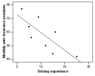
219. When driving experience increases by 1 year, we expect the average monthly auto insurance premium to decrease by $1.30
220. The correlation coefficient would stay the same.
221. $59.70
222. Yes, it seems appropriate because there is no clear pattern present in the graph.
223. mileage
224. weight
225. B
226. r = –0.663