Chapter 2: Organizing Data
Section 2.1
1. Class limits are possible data values, and they specify the span of data values that fall within a class. Class boundaries are not possible data values; they are values halfway between the upper class limit of one class and the lower class limit of the next class.
2. Each data value must fall into one class. Data values above 50 do not have a class.
3. The classes overlap. A data value such as 20 falls into two classes.
4. These class widths are 11.
5. 8220
Width8.86 7 =≈ , so round up to 9. The class limits are 20 – 28, 29 – 37, 38 – 46, 47 – 55, 56 – 64, 65 – 73, 74 – 82.
6. 12010
Width22 5 == , so round up to 23. The class limits are 10 – 32, 33 – 55, 56 – 78, 79 – 101, 102 – 124.
7. (a) The distribution is most likely skewed right, with many short times and only a few long wait times. (b) A bimodal distribution might exist if there are different wait times during busy versus slow periods. During the morning rush, many long wait times might occur, but during the slow afternoon, most wait times will be very short.
8. The data set consists of the numbers 1 up through 100, with each value occurring once. The histogram will be uniform.
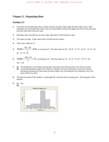
9. (a) Yes. (b)
(a)
(b) Yes. Yes.
(c)
11. (a) The range of data seem to fall between 7 and 13 with the bulk of the data between 8 and 12.
(b) All three histograms are somewhat mound-shaped with the top of the mound between 9.5 and 10.5. In all three histograms the bulk of the data fall between 8 and 12.
12. (a) Graph (i) midpoint: 5; graph (ii) midpoint: 4; graph (iii) midpoint: 2.
(b) Graph (i) 0-17; Graph (ii) 1-16; Graph (iii) 0-28.
(c) Graph (iii) is most clearly skewed right; Graph (ii) is somewhat skewed right; Graph (i) is barely skewed right.
(d) No, each random sample of same size froma population is equally likely to be drawn. Sample (iii) most clearly reflects the properties of the population. Sample (ii) reflects the properties fairly well, but sample(i) seems to differ more from the described population.
13. (a) Because there are 50 data values, divide each cumulative frequency by 50 and convert to a percent.
(b) 35 states.
(c) 6 states.
(d) 2%
14. (a) Graph (i).
(b) Graph (iii)
(c) Graph (iii) 15. (a) Class width = 25
(e) This distribution is slightly skewed to the left but fairly mound-shaped, symmetric.
(f)
(a) Class width = 11
(b)
(c)
(d)
(e) Approximately mound-shaped, symmetric.
(f) To create the ogive, place a dot on the x axis at the lower class boundary of the first class, and then, for each class, place a dot above the upper class boundary value at the height of the cumulative frequency for the class. Connect the dots with line segments.
17. (a) Class width = 12
(b)
(c)
(d)
Histogram of Time Until Recurrence
(e) The distribution is bimodal.
(f) To create the ogive, place a dot on the x axis at the lower class boundary of the first class, and then, for each class, place a dot above the upper class boundary value at the height of the cumulative frequency for the class. Connect the dots with line segments.
18. (a) Class width = 28.
(b)
(c)
(d)
(e) This distribution is skewed right with a possible outlier.
(f) To create the ogive, place a dot on the x axis at the lower class boundary of the first class, and then, for each class, place a dot above the upper class boundary value at the height of the cumulative frequency for the class. Connect the dots with line segments.
19. (a) Class width = 4
(b)
(c)
(d)
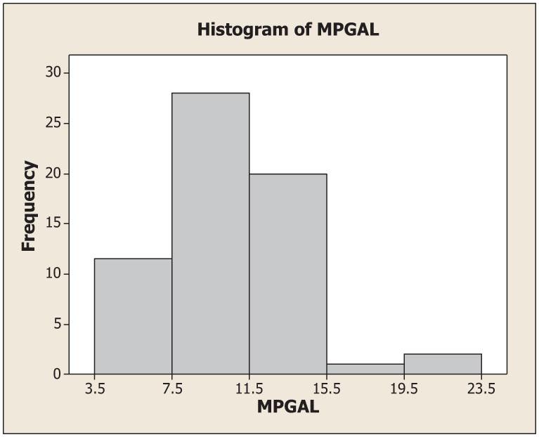
(e) This distribution is skewed right.
(f) To create the ogive, place a dot on the x axis at the lower class boundary of the first class, and then, for each class, place a dot above the upper class boundary value at the height of the cumulative frequency for the class. Connect the dots with line segments.
20. (a) Class width = 6
(b)
(c)
(d)
Histogram of Three-Syllable Words
(e) The distribution is skewed right.
(f) To create the ogive, place a dot on the x axis at the lower class boundary of the first class, and then, for each class, place a dot above the upper class boundary value at the height of the cumulative frequency for the class. Connect the dots with line segments.
Words of Three Syllables or More—Ogive
21. (a) Multiply each value by 100.
(b)
(a) Multiply each value by 1000. (b)
23. (a) 1
(b) About 5/51 = 0.098 = 9.8%
(c) 650 to 750 24.
The dotplot shows some of the characteristics of the histogram, such as more dot density from 280 to 340, for instance, that corresponds roughly to the histogram bars of heights 25 and 16. However, the dotplot and histogram are somewhat difficult to compare because the dotplot can be thought of as a histogram with one value, the class mark (i.e., the data value), per class. Because the definitions of the classes (and therefore the class widths) differ, it is difficult to compare the two figures.
The dotplot shows some of the characteristics of the histogram, such as the concentration of most of the data in two peaks, one from 13 to 24 and another from 37 to 48. However, the dotplot and histogram are somewhat difficult to compare because the dotplot can be thought of as a histogram with one value, the class mark (i.e., the data value), per class. Because the definitions of the classes (and therefore the class widths) differ, it is difficult to compare the two figures.
Section 2.2
1. (a) Yes, since the percentages total more than 100%. (b) No. In a circle graph, the percentages must total 100%. (c) Yes. The graph is organized from most frequently selected to least frequently selected.
2. This is not proper because the bars differ in both length and width.
3. A Pareto chart because it shows the five conditions in their order of importance to employees.
4. A time-series graph because the pattern of stock prices over time is more relevant than just the frequency of a specific range of closing prices. 5.
6. (a) 45% of the 18 – 34 year olds and approximately 30% of the 45 – 54 year olds said “Influential”. Perhaps the vertical scales should be labeled similarly.
(b) Yes, but the graph would take into account
and would not indicate if multiple
(b) Since the percentages do not add to 100%, a circle graph cannot be used. If we create an “other” category and assume that all other respondents fit this category, then a circle could be created.
15. (a) The size of the donut hole is smaller on the rightmost graph. To correct the situation, simply make all donuts exactly the same size, with the radii of the respective holes the same size as well. Data labels showing the percentages for each response would also be useful.
(b) The college graduates answered “no” more frequently than those with a high school education or less.
16. (a) Worry that the technologies cause too much distraction and are dangerous.
(b) The Matures.
(c) Gen X.
Section 2.3
1. (a) The smallest value is 47 and the largest value is 97, so we need stems 4, 5, 6, 7, 8, and 9. Use the tens digit as the stem and the ones digit as the leaf.
Longevity of Cowboys
(b) Yes, these cowboys certainly lived long lives, as evidenced by the high frequency of leaves for stems 7, 8, and 9 (i.e., 70-, 80-, and 90-year-olds).
2. The largest value is 91 (percent of wetlands lost) and the smallest value is 9 (percent), which is coded as 09. We need stems 0 to 9. Use the tens digit as the stem and the ones digit as the leaf. The percentages are concentrated from 20% to 50%. These data are fairly symmetric, perhaps slightly skewed right. There is a gap showing that none of the lower 48 states has lost from 10% to 19% of its wetlands.
3. The longest average length of stay is 11.1 days in North Dakota, and the shortest is 5.2 days in Utah. We need stems from 5 to 11. Use the digit(s) to the left of the decimal point as the stem and the digit to the right as the leaf.
The distribution is skewed right.
4.
5.
Texas and California have the highest number of hospitals, 421 and 440, respectively. Both states have large populations and large areas. The four largest states by area are Alaska, Texas, California, and Montana.
(a) The longest time during 1961–1980 is 23 minutes (i.e., 2:23), and the shortest time is 9 minutes (2:09). We need stems 0, 1, and 2. We’ll use the tens digit as the stem and the ones digit as the leaf, placing leaves 0, 1, 2, 3, and 4 on the first stem and leaves 5, 6, 7, 8, and 9 on the second stem.
Minutes Beyond 2 Hours (1961–1980)
(b) The longest time during the period 1981–2000 was 14 (2:14) and the shortest was 7 (2:07), so we’ll need stems 0 and 1 only.
Minutes Beyond 2 Hours (1981–2000)
(c) There were seven times under 2:15 during 1961–1980, and there were 20 times under 2:15 during 1981–2000.
6. (a) The largest (worst) score in the first round was 75; the smallest (best) score was 65. We need stems 6 and 7. Leaves 0–4 go on the first stem, and leaves 5 9 belong on the second stem.
First-Round Scores
6 5 = score of 65
(b) The largest score in the fourth round was 74, and the smallest was 68. Here we need stems 6 and 7.
Fourth-Round Scores
8 = score of 68
(c) Scores are lower in the fourth round. In the first round, both the low and high scores were more extreme than in the fourth round.
7. The largest value in the data is 29.8 mg of tar per cigarette smoked, and the smallest value is 1.0. We will need stems from 1 to 29, and we will use the numbers to the right of the decimal point as the leaves.
8. The largest value in the data set is 23.5 mg of carbon monoxide per cigarette smoked, and the smallest is 1.5. We need stems from 1 to 23, and we’ll use the numbers to the right of the decimal point as leaves.
of Carbon Monoxide
9. The largest value in the data set is 2.03 mg of nicotine per cigarette smoked. The smallest value is 0.13. We will need stems 0, 1, and 2. We will use the number to the left of the decimal point as the stem and the first number to the right of the decimal point as the leaf. The number 2 placed to the right of the decimal point (the hundredths digit) will be truncated (not rounded).
10. (a) For Site I, the least depth is 25 cm, and the greatest depth is 110 cm. For Site II, the least depth is 20 cm, and the greatest depth is 125 cm.
(b) The Site I depth distribution is fairly symmetric, centered near 70 cm. Site II is fairly uniform in shape except that there is a huge gap with no artifacts from 70 to 100 cm.
(c) It would appear that Site II probably was unoccupied during the time period associated with 70 to 100 cm.
Chapter Review Problems
1. (a) Bar graphs, Pareto charts, pie charts
(b) All, but quantitative data must be categorized to use a bar graph, Pareto chart, or pie chart.
2. A time-series graph because a change over time is most relevant
3. Any large gaps between bars or stems might indicate potential outliers.
4. Dotplots and stem-and-leaf displays both show every data value. Stem-and-leaf plots group the data with the same stem, whereas dotplots only group the data with identical values.
5. (a) Figure 2-1(a) (in the text) is essentially a bar graph with a “horizontal” axis showing years and a “vertical” axis showing miles per gallon. However, in depicting the data as a highway and showing them in perspective, the ability to correctly compare bar heights visually has been lost. For example, determining what would appear to be the bar heights by measuring from the white line on the road to the edge of the road along a line drawn from the year to its mpg value, we get the bar height for 1983 to be approximately ⅞ inch and the bar height for 1985 to be approximately 1⅜ inches (i.e., 11/8 inches).
Taking the ratio of the given bar heights, we see that the bar for 1985 should be 27.5 26 1.06 ≈ times the length of the 1983 bar. However, the measurements show a ratio of 11 8 7 8 11 7 1.60; ≈ = i.e., the 1985 bar is (visually) 1.6 times the length of the 1983 bar. Also, the years are evenly spaced numerically, but the figure shows the more recent years to be more widely spaced owing to the use of perspective.
(b) Figure 2-1(b) is a time-series graph showing the years on the x axis and miles per gallon on the y axis. Everything is to scale and not distorted visually by the use of perspective. It is easy to see the mpg standards for each year, and you also can see how fuel economy standards for new cars have changed over the 8 years shown (i.e., a steep increase in the early years and a leveling off in the later years).
6.
(a) We estimate the 1980 prison population at approximately 140 prisoners per 100,000 and the 1997 population at approximately 440 prisoners per 100,000 people.
(b) The number of inmates per 100,000 increased every year.
(c) The population 266,574,000 is 2,665.74 × 100,000, and 444 per 100,000 is 444 100,000
So 444 (2,665.74×100,000)1,183,589 100,000 ×≈ prisoners.
The projected 2020 population is 323,724,000, or 3,237.24 × 100,000.
So 444 (3,237.24100,000)1,437,335 100,000 ××≈ prisoners.
7. Owing to rounding, the percentages are slightly different from those in the text.
8.
(a) Since the ages are two-digit numbers, use the ten’s digit as the stem and the one’s digit as the leaf.
Age of DUI Arrests
(b) The largest age is 64 and the smallest is 16, so the class width for seven classes is 6416 6.86; 7 ≈ use 7.
The lower class limit for the first class is 16; the lower class limit for the second class is 16 + 7 = 23. The total number of data points is 50, so calculate the relative frequency by dividing the class frequency by 50.
Age Distribution of DUI Arrests
The class boundaries are the average of the upper class limit of the next class. The midpoint is the average of the class limits for that class. (c)
(d) This distribution is skewed right.
9. (a) The largest value is 142 mm, and the smallest value is 69. For seven classes, we need a class width of 14269 10.4; 7 ≈ use 11. The lower class limit of the first class is 69, and the lower class limit of the second class is 69 + 11 = 80.
The class boundaries are the average of the upper class limit of one class and the lower class limit of the next higher class. The midpoint is the average of the class limits for that class. There are 60 data values total, so the relative frequency is the class frequency divided by 60.
(b)
(c)
(d) This distribution is skewed left.
(e) The ogive begins on the x axis at the lower class boundary and connects dots placed at (x, y) coordinates (upper class boundary, cumulative frequency).
10. (a) General torts occur most frequently.
11. (a) To determine the decade that contained the most samples, count both rows (if shown) of leaves; recall that leaves 0–4 belong on the first line and leaves 5–9 belong on the second line when two lines per stem are used. The greatest number of leaves is found on stem 124, i.e., the 1240s (the 40s decade in the 1200s), with 40 samples.
(b) The number of samples with tree-ring dates 1200 to 1239 A D. is 28 + 3 + 19 + 25 = 75.
(c) The dates of the longest interval with no sample values are 1204 through 1211 A.D. This might mean that for these 8 years, the pueblo was unoccupied (thus no new or repaired structures), or that the population remained stable (no new structures needed), or that, say, weather conditions were favorable those years, so existing structures didn’t need repair. If relatively few new structures were built or repaired during this period, their tree rings might have been missed during sample selection.
12. (a) It appears that the percentage of adults who consider using a cell phone while driving to be dangerous increases as age increases.
(b) In each age category except the oldest group, a smaller percentage of people say they never use a cell phone while driving than the percentage of people who say cell use while driving is very dangerous. If people do not use a cell phone or do not drive, they may perceive that using a cell phone while driving is dangerous than people who do use cell phones while driving. The differing survey populations make it difficult to draw conclusions about inconsistencies in behavior and opinion.