MULTIPLE CHOICE. Choose the one alternative that best completes the statement or answers the question.
Use the frequency distribution below to answer the following question(s). A sample of 80 juvenile salmon is grouped into the resulting frequency distribution based on their weights.
Weight (in grams) Frequency
100-149 15
150-199 10
200-249 30
250-299 25
1) The distribution of the histogram for the weights of the juvenile salmon appears ________.
A) Skewed left
B) Normal
C) Uniform
D) Skewed right
Answer: A
2) If a relative frequency distribution were constructed for the weights of the salmon, what would be the relative frequency for the class weighing 150-199 grams?
A) 12.5%
B) 18.75%
C) 31.25%
D) 37.5%
Answer: A
3) If a cumulative frequency distribution were constructed for the weights of the salmon, what would be the cumulative frequency for the class weighing less than 200 grams?
A) 80
B) 55
C) 25
D) 15
Answer: C
4) If a pie chart were constructed for the weights of the salmon, what would be the measure of the central angle for the class weighing 200-249 grams?
A) 112.5°
B) 45°
C) 135°
D) 67.5°
Answer: C
5) Which choice displays the best graphic display of the amount of nitrous oxide (NO) explained by the amount of carbon monoxide (CO) emissions in million metric tons over a ten year period in the United States? The data set is below:
A) Nitrous Oxide (NO) and Carbon Monoxide (CO) Emissions in the U.S. over Ten Years

B) Nitrous Oxide (NO) and Carbon Monoxide (CO) Emissions in the U.S. over Ten Years
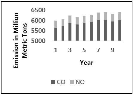
C) Nitrous Oxide (NO) and Carbon Monoxide (CO) Emissions in the U.S. over Ten Years

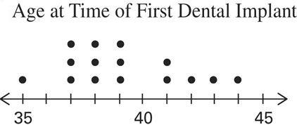
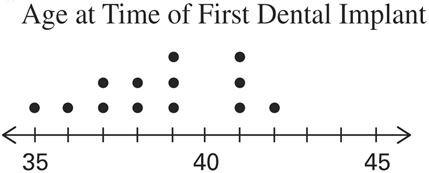
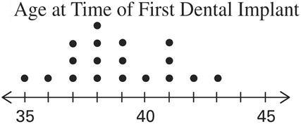
D) Nitrous Oxide (NO) and Carbon Monoxide (CO) Emissions in the U.S. over Ten Years

Answer: A
6) A nurse measured the blood pressure of each person who visited her clinic. Following is a relative-frequency histogram for the systolic blood pressure readings for those people aged between 25 and 40 years. The blood pressure readings were given to the nearest whole number. Approximately what percentage of the people aged 25-40 had a systolic blood pressure reading between 110 and 119 mm Hg inclusive?
Systolic Blood Pressure for People Aged 25-40 Years

A) 0.35%
B) 35%
C) 3.5%
D) 30%
Answer: B
7) A nurse measured the blood pressure of each person who visited her clinic. Following is a relative-frequency histogram for the systolic blood pressure readings for those people aged between 25 and 40 years. The blood pressure readings were given to the nearest whole number. Approximately what percentage of the people aged 25-40 had a systolic blood pressure reading between 110 and 139 mm Hg inclusive?
Systolic Blood Pressure for People Aged 25-40 Years
A) 89%
B) 59%
C) 75%
D) 39%
Answer: C
8) A researcher records the number of new loggerhead turtle nests she locates each day. The data are as follows. 10
Which of these choices displays the correct dotplot? A)
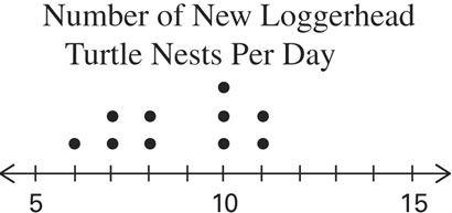

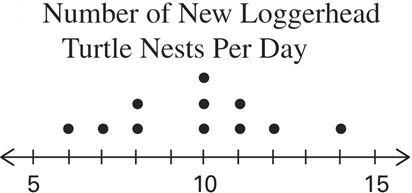

Answer: B
TBEXAM.COM
9) The following data show the number of patients seen by a doctor in a day for twelve days.
Which of these choices displays the correct stemplot?
Answer: A
10) The scatterplot below displays the amount of nitrous oxide (NO) explained by the amount of carbon monoxide (CO) emissions in million metric tons over a ten year period in the United States. Select the choice that best describes any relationship between the variables.

A) There is a negative linear association between NO and CO.
B) There is a positive linear association between NO and CO.
C) Overall, there is no noticeable relationship between NO and CO.
D) NO can be explained by CO.
Answer: C
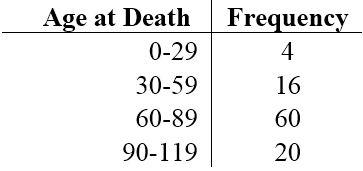
11) The following frequency distribution represents the age at which Alzheimer's was first diagnosed. Find the class midpoint for the interval 70-79.
Age Number of Diagnoses
50-59 2
60-69 4
70-79 6
80-89 15
90-99 5
A) 74.5 years
B) 75.0 years
C) 79.5 years
D) 70.5 years
Answer: A
12) The histogram below represents the number of digital thermometers per household for a sample of U.S. households. What is the sample size?
Number of Digital Thermometers Per U.S. Household
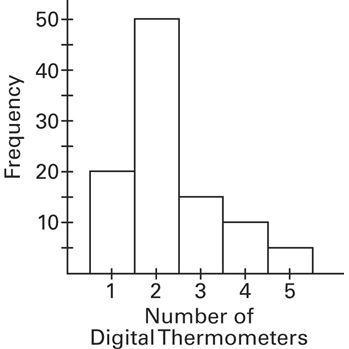
A) 5 households
B) 90 households
C) 50 households
D) 100 households
Answer: D
13) The weights (in pounds) of 22 members of the junior varsity football team are listed below.
Which of these choices displays the correct stemplot?
Answer: A
14) The two key parts of a regression equation involve the ________ and the y________.
A) slope; axis
B) asymptote; axis
C) asymptote; intercept
D) slope; intercept
Answer: D
15) Analysis of the data from 25 mothers indicates that an infant's birth weight (g), y, can be estimated by a mother's weight (kg), x, using the regression equation y = 31x + 1501. For every ________ kg increase in a mother's weight, the infant's birth weight increases by ________ g.
A) 31; 1
B) 31; 1501
C) 1501; 31
D) 1; 31
Answer: D
16) Analysis of the data from 25 mothers indicates that an infant's birth weight (g), y, can be estimated by a mother's weight (kg), x, using the regression equation y = 31x + 1501. If a mother's weight is 70 kg, the infant's birth weight can be estimated as ________ g.
A) 1718
B) 3671
C) 46
D) 48,701
Answer: B
17) Excessive drinking and the episodes of throat cancer have a high correlation, but it does not prove ________.
A) causation
B) a linear relationship
C) correlation
D) exponentiation
Answer: A
18) The frequency distribution below summarizes employee years of service for a regional hospital. Determine the width of each class.
Years of Service Frequency
1-5 5
6-10 20
11-15 25
16-20 10
21-25 5
26-30 3
A) 10 years
B) 4 years
C) 6 years
D) 5 years
Answer: D
19) The frequency distribution below summarizes employee years of service for a regional hospital. Determine the class boundary(ies) for the class 11-15. Years of Service Frequency
1-5 5 6-10 20 11-15 25
16-20 10
21-25 5 26-30 3
A) 10 and 16 years
B) 11 and 15 years
C) 25 years
D) 10.5 and 15.5 years
Answer: D
20) A quality control manager wants to monitor the production of its pills to be sure that the mean amount of medication does not change over time. Which of the following graphs is most helpful for that purpose?
A) Histogram
B) Pareto chart
C) Pie chart
D) Time-series graph
Answer: D
Use the frequency distribution below to answer the following question(s). A sample of 272 log jams found in river channels in the Northwest U.S. is grouped into the resulting frequency distribution based on the width of the channel in which the log jams were found.
21) The distribution of the histogram for the width of the channels appears ________.
A) Uniform
B) Normal
C) Skewed left
D) Skewed right
Answer: D
22) If a relative frequency distribution were constructed for the width of the channels, what would be the relative frequency for the class with a width of 20-24m?
A) 2.2%
B) 5.9%
C) 30.1%
D) 18%
Answer: B
23) If a cumulative frequency distribution were constructed for the width of the channels, what would be the cumulative frequency for the class width less than 10m?
A) 250
B) 185
C) 103
D) 234
Answer: B
24) If a pie chart were constructed for the width of the channels, what would be the measure of the central angle for the class width 10-14m?
A) 21.2°
B) 108.5°
C) 64.9°
D) 136.3°
Answer: C
25) The histogram below represents the number of digital thermometers per household for a sample of U.S. households. What is the sample size?
Number of Digital Thermometers Per U.S. Household
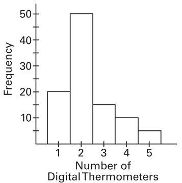
A) 5
B) 90
C) 100
D) 50
Answer: C
26) The following data consists of the weights (in pounds) of 15 randomly selected women and the weights of 15 randomly selected men. Which of these choices displays the correct back-to-back stemplot?
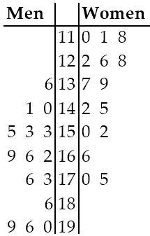
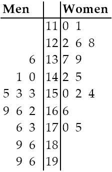
Answer: A
27) According to USA Today, the largest categories of sports equipment sales are as follows: fishing ($2.0 billion); firearms and hunting ($3.1 billion); camping ($1.7 billion); and golf ($2.5 billion). What type of graph would depict these different categories and their relative amounts the best?
A) A column char
B) A bar chart
C) A Pareto chart
D) A pie chart
Answer: C
28) The frequency distribution below summarizes the home sale prices in the city of Summerhill for the month of June. Determine the width of each class.
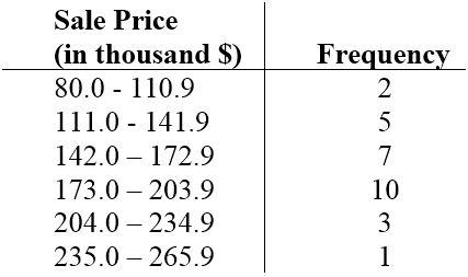
A) 28
B) 61
C) 30
D) 31
Answer: D
29) A nurse measured the blood pressure of each person who visited her clinic. Following is a relative-frequency histogram for the systolic blood pressure readings for those people aged between 25 and 40 years. The blood pressure readings were given to the nearest whole number. Approximately what percentage of the people aged 25-40 had a systolic blood pressure reading between 110 and 139 mm Hg inclusive?
Systolic Blood Pressure for People Aged 25—40 Years

A) 75%
B) 39%
C) 59%
D) 89%
Answer: A
30) The following frequency distribution depicts the scores on a math test. Find the class midpoint of scores for the interval 95-99.
A) 97.0
B) 98.0
C) 96.5
D) 97.5
Answer: A
31) A nurse measured the blood pressure of each person who visited her clinic. Following is a relative-frequency histogram for the systolic blood pressure readings for those people aged between 25 and 40 years. The blood pressure readings were given to the nearest whole number. Approximately what percentage of the people aged 25-40 had a systolic blood pressure reading between 110 and 119 mm Hg inclusive?
Systolic Blood Pressure for People Aged 25—40 Years
A) 3.5%
B) 35%
C) 0.35%
D) 30%
Answer: B
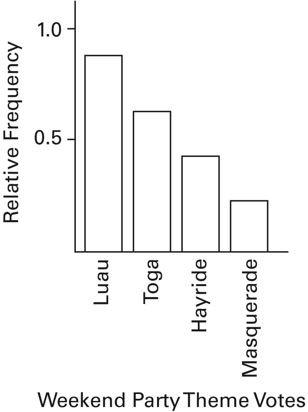
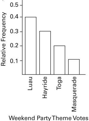
32) The Kappa Iota Sigma Fraternity polled its members on the weekend party theme. The vote was as follows: six for toga, four for hayride, eight for luau, and two for masquerade. Which of these choices displays the correct Pareto chart?
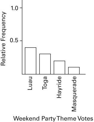

Answer: A
33) The following data show the number of patients seen by a doctor in a day for 12 days.
Which of these choices displays the correct stemplot?
Answer: B
34) The following frequency distribution displays the scores on a math test. Find the class boundaries of scores interval 40-59. Scores
A) 49.5, 59.5
B) 50.5, 58.5
C) 49.5, 58.5
D) 50.5, 59.5
Answer: A
Which of these choices displays the correct dotplot?

Answer: A
36) A pharmaceutical company is always trying to create new flavors of children's cough medicine. They are market testing three kinds to find out which one has the best chance of being consumed. They give small samples of each to 20 children at a pediatrician's office. Four tasters preferred the Strawberry Cream, 12 preferred Choco-Nuts, and four loved the Orange Mint. Construct a Pareto chart to represent these preferences. Choose the vertical scale so that the relative frequencies are represented.


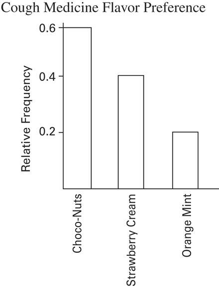
Answer: A
37) The frequency distribution below summarizes the home sale prices in the city of Summerhill for the month of June. Determine the class midpoint (in thousand $) for the class 235.0-265.9.

A) 250.5
B) 250.4
C) 250.45
D) 250.55
Answer: C
38) Identify the cumulative frequency distribution that corresponds to the given frequency distribution.


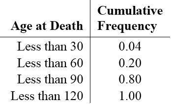
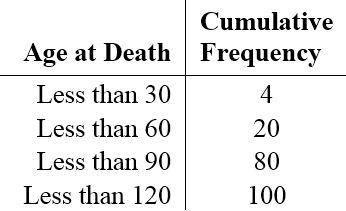
Answer: D
39) The linear ________ coefficient denoted by r measures the ________ of the linear association between two variables.
A) correlation; strength
B) squares; weakness
C) probability; likelihood
D) exponential; exponent
Answer: A
40) Smoking and the episodes of lung cancer have a high correlation, but it does not prove ________.
A) exponentiation
B) correlation
C) causation
D) a linear relationship
Answer: C
SHORT ANSWER. Write the word or phrase that best completes each statement or answers the question.
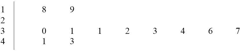
41) A study of physical fitness tests for 12 randomly selected Pre-Medical students measured their exercise capacity (in minutes). The following data resulted:
34 19 33 30 43 36
32 41 31 31 37 18
Construct a stem and leaf plot of the students' exercise capacity. Answer:
Use the frequency distribution below to answer the following question(s). A sample of 80 juvenile salmon is grouped into the resulting frequency distribution based on their weights.
Weight (in grams) Frequency
100-149 15
150-199 10
200-249 30
250-299 25
42) Identify the class width, the class midpoints, and the class boundaries for the class 150-199.
Answer: class width = 50; midpoints = 124.5,174.5, 224.5, 274.5 class boundaries = 99.5,149.5,199.5,
43) Construct a corresponding histogram for the weights of the juvenile salmon.
Answer: Notes: midpoints of classes were used; there should not be gaps between the bars.
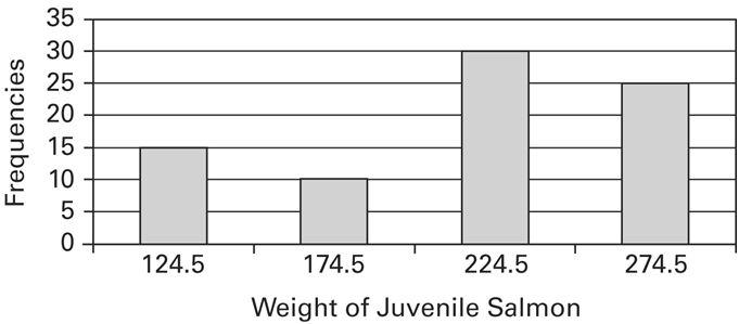
44) Describe the shape of the distribution of the histogram for the weights of the juvenile salmon.
Answer: Slightly skewed left.
45) If a relative frequency distribution were constructed for the weights of the salmon, what would be the relative frequency for the class weighing 200-249 grams?
Answer: 0.375
46) If a cumulative frequency distribution were constructed for the weights of the salmon, what would be the cumulative frequency for the class weighing less than 250 grams?
Answer: 55
47) If a pie chart were constructed for the weights of the salmon, what would be the measure of the central angle for the class weighing 150-199 grams?
Answer: 45
48) A bar chart and a Pareto chart both use bars to show frequencies of categories of categorical data. What characteristic distinguishes a Pareto chart from a bar chart and how does that characteristic help us in understanding the data?
Answer: In a Pareto chart, the bars are arranged in descending order according to frequencies. The Pareto chart helps us understand data by drawing attention to the categories which have the highest frequencies.
49) A medical school performed a study to find the main causes leading to its students dropping out of school. Thirty cases were analyzed, and a primary cause was assigned to each case. The causes included unexcused absences (U), illness (I), family problems (F), and other causes (O). The results for the thirty cases are listed below:
Construct a table summarizing the frequency distribution of the primary causes leading to student dropout.
Answer:

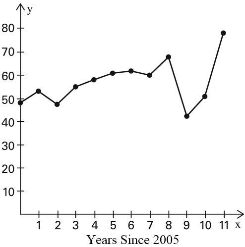
50) Use the high closing values of Statstar Inc. stock from the years 2005-2016 to construct a time-series graph. (Let x = 0 represent 2005 and so on.) Identify a trend.
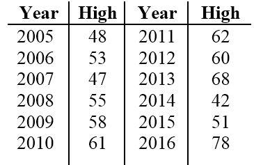
Answer: Trend: Answers will vary. Possible answer: Except for a drop in high closing value in 2007, there was a steady rise through 2013, after which there was a sharp drop in 2014 followed by increases through 2016.
51) Describe at least two advantages to using stemplots rather than frequency distributions. Answer: Answers will vary. Possible answer: The shape of a distribution can readily be seen. The plot can be drawn quicker, since class width need not be calculated.
52) The following data set represents the systolic blood pressure (in mm Hg) for 24 adults as measured at their annual physical.
Construct a frequency distribution with 4 classes, a class width of 2 hours, and a lower limit of 100 for class 1.
Answer:

53) The graph below shows the number of car accidents occurring in one city in each of the years 2011 through 2016. The number of accidents dropped in 2013 after a new speed limit was imposed. Does the graph distort the data? How would you redesign the graph to be less misleading?
Number of Car Accidents for 2011-2016
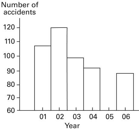
Answer: The graph distorts the data because the vertical scale starts at 60 rather than 0, giving the impression of a large difference in the number of accidents, when actually the number of accidents only varies from 90 to 120. To make the graph less misleading, change the vertical scale so that it begins at 0 and increases in increments of 20.
54) Upon entering a medical exam, 26 patients were asked their ages. The results are shown below. Construct a histogram to represent the data (with 5 classes beginning with a lower class limit of 19.5 and a class width of 10). What is the approximate age at the center?
Answer: The approximate age at the center is 50 years.

55) Suppose that a data set has a minimum value of 24 and a maximum of 79 and that you want 5 classes. Explain how to find the class width for this frequency table. What happens if you mistakenly use a class width of 11 instead of 12?
Answer: Since the range is 79 - 24 = 55, and 55 divided by 5 equals 11, a whole number, the class width has to be widened from 11 to 12. If the class width was 11 data values equal to 79 would not be included in the frequency distribution.
56) Describe the differences between a histogram and a stemplot and discuss the advantages and disadvantages of each.
Answer: Answers will vary. A histogram organizes the data into classes that have widths determined by the designer. Once a histogram has been created, the original data values can no longer be determined. An advantage is that large amounts of data can be organized into a relatively small space. For stemplots, the groups are determined by place value. The original data values are still accessible from stemplots. Stemplots can be prohibitively large for large sets of data.
57) The frequency table below shows the amount of weight loss during the first month of a diet program for a group of men. Construct a frequency polygon. Applying a loose interpretation of the requirements for a normal distribution, do the pounds of weight loss appear to be normally distributed? Why or why not?

Answer: Amount of Weight Loss Among Males During First Month

58) Define the difference between a relative frequency distribution and a cumulative frequency distribution. Answer: A relative frequency distribution displays the proportion or percentage of the total. The sum of the percentages is 100%. Another variation of a frequency distribution is accumulative frequency distribution in which the frequency for each class is the sum of the frequencies for that class and all previous classes.
59) Graphs should be constructed in a way that is fair and objective. A common deceptive graph alters the axes of the graph in what way?
Answer: A common deceptive graph involves using a vertical scale that starts at some value greater than zero to exaggerate differences between groups.
60) Describe how a data point labeled as an outlier can affect the analysis of a data set in a frequency distribution or histogram.
Answer: An outlier is defined as a data point far away from the other data points. An outlier affects the calculation of the mean of a data set and will pull the mean towards the outlier. In addition, an outlier will extend the range of the data set, causing most of the bin intervals to be bunched together along with a large range of bins with no data until the outlier bin is reached. This makes the analysis more difficult if the outlier is included making it more difficult to see the behavior of the rest of the data points.
1) A
ID: BISTAT3T 2.1-1
Diff: 0
Objective:
2) A
ID: BISTAT3T 2.1-2
Diff: 0
Objective:
3) C
ID: BISTAT3T 2.1-3
Diff: 0
Objective:
4) C
ID: BISTAT3T 2.1-4
Diff: 0
Objective:
5) A
ID: BISTAT3T 2.1-5
Diff: 0
Objective:
6) B
ID: BISTAT3T 2.1-6
Diff: 0
Objective:
7) C
ID: BISTAT3T 2.1-7
Diff: 0
Objective:
8) B
ID: BISTAT3T 2.1-8
Diff: 0
Objective:
9) A
ID: BISTAT3T 2.1-9
Diff: 0
Objective:
10) C
ID: BISTAT3T 2.1-10
Diff: 0
Objective:
11) A
ID: BISTAT3T 2.1-11
Diff: 0
Objective:
12) D
ID: BISTAT3T 2.1-12
Diff: 0
Objective:
13) A
ID: BISTAT3T 2.1-13
Diff: 0
Objective:
14) D
ID: BISTAT3T 2.1-14
Diff: 0
Objective:
15) D
ID: BISTAT3T 2.1-15
Diff: 0
Objective:
16) B
ID: BISTAT3T 2.1-16
Diff: 0
Objective:
17) A
ID: BISTAT3T 2.1-17
Diff: 0
Objective:
18) D
ID: BISTAT3T 2.1-18
Diff: 0
Objective:
19) D
ID: BISTAT3T 2.1-19
Diff: 0
Objective:
20) D
ID: BISTAT3T 2.1-20
Diff: 0
Objective:
21) D
ID: BISTAT3T 2.2-1
Diff: 0
Objective:
22) B
ID: BISTAT3T 2.2-2
Diff: 0
Objective:
23) B
ID: BISTAT3T 2.2-3
Diff: 0
Objective:
24) C
ID: BISTAT3T 2.2-4
Diff: 0
Objective: