Section 2-1: Frequency Distributions for Organizing and Summarizing Data 7
Chapter 2: Exploring Data with Tables and Graphs
Section 2-1: Frequency Distributions for Organizing and Summarizing Data
1. No. Instead of frequencies that start low, reach a maximum, and then decrease, the given distribution starts with a maximum frequency of 14 and the frequencies then decrease.
2.
3. There is overlap in the class limits of 1.0–1.2, 1.2–1.4, and so on. For an amount such as 1.2 mg, it would not be clear which class contains the value. The classes should not overlap.
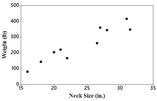
4. The sum of the relative frequencies is 125%, but it should be 100%, with a small round off error. All of the relative frequencies appear to be roughly the same, but if they are from a normal distribution, they should start low, reach a maximum, and then decrease.
5. Class width: 2.0
Class midpoints: 2.95, 4.95, 6.95, 8.95, 10.95, 12.95, 14.95
Class boundaries: 1.95, 3.95, 5.95, 7.95, 9.95, 11.95, 13.95, 15.95
Number: 147
6. Class width: 2.0
Class midpoints: 2.95, 4.95, 6.95, 8.95, 10.95, 12.95
Class boundaries: 1.95, 3.95, 5.95, 7.95, 9.95, 11.95, 13.95
Number: 153
7. Class width: 100
TBEXAM.COM
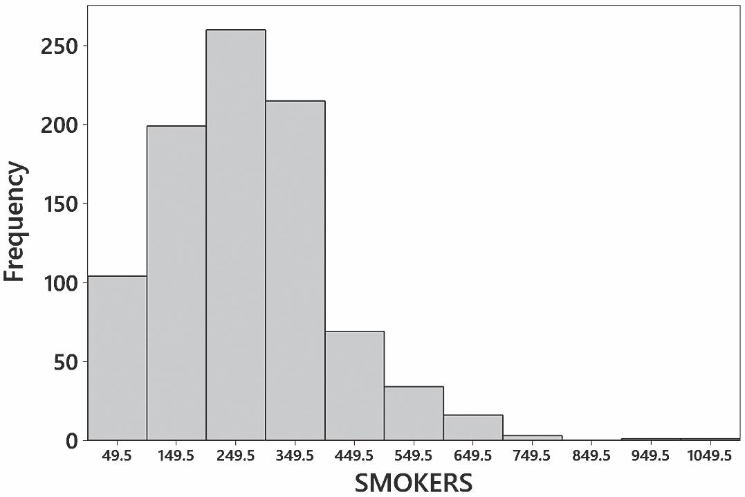
Class midpoints: 49.5, 149.5, 249.5, 349.5, 449.5, 549.5, 649.5
Class boundaries: –0.5, 99.5, 199.5, 299.5, 399.5, 499.5, 599.5, 699.5
Number: 153
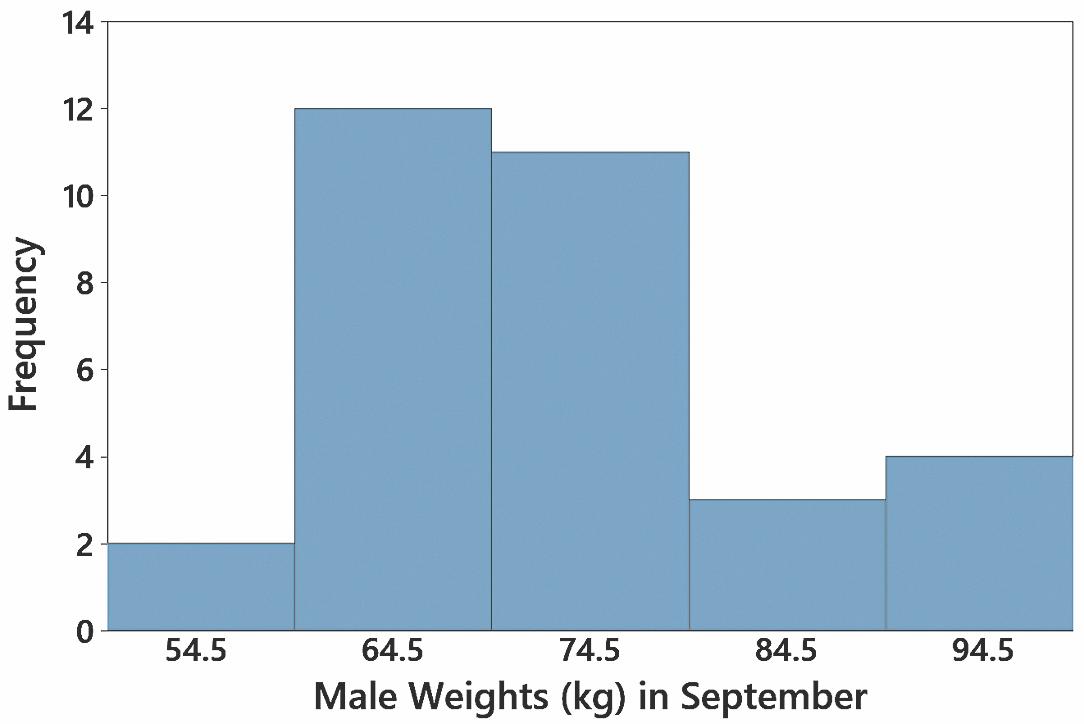
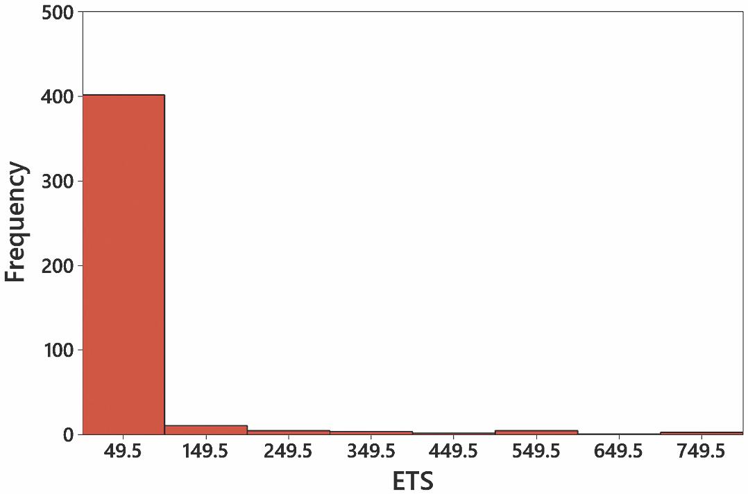
8. Class width: 100
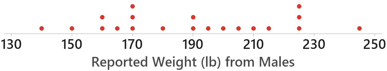
Class midpoints: 149.5, 249.5, 349.5, 449.5, 549.5
Class boundaries: 99.5, 199.5, 299.5, 399.5, 499.5, 599.5
Number: 147
9. Yes. The frequencies start low, reach a maximum, and then decrease.
10. Not normal. The frequencies are not approximately symmetric. The maximum frequency is in the second class.
11. Yes. Except for the single value that lies between 600 and 699, the frequencies start low, reach a maximum of 90, and then decrease. The values below the maximum are very roughly a mirror image of those above it. (That single value between 600 and 699 is an outlier that makes the determination of a normal distribution somewhat questionable, but using a loose interpretation of the criteria for normality, it is reasonable to conclude that the distribution is normal.)
12. Yes. Except for two values that lie between 500 and 599, there is a low frequency of 25, then a maximum frequency of 92, and then a low frequency of 28. The values below and above the maximum are roughly a mirror image. (Those two values between 500 and 599 are outliers that make the determination of a normal distribution somewhat questionable, but using a loose interpretation of the criteria for normality, it is reasonable to conclude that the distribution is normal.)
Copyright © 2024 Pearson Education, Inc.
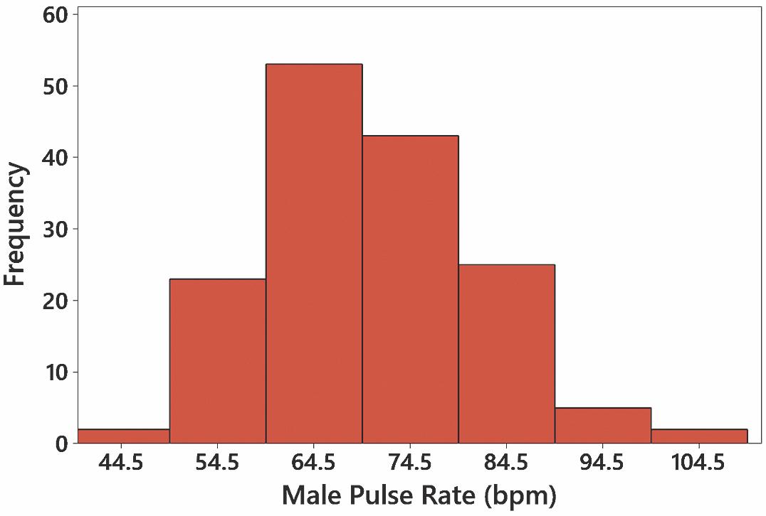
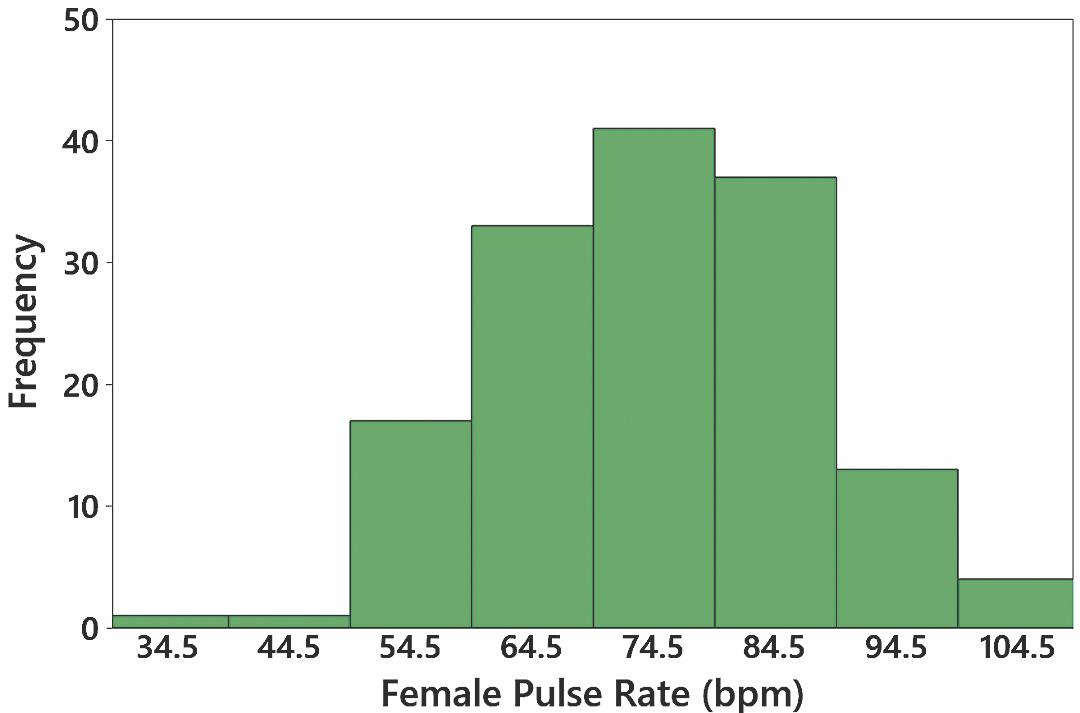
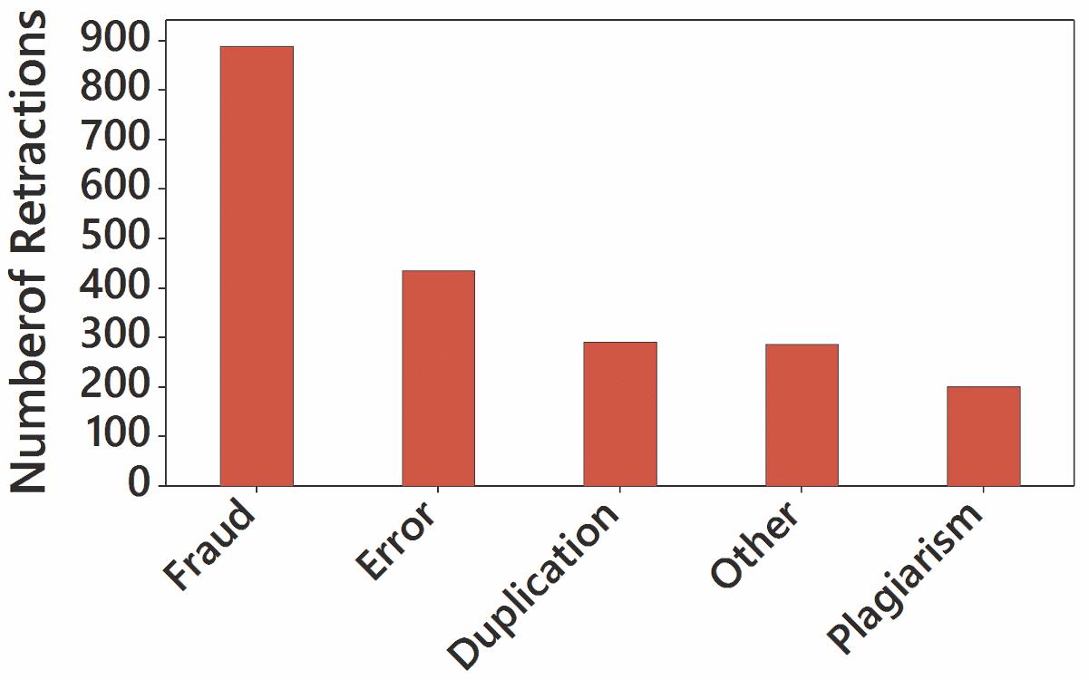
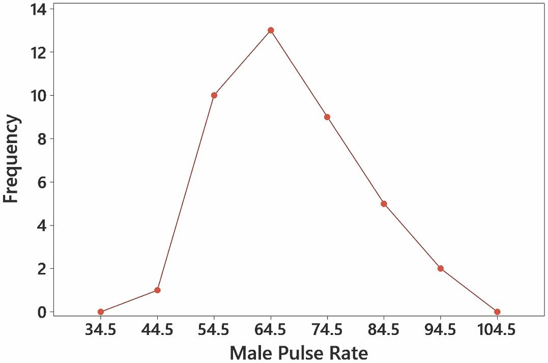
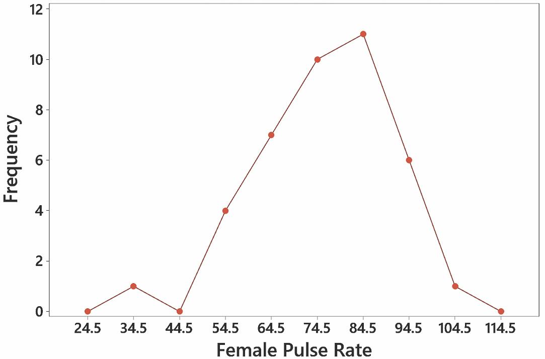
13. The pulse rates do appear to be from a normal distribution.
14. The pulse rates do appear to be from a normal distribution.
15. The verbal IQ
16. The verbal IQ scores do appear to be from a population having a normal distribution. Verbal
17. No, the pulse rates are not dramatically different. The pulse rates appear to be from a normal distribution.
8 Chapter 2: Exploring Data with Tables and Graphs Copyright © 2024 Pearson Education, Inc.
Section 2-1: Frequency Distributions for Organizing and Summarizing Data 9
18. No, the pulse rates are not dramatically different. The pulse rates appear to be from a normal distribution.
19. The distribution does appear to be a normal distribution.
20. No. There does not appear to be such a dramatic weight gain
21. Because there are disproportionately more 0s and 5s, it appears that the heights were reported instead of measured. Consequently, it is likely that the results are not very accurate.
Copyright © 2024 Pearson Education, Inc.
10 Chapter 2: Exploring Data with Tables and Graphs
22. Because there are disproportionately more 0s and 5s, it appears that the heights were reported instead of measured. There does appear to be a gap due to the tendency of respondents to round their heights to values ending in 0 or 5. Because the results appear to be reported instead of measured, it is likely that the results are not very accurate.
23. The two distributions appear to be very similar.
24. There do appear to be differences, but overall, they are not very substantial differences.
25.
Copyright © 2024 Pearson Education, Inc.
26.
Section 2-2: Histograms 11
27. Because only the five leading causes of death are listed, we know only that any other cause of death must have fewer than 150,005 deaths.
28. Yes, it appears that births occur on the days of the week with frequencies that are about the same.
29. The frequencies aren’t very symmetric, but using a very loose interpretation, the measurements do appear to be from a normal distribution.
Section 2-2: Histograms
1. The histogram should be bell-shaped.
2. Not necessarily. Because the sample subjects themselves chose to be included, the voluntary response sample might not be representative of the population.
3. With a data set that is so small, the true nature of the distribution cannot be seen with a histogram.
4. The outlier will result in a single bar that is far away from all of the other bars in the histogram, and the height of that bar will correspond to a frequency of 1.
5. Approximately 50
6. Approximate values: Class width: 0.5 mm, lower limit of first class: 2.0 mm, upper limit of first class: 2.5 mm
7. The largest possible value is approximately 4.5 mm, which is not an outlier.
Copyright © 2024 Pearson Education, Inc.
8. The histogram very roughly approximates a bell shape, so it appears that the sample is from a population having a normal distribution.
9. The distribution appears to be normal, and there are no outliers.
10. The distribution appears to be normal, and there are no outliers.
11. The distribution appears to be normal, and there are no outliers.
12. The distribution appears to be approximately normal (or perhaps skewed to the right), and there are no outliers.
12 Chapter 2: Exploring Data with Tables and Graphs Copyright © 2024 Pearson Education, Inc.
Section 2-2: Histograms 13
13. The distribution does not appear to be normal. It appears to be skewed to the right.

14. The distribution does not appear to be normal. It appears to be skewed to the right.

15. The distribution does not appear to be normal. It appears to be skewed to the right.
16. The distribution is dramatically far from normal. It is skewed to the right.
Copyright © 2024 Pearson Education, Inc.
Chapter 2: Exploring Data with Tables and Graphs
17. The digits 0 and 5 appear to occur more often than the other digits, so it appears that the heights were reported and not actually measured. This suggests that the data might not be very useful.
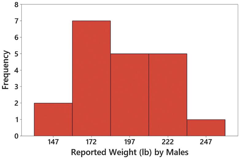
18. The digits 0 and 5 appear to occur more often than the other digits, so it appears that the weights were reported and not actually measured. This suggests that the data might not be very useful.
19. Only part (c) appears to represent data from a normal distribution. Part (a) has a systematic pattern that is not that of a straight line, part (b) has points that are not close to a straight-line pattern, and part (d) is really bad because it shows a systematic pattern and points that are not close to a straight-line pattern.
20. The histogram for the movie lengths suggests that the data have a distribution that is approximately normal with an outlier of 120 minutes. The histogram for the time of tobacco use appears to be similar to the histogram for the times of alcohol use, but both distributions appear to be skewed to the right, with each histogram having an outlier.
Section 2-3: Graphs That Enlighten and Graphs That Deceive
1. The data set is too small for a dotplot to reveal important characteristics of the data. Because the data are listed in order for each of the last several years, a time-series graph would be most effective for these data.
2. Yes, the original data values can be found from the stemplot
3. No. Graphs should be constructed in a way that is fair and objective. The readers should be allowed to make their own judgments, instead of being manipulated by misleading graphs.
4. No. If the sample is a bad sample, such as one obtained from voluntary responses, there are no graphs or statistical methods that can be used to salvage the data.
5. The pulse rate of 36 beats per minute appears to be an outlier.

Copyright © 2024 Pearson Education, Inc.
Section 2-3: Graphs That Enlighten and Graphs That Deceive 15
6. There do not appear to be any outliers.
7. The data are arranged in order from lowest to highest, as 36, 56, 56, and so on.
8. The two values closest to the middle are 72 mmHg and 74 mmHg
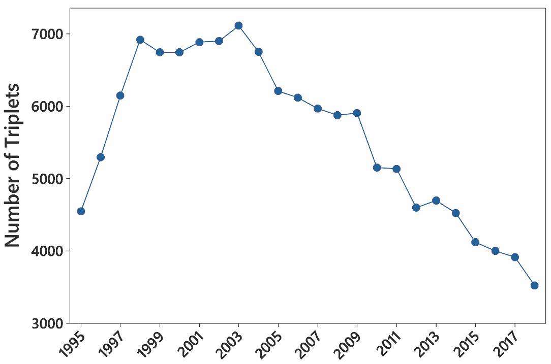
9. There was a steep jump in the first four years, but the numbers of triplets have shown a downward trend in the past several years.
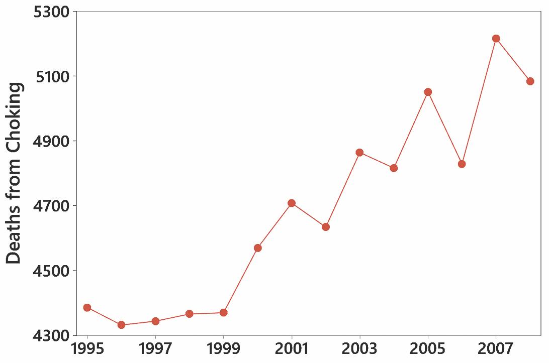
10. The first five years don’t show much change, but the trend starts to climb dramatically in 1999.
Copyright © 2024 Pearson Education, Inc.
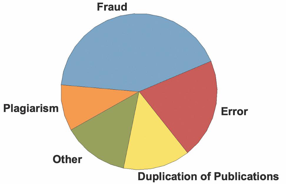
11. Misconduct includes fraud, duplication, and plagiarism, and it does appear to be a major factor.

16 Chapter 2: Exploring Data with Tables and Graphs Copyright © 2024 Pearson Education, Inc.
15. The distribution appears to be roughly bell-shaped, so the distribution is approximately normal.
Section 2-4: Scatterplots, Correlation, and Regression 17
16. The distribution appears to be roughly bell-shaped, so the distribution is approximately normal.
17. The two costs are one-dimensional in nature, but the baby bottles are three-dimensional objects. The $4500 cost isn’t even twice the $2600 cost, but the baby bottles make it appear that the larger cost is about five times the smaller cost.
18. The graph is misleading because it depicts one-dimensional data with three-dimensional boxes. See the first and last boxes in the graph. Workers with advanced degrees have annual incomes that are roughly 3 times the incomes of those with no high school diplomas, but the graph exaggerates this difference by making it appear that workers with advanced degrees have incomes that are roughly 27 times the amounts for workers with no high school diploma.
19. 96 9659
970001112333444
97
9800000000000002222233444444444444
985555666666666666666777777888888899
99001244
9956 55666666788888999
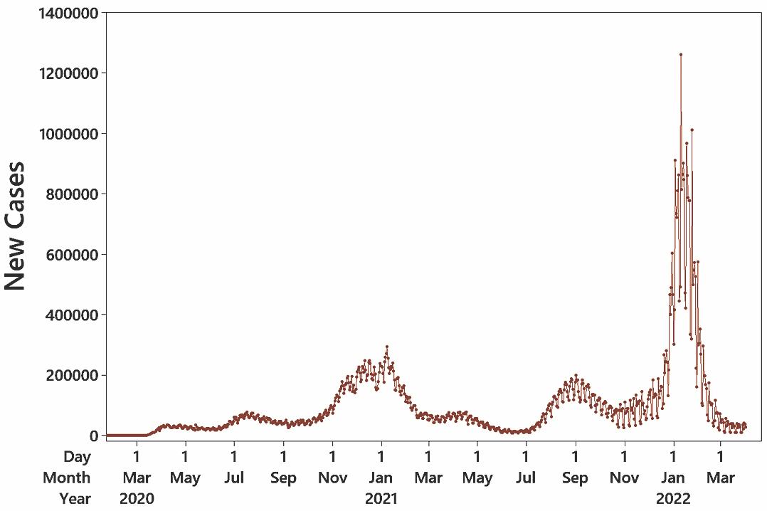
20. Because the data are listed in order according to day, a time-series graph would be most revealing about the nature of the data. The time-series graph shows two distinct major peaks: in around the beginning of 2021 and in September 2021.
Section 2-4: Scatterplots, Correlation, and Regression
1. The term linear refers to a straight line, and r measures how well a scatterplot of the sample paired data fits a straight-line pattern.
2. No. Finding the presence of a statistical correlation between two variables does not justify any conclusion that one of the variables is a cause of the other.
3. A scatterplot is a graph of paired (,) x y quantitative data. It helps us by providing a visual image of the data plotted as points, and such an image is helpful in enabling us to see patterns in the data and to recognize that there may be a correlation between the two variables.
Copyright © 2024 Pearson Education, Inc.
18 Chapter 2: Exploring Data with Tables and Graphs
4. a. 1 b. c. 0 d. 1
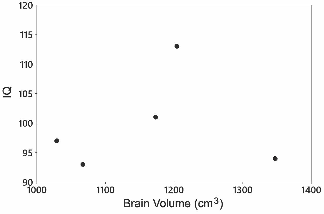
5. There does not appear to be a linear correlation between brain volume and IQ score.
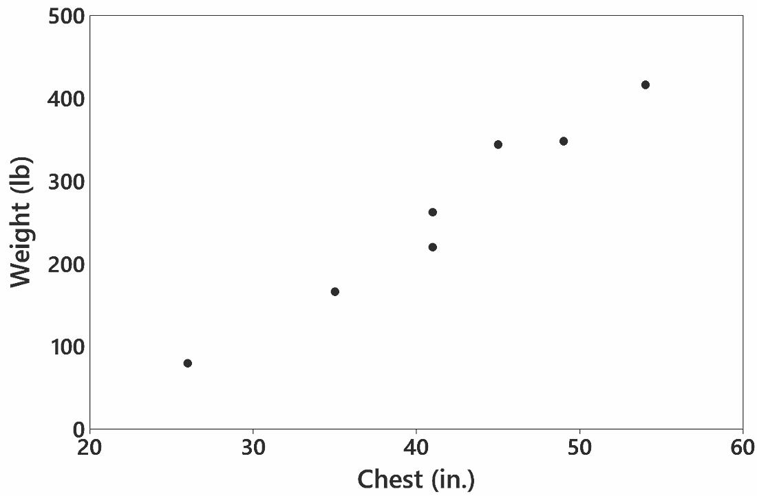
6. There does appear to be a linear correlation between the chest sizes and weights of bears.
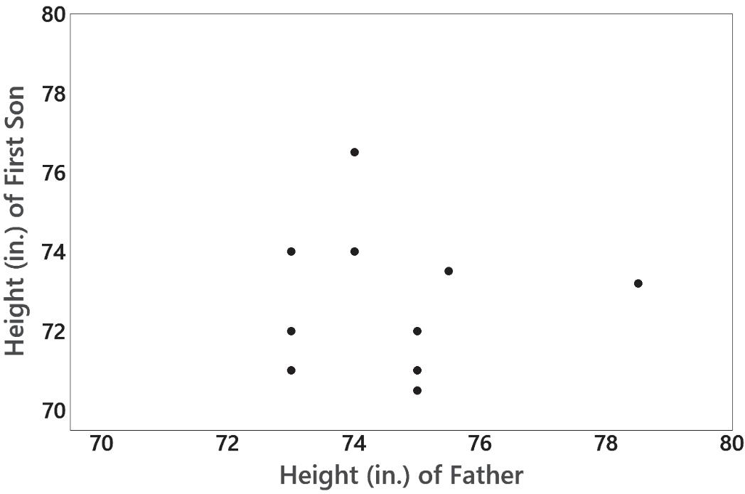
7. There does not appear to be a linear correlation between the heights of fathers and the heights of their first sons.
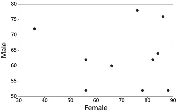
8. There does not appear to be a correlation between pulse rates of females and males. The major flaw with this exercise is that the data are not paired as required. The results are therefore meaningless.
Copyright © 2024 Pearson Education, Inc.
9. With 5 n pairs of data, the critical values are 0.878. Because 0.127 r is between –0.878 and 0.878, there is not sufficient evidence to conclude that there is a linear correlation.
10. With 7 n pairs of data, the critical values are 0.754. Because 0.980 r is in the right tail region beyond 0.754, there is sufficient evidence to conclude that there is a linear correlation.
11. With 10 n pairs of data, the critical values are 0.632. Because 0.017 r is between –0.632 and 0.632, there is not sufficient evidence to conclude that there is a linear correlation.
12. With 10 n pairs of data, the critical values are 0.632. Because 0.076 r is between –0.632 and 0.632, there is not sufficient evidence to conclude that there is a linear correlation. The data are not paired, so the results are meaningless.
13. Because the P-value of 0.839 is not small (such as 0.05 or less), there is a high chance of getting the sample results when there is no correlation. There is not sufficient evidence to conclude that there is a linear correlation.
14. Because the P-value of 0.0001 is small (such as 0.05 or less), there is a small chance of getting the sample results when there is no correlation. There is sufficient evidence to conclude that there is a linear correlation.
15. Because the P-value of 0.963 is not small (such as 0.05 or less), there is a high chance of getting the sample results when there is no correlation. There is not sufficient evidence to conclude that there is a linear correlation.
16. Because the P-value of 0.835 is not small (such as 0.05 or less), there is a high chance of getting the sample results when there is no correlation. There is not sufficient evidence to conclude that there is a linear correlation.
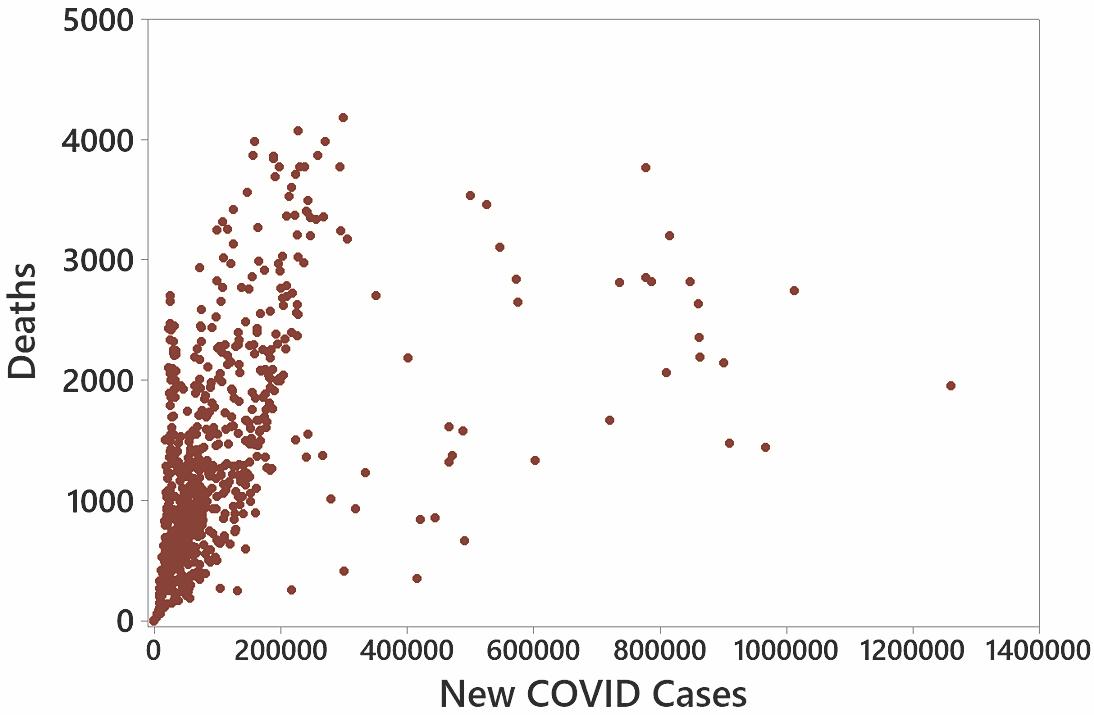
17. The scatterplot shows a pattern suggesting, not too surprisingly, that as the numbers of new cases of COVID-19 increase, the numbers of deaths also increase. There appears to be a correlation. Among the 800 points, there appears to be a somewhat strong correlation except for the 45 points farthest to the right. A flaw in the paired data is that vaccinations began roughly a year into the pandemic, so the paired data of new cases and deaths consists of a population that is changing instead of being constant.
Quick Quiz
1. The class width is 20.
3. No, it is impossible to determine the original values.
4. 153, 154, 158
5. The histogram will be bell-shaped.
6. variation
2. The class boundaries are 19.5 and 39.5.
7. time-series graph
8. scatterplot
9. Pareto chart
10. A frequency distribution is in the format of a table; a histogram is a graph.
Review Exercises
1.
Copyright © 2024 Pearson Education, Inc.
20 Chapter 2: Exploring Data with Tables and Graphs
2. The data appear to be from a population with a distribution that is approximately normal. The bars start low, reach a maximum, and then decrease, and the left half of the histogram is approximately a mirror image of the right half. The graph is approximately bell-shaped.
3. By using fewer classes, the histogram does a better job of illustrating the distribution.
4. There are no outliers.
5. Yes. There is a pattern suggesting that there is a relationship.
6. a. time-series graph b. scatterplot c. Pareto chart
7. By using a vertical scale that starts at 49.0% instead of 0%, the difference is greatly exaggerated. The graph creates the false impression that female enrollees outnumber male enrollees by a ratio of roughly 2.5 to 1, but
Copyright © 2024 Pearson Education, Inc.
Cumulative Review Exercises 21
the actual percentages of 50.5% and 49.5% are very much closer than that. If the graph had been created with a vertical axis starting at 0%, the difference between the two bars would be almost imperceptible.
Cumulative Review Exercises 1.
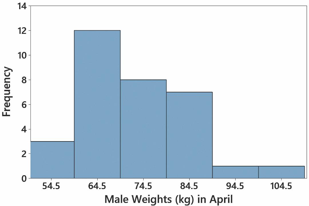
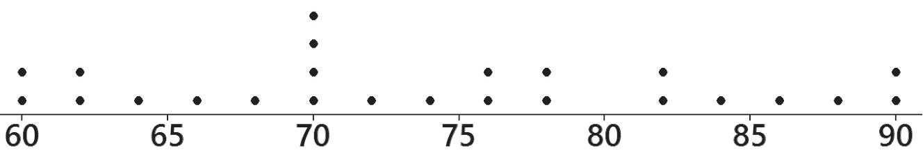
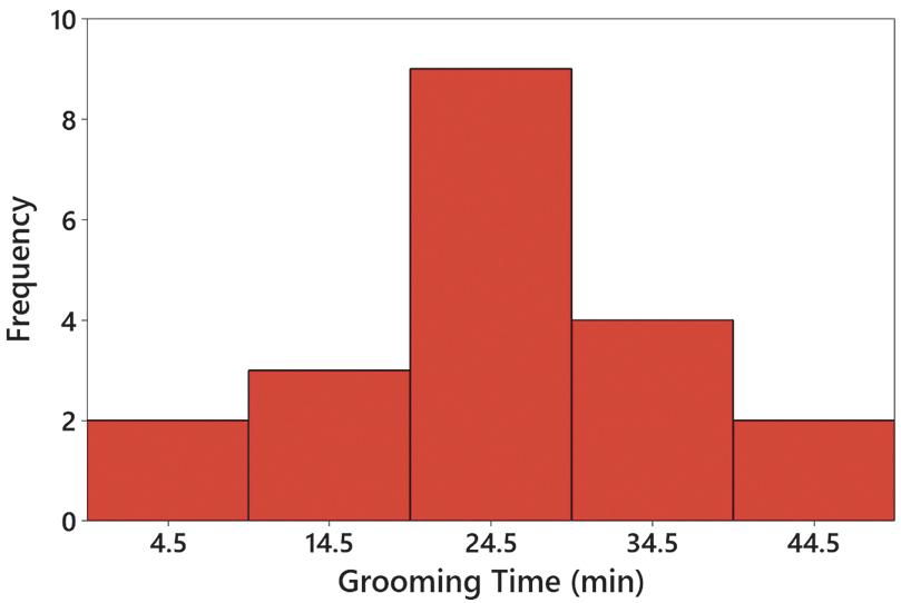
2. The histogram is approximately bell-shaped. The frequencies increase to a maximum and then decrease, and the left half of the histogram is roughly a mirror image of the right half. The data do appear to be from a population with a normal distribution. 3.
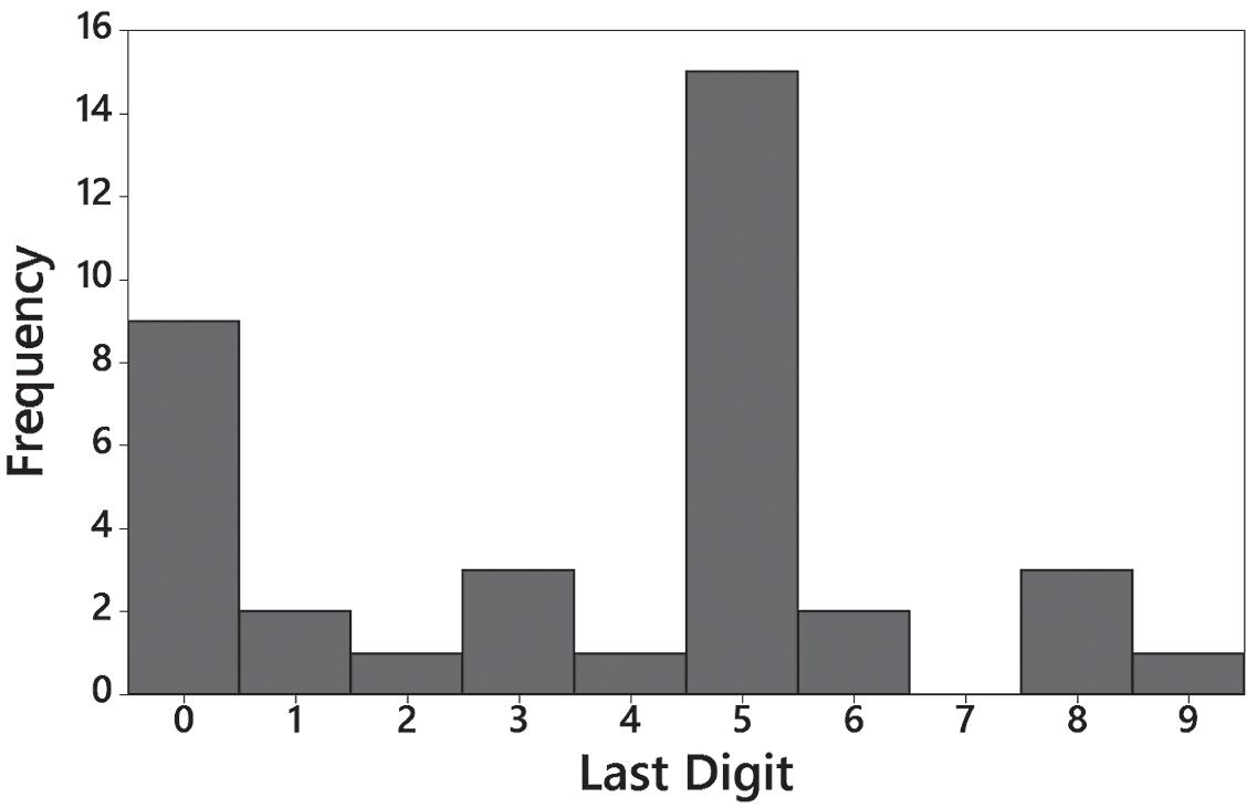
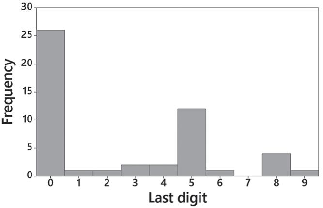
4. There are disproportionately more last digits of 0 and 5. Fourteen of the 20 times have last digits of 0 or 5. It appears that the subjects reported their own results and they tended to round the results. The data do not appear to be very accurate.
Copyright © 2024 Pearson Education, Inc.
22 Chapter 2: Exploring Data with Tables and Graphs
5. a. ratio
b. continuous
c. No. The grooming times are quantitative data.
d. statistic
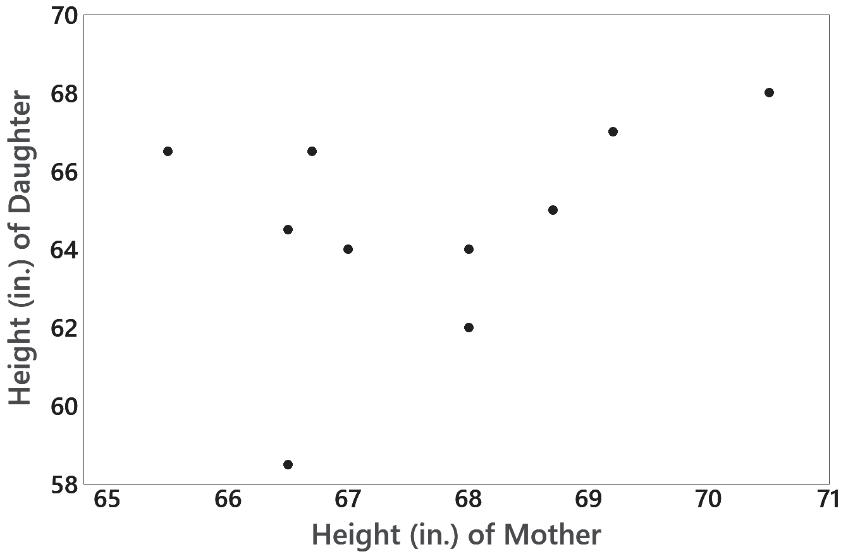
6. The scatterplot helps address the issue of whether there is a correlation between the heights of mothers and the heights of their first daughters. The scatterplot does not reveal a clear pattern suggesting that there is a correlation.
Copyright © 2024 Pearson Education, Inc.