Ch. 2Picturing Variation with Graphs
2.1Sec 1-2. Visualizing Variation in Numerical Data/Summarizing Important Features of a Numerical Distribution
1Interpret Dotplots and Histograms
MULTIPLE CHOICE. Choose the one alternative that best completes the statement or answers the question.
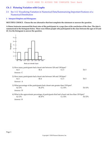
A fitness instructor measured the heart rates of the participants in a yoga class at the conclusion of the class. The data is summarized in the histogram below. There were fifteen people who participated in the class between the ages of 25 and 45. Use the histogram to answer the question.
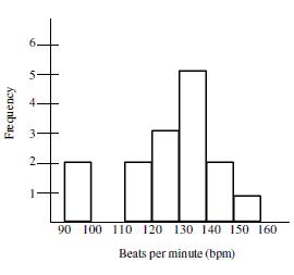
1)How many participants had a heart rate between 120 and 130 bpm? A)2
Answer:C
2)How many participants had a heart rate between 140 and 150 bpm? A)2 B)4
Answer:A
3)What percentage of the participants had a heart rate greater than 130 bpm? A)13% B)27% C)33% D)53%
Answer:D
4)What is the approximate percentage of participants that had a heart rate less than 130 bpm? A) 13% B) 47% C)33% D)53%
Answer:B
Solve the problem.
5)Each day for twenty days a record store owner counts the number of customers who purchase an album by a cer artist. The data and a dotplot of the data are shown below:
Data set: 1, 3, 4, 4, 5, 6, 7, 2, 3, 4, 4, 5, 6, 8, 2, 3, 4, 5, 6, 7, 9

Which of the following statements can be made using the given information?
A)On the first day of collecting data the record store owner had one person purchase an album by the artist.
B)The dotplot shows that this data has a roughly bell - shaped distribution.
C)During the twenty days when the record store owner collected data, there were some days when no one purchased an album by the artist.
D) None of these Answer:B
6)For twenty days a record store owner counts the number of customers who purchase an album by a certain artis data and a dotplot of the data are shown below:
Data set: 1, 3, 4, 4, 5, 6, 7, 2, 3, 4, 4, 5, 6, 8, 2, 3, 4, 5, 6, 7, 9

Which of the following statements can be made using the given information?
A)On five of the twenty days observed by the record store owner, there were four albums by the artist purchased.
B)During the twenty days when the record store owner collected data, at least one album by the artist was purchased each day.
C) The dotplot shows that this data has a roughly bell - shaped distribution.
D)All of these Answer:D
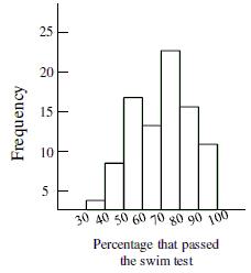
7)The histogram below shows the distribution of pass rates on a swimming test of all children who completed a four week summer swim course at the local YMCA. How many of the courses had a pass rate less than 40 percent?
A)About 8
C)About 3
Answer:C
B)About 5
D)Not enough information available
8)The histogram below shows the distribution of pass rates on a swimming test taken by all children who completed a four week summer swim course at the local YMCA. What is the typical pass rate for the swim test?

A)About 75%
C)About 95%
Answer:A
B)About 55%
D)Not enough information available
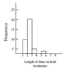
9)Based on the histogram below, would it be unusual to be on hold for 5 minutes or more at this call center?
A)Yes, it would be unusual.
B)No, it would not be unusual.
C)Not enough information given.
Answer:A
10)A dot plot of the speeds of a sample of 50 cars passing a policeman with a radar gun is shown below.
What proportion of the motorists were driving above the posted speed limit of 55 miles per hour?
A)0.50B)0.64C)0.14D)7
Answer:A
Provide an appropriate response. 11)
How many people were 20 years old?
A)9B)11C)13D)8
Answer:A
How many people were 22 years old or older?
A)13 people
Answer:A
Solve the problem.
B)8 people
C)17 people
13)In the following histogram, what can you conclude about the bin width?
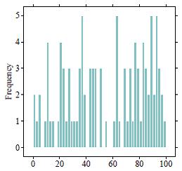
A)The bin width is too small. We are given too much detail.
B)The bin width is too large. We are given too much detail.
C)The bin width is too small. We are hiding details of the distribution.
D)The bin width is too large. We are hiding details of the distribution.
Answer:A
D)15 people
14)In the following histogram, what can you conclude about the bin width?
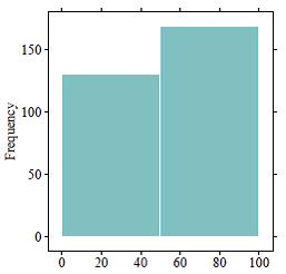
A)The bin width is too small. We are given too much detail.
B)The bin width is too large. We are given too much detail.
C)The bin width is too small. We are hiding details of the distribution.
D)The bin width is too large. We are hiding details of the distribution.
Answer:D
15)Which histogram represents the same data as the dotplot shown below?
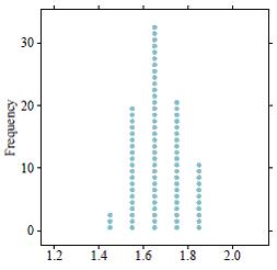
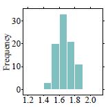
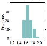
Answer:A
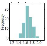
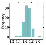
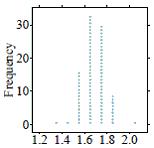
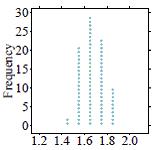
16)Which dotplot represents the same data as the histogram shown below?
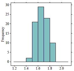
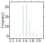
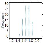
Answer:D
17)The following histogram represents audience movie ratings (on a scale of 1 - 100) of 489 movies. What is the typical movie rating given by audiences according to this distribution?
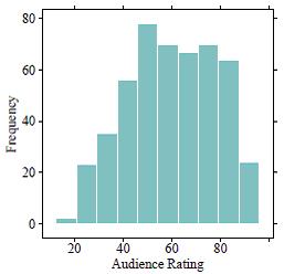
A)The typical value is about 40.
C)The typical value is about 60.
Answer:C
18)What is the typical value for the histogram shown below?
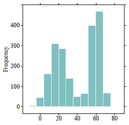
B)The typical value is about 50.
D)The typical value is about 70.
A)The typical value is 40 because it is the center of the distribution.
B)The typical value is 40 because it is the average of 20 and 60.
C)Since the data are bimodal, a typical value cannot be found.
D)Since the data are bimodal, there are two typical values - one is about 20 and the other is about 60.
Answer: D
19)The following histogram represents the movie runtimes (length of a movie in minutes) of 489 movies. What is the typical movie runtime according to this distribution?
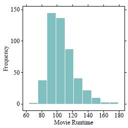
A)The typical value is about 90.
C)The typical value is about 120.
Answer:B
20)What is the typical value for the histogram shown below?
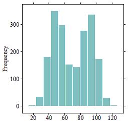
B)The typical value is about 100.
D)The typical value is about 130.
A)The typical value is 70 because it is the average of 50 and 90.
B)The typical value is 70 because it is the center of the distribution.
C)Since the data are bimodal, a typical value cannot be found.
D)Since the data are bimodal, there are two typical values - one is about 50 and the other is about 90.
Answer: D
21) What is the difference between a histogram and a relative frequency histogram?
A)A histogram uses numbers to record how many observations are in a data set, and a relative histogram uses categories.
B)A histogram uses categories to record how many observations are in a data set, and a relative histogram uses counts.
C) A histogram uses counts to record how many observations are in a data set, and a relative histogram uses proportions.
D)A histogram uses proportions to record how many observations are in a data set, and a relative histogram uses counts.
Answer:C
22)Which of the following would likely show a bimodal distribution in a histogram?
A)The heights of all students in a high school band.
B)The ages of students who attend a 4 - year university.
C)The number of hours preschoolers plays outside.
D)The final exam grades for an introductory statistics course.
Answer:A
SHORT ANSWER. Write the word or phrase that best completes each statement or answers the question.
23) How is a dotplot similar to a histogram? How is it different?
Answer:A dotplot and a histogram both show the overall shape of a distribution. They both can help determine a distributionʹ s shape, center, and spread. They differ in terms of appearance in only one way. A dotplot displays a dot to represent each observation in the data, while a histogram uses bars to display intervals of observations.
24) Below are two histograms. One corresponds to the ages at which a sample of people applied for marriage licenses; the other corresponds to the last digit of a sample of social security numbers. Which graph is which, and why?
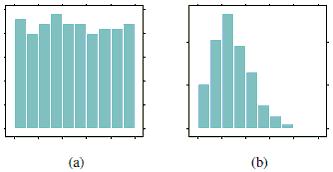
Answer:Histogram (a) displays the last digits of social security numbers because all of the values are mostly equally likely. Since the last digit of social security numbers are created randomly, we would expect any digit between 0 and 9 to show up just as often as another digit. Histogram (b) displays the ages at which a sample of people applied for a marriage license. Since most people get married in their early to mid- twenties, but there are also people who wait to get married until a later age, we would expect the distribution to be right - skewed.
25)The following histogram represents the number of reviews a movie received on a popular website. What is the typical number of reviews a movie is expected to receive, according to this distribution? Explain your reasoning.
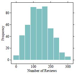
Answer:The typical number of reviews a movie will receive is about 130. We know this because the distribution is centered around the value 130 on the x - axis.
26)How would you describe the typical value for this histogram? Explain your reasoning.
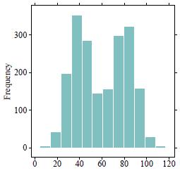
Answer:Since the data are bimodal, there are two typical values - one is about 40 and the other is about 80.
27)If you were to create a dotplot to display the same data that is represented in the following histogram, how many dots would you draw to represent heights that fall between 1.5 meters and 1.6 meters?
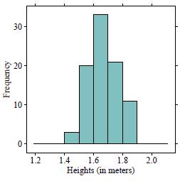
Answer:About 20 dots should be drawn because there are about 20 people whose heights fall between 1.5 meters and 1.6 meters, as shown by the frequency value on the y - axis.
2Summarize Important Features of a Numerical Distribution
MULTIPLE CHOICE. Choose the one alternative that best completes the statement or answers the question.
Solve the problem.
1) The histogram shows the distribution of pitch speeds for a sample of 75 pitches for a college pitcher during one season. Which of the following statements best describes the distribution of the histogram below?
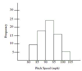
A)The distribution has a large amount of variation which can be seen by comparing the heights of the bars in the histogram.
B)The distribution is right- skewed and shows that most of the pitches were more than 90 mph.
C)The distribution is left - skewed and shows that most of the pitches were less than 95 mph.
D) The distribution is symmetric around a pitch speed of about 93 mph.
Answer:D
2)The histogram below is the distribution of heights for a randomly selected Boy Scout troupe. Choose the stateme is true based on information from the histogram.
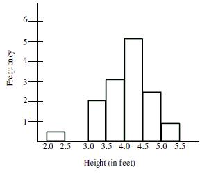
A)The gap between the two smallest values indicates an outlier may be present.
B)The smallest value is so extreme that it is possible that a mistake was made in recording the data.
C)Although the smallest value does not fit the pattern, it should not be altogether disregarded. It is possible that the Boy Scout is 2.4 feet tall.
D) All of these are true statements.
Answer:D
3)Data was collected on hand grip strength of adults. The histogram below summarizes the data. Which statement about the distribution of the data shown in the graph?
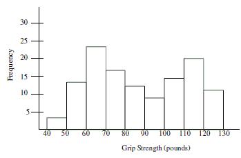
A)The graph is useless because it is bimodal.
B)The best estimate of typical grip strength is 80 - 90 pounds because it is in the center of the distribution.
C)There must have been a mistake made in data collection because the distribution should be bell - shaped.
D)The graph shows evidence that two different groups may have been combined into one collection.
Answer: D
4)The histogram below displays the distribution of the length of time on hold, for a collection of customers, calling repair call center. Use the histogram to select the true statement.

A)The distribution is symmetrical. The number of callers who waited on hold for less than three minutes was the same as the number of callers who waited on hold for more than three minutes.
B)The distribution is left - skewed and most callers waited on hold at least three minutes.
C)The distribution shows that the data was highly variable with some callers waiting on hold as many as 20 minutes.
D) The distribution is right- skewed and most callers waited on hold less than three minutes. Answer:D
Choose the histogram that matches the description.
5)The distribution of heights of adult males tends to be symmetrical.
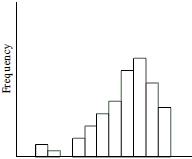
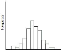
Answer:B
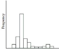
6)The distribution of the number of times individuals in the 18 - 24 age group log onto a social networking website during the course of a day tends to be right skewed.


Answer:C
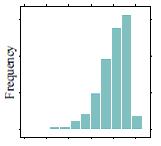
7)The distribution of test scores for a group of adults on a written driving exam following a refresher course tends to be left - skewed.


Answer:A
Construct the dotplot for the given data.
8)A store manager counts the number of customers who make a purchase in his store each day. The data are as fol
Answer:A
9)The following data represent the number of cars passing through a toll booth during a certain time period over a number of days.
Solve the problem.
10)How are individual observations recorded in a dotplot, a histogram, and a stemplot?
A)A dotplot displays the actual values of observations. A histogram displays a dot for every observation. A stemplot uses bars to display intervals of observations.
B)A dotplot displays a dot for every observation. A histogram uses bars to display intervals of observations. A stemplot displays the actual values of observations.
C) A dotplot displays the actual values of observations. A histogram uses bars to display intervals of observations. A stemplot displays a dot for every observation.
D)A dotplot uses bars to display intervals of observations. A histogram displays a dot for every observation. A stemplot displays the actual values of observations.
Answer: B
11) How are individual observations recorded in a dotplot versus a stemplot?
A)A dotplot displays the actual values of observations. A stemplot uses bars to display intervals of observations.
B)A dotplot displays the actual values of observations. A stemplot displays a dot for every observation.
C) A dotplot displays a dot for every observation. A stemplot displays the actual values of observations.
D)A dotplot displays a dot for every observation. A stemplot uses bars to display intervals of observations.
Answer:C
12)When examining distributions of numerical data, what three components should you look for?
A)Symmetry, center, and spread
C) Shape, symmetry, and spread
Answer:D
B)Symmetry, skewness, and spread
D)Shape, center, and spread
13)The two histograms below display the exact same data. How do the plots differ?
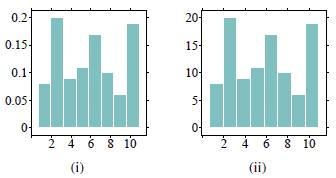
A)Histogram (i) uses frequencies to simply count the number of observations at a given value. Histogram (ii) uses relative frequencies to show the proportion of observations at a given value.
B)Histogram (i) uses relative frequencies to show the proportion of observations at a given value. Histogram (ii) uses frequencies to simply count the number of observations at a given value.
C) Histograms (i) and (ii) are exactly the same; there are no differences between the plots.
D)Histograms (i) and (ii) do not display the same data because the values listed on the y - axis do not match.
Answer:B
Match one of the histograms with its description.
14)The distribution of scores on an easy test is displayed in histogram __________.
Answer:A
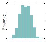
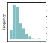
15)The distribution of household income in a large city is displayed in histogram __________. A) B) C)

Answer:C


16)The distribution of female heights is displayed in histogram __________. A) B) C)

Answer:B


17)The distribution of test scores for a group of students who received a 15 - minute study session prior to taking a test is displayed in histogram ________. A)
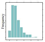
Answer:C
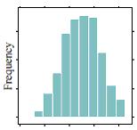
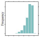
18)The distribution of male heights is displayed in histogram ________.

Answer:B


19)The distribution of the number of ʺfriendsʺ users of a popular social media site has is displayed in histogram ________.

Answer:A
Solve the problem.


20)Order the following histograms from least to most variability.
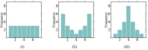
21)Order the following histograms from most to least variability.
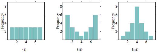
A)(i), (ii), (iii) B)(ii), (i), (iii)
Answer:B
C)(ii), (iii), (i) D)(iii), (i), (ii)
22)When examining distributions of numerical data, what three components should you look for?
A)Shape, center, and spread
C)Symmetry, skewness, and spread
Answer:A
B)Shape, symmetry, and spread
D)Symmetry, center, and spread
23)Which of the following would likely show a bimodal distribution in a histogram?
A)The midterm exam scores for an introduction to Spanish course.
B) The ages of students who attend a local high school.
C)The number of hours a college student spends on homework per night.
D)The price of college tuition, including both public and private schools.
Answer:D
SHORT ANSWER. Write the word or phrase that best completes each statement or answers the question.
24) When examining distributions of numerical data, what three components should you try to describe?
Answer:Shape, center, and spread of the data.
25)Describe a scenario in which a distribution could be bimodal. Explain your reasoning.
Answer:Answers may vary. Some examples include: (1) The price of college tuition, including both public and private schools (the different types of colleges would create two modes - private colleges would most likely have higher tuition costs compared to public schools). (2) The heights of all students at a high school (the different genders would create two modes - males are typically taller than females).
26) The two histograms below display the exact same data. How do the plots differ?
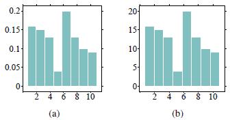
Answer:Histogram (a) uses frequencies to simply count the number of observations at a given value. Histogram (b) uses relative frequencies to show the proportion of observations at a given value.
27)Order the following histograms from least to most variability. Explain your reasoning.

Answer:Least to most variability: (iii), (ii), (i). Histogram (iii) has the least variability because it has more points that are close to the center of the distribution. Histogram (i) has the most variability because it has more points that are far away from the center of the distribution.
What would you expect the shape of the distribution described to look like? Explain your reasoning.
28) The distribution of the household incomes in a large city.
Answer:The distribution of incomes would most likely be right - skewed because most people earn middle - class salaries, but the very wealthy people are likely to earn incomes much higher than average.
29) The distribution of scores on an easy test.
Answer:The distribution of scores on an easy test would most likely be left - skewed because most test - takers will do well on the test, and a few will still do poorly.
30)The distribution of the time (in minutes) it takes to drive to work using the same route each day.
Answer: The distribution of the time it takes to drive to work using the same route each day should be roughly symmetric because the time you leave your house is probably the same each day. The commute times will be very similar on a day- to- day basis.
2.2Sec 3-4. Visualizing Variation in Categorical Variables/Summarizing Categorical Distributions
1Interpret Bar Charts and Pie Charts
MULTIPLE CHOICE. Choose the one alternative that best completes the statement or answers the question. Solve the problem.
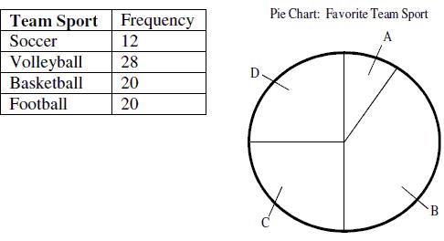
1)A group of junior high athletes was asked what team sport was their favorite. The data are summarized in the table below. On the pie chart, which area would correspond to the category ʺSoccerʺ?
Answer:A
2)A group of junior high athletes was asked what team sport was their favorite. The data are summarized in the table below. On the pie chart, which area would correspond to the category ʺVolleyballʺ?

A B)Area B
Answer:B
3)The graph below displays the number of homicides in the city of Flint, Michigan for each of the last three years. A reporter interprets this graph to mean that the number of murders in 2010 was more than twice the number of murders in 2008. Is the reporter making a correct interpretation?
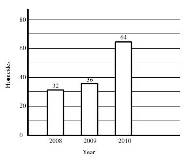
A)No. The width of the bars is identical, indicating that the number of murders in 2010 is no different from 2008.
B)Yes. The bar for 2010 is twice the height of the bar for 2008 and the number of murders indicated above the bars confirms that murders in 2010 were more than twice the level in 2008.
C) There is not enough information given in the graph to determine whether the reporterʹ s interpretation is correct or not.
Answer:B
4)The graph below displays the number of applications for a concealed weapons permit in Montcalm County, Michigan, for each of three years. A reporter interprets this graph to mean that applications in 2010 are more than twice the level in 2008. Is the reporter making a correct interpretation?
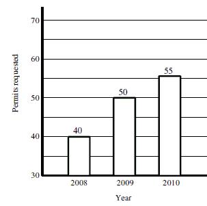
A)No. Although the 2010 bar is more than twice the height of the 2008, the bars do not begin at 0 applications, so the graph does not correctly represent the data. Fifty - five is not equal to two times the number of applications made in 2008.
B)No. The width of the bars is identical, indicating that the number of applications in 2010 is no different from 2008.
C) Yes. The bar for 2010 is twice the height of the bar for 2008 and the number of applications indicated above the bars shows that applications in 2010 are more than twice the level in 2008.
Answer:A
5)Which of the following statements about bar graphs is true?
A) It sometimes doesnʹt matter in which order you place the bars representing different categories.
B)It is appropriate to have gaps between the bars on the graph.
C)On a bar graph, the width of the bars has no meaning.
D)All of these are true for bar graphs.
Answer: D
The following double -bar graph illustrates the revenue for a company for the four quarters of the year for two different years. Use the graph to answer the question.
6)In what quarter was the revenue the greatest for Year 2?
A)fourth quarter B)first quarter C)second quarterD)third quarter
Answer:A
7)In what quarter was the revenue the least for Year 1?
A)second quarter B)first quarter C)fourth quarter D)third quarter
Answer:A
8)What was the revenue for the third quarter of Year 1?
A)$35 million B)$7 million
Answer:A
million
million
Construct a pie chart representing the given data set.
9)The following data give the distribution of the types of houses in a town containing 48,000 houses.
House Type FrequencyPercentage
Cape12,00025%
Garrison19,20035%
Split16,80040%
Answer:A
10)1,000 movie critics rated a movie. The following data give the rating distribution.
Rating FrequencyPercentage
Answer:A
11)The following figures give the distribution of land (in acres) for a county containing 70,000 acres.
Land Use AcresPercentage
Forest 10,50015 %
Farm 7,00010 %
Urban 52,50075 %
A) B)
Answer:A
Solve the problem.
12)What is the difference between a bar chart and a histogram?
A)They can both be used to represent numerical data.
B)They can both be used to represent categorical data.
C)A bar chart represents numerical data and a histogram represents categorical data.
D)A bar chart represents categorical data and a histogram represents numerical data.
Answer: D
13)Which statement below is NOT supported by the following bar chart?
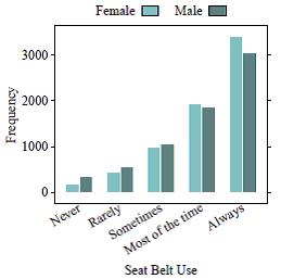
A)In general, people always wear seat belts.
B)About 2000 people wear seat belts ʺsometimes.ʺ
C)More females wear seat belts compared to males.
D)More males wear seat belts compared to females.
Answer:D
14)Which statement below is NOT supported by the following bar chart?
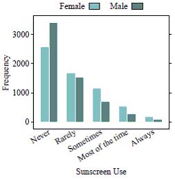
A)More females wear sunscreen than males.
B)Very few people, in general, always wear sunscreen.
C)More males wear sunscreen than females.
D)About 50% of males never wear sunscreen.
Answer:C
15)What does it mean to find the mode of a bar chart?
A)You cannot find a mode for categorical data. Modes are only used with numerical data.
B) The mode can be found by finding the bar, or category, with the most observations.
C)The mode can be found by adding up the total number of categories.
D)The mode can be found by adding up the total number of observations and dividing by the number of categories.
Answer:B
SHORT ANSWER. Write the word or phrase that best completes each statement or answers the question.
16)What is the difference between a bar chart and a histogram?
Answer:A bar chart represents a categorical variable and a histogram represents a numerical variable.
17)What does it mean to find the mode of a bar chart?
Answer: The mode can be found by finding the bar, or category, with the most observations. It will be the highest bar in the plot.
18)Using the following bar chart, what can you say about the difference in seat belt use for males versus females?
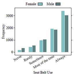
Answer:Answers may vary. Some examples include: (1) In general, people always wear seat belts. (2) Females wear seatbelts more than males. (3) About the same number of males and females report wearing seat belts ʺsometimes.ʺ
MULTIPLE CHOICE. Choose the one alternative that best completes the statement or answers the question.
The following side -by-side bar graph shows the level of post -secondary education achieved ten years after high school for graduates from the years 1999 and 2001. Use the bar graph to answer the question.
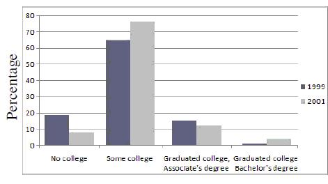
1)What was the most common response for 1999?
A)No College
C)Graduated College, Associateʹ s Degree
Answer:B
2)In which category was there more variability?
A)No College
C)Graduated College, Associateʹ s Degree
Answer:A
3)What is the mode response for 2001?
A)Graduated College, Bachelorʹ s Degree
C) Some College
B)Some College
D)Graduated College, Bachelorʹ s Degree
B)Some College
D)Graduated College, Bachelorʹ s Degree
B)Graduated College, Associateʹ s Degree
D)No College Answer:C
4)Which category shows the least amount of variation between years?
A)No College
C)Graduated College, Associateʹ s Degree
B)Some College
D)Graduated College, Bachelorʹ s Degree Answer:A
Solve the problem.
5)The bar charts below depict the marital statuses of Americans, separated by gender. Which bar chart shows more variability in marital status? Why?
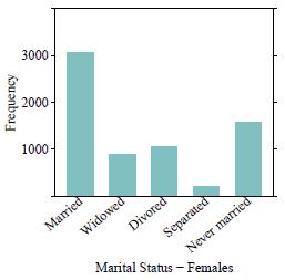
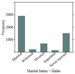
A)The female bar chart shows more variability because many of the observations fall into one category (ʺMarriedʺ).
B)The female bar chart shows more variability because there are more observations in the different categories than there are for males.
C)The male bar chart shows more variability because because many of the observations fall into one category (ʺMarriedʺ).
D) The male bar chart shows more variability because there are more observations in the different categories than there are for females.
Answer:B
6)The bar charts below depict the veteran statuses of Americans, separated by gender. Which bar chart has more variability in veteran status? Why?
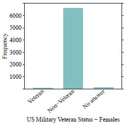
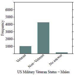
A)The female bar chart shows more variability because many of the observations fall into one category (ʺNon - Veteranʺ).
B)The female bar chart shows more variability because there are more observations in the different categories than there are for males.
C)The male bar chart shows more variability because because many of the observations fall into one category (ʺNon - Veteranʺ).
D) The male bar chart shows more variability because there are more observations in the different categories than there are for females.
Answer:D
SHORT ANSWER. Write the word or phrase that best completes each statement or answers the question.
7)The bar charts below depict theMPAA movie ratings of 489 movies, separated by high and low critic scores. Which bar chart shows more variability in MPAA movie ratings? Why?
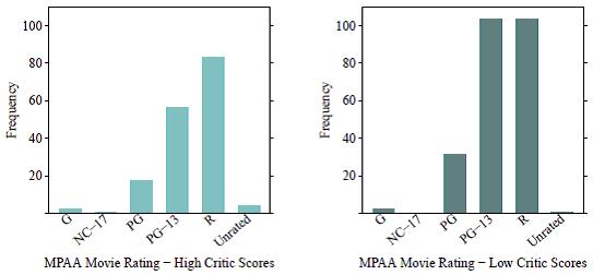
Answer:The ʺhigh critic scoresʺ bar chart shows more variability because there are more observations in the different categories than there are for the ʺlow critic scores.ʺ
2.3Section 5: Interpreting Graphs
1Explain Why a Graphic May be Hard to Interpret, and Identify Other Possible Graphical Displays
MULTIPLE CHOICE. Choose the one alternative that best completes the statement or answers the question.
1)Parking at a university has become a problem. University administrators are interested in determining the average time it takes a student to find a parking spot. An administrator inconspicuously followed 100 students and recorded how long it took each of them to find a parking spot. Which of the following types of graphs should NOT be used to display information concerning the students parking times?
A) pie chart
Answer:A
B)stemplot C)histogram D)dotplot
A large state university conducted a survey among their students and received 400 responses. The survey asked the studen provide the following information:
* Age
* Year in School (Freshman, Sophomore, Junior, Senior)
* Major
2)What type of graph would you use to describe the distribution of the variable Major?
A)A histogram because Major is a numerical variable.
B)A histogram because Major is a categorical variable.
C)A bar chart because Major is a numerical variable.
D) A bar chart because Major is a categorical variable.
Answer:D
3) What type of graph would you use to answer questions about how the popularity of majors (Major) differs for the different years of students (Year in School)?
A)Side - by- side bar charts should be used since these are two categorical variables.
B)Side - by- side bar charts should be used since these are two numerical variables.
C)Side - by- side histograms should be used since these are two categorical variables.
D)Side - by- side histograms should be used since these are two numerical variables.
Answer:A
A large state university conducted a survey among their students and received 300 responses. The survey asked the studen provide the following information:
* Age
* Year in School (Freshman, Sophomore, Junior, Senior)
* Gender
* GPA
* Height
4)What type of graph would you use to describe the distribution of the variable Height?
A)A histogram because Height is a numerical variable.
B)A histogram because Height is a categorical variable.
C)A bar chart because Height is a numerical variable.
D) A bar chart because Height is a categorical variable.
Answer:A
5)What type of graph would you use to represent the relationship between Gender and Year in School?
A)A side- by- side histogram should be used since these are two numerical variables.
B)A side- by- side histogram should be used since these are two categorical variables.
C)A side- by- side bar chart should be used since these are two numerical variables.
D)A side- by- side bar chart should be used since these are two categorical variables.
Answer:D
SHORT ANSWER. Write the word or phrase that best completes each statement or answers the question.
A large state university conducted a survey among their students and received 400 responses. The survey asked the studen provide the following information:
* Age
* Year in School (Freshman, Sophomore, Junior, Senior)
* Gender
6)What type of graph would you use to describe the distribution of the variable Year in School? Explain your reasoning.
Answer:A bar chart since Year in School is a categorical variable.
7) What type of graph would you use to describe the distribution of the variables Gender and Year in School? Explain your reasoning.
Answer: A side- by- side bar chart should be used since these are two categorical variables.
8)The accompanying graph shows the distribution of data on whether houses in a neighborhood have a swimming pool. (A 1 indicates the house has a swimming pool, and a 0 indicates it does not have a swimming pool.) A real estate agent claims that almost twice as many homes in this neighborhood have swimming pools than do not.ʹʺ Does this graph support this claim or not? Explain.
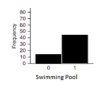
Answer:The graph supports the claim. Roughly 15 homes do not have swimming pools, and over 40, which is more than twice 15, do have swimming pools.ʺ
9)A student has gathered data on self - perceived height image, where 1 represents “short,” 2 represents “about right,”and 3 represents “tall.” A graph is given for these data. What type of graph would be a better choice to display these data? Explain.
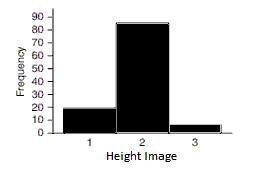
Answer: This data set is categorical since the numbers (1, 2, and 3) represent categories. Therefore a more appropriate graph would be a bar graph or pie graph.
10)The pie chart reports the distribution for the number of hours of studying “last night” for a sample of 200 college students. What would be a better type of graph for displaying these data? Explain why this pie chart is hard to interpret.
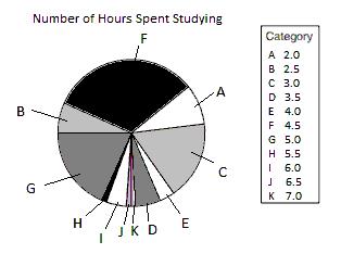
Answer:Hours spent studying is a numerical variable. A histogram or dotplot would better enable us to see the distribution of values. Because there are so many possible numerical values, this pie chart has so many “slices” that it is difficult to tell which is which.
11)The following graph shows the ages of females (labeled 1) and males (labeled 0) who are majoring in business at a community college. What type(s) of graph(s) would be more appropriate?
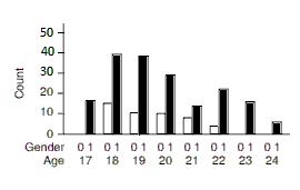
Answer:This is a bar chart (or bar graph). Bar graphs are for categorical data. These data are numerical and would better be shown with a pair of histograms or a pair of dotplots.
Graphs
MULTIPLE CHOICE. Choose the one alternative that best completes the statement or answers the question. A word cloud was created using the first chapter of John Greenʹ s The Fault in Our Stars . (Note that filler words such as ʺthe,ʺ ʺa/an,ʺ and ʺandʺ were excluded from the plot.)
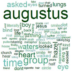
1)According to the word cloud, what is the most common word in the first chapter of The Fault in Our Stars ? Why?
A)The most common word is ʺthingʺ because it appears in the middle of the cloud.
B)The most common word is ʺaugustusʺ because he is a main character in the story.
C)The most common word is ʺhazelʺ because that is the narrator’’s name.
D)The most common word is ʺaugustusʺ because it is the largest in size.
Answer: D
2) What information is NOT explicitly portrayed in the word cloud?
A)The words that occur most frequently in the chapter.
B)The number of times each word occurs.
C)The specific word that occurs most often.
Answer:B
A word cloud was created using the first chapter of Lewis Carrollʹ s Aliceʹ s Adventures in Wonderland . (Note that filler words such as ʺthe,ʺ ʺa/an,ʺ and ʺandʺ were excluded from the plot.)
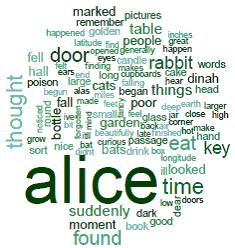
3)According to the word cloud, what is the most common word in the first chapter of Aliceʹ s Adventures in Wonderland? Why?
A)The most common word is ʺaliceʺ because it is the largest in size.
B)The most common word is ʺaliceʺ because she is a main character in the story.
C)The most common word is ʺmarkedʺ because it appears at the top of the cloud.
D) The most common word is ʺgardenʺ because it appears in the middle of the cloud.
Answer:A
4)What information is NOT explicitly portrayed in the word cloud?
A)The words that occur most frequently in the chapter.
B)The specific word that occurs most often.
C) The number of times each word occurs.
Answer:C
SHORT ANSWER. Write the word or phrase that best completes each statement or answers the question.
A word cloud was created using the first chapter of J.K. Rowlingʹ s Harry Potter and the Sorcererʹ s Stone . (Note that filler words such as ʺthe,ʺ ʺa/an,ʺ and ʺandʺ were excluded from the plot.)
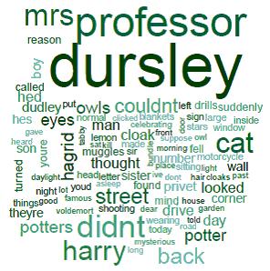
5)According to the word cloud, what is the most common word in the first chapter of Harry Potter and the Sorcererʹ s Stone? Why?
Answer:The most common word is ʺdursleyʺ because it is the largest in size.
6)The words ʺowlsʺ and ʺeyesʺ appear to be similar in size. Does this mean that each of these words is used the same number of times in the first chapter of the book? Why or why not?
Answer:A word cloud can only tell us what words are the most common which shows relative frequency. So if the words are same size, they occur with the same relative frequency. Since these words come from the same chapter, this means they also occur the same number of times.
7)People who played a sport as children were asked how many hours a day they practiced when they were teenagers, and whether they still play now that they are adults. To understand the graph, look at the third bar (spanning 1.0 to 1.5); it shows that there were five people (the grey part of the bar) who practiced between 1.0 and 1.5 hours and do not still play as adults, and there were two people (the white part of the bar) who practiced 1.0 to 1.5 hours and still play as adults. Did those who still play sports tend to practice a different amount as children than those who did not? Explain.
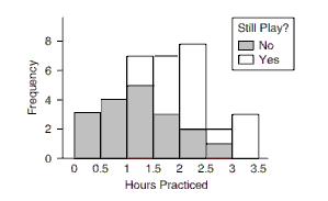
Answer:Those who still play tended to have practiced more as teenagers, which we can see because the center of the distribution for those who still play is about 2 or 2.5 hours, compared to only about 1 or 1.5 hours for those who do not. The distribution could be displayed as a pair of histograms or a pair of dotplots.
8) Refer to the accompanying bar chart, which shows the time spent on a typical day watching television for a sample of men and women. Each person was asked to choose the one of four intervals that best fit the amount he or she spent watching television (for example, “0 to 4 hours” or “12 or more hours”).
a. Identify the two variables. State whether they are categorical or numerical.
b. Which would be the better choice for these data , histogram or bar chart?
c. If you had the actual number of hours for each person, rather than just an interval, what type of graph should to display the distribution of the actual numbers of hours?
d. Explain what this graph tells us about the difference between these menʹ s and womenʹ s television - watching h
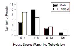
Answer: a. Gender is categorical and Time range is also categorical. b. The bar chart is appropriate since the data sets are both categorical variables. c. You could make two histograms (or two dotplots) for the data because the time would be numerical. It would be ideal to use a common horizontal axis for easy comparison of the two graphs. d. For this sample, the men tended to watch more television than the women (The mode for men is 4 - 8 hours, and the mode for the women is 0 - 4 hours).
9)People who grew up on a farm as children were asked how many years they lived on a farm when they were children, and whether they became farmers as adults. To understand the graph, look at the second bar (spanning 2 to 4); it shows that there was one person (the grey part of the bar) who lived on a farm as a child between 2 and 4 years and did not become a farmer as an adult, and there were two people (the white part of the bar)who lived on a farm as a child between 2 and 4 years and became farmers as adults. Comment on what the graph shows. What other type of graphs could be used for this data set?
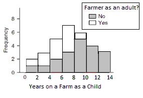
Answer:Those in the sample who are farmers as adults tended to live on a farm as a child for fewer years, The distribution could be displayed as a pair of side - by - side histograms or a pair of dotplots.
10)Refer to the accompanying bar chart, which shows a sample of the number of flights in a typical year for some travelers. Each traveler was asked to choose the one of four intervals that best fit the number of flights he or she took for either business or pleasure (for example, “0 to 5 flights” or “15 + flights”).
a. Identify the two variables. Then state whether they are categorical or numerical.
b. Which would be the better choice for these data , histogram or bar chart?
c. If you had the actual number of flights for each person, rather than just an interval, what type of graph should you use to display the distribution of the actual numbers of flights?
d. Explain what this graph tells us about the difference between the number of flights taken for business versus the number of flights taken for pleasure?
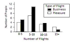
Answer: a. Type of flight is categorical and Number of Flights range is also categorical. b. Since the data set both variables are categorical, the bar chart is appropriate. c. You could make two histograms (or two dotplots) for the data because the number of flights would be numerical. It would be ideal to use a common horizontal axis for easy comparison of the two graphs. d. For this sample, the distribution show that the travelers tend to fly about the same for business and pleasure. (The mode for business is 5 - 10 flights and the mode for pleasure is also 5 - 10 flights.)
Ch. 2Picturing Variation with Graphs
Answer Key
2.1Sec 1-2. Visualizing Variation in Numerical Data/Summarizing Important Features of a Numerical Distribution
1Interpret Dotplots and Histograms
23)A dotplot and a histogram both show the overall shape of a distribution. They both can help determine a distributionʹ s shape, center, and spread. They differ in terms of appearance in only one way. A dotplot displays a dot to represent each observation in the data, while a histogram uses bars to display intervals of observations.
24) Histogram (a) displays the last digits of social security numbers because all of the values are mostly equally likely. Since the last digit of social security numbers are created randomly, we would expect any digit between 0 and 9 to show up just as often as another digit. Histogram (b) displays the ages at which a sample of people applied for a marriage license. Since most people get married in their early to mid - twenties, but there are also people who wait to get married until a later age, we would expect the distribution to be right - skewed.
25) The typical number of reviews a movie will receive is about 130. We know this because the distribution is centered around the value 130 on the x - axis.
26)Since the data are bimodal, there are two typical values - one is about 40 and the other is about 80.
27) About 20 dots should be drawn because there are about 20 people whose heights fall between 1.5 meters and 1.6 meters, as shown by the frequency value on the y - axis.
2Summarize Important Features of a Numerical Distribution 1)D 2)D 3)D 4)D 5)B 6)C 7)A 8)A 9)A 10) B 11) C
12)D Page 44
13)B 14)A
15)C
16)B
17)C
18)B
19)A 20)D 21)B
22)A
23)D
24)Shape, center, and spread of the data.
25)Answers may vary. Some examples include: (1) The price of college tuition, including both public and private schools (the different types of colleges would create two modes - private colleges would most likely have higher tuition costs compared to public schools). (2) The heights of all students at a high school (the different genders would create two modes - males are typically taller than females).
26) Histogram (a) uses frequencies to simply count the number of observations at a given value. Histogram (b) uses relative frequencies to show the proportion of observations at a given value.
27)Least to most variability: (iii), (ii), (i). Histogram (iii) has the least variability because it has more points that are close to the center of the distribution. Histogram (i) has the most variability because it has more points that are far away from the center of the distribution.
28)The distribution of incomes would most likely be right - skewed because most people earn middle - class salaries, but the very wealthy people are likely to earn incomes much higher than average.
29) The distribution of scores on an easy test would most likely be left - skewed because most test - takers will do well on the test, and a few will still do poorly.
30) The distribution of the time it takes to drive to work using the same route each day should be roughly symmetric because the time you leave your house is probably the same each day. The commute times will be very similar on a day - to- day basis.
2.2Sec 3-4. Visualizing Variation in Categorical Variables/Summarizing Categorical Distributions
1Interpret Bar Charts and Pie Charts
1)A
2)B 3)B 4)A 5)D 6)A 7)A 8)A 9)A 10)A 11)A 12)D 13)D 14)C
15)B
16)A bar chart represents a categorical variable and a histogram represents a numerical variable.
17)The mode can be found by finding the bar, or category, with the most observations. It will be the highest bar in the plot.
18)Answers may vary. Some examples include: (1) In general, people always wear seat belts. (2) Females wear seatbelts more than males. (3) About the same number of males and females report wearing seat belts ʺsometimes.ʺ
2 Summarize Categorical Distributions
1)B
2)A
3)C
4)A
5)B
6)D
7)The ʺhigh critic scoresʺ bar chart shows more variability because there are more observations in the different categories than there are for the ʺlow critic scores.ʺ
2.3Section 5: Interpreting Graphs
1Explain Why a Graphic May be Hard to Interpret, and Identify Other Possible Graphical Displays 1)A
2)D 3)A 4)A 5)D
6)A bar chart since Year in School is a categorical variable.
7)A side- by- side bar chart should be used since these are two categorical variables.
8)The graph supports the claim. Roughly 15 homes do not have swimming pools, and over 40, which is more than twice 15, do have swimming pools.ʺ
9) This data set is categorical since the numbers (1, 2, and 3) represent categories. Therefore a more appropriate graph would be a bar graph or pie graph.
10) Hours spent studying is a numerical variable. A histogram or dotplot would better enable us to see the distribution of values. Because there are so many possible numerical values, this pie chart has so many “slices” that it is difficult to tell which is which.
11)This is a bar chart (or bar graph). Bar graphs are for categorical data. These data are numerical and would better be shown with a pair of histograms or a pair of dotplots.
2Interpret Graphs
1)D
2)B
3)A
4)C
5)The most common word is ʺdursleyʺ because it is the largest in size.
6) A word cloud can only tell us what words are the most common which shows relative frequency. So if the words are same size, they occur with the same relative frequency. Since these words come from the same chapter, this means they also occur the same number of times.
7) Those who still play tended to have practiced more as teenagers, which we can see because the center of the distribution for those who still play is about 2 or 2.5 hours, compared to only about 1 or 1.5 hours for those who do not. The distribution could be displayed as a pair of histograms or a pair of dotplots.
8) a. Gender is categorical and Time range is also categorical. b. The bar chart is appropriate since the data sets are both categorical variables. c. You could make two histograms (or two dotplots) for the data because the time would be numerical. It would be ideal to use a common horizontal axis for easy comparison of the two graphs. d. For this sample, the men tended to watch more television than the women (The mode for men is 4 - 8 hours, and the mode for the women is 0 - 4 hours).
9) Those in the sample who are farmers as adults tended to live on a farm as a child for fewer years, The distribution could be displayed as a pair of side - by - side histograms or a pair of dotplots.
10) a. Type of flight is categorical and Number of Flights range is also categorical. b. Since the data set both variables are categorical, the bar chart is appropriate. c. You could make two histograms (or two dotplots) for the data because the number of flights would be numerical. It would be ideal to use a common horizontal axis for easy comparison of the two graphs. d. For this sample, the distribution show that the travelers tend to fly about the same for business and pleasure. (The mode for business is 5 - 10 flights and the mode for pleasure is also 5 - 10 flights.)
