Section 2.1
Chapter 2: Displaying and Describing Categorical Data
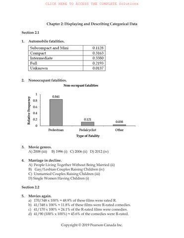
1. Automobile fatalities.
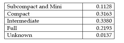
2. Nonoccupant fatalities.
3. Movie genres.
A) 2008 (iii) B) 1996 (i) C) 2006 (ii) D) 2012 (iv)
4. Marriage in decline.
A) People Living Together Without Being Married (ii)
B) Gay/Lesbian Couples Raising Children (iv)
C) Unmarried Couples Raising Children (iii)
D) Single Women Having Children (i)
Section 2.2
5. Movies again.
a) 170/348 x 100% ≈ 48.9% of these films were rated R.
b) 41/348 x 100% ≈ 11.8% of these films were R-rated comedies.
c) 41/170 x 100% ≈ 24.1% of the R-rated films were comedies.
d) 41/90 (100% x 100%) ≈ 45.6% of the comedies were R-rated.
6. Labour force.
a) 1261/29572 x 100% ≈ 4.26% of the population were unemployed.
b) 675/29572 x 100% ≈ 2.28% of the population were both unemployed and aged 25 to 54 years.
c) 380/4387 x 100% ≈ 8.66% of 15 to 24 year olds were unemployed.
d) 745/18410 x 100% ≈ 4.05% of those who were employed were aged 65 years and over.
Chapter Exercises
7. Graphs in the news I. Answers will vary.
8. Graphs in the news II. Answers will vary.
9. Tables in the news I. Answers will vary.
10. Tables in the news II. Answers will vary.
11. Forest Fires 2014. The relative frequency distribution of the forest fires is shown below:
fire
Causes of forest fires are about equally split between human activities and lightning. Only 2.50% of forest fires are due to unknown causes.
12. Forest fires 2014 by region.
Most forest fires occurred in Alberta and BC. Combined, they had nearly five times as many fires as Quebec and Ontario combined. The four provinces account for over two thirds of the forest fires in Canada.
13. Teen smokers According to the Monitoring the Future study, teen smoking brand preferences differ somewhat by region. Although Marlboro is the most popular brand in each region, with about 58% of teen smokers preferring this brand in each region, teen smokers from the South prefer Newports at a higher percentage than teen smokers from the West, with 22.5% of teen smokers preferring this brand, compared to only 10.1% in the South. Teen smokers in the West are also more likely to have no particular brand than teen smokers in the South. 12.9% of teen smokers in the West have no particular brand, compared to only 6.7% in the South. Both regions have about 9% of teen smokers that prefer one of over 20 other brands.
14. Bad countries
a) A bar chart is appropriate, because the variable we want to display is a categorical variable. Some individuals can choose more than one country as bad, and for this reason a pie chart is not appropriate.

b) No, it is not possible to determine what percent of individuals could not name any country as a negative force. It is possible that only the individuals who listed the U.S. as a negative force (52%) listed other countries also, and all others (i.e., 48%) did not name any country as a negative force.
c) This not true. Some (or maybe even all) who named Iran also named Iraq and Pakistan, and in this case this proportion is less than 49% (21 + 19 + 9).
15. Oil spills 2013.
a) Grounding, accounting for approximately 150 spills, is the most frequent cause of oil spillage for these 459 spills. A substantial number of spills, approximately 140, were caused by Collision. Less prevalent causes of oil spillage in descending order of frequency were Hull or equipment failures, Fire & Explosions, and Other/Unknown causes.
b) A pie chart is an appropriate display of the data, since there is only a single cause attributed to each spill, and all spills are represented in some category.
c) There were more spills due to Grounding than Collisions. This is much easier to see on the bar chart.
16. Winter Olympics 2014.
a) There are too many categories to construct an appropriate display. In a bar chart, there are too many bars. In a pie chart, there are too many slices. In each case, we run into difficulty trying to display those countries that didn’t win many medals.
b) Perhaps we are primarily interested in countries that won many medals. We might choose to combine all countries that won fewer than 8 medals into a single category. This will make our chart easier to read. We are probably interested in number of medals won, rather than percentage of total medals won, so we’ll use a bar chart. A bar chart is also better for comparisons.
17. Global warming Perhaps the most obvious error is that the percentages in the pie chart only add up to 93%, when they should, of course, add up to 100%.
Furthermore, the three-dimensional perspective view distorts the regions in the graph, violating the area principle. The regions corresponding to No Solid Evidence and Due to Human Activity should be roughly the same size, at 32% and 34% of respondents, respectively. However, the 32% region looks bigger, and the angle for the 34% region makes it look only slightly bigger than the 18% region. Always use simple, two-dimensional graphs.
18. Modalities
a) The bars have false depth, which can be misleading. This is a bar chart, so the bars should have space between them.
b) The percentages sum to 100%. Normally, we would take this as a sign that all of the observations had been correctly accounted for. But in this case, it is extremely unlikely. Each of the respondents was asked to list three modalities. For example, it would be possible for 80% of respondents to say they use ice to treat an injury, and 75% to use electric stimulation. In this case, the fact that the percentages total greater than 100% would not be odd. In fact, it seems wrong that the percentages add up to 100%.
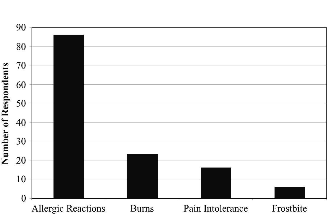
19. Complications
a) A bar chart is the proper display for these data. A pie chart is not appropriate since these are counts, not fractions of a whole.
b) The Who for these data is athletic trainers who used cryotherapy, which should be a cause for concern. A trainer who treated many patients with cryotherapy would be more likely to have seen complications than one who used cryotherapy rarely. We would prefer a study in which the Who referred to patients so we could assess the risks of each complication.
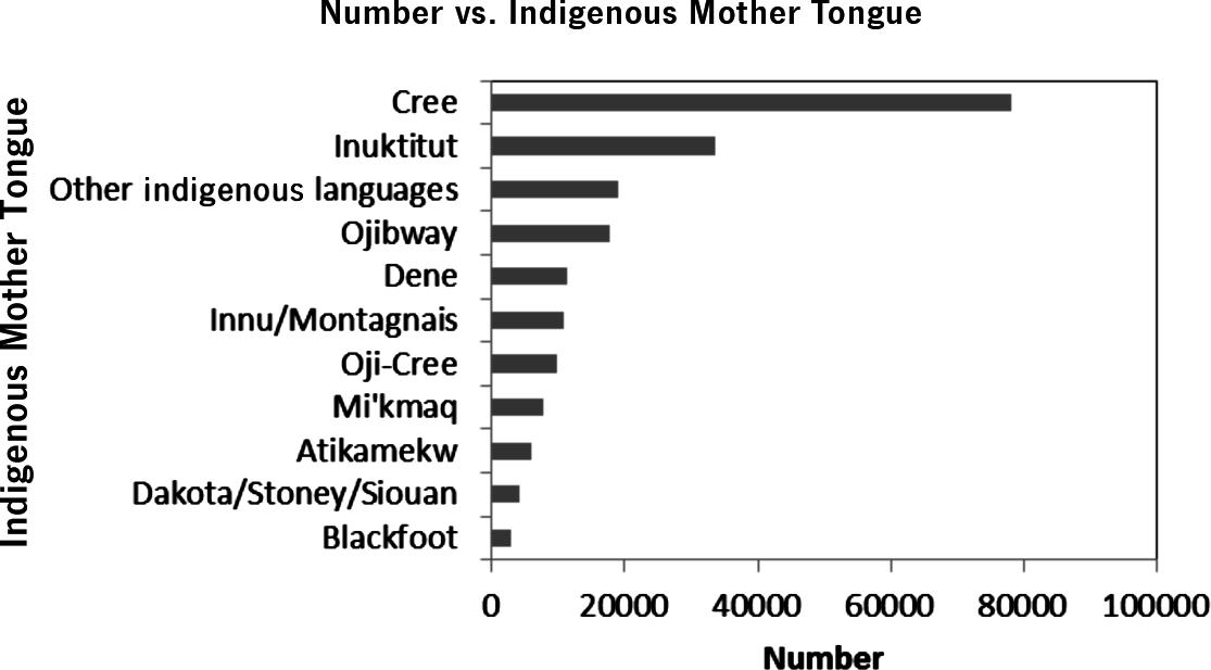
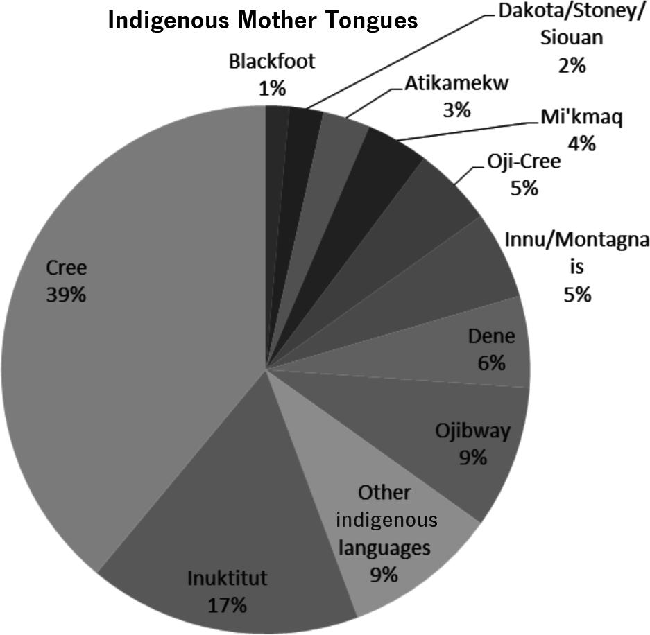
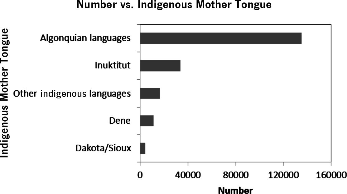
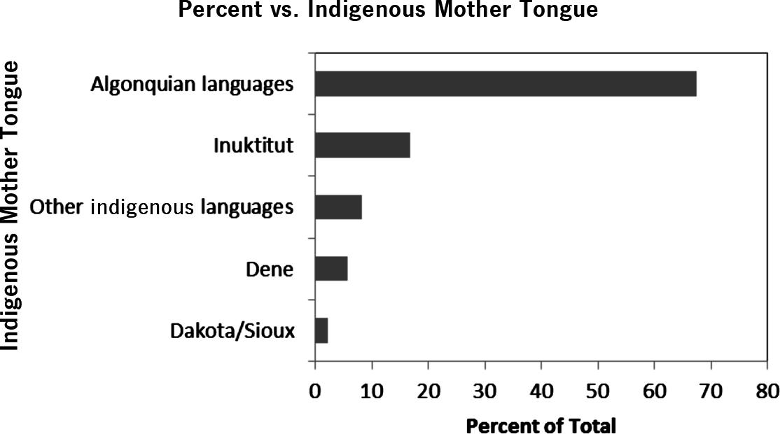
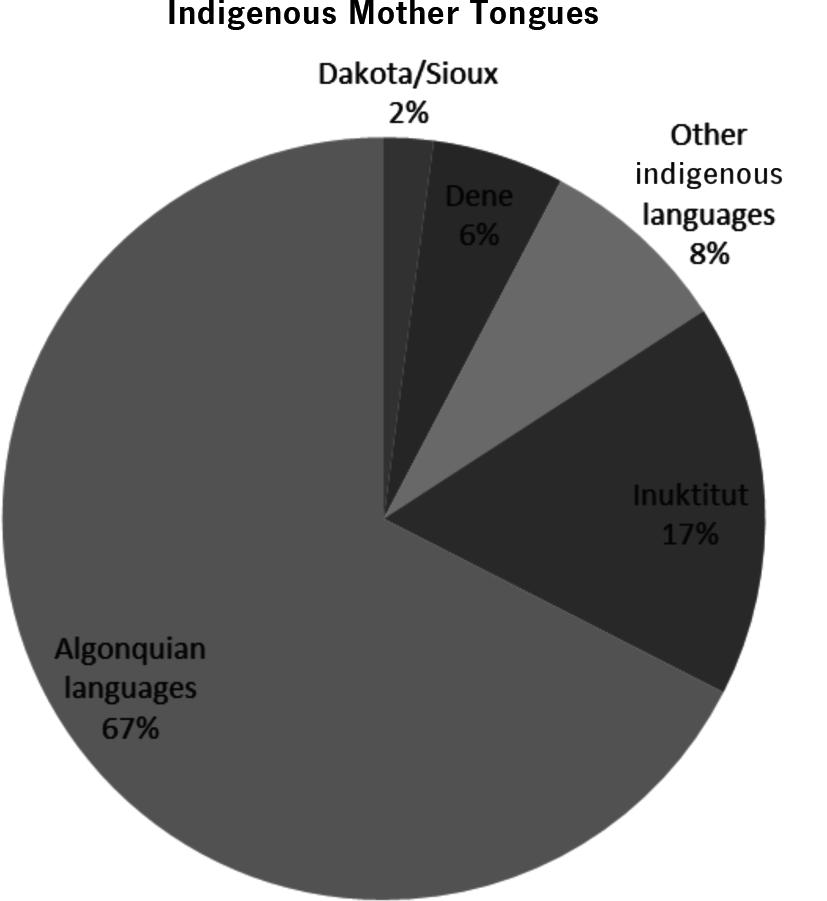
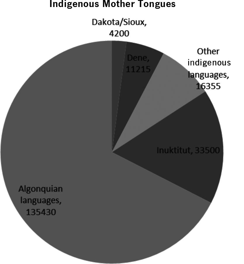
20. Indigenous languages 2011
a) The relative frequency (percentages) distribution of Indigenous mother tongue is given below.
Indigenous mother tongue %
b) Bar charts and pie charts are shown below. Cree is the mother tongue of the most and Blackfoot the least. Both bar charts and pie charts are good. It is a bit easier to compare the relative frequencies on the bar chart.
c) Bar charts and pie charts are shown below. More than 67% reported an Algonquian language as their mother tongue and Dakota/Sioux is the least spoken as the mother tongue (of those we have data for).
21. Spatial distribution
a) The relative frequency distribution of quadrant location is given below. Not all proportions are equal. In particular, the relative frequency for Quadrant 4 is approximately twice the other frequencies.
Quadrant
Quadrant 1
Quadrant 2
Quadrant 3
Quadrant 4 Relative
b) The relative frequency distribution of quadrant location is given below. There seems to have some similarity with that in part a. For example, Quadrant 4 has the highest relative frequency and Quadrant 1 has the lowest.
Quadrant
22. Politics
Quadrant 1
Quadrant 2
Quadrant 3
Quadrant 4
a) There are 192 students taking Intro Stats. Of those, 115, or about 59.9%, are male. b) There are 192 students taking Intro Stats. Of those, 27, or about 14.1%, consider themselves to be “Conservative.”
c) There are 115 males taking Intro Stats. Of those, 21, or about 18.3%, consider themselves to be “Conservative.”
d) There are 192 students taking Intro Stats. Of those, 21, or about 10.9%, are males who consider themselves to be “Conservative.”
23. Politics revisited
a) The females in this course were 45.5% Liberal, 46.8% Moderate, and 7.8% Conservative. (They don’t add up to exactly 100% due to the roundoffs.)
b) The males in this course were 43.5% Liberal, 38.3% Moderate, and 18.3% Conservative.
c) A segmented bar chart comparing the distributions is below.
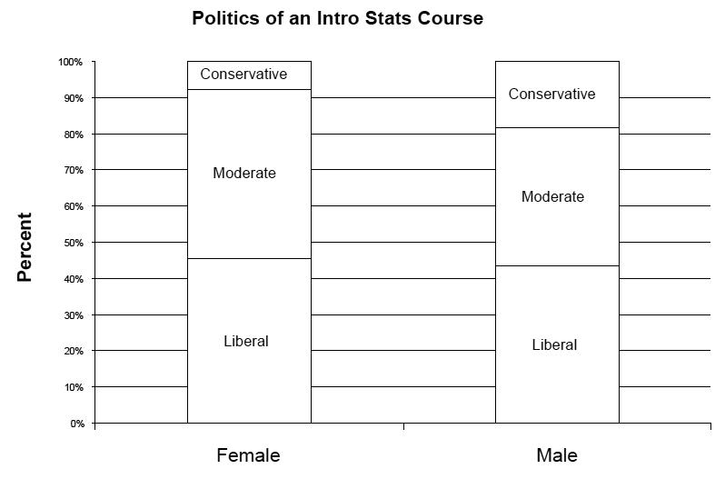
d) Politics and sex do not appear to be independent in this course. Although the percentage of liberals was roughly the same for each sex, females had a greater percentage of moderates and a lower percentage of conservatives than males.
24. More politics a)
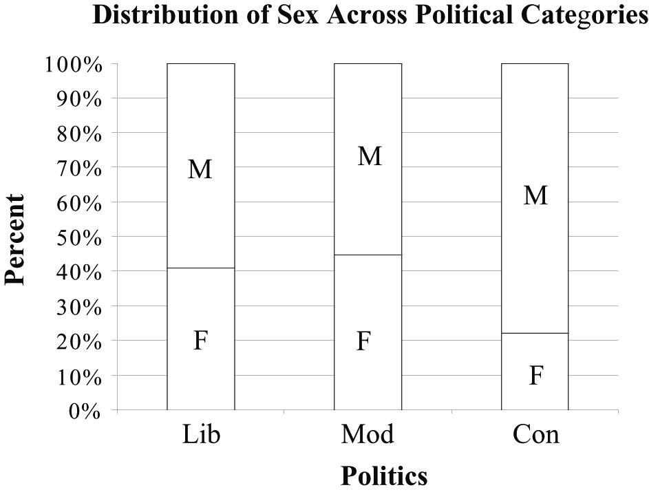
b) The percentage of males and females varies across political categories. The percentage of self-identified Liberals and Moderates who are female is about twice the percentage of self-identified Conservatives who are female. This suggests that sex and politics are not independent.
25. Canadian languages 2011
a) 22,564,665 Canadians speak English only. 22,564,665/33,121,175 x 100% total Canadians ≈ 68.1%
b) 4,165,015 Canadians speak French only and 5,795,575 speak both French and English, for a total of 9,960,590 French speakers. 9,960,590/33,121,175 x 100% total Canadians ≈ 30.1%
c) 4,047,175 French and 3,328,725 French and English speakers yield a total of 7,375,900 French speakers in Quebec. 7,375,900/7,815,955 x 100% Quebec residents ≈ 94.4%
d) 7,375,900 Quebec residents speak French and 9,960,590 Canadians speak French. The percentage of French-speaking Canadians who live in Quebec is 7,375,900/9,960,590 x 100% ≈ 74.1%
e) If language knowledge were independent of province, we would expect the percentage of French-speaking residents of Quebec to be the same as the overall percentage of Canadians who speak French. Since 30.1% of all Canadians speak French while 94.4% of residents of Quebec speak French, there is evidence of an association between language knowledge and province.
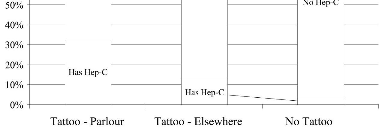
26. Tattoos The study by the University of Texas Southwestern Medical Center provides evidence of an association between having a tattoo and contracting hepatitis C. 32.7% of the subjects who were tattooed in a commercial parlour had hepatitis C, compared with 13.1% of those tattooed elsewhere, and only 3.5% of those with no tattoo. If having a tattoo and having hepatitis C were independent, we would have expected these percentages to be roughly the same.

27. Weather forecasts
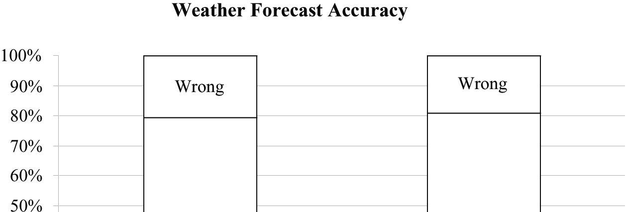
a) The table shows the marginal totals. It rained on 34 of 365 days, or 9.3% of the days.
b) Rain was predicted on 90 of 365 days. 90/365 ≈ 24.7% of the days.
c) The forecast of rain was correct on 27 of the days it actually rained and the forecast of No Rain was correct on 268 of the days it didn’t rain. So, the forecast was correct a total of 295 times. 295/365 ≈ 80.8% of the days.
d) On rainy days, rain had been predicted 27 out of 34 times (79.4%). On days when it did not rain, forecasters were correct in their predictions 268 out of 331 times (81.0%). These two percentages are very close. There is no evidence of an association between the type of weather and the ability of the forecasters to make an accurate prediction. It seems that he forecast is pretty accurate regardless of the type of weather?
28. Attraction, repulsion
a) There are 10 + 70 = 80 quadrants in which Agropyron is present. Ten of these 80 quadrants have Agrostis, i.e., (10/80) × 100% = 12.5%.
There are 40 + 80 = 120 quadrants in which Agropyron is absent. Forty of these 120 quadrants have Agrostis, i.e., (40/120) × 100% = 33.33%.
b) Conditional distribution of Agropyron presence/absence when Agrostis is present:
Agrostis present
Agropyron present 10/50 x 100%= 20%
Agropyron absent 40/50 x 100% = 80%
Conditional distribution of Agropyron presence/absence when Agrostis is absent:
Agrostis absent
Agropyron present 70/150 x 100% = 46.7%
Agropyron absent 80/150 x 100% = 53.3%
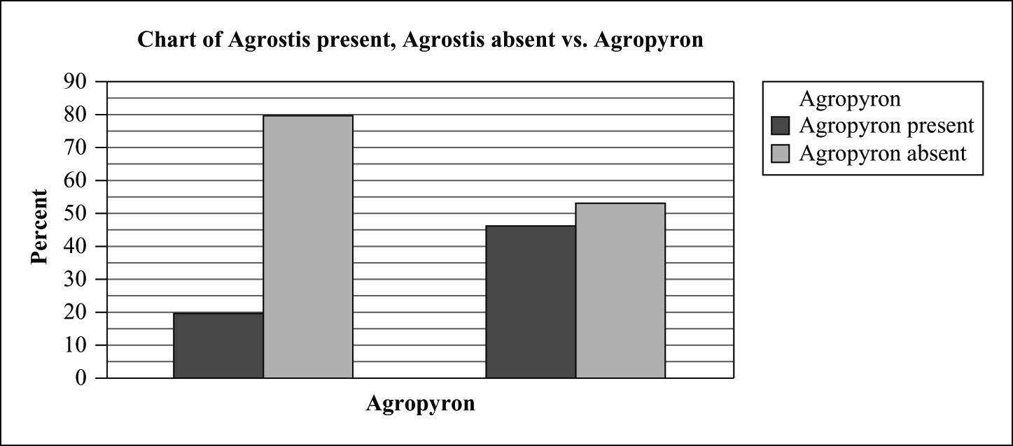
Presence of Agrostis is associated with less Agropyron. Thus they repel.
29. Drivers’ licences 2014.
a) (54927 + 1154574)/24914051 x 100%= 4.85%
b) 12832778/24914051 x 100%= 51.51%
c) In every age group, there are more male drivers than female drivers. The age group in which the percentage of male drivers is closest to 50% is 35-44. The age group in which the percentage of male drivers is furthest from 50% is under 16, followed by 65 and over.
d) If a driver’s age and sex were independent, then the table could be approximately reconstructed using only the row and column totals by multiplying the row total and the column total, and dividing by the grand total. Doing this, we get the following table:
The percentage difference between the original data and this table is:
We can see that there are about 5% more male drivers under the age of 16 than would be expected if age and sex were independent, and about 3% more male drivers 65 and over than would be expected if age and sex were independent. This is what was suggested in our answer to part c) – the proportion of male drivers depends (slightly) on the age group.
30. Fat and Fatter.
a) (2776 + 441)/(90 + 3909 + 2776 + 441) x 100%= 44.58% of normal weight Canadians in 1995 became overweight or obese by 2011.
b) 521/(240 + 3909 + 521) x 100%= 11.16% of normal weight Canadians in 2011 were overweight or obese in 1995.
c) 521/(521 + 2676 + 1670 + 243 + 1491) x 100%= 7.89% of overweight or obese Canadians in 1995 got their weight down to normal by 2011.
31. Anorexia.
These data provide no evidence that Prozac might be helpful in treating anorexia. About 71% of the patients who took Prozac were diagnosed as “Healthy.” Even though the percentage was higher for the placebo patients, this does not mean that Prozac is hurting patients. The difference between 71% and 73% is not likely to be statistically significant (will be discussed in later chapters).
32. Neighbourhood density.
a) They are row percentages. The rows add up to 100.
b) The segmented bar chart (showing the conditional distribution of density, by city) is given below.
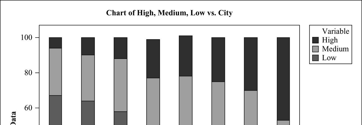
c) To construct such a table we would also need the total counts for each city (i.e., row total counts). If we knew the row total counts we could calculate the cell counts for each row by multiplying the row percents by the row totals. If we had the total sample size and the marginal distribution of each city, we could calculate the total counts for each city (just multiply the marginal proportions by the total sample size).
d) Yes, these data suggests that the Latin and French temperament causes people to live closer to each other. Cities like Quebec and Montreal have higher percentage of high density than cities like Calgary.
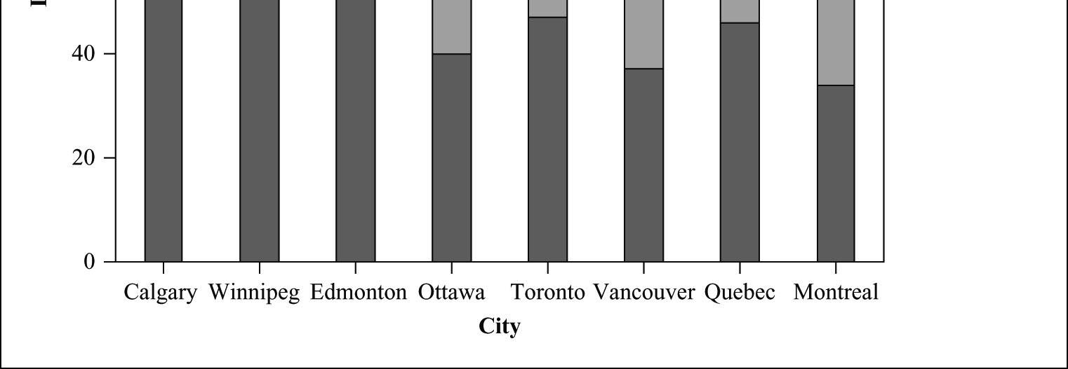
33. Smoking gene?
a) The marginal distribution of genotype is given below:
b) The conditional distributions of genotype for the four categories of smokers are given in columns 2–5 of the table below.
c) Though not a very noticeable difference, the percentages of smokers with genotype GT (also TT) are slightly higher among heavy smokers. However, this is only an observed association. This does not prove that presence of the T allele increases susceptibility to nicotine addiction. We cannot conclude that this increase was caused by the presence of the T allele. There can be many factors associated with the presence of the T allele, and some of these factors might be the reason for the increase in susceptibility to nicotine addiction.
34. Pet ownership
a) No, the income distributions of households by pet ownership shouldn’t be the same. Caring for a horse is much more expensive, generally, than caring for a dog, cat, or bird. Households with horses as pets should be in the higher income categories.
b) These are the percentages of income levels for each type of animal owned. Each pet was classified as belonging to a family in one of the income level categories.
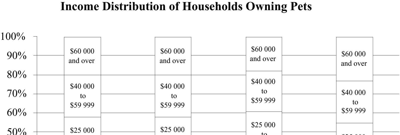

The data support the initial guess to a certain extent. The percentage of horses whose owners have income less than $12 500 is only 9%, compared to percentages in the 20s for other income levels, while the income levels of owners of other pets were distributed in roughly the same percentages. However, with the exception of those earning less than $12 500, the percentages in each income level among horse owners weren’t much different.
35. Antidepressants and bone fractures. These data provide evidence that taking a certain class of antidepressants (SSRI) might be associated with a greater risk of bone fractures. Approximately 10% of the patients taking this class of antidepressants experience bone fractures. This is compared to only approximately 5% in the group that were not taking the antidepressants.
36. Blood proteins. The two-way table and the conditional distribution (percentages) of protein (presence or absence) for each blood type are given below. It looks like the proportion of individuals with this protein is higher among the individuals with blood type B.
frequencies in Count
37. Cell phones
a) The two-way table and the conditional distributions (percentages) of ‘car accident’ (crash or non-crash) for cell phone owners and non-cell phone owners are given below. The proportion of crashes is higher for cell phone owners than for non-cell phone owners.
b) On the basis of this study, we cannot conclude that the use of a cell phone increases the risk of a car accident. This is only an observed association between cell phone ownership and the risk of car accidents. We cannot conclude that the higher proportion of accidents was caused by the use of a cell phone. There can be lots of other factors common to cell phone owners, and some of those factors can be the reason for the accidents.
38. Twins.
a) Of the 278 000 mothers who had twins in 1995–1997, 63 000 had inadequate health care during their pregnancies.
63 000/278 000 x 100% = 22.7%
Twin Births 1995-97 (in thousands)
b) There were 76 000 induced or Caesarean births and 71 000 preterm births without these procedures. (76 000 + 71 000)/278 000 = 52.9%
c) Among the mothers who did not receive adequate medical care, there were 12 000 induced or Caesarean births and 13 000 preterm births without these procedures. 63 000 mothers of twins did not receive adequate medical care. (12 000 + 13 000)/63 000 = 39.7%
d)
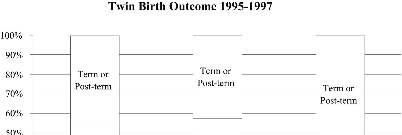
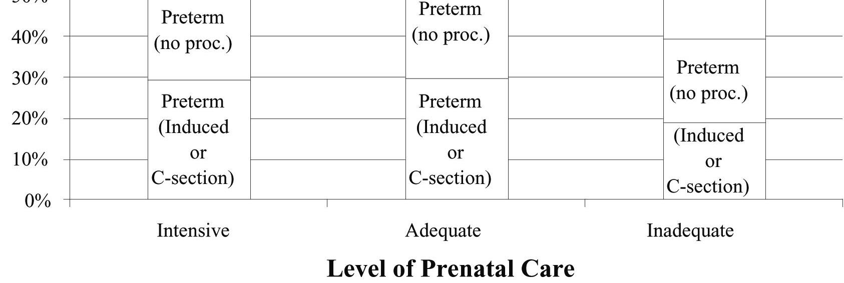
e) 52.9% of all twin births were preterm, while only 39.7% of births in which inadequate medical care was received were preterm. This is evidence of an association between level of prenatal care and twin birth outcome. If these variables were independent, we would expect the percentages to be roughly the same. Generally, those mothers who received adequate or intensive medical care were more likely to have preterm births than mothers who received inadequate health care. This does not imply that mothers should receive inadequate health care to decrease their chances of having a preterm birth, since it is likely that women that have some complication during their pregnancy (that might lead to a preterm birth), would seek intensive or adequate prenatal care.
39. Blood pressure.
a) The marginal distribution of blood pressure for the employees of the company is the total column of the table, converted to percentages. 20% low, 49% normal, and 31% high blood pressure.
b) The conditional distribution of blood pressure within each age category is:
Under 30: 28% low, 49% normal, 23% high 30–49: 21% low, 51% normal, 28% high Over 50: 16% low, 47% normal, 37% high
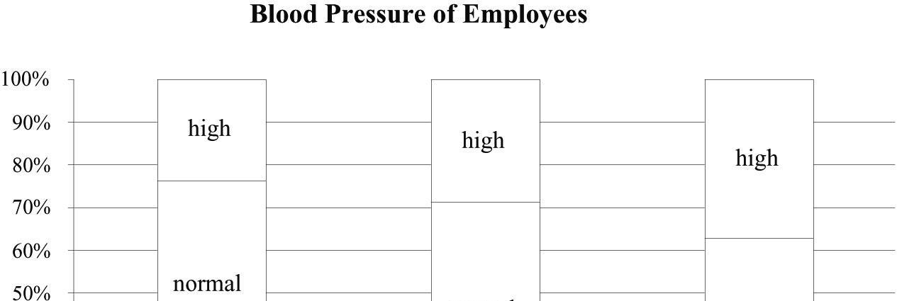
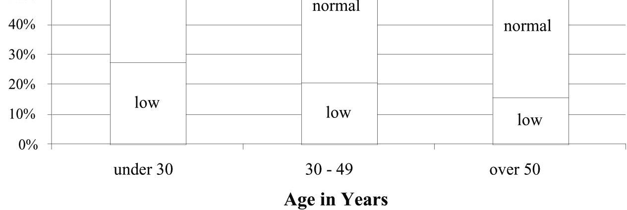
c) A segmented bar chart of the conditional distributions of blood pressure by age category is at the right.
d) In this company, as age increases, the percentage of employees with low blood pressure decreases, and the percentage of employees with high blood pressure increases.
e) No, this does not prove that people’s blood pressure increases as they age. Generally, an association between two variables does not imply a cause-andeffect relationship. Specifically, these data come from only one company and cannot be applied to all people. Furthermore, there may be some other variable that is linked to both age and blood pressure.
40. Self-reported BMI.
a) Conditional distributions (percentages) of self-reported BMI for the three measured overweight classes are given below (the last three columns of the table).
b) Conditional distributions (percentages) of measured BMI for the three selfreported overweight classes are given below (the last three columns of the table).
to 29.9)
(less than 18.5)
to 24.9)
to 29.9)
to 34.9)
or more)
c) It is reasonable to expect the self-reported BMI values to be close to the measured BMI values at least to some extent, and so not to be independent. The table (for example, column 3 of the table given in part a above) shows the conditional distribution of the self-reported BMI for each measured BMI class. These conditional distributions do not look very similar. In fact, they look very different. This means that the two variables (self-reported and measured BMI) are not independent.
d) A considerable percentage of people tend to understate their weight and overstate their height (i.e., report a smaller BMI). From the conditional distributions of self-reported BMI for the three measured overweight classes in part a, we see that approximately 47% of obese class II/III people have done this. This proportion is similar (i.e., approximately 47%) for obese class I people, and is about 30% for overweight people.
e) Answers might vary. Gender and age (young, old) are some examples.
f) Risk of overweight to health will be overestimated. For example, if those with BMI of 35 or more have high diabetes rates and are misclassified as having a BMI of 30, we will think it is only those with a BMI of 30 who have a high diabetes risk.
41. Indigenous identity 2011
a) The second column includes some individuals in the 3rd, 4th, and 5th columns, so it is not a standard contingency table.
b) Use the label “Indigenous population not included in columns 3, 4, and 5” (or call them “other Indigenous”). Use the value in second column minus those in the third, fourth and fifth columns as the new value.
Copyright © 2019 Pearson Canada Inc.
c) There are 27 070 Canadians who are Inuit from Nunavut. The Canadian population is 32 852 320, so the proportion of Canadians who are Inuit from Nunavut is 27 070/32 852 320 = 0.00082 = 0.08% (approx.).
d) There are 27 070 Canadians who are Inuit from Nunavut. The total Canadian Indigenous population is 1 400 685, so the proportion of Indigenous Canadians who are Inuit from Nunavut is 27 070/1 400 685 = 0.0193 = 1.93% (approx.).
e) The total Canadian Indigenous population is 1 400 685 and of them 59 440 are Inuit. So 59 440/1 400 685 = 0.0424 = 4.24% of Indigenous Canadians are Inuit.
f) The total Canadian Aboriginal population is 1 400 685 and of them 27 360 are from Nunavut. So 27 360/1 400 685 = 0.0195 = 1.95% of Indigenous Canadians are from Nunavut.
g) The total population in Nunavut is 31 700 and 27 360 of them are Inuit. So 27 070/31 700 = 0.8539 = 85.39% of the people from Nunavut are Inuit.
h) There are 27 360 Nunavut Indigenous Canadians and 27 070 of them are Inuit. So 27 070/27 360 = 0.9894 = 98.94% of Nunavut Indigenous Canadians are Inuit.
i) The total Inuit population is 59 440 and of them 27 070 are from Nunavut. So 27 070/59 440 = 0.4554 = 45.54% of Inuit live in Nunavut.
j) The total number of Ontario Indigenous Canadians is 301 430, and 301 430 – 201 105 – 86 015 – 3360 = 10 950 of them are other Indigenous Canadians (i.e., other than Inuit, Metis, or N.A. Indian) and so 10 950/301 430 = 0.0363 = 3.63% of Ontario Indigenous Canadians could not be simply classified as Inuit, Metis, or N.A. Indian.
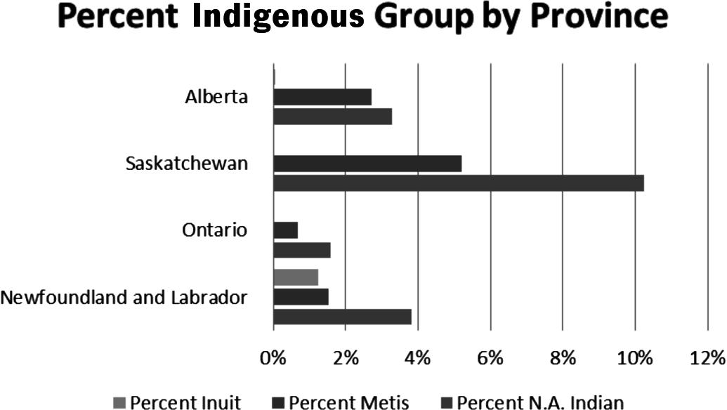
k) A table of percentages of total provincial population for each Indigenous identity group (Inuit, Metis, N.A. Indian) for Newfoundland, Ontario, Saskatchewan, and Alberta is given below. The second table is a bit easier if using MINITAB. The side-by-side bar charts below show that Saskatchewan has the highest proportion of N.A. Indian and Metis. Ontario, Saskatchewan, and Alberta have very small proportions of Inuit.
Group
42. Dim sum 2011.
a) There are three categorical variables, namely city (Calgary, Toronto, or Oshawa), spoken Chinese dialect (Cantonese or Mandarin), and year (2011 or 2006).
b) The conditional distribution of spoken Chinese dialect for 2011, in Toronto: Cantonese: 156 425/(156 425 + 91 670) = 0.631
Mandarin: 91 670/(156 425 + 91 670) = 0.369
The conditional distribution of spoken Chinese dialect for 2006, in Toronto: Cantonese: 129 925/(129 925 + 44 990) = 0.743
Mandarin: 44 990/(129 925 + 44 990) = 0.257
The conditional distribution of spoken Chinese dialect for 2011, in Calgary: Cantonese: 16 920/(16 920 + 9 900) = 0.631
Mandarin: 9 900/(16 920 + 9 900) = 0.369
The conditional distribution of spoken Chinese dialect for 2006, in Calgary: Cantonese: 12 785/(12 785 + 5 345) = 0.705
Mandarin: 5 345/(12 785 + 5 345) = 0.295
The conditional distribution of spoken Chinese dialect for 2011, in Vancouver: Cantonese: 113 610/(113 610 + 83 825) = 0.575
Mandarin: 83 825/(113 610 + 83 825) = 0.425
The conditional distribution of spoken Chinese dialect for 2006, in Vancouver: Cantonese: 94 760/(94 760 + 51 465) = 0.648
Mandarin: 51 465/(94 760 + 51 465) = 0.352
c) Can’t determine since we don’t know how many speak other Chinese dialects.
d) Bar charts can be used as we might want to compare between 2011 and 2006 and also between different cities. A pie chart may be used if our interest is in comparing the relative proportions of those who speak only these two dialects, but it might give the reader the impression that these are the only two dialects spoken. The percentage bar charts are shown below. In each city and each year the proportion of Mandarin speakers is relatively low, but in each city this proportion is higher in 2011 than in 2006. Vancouver has a higher proportion of Mandarin speakers compared to Calgary and Toronto.
e) Two-way table by year and dialect is shown below.
955185
470101
524 425287 195811620
The conditional distribution of dialect for each year:
The proportion of Mandarin speakers has increased from 30.01% (in 2006) to 39.25% (in 2011). It looks like more immigrants have come from other parts of China.
f) The marginal distribution of dialect (using 2011 data) is given in the fifth column of the table below. The conditional distributions of dialect for Calgary, Toronto, and Vancouver are given in the second, third, and the fourth columns, respectively. The conditional distribution for Vancouver differs the most from the marginal distribution; Calgary and Toronto have nearly identical distributions, but Vancouver has a higher percentage of Mandarin speakers.
43. Hospitals.
a) The marginal totals have been added to the table:
Discharge delayed
Large Hospital Small HospitalTotal
Procedure
Major surgery 120 of 800 10 of 50 130 of 850
Minor surgery 10 of 200 20 of 250 30 of 450 Total 130 of 1000 30 of 300 160 of 1300
160 of 1300, or about 12.3%, of the patients had a delayed discharge.
b) Yes. Major surgery patients were delayed 130 of 850 times, or about 15.3% of the time. Minor surgery patients were delayed 30 of 450 times, or about 6.7% of the time.
c) Large Hospital had a delay rate of 130 of 1000, or 13%. Small Hospital had a delay rate of 30 of 300, or 10%. The small hospital has the lower overall rate of delayed discharge.
d) Large Hospital: Major Surgery 15% delayed and Minor Surgery 5% delayed. Small Hospital: Major Surgery 20% delayed and Minor Surgery 8% delayed. Even though small hospital had the lower overall rate of delayed discharge, the large hospital had a lower rate of delayed discharge for each type of surgery.
e) No. While the overall rate of delayed discharge is lower for the small hospital, the large hospital did better with both major surgery and minor surgery.
f) The small hospital performs a higher percentage of minor surgeries than major surgeries. 250 of 300 surgeries at the small hospital were minor (83%). Only 200 of the large hospital’s 1000 surgeries were minor (20%). Minor surgery had a lower delay rate than major surgery (6.7% to 15.3%), so the small hospital’s overall rate was artificially inflated. Simply put, it is a mistake to look at the overall percentages. The real truth is found by looking at the rates after the
Copyright © 2019 Pearson Canada Inc.
information is broken down by type of surgery, since the delay rates for each type of surgery are so different. The larger hospital is the better hospital when comparing discharge delay rates.
44. Delivery service.
a) Pack Rats has delivered a total of 28 late packages (12 regular + 16 overnight), out of a total of 500 deliveries (400 regular + 100 overnight). 28/500 = 5.6% of the packages are late. Boxes R Us has delivered a total of 30 late packages (2 regular + 28 overnight) out of a total of 500 deliveries (100 regular + 400 overnight). 30/500 = 6% of the packages are late.
b) The company should have hired Boxes R Us instead of Pack Rats. Boxes R Us only delivers 2% (2 out of 100) of its regular packages late, compared to Pack Rats, who deliver 3% (12 out of 400) of its regular packages late. Additionally, Boxes R Us only delivers 7% (28 out of 400) of its overnight packages late, compared to Pack Rats, who delivers 16% of its overnight packages late. Boxes R Us is better at delivering regular and overnight packages.
c) This is an instance of Simpson’s Paradox, because the overall late delivery rates are unfair averages. Boxes R Us delivers a greater percentage of its packages overnight, where it is comparatively harder to deliver on time. Pack Rats delivers many regular packages, where it is easier to make an on-time delivery.
45. Graduate admissions.
a) 1284 applicants were admitted out of a total of 3014 applicants. 1284/3014 = 42.6%
b) 1022 of 2165 (47.2%) males were admitted. 262 of 849 (30.9%) females were admitted.
c) Since there are four comparisons to make, the table at the right organizes the percentages of males and females accepted in each program. Females are accepted at a higher rate in every program.
d) The comparison of acceptance rate within each program is most valid. The overall percentage is an unfair average. It fails to take the different numbers of applicants and different acceptance rates of each program. Women tended to apply to the programs in which gaining acceptance was difficult for everyone. This is an example of Simpson’s Paradox.
46. Be a Simpson! Answers will vary. The three-way table below shows one possibility. The number of local hires out of new hires is shown in each cell.
Company A
Company B
Copyright © 2019 Pearson Canada Inc.


