Chapter 2: Exploring Data with Tables and Graphs
Section 2-1: Frequency Distributions for Organizing and Summarizing Data
1. The table summarizes measurements from 40 subjects. It is not possible to identify the exact values of all of the original cotinine measurements.
2. The classes of 0–100, 100–200, …, 400–500 overlap, so it is not always clear which class we should put a value in. For example, the value of 100 could go in the first class or the second class. The classes should be mutually exclusive.
3. Cotinine (ng/Ml) Relative Frequency
4. The sum of the relative frequencies is 125%, but it should be 100%, with a small round off error. All of the relative frequencies appear to be roughly the same, but if they are from a normal distribution, they should start low, reach a maximum, and then decrease.
5. Class width: 100
Class midpoints: 49.5, 149.5, 249.5, 349.5, 449.5, 549.5
Class boundaries: –0.5, 99.5, 199.5, 299.5, 399.5, 499.5, 599.5
6. Class width: 90
Class midpoints: 1004.5, 1094.5, 1184.5, 1274.5, 1364.5,1454.5
Class boundaries: 959.5, 1049.5, 1139.5, 1229.5, 1319.5, 1409.5, 1499.5
7. Class width: 100
Class midpoints: 49.5, 149.5, 249.5, 349.5, 449.5, 549.5, 649.5
Class boundaries: –0.5, 99.5, 199.5, 299.5, 399.5, 499.5, 599.5, 699.5
8. Class width: 100
Class midpoints: 149.5, 249.5, 349.5, 449.5, 549.5
Class boundaries: 99.5, 199.5, 299.5, 399.5, 499.5, 599.5
9. No. The maximum frequency is in the first class instead of being near the middle, so the frequencies below the maximum do not mirror those above the maximum.
10. No. The frequencies start high and then decrease, so the frequencies below the maximum do not mirror those above the maximum.
11. By symmetry, the last three frequencies would be 18, 12, and 2. The middle frequency would be
1532182122289.
12. No. The maximum frequency is in the second class instead of being near the middle, and the first two frequencies are much greater than the last two frequencies, so the frequencies below the maximum do not mirror those above the maximum.
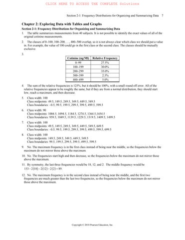
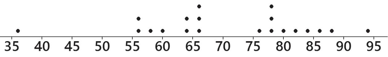
13. The pulse rates appear to have a distribution that is approximately normal.
14. The pulse rates appear to have a distribution that is approximately normal.
15.
16. The verbal IQ scores appear to have a distribution that is approximately normal.
17. Yes. The distribution appears to be approximately normal.
18. Yes. The distribution appears to be approximately normal.
21. The frequency distribution suggests that the reported heights were rounded with disproportionately many 0s and 5s. This suggests that the results are not very accurate.
Digit
22. The frequency distribution suggests that the reported weights were not rounded since the last digits seem equally distributed.
23. The two distributions differ substantially. The presence of cotinine appears to be much higher for smokers than for nonsmokers exposed to smoke.
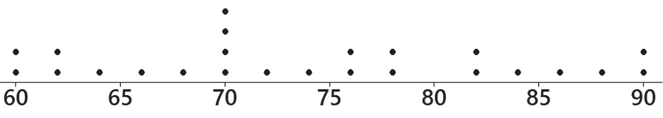
24. The two distributions show moderate difference. It appears females have slightly higher pulse rates.
Exposed
27. a. The values of 551 and 543 are clearly outliers; the values of 384, 241, 197, and 178 could also be outliers. b. The number of classes increases from six to ten. The outlier can greatly increase the number of classes. If there are too many classes, we might use a larger class width with the effect that the true nature of the distribution may be hidden.
(Nonsmokers Exposed to
Section
2-2: Histograms
1. It is easier to see the distribution of the data by examining the graph of the histogram than by examining the numbers in a frequency distribution.
2. Not necessarily. Because the sample subjects themselves chose to be included, the voluntary response sample might not be representative of the population.
3. With a data set that is so small, the true nature of the distribution cannot be seen with a histogram.
4. No, the term “normal distribution” has a different meaning than the term “normal” that is used in ordinary speech. A normal distribution will have a histogram that is approximately bell shaped. Determining whether a histogram fits the bell shape would be subjective.
5. approximately 50
6. Class width: 0.5 mm, lower limit of first class: 2.0 mm, upper limit of first class: 2.4 mm
7. The largest possible value would be approximately 4.5 mm, which would not be an outlier.
8. The sample does not appear to be from a normal distribution, since it is not symmetric about the middle class.
9. The pulse rates of males appear to have a distribution that is approximately normal.
for Exercise 10
10. The pulse rates of females appear to have a distribution that is approximately normal.
11. The IQ scores appear to have a distribution that is approximately normal.
12. The IQ scores appear to have a distribution that is approximately normal.
Histogram for Exercise 12
13. Yes. The red blood cell counts appear to have a distribution that is very approximately normal, although some might describe the distribution as being left-skewed instead of normal.
for Exercise 13
for Exercise 14
14. Yes. The red blood cell counts appear to have a distribution that is very approximately normal.
15. The histogram is shown below.
for Exercise 15
Histogram for Exercise 16
16. The histogram is shown above.
17. The histogram suggests that the reported heights were rounded with disproportionately many 0s and 5s. This suggests that the results are not very accurate.
for Exercise 17
Histogram for Exercise 18
18. The histogram suggests that the reported weights were not rounded since the last digits seem equally distributed.
19. Only part (c) appears to represent data from a normal distribution. Part (a) has a systematic pattern that is not that of a straight line, part (b) has points that are not close to a straight-line pattern, and part (d) is really bad because it shows a systematic pattern and points that are not close to a straight-line pattern.
Section 2-3: Graphs That Enlighten and Graphs That Deceive
1. The data set is too small for a graph to reveal important characteristics of the data. With such a small data set, it would be better to simply list the data or place them in a table.
2. No. If the sample is a bad sample, such as one obtained from voluntary responses, there are no graphs or other techniques that can be used to salvage the data.
3. No. Graphs should be constructed in a way that is fair and objective. The readers should be allowed to make their own judgments, instead of being manipulated by misleading graphs.
4. Center, variation, distribution, outliers, change in the characteristics of data over time. The time-series graph does the best job of giving us insight into the change in the characteristics of data over time.
5. The pulse rate of 36 beats per minute appears to be an outlier.
6. There do not appear to be any outliers.
7. The data are arranged in order from lowest to highest, as 36, 56, 56, and so on.
9. There was a steep jump in the first four years, but the numbers of triplets have shown a downward trend in the past several years.
10. The number of fatalities is decreasing, most likely due to greater enforcement of DUI laws and greater public awareness campaigns.
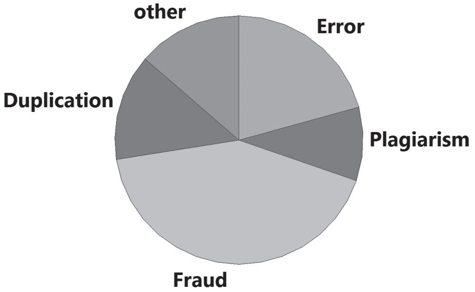
11. Misconduct includes fraud, duplication, and plagiarism, so it does appear to be a major factor.
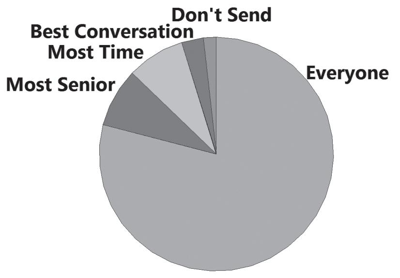
12. The overwhelming response was that thank-you notes should be sent to everyone who is met during a job interview. Given what is at stake, that seems like a wise strategy.
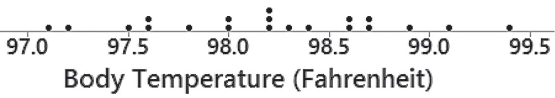
15. The distribution appears to be roughly bell-shaped, so the distribution is approximately normal.
Section 2-4: Scatterplots, Correlation, and Regression
16. The distribution appears to be roughly bell-shaped, so the distribution is approximately normal.
17. Because the vertical scale starts with a frequency of 200 instead of 0, the difference between the “no” and “yes” responses is greatly exaggerated. The graph makes it appear that about five times as many respondents said “no,” when the ratio is actually a little less than 2.5 to 1.
18. The two costs are one-dimensional in nature, but the baby bottles are three-dimensional objects. The $4500 cost isn’t even twice the $2600 cost, but the baby bottles make it appear that the larger cost is about five times the smaller cost.
Section 2-4: Scatterplots, Correlation, and Regression
1. The term linear refers to a straight line, and r measures how well a scatterplot of the sample paired data fits a straight-line pattern.
2. No. Finding the presence of a statistical correlation between two variables does not justify any conclusion that one of the variables is a cause of the other.
3. A scatterplot is a graph of paired , x y quantitative data. It helps us by providing a visual image of the data plotted as points, and such an image is helpful in enabling us to see patterns in the data and to recognize that there may be a correlation between the two variables.
4. a. 1 b. 0 c. 0 d. –1
5. There does not appear to be a linear correlation between brain volume and IQ score.
for Exercise 5
Scatterplot for Exercise 6
6. There does appear to be a linear correlation between chest sizes and weights of bears.
7. There does not appear to be a linear correlation between body temperature at 8 AM on one day and at 8 AM on the following day.
Scatterplot for Exercise 7
Scatterplot for Exercise 8
8. There does not appear to be a linear correlation between heights of fathers and the heights of their first sons.
9. With 5 n pairs of data, the critical values are 0.878. Because 0.127 r is between –0.878 and 0.878, evidence is not sufficient to conclude that there is a linear correlation.
10. With 7 n pairs of data, the critical values are 0.754. Because 0.980 r is in the right tail region beyond 0.754, there are sufficient data to conclude that there is a linear correlation.
11. With 7 n pairs of data, the critical values are 0.754. Because 0.502 r is between –0.754 and 0.754, evidence is not sufficient to conclude that there is a linear correlation.
12. With 10 n pairs of data, the critical values are 0.632. Because 0.017 r is between –0.632 and 0.632, evidence is not sufficient to conclude that there is a linear correlation.
Chapter Quick Quiz
1. The class width is 0.120.080.04.
2. The class boundaries are 0.075 and 0.115.
3. No, it is impossible to determine the original values.
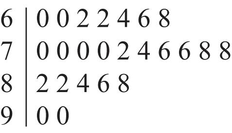
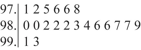
4. 16, 17, 18, 18, 19
5. bell-shaped
6. variation
7. time-series graph
8. scatterplot
9. Pareto chart
10. A frequency distribution is in the format of a table, but a histogram is a graph.
Review Exercises
1.
2. Yes, the data appear to be from a population with a normal distribution because the bars start low and reach a maximum, then decrease, and the left half of the histogram is approximately a mirror image of the right half.
3. By using fewer classes, the histogram does a better job of illustrating the distribution.
4. There are no outliers.
5. Yes. There is a pattern suggesting that there is a relationship.
6. a. time-series graph b. scatterplot c. Pareto chart
7. By using a vertical scale that starts at 45% instead of 0%, the difference is greatly exaggerated. The graph creates the false impression that male enrollees outnumber female enrollees by a ratio of about 3:1, but the actual percentages of 53% and 47% are much closer than that.
Cumulative Review Exercises
2. The histogram is approximately bell-shaped. The frequencies increase to a maximum and then decrease, and the left half of the histogram is roughly a mirror image of the right half. The data do appear to be from a population with a normal distribution.
4. There are disproportionately many last digits of 0 and 5. Fourteen of the 20 times have last digits of 0 or 5. It appears that the subjects reported their results and they tended to round the results. The data do not appear to be very accurate.
5. a. ratio
b. continuous
c. No. The grooming times are quantitative data.
d. statistic
6. The scatterplot helps address the issue of whether there is a correlation between heights of mothers and heights of their daughters. The scatterplot does not reveal a clear pattern suggesting that there is a correlation.