BRAND STYLE GUIDE


Huila Coffee Roasters is a Colombian coffee company that specializes in producing high-quality, sustainably sourced coffee, founded by a group of coffee growers from Huila’s region in Colombia.
Through its packaging, aroma, and flavor, Huila aims to show and celebrate the unique beauty of each region of Colombia, also seeks to establish a connection between the consumer and each coffee grower, give exceptional customer service, and involve their audience in all its projects.
Huila Coffee Roasters is committed to providing a high-quality product that meets the expectations of its customers, providing good service and making the consumer part of the company and the social projects we do.
Our mission is that more than a coffee, we want to create a connection between the consumer and the coffee grower, always highlighting and honoring the work of each coffee grower.
Our tone of voice is warm, authentic, and reflects a deep appreciation for the journey that takes coffee from bean to cup. We aim to captivate our audience with the passion and pride that are at the heart of our coffee culture.
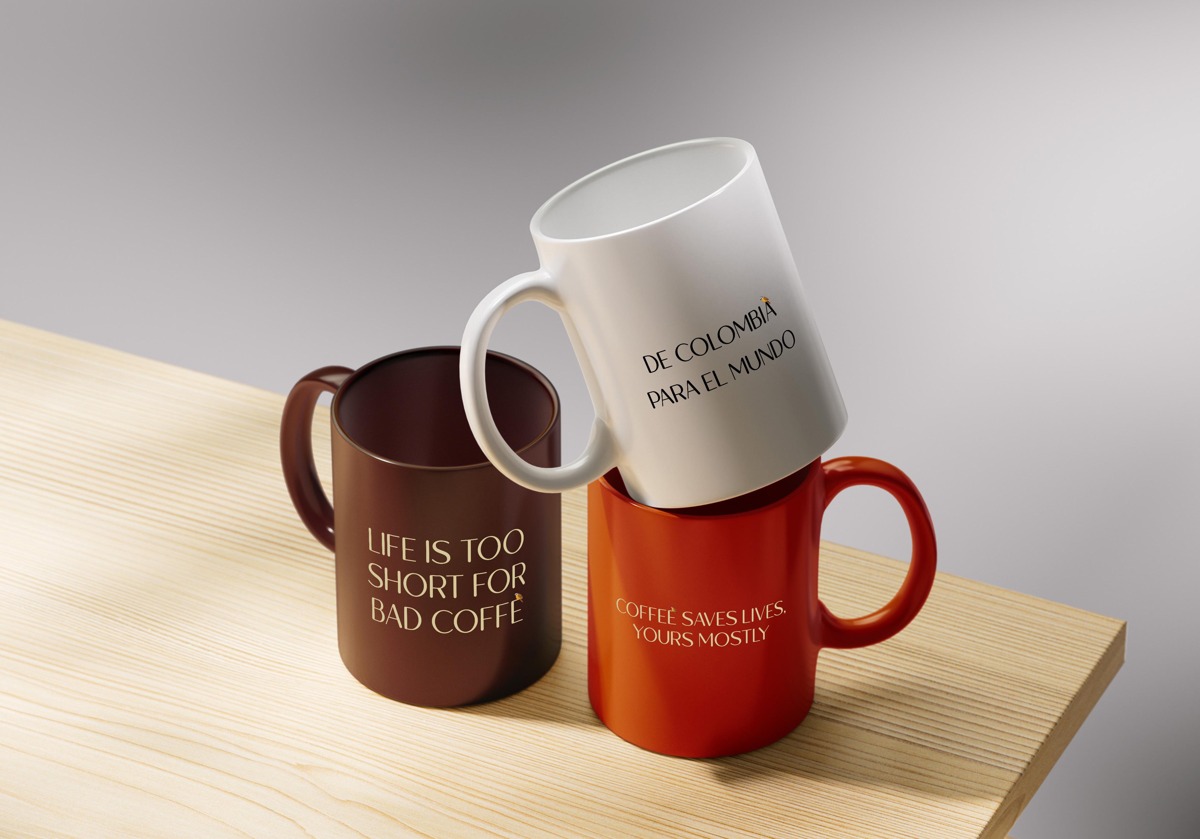
To ensure that we are accessible to all, we use both English and Spanish languages in our communication.
Promote sustanability
Service & Integrity


Producing high quality product
Reflect the work of our coffee growers & fair pay


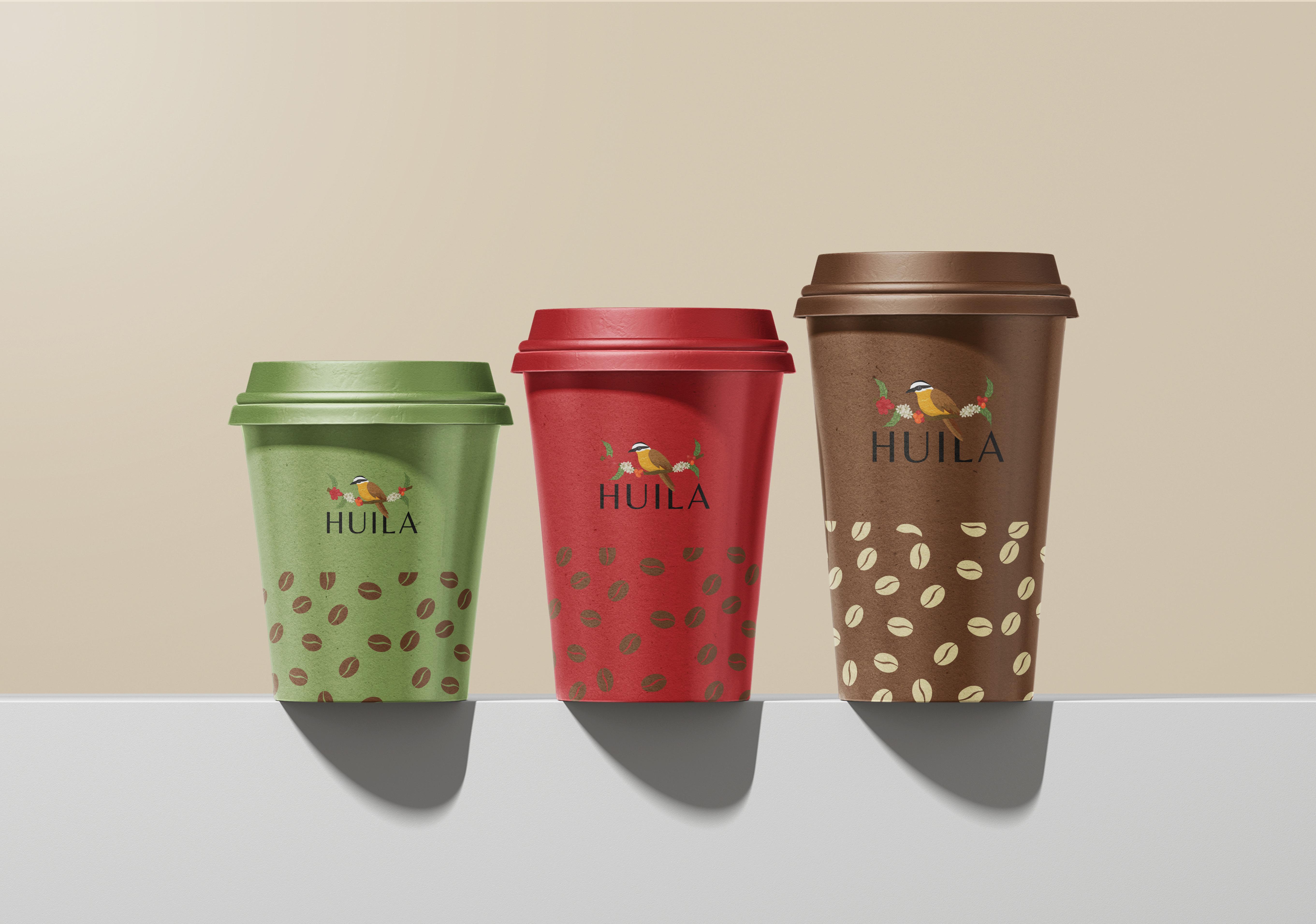
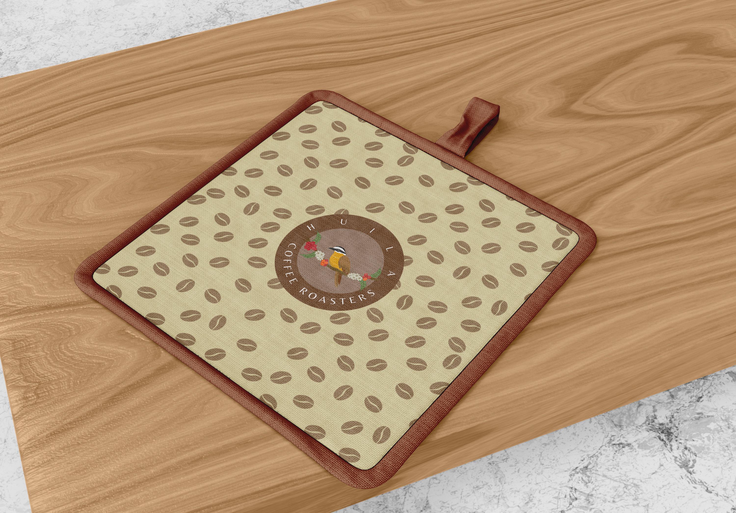
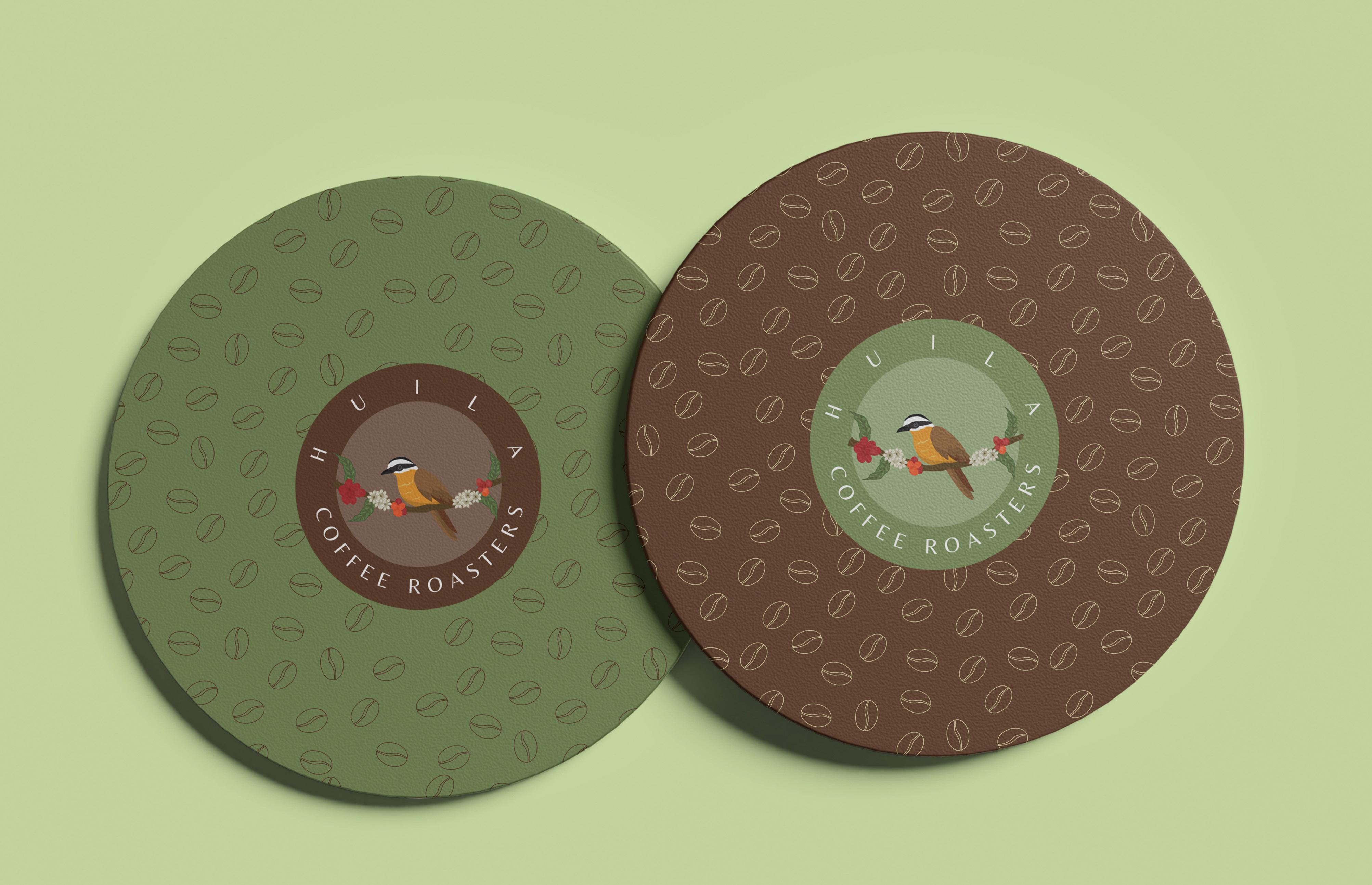
The name “Huila” is inspired by the department of Huila in Colombia which is famous for its lush flora and fauna, high-quality coffee production, and the warm hospitality of its people. The logo features a great kiskadee, a bird that is known for its boldness, peaceful nature, and vibrant colors. This bird is a common sight in Huila and is a symbol of pride for the locals. The kiskadee’s characteristics resonate with the brand’s values of warmth, hospitality, and boldness.
Huila’s logo is designed to be simple, elegant, and memorable.

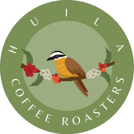
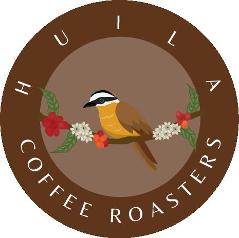
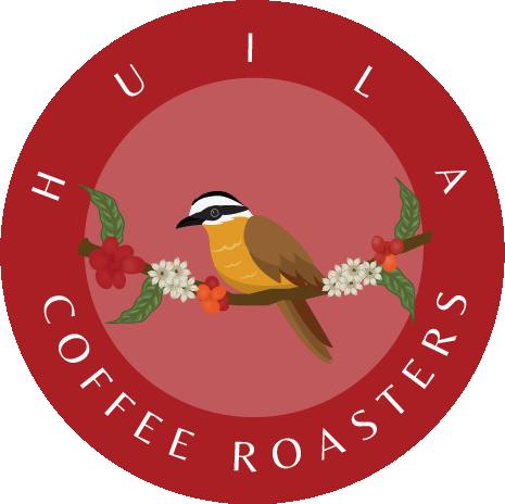


The colors of our brand are closely tied to the vibrant hues of Colombia. Red is inspired by the deserts of Tatacoa and coffee plantations, while green represents the Amazon rainforest.
Yellow is reminiscent of the sandy beaches and the joy of the people, and orange is inspired by the variety of fruits found in the country. Each color holds a special meaning and together they evoke a sense of warmth, culture, and vibrancy. We aim to bring these feelings to the world, sharing the essence of Colombia with everyone.


Camo #7B9154
WEB
R122 G144 B85
C55 M28 Y81 K8

Cornell Red #aa1f23
WEB
R170 G31 B35
C23 M100 Y99 K16

Irish Coffee
WEB
#5E361C
R94 G54 B28
C41 M71 Y89 K50
Pavlova
WEB
#D7C498
R213 G200 B153
C18 M17 Y45 K0

Lemon Ginger
Alpine
WEB
#BF9005
R183 G154 B61
C29 M35 Y93 K3

Black Olive

Cocoa Bean

Mango Tango

Dirt Brown

Dusty Blue
R33 G46 B26
#212e1a WEB PRINT
C73 M54 Y83 K69
R86 G28 B36
#561C24 WEB PRINT
C40 M88 Y69 K58
#E17226
R225 G114 B38
WEB PRINT
C8 M67 Y100 K1
R146 G98 B51
#926233 WEB PRINT
C34 M59 Y89 K21
R104 G137 B165
#6889A5 WEB PRINT
C64 M39 Y23 K1
Huila has chosen to utilize the Belleza font for essential elements like headings and calls to action. This humanist sans serif font adds a touch of elegance to the brand, while also being easily readable and approachable. For the rest of the text, Poppins regular font is used, which, when combined with Belleza, creates a professional and visually appealing aesthetic. Additionally, the Garamond font family has proven to be effective for web use, much like Belleza.
TITLE (BELLEZA 40pt & leading 40pt)
CONTENT (Garamond Primer Pro regular 13pt & leading 20pt)
Lorem ipsum dolor sit amet, consectetur adipiscing elit. Integer volutpat lacinia eros. Interdum et malesuada fames ac ante ipsum primis in faucibus. Nullam tellus massa, iaculis tincidunt tortor ac, bibendum maximus ligula. Suspendisse eget suscipit dolor.
BELLEZA : PRINT (max 300pt min 16pt ) WEB (30px)

GARAMOND : PRINT (min 13pts leading 20pts) WEB (mi 16px)



COLORS OUTSIDE THE COLOR PALETTE OUTLINED
STRECHED OR SQUISH



WITHOUT THE ICON ROTATED




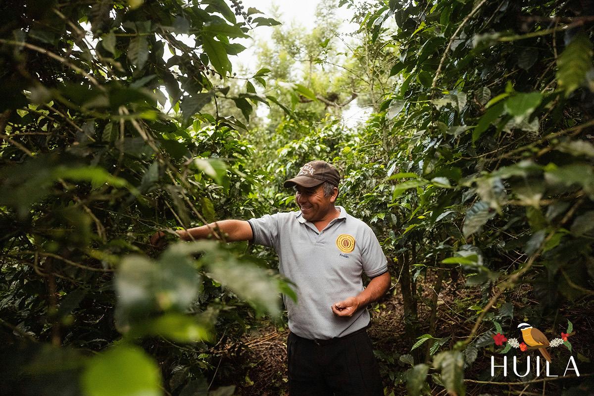
Using white space in the images allows for a clean design, generating a good contrast with the logo.

Do not place the light logo on a light background, it will not create contrast and will cause the logo to be lost and not easy to recognize. Use the other variations of the logo / color palette.
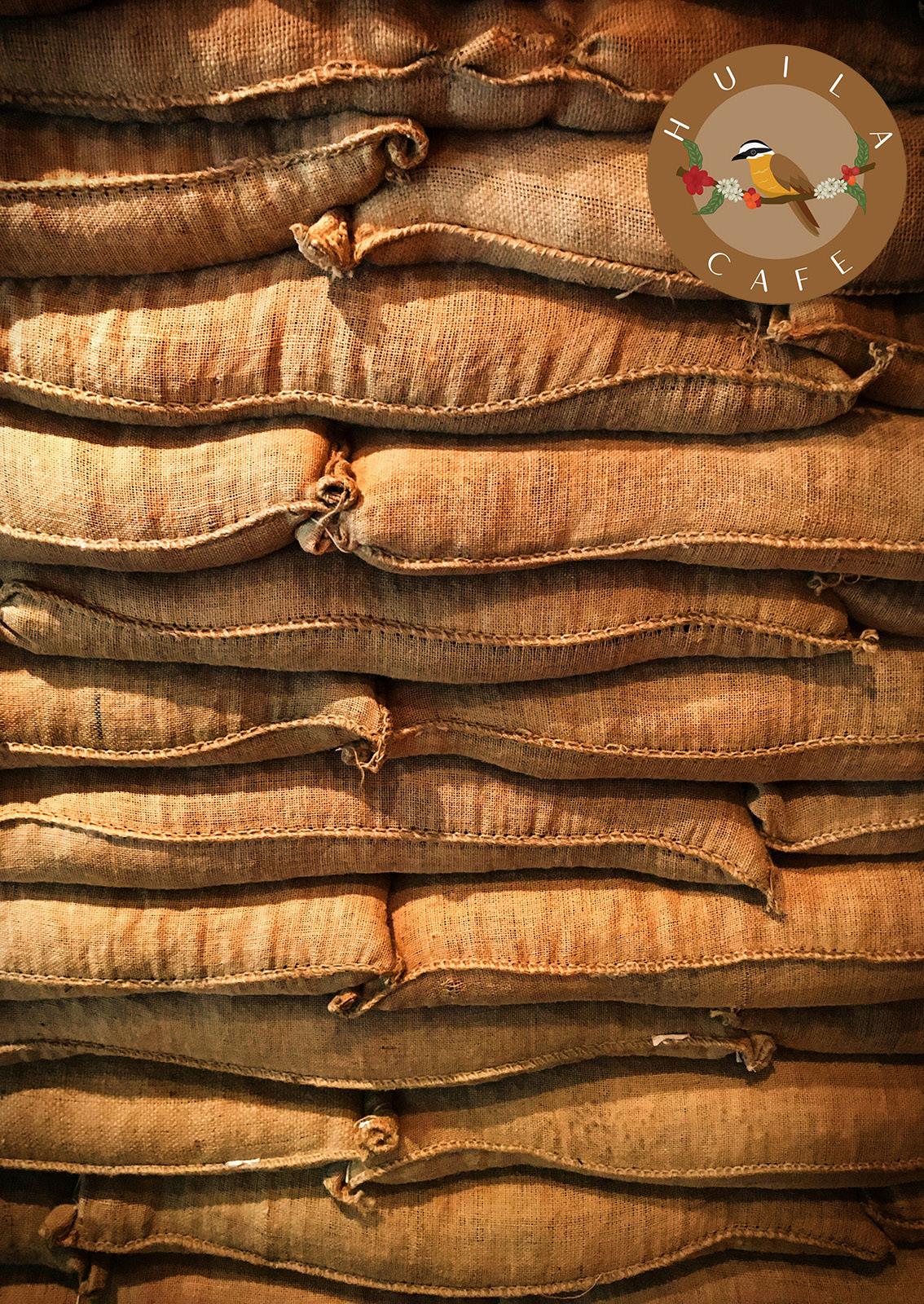
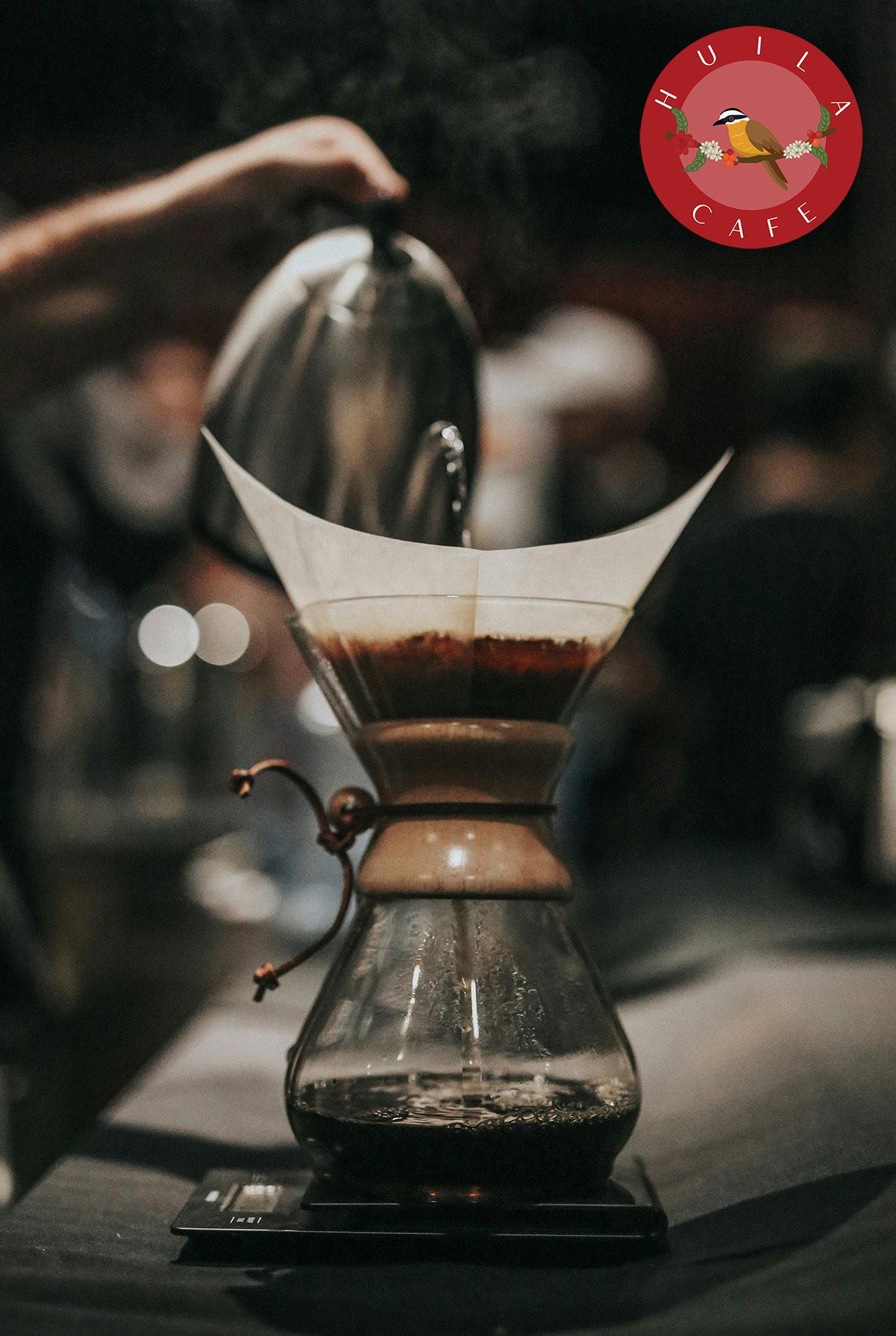
Use the colors of the palette according to the image you have, to create a connection between our logo and the image.
