Selected Professional Works: 2013-2023
GRAPHIC DESIGN PORTFOLIO
Selected Professional Works: 2013-2023

Education
MFA in Photography
Penn State University
State College, USA
2021-present
BA in Graphic Design
Alzahra University
Tehran, Iran
2004 - 2008
Softwares
Adobe Illustrator
Adobe Photoshop
Adobe Indesign
Figma
Keynote
Microsoft Office
Skills
Commiunication
Leadership
Concept Development
Time Management
Collabration
Problem Solving
Team Work
Typography
Photography
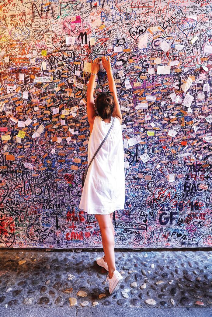
I'm a detail-oriented brand designer dedicated to crafting impactful identities through immersive visuals. My passion is reshaping brand identities by seamlessly blending creativity and strategy, offering unique design experiences that tell captivating brand stories.
The Pennsylvania State University
Brand Designer, State College, USA, 2023-Present
Graphic Designer, State College, USA, 2021-2023
Gallery Coordinator, State College, USA, 2021-2023
Rougine Pharmed | a Pharmaceutical Manufacturing
Brand Manager, Tehran, Iran, 2019-2021
Daarvag International | a DDB Worldwide Affiliated Advertising Agency in Iran
Art Director, Branding Department, Tehran, Iran, 2014-2018
Graphic Designer, Creative Department, Tehran, Iran, 2011-2014
Visual Identity Design

Billboard Design
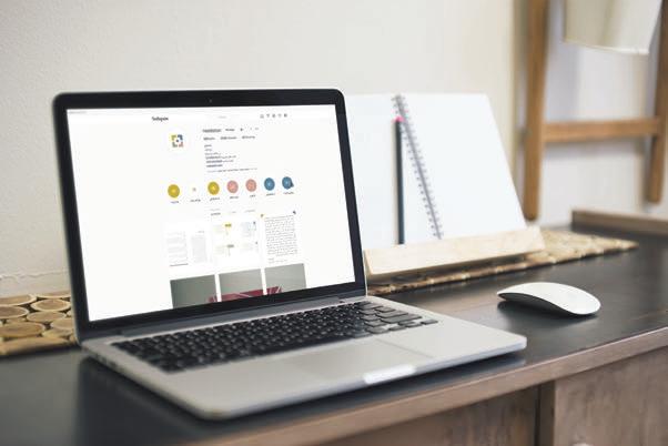
01. Dialog, Startup Application, 2020
02. Nadastan Magazine, 2019
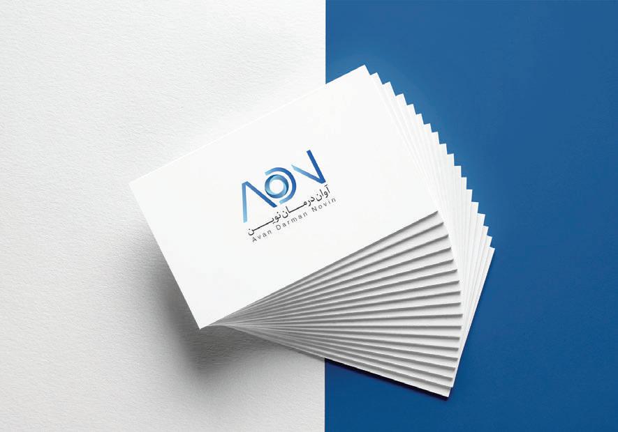
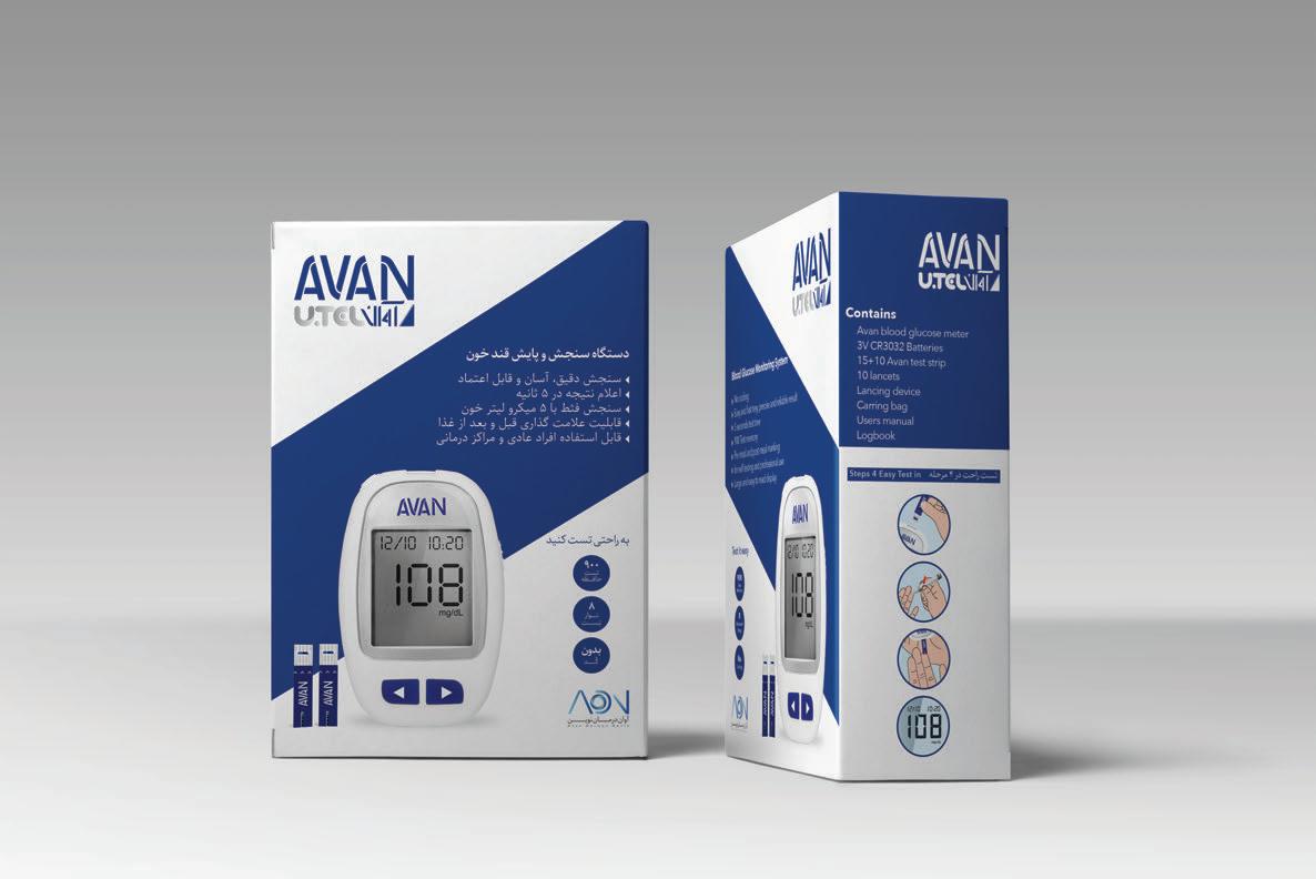
03. Avan Darman Novin, 2018
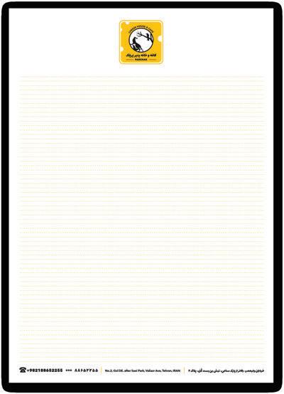
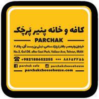
04. Parchak Cheese House Café, 2017
05. Sartas Nuts, 2016
06. Chum Cafe, 2015
07. Saboos Bakery - cafe, 2014
08. Cookie Box Pastry, 2014
Packaging Design
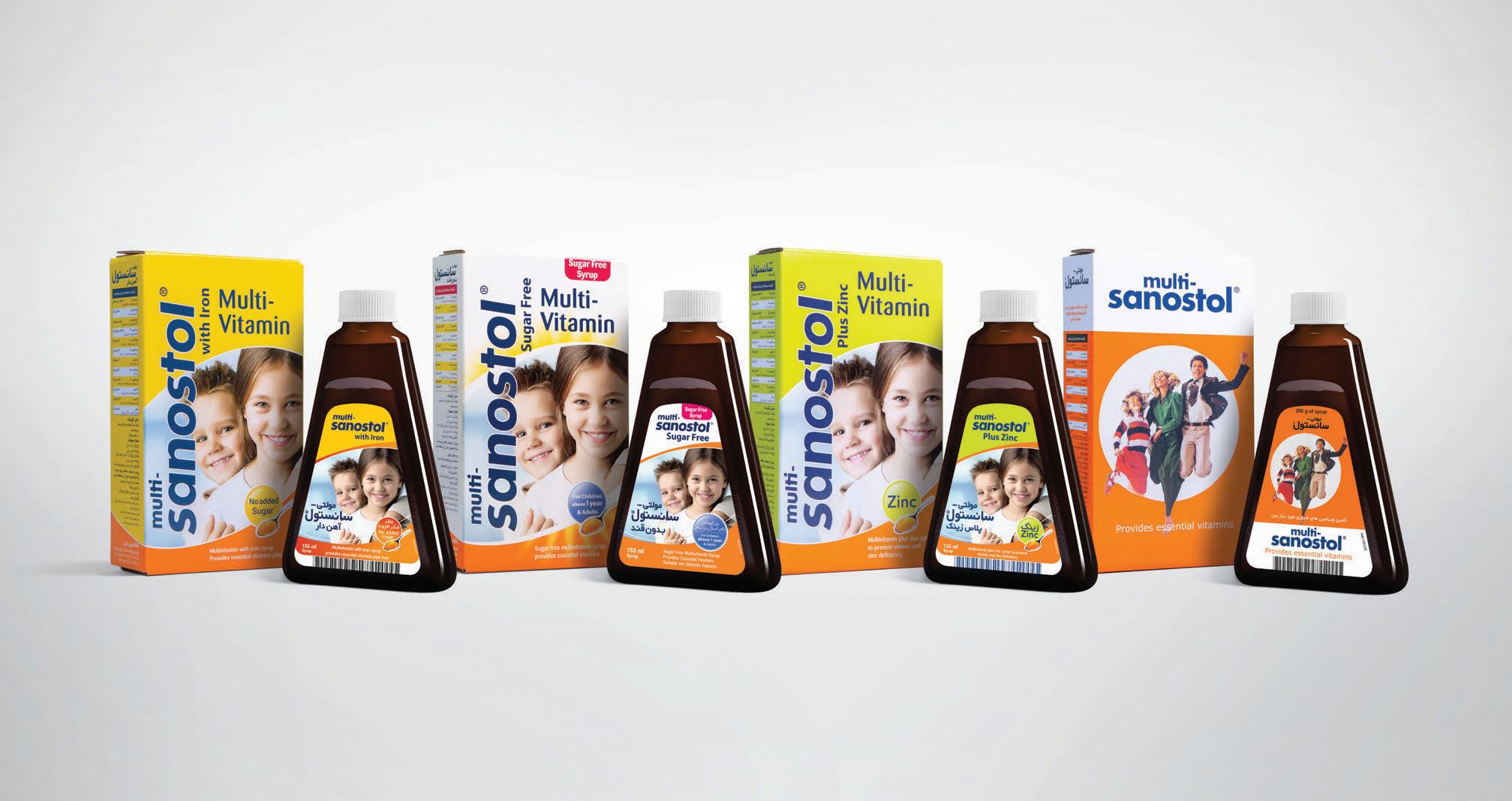
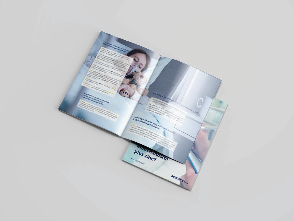
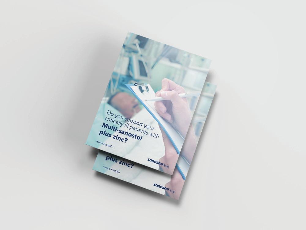
09. Sanostol Supplements, 2021
10. Avan Darman Novin, 2020
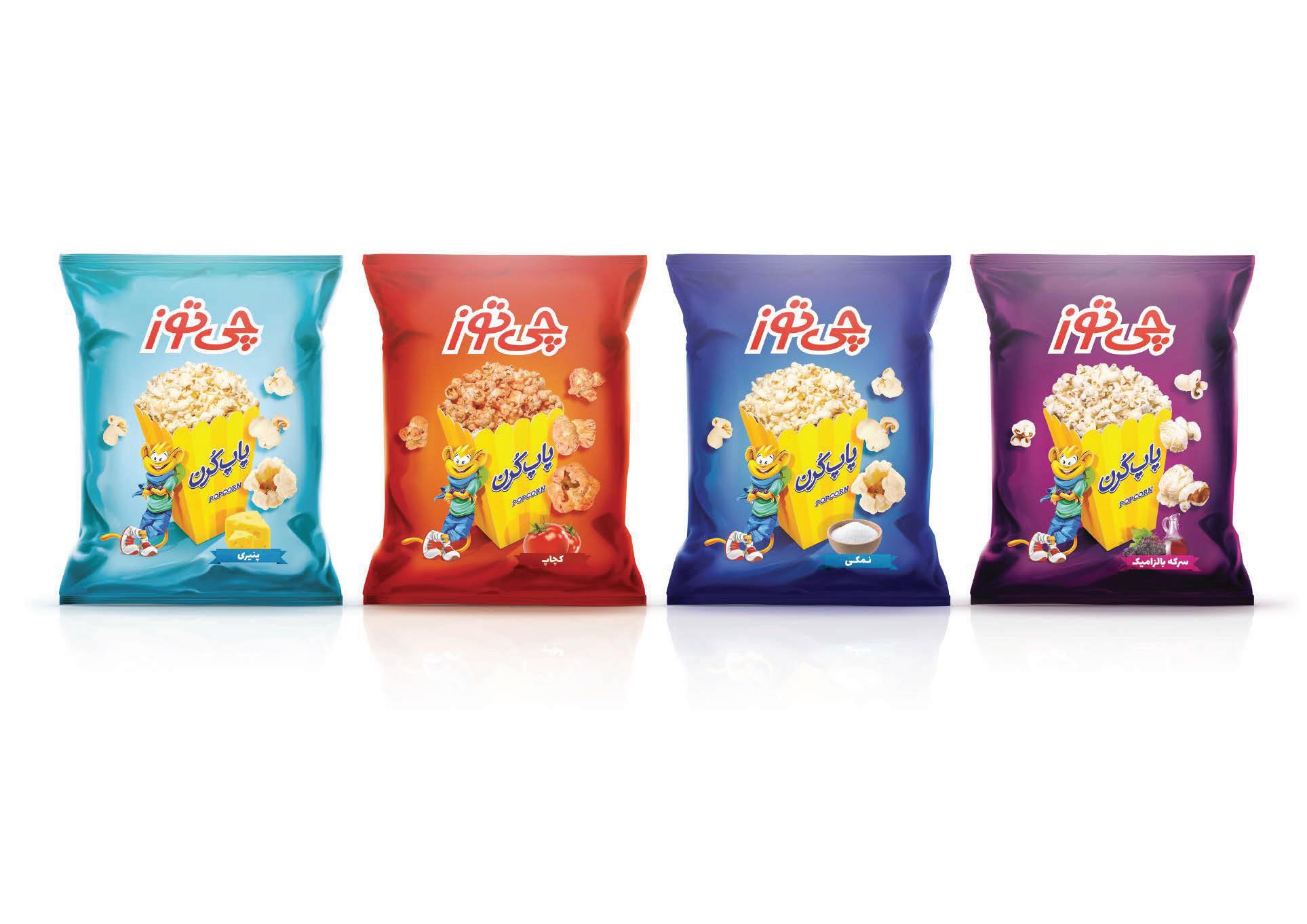
11. Cheetoz, Popcorn, 2018
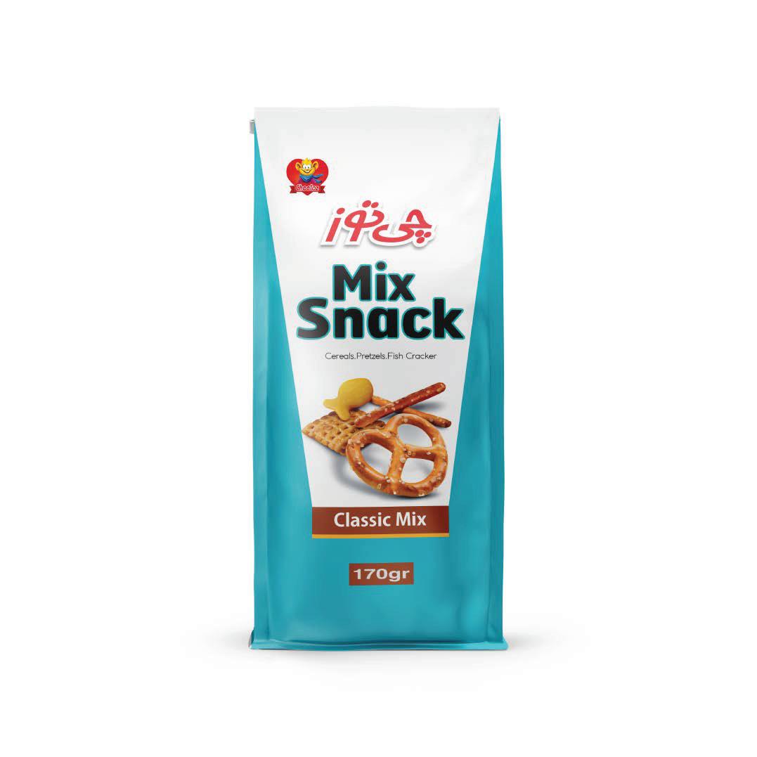
12. Cheetoz, Nuts, Snacks & Pretzel, 2018
13. NutraMix, Corn Flakes, 2017
14. Danette Desserts, 2017
15. Safra Yogurt, 2016
16. Cheetoz, Coated Peanuts, 2016
17. Cheetoz, Kettle Cooked Chips, 2015
18. Cheepellet Snacks, 2013
19. Cheetoz, Kettle Cooked Chips, 2018
20. Samsung, Smart Cook, 2015
21. Pepsi, 2013
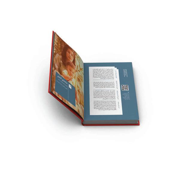
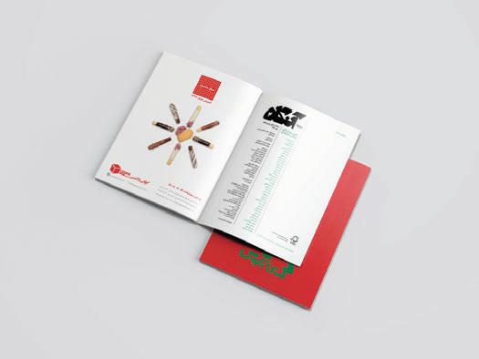
Catalog & Layout Design
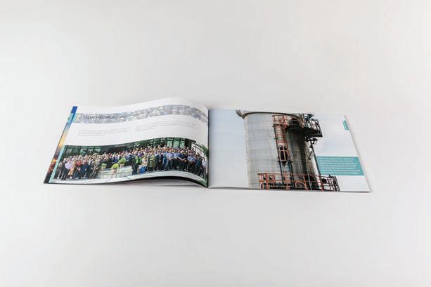
22. Penn State, 2023
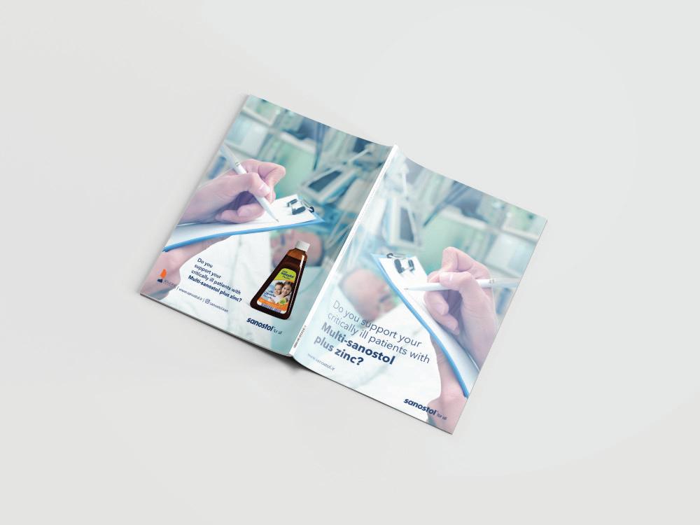
23. Sanostol, 2021
24. Avan Darman Novin, 2018
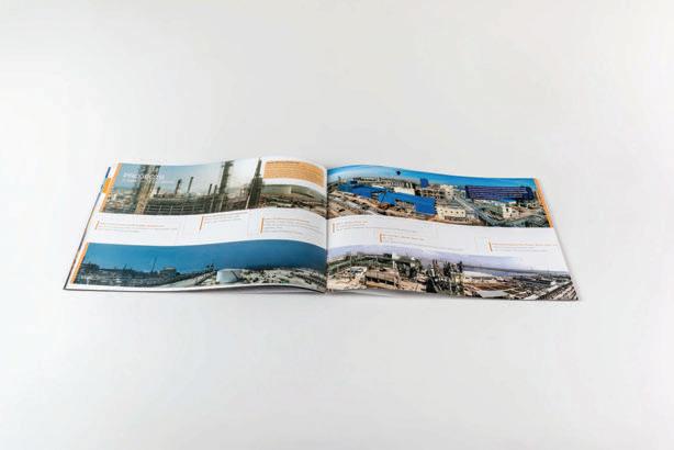
25. Namvaran Consulting Engineers, 2015
26. Beethoven Music Center, 2015
Poster Design
27. Penn State University, 2023
28. Sanostol, 2021
29. Theater& Movie, 2018
30. Cookie Box Pastry, 2015z
2014-2020
Logo Design
Client: Dialog, Startup Application | 2020
I designed the logo for a startup's application icon, tailored for diabetic individuals to measure and calculate blood sugar levels. incorporated magenta drops to convey its association with blood, distinguishing it from water droplets. Given its computational nature, represented the character using positive and negative symbols rather than traditional eye drops.
NOORA /family font
Noora/ Light . Noora/ Regular . Noora/ Bold
Aa Bb Cc abcdefghijklmnop qrstuvwxyz
Aa Bb Cc abcdefghijklmnop qrstuvwxyz
Aa Bb Cc abcdefghijklmnop qrstuvwxyz
ABCDEFGHIJKLM NOPQRSTUVWXYZ 123456789
ABCDEFGHIJKLM NOPQRSTUVWXYZ 123456789
ABCDEFGHIJKLM NOPQRSTUVWXYZ 123456789
Client: Nadastan Magazine | 2019
In 2019, conceptualized Nadastan Magazine's logo to re ect its non ction focus, aligning with the magazine's content sections: 'Life Story,' 'Documentary,' 'Old Story,' and 'Self-Portrait.' This concept inspired a design incorporating four identical shapes in various hues, symbolizing unity within diversity. These shapes cleverly form the last letter of 'Nadastan' (ن) and a central dot, seamlessly connecting the design and title. The logo played a pivotal role in establishing Nadastan Magazine as a top-seller in Iran.


Client: Avan Darman Novin, Pharmaceutical Holding | 2018
In 2018, I was commissioned by a pharmaceutical holding in Iran to design a logo for one of their subsidiary companies specializing in the production and import of diabetes-related products. To symbolize the global signi cance of blood sugar, I creatively incorporated the initials of the company's name into the logo, with the blood sugar circle at the heart of the letter 'D.' Notably, this company is the exclusive manufacturer of blood sugar measuring devices in Iran.


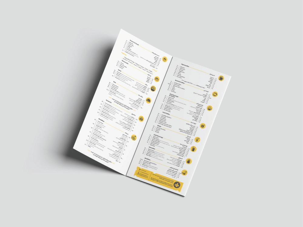
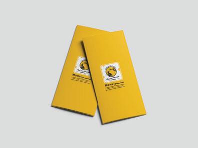
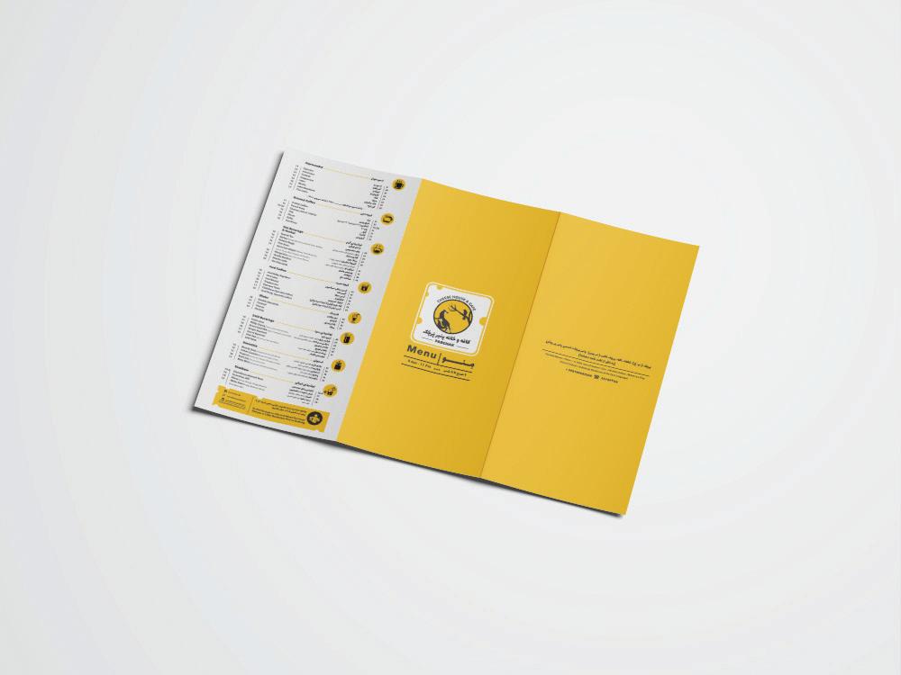
Client: Parchak Cheese House Café | 2017
In 2017, designed the visual identity for Perchak Cheese House Café. The concept behind this café's logo and interior was inspired by cheese and an old Persian story featuring a raven and a fox. I opted for the color yellow, which resembles some types of cheese, to create a signi cant visual impact. The images of a raven and a fox were also integrated to reinforce the concept. This approach contributed to the café's distinct and memorable brand identity.


Logo, CI & Packaging Design
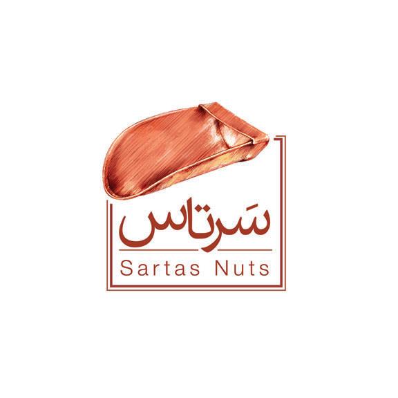
Client: Sartas Nuts | 2016
In 2014, Sartas Nuts Store was established on one of Tehran's most bustling streets.
Sartas, an age-old tool integral to the Iranian culture for picking nuts and snacks, served as the primary inspiration for the brand's visual identity. This choice was made to recognize the term's relative obscurity among the general public.
For the logo, I meticulously crafted an illustration of the Sartas tool, elegantly framed it, and incorporated the brand name in Persian and English. Subsequently, I embarked on developing Sartas' comprehensive visual identity, encompassing the design of its packaging and o ce materials. Across all visual identity components, the essence of Sartas and its distinctive illustration is consistently re ected, underlining the brand's unique concept and identity.


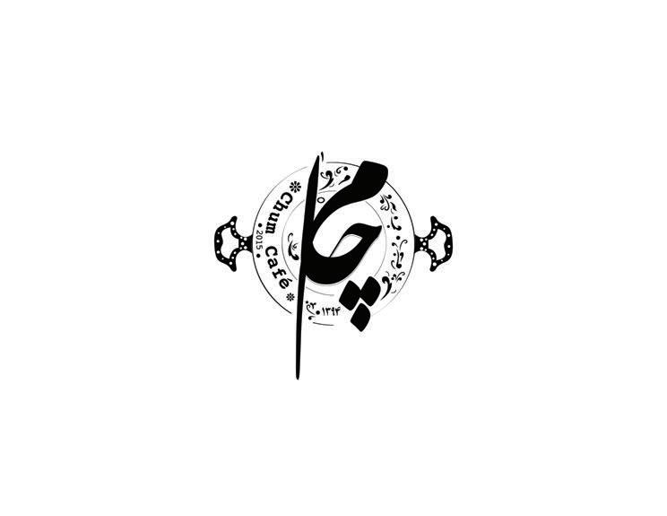
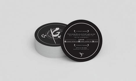
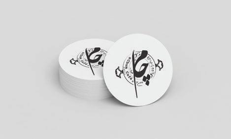
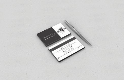
In 2015, Chum Café made its debut with three branches in Tehran. The client's initial request was to craft a logo that seamlessly blended both modern and traditional café aesthetics, intending to apply this logo onto ceramics and tiles for café signage.
The logo design took precedence, and after client approval, it set the tone for the entire visual identity of the café. This encompassed various elements such as menus, delivery packaging, labels, shopping bags, mugs, business cards, and even the customer club's membership card.
To align with the client's preferences, the design predominantly featured a classic black color scheme and a traditional font. An interesting addition to the design was inspired by the café's use of metal trays. I incorporated this element into the logo frame, creating a unique visual signature that extended throughout the rest of the design.
پاﺮـــــــﻓ
ﯽﮕﻧﺮــﻓ تﻮــﺗ/زﻮــﻣ/تﻼـﮑﺷ
Frappe chocolate/bannana strawberry
ﻮــﻨﯿـﭼﺎـﭘاﺮﻓ ﻦـــﻴﭼراد/ﺶــﻳﺮــﻳآ/قﺪـﻨﻓ
Frappuccino hazelnut/irish/cinamon

لﺎﮑـــــﯿﭘوﺮـﺗ
Smoothie Tropical
یﺮﺑ
Smoothie Berry


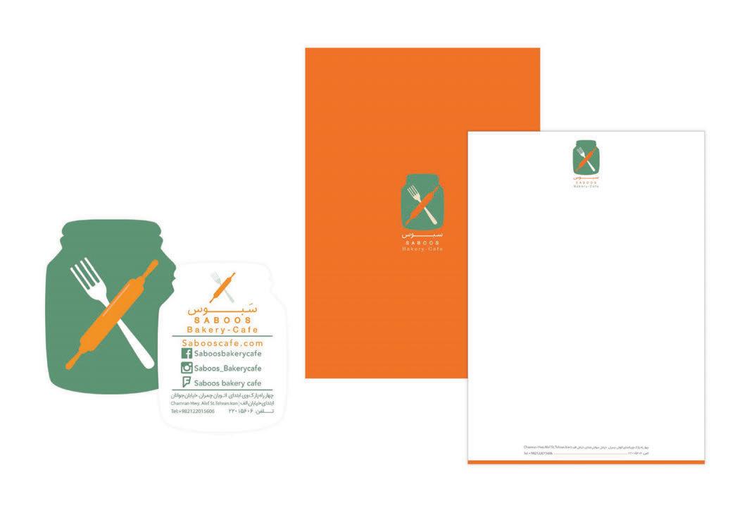
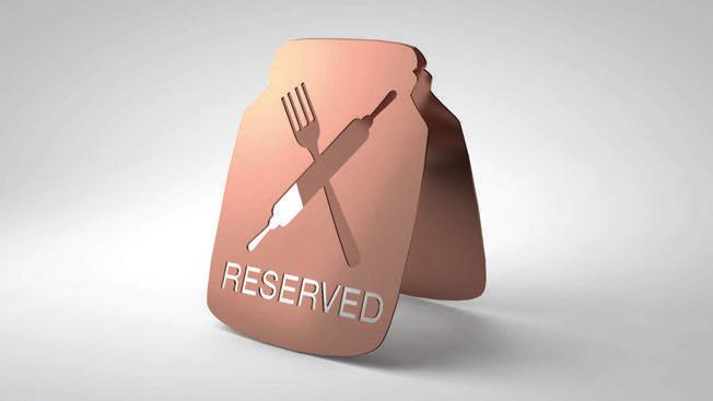
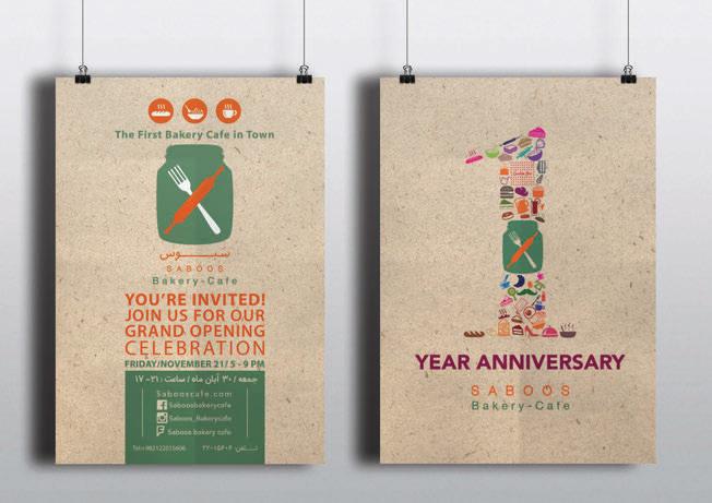
Client: Saboos Bakery - cafe 2014
In 2014, the inaugural bakery café debuted in Tehran, marking a unique addition to the city's vibrant café scene. While numerous cafés were ourishing during those years, the bakery café concept had yet to be introduced.
This café's distinctive feature was its utilization of Nutella dishes for its salads. I crafted the logo by drawing inspiration from the café's ambiance, concept, and innovative use of Nutella dishes. The design seamlessly integrated Nutella dishes, a fork, and a jar to encapsulate the essence of the café.
The color palette used in the café's visual identity was thoughtfully derived from its interior design and overall space. Additionally, I designed an array of collateral, including menus, business cards, delivery packaging, various labels, customer reservation boards, and more, to comprehensively elevate the café's brand identity.


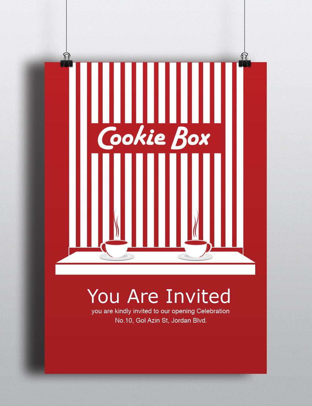
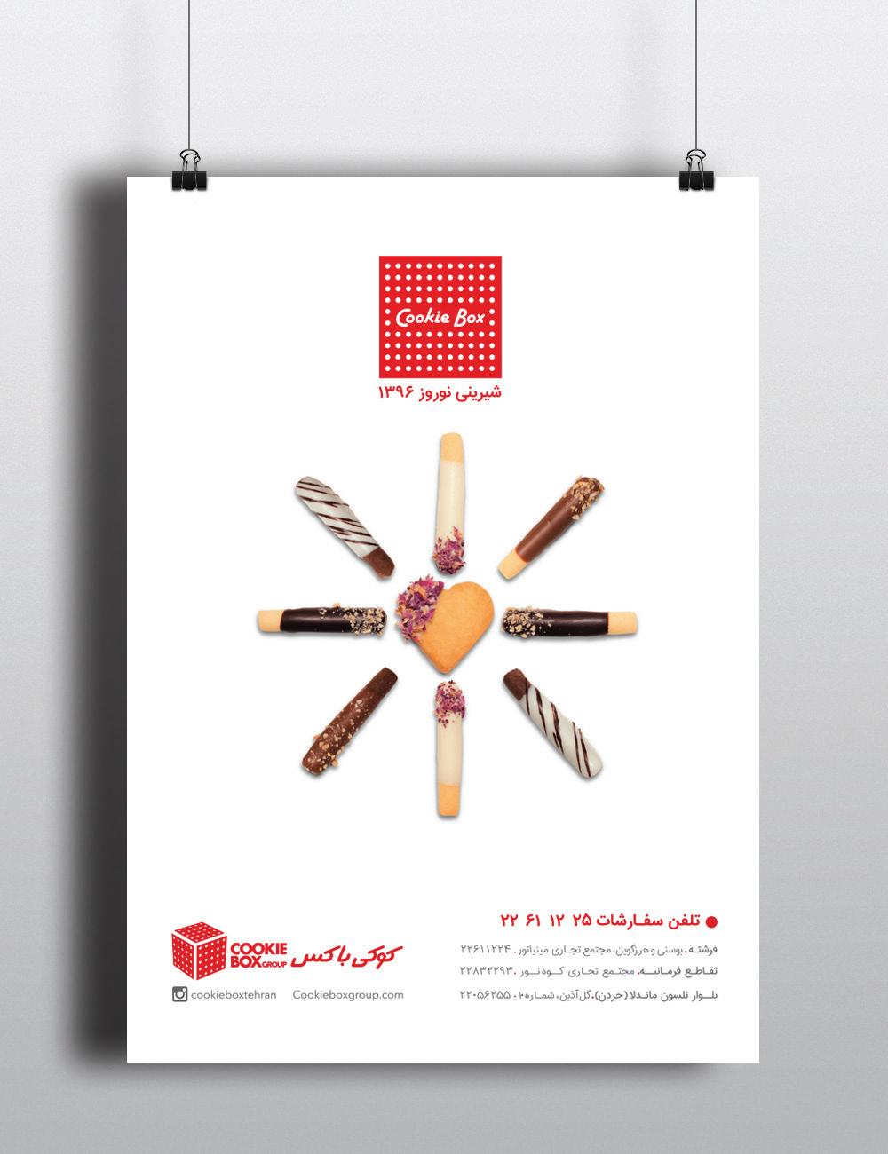
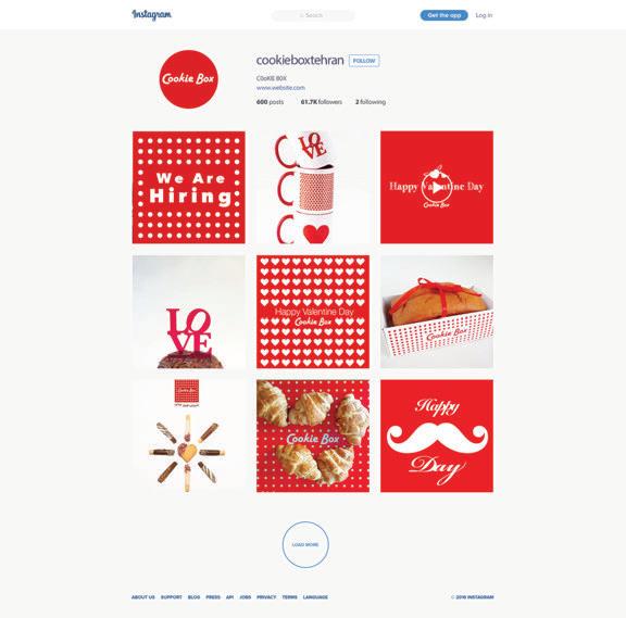
Client: Cookie Box Pastry | 2014
In 2012, a distinct American-style pastry shop opened in Tehran, reshaping the pastry market with individual purchase options, departing from traditional kilogram-based sales. This innovative approach aimed to establish a visually captivating American-inspired brand. The mission was clear: infuse the brand with unmistakable American charm and make it stand out. To achieve this, a vibrant red color scheme with white dots created a striking yet simple pattern synonymous with the brand.
This unique design extended to packaging, o ce materials, labels, posters, and ads, resulting in a compelling visual identity that e ectively di erentiated the Cookie Box Pastry Shop. Today, it thrives with three branches in Tehran, delighting customers with exceptional pastries.


Client: Dina Food Industry
Character Design: Mehdi Moayedpour
In 2018, Dina Food Company decided to create packaging for their popcorn products. They enlisted the help of Darvag International Advertising Agency. The nal packaging designs were selected from various proposals submitted by the Cheetoz design team.
The brand's character, the Cheetoz Monkey, played a central role in the design. I collaborated with the character designer to depict the monkey leaning casually on a popcorn box. I used bold and distinct colors to distinguish between di erent avors, establishing a clear visual identity for Cheetoz popcorn packaging.
These carefully designed packages are currently available in the Iranian FMCG market.

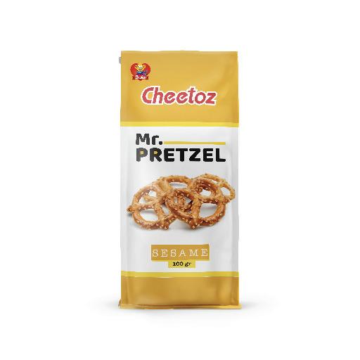
Cheetoz, Nuts, Mixed Snacks & Pretzel
Client: Dina Food Industry
© Daarvag International Advertising Agency - 2018


NutraMix, Corn Flakes
Client: Dina Food Industry
© Daarvag International Advertising Agency-2017

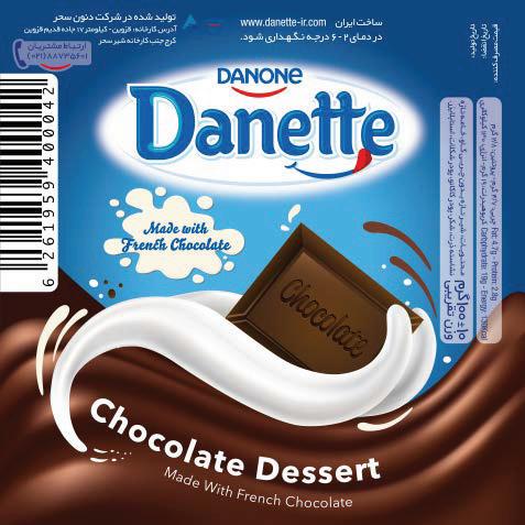
Danette Desserts
Client: Danon Sahar
© Daarvag International Advertising Agency - 2017


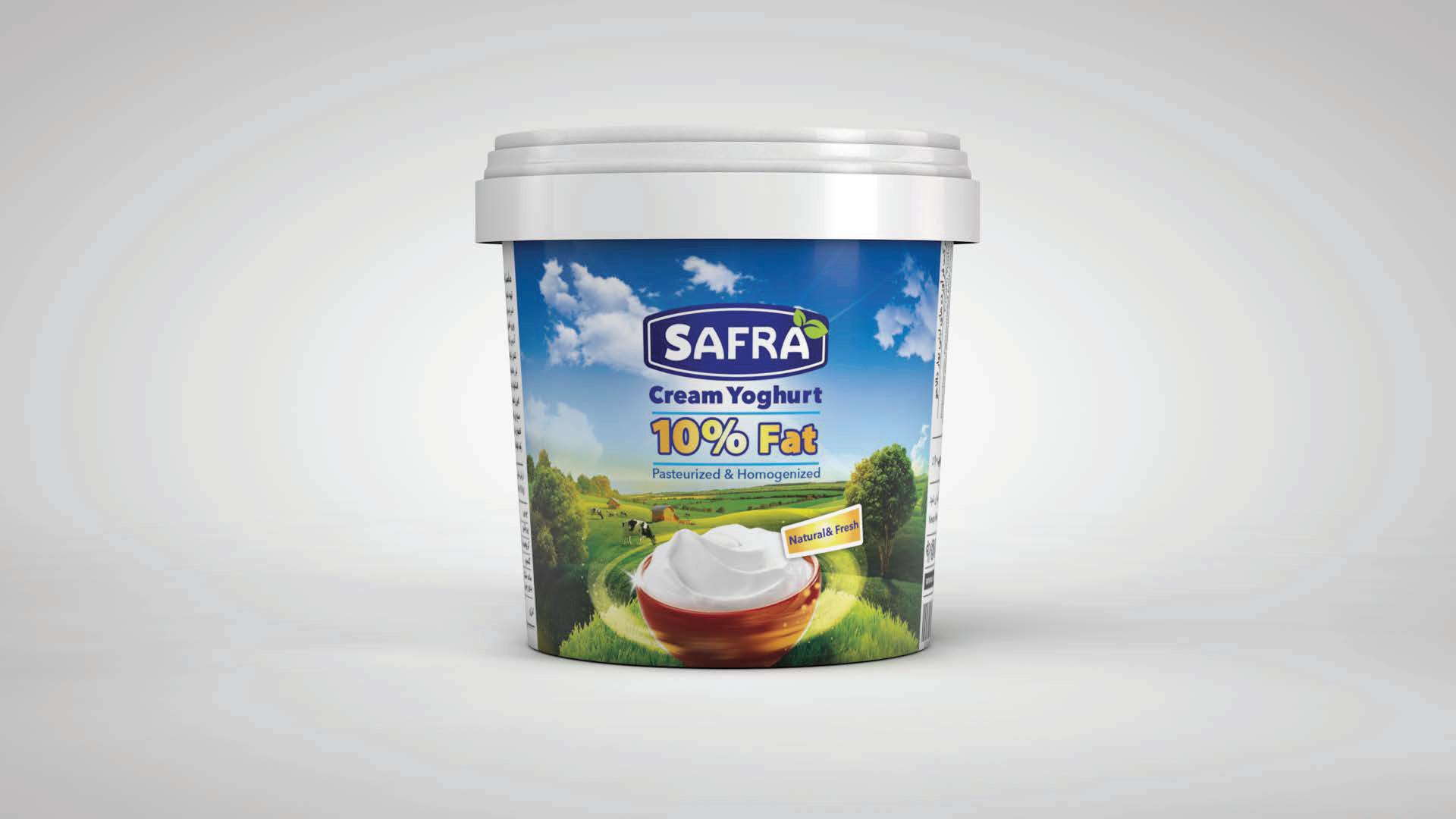
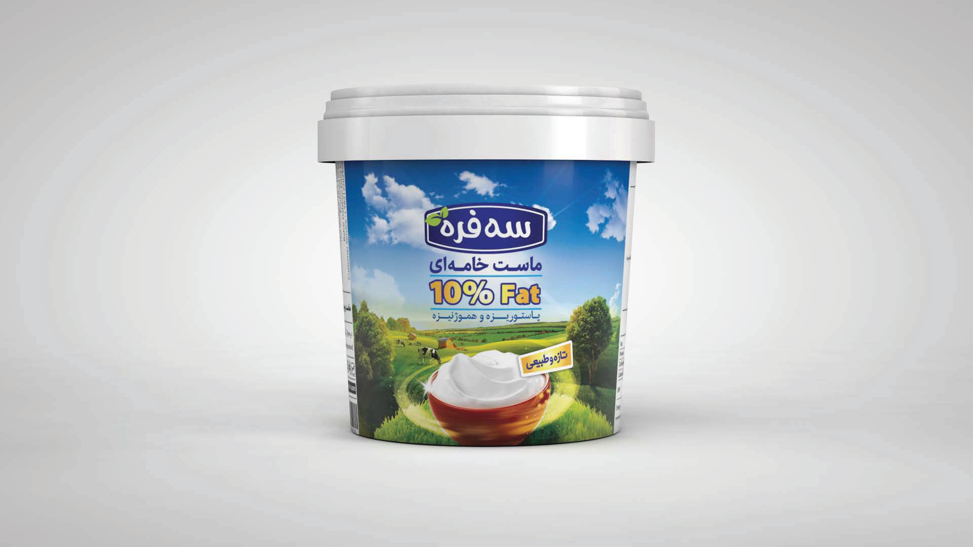
Safra Yogurt
Client: safra Company
Logo Design: Fatemeh Karkehabadi
© Daarvag International Advertising Agency - 2016
Client: Dina Food Industry
© Daarvag International Advertising Agency - 2016
In 2017, Dina Food Company introduced packaged coated peanuts, a novel product in the Iranian FMCG market. I presented several design ideas, and they ultimately chose my concept.
I conducted a photo shoot for this project featuring coated peanuts in various avors. Using Photoshop, I combined elements of photography and illustration to create the packaging design. used a white background with peanut imagery to distinguish between the di erent avors. The top of each package was adorned with vibrant colors matching the avor, aligning with the uniform packaging scheme. Today, you can nd these thoughtfully designed packages in the Iranian FMCG market.
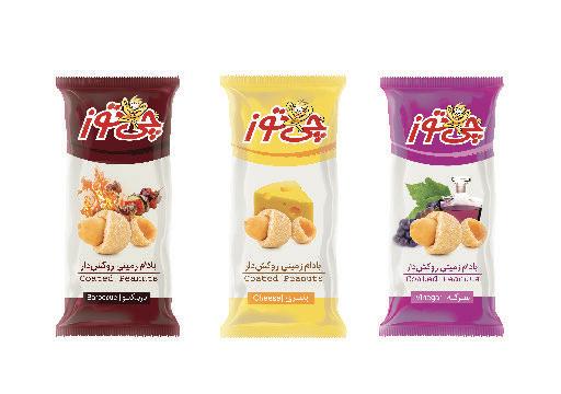
Illustrator: Mehdi Moayedpour
Client: Dina Food Industry
In 2015, I served as the Art Director for the Cheetoz brand in Iran. Our advertising agency received a client brief, tasking me with designing packaging that paid homage to the tradition of Kettle-cooked chips while suiting this product perfectly. Upon reviewing the brief, I recognized the unique nature of these chips, crafted with extra sensitivity. The brief also emphasized the importance of a classic packaging design to re ect the brand's timeless appeal. In response, I chose a sketch technique to showcase each avor. I sketched the potatoes and their distinct tastes, placing them on a clean white background to make each avor stand out on the store shelves. I used di erent colors on the packaging to o er consumers variety while maintaining a cohesive look.
This packaging design received widespread acclaim and has become a top seller in the Iranian FMCG market.
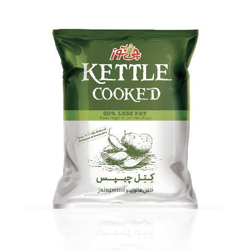


Illustrator: Mehdi Moayedpour
Client: Dina Food Industry
© Daarvag International Advertising Agency - 2013

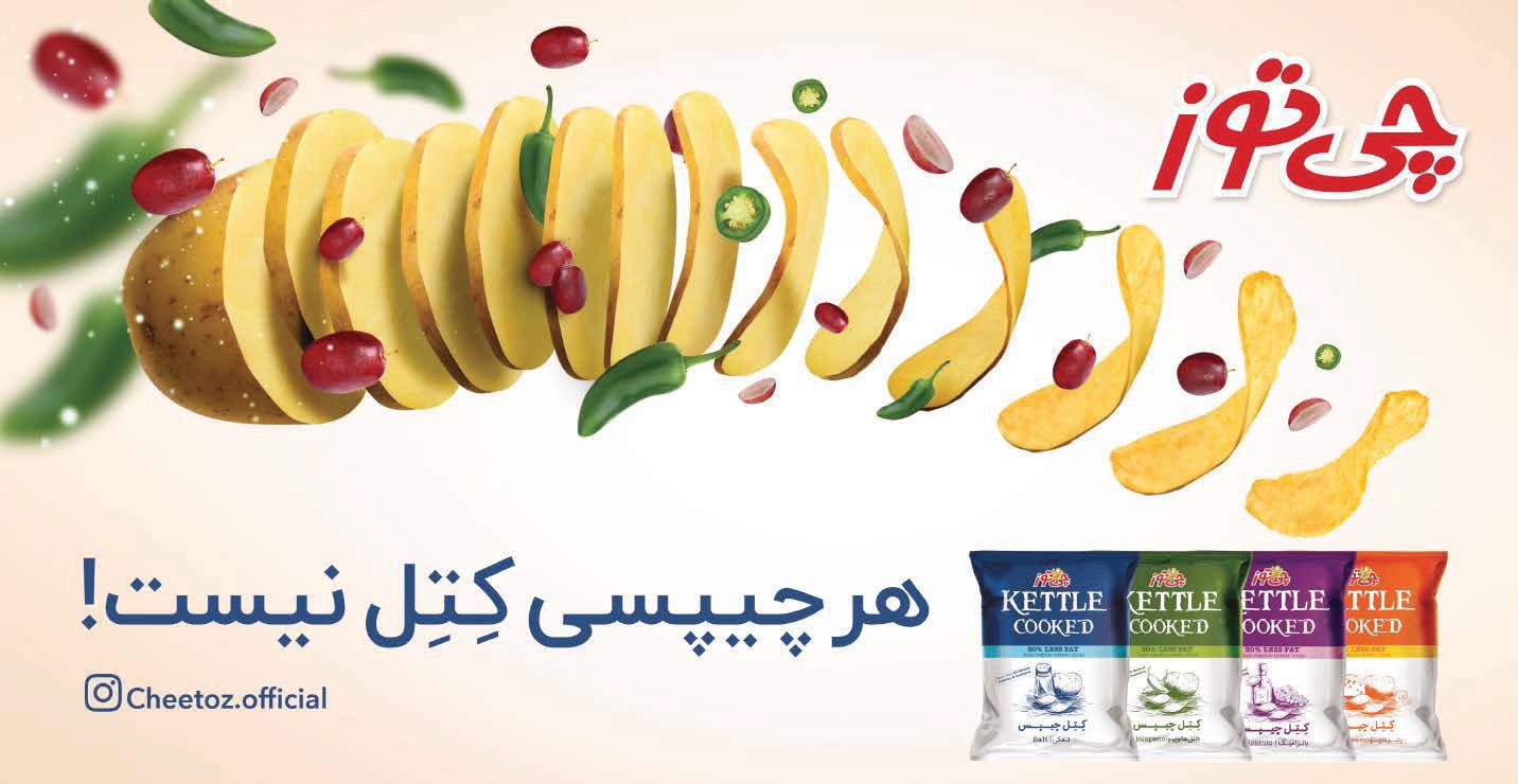
Cheetoz, Kettle Cooked Chips
Client: Dina Food Industry
Illustrator: Mehdi Moayedpour
© Daarvag International Advertising Agency - 2018
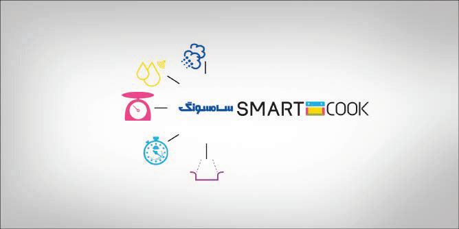
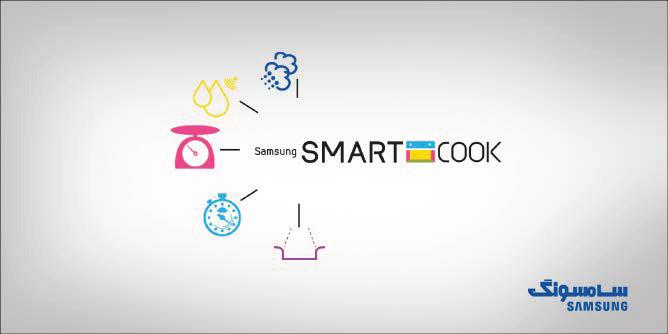
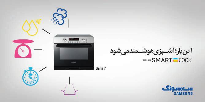
Samsung, Smart Cook Campaign
Client: Samsung Electronics
© Daarvag International Advertising Agency - 2015

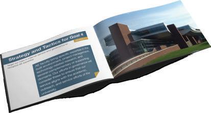
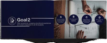
Penn State Department of Architectural Engineering
© Pennsylvania State University, 2023


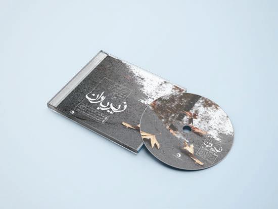


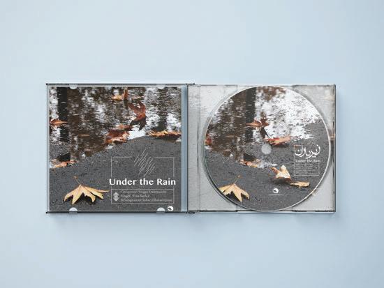

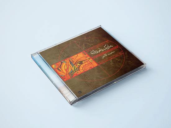

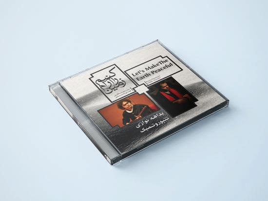 Beethoven Music Center, CD Cover Design
2015-2023


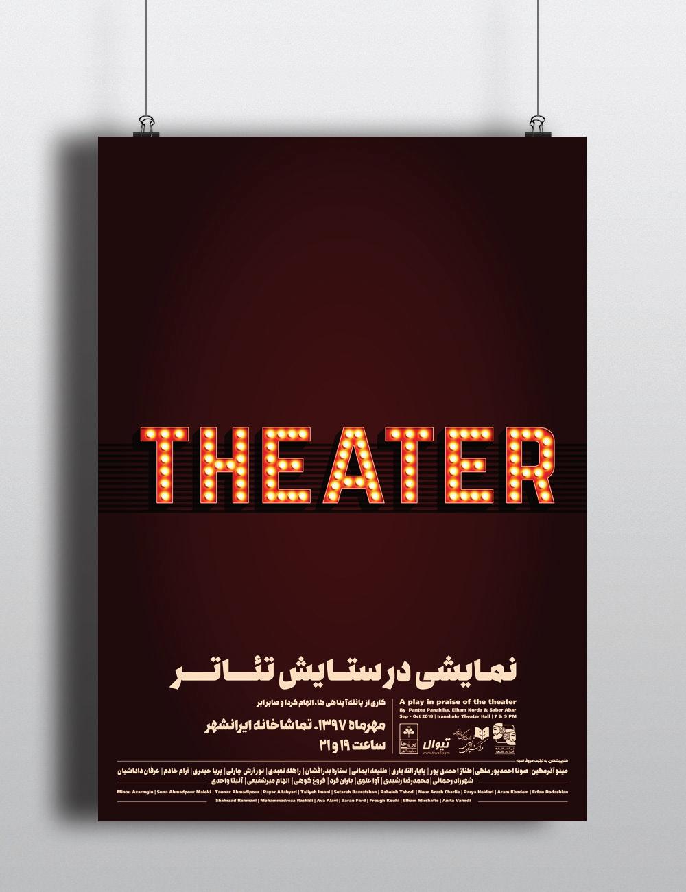
29 Theater, Poster Design
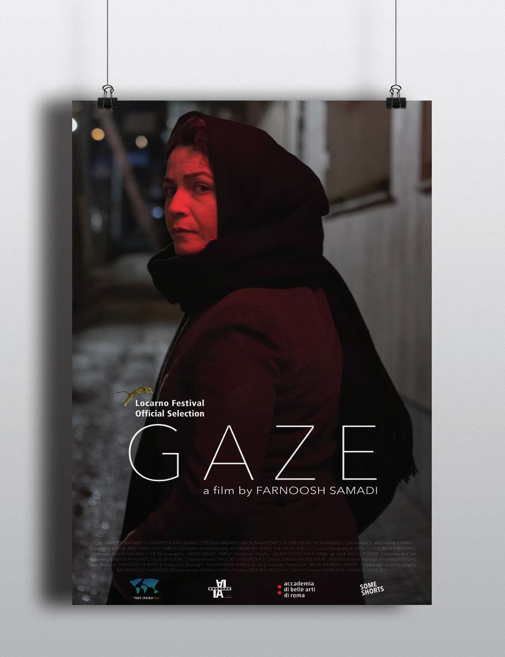
Gaze, Movie Poster Design