INTERIOR
DESIGN
TABLE OF CONTENTS
UNION CONNECT PAGE 2
Costa Rican Office Design (2023)
THE BESSE PROJECT PAGE 25
Apartment Design (2021)
EVOLVE PAGE 8
Dormatory Design (2022)
MONTECALVI PAGE 13
Airbnb | Rooftop Bar (2023)
Study Abroad | Florence, Italy
PALOUSE ELEMENTARY PAGE 20
Elementary School Design (2022)
THE BRIDGE PAGE 30
Water Pavilion Design (2020-22)
1
UNION CONNECT
COSTA RICAN OFFICE DESIGN
Through this design, my team and I committed to creating and maintaining a welcoming and healthy work environment by providing a variety of spaces that allow for productivity and comfort within the workplace, as well as introducing biophilic design to connect interior and exterior spaces. The company building for Union Connect is an office space designed to take you through the experience of Costa Rica. Beginning on the second level where social interaction and collaboration is encouraged, the vibrant colors of the flora are seen. As one migrates to the third level, the vibrant tones become neutral and toned-down to ease the mind for independent quiet work. With the change in environmental cues between each level, two different atmospheres are welcomed for a diverse range of working styles for office employees. (Collabroation with Mia Pignotti, Ingrid Noyes, and Samantha Milam)

2
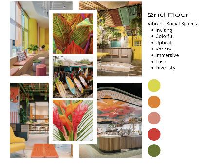
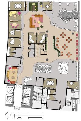
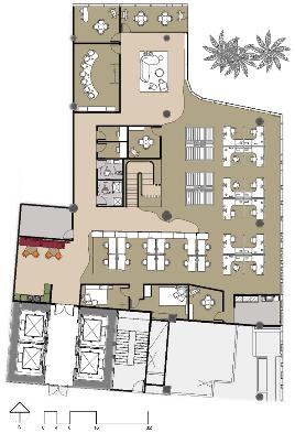
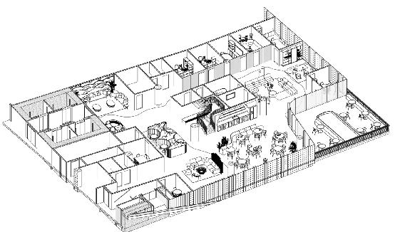
SECOND FLOOR
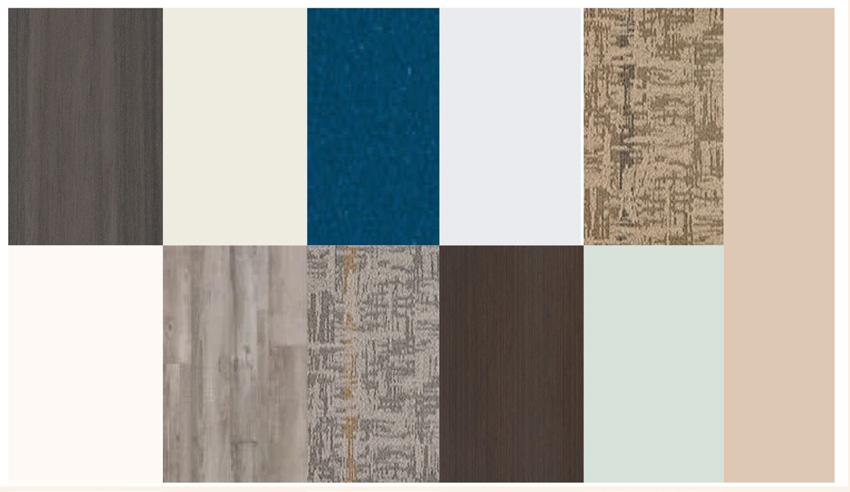
The ‘Look and Feel” Board demonstrates the concept of the second floor, showing a color pallette and architectural design ideas that could be brought into our design as well as listed characteristics of the space. The rendered second floor plan shows the materials that were used throughout the design.
3
2nd Floor“Look and Feel”Board (Collab)
2nd Floor Rendered Floor Plan (Collab)
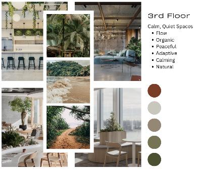
THIRD FLOOR
The ‘Look and Feel” Board demonstrates the concept of the third floor, showing a color pallette and architectural design ideas that could be brought into our design as well as listed characteristics of the space. The rendered third floor plan shows the materials that were used throughout the design.
 3rd Floor Rendered Floor Plan (Collab)
4
3rd Floor“Look and Feel”Board (Collab)
PERSPECTIVES | MATERIALS


5
Floor Community Space (Collab)
2nd
PERSPECTIVES | MATERIALS
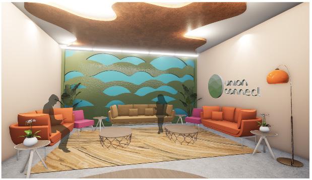
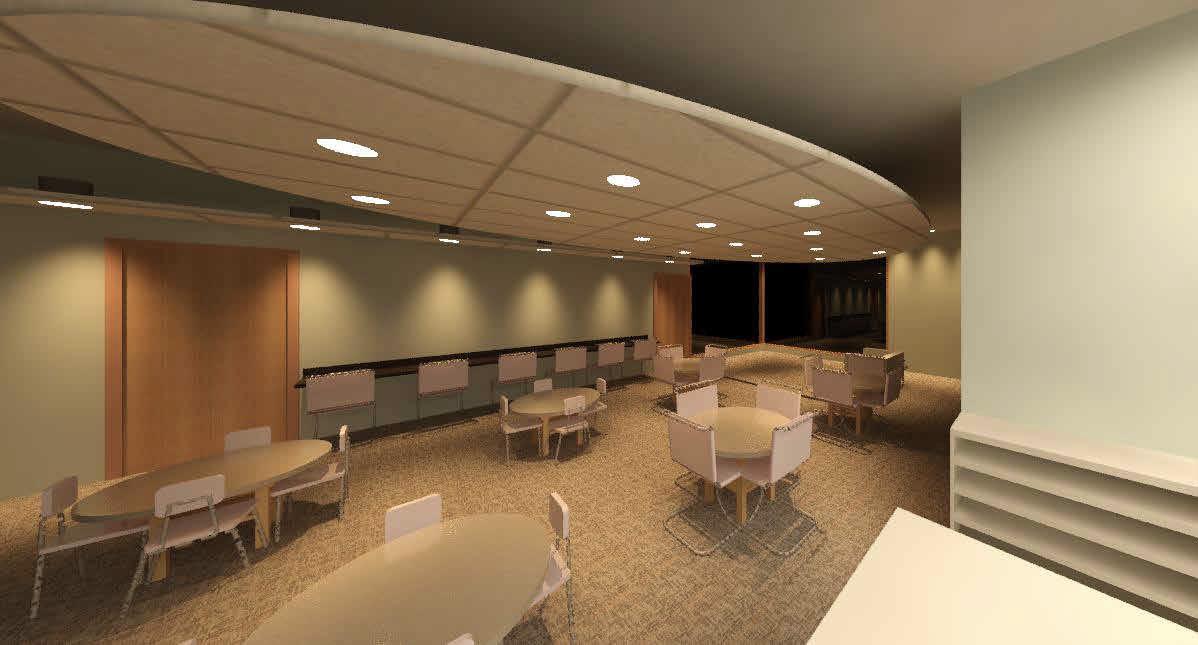
 2nd Floor Lounge (Collab)
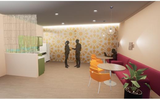
2nd Floor Reception (Collab)
3rd Floor Kitchen (Collab)
2nd Floor Lounge (Collab)
2nd Floor Reception (Collab)
3rd Floor Kitchen (Collab)
6
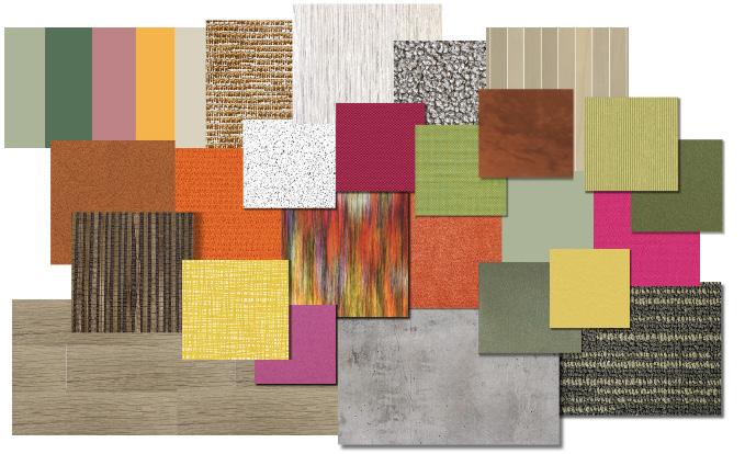
2nd Floor Materials Flatlay (Collab)
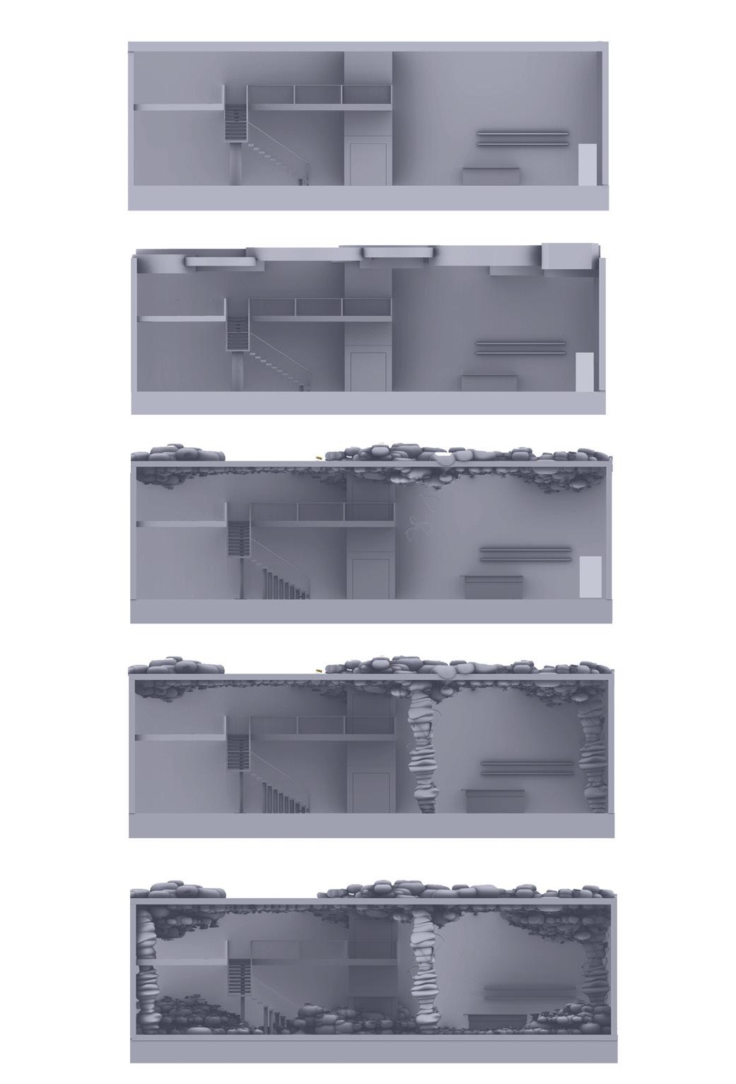
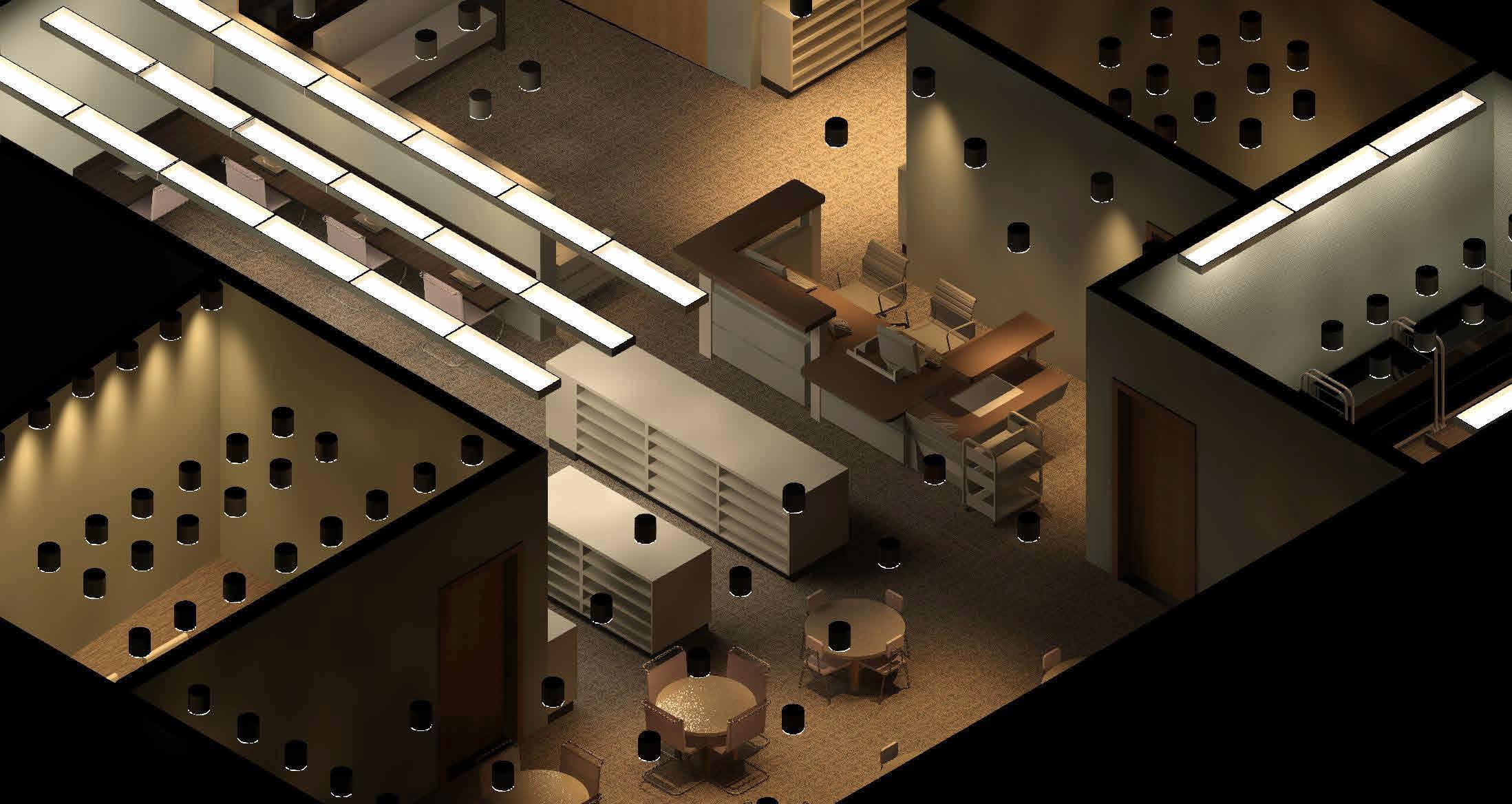
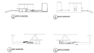
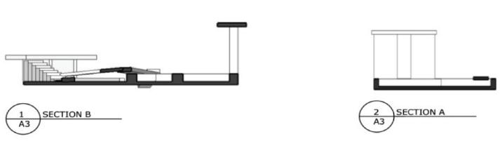
SECTIONS | AXONS
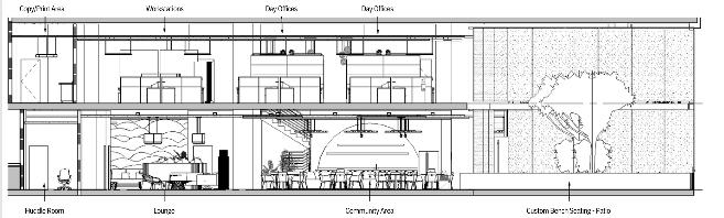
Sections and axons demonstrate parts of this design that are not represented in perspectives or areas that may be difficult to understand to the viewer’s eye in the floor plans. Including these diagrams to help to show dimension and architectural features is important in presenting this design.
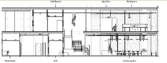
7
Floor Axon
2nd
Sections
EVOLVE
DORMATORY DESIGN
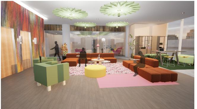
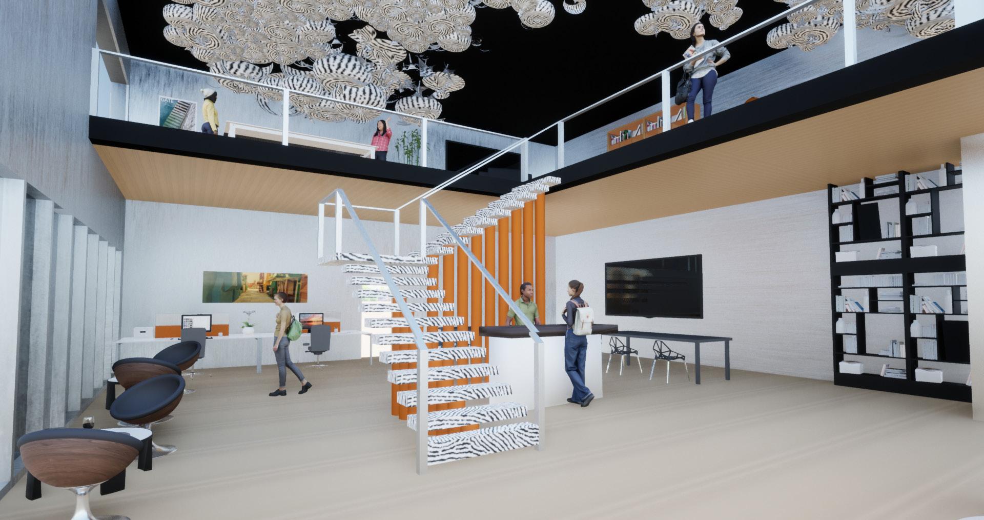
The primary focus of Evolve is to create a dynamic space for a variety of users to enjoy. Every person who walks through the doors of this environment comes from a different background and is seeking a unique experience which can change depending on the day. We wanted to create an environment which reflects the diverse and everchanging students that would use the lobby on a day-to-day basis. Organic forms and undulating patterns ebb and flow throughout the design signifying the metamorphosis that students are experiencing at this stage of life. Practicality plays a large role within the design of this space as well. As students experience the unfamiliar architecture in Evolve, they are also met with recognizable structures and objects, creating a sense of stability, comfort, and curiosity within the user. By combining these elements, we have created an environment which contrasts the evolution of life with our innate need for familiarity.
(Collaboration with: Bella Loera)
8
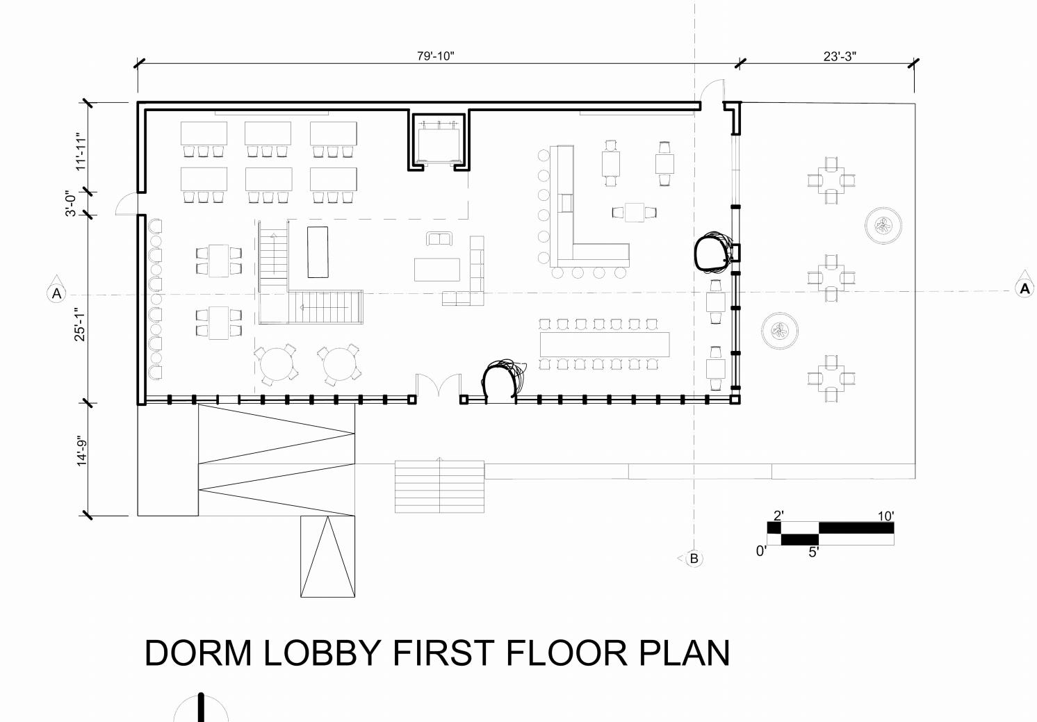
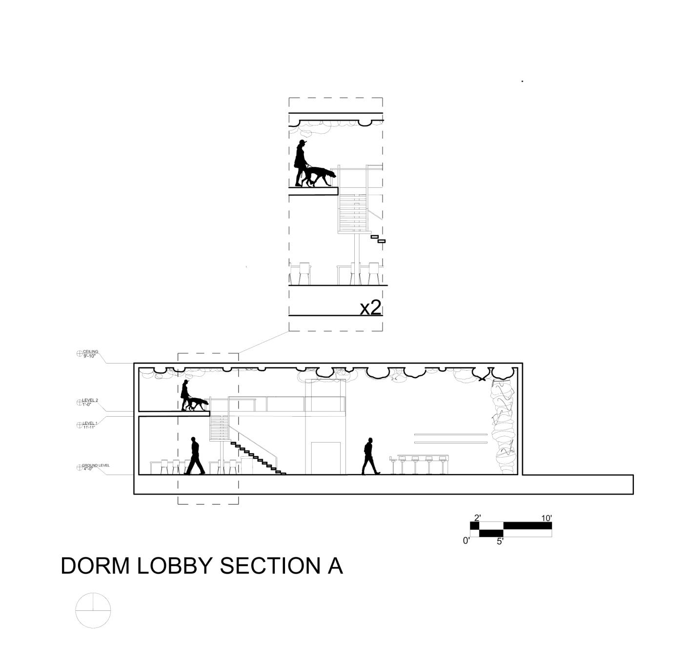
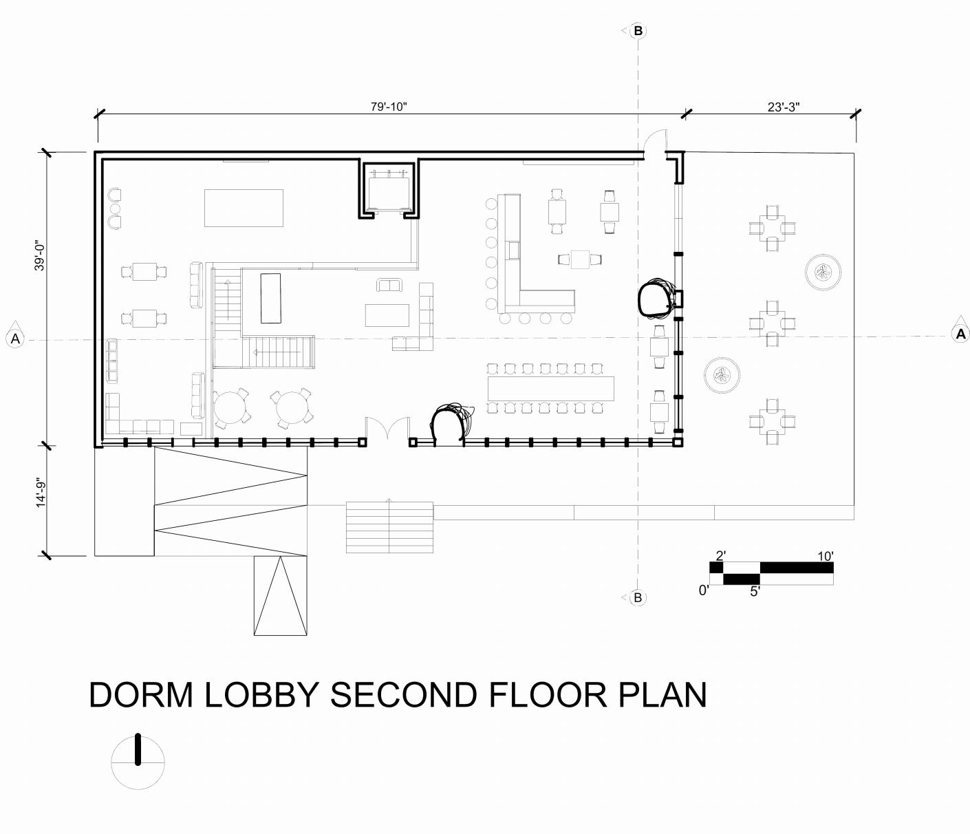
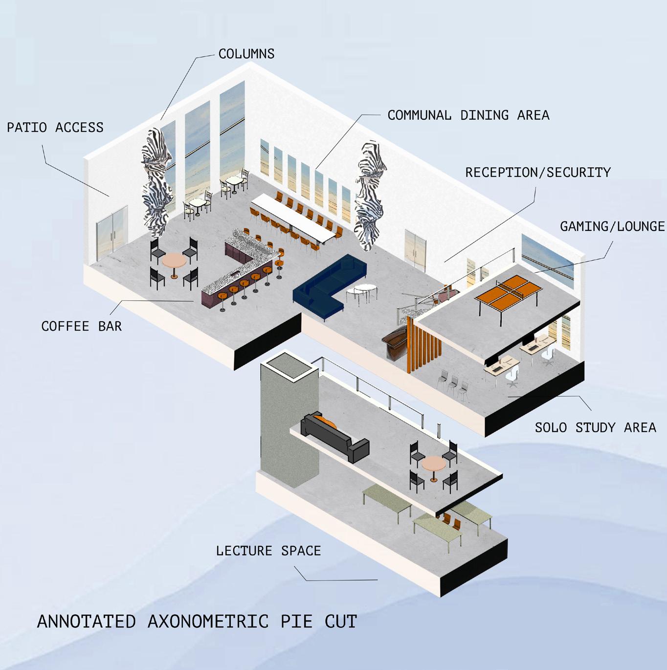
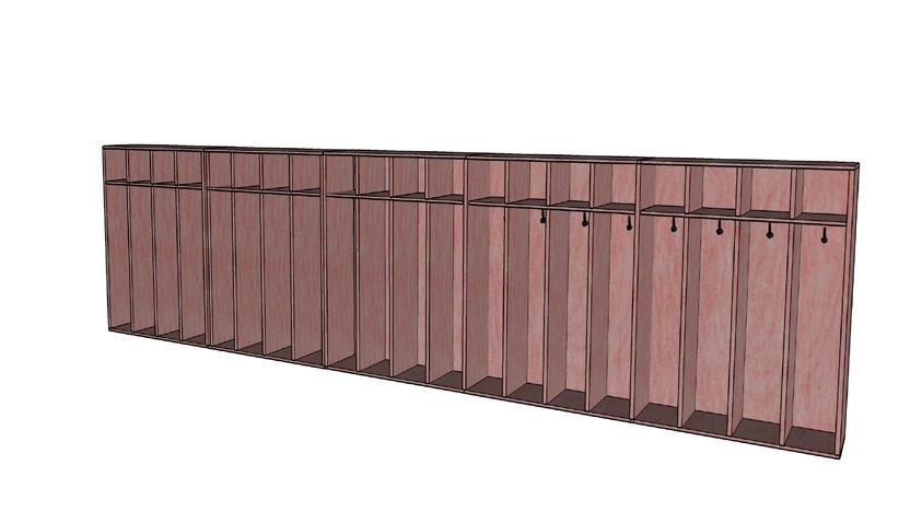
FLOOR PLANS | SECTION CUT
Shown here are the finished floor plans of the dorm lobby. The first floor plan is shown on the bottom left and the second floor on the bottom right. These floor plans are labeled with its accurate dimensions that also include the outdoor patio area. This page also includes a section of the lobby with a close up call out to show intriqate detail of the design as well as entourage to show accurate scale.
9
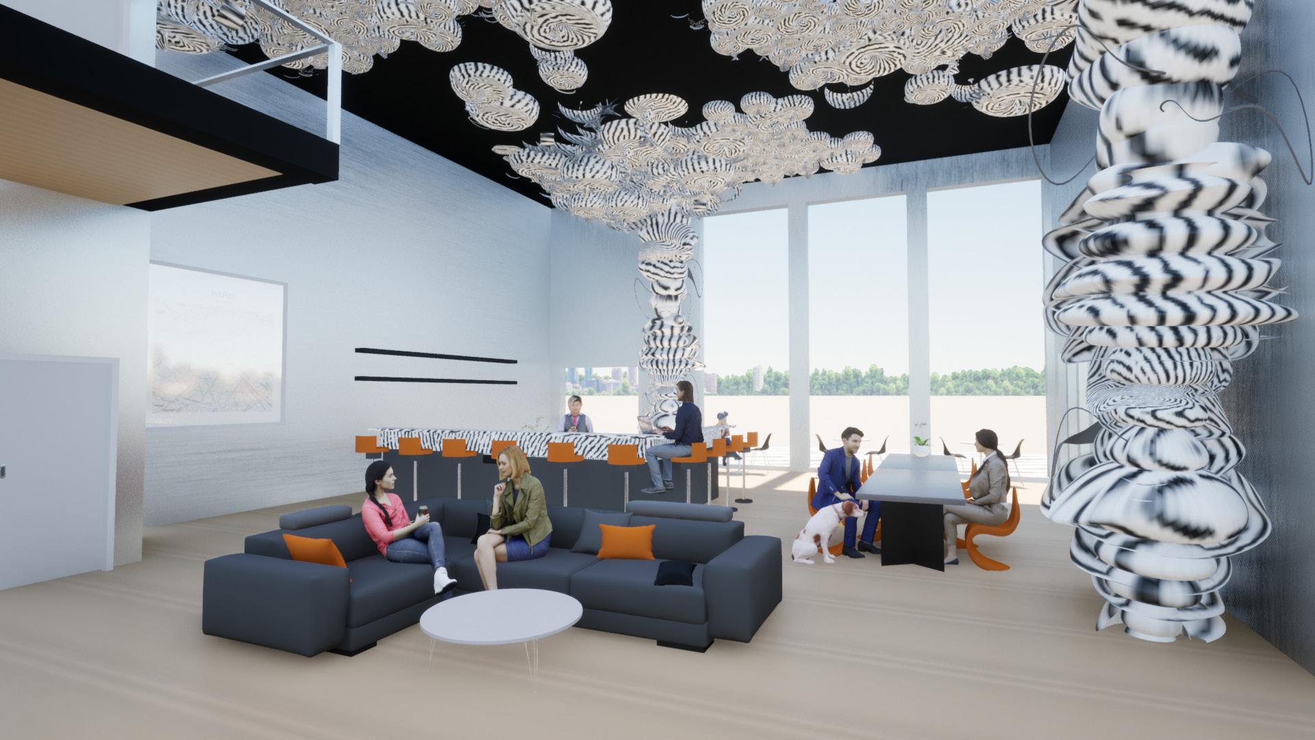
Rendered Dorm Lobby Perpsectives (Collab with Bella Loera)
10
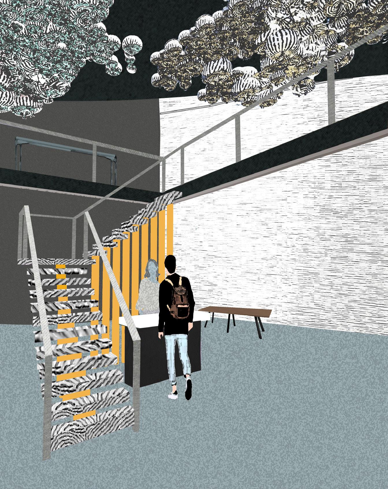
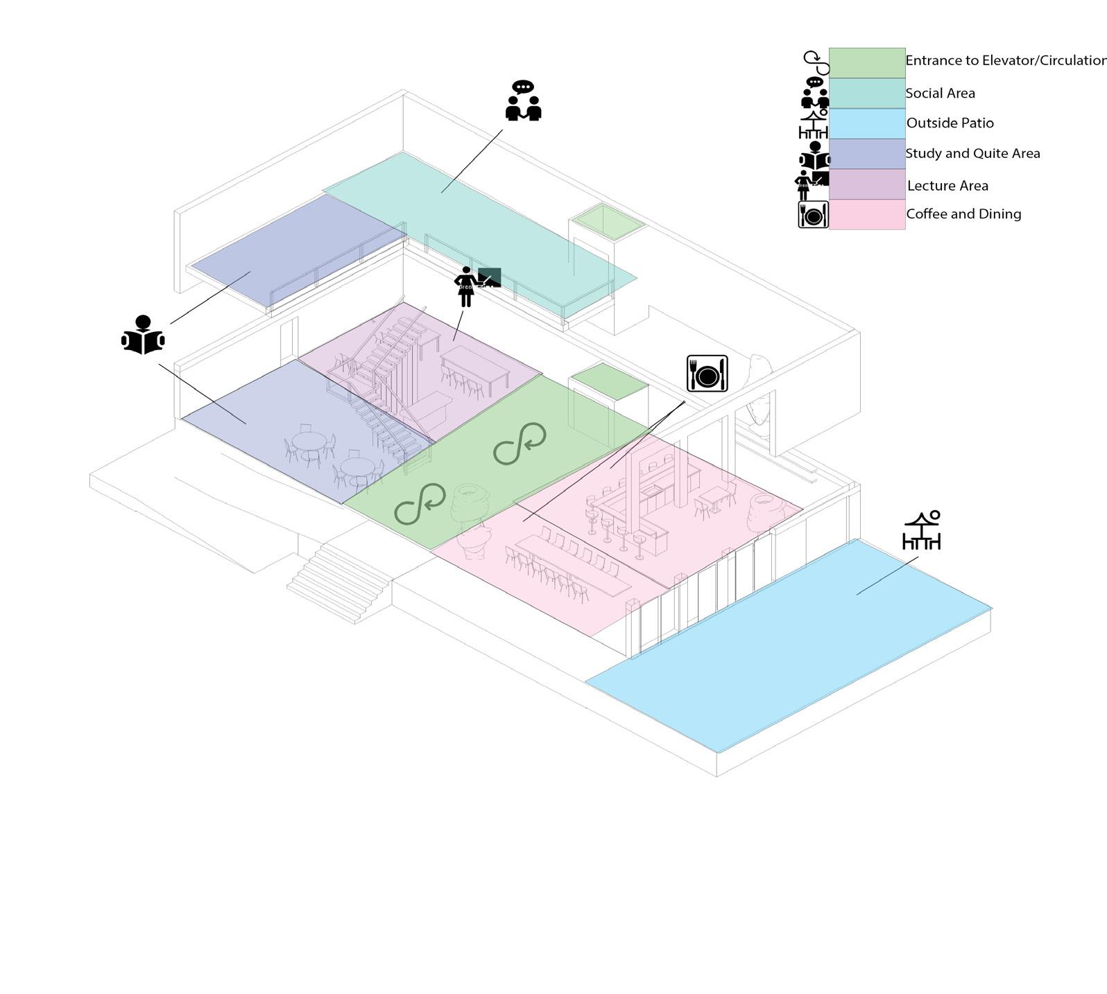
PROCESS WORK
During the beginning process of designing, the diagrams shown here show the evolution and design process that was done in order to get to the effective design I have created. The colorful diagram below shows the circulation routes and specific space planning areas that lead into the different areas of the lobby.
11
(Collab with Bella Loera)
PROCESS WORK
The columns shown below were created in VR, as well as a physcial model, and were further developed into a various amount of columns throughout the lobby. The five process pictures on the far right show how these columns were inserted into the lobby and how they developed into the ceiling, leading to a major part of my design concept.
 (Collab with Bella Loera)
12
(Collab with Bella Loera)
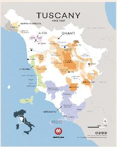
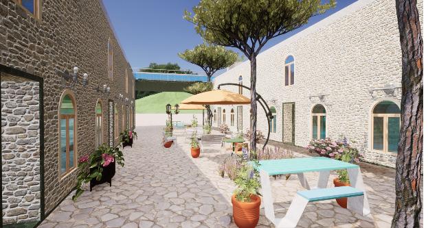
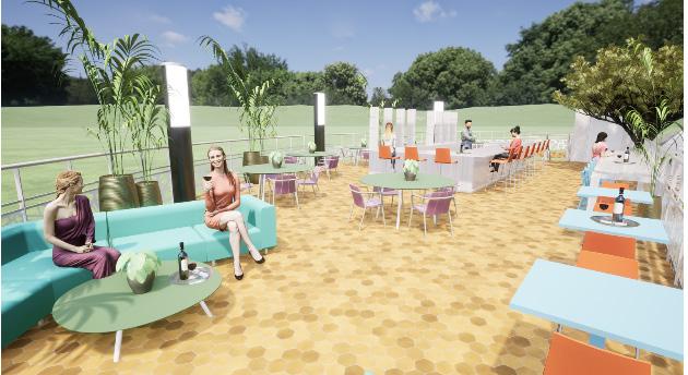
STUDY ABROAD | FLORENCE MONTECALVI
AIR BNB | ROOFTOP BAR
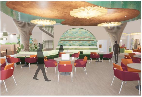
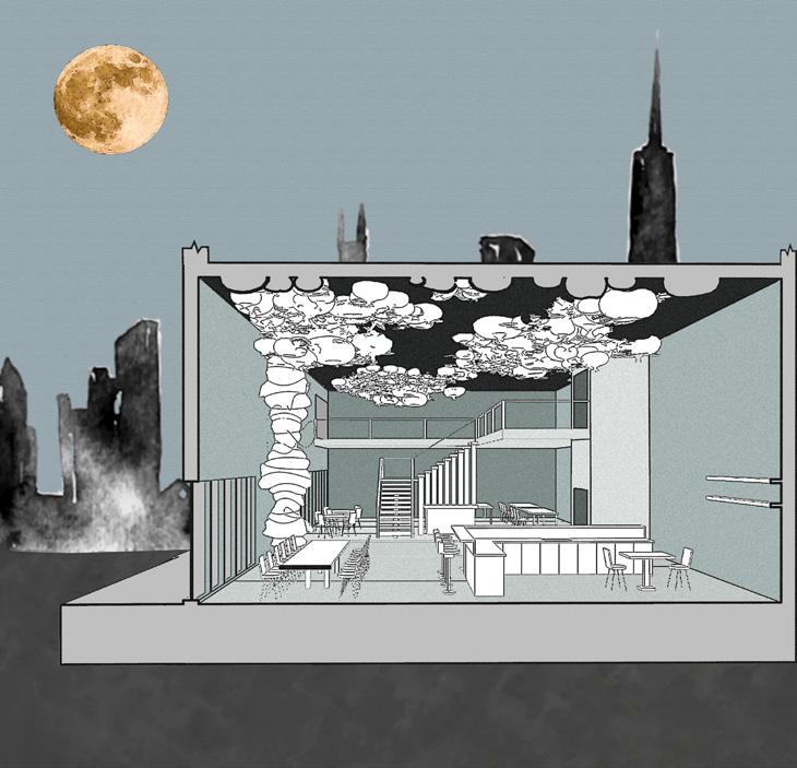
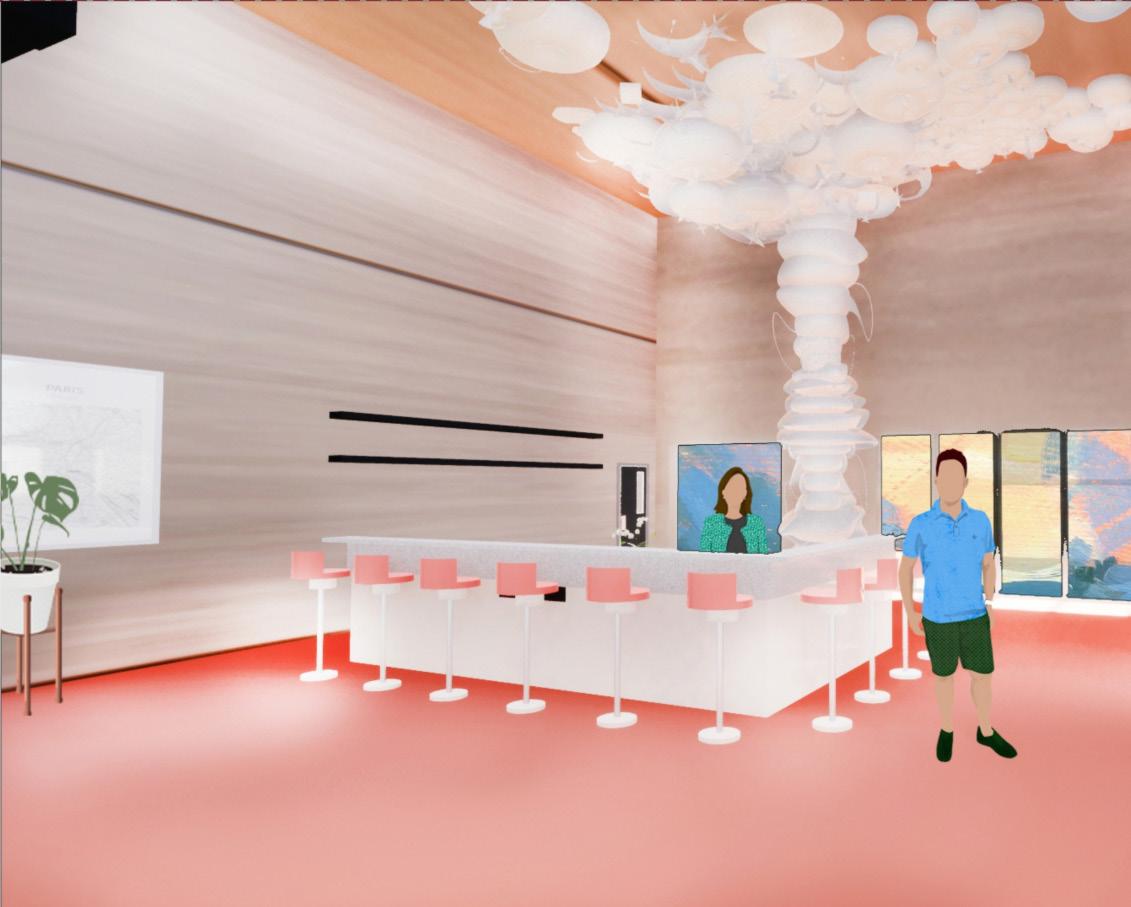
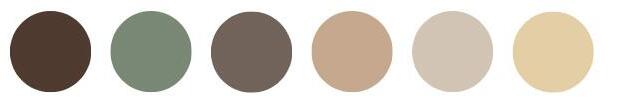
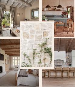
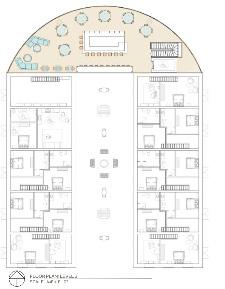
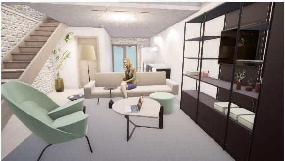
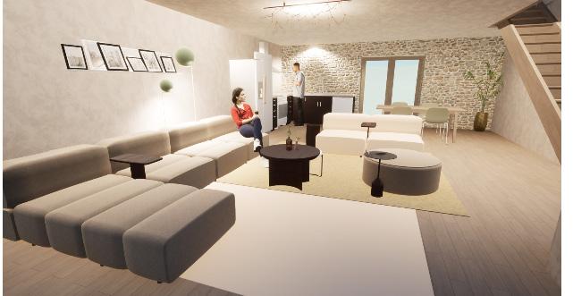
The addition of the airbnb, rooftop bar, and courtyard space to the MonteCalvi winery and vineyard is designed for family and friends to gather and enjoy the true Tuscan wine experience. The vibrant color pallet and textures chosen for the rooftop bar and courtyard are designed to encourage social interaction between the occupants as well as immerse with nature and biophilic design. The vibrant tones become neutral and toned down once occupants enter the living units, easing the mind from the outside vibrancy. The two different atmospheres offer a diverse range of experiences and types of interactions within each space.
(Collaboration with Isabel Riverman)
13
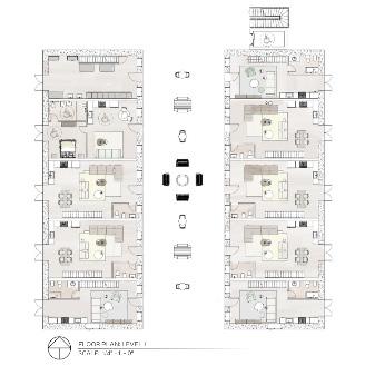
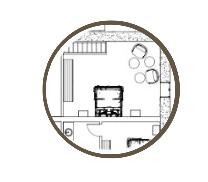
LEVEL 1 | AIR BNB UNITS
14
15
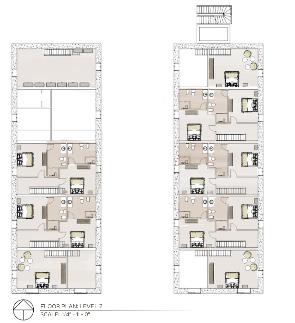
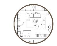
LEVEL 2 | AIR BNB UNITS
LEVEL 3 | ROOFTOP BAR | COURTYARD
16
1
17
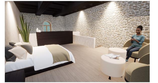
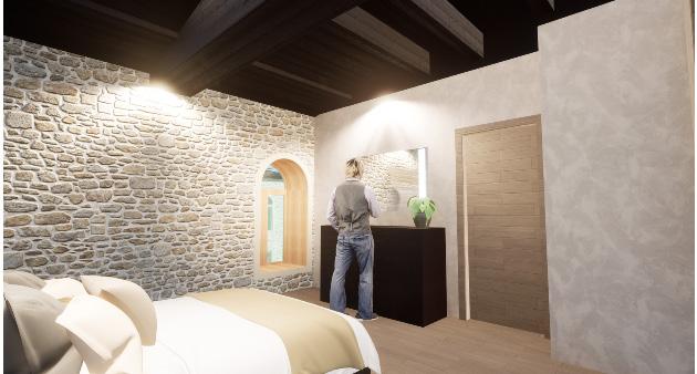
BEDROOM UNIT | LEVEL 1 & 2
2
18
BEDROOM UNIT | LEVEL 1 & 2
COURTYARD | ROOFTOP BAR
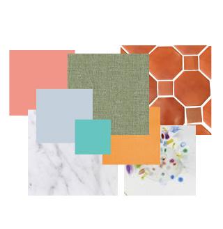
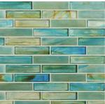
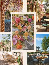
Material Flatlay
19
PALOUSE ELEMENTARY
ELEMENTARY SCHOOL DESIGN
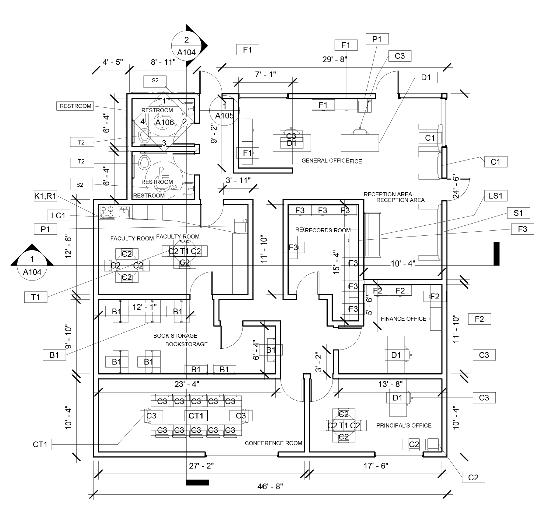
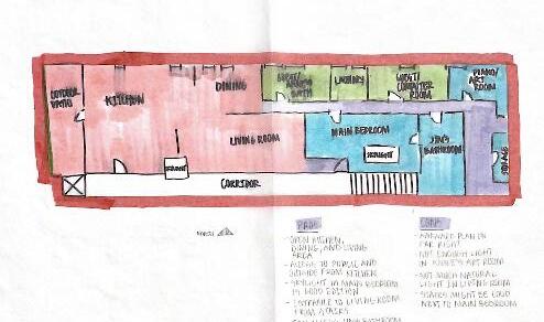
The purpose of this project was to design, as well as demolish and redesign, certain areas of an elementary school to fix issues that staff, teachers, and students were originally having with the space. The spaces that were being used were not working to the best of their ability for the occupants and users of the specified areas and needed to be redesigned for efficiency. Within this project, the goal was to create a fully accessible and efficient design for the occupants. The three main areas within the elementary school this new design includes are the administrative office, the library, and a classroom (given an assigned grade; 1st-3rd for this project in particular). Using case studies, research, previous knowledge of school design, in-person school tours, and Q & A’s with a librarian and elementary school teacher, I was able to create the desired spaces that are the most efficient for the users. Throughout the process of this design, bubble and blocking diagrams were used first to carefully lay out the most effective design possible while eliminating errors before creating the actual design itself. Some of the main topics focused on when designing this school were environmental psychology, how students interact within a space, and Maslow’s Hierarchy of Needs within design. These topics helped create an effective design for students to learn, grow, and succeed in their education, as well as a beneficial and fit environment for teachers and staff.
20
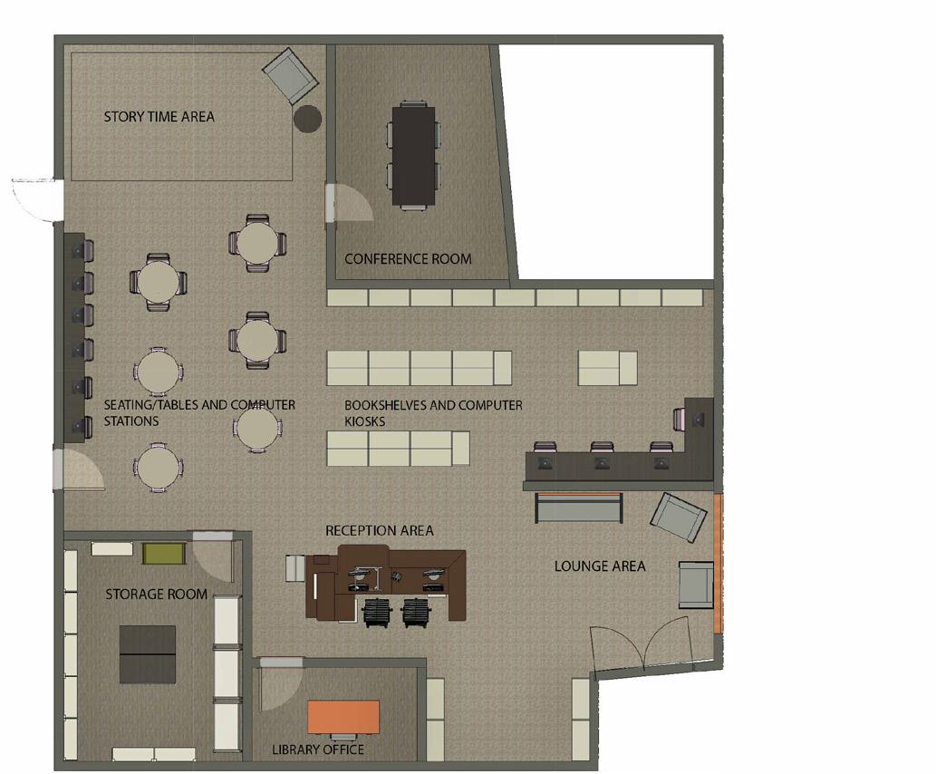
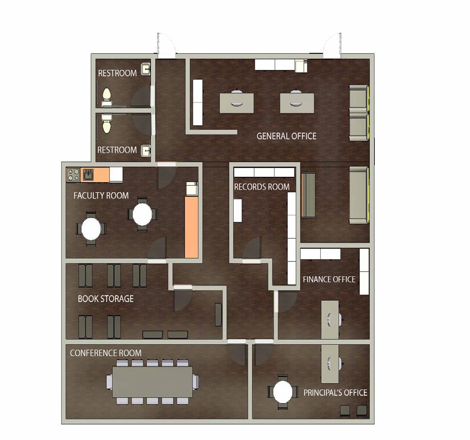
RENDERED FLOOR PLANS | PERSPECTIVES
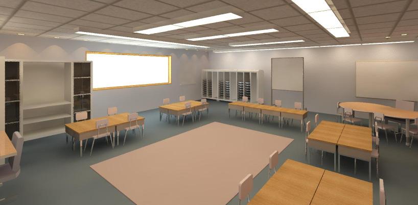
Shown here are the finished and rendered floor plans of the library and the administrative office. Two perspectives of the library are also shown here, showcasing the lighting fixtures and layout of the seating area, computer stations, and custom made reception desk.
21
Library Perpsectives
Administrative Office Floor Plan
Library Floor Plan
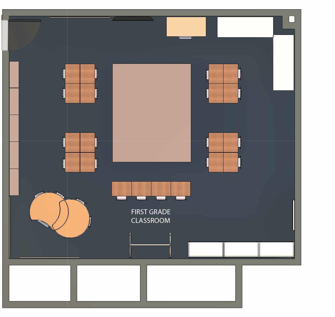
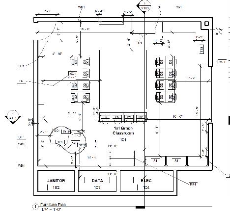
RENDERED FLOOR PLAN | PERSPECTIVES
Shown here is the finished and rendered floor plan of the first grade classroom as well as two rendered perspectives showcasing the custom made cubbies, storage, and entire layout of the classroom.
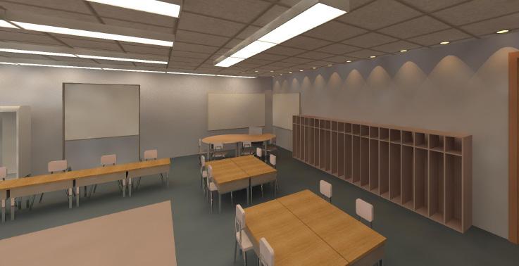
 Rendered Classroom Perpsectives
22
Classroom Floor Plan
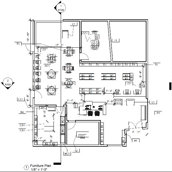
FURNITURE PLANS
Below the rendered floor plans are the labeled construction documents that show the section cuts of the plan as well as dimensions and labeled furniture.
23
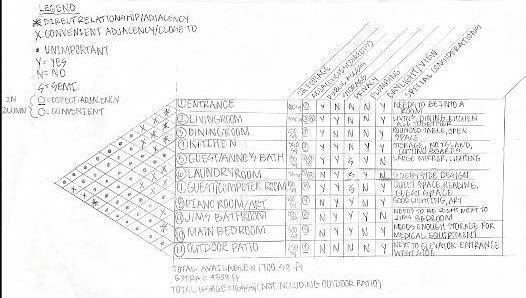
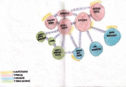
PROCESS WORK
When beginning the process of designing the elementary school, for each area of the school, (the administrative office and the library shown here), bubble diagrams and blocking diagrams help further the design process before beginning the actual floor plan for the space. Through this process, adjacencies, private vs public spaces, and the most efficient space planning is discovered.
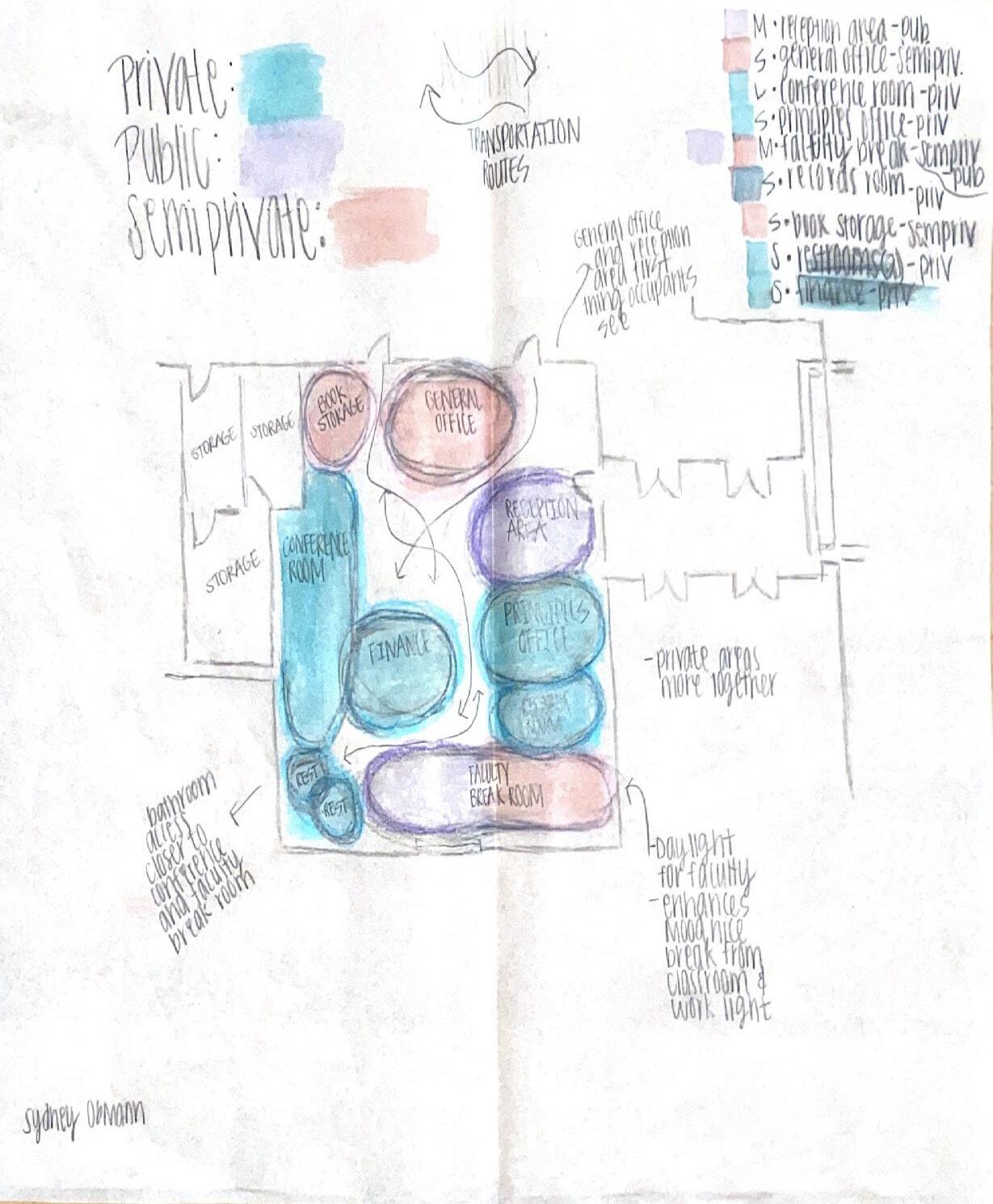
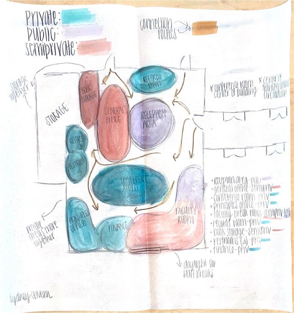
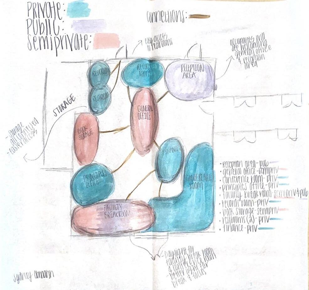 Administrative Office Blocking Diagrams
24
Administrative Office Blocking Diagrams
THE BESSE PROJECT
APARTMENT DESIGN
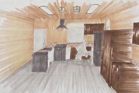
The Besse Project contained of renovating a gutted apartment for two eldery people, one being in a wheelchair, making the entire space ADA compliant. This project includes specific plans and renderings of the kitchen and the bathroom as well as a plan and crafted model of the entire apartment. This project began with the concepts of pattern, unity, and security. These conepts are demonstrated throughout the project specifically within its materials and layout of the floor plan. After having interviewed Jim and Anne Besse, their preferences of how they wanted their apartment to look and feel was brought forward through this design.
25
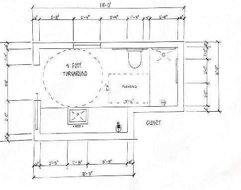
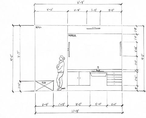
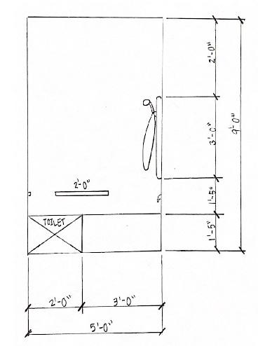
FLOOR PLANS | MODEL
The two hand drawn floor plans on the top show The Besse bathroom floor plan and kitchen floor plan. These two plans demonstrate an ADA compliant kitchen and bathroom, specifically the bathroom due to Jim’s wheelchair. The physcial model on the bottom shows the entire apartment floor plan and the built walls around its interior and perimeter.
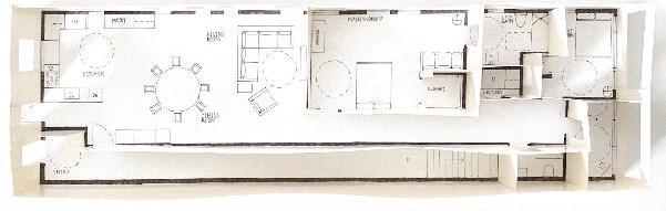 Physical Model of Apartment Floor Plan
Bathroom Floor Plan
Physical Model of Apartment Floor Plan
Bathroom Floor Plan
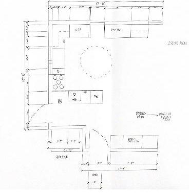
26
Kitchen Floor Plan
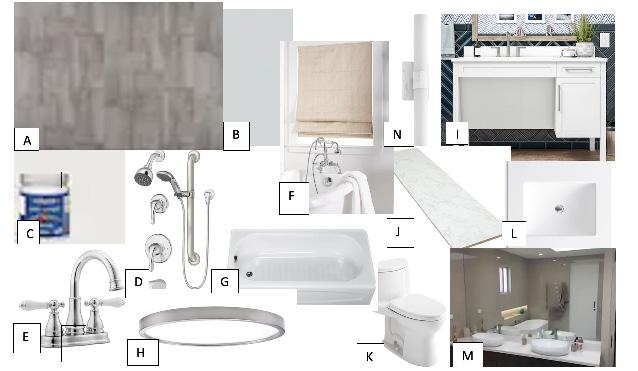
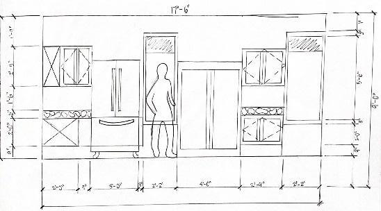
BATHROOM DESIGN
This bathroom layout is ADA compliant, shown through the two hand drawn elevations on the right. On the left is a rendered bird’s eye view perspective demonstrating the materials chosen by the Besses which is also shown through the ideas and materials palette below.
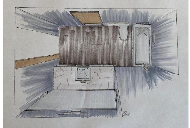
Elevation
Elevation
27
Birds Eye View
KITCHEN DESIGN
This kitchen layout is ADA compliant, shown through the two hand drawn elevations on the right. On the left is a rendered perspective demonstrating the materials chosen by the Besses.
Perspective
Elevation
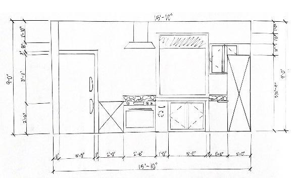
Elevation
28
PROCESS WORK
Process work was very important during the Besse Project. Located here are bubble diagrams and blocking diagrams that helped create circulation and adjaciences that were accurate and efficient before the final space planning began.
29
THE BRIDGE
WATER PAVILION DESIGN
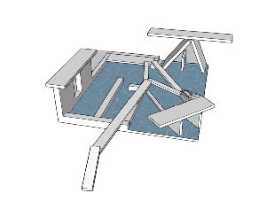
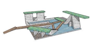
The Bridge Pavilion is designed so that anyone who walks upon it has access to many different platforms as well as bridges to walk across. The numerous bridges within the pavilion make it so there are pathways to get across the water that is contained in certain areas of the pavilion. People have the ability to walk across the bridges for platform access while having a view of the water. They also have the opportunity to step into the water as well as hop onto a floating platform above the water. The walls create a direction of water flow from the contained water space to outside the pavilion. There are access points on either side of the pavilion as well as two elevated structures where people can enjoy the shaded areas while they experience the Bridge Pavilion.
30
FLOOR PLANS
Shown below are a variety of different floor plans that include section cut lines and accurate dimensions of the water pavilion. The floor plan on the right was made in AutoCad and demonstrates all of the architectural features built. The floor plans on the right were made in Layout, demonstrating a plan view and a top view.
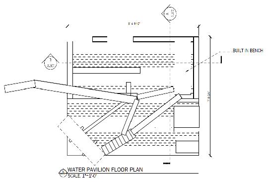
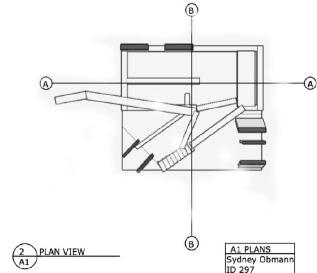
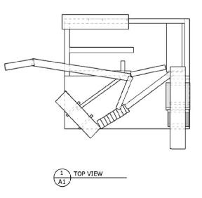
31 AutoCad Floor Plan Layout Plan View and Top View Plans
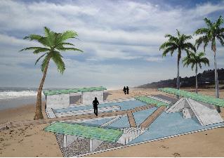
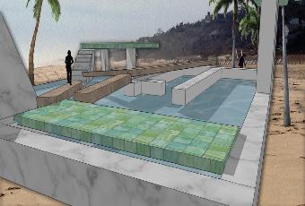
PERSPECTIVES
These rendered perspectives shown are two examples of the use of Photoshop after the model was created in SketchUp. This model was dropped into a setting with a beach landscaping as well as introducng the use of entourage as well as nature to come alive, completing The Bridge’s concept.
32
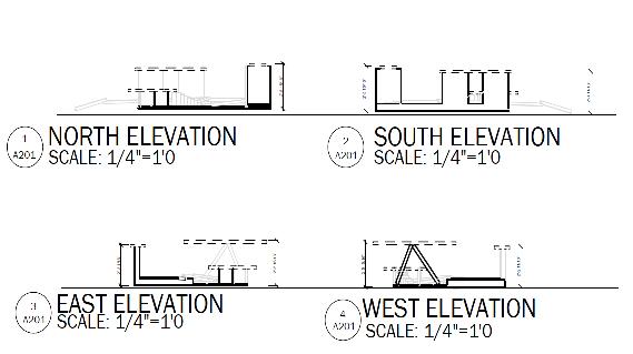
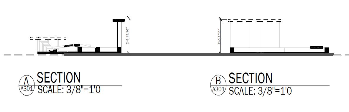
SECTIONS | ELEVATIONS
These sections and elevations represent features and dimensions of this design that are not represented through perspectives or floor plans. The sections and elevations on the left are created in AutoCad, while the sections and elevations on the right are created in Layout.
33
AutoCad Sections and Elevations
Layout Sections and Elevations
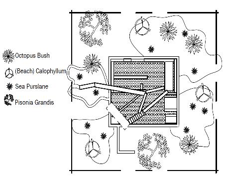
PHOTOSHOP | LANDSCAPE DESIGN
Shown on the left, is a rendered plan view of the landscape design of the pavilion. The landscape plan shows the different materials of the pavilion that is shown throughout the other renderings. This plan includes the different types of plants and nature from Cocos Islands best represented through Photoshop, as well as the gravel pathways throughout the landscape. Shown on the right is a detailed landscape plan view created in AutoCad.
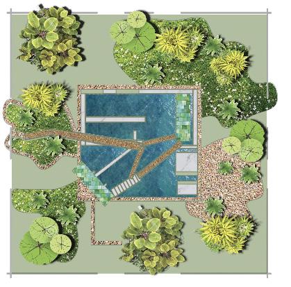
 Photoshop Rendered Landscape Plan View
34
AutoCad Landscape Plan View