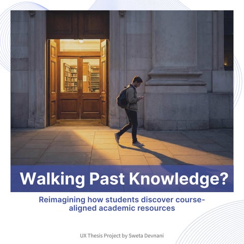
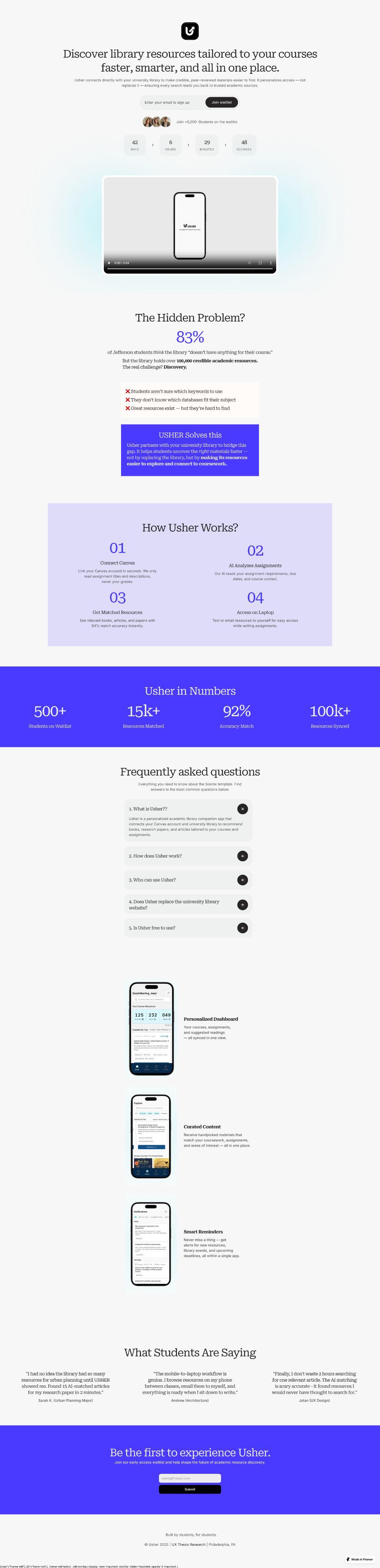
Reimagining how students discover coursealigned academic resources
UX Thesis Project by Sweta Devnani
Thomas Jefferson University
Kanbar College of Design, Engineering & Commerce
Stakeholders & Advisors
Neil Harner, Program Director
Mike Begley, Assistant Program Director
Thesis by
Sweta Devnani
M.S. User Experience & Interaction Design
Abstract
This thesis investigates how university students struggle to locate credible, courserelevant academic resources within existing library systems. Through research with 12 students, the study identified major barriers in navigation, relevance, and awareness, leading students to default to external platforms like Google or social media.
Usher, an AI-enabled mobile concept, aims to bridge this gap by analyzing assignments through Canvas API integration and matching students with personalized library resources. This thesis documents the complete UX process, from research synthesis to prototyping and pretotyping, demonstrating how thoughtful design can improve academic resource discovery and build trust in institutional tools.
01 Introduction
Introduction
Who Are the Users
Why is it important
How Big is the Problem
Introduction
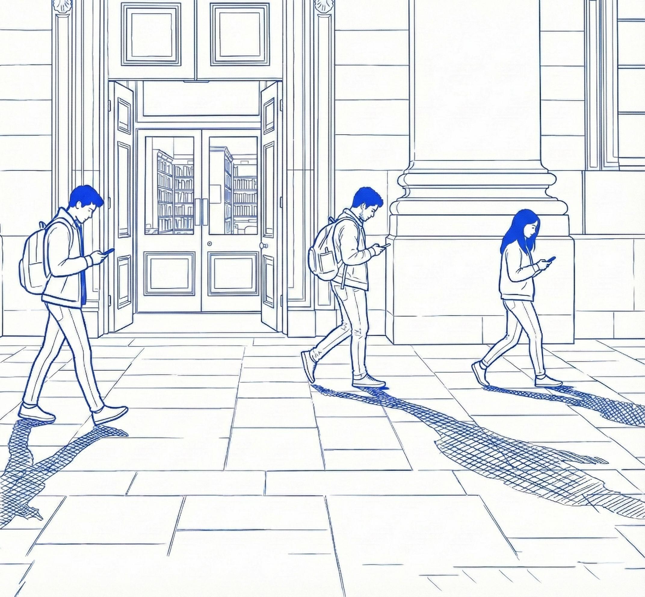
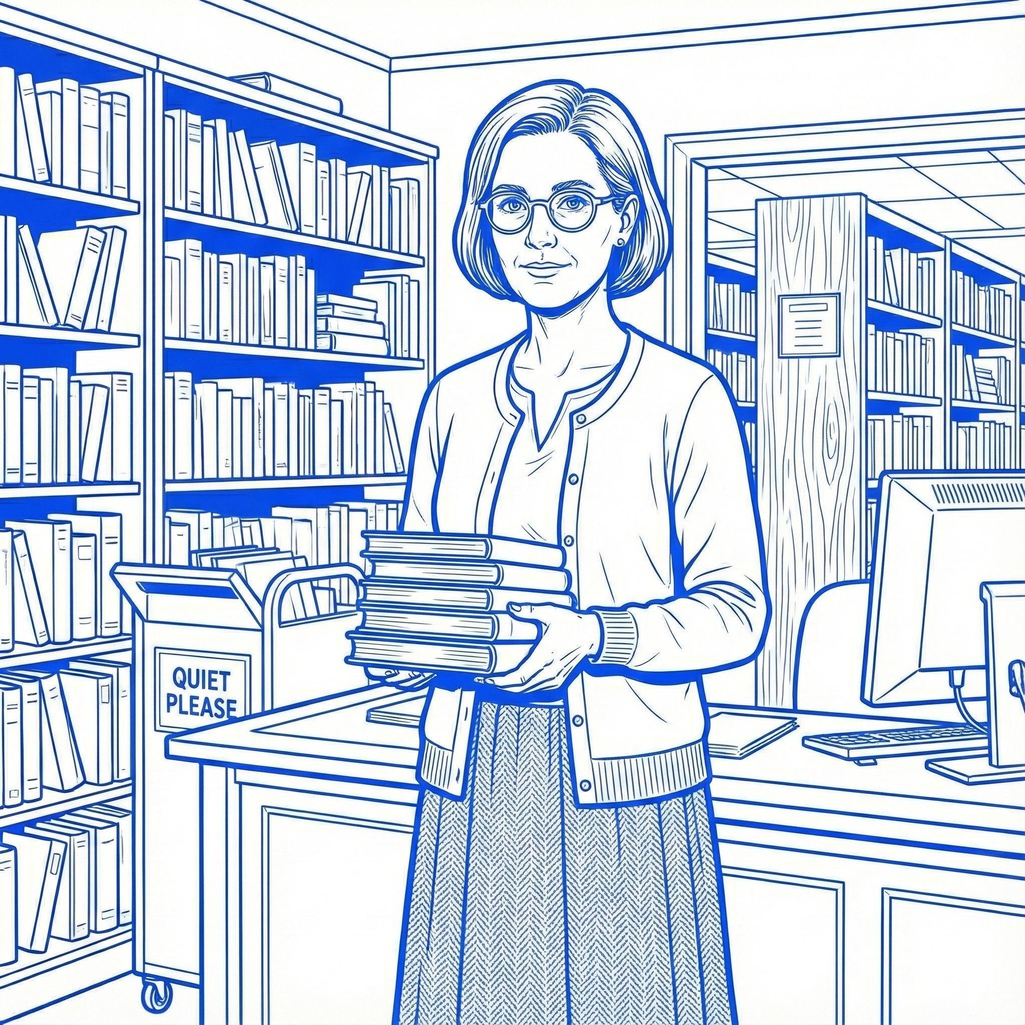
Academic libraries continue to expand their digital collections, yet many students still feel that these resources are difficult to navigate, disconnected from their coursework, or not relevant to their immediate academic needs. This perception gap often leads students to rely on external sources such as Google, Reddit, or AI platforms that feel faster and more intuitive. These sources are convenient, although they may not always be academically reliable.
The disconnect between student workflow and library systems creates significant friction. Many students begin their research on platforms that feel familiar and simple instead of using institutional tools. As a result, the value of the university library remains hidden behind complex navigation, repeated logins, and fragmented interfaces.
This thesis explores how a more intuitive, personalized, and integrated experience can reduce that friction. Through context building, literature review, primary research, synthesis, competitive analysis, prototyping, testing, and reflection, this project examines how students discover academic resources and how that journey can be improved within their existing digital environments.
Students are the primary users and the central focus of this project. They rely heavily on digital tools, learning management systems, and quick online searches. However, their experience across platforms is often fragmented, and this makes it difficult for them to locate
Faculty
Faculty design assignments and provide recommended sources, but they also rely on students being able to find credible materials. Fragmented systems, inconsistent engagement, and non-intuitive search pathways reveal clear gaps between available academic resources and what students actually access.
Librarians
Librarians curate academic materials, offer research support, and guide students throughout the discovery process. Despite this, low engagement and digital navigation challenges make it difficult for them to connect students with the right resources. Their perspective reveals important gaps in accessibility, awareness, and guidance.
Why is it Important?
Understanding this problem is essential because students rely heavily on digital tools to complete their coursework. When institutional platforms feel overwhelming, disconnected, or time consuming, students shift toward external sources that may be fast but are not always credible.
Improving accessibility and personalization supports students in several important ways. Students find trusted information more easily, research aligns more closely with course expectations, and they spend less time searching and more time learning. It also ensures that university funded resources are fully used and valued. Below are the key issues students currently face:
Students do not know where to start
Library platforms feel overwhelming and require too many steps.
Navigation feels unintuitive
Students struggle to locate relevant resources across multiple databases.
Course content library content disconnected Students rarely find match their assignments programs.
03 content and content feel disconnected resources that assignments or academic
04 Searching feels time consuming
Multiple filters, platforms, and login requirements create friction.
05
The library is used more as a space than a research resource Many students visit for studying or printing instead of exploring academic materials.
How Big is the problem?
Broader evidence shows that this challenge extends beyond a single institution and reflects a larger shift in student research behavior.
78%
78% of students report difficulty finding credible academic sources online due to lack of research skills.
89%
89% of college students begin their research with search engines like Google, rather than their university library databases.
These statistics demonstrate a clear need for a simpler and more course aligned system that allows students to discover academic resources without navigating multiple scattered platforms. Improving this connection strengthens research quality, increases student confidence, and ensures that the university’s investment in academic content is fully realized.
Only 6% of undergraduate students are active users of university electronic library databases. 06%
Only 20% of students turned to librarians for help during research. 20%
02 Primary Research
Interview Objectives
Recruitment Strategy
Interview Script
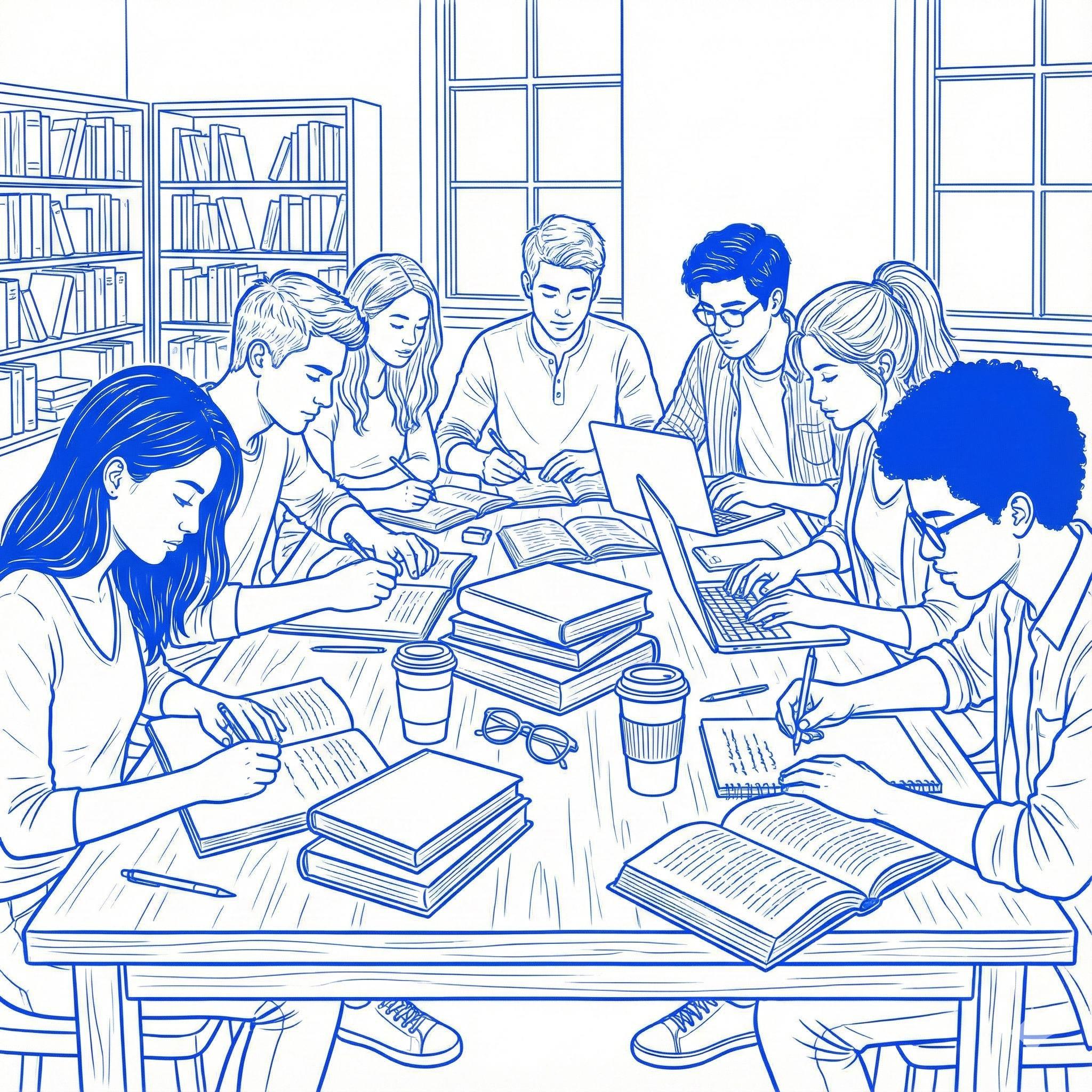
Primary Research
Academic libraries continue to expand their digital collections, yet many students still believe that these resources are difficult to use or do not align with their coursework. This perception often leads to the underuse of credible academic materials and creates friction when students begin research through systems that feel separate from their daily workflow.
The goal of this research phase was to understand how students currently engage with academic resources, what barriers they encounter, and which opportunities exist for improved guidance and personalization. Through context building, literature review, primary research, synthesis, competitive analysis, and visual and structural exploration, this phase shaped the foundation for designing a more intuitive and course aligned academic resource experience.
This chapter documents the research journey for Usher and outlines the methods used to gather insights that guided the rest of the project.
Interview objectives
This section outlines the core objectives that guided the student interviews and shaped the direction of the primary research.
01 Understand How Students Engage With Library Resources
Learn how students currently discover, access, and use academic library tools. Identify points where these systems support or hinder their research process.
02 Identify Barriers in Digital and Physical Library Use
Understand what challenges students encounter when using databases, attending workshops, or accessing physical collections. Explore moments where the experience feel disconnected.
03 Explore ResearchStudents Habits and Workflows
Investigate where students begin their research, which platforms they rely on, and why they often choose external tools like Google Scholar instead of institutional resources.
04
Map Opportunities for Improved Personalization
Identify which features, guidance, or forms of curation would help students engage more effectively with library materials and how a tool like Usher could support their academic journey.
Recruitment Strategy
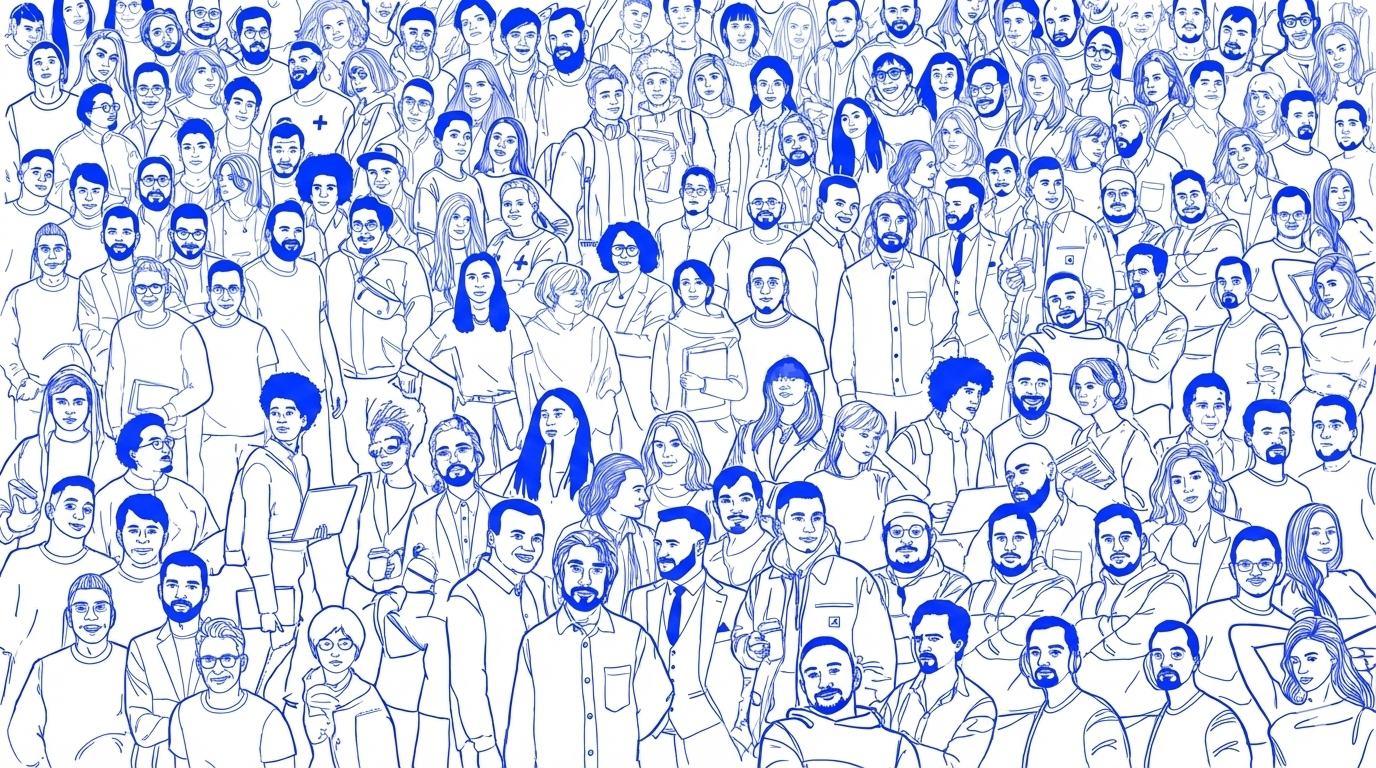
Participants were recruited through an online interest form shared across university student groups and academic networks. Additional outreach through peer connections helped ensure a diverse range of students with different research habits. This approach resulted in twelve participants whose experiences formed a strong foundation for understanding current library engagement challenges.
Criteria Inclusion
Age group: 18 to 30 years
Current university students
Involved in academic research or a thesis project
Use the university library for academic work
Former students of the university
Students who have never participated in academic research
Students who have never used library resources
Participant Distribution
Textile Design
Survey Response
Construction Management
23/27 faced challenges finding relevant resources in the library.
27/27 use Google Scholar or other external platforms for research.
08/27 do not use library resources at all.
These findings confirmed a significant gap between the resources universities offer and how students actually engage with them.
Interview Script
How did you first learn about the library’s research resources? (Follow up: Did you actually go to library after hearing about it?) (If not, why? If yes, how many times?)
Have you heard of any library’s workshops or research training sessions? (If yes, have you attended any?) (If no, why not?
Explores how students initially discover library resources and identifies gaps in awareness, communication, and outreach.
How often do you use the TJU library for your academic work? (Follow-up: How often do you use its digital vs. physical resources?) (What types of materials do you typically look for? )
When conducting research, where do you start your search? (Follow up: if they mention digital resources: Do you prefer digital or physical library resources? Why?)
Examines the frequency, patterns, and preferences in students’ interactions with both physical and digital library resources.
The interview script was structured into four categories that allowed participants to share their experiences across awareness, general usage, barriers, and opportunities.
Barriers Opportunities
How often do you visit the TJU library in person for research?
(Follow-up: If rarely, why not? And what challenges do you face?)
How do you typically discover new books or research materials
What factors discourage you from using physical library resources?
(Follow-up: What could make the experience more seamless?)
What changes would you suggest if you could redesign the library experience? (Both digital and physical improvements)
What additional resources or services would encourage you to use the library more often?
If digital accessibility is the key reason for your preference, what could make the library’s digital resources more competitive with external alternatives?
Uncovers obstacles that prevent students from visiting the library in person and highlights opportunities for improving physical services.
could make the library’s digital
Encourages participants to articulate unmet needs and potential solutions, providing direction for future design considerations.
03
Synthesis
Interview Debriefs
Actual Use the Library
Challenges Mapping
User journey
Root cause analysis
Landscape Analysis
Problem Statement
Synthesis
The synthesis phase brings together the insights gathered from primary research and reveals deeper patterns in how students navigate library systems. The findings show why many students struggle to locate course relevant resources and how current systems create friction throughout the research process.
Using methods such as affinity mapping, user journey analysis, resource segregation, and root cause analysis, this phase organizes observations into clear themes. These themes highlight the
barriers, motivations, and unmet needs that influence how students approach research. Through this synthesis, a recurring insight emerged. Students are not avoiding library resources because they lack value. They avoid them because the systems feel difficult to navigate, disconnected from coursework, and misaligned with their daily workflow. These insights shaped the conceptual direction of Usher and guided the creation of a solution that prioritizes clarity, personalization, and alignment with Canvas coursework.
Interview Debrief
Each debrief captured immediate reflections and key observations after every interview, documenting both explicit statements and subtle cues such as confusion or hesitation. Recording impressions while they were fresh ensured consistent analysis and helped surface early patterns that guided the synthesis process.
A major insight was the gap between what students reported and what they actually practiced. Many who claimed to “use library resources” were referring to the library as a physical study space rather than a source for academic research.
This revealed a disconnect between perceived and actual usage. Common patterns included difficulty navigating digital systems, reliance on external tools, limited use of academic databases, and a need for personalized, course aligned recommendations with clearer starting points for research.
I feel that these digital digital resources are like accessible to you anytime, even if you want to like sit at just in your living room and research about something you could just take out your phone and start researching about it.”
The participant was introduced to the library through a professor for her research. She hardly used library once or twice while she has been here for 1.5 years now. She mentioned that their professors always encourage to go to library and read physical books related to course rather buying a book. She would use the library space for quite environment which motivates her to work.
Preference for Digital Accessibility
The participant relies heavily on Google and AI tools for her research process. She mentions that whenever she wants to research, she can immediately take out her phone and do it, where as for using library, she has to walk all the way to research about her topic. The accessibility, speed, and ease of use make them far superior to the university library. She mentioned that when using a pdf version of book, she can highlight anything she wants where as in library books she is restricted to do that.
Experience of using Library Website
She mentioned that she once used library website and her said that it was not difficult to navigate but still it took her some time to figure out how to do it stating the need to make it ore user friendly. When compared to google research, she mentioned that searching on Google is more easy to navigate and she doesn't have to log in every time she opens google website. .
Age: 25 years
Awareness of Resources
The participant was aware of some of the resources provided by the library but never considered using them because she felt that google gives her answers to all her questions, so there is no need to go to the library. Even if her questions are not answered on google, she would prefer asking her professor regarding the same.
Factors Discouraging from using Library
She mentioned that she is aware of Tuesdays CWL, but she wouldn't go because she has class during that time. For visiting the physical library, she mentioned that because of weather, she doesn't feel like walking there. She feels that the Library does not have enough resources or materials for her department.
Suggestions for Library Improvement
She suggested that while searching on the digital website, if AI is integrated, it could be helpful where when a student searches something, AI could provide direct link to the resources. She also mentioned that having sections based on departments would be helpful where if she clicked her Architecture department, resources only related to architecture should be shown to her. A digital monitor to help in navigation of books would be helpful. She also mentioned that an option to read a book on library website and save it for later reading would be helpful too. Also, having latest collection of Architectural books would motivate her to go there more often.
How Students Actually
Types of Library Resources
Study Environment
Students who use the library primarily for its physical space: room booking, group studies,
IT Support & Services
Students visiting the library for technical help, device support, or access to the IT helpdesk.
Non-Academic Services
Students using library for things like printing, scanning, or attending general workshops.
Literature & Research Resources
Students who actively access books, journals, databases, or digital literature for academic/ research purposes.
Although students often stated that they used library resources, the interviews showed that most were referring to non academic services. Students regularly used the library for group study, IT support, printing, or general tasks, but only two out of twelve participants used academic research materials consistently.
Medical Student
Students Actually Use the Library
06/12 08/12 02/12 06/12
Medical Student
Only two students reported actually using the library’s academic resources. Upon deeper investigation, it became clear that these students were encouraged by their professors far more frequently than students in other departments.
Challenges Mapped from Debriefs
All interview observations were organized into an affinity map to identify recurring themes. Students consistently expressed challenges related to navigation difficulties, limited relevant resources, accessibility constraints, and shifting digital preferences. As clusters emerged, one challenge appeared across almost every interview: awareness. Students were often not aware of digital tools, databases, or the specific resources that supported their coursework.
This overlap was significant and led the thesis to initially focus on the awareness gap. It shaped the first version of the problem statement and guided early design assumptions.
Problem Statement
Awareness
Awareness vs Navigation
While the university had made several efforts to promote awareness, including orientation sessions, professor reminders, and weekly events like Tuesdays with Librarians, students were still not engaging with the available support.
Professors encouraged to use resources
A closer look revealed that awareness alone was not the primary barrier. Even when students knew about available resources, most still avoided them. The underlying issue was consistent across participants: navigation challenges. Students struggled to locate materials, understand website layouts, or access physical collections. This insight shifted the focus toward usability and structure, which limited engagement more than lack of awareness.
Actual Challenge?
Participant 2 - 01:58
“To go to the library, it like takes you an effort to walk all the way to the library… time is more valued when you're doing it digitally.”
Participant 1 - 02:59
“I have sometimes spent maybe 1 or 2 hours just finding a book or maybe a thesis… it’s time-consuming, so I prefer online.”
Participant 1 - 19:29
“Even the website, it's kind of tricky. We are not able to easily find where the things are… it's very difficult to find out.”
Based on the results, it became clear that the core issue was not the lack of resources. The challenge was the effort required to navigate both digital and physical systems. Students consistently mentioned the long walks to the library, confusing layouts, limited hours, extreme Philadelphia weather, and the difficulty of finding specific materials. These factors pushed them toward faster alternatives such as Google or AI tools.
Because these barriers appeared at multiple touchpoints, the problem statement evolved to focus on navigation as the central challenge. The goal became reducing friction in discovering, accessing, and using library resources so that students naturally engage with them more often, regardless of where they are.
Underlying Problem Statement
Navigation
User Journey
01 02 03
Initial Awareness
Students learn about the library through orientation, professors, or peers, but the introduction is brief and rarely revisited. Most students leave early stages unsure of what the library truly offers.
Beginning Research Trying the Library System
For most assignments, students start with Google Scholar, PDFs, or AI tools because they are fast and familiar. Many assume the library may not have what they need.
Students learn about the library through orientation, professors, or peers, but the introduction is brief and rarely revisited. Most students leave early stages unsure of what the library truly offers.
Orientation lacks clear, practical guidance
No ongoing reminders about digital tools or events
Library search feels slow and confusing
Students unsure how to start or which database to use
Orientation lacks clear, practical guidance
No ongoing reminders about digital tools or events
04 05 06
Most students use the physical library as a quiet study space rather than a research hub. Many are unaware of different floors or how to locate materials.
Students often struggle to find relevant, coursespecific content, especially outside medical fields. Many believe the library lacks materials for their major, leading to frustration.
Difficult to find books without help
No clear wayfinding inside the library
Limited hours and long walk from classrooms
Library not integrated with Canvas
Workflow feels disconnected from students’ digital habits Searching the Material Completing Assignment
Assumptions of low relevance
Limited confidence in finding niche topics
Assignments are often completed using external PDFs, open-web sources, and AI summaries. Library use remains minimal unless the professor requires it.
Root Cause Analysis
Why are students not using libraryacademicresources?
Because students often struggle to quickly locate materials that feel directly relevant to their immediate coursework or assignments.
Why is it difficult for students to find course-aligned materials?
Because most global academic library systems are built to serve diverse programs broadly, and their search tools naturally return wide-ranging results that may feel overwhelming without course-specific filtering.
Why do many provide broad, course-specific results?
Because higher ecosystems worldwide typically rely on standardized databases that do not automatically integrate with management systems adapt to individual needs.
many broad,systemscourse-specificnonhigher education worldwide on large, databases automatically learning systems or individual course
Why is seamless integration not yet the norm?
Because academic libraries operate within complex, institution-wide infrastructures where multiple platforms, data sources, and vendor systems must align—making real-time personalization technically challenging across the industry.
Why is this complexity difficult to address at scale?
Because student research behaviors are rapidly evolving, digital expectations shift quickly, and many universities worldwide are still exploring new ways to bridge students’ preferred tools with traditional academic systems.
The challenge is not specific to one institution. It reflects a global shift in student research behavior. Students expect clear, personalized digital experiences and naturally gravitate toward tools that provide instant clarity. Traditional library infrastructures were built for academic depth, but they require new design methods to meet modern expectations.
Landscape Analysis
The competitive review shows that existing university library platforms offer credible content and strong search tools. However, they often lack personalization, AI guidance, integration with coursework, or tailored recommendations. Students are expected to navigate multiple databases independently, which leads to search fatigue and low engagement.
No current solution combines LMS data, library data, and personalized recommendations in one place. This gap highlights an opportunity for Usher to provide a unified and student centered experience.
Features My Solution
AI Suggestions
Chatbot / Guidance
Uses Student data (LMS)
Peer Reviewed Content
Personalized Dashboard
Search/ Filters
Uses Library Data Reading List/ Save
Summaries/ Explanations
Notifications
Problem Statement
Insights gathered from the interviews were synthesized into clear themes that revealed how students think, behave, and struggle throughout their research journey. These findings shaped the problem statement presented below, which captures the central challenge that emerged across participants. It reflects the needs that guided the next phase of design.
How might we reduce the friction university students face when trying to discover and engage with credible, course-aligned library resources by improving navigation, personalization, and integration across digital library systems?
User Goals Needs
Why is it important
How big is the problem?
How have existing solutions failed
University students across different majors and institutions bring diverse research needs and workflows, yet many still use the library mainly as a study space while overlooking its digital academic resources. Students want to find credible, program-relevant materials quickly and intuitively without navigating multiple platforms or sifting through unrelated results. To support this, they need a personalized, streamlined resource experience that aligns with their courses and fits into their daily academic tools.
Across interviews, students reported non-intuitive navigation, difficulty finding relevant materials, confusing database structures, and inconsistent search accuracy. Even when universities introduced resources through orientation or faculty reminders, actual engagement remained low, revealing a clear gap between awareness and use.
At scale, millions of students default to external tools like Google, Reddit, or AI platforms because they feel faster and more approachable, even though these sources may lack academic credibility. This highlights how institutional resources remain underused despite substantial university investment.
Current solutions fall short because they are fragmented, generic, and disconnected from coursework, offering little personalization or guidance. Without a more intuitive and accessible library experience, students risk relying on non-verified sources and losing valuable time searching instead of learning.
Ideate Persona
What Solutions Could Fit?
Storyboard
MoSCoW
Userflow
Sitemap
Ideate
This chapter translates the findings from the research phase into a clear product direction for Usher. Insights gathered from interviews, task analysis, and affinity mapping were transformed into actionable design decisions that shaped the foundation of the solution. Through persona development, storyboard creation, MoSCoW prioritization, user flows, wireframes, and visual design, this
chapter outlines how user needs, pain points, and motivations informed the structure and experience of the app.
Together, these elements show how the product was intentionally crafted to deliver a personalized and intuitive research companion that aligns with student workflows.
Joey Green
“I know the library has great resources, but it always feels too complicated and disconnected from what I’m working on. It’s easier to just use Google Scholar, even if I’m not sure the sources are the best.”
Understanding the Primary User
This persona reflects the major patterns identified across all twelve interviews. It captures the core motivations, challenges, and research behaviors of the primary user group and serves as a reference point to ensure that decisions remain aligned with real student needs.
Joey is a graduate design student who relies heavily on digital tools for research but often feels overwhelmed by the library’s complex systems. He prefers simple digital platforms, struggles to discover relevant resources, and often relies on Google Scholar even when he is unsure of the credibility of the sources.
Goals
Quickly find relevant, credible academic resources tied to assignments.
Stay on top of new research in his field without endless searching.
Organize readings efficiently (separate literature review, case studies, references).
Save time and reduce stress while working on big projects..
Frustations
Overwhelmed by volume of library resources, doesn’t know where to start.
Library website is complicated, not mobile-friendly.
Doesn’t have time to visit the physical library regularly.
Ends up relying on Google Scholar or random online sources, which aren’t always credible.
Feels disconnected from the library in his daily workflow.
What solutions could fit here ?
Before narrowing the product direction, several potential solutions were explored to understand how students could be supported most effectively throughout their research workflow. Each concept offered unique advantages and helped shape the foundation of Usher.
Removes the discovery phase by showing library resources alongside assignments.
Reduces steps and keeps research aligned with coursework.
Boosts engagement since students already work inside Canvas daily.
Initial selected solution
Eight of twelve students said mobile searching is convenient and accessible.
Lets students research anytime, anywhere, fitting their habits.
Offers quick actions like checking, saving, and receiving updates on the go.
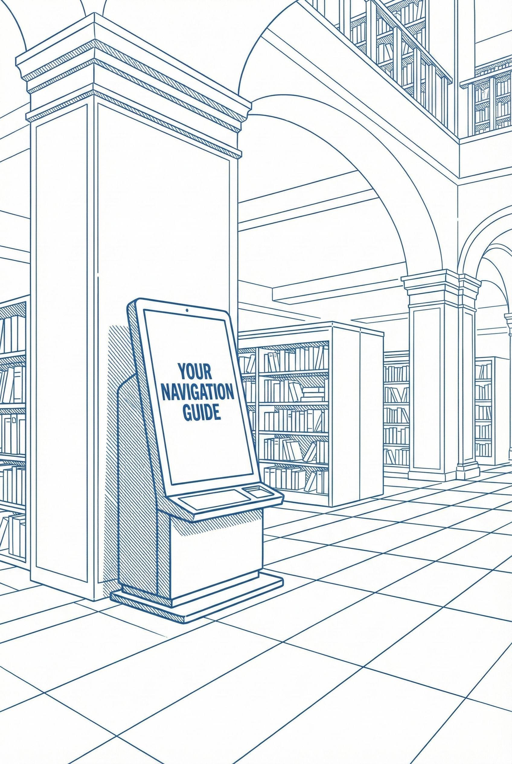
Solves physical navigation issues by giving clear, guided wayfinding.
Helps students quickly find books and sections without confusion.
Supports those who prefer inlibrary research but struggle to locate materials.
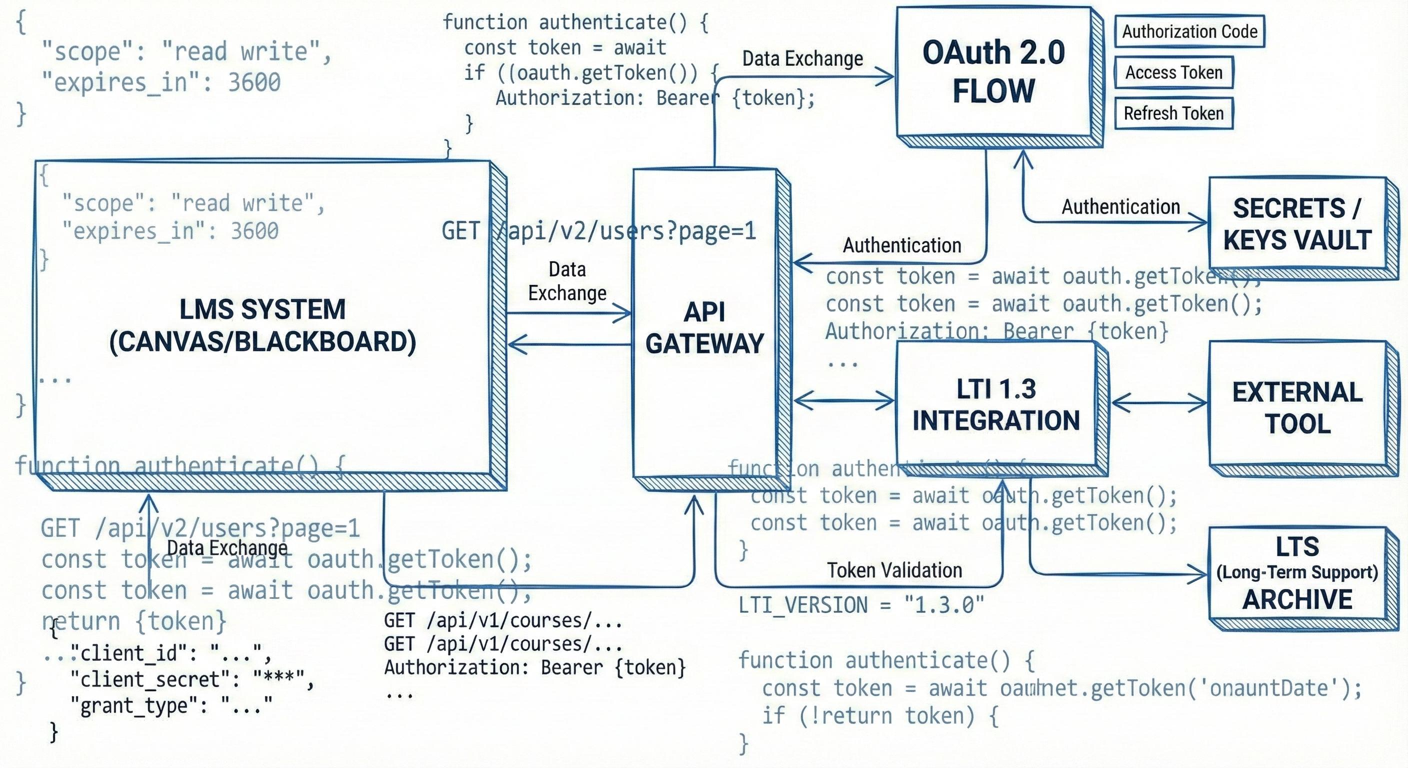
Why Canvas Integration Was Not Feasible
During exploration of the Canvas and Blackboard integration concept, an initial technical review revealed that creating a functional prototype required institutional approvals, complex system access, LTI 1.3 compliance, and secure data exchange. These requirements were far beyond the scope and timeline of this thesis.
Because a working integration could not be developed within these constraints, the focus shifted toward a more feasible and scalable direction. The mobile app approach aligned strongly with student behavior, and eight of twelve participants reported that mobile searching felt convenient and accessible. This allowed the design process to continue with a solution that could be meaningfully developed, tested, and evaluated without relying on restricted system integrations.
Visualizing the Student Journey
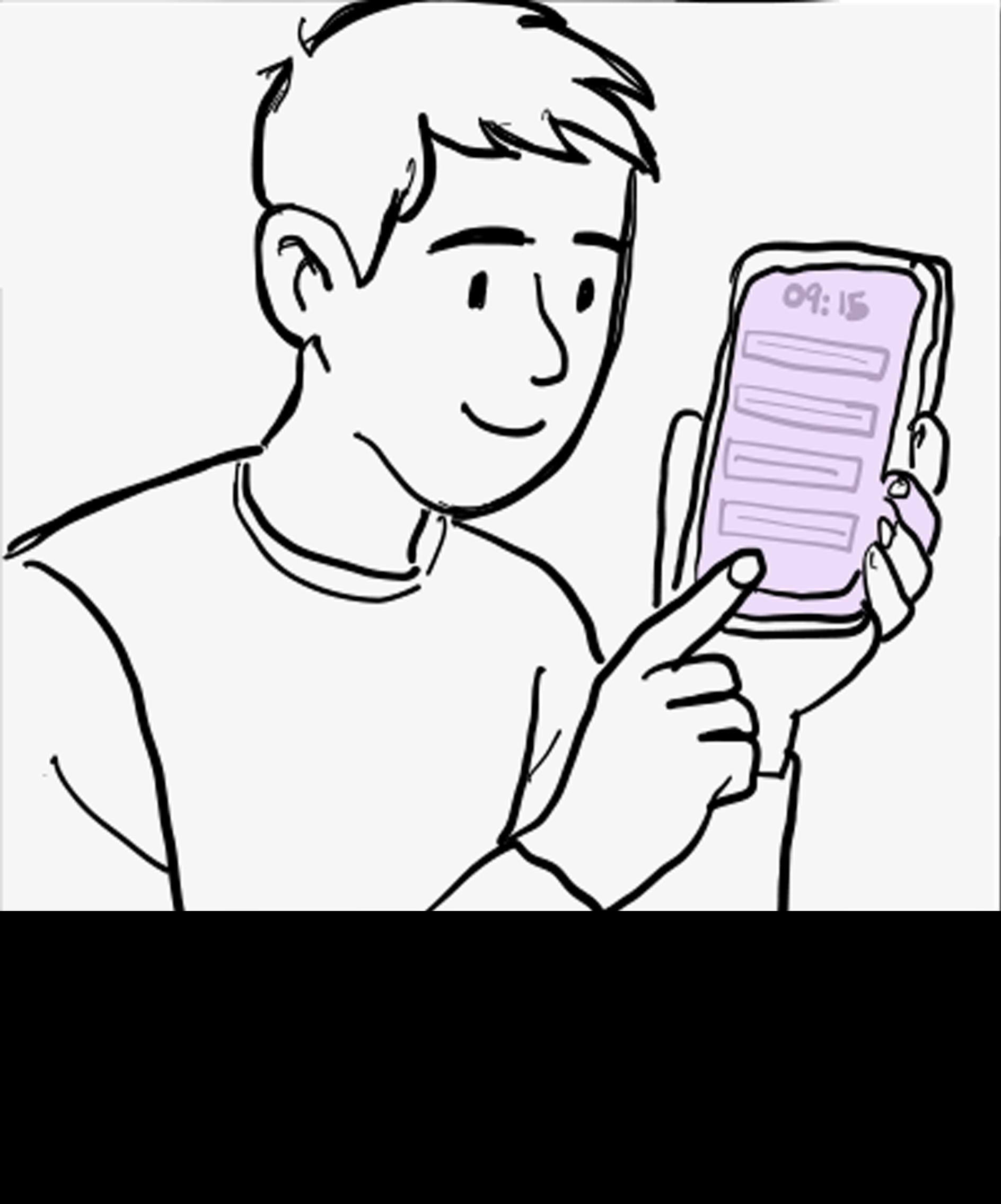
The storyboard illustrates how a student discovers and interacts with Usher throughout their academic workflow. The sequence begins with the student learning about the app, logging in with their university ID, and allowing Usher to sync Canvas courses and assignments. The storyline then follows how the student explores curated resources, saves readings, and benefits from helpful notifications that support their research needs.
The storyboard demonstrates how Usher simplifies academic resource discovery and supports students in completing their work with greater confidence and efficiency.
needs credible, sources but is unsure where to begin.
He discovers Usher through a class announcement. He installs the app
He logs in using his university ID, allowing Usher to automatically sync his Canvas courses & assignments.
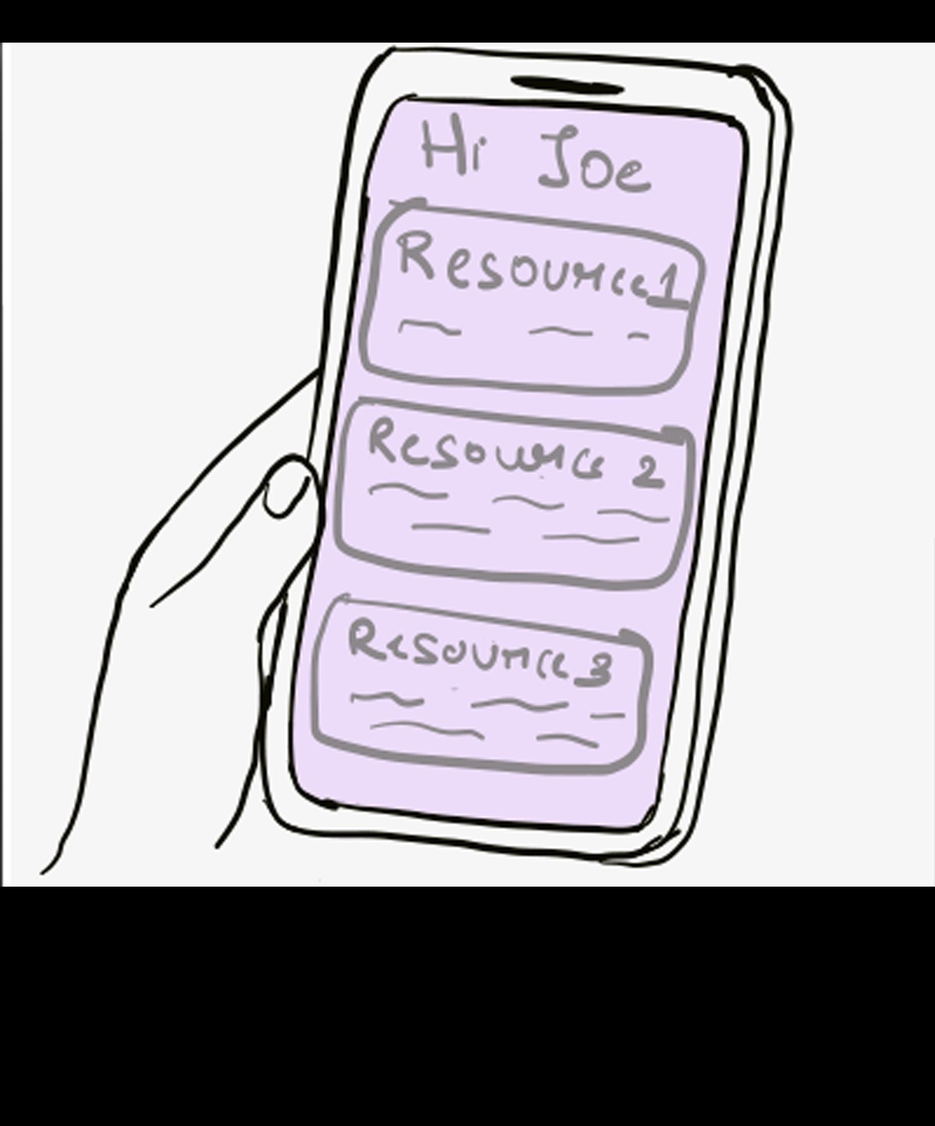
He is welcomed by a personalized dashboard offering curated resources
He receives smart notifications that alert him about new resources, assignment deadlines, and workshops.
He scrolls through AIrecommended articles, ebooks, and case studies.
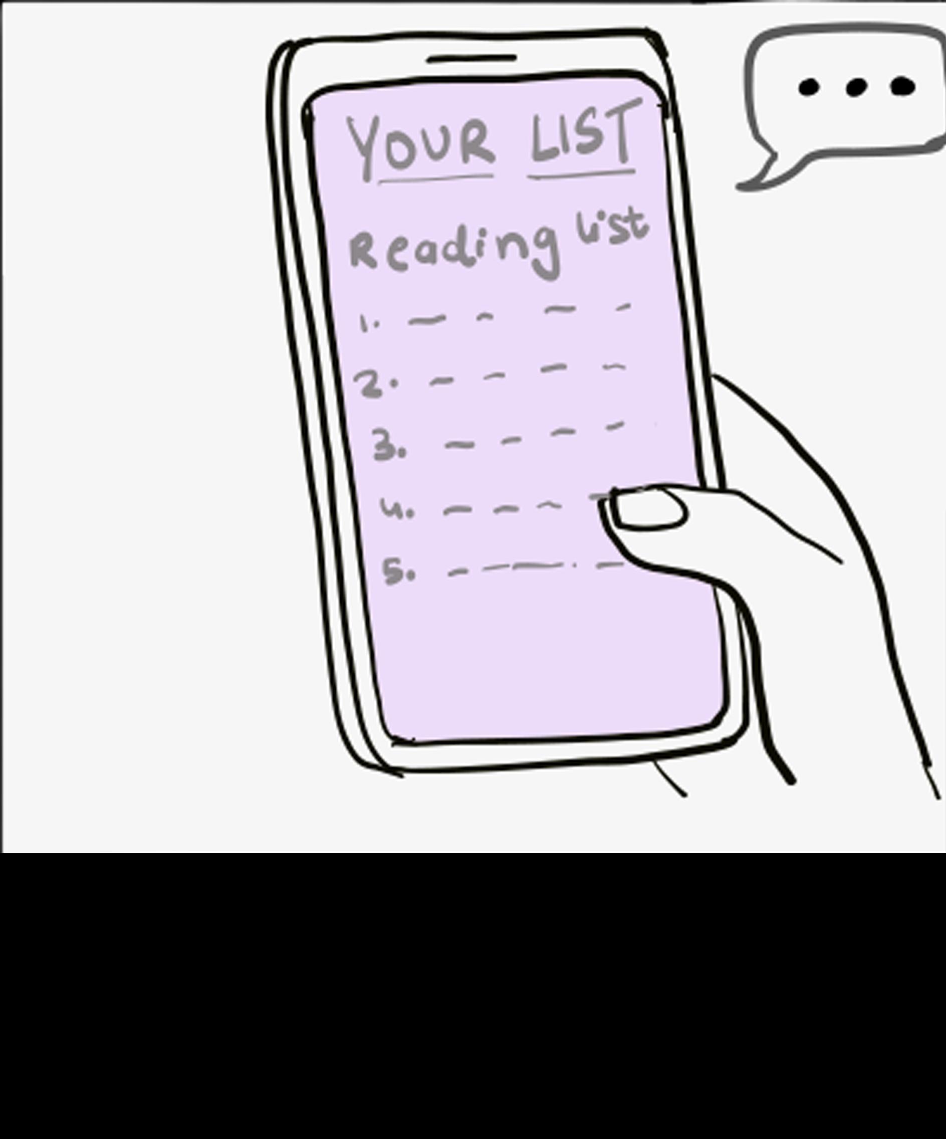
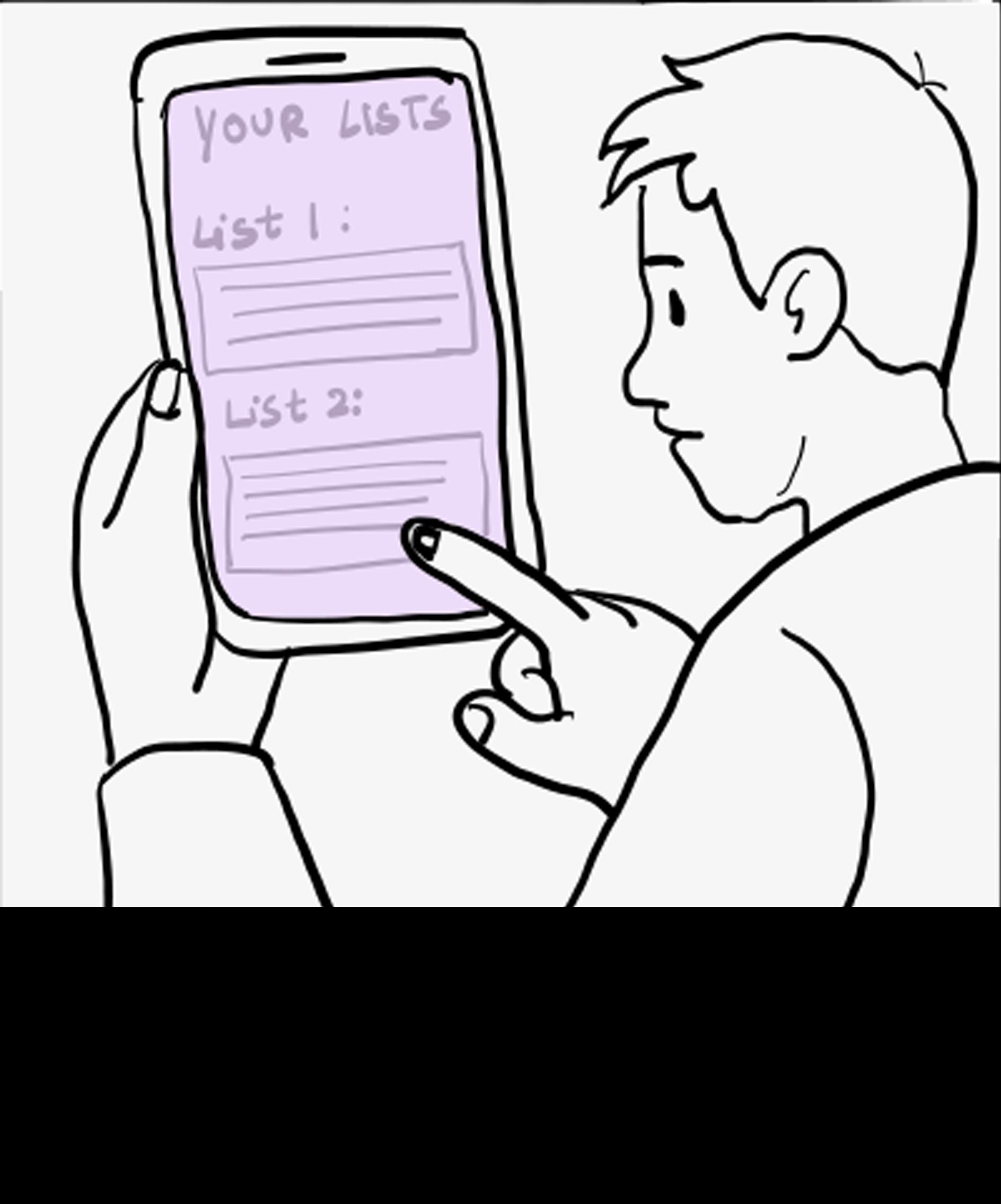
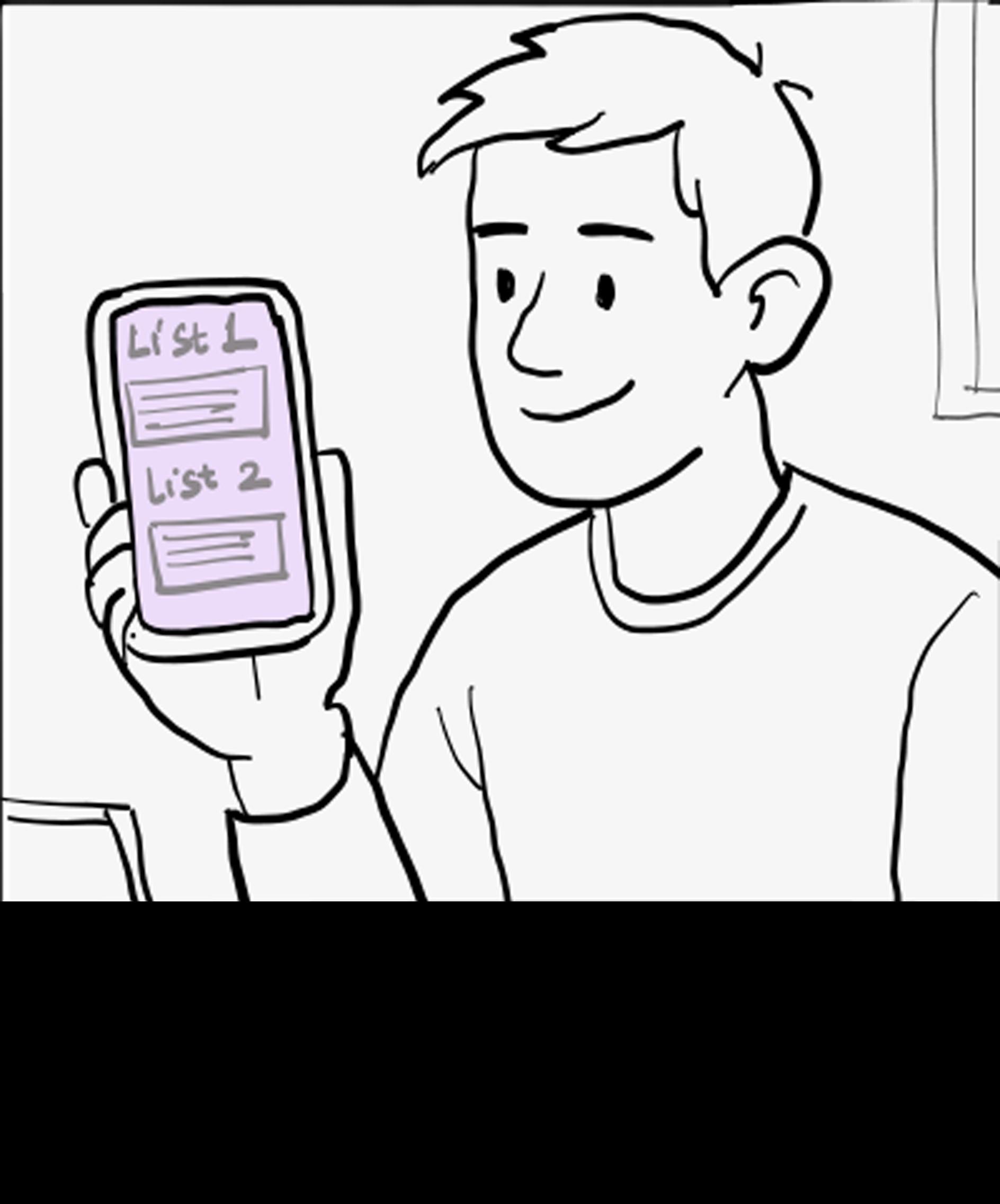
He organizes his saved resources into personalized reading lists for better management.
He explores the simplified search and discover sections
With accessible, curated, and credible resources, he completes his assignment more efficiently.
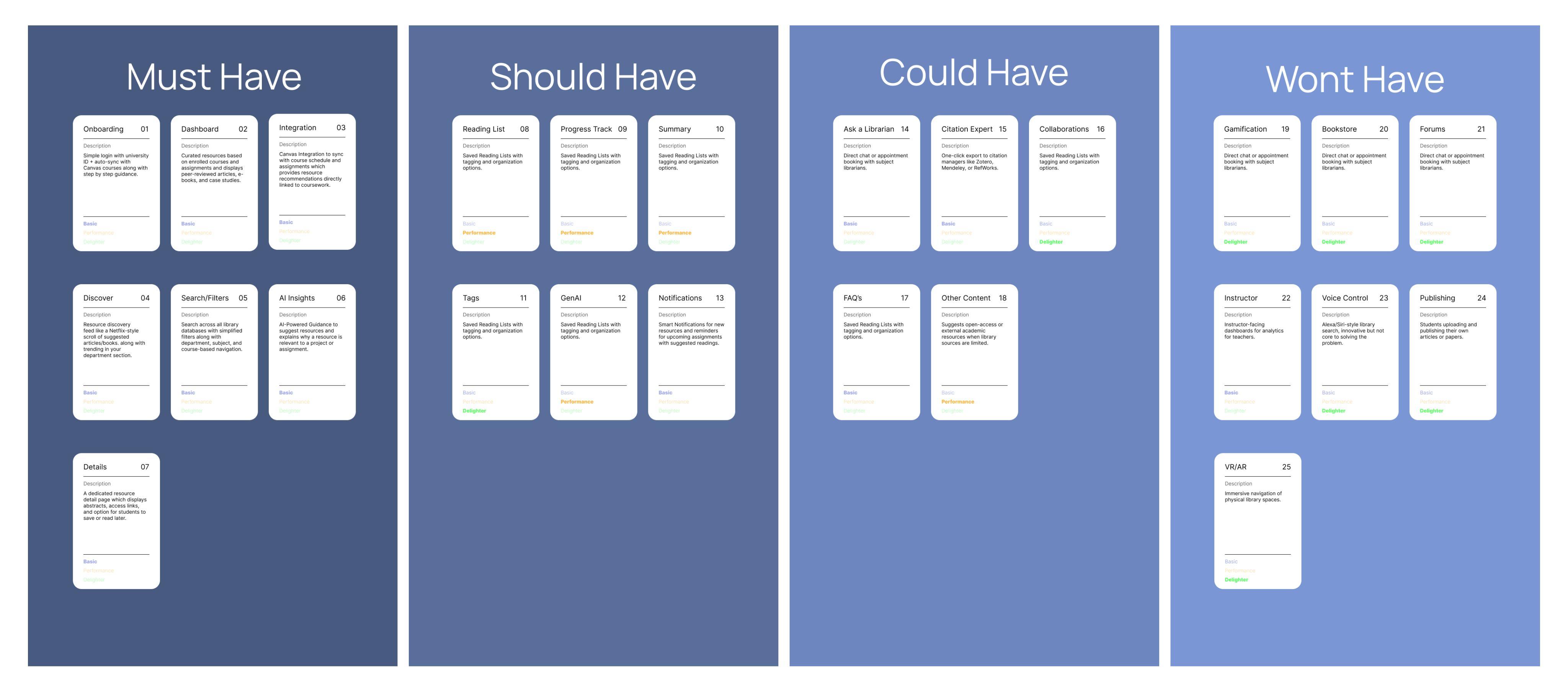
Prioritizing the Features
The MoSCoW method helped determine which features should be prioritized for the first version of Usher. Features were organized into four categories: Must Have, Should Have, Could Have, and Will Not Have. This structure made it easier to focus on the most essential features and maintain clarity during development.
How this Helped?
The prioritization also supported informed decision-making by showing which features were necessary for launch and which could be considered for future improvements.
Userflow
The user flow outlines the complete path a student takes while interacting with Usher, beginning with logging in and continuing through personalized recommendations, resource exploration, reading list creation, and notifications.
User opens the Usher Libr ary Companion App.
Create account Log in with university ID (SSO)
Database Start
New User? Yes No
User receives a notification of a new resource available
Closes app
Completes project confidently with stronger bibliographys
Database used
How this Helped?
Clarifying each step helped define how students move through the system and ensured that the experience remains intuitive and supportive throughout their research process.
Database used
System syncs with Canvas database Onboarding (Guided intro)
System syncs with Library database
Resource recommendations
User clicks resource detail
Database used
User clicks save to reading list View full resource
Start / End Steps / Pages
Decision Canvas Database Library Database
Dashboard
Site Map
The site map organizes the key sections of Usher and shows how students navigate from onboarding to personalized recommendations, saved lists, exploration tools, and profile settings. Structuring these pathways early ensured that each part of the app supported efficient research and seamless access to relevant resources.
How this Helped?
Mapping the structure clarified how features connect and highlighted the importance of keeping navigation simple. This step created a solid foundation for the wireframes and visual design explored in the following sections.
Design Wireframes
Mood Board
Style guide
Screens
Design
This chapter brings the solution to life by translating research insights into a cohesive and functional product experience for Usher. Each design decision was grounded in the needs expressed by students during interviews, ensuring that the final app supports their natural research habits and eliminates common friction points.
From early explorations to high-fidelity interfaces, every step focused on clarity, relevance, and real-world usability. This chapter includes persona alignment, journey visualization, feature prioritization, navigation structure, wireframes, visual language development, and final designs that reflect a clear and approachable academic support tool.
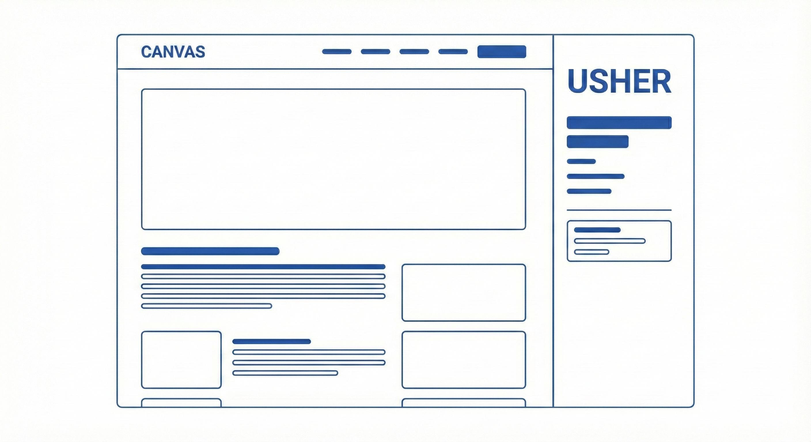
Wireframes
Before moving into high-fidelity design, lowfidelity wireframes were created to establish the core structure, navigation, and feature placement for Usher. These screens focus on functionality rather than aesthetics, helping validate essential user interactions early in the process.
Your guide to relevant resources
Splash screen
Establishes brand identity & sets the tone.
USHER
Welcome to USHER
Access with your University
Type the name of your university...
OR
Continue with Google
Continue with Microsoft
Welcome to USHER
Access with your University
Type the name of your university...
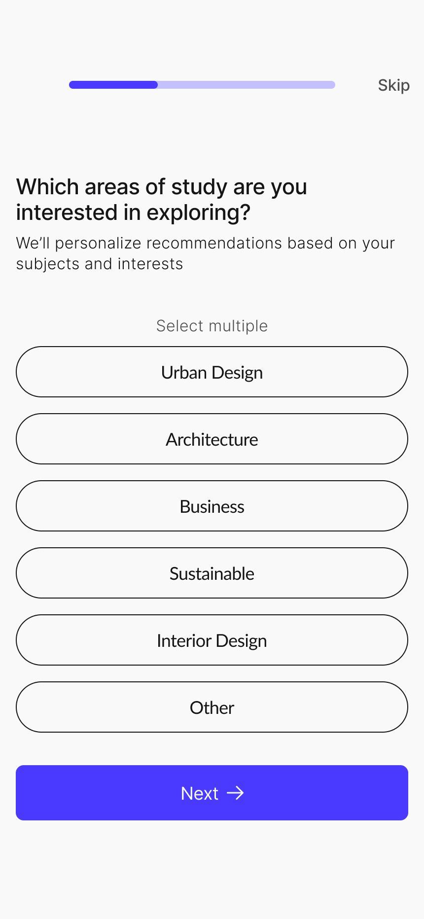
Which areas of study are you interested in exploring?
Lorem ipsum dolor sit amet consectetur. Turpis porta aliquam enim libero nunc nunc.
Select multiple
Lorem Ipsum
Lorem Ipsum
Lorem Ipsum
Lorem Ipsum
Other
Lorem ipsum dolor sit amet consectetur. Turpis porta aliquam enim libero nunc nunc.
We’ve synced details from Canvas Lorem ipsum dolor sit amet consectetur. Turpis
Name
Lorem Ipsum
Campus Key
Lorem Ipsum
Email
Lorem Ipsum
Course
Lorem Ipsum
Classes Registered this Semester Lorem Ipsum
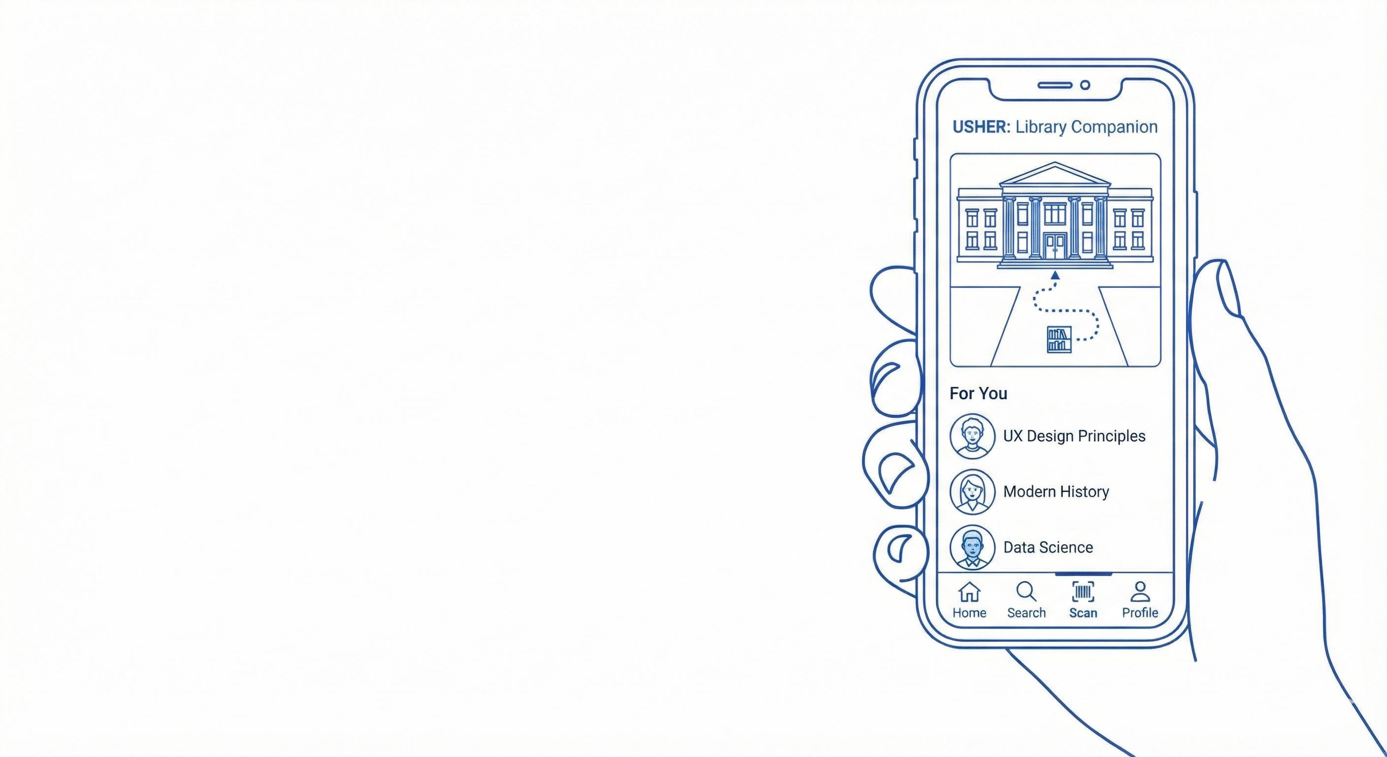
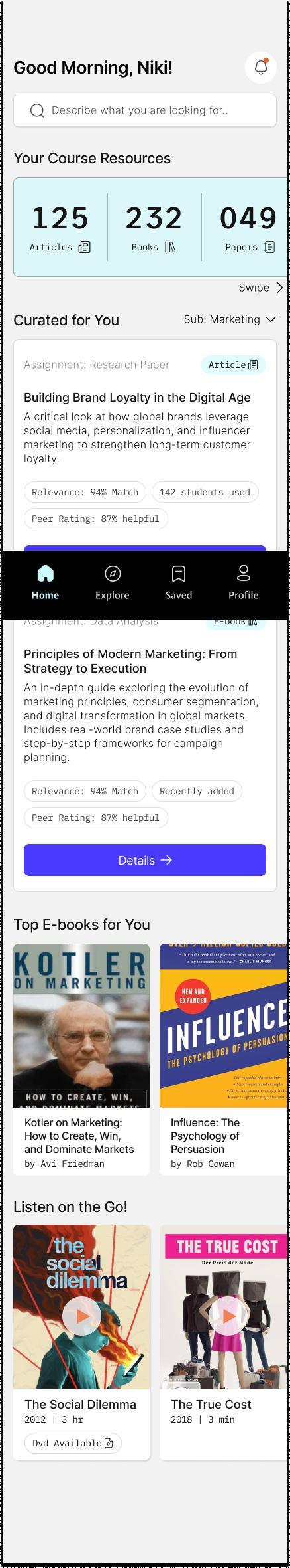
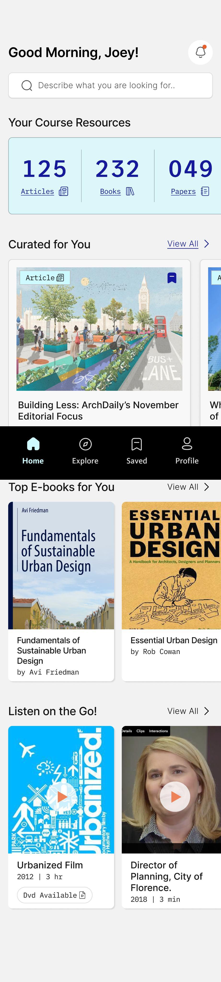
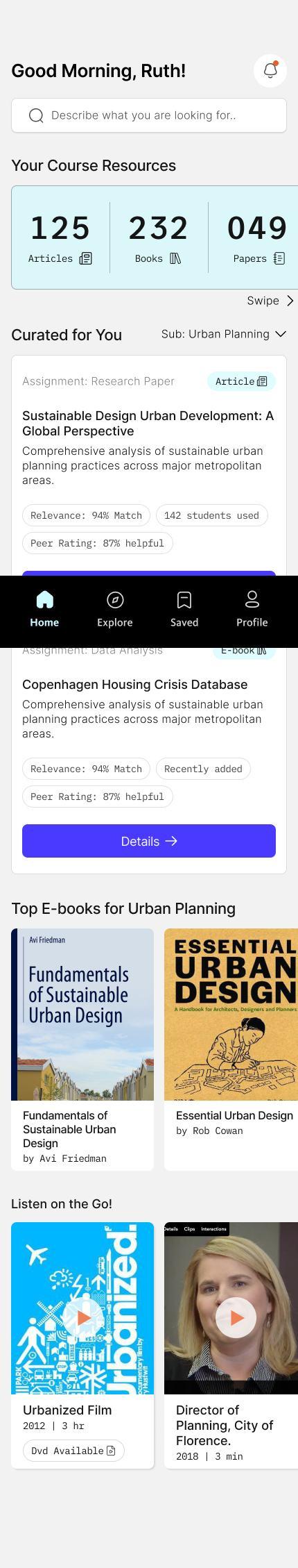
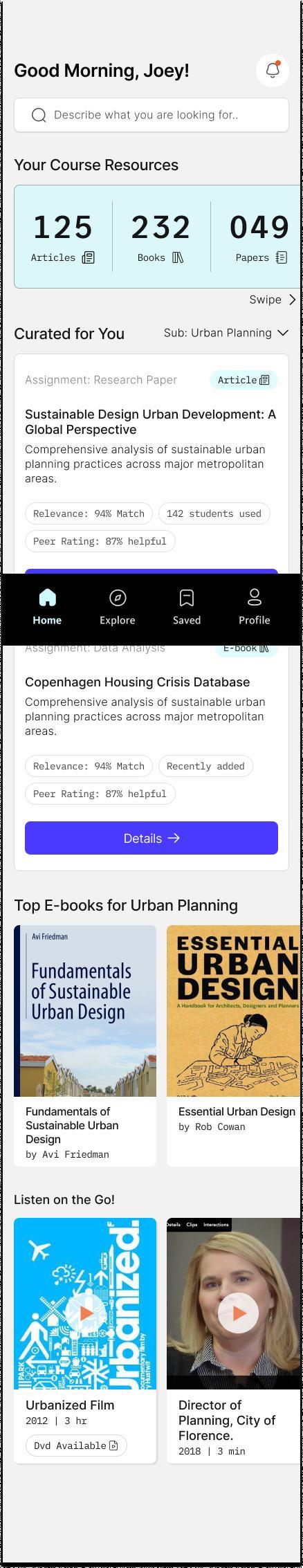
Good Morning!
Describe what you are looking for.. Your Course Resources
Curated for You Sub: Urban Planning
Assignment: Lorem Ipsum
Lorem ipsum dolor sit amet consectetur. Turpis porta aliquam enim libero nunc.
Lorem ipsum dolor sit amet consectetur. Turpis porta aliquam enim libero nunc nunc.
Tags: Lorem ipsum Tags: Lorem ipsum
Assignment: Lorem Ipsum
Lorem ipsum dolor sit amet consectetur. Turpis porta aliquam enim libero nunc.
Notifications
Selected tag Tags Tags Tags
Today
Lorem ipsum dolor sit amet consectetur. Turpis porta aliquam enim libero nunc.
Lorem ipsum dolor sit amet consectetur. Turpis porta aliquam enim libero nunc nunc.
Tag
Lorem ipsum dolor sit amet consectetur. Turpis porta aliquam enim
Lorem ipsum dolor sit amet consectetur. Turpis porta aliquam enim libero nunc.
Lorem ipsum dolor sit amet consectetur. Turpis porta aliquam enim libero nunc nunc.
Tag
Date
Lorem ipsum dolor sit amet consectetur. Turpis porta aliquam enim libero nunc.
Lorem ipsum dolor sit amet consectetur. Turpis porta aliquam enim libero nunc nunc.
Tag
Describe what you are looking for..
Top
Lorem ipsum dolor sit amet consectetur. Turpis porta aliquam
Lorem ipsum dolor sit amet consectetur. Turpis porta aliquam enim
Tags: Lorem ipsum
E-books
Lorem ipsum dolor sit amet consectetur. Turpis porta aliquam
Lorem ipsum dolor sit amet consectetur. Turpis porta aliquam
Written by Published date Reading time 00%
Lorem ipsum dolor sit amet consectetur. Turpis porta aliquam enim
Relevance 00% Peer rating 00 Students used
Tags: Lorem ipsum
Access on your Laptop
Lorem ipsum dolor sit amet consectetur. Turpis porta aliquam enim libero nunc nunc.
ipsum dolor sit Lorem ipsum dolor sit
Lorem ipsum dolor sit amet consectetur. E get vel ultrices eu risus varius nullam odio. Sodales dolor sit blandit sodales imperdiet nam cras neque. A met vitae pulvinar ac facilisis enim dui
Describe
Recent Searches
Your
Trending in your course
Trending topic 1
Trending topic 2
Trending topic 3
How this helped?
These screens helped:
Lorem ipsum
Lorem ipsum
Lorem ipsum
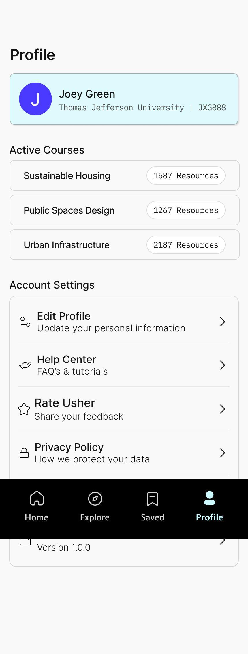
Account Settings
Edit Profile
Lorem ipsum dolor sit amet.
Help Center
Lorem ipsum dolor sit amet.
Privacy Policy
Lorem ipsum dolor sit amet.
Terms of Service
Lorem ipsum dolor sit amet.
About Usher
Lorem ipsum dolor sit amet.
Profile Screen
Define key screens across the journey
Test navigation paths before visual design
Connect features directly to research insights
Align stakeholders with product direction
Through this stage, gaps were identified in search, guidance delivery, and interestbased recommendations, which informed later design decisions.
Mood Board
The mood board establishes the visual direction for Usher, drawing inspiration from clean, minimal, and connected design elements. Shades of blue were chosen to convey trust, clarity, and focus qualities essential for an academic support tool. The imagery reflects simplicity, calm structure, and modernity, guiding the overall tone for the interface and helping ensure the app feels approachable, organized, and visually cohesive.
Structured
Serene
Creating the Visual Language
Colors
Primary Color HEX #4A3AFF White HEX #d9d9d9
#4A3AFF
Secondary Color HEX #CCFAFE Black
#151515
Creating the Visual Language
Logo
Buttons
Active State
Disabled State
Primary Button Secondary Button
Relative to screen width
Navigation bar Spacing
2 column grid Type - Center Gutter width - 16px Margin Width - 16px
Button
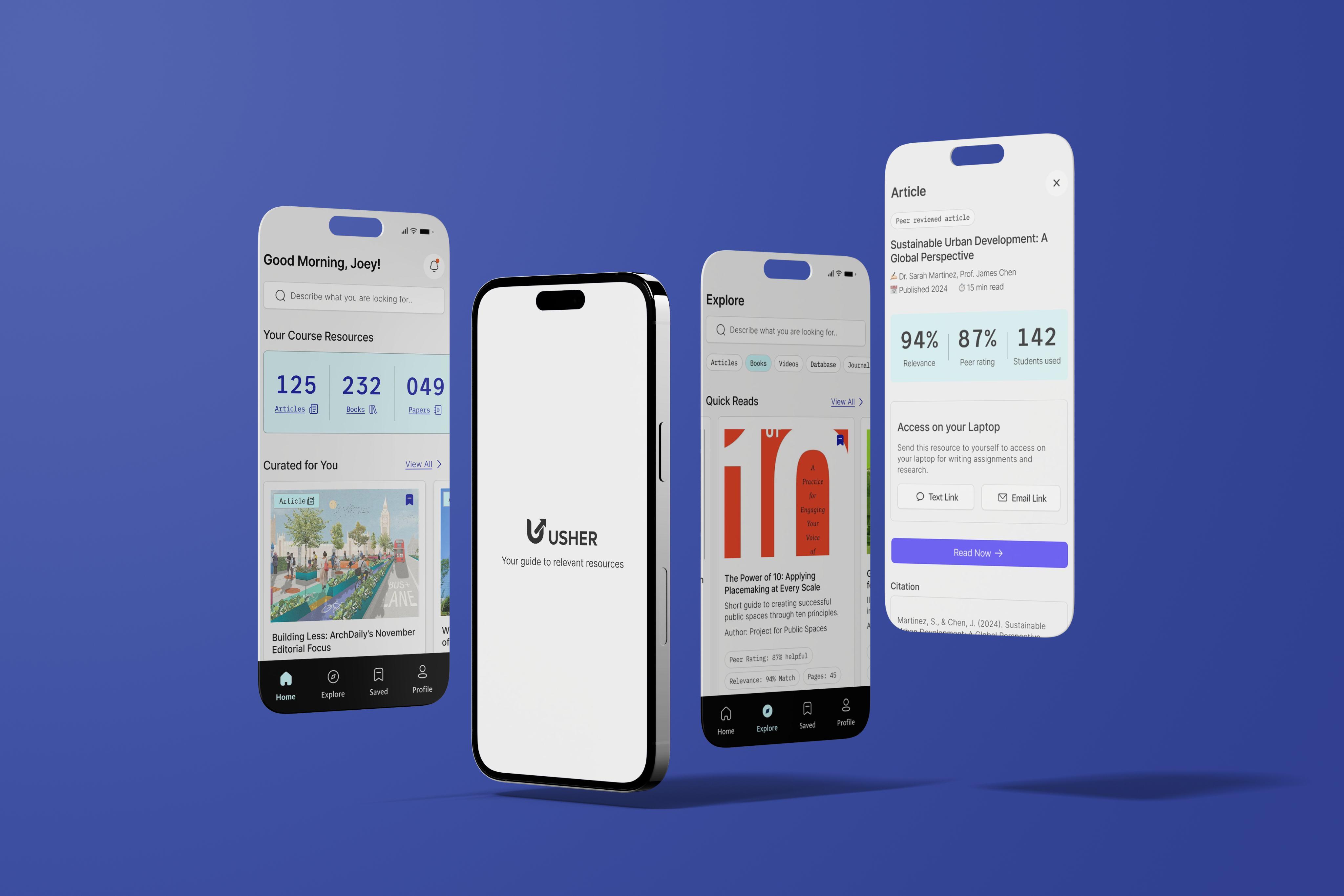
Final Interface Designs
Students quickly search and select their university from the global directory. App opens with the splash screen while system loads resources in background.
Multiple secure sign-in options let students easily access their account.
A confirmation card displays university details before redirecting to campus login.
Secure university SSO ensures no student login data is stored in Usher. Syncing screen shows progress while library & Canvas data integrates.
Final Interface Designs
Students review synced details to verify accuracy before continuing setup.
Usher ersonalizes recommendations based on selected academic interests
Preferred resource types to tailor homepage content recommendations.
Students set reminders preferences to receive timely updates
Personalization screen processes data to generate a tailored research experience.
Short onboarding tips help new users understand core features instantly & clearly.
Final Interface Designs
Search option placed upfront for quicker access to relevant resources.
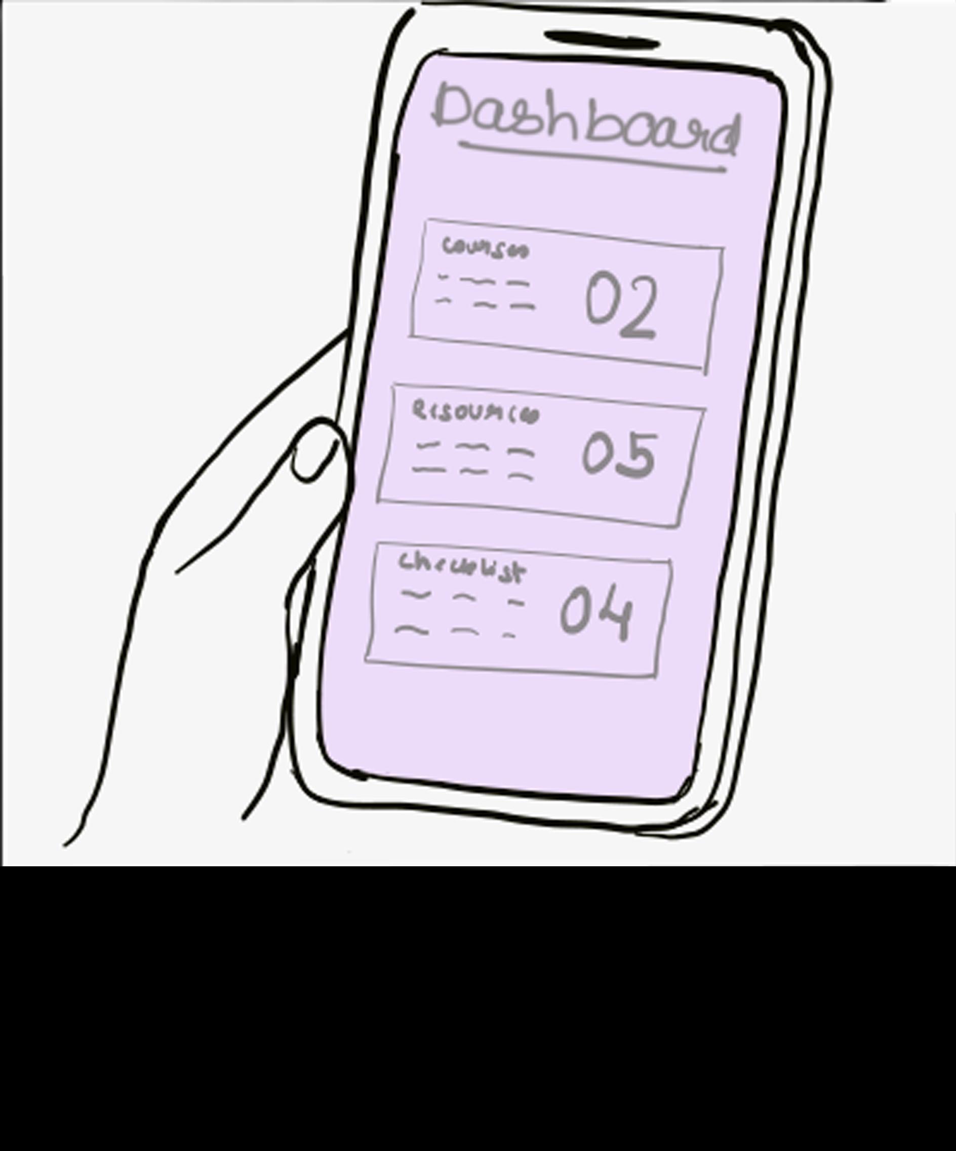
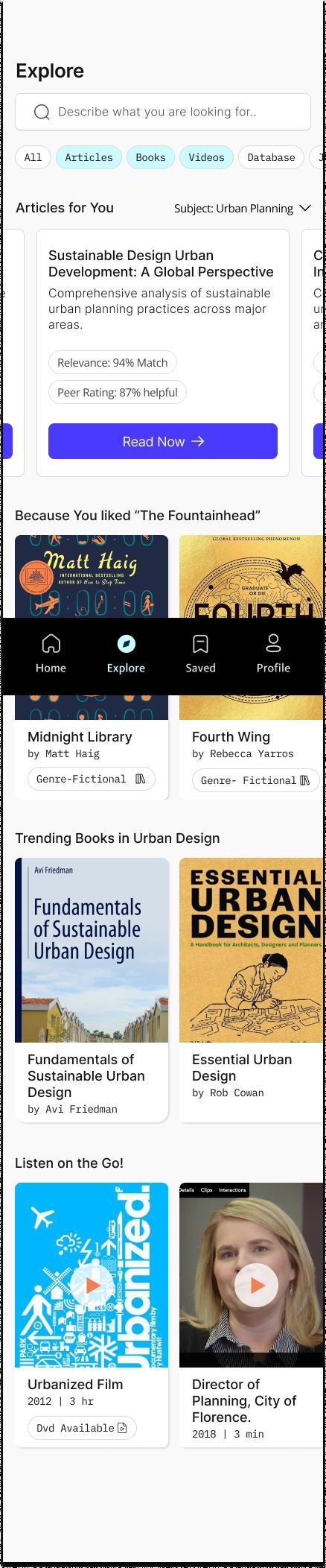
Dashboard displays the total number of articles, books, and papers available for each course.
(This directly addresses interview feedback where students felt the library lacked sufficient coursespecific materials.)
Curated recommendations appear based on the student’s enrolled subjects.
Home Screen
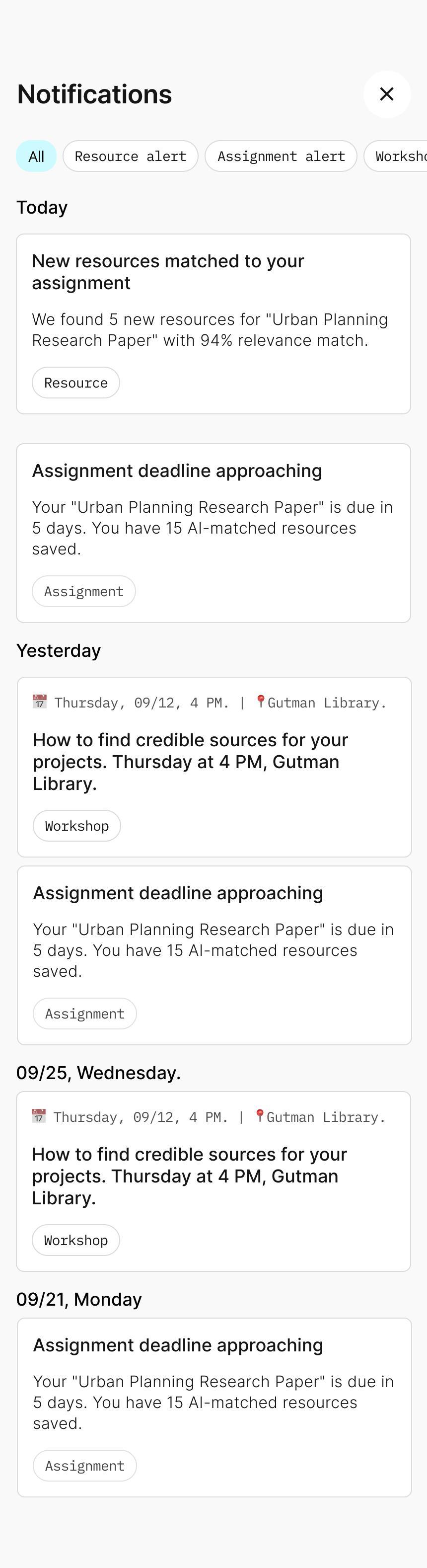
Notifications can be checked from here
Swipe interactions allow students to explore more recommendations effortlessly.
Home page can be curated based on the subjects
Resource cards show key information at a glance such as match percentage and peer rating, helping students make quicker decisions.
Centralized navigation bar makes it easy to move between core sections of the app.
Notifications
Filter tags help students view only the updates that matter to them.
Search bar positioned consistently across screens to reinforce discoverability.
Contextual labels on each card clarify whether it’s a new resource match, an assignment deadline, or a workshop reminder. Timely nudges encourage students to use trusted materials before deadlines, promoting healthier research habits.
Filter chips reduce friction by letting students narrow down resource types instantly.
Subject and course-based studentsfiltering helps discover materials aligned with their current academic needs. Additional sections like “Because You Liked…” provide personalized discovery paths inspired by successful media apps.
Final Interface Designs
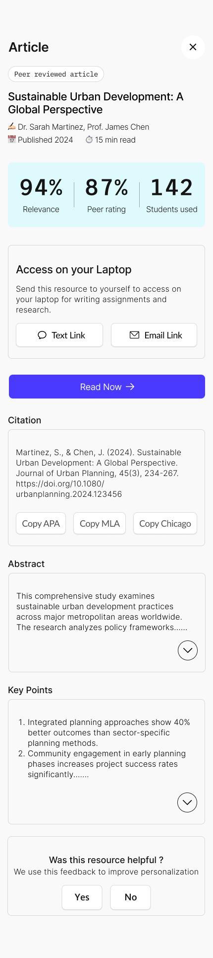
Peer-review indicators build trust by making credibility visible upfront.
Clear metadata helps students decide quickly whether the resource is relevant.
Direct ‘Read Now’ link takes students straight to the PDF, unnecessaryreducing steps.
Resource Detail
Provide social proof and help students gauge academic value at a glance.
Laptop access options support smoother assignment workflows, since most academic writing is done on laptops.
Citation options are provided at the bottom, allowing students to copy or export with a single tap.
Search bar consistently placed across screens to reinforce familiarity and improve discoverability.
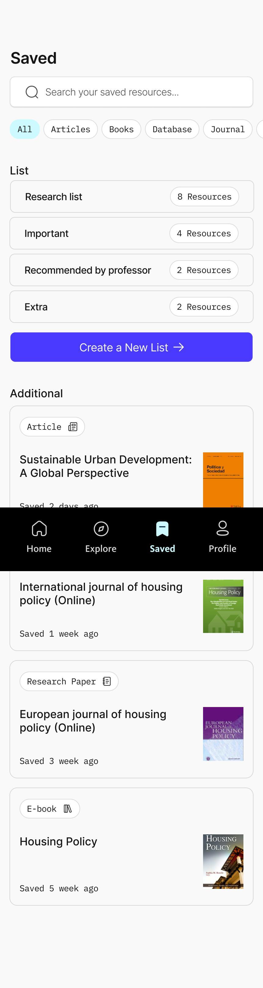
Filter tags help students sort saved items by type
Each list displays the number of resources it contains, giving quick insight into organization.
Option to create new custom lists supports different research contexts
Cards show quickly saved resources even if they are not yet categorized into lists.
Profile displays the student’s name and university, synced automatically through Canvas for a seamless onboarding experience.
Current active courses are listed with resource counts so students always know how many materials are available per class.
This chapter presents the usability testing process and explains how real student interactions shaped the refinement of Usher. The goal of testing was to observe whether the app enabled students to find credible, course-aligned resources with clarity, confidence, and minimal friction. Seven participants completed realistic research tasks that reflected their daily academic workflow.
Through these sessions, I identified patterns in how students navigated the app, interpreted information, and interacted with key features. The findings revealed both strengths and areas requiring greater simplicity and clarity. These insights guided the next round of design improvements to ensure the app aligned with students' natural research habits and the expectations set during onboarding.
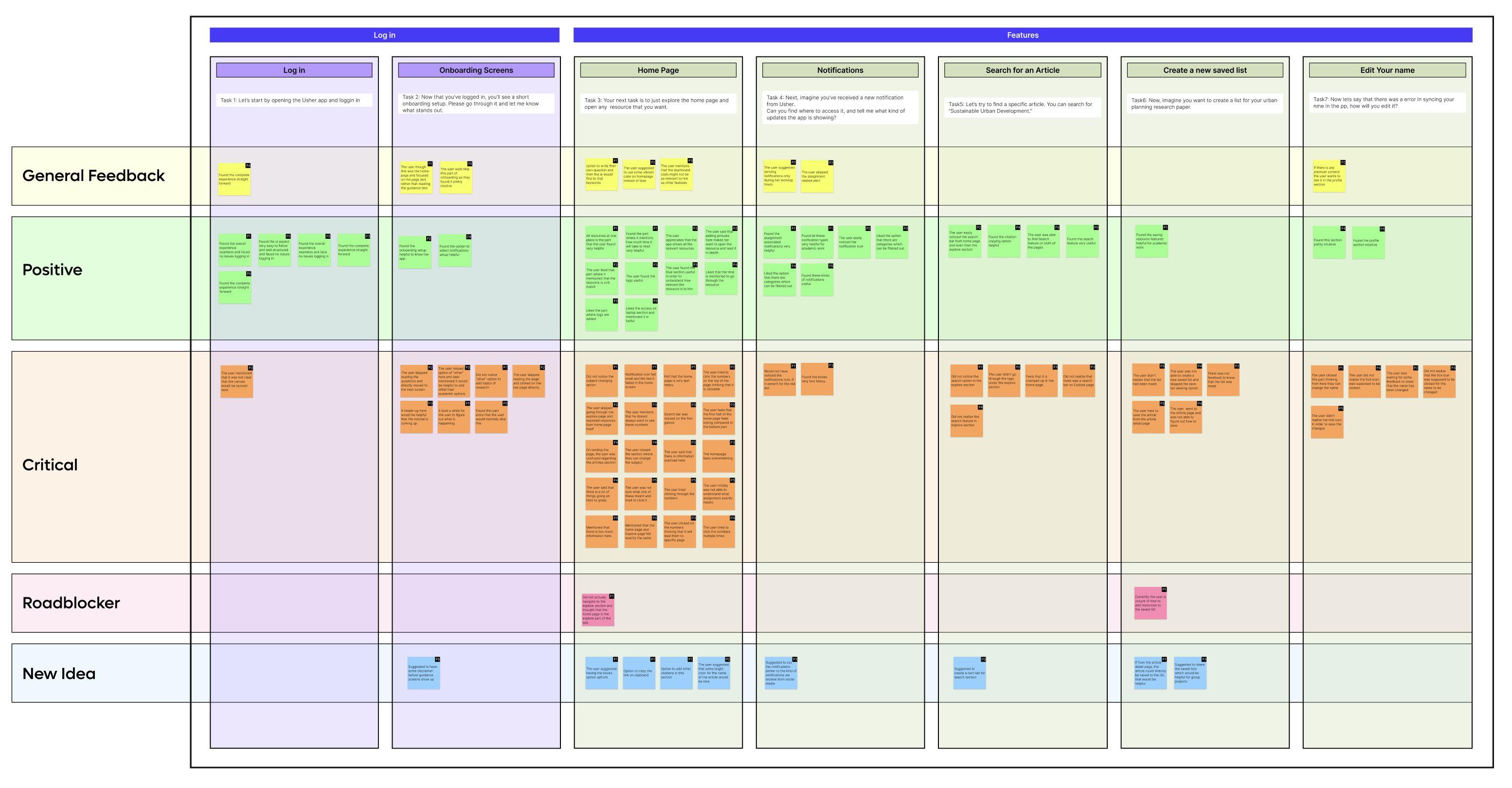
Testing Guide
A structured template was created to document feedback immediately after each usability interview. All comments were organized into six categories: general feedback, critical notes, positive feedback, major roadblockers, new ideas or suggestions, and prototype changes.
These tasks were selected because they reflect common academic behaviors such as logging in through university credentials, discovering resources, refining preferences, staying informed through alerts, and organizing saved materials.
Task 1
Please begin by opening the Usher app and logging in.
Task 2
Once you're logged in, you’ll see a brief onboarding flow. Go through it and share anything that stands out to you.
Task 3 Next, explore the home page and open any resource that interests you.
Task 4
Task 5
Now, imagine you’ve received a new notification from Usher. Find where to view it and tell me what updates the app is showing.
Task 6
Let’s try searching for a specific article. Please look up “Sustainable Urban Development.”
Task 7
Now imagine you’re creating a list for your urban planning research paper. Go ahead and create that list.
Finally, let’s say there was an error syncing your name in the app. Show me how you would edit it.
Testing Results
All task outcomes, verbal comments, and behavioral observations were consolidated and reviewed to analyze overall usability. Participants also rated their experience on navigation, visuals, and feature usefulness.
Key Findings
Across sessions, students responded positively to personalization, curated recommendations, and the clarity of the resource detail page. However, they also encountered several friction points, especially during saved list and the profile experience.
Overall Satisfaction Highlights
Navigation: Strong, but a few areas felt dense or visually overwhelming
Visuals: Clean and modern, but certain screens were too text-heavy
Features: Highly valuable, especially notification alerts and curated content
Priority Matrix
Critical feedback from testing was grouped into themes and mapped onto a priority matrix. Issues that affected the highest number of participants and created the most confusion were prioritized.
Highest Priority Issues
Users expected the resource numbers on the homepage to be interactive
The homepage felt text-heavy and required effort to scan
Multiple filter options on the Explore page caused visual overload
The “Other” category in onboarding was often overlooked
These findings guided the next round of design changes to improve clarity, navigation, and content visibility.
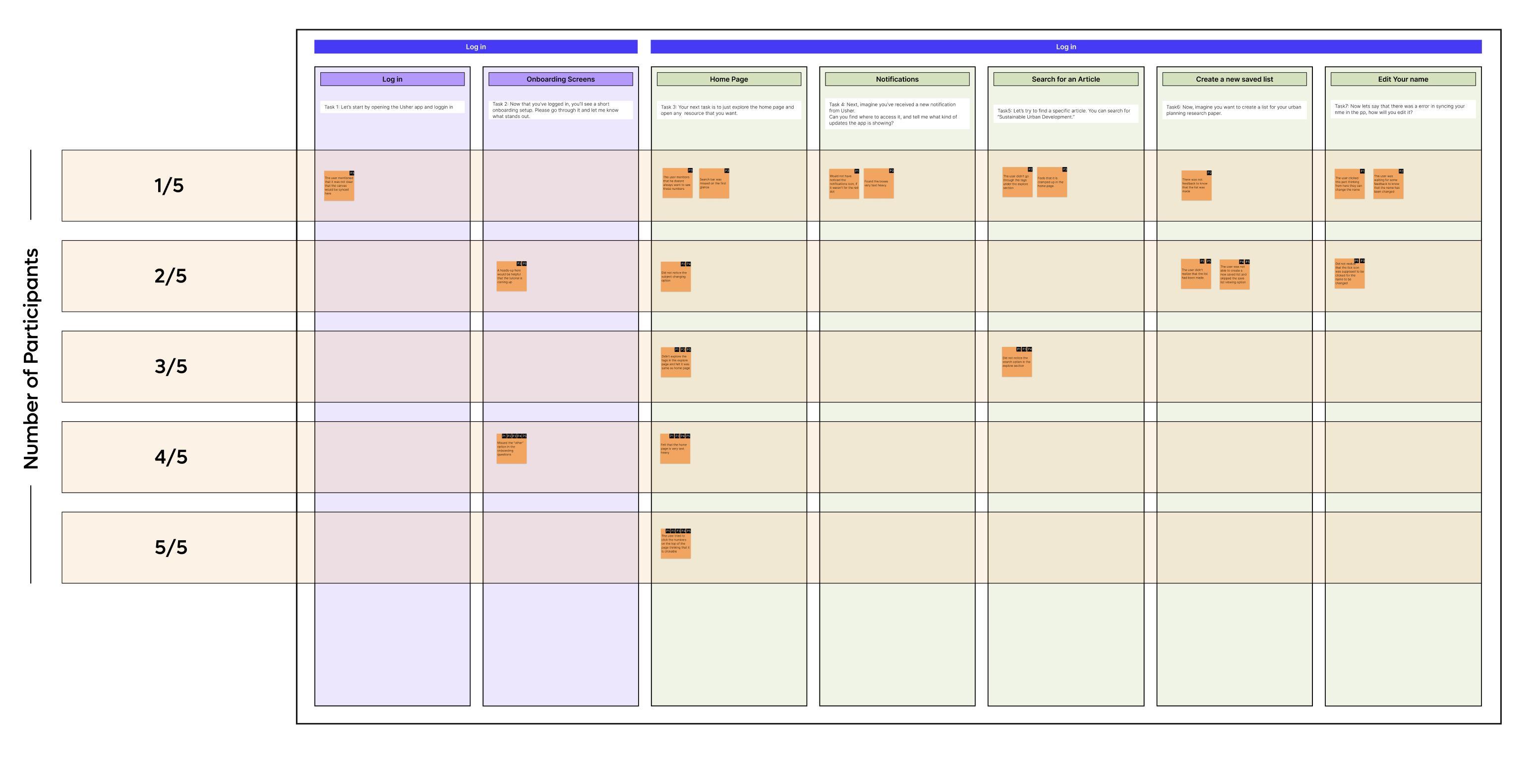
Number of Participants
Task Analysis
The numbers seem to be clickable. If not clickable, the user might not want to see it every time they open the app
“I really like it, but I don't know if this is relevant as relevant to me as the other things.” -P3
Missed out the other part in the onboarding which is very essential for the overall app experience.
“I was just curious like what if I don't want to read like academic stuff? ”P2
This section highlights key observations from task-by-task analysis during usability testing. Each task revealed specific usability strengths and friction points, supported by direct participant quotes. These insights guided targeted improvements across onboarding, homepage clarity, and resource interactions.
The option to access on laptop in resource detail page is something every student found relevant in their academic research
“I really liked this feature and I research a lot, so this is something i see myself like using.” -P4
There is information overload in the first section of the homepage
“I did not even explore this like I did not scroll down because I was so overwhelmed with all that information ” -P3
Insights & Next Steps
This section summarizes the key insights gathered from the task analysis and outlines the simplest, most actionable next steps. Each issue was mapped to a direct improvement that enhances clarity, reduces confusion, and strengthens the overall usability of the app. These refinements focus on improving onboarding, simplifying navigation, and reducing cognitive load across core screens.
No. Issue faced
1 Missed the “Other” option during resource subject selection
2 Clicked the resource numbers on the home page assuming they were interactive
3 The home page felt text-heavy and caused information overload
4 Multiple filter options on the Explore page created confusion for users
Simplest change
Add clearer prewritten options, including a more visible “Other” category
Make the resource numbers clickable and direct users to the corresponding resource list
Replace some text-heavy sections with visual cards to improve scanability
Limit the Explore page to a single, clearer resource filter to reduce confusion
Implementation
Users interpreted the resource numbers as interactive elements and expected them to open category-specific pages.
The homepage presented dense text content, making it difficult for users to quickly scan or focus.
Problem
Resource numbers were made interactive to match user expectations and support quicker navigation.
Text-heavy cards were redesigned as visual image cards to create a more balanced and approachable homepage layout.
Implementation
Pre-selected resource filters surfaced different content types simultaneously, making the Explore page feel inconsistent and difficult to parse.
A single resource type is now selected by default, and users can switch categories using the filter tags above, reducing visual overload and improving clarity.
Implementation
Problem
The “Other” category was often ignored during onboarding, causing gaps in personalization when users later asked for non-academic resources.
Expanded subject options ensure users see clearer, more relatable choices, reducing the likelihood of skipping key inputs and improving recommendation accuracy.
Prototype
Scan here to access the full prototype
07
Market validation
Risky Assumptions Matrix
Pretotype Strategy
Fake Front Door
Mechanical Turk
Pinocchio
Pretotype Results
Insights
Market Validation
This chapter focuses on identifying and testing the core assumptions that determine whether USHER can succeed in the real world. Insights from interviews, affinity mapping, and user-journey analysis revealed deeper behavioral patterns behind why students avoid library systems and default to external tools. These findings shaped USHER’s strategic direction, highlighting the need for clarity, personalization, and strong alignment with coursework.
Three major risky assumptions emerged:
Students will value curated, coursespecific recommendations over general search.
Students will use library resources more often if the experience is easier and more connected to their workflow.
Students will download and actively use a separate mobile application.
These assumptions informed the pretotyping strategy, allowing early validation of desirability before investing in development.
Risky Assumptions
Primary research with 12 students revealed a consistent challenge: library systems feel overwhelming, disconnected from assignments, and difficult to navigate. These insights were mapped onto a certainty–risk matrix to identify which beliefs posed the greatest threat to USHER’s success.
Behavior-related assumptions, such as adopting a new app or preferring curated content over familiar tools, were categorized as high-risk and uncertain.
Academic and technical factors, such as relevance or trust, fell into moderate-risk zones.
Top 3 risky assumptions
Students will value personalized curation over general search.
Students will download and actively use a separate app
Students will use library resources if they are easier to access.
This matrix informed the sequence of pretotyping tests, starting with the assumptions most likely to fail.
High Risk
Universities will allow Canvas + Library integration
Students will actively use the app for resources
Students will be comfortable sharing assignment/ course data
Certain
Universities will trust a 3rd party tool with student data
More academic resources will be utilized
Students will appreciate having resources centralized
Students will use library resources if they are easier to access.
Students will download and actively use a separate app
Students will value personalized curation over general search.
Uncertain
Students will use the saved resources feature regularly
Universities will want analytics on student engagement
AI recommendations will feel relevant
More credible resources will be used in assignments
Low Risk
Pretotype Strategy
Risky Assumption
01
02
Students will download and actively use a separate mobile application.
XYZ statement
At least 5% of students who walk past the posters should scan the QR code, and at least 10% of those visitors should sign up for early access.
Students will use library resources if they are easier to access.
03 Students will value personalized curation over general search.
At least 3 out of 5 students who are shown a simple prototype of curated, course-specific resources should state that it feels easier and more convenient than browsing the actual library website.
At least 4 out of 8 students who receive a curated set of coursespecific articles should indicate that they prefer curated recommendations over searching on their own using general tools.
Pretotype Method
Fake Front Door
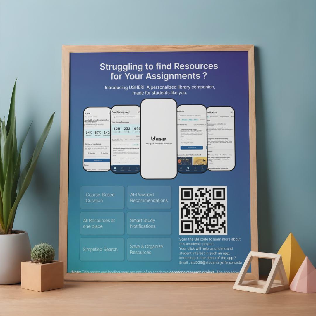
Pretotype Plan
A facade website will be created and paired with posters containing QR codes. Scanning the code will lead students to the site, allowing tracking of page visits and sign-ups to measure interest.
Mechanical Turk
5 students will be shown a prototype tailored to their course and subject. Afterward, a short Google Form will be sent to ask whether they would use the library resources if provided in this curated way.
Pinocchio
8 students will receive resource recommendations based on their subject and assignment. A follow-up Google Form will ask whether, if given the choice again, they would use Google or the app.
Fake front door
An estimated 7,000 students on the East Falls campus, approximately 4,000 students would walk past the poster across 10 different places, over the course of 7 days. If 5% of them scan the QR code and open the website (around 200 students), the Fake Front Door experiment would be considered successful. Additionally, if 10% of those visitors choose to sign up, it would further validate strong interest in the concept.
Actual visitors - 79 (~1.9%) Actual sign ups - 05 (~6.33%)
Initial hypothesis
At least 5% of students who walk past the posters should scan the QR code, and at least 10% of those should sign up for early access.
Expected visitors 200 (5%)
Expected Sign ups 20 (10%)
Failed hypothesis
1.9% students scanned the QR code out of which only 6.33% students signed up for early access resulting in failure.
Mechanical Turk
To understand whether students will prefer to use library resources if provided in this curated way, I conducted a Mechanical Turk style quick prototype test. Students were shown a simple, high-fidelity mockup of a personalized resources page and asked whether if they would use the library resources if provided this way. The goal was to validate whether curated content could make the students use more resources that the university is providing and increase engagement with academic materials.
Across the test, students consistently expressed that having resources grouped by course and assignment felt clearer, more organized, and far easier to navigate. The curated layout helped them immediately recognize what was relevant to their current academic workload, reducing the time and effort typically spent searching through the library interface.
Analytics
5/5
Students who used the app stated they would use more library resources if presented in this curated format. 4/5
Students specifically mentioned that curated course content made it easier to find credible and helpful materials.
Initial hypothesis
At least 3 out of 5 students who are shown a simple prototype of curated, course-specific resources should state that it feels easier and more convenient than browsing the actual library website.
Validted hypothesis
All students reported that they would use library resources more often if they were provided in a curated format. Four students mentioned that the curated resources were helpful, easier to use, and reduced the effort required to find relevant content.
Pinocchio
To evaluate whether students value curated, course-specific resources over general search, I manually created personalized bundles of academic articles for 8 students based on their assignment topics.
After reviewing the curated set, each student completed a short form comparing this
experience to their usual method of searching through Google or the library website.
This pretotyping method helped validate whether curated recommendations reduce search friction and improve relevance, confidence, and trust in the materials used for coursework.
Analytics
6/8
Rated the curated resources 8/10 or higher, indicating high usefulness for their current assignments.
6/8
Chose Usher over Google when asked which method felt more relevant to their topic.
Initial hypothesis
At least 4 out of 8 students who receive a curated bundle of course-specific academic resources should indicate that they prefer curated recommendations over searching on their own through general tools like Google or the library website.
Validted hypothesis
The hypothesis was validated, as 6 out of 8 students (75%) found curated resources more relevant and more useful for their coursework than general search. A majority also expressed higher trust, confidence, and intent to use curated library recommendations in the future.
Pretotype Results
Risky Assumption
01
02
At least 5% of students who walk past the posters should scan the QR code, and at least 10% of those visitors should sign up for early access.
03
At least 3 out of 5 students who are shown a simple prototype of curated, course-specific resources should state that it feels easier and more convenient than browsing the actual library website
At least 4 out of 8 students who receive a curated set of course-specific articles should indicate that they prefer curated recommendations over searching on their own using general tools.
Results
1.9% students scanned the QR code out of which only 6.33% students signed up for early access resulting in failure.
All students reported that they would use library resources more often if they were provided in a curated format while 04 stated that the curated resources were helpful and easier to use.
6 out of 8 students mentioned that if they had to do the research again, they would choose Usher than Google to find relevant resources
Insights
Insight 1
Students will not adopt a new app just because it exists. They need to see immediate, obvious value. USHER must prove usefulness first, instead of relying on app-based adoption.
Insight 2
It’s not the library resources that students struggle with, it’s the discovery experience. A clear, organized, course-aligned resource interface significantly reduces effort and increases confidence.
Insight 3
Students want content that is contextual, credible, and directly tied to their assignments. Personalized curation eliminates guesswork and improves trust in the materials they choose.
What This Means for USHER Moving Forward
Discovery remains the biggest barrier, and USHER’s strongest value lies in removing that friction.
The Fake Front Door experiment showed that students will not download a new app without first experiencing its usefulness.
Connecting USHER directly with Canvas and course assignments ensures the tool appears where students already work.
The Morsel and Mechanical Turk tests clearly showed that curated, pre-filtered academic content significantly improves engagement and trust.
One additional opportunity is to collaborate with the university to introduce USHER during new student orientation, where students can be guided to install the app as part of their academic setup. If faculty also reference USHER in their course materials or recommend it for assignments, students will begin using it early and once they actually experience curated, course-linked resources, they will naturally recognize its value and continue using it.
strategy
Business Mission
SWOT Analysis
Success Matrix
Goals
Business Strategy
This chapter evaluates how USHER fits within real university systems, academic workflows, and institutional expectations. Insights from conversations with professors, librarians, and administrators helped determine the feasibility of integrating USHER into existing infrastructures such as Canvas, library databases, authentication systems, and onboarding pipelines.
By understanding institutional constraints, adoption patterns, and workflow behavior, this chapter establishes what is realistically achievable now, and what would require longterm university partnerships. Ultimately, this section outlines the pathway for transforming USHER from a student-facing concept into a scalable, university-supported academic tool.
Business Mission
Weakness
To strengthen student engagement with library resources by delivering personalized, curriculum-aligned recommendations that support academic success.
This section defines USHER’s Business Model Canvas and details the ecosystem of partners, activities, resources, and revenue structures needed for long-term sustainability and institutional adoption.
Key Partners Key Activities
Universities – adoption, Canvas integration, and funding support.
Library platforms – Ex Libris, EBSCO, ProQuest (resource APIs).
LMS providers – Canvas, Blackboard, Moodle.
AI & cloud partners – Google Cloud, AWS, Microsoft Azure.
Research publishers – JSTOR, Elsevier, Springer for metadata.
Integrating Canvas and library APIs.
Developing and maintaining the app
Building AI recommendation and tagging algorithms.
Conducting user testing and UX improvements.
Partnering with universities and library systems for onboarding.
Key Resources
App development tea m
AI model trained on academic data.
API access to Canvas, Ex Libris, EBSCO, ProQuest, or similar.
Cloud hosting and data security infrastructure.
Partnerships with university libraries and LMS.
Value Proposition Customer Relationships
Personalized academic resource discovery for students.
AI-driven recommendations based on courses, assignments, and interests.
Single, intuitive interface connecting Canvas + university library systems.
Time savings — no need to manually search multiple portals.
Increased library engagement for universities.
Insights for librarians to understand what students actually use.
Onboarding guides and in-app orientation for new users.
Feedback collection from students to refine suggestions.
Ongoing engagement through push notifications & reminders.
B2B relationship management with university IT and library staff.
Channels
University app stores / portals
Direct integration within Canvas.
University library websites and student newsletters.
Social media & student ambassador programs for awareness.
Workshops or campus events.
Customer Segments
Primary University students (undergraduate & graduate) Secondary University libraries Academic departments & IT administrators University management (for analytics & adoption metrics)
Cost Structure
App design and development (UI, backend, AI model training).
Cloud hosting and data storage costs.
Maintenance, updates, and bug fixes.
Licensing or API access costs for library data.
Data privacy, encryption, and compliance auditing.
Marketing, workshops, and onboarding materials.
Revenue Streams
Institutional licensing (B2B model)
Subscription fee from universities for student access.
Tiered pricing by enrollment size or features.
Data insights dashboard (premium add-on for universities):
Anonymous usage analytics to guide library acquisitions.
Consulting & custom integrations for different library systems.
SWOT Analysis
Strengths Weakness
Personalization: the app gets info from canvas and provides recommendations of assignmentspecific, relevant resources.
AI Guidance: the app explains why a resource is useful, reducing overwhelm.
Accessibility: Mobile-first design which leads to usage of resources available anytime, anywhere.
Engagement: Smart notifications keep students updated on new content related to their course and interest.
Opportunities Threats
Scalability Across Departments: Once proven, app can expand beyond one university.
Integration with other LMSs or publishers.
Provide insights on student resource usage, helping libraries justify subscriptions.
Features like auto-summaries, citation generation, or reading recommendations tailored to deadlines.
Audio summaries, text-to-speech for inclusive learning.
Existing solutions like CampusM, Leganto, or Ex Libris may add similar personalization.
Handling student course data + usage patterns requires strict compliance.
Faculty or library staff may hesitate to adopt a new tool alongside existing systems.
Universities might deprioritize funding for new software if they already pay for LMS + library systems.
Success Matrix
Increase in Library Engagement
Decrease in Finding Resources
Short Term Goals
Validate student interest and usability
Collect feedback from students through pretotyping, usability testing, and early MVP interactions.
Refine core features such as curated recommendations, search, Explore page, and onboarding.
Build trust with faculty and librarians
Share findings with library staff and gather expert input.
Ensure recommendations align with academic expectations and credible library content.
Strengthen accuracy of recommendations
Improve the relevance of AI-generated suggestions using Canvas assignments and subject tags.
Test tagging models for better course-toresource matching.
Establish pilot partnerships within the university
Launch a controlled pilot with one department or a small group of faculty.
Measure engagement, user satisfaction, and impact on research behavior.
Long Term Goals
Institutional Integration
Full campus-wide adoption where every student can access Usher through Canvas.
Seamless library + LMS integration supported by university IT and library systems.
Personalized learning ecosystems
Offer deeper personalization using AI, such as tailored study paths, topic discovery, and suggested resources based on academic progress.
Expand to additional universities
Adapt the system to work with different LMS platforms (Blackboard, Moodle).
Create scalable onboarding for partner institutions.
Faculty & librarian dashboards
Provide insights on resource engagement, popular topics, and student needs.
Help instructors and librarians decide what resources to acquire or highlight.
Monetization & sustainability
Implement a B2B licensing model for universities.
Optional premium analytics dashboards for administrators.
Broader academic support features
Citation helpers, study tools, cross-course insights, and integrated note-taking.
Potential student-to-student academic collaboration features.
09 Development
Development
Usher was developed by translating user needs into clear functional components. Research insights revealed three core problems students consistently faced:
Difficulty finding course-relevant library resources. Preference for simple digital solutions over complex systems. Limited awareness of what the library offers.
These findings guided every feature choice and shaped the product roadmap.
The development process focused on:
Seamless access through simplified login and Canvas sync
Personalization through onboarding preferences
Relevant discovery through curated dashboards
Efficient exploration through improved search and filters
Better organization through saved lists
Continuous engagement through smart notifications
Feature
Log in Log in Log in
Splash Loading
Multi-Option Login
University Directory
Description
Loads resources & initialization in background before login.
Students log in using Google, Microsoft, or university credentials.
Students search and select their university from a global list.
Log in Log in Log in Onboarding Onboarding
Confirmation Modal Secure SSO
Canvas & Library
Sync
Canvas Review
Academic Interests
Displays selected university details before redirecting to SSO.
Redirects to campus login page; no credentials stored in Usher.
Sync progress for course and resource data.
Students confirm their synced details before setup.
Students select areas of study for better personalization.
Functional Requirement
Preload layout, app assets, and institution list.
Validate secure tokens.
Fetch and filter university data.
Trigger modal and apply selected institution.
Authenticate through institution; return token.
Fetch Canvas profile, course list, and library permissions.
Display student info and course list.
Store interest tags.
Page
Onboarding
Feature Description
Preferred Resource Types
Students choose preferred formats, ebooks, journals, videos.
Onboarding
Reminder Preferences
Students set notification types (push, email, SMS).
Onboarding
Feature Tips
Introduces core features through small tooltips.
Dashboard
Personalized Greeting
Time-based greeting with search bar.
Dashboard
Resource Summary
Curated Course
Dashboard
Resources
Displays total articles, books, papers per course.
Alert students of upcoming deadlines with recommended readings.
Notifications
New Resource Alerts
Notify when new items align with coursework.
Notifications
Workshop Alerts
Notify of library events & skill workshops.
Notifications
Filter Tabs
Separate alerts by type.
Explore
Global Search
Search across databases with improved filters.
Explore
Subject Cards
Explore
Trending Section
Resources grouped by subject.
Shows trending resources in the student’s department.
Explore
Content Type Tabs
Articles, journals, ebooks, videos, databases.
Functional Requirement Content Type
Content Source
Detect deadlines & match resources.
Trigger relevance scan for new materials.
Read events feed & generate notifications.
Tab-based filtering.
Federated search across sources.
Query by subject tags.
Track popularity & usage.
Apply filter states.
Page Feature
Description
Article
Abstract & Summary
Short description of the resource.
Article
Access Options
Text Link & Email Link for easy laptop access.
Article
Saved
Citation Search Saved Items
Provide formatted citations.
Filter saved resources.
Saved
Recent Saves
Quickly view new additions.
Profile
Settings
Edit profile details, notifications, privacy.
Profile
Profile
Help Center Rate Usher
Library FAQs & video tutorials.
Submit feedback or ratings.
Functional Requirement
Display metadata.
Trigger external link actions.
Display APA/MLA formats.
Search through stored items.
Timestamp sorting.
Save updates.
Display static help content.
Store feedback.
10
Key learnings
Key Learnings About Me
Resume Program Reflection
Acknowledgements
Overview
This chapter summarizes the strategic and personal learnings that shaped Usher from a research insight into an institution-ready product. Through interviews, usability testing, and pretotyping, key patterns emerged about student behavior, institutional workflows, and the gaps that exist across academic systems. These learnings guided the success metrics, growth pathways, and value proposition that strengthen Usher’s long-term potential.
The chapter also reflects on the growth and transformation experienced throughout the program, highlighting the evolution of my design practice, mindset, and approach to research-driven problem solving.
Key Learnings Research
Pretotype
A student-centered experience
Institutional alignment
Growth strategy
About Me
Hi, I am Sweta. I am a UX designer with a foundation in interior and architectural design, and I have always been inspired by the way thoughtful design can make everyday experiences feel clearer, easier, and more meaningful. During my master's program at Thomas Jefferson University, I developed a strong interest in research-driven design and in creating digital products that genuinely support people’s needs.
Working on Usher has been a reflection of the skills I have gained throughout this program. It brought together research, strategy, and visual design to create something that can help students feel more confident and connected in their academic journey. Outside of design, I enjoy exploring creative hobbies, finding inspiration in small details, and discovering calm, aesthetic spaces that spark new ideas.
Sweta Devnani
User Experience Designer
Work Experience
Inverse Paradox UI/UX Design Intern
aug 2025 - Dec 2025
Designed sitemaps, wireframes, and responsive UI screens for 5+ client websites. Supported WordPress implementation and collaborated with developers to streamline handoff and reduce revision cycles.
Vivek Kadecha Design Studio Senior Designer
Oct 2020 - Nov 2023
Led interior design execution for residential, commercial, and hospitality spaces, ensuring functionality, aesthetics, and on-site delivery aligned with client expectations.
Selected Projects
Jefferson University Library Research
Conducted interviews with 12 students and the library director, synthesized findings into key insights, and designed a mobile app concept that offered AI-driven recommendations to improve resource awareness and enhance student engagement.
Constant Mobile App
Designed a stress management app using the Hooked Model. Improved usability and engagement through testing and iterative flows.
Sharp Clock Website Innovation Feature
Redesigned the user journey with an interactive virtual clock. Simplified post-purchase tasks and improved overall usability.
Education
Thomas Jefferson University J a n 202 4 - Dec 2025
Masters in User Experience Design
Gujarat Technical University Aug 20 14 - m ay 20 19
Bachelors of Architecture
Certificates
Google Coursera (6 months)
UX Design Professional Certificate
GenAI for UX Designers
About Me
Hello! I am a Philadelphia-based UX designer passionate about research-driven, inclusive experiences and exploring AI’s role in shaping future-ready design.
Contact
shwetadevnani.com
devnanishwetaa@gmail.com
+1 267 221 4035
Skills
User Research
User Interview
AI in Design Ideation
Design System
Rapid Prototyping
Visual Design
Wire framing
Prompt Engineering
User Testing
Competitive Analysis
Tools
Sketc h
Figma
Figjam
Framer
Web flow
Photoshop
Illustrator
Miro
M.S. Office
HTML + CSS
Lovable
Teachable
Machine
Stitch
WordPress
Java Script
Program Reflection
I entered this program with a background in architecture and interior design, where form, function, and spatial problem solving shaped my thinking. Moving into UX introduced me to a new kind of design centered around people, their stories, and the moments that shape their everyday lives.
This program taught me how to communicate ideas with clarity, but it also helped me grow as a person. One of the most important lessons I learned is the role of empathy in design. Through interviews and research, I learned how to listen openly, understand user experiences, and recognize my own biases so I could approach every challenge with honesty and intention.
Over the last two years, I learned to experiment without fear, explore different perspectives, and build solutions grounded in real insights. Every course and project strengthened my ability to translate research into meaningful outcomes and showed me the impact of thoughtful, user-centered design.
Looking back, I can see how much I have grown. This journey made me more confident and more curious. Most importantly, it shaped me into a designer who values empathy, clarity, and purpose in every project.
Acknowledgements
This thesis was made possible through the guidance, support, and encouragement of many individuals. I am sincerely grateful to the faculty of the M.S. in User Experience and Interaction Design program at Thomas Jefferson University. My deepest appreciation goes to Program Director Neil Harner and Professor Mike Begley for their insight, direction, and consistent support throughout this work.
I am also thankful to the Jefferson University Library team and to all the students who participated in my interviews and testing sessions. Their honesty and feedback shaped this project in meaningful ways.
Finally, I would like to extend my heartfelt thanks to my classmates, peers, and family for their constant encouragement, which made the completion of this thesis possible.
Citations
Key Findings from Project Information Literacy Research
https://projectinfolit.org/key-findings
Lacking Research Skills, Students Struggle. School Librarians Can Help Solve the College Readiness Gap.