


JUNE 17TH-18TH (BY INVITATION)
JUNE 19TH-22ND (PUBLIC DAYS)
LOCATION: MESSE BASEL MESSEPLATZ 10 4058 BASEL SWITZERLAND FOR SHOW INFORMATION: https://www.artbasel.com/basel
146 Greene Street
New York, NY 10012
212-489-3331
info@susansheehangallery.com www.susansheehangallery.com

Though a brilliant draftsman, Willem de Kooning, like many of his Abstract Expressionist peers, showed little interest in printmaking in the 1950s. Small in scale and indirect in execution, prints simply were not, Robert Motherwell recalled, “a natural, logical, or convenient point of attack for what we were involved in.” The role of convenience in art production is often underrated. After all, these were adventurous artists, open to the unnatural and illogical if the circumstances were right.
For de Kooning, those circumstances announced themselves at a party in San Francisco in 1960, where the artists Karl Kasten and Nathan Oliveira asked if he might want to visit the University of California print studio in Berkeley, where Kasten had just installed one of the largest presses in the country. De Kooning, who had never made a lithograph, agreed. In the studio the following morning, two stones—each nearly four feet in length—were laid out for him, and the use of tusche (ink for drawing on the stone) was explained. Then everyone else went out to lunch, leaving the artist to get on with it on his own. Abjuring crayons or brushes, he took up a mop, swabbing the stones with powerful, full-bodied strokes. By the time lunch was over, he was done. Oliveira and artist George Miyasaki printed the tiny editions that afternoon, using architectural drafting paper they found in the studio. De Kooning gave a print to everyone involved, including the person who babysat his daughter while he worked.
Even without the subtitle, Litho #1 (Waves #1) would carry the suggestion of violent weather and open water. Its pure abstraction notwithstanding, it seems to echo maritime melodramas like Géricault’s Raft of the Medusa (1818–19) or Winslow Homer’s Gulf Stream (1899), with their dubious promise of deliverance poised eternally on the horizon. The muscular verticals and slashing horizontals echo de Kooning’s architectonic paintings of the time, but here they are freed from chromatic complication and the palpable opacity of paint. Concentrating their energy in the play of light and dark—streakiness, splatter, transparency, and dancing edges—they evince a lightness and liquid power very different from the paintings.

“These prints may be the most significant lithographs made in the last few decades,” Kasten boasted to the student newspaper soon afterward. He was not wrong. No other Abstract Expressionist prints convey more powerfully the sense of immediate action and spontaneous response. Looking beyond prints for comparison, it is clear that Waves #1 and Waves #2 are among the most exhilarating works of Abstract Expressionism in any medium.

Litho #1 (Waves #1), 1960
Lithograph
Sheet size: 45 3/4 x 31 3/4 inches
Printer: Nathan Oliviera and George Miyasaki, University of California, Berkeley
Edition size: Approximately 8
Catalogue Raisonné: Graham 2
Signed and dated in pencil
Provenance: By descent to a family member of the artist
Exceedingly rare. Other known impressions of this print can be found in the collections of the Yale University Art Gallery, the Museum of Fine Arts, Boston, the Fine Arts Museums of San Francisco, Legion of Honor, and the Staatliche Museen zu Berlin (Kupferstichkabinett).

“I’m thinking of doing a self-portrait of inner man”
Robert Rauschenberg
Robert Rauschenberg
Booster, 1967
Lithograph with screenprint
Sheet size: 71 3/4 x 35 1/2 inches
Printer and Publisher: Gemini G.E.L., Los Angeles
Edition size: 38, plus proofs
Signed, dated, and numbered in pencil
From the series Booster and Seven Studies, the artist’s first collaboration with Gemini G.E.L. in Los Angeles. At the time of publication, Booster was the largest fine art lithograph ever made. This print is a self-portrait, using an x-ray of the artist overlaid with seemingly unrelated imagery to explore the relationship between humanity and technology. Given the public’s fascination with space exploration at the time, the title is often interpreted as a reference to a rocket booster.


Helen Frankenthaler was hardly the first Western artist to draw upon the ineluctable magic of ukiyo-e woodblock prints. Edgar Degas and Mary Cassatt, Vincent van Gogh, and Edvard Munch all took inspiration from Japanese ideas about space, line, and surface pattern, which transformed the look of modern art. Frankenthaler, however, helped make that magic contemporary—fully abstract and revelatory of process and materials—in ways Hiroshige and Hokusai could never have imagined.
Frankenthaler had been making lithographs at Universal Limited Art Editions for more than a decade when the studio’s doyenne, Tatyana Grosman, suggested woodcut. Frankenthaler was game, but found the act of gouging wood to be “alien” to the instincts of her wrist. Using a jigsaw, by contrast, allowed her to think in terms of shape and color. Writing about her jigsaw prints in 1982, historian Richard Field described them as “a departure so profound that virtually all subsequent woodcuts incorporated the thinking it embodied.” Savage Breeze (1974) did not come easily. She recalled forcing herself “onto the problems of that jigsaw. I told it what to do and it told me. It had its own limitations, but there were no rules.” It took forty-four days of experimentation on the press to achieve the final print’s subtle chromatic glow, the clarity of the woodgrain, the earthy presence of the Nepalese paper; yet somehow the final image feels all but inevitable.
In the prints she went on to make with Ken Tyler at Tyler Graphics, this repartee with wood and paper became a vitalizing force. Essence Mulberry (1977) was a response to both the living mulberry trees on the workshop’s property and to particular blocks of wood that “spoke to her.” Those blocks came from different trees—oak, birch, walnut, and luan—and before making any marks, she had them inked and printed to study the grain. She again used a jigsaw, among other tools, but rather than print the blocks side by side as she had done before, she now layered them to create veils of lucid color. Strikingly, the lower third of the Japanese paper sheet remains unprinted—not a passive margin but an active element of the composition.
By the late 1990s, when she began her Tales of Genji series, Tyler Graphics had added expansive papermaking facilities and had hired the ukiyo-e block cutter and printer Yasu Shibata. While Western print connoisseurship celebrated the artist’s hand and tended to denigrate reproduction, ukiyo-e practice had always employed skilled cutters to translate the artist’s drawing into wood. Some years earlier, Frankenthaler had gone to Kyoto, as part of Crown Point Press’s Japanese woodblock program, and made her first ukiyo-e print, Cedar Hill (1983).
Her new project was wildly ambitious. She began by making six paintings on large wood panels. It was Tyler’s and Shibata’s job to figure out how to replicate them using ukiyo-e tools and waterbased inks—to break coherent flows of color onto different blocks, to imitate soft brushwork and stains, and to simulate the original wood panels. Cotton paper was made to match the tone and character of each panel, and a hydraulic press was employed to control the bleed of the ink.
Genji II (1998) is printed in forty-one colors from fourteen hand-cut blocks, though in reproduction it could easily be mistaken for a piece of plywood bearing a spontaneous (if brilliant) composition of watercolor spills, inky spots, and a black line like a dropped cord. It is only in person that the work’s real strangeness is felt, and that initial impression of casualness gives way to a certain material stubbornness. The six Tales of Genji prints took three years to complete. Shibata remembers them as “the most important project for me” in all his years at Tyler Graphics.
Frankenthaler’s last woodcut with Tyler Graphics, Madame Butterfly (2000), was also her most ambitious: a triptych more than six feet long, printed from forty-six blocks in 102 colors. The carving and printing were again done by Yasu Shibata; again, the paper mimics the appearance of wood panels, and again, the effect is of something swift—the feelings and thoughts of a moment—caught in amber.
The format of a coherent image broken onto adjacent vertical panels mimics that of Japanese folding screens, like one that Frankenthaler had purchased in Kyoto during her first ukiyo-e collaboration. Across those panels, layer upon layer of almost ineffable color passes cloudlike behind and beside one another. An indigo blur rises from the bottom in purplish mountain majesty. The sense of landscape and sky is inescapable, but the faux-wood substrates—each slightly different—continually call attention back to the surface, to the labor-intensive object as well as the transcendent image. Dulwich Picture Gallery curator Jane Findlay describes it simply as Frankenthaler’s “masterpiece.”


Helen Frankenthaler
Madame Butterfly, 2000
Woodcut on three adjoining sheets
Sheet size: 41 3/4 x 79 1/2 inches, overall
Printer: Yasuyuki Shibata at Tyler Graphics Ltd., Mount Kisco, New York
Publisher: Tyler Graphics Ltd., Mount Kisco, New York
Edition size: 33, plus proofs
Signed, dated, and numbered in pencil

Essence Mulberry, 1977
Woodcut
Sheet size: 39 1/2 x 18 1/2 inches
Printer and Publisher: Tyler Graphics Ltd., Mount Kisco, New York
Edition size: 46, plus proofs
Catalogue Raisonné: Abrams 57
Signed, dated, and numbered in pencil

Tales of Genji II, 1998 Woodcut
Sheet size: 47 x 42 inches
Printer and Publisher: Tyler Graphics Ltd., Mount Kisco, New York
Edition size: 35, plus proofs
Signed and numbered in pencil

Savage Breeze, 1974
Woodcut
Sheet size: 31 1/2 x 27 inches
Printer and Publisher: ULAE, West Islip, New York
Edition size: 31, plus proofs
Catalogue Raisonné: Abrams 47
Signed, dated, and numbered in pencil


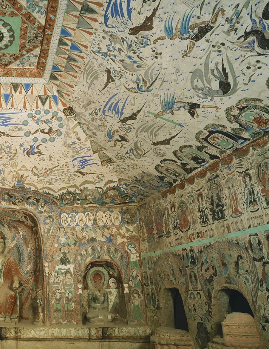
In 2018, Julie Mehretu visited the famous Mogao Grottoes near Dunhuang in northwest China. Situated on the edge of the Gobi Desert, Dunhuang was an important oasis and a locus of commercial and cultural exchange on the northern route of the fabled trade roads collectively referred to as the Silk Road. In the fourth century, Buddhist monks began excavating rock-cut temples in a nearby escarpment, and over the following millennium, nearly 500 caves would be cut into the cliff face. Many were extravagantly decorated—the murals cover some 45,000 m² (about an acre’s worth) of walls and ceilings. There are buddhas by the thousands; bodhisattvas and flying apsaras trailing ribbons of cloud; paradisiacal landscapes dotted with mountains, rivers, and pavilions where musicians play and the Buddha holds court with the enlightened.
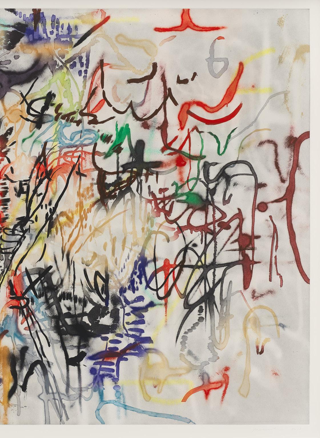
This was the impetus for Mehretu’s monumental print series Six Bardos, named for the transitional states of consciousness stretching from life to death and back again enumerated in The Tibetan Book of the Dead. The prints differ in proportions, size, and mood. Some are restrained to shades of black, white, and gray; others fizz with chromatic energy. All involve a spatial conversation between two bodies of marks: one a cluster of squiggles, dashes, and strokes in the foreground, the other a soft gray veil of blots and smudges, like distant lights seen through a fog.
Hymn (Behind the Sun) is the brightest in affect and most reminiscent of the Mogao paintings, with rusty reds, robin’s-egg blue, turmeric yellow, and a sinuous, roving line, suggestive of things in flight. As usual, Mehretu’s marks come in different flavors—some smooth and dapper, some frayed at the ends, some sporting the granular dissipation of spray-paint. They are given still greater variety by being inked à la poupée: any given mark might change from red to blue to black, or from solid to translucent, without skipping a beat.
Mehretu has worked in intaglio since art school and over the past decade has done so with increasing ambition, scale, and complexity. “A copper plate,” she observes, “is like a thin sculpture with its own landscape, a surface with its own geography.” At five feet long, Hymn is, like a painted cave, something to be entered rather than observed from a distance. Barely contained within the rectangular paper, the foreground cluster seems to bloom into our own space. Its geography is both palpable and elusive, physical and metaphysical. Mehretu has spoken often of her interest in “the layering and compression of time, space, and place.” It’s a phrase that neatly encompasses the 1600-year history of the Mogao Grottos, the philosophical conundrum of the bardos, and the prints that take their name.


Sheet size: 50 1/4 x 73 1/4 inches
Printer and Publisher: Gemini G.E.L., Los Angeles
Edition size: 45, plus proofs
Signed, dated, and numbered in pencil

The screenprints of William H. Johnson are remarkable for many reasons: their energetic exploration of a novel medium, their dazzling combination of modernist sophistication and candid accessibility, their paean to Black American cultural dynamism, and not least, their survival.
Johnson, born at the turn of the 20th century in the Jim Crow south, made his way to New York as a teenager and eventually earned a place at the school of the National Academy of Design. There he so impressed his instructors that they raised funds to send him to Paris in 1927. Like many Black expatriates, he found inspiration in European modernism, and relief in living at a distance from the implacable realities of race in America. He absorbed Chaim Soutine’s woozy expressionism, the chunkiness of Emil Nolde, and the rhythmic concision of the Scandinavian folk art to which his Danish wife, the textile artist Holcha Krake, introduced him. In lively, brushy paintings and bold woodcuts he depicted the places he went and the people he knew.
It was only after thirteen years, with war looming in Europe, that Johnson returned to New York. He and Holcha lived downtown, but when he began teaching at the WPA-supported Harlem Community Art Center he found himself once again immersed in African American cultural life. His art changed dramatically: portraits of Danish neighbors and Norwegian fjords gave way to street musicians performing for loose change, middle-class Black youngsters on a day out, and the dazzling, acrobatic dancing then animating Harlem clubs. His style too broke free of European models—the oncenuanced brushwork flattened into angular territories of “absolutely fearless color,” in Martin Puryear’s words, each elbowing the others in a jangly choreography.
Johnson also took up a relatively new technique taught at the Art Center: screenprint. While later Pop artists valued the medium for its smooth edges, uniform flatness, and mechanistic tidiness, Johnson’s prints are rough-and-tumble affairs. His woodcuts had been organized with stout line, sometimes augmented with watercolor, but in screenprint color shapes could stand all on their own. He used wide-gauge mesh and thick inks to produced surfaces like paste pushed through a porch screen. He employed scrappy found materials as substrates. The impression of Jitterbug II presented here is printed on a page from the May 24, 1942 New York Times: in and around the legs of the woman executing a dip, you can read an article about the war’s impact on family life and see bits of an ad for nylon stockings that, like those on the legs of Johnson’s Black dancer, are hued for white women. The registration is not overly precise: in Jitterbugs V a jacket’s checked pattern slips free of its housing, and the orange dress doesn’t quite fit its body. But these compositions are the opposite of haphazard: consider the extraordinary distillation of the woman’s head and arm in Jitterbugs V—a single brown shape, with only five fingernails and a line for teeth, yet somehow we can understand not only her motion but her mood.
In screenprint, his painted subjects were pushed to greater concision. The stacked trio of girls in stylish hats in Three Children is the same as that in a painting now at MoMA—but everything is more distinct, the girls’ attitudes brighter and more curious. In prints like The Blind Singer, he showed off a caricaturist’s gift for body language, as well as a mastery of modernist formal invention and the rhythmic intensity of folk and “outsider” art. There is nothing quite like them.
These prints were not done for the market. There are no regular editions, the dates are guesswork, the materials anything but archival. Instead they are dynamic records of a mind and hand at work. Jitterbugs III was printed on both sides of the sheet—on one side in solid colors, with careful registration and visible floorboards; one side loose and mottled with dancers hovering in uncertain space. (Though a stick-on label identifies it as Jitterbugs I, the Smithsonian designates this composition as Jitterbugs III.)
Here was Johnson at the peak of his abilities, forging an unprecedented style in pursuit of subjects often ignored. And then everything went wrong. In December 1942, a fire in his Manhattan home and studio destroyed much of his work. Two years later his beloved wife fell ill and died. Soon Johnson’s own neurological health deteriorated, and in 1947 the man who was hailed as “one of our coming great painters” was committed to Central Islip State Hospital, where he would remain, incapacitated, until his death 23 years later.
His surviving work—some 1300 items—had been warehoused, but in 1956 a court appointed attorney determined it should be destroyed since Johnson could no longer pay storage fees. A group of his friends went to court, however, and arranged for everything to be given to the Harmon Foundation. Established in 1921, the Foundation had offered crucial support to Black artists, writers, and scholars when other doors were closed shut to them. In 1929 Johnson had been presented with the institution’s Gold Award for Distinguished Achievement. Now the foundation stepped in and took custody of his estate. Between the fire and years of neglect, much was damaged beyond repair, but more than a thousand works were catalogued and conserved. When the Harmon Foundation closed in 1967, ownership of Johnson’s remaining oeuvre was transferred to the Smithsonian. In accordance with the foundation’s wishes, dozens of works were distributed to several historically Black colleges and universities.
In 1971 the Smithsonian mounted the first William H. Johnson retrospective. When curators wrote to the hospital to notify the artist, they received a curt reply saying that he had died a year earlier. There had been no public notice. Today, Johnson’s Harlem paintings and prints are recognized as singular and critically important works of American 20th century art. It almost didn’t happen.


William Henry Johnson
Blind Singer, c. 1940
Screenprint
Sheet size: 17 1/2 x 11 1/2 inches
Edition size: Printed by the artist in a very small but unknown edition
Signed “W.H. Johnson.” in pen, recto
Inscribed on the verso with the artist’s name, title, and Harmon Foundation inventory number
Provenance:
Collection of Mary Beattie Brady (director of the Harmon Foundation), Pawling, New York
Michael Rosenfeld Gallery, New York Private collection, California
Other known impressions of this rare print can be found in the collections of The Museum of Modern Art, The Harvard Art Museums (The Fogg Museum), The Smithsonian American Art Museum, The Whitney Museum of American Art, The National Gallery of Art, and the Philadelphia Museum of Art.

William Henry Johnson
Three Children, c. 1940
Screenprint
Sheet size: 16 3/4 x 11 1/2 inches
Edition size: Printed by the artist in a very small but unknown edition
Inscribed on the verso with the artist’s name, artwork title, and Harmon Foundation inventory number
Provenance:
The Harmon Foundation, New York
Acquired from the above Mr. and Mrs. Douglas Younger, New York By descent to the previous owner
Other known impressions of this rare print can be found in the collections of The Metropolitan Museum of Art, The Philadelphia Museum of Art, The Smithsonian American Art Museum, and The Library of Congress.

William Henry Johnson
Jitterbugs II, c. 1942
Screenprint on newsprint
Sheet size: 16 3/4 x 14 1/4 inches
Edition size: Printed by the artist in a very small but unknown edition Label on verso inscribed with the artist’s name, title, and Harmon Foundation inventory number
Provenance:
The Harmon Foundation, New York
Acquired from the above Mr. and Mrs. Douglas Younger, New York By descent to the previous owner
Other known impressions of this rare print can be found in the collections of The Art Institute of Chicago, The Metropolitan Museum of Art, The Smithsonian American Art Museum, The Amon Carter Museum of American Art, The Museum of Modern Art, The Philadelphia Musuem of Art, and The Library of Congress.


Jitterbugs III, c. 1941
Double-sided screenprint
Sheet size: 16 x 11 inches
Edition size: Printed by the artist in a very small but unknown edition
Label on verso inscribed with the artist’s name, title, and Harmon Foundation inventory number
Provenance:
The Harmon Foundation, New York
Acquired from the above Mr. and Mrs. Douglas Younger, New York By descent to the previous owner
Other known impressions of this rare print can be found in the collections of The Cleveland Museum of Art, The Smithsonian American Art Museum, and The Library of Congress.

William Henry Johnson
Jitterbugs V, c. 1941-42
Screenprint
Sheet size: 17 1/2 x 11 1/4 inches
Edition size: Printed by the artist in a very small but unknown edition
Inscribed on the verso with the artist’s name, title, and Harmon Foundation inventory number
Provenance:
The Harmon Foundation, New York
Acquired from the above Mr. and Mrs. Douglas Younger, New York By descent to the previous owner
Other known impressions of this rare print can be found in the collections of The Metropolitan Museum of Art, The Whitney Museum of American Art, The Smithsonian American Art Museum, The Museum of Modern Art, and The Library of Congress.


Untitled, 1991
Sheet size: 26 3/8 x 39 inches, each
Printer: Derrière l’Etoile Studios, New York
Publisher: Brooke Alexander Editions, New York
Edition size: 25, plus proofs
Catalogue Raisonné: Schellmann 207-210
Each print is signed and numbered in pencil, verso
The complete set of four woodcuts


Donald Judd
Untitled, 1991-94
Sheet size: 26 1/2 x 39 1/8 inches, each
Printer: Derrière l’Etoile Studios, New York
Publisher: Brooke Alexander Editions, New York
Edition size: 10, plus proofs
Catalogue Raisonné: Schellmann 223-226
Each print is numbered in pencil and stamped by the estate of the artist, verso
The complete set of four woodcuts


Untitled, 1992
Sheet size: 26 3/8 x 39 inches, each
Printer: Derrière l’Etoile Studios, New York
Publisher: Brooke Alexander Editions, New York
Edition size: 25, plus proofs
Catalogue Raisonné: Schellmann 215-218
Each print is signed and numbered in pencil
The complete set of four woodcuts

Donald Judd
Untitled, 1991-94
Sheet size: 26 3/8 x 39 inches, each

Printer: Derrière l’Etoile Studios, New York
Publisher: Brooke Alexander Editions, New York
Edition size: 10, plus proofs
Catalogue Raisonné: Schellmann 239-242
Each print is numbered in pencil and stamped by the estate of the artist, verso
The complete set of four woodcuts

Donald Judd
Untitled, 1993 Woodcuts
Sheet size: 23 1/2 x 31 1/2 inches, each
Printer: Derrière l’Etoile Studios, New York

Publisher: Brooke Alexander Editions, New York
Edition size: 25, plus proofs
Catalogue Raisonné: Schellmann 298-301
Each print is numbered in pencil and stamped by the estate of the artist, verso, and stretcher of each frame numbered in black felt tip pen
The complete set of four woodcuts in galvanized iron frames as designed by the artist, each with a hand-painted oil paint vertical or horizontal stripe on the glass.


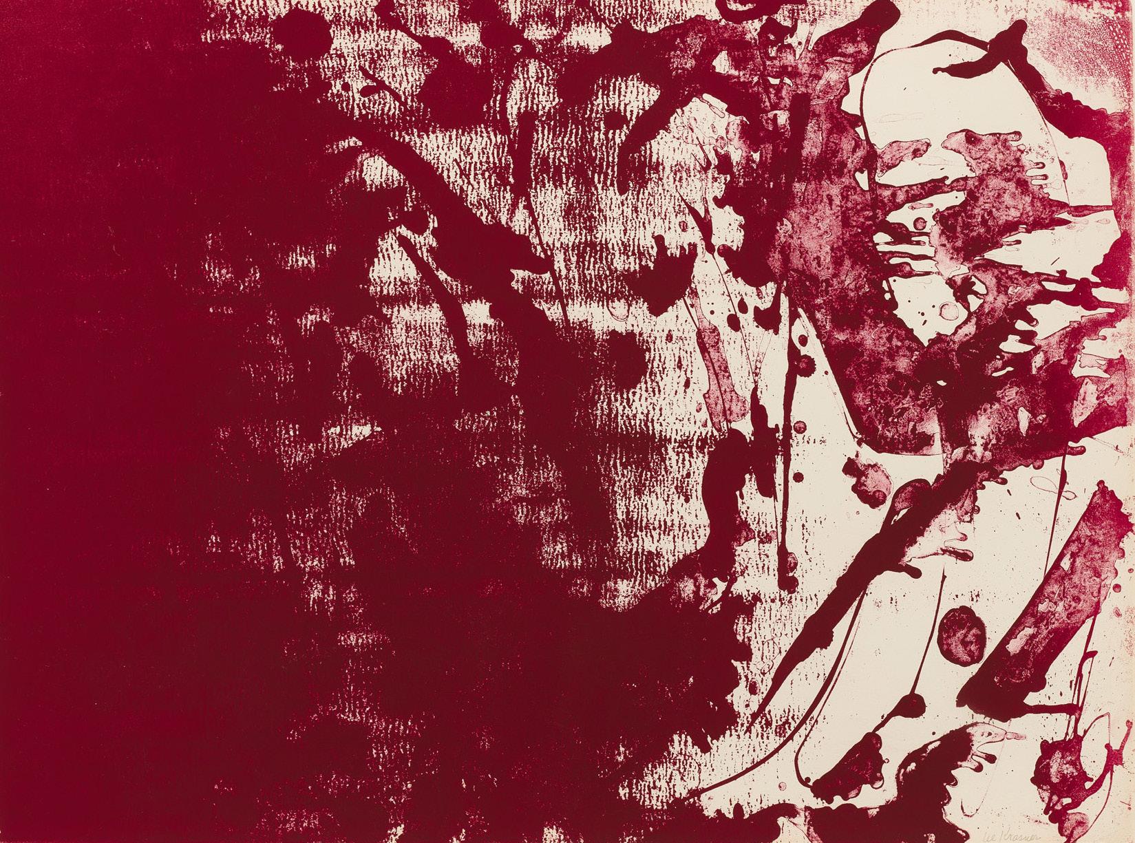
Though a prolific and long-lived painter, Lee Krasner produced relatively few prints. Her first foray, when she was already in her fifties, was a 1962 commission from Hilton for lithographs to decorate the guest rooms at their Rockefeller Center hotel. Working at Pratt Graphics in New York, she drew four stones with densely packed lines, chaotic and orderly in equal measure. Five years later she contributed a photolithograph to a memorial publication of poems by Frank O’Hara. Executed in gouache on translucent acetate (which would be exposed to create the printing plate), her drawing was alive with arcs and splatters of varying opacity, but this nature got flattened out in the finished lithograph. Those qualities, however, would come to fruition three years later in her most open, experimental, and ambitious printmaking project.
When the Parisian printshop Mourlot—famed for its work with Matisse, Picasso, and Chagall—opened a New York outpost in the late sixties, Krasner’s gallery encouraged her to give it a try. Her previous prints had been black-and-white and reflected an American lithographic tradition of muscular drawing and dynamic contrast. The French lithographers were heirs to a different tradition—one that emphasized the voluptuous depiction of translucent color. Taking up the challenge, she made prints about color. Like her O’Hara drawing, Primary Series: Blue Stone, Rose Stone and Gold Stone (1969) exploited the look of flung liquids rather than the controlled mark of crayon drawing. The ink was sometimes solid and opaque, sometimes cratered with the darkest centers and sharp edges of a dried puddle.
Printmaking, with its mechanical inversions and fiddly chemical interactions, is inevitably a venue where accidents happen. This can be alienating or frustrating, but Krasner found it inspirational. “I got very excited about it on the basis of some accidents that occurred while I was working at the shop. I learned to use these accidents,” she told an interviewer. The spontaneous marks appealled to her: “I’m against turning in a sketch or a study and letting the shop handle it. If I don’t get involved, there is nothing in it for me. That is the point. I have no understanding of detachment.”
Once the Primary Series was completed, she returned to those three stones to see where else the work might take her. The outcome was Long Lines for Lee Krasner, a portfolio that tripled her previous output; nine new works were drawn. The first one in each set of three directly continued the Primary Series, with some differences in inking. But for the second two of each set, Krasner and the lithographers introduced various forms of interference, jittery textures, and additional pools of ink and water. The original marks seem to blanch and retreat.
What is most striking in the portfolio format is that it lets artists find the repeatedly multiple solutions to the same problem. In painting we usually see only the most recent set of decisions; in printmaking, each attempt is preserved, and the artist can study and weigh the different results. Krasner would often, after printing her stone, study the differences and make her distinctions side-by-side, as Hilton Kramer explained in his essay on his 1963 lithography portfolio Constancy: “She is able to see, side by side, individual expressions, each with its own unique difference.”
Lee
her studio, Springs, New York, 1969


Lee Krasner
Long Lines for Lee Krasner, 1970
Lithographs
Sheet size: 22 1/2 x 30 inches, each
Printer: Mourlot Graphics Ltd., New York
Publisher: Marlborough Graphics Gallery, New York
Edition size: 15, plus proofs
Each print is signed and numbered in pencil
The complete set of nine lithographs which retains its original linen-covered portfolio case with the colophon page and a sheet with the poem “Long Lines for Lee Kranser” by Richard Howard.




Roy Lichtenstein was a prolific and innovative printmaker for most of his life. As a young artist in the 1950s, before his turn to comic-book styling and Benday dots, he had success with jangly, homemade etchings and woodcuts, semi-abstract yet narrative. Later, with the establishment of new, adventurous print workshops like Gemini G.E.L. in the late sixties, he returned to printmaking with fresh ambitiousness and technological daring. His 1965 screenprints Reverie and Sweet Dreams, Baby! fall in the hiatus between these two periods, though they may well be the most influential images of his career.
The prompt was an invitation to participate in the “11 Pop Artists” portfolio project, a venture very much of its moment. In the wake of the Surgeon General’s report linking smoking and cancer, the tobacco giant Philip Morris needed to burnish its image. Meanwhile, in the midst of the Cold War, the U.S. Information Agency was seeking ways to showcase American values to an often skeptical world. The PR firm Ruder Finn had a solution for both: the publication of dynamic prints by young artists, which could travel the world under the auspices of USIA and the sponsorship of Philip Morris. Art dealer Rosa Esman was enlisted to select the artists and organize the project, publishing under the imprint Original Editions.
There would be three portfolios in different sizes, with each artist producing one print for each. The medium selected was screenprint, whose commercial caché suited Pop sensibilities and which had the secondary advantage of producing large editions efficiently. For three years, the portfolios trotted the globe from Saskatoon to Buenos Aires, and from Hamburg to Rome. Meanwhile, a separate exhibition traveled across the United States. For many viewers, it marked their first direct encounter with Pop art.
Several of the prints remain icons of the era—Andy Warhol’s Jacqueline Kennedy I, II, and III, Alan D’Arcangelo’s Landscape III, and Tom Wesselmann’s Nude—but none has proved more indelible than Lichtenstein’s. Having successfully adapted the syntax of cheap print—the Benday dots, the primary color blocks, the hokey melodrama—to the scale and materiality of painting, Lichtenstein now exported it back into print with fresh clarity. In Reverie, a wistful blond croons Mitchell Parish’s lyrics to the old Hoagie Carmichael standard, Stardust, her lips parted as if in a whisper. In Sweet Dreams, Baby! the violent action is held in place by two almost affectionate curves—one sweeping downward along the slick black hair, the other swooping up with the fist. (His print for the smallest portfolio, Moonscape, is remarkable for its use of moiré plastic as a substrate, but, lacking any human action, has never achieved the fame of his other two.)
The look of offhand commercial reproduction is, of course, a ruse. Preparatory sketches show the artist tuning the swell and taper of every black line, while proof impressions show how carefully he tweaked those seemingly obvious colors. Working in screenprint on paper at Knickerbocker Machine and Foundry in New York, he could get sharper edges and denser color than either his canvases or the cheap newsprint of actual comics could support—two ideal manifestations of his comic book style.


Roy Lichtenstein
Reverie, 1965
Screenprint
Sheet size: 30 1/8 x 24 inches
Printer: Knickerbocker Machine and Foundry, Inc., New York
Publisher: Original Editions, New York
Edition size: 200, plus proofs
Catalogue Raisonné: Corlett 38, RLCR 1132
Signed and numbered in pencil
From the portfolio 11 Pop Artists II, which also includes prints by Allan D’Arcangelo, Jim Dine, Allen Jones, Gerald Laing, Peter Phillips, Mel Ramos, James Rosenquist, Andy Warhol, John Wesley, and Tom Wesselmann.
Provenance:
Galerie Ileana Sonnabend, Paris
Purchased directly from the above at the time of publication By descent to the previous owner

Roy Lichtenstein
Sweet Dreams, Baby!, 1965
Screenprint
Sheet size: 37 5/8 x 27 5/8 inches
Printer: Knickerbocker Machine and Foundry, Inc., New York
Publisher: Original Editions, New York
Edition size: 200, plus proofs
Catalogue Raisonné: Corlett 39, RLCR 1172
Signed and numbered in pencil
From the portfolio 11 Pop Artists III, which also includes prints by Allan D’Arcangelo, Jim Dine, Allen Jones, Gerald Laing, Peter Phillips, Mel Ramos, James Rosenquist, Andy Warhol, John Wesley, and Tom Wesselmann.
Provenance:
Galerie Ileana Sonnabend, Paris
Purchased directly from the above at the time of publication By descent to the previous owner

Jacqueline Kennedy III (Jackie III), 1966
Screenprint
Sheet size: 39 15/16 x 29 15/16 inches
Printer: Knickerbocker Machine and Foundry, Inc., New York
Publisher: Original Editions, New York
Edition size: 200, plus proofs
Catalogue Raisonné: Feldman and Schellmann II.15
Stamp signed and numbered in pencil, verso
From the portfolio 11 Pop Artists III, which also includes prints by Allan D’Arcangelo, Jim Dine, Allen Jones, Gerald Laing, Roy Lichtenstein, Peter Phillips, Mel Ramos, James Rosenquist, John Wesley, and Tom Wesselmann.
Provenance:
Galerie Ileana Sonnabend, Paris
Purchased directly from the above at the time of publication By descent to the previous owner

Roy Lichtenstein
Crying Girl, 1963
Offset lithograph
Sheet size: 18 x 24 inches
Printer: Colorcraft, New York
Publisher: Leo Castelli Gallery, New York
Edition size: Approximately 300
Catalogue Raisonné: Corlett II.1, RLCR 759
Signed in pencil
Provenance:
By descent to the previous owner


Roy Lichtenstein
CRAK!, 1963/64
Offset lithograph
Sheet size: 19 1/8 x 27 3/8 inches
Printer: Colorcraft, New York
Publisher: Leo Castelli Gallery, New York
Edition size: 300, plus proofs
Catalogue Raisonné: Corlett II.2, RLCR 812
Signed, dated, and numbered in pencil
Provenance:
Billy Al Bengston, Venice, CA


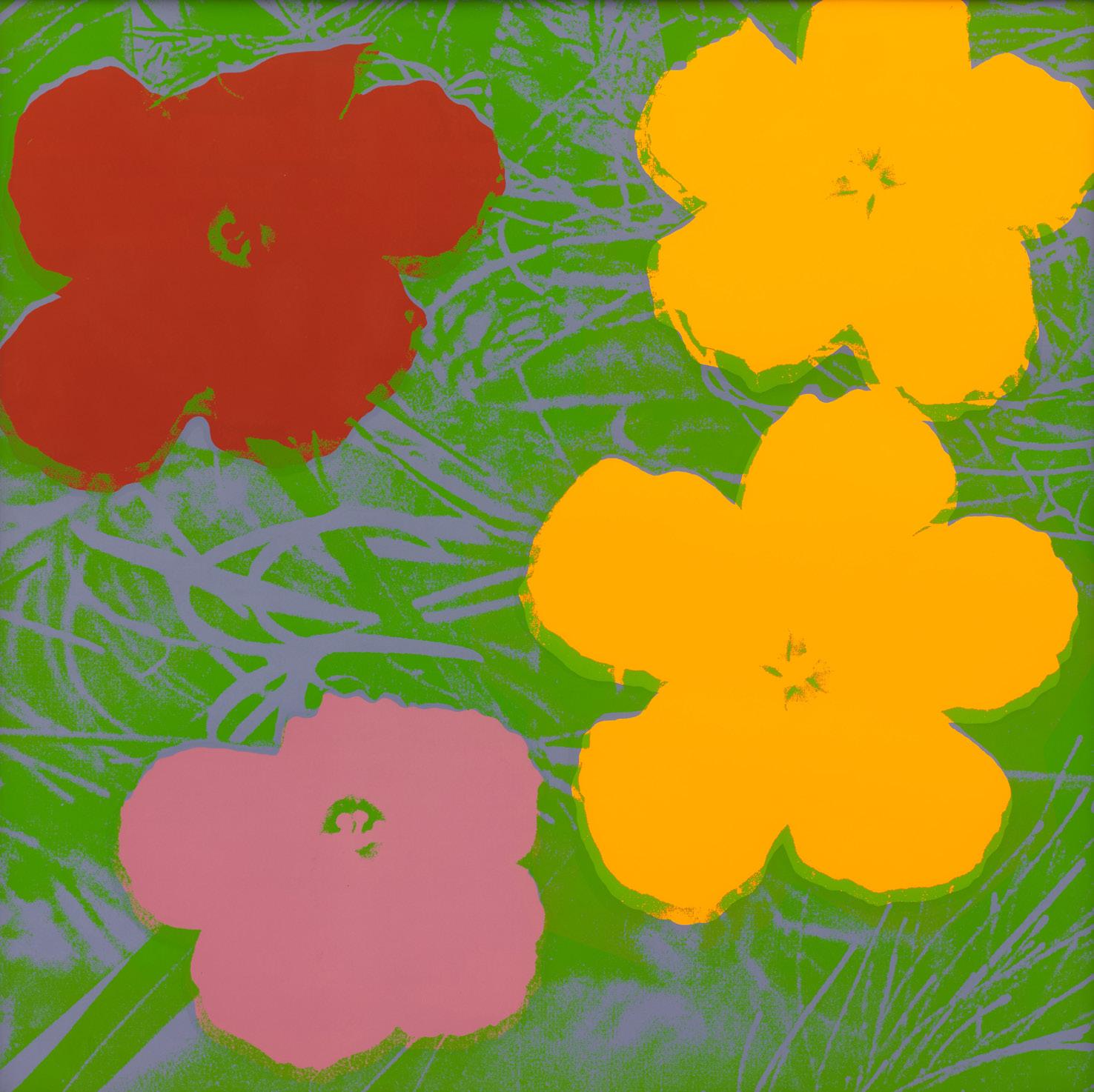
Andy Warhol
Flowers, 1970
Screenprints
Sheet size: 36 x 36 inches, each
Printer: Aetna Silkscreen Products, Inc., New York
Publisher: Factory Additions, New York
Edition size: 250, plus proofs
Catalogue Raisonné: Feldman and Schellmann II.64-73
Each sheet is signed and stamp-numbered, verso
The complete portfolio of ten screenprints in remarkable condition, the colors unfaded, bright, and fresh.
Provenance:
Galerie Ileana Sonnabend, Paris
By descent to the previous owner




Ed Ruscha
Air, 1969
Lithograph
Sheet size: 17 1/8 x 24 1/8 inches

Printer and Publisher: Tamarind Lithography Workshop, Los Angeles, CA
Edition size: 20, plus proofs
Catalogue Raisonné: Engberg 20
Signed, dated, and numbered in pencil
Provenance:
Billy Al Bengston, Venice, CA


Ed Ruscha
City, 1969
Lithograph
Sheet size: 17 x 24 inches
Printer and Publisher: Tamarind Lithography Workshop, Los Angeles, CA
Edition size: 20, plus proofs
Catalogue Raisonné: Engberg 19
Signed, dated, and numbered in pencil
Provenance:
Robert Rogers, master printer at Tamarind Lithography Workshop, Los Angeles

Ed Ruscha
1984, 1967
Lithograph with hand-coloring
Sheet size: 20 x 25 inches

Printer and Publisher: Gemini G.E.L., Los Angeles
Edition size: 60, plus proofs
Catalogue Raisonné: Engberg 6
Signed, dated, and numbered in pencil


Ed Ruscha
That is Right, 1989
Lithographs
Sheet size: 9 1/8 x 11 inches, each
Printer: Hamilton Press, Venice, CA
Publisher: The Artist
Edition size: 30, plus proofs
Catalogue Raisonné: Engberg 173-184
Each print is signed, dated, and numbered in pencil
The complete portfolio of twelve lithographs


Muses and Meres, 2001
Etchings and lithographs
Sheet size: 22 x 30 inches, each
Printer and Publisher: Gemini, G.E.L., Los Angeles
Edition size: 45, plus proofs
Each print is signed, dated, and numbered in pencil


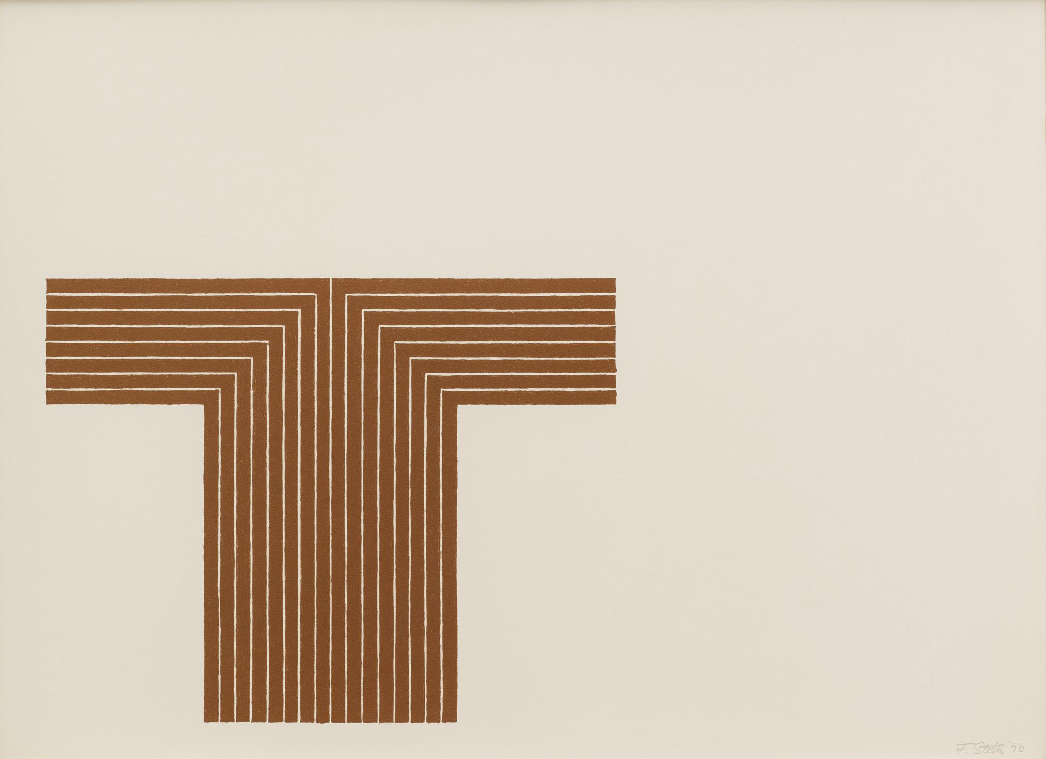
Frank Stella
Copper Series, 1970
Lithographs with screenprint
Sheet size: 16 x 22 inches, each
Printer and Publisher: Gemini G.E.L., Los Angeles
Edition size: 70, plus proofs
Catalogue Raisonné: Axsom 39-45
Each print is signed, dated, and numbered in pencil
The complete set of seven lithographs with screenprint




Frank Stella
Black Series I, 1967
Lithographs
Sheet size: 15 x 22 inches, each
Printer and Publisher: Gemini G.E.L., Los Angeles
Edition size: 100, plus proofs
Catalogue Raisonné: Axsom 4-12
Each print is signed, dated, and numbered in pencil
The complete set of nine lithographs


Still Light, 1989-90
Aquatints
Sheet size: 42 1/2 x 29 7/8 inches
Printer: Peter Kneubühler, Zurich
Publisher: Turske and Turske, Zurich
Edition size: 30, plus proofs
Each print is signed, numbered, and titled in pencil
The complete portfolio of eight aquatints which retains its original linen covered portfolio box.


The Seasons, 1987
Etchings with aquatint
Sheet size: 26 x 19 1/4 inches
Printer and Publisher: ULAE, West Islip, NY
Edition size: 73, plus proofs
Catalogue Raisonné: ULAE 238-241
Each sheet is signed, dated, and numbered in pencil
The complete set of four etchings with aquatint


Jasper Johns
Flag I, 1960
Lithograph
Sheet size: 21 7/8 x 29 3/4 inches

Printer and Publisher: ULAE, West Islip, New York
Edition size: 23, plus proofs
Catalogue Raisonné: ULAE 4
Signed, dated, and numbered in pencil

Jasper Johns
Corpse and Mirror, 1976
Screenprint
Sheet size: 42 7/8 x 53 3/8 inches

Printer and Publisher: Jasper Johns and Simca Print Artist, Inc., New York
Edition size: 65, plus proofs
Catalogue Raisonné: ULAE 169
Signed, dated, and numbered in pencil

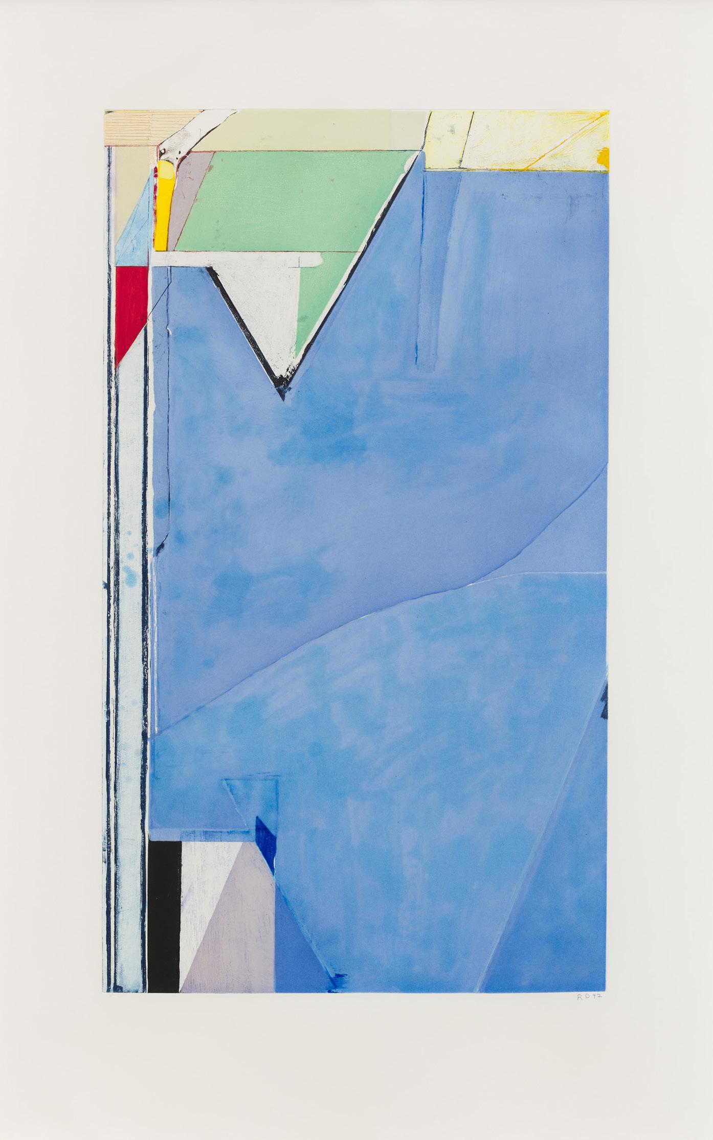
Richard Diebenkorn
High Green Version I, 1992
Aquatint, drypoint, and etching
Sheet size: 52 3/4 x 33 3/4 inches
Printer and Publisher: Crown Point Press, San Francisco, CA
Edition size: 65, plus proofs
Catalogue Raisonné: Liguori 345
Signed, dated, and numbered in pencil
Richard Diebenkorn
Twelve, 1986
Lithograph
Sheet size: 44 x 34 1/4 inches
Printer and Publisher: Gemini G.E.L., Los Angeles
Edition size: 50, plus proofs
Catalogue Raisonné: Liguori 309
Signed, dated, and numbered in pencil

Richard Diebenkorn
Blue Surround, 1982
Aquatint, drypoint, and etching
Sheet size: 35 x 26 1/2 inches
Printer and Publisher: Crown Point Press, San Francisco, CA
Edition size: 35, plus proofs
Catalogue Raisonné: Liguori 284
Signed, dated, and numbered in pencil
Provenance:
Richard Diebenkorn Foundation, Berkeley, CA

Kelly
Colored Paper Image XIII (Yellow Green Black Blue Orange), 1976
Colored and pressed paper pulp
Sheet size: 32 1/4 x 31 1/4 inches
Printer: Ellsworth Kelly and Kenneth Tyler, fabricated at HMP Paper Mill, Woodstock, Connecticut
Publisher: Tyler Graphics Ltd., Bedford, New York
Edition size: 23, plus proofs
Catalogue Raisonné: Axsom 153
Signed and numbered in pencil

Ellsworth Kelly
Colored Paper Image II (Dark Green Curves), 1976
Colored and pressed paper pulp
Sheet size: 46 1/2 x 32 1/2 inches
Printer: Ellsworth Kelly and Kenneth Tyler, fabricated at HMP Paper Mill, Woodstock, Connecticut
Publisher: Tyler Graphics Ltd., Bedford, New York
Edition size: 17, plus proofs
Catalogue Raisonné: Axsom 142
Signed and numbered in pencil


Untitled (Large Ocean), 1972
Lithograph
Sheet size: 28 1/2 x 45 1/2 inches
Printer: Ed Hamilton, Cirrus Editions, Los Angeles
Publisher: Cirrus Editions, Los Angeles
Edition size: 65, plus proofs
Catalogue Reference: MMA 5
Signed, dated, and numbered in pencil


Untitled (Large Desert), 1971
Lithograph
Sheet size: 22 3/8 x 29 inches
Printer: Ed Hamilton, Cirrus Editions, Los Angeles
Publisher: Cirrus Editions, Los Angeles
Edition size: 65, plus proofs
Catalogue Reference: MMA 4
Signed, dated, and numbered in pencil

Starfield, 2010
Mezzotint and drypoint
Sheet size: 26 1/4 x 35 3/4 inches

Printer: Simmelink/Sukimoto Editions, Ventura, CA
Publisher: The Artist, New York, Simmelink/Sukimoto Editions, Ventura, CA
Edition size: 30, plus proofs
Signed, dated, and numbered in pencil

Strata, 1983
Mezzotint
Sheet size: 29 1/2 x 35 1/4 inches
Printer: Dorris Simmelink
Publisher: Gemini G.E.L., Los Angeles
Edition size: 37, plus proofs
Catalogue Reference: MMA 14
Signed and numbered in pencil


info@susansheehangallery.com
