
SGD 7.90 (incl GST) RM September/OctoberIDRHKDPHPTHB16.901752506059,500 2014 At home in the modern world IdeasNaturefrom The Orchestral Green, a masculine landscape design harmonizing allgreen plants Reminiscene of Hope Report on Maison et Objet


Story by Kelly Vencill Sanchez Photos by Coral von Zumwalt 106 Back at the Ranch
92 How Swede It Is A Swedish guesthouse is built with modern sensibilities and centuries-old techniques. Story by Arlene Hirst Photos by James Silverman 100 A Sense of Place
A new home at Sea Ranch, a half-centuryold enclave of rugged modernist houses on the Northern California coast, captures the spirit of its surroundings. Story by Fred A. Bernstein Photos by Mark Mahaney
Cover: Forest Sauna, Sweden Photo by James Silverman This page: Ramirez Residence, USA Photo by Mark Mahaney 106
ContentsFeaturesSeptember/October2014
For a couple coping with Alzheimer’s, a thoughtful addition to their 1970’s home in Tacoma, Washington, creates a comfortable, long-term solution.

An art to walk on... the Rugmaker By appointment only | 1093 Lower Delta Road #02-20 Mapletree Industrial Singapore 169203 | (+65) 6270 2823 enquiry@therugmaker.com.sg | www.therugmaker.com.sg

ContentsDepartmentsSeptember/October20148Editor’sNote11IntheModernWorld
122 Sourcing Indulge in a little retail therapy with the help of our buyers’ guide, which gives you all the goods on the designs featured in this issue.
124
64 Big Ideas
Occupying a historic shophouse in Singapore, The Sandalwood Room offers an extensive collection of India’s best hand-crafted products, while the Jakarta-based Indonesian retail store, Formapura, embraces classic craftmanship with modern manufacturing in an assortment of timeless design.
66 Renovation Despite the horrifyingly small 607-square-foot Manhattan apartment, graphic designers couple Brenda McManus and Ned Drew took up the challenge and teamed up with another husbandand-wife architect team, in transforming it into an open and bright dwelling with enough life span for the whole family.
For a couple with different aesthetic and cultural backgrounds, creating a home that suited them both involved a steep learning curve. But as luck would have it, their architects are also teachers.
Design Finder
81 Off the Grid A new spin on rammed-earth construction aims to bring the method to the masses. 86
11686
Profile Growing concern about nature and how the world evolve due to human negligence led Yu Sing and his firm, Akanoma, into a series of exploration towards the relationships between nature and architecture.
74 Case Study A family’s house outside the hustle of Amsterdam makes the most of local materials and forms.
Homeschooling
Four captivating residences from Indonesia to Singapore offer inspiration for an enlivening renovation, while sixteen pages of the latest furnitures, bath fixtures, and kitchenware from notable households and the grand event Maison & Objet Paris 2014, keep you updated on the current hot list of design. We also spotlight the Maison & Objet’s Designer of The Year, Tom Dixon, sharing of his conquest in selling London bricks in Parisian fair, Amalya Hasibuan the Indonesian landscape designer with her masculine design using green plants, Alberto Perazza of Magis who shared on his latest updates and technologies, Daniele Dalla Pellegrina who talked about his newest cookware collection for WMF, and Budi Pradono on his installation of Mountain of Hope in Venice Architecture Biennale 2014.
Behind a house in crowded Bangalore, India, two architects carve out a midcity oasis.
70 Focus A chance encounter led a Dallas couple to a neighborhood where nature is prized as much as design, and houses are built to make the most of both.
Finishing Touch German photographer Ken Schluchtmann documents over 12,000 miles of Norway’s rugged landscape. 118 12
118


Taiwan Paula Epochepoch.paula@msa.hinet.netLiuLimited Thailand Jeremiah Amarinjeremiah@amarin.co.thPitakwongPrintingandPublishing
South Korea Soo Hoon Medirepsoohoonoh@medireponline.comOhCo.
Media Representatives Japan Yoshinori PACIFICpbi2010@gol.comIkedaBUSINESS INC Italy Carlo Director,carlo@fiorucci-international.comFiorucciFiorucciInternational Philippines Victor Globalvjeff@globalintmedia.comJefferyIntegratedMediaLtd
Dwell EditorAsia Sunthy Sunowo Language Editor Rachel Lovelock Copy Editor Lisa Amelia Writers Anindia Karlinda, Bernadetta Tya Art Director Citra A. Widyastuti Graphic Designer Taufik Fahrudin Contributing Writers Arlene Hirst, Asih Jenie, Diana Budds, Fred A. Bernstein, Helen Thompson, Jane Szita, Kelly Vencill Sanchez, William Lamb, Winifred Bird, Zahid Sardar Contributing Photographers Caren Alpert, Christopher Sturman, Coral von Zumwalt, Ian Allen, James Silverman, Ken Schluchtmann, Mark Mahaney, Tim Van de Velde, Zen Sekizawa ChairmanBusiness Julius Ruslan Chief Executive Officer & Publisher Denise Tjokrosaputro
PLC @dwell_asiaDwellAsia
Scan here to subscribe to the digital version of Dwell Asia dwellasiamag.com
Associate Publisher – Singapore Kenath Low Associate Publisher – Indonesia Grace Wong MCI (P) 040/07/2013 PPS 1802/06/2013 (022998) ISSN#: 20886640 New Media Investments (Asia) Pte Ltd Publisher of Dwell Asia Magazine New Media Investments (Asia) Pte Ltd Block 1008 Toa Payoh North #04-09 Singapore 318996 Tel: +65-6509-6118
Dwell OwnerUS& Founder Lara Hedberg Deam President / CEO Michela O’Connor Abrams Chief Operating Officer Brandon Huff Editor-in-Chief Amanda Dameron Creative Director Jeanette Abbink VP, Audience Development David Cobb Dwell Media LLC Publisher of Dwell Magazine USA Editorial Office Dwell Media LLC 192 Lexington Avenue, 16th Floor New York, NY 10016 Dwell®, the Dwell logo, and At Home in the Modern World are registered trademarks of Dwell Media LLC. Advertising Offices Singapore Kenath Newkenath.low@nmi.com.sgLowMediaInvestments
Dwell Asia is published six times a year and distributed throughout Asia. The magazine assumes no responsibility for the safekeeping or return of unsolicited manuscripts, photographs, or other material.
(Asia) Pte Ltd Indonesia Natalia MPGwijaya_natalia@yahoo.comWijayaMediaPublishing


In one of these days, we have to ask ourselves. Are we being too focused on our lives or have we taken a moment to look around us and decided to do a kind thing to the nature? When we are building our homes, did we ever consider thinking about the land we are standing on? Those questions should evoke some awareness in our mind or simply touch our empathy to the world we live in. The trend of sustainability and green concept is one of the good signs that we are starting to care about and becoming friendlier to Earth. The modern problems which arise from the quest of identity and character in the global world, such as the climate change, contribute as a warning sign for us to be more responsive to our surrounding. Designers and architects then start to pay more attention to the nature and explore ideas from it. What comes from nature should go back to nature as well. This is why we choose “Ideas from Nature” for our topic at the end of our journey with Dwell Asia. Yes, this is our last issue of the magazine – the lucky number 20 which leads us to a new dimension. We believe the ideas from nature are what make us stand out from the crowd, in terms of design and architecture. The best architects and designers show us that the ideas from the generous, local surrounding will result in a more comfortable design. One of them is Yu Sing, who continuously explores the local prospect for building materials and design philosophy in order to enrich his inspiration in architecture (page 116). We also feature the work of two bubble-up architects in Indonesia who came up with a humble, yet interesting design with their sensitivity towards the surroundings. Take a look at how a house dedicated for the architect’s mother took a heavy intake in exposed material (page 48), and how a humble revamp house tries to stay friendly to its neighborhood (page 50); while our belief in nature is getting stronger when we see how beautiful a landscape could be in the hands of Amalya Hasibuan (page 34).
EDITOR’S NOTE
Also, don’t miss out our special report on this year’s Maison et Objet Paris and more reminders on how generous the nature is to the world of modern design. Ideas are not just enriching our conceptual thinking, but also becoming the core of a friendly gesture to a more sustainable living. As sustainability means continuity, every goodbye means a cue for a newUntilhello.we see you again in our next journey! Sunthy Sunowo, Editor sunthy@dwellasiamag.com
Ideas naturefrom

Despite a run-in with poison oak while shooting “Back at the Ranch” (p. 106), Mark Mahaney fell in love with Sea Ranch: “The setting, architecture, and era of all of the homes,” Mahaney says. “The fog made it difficult to photograph—there were times when I couldn’t even see the house from across the small bay.” aSIh JenIe Singapore based Asih Jenie is the deputy managing editor of regional design publication Surface Asia. A long-time contributor (and a briefly an associate editor) of Dwell Asia, Indonesia-native Jenie is a former editor of the Indonesian editions of Indesign and Dwell before she relocated to Singapore in 2012. Spending more than a quarter of her life earning degrees in architecture and visual communication design,she has a passion for well-designed home items. In this issue she has tirelessly scourged the nine halls of the fall edition of Paris Maison & Objet (p. 26), curated the best finds for our even and product reports (p.28), and interviewed the most intriguing design players of the season, including Tom Dixon (p.32), Alberto Perazza of Magis (p.44), and Daniele Dalla Pellegrina (p.42). She calls the session with Dixon as a “nervewracking, but ultimately fun” experience, which ended with a selfie with the eccentric designer.
Fred a. BernSteIn Since learning about Sea Ranch as an architecture student, Fred A. Bernstein has wanted to visit the legendary enclave of modernist houses. He finally got his chance when reporting “Back at the Ranch” (p. 106). The only problem was the drive—hours on a road so twisty that it explains how Sea Ranch remains pristine during an era of rampant real estate development. tIM van de velde
Contributors
rachel lovelock Rachel Lovelock’s childhood dream was to live on a tropical island and become a writer, but she spent 19 years working for a corporate company in the UK before making the momentous decision, in 1998, to change her life. She is now living her dream on the island of Bali, writing for magazines and guidebooks.
For a decade, Brussels-based photographer Tim Van de Velde (Case Study, p. 74) has shot architecture and interiors for magazines and architects. “Translating space, light, color, and mood into an aesthetic document and paying close attention to composition are the guidelines that run throughout my work,” he says. “The kids at the Amsterdam shoot were great. The sons started a soccer game that went from calm to wild; they barely kept the ball from falling into the canal next to the garden.” helen thoMpSon Texas native Helen Thompson has seen many grain silos in her life—they’re a common sight in agricultural areas of the state. The iconic shape plays a big role in the house Dallas architect Max Levy designed for Deborah Orrill and Blair Sanders (Focus, p. 70). “The two-story, metal-clad drum serves as the entrance to their house,” she says.
Mark Mahaney
Care for some lively spots of color on your floor? Embodying the exquisite Javanese lily blossoms through its choice of contemporary shape and design, this rug mixes up both art and organic wool to truly capture the beauty of the blooming flowers. @m_o_h_o_i WorldModern 12 Products and Furniture 22 M&O Paris Fall 2014 34 Q&A 44 Material World 46 Hotel Register 48 Houses We Love 58 We Recommend 59 Event Report

A. Beat Table Brass by Tom Dixon Stirred by the simplicity of traditional Indian water vessels, Beat table brass lighting is made using solid brass and iron sand cast bases to enrich the complexion of any interior, while the adjustable slender arm will redirect the light beam in an tomdixon.netinstant.
B. Amalfi Bath by Victoria + Albert Outdoor Baths For all half-mermaids out there who love long luxurious soaks in the water, Amalfi might be the best news you’ve heard yet. Built for comfort through an extended backrest for full head support, and for versatility through its freestanding design and easy-clean white Quarrycast material, you can simply bathe anywhere, from the balcony to the open beach vandabaths.comhouse.
D. Bend Sofa by Foundry for Studio Juju With its capsule-like frame stretching upwards to provide side and back support, Bend Sofa embraces you within a private cocoon, while its symmetrical mirrored halves can transform into two single seats. In various captivating colors and fabrics, anyone will bend over backwards to own this portable studio-juju.com‘sanctuary’.
productsmodern world C D E F B G H
Enviable Ones
H. Hexaform by MOHOI Looking to make a bold, quirky statement? Just place this alien-like yet artful floor lighting within sight and let the Indonesian pinewood –with its ‘varnish doft’ finishing using an emulsion spray paint technique – draw gasps of astonishment from every corner of the room. @m_o_h_o_i 12 2014 13
F. Bellagio by Giardini for Zantob Dance your way around the room and feel the vibe of the 18th century through Bellagio wall-coverings. The French damask patterns, together with a color palette of antique lilac, beige and anthracite, gleam in perfect harmony with the choice of hot embossed 100% silk satin, while the floral decoration and motifs take you back to a world of classical pelopor.co.idbeauty.
C. Crusoé by Bleu Nature Being indoors doesn’t mean you can’t be at one with nature. Crusoé acrylic collection exhales the fresh air of outdoor living through the fusion of two materials, acrylic glass and driftwood in the form of a low table. Sleek and smooth, this is one piece of furniture that can hinder the yearning to head for the bleunature.comwoods.
G. Paysage Table by Roche Bobois Can a coffee table be too sophisticated? It can, and it should be. Fabrice Berrux makes sure that this rectangular silkscreen-printed extra-clear glass table does not settle for mediocrity. When the abstract movement of its black and white graphic designs is in play, it will captivate its roche-bobois.combeholder.
E. Gabbia Lamp by Ryosuke Fukusada and Rui Pereira for Industry+ If carrying a basket is no longer in style, it might be time to look for a new way to flaunt it. Inspired by the shape of inverted baskets, Gabbia lamp shines through its lightweight, transparent, acetate material in a play of shadows and ryosukefukusada.comcolors.
There’s nothing mediocre about these 15 objects of both indoor and outdoor delight. Each one conjures up murmurs of appreciation as it adorns the space.
dwell asia september/october 2014
september/october
dwell asia


I. Parison Pendant by Nat Cheshire for Resident Behold, folks, the wonder of this particular pendant lamp. The top of the pendant is crafted in opaque black hand-blown glass, which moves in a fluid gradient to ultimately become transparent, while the neck holds an LED lamp that diffuses the softest kind of resident.co.nzwarmth.
N. Lipp Sofa by Living Divani Fancy a glamorous sofa to laze upon? Pierro Lissoni came up with one that has a backrest and an armrest frame crafted in multi-layered poplar wood, with a choice of fabric or leather quilted upholstery that is removable by zippers. Lipp is determined to pamper us with both comfort and livingdivani.itelegance.
L. Tacon Gold by Nomon Can’t help checking the clock? Looking at Nomon golden collection, you’ll turn back time to the 1950s when contemporary classic designs prevailed in the name of elegance. Through a selection of natural wood with matt gold metal finishes, Tacon Gold will captivate you while bringing a vintage feel to your room. proof.com.sg M. Stones Collection by Haute Déco Is collecting stones a personal passion of yours? If so, this collection will thrill you. Using sandstone, limestone and pumice as materials, the various shapes of the door handle, from the conical knob to the olive-shaped lever handle, has a sole mission: to enthrall every visitor upon entering the doorknobshop.comroom.
J. Raya by Yuni Jie for Vivere The Indonesian culture was Yuni Jie’s inspiration for Raya. For this collection she has created a new form of elegance with a blend of traditional and modern taste. Using Kawung, Tenun, and Rumah Joglo original motifs with rattan, marble and brass, the very design of Raya speaks for the richness of Indonesian viverecollection.comheritage.
14 september/october 2014 dwell asia 15dwell asia september/october 2014 productsmodern world J I K M L N
K. Unipoli for Deesawat Reflecting on the reality of intimacy amongst the vastness of today’s modern technology is a tear-jerking affair. Determined to bring couples closer together, deesawat.comsation.throughwhichoutdoorBatylinemadeaTangkijngamwongJirachaihascreatedunionoftwoloungechairs,ofteakwoodandfabrics,forthosemomentsduringlovecanbepreservedrelaxationandconver


H. Fold table by Philippe Nigro for Ligne Roset, $1,915 Instead of run-of-the-mill nesting tables, consider a set of pivoting pieces that tuck together neatly when in stealth mode. ligne-roset-usa.com
productsmodern world A B C D E F G H I J K
I. Round Square mirror by Clara von Zweigbergk for Domestic, $88 There’s no denying a mirror’s effectiveness in giving the illusion of more space. This acrylic piece features a silkscreened geometric pattern for added depth. domestic.fr J. Family beds by Lorenzo Damiani for Campeggi, $1,900 For many, formal guest rooms are rare, but visitors aren’t. Luckily, this set of four beds folds neatly into a console. Rope handles act as drawer pulls. campeggisrl.it K. Moon table by Mist-o for Living Divani, $2,660 The compact charcoal-dyed cylindrical oak bedside table opens to reveal interior storage shelves. livingdivani.it
F. Acciaio lounge by Max Lipsey for Cappellini, $4,770 Instead of an overstuffed upholstered armchair, consider leatherframe:Lipsey’sAmericanEindhoven-baseddesignerMaxriffonaracingbicycleaseatinperforatedandmetal.cappellini.it G. Fju desk by Kaschkasch, price upon request German designers Sebastian Schneider and Florian Kallus created a wall-mounted wood desk that folds up to reveal storage pockets. kaschkasch.com september/october 2014 dwell asia 17dwell asia september/october 2014
Space Case
B. Royal System Shelving Unit A with desk shelf by Poul Cadovius for dk3, $1,855 Designed in 1948, the solid walnut or oak wall-mounted piece doesn’t skimp on utility: Use it for storage or a work station while saving precious floor space. dwr.com C. Elixir Minibar by CB2, $299 Corral home bar trappings in this acacia-wood cabinet. The sides fold down to offer a ledge for glassware. When closed, it discreetly hides its contents— a boon for keeping bottles dust-free. cb2.com
Jettison your bulky furniture and swap in pieces that are collapsible, multifunctional, and modest in size. From an energyefficient lamp that occupies a pinch of floor space to an essential stepladder that folds flat, this latest fleet will help create grand effects in tiny areas.
D. Levels tables by Lucie Koldova and Dan Yeffet for Per/Use, from $3,985 The oak-and-glass tables jigsaw together to form a tightly packed trio and can be separated when the mood strikes. peruse.be E. Hackney Sofa by Wrong for Hay, $3,397 The real magic of this foam-stuffedwood-frame,sofacomes to the fore when you’re moving: It breaks down and packs flat to make navigating narrow doorways and stairwells a cinch. wrongforhay.com A. Colina by Lievore Altherr Molina for Arper, $2,214 Raising furniture off the floor offers visual breathing room. Arper’s upholstered wire-base seat accomplishes this feat remarkably well. arper.com


U. <5_MY chair by Michael Young for Coalesse, $1,700 A carbon-fiber frame makes the stackable chair ultra-light (it weighs just five pounds) and strong (it can support up to 300 pounds). Durable enough to use indoors and out. store.coalesse.com V. Wall Hooks by Tina Frey, $100 per set of three Hand-sculpted from resin, Frey’s wall hooks add sculptural store.dwell.comutility.
W. Pil-low by Redesign for Prostoria, $6,500 Sofa beds are perhaps the quintessential transformable pieces. Unlike staid pull-outs, this fold-down model offers a more streamlined silhouette. prostoria.eu X. Laurel by Simon Kämpfer for Zilio A&C, $490 This oak valet combines a hat stand, accessories tray, shelf, and hanging rods to moving.andsmalldisorganization—acombatfoetospaces.Disassemblespacksflatforeasyzilioaldo.it productspacesolutionsVisitdwell.com/small-spacesourwebsiteforsmarttocommonsmall-dilemmasandmorerecommendations.
N. Step by Karl Malmvall for Design House Stockholm, $429 No home is complete without a stepladder, and this looker folds flat to take up a scant sliver of storage area. Sold with a hook for designhousestockholm.comhanging.
P O Q R S T
O. Folding Stool X by Åke Axelsson, $289 Strips of beech wood are steam-bent to create the stool’s frame, which folds flat when not in use. The canvas seat comes in blue, black, and off-white. akeaxelsson.com P. OK by Konstantin Grcic for Flos, $695 Inspired by Achille Castiglioni and Pio Manzù’s 1972 Parentesi lamp, Grcic created an updated LED version that swivels 360 degrees and can slide from floor to ceiling. usa.flos.com
Q. Long Chevron Waves tile by Marcos Cajina and Melanie Stephens for Granada Tile, $28 per square foot Small-format wall or floor tiles in colored cement offer a Moroccan-inspired flair. granadatile.com R. HS1 shelving by Henry Julier for Matter-Made, $7,530 Crafted from steel and maple, Matter-Made’s newly expanded HS1 system now boasts a writing desk with a perforated back panel for mounting mattermatters.comaccessories.organizational S. Kite table by Steuart Padwick for Resource Furniture, from $4,250 The 51-inch-long table sports a durable laminate surface— ideal for working and food prep. When unfolded to 102 inches, it reveals a refined walnut-veneer resourcefurniture.comtop.
18 september/october 2014 dwell asia 19dwell asia september/october 2014 productsmodern world L M N V U X W
T. N=N05 Bridges for Islands by Luca Nichetto and Nendo for Casamania, $2,745 The modular system, which features an attached coffee table and upholstery,removableworksas a stand-alone seat or can be combined to create a sofa. casamania.it
Content originally published in Dwell® Magazine and/or on www.dwell.com, © Dwell Media LLC 2014. Published with permission of Dwell Media LLC. All rights reserved.
L. Alfred shelf by Roman Pin and Florent Bouhey-Fayolle for Hartô, $188 Hooks, folded-metal shelves, and a mirror can be arranged in myriad configurations against the mesh hartodesign.frbacking. M. Indoor Stoop by Bridie Picot and Matt Smith for Thing Industries, $580 As multi-functional items go, this step stool, soft-close storage solution, display, and seating option proves its utility in spades. thingindustries.com


F. Ahnda chair by Stephen Burks for Dedon, price upon request Latticed red, orange, and brown textile cord make up the sides and back of the indoor-outdoor lounge chair. dedon.us G. Fog by Front for Zero, $727 The gradient on this glass pendant by the Swedish studio Front transitions from opaque on the bottom to clear up top, creating a cloudy look. zerolighting.com
DelightsEarthly
20 september/october 2014 dwell asia 21dwell asia september/october 2014
H. Majordome tables by Cédric Ragot for Roche Bobois, $1,605 A chromedsteel frame finished in brass or gold supports walnut-veneered MDF tops. Available in four different bases, including the Pied X Double Plateau, shown here. roche-bobois.com
Designers nod to the natural world in the form of warm-toned materials, details pulled from the atmosphere, and patterns that go with the grain.
D. Pushpin stool by Kenyon Yeh for Esaila, $320 Taiwanese designer Kenyon Yeh takes the shape of a pushpin and increases its size exponentially for his cork combination stool and end table. esaila.com E. LW73A by New Moon, $80 per square foot Hand-knotted in Nepal, the vegetable-dyed wool rug translates traditional Navajo flat-weave designs into a plush form. newmoonrugs. com
B. Derome light by Russell Pinch, $1,285 Standing just over three feet tall, British designer Russell Pinch’s table lamp has an ultra-thin ash veneer shade. When illuminated, the natural wood grain becomes pinchdesign.comvisible.
I. PS 2014 corner cabinet by Keiji Ashizawa for Ikea, $99 For its PS 2014 line, Ikea collaborated with international designers to create furniture targeted to renters, including this triangular cabinet built to tuck into underutilized corner spaces. ikea.com
ReadingRequired
DIY Furniture 2 offers instructions and inspiration for furniture making. Finding well-designed furnish ings on a modest budget is an ever-present challenge. Christopher Stuart of Carmel, Indiana might have the solution. For the second volume of his book DIYFurniture, he tapped 30 emerging designers to contribute do-it-yourself ver sions of their own pieces. “Those interested in design should find the book helpful by seeing how others are innovating with common materials,” he says. A handy at-home maker can reproduce a range of designs from coffee tables to chandeliers with common hardware-store materials and basic tools. Of particular note is the Iolo console by Thomas Jenkins of Norway (below). laurenceking.com
Content originally published in Dwell® Magazine and/or on www.dwell.com, © Dwell Media LLC 2014. Published with permission of Dwell Media LLC. All rights reserved.
C. Element Vessel Terra-Cotta by Vitamin, $214 Made in the United Kingdom from slip-cast terra-cotta, oak, and cork, the Element Vessel works as a vase, decanter, or sculptural store.vitaminliving.comobject.
“ Nature is full of movement and gesture, both formally and on the level of texture. These qualities add a rich layer to a modern room, instantly giving it a sense of timelessness.” —Nicole Hollis, designer A. Lucent coffee table by Matthew Hilton for Case, $1,185 Bronze glass panels joined at right angles create cubbies for storing books and casefurniture.co.ukmagazines.
A B C D E H productsmodern world


modern world M&O Paris Fall 2014 Sharing is Caring
The fall edition of Maison & Objet Paris sees the dynamic of collaboration in the digital age.
The Smart Life exhibition curated by Vincent Grégoire,saw Da Vinci’s “Last Supper” re-enacted by mannequins and hi-ech products (top). Words shows how letters, (right top) words and writings “are resisting the supremacy of digital communication.” Ebon Heath’s “Words are Things” (right middle) mobile installations prompted visitors to “listen with their eye.” Philippines’ booth (right) bottom at hall 7 features 8 homegrown brands. Nendo’s “Rain Bottle” (far right top) expressed the subtle nuances of Japanese language and the depth of its relationship with nature. 22 September/Oct O ber 2014 dwell asia 23dwell asia September/Oct
O ber 2014
The three pronged icon that has become the universal symbol for “share” command in electronic gadgets was the key graphic element used in the background and marketing collaterals of this year’s fall edition of Maison & Objet in Paris, France. Running from 5 to 9 September, Paris’ biggest interior and home décor exhibition took the theme of “Sharing”. The exhibition saw a worldwide dynamic of creative sharing, which is shaping the future of a caring world, one object at a time. In addition to displaying the latest collection of over 3,000 international brands in nine spacious halls, the design fair also presented the theme through three trend areas in hall seven. Curated by French leading design firms, these three trend areas exhibited the works of designers, artists and various creative professions in between. The Smart Life exhibition curated by Vincent Grégoire, the lifestyle director of French branding consultant NellyRodi, saw Da Vinci’s “Last Supper” re-enacted by mannequins and a long table strewn with smart electronics, appliances, and accessories that would make it big next year. Next to it was Experiential, and exhibition curated by François Bernard shows the products and the ways in which technologies seeks to materialize the invisible. The fascinating exhibition included 3D-body scan, Live 3D object printing and experimental artworks that straddle the line between design and fine art, like MOMENTum” by Japanese creative collective KAPPES, which is a kinetic installation that combines water with digital mechanism that sees liquid droplets dancing in patterns. The mesmerizing installation is meant to be integrated into furniture and momentarily suspend its audience’s perception of time.
The last of the trio of exhibition was Words, curated by Elizabeth Leriche which shows how letters, words and writings “are resisting the supremacy of digital communication” and have become elements that fill spaces, surfaces, and materials, communicating and decorating at the same time. Through a gate made of books, visitors were treated to feast of typographical art that included the works of Nendo, Ebon Heath, Faezeh Afchary-Kords and Elisabeth Raphaël, just to name a few. Nendo’s “Rain Bottle” installation presents 20 acrylic bottles, each depicts an imagery of different Japanese words for rain –yudachi or summertime evening shower, for example, was expressed by a scarlet tinted bottle. With this installation Nendo hopes to express the subtle nuances of Japanese language and the depth of its relationship with nature. “Words Are Things” mobile installation by typographic artist Ebon Heath comprises kinetic mobiles engraved with Maya Angelou’s words, which the light with projected into the surrounding walls. Accompanied by instrumental music and verbal reading of the text, this installation aims to make its viewers “listen with their eyes”. Maison & Objet’s 2015 calendar will start with Paris edition in January, followed by the Asian edition in Singapore’s Marina Bay Sands in March, and the American edition in May, before completing the round with another Paris edition in September.


Inspired by inspired by warm wooly textures that mark a mild autumn days, Tina Frey’s fall 2014 resin tableware collection reveals black and white collection, accentuated by baby pink and fuzzy grey pompoms that are irresistible to tinafreydesigns.comtouch.
E. Machine Collection by Selleti and Diesel Living Cups and glassware moulded after screws and Plates and dishes shaped after gears and cogs; this is the Machine collection, the latest collaboration between Italian brands Seletti and Diesel Living, designed to add fun to the mechanics of your dining table. seletti.it
modern world M&O Paris Fall 2014 Fall Fashions
B. Systema by Bulbo
D. Kuku’s Nest by Pearl Cork Measuring 110 x 60 x 52 cm, Kuku’s Nest is carved from a single block of cork. The cushioning nature of cork provides comfort and safety for the cradled infant, while its flexible frame enables gentle pearlcorkdesign.netrocking.
G. Big Dog by Fat Boy Size does matter at Dutch design house Fat Boy. A humourous spin on children’s balloon animals, this 2 meter-tall 2.5-meter-long puppy will defi nitely be the darling of the room. And the best part is you don’t need to take it out for a walk! fatboy.nl
H. Untitled Rail by Marc Scultess Leaning at a comfortable angle on the wall, Untitled Rail is a simple and elegant solution to optimize small urban interiors. The rail is assembled from 4 parts that are easily dismantled and moved, a perfect furniture for urban nomads. untitledstory. com
We take a look at what Paris has brought us this fall at Maison & Objet 2014.
A. MYX Hanging Lamp by Jonas Edvard Nielsen The words fungus and furniture in a same sentence usually spell a disaster, but not in MYX’s case. The hanging lamp is the result of mycelium grown on leftover plant fibers obtained from the textile industries. After three weeks, the edible mushroom is harvested, leaving a durable and lightweight lampshade. jonasedvard.dk
A cozy hideaway designed to weather the indoors as well as the outdoors , Cacoon has the comfort of a hammock and provides as much fun (and way less hassle) as camping and tree houses. Did we mention that it’s machine washable? hang-in-out.com
No space for gardening in your urban homes? No worries; Italian design start-up Bulbo has launched a super slim LED lights fixture to grow plants. At 40x2.1x6.5 cm, Systema can be easily integrated into any structure or shelves, literally adding greens to every interior scheme. bulbolights.com
A D B E F G H C 24 September/Oct O ber 2014 dwell asia 25dwell asia September/Oct O ber 2014
I. MiniDesk by Andrea Gravi na for Filodesign Part of the Easy Collection from Italian brand Filodesign, MiniDesk is a literal box full of surprises. MIniDesk’s perfect square profile breaks open into a chair and a desk, which comes with built in shelving and drawer without disrupting the clean geometric form. filodesign.it
C. Pompom Collection by Tina Frey
J. Latitude Lamp by Flynn Talbot for Innermost Latitude can shine a spotlight wherever you want, at whatever angle you want it to. The lamp’s clever suspension cable allows it to be pointed in any direction while its sleek wire cage transforms the lamp from a supporting fixture into a centerpiece. innermost.net
F. Cacoon by Hang-in-out


F. Cutlery Collection by Kim Hayoon for Twig NY Korean Ceramist Kim Hayoon’s pasted the shape of antique cutleries she found in a small London flea market into the pristine surfaces of the Cutlery Collection, evoking traces of history and conversations that happened over meal time. twigny.com
D.River Stone Teaset by Lin’s Ceramics Studio Famous amongst tea addict for its purion clay classic teasets, Lin’s Ceramics has launched a decidedly contemporary River Stone teaset which sees tea vessels wrapped by porous white ceramic layers. taurlia.com
modern world M&O Paris Fall 2014 Orient Express Asian products and young Asian designers thrived at & Objet Fall 2014. Here are some of our favorite picks!
E. Romblon Nesting Tables by Triboa Bay Living Romblon Nesting Tables from furniture brand Triboa Bay Living is the perfect exemplar of the new generation of Filipino smoothlycraftsmanship;pairingwood and marble into a surface that is at once warm and triboabayliving.comcool.
C. Jewel Eat by PLAYT Ceramic Inspired by the oversized jewel ring candy popular in her childhood, Korean designer Wang Go Eun created this adorable ceramic canapé dishes. Simply slot your thumb into the opening at the bottom, and you’re good to party. blog.naver.co m/ playtceramic
J. Victoria in Supermarket by Tsai & Fanchiang A playful spin on ornate 19th century Victorian furniture, Victoria in Supermarket collection by Taipei-based studio Tsai & Fanchiang is made of concrete, while its ornamental parts are cast after everyday objects found in tsai-fanchiang.comsupermarket.
B. Wormhole Lounge Chair by Studio IGI This lounge chair by Korean designer Lee Jung Hoon features a curving wooden seat finished in ottchil (traditional Korean black lacquer) and a hardwood pedestal with intriguing “wormhole” that exposes the spiral grain of the physalis8579@hanmail.netwood.
A B C D E G F H J K I 26 September/Oct O ber 2014 dwell asia 27dwell asia September/Oct O ber 2014
I. Scene Hanger by Drii Design Taking its shape from Taiwan’s mountainousworld-famouslandscape, the undulating Scene Hanger serves both as a decorative element and a canvas of a new scene composed of your wardrobeh. drii-design.com
A. Random Lights by Studio If Random’s hand-blown glass bulbs lights one by one in random order as the string is pulled. A play of serendipity, each pull of the string will yield different result, making each moment unique. Pull the other end of the string to dim and turn it off. studio-if.com
G. Valve Wine Tool by Toast Living Thanks to Valve, wine-serving has become literally as easy as turning a water valve. The handsome set includes a wine opener, a pourer with a switch to stop the flow, a stylish plug and a foil cutter designed to be use single-handedly. toasliving.com
K. Luxury Towers by Studio Juju for Industry+ Appearing like pebbles floating mid-air, the Luxury Towers set by Singapore brand Industry+ evokes a zen-like appeal. Made to “house precious objects”, the container set can also be used as either paperweight or industryplus.com.sgpedestal.
H. Slow Coffee Style by Kinto The Japanese ritualistic celebra tion of drinking does not only apply to tea thanks to Kinto’s Slow Coffe Style, an extensive collection of benumberporcelainhaveparaphernalia.coffee-brewingWhowouldthoughtembossingbrewerswiththeofservingsizescouldsoappealing?kinto.co.jp


modern world Paris Design Week 2014 C A F D G H I E B 28 September/Oct O ber 2014 dwell asia 29dwell asia September/Oct O ber 2014
F. Arvak Bike by Keim At only 7.5 kilograms, fixie bike Arvak is a friendly vehicle to haul up the upper floors. Arvak features a monocoque frame made from ashwood and bioresin. keim-edition.com
I. Toutalenvers Collection by Grégory Saraceni Toutalenvers is made of high-quality Limoges porcelain, thoughtfulness, and a dash of humor. Playfully fashioned after the upside-down position in which we store our tableware, this collection will surely start the conversation on your table. gsaraceni-design.com
inAutumnParis Celebrating the theme of Sharing, the fall edition of Maison & Objet Paris shares the spotlight with Paris Design Week 2014. Running from 6 to 13 September, Paris Design Week connects profession als with general public in an effort to make design more accessible with free-for-all design events in more 200 venues in Paris. Here are some of our favourite finds.
C. Noé Steak Knife by Perceval Designed by Noé Duchaufour Lawrance for celebrated French brand Perceval, Noé is sold as a set of six inside with exclusive wooden case. The knife features sleek white handle made of noeduchaufourlawrance.comsteelthermoplasticUV-resistantandstainlessblade.
E. Alteration Light by Guillaume Neu-Rinaudo for PIG A crow-favourite at the exhibition of creative collective PIG (Pleasure is the highest Goods), Alteration is a lighting that would adapt its hue to match the colour of the object or obstacle placed on its guillaumeneurinaudo.comspotlight.
B. Milk Crown Mirror by Shinya Ito and Kaori Yamamoto shatter-proofPracticallyandweighing a mere 150 grams, Milk Crown Mirror by Japanese designer Shinya Ito and Kaori Yamamoto is born out of desire to create an earth mirror.quake-safe.16and19.com
H. Basquete Sofa by Mula Preta Design Brainchild of Brazilian architects Andre Gurgel and Felipe Bezerr of Mula Preta Studio, Basquete recalls the childhood memory of deflated basketballs and gives firmer hugs than your average mulapretadesign.combeanbags.
A. Agrafe Desk by Mickaël Dejean Winner of Rado Star Prize France 2014’s Prix du Jury, Agrafe (French for stapler) is comprises a tabletop and two curving metal legs, which can be easily assembled and disassembled by slotting the parts mickaeldejean.comtogether.
D. Echoes Portable Speaker by Charlotte Juilliard Named after Pink Flyod’s song, this portable speaker is a perfect marriage of craft and technology. It features rawhide handle, sleek ceramic body, interchangeable fabric covering, and audio system compatible with Apple’s Airplay system, which requires no charlottejuillard.complugging.
G. Glass Mount Collection by Arik Levy for Bomma Precisely mounted on wooden plinth, this crystal vessel collection neatly captures the transition from warm to cool and soft to hard. It embodies that, elusive, split-second moment when a bubble touch a sharp object before it bursts. bomma.cz


Tell me about the bricks. try to think of what elements that’s very London, compared to Paris and– the only
To some, Tom Dixon’s design business might seem, as the designer himself put it, “a bit schizophrenic”. Famous for his furniture and lighting products, Tom Dixon the brand ventured into the world of accessories in 2012. The success of the accessories line sees Tom Dixon the designer hailed as Maison & Objet’s Designer of the Year in 2014. Dwell Asia visited Dixon’s stand at the fall edition of M&O Paris. Located at the fair’s Hall 8, his stand was bisected by red-carpeted pathways. The corner side was dedicated to an installation called “The Factory”, an on-site production line comprises a perfume distillery, a packaging station, and a pop-up shop selling Mud, a collection of scent diffusers made from bricks. Produced in London, the wood-fire red bricks are sent to Paris while the essential oils are distilled from the ingredients on site, and all the packaging, from manual wrapping and handnumbering, to laser stamping bottle caps and boxes, are done in full view of visitors.
The other half of Dixon’s stand showcased his extensive collection of furniture and accessories. We did our interview in a cozy corner set with two Scoop chair and a handsome Strut table. As gave him my business card, it slid and spun on the surface of the table. “Did you see that?” he asked. only saw my card skittering. “It flitted right back, like a hovercraft, see?” he said, indeed examining the movement of the laminated business card across the dark slate tabletop. “We might have discovered something here,” he smiled, maybe storing the ’hovercraft card” for future product developments. I could see why people would call his design approach schizophrenic. So began our interview.
“The Idea is to invade Paris with our London scent.” says Dixon of his brick diffuser, Mud, (opposite) which is sold for 30 Euros each. Tom Dixon at The Factory (left). The Factory, (bottom) an on-site production line comprises a perfume distillery, a packaging station, and a pop-up shop.
DixonTomofcourtesyPhotos
Ele-mental
Maison & Objet’s Designer of The Year Tom Dixon shares some updates, and tell us how he gets away with selling London bricks in Paris’s largest interior and home décor design fair text by Asih Jenie
Being the Designer of the Year is also great for marketing – it’s not like you get a medal or anything or a cup [laughs]. They’ve given us a big space where we can do a bit of conceptual development – over there is a nice idea of trying to make the whole of Paris smell like London. I’m a very impatient as a person so it’s nice to have speed for delivery. We can do things a lot faster, have an idea, create the product, deliver it to Paris and sell it. And just test things out.
certificate I got in high school is for doing ceramics, so like clay, it’s very primeval, it’s earth It was probably my first encounter with design. So you get back to the idea of using earth and then thinking about London – what London is made from. London is made from bricks. And you know how to diffuse perfume in a room they use reeds? I really hate them. I think has become a bit common. So tried to find alternatives, I’ve tried chalk, I’ve tried charcoal, we’re playing with bricks already, and there was an accident and someone broke a diffuser, and the brick sucked up the perfume and hold it in the brick for quite a while, it has become a perfect diffuser. So that combines in my head as a possibility of a product line from bricks. It was stupid idea, a mad idea, but what being a designer of the year allows me to do is to have space and a little bit money to test out an idea, and did it. Other designers who have been designer of the year tend to do a retrospective exhibition with all of their furniture lined up, and thought, you know what? I don’t what to do that, want to try and sell something, I like commerce. I like making things, but what legitimise it is if people actually buy it. So what’s amazing is I’m managing to sell London bricks for French consumers.
30 31September/Oct O ber 2014 dwell asia dwell asia September/Oct O ber 2014 modern world M&O Paris Fall 2014 Q&A
Dwell Asia: How has your year as M&O’s Designer of the Year’s been?? Tom Dixon: It’s very nice to be recognized in Maison & Objet because we’ve only been doing it for a couple of years – the accessories part thing is very new for us.


I’ve got two kids now and what you realise when you got two is each one is a different thing – they have got the same genetic make-up but they react to different stimuli very differently so for me, you know, I tried art school, and I only lasted for six months, it was really time for me to leave. I went to a very poor school apart from the pottery department, and I just didn’t have very inspirational teachers. I think education is very good, and design education in some cases is great, sometimes it’s pointless. wished I actually had the opportunity to do more vocational work actually, that would have to do with a proper trade and proper skill. Like plumbing, or I don’t know what, something technical, something with craft skill, engineering, something that if something goes wrong I would still have my trade. But you must have picked some skills like those along the way?
Yes I did choose the word invade. I’m part French so I can play it like that a bit, I thought I can amuse [people]. My mother is half-French so can make fun of the French – I’m one of them as well. If were properly English, they would find that insulting. How did you arrive to this particular scent of London? London is funny – it’s very dense, and quite trafficky, you know but it has also got parks, huge parks, and sometimes you get the smell, think it comes from the first rain after a really hot day in the summer, which I associate with London, which quite fresh but still dusty smell. Also the Thames, which runs through London, it has got a quite salty smell about it. So smoke, and salt, and a bit about urban heartland– fresh grass and stuff like that – this is all the stories you tell to the perfumier – We use the nose of a big French fragrance house – and they understand it. This perfume business is a new dimension too, tell me about it. The smell thing’s been an interesting kind of adventure that’s completely out of our dimension. But think what’s good for us is the idea that interior design is not just about the services, shapes, colour but also about the intent of the space as well. There’ve been too many restaurants that I’ve been into, where you might smell the bleach from the cleaner, and then your memory will often be of bad acoustic or that bad smell of the place rather than the beautiful colours. So think there more and more about interiors that is a complete sensory experience, also the tactility of things. Lately I’d like to think more about softness and smell, rather than thinking about shape or colour. Do you think it’s important to keep surprising people? know it’s important to keep surprising myself. I reinvest my money back for our new ideas. All of it. The turnover money we will reinvest to grow and to get back into the business. The people who are clever, the people who got one good idea and then stick with it forever; I think that would have been a better business move. What we do is constantly is “I’m a lighting company, no I’m a perfume company, no, you know what, I’m a carpet company”. But you don’t want to do just one thing and bank from it forever, though? That’s the thing [laughs]. I think in the modern world you can get obsessed with just newness the whole time so you have to strike a good balance. Because like that world, I like the fact that things are constantly refreshing itself, but at the same time, I think things should have some substance and some longevity to them. think what I’m trying to do in terms of surprising myself is to have adventures in different categories, so there could be a whole new category of products like textiles; maybe, I’ve never done textiles before. If I could do that I’d surprise myself. Or perfume, which has been very much an adventure. And once you’ve ventured into these new categories, what happens next? Start building it in what I think is a logical manner. Maybe for other people it looks a bit schizophrenic, even people in my own company start questioning, “we can’t possible do watches now, we’re not a watch company” but think as long as you’ve got a strong attitude to what you are doing, as long as you invest enough time in your research and development of those things, there is no reason not to do it. I think it’s easy to do merger and collaboration; a lot of designers do that – slap their names of sports equipments, slap their name of watches – for me, as long as have a bit more about the workings of the textile trades, for example, then I would have a reason to start doing something new.
So if you’re approached to do a project with a similar scale?
For us, I think, you know, a hotel is an ultimate job that has lend an industrial The complete Scent series (left top). The limited brick diffusers Mud Series (left bottom). Tom Dixon’s booth (this page) at M&O Paris Fall 2014
Yes, I’ll do more. I do believe that the hardest hotel project is your first one because nobody believes you can do it till you’ve done it, so it’s a catch 22. You’re a self taught designer, and looking back, would you have gone to design school? Do you think it’s important for designers to enrol in formal educations?
32 33September/Oct O ber 2014 dwell asia dwell asia September/Oct O ber 2014 modern world Q&A
In your release you said the idea is to invade Paris with London scent. Did you choose the word invade?
Yeah, but I’m afraid I’m bad craftsman; I have never finished anything off. I’m always starting. Craftsmen are normally experts. I’m notably inexpert, but still enjoy making. Are you going to do a retrospect exhibition at some point? Yeah, I’ll do a retrospective, when I’ve got enough. But I don’t want to do it in a design fair. If I’m gonna do it, might as well do it in a nice institution, a place I choose for explaining ideas rather than selling it.
How do you choose partners to collaborate with? We don’t do that many partnership though, you, each brand has its own story, it’s not like we have some strategy, sometimes it’s my personal obsession, sometimes I approach them, sometimes they approached me. A lot of people approached me and I just said no because I don’t feel very expert. It might be the, like that Trumpf for instance – the laser people we got there on the other side, making our packaging – that one is really about technology, about metalwork, about instant manufacturing, which are very important to us because we make things. I’ve got an idea that even for copying, it’s better to use the best and the most efficient machines because they would be faster to market and they would be more flexible in manufacturing. So that’s one of my collaborations.
strength to our interior business. Before we’ve been doing mostly smaller projects like a club or a restaurant or an office, but this is like a whole different scale. It’s been like growing up a bit, you know, suddenly you are in this position dealing with much bigger scale project all together, and it’s been [going on for] three and half years which longer – but I’m impatient anyway – than the time I’ve ever spent on anything, really. It’s been very very interesting, particularly from getting expertise and understanding what makes a very small room work properly, with a new family moving in everyday.
Your first hotel project, the Mondrian at the renovated Sea Containers House is opening soon. Tell me about that. How do you feel now that the project’s coming to completion?


Tell us of your fondness for topiary, and how it became one of the renowned features of your design.
Tell us about your background as a landscape designer, how did you come to start Eshcol Gardening & Landscape? It started out as a passion for plants, and to fulfill my dream of having a little plantation. It so happened that my dad had bought a piece of land in Cisarua, Indonesia, which he didn’t know what to do with. Starting from supplying freshly cut leaves to Hotels in Jakarta to exporting sanseviera to Korea, and from renovating friends’ gardens to designing and renting indoor plants to The Papilion Kemang, Eshcol has now expanded to a whole variety of commercial projects such as hotels, apartment buildings, corporate offices as well as residential homes.
In regards to differentiating the brand from its competitors, what are Eshcol’s special characteristics?
A ‘masculine’ design, which you emphasize with the use of green plants rather than flowers, has become your trademark. What message do you like to convey through this style?
There are tons of green plants or nonflowering plants out there that are underutilized or have never been exposed just because it’s not “colorful” or flowery. You would be amazed how rich they are in texture, color, which is different shades of green, and size, which all then comes together in such a beautiful orchestra. personally think they deserve to get maximum attention and appreciation.
“There should be a connection between architecture, interior and landscape,” says Amalya Hasibuan, the Principal and Lead Designer of Eshcol Gardening & Landscape. “What good does a garden do if it doesn’t resonate with the other key elements of design within the project itself?” To Hasibuan, a good relationship between the owner, architect, interior designer and landscape designer is vital, and this principle alone has influenced her works for the better. Coming from an interior design background, she claims she has a tendency to see things differently, which is in emphasizing the harmony of design elements - indoors and outdoors. “I like to make sure that instead of standing alone, the garden is an inseparable part of the building or property,” said Hasibuan. Ranging from residential to commercial projects, the expansion of Eshcol Gardening & Landscape, especially in its homeland of Indonesia, has enticed Dwell Asia to share a dialogue on the matter.
As far as competition is concerned, think every designer has their own strength, with which the owner can relate. Eshcol for instance, specializes in using modern pots, usually the black ones, vertical gardens and rooftop gardens as three major components in most of the projects. Our pots range from small to human height, which are designed by us and produced exclusively for us by our own local craftsman. We also introduced the use of hydroponic vertical gardens in Indonesia, something that we continue to take pride in to this day. Rooftop gardens on the other hand are more popular nowadays as they serve as additional green space and also as heat reducers.
Text Anindiaby Karlinda Photos by Eshcol, courtesy of Domisilium Studio and Eko Priharseno
I have to say that Eshcol has a passion for more than just designing a garden. We design a garden that goes along with the architecture and interior design of the house. I think a good relationship between the owner, architect, interior designer and landscape designer is vital. Gardens nowadays don’t only need to be pretty but also to meet environmental standards. More clients need to be encouraged and educated on how to control the surrounding heat, and how to conserve water by using automated irrigation systems. We also want to move into the use of storm water management technology, which is needed for today’s environmental standards.
How would you describe Eshcol’s aesthetic and function?
The green instalation, “Ivy the Phytomania Terrarium Sanctuary” (this page) was a collaborative work with Domisilium Studio.
The GreenOrchestral
Highlighting the beauty of a garden with all-green plants, Indonesian landscape designer, Amalya Hasibuan points out the true appeal of her world through the works of Eshcol Gardening & Landscape
34 35september/october 2014 dwell asia dwell asia september/october 2014 modern world Q&A
A statue of black deer adorned the green landscape of Lya Seba House, in Menteng area of Central Jakarta (left) while a corner of the garden displayed an orchestral variety of the color ‘green’ (below, left)


First, I determine the character of both the building and the interior, and from that I can ascertain what type of landscape needs to be designed. Then I can narrow down the type of plants needed, whether they should be tropical, or more formal, or suitable for an English garden, which requires topiaries and hedges.
What is your favorite landscape and gardening project so far, and why? For me every project has its own unique story. However, The Papilion Jakarta will
What are your considerations in choosing which plants to use in decorating a landscape?
modern world Q&A 36 37september/october 2014 dwell asia dwell asia september/october 2014SEPTEM b ER / OCT O b ER 20 14 dWE LL A s IA
The landscape by the poolside of a private residence in South Jakarta (left page) was designed back in 2010 by Amalya Hasibuan, the Principal and Lead Designer of Eshcol Gardening & Landscape (below) to emit a natural look that emphasizes the parade of green.
How do you source your plants? We have two nurseries in Cisarua and Parung where we grow our plants, but we also source our plants from all over the place. There is no way we could accommodate all the plants we need as it would probably require hundreds of hectares of land. A lot of the time, I use imported plants as well as sourcing from a lot of small local growers in order to share the business with them.
A vertical garden synches with the freshness of nature from the fish pond at the outdoor landscapae of a private residence in South Jakarta (above) The Park Lane Hotel, South Jakarta (top) highlighted an outdoor façade design by Eshcol in 2013. always stand out as it helped propel my presence within the industry. The other one would be a project in South Jakarta where I had the opportunity to set up my first hydroponic vertical garden for a residential property. What has been the most exciting development in Eshcol recently? Recently we were involved in ‘The Colours of Indonesia,’ a major design showcase in Senayan City shopping mall in late August, by 12 leading Indonesian interior designers. I was so flattered that such esteemed Indonesian designers were willing to include Eshcol in their major project.
I love the fact that so much effort and hard work gets put into a single topiary plant; especially the round ones that take the longest to establish. I was challenged by the fact that topiary is only used outdoors here, and always in a typical Indonesian garden setting where they are mixed with tropical plants or other large plants, which means that they don’t stand out. I had always wanted to combine the use of topiary with huge black pots in a very modern and sleek interior setting, when suddenly the Papilion project came along. Apparently it was something that they had been looking for. Ever since, the demand for topiaries and black huge pots has increased tremendously in Jakarta.


How did this collaboration come about?
Designer Daniele Dalla Pellegrina talks about combing ombining the best of German precision and Italian sensibility in his cookware design for WMF. Home kitchen has evolved from a place for the lowly labor of cooking hidden at the back of the house to a celebrated and inseparable part of our living space. Meal preparation has become an appreciated form of art and culinary objects are carefully designed to meet the increasingly discerning requirements. One of such objects is Concento, a new cookware range from German gourmet specialist WMF. Made of a WMF patented, specially engineered stainless steel called Cromargan, Concento is the brainchild of upcoming Munich-based Italian designer Daniele Dalla Pellegrina. We’ve caught up with him at Concento’s launch in Singapore and asked him to share more about the product.Tellus more about Concento’s design. Concento means harmony in Italian, and this cookware series combine the very best of Italian and German design. It’s a synthesis of this Italian sensibility and German technology and precision. The shape is round, we call it Mediterranean shape, which went nicely with this special stainless steel WMF have called Cromargan, which is rustproof and easy to care. The interior of the pots is sloping, seamless, no 90-degree planes so it’ll be easier to stir the food and clean the pan. The lid is also very heavy but it has an adjustable opening if the cook wants to let out some steam.
Usually it’s a brand which product I like. like simple, timeless product that everybody can use intuitively. Timeless in a sense that the design lasts, like, take for example Eames Shell Chair – it was designed in the 50s but it’s relevant, still actual today. It’s a fantastic product. I am to be timeless like that. Tell us about your design process and your studio in Munich. It’s a small space, about 60 square meter, only for me – I’m a one man show, I like to be alone with my in my desk with my pencil, my computer and my models; maybe one day I’ll have assistant. I started my process just with a pencil and a paper. I draw a lot and make paper models, so that’s the thinking process. There’s also, like a ping pong process between the models and the sketches and the 3D. When find the right idea then I stop and propose to the company. How did you become a designer? I’ve always like design. graduated from a polytechnic in Milan, and before starting university I worked for two years making plastic mould for this small company in Verona. It was a pretty technical job. We designed casting mold for the plastic pieces. worked in a small office, there are only three people, and next to use is the office of the designer, who mostly worked in the evening. So when I was free in the office I always sneaked there and I looked at the drawing he made. And eventually enrolled myself in a design school. This was how it all started, more or less. Then after working with several design company started my own. It’s time. You’ve designed a board range of products; do you have any plan to specialize in designing a particular type of product? No. I tried not to limit myself. like to be more open and have different range of products in my portfolio. You always learn something new in every project. Do you cook? Well, I’m Italian [smiles].
What was the most challenging par to design?
I made the approach. Before WMF I’ve designed furniture, lighting, small household objects and I want to add kitchenware to that. like WMF’s product and came to them with prototypes to offer. Unfortunately those were not what they were looking for. But two months after that thee called me and asked if I wanted to work with them. I said yes, WMF is a great company and it was a great opportunity for a young designer to design something for them.
The production of the handle of the pots – it wasn’t so easy. It is hollow and done in such a way that it prevents heat transfer from the body of the pot to the handles. This is at once a design feature and a technology unique to WMF called Cool+. I can’t be too detailed; it’s a company secret, patent pending [laughs].
Interview by Asih KitchenCleverJenie Helper 38 39september/october 2014 dwell asia dwell asia september/october 2014 modern world Q&A
How do select the brand you want to work with?


most important inventions, the gas lift system which we have introduced in 1997 with Stefano Giovannoni’s Bombo Stool. We wanted to reinterpret this category and represent the adjustability with Tibu’s pure, continuous shape. It is done in one solid colour, but the characteristic of the surfaces change; we combined coated steel and soft seating.
Interview by Asih Jenie Alberto Perazza with the special edition pink Puppy created by Magis and Xtra to support the Breast Cancer Foundation (above left page). Traffic Chaise Lounge by konstantin Grcic (below left page). Pina Chairs by Jaime Hayon (top). Theca cabinets by Erwan and Ronan Boroullec (below).
Have you ever been tempted with opening your own factory? No. We don’t like the idea of being dependent on one single material and one single technology. We like the idea of being free to explore more possibilities and go into different direction. So we spread the manufacturing in several factories, and build long time relationships with these factories by appointing one manufacturer for one specific material, and we grow together.
You have this term strategic designers. What are they?
Magis quam – is a Latin phrase entrepreneur Eugenio Perazza took for the name of his company. It means more than. “He thought the name was very appropriate,” says Alberto Perazza, Eugenio’s son and current co-managing Director of the company. “More than, is a comparison and, in a way, a challenge to be better than others and also better than yourself.” Founded 1976 out of sheer passion, Magis is responsible for some of the world’s most copied designs. To name a few: Jasper Morrison’s stacktable plastic rack Bottle, Stefano Giovannoni’s gas-lift barstool Bombo, and Konstantin Grcic’s Chair One, which was the first chair to use die-cast aluminum for its structure. We’ve had a chat with Alberto Perazza on his annual Asian tour at Xtra showroom in Singapore. What’s new? We’ve launched Officina, a new collection of tables designed by Erwan and Ronan Borroullec. They’re one of our strategic designers, with whom we are developing new projects almost every year. This new collection is made from wrought iron, which are traditionally associated with fences, banisters, and outdoor furniture which are very decorative, ornate, and very baroque. We wanted to take that material, and fashion it in a contemporary way and we thought the Borroullec Brothers were the best designers to develop this idea. It’s going to be available in Italy this October, and we will expand the collection next year in Milan. Here in Xtra today we’ve also introduced the Traffic collection by Konstantin Grcic, and now we are developing a new chair with Jaime Hayon, which, if everything goes to plan, will be in our next Salone presentation in April.
More Than Alberto Perazza of Magis shares the company’s updates, plans and latest technologies.
We’ve been around since 1976 and collaborate with many, many designers over the years, and today we try to focus on partnership with the existing designers. Of course we are always open to new ideas, but more importantly we want to grow our relationship with existing designers, hence the term strategic designers, which are designers with whom we will have a new product out in the market every year or two. Ideas for collections are developed internally, then we brief these ideas to the designers we feel are the most suitable for each, by knowing what they have done before and what they have done for others. And it’s not like we brief them the idea and leave to pick the finished design after a few months, we’d like the design process to be that, a process, a backand-forth communication, a dialogue between us Magis and the designer. That is also the criteria for selecting new designers; they must enjoy working with this kind of process.
Let’s talk about innovation; any recent breakthrough in manufacturing? There’s always a lot of research involved in our products. The breakthrough usually comes in form of material combinations and the use of our existing technologies in a new way; how we smoothly pair this material with that material in a durable product or how to incorporate an adjustable system of this chair for a new one. It is also the a matter of balancing the materials and the technology, like for example, the Tom & Jerry Stool by Konstantin Grcic where we combine wood and plastic or like Jaime Hayon’s Piña chair which combines upholstered cushions, steel rod frame and wooden legs. This year we had a new designer joining our roster from Norwegia, Anderssen & Voll, who developed a very nice barstool Tibu, which use one of our
You don’t have your own factory, how does the production work? We don’t have our own factory – it’s been like that since day one. We invest and own every mould and tools required to produce our product. These moulds and products are lent to the factories of production purposes, but we do not own the factories. What we are doing now in our own facility is mainly assembly works, putting together all these different parts of different materials together into finished products, and quality controls. All the parts are made in Italy – because we like the idea of sourcing and growing local talents – except for two; one of which is produced in Germany, and the other, the wicker part of Marcel Wander’s Cyborg chair, is made in the Philippines.
40 41september/october 2014 dwell asia dwell asia september/october 2014 modern world Q&A


We finally been able to send them with air cargo. But in order to reach venice, the installation must be transported to the truck and then to the boat and lifted by the crew to the second floor, the installation finally arrived at the location two hours before opening. What are you hoping for this installation? This installation is one of the communication media and also one of diplomacy tool that we can use to promote our culture amongs Indonesian people or with European. This is a new perspective of responding a phenomenon, therefore I hope contemporary architecture in Indonesia gain more views. How was the crowd response to your work? We receive a very good response from the crowd. They are very exciting with the installation and curiously checking up the installation. During the opening, there were 1000 guests and the 10.000 catalogs runs out in just two months and we have to reprint them again.
Text PhotoSunthybySunowoCourtesy of Budi Pradono Architect
42 43September/Oct O ber 2014 dwell asia dwell asia September/Oct O ber 2014 modern world Q&A
ofReminiscenceHope
What do you think of this invitation means to architecture in Indonesia. Can we consider this is an appreciation from international world toward architects in Indonesia ? Surely, this is a very positive contribution to architecture in Indonesia. On the other hand, we also gain more reputable in the eyes of international society.
Another story from Venice Architecture Biennale 2014 which leave us with the memory of Budi Pradono Installation, Mountain of Hope. Here is our corespondence between Sunthy Sunowo and Budi Pradono.
What were you invited to do in Venice Architecture Biennale and what was the first description they gave you to begin with? We were invited to create an installation in respond to Rem Koolhaas idea to bring up ‘fundamentals’ as the special theme in Pallazo Mora. Time, space, existence are in the spotlights and subject to a various intepretation. They request a proposal from as regarding the volume, material, lighting, and sound. The process is very interesting as we have to do an interview with some currators through skype. Even when we are already invited, we still have to talk and discuss with the currator to set the location, especially lighting and sound related. What inspire you and your team in the design process? What is the direction of your research for this project? At the beginning we were thinking of research on the roof shape in Indonesia for the las 100 years. For the initial showcase this idea has been exhibit for the first time in Arsitektur Nusantara in Semarang, 1994. This idea turn out to have a multi faces and multi intepretation which can be transform into so many form. Actually, the initial idea was established an installation on the roof combined with the shape of boat and placed them along the river of venice. This work can be apreciated by all the gondola passanger while going around the city. But the idea meet the problem with transportation authority of Italia.
How long did the design take? And why did you call it Mountain of Hope? It only took six months. At the beginning the shapes of roof will form a mountain like shape. Indonesia has so many mountains and one of them; Mountain Slamet was erupted in the middle of the process. This is the reason why in our contemporer society, we always hang our future, modernity, and architecture. Besides the material used for this project, is there a philosophical approach to bring up a comprehensive expression to the whole look. The essence is that hope is not only exist in the heart of Indonesian people but the world society in a big scale. There is a philosophical approach, but i am more interested in mapping the connection of europe and Indonesian people in the history. It goes way back to the age of spice s expedition and use coffee bean as a means of communication. Is there any adjustment and changes during the constructions and installation process? During the construction, we have adjusted the five mountain due to packaging and transportation problems. The whole structure is made of rattan in Cirebon. When it finally arrive at Milan, the installation is cut open by Italian custom officer because there are coffee beans inside of it. Was it very difficult to bring the installation to Venice? Are there any damages? Due to the big volume, the installation will need a big container and ship it to Italy which will take one month on the sea. Then we adjusted and implementation.


“The more we learn about our natural world, the more we’re inspired to change the way we approach design,” said Chip DeGrace, the Executive Creative Director of Interface. “This collection has both brains and beauty, and we’d like to believe Mother Nature would be both flattered and impressed by it.” paths. Made with 100% recycled nylon yarn, the design features five carpet tile patterns available in 25cm x 1m planks. Despite their skinny measurements, the tiles evoke a variety of earthly textures, from tumbled pebbles to freshly cut grass; while offering smooth transitions to surfaces that mimic traditional hard flooring, such as well-worn wood and polished stone. Even the skinny plank format is one that naturally emboldens design diversity. “Scientists have found that humans crave sensory change and variation,” Oakey said. “And although there is no doubt that the design community is drawn towards the aesthetics of concrete, stone and wood, the physical and acoustical benefits of soft surfaces are impossible to ignore. In Human Nature we’ve combined the best of both worlds – the hard surface look of planks with the benefits of soft, textured carpet tiles that feel comfortable and natural underfoot.”
Bound to Earth Eco-carpet manufacturer Interface’s 20-year history as a sustainability pioneer celebrates our human bond with the Earth and inspires beautiful thinking from the ground up.
Nature has always been acknowledged as the universal source of information and the wellspring of inspiration. But more often than not, we are so busy being mere observers, waiting for inspiration to make the first move and greet us loudly that we forget that we are part of the living world around us. We, too, are the phenomenon of nature. We’ve already had our first lesson about creativity and now the best way to nurture it is by reconnecting with the ultimate mentor – a mother called Nature. The innate connection between humans and the Earth inspires the eco-carpet manufacturer Interface to invite nature into our living and working space with its new carpet tile collection, Human Nature Designed by David Oakey, the collection takes its cue from the visual, tactile textures found in the most elemental of floor coverings – forest floors, grassy fields and pebbled garden
Text by Lisa Amelia
Each of the collection’s five skinny planks has a distinctive style, with a different texture and sensation. The simplest tile, HN820 sets a neutral ground for its more textured companions, while its near twin, HN810 is recognized by added volume and dimension. Both multi-tonal tiles accentuate the appearance of lightly distressed wood or worn limestone. A polished-pebble impression dominates HN840 and a transition tile is provided by HN850 — which bridges between its three aforementioned sibling tiles. It comes across as being a pebbly surface with a disordered wearing away. Lastly, HN830 plants a grass-like look with its shaggy texture and splashes a pop of color into the equation, with accents of poppy red, russet orange, yellow and green.
The skinny planks flows fluidly from one tile to the next, creating a seamless broadloom look in linear installations (right). They also pair perfectly with 50cm and 1m square carpet tiles, and they are ideal for composing imaginative floor designs, such as herringbone patterns (left), inset area rugs, or directional patterns for wayfinding. The configuration of mixed-textures (below and opposite, bottom) can contribute a fresh and vibrant look to the interior.
44 45September/Oct O ber 2014 dwell asia dwell asia September/Oct O ber 2014 materialmodern world


46 47September/Oct O ber 2014 dwell asia dwell asia September/Oct O ber 2014 modern world hotel register
Small yet luxurious, Wapa di Ume Resort & Spa evokes a feeling of total seclusion within the company of true nature. With a boundless expanse of rice field and rainforest surroundings, residents would think they’re in the middle of nowhere, as they bask in the beauty of the environment.
Text Anindiaby Karlinda Photo by Wapa di Ume Resort & Spa Ubud
In choosing materials for both the exterior and the interiors, Wapa di Ume opted for local ones, selecting Taro stone for the walls with ‘Alang-Alang’ thatch for the roof. All the furniture showcases a whitewash technique, in keeping with the theme. The extension of the resort, meanwhile, introduced a new communal pool, an additional spa, and a restaurant in which the fusion of east and west is presented through a variety of dishes and a choice of seating arrangements — the standard table and chairs or Balinese ‘Lesehan’ floor seating. In bringing out the sense of a private retreat and in sync with the concept of traditional life, there are no audio-visual amenities. Alternatively, some much more interesting facilities, services and activities are on offer including yoga lessons, an open-air theatre, Balinese cooking lessons, and rice fields walking tours. Following a stay at this charming hideaway, visitors feel physically and mentally refreshed, many have acquired some new skills, while others claim that their spirits have been awakened.
Now here’s one of the most exhilirating ways to spend some time away from the mundane struggles of everyday life. First, score a trip to Bali. Next, visit Ubud for a serious injection of art and culture, absorb the cultural vibe of the town and then head just five minutes’ drive to the north, book a stay or a spa appointment at Wapa di Ume, and sink yourself into the peacefulness and serenity of Balinese living.
RetreatHideaway
Wapa di Ume Resort & Spa in Bali draws peace and quiet through its natural setting, offering a secret haven of serenity.
“Our aim was to create a natural and traditional resort providing a calm Balinese
ambiance overlooking the rice fields,” says Trisna Dewi, the Sales & Marketing Manager of Wapa di Ume. Named after the owner, Wayan Pasek, Wapa di Ume means ‘Resort of Wayan Pasek in the rice field’. From its conception, Pasek wished to have a small and beautiful rural resort catering to visitors who are seeking tranquility. Collaborating with architect Ketut Sindana and the hotel management company, every aspect of the design, from the architecture to the landscaping to the interiors, was conceived under the main vision of preserving the culture and nature of Balinese village life. To deliver this blissful experience of being one with nature, a total of 13 Lanai and Suites were constructed around the rice fields, with eight more looking out over
Overlooking the rice fields, Wapa di Ume’s Suite Room offers an experience of unison with nature opposite), while another Suite Room (right) opens up to the view of rainforest. The openness design of the lobby and lounge (below) brings out a natural ambience, while the swimming pool area at the Pool Villa (bottom) delivers the freshest look over the rice fields. the rainforest. Additionally, 10 Pool Villas overlook the private garden and rice fields, while 15 new ones have been built upon the bank of an idyllic river. Reflecting on the main idea behind the resort’s design, Dewi elaborates, “The owner wishes to show guests that the original concept of the villas is that of being ‘back to nature’ while also highlighting the elements of luxury.”


From the very beginning of the design process, the architect was very much aware of his mother’s health condition, so his aim was to create a suitable and comfortable environment for her to enjoy. The best elements of tropical design formed the initial approach in generating a space with plenty of cross ventilation and an abundance of sunshine. The second approach was the space layout and dimension. As an architect, Hidayat maintains that the space layout is the basic challenge that has to be overcome before he can move onto the next stage.
A forSanctuaryMom
48
The house is situated in a rural district of Depok with its front yard open to the communal street. This was also one of the things that gave the architect a different vision. For his mother, a house means life itself – an identity that brings a feeling of warmth and comfort. Therefore, the morning ritual of sitting on the porch without fences is the definition of happiness. With an open view and the luxury of greeting the neighbors as they pass by, the house design creates an environment that consists of architectural solutions to provide a supportive ambience and the ideal, healthy condition of harmonious living.
A house designed and built by a 25-year-old son for his mother is the epitome of a solemn commitment. september/october 2014 dwell asia 49dwell asia
Project Ibuku House Architect Rahmad Hidayat Location Depok, Indonesia
The house rests upon a 75-squaremeter piece of land, with a fishpond as its centerpiece. Considering the limitations of the land size, this was a rather luxurious decision but the fishpond and the sound of water combine to produce a relaxing and comforting ambiance. This is also the area where the sunlight comes in and provides a positive effect by bringing warmth to the space and its occupant, which is perfect for the architect’s mother as she often feels a little bit chilly in the afternoons.
Text SunthybySunowo and Rahmad Hidayat Photos RahmadbyHidayat
For an architect of a young age, Rahmad Hidayat chose the perfect first solo project, showcasing his passion for his work and his love for his mother by providing a solution for her health problem and a house for her happiness. It seemed like an impossible dream for him to create a home for his mother, but somehow he managed to pull some strings and make it happen.This first residential project has a profound personal meaning for Hidayat, while also being a huge kick-start to his solo architectural career. His mother, who has been unwell for quite some time, needed a better environment in which to spend her old age. “This house is for an extraordinary woman who has sacrificed all of her dreams so that can have a bigger dream,” says Hidayat.
september/october 2014 modern world houses we love


Inviting Gesture
The house is an extended development from an initial renovation plan – a simple, old house that needed a major revamp to cater to the needs of a doctor and his family. The architect saw the potential of revamping this old house into a custom-designed family home and doctor’s room. Besides the need for more rooms, the design had to incorporate the doctor’s request for an examination room and a waiting room.The45-degree roof beautifully accents the front of the house. The roof is pointed towards the pond area where visitors will receive a warm welcome. It is also a design response for buffering the sun’s rays from the west. The geometric composition here nicely greets passerby with its modest disposition. The architect also mixes materials to create a subtle richness to the visual experience. The artistic creativity lead the design of the house into a balanced and in line with its surroundings gesture that inspired by the nature as wells. The renovation process left only a few walls from the original building due to the need to raise the house from one floor to two floors, connected by a small void. Major work on the room layout lead to a wider and more spacious feel. Armeyn Ilyas from Architect Two was responsible for the design and added subtle details to make it visually acceptable, comforting, and humble at the same time. The warm and inviting ambience extends into the back garden where a restful, sheltered patio with a circular opening within the ceiling for stargazing is a great spot for family gathering. An interesting feature of the house is where the grayish color tones of the walls and the natural look of the materials meet the wooden sections. This feature was requested by the owner from the first briefing. Therefore, wood material does not exist merely as a cover or as part of the wall but represents the character, fill the space, and create warm ambience.
50 september/october 2014 dwell asia 51dwell asia september/october 2014 modern world houses we love
Teks by Sunthy Sunowo Photos courtesy of Architect Two Project Doctor’s house Architect Architect Two Location Jakarta, Indonesia
The richness of the house lies in the creative use of material and incorporate them into one story of a home, where family live, work, and play.


A combination of two different joints and materials were used for the beam-tocolumn connection, making it possible to complete the “box” atop before the front column was set. Clad in black, the thin front column is barely visible at first glance, giving the impression that the second story is standingOperatingunsupported.onalimited space and budget, the architect focused on bringing the best to the primary living areas, practically and aesthetically. In most of the rooms, an unfinished look dominates the concrete walls and floors. While the unpainted walls provide a neutral background that accentuates the colors of the furniture; the floors are finished with nat-free hardener, which results in the sense of a more spacious area. For each opening of the house, sungkai wood was the chosen material to which natural finish was applied, exposing its light-based color and adding a warm character to the rooms. In addition to a few windows, narrow openings were placed in the bedroom, bathroom, office and stairway area, providing the house with an adequate amount of natural lighting; while energysaving is performed with the use of LED for 90% of the artificial lighting. To make the most of the compact interior, the understair area is utilized as a storage space; while an office area accessible via a shelfdisguised door provides a private environment for the owner – a video editor who does most of his work from home. By working on the essentials, the house efficiently accommodates the family’s requirements and naturally brings out its distinguishing qualities in return for the straightforward design. “Through this project,” Nanggala said, “we want to communicate that beauty can come out of something basic.”
Beyond Basic
Text by Lisa Amelia In the capital of Indonesia’s West Java, a small family dwells in a modest home where form and function are equally prized. 52 september/october 2014 dwell asia 53dwell asia september/october 2014
ArkidesofcourtesyPhotos
modern world houses we love
Project Basic House Architect arkidestudio.comArkides, Location Bandung, Indonesia
When designing a two-story family residence on an 80sqm site in Bandung, Indonesia, design and architecture firm Arkides was asked to build an ideal home relying only on functional forms and standard materials. “The clients dreamed of a simple home with interesting aspects, but wanted to avoid any elements that are based on mere aesthetics,” said principle architect Gania Nanggala. “So we decided to build the house in a box-shaped construction, which qualified for a standard composition of rooms. Amid the crowded neighborhood, the quiet exterior would stand out by itself.” Though it looks unassuming from the outside, the unembellished façade conceals an interesting technical detail.


Prior to conservation works, what remained on the ground floor was a poorly lit, long office unit that stretched all the way to the back of the site. To provide sufficient light and natural ventilation, a courtyard was strategically placed, inviting sunlight and wind to enter the house. A combination of green wall, grass carpet, and a young tree effortlessly brings the outdoor in and forms the visual focus of the first floor; while timber beams installed in the ceiling and the roof adds an old world charm to the home. With the absence of partition walls, there is a seamless visual transition from the kitch en to the living area, allowing the familyoriented homeowner to interact with his children while indulging in culinary exploits in the kitchen where a replica spiral staircase at the back reminiscent of the shophouse’s early days.
The award-winning architectural firm Ong&Ong has done one of the exceptional works of restorative architecture with the completion of 17BR-House in Singapore. Originally constructed between 1900 and 1940, this Peranakan shophouse was later converted to an office space. By restoring the structure to its original concept, the clients wanted to build a warm family home that would preserve the shop house’s historical character while infusing some new-fashioned ingredients.
The second floor holds two bedrooms with a shared bathroom and the top floor comprises the master bedroom, visually connected with a separate bathroom via a long slab of limestone that serves as the top counter of the bathroom’s vanity. Spanning all three levels, a dramatic spiral staircase maximizes vertical circulation while skylights in the jack roof directly above it provide natural illumination. At the house’s rear, there is a 7-meter long swimming pool with traditional glazed floorThetiles.façade’s restoration, with the reversion to a single pintupagar door, the reinstatement of the traditional, taller windows on the second floor, and the use of shiny enamel-finished dado tiles, completes the project that goes beyond the creation of a perfect, modern family home to a preservation of an invaluable cultural heritage
text by Lisa Amelia project 17BR-House architect ong-ong.comOng&Ong, location Singapore
Past Perfected A conservation project is a proof that a family home can have warm and historical character at the same time.
PocockAaronbyPhotos 54 september/october 2014 dwell asia 55dwell asia september/october 2014 modern world houses we love S e PT em B e R / O c T OB e R dw ell


Santalocationjagodaarchitecture.comJagodaarchitectArchitecture,Monica,California
A five-by-ten-foot door separates Ma hony’s office from the family room; when open, it fits neatly into a pocket where a cus tom cabinet meets one of the bookshelves.
text by Kelly Vencill Sanchez photos by Zen Sekizawa
“When the doors to the offices are closed, there are no visual distractions; they’re like completely sealed spaces.” —Emily Jagoda, architect When Libby May and Eoghan Mahony purchased a 1950s post-and-beam house in Los Angeles’ Santa Monica Canyon, they envisioned someday transforming the garage and adjoining workshop into livable space, with an office for each of them and a family room they could share with their sons, Wes, 14, and Duncan, ten. But then an enormous stone pine crashed unceremoniously into the garage, and suddenly the plan was no longer on the back burner. “Our ‘someday’ could have been years,” May acknowledges. “In the end, it was great that we were forced to do the May,project.”afreelance book editor, and Ma hony, a television writer, called on architect Emily Jagoda, who had designed an addition to their previous home. After sizing up the two-car garage and the dark, low-ceilinged workshop alongside it—about 600 square feet in all—Jagoda came up with a design for an informal retreat that would accommodate a comfortable family room, a pair of offices, and a bathroom. Rebuilding on the original footprint, this time with ten-foot-high walls, was the first step. A shared office was briefly considered, but the long, narrow workshop felt more like a hallway, so Jagoda borrowed a few feet from the garage and carved out two separate offices, leaving enough
modern world houses we love
dwell asia
“It’s really low-tech—just a big hinge and a wheel,” Jagoda explains. Mahony adds, “I love that my office can either be hidden from the main room or become an extension of it.” Whether they’re hanging out with friends or playing ping-pong outside, Wes and Duncan are in and out all day long, while May and Mahony retire to their offices as needed. And if that tree hadn’t fallen? May laughs. “This would still be full of boxes.”
she used it liberally for bookcases, ceilings, and cabinets. “Many people love plywood for its association with the Eameses’ World War II–era wood splints,” she says, “but like it because of the early work of Frank Gehry. love the pattern of the Douglas fir grain, as well as the color and texture. It’s great to work with such a seemingly humble material and treat it like something special.” Simple and functional, the offices offer abundant natural light as well as built-in desks and storage. “I wanted a big desk because I tend to collect stuff when I’m writing,” Mahony says. “Other than that, I needed lots of shelving for books and re cords, since I have a quasi-pathological impulse to collect those two things.”
After a tree falls in Santa Monica, a garage is reborn as a 600-squarefoot family gathering spot. Wes Mahony lounges on a Tufty-Time sofa by Patricia Urquiola for B&B Italia in the family room that architect Emily Jagoda created for his family in their tree-damaged garage in Santa Monica. square footage for an economical bath room in Slidingbetween.glassdoors extend 16 feet across the front of the family room, opening it to the patio. Jagoda retained the original concrete floors throughout—a detail the couple appreciate. “Emily was really keen to keep what was there,” May says. “She loves the archaeology of a place.” Jagoda also has a fondness for plywood, and, working with cabinetmaker Victor Cejeda and contractor Forrest Poorman, 56 september/october 2014 asia 57 september/october 2014
dwell
CabanaCanyon May/Mahonyproject Studio
The door to Eoghan Mahony’s office is set on a caster and has a hinge that runs the entire ten-foot height. Designed by Jagoda, it swings open to fit in front of a bookshelf (above and left). Landscape designer Jay Griffith recreated the area between the house and the studio (above right).


TASCHENofcourtesyPhoto
A chronicle of distilled sanctuary spaces conveys an inspiring sense of contemplation on man’s reconciliation with nature through innovation.architectural
A inStudySanctum
Text by Lisa Amelia Life in a cabin, off-the-grid, is a consolidation of freedom, self-reliance, reclusion, and sustainability; in other words, a simple life. Simplifying one’s lifestyle in reality is not so simple; the idea of a serene sanctuary in natural surroundings will never fail to seduce the urban psyche. Encouragingly, however, the exponential growth of our material existence and environmental footprint in the past decade has made it possible for architects around the globe to create sophisticated dwellings for simpleCabinsliving.,anew title from TASCHEN, explores the concept of a minimal, Cabins Written by Philip taschen.comTASCHENJodidio modern world we recommend low-impact, and isolated abode through insightful text, rich photography and exuberant illustrations by Marie-Laure Cruschi. It invites the reader to take a look at the philosophical significance beyond the cabin’s compact structure and the special opportunities for creative thinking provided by this particular architectural type. Emphasizing the variety of genre, both in terms of usage and geography, the selected cabins represent some of the most inspiring and forward-looking practices of contemporary architecture – from the award-winning architects to the many fresh young professionals.
58 september/october 2014 dwell asia

The chosen theme’s mission is to capture the expression and communication of emotion radiated from design and art, by stimulating individual’s thoughts, emotions, beliefs and ideas through the six senses.
In realization of dreams and passions in design and art, for the last five years Artura Insanindo organization and Yayasan Design + Art Indonesia have collaborated in organizing Indonesian Contemporary Art & Design (ICAD) by initiating the collaboration of art, design, technology, entertainment and hospitality industry. With participation of practitioners from creative fields— interior designers, graphic designers, photographers, painters, sculptors, scenographer, videographers, and film makers—ICAD arranged various program activities, from design and art installation, to convention, workshop and European film festival in alliance with British Council and Insitute Français Indonesie, that last for 6 weeks.Held from September 24th to November 7th at Grandkemang Hotel, Jakarta, ICAD 2014 celebrates its fifth under the theme of ‘Ayatana’, meaning ‘sense base’ in ancient Sanskrit, to express the essence of sight, taste, smell, hearing, touch and mind feeling, that will be used while experiencing design and art in ICAD.
SensesArtful
modern world event report 59dwell asia september/october 2014
Text Anindiaby Karlinda Photos by ICAD
Collaborative Cultural Performance: Women, Art and Soul of Minang was the theme of the opening night of ICAD 2014, featuring a group of contemporary dancer lead by Yola (above). Yasser Rizky, one of Indonesian graphic artists, presented ‘Tomorrow Today Yesterday’ (top, right) to expose the nature of female figure and invite its beholders to think and explore it as a part of the humanitarian and contemplation of daily conflict between spiritual and physical needs that people experience.
Well-known to exhibit the most esteemed collaboration of design, technology and entertainment, the annual Indonesian Contemporary Art & Design (ICAD) was held, this time exploring the sensation of design and art through ‘ayatana’, the six senses.
This year, the total of 34 artists from various creative backgrounds took part in ICAD. Several big names in the industry graced the exhibition, some are the first time participators, while others are the regulars most-anticipated: Eko Nugroho, notorious for his previous collaboration with Louis Vuitton on scarf designs, presented Landscape of a public anomaly, a mural work featuring fantasy figures which voice his view on national social and politic phenomenon, the artist Ade Darmawan with his political satire in an installation of The Magic Centre, displaying 3 books interpreting survival in the modern world, in the midst of capitalism system, and the young movie director, Yosep Anggi Noen with his video installation, Genre Sub Genre, which is a modification of an experiemental short movie with the same title, Anang Saptoto with his work The Fasted Springted in Asia 1962 that captures the passion of the most celebrated national athlete, Mohammad Sarengat, into a brilliantly set-up mural artwork, and Francis Suryaseputra with Lingga Yoni, a creatively designed air conditioner installation, representing a meeting point of two extrimities.
While succesfully translated the richness of Indonesian culture and history into contemporary art, through ‘Ayatana’, ICAD 2014 made a statement that design, art and culture are part of human life, the very elements that improve the quality of life while making it a ‘lifeway’ instead of a lifestyle.


The representatives of APSDA and HDII were holding angklung, the traditional Indonesian musical instrument at the press conference in Jakarta, at Galeri Indonesia Kaya on August 20th 2014 (below). Press Conference APSDA in Yogyakarta on September 18th 2014 was officially opened with a rtiual of sounding the gong (above)
60
Hosting the periodic assembly of The Asia Pacific Designer Alliance (APSDA) for the second time since 2000 in Bali, Indonesia brought together interior designers from Asia Pacific member countries to gather in two of Indonesia’s most invigorating cities, Solo and Yogyakarta. Held from September 15th to 19th , the Indonesian Society of Indonesian Designers (HDII) chose ‘Mystical Design’ theme to embellish the special event, as it coincided with the celebration of APSDA’s 25thAsideanniversary.fromaddressing problems and solution for associated fields that contribute in the economy of each country member, APSDA’s general assembly contemplated on strategical steps in facing the upcoming ASEAN Free Trade Area (AFTA) in 2015. Taking place in Solo that’s appraised to hold a sacredness quality in its artful and cultural charm, special delegations from 16 country members and 15 associations attended the event.
Reunion of Design ‘Players’
Celebration of Luminaries
Text Anindiaby Doc.PhotographyKarlindabyofHDIIJakarta and Magnifique
story WilliamPhotographyAnindiabyKarlindabyWilli
To immerse into the surrounding culture, HDII organized a cultural tour to Go Tik Swan, Batik Keris, Bamboo Biennale Exhibition, Rempah Rumah Karya, as well as workshops for students from Institut Seni Indoensia, Yogyakarta.
Yogyakarta, which holds a strong historical and artful value in its culture, was chosen to convene the design congress that featured seven congress sessions with experts from interior design and related fields, as keynote speakers, such as Jooyun Kim (Chairman of Korean Society of Interior Designers), Jay Subyakto (Creative & Artistic Director), and Professor Master David Koh (Malaysian Institute of Geomancy Sciences). The event supported a sharing-session format as a means to empower interior design industry by connecting every player involved, from college student to practitioner.
In appreciation of their role in Indonesian architecture, Indesign Indonesia Magazine recently honored two national luminaries: Tan Tjiang Ay and Ahmad Noe’man. Published since 2011, one of the leading architectural and design magazines, ‘Indesign Indonesia,’ relays the tradition of its predecessor, ‘Indesign Australia,’ by presenting awards to luminary figures in the world of design and architecture. The Luminaries are the selected few who have graced the magazine with a feature on Luminary design either because they have helped change the culture of design and architecture, or because they have left an influential mark on its course. Consequently, this award is highly prestigious.Witheyes only on the biggest names in the industry, Indesign Indonesia paid tribute to Ahmad Noe’man and Tan Tjiang Ay for their contribution to Indonesian architecture: the former is famous for his work on mosques, while the latter is well known for adapting ‘porous’ design within open spaces, gardens and foyers in tropical houses.Inpartnership with Formapura retail store, the event took place at its main showroom in Senopati, South Jakarta, on September 9th 2014. Following an introductory welcome from Isabelle Janvlyn, the Managing Director of Formapura, the award ceremony was performed by the Head of Indonesian Institute of Architects, Mr. Steve J, Manahampi.ClarkHarris from Interface and Irena Josoeb from Nippon Paint, as representatives of the sponsors, participated in a panel discussion about sustainability issues, together with Isabelle Janvlyn of Formapura, Prof. Simon Roberthsaw, Peter Svroc and Lyndon Yeo from Pitch It! Asia. To close the event, a creative workshop from Pitch It! Asia was held with the objective to create a networking platform for the guests to develop and share ideas.
Gathered in two of Indonesia’s most culturally rich cities, Solo and Yogyakarta, the country members of APSDA shared enthusiasm for advancement of their world: interior design.
The ceremonious value of the whole event proved more than enough to bring people together as they all gathered in a ‘design hub’ where the aspirations of creative people were able to roam freely. If, indeed, another generation of luminaries could be born from it, what a great, endless chain of achievements that would be!
At the end of the event, all participants visited Borobudur Temple, Yogyakarta’s Keraton, and watched the Ramayana traditional dance at Prambanan Temple.
Known as the alliance of association of interior designers from Asia Pacific countries, namely China, Hong Kong, Thailand, Malaysia, Singapore, Japan, Korea, Shenzhen, Philipines, India, Australia, New Zealand and Indonesia, APSDA organized this international agenda not only to inspire the people involved, but also to open up opportunities in advancing interior design industry in Asia Pacific.
Achmad Noe’man (top, left) one of the two receivers of Indesign Luminary Award, struck a pose with his colleague. Clark Harris (top, right), giving out his presentation of Interface, world’s largest manufacturer of modular carpet.
modern world event report SEPTEMBER /o CT o BER 2014 dwell as I a 61dwell asia september/october 2014


The Parallel Session III-A (top, right) on the second day of conference presented Suzie Attiwill as the keynote speaker, and four representative speakers from the session. Student works exhibition (below) took place at Lobby K, in the Faculty of Engineering building, Universitas Indonesia.
The concept of interiority in architecture engages all elements that affect the quality of human life. This vast concept has drawn a growing interest on the subject, especially as it offers an approach in dealing with resource saving and sustainable design, as well as examining how it responds culturally to the interdependencies of body and space. on September 10th and 11th 2014, at the Faculty of Engineering, Universitas Indonesia, the Interior Architecture program from the Department of Architecture launched their mostanticipated event, [in]arch International Conference 2014, addressing the topic of interiority and interior architecture.
The annual international competition for architecture and interior design students organized by Nippon Paint, known as Nippon Paint Young Designer Award (NPYDA), is the embodiment of Nippon Paint’s commitment in supporting the birth of talented young generation. Participated by 10 countries, Japan, China, Singapore, Hong Kong, Malaysia, Thailand, Vietnam, Philipines, Indonesia, and Pakistan, this year marked the 7th year of its establishment worldwide, and the 2nd year of its national apparition in Indonesia, with involvement of 24 universities in nine cities.orienting on this year’s theme, “RE:THINK RE:CREATE Future Living 2030”, Indonesian participants were challenged to visualize and plan an ideal community that’s able to redefine the standards of living in 10 to 20 years to come. Their mission was to find an area or an existing building, and to redesign it into a place to stay that incorporates creativity, innovation of design, and environmental friendly character, with the goal to improve a healthier quality of life, and reach a harmony, in the context of year 2030. This year, the ‘warm-up’ to resound the competition, was embodied through roadshow to various universities in Indonesia, involving more than 2000 students in the process. Collecting 407 works from the applicants in total, 225 in architecture category and 182 in interior design, 10 best finalists from both categories were selected to do a public presentation in front of the judges, before the announcement of this year’s winners at the NPYDA Award Ceremony, on the followingTakingday.place at JS Luwansa Hotel and Convention Center, Jakarta, on october 9th 2014, the ceremonial moment proudly welcomed the young victors from every category. In architecture, Natasha Astari (Universitas Parahyangan) won the Bronze Award, and Hendy Gunawan (Universitas Petra) was the winner of Silver Award, while the Best Green Innovation Award was won by Robert Simbolon (Universitas Sumatera Utara), and the special Best Colour Application Award was by Yohanes R. Wirawan (Universitas Petra). In interior design category, Ridho Darmawan (Universitas Gunadarma) won the Bronze Award, and the winning title of Silver Award was given to Stefanny (Universitas Gunadarma), while the winner for Best Green Innovation Award was Satio Pangestu (Universitas Gunadarma), and for Best Colour Application Award, Veronica Sekar Mayang (Universitas Gunadarma) brought home th. Uniquely enough, there was an additional category given for universities with most entries, which were won by Universitas Sumatera Utara in architecture, and Institut Sains dan Teknologi TD Pardede in interior design. At the peak of awarding ceremony, NPYDA 2014 proudly presented the Gold Winner for both categories: Robert Simbolon from Universitas Sumatera Utara brought home the Gold Award in architecture category with his project, “Deli River’s Smart Housing”, and in interior design category, Kevin Nathaniel from Bina Nusantara University won the title of Gold Award winner through, “The Seed”. This year’s event is nothing but special. Aside from gaining a bigger number of participants and universities than the year before, the Gold Winners showed that they are not only talented, but also tenacious. Having partaking the last year’s NPYDA without winning the main award, the two reapplied for the same opportunity this year, and proved how much perseverance is needed to achieve success.
The Architecture category presented their top winners (top) from left to right, Natasha Astari for Bronze Award, Mr. Jon Tan (CEO Decorative Paints Nippon Paint Indonesia), Robert Simbolon as the Gold Award winner, and Hendy Gunawan for Silver Award.
The VictorsYoung
In Interior Design category (above) the winners presented on stage from left to right are Ridho Darmawan for Bronze Award, Mr. Jon Tan, Kevin Nathaniel as the Gold Award winner, and Stefanny for Silver Award.
The winners share their experience throughout the judging process of NPYDA 2014, on the press conference stage (top of the page) with Mr. Jon Tan (CEO Decorative Paints Nippon Paint Indonesia), Miss. Irena Josoeb (Head of Marketing Nippon Paint Indonesia, Cosmas Gozali (judge representative from Interior Design category), and Ahmad Djuhara (representative of Architecture category).
Focusing on three specific themes, Knowledge of Interiority, Method & Creativity in Interior Architecture Design, and Agency & Collaboration in Interior Architecture, the conference provided an opportunity to reinterpret and develop knowledge, methods and creativity in interiority, together with an understanding of the potential agencies and collaboration in interior architecture design. With the promise of a profound discourse, the conference ensured the attendance of international scholars and practitioners to discuss interiority and interior architecture through the interdependent perspectives of practice and pedagogy. Markus Berger (Rhode Island School of Design, USA, co-founder of Int|AR Journal) with his topic, ‘Left over Spaces: Rediscovering Qualities for Interior Architecture’, participated as one of the three keynote speakers for the event, along with Nam-Kyu Park (University of Florida, USA, Board of Directors, Journal of Interior Design) with ‘Creative Approach for Design Research’, and Suzie Attiwill (RMIT School of Architecture and Design, Australia, Executive Editor, IDEA Journal) with the topic, ‘A Produced Interiority’. Nine others acted as plenary session speakers, including Jill Franz (Queensland University of Technology), Valerie Mace (University of the Arts London), Graeme Brooker (Middlesex University), Christine McCarthy (Victoria University), Thea Brejzek & Lawrence Wallen (University of Technology Sydney), Alistair Neil Harkess (New Design University St. Poelten), Paramita Atmodiwirjo (Universitas Indonesia) and Triatno Yudo-Harjoko (Universitas Indonesia). Additionally, there were 24 more papers representing 10 countries.
62
modern world event report SEPTEMBER /o CT o BER 2014 dwell as I a 63dwell asia september/october 2014
In response to the increasing interest towards interiority, interiorinternationalIndonesia,Architecture,Department2014International[in]archConferencewasheldbytheofUniversitastodevelopannetworkofarchitecture.
Nippon Paint Young Designer Award of Indonesia proudly welcomed the new winners of their annual contest, at NPYDA 2014 Award Ceremony in Jakarta.
Text Anindiaby AdityaPhotographyKarlindabyTama
InteriorityTheFathoming
Text Anindiaby AnindiaPhotographyKarlindabyKarlinda


TKTKTKTKTKTKTKBYPHOTOThe challenge was to find a way to seize our slice of sky.” Kamat, architect A C A B 18'11" 9' 32' 9' 8' C
Ground Floor Plan A Living Room B Garden C Garage A C 3 DWELL
By stacking the house three stories high, the architects were able to carve out 1,550 square feet of living space while preserving ample room for outdoor relaxing (below). Architects Smruti Kamat and Lester Rozario convinced their clients to set aside a third of their lot for the garden, which draws light deep into their three-story home (below). To make the move count, the wall “became as important as the house itself,” Kamat says. By stacking the house three stories high, the architects were able to carve out 1,200 square feet of living space while preserving ample room for outdoor relaxing (above).
“
64 september/october 2014 dwell asia 65dwell asia september/october 2014 modern world big ideas
Behind a house in crowded Bangalore, India, two architects carve out a midcity oasis.
text Winifredby Bird KamatarchitectStackprojectHouse&Rozario Bangalore,locationkamatrozario.comArchitecture,India
The architects realized they would run short on earth blocks, so they began play ing around with wall designs that incorpo rated conventional bricks. Countless brainstorming sessions later, they settled on the Fibonacci series, a classic mathe matical pattern that finds expression in na ture in the spiral of a pinecone or nautilus shell. Alternating russet bricks and tan blocks in a one-one-two-three-five sequence, they created a sculptural sur face that can be seen through a set of glass doors from the adjacent living room, trans forming the experience of being in that space. (“Full marks to the mason!” Kamat says of the complex creation.) Creeping roses, passionflowers, and arrow-leaf vines planted at the edge of the stone-paved patio climb a mesh extension above the wall to provide privacy on the upper floors and charm to the garden below. In Kamat and Rozario’s ideal world, simi lar green spaces will sprout throughout Bangalore. “Our thought is that every new house gives up a little piece of its plot in the form of a green pocket,” Kamat says. “The setbacks form a network and some where they bulge out in a little garden, and the whole becomes one system of veins.” That may sound fanciful, but on one lot, at least, Kamat and Rozario have managed to add a welcome dash of green to India’s erstwhile Garden City.
By stacking the house three stories high, the architects were able to carve out 1,200 square feet of living space while preserving ample room for outdoor relaxing (above).
Ground Floor Plan A Living Room B Garden C Garage A C 3 DWELL
—Smruti
TKTKTKTKTKTKTKBYPHOTO
Ground Floor Plan
pressed into blocks at a nearby vacant lot before being cured and assembled into textured, earth-toned walls. Because the blocks didn’t need to be fired or shipped, they have a much smaller carbon footprint than standard bricks. The challenge of the garden and its wall remained, however. “It was important for the garden to be special enough to justify not building anything on one-third of the site,” Kamat says. “The surface enclosing the garden became as important as the house itself.”
Living Room B Garden
Greening the Garden City
The 1,200-square-foot site was boxed in by tall buildings. At first, the architects played with standard strategies for bringing in light and air—opening up skylights, for instance, and cutting slivers into the main volume—but nothing seemed to work. Then they got bold. Carving a rectangle out of the lot’s northeastern corner, they proposed setting aside a full third of the property’s precious urban footprint for a walled garden that would function like a light well, and stacking the house in three stories on the remaining land. The clients, Ravi and Esha Chowdhary, were looking to build a house for them selves; their four-year-old son, Arya; and Esha’s parents. They said yes, with trepida tion. “We felt that space was wasted,” Ravi says. “Only in the last few days of construc tion did we realize, ‘Wow, this is going to lookForgood!’”themain building material, the ecoconscious Chowdharys eagerly accepted Kamat and Rozario’s suggestion of using compressed, stabilized earth blocks, which are becoming more popular in India. Soil that had been excavated to make way for the home’s foundation was mixed with a small amount of concrete and sand, then The wall surrounding Ravi and Esha Chowdhary’s backyard in Bangalore, India, includes bricks made from soil that was excavated for their home’s foundation.
Garage
Filled with tree-shaded lanes and flower beds, Bangalore has long been known as India’s Garden City. Two decades into the tech boom, the southern metropolis has a new nickname: the Silicon Valley of India, where glass-and-steel towers are going up as fast as old trees are coming down. Lester Rozario and Smruti Kamat, a Bangalorebased husband-and-wife architectural team, wanted to find a way to bring the green back into their city—both literally and figu ratively. So when a young couple with a penchant for sustainable living asked them to design an urban home, Kamat and Ro zario jumped at the chance. “The challenge was to find a way to seize our slice of sky,” says Kamat, who led the project.


A mutual friend put Drew in touch with Richard Garber, who runs the Manhattan firm GRO Architects with his wife, Nicole Robertson. The archi tects knew they could do something transformative with the space as soon as they saw that it was arranged around the shaft of the building’s deeply recessed entrance courtyard, and that four of its six windows faced south.
Let There Be Light
A husband-and-wife architect team transforms a 607-square-foot Manhattan apartment into an open and bright home for two graphic designers.
The architects carved out storage— a fundamental concern of every small-space dweller—by suspending custom bamboo-plywood compart ments from the ten-foot ceilings above the hallway, bathroom, and bedroom closet. Sturdy and inexpensive, the material complements the bamboo flooring, and both work to brighten theThespace.renovation took about six months and cost $195 per square foot. Drew and McManus moved into the apartment in the summer of 2007, turning it into a showcase for the midcentury furniture and oddball antiques—including a pair of Otl Aicher’s posters from the 1972 Summer Olympic Games in Munich and a vintage New York City subway ephemera,” Drew says. Standard chairs by Jean Prouvé for Vitra are tucked under the dining table, and an Eames Storage Unit (below) helps to define distinct living and dining spaces. A Melo sofa from BoConcept faces a chest of drawers that Drew found at a Manhattan flea market.
Architects Richard Garber and Nicole Robertson demolished a wall (bottom), creating an open area for eating and entertaining. The Vladimir Lenin prints (left) were a gift from Drew’s father, also a graphic designer, and reflect their shared love of “graphically powerful types of printed 2014
66 september/october
dwell asia 67dwell asia september/october 2014
Brenda McManus and Ned Drew still vividly recall the revulsion that washed over them when they first saw their tiny apartment in the Morningside Heights neighborhood of upper Manhattan. Navigating a dark, sloping hallway carpeted with artificial turf, they peered into a pair of small rooms whose walls—painted in gradations of garish blue and orange—resembled pages from an old Benjamin Moore catalog. The kitchen was in an equally sorry state, and the bathroom—outfitted with dingy pink tiles and a moldy shower curtain— arguably was in even worse shape. “It felt old, dirty, musty, cramped, dark—just really horrifying,” Drew says of the 607-square-foot apartment. McManus was similarly appalled. “We literally walked through, turned around, walked back out, and I was just, like, ‘No,’” she says. “There wasn’t a second of a thought of, ‘Oh, we could do something with this.’ It was just ‘No.’” But “no” turned to “maybe” and, finally, “yes” with a speed that stunned the couple, who teach graphic design— McManus at Pratt Institute, Drew at Rutgers University-Newark—and run their own firm, BRED. “Our broker had an architectural degree, so she was able to talk us through the bones of the place and its potential,” McManus says. “We were a little skeptical, but I think the thought that it could be exactly what we want on our own terms was kind of exciting.”
text Williamby Lamb photos Christopherby Sturman Drew/McManusproject Residence NewlocationGROarchitectArchitectsYork,New York Graphic designers Ned Drew and Brenda McManus have made their renovated Manhattan apartment a showcase for their collectibles, including a vintage Eames leg splint and a “Wilhelm Tell” poster by Armin Hofmann.
renovation
“There’s a window for every 100 square feet,” Garber says, “so just doing the math, we could actually get a fair amount of light into the space.” Pulling that off meant gutting the interior and demolishing all but two of the interior walls—one separating the bedroom and bathroom, and a struc tural wall between the kitchen and din ing area that was stripped to expose the original brick. The living-dining space was left open, but in other areas Garber and Robertson replaced walls with fixed and sliding Panelite panels. Composed of fiberglass sheets bonded to an aluminum honeycomb core, the panels preserve privacy while diffusing natural light so it reaches nearly every corner of the apartment.


A
Encased in Panelite, the bathroom (left) creates a lantern effect when illuminated from within. “At night it’s nice because you can put on the shower light, close that door, and it’s like a floating box in the apart ment,” McManus says. “It just glows.”
68 september/october 2014 dwell asia 69dwell asia september/october 2014
Garber and Robertson replaced walls and doors with translucent Panelite, which draws sunlight deep into the apartment. One section of Panelite serves as both the kitchen backsplash and the back of the bathroom cabinet (left and below). The architects designed the bamboo-plywood storage compartments above the hallway, bathroom, and bedroom closet (bottom left). Book jackets by Alvin Lustig and a vintage subway sign hang over a custom bed by Jeff Jenkins Design + Development (bottom right).
Drew/McManus Residence Floor Plan
I’d like Version 2.0 of this.” B C D
Content originally published in Dwell® Magazine and/or on www.dwell.com, © Dwell Media LLC 2014. Published with permission of Dwell Media LLC. All rights reserved.
A Bedroom B Bathroom C Kitchen D Living-Dining Area sign—that they have collected over the years. Despite the addition of a third resident—the couple’s son, Drew (who will grow up with his mother’s last name)—in 2013, the couple have no immediate plans to leave.
“One of the things we were really concerned about having a kid was, Can we do it here?” Drew says. “And you can. You give up certain things, but it’s totally doable if you understand what your perspectives are and what you want.” McManus—the more pragmatic of the two—can see a day when the family will outgrow its small dwelling.
A steel I-beam was exposed during the renovation (above), and McManus and Drew opted to leave it that way, as it complemented the radiators and pipes that remain in their raw state elsewhere in the apartment. The general contractor, Eze Bongo, constructed the bamboo plywood desk.
“At some point, will space be an issue? Probably,” she says. “And if that’s the case, I’d want to find another space and work with Nicole and Richard again.
renovation


70 september/october 2014 dwell asia 71dwell asia september/october 2014
room)(livingaiasmith,davischarlesbyPhoto
focus
Out on a Limb
Architect Max Levy designed a home in Dallas for Deborah Orrill and Blair Sanders using small but mighty design details, like a “martini deck” tucked atop the cylindrical entry (left), which is clad in raw, galvanized sheet metal. text CarenphotosHelenbyThompsonbyAlpert Vanguardproject Dallas,locationSharoninteriorMaxarchitectWayLevyarchitectOdumTexas
Deborah Orrill and Blair Sanders weren’t thinking about moving out of the house they’d lived in for 30 years, let alone building a new one. But they did both with the help of Dallas architect Max Levy, surprising themselves with an impetuosity that flew in the face of the security of a nearly paid-off mortgage. “It was an accident,” admits Orrill, a former director of Dallas’s Central Market Cooking School. How did two usually methodical peo ple upend their well-laid plans and end up in a brand-new, stucco-galvanized, metal-and-glass house? Luck, or perhaps fate: Orrill noticed a sign on a road near their house in the Dallas suburbs announcing Urban Reserve, a neighborhood of modern, single-family, architect-designed homes. “I was intrigued,” she says—and she liked what she saw. The city’s first low-impact development offered a synthesis of modern design, sustainable architecture, and respect for the Afterenvironment.atriptothe13-acre site, on the east bank of White Rock Creek, Orrill and Sanders discussed the possibilities. “We knew we didn’t want a bigger house, but a better house,” says Sanders, a former director of cloud technology for Xerox. “Our [previous] house was a tract home built around a courtyard,” he explains. “It looked in on itself. We wanted a house that was open to nature.” It didn’t take long for the couple to make a decision. They bought a lot, interviewed four architects recommended by the developer, and put their house on the market. One of the short-listed architects was Max Levy. “We’d heard so many wonderful things about Max that we were almost afraid to talk to him,” says Orrill. Levy grew up in Texas and has a small, hands-on practice; he’s known for a poetic treatment of modernism, connecting houses with nature in imaginative, cost-effective ways. “Deborah and Blair had modest needs,” Levy says. “The spark of their program was to connect with nature—they didn’t want features on steroids.” Playing off of his design brief to construct a home where his clients could enjoy space and light, Levy’s next consideration was the lot’s prominent location in the Urban Reserve neighborhood. The triangle-shaped lot is located at the entrance to a cul-de-sac and pos sesses a lone chinquapin oak, a species that usually grows in clusters. Despite the narrow lot, the tree took prece dence: “I thought that we could have Big windows need massive supports that are hard to disguise. To get unobstructed views, Levy did away with the beams, opting instead to use laminated veneer lumber studs to hold the windows in place (above). The Poltrona Frau sofas date from the 1980s, and the cane-chrome armchairs are from Gebrüder Thonet Vienna. Built-in bookshelves in the living room (below) hold Sanders’s vinyl collection.
A chance encounter led a Dallas couple to a neighborhood where nature is prized as much as design, and houses are built to make the most of both.


focus (kitchen)aiasmith,davidcharlesbyPhoto
D Half
H Bathroom I Master
B Living
Jason David Smith, a young architect working for Levy at the time, made birdhouses for local screech owls and purple martins (left). The play of shadows on the iconic shape, as well as on the shapes of the house numbers (below left), is a Levy trademark. “One of the things Max insisted on,” Sanders says, “was that we have views of our own house. That’s why all the sides of the house are different.” Some are stucco, others are metal-clad, and ipe latticework encloses one end of the garage (right). a house that surrounded the tree,” saysLevyOrrill.got crafty with the lot’s scalene dimensions, breaking what was to be a 2,500-square-foot house into two 16-foot-wide rectangles. A 50-foot-long rectangle houses the garage with two bedrooms and baths over it; the main living area measures 60 feet in length. A corner of that single-story building is nudged underneath the eaves of the two-story bedroom wing at a 100-degree angle that makes it look like it’s been kicked forward. The oak takes center stage in the resulting V. The cherry on top is Levy’s addition of a two-story metal-clad cylinder at the front of the main building that functions as the home’s entryway: It neatly fits into the triangle’s apex, “like a punctuation mark,” he says. After designing the bones of the Orrill-Sanders house, Levy began to wonder about one living zone in par ticular. “Deborah Orrill is a nationally known culinary expert,” the architect says. “I kept waiting for her to mention the kitchen.” Orrill didn’t say a thing, but she had her reasons: “I went to cook ing school in France,” she says, “and they teach you how to do everything manually. It cured me of needing showy industrial appliances and every little gadget.” Since Orrill wanted to keep things simple, Levy accommodated with a galley kitchen. He split the 30-foot-long kitchen into two parts: a public cooking area in front and a back kitchen, tucked behind a wall at the far end of the counter, that houses cabinets, an oven, and room to stage meals. The open section is separated from the living room at the other end by a gray-green wall, where Orrill hangs copper pots and pans. “It’s my tribute to Julia Child,” she says, referring to Child’s uber-practical PegBoard system, which she used to hang utensils in plain sight. This room is command central for entertaining: There’s a cooktop, a long white laminate countertop, and no visible cabinets. Nothing signals “messy kitchen” to guests seated at the dining table, on the banquette, or in the adjacent living room. The floor-to-ceiling windows help give “a very grand effect to a modest house,” says Levy. Levy had called in a local architect, Sharon Odum, for help with fabrics, furniture, and colors. Levy and Odum suggested painting the ceilings dark gray, another small design decision with impact. The residents feared the Orrill, a culinary professional, used Ikea’s kitchen planning software to plot out cabinetry and appliance placement (above). Levy split the 30-foot-long space into a private back kitchen, with an oven and staging area, and a public cooking station with a white laminate countertop— a maneuver that means guests in the adjacent dining area never see the messy stuff. “Deborah and Blair had modest needs. The spark of their program was to connect with nature— they didn’t want features on steroids.”
E Utility
J
72 september/october 2014 dwell asia 73dwell asia september/october 2014
Orrill wanted kitchen so is kept inside originally published in Dwell® Magazine and/or on www.dwell.com, © Dwell Media LLC 2014. Published with permission of Dwell Media LLC. All rights reserved.
the
C Kitchen-Dining
F Garage G
to be command central for entertaining,
—Max Levy, architect
Vanguard Way Floor Plan A Entrance Room Area Bathroom Room Bedroom Bedroom Deck
A B C D E F GHI H J
everything
AmericanbyDuluxpaintedoncoppercabinetry—exceptminimalistforthepotsandpanshangingthebackwall(above),inPaleWaterbyICIPaint.TherefrigeratorisJenn-AirandthefaucetisStandard. Content
Upper FloorGround Floor moody hue would overwhelm the all-white walls and white oak floors but are happy with the result; painting the four-and-a-half-foot-wide soffits and 11-foot-tall ceiling the same shade of gray extends the visual perception of space. “It’s the color of a thunder storm,” adds Levy, “and, in the Texas heat, that’s a good thing.” Color plays a subtle role throughout the mostly white interior. Odum responded to Orrill’s request for a “serene” house by matching the graygreen for the living room-kitchen wall to tonal nuances in the copper pots and pans. A peachy shade in the back kitchen references a dhurrie rug nearby. Upstairs, in the bedroom wing, Odum chose a paler blue for the ceilings—“partly as a nod to the shade you often see on porch ceilings in old Texas houses,” she says. Their new home has lived up to, if not surpassed, the original intent. Orrill and Sanders have been entranced by the spectacular sunrises and sunsets they’ve tracked, as well as the paths of the moon. “We are wide open to the east, where we see the moon rising,” says Orrill. “And in the morning we see it setting.” They also enjoy the shadows on the walls, the clatter of rain on the galvanized metal roof, and acorns pinging the roof when they fall from the big oak. “It’s been amazing,” says Sanders. “We are more aware of nature than we’ve ever been. It’s hard to believe we are in the middle of a big city.”


The rainy Netherlands may seem a long way from the sun-soaked Caribbean, but for Mark de Graaf and his family, the island of Curaçao, in the Lesser Antilles, was the inspiration for their new home on the outskirts of Amsterdam. “We have a holiday home on Curaçao, and we wanted the same indoor-outdoor feel,” says De Graaf, nodding toward the ground-floor glass wall that frames a restful natural view. This side of the house is a couple of feet from the water outside: Originally an agricultural drainage channel, it’s now a haven for herons, coots, ducks, and other wildlife. De Graaf, a businessman, and his partner, Sanne Wisman, a doctor, were living just around the corner with their sons Bram, 14, and Dirk, seven; their daughter, Fien, ten; and their dog, Bommel, when the plot went on the market. A dilapidated farmhouse had
Located on a canal in a neighborhood outside central Amsterdam is the house Mark de Graaf and Sanne Wisman share with their three children.
A family’s house outside the hustle of Amsterdam makes the most of local materials and forms.
74 September/Oct O ber 2014 dwell asia 75dwell asia September/Oct O ber 2014 case study case study
DutchGoing text by Jane TimphotosSzitabyVande Velde Houseprojecton Amsterdam,locationÉquipearchitectKadoelenwegtheNetherlands
Architects Huib van Zeijl and Daniëlle Segers of Équipe based the pitched-roof house and shed on the local vernacular.

76 September/Oct O ber 2014 dwell asia 77dwell asia September/Oct O ber 2014 case study
been demolished, and the family was entranced by the site’s waterside setting. “It’s hard to believe that we’re just 15 minutes from the bustling center of Amsterdam,” says Wisman. Attracted by the area’s country setting, the couple had given hardly any thought to building their own home. “Initially, we thought we could get a flat-pack house,” says De Graaf. “But we quickly changed our minds when we saw what wasTheyavailable.”turned to architects Huib van Zeijl and Daniëlle Segers of the local office Équipe, who had worked with De Graaf before, designing car washes. “This was very different, obviously,” says De Graaf. “But it was a great success. We really enjoyed the process of working with them; when we came up with an idea, they came up with a better one. They even built a 3-D model to show us what to expect, though
The kitchen “is where it all happens,” says Van Zeijl. As the hub of the home, the room is situated at the front of the house and features a minimal palette and Belgian granite countertops (above). The table is by Pilat & Pilat and the pendants are from It’s About Romi. With a custom design by Scalo (far left), the kitchen is “white and simple; we didn’t want handles,” notes De Graaf. The hotplate, oven, and teppan-yaki grill are from Falliss. The Catifa chair in the dining area is by Arper (left).
“It’s a modern translation of a kid’s drawing of a typical Dutch house.” —Huib van Zeijl, architect the finished result is better than we could have imagined.” While the collaboration between architects and clients was smooth, deal ings with the local planning authority were more complicated. “In a typically rustic area like this, regulations are very conservative,” Van Zeijl says. The height of the roof, for example, was not allowed to exceed 29 ½ feet—an obstacle, since the brief called for a threestory house, as De Graaf and Wisman wanted their bedroom on a separate floor from the kids’ rooms. The archi tects solved this issue by sinking the ground floor by 15 ¾ inches, fitting all three floors into the structure. The look of the home was determined by a planning requirement for “tradi tional” materials and shapes. “It’s a modern translation of a kid’s drawing of a typical Dutch house,” Van Zeijl says of the simple pitched-roofed design. The architects nevertheless avoided the tra ditional brick and tile in favor of an even older, more common material: wood. The timber roof adds a fresh, surprising touch to the archetypal building form and creates an interesting rhythm with the wood cladding the lower section of the house on the entrance side and the white plaster used for the middle zone. On the ground floor, the facade morphs
With its vertical slats, the garden fence helps unify the main house and the smaller shed (above). Inside, just off the entrance, pendants from Woonfabriek hang in the triple-height central hall (below).


“We really like the indoor-outdoor effect. The ground floor opens on three sides—on a summer day, it stays cool.”
Bram sits at a table by Gispen in the oak-floored public side of the house, facing the water, while the dog, Bommel, relaxes nearby. into a garden fence, which then be comes the wall of a smaller house. This little structure represents an other triumph over the strict planning regulations. Classed as a shed (and therefore exempt from the usual rules), it adds vital space for a guest room and storage, despite the limited allowable footprint. It also contributes a playful element to the design—a smaller volume corresponding to the larger one—and helps to create a sheltered terrace between the two struc tures: another of the inside-outside spaces that the family members enjoy. “We really love the contrast between the wood of the roof, facade, and fence and the white stucco in between,” says De Graaf. At night, the long expanse is beautifully illuminated. “It’s a bit of a local landmark,” says Wisman. The only downside with the material, she adds, is that “people can’t always find the door.”
—Mark de Graaf, resident
78 September/Oct O ber 2014 dwell asia 79dwell asia September/Oct O ber 2014 case study
Once the entrance is located, however, visitors step into the triple-height space of the hall, which is bathed in daylight from a window and a skylight above. To the left is the kitchen, with its gray Mosa tile, sleek white units, and granite worktops. This flows into the dining area, which has a raised Piet Boon fireplace as a focal point. “We use it every day in the winter,” says De Graaf.
The newly built house, just feet from the water’s edge, occupies the space where a decaying farmhouse once stood (above).
The couple added a gray accent wall and a red lamp from It’s About Romi. In the living room, Bram and Dirk sit on a sofa by Cocoon near a Persian rug and tables from Leen Bakker (right).
The architects illuminated one side of the stairway leading to the bedrooms.


80 September/Oct O ber 2014 dwell asia case study
Content originally published in Dwell® and/or on www.dwell.com, © Dwell Media LLC 2014. Published with permission of Dwell Media LLC. All rights reserved.
Magazine
Third FirstSecondFloorFloorFloorCellara
bb b CCC
The dining area leads into the L-shaped living area; both share a long glass wall and waterfront views. Oak flooring adds warmth, as does art by Wisman’s mother and various colorful pieces brought back from Curaçao. At the opposite end of the house from the kitchen, more glass doors open up to the outside, connect ing the living room to the main terrace, the small guesthouse, and views of fields beyond. An oak staircase, posi tioned opposite the entrance, leads to the cellar below (used as a den and for storage) and the bedrooms above— the kids’ rooms and a bathroom occupy the second floor, while the master bedroom and bathroom are on the topThefloor.house’s interior demonstrates the same lucid simplicity and clean, flowing lines that characterize the exterior. While uncompromisingly modern in attitude, this home fits natu rally into its context: a little street of semirural dwellings, most of which are many decades old. “The best thing about living here is that we add to the local scenery,” says De Graaf. “Often, I’ll hear people say of our place as they walk by, ‘Now, that’s a nice house!’” Presumably, the planning authority would be happy to hear that, too. A New York cityscape takes up one wall in Bram’s room, which has furnishings from Ikea and a bed from Goed Gemaakt (above left). Similar architectural geometries are at play in the ceiling of a bathroom, where custom sinks by Concr3te accompany Grohe fixtures (above right).
house on KadoelenwegFloorPlana Master Bedroom b Bathroom C Bedroom d Kitchen e Dining Area F Living Room g Shed h Utility Room
d F e g h


81dwell asia September/Oct O ber 2014 off
grid
text IanphotosZahidbySardarbyAllen A new spin on rammed-earth construction aims to bring the method to the masses. Mountainproject View Residence Watersheddesigner Materials, Atelier
A
David Easton, a pioneer in the field of
BuildingGreenerBlock
designerWright,himselfusedandblocksconstruction,rammed-earthdevelopedsturdymadefromrecycledwastematerialandthenthemtobuildahouseforandhiswife,CynthiaincollaborationwithJulietHsu. Napa,locationHsuCalifornia the

two rectangular wings—one on each side of a natural gully—connected on the main level by an attractive steeland-glass bridge that houses living spaces with bay views looking west; there’s a sheltered deck in back. In many ways, this essentially prefab ricated structure echoes Frank Lloyd Wright’s idealized midcentury Usonian house, which he describes in his book The Natural House as being “integral to its site, integral to its environment, integral to the life of the inhabitants.”
Edward De Reza of Watershed Materials uses a pump to fill blocks with concrete grout, which works with reinforcing steel to shore up the walls of the home (left). The bricks (top and above) were made from rock, gravel, clay, and silt from an old quarry near the site.
A birch-ply bookcase, designed by Hsu with input from Wright, stands in the living room and is one of several custom furnishings (right). Beyond the gas fireplace by Spark Fires, a Ball pendant lamp by George Nelson hangs over a custom cedar table in the dining area (below).
the expensive molds generally used in this type of construction. Thanks to the expertise of architect Joe Dahmen and materials scientist Jose Muñoz, who cofounded Watershed with Easton, the eco-friendly blocks are made of recycled and waste materials and are as inexpensive, strong, and versatile as common concrete blocks. “At first, we did not think we were going to live here,” Easton recalls, but as the experimental three-bedroom, twostory house took shape, Easton and his wife, Cynthia Wright, couldn’t resist. They decamped from their sprawling, nearly two-decades-old French-style rammed-earth farmhouse, a few miles away, and moved right in. “It was an opportunity to experience Watershed blocks up close and see what living in compact modern architecture felt like,” Easton says.
(worksite)wrightcynthialine),tion(snavelyjacobbyPhotosProduc
“Our Watershed blocks are made from local raw material to embody the character of the region,” Easton explains. For example, the tripartite southwestfacing structure that is his new home— which is within walking distance of central Napa—tucks neatly into a hillside lot that has the same kinds of rock, gravel, clay, and silt that were used, under very high compression, to make the building blocks. The ingredients
82 September/Oct O ber 2014 dwell asia 83dwell asia September/Oct O ber 2014 off the grid
Juliet Hsu, a designer and Easton’s daughter-in-law, split the house into David Easton, the founder of a Napa, California, company called Rammed Earth Works, has built more than 300 rammed-earth homes in 35 years. He completed another in 2013, this time with one crucial difference. This relatively modest 3,000-square-foot house was made—without building forms— of rammed-earth blocks. “An inexpensive rammed-earth house had been my unrealized dream,” Easton says, “until it dawned on me that a better concrete block—one of the most common building components in the world, but made of earth that you could pick up and lay together to form a wall—could be more effective for modernEastonconstruction.”promptlystarted Watershed Materials, a company that makes lithified building blocks, bringing the thermal, ecological, and aesthetic ad vantages of rammed-earth homes with in reach of more people by bypassing


Appropriately, the rock-hard, natu rally colored blocks are most prominent on the lower floor in Easton’s partially sunken master suite, pushed against the hillside. In turn, rocks that were dis placed during excavation were reused for terracing and to make the existing gully between the wings of the house look more naturalistic. “Winter runoff flows through our channel, under the bridge,” Easton says, while water—warmed by an ondemand natural-gas heater and circu lated via tubes in the concrete floors and under reclaimed old-growth red wood flooring in the living room— supplies radiant heat. Even on the most scorching summer days, the home holds steady at 74 degrees without air-conditioning.
Thick walls keep the house cool; deep roof overhangs—assembled off-site and craned into place—provide shade; and high clerestory windows facilitate cross-ventilation on the rare occasions when the interior needs rapid cooling. “Of course, for a passively cooled house, you need the active participation of the
The earth bricks are a dominant visual element in the master suite, which is furnished with a dresser from Room & Board (above) and a custom birch bed (below).
Main Floor A B C HGI M H
Mountain View Residence Floor Plan A Family Room B Half Bathroom C Kitchen D Living Room E Dining Room F Deck G Bedroom H Bathroom I Garage J Pantry K Master Bedroom L Closet M Study
Floor Lower
J KL
D E F G
84 September/Oct O ber 2014 dwell asia 85dwell asia September/Oct O ber 2014 off the grid
“Comfort is a psychological state,” Easton says. “In winter, when feet are warmed by in-floor heating, people automatically feel comfortable, even in rooms as cool as 66 degrees,” which is where they set the radiant-heat thermostat. Earth buildings also have a different sound quality that feels co cooning. It’s not the kind of hard science Easton relies on for Watershed block formation, but he is certain that dinner guests linger at the table “because they feel comfortable conversing. Rammed-earth blocks absorb sound in such a soothing way.”
occupants,” Easton says. “To keep sun light and heat out, we keep doors closed during the day, and open them in the evenings to flush out any excess heat gathered in the walls.”
Content originally published in Dwell® Magazine and/or on www.dwell.com, © Dwell Media LLC 2014. Published with permission of Dwell Media LLC. All rights reserved. came from an old quarry just two miles away, adjacent to an older one where stones for Napa County’s bridges were mined nearly a century ago. “The process has evolved over the years, from using site soil for wall construction to the use of quarry by-products,” Easton says. “And proximity helped to reduce our carbon footprint, too.” The blocks are eco-friendly and economical in other ways as well. Bonded together with a matching mortar, they require no surface finishes inside or out, and, because of their thick thermal mass, they need no artificial insulation. Thanks to the hygroscopic quality of the earth in their material composition, Watershed’s blocks act as reservoirs that absorb excess humidity when it’s wet outside and release it on drier days.
“ It was an opportunity to experience Watershed blocks up close and see what living in modern architecture felt like.” —David Easton, designer Easton and Wright in their dining room (above). The redwood flooring in the living and dining rooms continues onto the deck (below), which serves as a vantage point for admiring the California lilacs, manzanitas, and other native plants on the property.


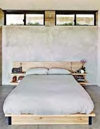
Architects Tom Chastain, Renee Chow, and Antje Steinmuller of Studio Urbis installed Swisspearl siding as a rainscreen and used concrete flooring and walls to insulate the home and regulate its internal climate.
For a couple with different aesthetic and cultural backgrounds, creating a home that suited them both involved a steep learning curve. But as luck would have it, their architects are also teachers. my house
86 87September/Oct O ber 2014 dwell asia dwell asia September/Oct O ber 2014
Elementsproject PalolocationStudioarchitectHouseUrbisAlto,California text IanphotosZahidbySardarbyAllen Spencer Greene and his daughter, Anya, go for a dip in their Palo Alto, California, home. The three-inch-thick acrylic pool window allows the parents to monitor their children’s swims from the LC4 chaise longue.
In Palo Alto, California, Spencer Greene, a Texas-raised technology ex ecutive, and Santosh Ramdev, a public relations professional from New York, just couldn’t agree on a home they both liked. Greene wanted light wood fin ishes in a midcentury modern house like his grandmother’s to match his collection of vintage furniture. Ramdev, who grew up in an Indian household full of color, preferred easy-care con creteThefloors.couple found a 50-by-200-foot lot with two teardown structures on it. Then they discovered that the smaller one could not be torn down because disturbing its foundation would harm the old trees beside it. In 2004, Greene and Ramdev began hunting for an ar chitect for the remodel. Just after their wedding, in 2005, they discovered architects Tom Chastain and Renee Chow of Studio Urbis on UC Berkeley’s web site. It was an instant match. “As teachers, we didn’t sell. We explained,” Chastain says. “Instead of style, we spoke of site and space, and that gave them the confidence to choose us.” Antje Steinmuller, a former student of Chastain’s who is now a principal at Studio Urbis and a professor of architec ture at California College of the Arts, became the project architect. Over the next five years, Greene and Ramdev’s children, Anya and Yash, were born, and several designs ensued for the ex panding family. Eventually, they made a choice. “We really helped them to understand what spatial associations they were triggering during our discus sions,” Steinmuller says. “Spencer was very precise He’d say, ‘I’ll enter and turn right to reach for a coat hook,’ and then physically demonstrate what he meant.” Thanks to such specific input, the refurbished, 500-square-foot guest cottage remains where it was, and the new 4,000-square-foot, two-story house is a composition of well-lit, open-plan spaces to “journey” through. Inside, bright green, red, and blue walls symbolize earth, fire, water, and air. “Color can be associative, but it also helps to define room spaces,” Steinmuller says. In the kitchen, Ramdev’s spices, beans, and grains are stacked in clear glass containers on open storage shelves against a wall of channel glass, like colorful, site-specific art. “The attitude of this home,” Chastain says, “is deliber ately not luxurious.”
Homeschooling
Ramdev: We looked at so many gor geous houses near University Avenue, but Spencer would walk in and say he would have to redo this and redo that. They were all construction proj ects. I realized then that he was in denial. He really wanted to build from scratch.


Greene: I had always imagined that architects were artists with great design sensibilities but I did not realize how much of their work is about negotia tion. Because there is little residential space close to downtown, Palo Alto lots are deep and narrow. With so many zoning codes, people are building to match the imposed mass and volume restrictions—and that becomes the de sign. Houses begin to look the same. We wanted something different. In the end, we left a bit of our buildable space unused so we could have a better design within the constraints. The pool, for instance, drove a lot of decisions. Long before this project, I woke up with this image of a porthole looking into a swimming pool. In my mind’s eye, it was a round porthole—just two feet in diameter. But even though I had worked so closely with Tom on the de sign, when they took the forms off the concrete, I was startled to see this huge gap in the swimming pool wall. Tom said it was the window! I thought a little opening would be all that we could do, practically. He made the idea better, and the water pressure keeps the Plexiglas shield in place. Ramdev: We had toured so many houses, and every one had wood ceil ings and wood everywhere. The natural theme was being overdone, and so I resisted that. We do have some wood paneling downstairs; the architects had to explain to me many, many times
In their bedroom, Anya and Yash hang out in the boat-shaped swing by Haba that their aunt brought them from Germany (it’s not currently available in the Unit ed States). A Rapson Rapid Rocker by Rapson-Inc. sits next to the window.
“I wanted a house that was livable, where our children could grow up happily.”
Chronicle Magazine. The house had channel glass, and we went to see it. We liked the style, but the house was intimidating. We are both down-toearth people, and I did not want marble flown in from India and special things from Italy. I wanted a house that was livable, where our children could grow up happily.
Greene: I’ve lived in this area for 20 years, and still it took a long time to find something we liked. We eventually found Tom Chastain’s work and began to be more interested in an in tellectual approach to our design. It struck me that he said right away that there will be mistakes, but he prom ised to make the good stuff outweigh the bad. He had the wisdom to say that he would not be perfect. I’ve been calledWhenhyperrational.wesatdown with him, he sensed my interests and explained very simply why modern architecture is different from premodern. In modern architecture, you design the whole site and not just a structure deposited onto the land. Ramdev: I think Spencer had certain architects he wanted to interview and was really keen on one whose work he had seen in the San Francisco
—Santosh Ramdev, resident
Movable wood screens on the exterior (above right) provide shade to alleviate heat gain. The home is color coded to correspond to the outside elements. In the kitchen, the walls near the garden are painted green. The built-in table was designed by Chastain, and the Tone chairs are from De La Espada.
88 89September/Oct O ber 2014 dwell asia dwell asia September/Oct O ber 2014 my house
A Lower Living Room B Media Room C Exercise Room D Sauna E Bathroom F Study G Laundry Room H Utility Room I Storage J Wine Cellar K Entry L Guest Bathroom M Living Room N Dining Room O Kitchen P Family Room Q Loft Library R Bedroom S Master Bedroom T Master Closet U Master BathroomLower Floor Ground Floor Upper Floor A BC D GF H JI N O P QEE RR S TU K L M Elements House Floor Plan


A flexible exterior wall—composed of two-by-six-foot Fleetwood glass doors that pocket into green side walls—links the interior to the exterior. The use of land scape colors inside is an inexpensive and simple way to visually reference the out doors. Frank Lloyd Wright employed this tactic, as did Arts and Crafts designers before him. fleetwoodusa.net
Ramdev: Antje Steinmuller was my window to architecture; she worked closely with me. When we were designing the kitchen, she showed me the layout on a piece of paper, and all I said was that I wanted it to be larger, larger. There is enough space for all of us to be working on totally differ ent recipes. I make Indian-style rotis and set the kids up to make their own. Spencer makes pancakes in the morn ing while I am getting the rest of break fast or lunch ready.
A double-sided gas fireplace by Regency separates—and also connects—the living room and dining area without diminishing the effect of the larger, loftlike space (right). regency-fire.com
Some Like it Hot
Shadow Play 3form Varia Ecoresin Organics panels were used as sidewalls for the stairwell. The material is a translucent resin that permits light to pass, making the adjacent spaces seem bigger. Silhouetted figures going up and down the stairs animate the room. Effects can be varied and modulated with panels of different textures from different suppliers, such as 3form, Panelite, and Bendheim. Panels can also be mounted in simple aluminum U-channels to be used as partial room dividers or as entire walls.
Greene: I call our home the Elements House because the exposed concrete slab suggests earth; the windows reveal the sky; the pool is a water feature, vis ible inside and out; and the fire is our double-sided fireplace. The lower level has three of the elements. We picked the colors to help make sense of it: Red is near the fireplace and sauna. Blue paint suggests air and water.
Here Comes the Sun Daylight ricochets into some of the darkest “landlocked” corners of the house via Sol atubes, making artificial light unnecessary during the day. In dense urban areas, where side windows are not possible and large skylights are inconvenient, light can still be channeled through these very small, circular exterior openings. They connect to ingenious reflective inner tubes that can be threaded into walls or ceilings and at tached to chandeliers. solatube.com
Greene: Santosh has a vast array of lentils and spices, and that drove cer tain aspects of the design. Instead of being hidden in a pantry, these foods have become a decorative feature that is extremely useful.
Make It Yours
The patio table and benches are from Crate and Barrel (top). Greene purchased the vintage George Nelson dining table and cane-back chairs together (above). “We assume they were originally a set, but there is no way to be sure,” he says. Content originally published in Dwell® Magazine and/or on www.dwell.com, © Dwell Media LLC 2014. Published with permission of Dwell Media LLC. All rights reserved.
90 91September/Oct O ber 2014 dwell asia dwell asia September/Oct O ber 2014 my house
“We picked the colors to help make sense of [the house]: Red is near the fireplace and sauna. Blue paint suggests air and water.”
Ramdev: In this kitchen, I always know where everything is because of how Antje designed the open storage shelves. It is not a decorative show kitchen that is not a place to cook. It really functions, and I wanted that. The red- and orange-painted cabinets are meant to reflect sunlight and represent the heart of the home (left). The glass-fronted cabinets in the kitchen are by Henrybuilt, and the clear containers with dry goods are from the Container Store. In the living room (be low), a vintage table and chairs by Edward Wormley sit in front of a Florence Knoll wall unit with a vintage jewelry chest by George Nelson for Herman Miller. The Hinaki pendant light over the stairs is by David Trubridge.
Primary Colors
how it represented the core of the house. It was a battle I lost, but now I agree it works aesthetically. I also wres tled with the architects over the acrylic panels embedded with bamboo rings that serve as translucent sidewalls for the stairs. I thought the panels should be clear, but in the end I picked the translucent panels.
The Big Screen
—Spencer Greene, resident
Upper cabinets with translucent 3form Ecoresin on the front and back panels and open steel shelves allow light into the kitchen from exterior walls of channel glass. This lively and practical screen idea can be used on any window wall or as a room divider to allow privacy while bring ing light from one space into another. 3-form.com


In Sweden, architect Bengt Mattias Carlsson created a pavilion adjacent to a residence dating from the late 1800s. The pergola is made from glue-laminated timber beams set atop steel posts; it protects the pool from falling pine needles. George Nelson benches offer places to sit.
ItSwedeHowIs
text Norrlandet,locationMeterArchieBengtarchitectForestprojectJamesphotosArlenebyHirstbySilvermanSaunaMattiasCarlsson,DesignLabandArkitekturSweden A Swedish guesthouse is built with modern sensibilities and centuries-old techniques. dwellings92dwellings September/Oct O ber 2014 dwell asia 9392 dwell a SI a September/Oct O ber 2014

dwellings 95dwell asia September/Oct O ber 201494 September/Oct O ber 2014 dwell a SI a
A wood-burning stove from Harvia, of Finland, heats the sauna. The pavilion’s rough-cut pine walls are treated with tar, a preservative that yields a time-worn aesthetic. Arne Jacobsen designed the Vola bathroom faucet (opposite).


The biggest obstacle was getting the necessary permits. Due to an abandoned underground military gun emplacement on the site, the family had been granted the rights to build on only a portion of the land. The heritage commission wanted the chamber preserved.
Light floods into the sparsely furnished living area thanks to the oversize glass doors. Carlsson used the same materials and timber sizes indoors and out to maintain a unified character throughout the pavilion (right). These days, something old can easily become the next big thing—whether it’s music, fashion, furniture, or even construction methods. That’s the case with the guesthouse that Bengt Mattias Carlsson of Archie Design Lab and Meter Arkitektur designed for Linda Seitola Gunnarson, Pekka Seitola, and their two chil dren. The family owns a large swath of land outside Gävle, Sweden, on a wooded peninsula that reaches out into the Baltic Sea. To blend the structure into the pastoral environment, Carlsson and builder Kaj Stefanius employed modern wood technology and 1,000-year-old Nordic building traditions, producing a pavilion that rests lightly on the land.
The 6,460-square-foot pavilion is one story high and nearly 200 feet long. Constructed as a series of modular spaces, it’s reminiscent of a forest cabin col lection. Each space takes up 107 square feet. “It’s put together as a system,” Carlsson says. “You don’t feel it as being big, but experience it as small rooms.” The main structure includes a laundry room, guest rooms, bathrooms, and a dining-entertaining space. There are only two bedrooms, but the house can sleep ten
“I contacted them and finally got them to agree to a bigger site,” Carlsson says. He swayed the committee by proposing to build on top of the military outpost. It still exists and is visible through glass inlays in the pavilion’s floor.
96dwellings September/Oct O ber 2014 dwell asia 97dwell asia September/Oct O ber 2014
The Seitolas renovated and restored a historic house dating from the late 1800s after they bought the land nearly 20 years ago. Though the house was large enough for the family of four, the Seitolas wanted additional space to entertain friends as well as a place for bathing, recreation, and storage. They reached that conclusion shortly after finishing the renovation, but almost ten years elapsed before the guesthouse was actually built. “When we started, the kids were small,” Carlsson says. “Today they’re 17 and 20 years old.”


A Bathroom B Laundry Room C Bedroom D Covered Pool E Recreation Room F Half Bathroom G Tub Room H Shower I Sauna J Dining-EntertainingSpace K Seating Deck BA C CE D J F HIG K Forest Sauna Floor Plan
SparfOSlObyStyledttaalexiuandJhanna
Content originally published in Dwell® Magazine and/or on www.dwell.com, © Dwell Media LLC 2014. Published with permission of Dwell Media LLC. All rights reserved.
98dwellings September/Oct O ber 2014 dwell asia 99dwell asia September/Oct O ber 2014
The pine forest around the complex provided the architects with their color scheme (opposite). The wood on the exterior has been treated with linseed oil or painted with tar. Seats built directly into the pavilion’s frame allow the family to relax and enjoy the surrounding woodlands without the need for additional furniture (above). thanks to its bunk-style interior. The four-chamber sauna is in a separate structure, as is the boathouse. In the traditional Finnish manner (Seitola is of Finnish descent), trees have been left standing close to the pavilion, creating a visual rhythm between site and structure. Solid wooden slabs form a stage for sunbathers, and people can move freely through indoor-outdoor spaces on the spruce hardwood deck ing. A newly constructed road leads to the entrance on the land side, where buildings for boats, cars, and tractors have been Seven-and-a-half-inch-wideerected. hewn logs frame the structure, which rests on site-cast concrete plinths. Log construction is one of the oldest building methods in Scandinavia. “Today we talk about sustainability, but what is more sustainable than a 1,000-year-old technique?” Carlsson asks. The walls feature roughsawn surfaces; every two-inch-wide board is tarred on the pavilion’s exterior and glazed with linseed oil inside, an eye-catching preservative treatment. The project took a long time, but it was a happy, harmonious one. “We all worked together,” Carlsson says. “Me, the family, and the builder.” The joint effort garnered national accolades: The house won first place in the Swedish Timber Prize, a competition that is held only every four years. The jury lauded the pavilion’s exceptional “creative zest and meticulous detail.” For Carlsson, the end result “feels like a shrine.”


Tacoma,locationKoarchitectStevensprojectAdditionWibowoWashington A ofSensePlace a couple coping with Alzheimer’s, a thoughtful addition creates a long-termcomfortable,solution.
Text by Kelly Vencill Sanchez Photos by Coral von Zumwalt
For
100dwellings September/Oct O ber 2014 dwell asia 101dwell asia September/Oct O ber 2014
Claire and Ken Stevens approached architect Ko Wibowo to create a modern addition to their 1970s home in Tacoma, Washington. The couple’s needs had changed since Ken was diagnosed with Alzheimer’s a few years ago.
dwellings


Claire adds, “He wanted to stay at home, as does everyone. So we started thinking, ‘How could we do this?’ The only full bath is on the second floor and so is the bedroom, but he couldn’t be going up and down stairs. Adding on was the only way.”
“It was important how Ken and Claire were going to use the addition,” Wibowo says. “But I also needed to respect the existing house and find a way for the addition to have its own merit.”
Stevens Addition Floor Plan A Existing Entry B Existing Living Room C Bridge Connector D Bedroom E Bathroom F Study G Enclosed Deck A B C D E F G102dwellings September/Oct O ber 2014 dwell asia 103dwell asia September/Oct O ber 2014
Wibowo immersed himself in the project, which took on keen urgency after Ken suffered two falls.
The house, designed by architect L. Jane Hastings in the early 1970s, is located on a steeply sloped site that backs up to a state park. In the early stages of the addition concept process, Wibowo referred to a research publication from Australia, Dementia Care and the Built Environment, which underscores the importance of building a space that is as homelike as possible, with abundant light and many familiar objects in place. The architect accomplished this by creating custom shelving to hold ceramics that Ken made or collected over the years along with pieces by artist friends (opposite). Ultimately the aim of the design is to help Ken retain his memories and keep him safe.
A chemistry professor who discovered a passion for ceramics in the late 1960s, Ken Stevens had a successful career as both a potter and an influential teacher at the University of Puget Sound. Now 75, he and Claire moved into uncharted waters as they coped with the challenges that typically accompany the disease: pro gressive memory loss, difficulty with motor planning and expressive language, and assorted health problems.
When Claire and Ken Stevens first contemplated building an addition to their home, it was plain that their needs had undergone a sea change since 1973, when L. Jane Hastings, a pioneering Pacific Northwest architect, had designed their house in the trees. Set on a tranquil, wooded site in Tacoma, Washington, the bi-level structure is filled with artwork, books, and one-of-a-kind treasures collected around the world— testaments to the couple’s rich and varied life together. When Ken was diagnosed with Alzheimer’s in 2009, architectural features that they had once negotiated without a thought—the steps leading to the front door, the two-step changes of level inside, the flight of stairs to the bedroom and master bathroom—all became potential hazards.
“Once Ken was diagnosed, we talked about what he wanted to do,” recalls Claire, 74, a physician’s assistant at the University of Washington. When it was suggest ed that he might be better off in a long-term care facil ity, both he and Claire balked. Remembering his sixweek stay in a convalescent unit after a fall, Ken says simply, “I didn’t enjoy that experience.”
Moving was out of the question, but something had to be done to make the house safe and habitable for Ken.
Through Hastings, they were introduced to Ko Wibowo, an Indonesian-born architect based in Puyallup, Washington. Wibowo met with the couple, whose stipulations were surprisingly few: a bed and a bath on one level.


104dwellings September/Oct O ber 2014 dwell asia 105dwell AS i A September/Oct O ber 2014
Compatible with the original house but decidedly modern, the addition sits lightly on the land, an impor tant consideration—its primary mass is set atop a con crete basement holding storage and the mechanicals, and the rest is supported by steel beams. “The design is based on the stump of a cut tree and its branches,” Wibowo explains. “The stump is represented by the basement that supports the main trunk—the bed room—while the branches are a cantilevered connec tion to the existing house, a study, an accessible bath room, and an enclosed deck.”
“The addition posed two challenges: first to accommodate Ken’s physical needs as well as his neural and psychological needs. The second was to fit the wooded site and respect the existing Northwest style.” —Ko Wibowo, architect
Wibowo says he’d like to install a hanging garden so Ken, who used to maintain the landscaping, can put his hands into the dirt. For now, he remains safely at home, surrounded by the things that he loves.
Clad in beveled-cedar siding that will naturally weather to match the shingles on the main house, the addition is reached via an interior bridge and a large pivot door from the living room. There, the old oak floors give way to solid maple, while generous win dows and high, slanted ceilings allow for abundant natural light even on cloudy days. Built-in cabinetry keeps freestanding furniture to a minimum. Wibowo opted against a door for the spacious bath room so Ken could easily move in and out. “All the doorways are at least three feet wide,” says the architect, “and there’s a five-foot turning radius in the bathroom.” The wall-mounted sink and toilet enhance accessibility, as does the roll-in shower, which contains a fold-down teak bench. The emphasis on aesthetics as well as function suits Claire. “I didn’t want this to look like a hospital room,” she says. Contributing to the feeling of familiarity, Ken’s ceramic plates, vases, and other vessels, all defined by his signature glazes, are displayed on open shelves in the bedroom. In the study is his collection of teapots— some of which he made, others he acquired from fellow potters or gathered on visits to Japan. A few steps from his reclining chair is the semi-enclosed deck, where he can take his walker to look at the Douglas fir, madrone, and vine maple trees.
All
The addition’s beveled cedar siding (left) will eventually weather to match the existing shakes, “but it’s different enough to distinguish the two,” says Wibowo. “The window frames and metal roof color also match the dark bronze aluminum of the existing house, so it all blends.” Wibowo also notes that the window on the bridge between the two structures could eventually be replaced with a door if the couple ever want to build a ramp. The addition, which includes a bedroom and a bathroom, also boasts an enclosed deck (opposite), a recommendedfeatureforthose with Alzheimer’s. “Ken used to do the landscaping here,” says Wibowo. “He also put many of the shingles on the original house.” originally published in Dwell® Magazine and/or on www.dwell.com, © Dwell Media LLC 2014. Published with permission of Dwell Media LLC. rights reserved.
Content
Taking the topography and the original structure as his cues, the architect designed an open, accessible space that would promote a sense of familiarity, while accommodating caregivers as Ken’s disease progressed and his ability to manage his daily needs declined.


The view from Gabriel Ramirez’s property in Sea Ranch, California, where meadow grasses and cypress trees give way to craggy cliffs and the lapping Pacific Ocean. His house joins those that a cohort of
Back at the Ranch
SealocationJudithNormanarchitectsRamirezprojectstretcharchitectsforward-thinkingbuiltalongthisofcoastinthe1960s.ResidenceMillarandSheineRanch,California
106dwellings September/Oct O ber 2014 dwell asia dwell asia September/Oct O ber 2014 107106
Text by Fred A. MarkPhotosBernsteinbyMahaney new home at Sea Ranch, a half-century-old enclave of rugged modernist houses on the Northern California coast, captures the spirit of its surroundings.
A

A GIHJ B C D EF108dwellings September/Oct O ber 2014 dwell asia 109dwell asia September/Oct O ber 2014
A Terrace B Living-Dining-Kitchen Area C Wine Cellar D Half Bathroom E Guest Bedroom-Office F Garage G Guest Bathroom H Guest Loft I Master Bathroom J Master Bedroom Ramirez Residence Floor Plan First SecondFloorFloor
Fifty years ago, a group of young architects began planning a cluster of contemporary houses on a rugged strip of coastline north of San Francisco. The goal was to turn a ten-mile expanse of bluffs and beaches into a community where modest, rustic second homes would blend in with the landscape. Among the founding architects was Charles Moore, a future dean of the Yale School of Architecture whose own condo featured a bedroom raised on corner posts over the living and din ing rooms, partaking of their light and views. Another was Joseph Esherick, whose famous Hedgerow Houses use occasional steps, two or three at a time, to scale the gently sloping sites.
Over the years, Sea Ranch has become a destination for architectural pilgrims, attracted by the pastoral modernism of its early buildings. But it’s also a thriv ing community that gains 30 or so houses each year.
One of the newer structures, sheathed in rough con crete and Cor-Ten steel, takes the Sea Ranch principles to heart. As Donlyn Lyndon, one of the original Sea Ranch architects, says, “It is a real continuation of what we were trying to do.”
The owner is Gabriel Ramirez, a radiologist who lived for 20 years in a Richard Neutra house in Los Angeles and commuted to area hospitals. But now that technology lets him review scans remotely, he prefers to work in quiet, isolated Sea Ranch. After buying a site overlooking an inlet called Smuggler’s Cove, he asked two architects—Norman Millar, dean of the Woodbury School of Architecture, and Judith Sheine, head of the architecture department at the University of Oregon—to design the house. The architects had never worked together but had similar modernist credentials, and both are close friends of Ramirez, who didn’t want to have to choose between them. “We’re like a family,” says Millar, who adds that Ramirez made it clear that the architects would always be welcome in their creation. Sea caves located beneath the property presented a problem: The house couldn’t occupy the center of Ramirez and his partner, Sarah Mason Williams, dine at a sequoia table by Redwood Burl next to a hulking juniper tree that they asked the architects to preserve as a centerpiece of the property (above). Cor-Ten steel and board-form concrete give the exterior a weathered look (right).


“I wanted to get rigorous. Let’s limit the number of building materials.”
—Gabriel Ramirez, resident Norman Millar and Judith Sheine designed the built-ins in the living-dining area, which were made from vertical-grain Douglas fir. Vintage Dutch industrial chairs are arranged around a black walnut dining table that, like the madrone coffee table, is by Urban Hardwoods.
110dwellings September/Oct O ber 2014 dwell asia 111dwell asia September/Oct O ber 2014

Boi sconces, which David Weeks designed for Ralph Pucci, illuminate the bedroom (left). The area rug is by Stephanie Odegard. The living room (opposite) is furnished with vintage items, including a leather-and-chrome chair by Suekichi Uchida and a stacking stool by Florence Knoll. the lot but rather had to hug its edges. By all accounts, that challenge proved beneficial by forcing the archi tectural duo to create two structures, a modest main house and a guesthouse, rather than one big one. This was fine by Ramirez and his partner, Sarah Mason Williams, a graphic designer. In true Sea Ranch fashion, they wanted the giant juniper at the center of their property to remain the site’s dominant feature. For the couple, following the Sea Ranch rules— local covenants guide new designs—didn’t mean slipping into Sea Ranch clichés. Lovers of Cor-Ten steel, with its ruddy and almost organic surface, the architects made it the main exterior material, along with board-formed concrete and ipe wood. The Cor-Ten, which quickly turned an autumnal rust in the sea air, and the concrete, with its grain and crannies, mean the house isn’t a pristine box, Ramirez says. His Neutra house “was very crisp and clean,” he says. “This house is more distressed, more wabi-sabi.” No wonder Sea Ranch stalwarts have embraced it.
Lyndon—coauthor of The Sea Ranch, the definitive volume on the development and its architecture (a new edition was released in time for its 50th anniversary in 2014)—says, “It doesn’t look like other Sea Ranch houses on the surface, but it’s deeply rooted in theIndeed,place.” the interiors recall both Moore’s loft, with its raised bedroom, and Esherick’s houses, with their stepped interiors. In Ramirez’s version, the living room, dining area, and kitchen are closest to the bluff. A few steps lead up to a guest room and study, and a few more lead to the master bedroom. The only enclosed rooms are the bathrooms, which project out in ipe boxes from one side of the house, and Ramirez’s office, tucked away below the master bedroom. The spaces flow into each other under an angled ceiling made of richly hued plywood—which, Sheine says, makes the interiors “warm, warm, warm.” On the sidewalls, everything above the datum line is covered in the same plywood; everything below is concrete, with
112dwellings September/Oct O ber 2014 dwell asia 113dwell asia September/Oct O ber 2014


grooves and pits that seem appropriate to the rugged surroundings. No part of the house is drywall, which Sheine describes as a kind of crutch—the material of lastToresort.avoid interrupting the long, sloped ceiling, Sheine and Millar decided there would be no lights mounted in it or on it. Instead, swing-arm fixtures— two by Serge Mouille, the others by David Weeks—are mounted on the walls. And when he serves dinner at night, Ramirez lights a pair of hurricane lamps on the large, black walnut dining table. As for the rest of his furniture, Ramirez relied as much as possible on built-ins, including a thickly upholstered bench that runs the length of the living room and is a perfect place to stretch out with one of his many architecture books. Though he may be working remotely, “in the end,” Ramirez says, “Sea Ranch is all about relaxing.”
“Given the kind of work we do, it’s very nice to have no distractions. You hear maybe the ocean, maybe the wind, maybe nothing.” —Gabriel Ramirez, resident originally published in Dwell® Magazine and/or on www.dwell.com, © Dwell Media LLC 2014. Published with permission of Dwell Media LLC. All rights
Content
Sea caves on the property forced the architects to split some of the living space into a 483-square-foot guesthouse (above). It has similar built-ins and is outfitted with a reproduction rotating sconce by Serge Mouille and rugs by Stephanie Odegard (opposite).
reserved.114dwellings September/Oct O ber 2014 dwell asia 115dwell asia September/Oct O ber 2014


The habit of how the people build their house is already shifted into a modern transaction between workers and contractor. What used to be the work of community in a vernacular way is no longer exist. This brings out the question in Yu Sing mind. “There are so many traditional houses in Indonesia which truly belong to the local climate and surroundings, but can we learn anything from them? We should be able to see its conection with surroundings and local resources,” says Yu Sing. As an architect, he always try to engage a closer bound between human and their nature. He will never stop convincing the client to understand the good ideas behind a decision to use material available around the site. Having to preserve one tree in the site is also a responsible start to be more friendly with the earth. If possible he advise the client to plant wood plant or fruit plant which will last years, but to some extend this notion as responded in positive way.
117dwell asia September/Oct O ber 2014116profile September/Oct O ber 2014 dwell asia
AkanomaandSingYuofcourtesyPhotos
The awareness grow inside Yu Sing mind as a person and professional architect who share idealist path of providing more affordable house for his clients. He understands that nature brings a great deal of influence when it comes to archi tecture and man made built environment.
The use of natural material from surrounding the site would be a friendly gesture toward nature. Hence, the design part of the process plays a crucial transition to deliver a satisfactory result for the client. This is also becoming an eye opener pro cess for the clients to give more appreciation to what nature can provide.
The interconnected relationship between nature, culture, and architecture attract his attention. “I observe the interdependence correlation between culture, architecture, and the nature surrounding them. The nature preservation turns out to managable when the human text
The growing concern about the nature and how the world evolve due to human negligence has lead Yu Sing and his firm Akanoma into a series of exploration towards the relationships between nature and architecture.
AllSunthybySunowoSenses to The Nature Yu Sing design a work station in order to be able to work by the nature and having the trees as a scenery. He uses all senses to understand the nature including explore with the taste of fresh green vegetables he can grow in his garden. still has the need toward the nature. “ By observing traditional houses and villages, Yu Sing sees the three big part, settlement, farm;included fishery and agriculture, and forbidden forest. This is where traditional lifestyles always mantain a balance relationship with the surrounding. When he build his studio, Yu Sing also concern how his building invade a minimum part of the land. it leaves a big part of the land and gives him opportunity to do simple farming and make the surrounding of the studio looks green. This is the proof that his concern doesn’t stay within the boundaries of the client’s projects, he extend the concern into his lifestyle and how he sees the life. While in his never ending quest on what to learn from the nature, his design will remain an eye opener and a new experience with nature for his client.


GO FIND FORMAPURAIT! INTERIORS & FURNISHINGS
BEST DEAL: Bixby Étagère and Bixby Armchair.
“It all started with a simple form product and a simple vision”. Behind the creation of the Formapura retail store back in 2013, the power of two siblings is in play – Janice Tjioe as Principal Designer and Isabelle Janvlyn as Managing Director. Having gained experience through their manufacturing facilities since 1983 in developing furniture products for the international market, and in collaboration with commercial operators, developers and chain stores worldwide, they strive to fulfill not only the volume of production, but also to maintain solid, longlasting relationships with their customers. Their vision is to combine authenticity and a passion for classic craftsmanship with the efficiency and capabilities of manufacturing,modernwhilealso providing a full range service of interior design and interior build for residential and commercial projects. “We find beauty in the fine details around us, and we wish to design and manufacture furniture that leads to a simple way of gracious living everyday because the most gracious shapes come from the human hand,” says Janvlyn. “Our furniture is made-to-suit, made-tolast, and made especially for each home owner.”
vertical living environments, to expatriates who appreciate Indonesianhandmade products, to new homeowners looking for made-to-last pieces within an affordable luxury budget, as well as many prominent developers, architects, and interior designers in Indonesia.
COOLEST FIND: Carrie armchair in orchid colour.
In terms of designing new products, what are you focusing on? We focus on each customer’s personal vision of timeless style, and deliver it through our hand-crafted, solid and upholstered goods. As Formapura strives to provide fine wood furniture, which is made to satisfy the client’s needs, we ensure that it remains true to the inspiring assortment of designs, furnishings, and classic craftsmanship, through the efficiency of modern manufacturing.
What made you open Formapura?
What is Formapura’s design and style? Intrigued by the history of traditional American elegance and style, Formapura expresses the integrity of modern form and function with classic details and proportions, refined design and expert craftsmanship. We also personalize every customized piece of furniture with special finishes, techniques and treatments. We add custom hardware, combining multiple finishes, or even altering overall dimensions. We design and execute one-of-a-kind, inspiring pieces to suit our customers’ tastes in the palette of their choice. What kind of customer can we expect to see at Formapura? Formapura appeals to all, from professionals residing in hip and modern Jalan Senopati No.75 Jakarta Selatan 12110 +62 21 2942 8723 +62 21 2942 formapura.co.id8722
ArdorTimeless
In this fall season, we extend a nod to mid-century modern and sleek shape with our new Bixby Collection – Bixby Etagere, Bixby Stool and Bixby Armchair – through an illusion of light furnishings with the compatibility of comfort, form and function. Meanwhile, for the newest Bixby Pedestal, we found that a void of color filled by thoughtful details, beautiful forms, and luxurious textures would combine not only timeless design but also the modern solution of a gracious function-efficiency piece.
Researching the strong demand for fine furniture in Indonesia, especially in the Jakarta area, we found that many of the furniture boutique retailers provided imported brands of furniture, coming from other parts of the world, with a pricy tag. We believe that our brand can be a bridge to homeowners who love to accent their homes with locally-made, long lasting pieces with a more affordable price tag.
The main actors behind Formapura retail store, Isabelle Janvlyn and Janice Tjioe (opposite, top) Formapura Interiors & Furnishings showroom (opposite, below) shows a rich variety of products, from their best-selling one, the Klismos Bench (far bottom), the Carrie armchair in orchid colour (below, left), to their newest Fall collection, the Bixby Étagère (below, right).
Text Anindiaby Karlinda Photo Mohammadby Nuhrizal
What can you share about your newest products?
SPECIALTY: Affordable luxury with American Modern casegoods and upholstered pieces.
Taken from the Italian phrase that means ‘pure form,’ the Jakarta-based Indonesian retail store, Formapura, embraces classic craftsmanship with modern manufacturing in an assortment of timeless designs.
TOP SELLING ITEM: Klismos Bench and Kate One & Half Chair.
In the upcoming future, Formapura will highlight neutral tones derived from environmentally-conscious natural materials with extensive organic form and details; a unique collection with plenty of personality derived from traditional American heritage. In your opinion, what makes for great design? A great design is a re-born interpretation of the aspirations of a timeless yet revolutionized style movement throughout a valuable timeframe. Uniquely one of a kind, the great beauty of a design is taking history as a part of its foundation with a twist for modern functional needs.
design finder Formapura 118 September/Oct O ber 2014 dwell asia 119dwell asia September/Oct O ber 2014
What other ideas are you looking to implement in Formapura?


GO FIND IT! THE SANDALWOOD ROOM 76 Prinsep Street Singapore 188663 +65 6883 2369 +65 9786 thesandalwoodroom.com.sg5896
Many of the designers who supply us aim to sustain these craftsmen. To name a few: Anokhi from Jaipur, Shrujan from the Kutch region, Gujarat, Maya Bazzar from Maharashtra, Ishika ceramic ware that is Indian inspired but produced in Srilanka, Temple Jewellery from artisans from South India. Part of the concept involves a ‘pop-up’ retail corner in which craft and couture items, artefacts and accessories will be cycled on a short term basis.
Text by Asih Jenie
You describe The Sandalwood Room as a place for ‘retail recreation’, tell us more about that.
RealitySuspended
Tell us more about some of the brands you have in the shop. We work with designers from across India – Delhi, Jaipur, Chennai and a lot of rural areas where craftsmanship is still alive, but perhaps not thriving.
RoomSandalwoodofcourtesyPhotos design finder Sandalwood Room 120 September/Oct O ber 2014 dwell asia 121dwell asia September/Oct O ber 2014
Occupying a historic shophouse in Singapore, this fragrant boutique offers an extensive collection of India’s best handcrafted products.
COOLEST FIND: Pillows stamped with traditional illustrations, Kanchan Chander’s wearable arts.
All of my life I’ve been so busy until a few years ago. made shopping lists, had a mental image of what I might pick up, ran into a store in between appointments and chores, scrambled to pick up something within my budget and charged back to the day’s to-do list. am not advocating that we all set aside huge chunks of our schedule to shop at leisure; but as I grew older I realized that there is a deep sense of pleasure in meandering through a store, in just holding and feeling things. And it’s not just the act of Time slows down inside this charming boutique retail in Singapore Occupying a carefully renovated heritage shophouse, The Sandalwood Room offers a curated selection of fine crafts, which run the gamut from home décor and tableware to jewelry and textile, as well as other cultural curios and novelties, sourced mainly from India. The shop is a brainchild of two ladies; entrepreneur Jayashrree S. Mani and retail consultant Mathangi Srinivasamurti.
she decided to share her love for “all things beautiful” by opening a shop in a heritage shophouse which had formerly housed a curry shop. The space is now a feast to all senses. Fragrant sandalwood scents the air, shelves of exquisite and colourful products line the walls, and friendly staffs smile behind the counter constructed from ornate Indian swings. And at the back of the shop is a small gallery dedicated to display the work of a chosen artist. We’ve caught up with the founder herself to find out more about this room that suspends reality.
buying, but the smell and warmth of a familiar store space, meeting the store staff – especially when they have been there for awhile and know your tastes – that relaxed me a lot. Now the word ‘retail therapy’ suggests that I am ill, yet I may just be tired, stressed and need a few minutes of the big T – time out. I don’t like the sound of retail therapy; and I thought it through and realized that what I am talking about is retail recreation. If therapy is about feeling more cheerful, recreation is about becoming any number of things while enjoying oneself – more exhilarated, mentally recharged or calmer! And this is how I would like The Sandalwood Room to be perceived. Why name the shop The Sandalwood Room? I think of element that is very Indian, and sandalwood is the top of that list, when you smell sandalwood you think of India, we use them extensively in our ceremonies. It is also have an antiseptic quality, and adding to that sandalwood has become an increasingly rare and precious commodity – did you know that to cut a sandalwood tree you need government’s permission now? We have Formerly a curry house, (opposite, top) this heritage shophouse now houses the finest of Indian craftsmanship. Owner Jayashrree S. Mani (opposite, bottom) leaning on shelves displaying Anokhi’s handmade quilts. Ishika ceramicware (top) blends traditional motifs with contemporary shapes. Handmade toys (bottom) displayed on the counter that is constructed from Indian ornate swing.
an actual sandalwood piece inside the store, and we keep it on one of the swings we use to construct the counter. How would you describe the shop’s collection, and what’s the biggest challenge in bringing them to Singapore? We bring artistic works that are unique even in India. We source from original creators who give a contemporary twist to traditional ideas; their creations will be unique and each piece will be exclusive. These are not mass marketed products, these are hand crafted, limited collections, which are only available from the designers. The most challenging part of sourcing these products is locating the suppliers whose products resonate with market needs and our taste; and then the logistics at the supplier’s end.
Chennai native Mani has been a regular visitor to Singapore for over 20 years before
What’s next for the Sandalwood Room? Wooing the market! Establishing the clientele base.
TOP SELLING ITEM: Stuffed animal plushies, Rema Kumar’s sari collection. BEST DEAL: Anokhi’s quilt, hand-crafted from organic cotton dyed with vegetable dyes.
SPECIALTY: Indian handcrafted home décor and accessories with contemporary twists.


All the products, furniture, architects, designers, and builders featured in this issue.
Sourcing
When contacting our advertisers, please be sure to mention that you saw their ads in Dwell Asia.
Wood-burning stove by Harvia harvia.fi Platform bench by George Nelson store.hermanmiller.com 96 A Sense of Place Architecture for Everyone architectureforeveryone.org General contracting and casework by Wanaka & Sons wanakasons.com Structural engineering by Panos Trochalakis ytengineers.com Geotechnical engineering by DJ Thompson geoengineers.com Wishbone chair by Hans Wegner from lllums Bolighus iIlumsbolighus.com Decking and panel siding by Azek Building Products azek.com 106 Back at the Ranch Norman Millar Architects normanmillar.com Judith Sheine faculty/sheinearchitecture.uoregon.edu/ Salvaged black walnut dining table, madrone coffee table, and Chinese elm coffee table by Urban Hardwoods urbanhardwoods.com Boi floor lamp, Boi sconce, and Shell sconce by David Weeks for Ralph Pucci International ralphpucci.net Bench upholstery by Galbraith & Paul galbraithandpaul.com H530 fireplace by Wittus wittus.com
rivendellwoodworks.com Kitchen table designed by Tom Chastain, Studio Urbis Swisspearlstudiourbis.comsiding swisspearl.com Ships See Saw Swing from Haba habausa.com Rapson Rapid Rocker by RapsonInc. rapson-inc.com Tone chair from De La Espada delaespada.com Kitchen cabinets from Henrybuilt henrybuilt.com Clear containers from The Container Store containerstore.com Hinaki pendant light by David Trubridge davidtrubridge.com Outdoor table and benches from Crate and Barrel crateandbarrel.com Glass kitchen wall from Bendheim Wall Systems bendheimwall.com 88 How Swede It Is Meter Arkitektur meterarkitektur.se Urfjallet Bygg AB urfjalletbygg.se HV1 faucet by Arne Jacobsen for Vola vola.com Floor mat by Chilewich chilewich.com Ship’s lanterns by Erik Magnussen for Stelton scandinaviandesigncenter.com Concrete countertop by Sonoma Cast Stone sonomastone.com Rugs by Stephanie Odegard stephanieodegard.com Custom copper hot tub by Diamond Spas diamondspas.com Salvaged sequoia outdoor dining table by Redwood Burl redwoodburl.com Chair First stacking chairs by Stefano Giovannoni store.hermanmiller.com 112 Profile Yu Sing rumah-yusing.blogspot.com 118 Design Finder Formapura formapura.co.id 112 Profile SUB subvisionary.com 116 Design Finder The Sandalwood Room thesandalwoodroom.com.sg 120Finishing Touch Hatje Cantz hatjecantz.de Ken Schluchtmann diephotodesigner.de Reiulf Ramstad Arkitekter reiulframstadarkitekter.no
BIG+BIH 2014 bigandbih.com Haiku haikufan.com ICAD 2014 arturaicad.com Roselle Mont-Clair rosellemontclair.com Rugmaker therugmaker.com.sg Supellex supellex.co.id TOTO toto.co.id
Contact AdvertisersOur 86 My House Studio Urbis studiourbis.com Structural engineering by Benjamin Corotis, Endres Ware endresware.com Canyon byBuilt-incanyonconstruction.comConstructioncabinetsRivendellWoodworks
FOLLOW @SURFACEASIAMAG The new Surface Asia —sleeker, sharper and focused on everything Surface is all about: global design.contemporaryFollowSurface Asia on Instagram, Twitter and Facebook for exclusive images, videos, and more. Su Rfac EPR abal gu R ung


124finishing touch September/Oct O ber 2014 dw E ll a sia
Content originally published in Dwell® Magazine and/or on www.dwell.com, © Dwell Media LLC 2014. Published with permission of Dwell Media LLC. All rights reserved.
text KenphotoDianabyBuddsbySchluchtmann interviewHeaddwell.com/ken-schluchtmannonlineforanextendedwiththephotographer.
Norway’s 18 National Tourist Routes wind their way up majestic mountains, snake along the choppy coastline, and hug precarious ridges overlooking fjords. In National Routes of Norway, recently published by Hatje Cantz, photographer Ken Schluchtmann follows the roads, capturing images of the country at its most wild, its most docile, and its most picturesque. Structures and architectural follies dot the landscape, offering places for people to stop and savor their natural surroundings. Norway’s Public Roads Administration began developing the National Tourist Routes in 1994, and local and internationally renowned practitioners such as Snøhetta and Peter Zumthor have contributed structures along“Thesethem.locations represent a perfect symbiosis of landscape and architec ture,” Schluchtmann says. “What they have in common is the fact that they invite people to linger for a while and give visitors the possibility of finding a restful place in this landscape where senses are generally overwhelmed by the extremes.”
Northern Exposures
Along the Geiranger-Trollsti gen road in western Norway, Oslo-based Reiulf Ramstad Arkitekter designed a footpath that traverses rocky terrain before terminating at a scenic overlook. “For me, this is one of the most visionary contemporary architecture projects,” photographer Ken Schluchtmann says. “It doesn’t destroy the landscape, but is instead fitted perfectly into it.”
German photographer Ken Schluchtmann documents over 12,000 miles of Norway’s rugged landscape.


Showroom: 8/F, Room 808, Tai Yau Building, 181 Johnston Road, Wan Chai. | +852 2836 5808
Engineer tested, designer approved.
Showroom: 9 Penang Road #11-02/03 Park Mall Singapore 238459 | +65 9732 5034
Winner of 24 international design awards, the 1.5-metre Haiku® ceiling fan is everything you expect from a Big Ass Fan®, designed specifically for your home. Haiku integrates a silent, powerful motor with aerodynamic aerofoils, crafted and balanced by hand to ensure perfect performance at all seven speeds. Without the wobble. Guaranteed. Together, Haiku’s features result in the world’s most efficient ceiling fan—verified by ENERGY STAR®. “Haiku is flawless.It is the perfect fit in our modern home. Haiku’s aesthetics, combined with its extraordinary features, make it the only ceiling fan we would consider.” Mark P.
Aerofoils Handcrafted in
Speak to a consultant on +65 9732 5034 or visit bigassfans.com/promo and enter promo code DW714 to receive a free Haiku info kit.
BIGASSFANS.COM/PROMO
America


