
SGD 7.90 (incl GST) RM July/AugustIDRHKDPHPTHB16.901752506059,500 2014 At home in the modern world Clean Houses The Simplicity and Practicality of Modern Houses in Bold and CleanLinedVisionariesDesigns. Lane: Smart Solution for Urban Living in Cultural Surrounding


Story by Kelly Vencill Sanchez Photos by Spencer Lowell 80 Stairway to Heavens Share how to outsmart an appartment through modification of the storage and skylight, only best represented by Simone ten Hompel’s life in her London flat.
Story by Arlene Hirst
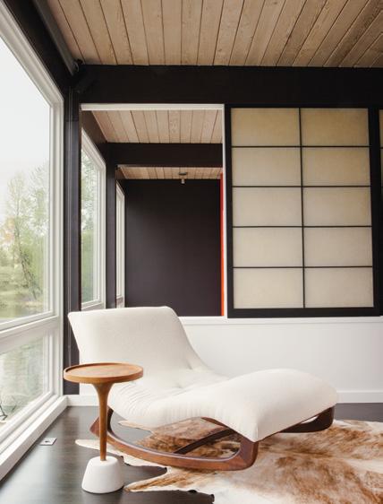
Photos by LATO Design 72 Designed for Living Find out how lucky Elise Loehnen and Rob Fissmer are for moving to the 1950 Kalmick House, Crestwood Hills, California, and get to live in a modestly unique abode with an open relationship to outdoors.
Photos by Joakim Blockstrom 88 Spare Change Expanding the quality of life is doable by downsizing the living space, as agreed by David Firedlander and Jacqueline Schmidt as they ‘liberate’ their life in a small Brooklyn apartment.
Story by Sunthy Sunowo
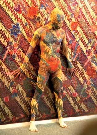
64 Behind The Timber Screen Take a peek behind the “Timber Ribbon Screen” as it shields for privacy, and be awed by how the clean lines and richness of texture on its visual features make this three-story house at Ming Teck Park, Singapore stands out among its neighbours.
Story by Luke Tebbutt
Photos by Matthew Williams
ContentsFeaturesJuly/August2014
Cover: Cave, Japan Photo by Masao Nishikawa This page: Ming Teck Park House, Singapore Photo by Lato design 64

the Rugmaker By appointment only | 1093 Lower Delta Road #02-20 Mapletree Industrial Singapore 169204 | (+65) 6270 2823 enquiry@therugmaker.com.sg | www.therugmaker.com.sg
An to walk on...
art

Renovation Be the witness to Sally Julien home transformation, from a ‘teardown’ midcentury house in Issaquah into a modern dwelling with an unlock view to the Lake Sammamish.
Nice Modernist Be inspired by the turning of a 450-square-foot apartment into an eight-unit live-work building in San Diego, named La Esquina, whose artful tenants from Woodbury University make every corner as fascinating as they are lively.
My House Sibling rivalry isn’t the case in Don Dimster and his filmmaker brother Dennis’s house, as the two share a duplex in Venice, California, each with distinct identity while maintaining one communal family space.
104 Finishing Touch Take a look at the paper artwork at dining room walls of paper artist, Pierre Pozzi’s new home in Valencia, Spain, which brings out an enchanting effect he calls “frou-frou”. 100 12
Take a peek into the wondrous choices of home interiors and seatings in colourful shades, while exploring the innovative world of kitchen space, laundry room, and apartments. And don’t miss out on feasting on veranda, only in Portico restaurant, Singapore, and enjoying works of Australian artists in Hotel Hotel, Canberra.
52
48
60
Design Finder Immerse yourself in a creative world where design roaming free and advancing, through AEDI that stores both local and Asian designer’s refined products.
102 Sourcing Indulge in a little retail therapy with the help of our buyers’ guide, which gives you all the goods on the designs featured in this issue.
96 Profile Explore the brilliant way of architect SUB, founded by Wiyoga Nurdiansyah and Muhammad Sagitha, searching for contemporary and innovative solution while pondering upon the cultural and environmental aspect of the projects.
43
ContentsDepartmentsJuly/August20148Editor’sNote11IntheModernWorld
10052
My House Trace the spatial continuity concept of Ivan Priatman’s family home in Surabaya, Indonesia, and see how every room is innovatively connected to each other, along with its clever exploitation of tropical climate.


President / CEO Michela O’Connor Abrams Chief Operating Officer Brandon Huff Editor-in-Chief Amanda Dameron Creative Director Jeanette Abbink
VP, Audience Development David Cobb Dwell Media LLC Publisher of Dwell Magazine USA Editorial Office Dwell Media LLC 192 Lexington Avenue, 16th Floor New York, NY 10016
Contributing Photographers Joakim Blockstrom, Kyle Johnson, Spencer Lowell, Ye Rin Mok, Masao Nishikawa, Eric Staudenmaier, Willie William, Matthew Williams
EditorAsia
Advertising Offices Singapore Rajiv Newkenath.low@nmi.com.sgKenathrajiv.sharman@nmi.com.sgSharmanLowMediaInvestments(Asia)
PLC @dwell_asiaDwellAsia
Dwell OwnerUS& Founder Lara Hedberg Deam
Pte Ltd Indonesia Natalia MPGwijaya_natalia@yahoo.comWijayaMediaPublishing
Dwell®, the Dwell logo, and At Home in the Modern World are registered trademarks of Dwell Media LLC.
Editor
ChairmanBusiness Julius Ruslan Chief Executive Officer & Publisher Denise Tjokrosaputro Associate Publisher – Singapore Kenath Low Associate Publisher – Indonesia Grace Wong MCI (P) 040/07/2013 PPS 1802/06/2013 (022998) ISSN#: 20886640 New Media Investments (Asia) Pte Ltd Publisher of Dwell Asia Magazine New Media Investments (Asia) Pte Ltd Block 1008 Toa Payoh North #04-09 Singapore 318996 Tel: +65-6509-6118
Dwell Sunthy Sunowo Language Rachel Lovelock Copy Editor Lisa Amelia Writers Anindia Karlinda, Bernadetta Tya Art Director Citra A. Widyastuti Graphic Designer Taufik Fahrudin Contributing Writers Diana Budds, Tiffany Chu, Margot Dougherty, Erika Heet, Arlene Hirst, Asih Jenie, Mitchell Alan Parker, Kelly Vencill Sanchez, Kirril Shields, Luke Tebbutt
Media Representatives Japan Yoshinori PACIFICpbi2010@gol.comIkedaBUSINESS INC Italy Carlo Director,carlo@fiorucci-international.comFiorucciFiorucciInternational Philippines Victor Globalvjeff@globalintmedia.comJefferyIntegratedMediaLtd South Korea Soo Hoon Medirepsoohoonoh@medireponline.comOhCo. Taiwan Paula Epochepoch.paula@msa.hinet.netLiuLimited Thailand Jeremiah Amarinjeremiah@amarin.co.thPitakwongPrintingandPublishing Scan here to subscribe to the digital version of Dwell Asia dwellasiamag.com
Dwell Asia is published six times a year and distributed throughout Asia. The magazine assumes no responsibility for the safekeeping or return of unsolicited manuscripts, photographs, or other material.

One creative illustration of how we turn trends into ideas and solutions. 01. IDEA Motion Lifting System 02. Tandem Coffee 03. Loox LED Lighting Systems 04. LINERO Rail System 05. Aquasys Faucet 06. Kitchen Sink 07. Moovit Drawer System 08. CONVOY Premio Pull-out Pantrywww.hafele.co.id MORE SPACE. MORE KITCHEN. Head Office: Taman Tekno BSD Blok A No. 3 Serpong Tangerang 15314 | P +62 21 75878888 | F +62 21 75877777 | info@hafele.co.id Bandung: Jl. Karapitan No. 137B Bandung 40261 | P +62 22 7307758 | F +62 22 7307877 | bdg@hafele.co.id Semarang: Jl. Majapahit 91 Ruko D Semarang 50167 | P +62 24 76744466 | F +62 24 76744433 | smg@hafele.co.id Yogyakarta: Jl. Janti No. 332 Banguntapan Bantul Yogyakarta 55281 | P +62 274 4534893 | F +62 274 4534361 | yogya@hafele.co.id Surabaya: Jl. Mayjen Sungkono 176-178 Ruko Grand Sungkono A8 Surabaya 60189 | P +62 31 5680800 | F +62 31 5670800 | sby@hafele. co.id Bali: Jl. Bypass Ngurah Rai 120i Kuta 80361 | P +62 361 764278 | F +62 361 759995 | dpr@hafele.co.id Makassar: Jl. Veteran Selatan No. 217B Makassar 90131 | P +62 411 852522 | F +62 411 852527 | makassar@hafele.co.id TVELECTRONICLIFT ELECTRONIC TV LIFT, UP TO 42’’ & UP TO 55” WEIGHT CAPACITY UP TO 100 kg THINKINGAHEAD

In a moderately short period of time, Asia has stolen the spotlight in the global design industry. Not only Japan – with its vast progress of technology, but many other Southeast Asian countries have risen up in notably interesting spectacles. In this issue, we are putting the spotlight on how modern design in the region has been enriched and how each white wall has a different story which vibrates a strong character to spaces, until it finally puts identity into the dwelling. Simplicity and practicality are the core ideas of modern life which have transformed the lines and geometric shapes into a pure coexistence. A clean manifestation of a homeowner’s lifestyle, interests, passions, habits, and soul are expressed through the design. The tendency to have white walls is undeniable. It may look plain, but take a closer look and one will see the amazing contribution of each material and element in building a simple, yet interesting abode. Just like what one of Indonesian architects has done in constructing his dream for the family in a clean-lined design and refreshing ambience (page 52). The clean shape, simple lines, and white walls are adorned with attractive patterns and various openings –welcoming daylight, fresh air and the view into the Besideshome.thevisual aspect, in building a house one must make friend with the local climate as an inherent part of design process. We visited a house in Bukit Timah, Singapore which acquired the spirit of simplicity in the design, while thoughtfully embracing the country’s tropical climate (page 64). With the touch of timber ribbon, the architect has managed to build a nice flow around the house, while at the same time created a perfect solution for privacy. The journey in this issue is summarized in one word: clean. This is how modern design became a universal language accepted by many cultures and nationalities. Our discussion with Eko Priharseno – a designer who owns an interior shop in Jakarta – can open up the understanding on how designs are expanding boundaries (page 100). A discussion with Bandung-based architects SUB expressed how their belief in modern world never pulls them away from their root and character (page 96). These are truly the beaming lights for the promising design climate in Asia, today and in the future. Sunthy Sunowo, Editor sunthy@dwellasiamag.com
EDITOR’S NOTE
HousesClean


spenCer lowell A photographer who works in the fields of science, industry, art, design and nature, Spencer Lowell’s clients include National Geographic, Time and Wired. He was born and raised in Los Angeles, where he lives with his wife and son. For this issue he photographed “Designed for Living” (p. 72). “The Fissmer-Loehnen family lives in a beautiful space where nothing had to be staged,” he says. ye rin Mok Capturing the Barrio Logan project (Nice Modernist, p. 48) was a new experience for Los Angeles-based photographer Ye Rin Mok. “I got to shoot an entire complex of units as opposed to an individual house,” Mok says. “At the end of the shoot, we all gathered on a neighbor’s patio for a barbecue – a wonderful end to the day.” Mok’s work has appeared in Apartamento, Monocle, Wired and The New York Times
Contributors raChel loveloCk Rachel Lovelock’s childhood dream was to live on a tropical island and become a writer, but she spent 19 years working for a corporate company in the UK before making the momentous decision, in 1998, to change her life. She is now living her dream on the island of Bali, writing for magazines and guidebooks.
Margot Dougherty Editor of Hunters Alley and One Kings Lane’s Vintage & Market Finds, Margot Dougherty is based in Venice, California, where architect Don Dimster’s duplex is located (My House, p. 60). “A great discovery during the project was finding a bootleg cellar during construction,” she says.


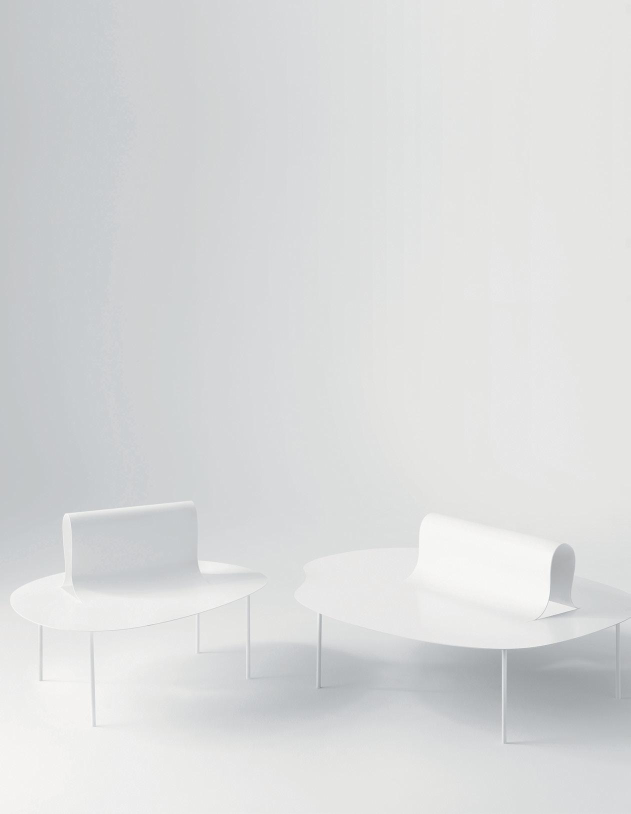
Got a room for revolutionary ‘movement’? Find out how the flipped, twisted, wrapped and bent details on metal sheets can turn a bench into a backrest, poles into a coat stand, and a tabletop into a tray while deceiving the eyes through the cloth-like flexibility and paper-lightness of its metal. nendo.jp WorldModern 12 Products and Furniture 20 Q&A 22 Material World 24 Hotel Register 26 Square Meal 28 We Recommend 29 Houses We Love 38 Event Report 42 Rewind
A. DL-L Drawer and Console by Craft Bro Company Who says that a table should stand on four legs? Craft Bro. Company speaks out through the ‘anomaly’ of the three-legged DL-L Drawer, which comes in a mix of walnut, ebony, maple, and brass with oil finish. A drawer on the side gives an edge of functionality to the table, makes it an unconventional piece of craftbrocompany.co.kreccentricity.
A C B 12 JULY/AUGUST 2014 dwell asia modern world new product
Full of characters, these 13 new products introducing ways to flourish amidst the ambiance, while maintaining their wonderfully distinguishable twists.
B. Three-legged Magazine Table by STUDIO248 There’s not enough pleasure in reading a magazine without the company of ‘ease’. Standing on durable wooden legs that make for a unique structure, steel plates are shaped in unique angles to store your lovely reading material, while a flat-topped surface is available to support precious belongings and refreshments to keep you going through the golf.studio248.compages.
C. Asterisk Lamp by Lilianna Manahan As seen in the Asterisk Lamp, Lilianna Manahan embodies childhood memories and the whimsical appeal of children’s tales into her works. Standing on a table top exposing its brass casted body, which emulates an imaginary figure of satellites, Asterisk’s roving head beams its light in any direction in accordance with the user’s needs. studiomagee.com
Wondrous Quirks


Who wouldn’t wish to dive into the magical realm of Wonderland and live an adventure? As the initial design of the ‘Into the Rabbit Hole’ collection, Vortex rug embodies the enchanting portal through the use of 100% New Zealand Wool and an array of colors with patterned shapes that invite outsiders to enter the whimsical world of Alice. therugmaker.com.sg
Turning trash into functionally beautiful products is amazing, but having less-fortunate children become green artisans and entrepreneurs by baking bottle caps that transform into colourful plates of plastic is the innovative world of Ffrash. Give your room a touch of “ffrashness” with this funky green and blue side table! ffrash.com
F. MicroSun by Conture Indonesia
F G D. Trinity Hammocks by Gilbert Tourville
E 13dwell asia JULY/AUGUST 2014
Now the third wheels won’t feel so lonely anymore. These comfortable hand-woven and quilted hammocks have a three-ring design made of durable stainless steel, offering the opportunity for a group laze as well as an intimate trinityhammocks.comconversation.
What kind of life would we have without the sun, our one most loyal source of light? Bringing its warmth to people on Earth, MicroSun takes the form of a pendant lamp made of a special concrete mix that exudes lightness, with aesthetic versatility to either stand or be hung from the facebook.com/contureindonesiaceiling.
D
E. Side Table by Ffrash
G. Vortex by The Rugmaker


I. Wild Berry by Anna Carin for Designer Rugs Picking wild berries in the meadow and eating them with cream and sugar is Anna’s enchant ing childhood memory that gives birth to the Wild Berry rug. Bestowing the dreamy quality of her youth into the Forsa Collection, the use of Tibetan Wool and traditional Nepalese hand knotting techniques enhance the Scandinavian aesthetic to her designerrugs.com.austorytelling.
How do you add personality to a room? Cushions will do it, especially with a taste of the traditional incorporated, as seen in the Toraja colors cushion from Moscha Living. Bearing Indonesian ethnicity on its Orange Leaf color, this 50x50 cm cushion is simply impossible to moschaliving.commiss.
J. Grand Suite by EOOS for Walter Knoll
H. Moscha by Innovabric
What could be more important than your private life? Ensure its sacredness by providing the truest form of luxury for your seating arrangements with the Grand Suite. Showcasing a horizontal line of upholstery that flows into the armrest and board, this modular sofa is crafted to perfection with a choice of fine walterknoll.dematerials.
I J H 14 JULY/AUGUST 2014 dwell asia modern world new product


M L
K K. Fly Me To The Moon Divider by Artes Living Dividing a room should be a joyful business. Aurora R.A. takes you on an imaginative journey to outlandish places with her ‘Fly Me To The Moon Divider.’ Here, strange shapes and beautiful colors are articulated in oil upon canvas, accentuating the room with plenty of frolicking artes-indonesia.comfun.
L. Rugg The Cabinet by Meizan Nataadiningrat Inspired by the Fountain of Marcel Duchamp circa 1917, Rugg The Cabinet was brought to life using reclaimed pine wood from an industrial junk stock area combined with a modified, ready-made trolley. Its simplicity brilliantly re-questions the role of objects in our daily wordpress.commeizannataadiningrat.lives.
M. Wooden Cutlery Collection by Aljir Fine Crafts Safe for food and for hand-washing, this Wooden Cutlery Collection comes straight from nature and ranges from forks, tea spoons and tongs to butter knives. Beautifully crafted in sawo and white oak wood with a natural or light brown finish, Aljir Fine Crafts gives your tableware an all-rustic aljirfinecrafts.comlook.
ChicCulturally Holding degrees in Industrial Design from RMIT University and MA Product Design from Istituto Europeo di Design (IED) on his backpocket, Alvin Tjitrowirjo first established his design firm, AlvinT Studio, at Jakarta, Indonesia, in 2010. Through the creation of AlvinT, a furniture brand found in 2006, the designer intends to exploit the rich ness and diversity of Indonesian cul tural heritage into a collection of furni tures with modern contemporary style. Take three looks at Amarta, Salaa, and Lyan chair from his newest collection, and prepared to be awed! Composed of natural rattan, mahogany wood and cushion fabric upholstery, Amarta dining chair is created through an approach to the classic Windsor chair, while its unique character owes much to the thickness, details and propor tions on the design. Salaa lounge chair, made from twitchell fabric and steel, gives out a modern and sleek look to the outdoor, while the simple and re fined design is supported by durability that trascends generations. And lastly, try dining on a chair that’s driven by details and affords a balanced propor tions between natural rattan and solid wood. With the use of fabric upholster and leather binding that radiates sim plicity, Lyan offers a fashionably com fortable dining. alvin-t.com
15dwell asia JULY/AUGUST 2014


D. Twiggy lamp by Marc Sadler for Foscarini Foscarini, an Italian lighting manufac turer, introduced seven limited-edition rainbowinspired colors of its popular LED or incandescent floor lamp. foscarini.com
A B C D 16 JULY/AUGUST 2014 dwell asia
A. Mitt chair by Claudia & Harry Washington for Bernhardt Design Inspired by a baseball glove’s shape and stitching detail, the versatile upholstered lounge chair features soft, rounded edges—a boon for families with young children. Made in the bernhardtdesign.comUSA.
Enliven your interior with a punch of supersaturated color in the form of vivid furniture and lighting pieces.
“Larger objects, like a sofa, can take control of the room. I select larger items first. I prefer classic and elegant anchor pieces that melt into the space.” —Jiun Ho, designer
B. Lazy sofa bed by Andreas Lund for Softline This isn’t your standard pull-out sofa; pushing the backrest down creates a flat sleeping surface. Available in hundreds of fabric and color combina tions. softline.dk
OnBright
modern world products
C. Neon tables by Sebastian Herkner for Haymann Thin layers of white onyx are placed atop acrylic to achieve an acid-washed look for the steel-legged haymanneditions.comtables.


E F G G. Swell sofa by Jonas Wagell for Normann Copenhagen Available in 21 hues spanning lemon yellow to rich purple, Swell now comes in two- and three-seat normann-copenhagen.commodels.
Content originally published in Dwell® Magazine and/or on www.dwell.com, © Dwell Media LLC 2014. Published with permission of Dwell Media LLC. All rights reserved.
17dwell asia JULY/AUGUST 2014
Ping Celebrating abstract art, the wool-and-flax carpet’s golden gradient mimics the effect of diluted paint spilled on paper. taipingcarpets.com
Outfitting ArchitectChandigarhPierre Jeanneret masterminded furniture to embody India’s architecture.progressive
When India’s commissionedgovernmentLeCorbusier to design its new capital city in 1951, the project brief went beyond architecture. His cousin Pierre Jeanneret developed a collection composed of chairs, tables, desks, bookshelves, and room dividers that shared the city’s visionary symbolism. “Pierre Jeanneret’s furniture was conceived like an archi tect—minimalist and non-dec orative,” says French gallerist François Laffanour. Jeanneret married modern sensibilities with traditional carpentry tech niques to produce the pieces. Objects in the family, like the Managing Committee table and Cinema armchair (below), share a geometric language, and their dimensions correspond to Le Corbusier’s Modulor theory. galeriedowntown.com
F. Bar Technicolor pillow by Leah Singh Bands of vibrant wool embroidery adorn the cotton throw pillow made in leahsingh.bigcartel.comIndia.


A B C D E 18 JULY/AUGUST 2014 dwell asia
modern world products
Frame Thronesof Structure comes forward in this armada of architecturally inclined sofas and armchairs.
A. Superkink chairs by Osko + Deichmann for Blå Station Tubular steel pieces often feature a gentle bend, but the Swedish manufacturer Blå Station creases the corners as an angular statement. Comes in fabric or leather upholstery. blastation.com E. Yas by Samuel Accoceberry for Bosc Historically, stilt walking was a common way to move through wet terrain in the Gascony region of southwestern France. Bosc, a local furniture maker, uses this reference for its eiderdownfilled sofa. bosc-leslandes.fr
C. Fly sofa SC3 by Space Copenhagen for &Tradition Movable cushions make it easy to get comfortable on this dowel-backed looker. Choose from white oiled oak (shown) or a darker smoked-wood version. andtradition.com
D. Elysia lounge chair by Luca Nichetto for De La Espada A frame in solid American black walnut (shown) or European ash hugs a padded seat and backrest. Fabric upholstery options include blue, red, and dove gray. delaespada.com
B. Altay sofa by Patricia Urquiola for Coedition Coedition of France debuted its inaugural line this year. Prolific designer Patricia Urquiola created the Altay, which sports a glossy black coat on its beech frame. coedition.fr


A. Zartan Raw chair by Philippe Starck and Eugeni Quitllet for Magis Using a mixture of recycled polypropyl ene and natural wood fiber, the Italian manufacturer has made a stacking chair whose production is kinder to the environment. magisdesign.com
—Betsy Burnham, interior designer
RoomEngineering
A B C D Content originally published in Dwell® Magazine and/or on www. dwell.com, © Dwell Media LLC 2014. Published with permission of Dwell Media LLC. All rights reserved.
19dwell asia JULY/AUGUST 2014
DelightfullyUpPucker
Hug armchair by Studio Jean-Marc Gady Bumpy upholstery offsets the rigid oak structure. sieges-perrouin.com Ploum love seat by Ronan & Erwan Bouroullec for Ligne Roset Quilted stitching over foam padding gives this seat dimension and ligne-roset-usa.comdepth.
“There are more and more good-looking engineered
and
D. Boiacca Wood table by LucidiPevere for Kristalia Oak legs support a tabletop made from Fenix-NTM, a water-repellent, anti-bacterial surface developed using nanotechnology. Though it looks like stone, the surface is soft and warm to the touch. kristalia.it
By harnessing the latest high-tech innovations, like 3-D printing and nanotechnology, manufacturers are using science to create forwardthinking design.
tactile surfaces come courtesy of torangingtreatmentsfromshowysubtle.
Bloom blanket by Bianca Cheng Costanzo for Oak Form Origami folding techniques inspired this Italian cashmere bloomblanket.comthrow.
C. Midsummer rug by Ritva Puotila for Woodnotes Consisting of tightly woven strands of paper yarn, the Midsummer rug is hypoaller genic, stain resistant, and easy to clean. woodnotes.fi fabrics out there, and it’s worth considering them if you need upholstery that’s family pet friendly.”
B. Afilla pendant lights by Alessandro Zambelli for .exnovo Marrying new materials with traditional ones, this lighting series features 3-D printed nylon shades and a Swiss-pine exnovo-italia.comstructure.


A lovechild of Malaysia’s pewter empire, Royal Selangor, and one of Japan’s oldest lacquer houses, Zohiko, Shori is a true masterpiece born out of centuries of heritage and craftsmanship.
Tsuyoshi Nishimura (TN): We’re always on the lookout to expand our products by Text by Asih Jenie
20 july/august 2014 dwell asia modern world Q&A SelangorRoyalofcourtesyPhotos
We caught up with Royal Selangor’s Executive Director, Yong Yoon Li, and Zohiko’s president, Tsuyoshi Nishimura, in Singapore to share more about their collaboration.
Few brands can match Royal Selangor’s decorated history. Proven to be as malleable as the pewter from which it has made its fortune, the brand has evolved from a humble 19th century cottage industry into a 21st century business empire. It has also elevated its products from common souvenirs to items and collectibles sought after for their design value. Since the crucial decision to form an in-house design team in 1978, the brand has continued to expand its design repertoire by collaborating with contemporary designers, as well as perfecting the pewter-smithery.
A MatchRoyal
This year the brand has met a royal match – the lacquer brand Zohiko of Kyoto; one of Japan’s oldest stewards of ‘urushi,’ or the lacquering arts. Together, these two brands share almost five centuries of craftsmanship and, out of their collaboration, has been born an exquisite, limited edition –only 88 pieces are available to order – sculpture Shori, which combines fine pewter craftsmanship and an age-old lacquering technique called ‘maki-e.’
Literally translated as ‘sprinkled picture’, maki-e is a traditional multi-layered lacquering in which metallic dust is sprinkled to ‘paint’ a design on a wet lacquered surface using a ‘funzutsu’ (bamboo sprinkler) and a ‘kebo’ (hair-tipped paintbrush) – a technique Zohiko is famous for and has practised since 1661. This manual airbrushing technique is a painstaking process that often requires over one hundred layers of repeated lacquering and sprinkling that could take months to finish.
How did the collaboration come to be?
Yong Yoon Li (YYL): It was a matchmaking process. We have a mutual friend – the Yamamoto family from the Zippan group. The family introduced us to the Nishimura family, who told us they were interested in collaborating with Royal Selangor.


YYL: All these are also displayed on a wooden box with matched wood grain. All of the boxes for the 88 pieces came from a single giant tree in a churchyard in Penang that was brought down by a storm. We’re salvaging the wood.
What was your initial reaction on mixing pewter with lacquer?
TN: Aside from the three finishes on the koi, Go [bronze], Irodori [multi-colored] and Miyabi [gold], the the back panel and the base upon which the Shori is displayed is also treated with a maki-e technique called ‘mine kumonuri,’ which translates into foggy mountain. The finished look appears like dark mirrors, but on closer inspections it reveals layers upon layers of blue. Traditionally mine kumonuri is done in a green color. Shori premiered the blue version. It captures deep water and it casts a mystery that draws the viewers closer.
collaborating with companies outside of Japan. We look for companies that have the same values as us, a company rooted in tradition – a company that is unlike any other in the world. Royal Selangor fits those criteria. We also aim to continually evolve.
What’s next for Royal Selangor and Zohiko?
TN: Everything! But that is what makes the effort worthwhile, and what makes the effort so rewarding. Lacquer sap is a very temperamental substance. It will harden when the air is at a certain humidity so we must keep the air just right. Some days, when it’s really dry, it will not harden and we have to wait, other days when it’s raining and humid, it will harden too fast so we must wait. Can you share a bit about the maki-e techniques you developed specially for Shori?
YYL: I said it was madness! It’ll never work! But then they [Zohiko] did some test-work with one of our products – this plaque with nine koi carps on it. They did the maki-e technique on it and the result was, WOW! It was intricate, so superbly detailed – they even added this motherof-pearl water drop on the lily pad. We were amazed at how well the lacquer worked on the pewter. So we said, Okay, let’s do this. The sculptures are cast in Malaysia and then flown to Kyoto for Zohiko to finish with maki-e. What was the biggest challenge in crafting Shori?
TN: In the olden days in Japan, it was fashionable for men to carry a medicine pouch that contained a lacquered box, but that’s not so today. Nowadays, men carry pens and wear watches. We should integrate lacquer with these practical things, updating them so that more people will use lacquered items more often. We will continue to do this and we are always open for collaborations.
YYL: If last year Royal Selangor was about collaboration with contemporary artists, then this year it’s all about culture. We released our India-inspired collection in the first half of 2014 and now Shori is heralding an up-and-coming collection inspired by Japan. You’ll see more lacquer arts on our products too.
21dwell asia july/august 2014


Aiming to be the best yet evolving master in the field of stone design, Odyssey Stone Architecture & Design uses its creative hunger to score breakthroughs above the common trends by exploring various stones while pursuing innovation in design. The company’s latest inspiration is the art of origami. Ruchika Grover, the Director of Odyssey, revealed why they were motivated to mix the unthinkable formula of paper and stone, “We wanted to create awe and surprise and make everyone rethink stone and its application.”
Folding Paper and stone have nothing in common. For the Ishi Kiri Collection, Odyssey takes up the challenge by transforming the former onto the latter, with inspiration driven from origami – the art of Japanese paper folding.
Reflecting on the possible outcome of translating the contour of origami paper into stones, Ishi Kiri Collection was conceived. Grover reminisced about how they came up with the idea for the collection, “We were looking at creating dimensional surfaces which gave the feel of paper and could be interspersed with light; the Japanese art of paper folding,
22 july/August 2014 dwell asia materialmodern world
The Art of
Text Anindiaby Karlinda
Imagine the flexibility and lightness of paper, and try picturing the way it folds and can be sculpted to form any shape you want. The feel of folding paper should be familiar enough, since almost every childhood memory involves certain contact with origami, the Japanese art of paper folding. The fascination shown towards this art-form might be due to the whimsically versatile transformation brought by a piece of paper that holds no bound to creativity . That kind of charm is impossible to miss, as Odyssey can vouch to be true.

One of Ishi Kiri Collection’s best-seller, Puritsu (opposite) is inspired by pleats, as was shown by the way it syncs with the engravings and give out a grand flower-look pattern.
Each with a distinct identity and features, the installations for this collection can be used in numerous spaces; spas, bath areas, boundary walls, bars, just to name a few. The collection itself offers a mix of geometric, floral, classical, modern, and straight lines, up to 20 designs. The four designs considered to be the best-sellers are: ‘Taiyou,’ which means ‘sun’ in Japanese, displaying a circular pattern with engraving that emits light in a way that resembles the rays of the sun; ‘Hana,’ which uses well-defined flower petals to form a floral pattern, intensifying its beauty when installed with full light passing through the carving; ‘Sankaku’ is designed using Jurassic origami, was the basis of our inspiration for this Followingcollection.”thebirth of the idea, Odyssey made an extensive research of origami folding patterns and its interpretation in stone, while searching for the required types of marble, granite, and tools to achieve the desired finish and proportions. The main objective of the collection was to create a dramatic form of stone installation by exploiting the paper-like pleats and creases in multi-dimensional form.
SunejaRajeshofCourtesyPhotos
For an extraordinary and dramatic result, the surfaces can be customarily designed using back-lit and front-lit options for the walls. “The dimensionality of the surface allows a varied intensity of light to pass through the different patterns, and since the surfaces use natural white marble as the base, the vein and the natural formations are also highlighted in every installation,” explained Grover, “and when it’s back-lit or front-lit, each pattern has a completely yellow limestone and Indian white marbles whose formations not only project a multi-dimensional look and feel, but also display a rotational appearance on the passing light, just like the sails of a windmill; last but not least, ‘Puritsu,’ which means pleats in Japanese, shows a grand pattern of delicate pleats harmonizing with the engravings and emitting the overall look of a flower.
“When one thinks of stone, words like heavy, cumbersome, bulky and solid cross the mind, but we have tried to dispel those notions with Ishi Kiri by making it translucent and paper-like,” spelled out Grover. She stated that the image they want to project is that of Odyssey pushing the envelope and exploring possibilities in a medium of stone that is rarely explored. And how has the response to this innovative approach been? To this, Grover stated, “Most of the people viewing the collection for the first time want to touch and feel the surface to really believe what they are seeing.”
While it’s fashioned in a form of flower, Hana (left) pass on light thrhough the carving of its well-defined flower petals, while Sankaku (below, left) is designed with 2 stones, Jurassic Yellow Limeston and Indian White Marble, in triangular form to give a multidimensional look and feel, and Taiyou (below, right) ‘shines’ as bright as the sun through the use of circular pattern.
23dwell asia july/August 2014
different look.” This passing of light through the pattern of the installations becomes the key feature of the collection, and a 30-mm Indian white marble sheet, known for its translucency, is used for engraving deep into the pattern, which enables the lights to penetrate and show up on the surface.


Text SunthybySunowo
The Efkarpidis know exactly what they want, which is not another boutique art hotel. An intense collaboration with more than 56 designers, makers and artists was resulting in warm, artsy, profound and intriguing spaces. The secret garden and library is available near the foyer area to accommodate the guests and give them more alternatives of activity with books stocked by specialized small press publisher and distributor Perimeter books.
JourneyEnlivening
With a discerning creativity and fine craftsmanship, this hotel embraces the charm of midcentury style in collaboration with contemporary designers, makers and artists.
24 july/August 2014 dwell asia modern world hotel register
Nishi, one of Australia’s most sustainable buildings may look like a giant concrete pineapple when viewed from a far, but look closer and the building will reveal its fascinating detail. The architecture’s element forms a dynamic façade while allowing a modern approach to fill the interior with such an elegant design.
Occupies three levels of Nishi building, Hotel Hotel was found by Johnathan and Nectar Efkarpidis, the brothers behind the initial idea. They love of hotels – as reminder of human’s transience and the importance of romance – encouraged them to put the idea into reality by made use of skillful craftsmanship to all of the hotel’sManyelements.surprises will greet us when we walk inside the hotel, from the large scale of grand stairs to glassware to ceramics. Designed by March Studio in collaboration with a landscape architects, Oculus, the hotel’s grand stair is a geometric explosion of handcrafted salvaged local timbers. Rough-formed concrete structural lintels had been woven to create the feeling of a single, vast space that leads visitors to a hotel foyer – which looks more like a fancy living room than a lobby.
The enlivening journey starts from the outside to the foyer and into the bar before

arriving at a room where simplicity is expressed with a rich texture. Hotel Hotel’s rooms are the outcome of Nectar’s inspiration from the Australian shack, Cameron; while Efkarpidis had created and applied a quintessentially Australian vernacular to each room. Moreover, the spirit of mid-century style with a contemporary mind frame in the hotel’s 99 rooms will instantly steal the attention. It is Efkarpidis’ desire to eschew and discard the consumptive culture of contemporary designs and manufactures. Restored 20th century furnishings, collected objects, original artworks collected over ten years, and a limited run production of new pieces designed by Cameron and fabricated by European artisans bring up the soul of each room. The furniture’s characters fill in the space and arouse imaginations, while at the same time provide alluring comfort to the guests.
HotelHotelofcourtesyPhotos
The grand scale and design of the staircases gives a wow factor when we enter the foyer. In modern building Hotel Hotel brings in a touch of mid century furniture and create a story of colours, texture, and shape in each room. The Bar area are design with a simple construc tive way to match the feel from the foyer.
25dwell asia July/August 2014


Text by Asih AsihPhotojeniebyJenie
With Portico’s charming setting, flourishing herb garden, and exceedingly creative fare, a feast on the veranda has never tasted so good.
26 july/august 2014 dwell asia modern world square meal
Inside, photographs of Portico’s ‘families’ line the walls; guests can choose to be seated at the ‘dining room’ tables or at the intimate bar. The furniture, both indoor and out, combines blond teakwood with muted blue and cheerful splashes of citrusy colors and patterns that, together, create a friendly, relaxing seaside vibe to make you feel completely at Porticohome. is the brainchild of two restaurateurs, Alicia Lin and Sean Lai, who met a year ago when they opened neighboring restaurants in Singapore’s farmers’ market concept ‘Pasarbella.’
Tucked away inside an office compound in Singapore’s Alexandra Road, ‘Portico’ is an oasis of green and calm. Guests enter along a pathway through the sunny, spacious alfresco dining area, which is decorated with a swing, greeneries and herb planters.
According to Lai, Portico is designed to create the experience of hanging out on a
A AdventureToothsome


(sophisticated) friend’s porch. The kitchen is helmed by Executive Chef Leandros Stagogiannis, whose resumé includes UK restaurants FiftyThree, St. Pierre and The Fat Duck. Armed with a solid training in classical French cuisine and pastry, and the many techniques and skills he has learnt over the years, as well as an incredible sense of fun coupled with precision, Stagogiannis will take diners on an unforgettable culinary journey. The menu speaks volume about the chef’s creativity; who would have thought of putting together crispy sweetbread, onion puree and heart of palm in a salad? Or mixing soba noodles with truffles and ebi? How about pairing Tart au Citron with onion ice cream? These combinations are definitely risks worth taking. Amazingly these unusual flavorpairings complement and balance each other wonderfully. This ingenuity also works in many other ways, such as satisfying your appetite, tickling (and expanding) your taste buds, and giving you some bragging rights both for having tasted something original and for having chosen to eat local. Yes, most of the ingredients are sourced locally, and the rest, regionally. The fish and selected seafood are fresh catches shipped daily from Pulau Ubin, while other particularities are sourced from the neighbouring islands of Indonesia. Then, to finish this exhilarating culinary adventure, Portico presents Lola – a custom-made, state-of-the-art coffee machine, which produces a gourmet cuppa like you’ve never tasted before.
27dwell asia july/august 2014


Text by Lisa Amelia
Milk Bottle by Tejo Remy, 1991 Features a dozen frosted glass milk bottles, the lights hang just above the floor in rows of three by four, as in the old days when Dutch milk was delivered in crates.
TASCHEN©imagesall(Lytegem);OstroffDanielofcourtesySarapochiello,Jerry(Liane);CholetRenanbyPhotos
1000 Lights Written Charlotteby& Peter Fiell taschen.comTASCHEN
modern world we recommend
On the Bright Side
The history of man overcoming darkness with the invention of artificial lighting, which led the march of civilization, is depicted through an inspiring collection of lights in over 600 pages of truly illuminated works.
The sun, the greatest light source of them all, has been the naturally decisive factor in the patterns of daily life since the earliest origins of humankind. With the great discovery of fire, the earliest means of artificial lighting was born in the form of campfires and torches. The advancement of man-made light – from the oil lamp to the first practical incandescent electric light bulb, and on to fluorescent tube lighting – signified an independence from the rhythms of nature and progressively enabled humans to enter a non-stop 24hour society. However simple it may appear today, the capability to turn on the light at the flick of a switch is one of mankind’s highest achievements and must never be taken for granted. To celebrate the power of light over darkness, TASCHEN’s 1000 Lights has put together a shining selection of interesting lights. A range of the 20th century’s most thought-provoking electric lights are presented chronologically by decade – from Tiffany’s beautiful leaded glass shades to peculiarly surprising designs from the late 1960s and 1970s to the latest high-tech LED lamps – and represented by all major styles, from Art Nouveau to Radical to Contemporary. Focusing on domestic lighting design from the late 1870s to the present day, the book shows how the development of electric lighting at the end of the 19th century concurred with the emergence of the new profession of industrial design and its exciting application to the various types of luminary design.
Liane by Jean Royére, c.1959
Made of wrought iron and vellum, the six slender rods of this floor lights were twisted and turned like spaghetti in a harmonious arrangement, creating a vibrant and seductive look. Lytegem by Michael Lax, 1967 This stunning high-intensity mini-lamp is not only equipped with a weighted-base for tabletop use and a bracket for wallmounting, but also an extendable telescopic rod and a 360-degree rotatable head.
28 July/August 2014 dwell asia


RisingAbove
Content originally published in Dwell® Magazine and/or on www.dwell.com, © Dwell Media LLC 2014. Published with permission of Dwell Media LLC. All rights reserved.
In a couple’s Mexico City apartment designed by David Levy of Flexform, a Murano chandelier hangs above a marble-topped dining table from the showroom (above left). The Antonio Citterio walnut-back Morgan chairs are also from Flexform (above right).
In the midst of Mexico City’s everchanging landscape, a time-honored residential model endures: the high-rise. It is in such a building that David Levy— owner of the furniture maker Flexform’s New York showroom and the head of the Mexico-based development firm Piso 18— has designed an apartment for an art-col lecting couple with two grown children and six grandchildren.
modern world houses we love
Levy sheathed the room in whitewashed pine, giving the illusion of more light, and clad the fireplace wall, which divides the room from the living room bar, in matte marble. A deep, low-slung recess in the fireplace offers a peek into the rooms beyond—allowing the space to be at once separated from and connected to them. Similarly, it can expand and contract as the family’s needs vary. “The couple can entertain their large family in the space, yet it still feels intimate enough to relax in at home after a long day,” says Levy, who adds that they use the room for “enjoying company, family reunions, casual relaxing, viewing the city, and fun.”
“The clients particularly love Italian design,” says Levy, who established a European connection in the area most resembling a formal space, the dining room. “We tried to incorporate their love of European finishes and style into their casual yet still quite elegant livingLocatedenvironment.”justoffthe entrance to the apartment and separated by a floating Calacatta-marble wall, the room is spare, save for a substantial white-marbletopped Flexform table surrounded by a dozen of Antonio Citterio’s solid-walnut Morgan chairs, designed for the Bulgari Hotel in London. Levy added a custom black-lacquered Italian sideboard to hold tableware.
29dwell asia JULY/AUGUST 2014
photos by Alicia Vera
Mexicolocationflexformny.comDaviddesignerCityprojectApartmentLevy,City,Mexico
With its generous band of horizontal win dows, the room looks down to the Piso 18–designed common area for the building’s residents, with walkways and children’s play areas. Beyond is a view of the bustling city, where cranes abound and a brand new batch of high-rises slowly ascends as a silent symbol of progress.
The owner of Flexform’s New York showroom, David Levy, creates an elegant dining room MexicooverlookingCity.


SunthybySunowo An apartment
life
An South
LivingArtful project Galaus ARCHITECT anlstudio.comAnLstudio, Location Seoul,
There are so many aspects that can be taken up from a renovation. One important thing is a moment to reassess what works and what does not. This is where AnLstudio gets the opportunity to explore an interaction between an atelier and a dwelling space. The client, a traditional Korean painter and collector, desired a space in which she could not only invite guests to view her paintings, but also to live comfortably in an environment that can shelter her tools and works; challenging the architect with the project’s main goal: merging life with art, as well as public living with the private one. The proportions of the existing apartment presented some practical difficulties from the typical Korean Text in Seoul had given a new face that breaths art into from which a balanced living is manifested.
30 JULY/AUGUST 2014 dwell asia modern world houses we love
Korea
AnLstudioofcourtesyPhotos


The client’s apartment had a C-shaped wall in the center which divided the kitchen and living room, separating her life patterns in the two areas. Instead of seeing this wall as an obstacle and destroying it altogether, AnLstudio took advantage of it as a gallery wall, while incorporating the use of geometrical lighting structures throughout the ceiling to perform a connection between the living room and the kitchen. These fixtures were installed to display elements with three different lighting sources: direct, indirect and spotlight. The lighting structures then release a flow through the entire space and create a hybrid of the exhibition areas and living spaces with a visual continuity.
The apartment’s C-shaped wall (opposite, bottom) is used as a gallery wall to display the owner’s painting while geometrical lighting structures (right and opposite, top) are arranged throughout the ceiling to suggest a linkage between the kitchen and living room. dwell
LDK-type apartments which integrates the living room, dining room and kitchen.
31
asia JULY/AUGUST 2014


MasaophotosAmeliabyNishikawaCorner
Project Cave Architect APOLLO Architects & Associates, kurosakisatoshi.com
Location Tokyo, Japan
Cave
text by Lisa
32 JULY/AUGUST 2014 dwell asia modern world houses we love
Built for a single person, the 38.97-squaremeter house uses dark brown Galvalume steel for its exterior walls, neatly contrasted with galvanized steel sheets next to the entrance and around the garage. A pan oramic window emphasizes the character istic of the residence’s corner site, horizon tally framing the view of the neighborhood. Private areas of the dwelling such as the bathroom, toilet, main bedroom and a small
The Galvalume steel façade gives the house a distinctive feature, while a panoramic window emphasizes the characteristic of its corner site, horizontally framing the view of the neighborhood.
Known for his distinctively minimalist approach, Japanese architect Satoshi Ku rosaki of APOLLO Architects & Associates has completed an unpretentious, yet dis tinguishable house in Kagurazaka, Tokyo.
A four-story house in a quiet residential area adorns the street with its clean-lined façade vestured in a combination of steels.

garden are located on the third floor. To meet the owner’s love of cooking, an open kitchen is situated on the second floor. Dressed in black, the kitchen dapperly stands out between the modest white wall and the laid-back wooden floor. A spacious storage area is assigned on the first floor, and a room with Japanese paper and tata mi mats serves as a guestroom where min imum natural lighting is structured to cre ate a microcosmos. In the basement is a wine cellar furnished with a custom-made rack, and a study with a sofa and book shelves. All four levels are connected by the see-through stairs in the center. A large skylight showers the home with soft dif fused light while various openings unveil the town view, providing a sense of space and depth to the compact interior.
33dwell asia JULY/AUGUST 2014


text EricphotosTiffanybyChubyRoth
34 JULY/AUGUST 2014 dwell asia
Often, we cleanse our duds in a wasteland of half-forgotten detergent bottles and dryersheet-detritus. But one creative couple in Boston’s South End have reimagined their laundry room as a sanctuary.
30E Design transformed a hallway in a Boston brownstone from a “dumping ground for all the plumbing and utilities with an existing metal ductwork laundry chute” into a modern space that houses the laundry, furnace, and boiler.
MyprojectBeautiful Launderette 30EarchitectDesign, 30edesign.com Boston,locationMassachusetts
modern world
According to architect Anne Barrett of the Jamaica Plain, Massachusetts, firm 30E Design, the vision for revamping a laundry room in an 1849 Boston brownstone began with her favorite question: “What would James Turrell do?” The back-of-house space was originally a cold, dank hallway with a dingy aluminum vent linking the basement and first floor. Now anchored by a glowing borosilicate chute—illuminated by a bundle of fiber-optic cables—this laundry room is more of an art installation than a hub for domestic chores. The residents wanted the space to be as beautiful as it is functional. Barrett’s challenge was to create a minimalist de sign to conceal the water heater, cables, Miele washer and dryer, and storage space, all of which are now tucked away behind lacquered cabinets and chiseled lime stone. The sleek new laundry room forms a graceful passageway that serves as a transitional space from the main part of the house to the garden out back. we love
rooms
HamperHappy

The top of the luminous chute sits beneath the residents’ first-floor sink; they can toss garments from their main bath room through the diffuse tube, and into a basket below. “Life is messy,” one resident says, “but we never have dirty clothes around. The laundry chute is a big deal in our lives because it makes the mess from upstairs vanish.”
After occupying the house for over a decade, the residents knew exactly how to transform the space so it catered to their habits—and part of that meant that it does double-duty when they entertain. “When we’re not doing laundry,” says one, “this becomes a kitchenette—we can store glasses here, have drinks, a bucket of ice, and an hors d’oeuvres prep space for a garden party.”
—Anne Barrett, architect
The focal point of the sleek, white space is a glowing laundry chute (left) illumi nated from within by fiber-optic cables. The Pyrex tube was produced by a equipmentofmanufacturerlaboratoryvacuumandwas
“We were given the brief to treat the project as an art installation. We took the approach of ‘What would James Turrell do if he were to design a laundry room?’”
For these clients, at least, Barrett says, “the laundry room is the new kitchen.”
sand-blasted from the inside to contain the light. The architect worked carefully to create ample storage for myriad uses, since the space doubles as a wet bar for entertaining due to its proximity to a garden terrace. The cabinetry cleverly conceals rackincludingeverything,acustomdrying(above).
Content originally published in Dwell® Magazine and/or on www.dwell.com, © Dwell Media LLC 2014. Published with permission of Dwell Media LLC. All rights reserved.
35dwell asia JULY/AUGUST 2014


Brisbane-based studio and Vokes and
ConfidentialKitchen A modest kitchen addition to a couple’s cottage outside of Brisbane proves that one 376-square-foot room can revive an entire home. text KirrilbyShields Panoramaproject Drive House OwenarchitectandVokes and Doonan,locationowenandvokesandpeters.comPeters,Australia
Peters designed a modern kitchen addition for a isCentorAmericanJoinerycabinetrykitchenhouse.Queensland-styletraditionaltimberGlossyVogueGhiacciotilessetoffcustombuiltbyCooroy&Woodworksusingoakveneeranddoors.ThedishwasherbyAEG. modern world kitchens we love ylorAlicibyPhotosAtA 36 JULY/AUGUST 2014 dwell asia
Owen
The kitchen addition is clad in James Hardie fiber-cement board (left). The architects used blackbutt wood for the flooring and Whisper White paint by Dulux throughout the interior (far left). An A110 Hand Grenade Pendant Lamp, by Alvar Aalto for Artek, hangs above the white Carrara marbletopped island. In the living area, an EcoSmart Fire ethanol-fueled fireplace is lined in charcoal tile by Winckelmans (below); the bench cushion is upholstered in Gillespie Onyx from Warwick Fabrics.
37dwell asia JULY/AUGUST 2014
When Australian architects Paul Owen, stuart Vokes, and Aaron Peters were hired to update a timber mountain house on the sunshine coast, outside of brisbane, they went small and modern—a complement to the region’s Queensland vernacular style. they installed a new triangular kitchen extension, measuring only 376 square feet, to clarify the entry to the house and create space for informal gatherings. historically, Australians often built their kitchens away from the main house, mostly as a way to minimize fire damage, a com mon hazard for wood-framed structures in this hot, dry climate. the separate kitchen was outdated by the 1940s, but owen and Vokes and Peters saw a certain elegance in such an arrangement, since it allowed for a veranda between the main house and the kitchen. “Neither inside nor outside, not quite a corridor and not quite a room,” owen and Vokes and Peters partner Aaron Peters says of verandas. “they’re delight fully ambiguous spaces that seem to be absent in many contemporary homes.” the extension is clad in panel boards made of fiber cement—a durable, cost-effi cient material from Australian manufactur er James hardie. the cladding is coated with heat-reflective resene coolcolour paint in blackjack to reduce heat stress on the new structure. the architects chose black to help the addition recede when seen through the surrounding foliage. by con trast, says Peters, “the original house is painted white to underscore its primacy in the composition. We wanted the new works not to dominate the original house.”
the owners, a semiretired couple who intend to make the house their full-time residence, see the kitchen addition as a crucial social element where their extended family can convene to read the newspaper or sidle up for a chat while someone is pre paring dinner. Enhancing the intimacy and warmth of the kitchen is an adjacent stairstepped lounge area that looks out onto the surrounding landscape. the architects created select apertures to the outside world with the careful placement of eaves, taking the focus off the broad, sweeping vistas and shifting the view onto certain moments in the garden and the odd glimpse of foliage. American oak–veneer cabinetry, carrara marble bench tops, and a custom surround for an Ecosmart fireplace con tribute to the cozy interior.
Content originally published in Dwell® Magazine and/or on www.dwell.com, © Dwell Media LLC 2014. Published with permission of Dwell Media LLC. All rights reserved.


38 july/August 2014 dwell asia modern world event report
Made Indonesiain
Inspired by the uniqueness of the Indonesian culture, 152 graduates of LaSalle College Jakarta showcased their design pieces through a creative show called I.MADE. Text Bernadettaby Tya
Held in the middle of April 2014, I.MADE was a true celebration of design. Divided into two sessions, it started with a graduation ceremony for a total of 152 students, and continued with awards for the best students in each program. They were: Aswin Satriyo Aji for Fashion Design, Jessica Ariel for Fashion Business, Ivonne Prasetya Supandi for Interior Design, Patricia U for Digital Media Design, Pritha Primasari for Photography, and Agustina for Artistic Make-up. A fashion show took the stage for the second session, which opened with Bala Turangga dance by EKI Dance Company. The show had seven sequences: Sultanate; Vanity Fair; Retrospective; Cosmopolites; Thermo Dynamix; Kidswear Mini Collection; and a collection by Febriyantin Athila, the Hempel Award Finalist. “This year, LaSalle College showcased masterpieces from the best young designers, inspired by Indonesian culture,” concluded Mr. Douwes Lasmana, Head of Marketing & Communication. I. MADE was held to exhibited the masterpieces from 152 graduates of LaSalle College (top). Part of the show was the body painting (middle) conducted by Artist Make-Up graduate. Best graduate students from each program (bottom) of LaSalle College.


KTCFdoc.byPhoto
39dwell asia July/August 2014
As venues, Kota Tua Creative festival 2014 made use of old buildings in Kota Tua (left) quarter including Kali Besar area and Lapangan Fatahillah field. One of the highlighted event was the contemporary art exhibitions which displays works of 30 artists of various medium, from paintings (above, right) to sculptures (above, left).
Text Anindiaby Karlinda
Preserving a history is more than letting its vessel to exist. Construction projects for new buildings become the most natural step in developing a city, but what will be the role of old buildings in this calculation? Kota Tua (Old Town) quarter was once the center of governmental and commerce activity back in the 16th century, but today, many old buildings in the area are poorly maintained.
One of the highlighted events was Jakarta Old Town reborn: 7 Projects for the City which showcased the works and ideas to revitalize 6 historical buildings and landscape by 7 teams of architects from Netherlands and Indonesia. Workshops, seminars, debates, negotiation with stakeholders, and consultation with government officials conceived an idea of ‘archipunctural urban renewal strategy’ which was envisioned as an injection of new activities that revitalize and make Kota TuaAnotherinhabitable.highlight was ‘Ars longa, vita brevis’, a contemporary art exhibition displaying the works of 30 artists. Occupied almost two floors of Tjipta Niaga building, this exhibition allowed visitors to experience a historical office space from Dutch colonization era in a newThelight.main evidence that validates a wellfunctioning city is the accommodation of social, cultural and economic activities. This aspect seems to resonate well with the restoration of Kota Tua to its former glory, as the center of all activities for the people of Jakarta.
In support for the cause, DKI Jakarta Provincial Government organized the revitalization and conservation programs, in which one of them was Kota Tua Creative festival (KTCf) 2014. Launched to publicize awareness and education of the program, it was held from June 21 to 22, using historical building as the venues for art and architectural exhibition.
Rebirth of a City Jakarta had thrown a grand festival to celebrate the revitalization agenda of the very soul of its historical quarter.


The visitors are presented with inspiring and enchanting works in twelve real-sized rooms created by ID12’s designers: Agam Riadi, Anita Boentarman, Ary Juwono, Eko Priharseno, Fifi Fimandjaja, Hendramianto Syamsulhadi, Joke Roos, Prasetio Budhi, Reza Wahyudi, Roland Adam, Shirley Gouw and Yuni Jie. Touring around the exhibition area felt like an enlightening visit to a house of a sophisticated person. Each room showcased a variety of colors, textures,
40 July/August 2014 dwell asia
Eko Priharseno converted the Family Room (top) into a garden of foliage where the elements of Indonesian tropical verdures met modern-styled furniture. Ary Juwono’s luxurious Private Bathroom (above) used Bisazza mosaic tiles wrapped in the patterns of Bali’s Gringsing woven cloth.
TwelveTalented
The remarkable talents were reflected from their personal works, which had spread, acknowledged and appreciated. Armed with one vision, they banded together to share their knowledge and inspiration in a ship named ID12.
The noteworthy mission was manifested in one exhibition, entitled The Colours of Indonesia. It was held in conjunction with Glorify Indonesia, a commemoration of Indonesia’s Independence Day, organized by Senayan City. Ran from 15-24 August 2014, the enticing collaboration has successfully contributed a fresh definition to contemporary interior design.
modern world event report
Cultural expression in a dozen rooms of profound inspiration is a feast for the eyes and mind.
Text by Lisa Amelia
WilliamWilliebyPhotos
moods and elements from which the personal touch of each designer is reflected. The beautiful diversity in the designs was connected with one major inspiration that is Indonesia. Some of the designs applied the colors of local spices, fruits and flowers; while others used traditional patterns and woven materials. The styles varied from classic to contemporary, using traditional techniques to hi-tech production methods. In addition to the exhibition, this ten-day event also presented a series of programs, such as book and furniture launch, talk show, fashion show and student workshop. Part of the exhibition profit was donated as a gesture of appreciation to Habitat for Humanity, a nonprofit organization whose commitment is to build simple, decent and affordable homes with people in need.
It all started seven years ago, when the path of twelve Jakarta-based interior designers crossed. At that time, despite the relatively young age, each of them has possessed a distinctive sense of creation.
“The Colours of Indonesia is a celebration of friendship,” stated Ary Juwono, the Chairman of this year’s exhibition. ID12 has grown into a positive synergy through each of the designers’ works. Collectively, they have given definition to a space, equalized function and aesthetic, and developed new ideas. Furthermore, they have preserved and strengthened cultural values by means of their designs.
The


Nippon
Representatives from Nippon Paint Indonesia, Mr. Jon Tan, the CEO Decorative, and Irena Joesoeb, Head of Marketing (below) are accompanied by the two Gold WInners from NPYDA 2013 for architecture and interior design category, Raynaldo Theodore and Rahmat Hidayat while shwoing the mock-up of their projects for last year theme, RE:THINK RE:CREATE, which focused on renewing a historical and cultural space in Indonesia. The four of them sat alongside the four judges (left) for the 2014 competition, Roland Alam, Cosmas D.Gozali, Wendi Djuhara and Ahmad Djuhara on NPYDA 2014 press conference.
This annual event’s one main objective is to motivate the students of interior design and architecture at universities to be creative and innovative as they embark a real step in professional world.
Text Anindiaby
41dwell asia July/August 2014
Future Teller Paint 2014 provides a room for creativity and determines control over quality of life in the future. Karlinda
Young Designer Award
Do you ever think of what kind of ideal home in 10 to 20 years in the future would be? Takes up RE:THINK RE:CREATE Future Living 2030 as the theme, Nippon Paint Young Designers Award (NPYDA) 2014 gives a chance to young architects and interior designers to visualize an ideal community in existing areas and redesign it into an ideal future and environment-friendly residence.
Through the contest, young talents will be given a chance to engage in an international event, while at the same time gain an experience by interning in one of the industry’s biggest architectural firms. This year, the winner of Gold Award will be sent to Tokyo, Japan, to attend NPYDA Tokyo Conference 2015. China, Japan, Malaysia, Indonesia, Pakistan, Singapore, Thailand, Vietnam and Hong Kong are the 9 Asian countries that will take part in the event. The winners will participate in the international workshop with universally-recognized architects and interior designers, while their works will be expected to be displayed at Jakarta House Vision 2016 with Kenya Hara. To succeed in this competition, one not merely has to “foresee” the future, but also has to create an innovative and sustainable living – an environment that will elevate the quality of life in 2030 to a more harmonious, healthful and colorful one.


rewindmodern world
More than a half-century later, the center is still GM’s thriving creative hub where designers, engineers, and craftspeople develop prototypes and technologies—and the architecture continues to inspire. “See ing the giant ‘wall of water’ on the lake for the first time in spring, or the blue skies over the colored brick in the evening—it’s a reminder that good design is important, impactful, and lasting,” Skarsgard says.
Design archive and Special Collections.
Designed by architect Eero Saarinen and landscape architect thomas Church, the 320-acre General Motors technical Center campus initially featured 25 buildings. the most visually arresting and technically challenging of these is the alu minum-clad Styling dome, an auditorium and exhibition space. harley Earl, GM’s chief of style at the time, believed that the center’s architecture should reflect the automaker’s emphasis on advanced engi neering and design, and persuaded the company’s leadership to be ambitious and bold when commissioning the concept, says Susan Skarsgard, manager of GM
The Styling dome on the campus of General Motors’ Technical Center is 188 feet wide and 65 feet tall. At just three-eighths of an inch thick, the atelyaluminumstructure’sskinisproportionthinnerthananeggshell.
Content originally published in Dwell® Magazine and/or on www.dwell.com, © Dwell Media LLC 2014. Published with permission of Dwell Media LLC. All rights reserved.
Heralded as the “Versailles of Industry” when it opened in 1956, the General Motors Technical Center in Warren, Michigan, remains symbolic of cutting-edge design.
toES/rStollEzra©PhotoE
42 JULY/AUGUST 2014 dwell asia
Metal Achievementof

43dwell asia JULY/AUGUST 2014 renovation
text
Sally Julien and Peter Loforte sit on the porch of the Aqua Lair, their restored 1960s house on Lake Sammamish, near Seattle. The Bertoia chairs and clay lion are from Pacific Galleries.
TheprojectAqua Issaquah,locationandSchemataarchitectsLairWorkshopBlipDesignWashington
PaybackBigThe Mitchellby Alan Parker photos by Kyle Johnson Plagued by remodeling pitfalls, two tenacious homeowners reinvent a soggy midcentury home outside Seattle as a masterpiece.modern

A George Nelson Cigar lamp and Malm fireplace were salvaged in the living room (top and above). The fireplace was powder-coated orange to complement the vintage furnishings. The sofa is from Design Within Reach; the coffee table is by Alexander Girard for Knoll.
renovationIn1963,thestory
The couple had high hopes for a smooth process, but trouble began almost immediately. “Very little, if anything, had been done to the house since 1963,” Julien says. “Rolling off the Palm Springs remodel, we got a little cocky, I’ll admit.
The designer and her partner, Peter Loforte, who works at Microsoft, had recently fallen in love with nursing sick homes back to health. The Seattle couple had just come off an easy-breezy remodel of their Palm Springs vacation home when, a few months later, they discov ered the throwback house in Issaquah, with its L-shaped, five-bedroom layout that cascades down to the waterfront of Lake Sammamish. In its dismal condi tion, the house was being advertised as a teardown.“Westarted looking at it like, ‘Wow, this could be a good investment; it could be a really neat place,’” Julien says, re calling her optimism at the prospect of spiffing up the house to what its original owners had, perhaps, intended.
44 JULY/AUGUST 2014 dwell asia
A pair of undated paintings by Arthur L. Kaye hang on a wall painted in a Benjamin Moore hue custom matched to the outside of the window frames. The triangular nesting tables are a vintage find. “They’re always billed as ‘guitar pick tables,’” Julien says.
goes, a mechanical engineer for McDonnell Douglas visited friends in Newport Beach, California, and fell in love with their house— believed to have been designed by Gordon Drake, or at least in his style.
Ambitiously, if not ignorantly, the engi neer tried recreating the house from memory in his home city of Issaquah, Washington, drafting blueprints and undertaking construction with his brother. What he didn’t account for, though, were the obvious differences in weather conditions between dry and sunny Southern California and the rainslogged Pacific Northwest. This shortsightedness, coupled with a layman’s understanding of construc tion, resulted in a Popsicle-sticks-andbubble-gum structure whose open-air louvers welcomed—for nearly five decades—the ever-present moisture to rot, mold, sink, and ultimately destroy the house. That’s when Sally Julien found it.


Central to the living room is a pair of George Mulhauser for Plycraft chairs (left). The adjacent dining room, which retained its original shape but lost the wall nearest the kitchen (below), sports a Galaxy chandelier from Rejuvenation, a custom table, and Gideon Kramer Ion chairs.
45dwell asia JULY/AUGUST 2014
I got brought back down to earth veryAfterquickly.”calling in Seattle-based architect Jim Burton of Blip Design for the initial scheme, Julien turned to a friend, archi tect Grace Kim of Schemata Workshop, and contractor Steve Fradkin. “There was no real structural logic behind the house,” says Fradkin, who had to reframe and waterproof about 65 percent of the house because of the rot; replace all the windows; add a new roof; and figure out head-scratching foundation problems. For example, one day a demolition crewman put the tip of his wrecking bar on the ground for support while he caught a few moments of rest. He was shocked to watch the tool effortlessly sink into the ground like a chopstick into warm tofu. The poured-concrete foundation was sitting on a massive sinkhole. When Fradkin and his crew began excavating, they found that the original builders, when faced with the Working with architect Grace Kim of Schemata Workshop, the couple retained original features like the shoji screens separating the master bedroom (bottom right) from the living room below. Julien, who runs a design and staging firm, added a chaise longue that she found on eBay (bottom left).


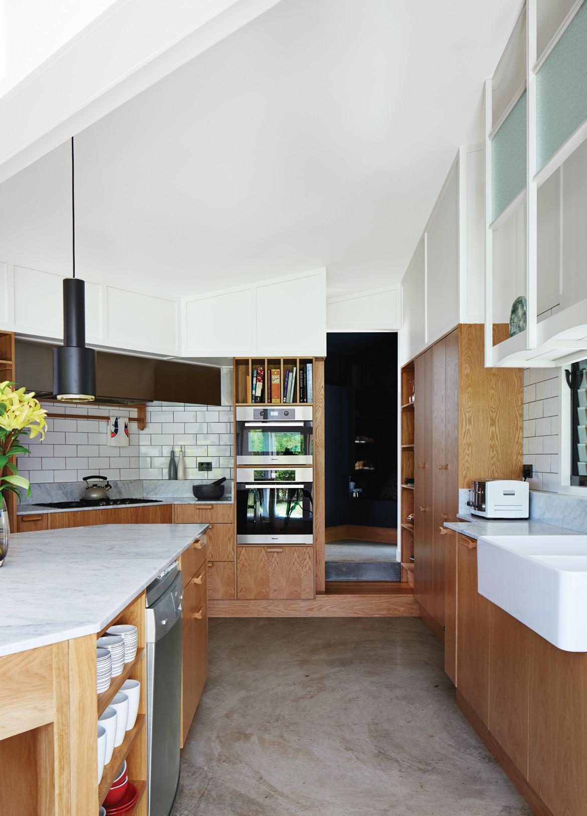
Once a dark and disconnected space (below), the kitchen now includes walnut cabinetry, a Bertazzoni range, a Futuro Futuro range hood, a Nespresso coffee system and convection oven from Miele, and a Jenn-Air refrigerator (left). The faucet is by Grohe; the sink is from Ticor.
—Sally Julien, resident
“I’ve been in business 23 years and have never seen anything like it,” Fradkin says. “Whoever built it didn’t under stand it at all. They were obviously used to dry weather.” Fradkin decided not to disturb the sinkhole too much. It had been working up to that point; no rea son to muck with it. Instead, he drove a three-inch pipe into the sinkhole and bracketed it to the concrete foundation. He then backfilled and buried the hole as much as possible—a dirty fix to a filthyJulien,problem.however, was just about at her wit’s end. With the extensive rot, a sinkhole, and buried ductwork that was in need of replacing—not to mention the skyrocketing budget—the couple were prepared to walk. “At least two times, I remember Sally and Peter had thrown up their hands
“Very
problem of an underground stream, apparently attempted to fill it by toss ing in cut wood logs, sacks of concrete still in the bag, and other debris.
46 JULY/AUGUST 2014 dwell asia renovation
“The kitchen is in the same spot as it was,” Julien says. “We kept the plumbing fixture locations, but enlarged it.” little, if anything, had been done to the house since 1963. It was being marketed as a teardown.”
The entrance opens to the living area, in which an I-beam stands where the kitchen enclosure was. “It was really tight, so we wanted to push back the wall that was in front of the door,” Julien says. The couple traded the old carpet for terrazzo flooring. Julien found the test bomb at an antiques mall.


Lower Level
The original exterior (above), had Astroturf-covered stairs; the couple added pavers and a rock garden (above left). “The transparency of the house is really quite wonderful,” says Kim of the residence, now open to the lake view (right).
and said, ‘That’s it. We’re going to sell the house,’” Kim says. “I said, ‘Sally, there is no house to sell. We need to put it back together to do that.’” Once Fradkin solved the structural challenges, Julien got to work on the interiors. To enter the house, guests descend a staircase, walk through a small courtyard, and open two heavy wood doors, original to the house, that Julien and Loforte painted orange. The doors open to a reddish-orange abstract painting that Julien picked up in a Seattle antiques store. The vibrant piece serves as the basis for the interior color scheme: bright, fun, and a little cuckoo.
Case in point: When the need arose for a vertical design element in the living room, Julien set out with a friend to an antique mall, where a World War II test bomb hit the mark. “My friend was say ing, ‘You can’t buy a bomb,’” Julien says.
“And I’m ignoring her, like, ‘I think it’ll fit in your car.’ Next thing we know, we’re leaving with a bomb.” Explosive decor aside, the true visual attraction is Lake Sammamish. Julien seized every opportunity to make it the star of the house. The kitchen space, for example, had been closed off and al most hidden, despite its potential to open up toward the lake. “That was the ’60s,” Julien says. “People didn’t want to see the kitchen.” Fradkin and his crew knocked down a wall and installed a moment frame to unlock the view to the water, which is really what the house has always been about. Only now, the water is kept safely outside.
I Double-Height Open Space J Dressing Room K Master Bathroom L Laundry Room M Bathroom N Bedroom O Man Cave P Exercise Room A Garage B Dining Room C Living Room D Kitchen E Family Room F Storage G Woman Cave H Master Bedroom The Aqua Lair Floor Plan Garage Level Mid Level A B C D E F G H MKJLN O P N I Content originally published in Dwell® Magazine and/or on www.dwell.com, © Dwell Media LLC 2014. Published with permission of Dwell Media LLC. All rights reserved. 47dwell asia JULY/AUGUST 2014


A professor takes the first step toward creating a new model for micro-living in San Diego. From the mezzanine of his 450-square-foot apartment at La Esquina, an eight-unit live-work building in San Diego’s Barrio neighborhood,Logandesigner, artist, and Woodbury University professor Patrick Shields chats with fellow professor Hector Perez, who spearheaded the project.
nice modernist Little by Little text YephotosErikabyHeetbyRinMok
SanlocationHectordesignerLaprojectEsquinaPerezDiego,California
48 JULY/AUGUST 2014 dwell asia

The first lot to be developed now holds a double-height, mixed-use build ing of Perez’s design, where, in less than 4,000 square feet, he has created eight live-work units, each with a dedicated outdoor space. “I’m sort of the canary in the coal mine, being the first to build, but we were lucky in that all the units were leased by word of mouth before construction was even complete,” says
Designer and digital fabricator Shawn Benson shares his 595-square-foot second-floor space with his wife, Jessica, and their daughter, Rue (left). The 15-foot-high ceilings allow plenty of room for a full-size kayak. The Bensons’ patio is semi-privatized by horizontal slats (below left).
dwell asia JULY/AUGUST 2014
It was the middle of the aughts when Woodbury University professor Hector Perez rallied a group of architects to pool their resources and buy nine lots in the historic Barrio Logan neighbor hood of San Diego, near the Mexican border, to develop as campus space for the school. Then the economy stalled, and the plans for the university shifted to another area nearby. But the archi tects kept the parcels with the intention of developing them in a way that would best serve the community.
The units, which range in size from 450 to 595 square feet, are all based on the same principle: a high-ceilinged main volume that gives way to a lower ceiling over the kitchen and bathroom, above which Perez shoehorned an open sleeping loft accessed by a ladderlike stairway. The smaller ground-floor units have street-side patios, while three larger units on the second floor include shared open courtyards and private patios overlooking the neigh borhood, with its colorful murals and eclectic mix of prewar and colonialstyle buildings. Working within a tight budget, Perez managed to build for 49
Perez, who named the building La Esquina, meaning “the corner” in Spanish—a reference to its position in the neighborhood. “It’s an incredibly scary thing to be a developer when you don’t come from money, with all the marbles riding on this thing.”


The building’s exterior includes a 3-D mural of Cesar Chavez (far left) conceptual ized by Perez’s son, Adrian, who also helped his dad with the multicolored doors (left).
—Hector Perez, designer
On the building’s exterior— Corbusian in its geometric whiteness, punctuated by a few bits of color— Perez has placed what he calls “my nod to the premier Hispanic figure in America,” a 3-D mural of Cesar Chavez. Conceptualized by Perez’s 13-year-old son, Adrian, executed by artists Titus Dimson and Tony Salamone, and de signed to be viewed with 3-D glasses, the portrait “is based on a dignified image of Chavez, rendered in a graphic, 21st-century way,” says Perez. It’s an appropriate gesture for the neighbor hood: Just a few blocks away, Cesar E. Chavez Parkway leads to a large park named for the human-rights activist. Adrian, who grew up while this project was being completed, knows firsthand the dedication required to create a thoughtful development. “He was there with me from day one, clearing weeds, and picking up trash from the lot,” says Perez. “He says he’ll never be an archi tect,” he adds with a laugh. “We’ll see.”
Upstairs, tenants and friends gather outside sculptor Chris Puzio’s apartment (below). around $130 a square foot, relying on board-formed concrete walls, plywood paneling, and passive cooling.
“Although the units are small, we wanted to have them paired with an outdoor space. It’s a sustainable layout.”
50 JULY/AUGUST 2014 dwell asia nice modernist
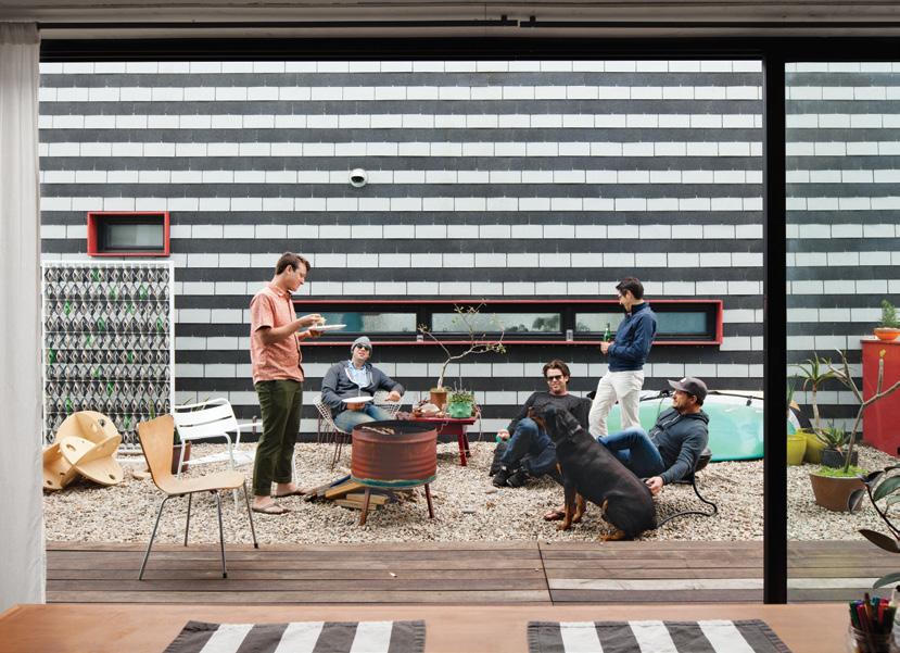

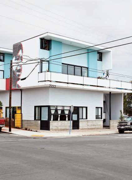
a b c cc d F e ee F F F b b b d d d d e e e e
“When the nine of us bought these lots, we knew a dynamic would evolve,” Perez adds. “Being the first one out, I was concerned that the dynamic would not be as lively as it is, but it’s so alive. I only know that you have to build the project that you would love to live in.”
La esquina Floor Plan a Corner510-Square-FootUnit b 450-Square-Foot Unit c 525- and 595-SquareFoot Units d Bathroom e Kitchen F Terrace-Courtyard bottom Floor Content originally published in Dwell® Magazine and/or on www.dwell.com, © Dwell Media LLC 2014. Published with permission of Dwell Media LLC. All rights reserved. 51dwell asia JULY/AUGUST 2014
On any given day, the tenants— all current students, graduates, and instructors from Woodbury—can be found working on art and architecture projects in their apartments, their doors left open to maximize light and wel come the ever-present sea breezes. They meander into one another’s spaces to share meals, to collaborate, or to sponta neously gather in the afternoon. “I’m fascinated and inspired by the work that every single one of these people does,” says Perez, who often drops by on his way to and from Woodbury, just blocks away. “There are creative collaborations happening all the time.
Like the other larger upstairs units, Puzio’s includes two loft spaces flanking the kitchen (above), whereas those below have one. The living room is tucked beneath one of the lofts, which are accessible by a steep ladder-like staircase and fronted by pegboard (right).


my house July/August 2014 dwell asia52

The house for Priatman and his family with two children comprises a series of spaces that allow one continuous sequence to gain an experience of all of the rooms. This starts from the main entrance as the most public area and moves gradually towards the master bedroom as the most private part of the house. The program and massing of the house is designed upon the concept of spatial continuity. This architectural concept unfortunately mandates a 53
to counter and create microclimatic comfort in every room of the house. This concern is in line with the initial brief. Ivan Priatman, the architect and also the owner of the house, decided to call for a courtyard house and indooroutdoor living.
dwell asia July/August 2014
All White walls are not keeping this house looks flat. A rich texture, solid-void, and a play of mass has bring up the strong character of the house in the corner with two fasade. Every house has a soul which reflects the owner’s lifestyle. But some houses also reflect the owner and the designer’s appreciation of the process through a sequence of spaces suited to the owner’s family activities. This is what happens at a rectangular 464-square-meter site located in a new residential development in the west of Surabaya, in a situation best described as semi-urban, where the houses are grouped in clusters and share a party wall with each other.
spiral House
Surabaya,locationIvanarchitectSpiralprojectHousePriatman-ArchimetricIndonesia
The modern approach apparently does not diminish the wise attitude that responds to the tropical climate and a specific microclimatic problem commonly suffered by buildings in Surabaya. Here, the hot weather with its high humidity requires a certain action text by Ivan Priatman and Sunthy Sunowo Courtesyphotos of Archimetric
A sequence of spaces touches the soul of the house in a spiral look-alike pattern.

54 July/August 2014 dwell asia my house
A simple landscape of weed and frangipani trees grow wildly as a contrast to the simple and clean line design of the house. These combination turn out to bring a fresh ambience. Meanwhile, the oppening and windows are located in the right place for daylight, ventilation, and also bring the outside in. thin and long mass that would not fit a site that is relatively square in shape. As a solution, which becomes the model of the house, this elongated mass is folded several times to create an angular, yet continuous spiral that also defines the central courtyard. This is antithetical to the typical middle-upper-class house where a void is usually placed indoors above the living room to make the house appear grander. The void in this house is outside in the form of the courtyard to signify a recent paradigm shift that places nature in a more central role in residential family living. The living area of the house is located on the east side at ground level to take advantage of the prevailing wind, which for the majority of the year comes from the east. The floor-to-ceiling sliding glass doors around the house’s primary living area blur the boundary between the indoors and the outdoors, bringing the natural environment inside and creating indoor-outdoor living. When we open the doors, the side yard, the living area, and the courtyard become a connected, indoor-outdoor, naturally ventilated space. Meanwhile, the courtyard and the swimming pool become an extension of the living room. The tropical climate is embraced by this house as a realization of the essence of indoor-outdoor living in the tropical climate where a deep overhang is desired to shelter spaces from the Tropicalweather.landscaping also demands a great deal of attention from the architect. Positioned in the side yard and also the courtyard, this


55dwell asia July/August 2014

56 July/August 2014 dwell asia my house

The colors of white still dominate the interior as the big opening for daylight and vegetation brings the freshness of outside landscape in. A warm notion in the interior of this house are coming from the parquet floor and protuding red chair. not only creates privacy and spatial separation from the street but also creates a microclimate so that the air surrounding the house is cooler and thus the prevailing east wind is cooled before it ventilates the house. The partlyshaded swimming pool provides an additional psychological cooling effect to the indoor environment while also creating a feeling of serenity around the living and dining area. While the first floor is mainly rectangular to maximize space, the second floor is at an angle. The end of the house points due south to frame the view of the green space and to avoid facing other houses, leaving the thin massing with operable openings on opposing sides to allow for cross ventilation. By using natural ventilation, and due to the orientation of the house, the use of air-conditioning – which has become a mandate for all living spaces in Surabaya’s hot and humid weather – is significantly minimized. The thin floor plan also allows for ample natural light and further energy savings.
57dwell asia July/August 2014


58 July/August 2014 dwell asia my house
The house uses a reinforced concrete structure with Autoclaved Aerated Concrete brick walls. While reinforced concrete structures are a common building tradition in Indonesia, the use of aerated concrete walls for private houses is not. Brick walls are the most commonly-used materials due to the cheap cost and greater availability. Nevertheless, aerated concrete walls are used in this house to provide greater insulation against heat and sound, and also are helpful in reducing the structural load of the building. The constrained palette of white walls and clear glass as exterior finishes make the house stand out in stark contrast with the surrounding neighborhood of custom-designed, eclectic houses. Solid wood floors are used throughout the interior of the house. With predominately white colors, this house finally becomes a reflection of the deepest thoughts and ideas of Priatman as an architect who designs for his own family. The wise decision to stay on the ground and embrace the tropical climate is not a simple step, but it often takes a complexity of ideas to attain perfection. Functions are neatly designed to create an ambience, a connection, and also an experience for the family and their visitors – a clean modern house, which spirally opens up to the wind and the sunlight.
A Pattern of opening along the stairscase walls has created an interesting space where the lights and shadow cntribute the ambience.The interior choose a certain elements of contrast like chairs or having a aerial view of the city on one hall of the home office.

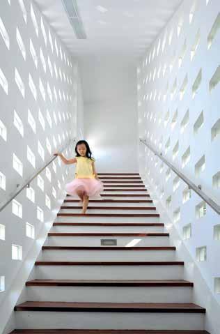
59dwell asia July/August 2014

Venice,locationDimsterarchitectDualprojectHouseArchitectureCaliforniaThedramaticstaircase
text EricphotosMargotbyDoughertybyStaudenmaier
Sibling Revelry Architect Don Dimster celebrates the concept of communal family space with a pair of homes in Venice, California, for himself and his brother.
60 July/August 2014 dwell asia my house
in architect Don Dimster’s South ern California home is made from T- and L-profile steel, shelf board, glass panels, and plate steel. Electric shades on the outside of the house keep the sun from penetrating the glass wall of the staircase and overheating the interior.

With a fire pit, mobile shades, and drought-tolerant grasses recessed in the Mangaris plank expanse, the roof deck is a communal space in the duplex (above left). The Kookaburra Shade Sail, made of a woven polymer material that prevents mold, can be moved around as Theneeded.glassstaircase figures prominently in the facade, but Don designed the windows to ensure privacy (above right). Using computer models, he conducted visual studies to suss out sight lines from the street. “People can’t see in, but we still get light.”
Dual House Floor Plan Ground Floor A D C CE E D A CC B B H J I I GG J F F Second Floor H A Bedroom-Office B Entry C Bathroom D Bedroom E Garage F Living Room G Kitchen-Dining Area H Half Bathroom I Master Bathroom J Master Bedroom 61dwell asia July/August 2014
Don Dimster: The lot was empty when we bought it, but we found an undocumented basement with old Prohibition-era bottles and two steep staircases leading into a tiny room about four-and-a-half feet under ground. Apparently, there were a lot of moonshine basements in Venice. We considered every permutation for the building: three units, two units, a garden courtyard—but, in the end, we knew we wanted it to be a duplex, with my brother and me as the occupants. I wanted a building that could read as one but that had two distinct identities.
Don Dimster and his filmmaker brother, Dennis, had lived together on and off for nearly a decade when, in 2004, they purchased a 40-by-120-foot lot in Venice, California, just a few blocks from the beach. Eight years and myriad hypothetical schemes later, the Dimsters moved into the duplex that Don, an architect, designed. By this time, Dennis was married to Noreen Perez, an assistant film director, and Don to Lisa Turner Dimster, the design director for the outdoor clothing maker Aether Apparel; what might have become a pair of high-design bachelor pads instead turned into two family homes with considerable flexibility. The building’s most striking feature, both inside and from the street, is a pair of glass-walled, suspended steel stairways that lead from each home’s living space to a shared 1,000-squarefoot rooftop patio. The terrace provides ample communal space for the two couples, their dogs, and Dennis and Noreen’s new baby. And when each family opts for a bit of private time, the six-inch-thick cinder-block walls that define each of the three-bedroom, twoand-a-half-bath homes give them all the privacy they need. Don shares the story behind the Dimster duplex.


The idea of a collective main space was always important. It’s actually an old idea; Le Corbusier was a propo nent of it in many of his social housing projects, and the theory was that the collective space would always be much more grand and significant than indi vidual spaces. As the building footprint grew, the collective outdoor space moved naturally up to the top floor.
The second floor has 11-and-a-halffoot ceilings, is a simple L shape, and contains the kitchen, living, and dining areas. We didn’t want to waste dupli cate space, so we built the dining room inside the kitchen.
Don preferred closed cabinets for his kitchen but Dennis didn’t want doors swinging out. So Don designed plywood sliders that park at specific positions and fit together like puzzle pieces in Dennis’s space (below).
62 July/August 2014 dwell asia my house
The deck is an access point for the two units. The other night, I went over to watch basketball and it was so conve nient. Lisa and I can go hang out, watch a movie on their side, or meet up with them in the middle. It’s a nice balance between togetherness and privacy.
My brother’s unit is a mirror of ours, so if you wanted to bust through and combine the whole shebang into one big building, the kitchen would be a logical place to connect. There are six inches between the two walls. You could turn one kitchen into a formal dining room and use it as the passage to the home’s other side. The project is really designed to be future-proof: One family could take over both units, two families could stay, or one could sell without affecting the other.
Because we wanted a garage, there wasn’t much space left on the ground floor, so it was important to have a nice entry that brings you up to the liv ing area. The stair is a special element. We studied different configurations— next to the facade, perpendicular to the facade—but it became obvious the stair should become the facade. It animates the building’s exterior and shows life inside the house. Because of its shape, the stair is quite a nice sculptural piece.
Contractor Franklin Pineda custom-built the cabinets using Baltic birch plywood from Anderson Plywood.

“Because of their size, the doors had to be made inside,” says Don, who did the job himself. mcmaster.com
Don designed and built the white-oak kitchen table ( C ), which is cantilevered so knees don’t bump the underpinnings. Half of the table can be manually raised to counter height ( D ), making an ideal serving, prep, or work station. “Don did all of the welding,” Lisa says, “and I’d hold the fire-spark cloth to protect the cabinets and wood bench.”
A Concrete Plan
Close Call A nine-foot-tall door covered with quarter-inch white oak slides along a ceiling rail and can be moved with just a finger to close off Don and Lisa’s kitchen or bedroom ( A ). Made of wood and metal, and welded onsite, the door moves along 400-pound-capacity roll ers by McMaster-Carr. A matching slid ing door opposite hides a storage area.
A B DC
ItMakeYours
Content originally published in Dwell® Magazine and/or on www.dwell.com, © Dwell Media LLC 2014. Published with permission of Dwell Media LLC. All rights reserved.
63dwell asia July/August 2014
Don originally wanted to have wood floors throughout the interior but for cost reasons decided to use lightweight concrete instead. “In order to make it as resilient to cracks as possible, the concrete is extra thick—two-and-ahalf inches—and has fiberglass and wire mesh reinforcing,” he says. “It was pol ished and machine-troweled as it was being finished, the same as the lowerlevel concrete slab, so we could get a similar look throughout.”
Bright Ideas
The master bathroom ( B ) has a small window and a large skylight above the shower—and shares a translucent glass expanse with the kitchen, where it becomes the backsplash. “Even though it’s a buried room,” Don says, “we have three sources of natural light. For the shower, we made a very high curb so you can stop up the drain and turn it into a big soaking tub. We used white, one-by-four-inch or one-by-six-inch Carrara marble tiles from Royal Stone and Tile. They come on a 12-by-12-inch sheet. I got the small tiles because you can use them to work the bottom plane into the shower.” royalstonela.com
On the Table


64 july/August 2014 dwell asia dwellings

Behind The Timber Screen
Text PhotosSunthybySunowocourtesy
dwell asia july/August 2014 65
MingprojectTeck
Clean lines, unadorned, yet rich in texture and visual features, the design of this house in Bukit Timah, Singapore, focuses around a timber ribbon screen.
The architect create what looks like to be a ribbon from timber, constructed from several kinds of materials with considerations of functions and maintanance. The entire space inside the house is like a continous journey with enough opening and ventilation to invite in the wind and lights.
BukitlocationLATOarchitectHouseDesignTimah,Singapore
of LATO Design

The modern feel of the entire livingroom is a combinations of all white chairs, coffee table, and dining table. The space definitions are marked by the timber screen. The architect consistently use the white painted wall to be a canvas of all the owner’s family activities inside the house. The stairs is located in the long side of the building and enjoy the abudant lights come from the skylight. Furniture is the sign of function in this house since the design of the space is an open set up with a free flow circulation.
66dwellings july/August 2014 dwell asia
This two-story mid-terrace house is a perfect exam ple of how modernity embraces the many elements of design, while still projecting simplicity, practicality and functionality to create a contented homely environment.
The house, complete with an attic, has a land area of 200 square meters with a 280-square-meter building. During the design process, a challenge emerged as to how to provide light and ventilation to the centre of the house. This was the first dilemma for which archi tect LATO Design had to find a solution. A stylistic ap proach was adopted to solve the problem while ensur ing privacy at the same time. The solution generated the design and typology of the house. The next problem that drew attention of the design er was how to manage the privacy factor within the house. To do this, the architect created a storyline in volving the stairs, the screen, the corridors and the windows to make a strong definition between the com munal areas and the private spaces. The house was practically split into two sections, a very ‘transparent public zone’ and a ‘screened private zone,’ with the circulation spaces becoming the public zone. In this area, the architect also used a full height openable win dow to create a feature with interesting proportions on both ends. A skylight was then stretched to connect them and bring in the sun’s rays to illuminate the inte rior and to create a light and airy feeling. The private zone contains the personal spaces such as the bedrooms, the bathrooms and the study. A ‘tim ber ribbon screen’ was then created to shield this


67dwell asia july/August 2014

68dwellings july/August 2014 dwell asia

dwell asia july/August 2014
Thelayout.lights and shadows in this part of the house create a pattern in the wall, a reflections on the glass railing that result in a visual play.
timber tiles were used for practical reasons as this ma terial is less susceptible to scratches. As a feature on the interior wall and ceiling, timber veneer was select ed for its warm character, and for the building façade and roof, chengal timber was selected for its outdoor durability and capacity to withstand the elements. The colors and tones of the chengal timber and timber ve neer were stained to match the mock timber tiles to ensure a consistent overall look to the whole of the timberBesideribbon.thetimber ribbon is a void that runs along the depth of the space to provide volume for light and ventilation, as well as a visual connectivity to the en tire three-story house. Hanging pendant lights greet guests as they enter the house and enjoy the scale cre ated by the void. The staircases also have an open tread design to maximize the penetration of natural light
The 2-storey house with an attic is not using too many material. the wood, steel, and plestered-painted wall are the language inside the house. Above the stair is the skylight, a design solution from the architect to illuminate the centre part of the house without sacrificing the room
zone from public roads and prying eyes in order to give it privacy. Furthermore, the timber ribbon screen ex tends throughout the house, starting at the outdoor car porch steps, to the living and dining area as a floor, wall and ceiling feature, before reaching out to become the screening façade of the house and finally the roof of the house. Psychologically it also reinforces the idea that a house is a whole instead of a collection of differ ent areas and rooms. A slit opening cut from the tim ber ribbon offers a nice fenestration to the façade but more importantly directs the views from the parents’ room to the sky rather than to the houses on the oppo site side of the road.
The timber ribbon was created using a mixture of materials, each one depending on its suitability at the various different locations. On the floor of the car porch as well as the living and dining area, mock 69

70dwellings july/August 2014 dwell asia

Under the glass roof, the attic area is a place where the resident of the house can relax and enjoy the moment of togetherness. Still covered from the rain and located near the roof has made this area is visually secluded from the neighbouring house. Besides the timber screen ribbon, the parquet floor is also the sign of private area.
through the skylights, while illuminating the threestory space all the way down to the ground floor.
71dwell asia july/August 2014
The ending of the story of this house is an open ter race with views of the trees, created alongside the attic, which is accessible from master bedroom. The attic study-room, which is solely for the use of the residents of the master bedroom, also opens to a small terrace at the front of the house. This modern house is a perfect example of how simplicity and practicality can emerge within a design to provide a rich experience with a sense of warmth.
Meanwhile, a small cozy family area is located on the second story near the staircase – strategically posi tioned to create a sense of warmth and togetherness for the family of this house. Nature and greenery then brings more fresh and interesting qualities into the building from its location at the back of the house where it can be clearly appreciated. Every time some one uses the stairs, a spectacular view looking out to wards the mature trees within the forested areas at the back of the house can be enjoyed through the full height windows and the skylight.


dwellings july/August 2014 dwell asia72

Kelly Vencill Sanchez Photos
Text by by
TheprojectKalmick House A.architectsQuincyJones and Whitney R. Smith LoslocationAngeles, California designed for living with new owners, a midcentury home in los angeles begins a fresh chapter.
Spencer Lowell Crestwood Hills, in the Brentwood neighborhood of Los Angeles, is an endangered enclave of MadisonandLaccioJasperingdatesboughtLoehnenanddesignedpost-and-beammidcenturyhousesbyA.QuincyJonesWhitneyR.Smith.EliseandRobFissmertheirhouse,whichto1950,in2012,furnishthelivingroomwithasofabyRoom&Board,tablesbyMarcelBreuer,awoolsisalrugfromFlooringandDesign. dwell asia july/August 2014 73

“They wanted to be sure we understood how special the neighborhood is and how special it is for Max to grow up here,” Loehnen recalls.
The dining area features a distinctive cinder block fireplace (left). Molded plastic side chairs are arranged around a Segmented Base table, all by Charles and Ray Eames for Herman Miller. The space is illuminated by a Saucer pendant lamp by George Nelson from LoehnenModernica.and
Fissmer relax on a bench outfitted with orange pillows by Sunbrella on the deck outside their living room (below). A 606 Universal Shelving System by Dieter Rams for Vitsœ dominates one end of the living room (opposite).
Shortly after they moved to Crestwood Hills, an enclave in the Santa Monica Mountains, in 2012, Elise Loehnen and Rob Fissmer got an inkling that their new neighbors felt more than just run-of-themill community pride. On their first strolls in the area with their newborn son, Max, longtime residents often stopped them and struck up conversation.
74dwellings july/August 2014 dwell asia
Occupying some 800 acres above Sunset Boulevard in Brentwood, Crestwood Hills is indeed a rarity.
The Mutual Housing Association—which four musi cians with a dream of cooperative living founded in 1946—enlisted architects A. Quincy Jones and Whitney R. Smith and engineer Edgardo Contini to develop a novel yet affordable housing option for middle-class Angelenos. The team conceived 500 modern singlefamily houses in the Santa Monica Mountains, on angled sites that would offer canyon and ocean views. In the end, only 160 were built, along with a coopera tive nursery school and community center. The postand-beam dwellings were modest, constructed of exposed concrete block, redwood siding, and tongueand-groove Douglas fir ceilings, but their abundant windows and angled rooflines amplified their relation ship to the outdoors. A 1961 fire destroyed about 45 of the houses; others were poorly redone or demolished outright. Today, just 33 remain intact. According to architect Cory Buckner, Crestwood Hills holds a unique place in the canon of modern


75dwell asia july/August 2014

76dwellings july/August 2014 dwell asia

Max’s bedroom is outfitted with a Gulliver crib and a red PS cabinet, both from Ikea, as well as a Birds in Harmony mobile by Christel Sadde and Katsumi Komagata for the Museum of Modern Art Store (opposite). The custom “I brake for unicorns” neon sign is from Let There Be Neon, a shop in New York City.
“reinvigorated my interest in architecture,” particularly the midcentury-modern style, which he resisted while studying architecture at the Rhode Island School of Design. When the couple discovered the 1950 Kalmick House, also known as Historic-Cultural Monument No. 634, “within 20 seconds, we knew it was for us,” Fissmer says, recalling the first visit. “We were com pletely moved by the space—by the floor-to-ceiling windows in the living area, by the house’s simple but deeply considered lines, by the view of the ocean.” At just 1,468 square feet, the three-bedroom, twobath house is filled with light. The couple thoughtfully arranged furniture they’ve amassed over the years throughout the open-plan space: tables and chairs by Charles and Ray Eames, objects by Dieter Rams, Fissmer’s sizable collection of vinyl records, and odds and ends that Loehnen has gathered on her travels.
“We cringed when the cats first took their nails to the Eames chair, but what’s the point of having things if you’re not going to enjoy them?”
A print of Enzo Mari’s La Mela e La Pera for Danese Milano hangs in the master bedroom (above). Delta lamps by Robert Abbey sit atop bedside tables from Rams’s 606 shelving system for Vitsœ. architecture. A resident of the enclave since 1994 and the author of A. Quincy Jones (Phaidon, 2002), she has spearheaded an effort to have many of the Crestwood Hills houses designated as HistoricCultural Monuments by the Los Angeles Cultural Heritage Commission. “In the beginning, we had to fight to get people interested in saving them,” she says. “But as the years go by, their appreciation grows. They’re willing to bring these houses back to what they were and to respect and maintain them.”
77dwell asia july/August 2014
Fissmer and Loehnen knew nothing about the neighborhood when they began searching around Los Angeles for an architecturally significant house. After moving to California from Jersey City, New Jersey, in 2011, they lived in a Venice loft for about a year. Fissmer, who works for the furniture company Vitsœ, says the move to Southern California
—Elise Loehnen, resident

“We somehow have an amazing amount of privacy considering that the lot is not all that big and we have neighbors on both sides.”
—Rob Fissmer, resident She has a particular affinity for Ray Eames. “I love that she was a collector—and not a collector of things that were ‘good’ or pedigreed, but of things that spoke to her soul,” Loehnen says. “I try not to be pre cious about things. We cringed when the cats first took their nails to the Eames chair, but what’s the point of having things if you’re not going to enjoy them?”
Though Fissmer and Loehnen are proud of their collection, they wanted the structure, rather than the things within it, to be the star of the show. “We’re not minimalists,” Fissmer says, “but we try to find an appropriate balance. In a house like this, it should be more about the architecture than your furniture. We’ve made a conscious decision not to obstruct any original walls or finishes, as they’re extremely beautiful.” When Fissmer and Loehnen purchased the home, many of the original finishes were in good condition. But previous residents had altered or updated the structure, and the couple plan to restore some of the details. One day, Fissmer happened upon some dusty tubes stowed among the cobwebs in the carport.
Upon closer inspection, he saw that they held a set of plans and elevations for the site and the house— signed by A. Quincy Jones in 1949. “It was like a time capsule,” he says. The documents will come in handy in the years to come as the couple begin to return the house to its roots. “Every day, we look at each other and wonder how we ended up in this house,” Fissmer says. “We’re very grateful to be stewards of one of the homes in this remarkable architectural community.”
A previous owner remodeled the kitchen (left) in 2000, outfitting it with cabinets by Bulthaup as well as a Sub-Zero refrigerator and an induction stove by Diva. “It’s like Lego for grown-ups,” Fissmer says of Rams’s 606 Universal Shelving System for Vitsœ, which makes another appearance in the office (opposite). “It’s a responsible way to handle storage.” Fissmer discovered a set of plans for the house, signed by Jones and dated 1949 (below), in a tube in the carport.
Content originally published in Dwell® Magazine and/or on www.dwell.com, © Dwell Media LLC 2014. Published with permission of Dwell Media LLC. All rights reserved. july/August 2014 dwell asia
78dwellings


79dwell asia july/August 2014

TexT by Luke Tebbutt PhoTos by Joakim blockstrom
80 july/August 2014 dwell asia

With clever storage and a retractable skylight, a London apartment feels larger than its 576 square feet.
Architects London,locationEngland
dwell asia july/August 2014 81
Stairway
Architects Silvia Ullmayer and Allan Sylvester worked with joiner Roger Hynam to reinvent an apartment for metalworker Simone ten Hompel (above). The stairs lead to a sleeping loft outfitted with a mechanical skylight. to Heavens
UllmayerarchitectLivingprojectWorkshopSylvester

82dwellings july/August 2014 dwell asia
“It was important to give the space a weight and sensuality it didn’t have before, so you experience it acoustically and haptically as well as visually.” —Silvia Ullmayer, architect

83dwell asia july/August 2014
Hynam designed and built the cabinets under the stairs and a drawer that slides out from beneath the bottom step. Drink H1 pendant lamps from Rotaliana hang in the kitchen and above a Grassworks dining table by Jair Straschnow.

For 15 years, metalworker Simone ten Hompel lived uncomfortably with the shortcomings of her London flat—four poorly insulated rooms squeezed into 398 square feet. She used the cold bedroom at the back for storage and the small living room at the front for vir tually everything else; a futon mattress on the ground served as her bed and sofa, and a tray doubled as a dining table. “I spent all my time on the floor,” she recalls. “But I promised myself I wouldn’t do anything apart from new paint, new carpet, and a new bathroom until I’d saved for a renovation. It needed to get on my nerves so badly that I would go through the hassle.” She finally reached the breaking point in 2008 and approached Roger Hynam of Rogeroger Design Solutions, who had trained as an architect before becoming a joiner. Hynam, who once kept a workshop in the same building as ten Hompel’s metalworking studio, told her that he would prefer to concentrate on carpentry for the renovation and suggested that she hire Silvia Ullmayer and Allan Sylvester of Ullmayer Sylvester Architects to design her new living space. Ten Hompel’s brief was succinct, befitting her tiny space: more storage and insulation and a better con nection with her hilly surroundings in a rejuvenated pocket of Islington, North London. The team tackled it in a uniquely collaborative way, with Ullmayer Sylvester planning the space, Hynam creating the built-in storage and the kitchen island, and ten Hompel making models and scrawling on the wall to better envision their proposals. Drawing on their creative backgrounds, they were able to share and refine ideas with more rigor than is customary in a designer-client relationship. “It was a dream team,” Ullmayer says. “Simone comes from a craft back ground and Roger comes from a craft background, so we were able to have a level discussion.” To make the most of the small footprint, they opted to remove all the internal walls and knock through the
84dwellings july/August 2014 dwell asia
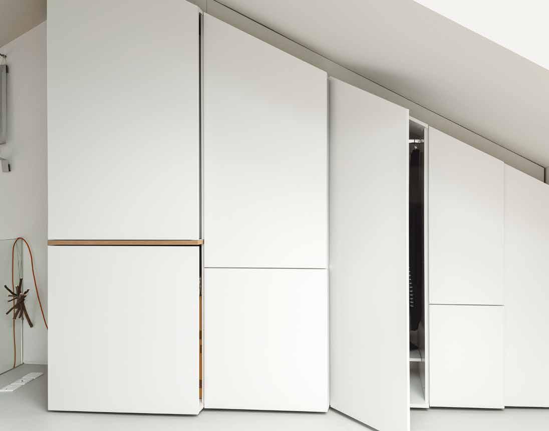
A wood-burning stove, new double glazing, and insulation in the walls, floor, and ceiling have made ten Hompel’s home more comfortable and cheaper to live in. (Her heating bills have been cut about in half, she says.) New soundproofing beneath the floor boards has also made it quieter. Construction started in December 2009 and was completed the following April; detailed joinery, such as the shelves in the sliding wall and the wardrobe in ten Hompel’s bedroom, was added in phases over the rest of 2010. “I’m a slow person, so I needed to live in 85
“Our focus was on maximizing the spatial experience rather than the floor space,” says Ullmayer, who adds that she steered ten Hompel away from her initial inclination to keep the ceiling and create a larger sleeping space in the attic. “It was about making one space that feels really generous and can be subdivided into smaller spaces.” Key to this flexible subdivision of space is a sliding storage wall that Hynam and his team designed and built between the kitchen and living room; it has three sections that can be moved to either side to open up or completely separate the rooms. When friends or fam ily stay over, ten Hompel can grab a camping mattress from the cabinets under the stairs—another of Hynam’s innovations—and close the wall to transform the kitchen into a bedroom. And when guests gather around a new dining table that seats up to nine, she can slide the wall to the side to create one big space.
“Our approach was to make things that are part of the fabric of the flat, but also multifunctional,” Ullmayer says. “Rather than dictate how the space has to be used, they offer invitations of how it can be used.”
dwell asia july/August 2014
Hynam built additional storage along one angled wall of the bedroom loft (opposite) and beneath the skylight (above). The bed, also by Hynam, is on casters, allowing ten Hompel to move it to gaze at the stars. ceiling. The latter move created a mezzanine bedroom, giving ten Hompel more than 178 square feet of addi tional floor space, and doubling the height of the living room to 16.4 feet at its tallest point. The new ceiling has a fully retractable mechanical skylight that opens 8.2 feet wide and closes automatically when sensors detect rain or excessive wind.

AB
86dwellings july/August 2014 dwell asia
Living Workshop Floor Plan
The Salvatori marble tiles in the bathroom (below) were added at the last minute, once everyone was confident that they would not put the project over budget. The kitchen features a compact cooktop by Whirlpool (right). A sliding storage wall can be tucked aside to allow a seamless connection to the living and dining area (opposite).
Content originally published in Dwell® Magazine and/or on www.dwell.com, © Dwell Media LLC 2014. Published with permission of Dwell Media LLC. All rights reserved.
A Bathroom B Kitchen C Living-Dining Area D Bed Loft the space before I could know exactly what I wanted from the storage,” she says. Ullmayer Sylvester aptly named the project Living Workshop because it gives ten Hompel space to pre pare models at home for the metal spoons, bowls, and other objects that she creates. She stores model-making materials beneath the stairs and in her bedroom, cuts them into shapes on her kitchen island, and puts them together on the clean sweep of floor in her living space, where she also cuts firewood in the wintertime, “like a hunter-gatherer in London,” she says. The flat works equally well in summer, when ten Hompel opens the skylight to make her mezzanine feel more like a terrace. “The bed is on casters,” she says, “so I can move it around to follow the sun, and at night I can look up at the stars.” That kind of flexibility is perhaps the flat’s greatest achievement. While other small homes force their owners into a more edited way of life, ten Hompel’s space allows her to live ex pansively. “I made the flat how I am, so now I can live the way I want to,” she says. “It doesn’t feel small when I walk through it.” C D


“ The space just works when guests visit. One person can be on the stairs, another in the living area, and me in the kitchen. People find their own places, and I like that.” —Simone ten Hompel, resident 87dwell asia july/August 2014

an oak table from Canvas Home, with Wishbone chairs by Hans Wegner. Decorators White paint by Benjamin Moore and oiled Hakwood European oak flooring are used throughout.
Schmidt-Friedlanderproject Residence Jacquelinedesigner TheWindsorFriedlandersquareseeminglyfromABrooklyn,locationDavidarchitectSchmidtBucovyArchitectNewYorklargemetalfloatingmirrorRestorationHardwaredoublesthe675feetoftheSchmidt-apartmentinTerrace,Brooklyn.familyofthreedinesat
ChangeSpareAgrowingfamilyinBrooklyndownsizestheirlivingspacewhileexpandingtheircollectivequalityoflife. dwellings July/August 20144 dwell AS i A88

TexT PArlenebyHirstHoTosbyMatthewWilliams dwell AS i A July/August 2014 89
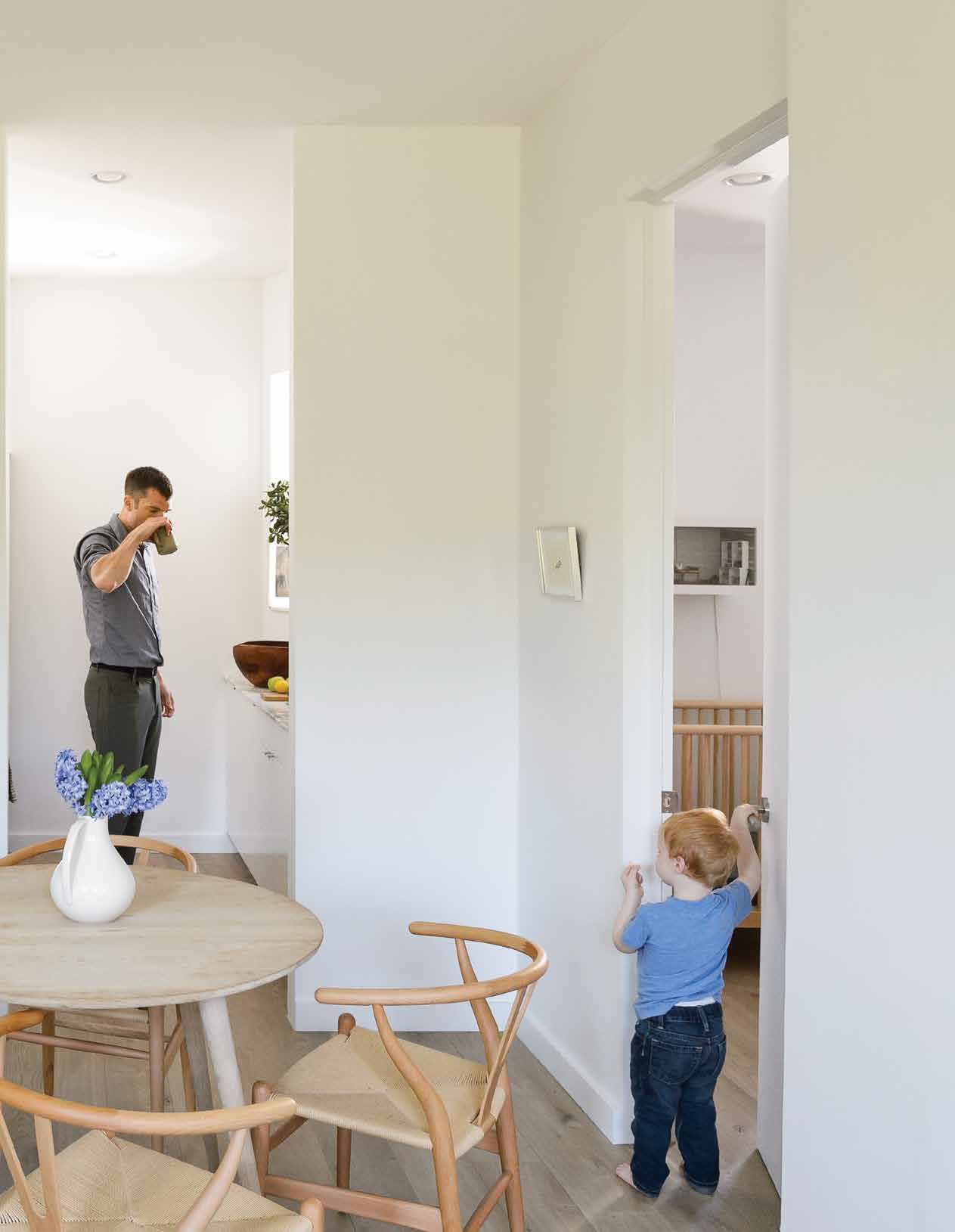
90dwellings July/August 2014 dwell asia

The couple bought the apartment in October 2013 and started renovation in early December because the co-op board approved their renovation plans in one weekend. Four months later, they moved into their now sun-drenched space. The only things that hadn’t changed were the front door and the windows (al though a few were added); every room in the apart ment now has one. Walls were moved, the bathroom was gutted, the kitchen became a galley, and the two bedrooms were made especially spacious thanks to wall-mounted Murphy beds from Resource Furniture in both the master bedroom and that of two-year-old Finn (who will soon have a baby sister or brother).
In his room, Finn sits on a Stump stool by Kalon Studios at an oak table from Canvas Home (opposite). The flat jute rug is from ABC Carpet & Home; the stainless-steel door hardware is by Emtek. The bunk bed, the Lollipop IN model from Resource Furniture, stows away flush to the wall when not in use. Schmidt selected Oeuf’s Robin crib (above) for Finn’s soon-to-be sibling. The bird mobile is by Tamar Mogendorff. Finding an almost affordable apartment in New York can be harder than uncovering the proverbial needle in a haystack. While the hunt has never been easy, the past few years have been almost impossible, with sky-high prices, pent-up demand, and a scarcity of available inventory. That was the market that David Friedlander and Jacqueline Schmidt faced when they found they were soon to be parents. Their 500-squarefoot rental in Brooklyn’s Park Slope just wasn’t big enough for three. After a frustrating, unrewarding search, they decided to move upstate to Beacon, where they envisioned a bucolic country life. Instead they felt isolated, needing a car just to go grocery shopping or see a movie. They missed the city, its easy access to friends, food, and entertainment, and the joy of just walking around. They started hunting in the city again and finally found something suitable and made a bid, which was accepted. But they hesitated, because a high price tag for a 700-square-foot apartment was a real stretch that meant they wouldn’t be able to afford any kind of renovation. At the 11th hour, searching on Trulia, the residential real estate site, they discovered a small two-bedroom apartment, a fourth-floor walk up in Brooklyn’s Windsor Terrace neighborhood. It was in terrible shape, but its significantly lower price tag—around 40 percent less—meant they would be able to rehaul it completely. “This place was a dump,” declares Schmidt, explaining that the floors were warped, there were three layers of Sheetrock on the walls, and the ceilings were dropped. But she saw the bones and knew what they could do with the space. The unit had other advantages: It faced Prospect Park—a glorious green expanse—it had storage in the basement and stroller parking, and it was in a very good school district.
91dwell asia July/August 2014


The couple’s Murphy bed, Clei’s Penelope model, folds up into the wall (above).
A Model 78 side chair by Niels Otto Møller tucks into a custom desk in the master bedroom (right), a home base from which Friedlander works remotely. The brass pendant light is by Allied Maker.
92dwellings July/August 2014 dwell asia


A seamless sliding door by CS For Doors—accented by Mockett hardware—separates the master bedroom from the living room and doubles as a backdrop for a projector (left). The renovation stripped away crown molding and French doors (below).
The folding beds are the critical element in the spacesaving design. Because they fold out of sight (very easily insists Friedlander, doing a Vanna-like on-the-spot demonstration), the couple were able to create an un cluttered, L-shaped living area. A custom-made slid ing door closes off the bedroom when privacy is need ed, and built-in storage in Finn’s room will provide enough space for the new baby. Another reason the apartment feels especially open and light is the absence of tchotchkes. Before marry ing Friedlander, Schmidt—an illustrator and children’s book author who has her own paper goods company, Screech Owl Design—had lived in a 1,200-square-foot loft in Greenpoint that was filled with furniture, ob jects, and thousands of art books. But as a true convert to the philosophy of LifeEdited, the company for which Friedlander works as communications director, she spent the past year and a half selling off every thing on eBay, Craigslist, and Etsy. LifeEdited, a firm started by TreeHugger founder Graham Hill, consults and works with developers to create small living spac es. Its website proclaims that it’s dedicated to showing you how to “design your life to include more money, health, and happiness with less stuff, space, and “ It really has made us scrutinize what’s important and what we can do without. Rather than being a burden, that has been liberating. We don’t feel weighed down by stuff we don’t need or use.”
Takeshi Nii’s Ny chair is paired with a Reese sofa and cherry Grove nightstand from Room & Board in the living room (right).
—David Friedlander, resident
93dwell asia July/August 2014


www.dwell.com,
energy.” “We practice what we preach,” says Friedlander proudly. People usually try to fit their old furnishings into a new space, but, says Schmidt, “We fit ourselves into the space.” She shows off half-empty drawers in their compact kitchen, which is lined with cabinets from Ikea and filled with Fagor appliances designed for small spaces. But the kitchen feels elegant thanks to a Calacatta Borghini marble countertop and backsplash from Ann Sacks, which is honed, not polished, she stresses, because honed marble wears better. The small bathroom is also given a luxe treatment, with marble tiles and floors and Kohler appliances. Another splurge was the wide-planked European oak floors. They were able to make these expensive choices partly because the spaces were small and didn’t require a lot of any one material. And, since the apartment cost so much less than the one they had originally planned to buy, they were able to rationalize their spending.
All of the apartment’s fixtures are by Kohler, including the kitchen sink and faucet as well as the Tea-for-Two bathtub, Vox square sink, and Catalan mirror in the bathroom (below). The Thassos marble subway tile is by Ann Sacks.
Content originally published in Dwell® Magazine and/or on © Dwell Media LLC 2014. Published with permission of Dwell Media LLC. All rights reserved.
Schmidt conceived the design of the space by herself after using architect David Bucovy to create working drawings. LifeEdited’s design team pitched in when ever advice was needed, and the house-proud couple claim that they are living examples of the company’s motto: Their home is all about “the luxury of less.”
94dwellings July/August 2014 dwell asia
AResidenceSchmidt-FriedlanderFloorPlan Entry B Bathroom C Kitchen D Living Area E Kids’ Room F Master Bedroom
Replacing the existing stock cabinetry in the kitchen (below, right), small-scale, 24-inch appliances from Fagor are incorporated into Ikea’s Applåd cabinetry (right). The showstopping material elements are the Borghini honed marble countertop and backsplash by Ann Sacks (opposite). Hasami porcelain vessels line the open shelving.
A B C D E F


95dwell asia July/August 2014

LaneVisionaryKarlinda
Approaching architecture through a contemplation of the surrounding cultures for a contemporary solution, Wiyoga Nurdiansyah and Muhammad Sagitha make sure their vision leaves an influential mark on the path behind.
text SunthybySunowo and Anindia
They say a picture is worth a thousand words, which relates to the complex ideas that can be conveyed through a single im age. This strikes a chord as to what SUB studio is all about, which is easy to identify from the way each of their projects transmits a bold vision of innovative thinking. Looking at the Grey House project, one will gasp over the fact that the single slope roof was meant to create an attic space; the zoning scheme for the areas, according to circula tion hierarchy, gives effective function to a room; while the movable windows aim for flexibility of space; all in the name of a space-economizing strategy in response to the modest budget.
The level of commitment that SUB af fords is the kind that addresses the local and social cultures surrounding the people in the making of an efficient solution for each particular case in each project. Such dedication is proven impressively through AN House, a private house project in Jakarta located in an aging residential complex that used to be swamp land with the absence of an interesting view within the vicinity. This unfavorable condition demanded an exploration of green space inside the house for the sake of having a patch of nature to enjoy. Designed with an inward-facing lay out, the house opens up to a main garden that functions as the core activity area, with a large terrace accompanying the living and dining areas to let the natural breezes in, and a private roof garden for the master bedroom, while the children are able to en joy an extended outdoor play space also within a large roof garden. With the focus on architecture and de sign at all levels and scales, SUB offers an integrated design for the master plan, the architecture, the landscaping, the interior design and the furniture design, with a con temporary approach to problem-solving through innovative thinking. The vision shared by the two founders, Wiyoga Nurd iansyah and Muhammad Sagitha, is trans lated into a creative collaboration, through which they evolve towards an ingeniously inventive work as all visionaries do. Can you tell us how you first came to know each other, up to the point when you de cided to make SUB Studio together?
July/August 2014 dwell asia
SUBofcourtesyPhotos96profile

MS: I joined Budi Pradono Architect for one year before moving back to Bandung when my dad passed away. After that, Ridwan Kamil, the principal architect of Urbane, helped me join Urbane to do competitions, and then I got a very good chance to join WOHA in Singapore. I was very lucky to join the WOHA team and to do projects such as Alila Villas Uluwatu Bali, Sanya InterConti nental China and Nest House Singapore, which have all been built. I learned from scratch and always gained inspiration from Wong Mun Summ & Richard Hassel. This office is a fine example of an architect’s responsibility to create diverse, innovative and exciting environments. What made you open SUB Studio?
Wiyoga Nurdiansyah (WN): We started do ing architectural projects together when we were in college. Our first project was de signing a small house. Then, we realized that we both had the same architectural design Muhammadchemistry. Sagitha (MS): We’ve had the same interests ever since we met in univer sity, we did some very small projects togeth er and we both sought out architecture so that we could experience and learn from it. We both had a passion for architecture, and we learnt by experiencing it rather than sit ting in the class. We grew together from being students of architecture until now. Following graduation, what kind of experience did you gain? And what contribution did they bring to your personal approach today?
WN: After I graduated from Parahyangan Catholic University in 2003, I joined one of the leading Indonesian architects, Andra Matin, who became my mentor and motiva tor. Andra taught me architectural design at every level, from site plan design and plan layout to the creation of space, mate rial selection and detail ideas.
WN: After I worked with AndraMatin for six years, I thought I should pursue my dream to have my own architecture studio. When I called Agit in Singapore to talk about that, he agreed to make our studio, and we called it SUB.
MS: We had a dream to start our own stu dio formally before we both reached the age of 30, we took a risk by giving up our fixed income at that time, but we stepped backwards to take a giant leap forward. We reached our goal within our age target. Tell us how the business went in the early years? What were the main 97
One of SUB’s project, House of Trimmed Reform (opposite) is built by ‘tightlacing’ the form or trimming some edges, and by implementing a flat roof design that compliments the surrounding single story house, while the visual focus on interior (above) of the house is inverted towards the inner court using large openings. Swadaya House project (left) displays the use of secondary skin on the house façade, as well as greeneries in the gate area.
dwell asia July/August 2014


MS: I always reduce unnecessary things. It might be the same way with ‘form follows function’, but with a unique touch in every project. Every project has a different story, a different problem and different types of approach. And the basic thing is that we don’t want to be trapped in one style.
WN: I think the main obstacle was that In donesian people were unaccustomed to hiring architects because they considered it too costly. So, we had to think about how to reach them with affordable architecture. After we designed a modest house project we started to try different design ideas, such as the Geomelt project or GH House, on which we created new unusual space for a dwelling function.
for the typology of a Jakartan urban house.
WN: We always discuss it together first, because each project for SUB has a differ ent point of view. For example, in our AN House project, we started with an existing site condition. We decided to design a house without an orientation to the outside. Another example is the Grey House project for which we focused on construction
98profile July/August 2014 dwell asia
Founder and principal architects of SUB, Wiyoga Nurdiansyah and Muhammad Sagitha (left) had been doing architectural projects together since in college. Located on swamp land without interesting surrounding views, one of their project in Jakarta, AN House (below), was designed with an inward facing layout which opens up to the main innercourt.
obstacles or hardships you had to endure, and how did SUB Studio come to establish its name in the industry?
MS: It’s hard to practice in a place where people think an architect is unnecessary because contractors will offer to design free of charge, that’s why we started with affordable architecture until we could prove ourselves to society through our published works, and let them selectively come to us. What do the two of you have in common?
WN: In terms of architecture and interiors, I like clean, raw design and modern architec ture that still relates to our social and local cultures. For me, design should represent the time. The modern era creates more possibilities for us as architects to design with new ways and new ideas. Computer aided design really helps our work too.
What are your best projects so far? Can you point out to us the highlighted features of the projects and the design philosophy behind them? WN: Regardless of the scale, each project has a unique idea. It’s very hard to pick the best, for me it’s maybe the Grey House proj ect. In spite of the limited budget for this project, we still managed to answer the ba sic needs, which then became a new idea
MS: I can’t decide which project is my fa vourite, every project is unique and has a different story. Maybe the recent projects will be the best; I am always trying to pro duce a better and better quality each and every time. What are your top priorities in designing a project?
WN: I think both of us are different, we both complement each other. In design terms, I prefer the conceptual design, as in how to create space and form, while Agit focuses on materials, details and project execution to fit the design. Can you describe your personal style in terms of architecture, landscaping, interior design and furniture design?

MS : A unique touch is that every project has a different story, different challenges and different methods of approach. We graphi cally explain our design process so that our clients can understand our ideas. Normally, they will be satisfied with the result because they are involved in the process. Amongst the many awards you have received, which one holds the biggest sentimental value to you and why?
budget. So I think every project has differ ent priorities based on the owner guide lines, the site condition, and other things.
MS: Yes, we really enjoyed speaking at DA TUM KL 2010, and we were proud to share our small projects. What other ideas are you looking to pursue?
SUB’s main vision in finding innovative solution is adapat ed through accessstairscanshows(below)thethewithwhichandoutmodernityprojectseenarchitecturalcontemporaryapproach,asfromSampitApartment(above)thatembodieswithoutleavingtheneedofgreenspace,GeoMeltVilla(right)createdspaceflowingmodulethatfollowstoupanddowncontoursofground.GreyHouseontheotherhand,howflexibleaspacebe,byaddingahiddenonmasterbedromtotheattic.
dwell asia July/August 2014
WN: As a conference speaker at DATUM KL 2010, an annual architecture conference held by Pertubuhan Akitek Malaysia. Why? Because we were the youngest architects from Indonesia talking in front of an audi ence of more than 3000.
WN : We started with residential, small sized projects, because residential is a basic need and during the economic crisis, small projects were not affected.
MS: Problems, ideas come when we try looking for ways to fix them. Face it and fix it, then you will have a story from the idea. And
with travelling we will learn so much when we face things firsthand. What do you hope to convey to your clients? We always see ourselves as partners to the client rather than as architecture consul tants. Therefore, we believe there is always a good bond and new creative thoughts flowing from both sides. What is your long term goal for SUB Studio, both in national and global industry? Technically we want to grow up to be a global architecture office, known in the global industry regardless of the scale, while keeping a few people to control the design quality. SUB’s design always ex plores and studies to develop ideas further, while embracing the advent of a new style of Indonesian visionary architecture. 99
What do you think is the strength that makes you stand out from your competitors?
WN: Architectural Traveling. I believe I will always find new ideas, not only about archi tecture but also about many other things.


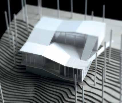
ideology, in order to build a global network that will advance the world of Indonesian design. What is AEDI’s design and style?
design finder AEDI 100 July/August 2014 dwell asia
Having spent more than half a decade in architecture, production, and the interior design industry, both overseas and in Indonesia, Eko Priharseno established his own design studio, AEDI, in 2004. Motivated by passion and the need to express his design idealism, a 50-square-meter studio in Kemang area became the first home of his product collection. Over the last ten years, AEDI has evolved, even had a store relocation, and successfully reinvented itself, aiming for the higher prize of becoming a design space for both local and Asian designers, where activities within will push forward the world of Indonesian design. Here, Priharseno shares his vision with Dwell Asia. What made you open AEDI?
PriharsenoEkoandKarlindaAnindiabyPhotos
Aiming to liberate design and move it forwards, Indonesian design studio AEDI shows appreciation for free expression through its inventive style.
Our typical customers had changed over the years, following the direction of our style. Back into our early years, we had many clients from advertising and design studios, and they were fond of the unique and funky aspects of our design. Following our evolvement into a more subtle and refined style, our typical clients have become urban people from B to A+ social class, in the 30 to 40 age bracket, who travel a lot and have an established and interesting lifestyle. Our style is now more dynamic, and our customers seem to have one thing in common – a desire to be unique and stand out.
ExpressionFree
Text Anindiaby Karlinda
For AEDI, I want something that’s down to earth and simple. AEDI’s style used to be rustic and forthright because I was influenced by a number of Scandinavian designs and Dutch designers. But now I have started to make it more upscale and refined. Our products are getting wise but still contemporary; they’re still modern but more subtle, with a fun and playful spirit.
Who are the typical AEDI customers?
I felt the tendency of everything orienting towards trends. Trend itself is created by people, and I wanted to provide a good alternative that was able to push forward design activity, regardless of ongoing trends. By opening AEDI Interior Design Bureau I was able to provide a design service, while Aedi Living – the retail space that stores products from AEDI and various designers – was opened to enable collaborative activities between other brands that are in sync with the
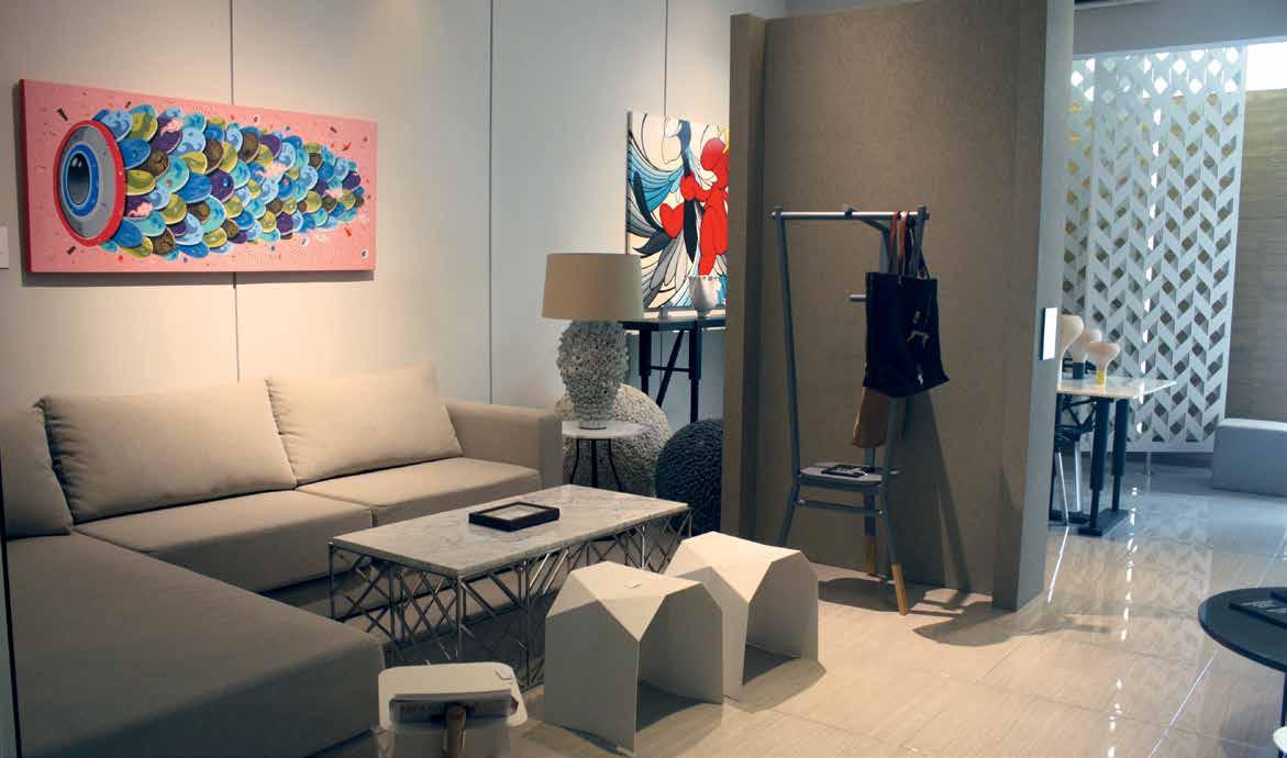

By wanting to fulfill their dreams. When you’re about to build something for them, you will have to build it within their expectation, but our team tries to give them what they hadn’t thought about before. What we basically do is reach a full understanding of their situation and long-term plan, so we know what they are expecting in the years to come. When you draw, you have to start by making a dot, don’t you? From that viewpoint, getting to know our client would be that first dot for us.
SPECIALTY: Design space for Asian and local designers.
TOP SELLING ITEM: Coffee table and seating. BEST DEAL: Dining table by AEDI. “This not-yet-titled dining table is big, and the shape of its feet is something I‘m currently developing for my other collection.”
What makes for great design?
101dwell asia July/August 2014
GO FIND IT! AEDI STUDIO + SHOWROOM Jl.
Aiming to be a design hub for local and Asian designers, AEDI Studio + Showroom (opposite, top) displays collaboration project as well as products from other designers’ collection, such as SUB Stool (bottom) by Jutamas & Piti Amraranga for O-D-A and Real Moss Table (opposite, bottom) from Ayodhya. The founder and principal designer, Eko Priharseno (right, bottom) is developing a new design of table legs, as seen used for the not-yet-titled dining table (right) from AEDI. Kemang Timur Raya No.45 B Jakarta 12730, Indonesia +62 21 71 794 455 +62 21 71 794
What are some of the new products that you are excited about? I like O-D-A and I have few of their chairs in the shop. I also like the works of Jakkapun Charinrattana, known as ‘Golf,’ who is now one of the biggest stars in the industry. What projects are you working on right now? I’m working on a new line with a different concept approach, hopefully to be launched in November. For this line, I have made a collection comprising interior objects such as tables, chairs, lamps, and glass coasters, each with one design character that will be the theme characteristic of the whole series. What other ideas are you looking to do?
I intend to develop AediLiving because it’s one of my ideal projects, which I started dreaming about ten years ago. What I’m planning to do is to set up a larger network and create a design hub. My other plan is to open a similar shop outside Indonesia, probably in Bangkok, where I have a contact who is actually looking for a new fresh Indonesian designer who’s on board with the project. I also plan to open a shop in a more commercial space such as a mall, to create more awareness about the richness and full potential of Indonesian design.
I agree with one quote that says great design is how you put a soul into a space. I feel that the most beautiful design is made when you are fully focused and put a lot of effort and love into it. If I design something I’m not passionate about, the end product will seem flat and soulless. So, for me, great design is about putting your soul and passion into the space.
aedishop.com456
COOLEST FIND: Real Moss Table from Ayodhya.
How do you provide a good service that ‘listens’ to clients’ needs?


from Flos flosusa.com Parentesi hanging lamp by Achille Castiglioni and Pio Manzù for Flos store.dwell.com The Audience print by Kozyndan kozyndan.com 80 Stairway to Heavens Simone ten Hompel tenhomple.com Ullmayer Sylvester Architects ullmayersylvester.com Sliding wall, custom storage, bed, wardrobe, and kitchen table by Rogeroger Design Solutions rogeroger.co.uk Untreated Swedish pine flooring by Russwood russwood.co.uk Grey oiled floor treatment by Junckers junckers.com Under-floor soundproofing by JCW Acoustic Supplies acoustic-supplies.com Drink H1 pendant lamp from Rotaliana rotaliana.com Grassworks dining table by Jair Straschnow straschnow.com Felt on dining chairs by Johanna Daimer daimer-filze.com Carat vertical wall radiator by MHS mhsradiators.com Colorette linoleum flooring on stairs by Armstrong armstrong.com Powder-coated steel balustrade by Hollywood Design hollywood-design.com Glass balustrade by Harlow Glass harlowglass.co.uk Retractable skylight by Roto roto-frank.com Clay-based wall paint by Earthborn earthbornpaints.co.uk Engineered stone countertop by Diresco diresco.be Cooktop by Whirlpool whirlpool.com Mini Glo-Ball wall lights by Jasper Morrison for Flos usa.flos.com Bamboo-textured marble tiles by Salvatori salvatori.it 88 Spare JacquelineChangeSchmidt jacquelineschmidt.net LifeEdited lifeedited.com David Bucovy davidbucovyarchitect.com Hakwood European oak flooring from LV Wood lvwood.com Decorators White paint by Benjamin Moore benjaminmoore.com Slenderized radiator by U.S. Boiler usboiler.net Metal floating mirror by Restoration Hardware restorationhardware.com Round oak dining table and oak side table in soap
Dot bowls by Paul Smith for Stelton unicahome.com Thonet chair No. 14 dwr.com Serape from the Montana Antique Mall in Missoula, Montana montanaantiquemall.com
Contact AdvertisersOur
Saucer pendant lamp by George Nelson modernica.net Kitchen cabinets by Bulthaup bulthaup.com Orange pillows and umbrella by Sunbrella restorationhardware.com La Mela e la Pera print by Enzo Mari store.dwell.com Delta table lamp by Robert Abbey lampsplus.com
Glacier Park 100th Anniversary Blanket by Pendleton pendleton-usa.com Alarm clocks by Dieter Rams for Braun braun.com Gulliver crib and PS 2014 cabinet by Ikea ikea.com Archimoon lamp by Phillipe Starck for Flos flosusa.com Birds in Harmony mobile by Christel Sadde and Katsumi Komagata momastore.org Crib sheets by Aidan + Anais adenandanais.com Custom neon sign from Let There Be Neon lettherebeneon.com Eames Aluminium Group Management Chair from Herman Miller store.hermanmiller.com Toio floor lamp by Achille and Pier Giacomo Castiglioni
When contacting our advertisers, please be sure to mention that you saw their ads in Dwell Asia.
64 Behind the Timber Screen LATO Design latodesign.com
72 Designed for Living 620 Chair Program, 621 side table, 606 Universal Shelving System, by Dieter Rams for Vitsœ vitsoe.com Baskets under shelving system from Mujeres Artesanas de las Regiones de Oaxaca, Mexico mujeresartesanas.mex.tl Jasper sofa by Room & Board roomandboard.com Laccio coffee and side tables by Marcel Breuer knoll.com Wool sisal rug from Madison Flooring and Design madisonflooringanddesign.com
APSDA 2014 apsdaindonesia.com Grohe Spa hydrospa.co.id Häfele hafele.co.id Haiku haikufan.com Roselle Mont-Clair rosellemontclair.com Rugmaker therugmaker.com.sg TOTO toto.co.id
finish by Canvas Home canvashomestore.com CH24 Wishbone chairs by Hans Wegner for Carl Hansen & Søn carlhansen.com Stump stool by Kalon Studios kalonstudios.com Tubular stainless steel door handles by Emtek thehardwarehut.com Tight weave jute rug and kilim rug by ABC Carpet & Home abchome.com Lollipop IN wall bunk bed system and Penelope queen-size bed by Clei from Resource Furniture resourcefurniture.com Robin crib by Oeuf oeufnyc.com Bird Mobile by Tamar Mogendorff tamarmogendorff.com White Thassos marble subway tile, honed Carrara marble vanity counter, Calacatta Borghini honed marble countertop, and backsplash by Ann Sacks annsacks.com Stillness shower fixture, Tea for Two bathtub, Vox square sink, Catalan mirror, kitchen sink, and Purist faucet by Kohler us.kohler.com Gas cooktop, 24-inch convection oven, and Torre refrigerator by Fagor fagoramerica.com Bathroom lighting and brass pendant light by Allied Maker alliedmaker.com Applåd cabinetry by Ikea ikea.com Hasami porcelain vessels by Taku Shinomoto and NY chair by Takeshi Nii store.dwell.com T drawer pulls in Satin Chrome and sliding door hardware by Mockett mockett.com FH-CeilingMountTrack sliding door by cs For Doors specialtydoors.com Reese sofa and Grove nightstand by Room & Board roomandboard.com Model 78 side chair by Niels Otto Møller for J.L. Møllers Møbelfabrik dwr.com 104 Profile SUB subvisionary.com 100 Design Finder AEDI Interior Design aedishop.com SUB Stool by Jutamas Buranajade and Piti Amraranga for O-D-A o-d-a.net Real Moss Table from Ayodhya ayodhyatrade.com 104 Finishing Touch Pierre Pozzi pierrepozzi@hotmail.com
Sourcing
All the products, furniture, architects, designers, and builders featured in this issue.
Indian sari fabric ball from New Stone Age, Los Angeles newstoneagela.com Segmented Base table and Molded Plastic side chair with Eiffel Tower base by Charles and Ray Eames for Herman Miller store.hermanmiller.com
FOLLOW @ SURFACEASIAMAG The new Surface Asia —sleeker, sharper and focused on everything Surface is all about: global design.contemporaryFollowSurface Asia on Instagram, Twitter and Facebook for exclusive images, videos, and more.

Content originally published in Dwell® Magazine and/or on www.dwell.com, © Dwell Media LLC 2014. Published with permission of Dwell Media LLC. All rights reserved. July/Au G u ST 2014 dwell a S ia
Paper artist Pierre Pozzi uses his signature material to wrap the dining room walls of his home in Valencia, Spain.
104
Seeking a slightly quieter existence, paper artist Pierre Pozzi relocated from Paris to Valencia in 2010. Soon after, he embarked on a three-year renovation of a 1,970-square-foot apartment, which now features a mix of modern furniture, original architectural details (like ceramic tile floors and crown moldings), and his own artwork. The highlight is the whimsi cal, three-dimensional wallpaper in the dining room. Pozzi spent three weeks cutting eight-inch-tall, two-millimeterwide lightweight paper stock into fringe by hand. Guests in Pozzi’s home are charmed, captivated, and intrigued by the effect, which he calls “frou-frou.” “I try to enchant,” Pozzi says of his work. “I’m happy that I achieved what I had imagined.”
Pedrali’s orange Frida 752 chair, two metal Tolix Marais chairs, and Philippe Starck’s Olly Tango seat surround a dining table that resident Pierre Pozzi wrapped in paper. Fittingly, the 1950s Valencia abode is near Xàtiva, home to Spain’s first paper mill.
Fringe Benefits
text BethphotosDianabyBuddsbyEvans Valencia,locationPierredesignerPozziprojectResidencePozziSpain
finishing touch


Speak to a consultant on +65 9732 5034 or visit bigassfans.com/promo and enter promo code DW714 to receive a free Haiku info kit.
Showroom: 9 Penang Road #11-02/03 Park Mall Singapore 238459 | +65 9732 5034
Showroom: 8/F, Room 808, Tai Yau Building, 181 Johnston Road, Wan Chai. | +852 2836 5808
Aerofoils
Engineer tested, designer approved.
Winner of 24 international design awards, the 1.5-metre Haiku® ceiling fan is everything you expect from a Big Ass Fan®, designed specifically for your home. Haiku integrates a silent, powerful motor with aerodynamic aerofoils, crafted and balanced by hand to ensure perfect performance at all seven speeds. Without the wobble. Guaranteed. Together, Haiku’s features result in the world’s most efficient ceiling fan—verified by ENERGY STAR®. “Haiku is flawless.It is the perfect fit in our modern home. Haiku’s aesthetics, combined with its extraordinary features, make it the only ceiling fan we would consider.” Mark P.
BIGASSFANS.COM/PROMO Handcrafted in
America


