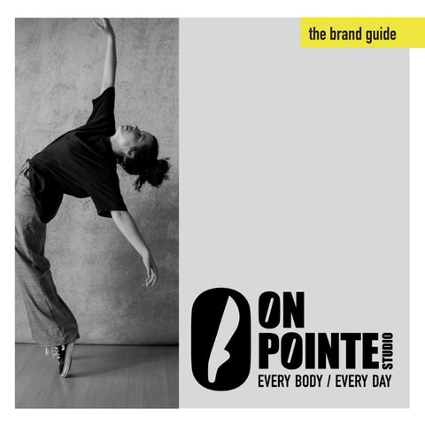
the brand guide


EVERY BODY / EVERY DAY

COMPANY PROFILE
On Pointe is a dance studio specialising in ballet classes for health & enjoyment; a place for everybody: inclusive of age, level, ethnicity & gender, etc. Its primary aim is to share the benefits of ballet for every day life. The corporate branding uses a largely monochrome palette with bright accents to create an urban and high-energy mindset. Hero imagery focuses on strength, confidence & daring, while featuring a diversity of dancers in every day settings & every day clothes. Dance is not just at the barre or in the studio, but carries a person throughout the day. It seeks to communicate “life on pointe!”
LOGOMARKS
The logos are designed for visual impact to communicate strength, boldness & confidence. There is no allusion to a specific gender binary through colour, line style or imagery. The skewed counter-space in the letter O symbolises movement, and a ‘striking’ pose, similar to an extended leg.
Primary SecondaryLogo/ Tertiary Logo LOGOMARKS


BrandVariationsMarksWhite 809PMS Wordmark AIcon BIcon Misc LOGOMARKS


Sample logo & mark application


find your EVERYEXTENDbalancéYOURSELFmeetmeattheBARREeverydayislegdayBODY/EVERYDAY
LANGUAGE TONE &
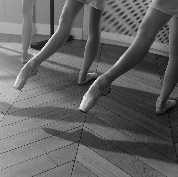
IMAGES Hero imagery uses black and white photography with appropriate brand Colouredcolours. photographs appear in neutral tones or with a pop of neon yellow (PMS 809) or similar.
COPY
Featured text such as slogans, key headings & company values are communicated in clever, humourous & punch ways using the corporate font styling. Where appropriate, these key phrases should make sense, with ... “on pointe”.


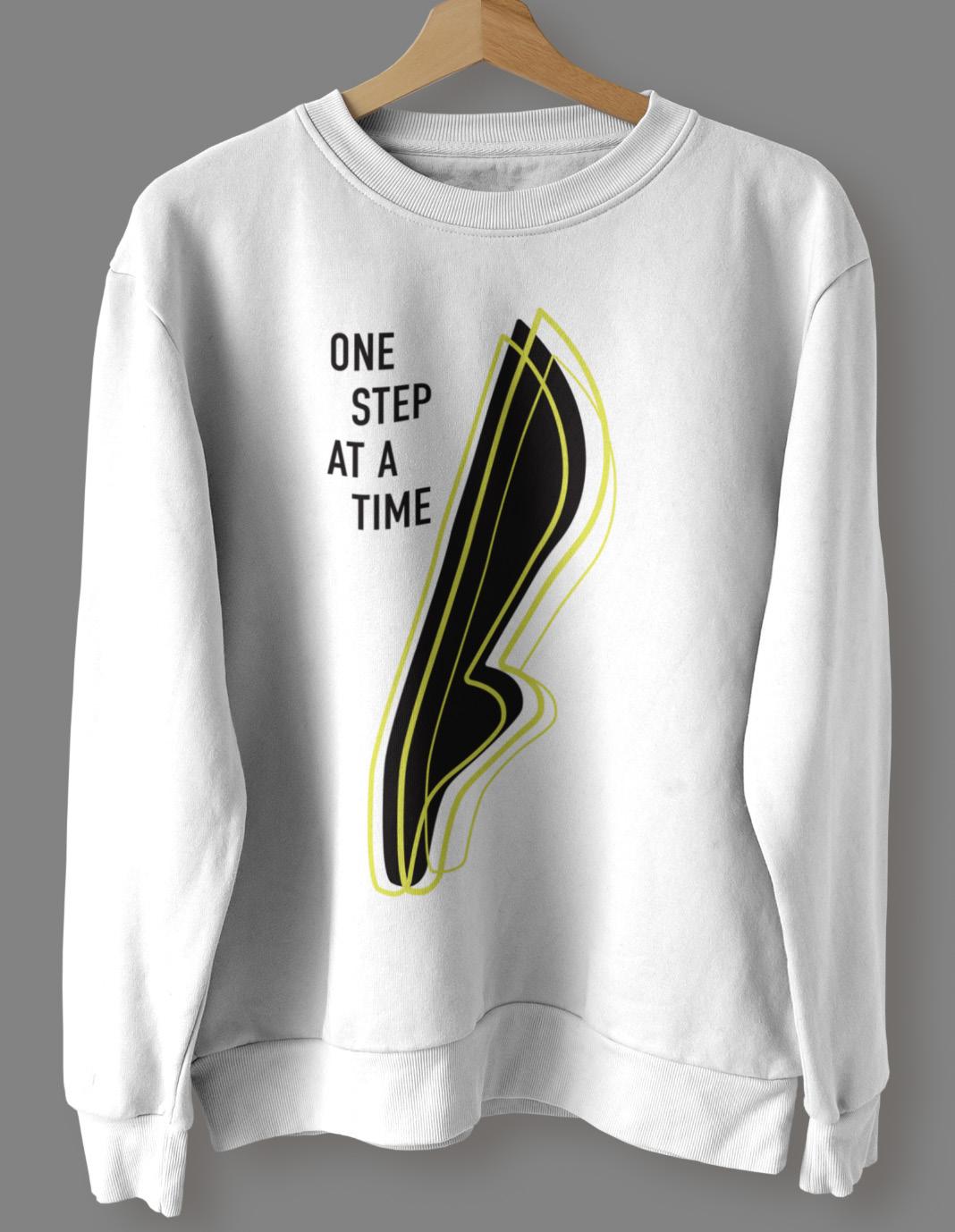
MERCH From motivational posters to promotional gear - the range of merch is practical, sleek & on pointe, usable in every day settings!


CREDITS Stock imagery from Unsplash / Pexels Brief via @thebriefbank Branding by Gigi Anderson / SUMMA GRAFIKA All@summagrafikaRightsReserved.
