
Art & Culture Australia & Asia-Pacific Ry David Bradley Daniel Crooks Jula Gutman eX de Medici Natalya Hughes Naminapu Maymuru-White Alex Seton Yang Yongliang May June July 2024 No. 24
Sullivan+Strumpf
Bimonthly Publication Issue No 24
May–July 24
COVER
Alex Seton Accept All Cookies (Enchantment/Disenchantment Series), 2024, Chillagoe Pearl marble (Wakaman), cosmetic finishing powder, 125 kg, 35 × 72 × 47 cm. Photography by Mark Pokorny.
BACK COVER
Alex Seton, When We Know Where We Are, We Know Who We Are (detail), 2024. Photography by Mark Pokorny.
INSIDE BACK
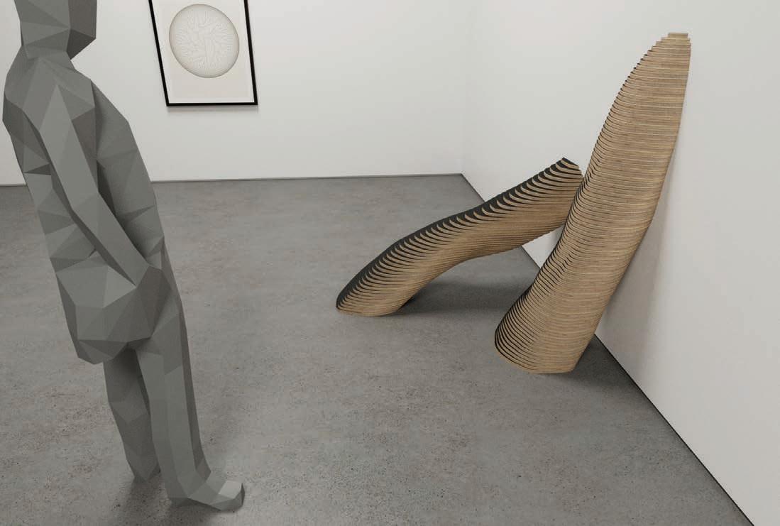
Daniel Crooks, work in development, 2024
EDITORIAL DIRECTORS
Ursula Sullivan
Joanna Strumpf
MANAGING EDITOR
Claire Summers
CREATIVE DIRECTOR
Matthew J Tambellini, More Studio
GRAPHIC DESIGN
Matthew J Tambellini
JJ du Plessis
EDITORIAL ASSISTANTS
Elsa Bryant
Elsiena ten Kate
Tiffeny Fayne
Siobhan Sloper
ADVERTISING ENQUIRIES
PH +61 2 9698 4696
claire@sullivanstrumpf.com www.sullivanstrumpf.com
SUBSCRIPTIONS
art@sullivanstrumpf.com
PH +61 2 9698 4696
5 print issues per year Australia/NZ & Overseas
PRINTING
Carbon8 Sydney
SULLIVAN+STRUMPF
Ursula Sullivan
Joanna Strumpf Directors
EORA / SYDNEY
799 Elizabeth St, Zetland
Sydney NSW 2017
Australia
+61 2 9698 4696
art@sullivanstrumpf.com
NAARM / MELBOURNE
107-109 Rupert St, Collingwood
Melbourne VIC 3066
Australia
PH +61 3 7046 6489
art@sullivanstrumpf.com
SINGAPORE
Megan Arlin Director, Singapore
PH +65 8310 7529
megan@sullivanstrumpf.com
Sullivan+Strumpf acknowledge the traditional owners and custodians of country throughout Australia and recognise their continuing connection to land, waters and community. We pay our respects to the people, cultures and elders past, present and emerging.
© 2024 Sullivan+Strumpf, all rights reserved.
2
We begin this issue with a heartfelt congratulations to Archie Moore (Australia) and the Mataaho Collective (Aotearoa, New Zealand) for their unprecedented and historic Golden Lion awards at the La Biennale di Venezia.
As we observe our ever-changing world through the contemporary agendas of our featured artists and industry leaders, we witness the history making celebration of Indigenous Australian art at La Biennale di Venezia, and simultaneous symbiosis of humans and technology evolving. We find ourselves in a unique point in time where both ancient and hyper contemporary art practices are centre stage. Emerging from the chasms between past, present and future, artists hold a mirror to the pressing issues of our times, to the thresholds of reality.
eX de Medici presents an urgent new body of work, Blue For Boys , that refuses to look the other way; Joanna Kitto delves into the symbolism behind the ubiquitous puffer jacket and its relation to our digital connectedness for Alex Seton’s Reality is Fabulous ; Amelia Barikin introduces Daniel Crooks’ debut exhibition with the gallery where sculpture and drawing come to the fore; Yang Yongliang speaks with Mariia Zhuchenko about his new series Parallel Metropolis ; and Jon Broome sets the scene for the trajectory of Ry David Bradley’s latest exhibition, Stages . For the Last Word, Head of Visual Arts at Creative Australia, Mikala Tai, discusses with Claire Summers the creative and curatorial themes at play within the context of honouring and preserving Indigenous histories within the global arts landscape.
As you read on, we hope you will journey somewhere meaningful within these pages, and beyond.
Jo + Urs
Left: Naminapu Maymuru-White, Milŋiyawuy, 2023, bark painting, 144 × 95 cm
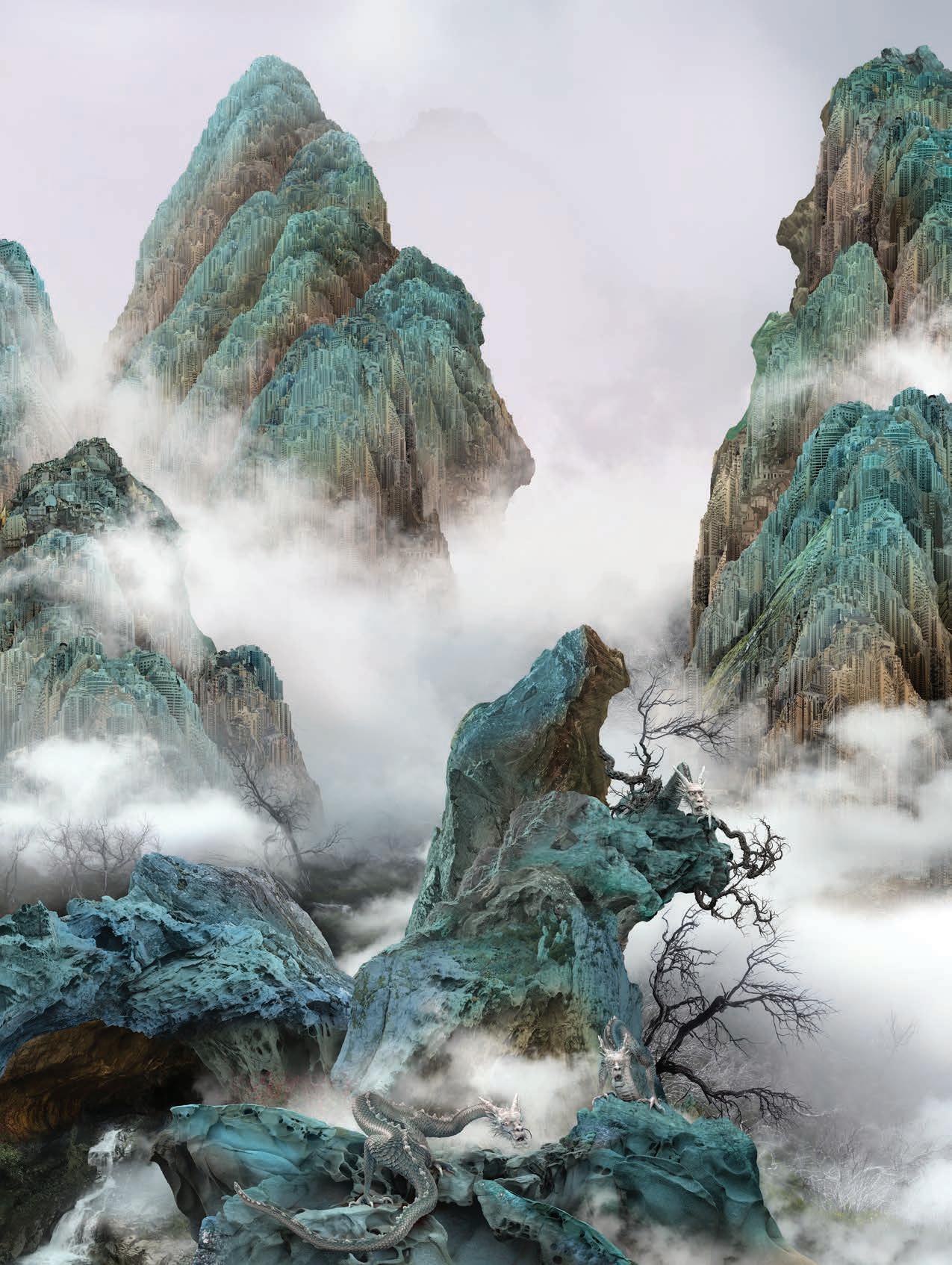
Previous: Yang Yongliang, Dragon, 2023, Giclee Print on Fine Art Paper or Premium Backlit Transparencies in dimmable LED Light Box, 160 x 130 cm (print size) or 170 × 143 × 9 cm (lightbox size).
5


Presented in association with the Adelaide Festival, and with generous support received from the Art Gallery of South Australia Biennial Ambassadors Program and Principal Donor The Balnaves Foundation. This project has been assisted by the Australian Government through Creative Australia, its arts funding and advisory body and by the Visual Arts and Craft Strategy, an initiative of the Australian, State and Territory Governments. Free entry. See more at agsa.sa.gov.au @agsa.adelaide #adelaidebiennial
8 QUICK CURATE Grace Mcdonald 10 Alex Seton Reality is Fabulous 20 Yang Yongliang Metropolis Parallel 32 eX de Medici Pandora's Box 42 Naminapu MaymuruWhite at the La Biennale di Venezia 50 Daniel Crooks Visualising Time 60 Ry David Bradley Stages 68 5 Things to Do in Venice 70 Natalya Hughes The Castle Of Tarragindi 76 Julia Gutman Lighting of the Sails 82 LAST WORD Mikala Tai CONTENTS


Major Event Partner SydneyOperaHouse Media Partner 24 MAY – 15 JUN
Projected daily
By Julia Gutman and Pleasant Company, soundtrack by Angus Mills.
27 MAY Join Julia and Sydney Opera House Curator, Contemporary Art, Micheal Do as they discuss Julia’s art and making Echo. Free, registrations essential at sydneyoperahouse.com
Julia Gutman and Pleasant Company, Lighting of the Sails: Echo (2024), animation render. Commissioned by Sydney Opera House and Destination NSW for Vivid LIVE 2024.
Photo by Timothy Salisbury
QUICK CURATE
GRACE MCDONALD
CLIENT & ENGAGEMENT MANAGER

Sullivan+Strumpf is pleased to welcome Grace McDonald to the Sydney team. A specialist in her field, Grace brings with her a wealth of experience and an unabashed enthusiasm for contemporary art in the region.
ALONGSIDE OUR JAM-PACKED EXHIBITION schedule this year, our artists are participating in a range of offsite projects. Jumping all around Australia, the works in this curation represent my dream list in celebration of these upcoming exhibitions and presentations. Take a little vacation with me!
First stop: Adelaide to view Seth Birchall’s inclusion in the 18th Adelaide Biennial of Australian Art: Inner Sanctum. These meditative landscapes transport us and act as portals for looking both inward to psychological states and outward to the natural world.
Bringing life into the cooler months in both Melbourne and Sydney, RISING Festival and VIVID provide a reprieve from the darkness with Julia Gutman’s work Echo for Lighting of The Sails at the Sydney Opera House and Tony Albert’s BEAM ME UP at Federation Square.
In the middle of the year, we journey far down south to Hobart to celebrate Polly Borland and Darren Sylvester's inclusion in Namedropping at the Museum of Old and New Art (MONA). One not to miss!
The long-awaited reveal of major public art installations directs our path for the remainder of 2024. First to Canberra, for Lindy Lee’s Ouroboros, an immersive public sculpture to be installed in the National Gallery of Australia’s forecourt, followed by Brisbane, for the unveiling of Tony Albert and Nell’s, THE BIG HOSE at Queensland Art Gallery of Modern Art (QAGOMA).
The journey thus far is only a handful of stops on what is to be an art-filled year. Stay close. We look forward to sharing more with you very soon.
1.
Jemima Wyman
Plume 25, 2024 hand cut digital photographs
125 × 89 cm (image) 2.
Marion Abraham Deep Privacy and Questionable Fertility, 2023 oil on linen 108 × 86 cm 3.
Seth Birchall
The Setting Sun Talks, 2023 oil on canvas
183 × 153 cm 4.
Lynda Draper Man in the Moon, 2023 glazed ceramic 57 × 45 × 42 cm 5.
Tony Albert Ash on Me (resin) XXIV, 2024 resin, cigarettes
10 × 8.5 cm × 2 cm 6.
Lara Merrett stay here awhile, moss and all,, 2023 ink and acrylic on cloth and linen 220 × 150 cm 7.
Polly Borland
Morph 13, 2018 archival pigment print 92 × 78.5 cm
Edition of 6 plus 3 artist's proofs
8.
Darren Sylvester Just Death is True, 2006 120 × 160 cm
9. Lindy Lee unfettered, 2020
Chinese ink, fire and rain on paper 155 × 103 cm
SULLIVAN+STRUMPF 10


QUICK CURATE 7 4 1 8 5 2 9 6 3 11

156
12
Alex Seton, When We Know Where We Are, We Know Who We Are, 2024, Chillagoe Pearl marble (Wakaman), Cast iron, enamel, blackbutt,
× 69 × 93.5 cm, 1060 kg. Photography by Mark Pokorny.
Reality is Fabulous ALEX SETON
INTERVIEW JOANNA KITTO PHOTOGRAPHY MARK POKORNY

IN HIS LATEST BODY OF WORK , Sydney-based artist Alex Seton draws on the image of the puffer jacket as a ubiquitous fashion item wryly suggestive of the human desire to protect and insulate ourselves from the exterior world. Reality is Fabulous is an extension of the artist’s ongoing exploration of the way we participate in society, in particular our digital connectedness and the rare privilege of a truly private, sequestered space, either online or in the real world. Joanna Kitto spoke with Alex about working with marble, the texts that inspired his thinking, and the slippage between the digital and real worlds in the era of artificial intelligence.
Alex Seton in his studio, 2023. Photography by Havard Sagen.
SULLIVAN+STRUMPF 14

JOANNA: I want to start with the puffer jacket as a symbol of our desire to insulate and protect ourselves. Can you tell me what attracted you to this item of clothing?
ALEX: I’ve been interested in items of contemporary clothing for quite some time and the puffer jacket has an interesting history. It’s an Australian invention, created by George Finch for an attempt to climb Mount Everest in 1922. Over the last hundred years, the puffer has found its way to being an item of both fast fashion and high fashion. The puffer is not ecologically friendly, which becomes the perfect symbol of cognitive dissonance with nature.
Over the last few years, particularly post-COVID, like everyone else, I started spending my time far more online, and became interested in the technology of Augmented Reality (AR) and the rise of Artificial Intelligence (AI). It was interesting to learn that for AI the puffer jacket is incredibly easy to render. We saw this play out a last year with the viral meme depicting the Pope in a white Balenciaga puffer jacket, created by a Chicago construction worker. What struck me about this was that while it wasn’t the first AI image to go viral, it was believed to be real by many, making it one of the first mass deception events created by AI.
The padded folds of the puffer jacket have the bloated abundance of modern conveniences, like Bibendum (the Michelin Man) or the Stay-Puft Marshmallow Man, both comic figures of excess. It’s a frivolous item that doubles as a much more serious signpost of how we deal with authenticity, which in today’s context is a moveable feast.
Alex Seton, Ache for an Epilogue (Enchantment/Disenchantment Series), 2024, Chillagoe Pearl marble (Wakaman), cosmetic finishing powder, 35 × 72 × 47 cm, 125 kg. Photography by Mark Pokorny.
15 REALITY IS FABULOUS

16
Above: Alex Seton, Accept All Cookies (Enchantment/Disenchantment Series), 2024, Chillagoe Pearl marble (Wakaman), cosmetic finishing powder, 125 kg, 35 × 72 × 47 cm. Photography by Mark Pokorny. Right: Alex Seton, The Last Invention (detail), 2023, Wombeyan marble (Gundungurra, NSW), cosmetic finishing powder, 110 × 68 × 77 cm, 700 kg. Photography by Mark Pokorny.

Let’s talk about that title. Since you started making hoodies, the idea of ‘posttruth’ has flourished. Your work leans into the illusion of materiality and the slippage between our real and online worlds. Can you tell me why you chose this title, and the significance of the reference text?
The title is lifted from Walden Pond (1854) by Henry David Thoreau. The full quote is, “Shams and delusions are esteemed for soundest truths, while reality is fabulous”.
I grew up reading this book, it shaped my growing up in many ways, and the central themes are evergreen. Thoreau bemoans humanity’s struggles with sorting fact from fiction. He uses the term ‘fabulous’ in its 19th-century guise, originating from the word ‘confabulation’ — the telling of tall tales, inventions and hallucinations. Today, Thoreau’s warning is somewhat lost in the new meaning of the word ‘fabulous’, and yet his core concern is as relevant as ever. Since it was published, people have fallen in love with the way this book talks about returning to nature as a way of living that is authentic and real, unencumbered by conveniences. It’s also about sequestering yourself away from society so that you may then participate in it more knowingly and ethically; being mindful of your time and energy so that when you contribute, you can really be of value. But of course, we don't live in that world anymore. Now we are voracious tourists on the earth, and users of its resources. The idea of living off the grid also seems like such a privilege now, the ability to ‘opt out’ is less and less possible. These themes exist in some of my earliest works, carving things like a figure in a sleeping bag that critique the Australian myth and delusion of the jolly swagman — the unidentified itinerant worker who lives on the move from town to town. That can’t exist anymore. In a post-9/11 world, everyone needs to be identified. My practice has continued to consider what are the true costs of accepting the many conveniences of living a digital life- renouncing privacy being just the start.
You often use literary references in your work, Thoreau and Kurt Vonnegut are both found in Reality is Fabulous. Can you tell me about your research process and where text comes into play?
For me, certain words and phrases that I’ve read come rolling back to me while I'm making a work. And So It Goes… is the deathly refrain taken from Kurt Vonnegut’s Slaughterhouse-Five for example, the only anti-war novel that I've read that genuinely doesn't glorify war. There's always that inherent problem of glorification or elevation in art of the thing you're trying to condemn. You end up aestheticizing these topics in some way. Vonnegut has a way with words that just cuts through and reminds us that we, as humans, are inherently awful and beautiful to each other all at once.
In another work, I’ve referenced a sculpture by Auguste Rodin titled Pense, which is a portrait of a woman's head in a 19th century bonnet, lost in thought and emerging directly from the raw block. For The Last Invention, I tossed a hooded puffer over the top of a block of marble, carving out a disembodied space for disembodied thoughts. The title references some of the first writings in 1965 by I.J.Good around AI as ‘the last invention that humans need ever make’.
My artwork titles are often the key to understanding my references and influences, selected for their poetic quality as much as their ability to hold a larger concept. Another example is the Enchantment/Disenchantment series, actually drawn from a digital culture theorist’s online paper I read a few years ago about the adoption of new technologies in our lives.
SULLIVAN+STRUMPF 18
How does this relate to your material of choice — marble?
There is a desire to reconnect with earthly materials for many of us and this is certainly something I've always carried through my practice. Not only is marble a beautiful material to work with on a practical level, it is plentiful on the Earth’s surface, so there is an ethical element to its use for me. When I make work, the offcuts go to the Natural Brick Company who use it in their designs. I’m also thinking about the consequences of our relationship with nature, with natural materials, and with deep time. When you’re looking at marble, you're looking at geological time and you can't help but feel we are a small part vitally connected to something much bigger. It's these thoughts that lead to the photographic prints of marble in the show, and the display of a raw section of marble with natural crystal filled fissures.
Through stone and stone reproductions, I’m also inviting contradiction into this discussion around augmented and digital realities. For the Enchantment/Disenchantment series, I’ve augmented the marble with cosmetic mica powders, exaggerating the tension between the synthetic nature of the garment and the natural material of marble. This is also a nod to the polychrome marble sculptures of antiquity. In these carvings, the very fabric of reality is at once concrete and illusory.
This leads me to thinking about the bodies — or the absence of bodies — in your work. Marble is best known across art history for depicting the human form, and yet your work is characterised by absence — empty life jackets, shrouds, hoodies, all of which hold the shape of a human but do not show the human form.
“NOW WE ARE VORACIOUS TOURISTS ON THE EARTH, AND USERS OF ITS RESOURCES. THE IDEA OF LIVING OFF THE GRID ALSO SEEMS LIKE SUCH A PRIVILEGE NOW, THE ABILITY TO ‘OPT OUT’ IS LESS AND LESS POSSIBLE.”
I first used the empty hoodie for its egalitarian credentials over ten years ago, a means by which to mask our identity, to hide and insulate ourselves from the surveillance state, as symbol of the dissolution of privacy and protest under it. The empty hoodie could be read by audiences as malevolent delinquent or benevolent monk, depending on their disposition. It is in this interaction between viewer and object, that the sculpture becomes activated and meaning is made. The physical absence is about leaving room for the body of you the audience. Another example of this way of working is my installation for the 2014 Adelaide Biennial of Australian Art: Dark Heart, titled Someone died trying to have a life like mine, this work was twenty-eight marble life jackets tumbled across the gallery floor as an imagined drift from a very real and devastating event off the Cocos Islands in May 2013. For me, this work was about the way news is presented in Australia as well as Australian privilege. When I use the empty vest in place of the figure, you picture yourself in that pose or as physically feeling its weight if you were to try it on, knowing that you couldn't.
In the Enchantment/Disenchantment series, I’m inviting the audience into an emotional, but shifting embodied experience when discovering the implied bodies within the twisted, augmented state of these puffer jackets.
Seton, Reality Is Fabulous, Sullivan+Strumpf Naarm/Melbourne, 09 May – 01 June 2024
Joanna Kitto is an arts worker with an interest in generating meaningful connections between art and audiences. She currently holds the position of Director, West Space, a not-for-profit contemporary art space in Naarm/Melbourne.
Overleaf left: Alex Seton, Hallucinations of Earth (Pilbara Red), 2018-2024, archival inkjet print on cotton rag, steel frame, anti-reflective acrylic, 110 × 116 cm. Overleaf right: Alex Seton, Hallucinations of Earth (Pilbara Green), 2018-2024, archival inkjet print on cotton rag, steel frame, anti-reflective acrylic, 110 × 116 cm
19 REALITY IS FABULOUS
Alex


PARALLEL YANG
YONGLIANG SULLIVAN+STRUMPF

METROPOLIS
INTERVIEW MARIIA ZHUCHENKO
PHOTOGRAPHY SHAE XU

24
“While the high-rises in Shanghai are more homogeneous and were mostly built in the 90s and early 2000s, the buildings in New York are much more diverse, containing more layers of the city’s historical changes.”
MZ: Can you tell us a little bit about the focus of your new body of work and how it is different from your previous series?
YY: The new series, Parallel Metropolis, features landscapes of New York City and its surroundings. For the first time, there’s a city other than my hometown, Shanghai, that occupies almost the full percentage of the images.
Previously, my landscapes always started with Shanghai landscapes, even though they were a mixture of multiple Asian cities and beyond. Since the pandemic years, I started combining landscapes from all over the world. Sometimes, I'd put a Norway waterfall next to the London Bridge, connecting Hong Kong's port to the Hudson River. However, in Parallel Metropolis, I’m attempting to portray a city more iconic to its true essence.
Why is this important to you?
Portraying cities as landscapes has become second nature to me; it was a hobby that turned into a profession. Whenever I visit a new place, I can't help but see fragments of a digital landscape, whether from simply walking through a neighborhood or glancing at a certain intersection. The history of a city and the diversity of its architectural styles deeply intrigue me, and they inspire new directions in my work — in my way of seeing these new places.
Through Parallel Metropolis, I began portraying cities beyond my birthplace. And it is an absolutely fascinating process; it made me feel like my work is being reborn.
You often present a global collage of locations that is often seated/ based from directly where you have lived – for example, Shanghai, Hong Kong, a residency in New Zealand. Having moved to upstate Long Island in 2020, how has this location infiltrated your new work? Are there specific instances where the location has moved you, or impressed you?
I moved to New York in 2018, and since then, I’ve lived in Murray Hill, Hell’s Kitchen, Lower East Side, Long Island City in Queens, and eventually moved further east on Long Island. Initially, I interpreted New York the same way I viewed Shanghai, until I completely broke this method and started seeing the city without a pre-existing concept of an urban place. Then, I truly began to understand New York.
25 PARALLEL METROPOLIS
Previous: Yang Yongliang, 2024. Photography by Shae Xu. Left: Yang Yongliang, Queensboro Bridge 皇后⼤桥, 2024, Giclee Print on Fine Art Paper, 60 × 60 cm

26
Yang Yongliang, New York City 纽 约, 2024, Giclee Print on Fine Art Paper, 100 x 300 cm

27
There’s a huge difference between the landscapes of Shanghai and NYC. While the high-rises in Shanghai are more homogeneous and were mostly built in the 90s and early 2000s, the buildings in New York are much more diverse, containing more layers of the city’s historical changes. It took many experiments for me to figure out how to fairly portray the NYC landscape, with respect to what the city means to its residents. After living in New York for more than five years, I feel entitled to start portraying this city, and I hope my portrayal introduces a unique insider’s view.
While my Shanghai series focuses more on the fast urban growth of China, my New York series emphasizes an experience of multiculturalism and trans-regional living as a global citizen.
With a practice founded in ancient Chinese Song dynasty landscape painting and developed with evolving digital technologies, you have been able to create a contemporary view and commentary on our world. How has this view evolved and how do you draw the line between reflecting deep social reflections and the 24 hour news cycle that is epitomised in the madness of upcoming US elections.
My view of the world has evolved as I've matured, allowing me to see the world from different perspectives. A few years ago, I felt that I might hit a ceiling if I stayed in one place, since I am a landscape artist and my surrounding landscape had become too familiar and comfortable. I knew that my work would hardly change if I didn’t change my environment and start anew.
After moving to the States, my thoughts became fresh as my surroundings fed me different stimuli; I realized I must stay curious, open-minded, and constantly alert. Gradually, these new feelings reshaped my work in an organic way, until I reached the next breakthrough and came up with something I’d never imagined before. I make sure to portray landscapes that are objective, with very few hints of my personal beliefs, leaving it to the audience to interpret what they really see.
Regarding the U.S. elections, I view them as an outsider from a place where elections aren’t accessible to its citizens. Being able to vote is better than having no choice at all. As a close observer in America, I will stay tuned to this dramatic chaos.
Your work is constantly adapting and shifting to align with new technological advancements. How does it affect your methodology, and does it have an impact on your conceptual framework?
Yes, my work is constantly evolving to align with the latest technological advancements. I stay up-to-date with all technologies and skills; however, I only select the ones that truly support my scope of work, instead of being led by techniques that have little to do with what I aim to achieve.
For example, when Virtual Reality came around, I saw how it was connected to the idea of a multi-perspective viewing experience, which is fundamental to the methods of traditional Chinese landscape painting. In this case, exploring VR is perfect for me. In contrast, Augmented Reality, while equally exciting as a growing technique, doesn’t really speak to landscapes, and therefore I won't delve into it.
What do you think about the development of A.I. and do you see yourself using it in practice?
I have started using A.I. tools to support my work. In my opinion, A.I. is capable of generating imagery that serves many creative and artistic uses, but the essence of A.I. is fundamentally contradictory to what true art means to me.
You have a few exciting exhibitions and projects coming up this year. Can you talk about that?
I’m excited to kick off the year with a New Year group show at the China Institute, featuring five recent videos including Glows in the Arctic, which I showcased with Sullivan+Strumpf Singapore back in 2021. In March, I have a solo exhibition coming up at the HOW Art Museum in Shanghai, entitled Vanishing Shore. Later this year, the same exhibition will tour to France with the Art Contemporain Salomon. In June, I’m bringing this new series, Parallel Metropolis, to Sullivan+Strumpf Melbourne.
Yang Yongliang, Parallel Metropolis, Sullivan+Strumpf Naarm/Melbourne, 06 June – 29 June 2024
SULLIVAN+STRUMPF 28
 Yang Yongliang, Riverbank 河 岸, 2024, Giclee Print on Fine Art Paper, 100 × 100 cm
29
Next: Yang Yongliang, 2024. Photography by Shae Xu.


RISING ⠃


PRESENTED WITH FED SQUARE
art
Fed Square becomes a constellation of
and stories sharing First Peoples futures, connections to the cosmos, and political discourse.
• RICHARD BELL • MICHAEL
• KAIT JAMES • TARRYN LOVE • ELLEN VAN NEERVEN • JOSH MUIR • ENOKI
JUNE
JUNE VISIT WWW.RISING.MELBOURNE FOR MORE INFORMATION
TONY ALBERT
COOK
FED SQUARE — SAT 1
— SUN 16
Deliciously Complex

TINADRINKS.COM.AU @TINADRINKS
eX de
WORDS STEPHANIE RADOK PHOTOGRAPHY ROB LITTLE

Pandora‘s
34
SULLIVAN+STRUMPF

Pandora‘s Box
35
Medici PANDORA'S BOX
eX de Medici, Blue For Boys, 2023, watercolour and tempera on paper, 114 × 320cm, unframed


eX de Medici is always on an edge. The edge of dissent, of controversy, of resistance, of anger and revolt. She analyses the follies of the world, watches, listens and reads compulsively, intensively following debates, philosophies, events and controversies. War, environmental damage, violence against women, societal shifts, Big Pharma, injustices of any kind prompt her to rage, and to finely delineate in her art multiple juxtapositions of the saccharine with the odious. Like Grayson Perry, she draws the viewer in with conventional beauty and then delivers the sucker punch of political reality. Like a fever dream, the work embraces confrontation and induces contemplation.
de Medici’s latest body of work, Blue For Boys, following hard on the heels of her extraordinary forty-year retrospective at the Queensland Art Gallery | Gallery of Modern Art (QAGOMA) in 2023, is full of her signature firecracker energy. Her obsessive works explode off the smooth paper they are skilfully painted on. One in particular, Hardcentre, has a deep blackblue box at its centre which seems as if it might pulse at you and silently absorb your brain while you observe it. It could be an analogy for our experience of the internet, A.I. and the electronic future we are living in as our servant becomes our master, and our slave becomes a bully. With recent technology, rather than directing what happens, we are all too often being told what to do. Thus, rather than our horizons expanding, they are being tightened around us.
Reading, watching, listening, scrolling, scanning, posting, commenting, sharing, tweeting – people have never been more connected and never more apart. The utopian promise of the internet – a forum for multiple voices, a paradise of openness and freedom – has sadly, all too often, become a place of fear and abuse, paranoia, anonymous violence and hatred. de Medici is impelled to observe and examine this can of worms, to ponder the dark side, to wade in where angels fear to tread.
Pandora’s Box is a Greek myth that I recall hearing and reading as a child. Pandora is given a box and told to not open it. She disobeys and, in so doing, unleashes bad human qualities–greed, anger, deceit, pride, envy, aggression–which immediately fly off around the world to do evil. Yet, something small and quiet then emerges from the box: hope. This is what I remember most about the story - the presence of hope.
de Medici’s method of using a traditional art medium – watercolour and tempera on paper – to make confronting statements is well-known. The artist spends long hours looking through a microscope and paints with signature precision. She has a deep admiration for the observational
work of botanical illustrator Ferdinand Bauer. Her own technique has been established by finely tattooing human skin over many years as well as twenty years of studying and painting in great detail the colours, scales and structures of miniature moths from the CSIRO Collection. Science enthralls her in its endless encounters with the world, its measuring, its hypotheses, its obsessiveness. Yet we can observe a notable contradiction between her extreme demonstration of control in a world where control often seems illusory.
Juxtaposed with de Medici’s depiction of actual weapons are symbolic and decorative elements that she creates out of molecules and atoms. In Blue for Boys the guns used by various tough guys are spliced together to make new hybrid weapons. Other details in these new works include cherries, flowers, voids and sickly-sweet wallpaper. They are combined with molecules of various chemicals or medications such as testosterone, estrogen, estradiol, progesterone, cortisol, Viagra, methane, morphine, dopamine, serotonin, Xanax, lithium, all of which we may have once not known about, but which are now often prominent in our newsfeeds. Many if not most of these chemicals, whether manufactured or arising naturally, have become weaponised in a world of relentless confrontation.
In Paris’s Cluny Museum of the Middle Ages, the tapestries of The Lady and the Unicorn, created around 1500 AD, surround the visitor in a special room. Each tapestry references one of the five senses: touch, taste, scent, hearing and sight. The sixth sense is still mysterious. The millefleur (thousand flowers) scattered over their backgrounds are also often present on medieval manuscripts. Like the early 21st-century, the Middle Ages struggled with a plague – the Black Death, with predictions and premonitions of imminent apocalypse, with war, inequality and injustice. Like a medieval scribe, de Medici sits for long hours at her work and carefully limns the complex repetitive imagery with which she points at some of the most controversial issues of our time.
Like many highly successful artists, de Medici has a deep appreciation of mortality. It is instrumental in enabling her long days and nights of concentration. She is insistent on leaving a trace of her life. Her constant rage and despair at injustice are ever-present in both her artworks and conversation yet she says that her anxiety is softening with age. It seems to me that, as with the notable medieval writer and anchorite Julian of Norwich, who caught and recovered from the Black Death in 1373, de Medici will have to say in the end that “all will be well.” Hope is the last thing in Pandora’s Box and the children need to hear it.
eX de Medici, Hard Centre (detail), 2023, watercolour and tempera on paper, 115 × 115 cm
37
PANDORA'S BOX


On thinking about my dear friend of many years, the artist de Medici, the iconic description by Jack Kerouac in his 1957 novel On The Road of the ‘mad ones’ comes to mind (in the nicest possible way!).
... the only people for me are the mad ones, the ones who are mad to live, mad to talk, mad to be saved, desirous of everything at the same time, the ones who never yawn or say a commonplace thing, but burn, burn, burn like fabulous yellow roman candles exploding like spiders across the stars and in the middle you see the blue centerlight pop and everybody goes “Awww!”.
Yet it must be said that de Medici also reminds me of James Dean’s character in Rebel without a Cause, the 1955 film directed by Nicholas Ray: “What are you rebelling against?” goes the question. “What have you got?” is the answer.
— STEPHANIE RADOCK
eX de Medici, Blue For Boys, Sullivan+Strumpf Gadigal/Sydney, 02 May – 01 June 2024
40
Previous: eX de Medici, Mowing the Grass at the Camp of Widows and Mowing The Grass, 2024, Installation view, Sullivan+Strumpf, Gadigal/Sydney. Photography by Mark Pokorny.

41
eX de Medici, Sink (detail), 2023, watercolour and tempera on paper, 115 × 115 cm
 eX de Medici, Pink For Boys, 2023, watercolour and tempera on paper, 114 × 223 cm, unframed

at the La Biennale di Venezia
The 60th International Art Exhibition
Stranieri Ovunque–Foreigners Everywhere Curated by Adriano Pedrosa 20 April—24 November
TEXT HOWARD MORPHY PHOTOGRAPHY COURTESY BUKU-LARRNGGAY MULKA CENTRE
Naminapu
Maymuru-White
44 SULLIVAN+STRUMPF
LA BIENNALE DI VENEZIA

 Above: Naminapu Maymuru-White in Venice, 2024.
45
Below: Naminapu Maymuru-White in Stranieri Ovunque - Foreigners Everywhere, installation view, 2024, La Biennale di Venezia.

 Top left: Naminapu Maymuru-White, Milŋiyawuy, 2023, bark painting, 144 × 95 cm
46
Bottom left: Naminapu Maymuru-White, Milŋiyawuy River of Stars, 2023, bark painting, 190 × 104 cm
SULLIVAN+STRUMPF

ART IS A FUNDAMENTAL MEANS OF expression in Yolŋu culture and it has been central to the Yolŋu engagement with the outside world. Naminapu Maymuru-White was born into a family of artists. Her father Nanyin Maymuru and his brother Narritjin were two of the painters of the 1962 Yirrkala Church Panels which the art historian Charles Green recently referred to as ‘the most important paintings ever made in the context of the Australian nation-state.’ 1 The following year Narritjin painted the designs on the Bark Petition, one of the foundational documents in the struggle for Aboriginal land rights. Naminapu’s older sister Nyapililŋu was one of its signatories.
Following on from exhibitions in London and Hong Kong Naminapu’s inclusion in the 2024 Venice Biennale represents the culmination of her life’s work to date. As a practicing artist she has continually challenged herself to produce innovative forms that are deeply connected to Yolŋu culture, always purposeful and with different audiences in mind. In her early years the depiction of sacred designs (madayin miny’tji ) was primarily the responsibility of Yolŋu men, but by the time she started painting, women had begun to acquire the authority to paint madayin miny’tji and have come to play a central role in passing knowledge of their significance on to succeeding generations. Naminapu began painting as a young woman, learning her clan’s miny’tji from Narritjin following her father’s death. She became technically accomplished across different media –painting, carving in wood, batik and printmaking.
She quickly gained a reputation, winning many awards. Her 1996 triptych Nyapililŋu was chosen as the ‘Best Work on Paper’ at the NATSIAA Art Awards2 . Nyapililŋu is an ancestral woman who lived at Djarrakpi, the country of Naminapu’s Maŋgalili clan. In the Wangarr (Ancestral times) her brothers died when their boat overturned in a storm out at sea, and their bodies were washed ashore. Nyapililŋu created a sand sculpture named yingapuŋapu in the form of an ellipse where she laid their bodies to rest. Today a yingapuŋapu sculpture is used as a central element of Yirritja moiety mortuary rituals. 3 Through song and dance the spirits of the dead are guided to return to the spiritual domain; they are manifest in the stars that shine at night in the Milky Way (Milŋiyawuy). Milŋiyawuy is both the mayaŋ’ (river) of stars that crosses the night sky and also a mayaŋ’ on earth that flows out into northern Blue Mud Bay in Maŋgalili country. The constellations of Milŋiyawuy in the heavens are instantiations of animals which also live in the waters below – freshwater crocodile (ŋäw’ ), blue tusk fish ( yambirrku), sand crabs ( gunyaṉ). The mythic tragedy of Nyapililŋu’s brothers has provided a theme for many of Naminapu’s works and is illustrated figuratively in the central panel of the work she has made for the Venice Biennale. In 2000 Naminapu was awarded the HC Coombs Creative Arts Fellow at the Australian National University in Canberra. She used the opportunity of the Fellowship to push the boundaries of her printmaking. I witnessed her determination when collaborating with the printmaker Heather Burness. She explored the medium to see if by printing in ink on a flat paper surface she could replicate the colour and effect of miny’tji painted in red and yellow ochre, manganese and white clay on bark. Using multiple plates
47 LA BIENNALE DI VENEZIA
Naminapu Maymuru-White, Milŋiyawuy, 2023, bark painting, 239 × 92 cm
and sugar lift to apply cross hatching with a traditional brush of thin strands of human hair (marwat) she achieved the effect she wanted in print of Gunyan the Crab 4 However, during her Fellowship she also produced a large, stark, print in white pigment on a black background of the river of stars that form the Milky Way. In retrospect, that print set her on a journey that produced the series of paintings and larrakitj (hollow-log coffins) that she refers to as yuta (new style) miny’tji
Since then Naminapu has experimented with the continuum between black and white to express the cosmological and spiritual sense experienced by Yolŋu. The black ground has remained but over time it has become more integrated within the modulated appearance of the surface as a whole. The contrast between black and white has transformed into relationships between the two. In conversation with me in 2019 she referred to this process as creating different shades of light: ‘[I] make the colour of the white darker – the black is still there’.
The Biennale artwork is centred on the central narrative of the yiŋapuŋgapu and Milŋiyawuy. The central panel exemplifies, simultaneously, the dialogue between figuration and abstraction that is central to Yolŋu art and the play on colours as a continuum. In the painting she consciously foregrounds elements of the earthbound narrative – the fish in the waters the sand crab, the brothers’ upturned boat, the yiŋapuŋapu sculpture. But beyond that we can see their spiritual transformation through manikay (song) and buŋgul (dance) and their eventual incorporation in the spiritual dimension. The surrounding paintings take the viewer on a journey that is only lightly anchored to the central narrative; it is a meditation on the spiritual universe into which humans are born and die, and the feelings and emotions evoked by the place where the artist lives.
Naminapu outlined this metamorphosis, referring initially to the animals represented in the paintings:
Garwarrya ŋunha ŋorranha munathaŋura. Marrtjinha ŋayi ŋunhiyi buwayakthina ya ga dhawar’yun. Same ga bitjan ŋayaliyi Yolŋuwu. Still use that same mayaŋ.’ Ŋunhi ŋayi yukurra dhiyala representing munathaŋura. Ŋunha garwarrnha ŋayi malinha.
Those ones that live on the earth [move] above. They go [up], becoming faint, and then they are gone – just the same as with people. They all travel up that same river, the one that is also represented on the ground [Milŋiyawuy]. Up above is their spirit reflection.
1. Green, Charles 2023, “Why the Year 1962 Matters Now More than Ever Before:
2. War, Conflict, Crisis and Postnational Art History”. In Ian McClean and Charles Green (eds), Postnational Art Histories: What Is Postnational Art History, pp.7387. Melbourne: COVA × Perimeter
3. National Aboriginal and Torres Strait Islander Arts Award.
4. Yolŋu society is divided into two patrilineal moieties, Dhuwa and Yirritja. People belong to their father’s Moiety and marry a person of the opposite moiety. The moieties are spiritually distinct.
5. Due to a family bereavement she had to return to Yirrkala before the work was completed. This set in place a collaborative process extending over 10 years at the end of which she eventually achieved her objective and the print was editioned.
48
SULLIVAN+STRUMPF
Naminapu Maymuru-White in Venice, 2024.


www.curiopractice.com.au
Art Direction Stephanie Stamatis
Photography Phillip Huynh


Between Lines +61 (0)416 826 843 105 Wilson Street Newtown 2042 read @ btwnlns.com @ btwn.lns
and Conversation
&
Books Furniture
Connecting people, places
objects

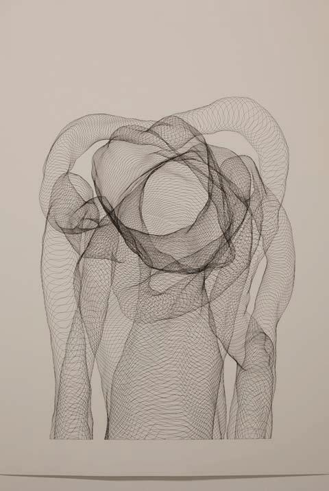
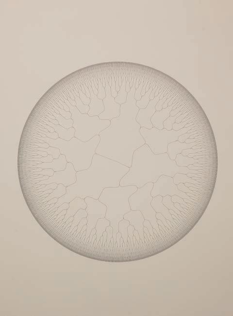
Visualising Time Daniel Crooks
SULLIVAN+STRUMPF 52
IN AN ILLUSTRATION IN THE FRENCH astronomer Camille Flammarion’s 1888 book L'atmosphère: Météorologie Populaire, a traveller from the middle ages, upon reaching the ends of the earth, finds a point in the horizon where the sky and the earth do not quite meet.
“By stooping his shoulders”, Flammarion writes, the traveller can pass “under the cover of the heavens to the great starry beyond”.1 He enters a gap in the fabric of space-time, pictured as a portal between one world and the next. On one side, the familiar trees and rolling hills of the earth, on the other, divine metaphysics. Pausing in this doorway opens a host of questions about how time might be visualised or represented in works of art.
TEXT AMELIA BARIKIN PHOTOGRAPHY CLAIRE SUMMERS
53 VISUALISING TIME
Daniel Crooks in his studio, 2024. Photography by Claire Summers.

13 June – 13 July 2024
Daniel Crooks, progress detail in the studio, 2024
SULLIVAN+STRUMPF 54
Daniel Crooks, Sullivan+Strumpf Gadigal/Sydney,
WHEN YOU THINK ABOUT THE SHAPE of time, what do you visualise? Some might picture a line, stretching out before them, linking the past to the future. Others may imagine a river, rushing towards the sea, or maybe even a clock, counting down the minutes. Time might also be seen as a spiral or circle, marked by recursive, seasonal repetitions. Or perhaps time fractals outwards in an ever-changing matrix of ‘nows’, a spectrum of labyrinthine durations that collapse any distinction between the past, present, or future. It depends who you are, where you stand, and even on how fast you are moving.
The way Daniel Crooks views time is central to his practice. “What I am trying to do”, he has confessed, “is to offer another model of interpreting the space-time flow that we exist in.”2 Although Crooks is most well-known for the “time-slice” videos that he has been working on since the late 1990s, he has also made still images, sculptures and drawings that confront the human experience of time, while acknowledging that time might in fact work very differently to how we perceive it. The way he does that is not through fantastical or imaginary visions, but instead by combining technology, duration, space, and materials to try and get closer to how time might really look : “This is what it actually looks like”, he says, “we just can’t see it in that way.”3
To those familiar with Crooks’ imagery, this insistence on realism might come as some surprise. Aesthetically and compositionally, his works often feel abstract or unreal. Different moments and spaces, often captured by multiple cameras or technological sources, are sliced together to create kinetic formations that seem to dilate or compress duration, rather than visualise time as it might actually exist. However, as Crooks explains, if his projects “sometimes look psychedelic and completely unnatural”, they are in fact “entirely topologically valid … I haven’t cut or pasted anything.”4 For example, if we think of a sequence of video as, say, a stack of individual photographs or frames all laid on top of each other, then we get a better understanding of why Crooks so often refers to his durational works as “video volumes”. Time becomes a spatialised block that might also, theoretically, be seen from its side.
In physics, this idea is not as crazy as it sounds. Here is Paul Davies, discussing the irrelevance of ‘flow’ to modern physics back in 2002: “Physicists prefer to think of time as laid out in its entirety – a timescape, analogous to a landscape – with all past and future events located there together … In short, the time of the physicist does not pass or flow.”5 It’s a difficult concept to get one’s head around, because it goes directly against any common sense understanding of how we might experience time in our daily lives. How might we visualise this kind of “block time”, in which flow is substituted for something else altogether? What if time doesn’t proceed horizontally, but might instead be configured volumetrically?
Although it may be easy to see the influence of science-fiction on Crooks’ practice (he is not only a science fiction fan but also a self-confessed “geometry nerd”), the foundations he trades in are emphatically real. His projects constantly seek to capture time from angles beyond human perception. In his transition from video to sculpture to works on paper, the gap between perception and actuality
55
VISUALISING TIME
Daniel Crooks, work in development, 2024


is perhaps even wider. The movement of a figure walking in space, for example, becomes solidified into “trails” that literalise the arc of a leg, or sway of an arm. The final forms resemble twisted limbs and extensions that trap fragments of motion and fuse them together, freezing branches of duration into one solid form.
Some of the earliest physical objects Crooks produced were made in 2014, in an exhibition he called “Truths Unveiled by Time”.6 The title of the show referred to a 1652 baroque marble sculpture by Italian artist Gian Lorenzo Bernini that remained unfinished at the time of Bernini’s death. The sculpture was intended as an allegorical representation in which “Father Time” as an elderly patriarch, stands above a young, naked woman symbolising “Truth”, as he strips her of her robes. Although Bernini succeeded in rendering the figure of the woman, the block of marble that was meant to be carved into the shape of time was never completed. What stands in its place is the majestical column of drapery that would have served to link both figures, its raw, uncut marble surface chiselled with the signs of the artist’s unfinished labour.
For Crooks, the parallel was irresistible. Rather than a figurative representation, time instead appears physically in Bernini’s work, as the process of creating the object stands in for the metaphorical depiction of its subject. Although Bernini might have literally run out of time to make “Time”, for Crooks the piece couldn’t be more successful in communicating its theme. “It always seems to come down to this basic question”, he has said. “Is the universe discrete, or is the universe continuous? Especially whenever any conversation of time comes up — is there ultimately a frame rate, at the bottom of things? Or is there not? I’ve spent a lot of time pondering that, and reading about it, and trying to work it out myself.”7
Most recently, Crooks has been working on how to re-translate the movements of his temporal sculptures back into two-dimensions. He started by designing and constructing a unique drawing machine, based on algorithmic programming. The aim was to render the kinds of temporal extrusions his sculptures were materialising in graphic form, while still seeking to preserve the time of the image’s own construction.
Metaphorical bodies in motion are the starting point for his series of line drawings that explore what are known as self-avoiding walks. These paths or ‘tours’ were first studied in detail by the 19th century Irish polymath William Hamilton but have recently found a new resonance in biology and the study of protein folding. A collaboration with mathematical physicist Nathan Clisby allowed Crooks to more rigorously investigate their formal and conceptual possibilities. As Crooks explains, it was “this fascination with the labyrinthine qualities of Hamiltonian paths that was the main impetus for building the drawing machine in the first place.”8
Although Crook’s drawings may look like code, or maps, or complex labyrinths, they all still address the movement of forms in time. Even though it is impossible for us to know how time might be experienced beyond the human, every now and then a glimmer might spark the potential for something else. Another, much older word for this kind
of effect is the sublime – a sudden and very intense realisation of the limitations of anthropocentric knowledge, a confrontation with impossibility that makes one realise how awe-inspiring the possibilities might be. It’s this kind of potential that drives Crooks’ ongoing explorations into the shape of time.
1. “…Un naïf missionnaire du moyen âge raconte même que, dans un de ses voyages à la recherche du Paradis terrestre, il atteignit l'horizon où le ciel et la Terre se touchent, et qu'il trouva un certain point où ils n'étaient pas soudés, où il passa en pliant les épaules sous le couvercle des cieux.” Camille Flammarion, L'atmosphère: météorologie populaire, Librairie Hachette, Paris: 1888, p. 162.
2. Daniel Crooks, conversation with the author, 19 January 2024.
3. Daniel Crooks, conversation with the author, January 19, 2024.
4. Daniel Crooks, in Lawrence Weschler, “A Conversation with Melbourne Video Artist Daniel Crooks”, Samstag Museum, University of South Australia, 2013, 13. https://lawrenceweschler.com/static/ images/uploads/SMA_Lawrence_ Weschler_Daniel_Crooks_conversation. pdf
5. Paul Davies, “That Mysterious Flow”, Scientific American, 287, No 3, September 2002, p. 42.
6. https://annaschwartzgallery.com/ exhibition/truths-unveiled-by-time Publishing. Yogyakarta
7. Crooks, in Lawrence Weschler, “A Conversation with Melbourne Video Artist Daniel Crooks”, Samstag Museum, University of South Australia, 2013, 13.
8. Daniel Crooks, email to the author, April 16, 2024.
Previous: Daniel Crooks, work in development, 2024. Right: Daniel Crooks, progress detail in the studio, 2024. Next: Daniel Crooks, artist renders, 2024.
SULLIVAN+STRUMPF 58


59 VISUALISING TIME


RY DAVID BRADLEY
STAGES
ESSAY JON BROOME

HEY SAY IT’S YOUR EYES that need to consider art and its exponents, but sometimes it pays to also use your ears. I recall back in 2007 hearing about a bunch of ‘post-internet’ artists. The term intrigued me. I couldn’t begin to imagine what the hell that meant, but there appeared to be some buzz growing around three local artists in particular: Michael Staniak, Johnny Niesche and Ry David Bradley.
64 SULLIVAN+STRUMPF
Ry David Bradley in the studio, 2024.
After some investigation I established the term ‘post-internet’ means a world beyond the internet yet, somehow, the internet remains at central. To me, it felt like we were creating another category that didn’t really need creation. As it turns out, Ry has been particularly successful in evolving his practice beyond categorisation, whilst still embracing the digital world.
I think I first heard about institutional interest in Bradley from Max Delany, Artistic Director and Chief Executive Officer at Melbourne’s Australian Centre for Contemporary Art (ACCA). At this stage in his career, Bradley was doing ghost like paintings, pinkish hues with an underlying figure lurking somewhere beneath the surface, almost as if they were behind a fogged-up shower screen. The kicker with these works, and an interesting allure, was the claim that if you looked at them through an iPhone camera lens, the blurry figure became a discernible body. Bradley as much confirmed this in one of his visits to my offices, a space that houses two of Bradley’s works side-by-side. I am still not certain if this is fact or an elaborate ruse. I, for one, can’t see it. Perhaps it’s all in the eye of the beholder. You see what you believe.
Bradley’s next iteration of works confirmed that we were true believers. The artist developed a series of double-sided works, Not To Be Digitized, that, when placed together, hung elegantly like colour coded flags on a hills hoist. Adhered to the ceiling, rather than the wall, one had opportunity to circle the work in 360 degrees. On the front: a blaze of abstract colour with what looked like a set of stacked cards at its centre, perhaps in reference to the ubiquitous postcard and how it has survived in a digital world. In clusters they are wildly effective. It is a pairing from this series that hang in our offices, with the plurality doing more to service the subject matter than one would alone. The rear of the paintings are more subtle–cartoonish and sparse–and partially obscured by metal framing. I often walk behind them, taking pleasure in the juxtaposition of the verso images with the strength of the images on the front face.
Just as you were thinking Bradley had found his oeuvre, he changes tack again. At this stage Bradley has begun to remind me of Beck, a musician who also moves in strange ways and does as he pleases, but holds with folk music as his centre. Likewise, with Bradley, change is constant, but the influence of digital technologies seems his anchor. In Bradley’s next round we see a switch to tapestries, starting with elaborate abstracts, riffing off his previous series, but this time a progression to a gentler take on abstraction. Yet, somehow, there was still a phone in there. When talking to one of the tapestries in our offices, Bradley seemed to centre on the phone–it was the only figure in the work we all seemed to agree on. The balance is left to one’s interpretation. Some see a crucifixion, others an animal on a rock. There may well be a figure holding the phone, but it is left to your imagination. The culmination of this period in Bradley’s career was an epic tapestry completed for the Lyon Housemuseum: a riot of purple and yellow that felt almost alight. This tapestry contained more discernible underlying figuration, and from there Bradley’s tapestries seemed to shift more into realism and, ultimately, into detailed monster-like contorted faces and figures.
When we a talk about shifts in Bradley’s work, it’s worth nothing that they happen quickly. While there is usually enough to discern the bridge from one era to the next, the metamorphosis is swift. The most recent works we have seen from Bradley comprise elements from the past paired with a decided shift towards his new future. In 2023, his solo exhibition at Sullivan+Strumpf in Melbourne saw six almost entirely grayscale canvases bearing a refined but faded digital dreamscape lurking beneath the surface, recalling the earliest of Bradley’s works. Over the top of the linen, Bradley added a flourish: minimalist strokes of thick paints combining together in a soft elegance, sometimes resembling Ned Kelly-style stickmen.
So, what’s next? I can’t wait to see. Bradley has been industrious in his Paris studio, restless as always, seeking the next thing. I had a sneak peek and I felt like I was in an A.I. simulator – digitally warped images of monstrously large ghouls looking menacing. The scenes before are us are heavily refracted, the figures and landscapes within them barely distinguishable from a dream. These works continue Bradley’s investigation of what we understand contemporary painting to be, intertwining it inextricably with technologies on the forefront of advancement in the field. If Bradley follows his own precedent , we can expect him to continue to pivot constantly while retaining central elements at the core. Where he goes now with A.I. at the forefront of his practice, and Paris as his home and inspiration, will be intriguing to see.
Ry David Bradley, Sullivan+Strumpf Gadigal/Sydney, 13 June
– 13 July 2024
Jon Broome is an avid art collector and long term supporter of Gertrude Contemporary
65
STAGES

66
Ry David Bradley, Stage One (artist render detail), 2024, UV print & acrylic on banner, 200 × 260 cm

67 STAGES
Ry David Bradley, Stage Two (artist render), 2024, UV print and acrylic on banner, 200 × 260 cm


Free exhibition entry biennaleofsydne y.art

JEWELLERY bellaclarkjewellery.com Bella Clark

for the gallery fatigued
Venice Grand Canal, 2023. Photography by Millie McArthur.
The 60th Venice Biennale returns to its titular city for 2024 with all the aplomb, energy and fervorous celebration that make it the most significant international event on the global arts calendar. Amongst the rush and awe of the central exhibition and all manner of satellite projects, one may find themselves in need of reprieve from art seeing and seeking. Cleanse the palate with these five greatest hits around the city of Venice.
Shop for new frames or sunglasses at Laltraottica, Rialto. Each pair of their glasses is designed and handmade in Italy. Excellent styles and craftmanship. Don’t know your script? They’ll test your eyes for you too.
A favourite of Ernest Hemingway, stop by Harry’s Bar on the Grand Canal by the Giardini Reali. Famous as the home of the Bellini and Carpaccio, Harry’s Bar is also renowned for the driest martini in the sinking city.
The infatuation with natural wine is a world wide phenomenon. Vino Vero is Venice’s best for a canal-side seat paired with natural wines and outstanding cicchetti.
Located near San Marco square, Paropàmiso is a trove of Venetian glass beads, antique jewellery and objects from across Europe and Asia.
5.
A short voyage from Venice finds you in Padua, a charming town where the Life of Christ and Life of the Virgin frescos by Giotto (di Bondone) dazzle overhead in Giotto’s Scrovegni Chapel. Completed in 1303, the intricate frescoes speak to a shift towards a more humanist sensibility and the stylings of the Renaissance.
1. L'altraottica
Giotto’s Scrovegni Chapel
3. Harry's Bar
2. Vino Vero
4. Paropàmiso
71 5 THINGS TO DO IN VENICE

THE CASTLE OF TARRAGINDI
INTERVIEW CHLOE BORICH
PHOTOGRAPHY CHLOË CALLISTEMON
NATALYA HUGHES
Natalya
2023. Photographed by Chloë Callistemon. Courtesy QAGOMA. Previous: Natalya Hughes, The Castle of Tarragindi, 2023-24, installation view, Queensland Art Gallery | Gallery of Modern Art Children's Art Centre. Photographed by Chloë Callistemon. Courtesy QAGOMA.
QAGOMA, Brisbane Open until 14 Jul 24
natalya hughes inhabits more worlds than one. She is a deep thinker, a shapeshifter, a multidisciplinary artist and educator, mentor and mother. Her recent work moves between the histories and studios of Modernist male painters with clever subversion, probing at widely held perceptions of the feminine perpetuated by their hand. Although for the Children’s Art Centre (CAC) at the Queensland Gallery of Modern Art, Hughes has created an interactive realm unlike any other before, The Castle of Tarragindi.
As if lifted from the pages of a fairytale and placed in the heart of Brisbane, through her signature application of pattern and colour Hughes has reimagined the life-sized interior of a foreign château inspired by the designs of Jean Bérain. Made in collaboration with her daughter Violet, the castle is fitted with an array of fantastical activities and delights, from decorative crafting to a hall of mirrors to a giant wall of moveable magnets. The immersive installation invites children into playful yet meaningful interactions with a key theme within Hughes’ practice, the grotesque, and the many ways it can be interpreted throughout art and design in our everyday lives.

74
Right:
Hughes,
SULLIVAN+STRUMPF
CB The Castle of Tarragindi is your largest immersive project for children to date. What was the catalyst for bringing the exhibition into being?
NH There were a few catalysts. One was my familiarity with the Children’s Art Centre (CAC) and QAGOMA’S education activities. I’d worked on a very casual, very junior basis facilitating and in a couple of instances designing children’s activities/ workshops when I was a baby artist (at uni and immediately after). So, I knew the kind of work they do (which is amazing, by the way) and they knew of my practice. Another catalyst was the fact that I had started to rely on their activities as a parent. I had visited lots of recent Children Art Centre activities with my daughter so knew what kind of role they played for children and their families. When I received the invite to collaborate with the CAC on the project, I guess I had a good sense of what the stakes were. They play such an important part in introducing children in Queensland to contemporary art. They aim high and I appreciate that.
CB Your daughter Violet has been a key voice in the development of the project, which is a unique collaborative opportunity to have. What was it like to see the project come together through Violet’s eyes?
NH It’s been the sweetest thing to craft a project in consultation with my little art advisor. Violet is seven and is pretty contemporary art literate for a little person. But she has strong opinions and is critical when something doesn’t hit for her. I was very interested in following through on what I thought would be an interesting experience for Violet and other art curious kids. But I was also keen to hear about what she thought would be engaging for children.
To do this with her meant a lot. Often my projects –because they demand so much of my time in the evenings, on weekends, whenever I have time available – take me away from her. This was a project that felt like it was addressed to her. And I could invite her participation (in conceiving of certain activities, in supplying certain motifs that could be used in the designs). That was great for both of us. She can be pretty poker faced when she comes to museum and gallery showings of the work. But when I invited her and her friends to this one, I could see she was proud. For a second there I thought “she finally thinks I’m cool!”. I liked that.
to make something like that happen at the CAC, but in a way a bit more visually engaged with where I live and work. The thing I like about the term and the visual phenomenon of the grotesque, is how well it accommodates hybrid forms. Ornamental grotesques are part plant, part animal, part curlicue etc. I knew that kind of logic, which is a little bit monstrous but funny and playful, would appeal to kids. So, I landed on grotesquery as a kind of guiding principal for the show and its activities.
CB How did you narrow down what mediums children would engage with in the immersive, hands-on activities throughout the exhibition?
NH I let the CAC guide me in this. They know well what works well for different age groups. But they also know the restrictions so well that must be in place given they operate in the context of a museum space. They have an incredible multimedia team who spent so much time developing my funny ideas into programs that worked digitally. And the exhibitions and design team made it possible to turn watercolours, sketches and conversations into wallpapers, carpets, chandeliers and more. All the activities were produced in consultation and collaboration with these teams. This made a lot of things possible that might not have occurred to me. I think that kind of facilitation is rare, and it was precious for me. We really made a castle filled with activities. I’m still a bit in awe of that.
CB Has there been a standout moment or story you’ve witnessed or about interactions with the project?
NH I have been tagged online into the sweetest images and videos since the project commenced. People I don’t even know have sent their collages, house of mirror family portraits, face swaps. That’s been pretty cute. But the real standout for me was attending the show with a small group of kids from Violet’s school. They had a different appreciation in seeing our faces, our pets etc integrated into the castle designs. And Violet was so happy and proud to introduce them to it. That experience made the whole thing feel like such a gift. It’s ongoing because the kids interact with me slightly differently since then.
“This was a project that felt like it was addressed to her. And I could invite her participation (in conceiving of certain activities, in supplying certain motifs that could be used in the designs). That was great for both of us.”
CB What drew you to interrogate the theme of grotesque design specifically?
NH My interest in the grotesque is long-standing. It’s been a keyword for my research and work for some time, playing a part in my PhD and being used to describe a lot of practices I am drawn to. In the initiation of this project, when Violet and I decided we wanted to make a fantasy space, I found images of a castle in Turin that was decorated in delicate ornamental grotesques. And I knew I wanted
75 THE CASTLE OF TARRAGINDI

76


77
Natalya Hughes, The Castle of Tarragindi, 2023-24, installation view, Queensland Art Gallery | Gallery of Modern Art Children's Art Centre. Photographed by Chloë Callistemon. Courtesy QAGOMA.
JULIA GUTMAN
Lighting of the Sails
INTERVIEW
79
THE ARTIST
CLAIRE SUMMERS PHOTOGRAPHY COURTESY

“Myownprocessisincredibly intuitive.Alotofmyprocess ismefeelingmywayaround aroominthedark.So,when you'retranslatingthatinto somethingcollaborative,it comesdowntotwokeythings: trustandcommunication.You reallyneedtohavearesolved senseofwhatyouwantthe worktofeellike.”
CS: The scale of this project is enormous, both in its process and in its final form, projected onto the ‘sails’ of the Sydney Opera House. How does working to such a scale influence the way you conceptualise the work or go about crafting it?
JG: You know, it's a great question. In order to make this work, I've actually had to put out of my mind the fact that it is going to be on the Opera House. The way that I've been able to approach the project in a sustainable and healthy way in that I've convinced myself that it's a speculative project. I think like removing the pressure of the landmark location has allowed me to keep my focus on the work. In general, no matter where my work is going to be exhibited, I try not to think about it as something that is going to be in a museum or on the side of a building. I focus on resolving it within the realm of the studio in the best possible way: maintaining focus on the work, making the work as good as it can be and letting the work set the tone and the pace for the way that I work.
This is the first time you have applied your work to animation. How has the intended outcome of animated your work impacted your already labour intensive and highly detailed process?
Julia Gutman, Echo, 2024, work in development.
I've always been drawn to animation because, similar to textiles, animation is incredibly laborious. It’s about world building, and you have control over every single element. As someone who's concerned with the minutiae in a cinematic sense, having that control is probably the most exciting way to build a story. What’s ultimately been really successful in this project is the animators and the creative director allowing me a lot of space to bring analogue and tactile modes of working directly into the process. Rather, than animating everything within a digital space, we've made a lot of it by hand. Every part of the project that you see with a character has been shot in a green screen studio with an incredible dancer named Jasmine, who has been wearing a mask made from a piece of my work. She performs very
81
LIGHTING OF THE SALES
intuitive choreography, and the animators are then responding to her movement by building a world that envelopes her. It’s an oscillating collaboration; there is a medley of the digital and the real which has brought my work to life in a way that I didn't even really think was possible.
You are working with Angus Mills on the musical composition of this work. Can you speak to the way an audio-visual partnership has influenced you?
Angus Mills is a close friend and an incredibly gifted composer. Working with him has been so useful to the process because he knows my practice so intimately and he knows me very well. He's been close, in some way, for every project that I've made. Likewise, I know, his music inside and out. In terms of the way that this project unfolded, the music was one of the first elements to start to feel resolved. Roughly summarised, the process to this point has been I wrote a narrative that I then sent to the digital team, and they responded with a storyboard based on that narrative. Simultaneously to that, Angus began a rough draft of the composition, and because Angus knows me and my work so well, with very little direction, that composition captured the tone of the work immediately. The animators were then able to use Angus’s composition to set the tone for the motion. It has meant that one of the big insights into the feel of this digital world came through the score that Angus produced initially. It’s been an incredible collaboration.
What differences do you notice in your own practice when collaboration is so central to the outcome?
Something that the process of collaboration has taught me about myself is that I really want everyone to have freedom to do their best work. To me, the key to collaboration is putting the right people in the room together, communicating really well, and trusting them to do the thing they do best. That requires trust, honesty and communication. My own process is incredibly intuitive. A lot of my process is me feeling my way around a room in the dark. So, when you're translating that into something
collaborative, it comes down to two key things: trust and communication. You really need to have a resolved sense of what you want the work to feel like. You need to do what you can with the skills that you have, and how you want your vision to be translated by someone else with a really different skill set. You need to let someone else, who is really good at their job, do their job. That trust comes through a respecting their capacity and knowing you've done a really clear job communicating what you want to achieve.
What new understanding do you hope people might take away from this work?
I'm never too prescriptive about what I want someone else to feel or think when they engage with my work. I'm also not arrogant enough to believe that I can evoke anything in anyone else. I have to focus on the work functioning in the way that it needs to, and then offer it over. When you make really slow, laborious work, even if the work is incredibly emotive, personal and sensitive, like my work is, by the time the composition is resolved, you're so engaged in it in a technical sense–the composition, the craft, the light, the colours–I’ll get to a point where, even though I know what I was feeling when I composed it, I’ll look at and I'm thinking about the minutiae of how the shadow reads, or is that green sitting next to that kind of brown in the right way and I lose the ability to just feel the work and see it as a whole rather than as a lot of small parts. But something that was so special about working with performers on this project was, once they're masked in my work, I get to see the composition for the first time and have that emotional response that I've never been able to have with my own work before through really seeing the movements and the moments that happen. Being in the room and seeing those happen and come to life. I had such a stirring emotional reaction, and I think it gave me a lot of faith in what I do.
82
SULLIVAN+STRUMPF

83
Julia Gutman, Echo, 2024, work in development.
THE LAST WORD
Mikala Tai
Head of Visual Arts, Creative Australia
Interview Claire Summers
Portrait Joshua Strong
SULLIVAN+STRUMPF 84

“Curatorial thematics shift year-to-year and curator-to-curator but Creative Australia's role is to actively ensure that international forums such as the Venice Biennale have the intel they need to include Australian artists.”
The curatorial premise of the 60th International Art Exhibition borrows from a 2004 Claire Fontaine work Foreigners Everywhere. Though mediating on the concept of the foreigner or the distant, this curatorial lens considers the indigenous. How do you view the relationship between the idea of foreigner and indigeneity?
My most immediate reaction is that the concept of indigeneity being aligned with the idea of a foreigner is an oxymoron. But, in curator Adriano Pedrosa's show, I think it is more of a critique on how indigeneity has been classified throughout colonialisation and actively distanced to the point where it has appeared foreign rather than foundational.
Australia’s representation at the 60th La Biennale di Venezia and as part of the International Art Exhibition is being carried by exceptional First Nations artists: both Naminapu Maymuru-White and Marlene Gilson (Martin Browne Contemporary) as part of Foreigner’s Everywhere; and Archie Moore (The Commercial) at the Australian Pavilion. Can you speak to the significance of this in connecting the global community with this country’s First Nations artists and their stories?
This is an historic moment for Australian First Nations artists. For their storytelling to meet audiences of this scale and influence is unprecedented. I must admit that seeing both Marlene and Nami's works hung in the first few rooms of the Arsenale in Venice was a thrill. Then for Archie to win the Golden Lion was as surreal as moments get. The fanfare is a great global marker of recognition of First Nations knowledge systems. Knowledge systems that have always celebrated and honoured humanity's fundamental deep connectedness to, as Archie's title notes, our kith and kin.
SULLIVAN+STRUMPF 86
How does Creative Australia see their role in preserving ancient histories and traditional practices within the context of a contemporary international forum such as the Venice Biennale?
We have the responsibility to ensure that international curators have access to great Australian artists, thinkers and provocateurs. We also have the responsibility to ensure they understand the contexts in which our artists work. Curatorial thematics shift year-to-year and curator-to-curator but Creative Australia's role is to actively ensure that international forums such as the Venice Biennale have the intel they need to include Australian artists.
Naminapu Maymuru-White’s works speak to ancient stories belonging to the world’s longest living culture but stylistically has found a contemporary visual language. How do you see the positioning of these works in a global arts landscape?
Nami's installation looked so at home in the Arsenale. Her work is so mesmerising and powerful in what is an extremely large and busy exhibition space. I think her works translate so well on the global stage as they are unique but also deeply familiar. The night sky envelopes us all and it was wonderful to observe viewers encountering her works for the very first time and instantly finding a connection to her storytelling through her depiction of the stars.
In what ways is contributing to the 60th International Art Exhibition distinct among the projects in Creative Australia’s care?
Creative Australia is primarily the federal governments investment and advisory body so our involvement in Venice is very distinct! But we take it very seriously, presenting in the Australia Pavilion and at the Venice Biennale is of cultural significance and we seek to ensure the opportunity is always there for Australiam artists and, when they receive the invitation, they are supported every step of the way.
“The fanfare is a great global marker of recognition of First Nations knowledge systems. Knowledge systems that have always celebrated and honoured humanity's fundamental deep connectedness to, as Archie's title notes, our kith and kin.”
87
LAST WORD

UP NEXT
Sanné Mestrom
01 Aug – 24 Aug 24
Sullivan+Strumpf Naarm/Melbourne

Sydney Ball
curated by David Flack, 29 Aug – 05 Oct 24
Sullivan+Strumpf Naarm/Melbourne

Ramesh Mario Nithiyendran
12 Sept – 12 Oct 24
Sullivan+Strumpf Eora/Sydney
The Armory

Kanchana Gupta 15 Aug – 07 Sept 24
Sullivan+Strumpf Eora/Sydney

Sydney Contemporary
Sydney, 05 Sept – 09 Sept 24

New York, 06 Sept – 09 Sept 24
SULLIVAN+STRUMPF 88

89
UP NEXT
Sanné Mestrom, The Offering, 2021, bronze or concrete. Made to order. Variations possible, 130 × 104 × 44 cm
QUESTION

Why can’t Australian botanicals make the world’s best gin?


#003


