PORTFOLIO
HELLO.
Hello! My name is Tara and I am a creative professional with a passion for working on good creative projects that push boundaries, challenge conventions, and make a positive impact on the world.
Are you up for the challenge? Let's dive into my portfolio where unicorns dance, colors come to life, and imagination knows no bounds.


BRAND IDENTITy
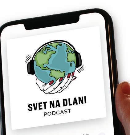
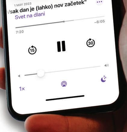
SVET NA DLANI (”WORLD AT YOUR FINGERTIPS”)


The logo of the "Svet na dlani" podcast consists of a globe, the connection to travel, exploration, and discovering the world. It successfully captures the spirit and content of the podcast. With the clear message "world at your fingertips," it alludes to the exploration and unveiling of new worlds, ideas, and cultures.


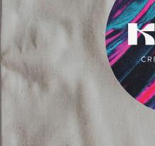
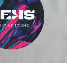
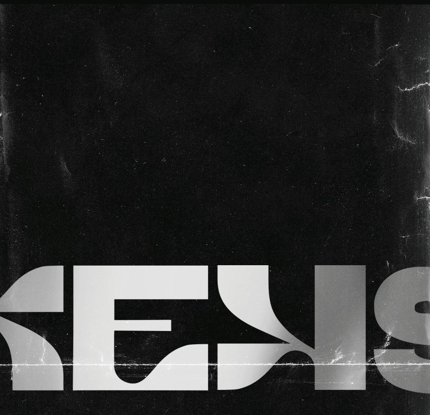
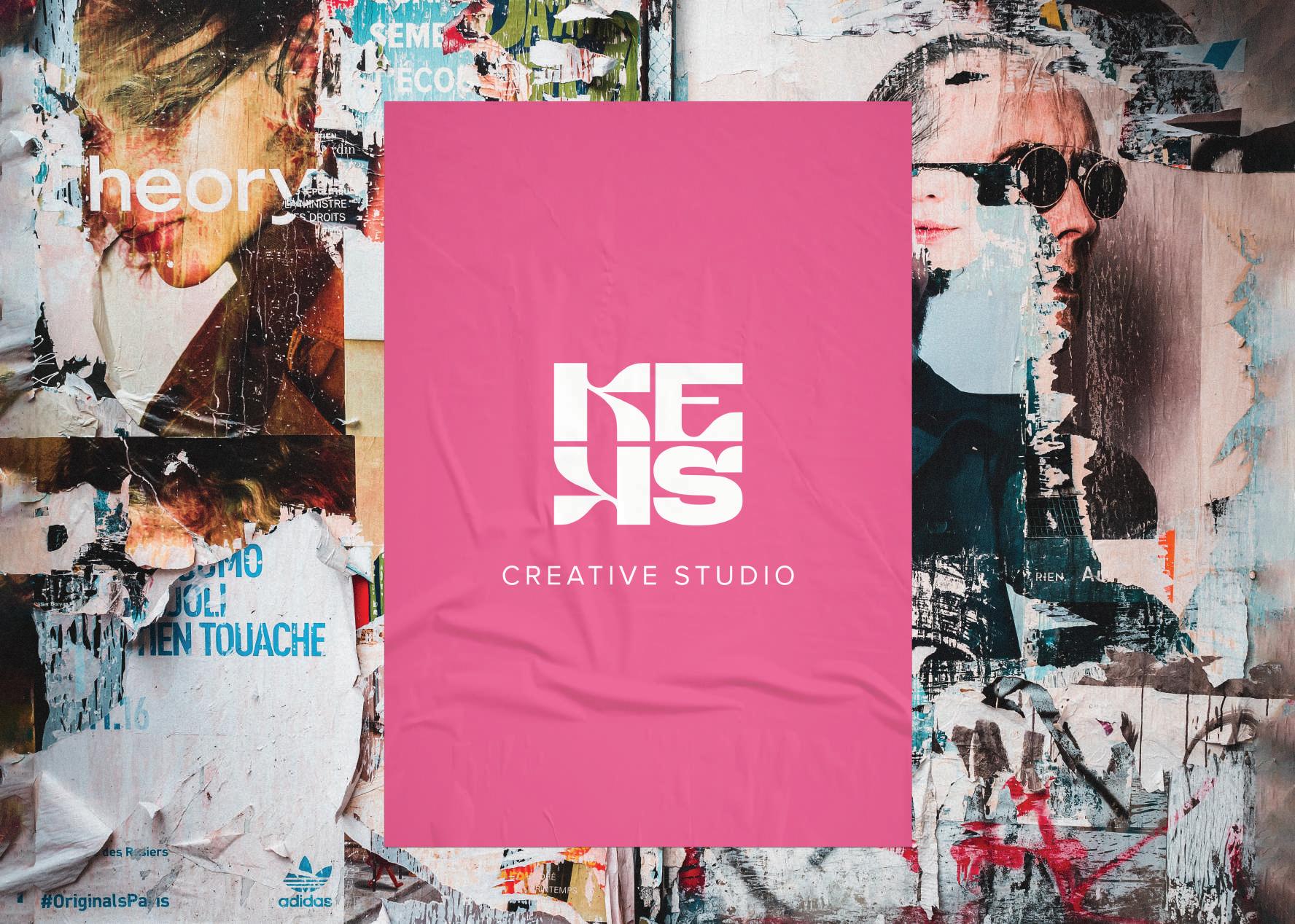
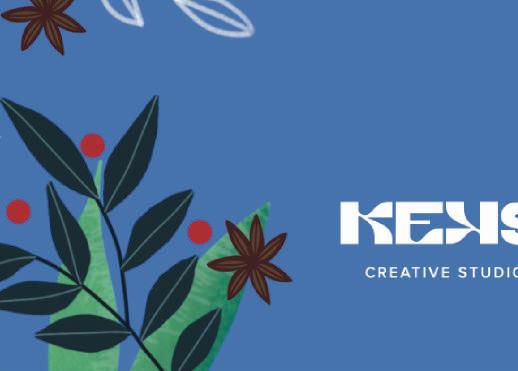
KEKS CREATIVE STUDIO
The logotype of “Keks Creative Studio” is a modern and strong typographic design that was custom made for my studio. The typography used in logotype was created specifically for this design, ensuring that it is unique and one-of-a-kind.
Overall, the logotype is showcasing my dedication to creativity, innovation, and quality.


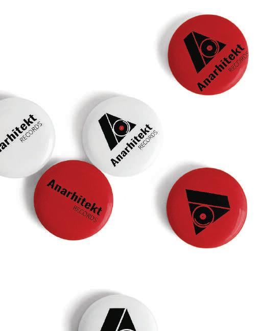
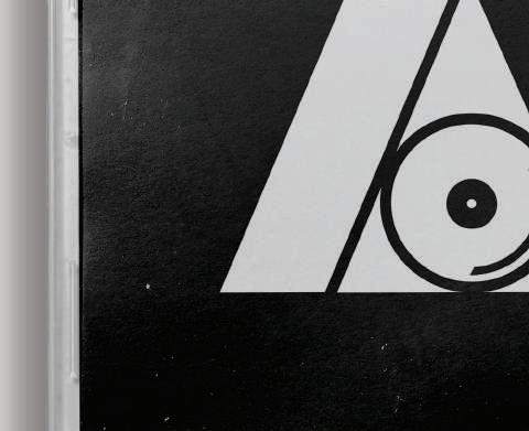
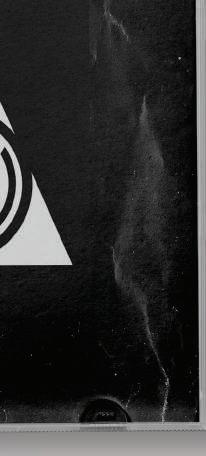
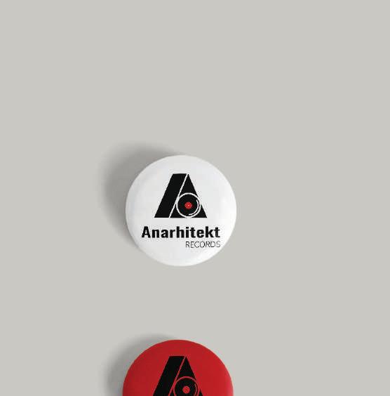
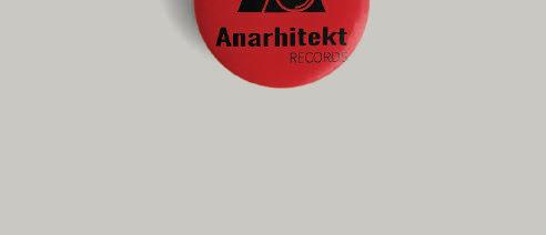
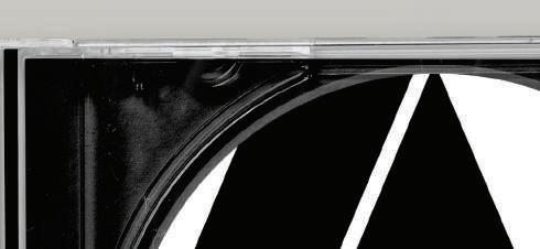
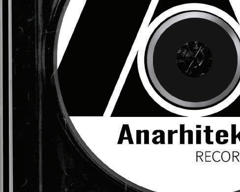
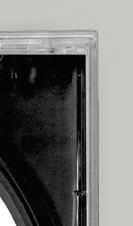
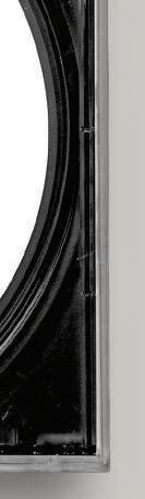
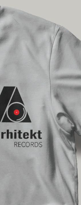
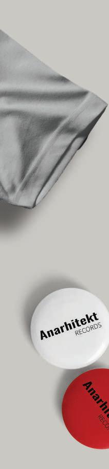
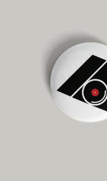
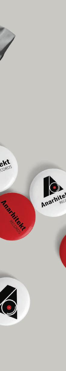
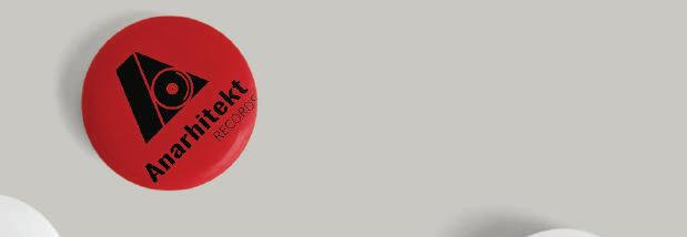
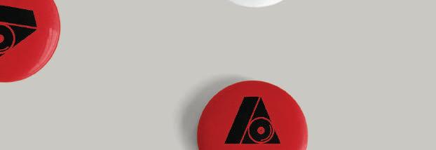
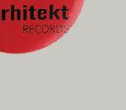
ANARHITEKT RECORDS
The logotype for Anarhitekt Records (Slovenia) reflects the company's commitment to music and creativity.
The logotype consists of a sign and typography. The sign, which represents the letter A and a CD, is a unique and powerful design that combines elements of music and architecture.
The architectural style of the sign is intended to reflect the company's name, which translates to "Architect of Anarchy". The use of the CD element in the sign represents the company's core focus on music production.


ILLUSTRATIONS


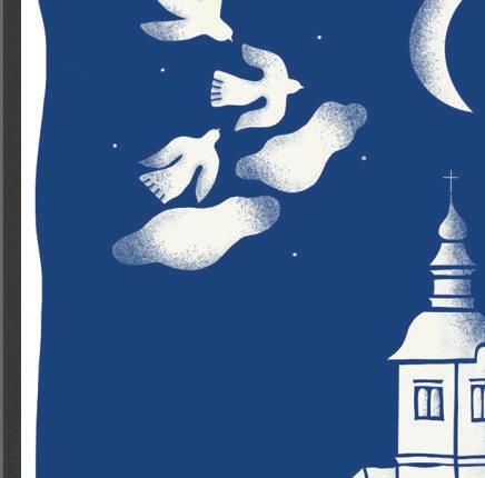
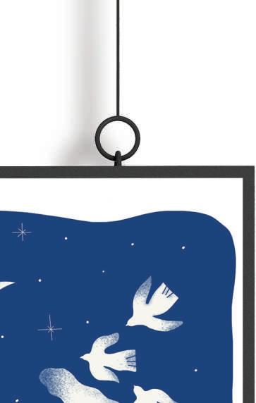
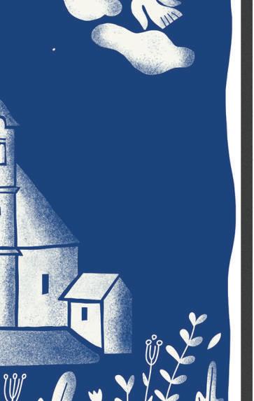
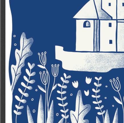
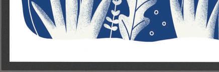
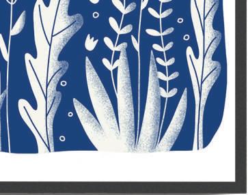
EXHIBITION - EVENINGS IN KAL
The art exhibition in Kal, Slovenia, showcases a captivating illustration created by me, featuring the Church in Kal. This artwork stands out with its striking use of blue and white colors, creating a visually captivating and serene composition.
The blue hues evoke a sense of calmness, while the white tones convey a feeling of elegance and simplicity.
The church in Kal holds a special place in the hearts of both locals and visitors, and the illustration captures its charm.


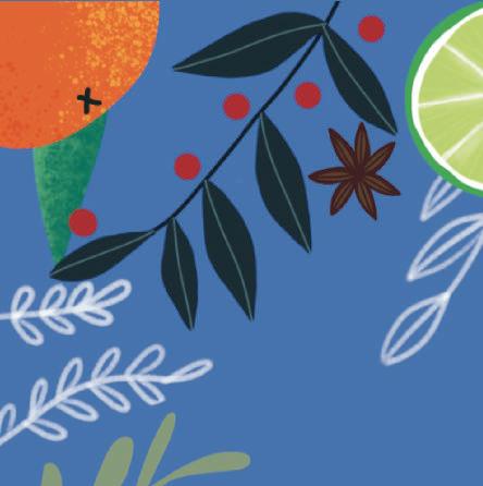


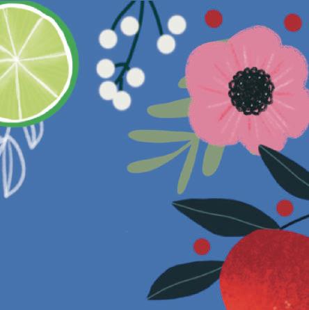
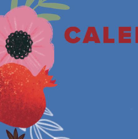
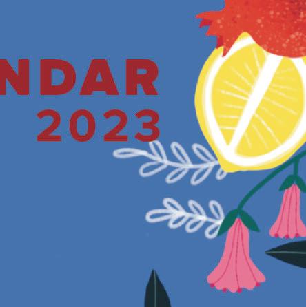
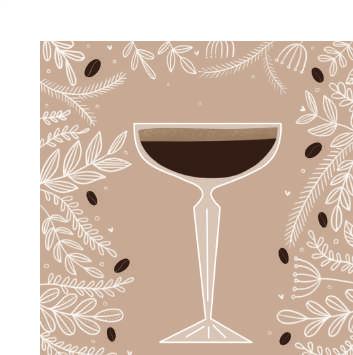
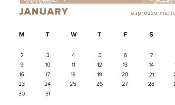
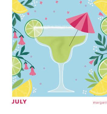
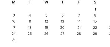
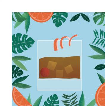
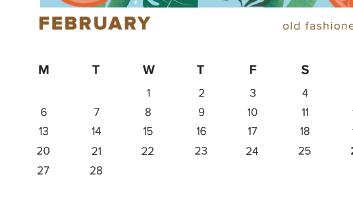
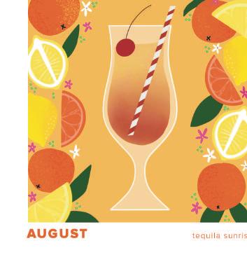
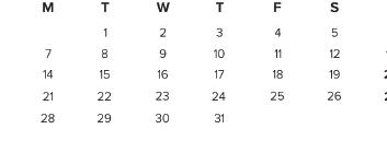
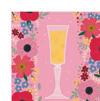
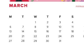
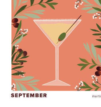
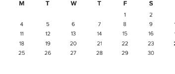
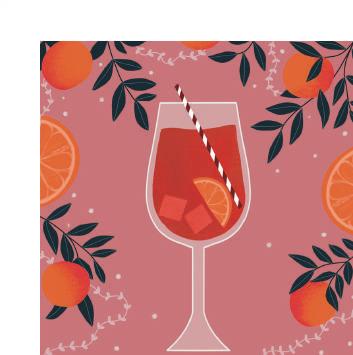
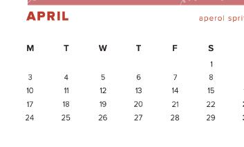
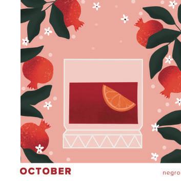
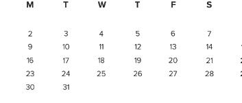
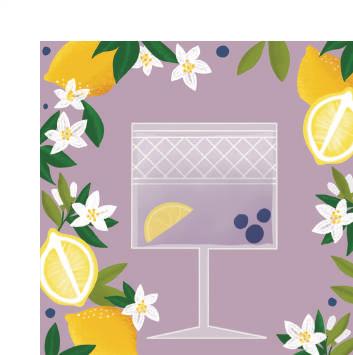
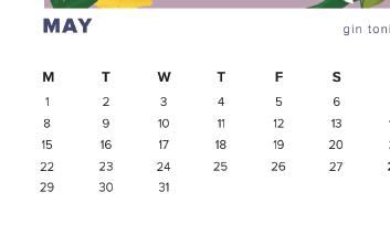
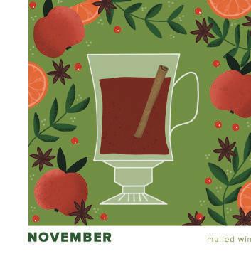
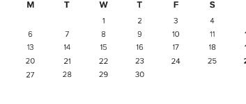
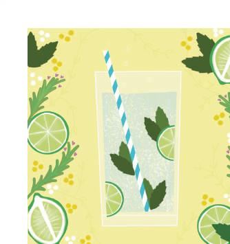
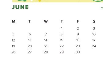
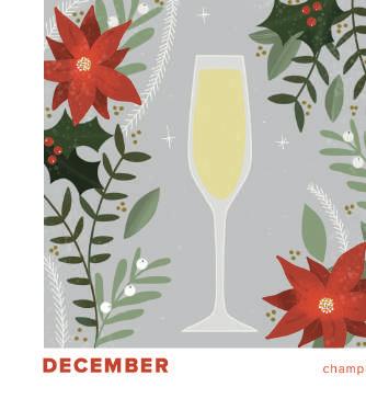
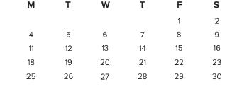
CALENDAR 2023 - CHEERS!
The unique concept of featuring different cocktails and drinks for every month of the year is both visually stunning and practical. Each month showcases a different drink, including popular favorites like Aperol Spritz, Espresso Martini, Gin Tonic, Mimosa, Negroni, Old Fashioned and more.
In addition to the illustrations, the calendar design is also highly functional. The layout is clean and the use of bright, bold colors for each drink also makes it easy to quickly identify the month at a glance.


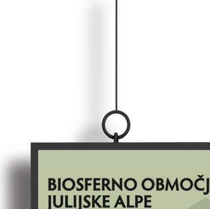
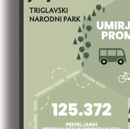
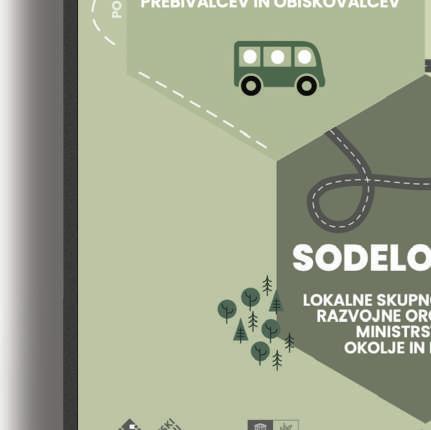
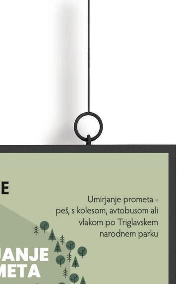
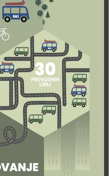
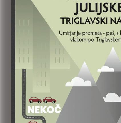
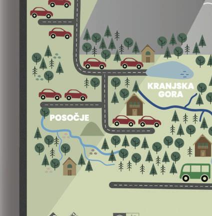
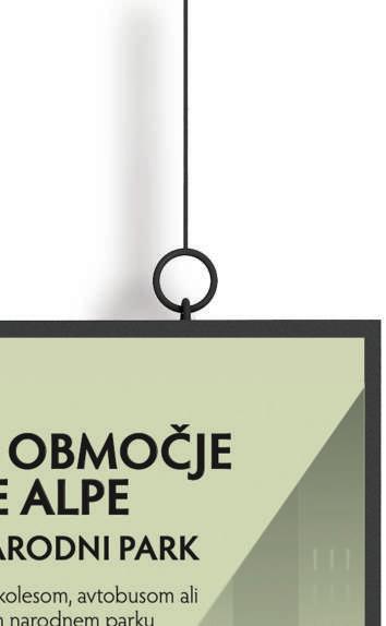
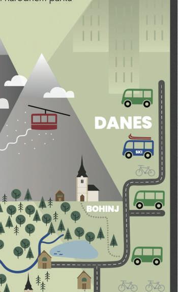
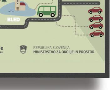
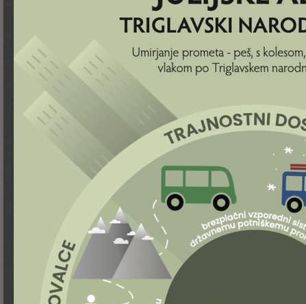
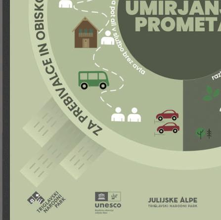
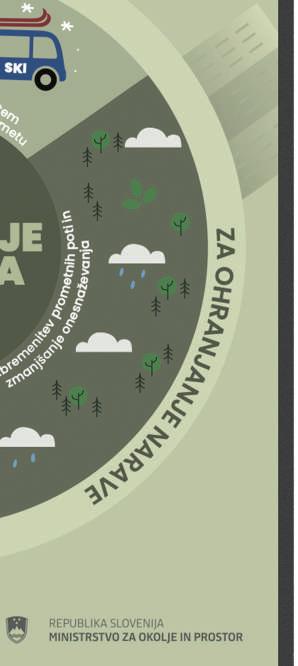
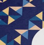
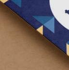
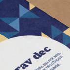
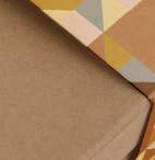
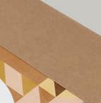
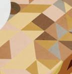
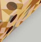
TRIGLAV NATIONAL PARKTRAFFIC CALMING PROJECT
The series of illustrations for the Triglav National Park are a visual representation of the European project aimed at minimizing car pollution in this area.
The illustrations showcase the natural beauty of the park like mountains, forests, and waterfalls that make up this unique landscape.
In addition to the visual appeal, the illustrations also serve an important purpose in promoting environmental conservation. The European project aimed at minimizing car pollution, preserving the natural habitat of the park and ensuring that it remains a protected area for generations to come.
BOOK & TyPOGRAPHY
BOOK EDITING - KARA, THE CAT WITH THE BIGGEST HEART IN THE WORLD

"Kara, the Cat with the Biggest Heart in the World" is a children's story with a purpose, written by Sara Težak. I was honored to be chosen as the editor of

The story revolves around the life and adventures of Kitty Kara. Just like life itself, the story concludes with her passing. In this way, it aims to destigmatize death and present it for what it is - an integral part


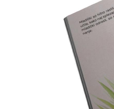

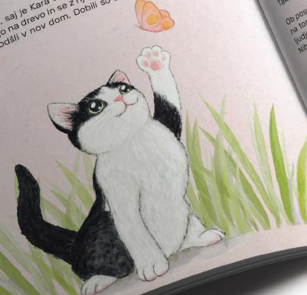
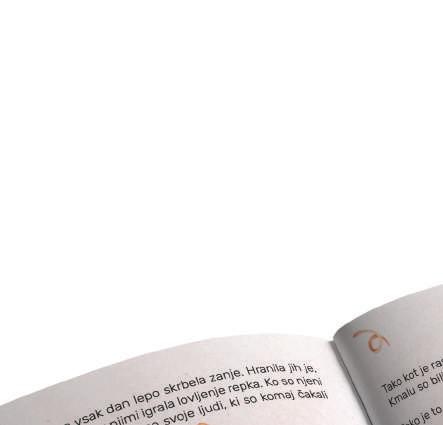
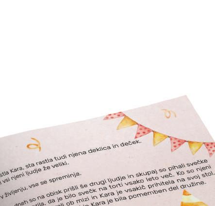


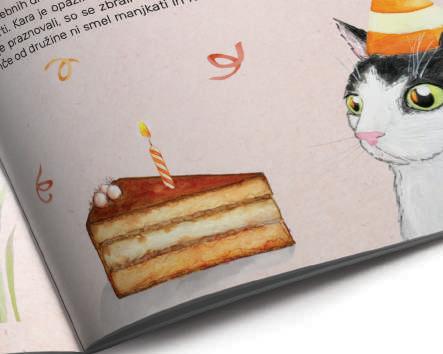

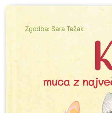
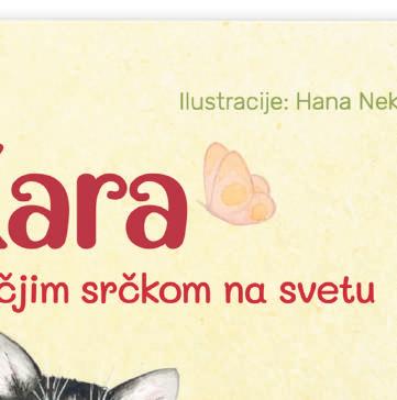
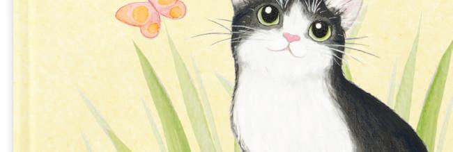
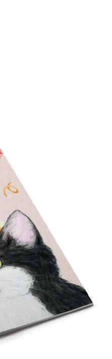


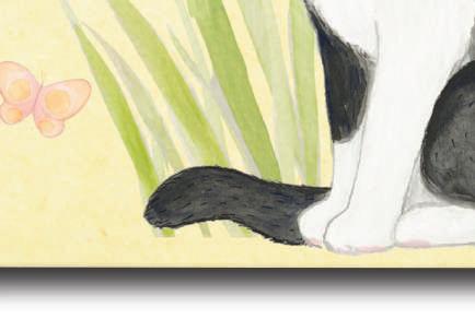
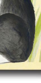


The book was created in collaboration with the Slovenian Hospice Association.
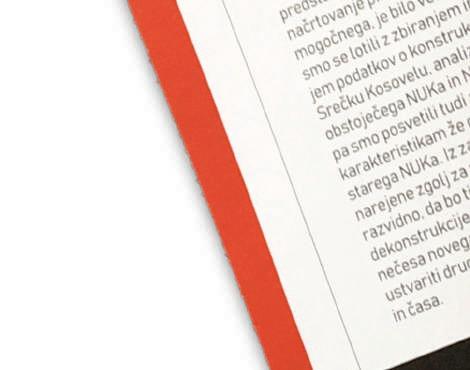
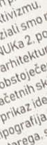
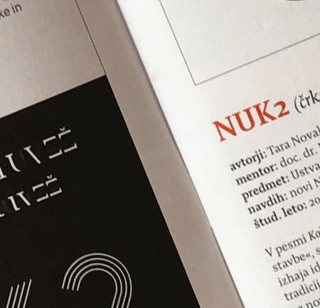
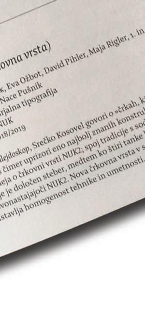
NUK2 - TyPEFACE
GROUP PROJECT
ABCČDEFGHIJKLMN OPRSŠTUVZŽ
abcčdefghijklmnoprsštuvzž
0123456789
The typography was created for National and University Library (NUK), Ljubljana, Slovenia. The idea stems from constructivism - a visual interpretation of the old and new, tradition and modernity.
N UK


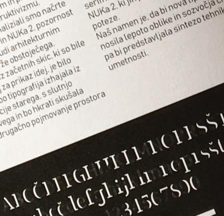
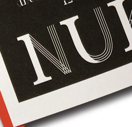
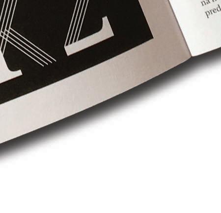
A pillar was chosen as the most representative element of the letters. Each element is a composition of the magnificent pillars, represented by the serif parts of the letters, and the new parallel pillars of NUK 2, depicted by four thin strokes.

PACKAGING


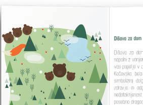
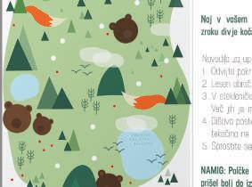
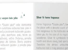
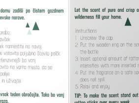
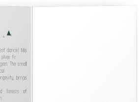
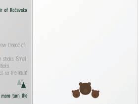
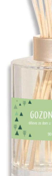
HOME FRAGRANCE GOZDNI PLES (“FOREST DANCE”)
AWARD - Best Souvenir of the Municipality of Kočevje 2020
The idea of a tourist souvenir - a home fragrance, stems from the desire to allow people to take a piece of Kočevska with them and relive the sensations that the wild Kočevska nature brings to their homes.
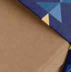
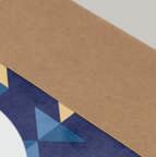
My idea was to make the product and packaging exclusively from local and environmentally friendly components, eco-friendly packaging, and a playful and visually appealing design - natural tones, wild animals ...


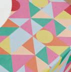
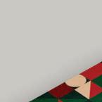
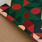
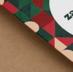
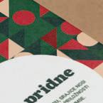
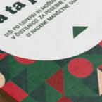
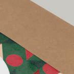
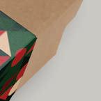
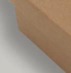
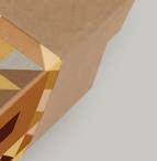
Packaging Design for Gift Sets for Rebamboo SHOP


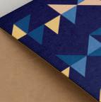


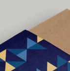


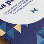


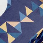
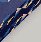


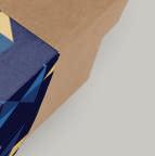


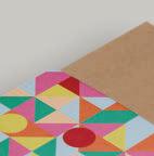
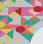
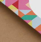

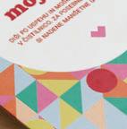
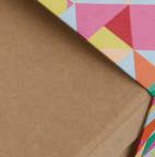


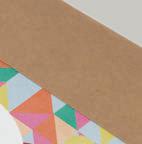
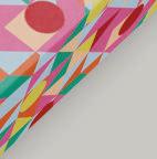

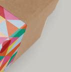

The packaging for gift sets was created with great thoughtfulness. Each of the 4 packages features different patterns. The package for men is in shades of blue with yellow details. The pattern hides a bow-tie element.
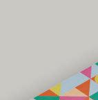
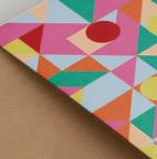
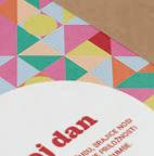
The package for women, called “My Day” is vibrant in colors. A special element hidden in the pattern is a heart.
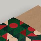
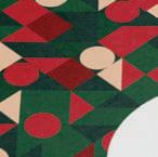
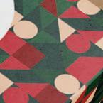
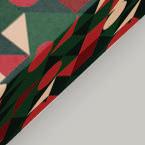
The Christmas gift package is in typical red and green colors, with a pattern featuring a Christmas tree element.
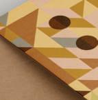
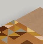
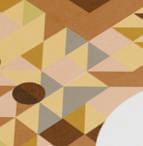
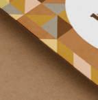
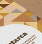
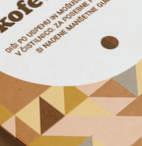
The last of the 4 packages is designed for all coffee lovers. The pattern is in yellow and brown tones. If we take a closer look at the pattern, we can find the shape of a coffee maker and coffee beans within it.


SOCIAL MEDIA
MANAGING FACEBOOK AND INSTAGRAM PROFILES
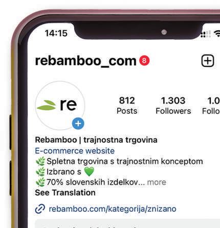
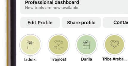

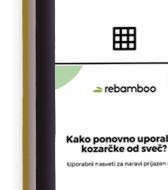


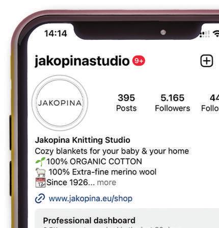
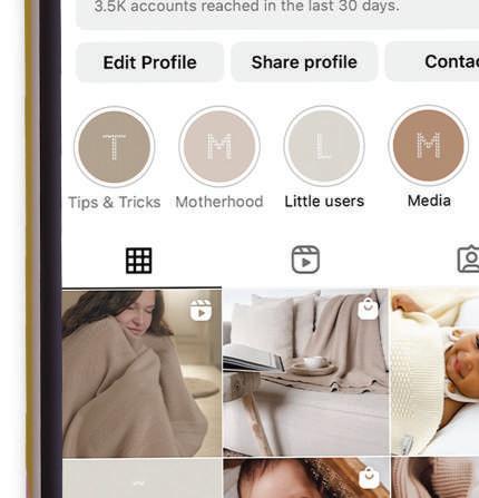


My work also involves managing Instagram profiles for various companies - Rebamboo shop and Jakopina Studio, a knitting studio with a century-long tradition. On both profiles, I take care of the visual identity, writing posts, capturing stories and reels, as well as communicating with influencers and engaging with other profiles.
I took over these profiles when they had just a few hundred followers.
EVENTS
LA HECHICERA EVENT - LEAD GRAPHIC DESIGNER


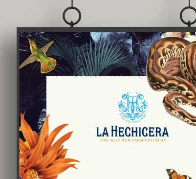
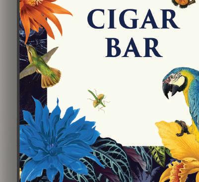
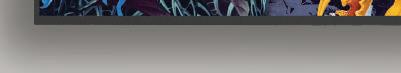


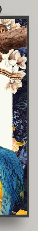

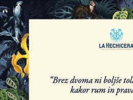


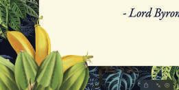
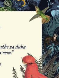
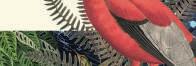


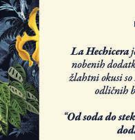
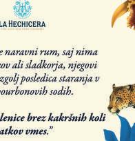


In April 2023, I participated as a lead graphic designer of large-format and small-format print materials for the La Hechicera event. My task was to design printed and digital invitations for the attendees. I also created signage boards, menus, reservation cards, and other necessary printed materials for the event, which provided visitors with an authentic jungle experience.
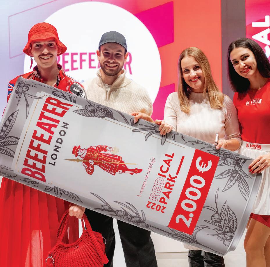
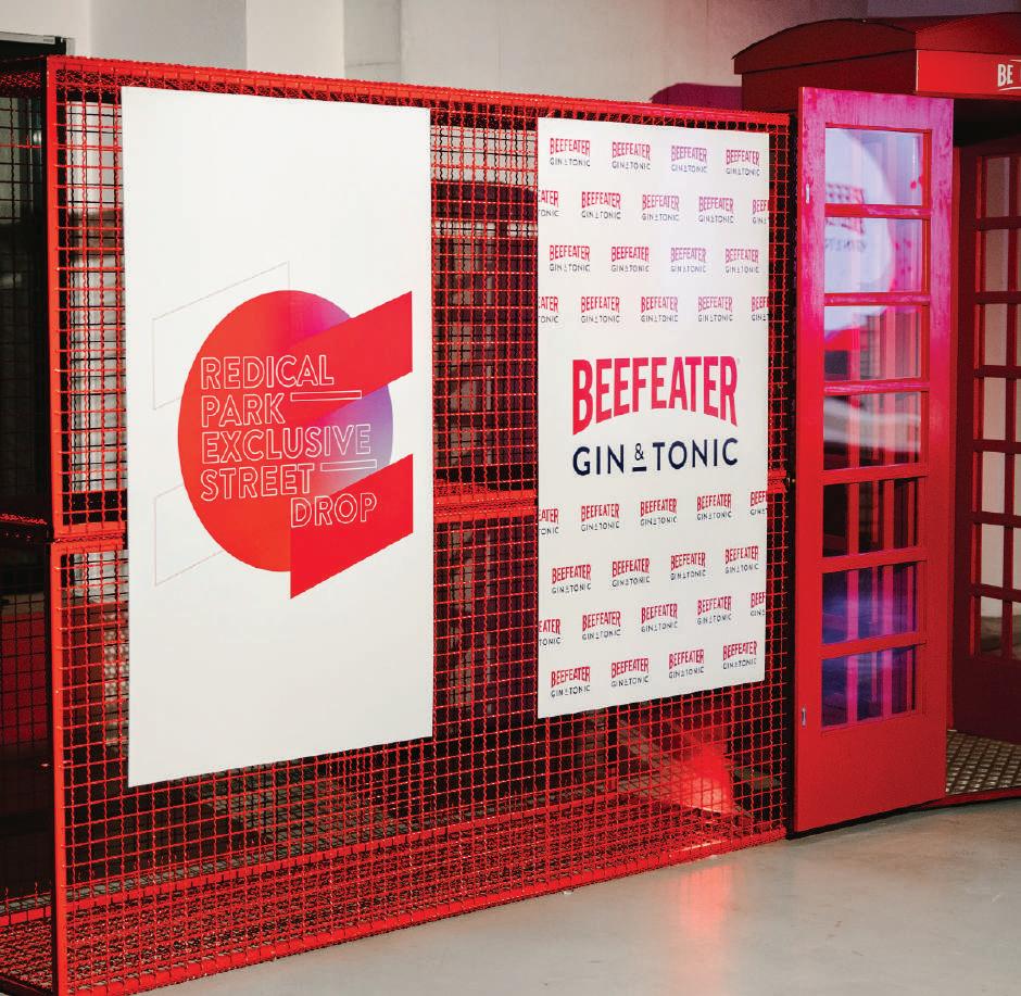
BEEFEATER REDICAL FASHION SHOW -
DESIGNER FOR PRINTED AND DIGITAL VISUALS
The Beefeater Redical Fashion Show held at Cukrarna, Ljubljana, Slovenia in October 2022 was a remarkable and vibrant gathering. I had a chance to create printed and digital visuals which infused the event with a sense of excitement and dynamism.
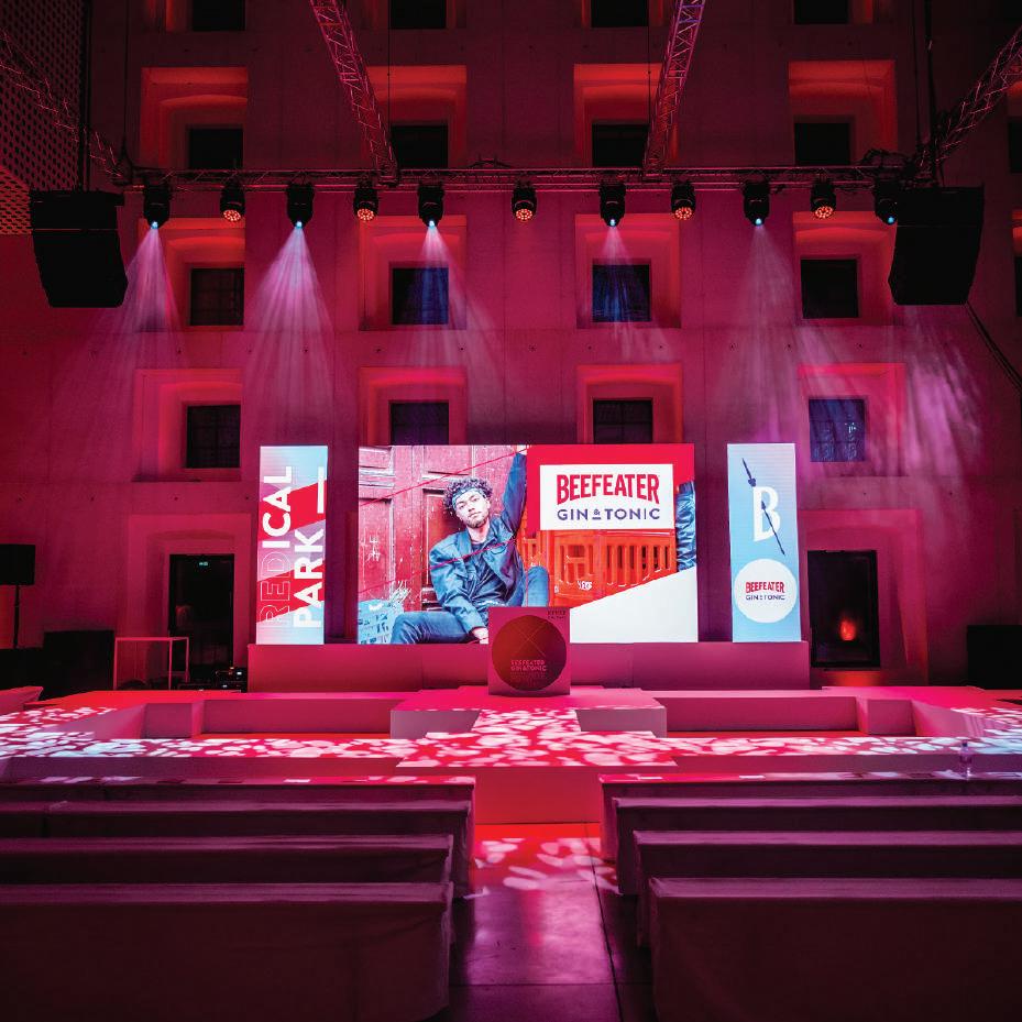
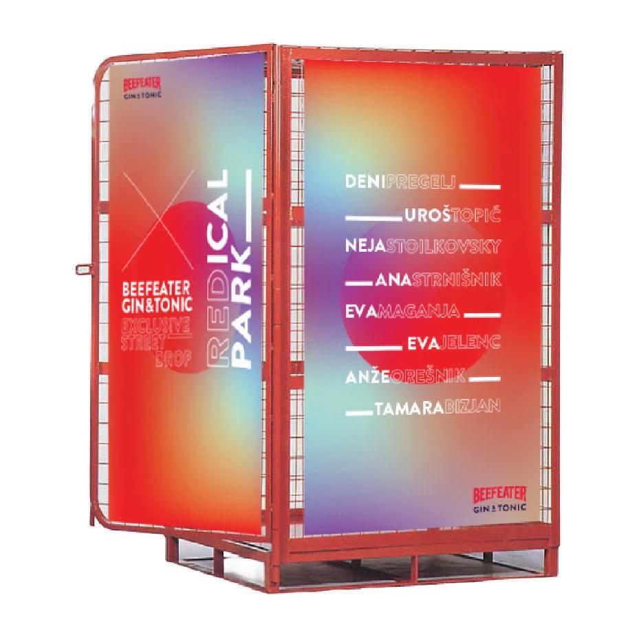
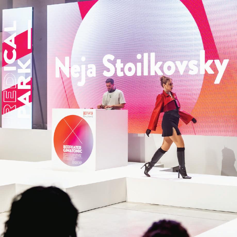
From signage and banners to projections and digital displays, every detail reflected the essence of Beefeater and its commitment to pushing boundaries.
“Look and feel” of the event was young, modern and urban.
.I hope you've enjoyed this wild ride through my creative universe, and remember, if you're in need of some mind-blowing designs, feel free to reach out and let's make some magic together. Stay creative and keep spreading smiles!