 Autumn Strittmater
Autumn Strittmater
Autumn Strittmater
Logo and Lockup
Lockup
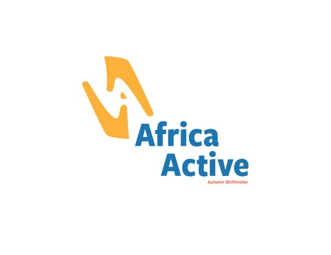
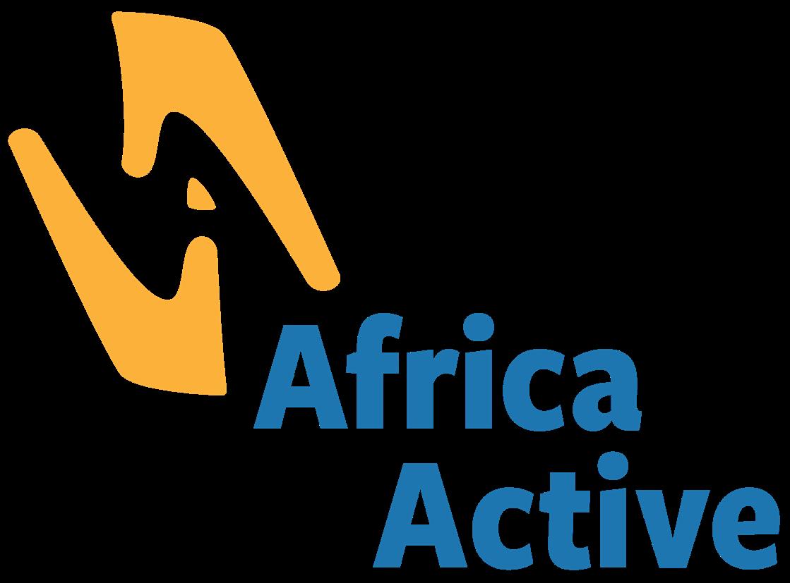
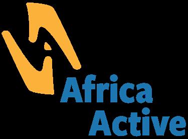
The Africa Active lockup takes inspiration from the company’s community-focused attitude. It incorporates two hands reaching towards each other forming the shape of an “A” in its negative space. It is to be used in its entirety without any alterations. It will be used in most consumer-facing communications.


Primary Logo and Usage
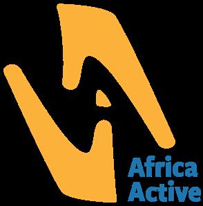
The Africa Active logo will be used for internal communications. It can also be used for merchandise, apparel, and promotional materials.
Limited Usage
The secondary logo is another option for merchandise, apparel, and promotional when fitting. It also acts as a smart phone app icon.
The icon on the far right is a representation of the brand suitable for things such as a favicon. The icon should not be paired with the lockups or logos in close proximity since those already contain the hand imagery.
Lockup
Primary Logo
Secondary Logo Icon
1 Africa Active Style Guide
Logo and Lockup

Clear Space
Use the “A” from the logo to hold consistent clear space around the logo as seen to the right. The longest part of the “A” will be used to keep space on every side.
Minimum Size
The lockup’s minimum size is 1.25 inch and 32 mm wide for printing and 120 px wide on screen.
The logo’s minimum size is 1 inch and 26 mm wide when printing and 72 px wide on screen.
1.25 inch / 32 mm printing width 120 px screen width
1 inch / 26 mm printing width 72 px screen width
Longest part of the “A”
1 Africa Active Style Guide
Africa Active’s colors take inspiration from the fun, energetic community surrounding the company. Each color has been optimized for on screen (RGB and HSB) and print (CMYK and PMS).
Blue
CMYK: 85 49 10 0
RGB: 35 118 175
HEX: #2376af
PMS: Process Blue C
Light Blue
CMYK: 54 15 0 0
RGB: 108 180 227
HEX: #6cb4e3
PMS: 284 C
Yellow
CMYK: 0 34 87 0
RGB: 252 178 59
HEX: #fcb23b
PMS: 1365 C
Red-Orange
CMYK: 0 74 74 0
RGB: 242 104 75
HEX: #f2684b
PMS: 1645 C
Africa Active Style Guide 2 Color
Typography
Fonts
Headlines and Accent Copy
Freight Sans Condensed Pro Bold is used for headlines and accent copy. All caps should not be used when using this typeface.
Freight Sans Condensed Pro can be found on Adobe Fonts.
Subheads and Body Copy
ITC Avant Garde Gothic Pro is used for subheadings and body copy. Subheadings use the bold weight, while body copy uses the book, medium, and bold weight as seen fit. All caps should not be used when using this typeface.
Alternate Fonts
If necessary, alternate fonts can be used. Freight Sans Condensed Pro Bold can be replaced with Helvetica Neue Condensed Bold. ITC Avant Garde Gothic Pro can be replaced with Roboto. Type guidelines remain the same.
Subhead and Body Copy
Africactive
Africa Active Style Guide
ITC Avant Garde Gothic Pro Medium ITC Avant Garde Gothic Pro Medium ITC Avant Garde Gothic Pro Bold ITC Avant Garde Gothic Pro Bold ITC Avant Garde Gothic Pro Book ITC Avant Garde Gothic Pro Regular
Freight Sans Condensed Pro Bold
Helvetica Neue Condensed Bold Africactive
Subhead
Subhead
Subhead
Subhead
and Body Copy Subhead and Body Copy
and Body Copy
and Body Copy
and Body Copy
3
General
All text should be left-aligned with no hyphenation at the end of lines. The number of text weights and sizes should be reduced to a minimum per application. The text is used to convey a message and not act as a decoration.
Headlines and Subheads
Typography Headlines
Freight Sans Condensed Pro Bold is always used for headlines. Headlines are always Title Case and left-aligned. Space should separate headlines from body text.
ITC Avant Garde Gothic Pro Bold is always used for subheadings. Subheadings are always Title Case and left-aligned. Space should separate subheadings from body text
Body Copy
ITC Avant Garde Gothic Pro Medium or Book is used for body copy. Medium weight or italics can be used to emphasize words or phrases.
Type and Color
Always use black for body copy. Blue is frequently used for headlines and red-orange is used for subheadings, but can be interchangeable.
Subheads
This is an example of the body copy. This is an example of the formatting. This is an example of the formatting. This is an example of the formatting. This is an example of the formatting. This is an example of the formatting. This is an example of the formatting. This is an example of the formatting. This is an example of the formatting. This is an example of the formatting. This is an example of the formatting. This is an example of the formatting. This is an example of the formatting. This is an example of the formatting. This is an example of the formatting. This is an example of the formatting. This is an example of the formatting. This is an example of the formatting.
Subheads
This is an example of the formatting. This is an example of the formatting. This is an example of the formatting.
Africa Active Style Guide
4
Graphic Elements
Pattern
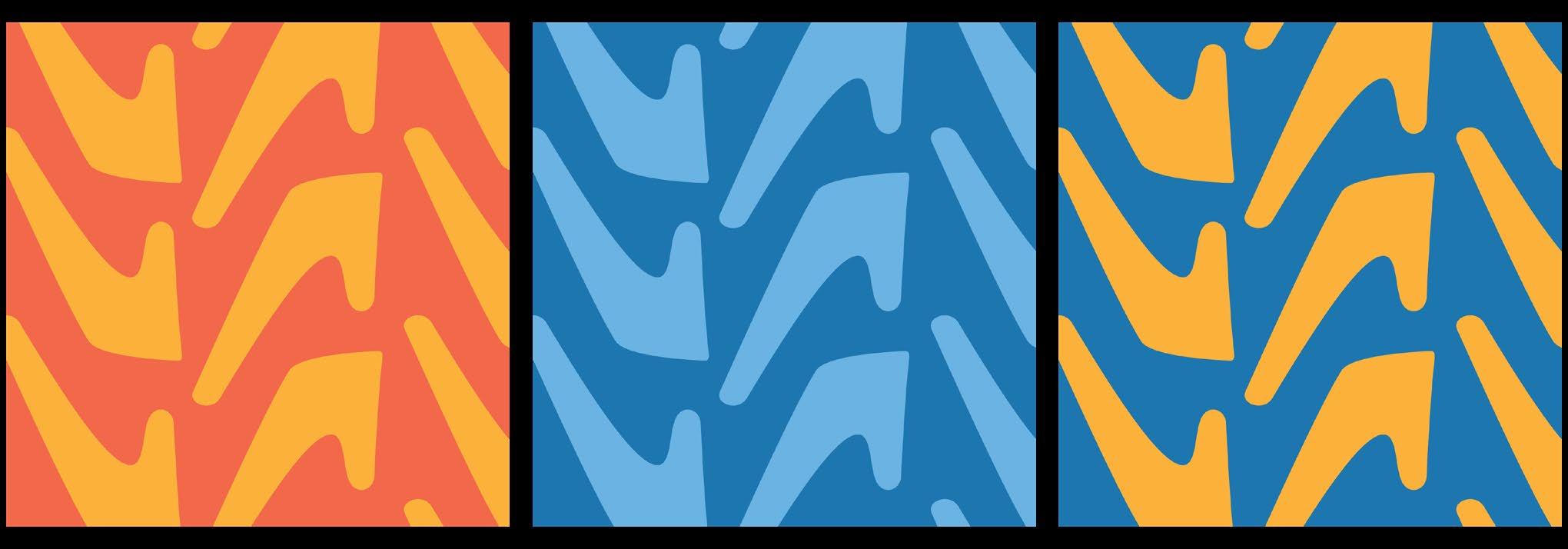
Patterns can be used as accents for online content, physical promotional material, or merchandise. These patterns include the hand shape from the Africa Active logo. These patterns should not be used in the same design.

Shapes and Lines
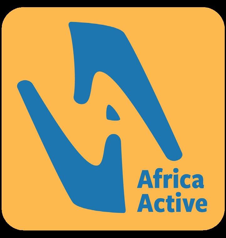
The yellow outline is to be used when it is necessary to contain the logomark. It is also meant to be for the background color of an app.
The hand icon can work as a standalone element. It is not meant to be placed with the lockup or logo. It works on both a small and a large scale.
The paragraph divider falls between the headline and subheading. It should be light gray. Only one line is used to divide the two sections.
Outline Icon
Paragraph Divider
Africa Active Style Guide
5
Collateral
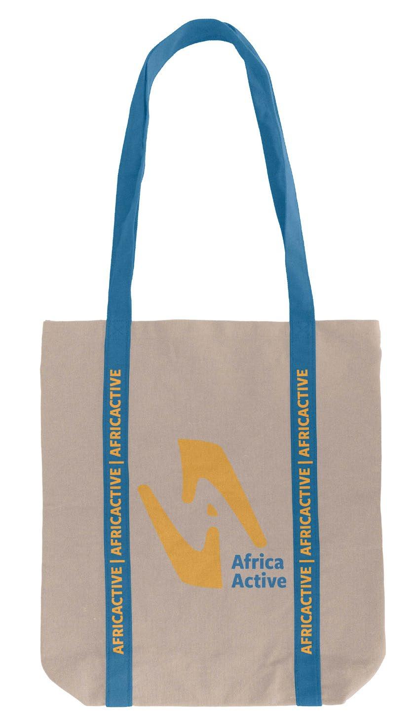
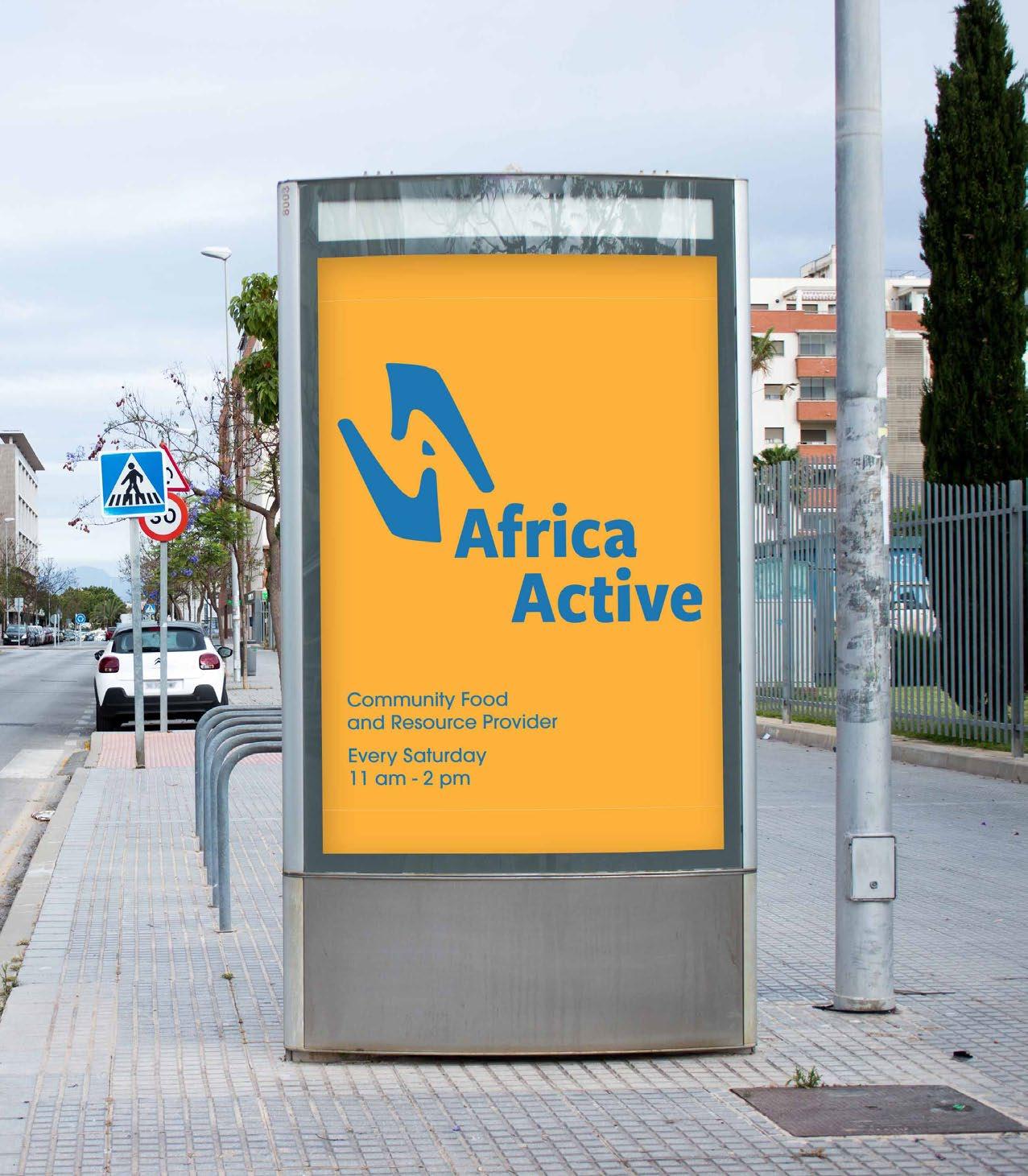
Collateral
Here is an example of the logo application to a tote bag and a poster. The blue and yellow are the dominant colors used. Light blue and red-orange can also be used on collateral, but the blue and yellow should be the main colors.
Africa Active Style Guide
6