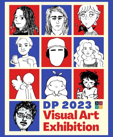
Visual Art Exhibition D

P 2 0 2 3


Congratulations

DP Visual Art Class of 2023!
Inside this brochure are samples of the fabulous work created over the two year program and the students curatorial rationale which explains ideas and meaning. With enduring gratitude,
Ms. Melanie Dueck & the Grade 12 Artists
Our Artists
DP Visual Art Exhibition
Tuesday, April 4, 2023
6:30 pm - 8:00 pm
DP Building
The exhibition may contains content that may be difficult for some viewers.


Viewers discretion is advised.
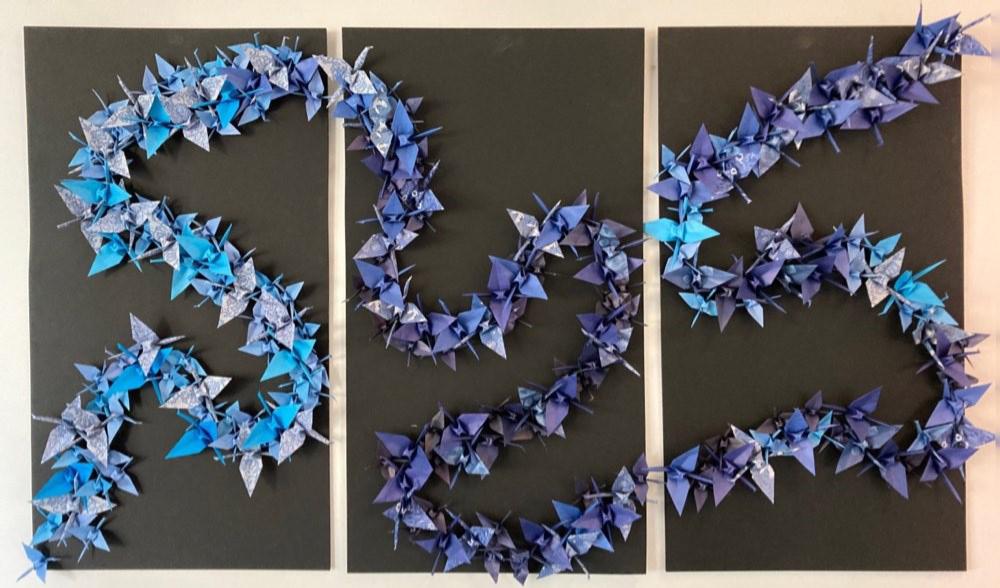
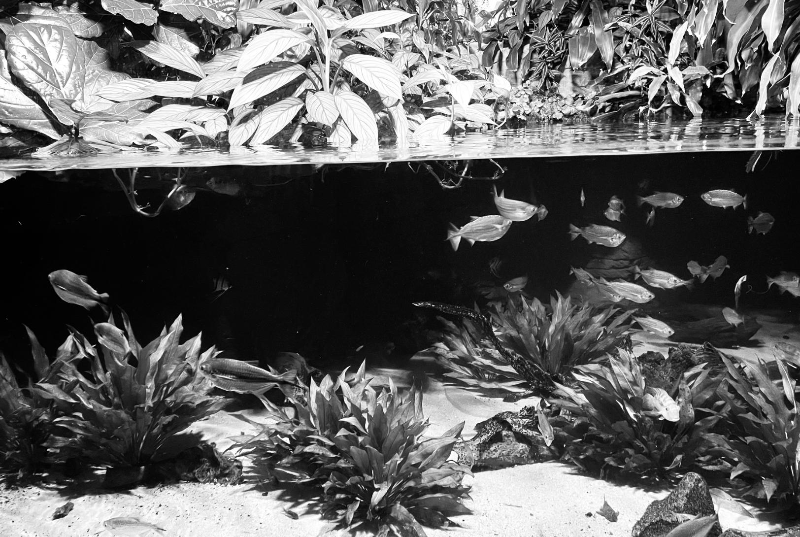
THE ABANDONED
03 REMINISCENCE Kristen Chan 23
01
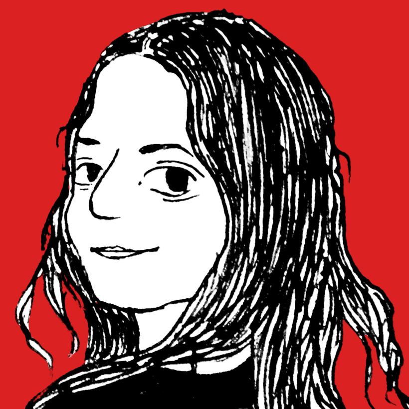
Misha Morozov


07 BE-LONGING Hannah Chin 11 MENTAL PICTURES Alex Coleman 15 A MURDER!! Victoria Haussmann 19 INSTANT GRATIFICATION Kenji Kamachi 27 LANDMARKS Madeleine Quennec 31 SPEECHLESS Noelle Quennec 35 INTERLUDE Claire Treacy 39 IDENTYCZNOŚĆ Adrian Yeldan 02
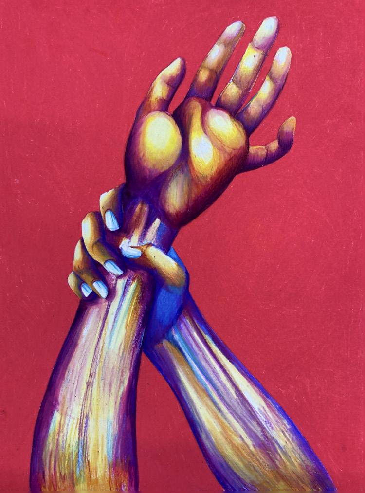
REMINISCENCE Kristen Chan

03
Reminiscence is an exploration of the positive and negative memories, along with the emotional connection associated with them. These pieces consist of a mix of previous and recent memories – some of these experiences are presented through a subject, adding symbolism. With these works, I explore the idea of “presenting memories” where the main concepts explored are nostalgia, childhood, and memory.
My body of work largely consists of twodimensional works such as pencil drawings and paintings, but also includes a couple sculptural works. To display these works, I chose to present them in an L-shaped area of the foyer, where an individual can view all the pieces at once to demonstrate connections between the pieces. The works will be displayed in chronological order to demonstrate the progression of my art throughout this program – this arrangement resembles a timeline of my works where I kept in mind how I was feeling in the moment of the past or present memory I captured. Each piece is meant to be looked at individually; however, when stepping back, all pieces are connected through similar ideas and repetition of cool colours throughout for unity. I have explored different mediums and techniques where I aimed to improve my art techniques. I wanted to challenge myself with the materials I used such as the moldable medium of wire, watercolour pencils or acrylic inks.
With each piece in my exhibition, I want my audience to see the different moments in time in my life. I wanted to document a variety of childhood memories which would create a sense of nostalgia for myself. I also wanted to convey a nostalgic feeling for those that experienced the same things I did when I was child. On the other hand, I wanted to capture more recent moments with the feelings of being overwhelmed or stressed. I hope those that are feeling these emotions recently can find comfort through these pieces, as they are not the only ones feeling that way.
At times, it was difficult to put words to some of these experiences, especially personal and vulnerable pieces, and express what I was feeling fully knowing that it would be publicly displayed. Through Reminiscence, I want the audience to have a glimpse of my experiences and hopefully find a relatable piece to their own experiences.
04
02 05 01 | Lost My Way 02 | Now 03 | Paralyzed 04 | Personalities 05 | Timeline The Gallery 01
06 03 04 05

07
Chin
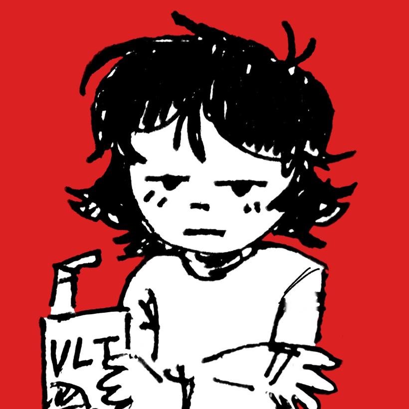
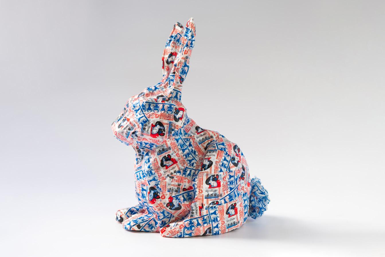
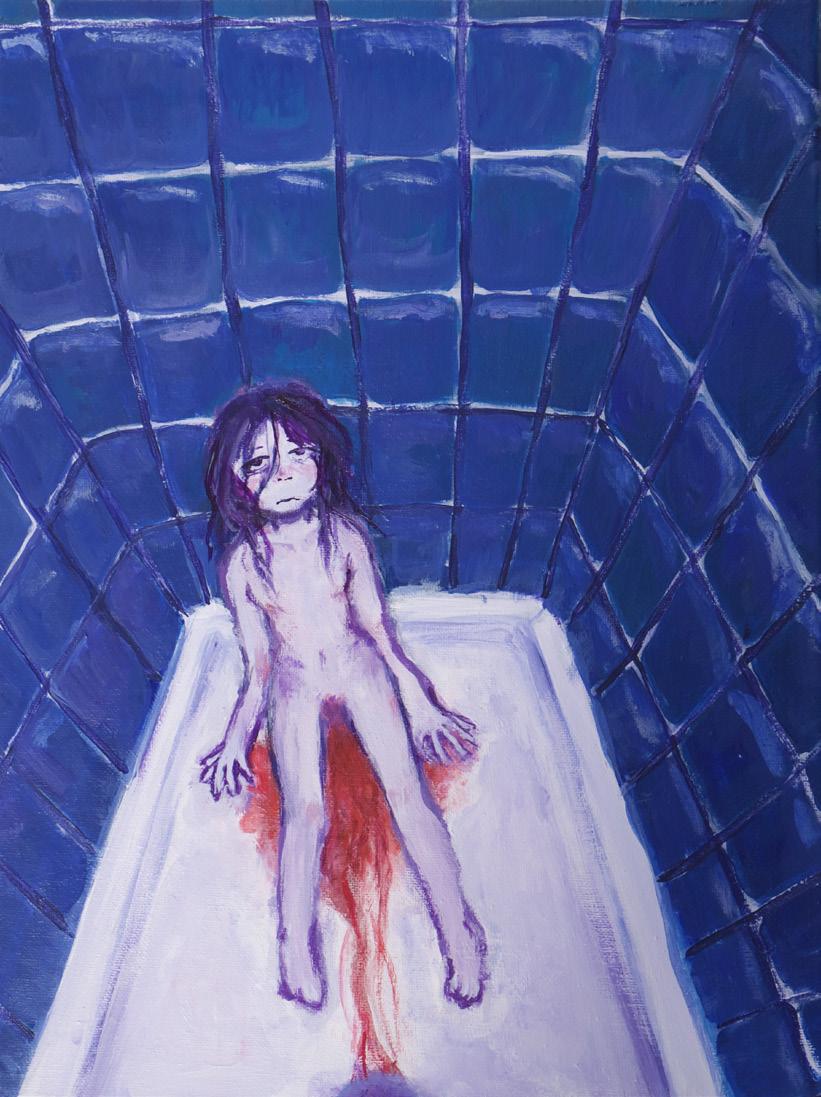
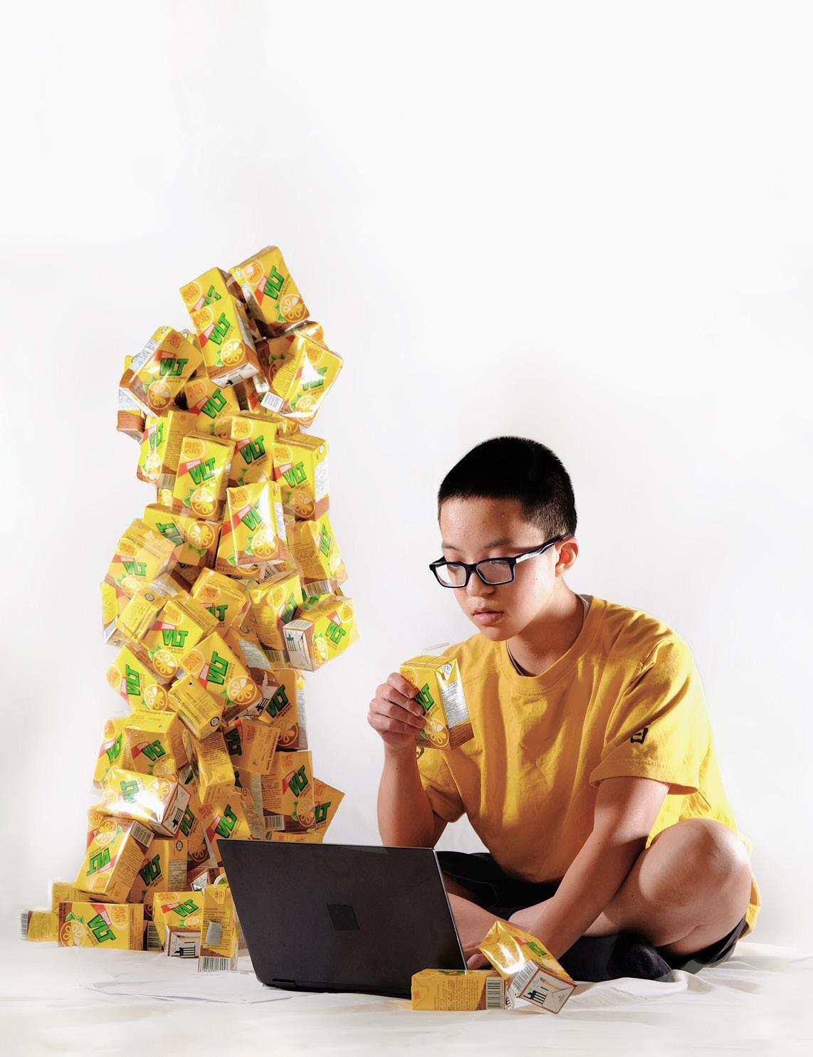
BE-LONGING Hannah
My exhibition envisions the imaginative retelling of my feelings toward my identities as a second-generation Chinese-Malay immigrant, a woman, and the intersections in between.
In some works, I take a playful approach, where staple Chinese/Malaysian snacks and desserts such as White Rabbit candy and Vita Lemon Tea juice boxes are a symbol of pride in my heritage. Other works contain a more reflective tone, where my depictions of foggy memories of my visits to Malaysia and China communicate my longing for a closer connection with my heritage. I also explore more afflicting themes, where my illustrations of women paired with colour symbolism depict issues regarding the female image. My exhibition includes photography, sculpture, painting, digital illustrations, and photo collages. I often incorporated the practice of using existing items I owned, introducing them as the subject of the piece and the anchor of my messages. From juice boxes to archived photographs, these items carry a significance involving my identity and experiences. To communicate these themes, I took inspiration from contemporary artists such as Japanese painter Makiko Kudo’s painterly style to portray hazy memories and uncertainty, and Canadian-Chinese multidisciplinary artist Shellie Zhang’s use of familiar iconography as a reflection of the Chinese diasporic experience.
I acknowledge the emotional duality in the ideas in my work and the tones I companion them with. To provide the audience with a seamless viewing experience of my body of work, I discerned my work by three main
ideas, separated by the gallery’s walls: Chinese diasporic longing, diasporic joy, and my grasp on womanhood. These themes are distinguished by the gallery’s walls. Hence, the audience is able to immerse themselves in the individual concepts I explore. In the middle of the gallery stands my sculpture White Rabbit Rabbit, as I intend for the viewer to walk around it, observing the piece’s form from different angles as well as how I used actual candy wrappers to cover the sculpture. Underneath the mounted prints of my photograph triptych Wilting, the equipment I used for the image; a pocket point-and-shoot camera, red veil, and beige hosiery are also displayed. This not only articulates my intentions behind the photographs, being to explore creative concepts and lighting in photography, but to also communicate that in photography, I value creative direction and using materials accessible to myself, over sophisticated equipment.
My use of familiar iconography and design within my pieces aims to reach out to audiences who like me, are familiar with these items and likely have a nostalgic or cultural connection to them. Pieces that employ this practice are the most successful when viewers identify their own experiences with the items and material I incorporated. Within the audience, a sense of community and belonging is sparked. I use this practice to communicate more personal concepts as well. By incorporating a familiar motif, it provides an accessible window into an issue that in society, lacks discussion and empathy, as seen in my illustration Bittersweet.
08
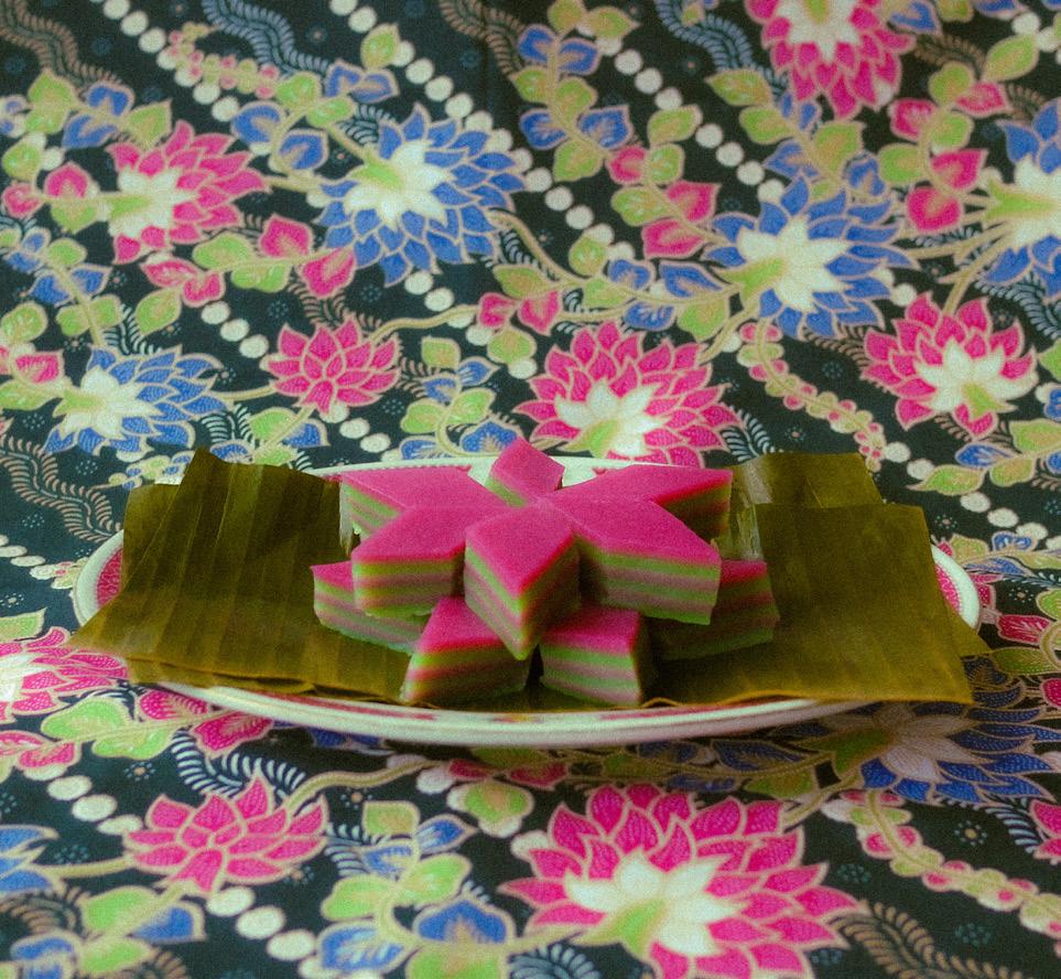
02 09 01 | Bittersweet 02 | Kueh Lapis 03 | Shower Thoughts 04 | Study Habits 05 | White Rabbit Rabbit The Gallery 01
10 03 04 05
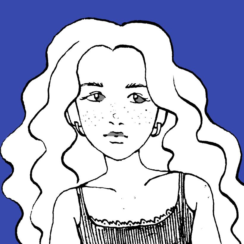
MENTAL PICTURES

11
Alex Coleman
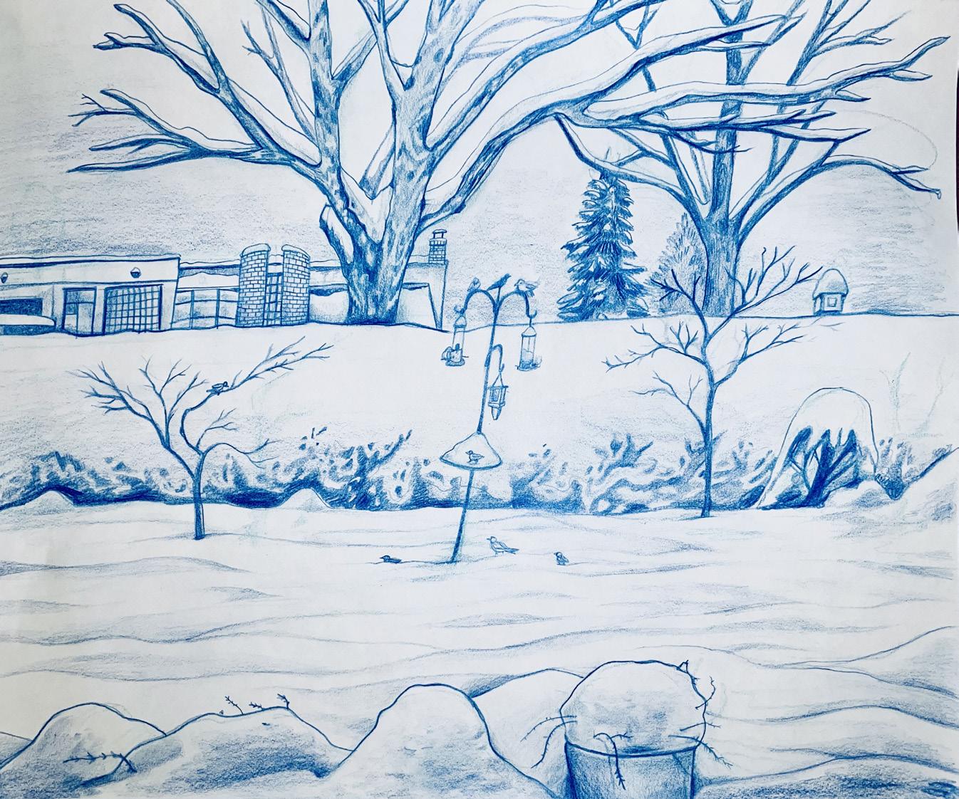
The main idea explored in this exhibition is connection to place. Each piece was inspired by aplace I personally visited, and I represented them in a way that shows personal and conceptual meaning. I was influenced by artists who captured subjects from their own life, such as Mamma Andersson and James Jean, and while studying them and making this exhibition, I realized that representing daily places that may seem insignificant to the artist can tell personal and meaningful stories. By depicting places from my daily life, I have created snapshots that provide insight into my experiences. Thus, my vision for this exhibition is to present a collection of scenes from my life, sharing my experiences and provoking the viewer to consider the significance of places from their own life. I had two main approaches to medium, which represented places differently: photography, or drawing and painting. The photographs are unedited snapshots of a moment in time, and this specific moment reflects my perspective on how the place has changed compared to past memories. The second medium approach, drawings and paintings, allowed for increased manipulation of the place, as I had complete control of elements such as line and form. The transition between these two sections of the exhibition is my digital collage, which combines a photograph of Chinatown with a digitally drawn sky.
Overall, this exhibition uses places that are significant to my life, with choices in medium and artistic strategies representing them in different ways. I am proud of this exhibition because I experimented with different methods of drawing, such as observational drawing and photography, that I was previously unfamiliar with, and artistic progression is evident since some later pieces are more technically strong than previous pieces. While looking through this exhibition, I hope the viewer will learn why these places are important to me and find places from their own life with similar emotional meaning. This is important to helping us be more appreciative of the physical world we live in, especially at a time in which people are too often distracted by technology.
12
02 13 01 | Above & Below 02 | Desolation Diptych 03 | Winter’s Day 04 | Urban Wish 05 | Junkyard Cat The Gallery 01
14 03 04 05
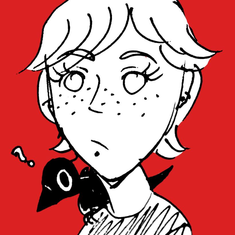
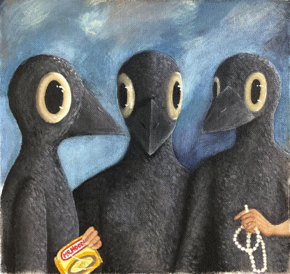
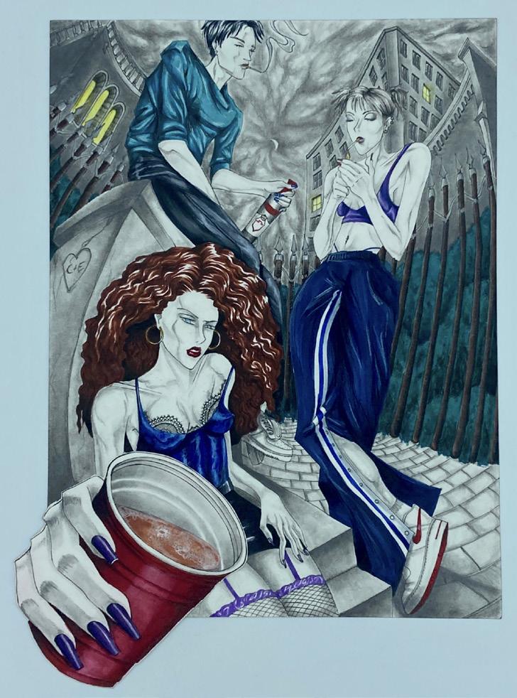
A MURDER!!
Victoria Haussmann
15
I like crows. They’re little menaces living in modern environments that eat junk all day and like shiny things; I relate to that a lot. The theme of my exhibition is to show my experiences through my own perspective, following the motif of a little crow. I have difficulty taking myself seriously so I gave it a cartoonish, foolish-looking appearance, with bad posture, to reflect myself. The selected art pieces are of significant stages in my life that I wanted to give a visual substance to, each featuring or alluding to the crow. I used media that I usually avoid, like digital art and 3D sculptures, to challenge myself. After determining my theme, I made art pieces that corresponded to it, and those I liked I chose to exhibit. Each piece explores my growth as an individual in physical and psychological changes. I have a preference for technically impressive art and not overly conceptual pieces that require deep analysis, which is generally what I try to lean towards in my own art production. I tend to be a perfectionist, so I was challenged by the difficulty in my ideas, especially when using less familiar media, and my art skills greatly improved consequently. Scale in my artwork is something I controlled very tightly. In most pieces the crow is never large and tends to be consumed by its surroundings. This is because these pieces are observed through the lens of my eyes, and I don’t view myself as very big next to the world. My main concern in making art is not a profound audience impact; rather it’s a personal exploration. As such, I hope that seeing my art will give people a better understanding of what goes on in my life and mind.
16
The Gallery
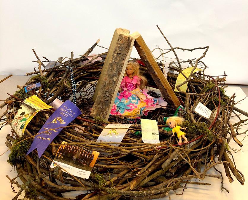
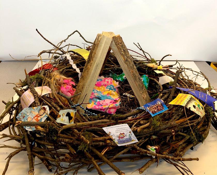
02 17 01 | A Lame Duck Crow? 02 | Leaving the Nest 03 | Hatchling 04 | Identity Crowsis 05 | Crow in 3 Positions
01
05 18 03 04
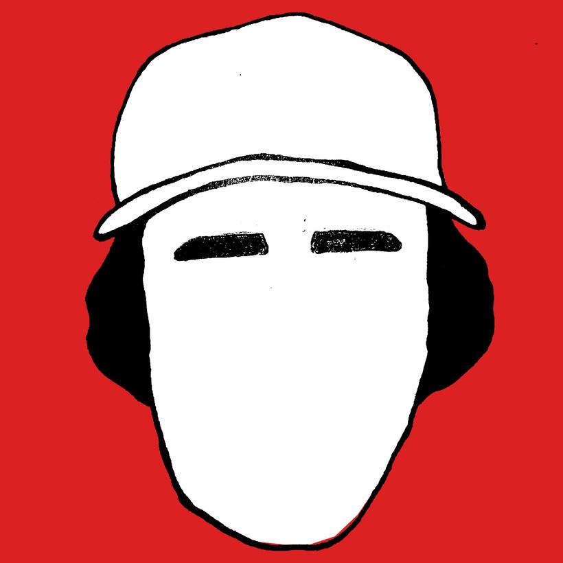
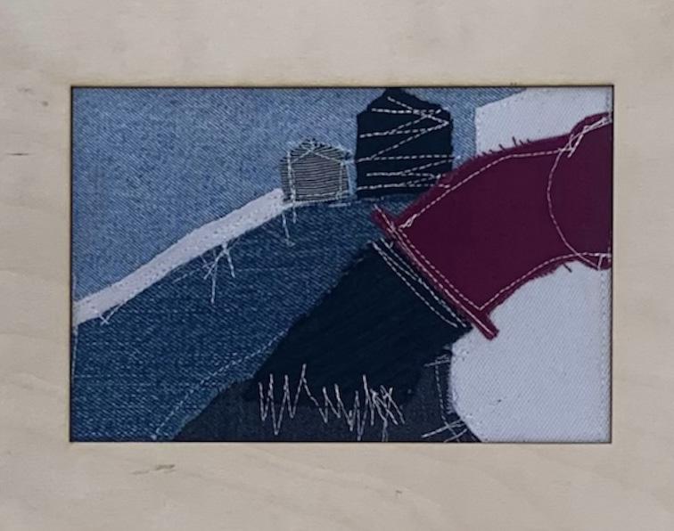
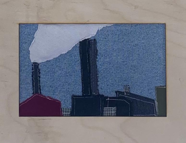
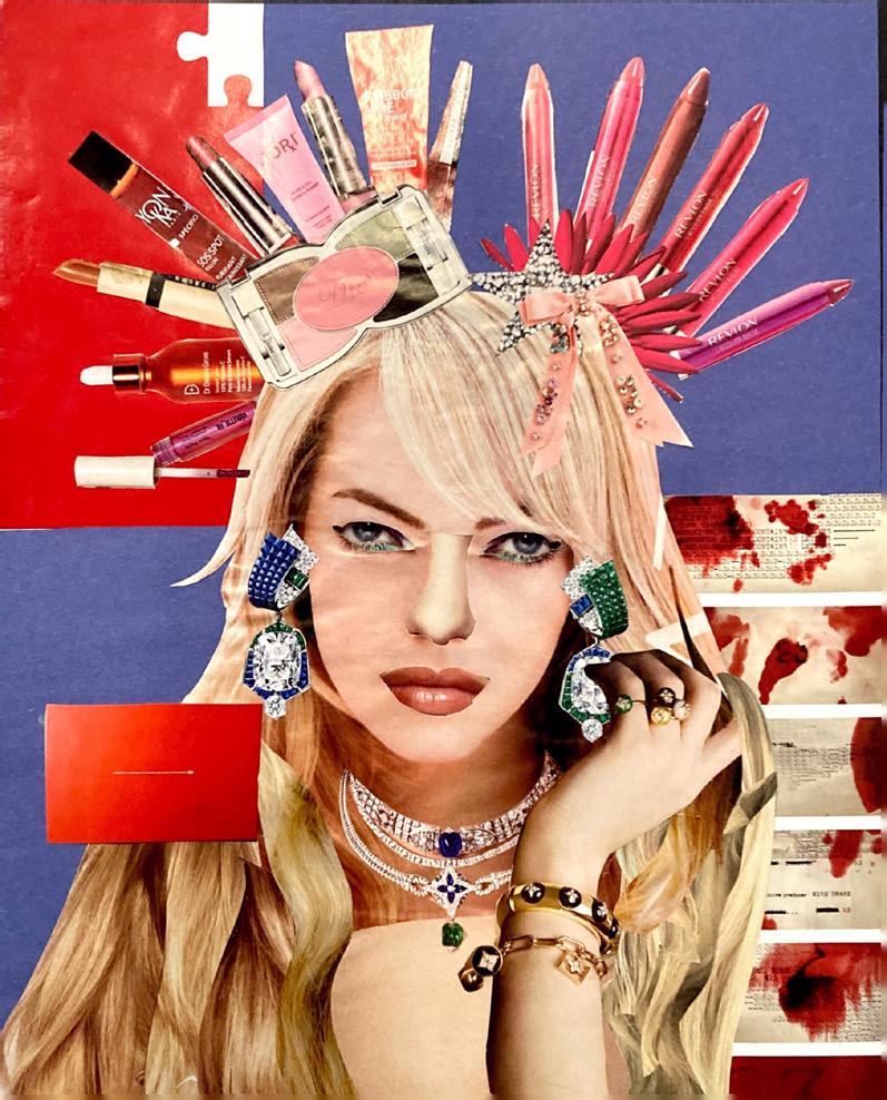
INSTANT GRATIFICATION
19
Kenji Kamachi
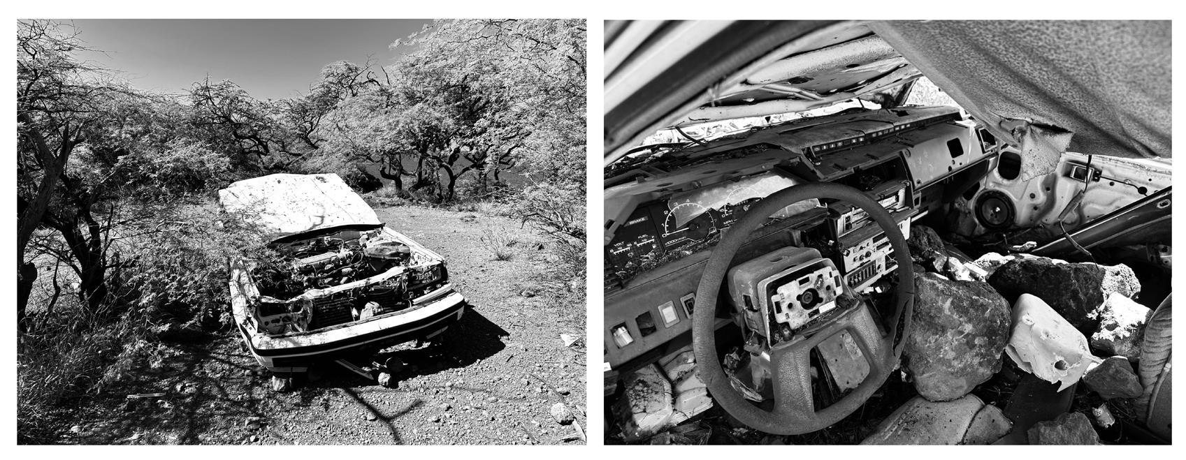
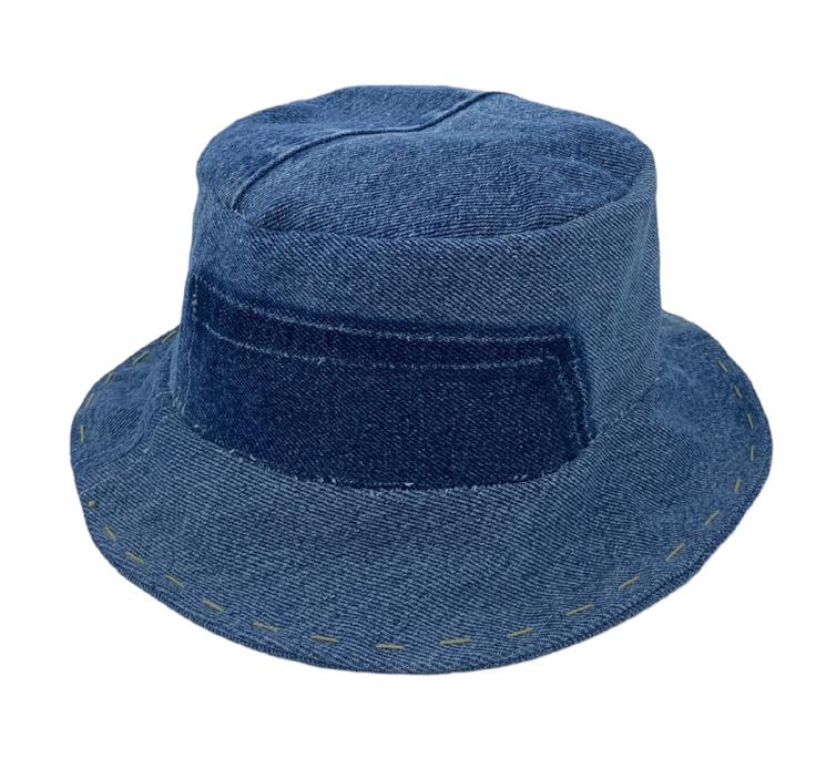
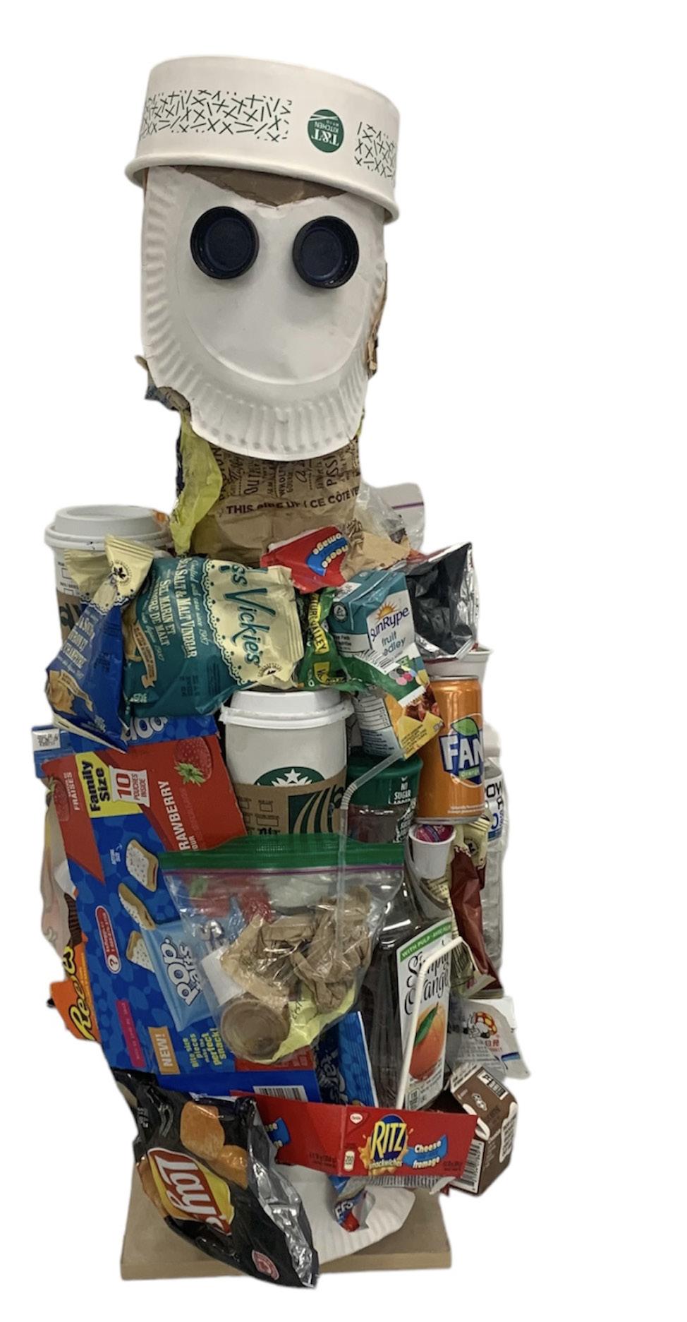
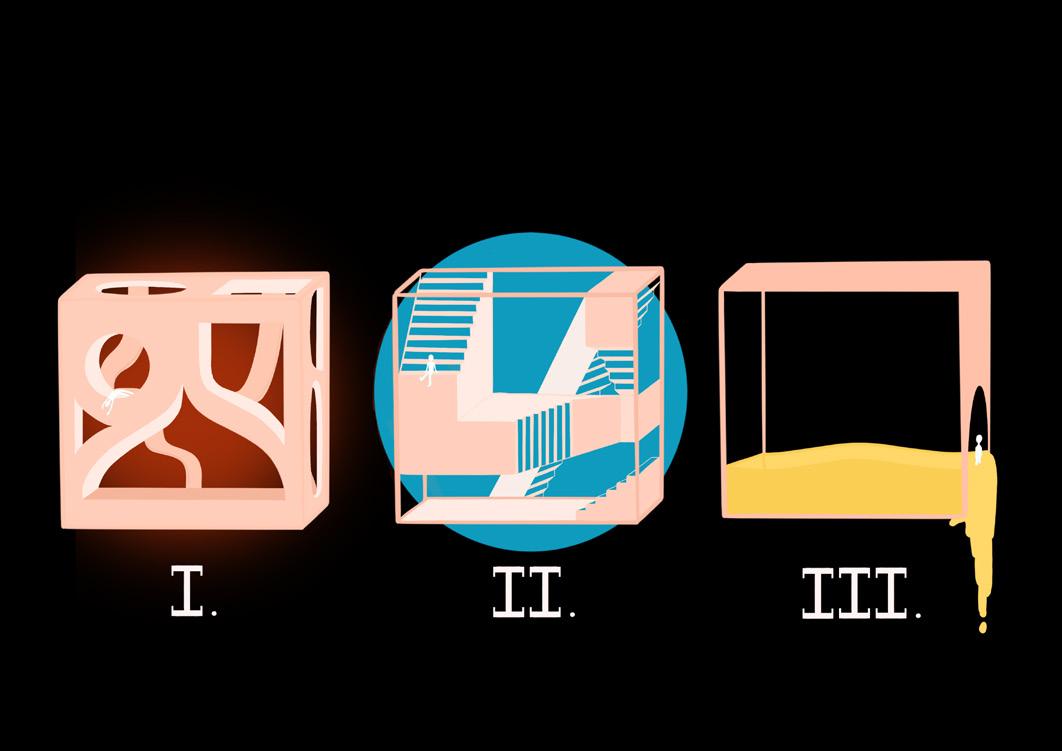
Titled Instant Gratification, my exhibition attempts to capture some of the ways in which the growing culture of consumerism has affected modern society. My work explores ways in which the growing culture of consumerism has influenced aspects of our lives and the world around us, individual pieces comment on a range of issues such as health, environment and personal identity. As my body of work began to develop over the past year I became more interested in exploring consumerism in relation to identity. My exhibition attempts to ask the question; how does what we consume influence our identity and conversely, how does our identity influence what we consume? The Textile Landscape Diptych is an early exploration of my sewing skills, the pieces comment on the destruction of the earth by the fashion industry for profit’s sake. The meaning of the diptych becomes increasingly powerful as major fashion companies continue to destroy the earth by pushing for rapid trend cycles and producing low-quality clothing at the expense of garment workers and the health of our planet. I created the Textile Landscape Diptych using scrap fabrics as I try to consider sustainability at the forefront of my design practice.
Deferred Gratification serves as the antithesis to my exhibition; a symbol for the rejection of the culture of mass consumerism that has overtaken society. Deferred Gratification is the title of a hat that was constructed using scrap denim, the conscious and sustainable approach to this design provided a valuable lesson on resisting immediate pleasure for long-term reward. By presenting my exhibition Instant Gratification I hope that audience members consider their role in the growing culture of consumerism and can use the experience as an opportunity to reflect on their consumer behaviour.
20
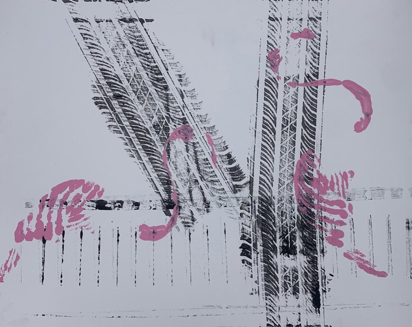
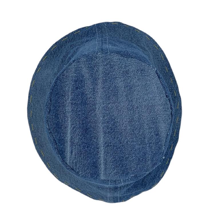
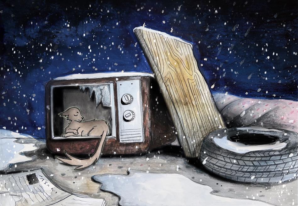
21 The Gallery 01 02 01 | On Track 02 | Deferred Gratification 03 | Textile Landscape Diptych 04 | Wreck 05 | Garbage Man
03 05 22 04
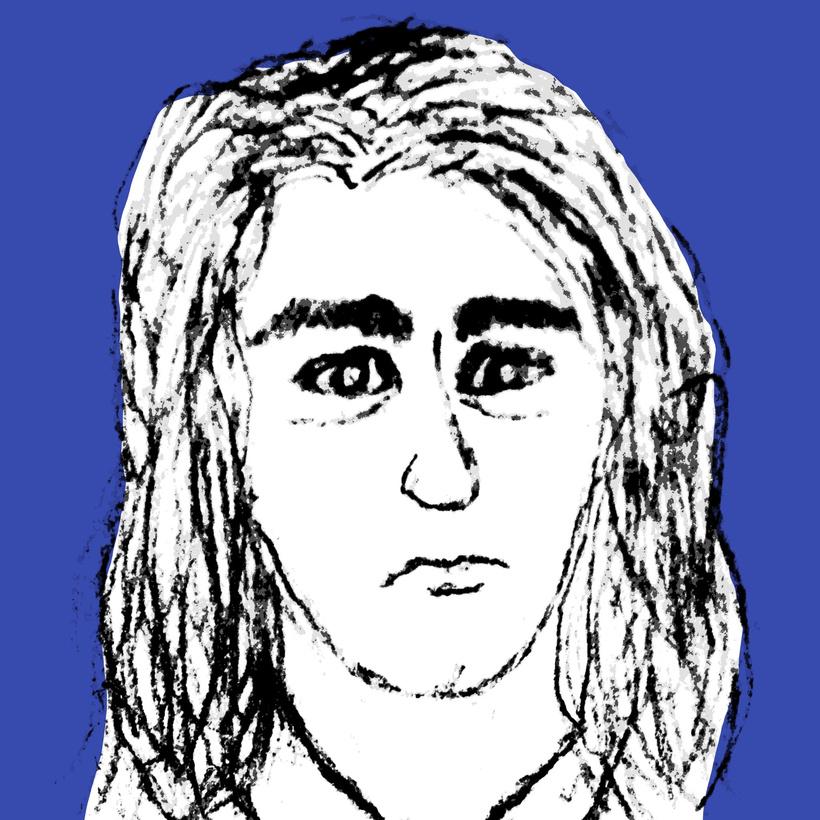
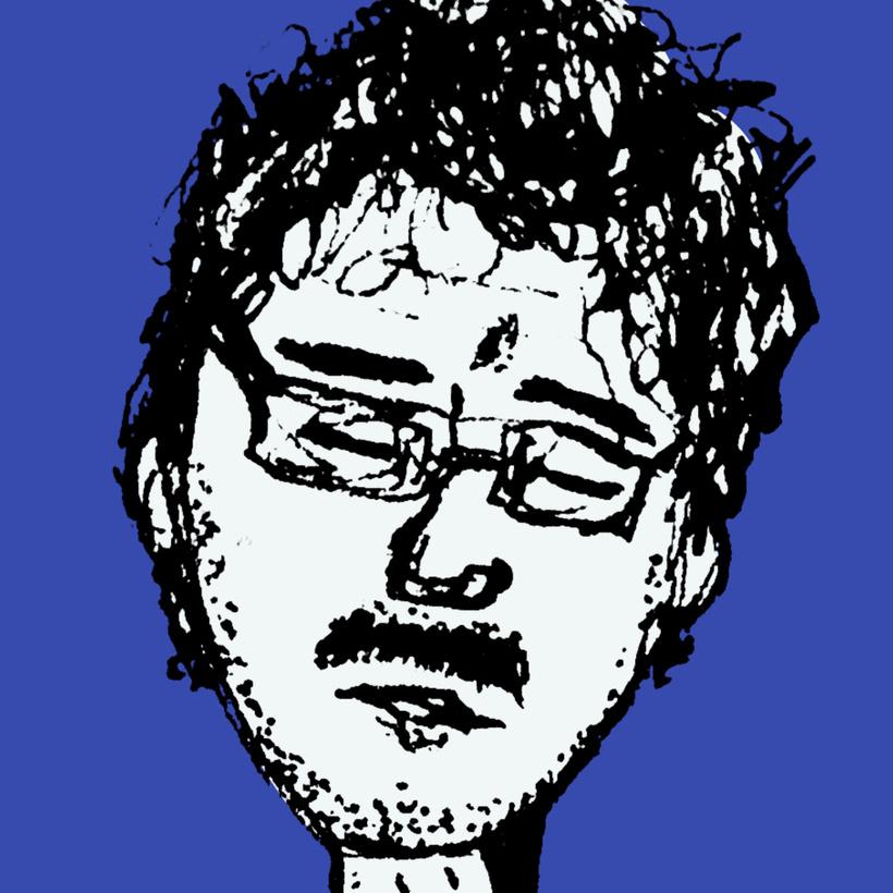
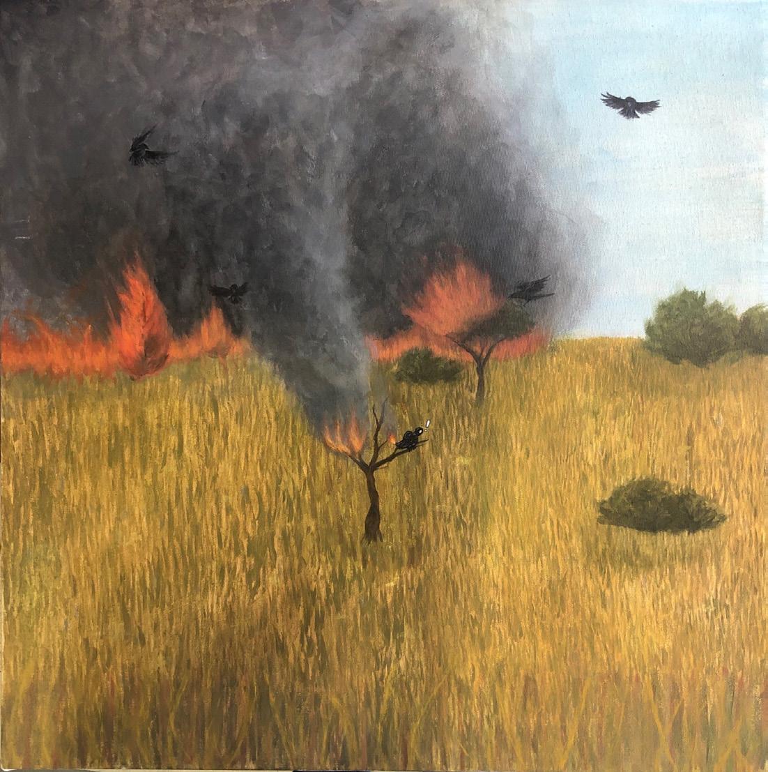
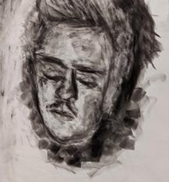
THE ABANDONED
Misha Morozov
23
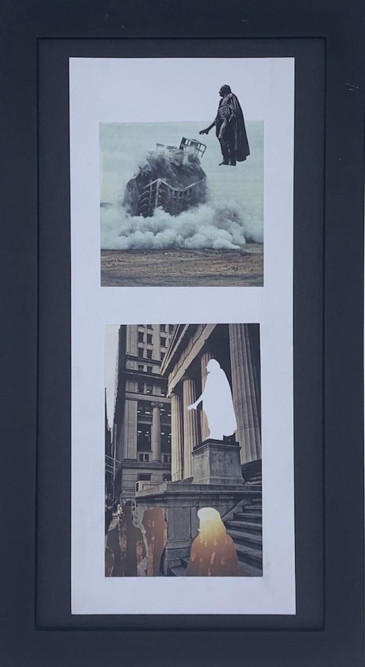
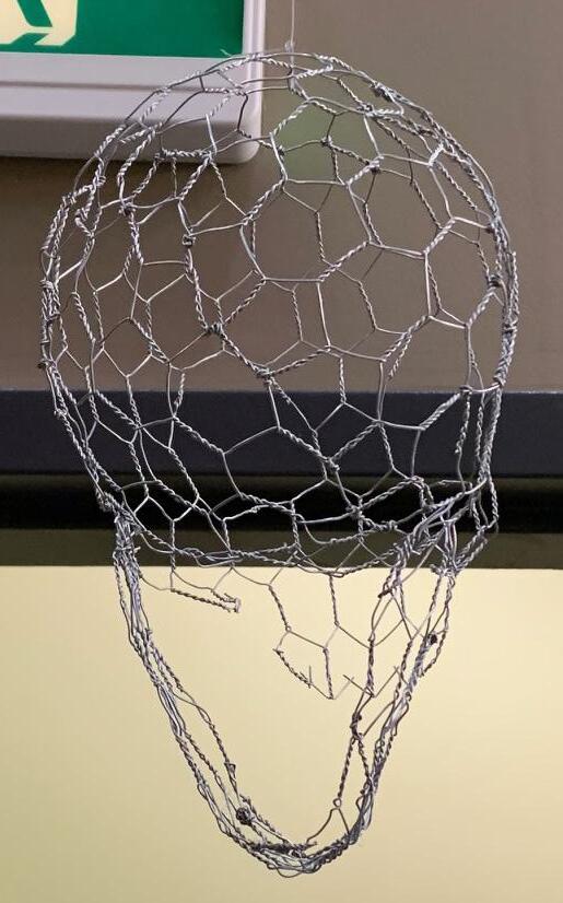
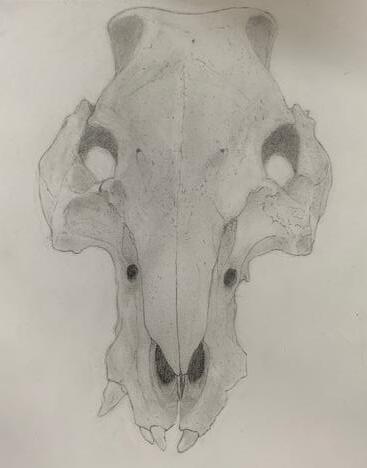
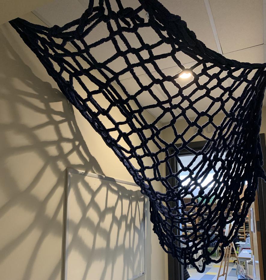
Above all else, I wish to explore the element of form - organic or otherwise - in various mediums. The technical and aesthetic aspects of art interests me more than arbitrarily assigning lofty meanings to my works that were made on a whim. Whatever meaning is assigned to my work is up to the viewer; some of my works are abandoned or unfinished to adhere to the concept espoused by literary critic Roland Barthes’ 1967 essay The Death of the Author, which argues against traditional literary and artistic criticism’s reliance on authorial intent. During this course I have experimented with many physical mediums, most prominently drawing and sculpture. Drawing has been primarily pencil work, which has been focused on very realistic and meticulous shading and detail; my skull drawing is the foremost example of this. I’ve also dabbled in ink, inspired by some of the activities in CAS workshops, which has been applied to my Bosch-inspired ink portrait. A large part of my experience with art has been frustration with the limitations of media both familiar and unfamiliar, accentuated by my short attention span and desire to create something new even before I am finished on a current project. This pattern has led to a slew of abandoned and half-finished works in my wake that has resulted in slow progress over the past two years.
Most of my pieces weren’t made with a specific place or method of exhibition in mind. They’re meant to be easy to transport and exhibit anywhere, whether by hand, on a table, desk, shelf or wall. An exception
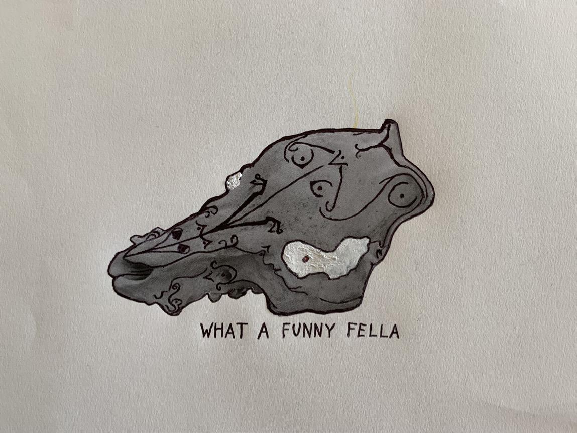
to this rule is my wire sculpture Barnabus, which is meant to be hung from a significant height in a semi-public place. I chose to dangle the sculpture above a doorway in the lobby leading to the stairwell, positioned just above the height of most people. Adding an element of passive audience participation helps the work develop its own meaning as an installation - by provoking a reaction in an audience that didn’t expect to be an audience to anything, the audience is forced to evaluate the work without any established context coloring their perceptions. Because of the different directions in which my artistic intent went, some of my pieces were either rushed to be finished or (initially) left incomplete. Some of my pieces were improvised, either as last-minute changes to previous works or as additions to fulfill a quota. An example of the latter would be my mixed-media piece Funny Fella, which I made in under three hours on a weekend ahead of a deadline. Surprisingly, the piece turned out to be well-received and I have decided to choose it to be displayed for my final exhibition. What this ultimately relates back to is my recurring idea of the audience’s interpretation taking precedent over anything else.
24
25
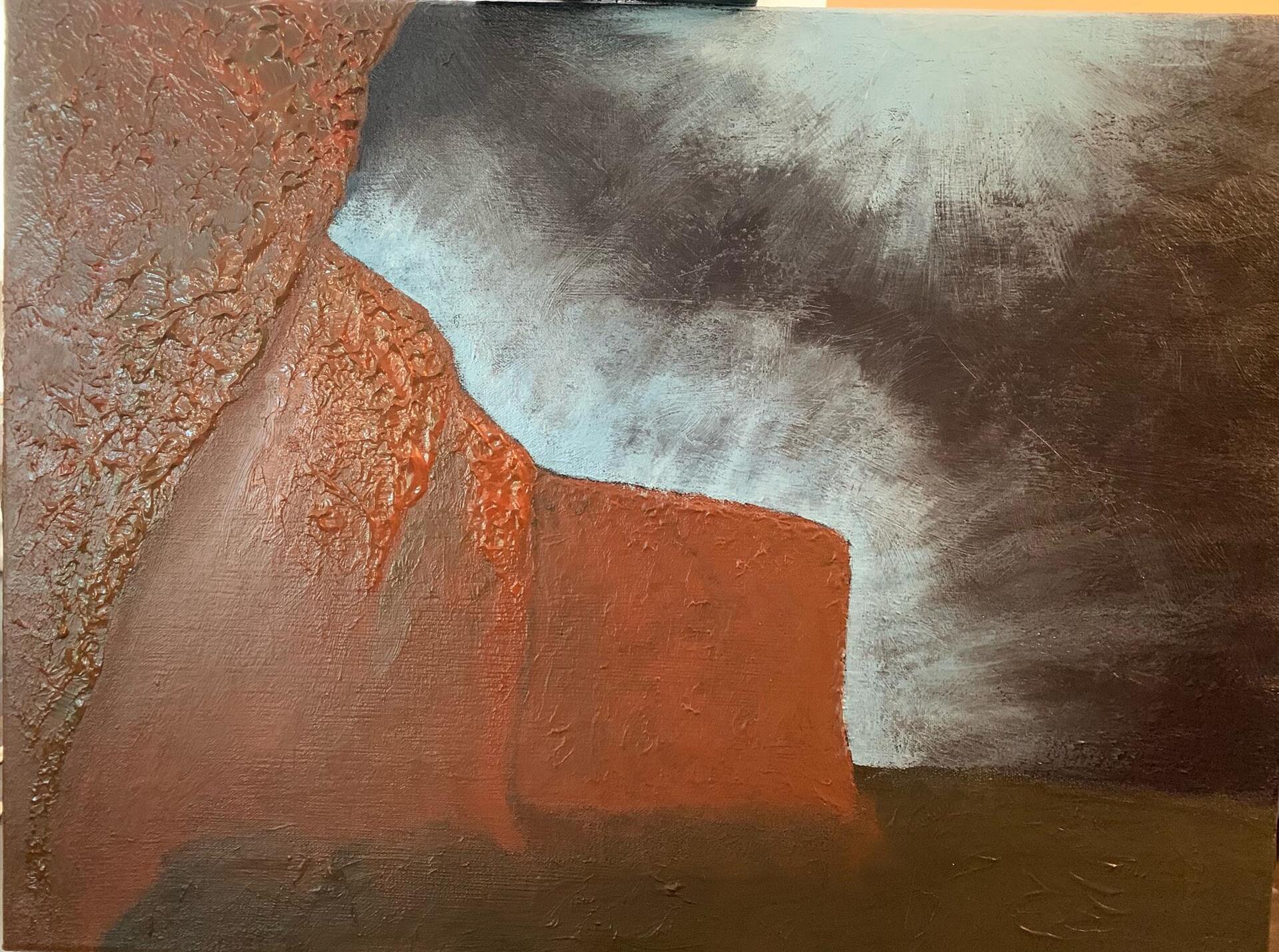
Gallery 01 02 01 | Inverted Cliffs 02 | Funny Fella 03 | Barnabus 04 | Graphite on Paper 05 | With Apologies to O’Keefe
The
03 05 26 04
LANDMARKS
27
Madeleine Quennec
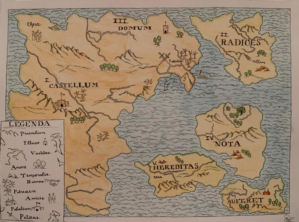
Landmarks is a collection of artworks representing defining moments in my life. This exhibition is composed of five works, with four complementary artworks that inform or respond to the third piece, central to the display. Carta Psyche is the first piece that the viewer sees upon entrance, representing locations, phenomena, and significant events that give the viewer context for later pieces. In Carta Psyche, I took inspiration from these utilitarian visual representations and redefined them in Carta Psyche’s guiding key to create an emotional meaning. For instance, the island labelled “radices” is Latin for “roots”, and the land to which it is ascribed in Carta Psyche represents a place that contains familial roots.
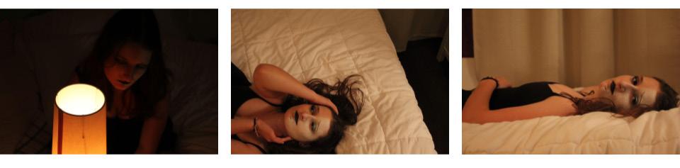
Landmarks displays my pieces sequentially, and according to the time period of these events’ influence. After Volatility, the colour palette of my pieces become darker and the topics more mature. Volatility is the conceptual crux of Landmarks, an abstract response to the trauma that I
endured upon experiencing sexual assault as a 14-year-old girl. ego death is the next piece in displayed in sequential order of the exhibition, bridging the temporal context prior to and in lieu of this traumatic event. The familiar textures of the bed and warm tint of the photos create a soft and intimate mood, while still touching on mature and turbulent themes. Ultimately, Landmarks demonstrates the emotional toll inflicted upon me in the aftermath of a defining moment during my lifetime. It is intended to immerse the viewer in a holistic representation of myself, evoke empathy with my personal experience, and understand how the events have shaped my current state of emotional being. The presentation of my works in a time-related progression allows the viewer to connect and contextualize themselves with myself as the artist, and empathize more deeply with the distress being conveyed in my work.
28
29 The Gallery 01 02 01 | Volatility (front view) 02 | Volatility (rear view) 03 | Dark Matter 04 | Carta Psyche 05 | Ego Death
03 05 30 04
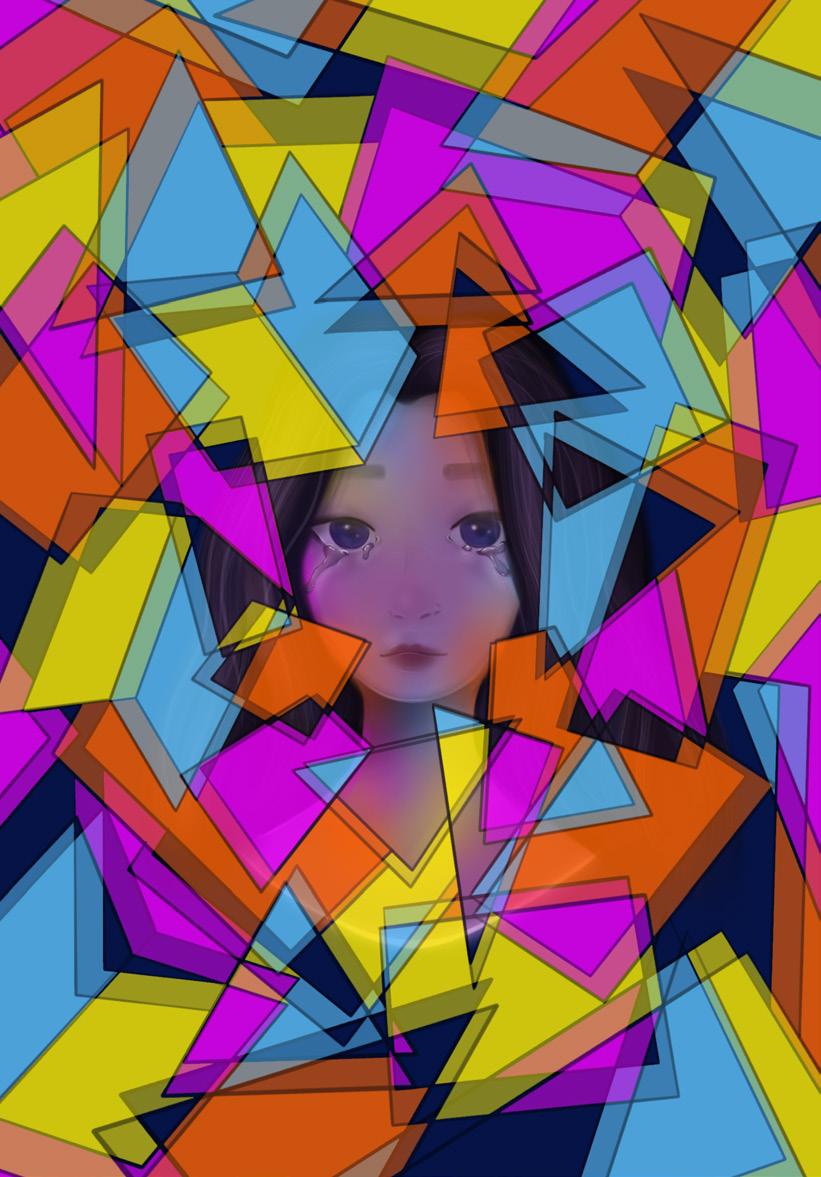
SPEECHLESS
31
Noelle Quennec
Speechless is a look into identity as a whole. It’s a look into the concept of your own understanding of yourself clashing with how you’re known to others. My work embodies not just the pessimistic side of this but also aims to represent the highlights and celebratory, hopeful stages. The pieces I selected for this exhibition center around a figure or portrait to draw a clear connection to identity and the internalized side of the issue. I selected each work carefully to reflect the topic of identity to illustrate my own experience with being in a constant and tumultuous state of discomfort and confusion. The works are meant to evoke varying emotions and create different moods to illustrate the intense and turbulent experience of knowing yourself and hiding yourself.
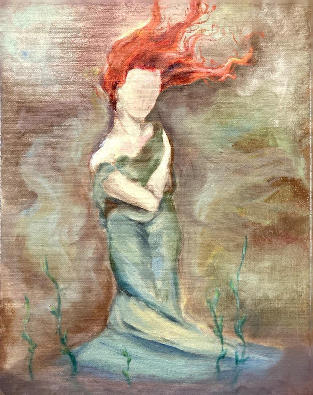
Skin explores the feeling of being trapped in your skin, and the smoothly connected brushstrokes are aimed at creating a visual representing a straitjacket. Mask delves into the emotionality and sense of belonging of youth that becomes out of reach as you grow up, and to do so in a nostalgic, joyful manner. The two hang beside each other to suggest that the idea of the mask or face is what’s missing in Skin. Though Mask was intended to reflect positivity, its connection with Skin brings to light that it represents taking on a past identity in
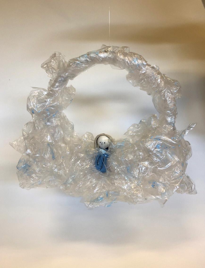
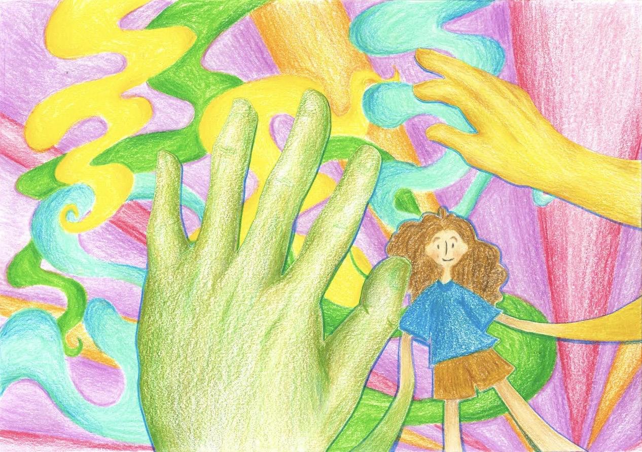
order to hide one’s present self. My pieces Cloud Wreath and Hopefully are similar in incorporating the cartoon version of myself. In Hopefully, the simply designed cartoonish character adds levity to the main subject and represents positivity and hope in the midst of struggle. Cloud Wreath aims to create positivity that illustrates solitude without bringing negativity to it, done so through the blue accents and character’s peaceful lack of expression. These works contrast with Waves, a pencil drawing that incorporates realism as opposed to the previous cartoon style. The serious face and medium emphasize the graveness or seriousness of the exhibition’s subject matter and strays from the lightness of the cartoon-style pieces. It’s a self portrait that connects with Mask through the pulling of the skin which suggests a hidden identity beneath, and the action of pulling the skin suggests a feeling of being trapped in it much like Skin. All in all, the pieces I have selected represent my own ongoing experience with identity and the seemingly endless ups and downs.
32
33 The Gallery 01 02 01 | Cloud Wreath 02 | Hopefully 03 | Mask 04 | Skin 05 | Waves
03 05 34 04
35
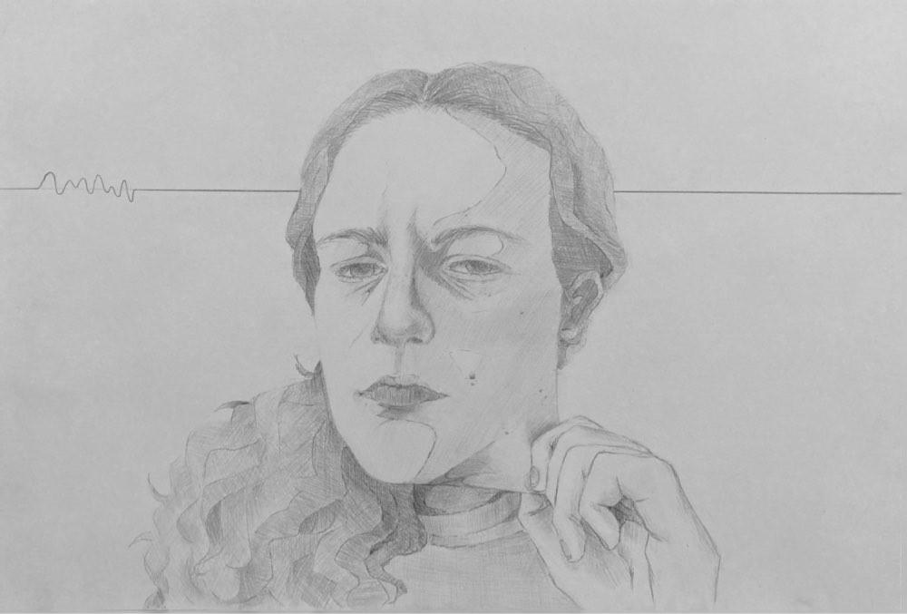
INTERLUDE Claire Treacy
My body of work encapsulates my personal worldview. Every piece illustrates a moment, a concept, or a place that has been integral to the formation of my identity. Through the use of various 2D media I created an exhibition that is essentially a visual diary – A documentation of my eleventh and twelfth grade psyche. Some of my pieces represent almost uniquely female experiences, like the expectation of beauty, but others represent a broader teenage perspective. Over the past two years, I have aimed to strengthen and affirm my drawing abilities, but also to investigate media new to me to give myself more range. Additionally, my art used to be solely about technical competence, but through this exploration I geared towards more conceptually engaged work.
Home and Interim are placed in the centre wall which the audience sees first. Home illustrates my place of origin, East Vancouver, and Interim is a depiction of myself – these are literal representations of me and where I am from. As my exhibition revolves around my worldview, I placed the other pieces adjacent to Home and Interim; Depictions of inner thoughts flank the more literal, introductory pieces. I arranged pieces with similar concepts or details which illustrate an artistic progression together to make the showcase cohesive. For example, Safe and Unsafe are relevant to each other because they illustrate the influence of diet culture on my view of certain foods through juxtaposition of colour and composition. Furthermore, despite Cat Robot and Teenage Endeavours not being thematically related, there is a detail popping off the page in both pieces; This is inspired by Sonny Assu, an artist I studided through grade
eleven and twelve. Teenage Endeavors utilizes a grungy style inspired by David Rappeneau, whereas Cat Robot mirrors the wholesome style of Eisaku Kubonouchi. There is a clear thematic shift between these pieces illustrated through stylistic choices. They present both a technical and artistic progression as well as the transition from an imaginative childhood to a grungier teenage experience, hence their placement next to each other.
Within my pieces, specifically Teenage Endeavors, Cat Robot, and A Girl’s Walk Home, there is a sense of audience interaction through the composition. For example, the framing of A Girl’s Walk Home gives the viewer the sense that they are the person staring through the bushes. Colour, or lack thereof, inherently creates mood. The near-complimentary contrast between red and blue in Needy and Pursuit of Beauty is used to create a strikingness which informs the concepts. A monochromatic purple colour scheme is used in A Girl’s Walk Home to set a mysterious night scene. In Safe and Home, bright colours are used to express a sense of comfort, whereas greyscale is used in Unsafe and Teenage Endeavors to convey the opposite feeling. Ultimately, I intend for the viewer to learn about me and the experiences that have shaped my worldview and some semblance of identity. I hope that “Interlude” is taken as a visual narrative and documentation of my life for the past two years.
36
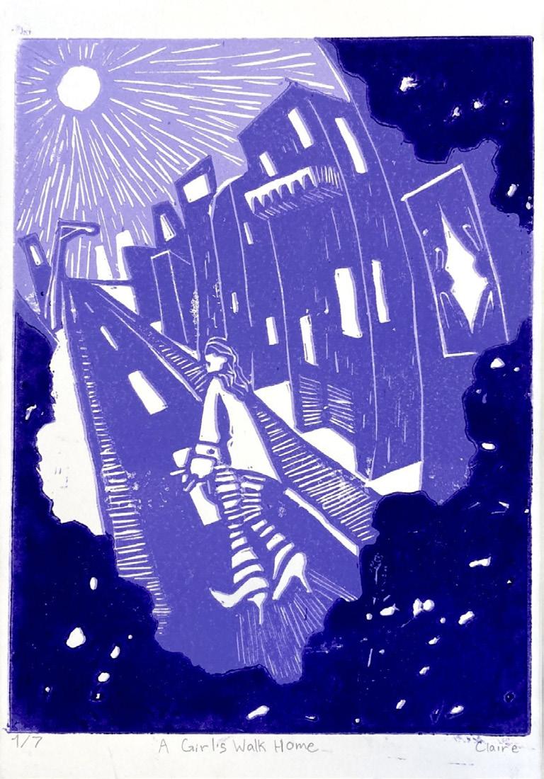
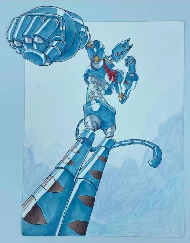
37 The Gallery 01 01 | A Girl’s Walk Home 02 | Cat Robot 03 | Home 04 | Needy 05 | Pursuit of Beauty 06 | Teenage Endeavors 02
03 05 38 04 06
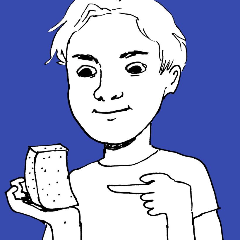
IDENTYCZNOŚĆ
 Adrian Yeldan
39
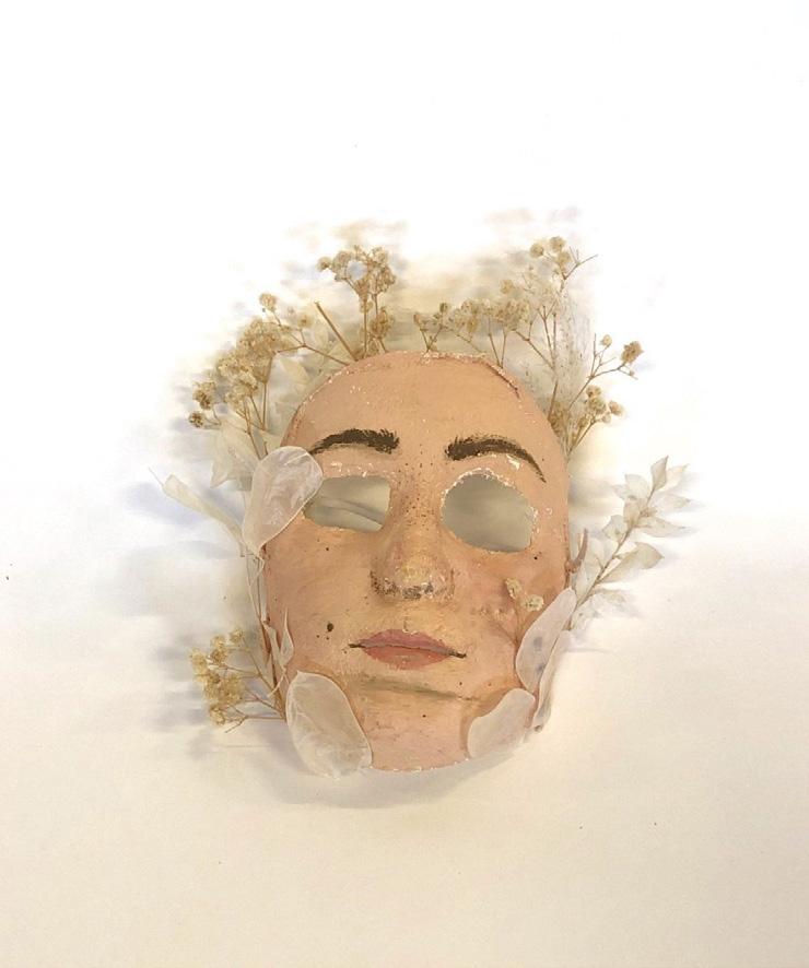
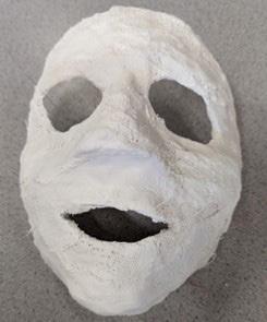
My exhibition, Identyczność or Identity, tells the story of my journey of selfexploration and self-expression through various materials, styles, and messages. Each piece deals with themes of self-acceptance, identity crisis, and the idea of change. Digital media is a recurring medium, but I also used charcoal and painting to represent different perspectives of myself. The exhibition is organized like a comic strip to present the pieces in a storytelling manner, with works displayed from left to right and ending with a triptych which brings the exhibition together. I specifically chose to include the sculpture, The Mask in this exhibition as it allows the audience to interact with the display and explore its message in all dimensions and perspectives. As the mask symbolizes me not constantly feeling like myself or hiding behind a mask, the viewer can interact with it to view this idea from my perspective.
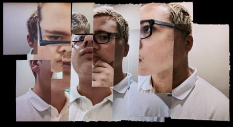
I aim to challenge the viewer’s perception of reality by distorting figures and removing body parts to create confusion and fear that resonates with the audience. For example, in Puzzled, I cut up and reassembled a face to develop a sense of confusion and disorientation. At the same time, in Existentialism, I presented a body-less head in its environment to challenge my feeling of completeness. In addition, my use of texture and colour creates a softer, more contemplative mood in pieces such as Czy To Moj Dom and Two Worlds Apart, which explore the impact of culture and place on
my ever-shifting identity. The exhibition also highlights significant events and struggles and connects them to my culture and heritage. Having not lived in Poland since I was three, I relate these pieces to my cultural identity and represent what I love about my culture and heritage, what I miss about my home and the contrast between my life in Canada.
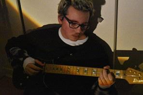
My main objective is to encourage the audience to question my work, as it is not meant to be interpreted from one perspective alone. I hope they will learn that life is constantly changing, and we must learn to adapt and move on despite the obstacles that come our way. We may face challenges that knock us down, but there will always be a helping hand to pick us up. For example, in A Polyphonic Tryptych, the guitar symbolizes what helped me through difficult times while questioning who I am and my purpose. I intend for my audience to self-reflect after they view this exhibition and feel connected to my story and the meaning behind the pieces. By carefully planning the exhibition pieces and putting my all into the creative process, I aim to achieve this effect on the viewers.
40
41
01 01 | A Polyphonic Tryptic 02 | Puzzled 03 | Existentialism 04 | Czy To Moj Dom? (Is this my home?)
The Gallery
04 02 42 03


STAY CONNECTED www.stratfordhall.ca @StratfordHallSchool @Stratford_Hall @Stratford_Hall 2023 Stratford Hall | 3000 Commercial Drive, Vancouver, BC Canada V5N 4E2 | www.stratfordhall.ca