
The StoJournal for Architects

Building with conscience.

How photography can preserve a legacy Colour in the architecture of Michael Wilford
Colour gives architecture a very distinct character that, in turn, every observer perceives in a different way. At the same time and as a legacy of the architect, successful and evocative architecture is built to last generations. To preserve the original splendour in all its colour at the end of a life cycle, a building can also be captured for the ages in a photo, as Richard Bryant did with the buildings designed by the late British architect Michael Wilford, who joyfully applied a vibrant colour palette to his architecture.
Watch the short documentary ‘Building with Colour’, which explores the role of colour in architecture through the work of Michael Wilford (1938–2023):

It was forever there, in gas, in pigments, in minerals, long before we inhabited the earth – colour.
Colour is something we all see – but not necessarily in the same way. What for one person is deep purple, may well be brown for another – and we may not even notice. Over 300 million people suffer from various forms of colour blindness, that equates to almost the entire population of the USA.

If you are a person with a particular kind of synesthesia, you may perceive a colour for a day of the week, or a name. For example, mention Monday and my husband sees a greeny yellow; while his own name, Richard, is very red. It‘s not universal though, another person with synesthesia may interpret the same words with different colours.
Colour can be as ephemeral as a rainbow or the aurora borealis. Colour is in our head, we don‘t really “see” colour, but rather reflected light interpreted in our brain. But for the purpose of this text, let us assume we all see within a similar colour range. It seems the first colour used for decoration and communication was a dark red ochre pigment – the painting of a pig on a cave wall in Indonesia that is with certainty at least 45,500 years old. Now that is truly a legacy in colour.
Preserving a legacy through photography
This legacy has been shared thanks to photography, initially analogue in black and white, then in colour and now as digital images.
Together with video, photography is the medium used to transport us to places we may never visit, or places that have been forgotten or lost. A photo represents a legacy, showing a
place or capturing a moment, both of which are waiting to be re-imagined, remembered, revisited or re-lived. We can visit many more buildings through photographs than we can by actually being there. Prior to photography we relied primarily on the written word, which upon reading conjures up different images for everyone – similar to when we listen to something on the radio.
Add to that our ability to describe and see colour differently, and that makes everyone’s perceived image of a past time and place, let’s say the Hanging Gardens of Babylon, unique. Leap forward to a lost icon within the age of photography and we are all only too aware of what the Twin Towers looked like. With or without colour, what we create today is a legacy for tomorrow.
Colour in the architecture of Michael Wilford
Architect Michael Wilford had a love of colour, an attribute that no doubt caught the attention of Sto and led to a lifelong working relationship. Michael‘s architecture and vibrant colour palette, together with a consistency in photography, have enhanced both the Michael Wilford and the Sto brands. Enduring images perceived through a single eye, that of Richard Bryant, provide a unified photographic legacy
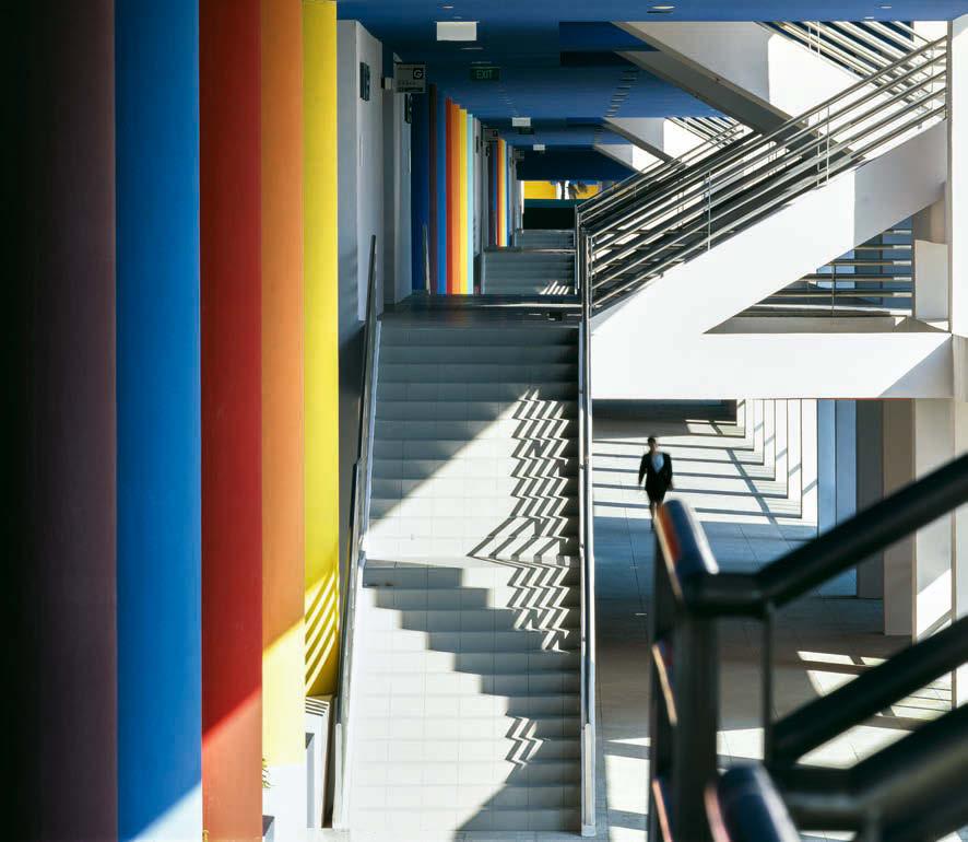
Colour can be a useful tool in defining a space, contributing to well-being and of course, branding. When Michael used colour, to me that colour had a single purpose – to be joyous: one of my all-time Michael Wilford favourites are the columns at Temasek Polytechnic in Singapore. Those columns with their colours should be listed, they define the building.
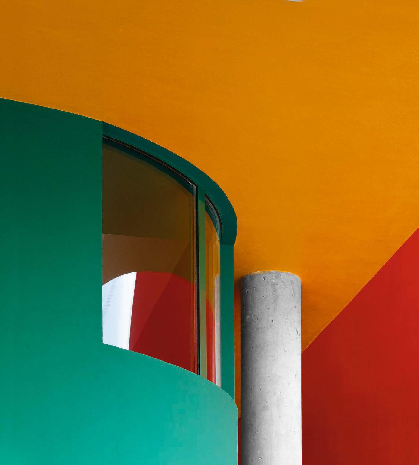
Can we ever imagine the handrails at the Staatsgalerie being anything other than pink and blue, or the triangular window at the Clore Gallery at Tate Britain being anything other than green? This is all part of Michael building a legacy, where colour is integral to the design.
The emotional aspect of colour
Colour can be very personal and evocative. Visiting the Fogg Museum extension at Harvard, the wall colours took me back to my childhood, back when my favourite colours were – as I called them – lemon and mauve. I had my bedroom and for several years, even birthday cakes, in these colours.
For an architect like Michael Wilford, commissions for Sto – with its vast array of colour products to work with – must have been like Charlie in the Chocolate Factory seeing the river and waterfall made entirely of chocolate.

A documentary especially commissioned by Sto, ‘Building in Colour’, explores the subject in depth – colour that is, not chocolate!
Preserving a personal legacy
Each and every one of us leaves a legacy, personal and professional. Our professional legacy may influence generations, possibly even across continents. Not all legacies are as clearly apparent as creating a life-saving drug or founding a charity. Many people keep personal diaries, writers have easily accessible publications, the artist‘s works may be appreciated in galleries and are available as reproductions. The legacy of an architect is the building, anchored and immovable in its commissioned location. If successful in quality and function, it could be used over many lifetimes, becoming an integral, identifiable part of the lives of the communities it serves. An icon, even.
If colour is an integral part of the design, will that colour be maintained and protected? Or will it weather and change, or even be abandoned to the whims of fashion? What is certain is that if the original architect has invested in quality photography, whatever happens to the building, their intention will forever be available for research and the architect will have immortalised their legacy.
When recorded and saved, the use of colour, brilliant or subdued, and structures, spaces, materials and processes, leaves a legacy that would be of interest to students and historians beyond the world of architecture. How you preserve it presents a challenge. Documents and images produced photographically or digitally are fragile. They are at the mercy of online platforms continuing to support the software and of the compatibility of old and emerging technologies.
I‘m not advocating a return to drawing on vellum or tablets of stone, what I am in favour of is editing a core collection of work. Print out key photographs and keep them in archival sleeves in a fireproof cabinet, in the same way as important drawings and documents A simple way to ensure your legacy is not lost.
Colours inspired by nature
The chemical- and pigment-based colours we make can last, but for the longest lasting naturally brilliant colour, we look to nature and structural colour. Structural colour often appears as the brightest form in nature, characterised by a dazzling metallic sheen. Such colour is 100% reflective, so it can even be seen in the deep sea. The peacock leaves an iridescent legacy in every feather, which never fades. Instead of being pigment-based, these colours are produced when light is refracted by the proteins in the feather.


It‘s complicated, there‘s a lot of research being undertaken and it will be a long time before structural colour can be manufactured on an industrial scale. Harnessing the qualities of structural colour –its colourfastness and very light weight – will be yet another legacy of nature. Meanwhile, the colour palette and number of finishes Sto provides will continue to expand while research into future materials advances.

 Watch our new film, ‘Building in Colour’ (15:40)
Image: Richard Bryant/ arcaidimages.com featured in ‘A Legacy in Colour’ exhibit, London 2023.
Watch our new film, ‘Building in Colour’ (15:40)
Image: Richard Bryant/ arcaidimages.com featured in ‘A Legacy in Colour’ exhibit, London 2023.