
How to Read Candlestick Charts for Intraday Trading

Intraday trading is a way of trading in stocks where the trader buys and sells stocks on the same day, leaving no open positions at the end of the day. So, daily traders try to buy a share at a low price and sell it higher or short-sell a share at a high price and buy it lower within the same day. This takes an in-depth knowledge of the market and relevant facts that can help them make the right choices. On the stock market, the price of a share is based on its demand and supply, among other things.
This is how candlestick chart patterns look:

Candlestick charts or you can say candlestick chart patterns show that emotion by showing the size of price moves with different colours. Traders use the candlesticks graph to make trading decisions based on patterns that show the short-term direction of the price.

Components of Candlestick

In technical analysis, we will talk about time frames at some point in the future, but for now, let’s just say that there is something called “time frame,” which means that a daily candlestick shows the market’s open, high, low, and close prices for the day. In another case, if we choose 15 minutes, a 15-minute candlestick shows the market’s open price, high price, low price, and closing price for those 15 minutes.
• The part of the candlestick that is wide is called the “Body.”
• Above and below the body are vertical lines called “wicks” or “shadows” that show the lows and highs of the stock’s traded price.
Does candlestick charts pattern analysis really work?
Yes, it does work, but not all chart patterns with candlesticks do. Let me help you with some real-world candlestick patterns that work. Some evidence shows that analysing candlestick chart patterns can be a good way to predict how the market will move.
Candlestick charts are a great way to figure out how investors’ emotions and how demand and supply, bears and bulls, greed and fear, and so on, affect each other. Traders need to remember that although every candle gives enough information on its own still you can not be so sure based on that info, it is highly advisable that it can only be identified by comparing one candle to the previous candle and the candle next to it
Traders need to know how to read trends in candlestick charts if they want to use them. We divided the patterns into 3 parts to make them easier to understand:
• Bullish patterns
• Confusing patterns
• Bearish patterns
Bullish patterns in the stock market
• The Hammer Pattern

This candle has a short body and a long wick at the bottom. It is generally at the bottom of a trend that goes down. It means that even though there was a lot of pressure to sell, the prices went up because a lot of people bought. If the body is green, the bull market is stronger than if the body is red.
• The Bullish Engulfing Pattern
This is a pattern with two candles. The first candle is short and red, and the second candle is big and green. It means that the market is bullish, which drives the price up even though it opened lower than the day before.
Confusing patterns in the stock market
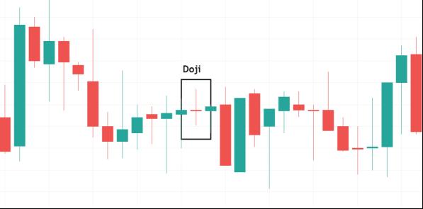
• DojiThe Doji is considered to be one of the most important single candlestick designs because it shows how the market sentiment. When a stock’s starting price and its closing price are the same, this is called a “Doji.” Since the starting price and the closing price are the same, these candlesticks have almost nobody. Here’s what a Doji looks like means that bulls tried to close it on the top of the candle but couldn’t, and bears tried to close it on the bottom of the candle but couldn’t. This shows that the market is confused because buyers and sellers couldn’t close at their favourable positions

Bearish patterns in the stock market
• Shooting Star
This candle has a short body and a long wick at the top. It is often at the top of a trend that is going up. Usually, the market starts the day higher than it did the day before. It then goes up for a while before falling like a shooting star. It shows that sellers are in control of the market

• The bearish Engulfing pattern
This is a pattern made up of two candlesticks. The first candle is a short green one that is swallowed up by a big red candle. It generally happens when things are going up. It means that the market’s rise is slowing down and that a drop is coming. Most of the time, a decline is stronger if the red candle is lower.
Recommended: Also Read this blog post on Inside Bar Candlestick Pattern as well.
