Stephanie Murray Design Portfolio


The reason I chose to study Interior Design was, I truly believe that design has an impact on everyones lives, and I wanted to do something that would have a positive influence on others. In the Spring of 2019, I graduated from Miami University, where I studied Interior Design, Architecture, Graphic Design, and User Experience Design. I received a Bachelors of Fine Arts in Interior Design and a minor in Graphic Design. Then I continued my education at the University Of Notre Dame for graduate school. I received a Masters of Science in Management which is comparable to an MBA but designed for non-business undergrad students.
I was born and raised in Pittsburgh Pennsylvania, but I love to travel and experience new places. Traveling has given me a different and more holistic approach to design. I have always been eager to learn, and have found myself passionate in expressing my creative side. I am ready when presented with an opportunity to enter the world of design and continue to learn and develop into a designer.
One
Tree
Katy Popple Design
Kitchen/Bath/Living Room Renovation
Two
Healing Home Cancer Center
Thesis Project
9 Month Project (4 Months Designing/ 5 Months of Research)
Three
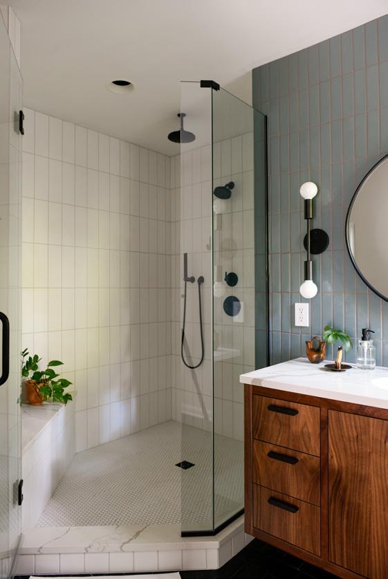
Fox Chapel
Katy Popple Design
Kitchen & Bathroom Renovation
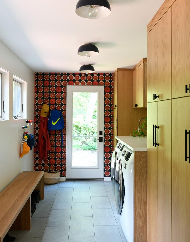
Four
Point Breeze
Katy Popple Design
Whole House Renovation and Styling
Five
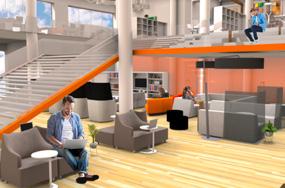
Stantec Satellite Office
Design
Senior Year
4 Month Project
Six
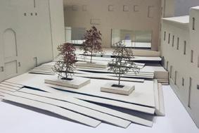
Uffizi Museum Exit
Junior Year
3 Month Project
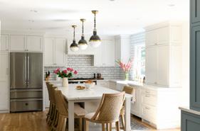
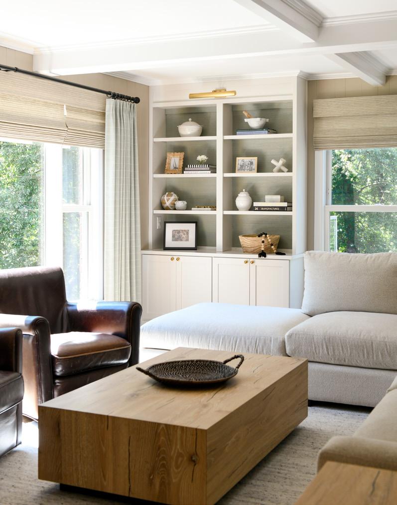
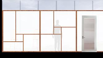
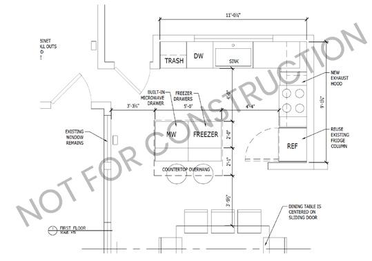
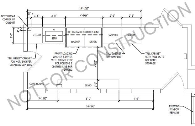
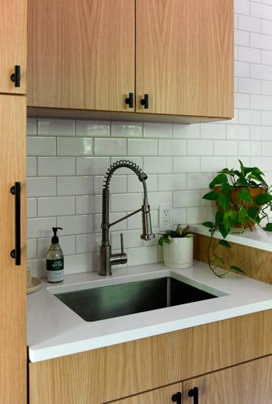
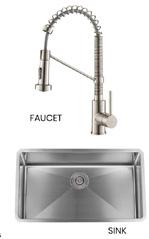
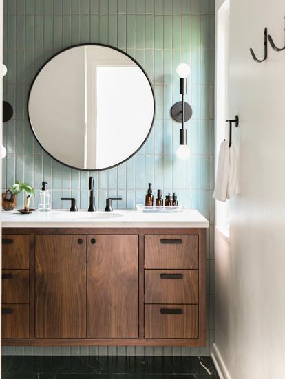
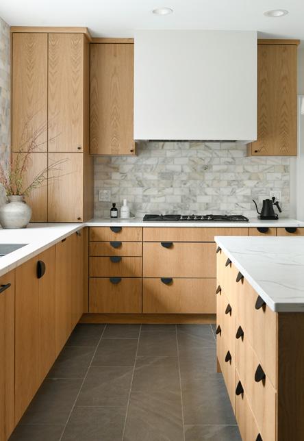
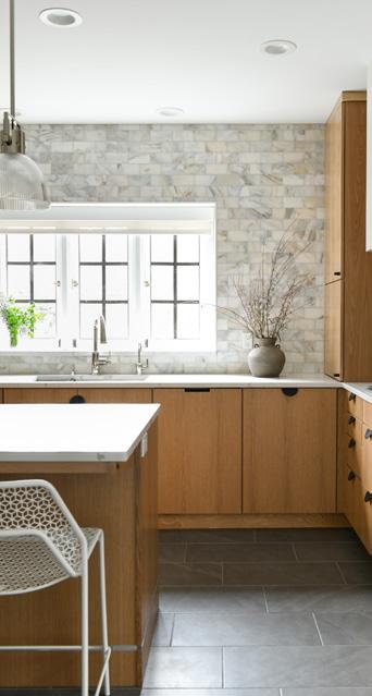
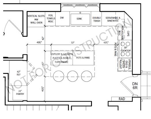
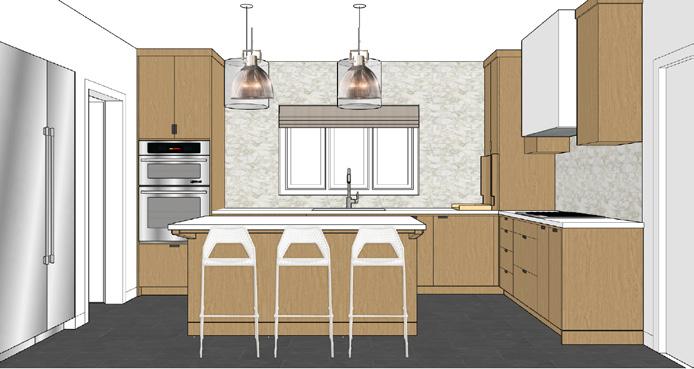
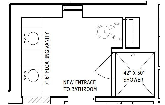
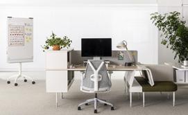
This project was completed while working as an Interior Designer at Katy Popple Design. We worked as a team through the whole process, from construction documents, finishes, to the final renderings.
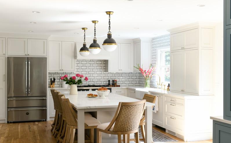
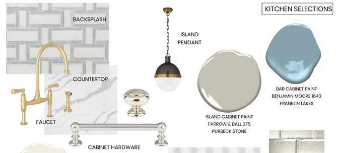
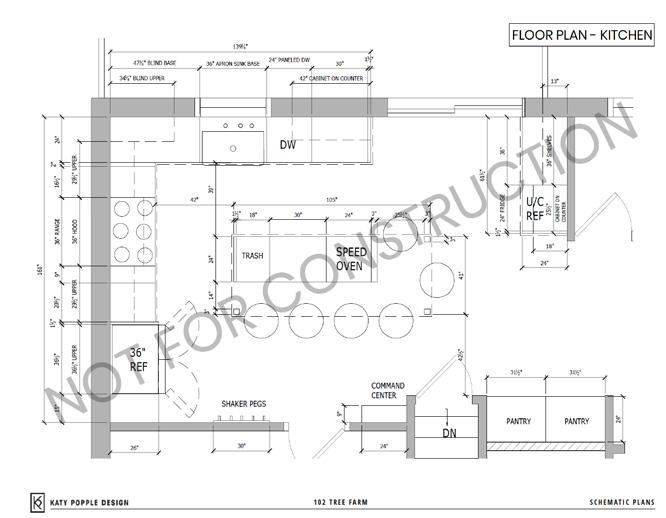
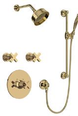
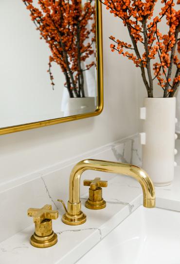
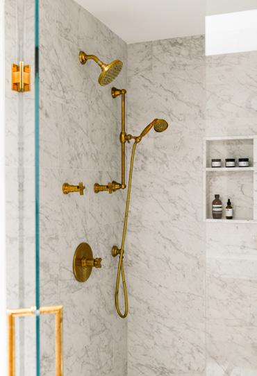
This New York / Glam style kitchen is finally functional for this family.
Prior to renovations the upper cabinets weren’t even a foot from the counter tops making it nearly impossible to store things on the counter.
The main goals for this family were to gain an island, pantry space, and a bar.
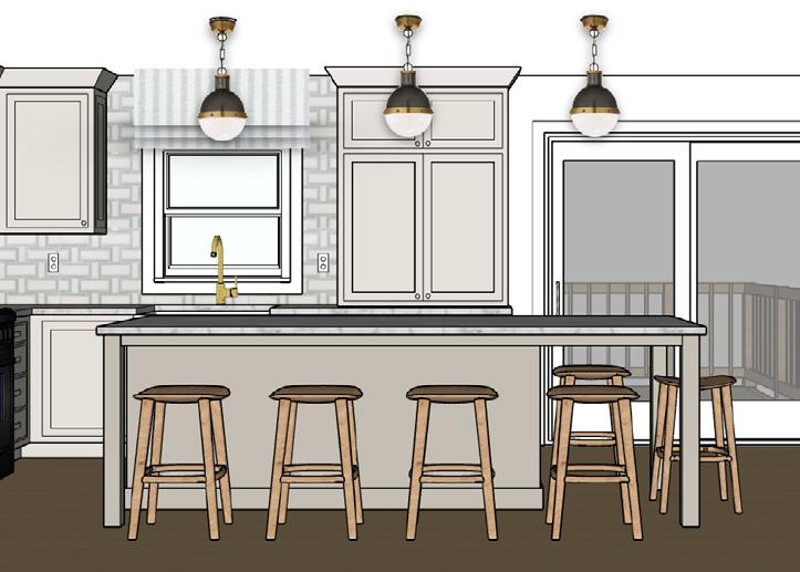
 Kitchen: Sketch Up Rendering
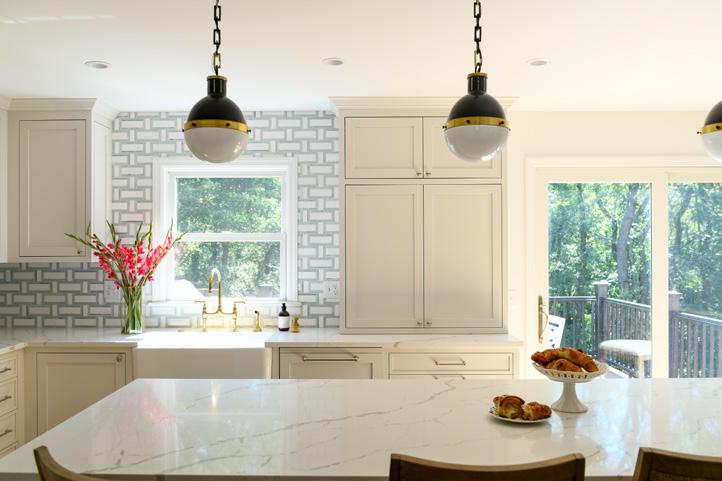
Kitchen: Reality
Kitchen: Sketch Up Rendering
Kitchen: Reality
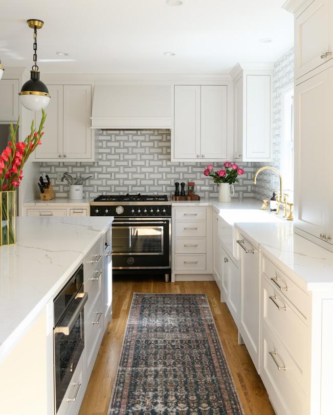
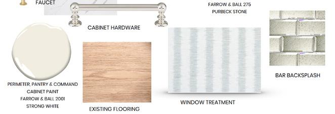
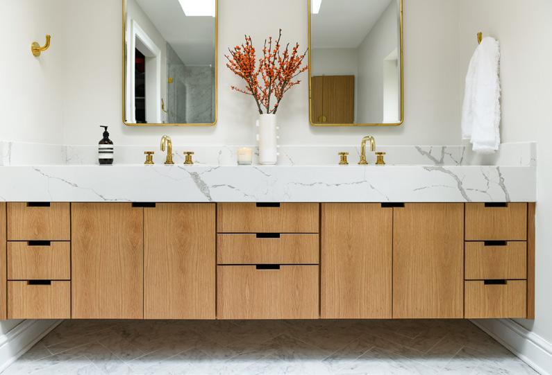
The back splash in this kitchen was our starting point and once our client told us they loved it our ideas took off. The basket weave was elegant and aligned with the clients glam style.
The family was constantly on the go and often has a quick grab and go meal, so they wanted enough seats at the island for the entire family. By adding an overhand to the island we were able to get two more stools the counter.
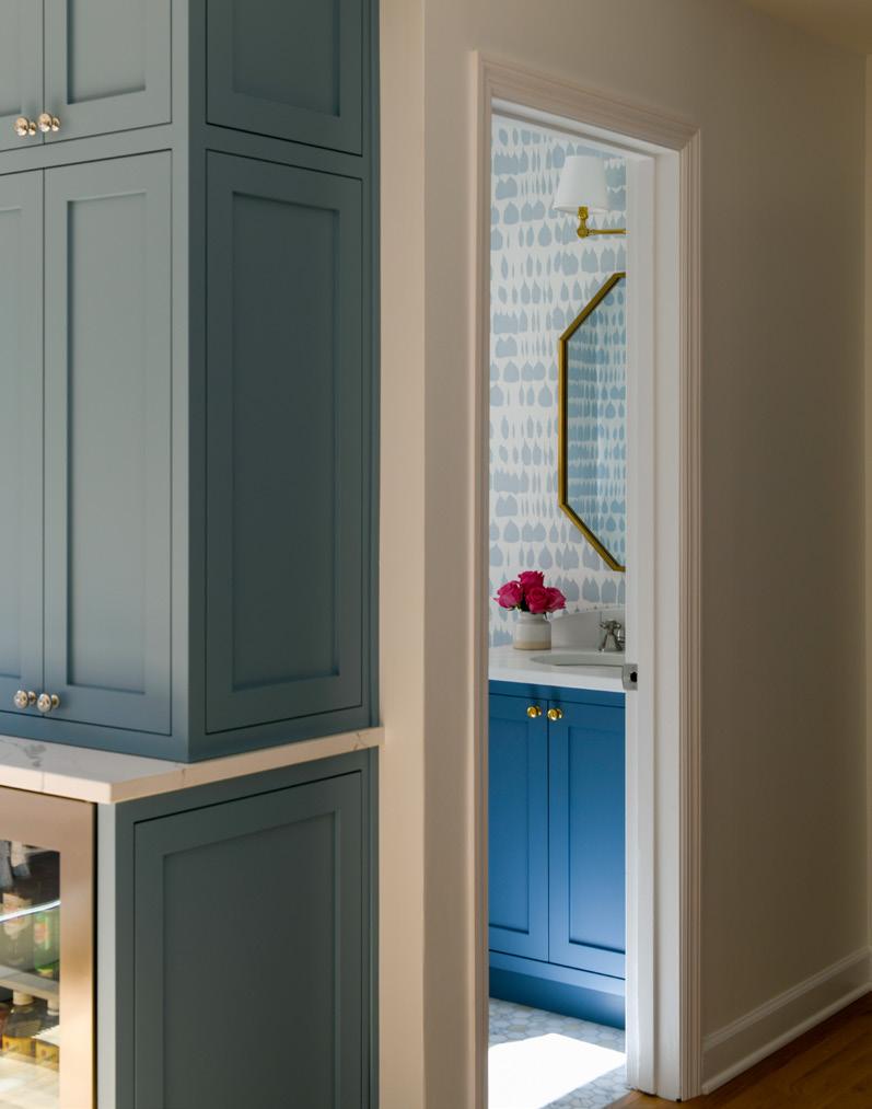
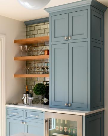
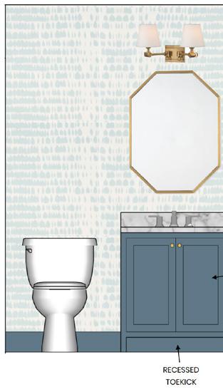
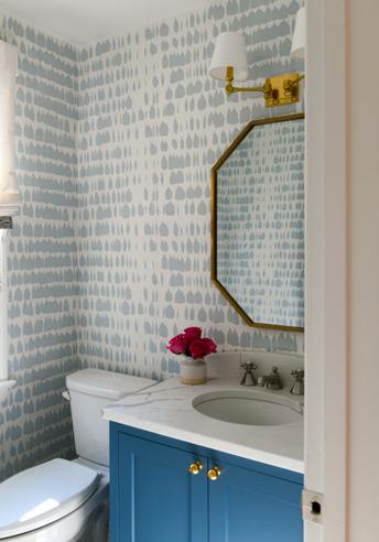
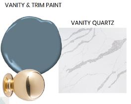
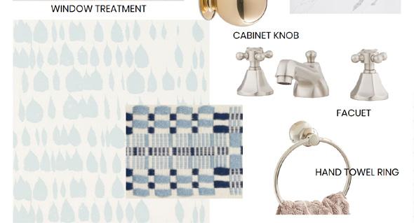
The bar pulled together all the elements we renovated. Having the blue cabinets tied in the blue from the back splash, and the blue from the wallpaper in the powder room.
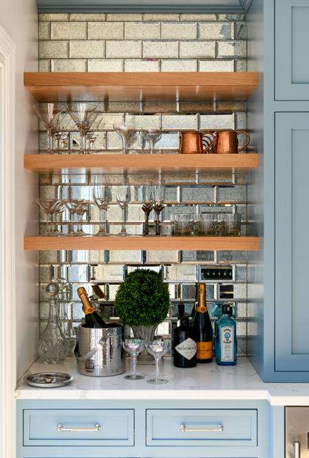
What we loved most about this space was the mirror back splash, not only did it add the element of glam, but it reflects the light from the sliding glass door to bring more light into the space.
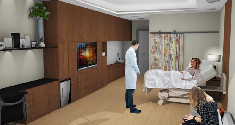
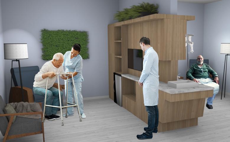
The Healing Home Cancer Center was inspired by my grandfather. He passed away in 2017 from cancer and spent a majority of his final time in a hospital. The Healing Home was designed for blood cancer patients. During their treatments patients must stay in the hospital for at least a month. I chose this as my passion project because I think healthcare is an example of how design can positively impact patients.
My goal was to create a place that gave people freedom. The biggest complaint people have during their treatments is the loss of privacy, choice, and control. These three words were the focus throughout my whole project and it was my mission to create a space to give patients all of these things.
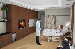
Patient Room: Perspective 3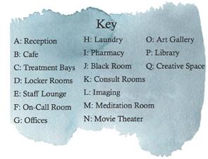
I created privacy by tucking the patient’s beds behind the bathroom walls, so when the door opens to their room you don’t instantly see the patient.
Choice was created by giving patients things to do during their stay; they can use the movie theater, meditation space, art space, take an art class, the library, art gallery, or roam the healing gardens.
Control over what they do or their environment was provided by using RF (GPS) tags to allow patients to roam the space freely. They can control the temperature of their rooms from their bed.
O Healing Garden: Perspective 5 Creative Space: (Q) Elevation 4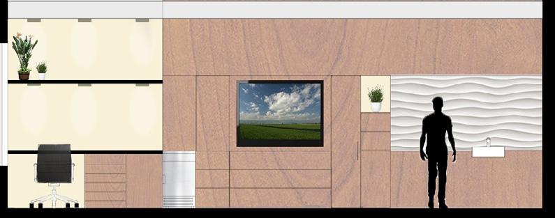
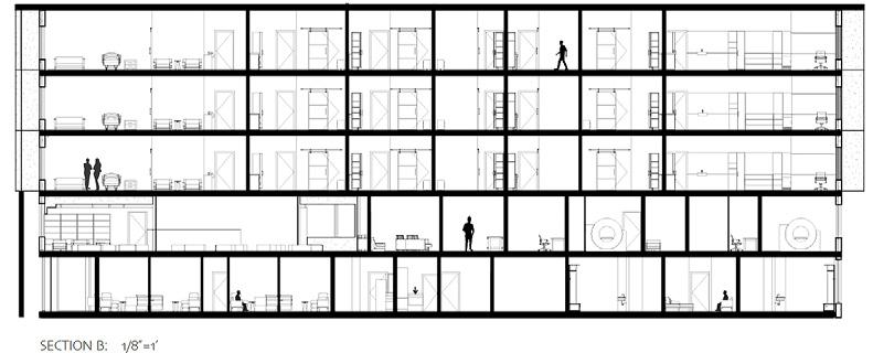
Every patient room was private each with its own bathroom, mini fridge, desk, closets, pull out couches, and a ton of storage for patients and family belongings. I made it a goal of mine to give not only the patients enough space, but also their families and friends. The use of warm colors and materials in their rooms was done to separate patient rooms from the public areas.


This concept can also be seen through my material choices and how I showed the difference between public and private spaces with my material choices as well. The private areas used warmer wood colors mixture with natural tones.
Patient Room: Elevation 2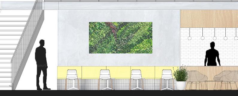
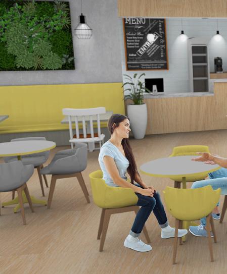
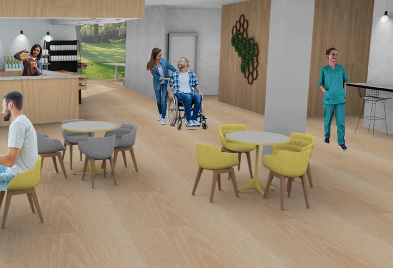
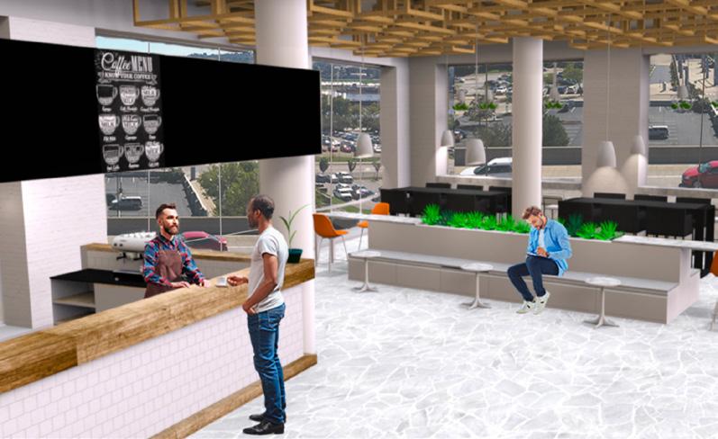
The cafe space was meant to double as a waiting room for family and friends when their loved ones were receiving treatments or getting scans. There is also a staircase that connects the first and second floor. The second floor is where families can explore the art gallery, library, movie theater, or sit together in the common areas.


While in the public areas I used lighter and brighter colors. Each of these areas use the natural colors and greenery to emphasize bringing nature indoors. Using colors like this is supposed to increase healing among patients.
Another way I connected patients to the outdoors was dropping walls. Instead of having the wall go from floor to ceiling, I made them stop short so natural light will be able to reach all spaces.
 Treatment Bay (C) Perspective 1
Most of the treatment bays face the windows so each patient has views of the outdoors during treatments. There are private rooms in the center that are for patients who may be having side effects such as migraines and don’t want access to the natural light or may want more privacy because they are struggling.
The hallways each have waiting spaces that also can function as gathering spaces for patients and families. They are filled with plants because in these areas there is no access to natural light, so this still brings nature indoors and connects patients to the nature.
 Waiting Room: Perspective 2
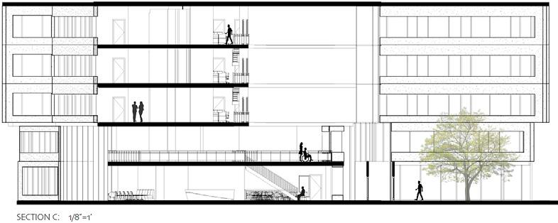
The section above shows the atrium that extends from floor to ceiling of the entire building. I left the overlook to this area on the upper floors free, so visitors and patients will have an easy direct view to the outdoors.
I placed the cafe on the lower level in the atrium. It functions as not only a cafe, but it is also a waiting room for family and friends of loved ones when they may be receiving a treatment or getting some scans done.
This atrium was one of the main reasons I chose this building because it carried light throughout every floor.
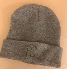
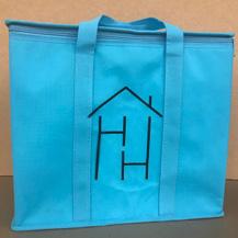
Patients wouldn’t want a t-shirt that displays that they have cancer. I chose to create a beanie that patients can wear after hair loss. Socks and a blankets that patients can wear to chemo since a common complaint is being cold, and the mug keeps liquid hot or cold for over 12 hours so they can take it around the center. A cooler bag to bring snacks to long treatment sessions or families can take to the store with them to restock their loved ones mini fridge.
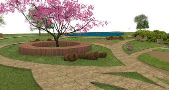
I chose this building because of the abundance of windows on every floor. It allowed each patient to have an entire wall bringing in natural light and connecting them to the outdoors. It is also located in Pittsburgh Pennsylvania near world renowned doctors and well known teaching hospitals. The surrounding area also had some existing landscaping, such as a pond trees and bushes, so adding some new pathways and even more greenery throughout the area created a healing garden.
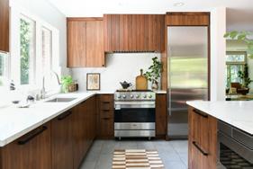
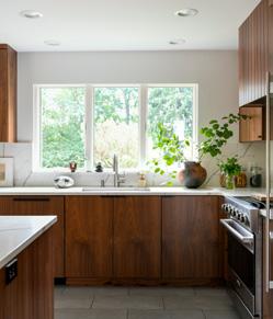
This project was completed while working as an Interior Designer at Katy Popple Design. We worked as a team through the whole process, from construction documents, finishes, to the final renderings.
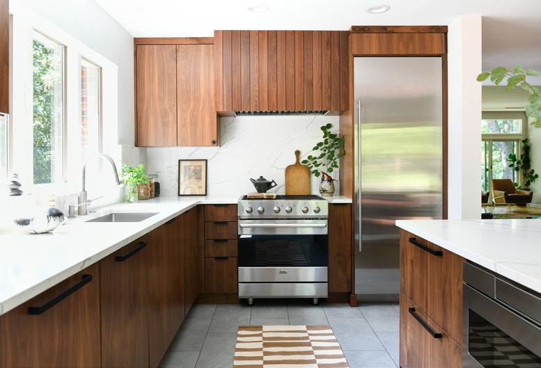
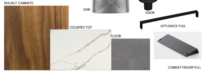
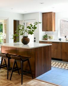
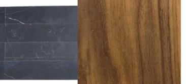
We used the original appliances and windows to complete this project. So we had many barriers to work around because all appliances were also staying in their existing locations.
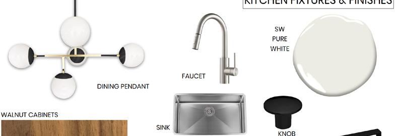
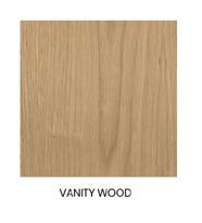
An obvious selection to make this style choice pop was the wood on the cabinets. The walnut screams mid century and transformed the entire space.


This project was completed while working as an Interior Designer at Katy Popple Design. We worked as a team through the whole process, from construction documents, finishes, to the final renderings.
This home located in the heart of Point Breeze was covered with the prior families charm and character. Pink walls, purple carpet, and random room dividers are the complete opposite style choices to these new owners.
Yes these owners loved color, but it was more of an accent piece. This home was so fun to work on because we got to put some of our personal style choices to work while exploring with colors. We coined using the term light and bright on this project.


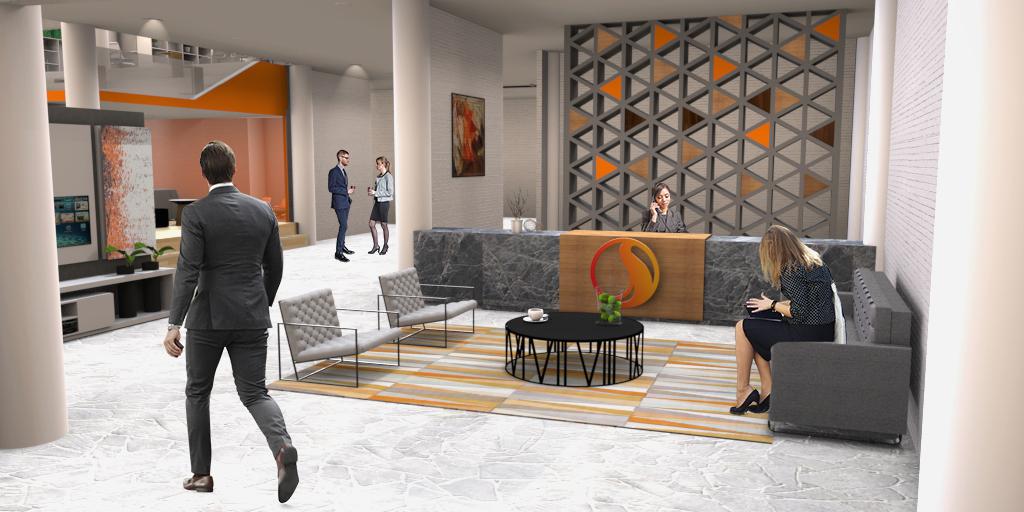
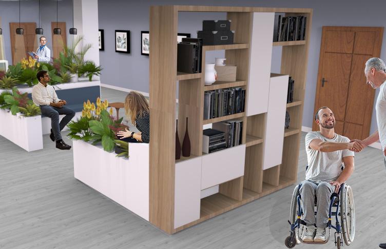
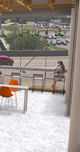
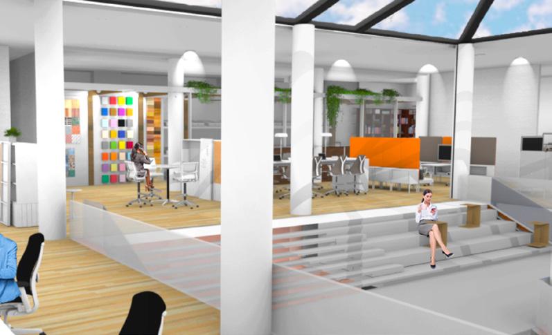
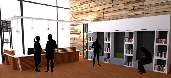
Stantecs design mission is to design with the community in mind. I was inspired by their mission, to me the word community also means family. So I wanted to create a space that is open with clean lines and pops of bold color. Materials will be light and simple to highlight the branding of orange throughout the space. The office will be somewhere employees can not only work but also live and play.
The lower level is meant to be for the visitors of the company. There are many individual spaces as well as conference rooms and a presentation room. Since Stantec is such a large company this level is meant for all the workers that are coming from the other locations around the world to collaborate on a project. It features a cafe and a family room for people to come together.

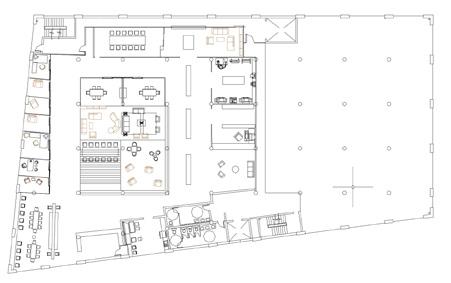
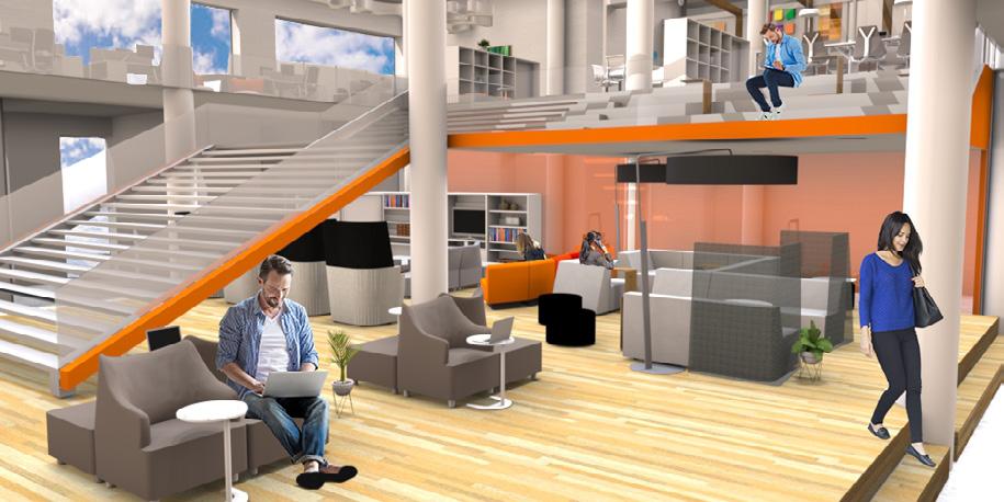
The upper level is connected by a grand stair case. This space is not only used for circulation but also for people to sit and gather together. Upstairs has individual assigned work stations along with many team breakout spaces and team areas.
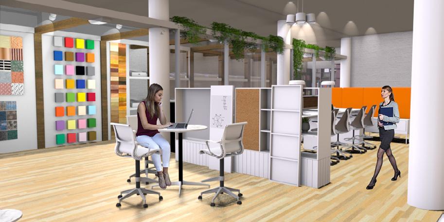
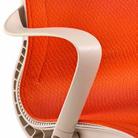
My material choices were inspired by existing Stantec Offices. They used orange, a light wood, and gray tones throughout the space. I chose to use the same scheme but use the orange as an accent color instead. The pops of orange are symbolic of the areas people are supposed to gather.


The neutral and natural tones allowed for the orange to pop throughout the space, while the green complimented the orange. The orange was used to put emphasis on areas users gather and carry visitors through the space.


This project was completed after I turned in a detailed set of construction documents. This project was the first time I was exposed to this documentation and I created the entire set of construction documents for my project.

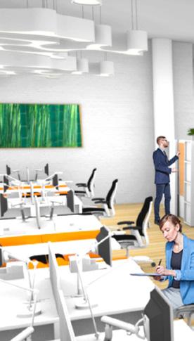

Offices are becoming more flexible. Many employees do not have a work station, therefore for my design I continued this idea. There are many touchdown spaces and team rooms. But I also recognized that not all people enjoy that type of environment. I have one assigned workstation for all employees, and separated key areas of the office to force employees to move throughout the space, therefore encountering others and building connections.
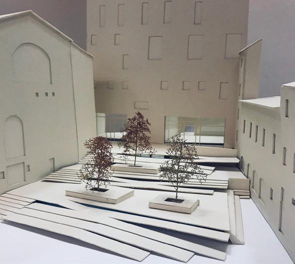
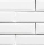
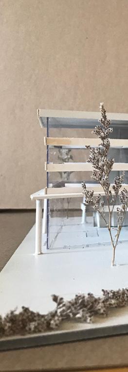
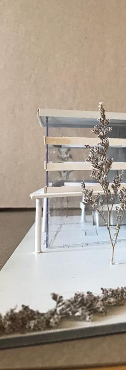
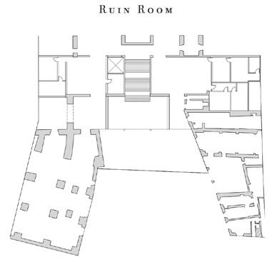
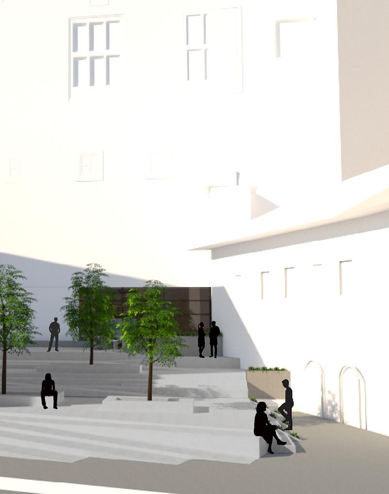
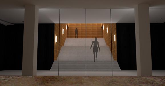
The purpose of my design “The Circuit”, is to create an outdoor gathering space, that doubles as a transition from the museum to ground level. Visitors can travel through time as they move through the modern additions, to the historical art pieces inside the galleries, then visit the ancient Roman ruins below the earth. By reusing some of Uffizi’s unique materials these new and modern additions should blend well with the original building even though it was built over 400 years ago. This design connects the exit level of the Uffizi Museum to the ground level of the Piazza del Grano through a system of ramps and stairs. In result a public gathering space is created, creating a new recognizable space to tourists, and finally gives the Uffizi Museum an exit it deserves that is just as memorable as the entrance.
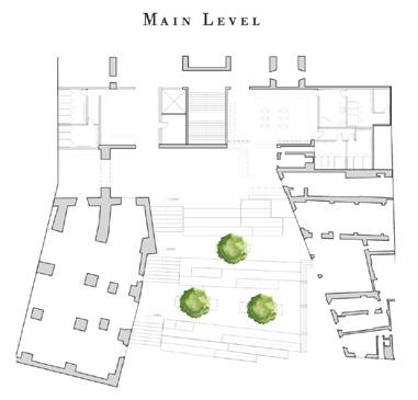
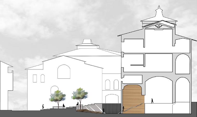
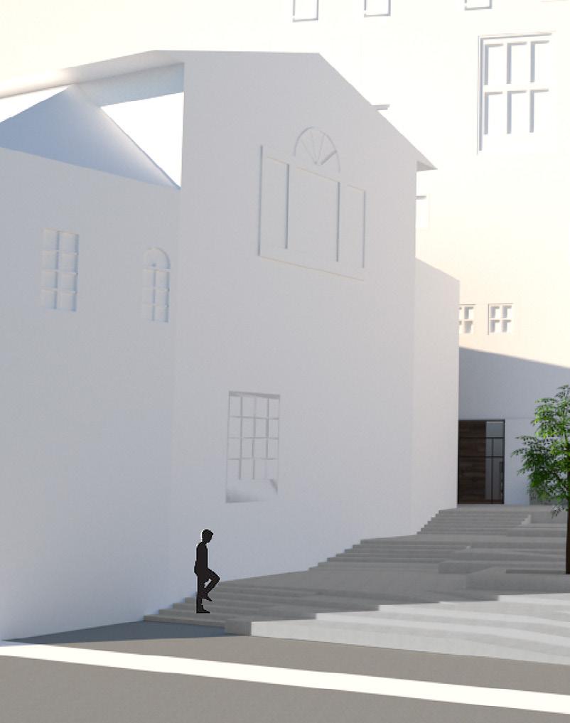
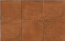


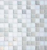
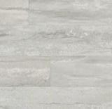
Terracotta Flooring- The original flooring used on the main level of the Uffizi. I wanted to keep this material because it shows the history and culture of the building
Stucco was used on the exterior of the building, but I chose a gray stucco as the ramping and stair material along with the flooring material in the ruin room.
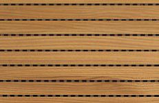
IC Acoustics’, perforated acoustic wooden wall panels are made up of MDF board pasted with melamine sheet at the front side and fiberglass tissue at the back side
IC Acoustics’, black perforated acoustic wooden wall panels.
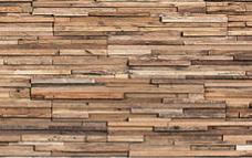
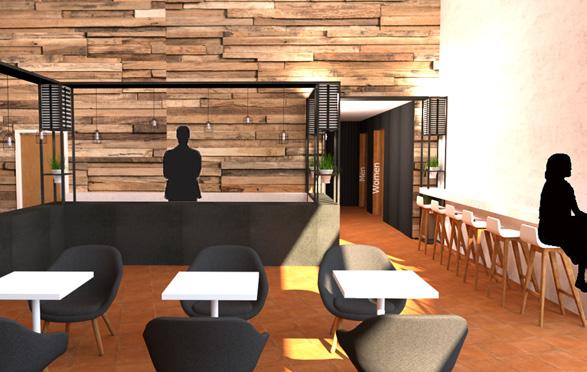
Wood Accent Wall- In every room on the main level I used this rustic wood to draw users to the main area of the space.
Be sure to check out my website with all of my projects: https://stephaniermurray.wixsite.com/portfolio