Please Respect the License !
1 Type is everywhere. Type exists. It is a fundamental part of our lives. These simple facts are essential to understanding how to communicate more effectively.
2 What is type?. Between type’s past and its future, our present understanding of type is rooted in who we are and how we communicate. Type is a living entity integrated into society’s moods and trends.
3 Looking at type. Training the eye to recognize type begins with familiar elements on the page. Looking at type from the basic shapes to the finest details is the first step toward understanding how type works.
4 Type with a purpose. Choosing typefaces for a particular purpose need not be more intimidating than planning your wardrobe. Matching an appropriate typeface with the right task is easy.
5 Type builds character. Understanding the tone, or feeling, of text is essential in determining what typeface to use, and how it might be arranged on the page.
6 Types of type. Once understood, basic characteristics of typefaces, can eliminate difficulty with typeface identification. Simple distinctions among typefaces are best understood by analogy to human counterparts.
7 How it works. Legible, readable type depends on a few basic principles: space between individual letters and around words. Choosing the right typeface for the right text also means using the right spacing.
8 Putting it to work. Considering where type is going to live and work will determine its effectiveness. Simple rules of placement create practical page layouts.
9 Type on screen. Type on screen used to be the poor sister of type for print. While technical constraints remain, there are no more excuses for not choosing the appropriate typeface for any project that will appear on a screen.
10 Variable fonts. The variable font format allows a single file to contain all previously separate files (e. g. from Light to Black) in a single, highly efficient one.
11 There is no bad type. Type is a basic element of communication. As the means of communicating changes, type evolves in unique and lively ways.
12 Final form. Bibliography, list of typefaces, index, partners.
We see so much type that we sometimes stop looking. This is not necessarily a bad thing, as in the case of this sign, which tells us that we may not enter this street between eleven and six, nor between eleven and six, and certainly not between eleven and six.
stealing sheep? Letterspacing lower case? Professionals in all trades, whether they be dentists, carpenters, or nuclear scientists, communicate in languages that seem secretive and incomprehensible to outsiders; type designers and typographers are no exception. Typographic terminology sounds cryptic enough to put off anyone but the most hardnosed typomaniac. The aim of this book is to clarify the language of typography for people who want to communicate more effectively with type.
These days people need better ways to communicate to more diverse audiences. We know from experience that what we have to say is much easier for others to understand if we put it in the right voice; type is that voice, the visible language linking writer and reader. With thousands of typefaces available, choosing the right one to express even the simplest idea is bewildering to most everyone but practiced professionals.
Familiar images are used in this book to show that typography is not an art for the chosen few, but a powerful tool for anyone who has something to say and needs to say it in print or on a screen. You will have ample opportunity to find out why there are so many typefaces, how they ought to be used, and why more of them are needed every day.
This is a sidebar. As you can see by the small type, the copy here is not for the faint of heart, nor for the casual reader. All the information that might be a little heady for novices is in these narrow columns; it is, however, right at hand when one becomes infected by one’s first attacks of typomania.
For those who already know something about type and typography and who simply want to check some facts, read some gossip, and shake their heads at our opinionated comments, this is the space to watch.
In 1936, Frederic Goudy was in New York City to receive an award for excellence in type design. Upon accepting a certificate, he took one look at it and declared that “Anyone who would letterspace black letter would steal sheep.” (Goudy actually used another expression, one unfit for print.) This was an uncomfortable moment for the man sitting in the audience who had hand lettered the award certificate. Mr. Goudy later apologized profusely, claiming that he said that about everything. You might have noticed that our book cover reads “lower case,” while here it reads “black letter” –two very different things. Lower case letters, as opposed to CAPITAL LETTERS , are what you are now reading;
See the changes made to the sign in the last three decades: the small picture on the right is from this book’s first edition, printed in 1992; the one on its left is from the second edition in 2003, and the small one on the opposite page from Sheep 3.0 in 2014. Big picture is from 2020.
We’re not sure how “black letter” in this anecdote got changed to “lower case,” but we’ve always known it to be the latter; whichever way, it makes infinite sense. By the time you finish this book we hope you will understand and be amused by Mr. Goudy’s pronouncement.
paul WatzlaW ick c hapter 1
paul WatzlaW ick (1922–2007) is author of Pragmatics of Human Communication, a book about the influence of media on peoples’ behavior. “You cannot not communicate” is known as Watzlawick’s First Axiom of Communication.
Typeset in Equity
FF Real Head Thin
h ave you ever been to Japan? A friend who went there recently reported that he had never felt so lost in his life. Why? Because he could not read anything: not road signs, not price tags, not instructions of any kind. It made him feel stupid, he said. It also made him realize how much we all depend on written communication.
Works in most languages, avoiding tasteless mistakes: S for Salt and P for Pepper.
Picture yourself in a world without type. True, you could do without some of the ubiquitous advertising messages, but you wouldn’t even know what the packages on your breakfast table contained. Sure enough, there are pictures on them – grazing cows on a paper carton suggest that milk is inside, and cereal packaging has appetizing images to make you hungry. But pick up salt or pepper, and what do you look for? S and P!
Try to find your way around without type and you’ll be as lost as most of us would be in Japan, where there is plenty of type to read, but only for those who have learned to read the right sort of characters.
You’ve hardly got your eyes open when you have to digest your first bite of type. How else would you know how much calcium fits on your spoon?
Type says much more about a newspaper than just the information it carries.
Breakfast for some people wouldn’t be the same without the morning paper. And here it is again: inevitable type. Most people call it “print” and don’t pay too much attention to typographic subtleties. You’ve probably never compared the small text typefaces in different newspapers, but you do know that some newspapers are easier to read than others. It might be because they have larger type, better pictures, and lots of headings to guide you through the stories. Regardless, all these differences are conveyed by type. In fact, a newspaper gets its look, its personality, from the typefaces used and the way in which they are arranged on the page. We easily recognize our favorite newspapers on the newsstand, even if we see only the edge of a page, just as we recognize our friends by seeing only their hands or their hair. And just as people look different across the world, so do the newspapers in different countries. What looks totally unacceptable to a North American reader will please the French reader at breakfast, while an Italian might find a German daily paper too monotonous.
Of course, it’s not only type or layout that distinguishes newspapers, it is also the combination of words. Some languages have lots of accents, like French; some have very long words, like Dutch or Finnish; and some use extremely short words, as in a British tabloid. Not every typeface is suited for every language, which also explains why certain type styles are popular in certain countries, but not necessarily anywhere else.
What appears frightfully complex and incomprehensible to people who can read only the Latin alphabet brings news to the majority of the world’s population. Chinese and Arabic alphabets are read by more than half the people on this planet.
áåæäàœöøçß¡¿
Some of the accents, special signs, and characters seen in languages other than English, giving each of them its unique appearance.
Newspaper design changes very slowly: the picture on the right is from this book’s first edition, printed in 1992; the color one in the middle is from the second edition in 2003, and the photograph on the left was taken for the third edition in 2013.
This brings us back to type and newspapers. What might look quite obvious and normal to you when you read your daily paper is the result of careful planning and applied craft. Even newspapers with pages that look messy are laid out following complex grids and strict hierarchies.
Just as the newspaper on the opposite page is laid out according to an underlying structure of some intricacy, this book is designed within its own constraints.
USA Today, one of the leading newspapers in the United States, is designed to a grid.
The artistry comes in offering the information in such a way that the reader doesn’t get sidetracked into thinking about the fact that someone had to carefully prepare every line, paragraph, and column into structured pages. Design – in this case, at least – has to be invisible. Typefaces used for these hardworking tasks are therefore, by definition, “invisible.” They have to look so normal that you don’t even notice you’re reading them. And this is exactly why designing type is such an unknown profession; who thinks about people who produce invisible things? Nevertheless, every walk of life is defined by, expressed with, and indeed, dependent on type and typography.
More and more people read the news not on paper, but on TV screens or computer monitors. Type and layout have to be reconsidered for these applications.
The page is divided into equal parts, each of which has the same proportion as the whole page, i.e., 2 :3. The page is made up of 144 rectangles, each one measuring 12 by 18 millimeters, 12 rectangles across and 12 down. This makes the page 144 by 216 millimeters, or roughly 5 21⁄32 by 8 1⁄2 inches. The columns are multiples of the 12-millimeter unit. As there has to be some distance between columns, 3 mm (or more for wider columns) have to be subtracted from these multiples of 12 to arrive at the proper column width.
The distance between lines of type (still archaically referred to as leading – rhymes with heading) is measured in multiples of 1.5 mm.
All typographic elements are positioned on this baseline grid of 1.5 mm, which is fine enough to be all but invisible to the reader, but which helps layout and production. The discipline offered by this kind of fine grid gives the same sort of coherence to a page as bricks do to a building. They are small enough to allow for all styles of architecture, while serving as the common denominator for all other proportions.
If you think that the choice of a typeface is something of little importance because nobody would know the difference anyway, you’ll be surprised to hear that experts spend an enormous amount of time and effort perfecting details that are invisible to the untrained eye.
It is a bit like having been to a concert, thoroughly enjoying it, then reading in the paper the next morning that the conductor had been incompetent, the orchestra out of tune, and the piece of music not worth performing in the first place. While you had a great night out, some experts were unhappy with the performance because their standards and expectations were different than yours.
Food and design: how often do we buy the typographic promise without knowing much about the product? Stereotypes abound – some colors suggest certain foods, particular typefaces suggest different flavors and qualities. Without these unwritten rules we wouldn’t know what to buy or order.
The same thing happens when you have a glass of wine. While you might be perfectly happy with whatever you’re drinking, someone at the table will make a face and go on at length about why this particular bottle is too warm, how that year was a lousy one anyway, and that he just happens to have a case full of some amazing stuff at home that the uncle of a friend imports directly from France.
Does that make you a fool or does it simply say that there are varying levels of quality and satisfaction in everything we do?
Effects that mimic hand lettering, stone carving, sewing, etching or even metal typesetting are all easily achieved electronically.
As they say in England: “Different strokes for different folks.”
The kinds of food and drink known to mankind are almost limitless. No single person could be expected to know them all. One guide through this maze of taste and nourishment, of sustenance as well as gluttony, is offered by the labels on products –as long as they are packaged in containers that can carry information. Without typography we wouldn’t know which contains what or what should be used which way.
Small wonder that type on food packages is often hand lettered, because standard typefaces don’t seem to be able to express this vast a range of tastes and promises. These days, hand lettering sometimes means using software programs, such as Adobe Illustrator, that combine design and artwork at a level unimaginable only a few years ago. Anything a graphic designer can think of can be produced in amazing quality.
While it might be fun to look at wine labels, chocolate boxes, or candy bars in order to stimulate one’s appetite for food or fonts (depending on your preference), most of us definitely do not enjoy an equally prevalent form of printed communication: forms.
The “generic” look of most business forms usually derives from technical constraints. But even when those restrictions no longer exist, the look lingers on, often confirming our prejudice against this sort of standardized communication.
If you think about it, you’ll have to admit that business forms process a lot of information that would be terribly boring to have to write fresh every time. All you do is check a box, sign your name, and you get what you ask for. Unless, of course, you’re filling out your tax return, when they get what they ask for; or unless the form is so poorly written, designed, or printed (or all of the above) that you have a hard time understanding it. Given the typographic choices available, there is no excuse for producing bad business forms, illegible invoices, awkward applications, ridiculous receipts, or bewildering ballots. Not a day goes by without one’s having to cope with printed matter of this nature. It could so easily be a more pleasant experience.
While onscreen forms offer a very reduced palette of typographic choices, they at least provide some automatic features to help with the drudgery of typing your credit card number.
These are some of the new typefaces designed to work well on lowresolution output devices, such as simple printers and small screens.
Typefaces used for business communications have often been designed for a particular technology – optical character recognition, needle printers, monospaced typewriters, and other equipment.
What was once a technical constraint can today become a trend. The “nondesigned” look of ocr B, the good old honest typewriter faces, even the needle printer, and other low-resolution alphabets have all been exploited by designers to evoke certain effects.
If you want to avoid any discussion about the typefaces you’re using in your letters or invoices, you can fall back onto Courier, Letter Gothic, or other monospaced fonts (see page 175), even though they are less legible and take up more space than “proper” typefaces. You could be slightly more courageous and try one of those new designs that were created specifically to address both the question of legibility and space economy, and reader expectations.
Typefaces designed with technical constraints.
When each egg has data stamped on it, we wonder how the type got there. Does each chicken have its own little rubberstamp? Or do all the eggs roll by a machine, which gently impresses onto that most breakable of surfaces? And do different sorts of eggs have different types on them? Brush Script for freerange, (see page 195), Copperplate for the expensive gourmet ones from geese and Helvetica for battery eggs?
Every pc user today knows what a font is, calls at least some of them by their first name (e.g. Helvetica, Calibri, and Times), and appreciates that typefaces convey different emotions. Although what we see on screen are actually little unconnected square dots, that fool the naked eye into recognizing pleasant shapes, we now expect all type to look like “print.”
While there is a tendency to overdesign everything and push technology to do things it was never intended to do, like printing onto raw eggs, at least we can continue our typographic training even when deciding whether the food we bought is good for nourishing or not.
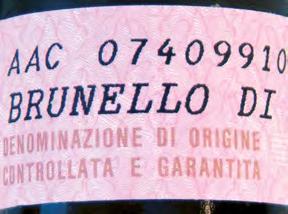
We don’t know whether the makers of Brunello di Montalcino deliberately chose the tall type for the labels on their wine bottles, but the widely spaced figures and the robust caps possess a certain elegance. As Monotype shows with their Andale Mono (which comes free with Microsoft software), there is room for good design even within the constraints of monospaced system fonts. Bar codes and ocr numbers are inseparable, but even that generic alphabet has already inspired a whole new type. And if you must imitate the printing on eggshells, ff Atlanta has the blotchy outlines needed to do so convincingly. While the makers of dot matrix printers try to emulate real logos, the designers of real fonts deliver the tools to print your supermarket receipts.
Several countries adopted the British Transport alphabet for their road signage. Unfortunately, somebody made the type much fatter: probably an engineer who thought that more weight is more legible. The opposite is true.
Some of the most pervasive typographical messages have never really been designed, and neither have the typefaces they are set in. Some engineer, administrator, or accountant in some government department had to decide what the signs on our roads and freeways should look like. This person probably formed a committee made up of other engineers, administrators, and accountants who in turn went to a panel of experts that would have included manufacturers of signs, road safety experts, lobbyists from automobile associations plus more engineers, administrators, and accountants.
You can bet there wasn’t one typographer or graphic designer in the group, so the outcome shows no indication of any thought toward legibility, let alone communication or beauty. Nevertheless we’re stuck with our road signs. They dominate our open spaces, forming a large part of a country’s visual culture.
Traditional type for signs used to be constructed from geometric patterns so that they could be recreated by signmakers everywhere. Type as data travels more easily, so there are no more excuses for not having real type on signs.
Newark Newark
Signage systems have to fulfill complex demands. Reversed type (e.g., white type on a blue background) looks heavier than positive type (e.g., black on yellow), and back-lit signs have a different quality than front-lit ones. Whether you have to read a sign on the move (from a car, for example), or while standing still on a well-lit platform, or in an emergency – all these situations require careful typographic treatment. In the past these issues have been largely neglected, partly because it would have been almost impossible to implement and partly because designers chose to ignore these problems, leaving them up to other people who simply weren’t aware that special typefaces could help improve the situation.
These have now been designed with a series of closely-related weights to offer just the right one, whether it’s for a back-lit dark sign with white type, or for just black words on white, lit by the sun from above. The PostScript™ data generated with these types in drawing and layout applications can be used to cut letters of any size from vinyl, metal, wood, or any other material used for signs.
There are no more excuses for badly designed signs, whether on our roads or inside our buildings.
C Too much weight makes the counters, the space inside the letters, almost disappear. Letters become blobs.
D Reversing out increases that effect. Backlit signs would look even worse (see next page).
A Dark type on a light back ground needs some weight to be legible, but not too much.
B Light type on a dark background has to be a little thinner in order to appear as legible as the other version.
Engineers are still responsible for the signs on our roads and freeways. And they still think that Arial is the best typeface ever, simply because it is ubiquituous. But there are signs (!) of progress even in those circles: The new German D in (Deutsche Industrie Norm = German Industrial Standard) committee finally acknowledged what a lot of designers have always known: Some characters are easily confused with each other. A figure 1 looking like a lowercase l and a capital I (sic!) are majors offenders. The new D in 1450 suggests a lowercase l with a loop, a capital I with serifs, and a figure 1 with a horizontal bottom stroke.
Why not use serif faces in the first place, you may ask? Interesting question, and unfortunately one not even discussed amongst the engineers on the committee (although there was a real type designer present). They think that serif faces are old-fashioned and could not possibly be used for signage or any other contemporary purpose.
Since this book was first published in 1993, quite a few type designers have turned their attention to this field, although neither fame nor fortune are likely to be made here.
The US freeways now have Clearview, a typeface designed by James Montalbano, based on the existing Highway Gothic, but actually legible and friendly. Airports the world over have adopted Frutiger, the typeface originally designed for Charles de Gaulle airport in Paris in 1976. It has recently been updated with its signage version featuring that special l, the 1 and a dotted 0.
Berlin Transit has had their special version of Frutiger Condensed, called ff Transit, since 1992. Düsseldorf Airport has signs in ff Info. Ralf Herrmann designed a typeface called Wayfinding Sans. Vialog was developed by Werner Schneider and Helmut Ness for wayfinding projects, as was Arrival by Keith Chi-hang Tam.
C A thinner version of the typeface needs to be used.
D Now shapes are easier to make out.
A Light type on dark shouldn’t be too bold. B When lit from behind, type appears even bolder.
Another random document with no related content on Scribd:
Patrologia Latina, Migne edition (Paris, 1844–1855).
The Book of The Thousand and One Nights, translated by John Payne (London, 1884).
“Aaron the Just,” 418
INDEX
Abbasside Caliphate, the, 172
Abd-el-Kader, Algerian ruler, 249
Abd-er-Rahman I, 473
Abdul Hamid I, Sultan, 110, 159
Abdul Hamid II, Sultan, 50, 110, 268
Abgar, King, 285, 296
Abraham, Patriarch, 253, 275, 294
Abydas, Strait of, 77
Abyssinia, 312
Achilles, Ashes of, 36
Adadinari IV, 386
Adana, commercial center, 197
Aegean Sea, 90
Afium-Kara-Hissar, 122
Agamemnon, “King of Men,” 87
Agostino, Padre, 263
Aimée Dubuc de Rivery, 110
Albertus Magnus, 6
Alcæus, 105
Aleppo, 255, 263
Alexander I, of Russia, 78
Alexander the Great, 27, 46, 78, 83, 194, 217, 400
Alexandria, 289
Alfold, great central plain of Hungary, 19
Ali, first legitimate Caliph, 445
Al-Khader, 260
Allah, 237
Al-Mamun, Caliph, 420
Al-Mansur, founder of Bagdad, 409
Ameghino, Dr., 453
America, does not know or care about the truth about Turkey, 211
Ammianus Marcellinus, 297
Amru, 316
Amuita, Queen, 488
Anadoli Kavak, 45
Anathema Maran-atha, 327
Anatolia, 183 life of the Osmanlis, 121 ruins of, 106
Anatolian Railway, 99, 121, 157
Anazarbas, 199
Andrae, Dr. Walter, 379
Angel de Villarubbia, Fra, 292
Anglo-French press, hostile to Bagdad railway, 166
Antakia, 255
Anthimos VII, Œcumenical Patriarch, 336
“Antioch the Beautiful,” 218, 255, 289
Antipater, 201
“Apostle and Proto-Martyr among Women,” 172
“Apostle of the Gentiles,” St. Paul, 202
Arabian horses, 441
Arabians, life of the, 442
Arab robbers, protection against, 266
Aracca, the Erech of Scripture, 461
Aramaic language, 272
Aratus, 201
Archimedes, 201
Argonauts, 42
Argos, 44
Arianism, 232
Aristarchus of Samothrace, 106
Aristotle, 83
Armenian question, 208
Armenians, business ability of, 271 massacre of 1909, 205
responsible in great part for massacres, 207
Arrians, 101, 305
Artemidorus, 201
Ashbelkala, 380
Ashurnasirpal III, 380
Asia Minor, 183 great trouble of, 149 rich in natural resources, 184
Aspasia, wife of Pericles, 104
Asshur, city of, 294
“Association Laws,” 292
Assuerus, King, 353
Asur, builder of Nineveh, 345, 379
Assyrian Empire, 347
Astronomy, foundations and practice of, by Babylonians, 501
Asurbanipal, the Grand Monarch of Assyria, 353
“A Thousand Nights and a Night,” 261
Attica, 104
Attila, 23
Augustine of Hippo, 369
Augustus, Emperor, 11
Aurelian, Emperor, 217
Babil, mound of, 475, 477
Babylon, 471–508
bird’s-eye view of desolation of, 506 descriptions of, by ancient writers, 483 great wall of, 483 hanging gardens of, 282, 494 present day, 486 tower of, 491
Bagdad, 41, 260, 402–436 ancient glories of, 412 bazaars of, 432
Carmelite priests of, 403 etymological names of, 410
fall of, 425 founding of, 409 modern, 427 periodically visited by the plague, 431 population one-fourth Jewish, 432 the future of, 435 the women of, 432
Bagdad railway, 151 aim and purpose of, 168 completion of, held up by World War, 370 Germany gets concession for, 158 meeting of Czar and Kaiser in 1910 in regard to, 164 source of far-reaching political cataclysm, 169 splendidly built, 167 tunnels of the, 255
Balkan peninsula, 22 peoples of, hated one another, more than the Turks, 22
Barbarossa, Frederick, 78, 121
Barmecides, Slaughter of the, 419
Barnabas, 171
Basra, 264
Bayazid I, Sultan, 46
Bazaars of Bagdad, 432
Beaconsfield, Earl of, 63
Beames, William, 265
Bedouins, 268 life of, 442
Beirut, 310
BeithAllah, house of God, 235
Belgrade, 19
Belus, first astronomer, 501
Benjamin of Tudela, 414, 480
Berosus, priest of Bel, 348
Berlin, 1
Bessarion, Cardinal, 335
Bethsabee, 275
Bianca Capello, 110
Bilejik, 122
Bir, 281
Birs-Nimrud, 477
Black Forest, 5
Black Obelisk of Salmanasar II, 200
Black Sea, 30
Black Stone, worshiped by Mohammedans, 235
“Blue Mosque,” 175
Bohadin, 417
Borsippa, 480
Bosphorus, 161 plan for tunnel under, 166 proposed bridge over, 166
Bossuet of Meaux, 369
Botta, Paul Emil, 349
Bourse, the, 163
Bozanti Khan, 188
Bralia, 31
Bréau, Quaterfages de, 456
Bronze Horses of Lysippus, 58
Bruin, Cornelius de, 358
Brusa, 94
Budapest, 18
Bukcovitz, Stephen, 114
Bukharest, city of, 29
Bulgar Dagh, the, 189
Burckhardt, discovers black basaltic block, 275
Burnouf, Eugène, 362
Byron, Lord, 43
Byzantine liturgy, 313
Byzantines, 305
Byzas, son of Neptune, 67
Cæsaropapism, 326
Caetani, Prince, 466
Caliphs, triumphs of the, 281
Callicolone, 87
Calmet, Dam, the Benedictine, 459
Calycadnus, the, 191
Camels, trains of, 185
Canals,
Danube-Elbe, 34
Danube-Oder, 34
Danube-Salonica, 34
Ludwig, 33
Suez, 153
Canon law of Mohammedanism, 244
Cantacuzenos, introduces the Osmanlis into Europe, 113
Capistrau, St. John, 20
Capuchins, the, 291
Caravans, 186
kept in communication with friends by homing pigeons, 267 protection against Arab robbers, 266 trade, 264
Carchemish, the, 276, 282
Carmelite priests, of Bagdad, 403
Cassandra, 91
Castle of Simeon, 256
Catherine de Medici, 110
Catherine II, of Russia, 61, 383
Caulaincourt, French Ambassador, 79
Cerularius, Michael, 325
Chalcedon, 97
Chaldean church, 307
Champollion, Jean François, 356
Chansans de Geste, untruths in, concerning Mohammedanism, 222
Chardin, Jean, 358
Charlemagne, 10, 324
Chateaubriand, 52
Chesney, Colonel, 152
Chilat, 298
Chosroes I, 194, 281, 287
Christianity, in relation to Mohammedanism, 247 need of change of attitude of the West toward the East, 251
Chrysopolis, the golden city, 96
Chrysostom, St. John, 71
Churches of the East, 303–340
Church of Holy Wisdom, 56
Cicero, 171
Cilician Plain, or CiliceaCampestris, 189 population of, 198
the Garden of Eden, 214 three decisive battles of the world fought on, 194
Citadel, at Aleppo, 273
“City of Delight,” the, 29
“City of the Blind,” the, 97
“City of the Saints,” Bagdad, 260
Cleopatra, 204
Code of Hammurabi, 345, 364, 504
Coffee, great beverage of the Moslems, 179
Coffeehouse, Oriental, 181
Columbus, 452
Comnena, Princess Anna, 72
Conquest of Constantinople, 328
Constantine IX, Emperor, 325
Constantine Paleologus, 68
Constantine Porphyrogenitus, 414
Constantine the Great, 68, 321
Constantinople, 51 people of, 65
Constanza, 37
Consul Lirius, 84
Coptic church, 312
Copts, of Egypt, 312
Corinth, 217
Cos, 105
Council of Florence, 327
Crassus, 297
Creation, one of the oldest accounts of, discovered, 462
Crescent and the Cross, 27
Crimean War, 99
Crœsus, King of Lydia, 184
Cross and the Crescent, 27
Crusaders, castles built by, 257 in Phrygia and Lycaonia, 187 in the footsteps of the, 171 route of the, 257
Crusade, Fourth, 327 time has come for a new but different, 252
Cunaxa, battle of, 375
Cyaxares, 345
Cydnus, 203
Cydnus, the, 190
Cyrus, Bishop, 297
Cyrus the Great, 433 army of, 171
Cyrus the Younger, 281
Dacia, 26
Dacians, the, 30
Damascus, 289, 313
Damoclean sword, 331
Dandolo, Henricus, 68
Dante Alighieri, 247, 295
Danube, 4, 31
Darius, 194, 281
Darius Hystaspes, 31
“Dates of Akkad,” 472
Dati, Leonardo, 457
David, King, 275
Dawson, J. W., 463
Debora, nurse of Rebecca, 298
Deggendorf, 8
De Lesseps, and the Suez Canal, 165
Delitzsch, Friedrich, 363, 369, 448
Delta of the Nile, 317
Dervishes, dancing or whirling, 173 howling, 96
DeutscheOrient-Gesellschaft, 387
Devil’s Wall, 9
Diana, Temple of, 217
Diering, Professor, on the Germans, 168
Diocletian, 100
Diodorus Siculus, 201, 483
Dionysides, 201
Dioscur, Patriarch of Alexandria, 315
Disraeli, and the Suez Canal, 153
Djerabis, 282
“Doctrine of Addai,” 286
Dominican Sisters of the Presentation of Tours, 308
Dominicans of Mosul, 307
Drangnachosten, Trend toward the East, 155
Duke Leopold, of Austria, 10
Dunkelboden, 7
Earthquakes, 218
Eastern Churches, 303–340
reunion with the Mother Church, 334
Edessa, 284
legend connected with, 284 school of, 297
Egyptian monophysites, 312
Eldred, John, 265, 478
El Farruch, Earth-Divider, 74
Elgin, Lord, 57
Endocia, Empress, 257
Enoch, the Hermes Trismegistes of the Orientals, 284
EntenteCordiale, 165
Ephesus, 103
Epicureans, 201
ErmeniMillet, 318
Eski Bagdad, old Bagdad, 398
Eski-Shehr, 122
Etchimiadzin, monastery of, 311
Eudocea, Empress, 71
Euphrates, the, 278, 488
Eusebius of Cæsarea, 285
Eutyches, 309
Eutychianism, 309
Euxine Sea, 5, 35
Father Damien, 247
“Father of Medicine,” 105
Fatihah, first chapter of the Koran, 96
Feringees, 319
Figueroa, Don Garcia de Sylva y, 357
Fourth Crusade, 327
Fra Diavolo, 195, 196
Fragistan-Europe, 319
France, as a protector of Turkey, 160 fate of the French railway in Near East, 160 has always encouraged scientific research, 349 not willing to give recommendations to Bagdad railway project, 163 on friendly terms with Ottoman Government, 155
Franciscan friars, 262
Francis I, of France, 155
Frankish States, 328
Fra Oderic of Pordenone, 39
Galambocz, 24
Galata, 65
Galatz, 31
Garden of Eden, 214 location of, 447
motoring in the, 437
one of the oldest accounts of creation discovered, 462
Gargar, valley of, 298
Genghis Kahn, 113
Germans, determined to build Bagdad railway unaided, 166 Germany, dream of world power in the East, 155 gets concession for Bagdad railway, 158
Ghazzali, 417
Girgenti, ruins of, 475
Gisdhubar, 281
Giurgero, 29
Gladstone, William, 64
Glaser, E, 465
Glorietta of Schönbrunn, 12
Godefroy de Bouillon, 121
Golden Fleece, 44
Golden Horn, 47
Gordianus III, 297
Goths, the, 217
Gourea, Antonio de, 357
“Granary of Northern Syria,” 278
Grand Opera House, of Paris, 55
“Great Assassin,” Abdul Hamid, 159
Great Britain and the Gold Coast, 250 attitude toward Bagdad railway, 160 attitude toward Turks, 159
does not wish to know the truth about Turkey, 211 fear of protectorate over Turkey by Teutonic powers, 162 not willing to give recommendation to Bagdad railway project, 163
Great Cemetery, 96
Great Chimu, 497
“Great Idea,” 332
“Great Schism,” 325
Great Sweet Water, 48
Great Wall of China, 483
Greece, people of, in ancient days, 274
Greeks, business ability of, 271
Gregorians, 310
Gregory of Nyssa, 369
Grotefend, Georg Friederich, 360
Hadj, annual pilgrimage to Mecca, 244
Haidar Pasha, military hospital, 98
Hainburg, 14
Halicarnasus, 217
Halil Halid, the Anatolian, 210
Hamme, Frère Lieven de, 263
Hammurabi, Code of, 345
Hanging gardens of Babylon, 282, 494
Hannibal, 94
Haran, city of, 293
Harem, explanation of, and meaning, 126–129
Haremlik, 126
Harnack, Professor, 338
Harpies, 44
Harum-al-Rashid, 46, 417
Hazret, Mevlana, 175
Hebron, 275
Hedja railroad, 267
Hellespont, the Thacian, 77
Heraclius, 194, 281
Herbert, Thomas, 358
Hergenroether, Cardinal, 229
Herodotus, 281, 347, 488
Hieron, city of, 46
Higden, Ralph, the Benedictine, 449
Hillah, village of, 349, 471
Hincks, Edward, 362
Hipparchus of Nicæa, 105, 502
Hippocrates, 105
Hippodrome, in Constantinople, 58
Hissarlik, hill of, 86
Hittites, language of undecipherable as yet, 276 third great empire with Egypt and Babylonia, 275
Hogarth, David G., on the Armenian question, 208
Holy City of Jerusalem, 187
Holy Directing Synod, 331
Homer, 36, 81
Hommel, F., 465
Howling Dervishes, 96
Hudibras, 450
Huet, Pierre Daniel, 460
Hugo, Victor, on the Danube, 5
Hulagu Khan, 426
Hunyady Janos, 20
Ibrahim, 117
Iconium, now Konia, 122, 151
Iconoclasts, doctrine of, 102
Ida, 87
Iliadand Odyssey, 81
Illock, 20
Imam, the, 236
Iman Dura, town of, 397
Imperial Museum of Constantinople, 273
Independent Church of the Monastery of Mount Sinai, 331
Indicopleustes, 450
International Commission, for regulation of traffic, 33
Io, priestess of Hera at Argos, 45
Ionia, 104
Irene, Empress, 102
Iron gate, 26
Irrigation, of Babylon, 499
Isaac, 295
Ishtar gate, 494
Islam, creed of, 227
liberal policy of, 116 not opposed to influence of foreign science, law or theology, 243
past and present, 220
“the lay religion par excellence,” 233
Island of Achilles, 36
Ismid, 100
Italy, recent campaigns in Tripoli, 250
Jacobites, 309
Jacob, Patriarch, 284
Janissaries, corps of, 114
Jappa, Gate of Jerusalem, 262
Jason, 44
Jebel Hamrin, 389
Jebel Makhul, 389
Jebel Sinjar, 300
Jelal-ed-din-Rumi, tomb of, 172
Jenghiz Khan, 216
Jerablus, 278
Jerusalem, 263
Jinn, land of the, 261
Joachim III, Œcumenical Patriarch, 334
Joan of Arc, 247
Joseph II, Emperor of Austria, 61
Joseph of Burgos, Fra, 292
Judas Iscariot, 295
Julian, the Apostate, 10
Julius Cæsar, 84
Justinian, 321
Kaaba at Mecca, the, 235
Kadi Keni, town of, 97
Kaempfer, Engelrecht, 358
Kaffa, city of, 41
Kaif, favorite pastime of the Moslems, 138
Kalah Sherghat, mound of, 378
Kalat el Gebbar, 389
Kalat Makhul, 389
Kapist, Count, 154
Katholicos, head of the Nestorian church, 306
Kelek, a trip down the Tigris on a, 370–401
Kerbela, sacred shrine of, 444
“Key of the Danube,” the, 24
Khabur, valley of, 298
Khanikin, 154
Khatti, the, 275
Kheta, the, 275
Knights of St. John of Jerusalem, 217
Kohl, J. G., 17
Koldewey, Dr. Robert, 379, 475
Konia, 151
ancient Iconium, 122 inhabitants of, 176 situation and climate of, 174
Koran, 96, 116 contains many beautiful things, 248
Kublai Khan, 40
Kufah, 466
Kurdish race, 208 Kurdistan, 306
Kutchuk Ali Uglu, 194
Kuyunjik, 365
Lane-Poole, Stanley, 243
Language of Babylonia, 500
Latin Empire in Constantinople, establishment of, 327
Latin, language of Hungary for many years, 16
LatinMillet, 318
Layard, Austen Henry, 350
Leah, 294
Lebanon, 313
Lebanon Range, 294
“Legend of Abgar,” 285
Lemnos, 87
Lenormant, François, 456
Leo, the Mathematician, 423
Leo XIII, Pope, 334, 338
Lesbos, 105
LiberatorofBulgaria, 29
Library of Asurbanipal, 354
Linschoten, John Huyghen Van, 265
Little Sister of the Poor, 248
Little Sweet Water, 48
Lloyd George, David, 64
Lombard, Peter, 449
Loti, Pierre, on the Turks, 140, 144
Louis VII, of France, 121
Lucian, the Greek Voltaire, 346
Lucullus, 297
Ludwig I, of Bavaria, 6
Ludwig Kanal, 33
Lully, Raymond, 252
Mahmud II, Sultan, 110, 156
Malabar, 310
Malik al-Ashraf, 217
Mandeville, Sir John, 378, 451, 482
Manzoni, 8
Marco Polo, 39, 304, 412
Marcus Aurelius, 14
Mardin, city of, 304
MareMagnumor Majus, 39
Margaret de Valdemar, Queen of Norway, Sweden and Denmark, 383
Maria Theresa, Queen, 15
Marie-Joseph, Father, 405
Mark Anthony, 204
Marmora, Sea of, 77
Maronites, 313
Marquise de Pompadour, 110
Marracci, Padre Lodovico, 221, 226
Mar Shimum, Lord Simon, 306
Mar Yohannan, 308
Mausolus, King of Caria, tomb of, 184
Mayo, M., 453
McGahan, Januarius A, 27, 28
Mecca, hadj, or annual pilgrimage to, 224
Medak, or story-teller, 177
Medes, the, 345
Mehemet Ali, 189
Melchites, 310
Merodach, temple of, 490
Mesopotamia, 283
Metz, Gautier de, 449
Mevlana, tomb of, 172
Meyer, Professor Wilhelm, 361
Michael Cerularius, 325
Michael Prellos, 326
Midas, King of Phrygia, 184
Moawiah, Saracen, 61
Mohammed, accomplishments of, 230 and his followers, 224 creed of, 227
erroneous notions concerning, 224 preaches monotheism, 230
reformation of his countrymen by, 229
Mohammedanism, campaign of vilification against, 225 changeless in doctrine, 242
Christianity in relation to, 247 has a reverence for our Saviour, 249
much to respect and admire in, 270 not on the wane, 240
“the lay religion par excellence,” 233 theologians comment on, 238
Mohammed II, Sultan, 57, 68, 108, 311, 321
Mohammed V, Sultan, 125
Monogamy, 125
Monophysitism, 309
Monotheism, preached by Mohammed, 230
Montague, Lady Mary Wortley, on the Turkish women, 181
Mopsuestia, city of, 197, 199
Moslems, by law not allowed to erect tombstones, 259 characteristics of, 134 creed of the, 227 forbidden tobacco, 178 great use of coffee, 179 of a deeply religious nature, 221 orthodox, do not like the dervishes, 173 piety and devotion of, 124 prayers, 237
regard paintings and statues as impious, 175 women, their place in things, 129
Mosques, the, 234
Mosul, 298, 299, 303
Mount Athos, community of, 331
Mummius, 217
Murad II, Sultan, 108
Muslin, derivation of the word, 298
Mustansiriyah College, 417
Nabonnassar, era of, 501
Nabopolassar, 345
Nahr Belikh, 293
Napoleon, 78
Nazienzus, St. Gregory, 71
Near East question, modified by the Bagdad railway, 151
Nebuchadnezzar II, 281, 397, 490
Nehi Yunus, 365
Nejef, sacred shrine of, 444
Nestor, 201
Nestorianism, 297, 305
Nestorius, Patriarch of Constantinople, 305
Nibelungenlied, 11
Nicæa, 101
Nicene Creed, 102
Nicomedia, 101
Niebuhr, Carsten, 349, 358, 480
Nightingale, Florence, 98
Nimrod, 284
Nimrod’s tower, 478
Nimroud, general aspect of, 376 ruins of, 376
Nineveh, 341–369
built by Asur, 345 early history of, 345
“Niobe of nations,” 310
Nippur, ruins of, 364
Nisibis, 289, 296
Nitocris, Queen, 488
Nizamiyah College, 417
Noachian deluge, 351
Nod, land of, 462
Novatians, 305
Norris, Edwin, 362
“Oak of Weeping,” 298
Obbanes, 281
Œcumenical councils, 102
Œcumenical Patriarchs, 330
Olympus, 90
Omar Khayyám, 417
Opis, 400
Oppert, head of French expedition to Mesopotamia, 482
OrientaliumDignitasEcclesiarumof Pope Leo XIII, 340
Orkhan, second ruler of the Osmanlis, 95 son of Osman, 107
Orthodox churches, 320
Osman, founder of the Osmanli dynasty, 107
Osmanlis, characteristics of, 133 great sin, one of omission rather than commission, 219 plea for more tolerance to, 150
Oshœne, kingdom of, 284
Ottoman women, 49
Pæstum, ruins of, 475
Pagans, 304
Palace of the Star, 49
Paleologus, Theodore, 114
Palgrave, on Mohammedanism, 241
Palmyra, 217
Pan-Islamism, a force which Christianity must reckon with, 243 greater missionary force than ever, 244 the strengthening of, 268
Parthenon, 57
Parthian Kings, 491
Parthians, 297
Passau, 7
Patriarch of Alexandria, head of the Copts, 312 PatriarchusAntiochenusMaronitarum, 314
Paulinists, 305
Paul-Simon, Father, 403
Perez, Father, 403
Pergamus, kingdom of, 185
Peripatetics, 201
Persepolis, 356
Persian Gulf, 466
Persian Kings of the Achæmenian dynasty, 356
Persian satraps, 310
Persian shiites, 445
Persians, school of the, 290
Pescennius Niger, 194
Peter the Great, 331
“Peuteringian Table,” 298
Peter the Venerable, Abbot of Cluny, 232, 252
Petervarad, 20
Phanar, the Vatican of the Orthodox church, 330
Philetism, love of one’s race, 330
Photius, 71, 323
Phrygian language, 171
Pietro della Valle, 263
Pillars of Hercules, 325
Pinches, T. F., 462
Plague, in Bagdad, 431
Platonists, 201
“Plato the Divine,” 172
Pliny the Younger, 94
Polygamy, 125
PontusAxenus, 39
Pool of Abraham, 291
Porter, Robert Ker, 480
Potsdam, meeting at, in 1910 of Czar and Kaiser, 164
Poverello of Assisi, 142
Pozsony, 18
Præclara, 335
Prayer, of the Moslems, 237
Priam, city of, 88
Primate of the Melchites, 313
Princes Islands, 99
Prophet Daniel, 375
Prophet Jonas, mound of, 352
Prophet Zephaniah, 345
Psametik, King of Egypt, 171
PylæCiliciæ, or Cilician Gates, 188
Pylæ-Tauri, gate of Taurus, 189
“Queen of the East,” 194
Rachel, 294
Railway, construction of, across Mesopotamia, 152
Rameses II, the greatest of the Pharaohs, 274
Ramsay, Lady, 129
Ramsay, Sir W. M., 129
Raphael’s Madonna of San Sisto, 3
Rashid ud Din, 413
Rassam, Ormuzd, 351
Ratisbon, city of, 3
Rawlinson, Sir Henry, 361, 411
Rebecca, 294
Reign of Terror in France, 212
Rhazes, Mussulman physician, 416
RhenusSuperbus, 8
Rhine, river, 11
Richard Cœur de Lion, 10
Rich, Claudius James, 349, 480
Ricouard, Marie, 404
Rio de Janiero, 66
“Rite of Malabar,” 314
Robinson, Reverend Paschal, 141
Romans, road builders of antiquity, 254
Roumania, 26
Roxalana, the Muscovite, 109
Royal Art Gallery of Dresden, 3
“Royal Road,” 121, 253
RumMillet, 318
Russia, attitude toward the Bagdad railway, 160 campaigns in the Transcaucasia, 250 waives all share in Bagdad railway, 164
Russian Nihilist, Armenian revolutionists inspired by, 206
Russians, 28
Safia, the Venetian, 110
St. Athanasius of Alexandria, 335
St. Augustine, 228
St. Basil’s liturgy, 340
St. Bernard, 299
St. Cyril, Patriarch of Alexandria, 315
St. Dominic, Sons of, 341
St. Ephrem, 290
St. Francis, Sons of, 142
St. George and the dragon, 24
St. Gregory Mazienzen, 333
St. Gregory the Illuminator, 310
St. Jerome, 232, 299
St. John of Chrysostom, 333
St. John of Damascus, 231
St. John of Jerusalem, Knights of, 217
St. Mary of Kanobin, 314
St. Paul, 171, 189
life and career of, 202–205
St. Peter of Alcantara, 406
St. Prosper of Aquitaine, 216
St. Simeon Stylites, 257
St. Stephen, cathedral of, 12
St. Thecla, 172
St. Theodore of Studium, 339
St. Theresa, 247
St. Thomas, church of, in Malabar, 314
St. Vincent de Paul, 247
Sainte-Thérèse, Father Bernard de, 404
Saladin, Sultan, 223 birthplace of, 393
Salmanassar I, 376
Salmanassar II, black obelisk of, 200
Salmanassar III, 386
Sammuramat, or Semiramis, 381
Samothrace, 87
San Marco, Cathedral of, 58
San Stephano, treaty of, 63
Santa Sophia, church of, 53
Sapor I, 297
Sappho, 105
Saracens, 317
Sardanapalus, 203
Sargan II, 386
Sarzec, M. Ernest de, 363
Satyrs, 476
Saulcy, M. de, 362
Schneider, Siegmund, German engineer, 166
Scholarios, George, 328
School of Edessa, 297
“School of the Persians,” 290
Schrader, Eberhard, 363
Second Council of Lyons in 1274, 327
See of Constantinople, 325
Selamlik, 127
Seleucia, city of, 491
Seleucia-Ctesiphon, 305
Seleucids, the, 316
Seleucus Nicator, 491
Seleucus, the Chaldean astronomer, 503
Selim I, Sultan, 108, 117
Seljuk Sultans of Rum, 172
Semiramis, 381
family and connections of, 386
“Semiramis of the North,” the, 61
Sennacherib, 375
Septimus Severus, 14, 194, 297
Serbians, against the Turks, 148
Serpent Column from Delphi, 59
Seven Sleepers, legend of the, 197
Shamsi-Adad V, 380
Simeon, castle of, 256
“Siren of the Nile,” 205
Sister of Charity, 247
Sisters of St. Francis from Lons, 292
Skobeleff, General, 28
Smith, George, 351
Sobieski, John, 13
Solyman the Magnificent, 108
Solyman Pasha, 78
Sons of St. Dominic, 303
Sons of St. Francis, 142
Sanusiyahs, the, 246
Stamboul, 48
Stanley, Dean, 337
Stoics, 201
Stone of Nebi Yunus, 352
Strabo, 201
Suez Canal, 153
Sunnites, the, 445
Syrians, the, 272
Syrian Uniates, 310
Tabriz, city of, 41
Tallyrand, 34
Tarsus, 190, 202 once the center of Greek thought and knowledge, 201
Tartars, 306
Taurus Mountains, 183
Tekrit, 392
Telloh, city of, 364
Temple of Fame, 6
Tenedos, 87
Ten Thousand Greeks, the, 171
Terrestrial Paradise, dispute as to, 447
“Testament of Leo XII,” 335
Teufelsmauer, Devil’s Wall, 9
Teutonic Powers, 162
Thaddée, Father, 403
Thapsacus, 281
Thare, 294
“The Great River” of the Jews, 282
Theodora, daughter of Cautacuzenos, 114
Theodora, Empress, 102
Theodosius II, Emperor, 257
“The Round City,” 411
“The Terrible Turk,” 148
Thévenot, Jean de, 391
“Thirty pieces of silver,” 295
Thracian Hellespont, 77
Tiglath-Pileser I, King of Assyria, 293, 386
Tigris, the, 278
Timok River, 27
Timur, 113, 216
Tobacco, use of, forbidden by Moslems, 178 Tomi, 37
Tonietti, Sig. A., 154
Tower of Babel, mound of Babil not the, 479
Trade routes of the Near East, 253
Trajan, Emperor, 298
Trampe, Herr, 168
Treaty of San Stephano, 63
Trojan War, 319
Troubadours, the, 222
Troy, glory of, immortal, 93 plain of, 88
“Turk,” applied by Osmanlis when referring to a brutal man, 112
Turks, propaganda against, 123 treatment of the women, 131
Turkey, Great Powers cannot, without trouble, treat, as pariah nation, 213
Tyre, city of, 217
Uniate Copts, 313
Uniates, 308
Urban VIII, Pope, 404
Urfa, 284
“Uriah the Hittite,” 275
Ur of the Chaldees, 294
Vale of Bozanti, 188
Valle, Pietro della, 357, 478
Vasco da Gama, 73, 264
Venice, 58
ViaSacra, of Babylon, 497
Vienna, 13
Villamil, Emeterio, 453
Violet, M. H., 399
Vladimir, King of Russia, 339
Volga River, 32
Voltaire, 269 on the Koran, 225 von Bieberstein, Baron Marschall, 158 von Hammer-Purgstall, 304 von Moltke, 156
von Pressel, Wilhelm, German engineer, 166 von Siemens, Dr. George, 156
Wahabis, the, 179
Wallachians, 114
Whirling dervishes, 173
“White City” of Serbia, 21
Whitman, Sidney, on the Turks, 147
Wiseman of Westminster, 369
WoLagdasParadies, 466
Wolf of the Capitol in Rome, bronze, 59
Worship, freedom of, allowed by the Turks, 145
Xenocrates, 97
Xenophon, 46, 189, 281
Xerxes, 59, 77, 83
Yashmak, veil worn by Moslem women, 128
Zab, the, 388
Zenobia, “Queen of the East,” 194
Zeno, Emperor, 201, 297
Zeus, 45, 91
Zikr ul Aawaze, 376
Zobeide, tomb of, 440
Zoroaster, religion of, 256


