3 minute read
DIFFERENT LAYOUTS FOR LIVING / DINING


DIFFERENT LAYOUTS FOR LIVING / DINING
The way to use this section is to print it out, and trace over the plans with a marker, not a biro. Print them many times so that you can get accustomed to tracing over them. Mark where the hob is, the sink is, the under counter appliance. The fridge is either within the lines showing cupboards, or in the pantry. This exercise will get you accustomed to the different layouts, and hence help you understand what you like for yourself.
Advertisement
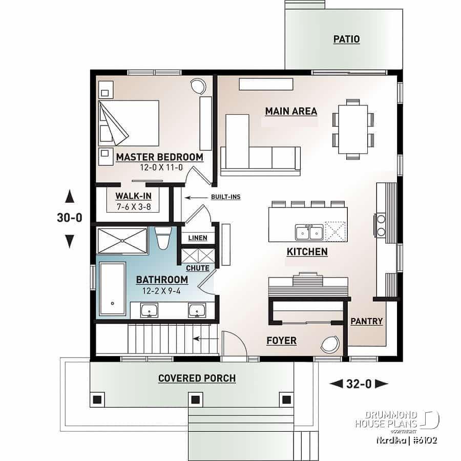
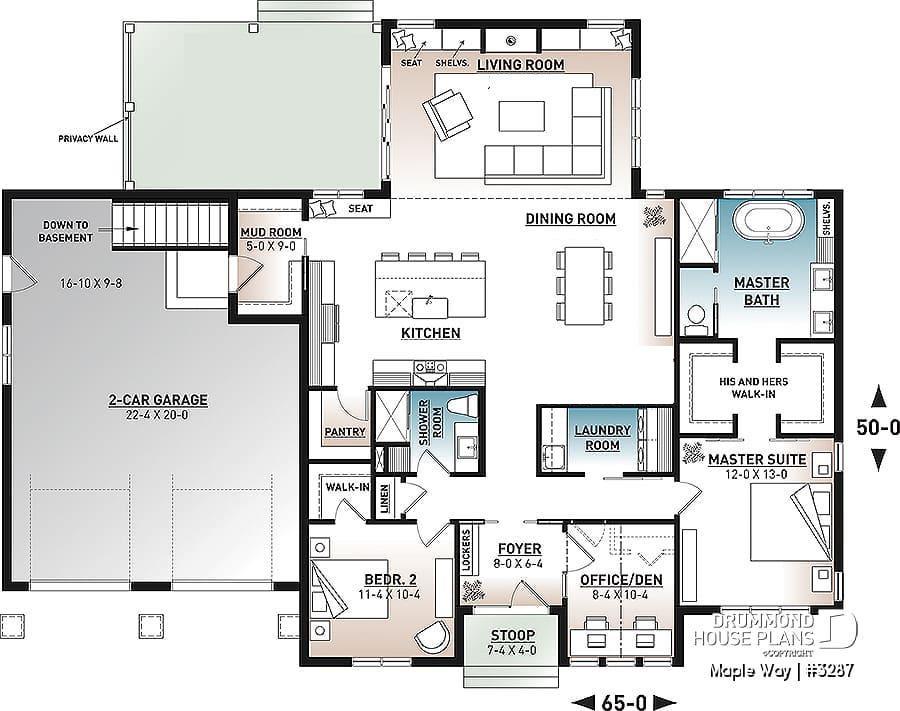
RECTANGULAR
This dashed box denotes an under-counter appliance like a dishwasher or drinks fridge.
Double Sink Green Area denotes Deck or Outdoor Paving
Dining
Living Space, L-Shape Sofa marks the space
Lines denotes Over-Head Cupboards
The circles denote the Hob.
Pantry becoming more used in homes due to the social nature of a Kitchen these days. Not everything needs to be on display. This is where you will keep your mixers, nutribullet, counter top appliances out of sight.
A nice continuous counter here, which is better ergonomically
SQUARE

Any WC needs a lobby between it and the kitchen, so a sliding door is required here
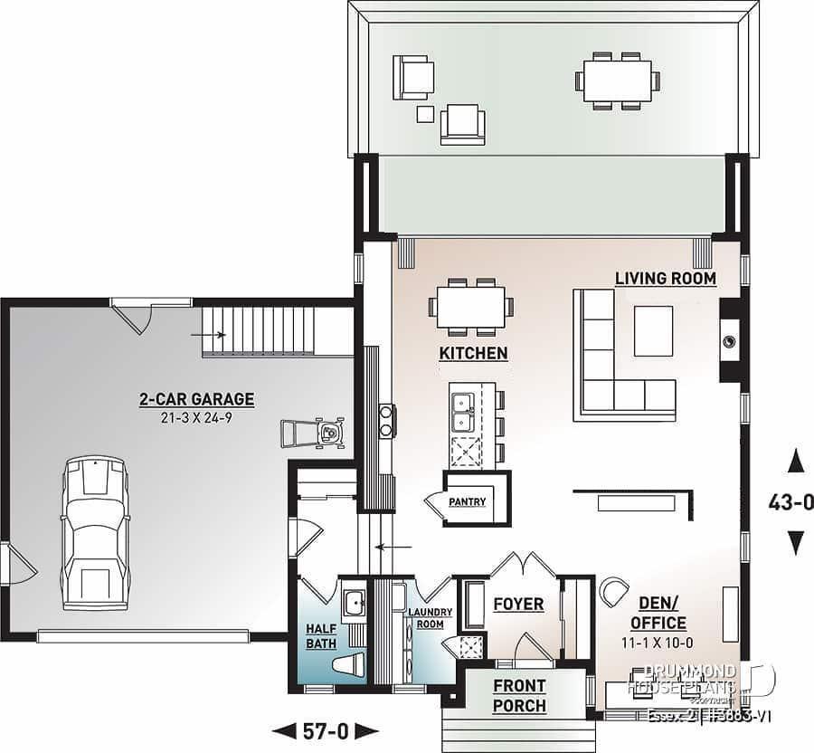
Full width sliders here let a lot of light in. This whole back wall opens up.
Note:
A stair can not open out into a kitchen due to Fire Regulations.
Some furniture to separate the living space from the thoroughfare behind
L-SHAPE
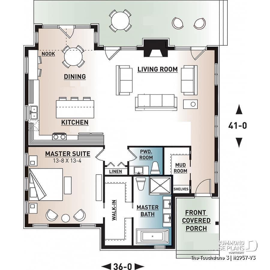
Some corner windows make for a pleasant nook
Double doors denote the fridge.
It is always best to keep the kitchen and dining as close as possible.
This L Shape allows the living room to popout entirely separately, which I find pleasing.
The break in the counter is offset by the use of an island. I would always use a sliding door to a pantry, rather than a hinged.
This L Shape allows the Dining Area to pop-out.

So how do I know what to design for my own home?
Refer back to you Mood Boards from Module 1, Topic 2. Look the images there, they will tell you what you like. Analyse them. Write on the images what you like about them, and what you do not like about them too.
Here is my method:
I do not like the formal chairs This yellow is not for me
I do not like this style legs I like something interesting on the ceiling
This up-lit ceiling makes the ceiling seem much higher
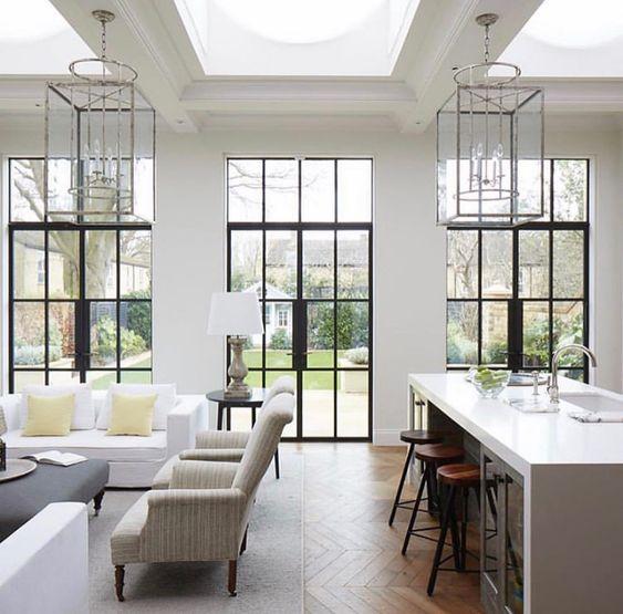
I LOVE these lantern style lights.. I have no idea why..I just love them
I like the critical style windows, the glass is full height, not just to top of door. And I like the wall in-between and not full width
I like the white counter-top, it looks fresh and clean
This floor is my favourite type, but I prefer a little lighter colour
Now that you have practice drawing plans, try to draw the plan of a photograph you have saved on Pinterest

Give it a go! No one is watching or giving you a test :)
It does not matter what your sketches look like.
The more you sketch, trace, and analyse images with writing; the more you will know what you like and don’t like.
And that is the priority at this stage.


