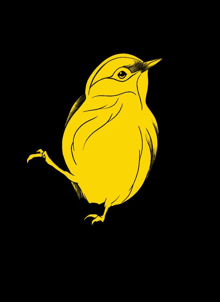
WARBLER
Designed by David Jonathan Ross

rb l e
Warbler Banner Roman
Warbler Banner Italic
Warbler Banner Bold
Warbler Banner Bold Italic
Warbler Deck Roman
Warbler Deck Italic
Warbler Deck Bold
Warbler Deck Bold Italic
Warbler Display Roman
Warbler Display Italic
Warbler Display Bold
Warbler Display Bold Italic
Warbler Text Roman
Warbler Text Italic
Warbler Text Bold
Warbler Text Bold Italic
Warbler Banner 13 pt
With a seemingly unlimited combination of melodies, these migrating wonders lure us with their subtle, varied voices. Songs range from the black-and-white warbler’s repeated wheezy, wheezy, wheezy, the blue-winged’s bee-buzz rasp and the familiar sweet, sweet, sweet, I’m so sweet of the yellow warbler.
Warbler Deck 13 pt
With a seemingly unlimited combination of melodies, these migrating wonders lure us with their subtle, varied voices. Songs range from the black-andwhite warbler’s repeated wheezy, wheezy, wheezy, the blue-winged’s bee-buzz rasp and the familiar sweet, sweet, sweet, I’m so sweet of the yellow warbler.
Warbler Display 13 pt
With a seemingly unlimited combination of melodies, these migrating wonders lure us with their subtle, varied voices. Songs range from the black-and-white warbler’s repeated wheezy, wheezy, wheezy, the blue-winged’s bee-buzz rasp and the familiar sweet, sweet, sweet, I’m so sweet of the yellow warbler.
Warbler Text 13 pt
With a seemingly unlimited combination of melodies, these migrating wonders lure us with their subtle, varied voices. Songs range from the black-and-white warbler’s repeated wheezy, wheezy, wheezy, the blue-winged’s bee-buzz rasp and the familiar sweet, sweet, sweet, I’m so sweet of the yellow warbler.


About Warbler
Warbler is a typeface for extended reading, with an emphasis on the screen. Stylistically, it follows in the footsteps of the types cut by William Martin in 1790 for the English printer William Bulmer, who famously used them in his editions for the Shakespeare Printing Office. This interpretation attempts to showcase the softer side of the Modern serif that Martin cultivated in his designs, a more genteel approach that contrasts with the vigorous, authoritative tone of the Scotch Romans that would follow it.
About Jonathan David Ross
David Jonathan Ross draws letters of all shapes and sizes for custom and retail typeface designs from his studio in the woods of Western Massachusetts. A native of Los Angeles, he began drawing typefaces at Hampshire College and joined The Font Bureau in 2007 where he honed his bézierwrangling skills. Now he publishes his typeface designs at his own foundry, DJR, as well as working on projects with Type Network and developing unusual display faces for his Font of the Month Club.