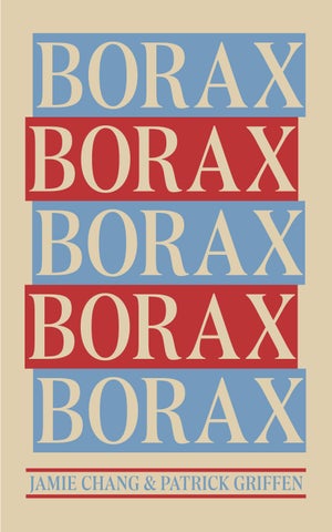
BORAX BORAX
is a variable type font family that is an ode to the typography scene of New York City and Chicago in the late 1970s, when ad agencies, design studios and typesetters used their cameras, geometry sets, drafting boards and cunning lingo to model an ideal life of consumption, and printed it all into a sleek culture everyone thought would last forever. was made to relive that technologyturnover, melting-pot tension between restraint and personality in an alphabet, and all the interesting quirkiness that can result from such an exercise. The Borax family comes in four weights with accompanying italics, includes many fine typography features such as stylistic alternates, automatic fractions, a complete set of f-ligatures, and support for the majority of Latin languages.
BORAX NEWS ALL ABOUT THE NEWEST FONT IN TOWN!
By Julia Dosch
Borax, the variable font by Canada Type, is changing the typography scene.
By the time phototypesetting was peaking in the 1970s, interesting transformations in mainstream display typography were taking place. With typesetting tools having become more than capable of reconstructing and remixing the entire eras of type history in a short time, the classic workhorses were undergoing fresh scrutiny from more appreciative angles. New faces with too much personality were still being made, but high-level advertising typography was introducing classic elements back into the mix. Professional typesetters at the time were fascinated by the colour and apertures of the transitional genre, the contrast of the Didone, the delicate balance of flare-serifs, and how a magazine ad with a large enough x-height can be read from across the room. So the popular type houses began gradually scaling back on personality and producing designs with focus on classic legibility and contrast. Outfits like ITC and VGC in particular competed within that space, and from there set advertising typography on its way to quickly shed its dated ornamental skins.
That formative period of a new typographic framework and perspective — particularly the early part when designers were trying to find a perfect balance between form and function within their field — was a fascinating time for type. Demonstrative designs from that era include Tom Carnese’s Toms Roman and the numbered Caslon series, Dave Trooper’s eponymous design, Tony Stan’s not-really-Garamond, and Ed Benguiat’s takes on classic American metal faces from a few decades earlier.
AB CDEF G 201 3 4 5 6 7 8 9 @ ! ? # % & *
Aa Bb Cc Dd Ee Ff Gg Hh Ii
Jj Kk Ll Mm Nn Oo Pp Qq Rr Ss Tt Uu Vv Ww Xx Yy Zz
0 1 2 3 4 5 6 7 8 9
BORAX IN A PARAGRAPH
During the ‘70s, New York City, a wave of creativity swept across the art scene, with artists creating bold, new works that pushed boundaries and challenged traditional ideas about what art could be. From the abstract expressionism of Jackson Pollock to the pop art of Andy Warhol, the city was home to some of the most influential artists of the 20th century. The opening of iconic institutions such as the Museum of Modern Art’s PS1 and the New York Public Theater provided platforms for artists to showcase their work, and in addition to this explosion of institutional art New York also saw the rise of street art and graffiti as legitimate art forms during the ‘70s.
During the 70s, Chicago was shaped by art and ideas produced and circulated on its South Side. Defined by the city’s social, political, and geographic divides and by the energies of its multiple overlapping art scenes, it was a vibrant era of creative expression that produced a cultural legacy whose impact continues to unfold nationally and internationally.
Bold color and pattern also featured as ‘70s design trends of typography. The psychedelic influences from the 1960s continued well into the next decade, but as diverse social movements and new music genres evolved, so did visual art. New technologies meant that designers had a lot more control when it came to lettering. Type artists moved away from the rigid typographic styles that reigned in the ‘50s and early ‘60s and began experimenting with spacing and hand-drawn letterforms. You could say that fonts began free-flowing just like the hippies of the era.
PURCHASE PURCHASEBORAX ONLY$30USD
PURCHASEBORAXTODAY USD ONLY$30USD
GLYPHS
LANGUAGE CAPABILITIES Breaking
¡Leer el periódico! Știri de ultimă oră!