EVENING AUCTION NEW YORK | 20 NOVEMBER 2025 | 6 PM AND
MODERN DAY AUCTION NEW YORK | 21 NOVEMBER 2025 | 10:30 AM & 2 PM
ALL EXHIBITIONS FREE AND OPEN TO THE PUBLIC
SATURDAY 8 NOVEMBER
12 PM–5 PM
SUNDAY 9 NOVEMBER
1 PM–5 PM
MONDAY 10 NOVEMBER
10 AM–5 PM
TUESDAY 11 NOVEMBER 10 AM–5 PM
WEDNESDAY 12 NOVEMBER 10 AM–5 PM
THURSDAY 13 NOVEMBER 10 AM–5 PM
FRIDAY 14 NOVEMBER 10 AM–5 PM
SATURDAY 15 NOVEMBER 10 AM–5 PM
SUNDAY 16 NOVEMBER 1 PM–5 PM
MONDAY 17 NOVEMBER 10 AM–5 PM
TUESDAY 18 NOVEMBER 10 AM–1 PM
WEDNESDAY 19 NOVEMBER 10 AM–5 PM
945 MADISON AVENUE NEW YORK, NY 10021 +1 212 606 7000
SOTHEBYS.COM
FOLLOW US @SOTHEBYS #SOTHEBYS

TO LEARN MORE ABOUT THE PROPERTY IN THIS SALE, PLEASE VISIT SOTHEBYS.COM/PRITZKER

CHAIRMEN
LISA DENNISON
Chairman, Americas Lisa.Dennison@Sothebys.com
HELENA NEWMAN
Chairman, Europe
Chairman, Impressionist & Modern Art Worldwide Helena.Newman@Sothebys.com
OLIVER BARKER
Chairman, Europe Oliver.Barker@Sothebys.com
BENJAMIN DOLLER
Chairman, Americas Benjamin.Doller@Sothebys.com
AMERICAN ART
STEFANY MORRIS
Head of American Art Stefany.Morris@Sothebys.com
CAROLINE SEABOLT
Head of Modern Day Auction Caroline.Seabolt@Sothebys.com
KATIE MAHER
Associate Specialist Katie.Maher@Sothebys.com
IMPRESSIONIST & MODERN ART
JULIAN DAWES
Vice Chairman
Head of Impressionist & Modern Art, Americas Julian.Dawes@Sothebys.com
SCOTT NIICHEL
Vice Chairman
Head of Middle Market for Modern & Contemporary Art Scott.Niichel@Sothebys.com
SIMON SHAW
Senior Advisor Simon.Shaw@Sothebys.com
EDITH EUSTIS
Global Head of Research, Impressionist & Modern Art Edith.Eustis@Sothebys.com
ALLEGRA BETTINI
Head of Modern Evening Auction Allegra.Bettini@Sothebys.com
SARA LAND
Specialist, Modern Evening Auction Sara.Land@Sothebys.com
GENEVIEVE RICHARDSON Cataloguer, Modern Evening Auction Genevieve.Richardson@Sothebys.com
SALE NUMBER
N12130 “PRITZKER”
BIDS DEPARTMENT
+1 212 606 7414 bids.newyork@sothebys.com
Telephone bid requests should be received 24 hours prior to the sale. This service is offered for lots with a low estimate of $5,000 and above.
PRE-SALE COORDINATOR
Bridget Quinn Impressionist & Modern Art Bridget.Quinn@Sothebys.com
POST SALE SERVICES
Samit Sinha
Client Accounts Receivable Manager Impressionist & Modern Art uspostsaleservices@sothebys.com +1 212-606-7444
COLLECTION SALE MANAGEMENT
Melissa Cooper Head of Collection Sale Management Melissa.Cooper@Sothebys.com
AUCTION & EXHIBITION INFORMATION 5
SPECIALISTS AND ENQUIRIES
44
THE CINDY AND JAY PRITZKER COLLECTION
EVENING AUCTION 20 NOVEMBER 2025
LOTS 1–13
DAY AUCTION 21 NOVEMBER 2025
WESTERN ILLUMINATED MANUSCRIPTS AUCTION
SOTHEBY’S LONDON, DECEMBER 2025
IMPORTANT AMERICANA AUCTION
SOTHEBY’S NEW YORK, JANUARY 2026
MASTER SCULPTURE AND WORKS OF ART AUCTION
SOTHEBY’S NEW YORK, FEBRUARY 2026
CHINESE WORKS OF ART AUCTION
SOTHEBY’S NEW YORK, MARCH 2026
INDIAN AND HIMALAYAN ART AUCTION
SOTHEBY’S NEW YORK, MARCH 2026
CLASSIC DESIGN AUCTION
SOTHEBY’S NEW YORK, APRIL 2026

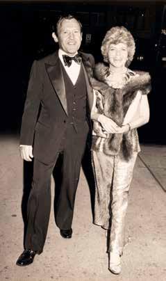
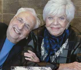
The Cindy and Jay Pritzker Collection represents a lifetime of passion for collecting and a love of art. Known for their quiet generosity and a belief in the power of civic commitment to uplift communities, they championed art and culture in all its forms – not least through the founding of the Pritzker Architecture Prize, recognized globally as the field’s highest honor.
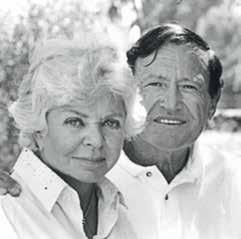
For nearly five decades works from their collection including masterpieces by Vincent van Gogh, Paul Gauguin, and Henri Matisse, have remained within the private home of a couple whose lives were devoted to Chicago, the city they loved. Cindy and Jay Pritzker were instrumental in transforming the city’s cultural and civic heartbeat, breathing life into its institutions, organizations, and communities.
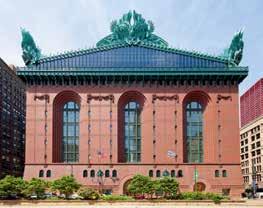
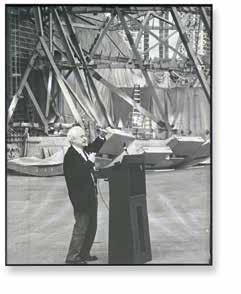
Nowhere is this devotion more evident than in Cindy’s leadership in bringing Chicago’s Harold Washington Library Center into being. As President of the Chicago Public Library Board and founding chair of the Library Foundation, she mobilized the civic will and philanthropic support that made the nation’s largest public library a reality. Cindy was also a driving force behind Chicago’s Millenium Park and the Jay Pritzker Pavilion designed by Frank Gehry.
It is fitting, then, that the collection is led by van Gogh’s masterpiece Piles de romans parisiens et roses dans une verre (Romans parisiens) (1887) – a still life of books by an artist who read voraciously – echoing Cindy’s own lifelong passion for literature and her conviction that education, like art, is essential to the enrichment of public life.
Cindy possessed a remarkable instinct and impeccable taste. Like the van Gogh, each work in the Pritzker Collection was carefully chosen by Cindy and Jay and is of exceptional quality.


“I could have gone to graduate school for years and never learned as much as he (Jay) taught me that day.”
— WARREN BUFFETT
Jay Pritzker was viewed as one of the great entrepreneurs of his generation. One of his most renowned investments occurred in 1957 at the Los Angeles International Airport, where he saw an opportunity: with the acceleration of air travel for business, there was a demand for a new kind of accommodation catering to the needs of an emerging generation of business travelers. He purchased the nearby Hyatt House motel, laying the foundation for what would become the global Hyatt Hotels empire. Further, his acquisitions included firms such as Trans Union, McCall’s Magazine, and Ticketmaster. He soon established his reputation as a visionary businessman, known for his personal integrity and for identifying opportunities with remarkable speed. As Warren Buffett said, recounting a 1954 chance meeting: “I could have gone to graduate school for years and never learned as much as he (Jay) taught me that day.”
Over time, the Pritzker family became synonymous with civic engagement, as is reflected in the numerous Chicago institutions that now bear their name: from the Pritzker School of Medicine at the University of Chicago to the Pritzker Garden at the Art Institute of Chicago to the Jay Pritzker Pavillion in Millennium Park and the Pritzker Family Children’s Zoo at the Lincoln Park Zoo.


The creation of the Pritzker Architecture Prize in 1979 was a joint venture between this remarkable couple. It was a natural extension of Cindy and Jay’s deep admiration for design and its role in the built environment. The positive public response to the newly built Hyatt Regency in Atlanta was an inspiration; helping them understand the profound impact of architecture on daily life. The purpose of the Pritzker Prize is to honor a living architect or architects whose built work demonstrates a combination of those qualities of talent, vision, and commitment, which has produced consistent and significant contributions to humanity and the built environment through the art of architecture. This statement reflects the elegance with which they approached every task from collecting to civic engagement. The Pritzker Architecture Prize is now the equivalent of the Nobel Prize in the world of architecture. Over its 47 years the Prize has presented the talents of Frank Gehry, I.M. Pei, Zaha Hadid, Jean Nouvel, Richard Rogers, Sir Norman Foster, Rem Koolhaas, Renzo Piano, Hans Hollein, Diébédo Francis Kéré, Tadao Ando and Shigeru Ban – figures whose designs represent some of the most important architectural achievements of recent times, shaping communities around the world.


“Cindy Pritzker’s legacy lives in every branch, every program, and every reader who finds inspiration within our libraries. She built more than a library system: she built a Chicago where knowledge, culture, and opportunity belong to us all.”


Cindy Pritzker, also a Chicago native, emerged as a cultural visionary whose leadership transformed Chicago’s civic identity. One of her most celebrated achievements was overseeing the development of the Harold Washington Library Center, Chicago Public Library, which opened in 1991 as one of the largest libraries in the United States. With ten floors of resources and a distinctive Winter Garden enclosed in glass, the library became both an important and functional resource as well as an architectural landmark. Cindy chaired the library board for nearly a decade, during which time she championed the construction or renovation of dozens of neighborhood branches, crucially expanding access


to education and information for communities across the city. Cindy’s influence extended further into Chicago’s civic life, not least playing a decisive role in the creation of Millennium Park. She secured Frank Gehry, a Pritzker laureate, to design the sweeping stainless steel bandshell that now stands as the Jay Pritzker Pavilion. This structure, with its flowing ribbons of steel, has become one of the city’s most iconic landmarks, hosting concerts and cultural gatherings that bring residents and visitors together. Her leadership ensured that the park would serve not only as a space of recreation but also as a cultural epicenter.
Through her decades of work, Cindy redefined what it meant to be a civic leader. She combined vision with practicality, ensuring that projects not only reflected ambition but also delivered real benefits to the public. For many, she became the city’s “philanthropic first lady,” remembered for her ability to turn bold ideas into enduring institutions.
Cindy and Jay Pritzker are remembered as figures who fused vision, philanthropy, and leadership. Jay’s entrepreneurial brilliance and integrity, combined with Cindy’s passion for civic life and the arts, left an indelible mark on the city of Chicago and beyond. Their joint legacy is a testament to the transformative power of giving, serving as a model for how individuals can enrich communities and inspire lasting change across generations.


BY JOACHIM PISSARRO
Freud’s term unheimlich, (often translated as “the uncanny”) designates something that unsettles us. It feels both familiar and unfamiliar. When applied to art, the unheimlich, “uncanny”, evokes those works that surprise us, that take us out of our realm of known quantities. We are suddenly confronted with the unexpected, something new, yet not totally unknown. It is in this fascinating context that the Cindy and Jay Pritzker Collection yields something unique to itself.
Art history intersects with the commercial art world in that both entities recognize certain universally acclaimed standards and values. While this canon is in many ways necessary, it can reduce our understanding of artists and art history to recognizable themes: Vincent van Gogh as a painter of sunflowers, Henri Matisse the painter of odalisques or as the master of cut-outs, Paul Gauguin as the chronicler of Tahiti. The genius of the Pritzker Collection lies in its resistance to such clichés: it reveals works by those universally acclaimed artists in an unexpected and daring light.
The Pritzkers’ unique curatorial sense was nurtured by a deep instinctual sensibility. The Pritzkers, whose name is eponymous with the most famous architectural prize, brought to art collecting the same attentiveness to volume, space, form and objectality. They were drawn to works that embody purity of shape, solidity of mass and the tensions of solid juxtapositions. Seen together, the collection has the clarity and coherence of an architectural masterplan: every work contributes to a vision of art that is spacious, structural, and resonant.
The result is a collection that feels both daring and refined, a group of works that do not repeat what is already known but expand the canon in surprising and meaningful ways. Each of these exceptional works allows us to encounter each artist anew, reminding us that true connoisseurship lies in the courage to choose beyond the predictable.
Among the most striking examples is van Gogh’s Piles de romans parisiens et roses dans une verre (Romans parisiens) of 1887, a still life that departs radically from van Gogh’s fields and flower-compositions for which he is best known. Here, instead of nature in bloom, we find the intimate presence of books: a subject that reveals a lesser-known but essential dimension of the artist’s creative world.
The subject itself is rare within van Gogh’s oeuvre. Of nearly nine hundred canvases, fewer than ten focus on books, and Romans parisiens is the largest and most ambitious of them. Here van Gogh identifies not with flowers or fields, the images that came to define his posthumous reputation, but with novels, the “livres jaunes,” yellow-backed paperbacks by Zola and the Goncourt brothers that he read voraciously. The painting is, in effect, an oblique self-portrait: van Gogh as a reader and an intellectual, immersed in the world of literature as deeply as he was in the field of paint—the two fields (painting and literature) being inherently bound together and nurturing each other in van Gogh’s creative psyche.
This counters one of the most enduring myths about the artist. Too often, van Gogh has been portrayed as a creature of instinct, a man driven by frenzy and madness, devouring paint like an animal, as he is portrayed in films such as Lust for Life (1956) or The Life and Death of Vincent van Gogh (1987). The reality, illuminated by van Gogh’s letters and his “poetry albums,” is far richer. Van Gogh spoke, read, and wrote in four languages; he copied hundreds of poems into albums he created for himself and his friends; he read incessantly, drawing inspiration from literature, poetry, philosophy, and the scriptures. His art was not the product of blind instinct but of a cultivated, literary, deeply thoughtful and sophisticated mind.
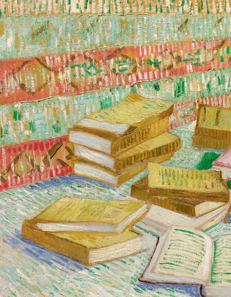


As van Gogh himself wrote to Theo, he admired writers like Zola and the Goncourts because they told “life as we feel it ourselves,” truth unvarnished, raw yet meaningful. The painting embodies this very ethos: a still life that is also a meditation on truth, reading, and the intellectual passion of an artist far more sophisticated than the stereotype suggests. Instead of the familiar myth of the tormented genius, we encounter a cultivated, literate, modern man: a painter who, despite the complexities of his psyche, read, wrote, and reflected to unparalleled levels. Rare, complex, and revealing, Romans parisiens exemplifies the collection’s daring ability to expand the canon, to show us the richness of an artist beyond cliché. This fascinating example epitomizes the Pritzkers’ own creative imagination as they assembled this edifying collection together.

Equally enlightening is Léda et le cygne. There Matisse turns not to canvas but to painting directly on a door and a set of shutters which he had joined together. This rare convergence led the artist to a new dimension where art, sculpture and architecture are all intertwined.
Commissioned for a private Parisian home, the triptych transforms these found architectural elements into a mythological tableau. Across three panels, fields of vermillion paint frame the encounter of Leda and her courtier/seducer, Zeus having metamorphosed into a swan.
On the interior of the flanking panels the scene is enlivened by Matisse’s finely incised foliage motifs, while on the exterior he finely applied luxurious gold leaf. Light, form, and functionality all brought together to give this work its maximum impact, an object transformed.

This duality makes it unique. Unlike his canvases or cut-outs, Léda et le cygne is a total work of art (Gesamtkunstwerk): decorative and architectural, intimate and monumental. It is sculptural in its volume, painterly in its surface, and mythological in its subject. The myth itself, simultaneously erotic and violent, adds a charge of vitality and tension uncommon in Matisse’s late work, where serenity usually prevails.
In the canon, Matisse is most often remembered for color as pure shape. Yet this rare commission shows him engaging with art as an environment, exploring how painting could inhabit and transform space. Within the Pritzker Collection, Léda et le cygne stands as a singular work that embodies both the architectural sensibility of the collectors and the daringness of an artist rethinking the very dimensions of painting.
Paul Gauguin’s La Maison du Pen du, gardeuse de vache is not the kind of luminous, tropical painting typically associated with the artist’s name. Far from his most recognizable Tahitian scenes, this work presents instead a Breton landscape: a solitary cowherd beside a stark farmhouse perched on windswept cliffs in remote Le Pouldu. In its day, such a modest rural motif would have definitely struck a chord as an anti-monumental statement. It is precisely in such works that Gauguin forged the vocabulary that would become the corner stone for modern painting.
The painting exemplifies Gauguin’s pivotal Breton period, where, disillusioned with Impressionism and urban Paris, he turned to Brittany, the furthest most and wildest province of France, in search for raw authenticity, and a total break from what he called “civilization”. Here, he experimented with compressed space, a high horizon, decorative flat color, and bold contours, drawing influence upon Japanese prints and folk art, with which he was intimately acquainted. The palette, while brightened by his trip to Martinique, remains more restrained compared to his later work, but the vision is already abstracted and stylized, departing from Impressionism and laying the foundation for Synthetism and his later, much-celebrated Tahitian paintings
What makes La Maison du Pen du so important, despite its unassuming and relatively quiet subject, is that it marks Gauguin’s first true artistic breakthrough: his turn from observation to invention, from naturalism to symbolic, memory-driven abstraction. In Pritzker’s collection, the painting is significant because it reminds us that artistic revolutions begin in quiet places, with works that might appear atypical but reveal their audacity, and their future promise.
Max Beckmann’s Der Wels, while representing a recurring subject in his later work, stands out as a pivotal example that reveals a decisive transformation in the artist’s career, precisely the kind of moment that defines the Pritzker Collection. Painted in Paris in 1929, it captures Beckmann at the threshold of his mature style, where allegory, monumentality, and psychological tension converge with bold new force. The thick, assertive brushwork and heavy black outlines signal this shift unmistakably: form becomes dense and sculptural, color carries weight, and every contour feels charged with symbolic intent. Within its compressed, stage-like space, four figures: a fisherman, two women, and a monumental catfish, enact a scene that is at once ordinary and metaphysical. The strength of the image lies precisely in this duality: the seemingly banal motif of fishing conceals a powerful religious allegory. The catfish, recurring throughout Beckmann’s late work, takes on an almost devotional role, a modern emblem of transcendence rising from the everyday. Through this convergence of myth, faith, and human presence, Der Wels reveals a Beckmann who no longer observes but declares—a painter entering his full maturity, fusing the sacred and the profane into a single vision.
Tracing back to Freud’s notion of the unheimlich, the uncanny, the Pritzker Collection distinguishes itself with works that surprise rather than confirm our expectations. These selections show artists in moments that feel both familiar and unfamiliar: works that expand their language, unsettle their stereotypes, and reveal the breadth of their vision, and the manifold complexities of their creative imaginary processes of great artists.
Van Gogh appears not as a tormented painter of fields, ceaselessly on edge, but as a cultivated and sophisticated reader and thinker; Matisse not only as a master of color, but as an artist who could transform found objects into a dazzling triptych; Gauguin not yet in Tahiti, but on the threshold of a revolution whose first step unfolded in the Breton countryside.
The Pritzkers’ choices show artists thinking differently, testing boundaries, and creating with unexpected delicacy or force. Many other works in the collection share this quality, but even the few highlighted here demonstrate a clear vision: to collect with a total independence from trends and market forces, to value the particular, and to see beyond the predictable. In this way, the collection does more than assemble exceptional works of art. It exemplifies connoisseurship as a renewed act of courage: the willingness to trust one’s eye, to embrace the unanticipated, and to understand that the canon itself is not fixed but open, expansive, and alive.


1886 - 1966

Torse enjoué
stamped with artist’s monogram and numbered V/V (on the interior)
bronze height: 43 ¼ in. 110 cm.
Conceived in 1965 and cast in a posthumous edition of 5; this example cast by Rudier on 7 February 1973.
$ 800,000-1,200,000
PROVENANCE
Galerie Artcurial, Paris
Edouard Loeb, Paris
Feingarten Galleries, Los Angeles
Acquired from the above on 21 April 1978 by the present owner
EXHIBITED
Musée des Beaux-Arts du Havre, Jean Arp, 1973 (not in catalogue)
LITERATURE
Eduard Trier, Marguerite Arp-Hagenbach and François Arp, Jean Arp: Sculpture, His Last Ten Years, New York, 1968, no. 355, p. 128, illustration of another cast; p. 129
Exh. Cat., Madrid, Museo Español de arte contemporáneo, Jean Arp, [1886-1966]: Esculturas/ Relieves/ Obra Sobre Papel/ Tapices, 1985, no. 59, p. 134, illustration of another cast
Claude Weil-Seigeot and Renaud Ego, Atelier Jean Arp et Sophie Taeuber, Paris, 2012, pp. 18 and 24, illustration in color of another cast (in photographs of Fondation Arp’s sculpture garden); p. 198, illustration in color of another cast
Arie Hartog and Kai Fischer, Hans Arp: Sculptures–A Critical Survey, Ostfildern, 2012, no. 355, pp. 194 and 215, illustration of another cast
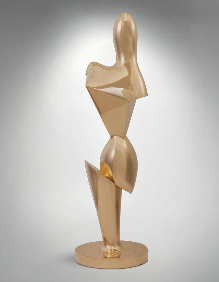
Atotem to the evolution of sculpture and the enduring inspiration of the human figure, Torse enjoué stands among the most dynamic works of Jean Arp’s late oeuvre.
In 1954, Arp received the Grand Prix for Sculpture at the Venice Biennale. This crowning achievement of his career was shortly followed by a retrospective at The Museum of Modern Art in New York. This newfound fame and financial stability at last afforded Arp the opportunity to see many of his earlier plaster forms cast in bronze and carved in marble. In this process, Arp would look back to his earlier sculptures for inspiration, including many of his Torse forms. Such renown and retrospective reflection did not stifle the artist’s creative ambition. As Serge Fauchereau writes, “Arp was not the kind of man who would feel as if he had ‘made it.’ He was to take his study of form even further to develop those forms he had discovered” (Serge Fauchereau, Arp, Barcelona, 1988, p. 26). The decade that followed—the last of his life—would reveal an artist continually striving for innovation and one working with undiminished vitality in the pursuit of new formal solutions.
Arp’s travels in the late 1950s and early 1960s— to North America, Mexico, Egypt, the Middle East and Germany—provided the artist with an ever-expanding visual vocabulary. Exposure to Pre-Columbian sculpture, monumental statues of Egypt and Assyria, Renaissance limewood carvings, Cycladic and classical Greek forms deeply enriched his formal repertoire (see fig. 1). Steeped in these historical precedents, Arp incorporated the essence


and fragmentation of such forms, integrating them into his unique sculptural language. In Torse enjoué, the human torso is abstracted and transformed, simultaneously evoking nature while defying literal representation.
This dialogue with ancient simplicity also finds kinship in the work of Constantin Brancusi, whose pursuit of the “essence of things” profoundly influenced twentieth-century sculpture. Arp’s smooth, organic surfaces echo Brancusi’s polished marble and bronze forms, yet diverge in temperament—where Brancusi seeks the sublime and eternal, Arp embraces a sense of playful metamorphosis, aligned with the Surrealist spirit of chance and transformation. His “joyful torso” does not merely symbolize the body; it becomes a poetic game between abstraction and figuration, between conscious form and the spontaneous emergence of shape.
Well known and lauded for his lyrical, biomorphic forms, Arp in the 1960s endowed many of his favored motifs with increased angularity and juxtapositions of shape. Within this context, Torse enjoué emerged. Whereas Arp’s first Torse from 1930 was clearly extrapolated from the bodily form, conveying the undulations of shoulders, back and buttocks, the artist’s mature variations on the theme witness a greater liberation of form. Though still rooted in the human figure, the swelling curves of Arp’s Torse enjoué are at turns punctuated by rectilinear planes, conjuring forms that transcend mere corporeality. Through this contrast of carefully composed angles and arcs, Arp compels the viewer to move around the sculpture in order to fully engage with its dimensionality and behold its spatial presence.
Torse enjoué presents a culmination of Arp’s remarkable oeuvre, bridging the playful experimentation of his Dada reliefs and the geometry of his early collage with the formal sophistication of his late work to create a dynamic synthesis of figure and abstraction. “The starting-point for my work is from the inexplicable, from the divine, from the fact that I can wake up, that I move, act, am suspended and live, that I can give birth to poetry, drawing, sculpture, handwriting, lines, planes, choice of colors and forms;

that I am conscious of flowers, stones, an odd fragment of marble, of a look, a step, a silhouette, a human figure, of the shape of a cloud. The inexplicable that binds me to a twig, a particle of earth, spots, or flashes of lightthat is what decides the expressive content of my work. My tasks are tied to day-dreams, with no scorn at all for the matter from which they are fashioned”(quoted in Exh. Cat., New York, The Metropolitan Museum of Art, Jean Arp, 1972, p. 30).
In Torse enjoué, Arp achieves a harmonious convergence of the figurative and the organic, seamlessly integrating the human torso with biomorphic forms. The sculpture transforms the body into a site of metamorphosis, where natural and anthropocentric elements coexist in dynamic interplay. Held in The Cindy and Jay Pritzker Collection for nearly fifty years, this work represents the sole example of Torse enjoué to appear at auction in nearly as long. Another cast of this form belongs to the collection of the Fondation Arp in Clamart, France.
1866 - 1944 Ins violett (Into Violet)
signed with artist’s monogram and dated 25 (lower left); dedicated Der verehrten Frau E. Reichelt herzlichst
Kandinsky (on the artist’s mount); titled Violett, dated 1925 (on the reverse of the artist’s mount)
watercolor and pen and ink on paper on the artist’s mount image: 13 ¾ by 8 ¾ in. 35 by 22.2 cm.
mount: 19 ⅜ by 13 ⅝ in. 49.3 by 34.5 cm.
Executed in January 1925.
$ 700,000-1,000,000
PROVENANCE
Elfriede Reichelt, Breslau (acquired directly from the artist in exchange for photographs in April 1926)
Galerie Jacques Benador, Geneva (acquired by 1956)
Heinz Berggruen, Paris (acquired by 1956)
Hanover Gallery, London (acquired in 1956 and until 1958)
Heinz Berggruen, Paris (acquired by 1958)
Mr. and Mrs. Peter Bensinger, Chicago (acquired by 1959)
Linda Olin, Chicago (until 1982)
Richard Gray Gallery, Chicago
Acquired from the above on 10 November 1982 by the present owner
EXHIBITED
Dresden, Graphisches Kabinett Hugo Erfurth and Erfurt, Angermuseum, Kunstverein, Sieben Bauhausmeister, 1925
Paris, Berggruen & Cie., Klee et Kandinsky: une confrontation, 1959, n.p., illustrated (titled Violett)
New Haven, Yale University Art Gallery, Paintings, Drawings and Sculpture Collected by Yale Alumni, 1960, no. 199, p. 192, illustrated (titled Violet)
LITERATURE
The artist’s handlist, I, no. 188
John Prossor, “An Introduction to Abstract Painting,” Apollo, vol. LXVI, no. 392, October 1957, fig. II, p. 76, illustrated (titled Violett)
Vivian Endicott Barnett, Kandinsky Watercolours, Catalogue Raisonné, vol. II, Ithaca, 1994, no. 750, p. 145, illustrated


“In any case of translation into the abstract or the employment of non-objective forms, the artist’s sole judge, guide, and principal consideration should be his feeling. …Since art affects feeling, it can only be effective through feeling.”
— WASSILY KANDINSKY

Dedication to Elfriede Reichelt on the mount of the present work
Opposite left: Fig. 1
Elfriede Reichelt, Portrait of Wassily Kandinsky, Breslau, 1926
Opposite right: Fig. 2
Elfriede Reichelt, Portrait of Wassily Kandinsky,
, 1926
1925 marked a creative apogee in Wassily Kandinsky’s involvement at the Bauhaus. In June of the same year, mounting political pressures forced the school to relocate from its original location in Weimar to Dessau. Kandinsky quickly found inspiration in the industrial city and the functionalist aesthetic of the school’s new building which its founder Walter Gropius designed. In July of the same year, Kandinsky began work on his second seminal text Punkt und Linie zu Flache (Point and Line to Plane), begun in July and completed in November of the same year.
Executed in January, Ins violett (Into Violet) at once offers a beautifully articulated compendium of the theories between color and form, point and line, and Kandinsky’s overarching ideation on the notion of correspondence, which he continued to expand on in his teachings at the Bauhaus. It anticipates the profoundly generative impulse which would come to characterize his artistic output of the period.
Throughout his eleven year tenure as a teacher at the Bauhaus, Wassily Kandinsky’s watercolors were a formative means of theoretical and methodological experimentation. His work within the medium was prolific; according to his personal handlists, Kandinsky executed 183 watercolors between 1922 and 1926 alone. It was not until 1924, however, that each entry was recorded with its own unique title, rather than one that positioned it as a preparatory work for a culminating oil painting. This indication that Kandinsky had begun to understand his watercolors as independent to his larger format works, and equal in importance, is deeply felt in the luminous Ins Violett
Within the elegantly balanced composition, Kandinsky creates a world contained unto itself— one whose component parts are familiar, and exist within our lived reality, but which are relieved of the representational meaning that we ascribe to them. At first glance, there is a distinctly hieratic arrangement to these elements: the totemic form floating at right, the ascending stack of blocks at left, and the stepped diagonal between them, all of which impart a sense of architectural rigidity to the whole. At the same time, the structural integrity of that arrangement is immediately destabilized by the magnetic pull of the various diagonals. The title, Ins violett, serves as yet another instruction to the eye, a directive which draws the viewer’s gaze to the wash of violet in the upper register, conferring on the whole the suggestion of a vertical ascent. Without the aid of contextual or spatial moorings, each of these elements becomes untethered from its physical placement within the composition and is released into a rhythmic oscillation, alternately receding away from and projecting out of the surface. The transparency of their coloration calls into flux the geometry of their outline, particularly in the areas where intermingling forms give way to new shapes in their point of contact. To the uninitiated viewer, the behavior of these forms and colors offers perhaps the most explicit articulation of Kandinsky’s theories in practice.
A defining feature of his Dessau period was precisely this overlapping of shapes and colors, which reintroduced a sense of spatial depth that had been missing from his earlier Bauhaus works. One cannot help but ascribe physical properties to these

elements, which makes comparison to his earlier figurative compositions a particularly apt point of reference for the innovations that Ins Violett reveals. In his 1909 landscape, for example, the beginnings of Kandinsky’s theorization on the psychological quality of color is present, which he so brilliantly translates in the present work (see fig. 4). Though not yet entirely liberated from its figurative subject, and still conceived within a representational framework, the Fauvist brushstrokes simultaneously evoke their real-world counterpart through the simplest of formal means and begin to behave independently of the objects they describe. Yet, just more than fifteen years later in 1925, any semblance of narrative is removed from the elements within the composition. Whereas in Häuser in Murnau (Houses in Murnau), Kandinsky elicits an emotional response through means of expression and the frenetic energy of its articulation, within Ins violett, he removes any qualifier from his brushstrokes. Color is relieved of its descriptive
obligation and form of its representational obligation. If one imagines the row of houses lining the hillside as equivalent to the two scalloped diagonal lines, or even further to the curlicue, the transformation which Kandinsky’s work underwent within the intervening period becomes aboundingly clear. Whereas the color yellow as used to describe the sunlit facades of the structures is inextricably linked to the sentimentality of the time of day which Kandinsky depicts in the landscape, we are here left to consider the behavior of color itself as a subject.
The aesthetic theories governing many of Kandinsky’s compositions throughout his career derived from his 1911 treatise, Concerning the Spiritual in Art, in which he praised the power of color and its influence on the viewer. Like many of his contemporaries working in Russia at the time, Kandinsky was deeply influenced by the principles of Suprematism. Founded by Kazimir Malevich, and based on the notion of the supremacy of pure feeling
in the pictorial arts, Suprematism rejected nature in favor of a geometric abstraction reduced to its most fundamental form (see fig. 5). Kandinsky’s own theories on art were based on his tangential notion of an “innermost necessity,” communicated between artist and viewer through the perceptual effects engendered by different pairings of shape and color. Kandinsky contended that colors carry inherent psychological effects which can be heightened or diminished when articulated within certain shapes, which also bear innate perceptual qualities. The objective of his idea of non-objectivity—a reduction of shape to its most essential form—was to remove from representation any obligation to an object beyond itself, so that those pairings can be read without the emotional meaning we attach to figurative painting. The art object and the arrangement of its formal elements thus become a means for universal, subliminal communication.
Two months after completing the present work, Kandinsky began on a major oil painting, Gel-RotBlau (Yellow-Red-Blue), now housed in the Centre Georges Pompidou (see fig. 3). As testament to the strength of the composition he achieved within Ins violett, the arrangement of forms is translated almost exactly onto the left-hand side of the canvas, poised in conversation with an explosion of overlapping organic shapes on the right. The rhythmic, synesthetic quality he is able to achieve through the juxtaposition and counterbalance of these opposing formal languages offers among the most visceral articulations of Kandinsky’s ability to engage each of the senses through the arrangement of elements within a work.
In April 1926, shortly after the oil painting was completed, Kandinsky gifted the watercolor to the German photographer Elfriede Reichelt in exchange for portraits she had taken of the artist and his wife, Nina. The inscription on the artist’s mount, Der verehrten Frau E. Reichelt herzlichst Kandinsky (To the esteemed Mrs. E. Reichelt, Kandinsky) serves as a poignant foreshadow of the acclaim with which Reichelt’s photography would soon come to be met. Her portraits of Kandinsky from the mid-1920s in particular stand among the most recognizable of the period (see figs. 1 and 2). Ins violett offers a portrait of Kandinsky in another form—capturing within its painted surface a record of the artist at a moment of profound creative invention.


“As the number of colors or forms is endless, the combinations and effects are, also, infinite. This material is inexhaustible.”
— WASSILY KANDINSKY


1853 - 1890
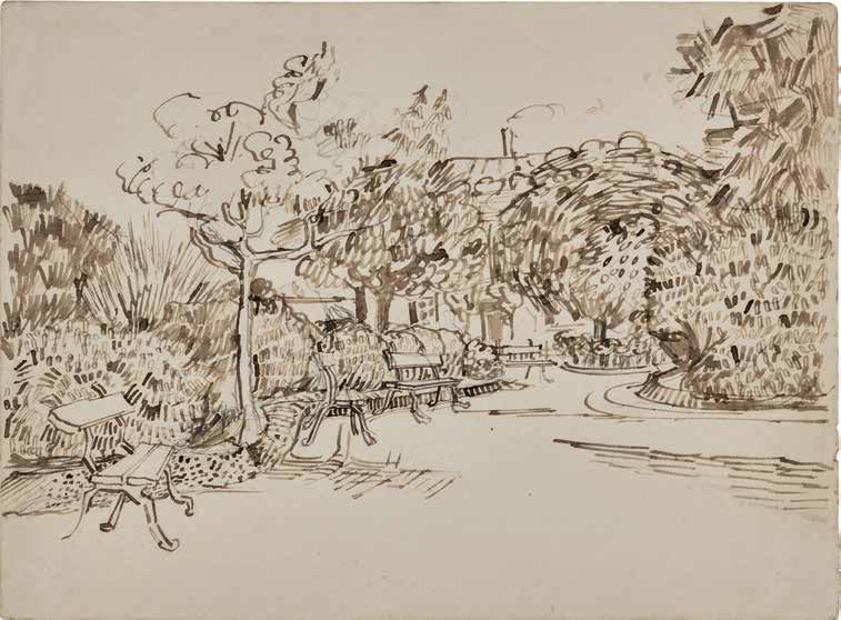
Jardin public avec bancs à la Place Lamartine
reed pen and ink and pencil on paper 10 ⅛ by 13 ¾ in. 25.8 by 34.8 cm.
Executed in late April 1888.
$ 2,000,000-3,000,000
The authenticity of this work has been confirmed by the Van Gogh Museum, Amsterdam.
PROVENANCE
Theo van Gogh, Paris (acquired by descent from the artist)
Johanna van Gogh-Bonger and Vincent Willem van Gogh, Amsterdam and Laren (acquired by descent from the above)
J.H. de Bois, Haarlem (acquired from the above in 1912)
Dr. Heinrich Stinnes, Cologne-Lindenthal (acquired from the above on 7 April 1928)
Stuttgarter Kunstkabinett, 26 April 1951, lot 1345 Auctiones AG., Basel, 24 January 1970, lot 81
Heinz Berggruen Galerie, Paris (acquired by 1970)
Kornfeld und Klipstein, Bern, 20-22 June 1979, lot 461
Alice Adam, Chicago (acquired at the above sale)
Acquired from the above on 3 July 1979 by the present owner
Opposite: Fig. 1 Vincent van Gogh, Entrée du parc public à Arles, AugustOctober 1888, The Phillips Collection, Washington, D.C.
EXHIBITED
Amsterdam, Stedelijk Museum, Tentoonstelling van schilderijen en teekeningen door Vincent van Gogh, 1905, no. 471 (titled In een park)
Cologne, Kunstverein and Frankfurt, Moderne Kunsthandlung Marie Held, 1910, no. 34 (titled Tuin met bank, huis op de achtergrond )
Frankfurter Kunstverein, Vincent van Gogh. Zeichnungen und Aquarelle, 1970, no. 59, p. 92; pl. 59, illustrated (titled Vue de Jardin and dated September 1888)
LITERATURE
Jacob-Baart de la Faille, L’Oeuvre de Vincent van Gogh, catalogue raisonné, Paris, 1928, no. 1487, vol. III, p. 147; vol. IV, pl. CLXV, illustrated (titled Vue de Jardin)
Jacob-Baart de la Faille, The Works of Vincent van Gogh, His Paintings and Drawings, Amsterdam and London, 1970, no. 1487, p. 519, illustrated (titled The Park and dated September 1888)
Charles W. Millard, “A Chronology for Van Gogh’s Drawings of 1888,” Master Drawings, vol. XII, no. 2, 1974, pp. 161 and 165 note 64
Jan Hulsker, “The Intriguing Drawings of Arles,” Vincent, Bulletin of the Rijksmuseum Vincent van Gogh, vol. 3, no. 4, 1974, no. F 1487, pp. 28 and 30 (titled The Park)
Jan Hulsker, The Complete van Gogh, Paintings, Drawings, Sketches, New York, 1980, no. 1410, p. 320, illustrated (dated April-May 1888)
Walter Feilchenfeldt, Vincent van Gogh and Paul Cassirer, Berlin, The Reception of van Gogh in Germany from 19021913, Amsterdam, 1988, no. F 1487, p. 135 (titled The Park)
J.F. Heijbroek and E.L. Wouthuysen, Kunst, kennis en commercie. De kunsthandelaar J.H. de Bois (1878-1946), Amsterdam and Antwerp, 1993, p. 205
Liesbeth Heenk, Vincent van Gogh’s Drawings,. An Analysis of their Production and Uses, Dissertation, University of London, 1996, p. 178
Jan Hulsker, The New Complete Van Gogh, Paintings, Drawings, Sketches, Amsterdam and Philadelphia, 1996, no. 1410, p. 320, illustrated
Exh. Cat., Amsterdam, Van Gogh Museum and New York, The Metropolitan Museum of Art, Vincent van Gogh: The Drawings, 2005, p. 149
Marije Velekoop and Roelie Zwikker, Vincent van Gogh Drawings, Volume 4, Arles, Saint-Rémy & Auvers-sur-Oise, 1888-1890, London, 2007, fig. 331C, p. 90, illustrated
Leo Jansen, Hans Luijten and Nienke Bakker, ed., Vincent van Gogh, The Letters, The Complete Illustrated and Annotated Edition, vol. 4, London, 2009, letter no. 602, p. 73, illustrated
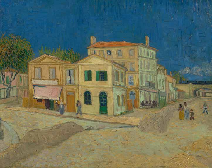
Dating to late April 1888, Jardin public avec bancs à la Place Lamartine is one of the first drawings depicting the public gardens near Place Lamartine in Arles which van Gogh executed following his move to the luminous Provençal city two months prior.
Moving to Arles from Paris in February 1888 in search of color—which was quickly becoming the main instrument of creative expression for the artist—van Gogh would spend approximately fifteen months there. This period in his oeuvre is universally recognized, as Roland Pickvance aptly notes, as “the zenith, the climax, the greatest flowering of van Gogh’s decade of artistic activity” (Exh. Cat., New York, The Metropolitan Museum of Art, Van Gogh in Arles, 1984, p. 11).
It was also a place where van Gogh envisioned the creation of what he called “The Studio of the South,” an artistic commune where he and fellow
artists—among them, his kindred spirit Paul Gauguin—could live and work together. The famous Yellow House, where van Gogh would rent four rooms in from May 1888, and which for the artist acted as a personification of that dream, was located in Place Lamartine and adjacent to the public gardens that the present work depicts. Jardin public avec bancs à la Place Lamartine is as such directly linked to the location which held incredible significance for the artist during this period.
It was in Arles that drawing once again—since van Gogh’s early career as an artist in the native Netherlands—became an important part of his creative practice and routine. In part, this was due to the new, inspiring surroundings—whether Arles itself, the surrounding Montmajour Abbey, the La Crau plain, or the nearby Mediterranean seaside—which encouraged the artist to capture his impressions
Opposite:

with amplified immediacy. In one of the letters to his brother Theo from May 1888, he exclaimed:
“I have to draw a lot… things here have so much style. And I want to arrive at a more deliberate and exaggerated way of drawing” (Vincent van Gogh to Theo van Gogh, 29 or 30 May 1888, letter no. 617)
Van Gogh’s turn to drawing was likewise driven by his fascination with Japanese prints, an interest he had an opportunity to fully engross himself in during his recent sojourn in Paris. In another letter to his brother dated 9 April—closely preceding the creation of the present work—the artist remarked that he “… must do a tremendous lot of drawing, because I want to make some drawings in the manner of Japanese prints” (quoted in Exh. Cat., New York, The Metropolitan Museum of Art, Van Gogh in Arles, 1984,
p. 54). Yet, the same letter contains a more practical reason for van Gogh taking up drawing that year. His brother Theo, who supported the artist financially, was experiencing commercial difficulties; focusing on drawing, due to its less costly nature, would allow van Gogh to alleviate his brother’s expenses.
Van Gogh’s drawings executed in Arles are widely considered among the artist’s true masterpieces, marked by brilliant spontaneity, freshness and confidence of execution. In no small part, this is due to the fact that during this period van Gogh once again turned to drawing with reed pen, a method he had briefly attempted while working in the Netherlands in the early 1870s. While the Dutch reed quickly proved unsuitable for drawing purposes, the Midigrown reed was superlative in quality, and van Gogh

began experimenting with it with great vigor and determination soon after his arrival.
With its brilliant variety of size, shape and intensity of strokes on display, the present work highlights how the use of reed pen—here combined with subtle pencil lines which the artist employed in the first instance to delineate some of the compositional elements— allowed van Gogh to achieve a new level of expressivity in his draftsmanship. As Colta Ives notes on this:
“Only after switching from quill pen to reed in Provence did he successfully inject into his designs the purposely rough, unstudied quality that became the primary source of their power, transforming otherwise static scenes into charged fields. Respecting the quirkiness of each mark and giving it room to be recognized, he came to appreciate and finally achieve that balance between blank paper and black lines that characterizes the superlative reed-pen drawings of his
fellow countryman Rembrandt” (Exh. Cat., Amsterdam, Van Gogh Museum and New York, The Metropolitan Museum of Art, Vincent van Gogh: The Drawings, 2005, p. 11).
In its subject matter, Jardin public avec bancs à la Place Lamartine is closely related to several important oils executed during the same period and held in major museum collections: L’Entrée des jardins publics à Arles (The Phillips Collection, Washington D.C.), Soleil du midi (The Poet’s Garden) (The Art Institute of Chicago) and Voie du jardin public d’Arles (Kröller-Muller Museum, Otterlo) (see figs. 1, 4 and 5).
Writing about the public gardens near the Place Lamartine and the interest they held for van Gogh, Judy Sund remarks that “Unlike many of his artist contemporaries—Claude Monet being the most notable example—van Gogh was never able to paint in a garden of his own making. But over the course of several
Above: Fig. 4 Vincent van Gogh, Allée dans un jardin public à Arles, September 1888, Kröller-Müller Museum, Otterlo
Opposite: Fig. 5 Vincent van Gogh, Le Jardin du Poète, 1888, The Art Institute of Chicago
“I have to draw a lot […] things here have so much style. And I want to arrive at a more deliberate and exaggerated way of drawing.”
—
LETTER FROM VINCENT VAN GOGH TO THEO VAN GOGH, 30 MAY 1888 (LETTER NO. 617)
months in Arles, he took vicarious possession of the gardens across the street, imbuing each section with personal associations and enthusiasms that, in turn, infused the images he made there” (Exh. Cat., London, National Gallery, Van Gogh: Poets & Lovers, 2024, p. 46).
Beyond the idea of “The Studio of the South,” which van Gogh hoped Arles and the Yellow House would come to embody, the concept of “a poet’s garden”, that is, garden as a space of poetic imagination, preoccupied van Gogh deeply during this period. It was inspired in part by his reading of Francis Petrarch and Giovanni Boccaccio, two Italian Renaissance poets who made gardens a central theme of their creative vision.
At the same time, van Gogh had in mind his close friend Gauguin, whom he was expecting to receive in Arles shortly and whom he considered a poet, a master of imagination-driven painting (see fig. 3).
Most of the oils depicting the public gardens were intended for the room in the Yellow House which hoped Gauguin would occupy upon his arrival in Provence (see fig. 2). The importance of Jardin public avec bancs à la Place Lamartine—a superbly executed drawing that has formed part of Cindy and Jay Pritzker’s distinguished collection for forty-six years— is as such further amplified by it being one of the first works depicting a space that proved crucial for ’s imagination during a critical stage in his career.


Above left
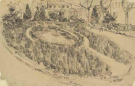
LE PARC ET L’ÉTANG
DEVANT LA MAISON JAUNE
pencil, pen and reed pen and ink on paper
12 ¾ by 20 in.
32 by 50.1 cm.
1888 Van Gogh Museum, Amsterdam
Above right
PARC À ARLES AVEC UN COIN
DE LA MAISON JAUNE
reed pen and ink and pencil on paper
13 ¾ by 10 ¼ in.
35 by 25.9 cm.
1888 Private Collection
Right
PARC AVEC ARBUSTE
pencil, reed pen and pen and ink on paper
10.0 by 13 ⅝ in.
25.8 by 34.6 cm.
1888 Van Gogh Museum, Amsterdam


The present work was part of a group of drawings sent by Vincent van Gogh to his brother Theo on the first day of May in 1888. The Van Gogh Museum has identified this work, alongside three others (F1476, F1513 and F1421) as all likely accompanying this letter and illustrating Vincent’s new home.
reed pen and ink and pencil on paper
10 ⅛ by 13 ¾ in.
25.8 by 34.8 cm.
“I’ve just sent you a roll of small pen drawings... among them you’ll find a hasty croquis on yellow paper, a lawn in the public garden at the entrance to the town. And in the background a house more or less like this one. A, well—today I rented the right hand wing of this building.... It’s painted yellow outside, whitewashed inside—in the full sunshine.... I hope I’ve been lucky this time—you understand, yellow outside, white inside, right out in the sun, at last I’ll see my canvases in a really bright interior. The floor’s made of red bricks. And outside, the public garden, of which you’ll find two more drawings.”
Vincent van Gogh to Theo van Gogh, 1 May 1888, letter no. 602
1865 - 1925
Femme couchée dormant (Le Sommeil)
signed F. Vallotton and dated 99 (lower left) peinture à la colle on paper laid down on board mounted on cradled panel
22 by 30 ⅛ in. 55.8 by 76.5 cm. Executed in 1899.
$ 1,800,000-2,500,000
PROVENANCE
Galerie Bernheim-Jeune, Paris
Paul Rosenberg, Paris (acquired from the above in 1900)
Hôtel Drouot, Paris, 21 May 1909, lot 43 (consigned by the above)
Galerie Bernheim-Jeune, Paris (acquired at the above sale)
Pierre Goujon, Paris (acquired by 1914)
Lily Goujon-Reinach, Paris (acquired by descent from the above)
Private Collection, Paris (acquired by descent from the above) Wildenstein & Co. Inc., New York (acquired from the above in 1985)
Acquired from the above on 3 April 1986 by the present owner
EXHIBITED
Paris, Galerie Bernheim-Jeune, Oeuvres de Bonnard, Maurice Denis, Ibels, Aristide Maillol, Hermann Paul, Ranson, Roussel, Sérusier, Vallotton, Vuillard, 1900, no. 7 (titled Sommeil )
New Haven, Yale University Art Gallery; Houston, Museum of Fine Arts; Indianapolis Museum of Art; Amsterdam, Van Gogh Museum and Lausanne, Musée cantonal des BeauxArts, Félix Vallotton: A Retrospective, 1991-93, no. 19, p. 24, illustrated in color; pp. 113 and 297 (catalogued as oil on board) (New Haven); no. 19, p. 24, illustrated in color; pp. 113 and 313 (Lausanne)
LITERATURE
Livre de Raison, no. 411
Thadée Natanson, “Félix Vallotton, peintre,” L’Art décoratif. Revue internationale d’art industriel et de décoration, vol. II, issue 19, October 1899-March 1900, p. 5, illustrated (titled Dormant)
André Fontainas, “Art moderne,” Mercure de France, vol. 34, May 1900, p. 544
Julius Meier-Graefe, “Félix Vallotton,” Dekorative Kunst. Illustrierte Zeitschrift für angewandte Kunst, vol. VI, issue 7, 1900, p. 293, illustrated (titled Im Schlaf )
Mir Iskousstva, Le Monde artiste, Saint Petersburg, nos. 2-3, 1901, p. 64, illustrated
Hedy Hahnloser-Bühler, Félix Vallotton et ses amis, Paris, 1936, no. 411, p. 284
Exh. Cat., Kunsthaus Zürich, Félix Vallotton, Werkverzeichnis 1865-1925, 1938, no. 411, p. 49
Günter Busch, Bernard Dorival, Patrick Grainville and Doris Jakubec, Vallotton, Lausanne, 1985, pl. 97, p. 101, illustrated; p. 234 (as oil on canvas)
Marina Ducrey, Félix Vallotton, His Life, His Technique, His Paintings, Lausanne, 1989, p. 82; p. 83, illustrated in color
Exh. Cat., Lyon, Musée des Beaux-Arts and Marseille, Musée Cantini, Le très singulier Vallotton, 2001, p. 58 (note 29)
Marina Ducrey and Katia Poletti, Félix Vallotton, 18651925, L’Oeuvre peint, Lausanne, 2005, no. 283, vol. I, p. 252, illustrated in color; pp. 251 and 273; vol. II, p. 173, illustrated in color
On flap: Félix and Gabrielle Vallotton in Lausanne, May 1899


Félix Vallotton’s tightly composed painting of a slumbering woman is among his most vivid and accomplished interior scenes. Choosing to show only the model’s vulnerable face emerging from the swathe of patterns that envelop her, he creates an image that is at once serene and suffocating—the textiles becoming a dominating force that verges on the overwhelming, while the dark, weighty furniture reinforces both the heaviness of sleep and a sense of domestic confinement. Painted in 1899, Femme couchée dormant (Le Sommeil) is almost certainly a portrait of Vallotton’s new bride Gabrielle RodriguesHenriques (née Bernheim). The couple married in May of that year, triggering a complete change in the artist’s way of life and a significant shift in his practice. Gabrielle was a wealthy widow and the daughter of the successful art dealer Alexandre Bernheim—one of the most important promoters of Impressionist and Post-Impressionist art in Paris. “I have known her for four years,” Vallotton wrote to his brother, “she is surely a good woman with whom I will get along easily. She has three children, the oldest is fifteen, the youngest seven, thus they are grown, they like me and I will love them. We expect to live together without changing our habits or almost,
me at my work, she in her interior, it will be very reasonable” (quoted in Exh. Cat., New Haven, Yale University Art Gallery, Vallotton, 1991, p. 271). Marriage brought Vallotton a combination of personal stability and companionship, along with a marked elevation in social status and valuable professional connections. In many respects, it was a happy and strategic union, though not without its underlying strains. In this bourgeois alliance—where wealth and standing seemed as significant as love and affection (see figs. 1 and 3)—Vallotton embraced the very elements he had previously critiqued: women, marriage, society and money, all subjects he had satirized in his celebrated print series Intimités, published just a year before his wedding. The union ended his long friendship with the anarchist artist Charles Maurin, who felt Vallotton had conformed to bourgeois norms, while his fellow Nabis painter Édouard Vuillard remarked on the change with the comment, “There seems to have been a revolution” (quoted in ibid., p. 34). By joining his life with Gabrielle’s, Vallotton surrendered the fiercely guarded independence he had long valued, and in doing so, left behind Hélène Chatenay, the working-class seamstress who had been his mistress since 1892.
Vallotton was born in 1865 to a Protestant family in the Swiss city of Lausanne. He left for Paris aged sixteen, where he enrolled at the Académie Julian and showed a remarkable facility for portraiture. In 1885 his work was exhibited publicly for the first time, when two of his paintings were accepted into the Salon. Yet such progress wasn’t enough to ease the financial strains that he faced, and he turned to illustration, writing and art restoration to make ends meet. By the late 1890s, Vallotton was renowned as the principal illustrator for Le revue blanche, the leading cultural journal in Paris, known for his sharply observant woodcuts that were praised for their bold black-andwhite contrasts, flattened silhouettes, and biting social commentary. After marrying, Vallotton could afford to all but give up his print work. He was now able to devote himself to his first love, painting, and his new
lifestyle opened up a rich vein of subject matter in the subtle intimacies of domestic life, with Gabrielle serving as his favorite model.
Not least among the changes in Vallotton’s life was his departure from the bohemian Latin Quarter, where he had lived since arriving in Paris. In June 1899, he secured an apartment at 6 rue de Milan, in the heart of the 9th arrondissement—a fashionable new district close to the Saint-Lazare train station filled with middle-class households and new apartments. Here, Vallotton inhabited the very world he so often critiqued in his art, where outward respectability and so often masked private chaos (see fig. 2). It was the same world that playwright Georges Feydeau skewered in his 1886 farce Tailleur pour dames (Ladies’ Dressmaker), where the 9th-district setting served as shorthand for the bourgeois society


he lampooned. Yet amid the ironies that defined Vallotton’s life, his paintings of Gabrielle and their home from this period convey a subdued sense of warmth, domestic ease, and personal contentment. Even Gertrude Stein noted that he was “very happy with his wife and she was a very charming woman” (Gertrude Stein, The Autobiography of Alice B. Toklas, New York, 1933, p. 61).
The family lodgings, on the fifth floor of the Rue de Milan building, included a studio under the roof for Vallotton to work. Yet Femme couchée dormant is not set in Gabrielle’s spacious bedroom, familiar from paintings such as Femme se coiffant, 1900 (Musée d’Orsay, Paris), nor in his studio. Vallotton’s biographer, Marina Ducrey, has suggested that the somewhat masculine furnishings indicate the scene may be set in the artist’s own bedroom. The same wallpaper and wooden bed with its red-andgold cover reappear in Nu de dos dans un interieur of 1902 (Kunsthalle Bremen), where the figure of a half-dressed woman seen from behind anticipates Vallotton’s later preoccupation with sculptural nudes in interior settings. These subjects, however, ran in parallel to his treatment of Gabrielle, whose modesty he always preserved. She was frequently portrayed against the backdrop of their home, whether playing the piano, at her toilette, arranging the linen cupboard, or interacting with her children—she is the guardian of the hearth, central to the home they dwell in. However, in such works, Vallotton did not attempt literal portraits: her stylized features and silhouette evoke less a likeness than an atmosphere, a distilled sense of the feminine woven into the rhythms of everyday life.
The poetics of domestic space and the sphere of women were a common theme within the Nabis artistic circle, where familiar interiors became stages for both symbolic meaning and aesthetic experimentation. However, unlike Pierre Bonnard or Édouard Vuillard, who reveled in patterned surfaces and chromatic harmonies, Vallotton tended to keep


his forms pared back, his palettes restricted, and his compositions taut (see figs. 4 and 5). This austerity has often been interpreted as a moral stance, or a reflection of Vallotton’s detached, outsider persona: his images were not ornamental frills but sober statements, their impact heightened by an economy of means. In this regard, the deliberate clash of patterns of Femme couchée dormant may be seen as more than a record of bourgeois taste. It draws Vallotton into the current of late nineteenth-century anxieties about decoration itself. At the fin de siècle, ornament was charged with meanings that went far beyond style. In Charlotte Perkins Gilman’s novel
The Yellow Wallpaper (1892), tangled motifs became both prison and torment, their proliferating forms a metaphor for female entrapment within the bourgeois home. By the early 1900s, Adolf Loos would condemn such embellishment as a sign of cultural decline, insisting that true progress lay in the elimination of ornament altogether. Between these poles, artists found in decoration a language for the unseen.
Gauguin’s arabesques and color harmonies became emblems of the spiritual; Vuillard dissolved figures into wallpaper and fabric to evoke the psychic pressure of domestic life; while the florid curlicues of the Art Nouveau movement sought a return to nature during an era of rapid industrialization and political unrest. Vallotton’s interiors, by contrast, thrum with a quieter but no less unsettling tension: the designs he painted so meticulously in this work seem at once to stabilize and to smother.
The charged interplay between exuberant patterning and methodical execution in Femme couchée dormant may also be due to Vallotton’s use of peinture à la colle (distemper), a medium favored by the Nabis for its saturated, matte tones. Applied quickly while heated, it can yield either a fresco-like crusted surface or, when used thinly as here, an open, swiftly brushed effect. Forms, textures and light effects have all been deliberately simplified, echoing the strong graphic sensibility of Vallotton’s woodcuts and the Japanese prints that influenced them. However,


“I love her very much, which is the main reason for this marriage, and she loves me back; we know each other thoroughly, and each have full confidence in the other.”
— FÉLIX VALLOTTON WRITING ABOUT GABRIELLE VALLOTTON, SPRING 1899
we also see a reintroduction of spatial perspective and a heightened realism compared to the paintings executed before his marriage, suggesting Vallotton was forging a new direction that harmonized his academic grounding with the innovative approaches of his contemporaries. Vallotton himself did not see originality—so often ascribed to his woodcuts by his peers—as an essential part of the artistic process. As he wrote in 1905, in a contribution to the Mercure de France on recent artistic trends: “I don’t believe that art ever takes new directions, its goals are perpetual, immutable, and have been so forever” (quoted in
Exh. Cat., New Haven, Yale University Art Gallery, Vallotton, 1991, p. 33). Always determined to follow his path, Vallotton moved through the volatile cultural, social and political landscape of fin-de-siècle France with singular independence (see figs. 6 and 7). He inhabited many worlds, yet his art pursued its own steadfast, uncompromising course, indifferent to the currents swirling around him.
Acquired from Wildenstein & Co. in 1986, Femme couchée dormant has remained in The Cindy and Jay Pritzker Collection for nearly forty years and comes to auction for the first time since 1909.
BY EVGENIA KUZMINA
Shown for the first time at Gauguin’s major retrospective in Copenhagen in 1893, La Maison du Pen du, gardeuse de vache from 1889, depicting the isolated house known as Pen-Du (or “black slope” in Breton), failed to find a buyer. Theodor Thorup described it as follows in his review of the exhibition: “What a marvelous atmosphere reigns in this Breton coastal landscape, with its white-painted house on its green lawn. And such a painting sells for 300 Danish kroner! One does not notice that there is great artistic sense in Copenhagen until this painting is sold.”1 The painting subsequently came into the possession of Heinrich Thannhauser’s gallery in Munich, who sold it in 1916 to Otto Nyquist, a Danish soldier and writer, editor-in-chief of the magazine Norsk militært tidsskrift. Exported to the United States in 1930, it found its way into several American private collections, including that of Charlse J. and Aline Liebman, before entering the collection of the German-born composer Werner Josten and his wife Margaret in 1955, who loaned it for the last time to the Gauguin retrospective exhibition at the Cincinnati Museum in 1971. Since then, this work has never been shown to the public.
¹ Cf. Th. Th. [Theodor Thorup], “Den frie Udstilling: Paul Gauguin,” Aarhus Amtstidende 27, no. 100 (May 1, 1893), p. 1.


The use of a vibrant palette bathes the canvas in a warm light. Harmony is achieved through the juxtaposition of primary colors that express a strong emotional and decorative surge. Far from conventional laws of perspective, the composition is constructed from the juxtapositions of geometric planes which create an offset perspective. Thus, we can see that there is no center to the composition and that the vanishing line seems to shift to the right. In the foreground the peasant woman, whose face dissolves into abstraction, as well as the orange haystack form a vertical axis that is paralleled by the silhouette of the cow on the left. A diagonal line can be traced between the cow and the house, creating a complex interplay between different geometric planes.
Gauguin had previously incorporated the cow motif with angled foreshortening in several of his other works, reminiscent of Japanese prints (see fig. 2). In La Maison du Pen du, one is particularly reminded of the drawing Bretonnes et vaches, held in the collection of the Albertina Museum (see fig. 1). The cow’s protruding bone structure, seen from the side, is recognizable in other works by Gauguin, such as Bord de l’eau, veau et vache (DW 2092), Gardeuse de vaches sur la plage de Bellangenet from 1886 (DW 234), Cours d’eau sous les arbres, Martinique from 1887 (DW246), or La Vache rouge from 1889 (PG588L3).
La Maison du Pen du is a pivotal work in Gauguin’s Breton period. The simplification of forms, disjointed perspectives, and fragmentation of faces are strikingly modern and herald the avant-garde artistic movements that would dominate the art world in the twentieth century. It is no coincidence that artists such as Pablo Picasso and Wassily Kandinsky gave Paul Gauguin a prominent place as a precursor in their manifestos.
La Maison du Pen Du is one of the first depictions of this modest building, which many painters from the Pont-Aven school helped to make famous4. In his letter to Vincent van Gogh on October 20, 1889, the artist wrote: “[...] What I have done most of this

year, are simple peasant children, walking indifferently along the seashore with their cows. But since I do not like the trompe l’oeil of the open air or of anything else, I try to put into these desolate figures the savagery that I see in them and that is also in me. [...]”5
Paul Sérusier painted this building twice: once from a spot slightly closer to the edge of the cliff than Gauguin’s6; Charles Filiger depicted it many times in his compositions from 1890.7 Gauguin returned to this motif, using it in the background of La Petite Gardeuse de vaches (PGJ0NB) and painting it from a different angle in 1890, in another Maison du Pen-Du (PG80SZ; see fig 3). The rocks to the left of the house form the motif of La Moisson au bord de la mer (PG9MHR) from 1890 and are also repeated in the background of La Perte du pucerage (PGZ6NC).
² DW refers to n. of cat. Gauguin: premier itinéraire d’un sauvage : catalogue de l’oeuvre peint, 1873-1888, Milano : Skira ; Paris : Wildenstein Institute, 2001
³ No. PG fait refers to the numbering in Gauguin: Catalogue Raisonné of the Paintings, 1889–1903. Edited and compiled by the Wildenstein Plattner Institute, Inc.
4 It should be noted that these artists, who were later grouped together under the label of Pont-Aven, were captivated by the rural and maritime landscapes of this region, often using the local people going about their daily business as models. Cf. Wladyslawa Jaworska, Paul Gauguin et l’école de Pont-Aven (Neuchâtel: Éditions Ides et Calendes, 1971)
5 Douglas Cooper, ed., Paul Gauguin: 45 Lettres à Vincent, Théo et Jo van Gogh; Collection Rijksmuseum Vincent van Gogh, Amsterdam (The Hague: Staatsuitgeverij; Lausanne: La Bibliothèque des Arts, 1983), pp. 273, 275
6 Marcel Guicheteau, Paule-Henriette Boutaric, and Georgette Guicheteau, Paul Sérusier (Paris: Éditions Side; Cergy-Pontoise: Graphédis éditeur, 1976); no. 21, p. 200.
7 Filiger: dessins, gouaches, aquarelles, exh. cat. (Saint-Germain-en-Laye: Musée départemental du Prieuré, 1971), p. 45.

1848 - 1903
La Maison du Pen du, gardeuse de vache
signed P. Gauguin and dated 89 (lower right) oil on canvas
24 by 29 ¼ in. 61.1 by 74.2 cm.
Executed in summer 1889.
$ 6,000,000-8,000,000
PROVENANCE
Mette Gauguin, Copenhagen (on consignment from the artist circa 1893)
Moderne Galerie Heinrich Thannhauser, Munich (acquired by 1916)
Otto Nyquist, Oslo (acquired from above through A.S. Mohr & Sønner, Bergen, Norway on 29 July 1916)
Charles J. and Aline Liebman, New York (acquired by 1930)
Parke-Bernet Galleries, Inc., New York, 7 December 1955, lot 63 (consigned by the above)
Werner and Margaret Josten, New York (acquired at the above sale and until at least 1971)
Peter W. Josten, New York (acquired by descent from the above and until at least 1984)
Richard L. Feigen & Co., New York
Acquired from the above on 22 October 1997 by the present owner
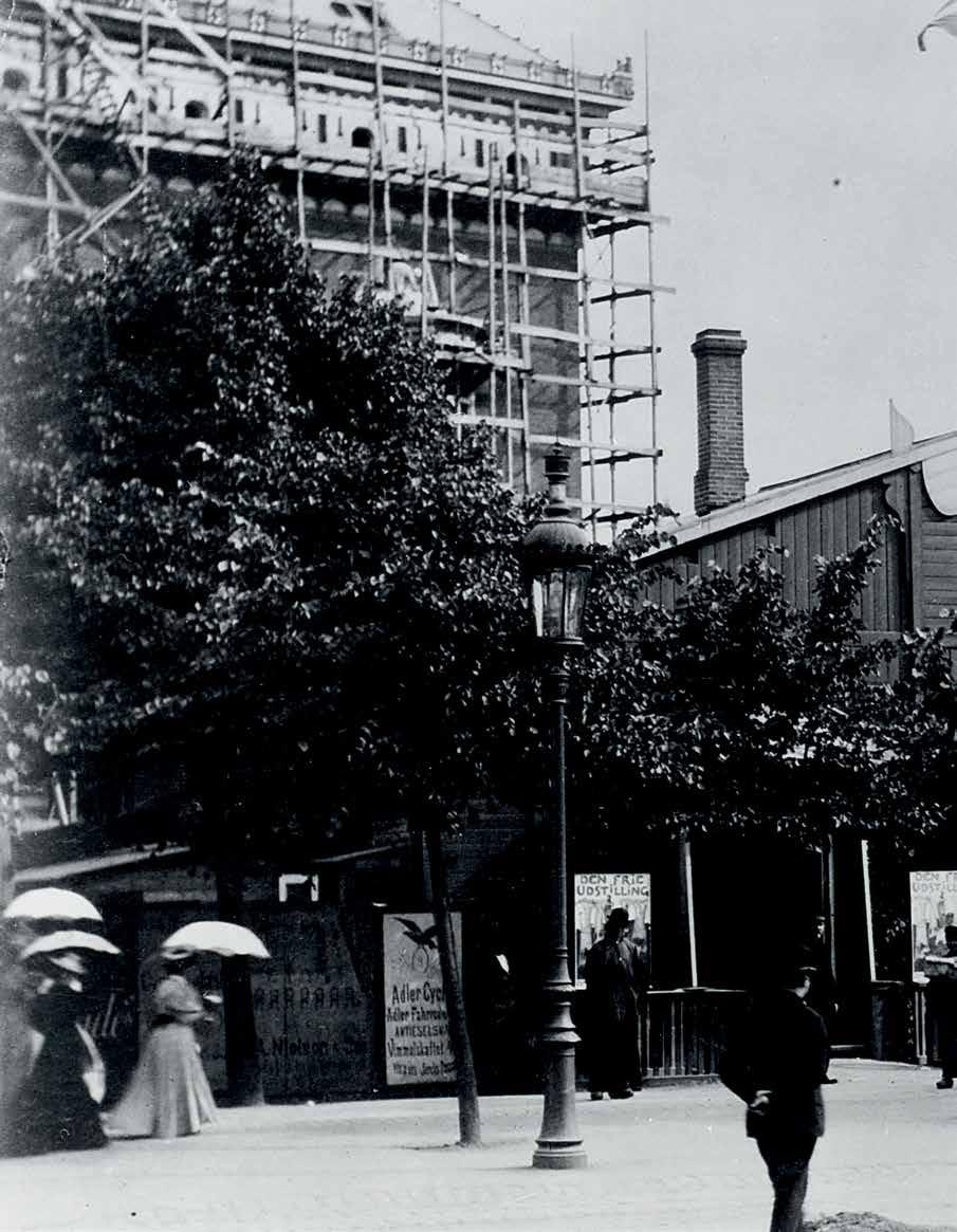
EXHIBITED
Copenhagen, Vesterbors Passage, Den Frie Udstilling, 1893, no. 149 (titled Kystlandskab. Bretagne)
New York, The Museum of Modern Art, Summer Exhibition: Painting and Sculpture: Retrospective, 1930, no. 37, p. 5 (titled Breton Landscape)
New York, Wildenstein, Paul Gauguin, 1946, no. 5, p. 19, illustrated; p. 63 (titled Landscape, Brittany and dated 1889)
New York, Wildenstein, Gauguin, 1956, no. 16, p. 16; p. 36, illustrated (titled Landscape, Brittany)
Paris, Galerie Charpentier, Cent oeuvres de Gauguin, 1960, no. 52, n.p., illustrated (titled Paysage du Pouldu) Munich, Haus der Kunst, Paul Gauguin, 1960, no. 40, p. 9; p. 25, illustrated (titled Landschaft bei Le Pouldu) Vienna, Österreichische Galerie im Oberen Belvedere, Paul Gauguin, 1848-1903, 1960, no. 19, p. 37; pl. 5, illustrated (titled Landschaft bei le Pouldu)
New York, The Solomon R. Guggenheim Foundation, Gauguin and the Decorative Style, 1966 (titled Landscape, Brittany: The Lone House)
Cincinnati Art Museum, The Early Work of Paul Gauguin: Genesis of An Artist, 1971, no. 22, p. 12; p. 27, illustrated (titled The Lone House (La Maison Isolée))


LITERATURE
Theodor Thorup, “Den frie Udstilling: Paul Gauguin,” Aarhus Amtstidende, vol. 27, no. 100, 1 May 1893, p. 1
Katalog der Modernen Galerie Heinrich Thannhauser, München, Munich, 1916, pp. XXIX and XXVIII, pl. 33, illustrated (titled Bretonische Landschaft)
Pola Gauguin, My Father Paul Gauguin, 1937, New York, p. 129, illustrated (titled Landscape)
The Bulletin of the Metropolitan Museum of Art, New York, Summer 1951, p. 32
René Huyghe, Le Carnet de Paul Gauguin, vol. II, Paris, 1952, pp. 168-69
John Rewald, Post-Impressionism: From Van Gogh to Gauguin, New York, 1956, p. 285, illustrated (titled Landscape at Le Pouldu)
Raymond Nacenta, Gauguin, Paris, 1960, n.p., illustrated (titled Paysage du Pouldu)
Claude Roger-Marx, “Des chefs-d’oeuvre de Gauguin sortent des collections particulières,” Le Figaro littéraire, 23 January 1960, p. 14, illustrated (titled Paysage)
Georges Boudaille, Gauguin, Paris, 1964, p. 113, illustrated in color (titled The Lonely House)
Georges Wildenstein, Gauguin, Paris, 1964, no. 364, p. 139, illustrated (titled La Maison isolée)
Gérard Legrand, Gauguin, Paris, 1966, p. 16; p. 19, illustrated in color (titled La Maison isolée)
Wayne Andersen, “Gauguin’s Motifs from Le Pouldu: Preliminary Report,” Burlington Magazine, vol. 112, no. 810, September 1970, fig. 65, p. 616, illustrated (titled La Maison isolée)
Wladyslawa Jaworska, Paul Gauguin et l’école de PontAven, Neuchâtel, 1971, p. 235, illustrated in color (titled Paysage breton, la maison isolée)
G. M. Sugana, L’Opera completa di Gauguin, Milan, 1972, no. 179, p. 98; p. 97, illustrated (titled Pastora e mucca in riva al mare (La casa isolata))
Lee van Dowski, Die Wahrheit über Gauguin, Darmstadt, 1973, no. 170c, p. 263 (titled La Maison isolée)
Vojtěch Jirat-Wasiutyński, Gauguin in the Context of Symbolism, Dissertation, Princeton University, 1975, vol. 1, p. 185 (titled La Maison Isolée)
Pierre Leprohon, Paul Gauguin, Paris, 1975, pp. 168 and 381 (titled La Maison isolée and dated summer 1890)
Ziva Amishai-Maisels, “A Gauguin Sketchbook: Arles and Brittany,” Israel Museum News, no. 10, April 1975, pp. 71 and 75 (note 18; titled Isolated House)
Elda Fezzi, Gauguin: The Complete Paintings, vol. I, London, 1979, no. 350, p. 88, illustrated (titled Shepherdess and Cow by the Sea)
Douglas Cooper, ed., Paul Gauguin: 45 Lettres à Vincent, Théo et Jo van Gogh, Amsterdam, 1983, pp. 273 and 275 (note 5)
Exh. Cat., Charlottenlund, Ordrupgaard, Gauguin og Van Gogh i København i 1893, 1984, no. 37, p. 84, illustrated (titled Kystlandskab. Le Pouldu. Landscape at Le Pouldu)
La Route des Peintres en Cornouaille: 1850–1950, Quimper, 1990, p. 98 (titled Maison du Pan du)
Belinda Thomson, ed., Gauguin by Himself, Boston, 1993, pl. 122, p. 158, illustrated in color (titled Landscape at Le Pouldu / Isolated House)
Leo Jansen, Hans Luijten and Nienke Bakker, eds., Vincent van Gogh: The Letters, vol. V, London, 2009, no. 828, p. 163
Stefan Koldehoff and Chris Stolwijk, eds., The Thannhauser Gallery: Marketing Van Gogh, Brussels, 2017, pp. 46 and 124 (titled Landschaft mit Kühen)

La Maison de Pen du, gardeuse de vache, painted in summer of 1889, is an evocative example of Paul Gauguin’s Pont-Aven style. Painted in Le Pouldu, a village situated several miles east of the busier town of Pont-Aven, the present work captures the bucolic landscape and seascape of this remote part of Brittany. The late 1880s and early 1890s were the most crucial and fruitful of Gauguin’s career. Through several stays in Brittany, time in Paris, a trip to Martinique and his famed collaboration with Vincent van Gogh in Arles, Gauguin’s artistic practice and signature style and imagery developed into one of the most recognizable in modern art. It is from this period that La Maison de Pen du, gardeuse de vache springs, a canvas which synthesizes the impact of the tropical colors of Martinique, van Gogh’s florid brushwork and the impact of Japanese prints (see figs. 1 and 2).
As early as the 1860s, Brittany had served as an inspiration for many artists who were drawn to the verdant landscape and traditional customs. In apposition to the Impressionists, who sought to depict the encroaching change of the industrial revolution on the cities, suburbs and countryside of France, the artists who flocked to Brittany were in search of a more traditional agrarian society, undisturbed by the rapid acceleration of modern life. Gauguin’s aims were similar in his first trip to the region. Writing to his friend Emile Schuffenecker he stated “I love Brittany which I find savage and primitive. When my clogs ring on the granite ground I hear the dull and powerful sound that I am looking for in painting” (quoted in Victor Merles, ed., Correspondence de Paul Gauguin, Paris, 1984, letter 141, p. 172).
The present work takes as its subject an anonymous cowherd, set against the rolling countryside towards the sea. A boat scuds across the water at far right and an abandoned house, which featured in a number of other works by Gauguin and other artists at this time, sits atop the rocky promontory. This picture combines the striking palette that typified Gauguin’s work in Martinique and a modern compositional structure that owes much to Japanese printmaking, particularly Hiroshige. This appropriation of Japanese style would prove significant in the Nabis movement to
which Gauguin’s work in Brittany gave rise. The decorative treatment of the landscape and the flattening of perspectival space illustrate Gauguin’s bold artistic vision. As Judy Le Paul explains: “Aware of the way Japanese artists constructed certain of their landscapes, Gauguin began to turn away from Western influences. The general rule of a centrally placed horizon… gave way to a horizon near the top of the canvas or even raised beyond its boundaries. Using a steep perspective, Gauguin narrowed the field of vision, consciously cutting up the landscape to concentrate on one detail or fragment at the


“The eight paintings by Gauguin stretch with still more emphatic variations from two Breton landscapes, fresh and moving in color, to Adolph Lewisohn’s “Ia Orana-Maria,” in which one may find for the looking something of the nature of his “escape” from civilization, an escape made with all the essentials of sophistication packed in with the rest of his spiritual and intellectual luggage. Artistically if not esthetically he makes here an impressive figure, his color is sumptuous on the walls of this most initiated of museums, his design is arresting without introducing the element of deformation. His “Ia Orana-Maria” is our Ave Maria….” — ELIZABETH LUTHER CARY, REVIEWING SUMMER EXHIBITION: PAINTING AND SCULPTURE: RETROSPECTIVE AT THE MUSEUM OF MODERN ART , NEW YORK IN THE NEW YORK TIMES , 29 JUNE 1930, P. 107
expense of another” (Judy Le Paul, Gauguin and the Impressionists at Pont-Aven, New York, 1987, p. 80). In the present work Gauguin employs this technique to masterful effect building a dynamic landscape that is full of local incident and detail.
La Maison de Pen du, gardeuse de vache has a distinguished early exhibition history. It was included in the famed 1893 Den Frie Udstilling (The Free Exhibition), where Vincent van Gogh’s work was also exhibited. This Danish artist’s association was founded just two years prior and was created in the manner of the Salon des Refusés in Paris. “What a simply wonderful atmosphere,” wrote Theodor Thorup, “there is in the coastal landscape from Brittany with the white-painted house on the green point. And a picture like this is being sold for 300 Kr.! One cannot feel that there is any great sensitivity to art in Copenhagen, seeing that it is not sold yet” (Theodor Thorup, “Den frie Udstilling: Paul Gauguin,” Aarhus Amtstidende, vol. 27, no. 100, 1 May 1893, p. 1). Nearly forty years later, the present work was one of eight Gauguin’s included in the 1930 Summer Retrospective at the new Museum of Modern Art in New York. In their review, The New York Times stated: “The eight paintings by Gauguin stretch with still more emphatic variations from two Breton landscapes, fresh and moving in color, to Adolph Lewisohn’s “Ia Orana-Maria,” in which one may find for the looking something of the nature of his “escape” from civilization, an escape made with all the essentials of sophistication packed in with the rest of his spiritual and intellectual luggage. Artistically if not esthetically he makes here an impressive figure, his color is sumptuous on the walls of this most initiated of museums, his design is arresting without introducing the element of deformation. His “Ia Orana-Maria” is our Ave Maria….” (Elizabeth Luther Cary, “What Has Been Chosen,” The New York Times, 29 June 1930, p. 107). This exhibition, held just a year after the museum opened, firmly demonstrated Gauguin’s place as one of the great doyens of modern art.
Charles and Aline Liebman, the lenders to the 1930 exhibition at the Museum of Modern Art, had a revolutionary collection, from the present painting to works by Gino Severini, Edgar Degas, Georgia O’Keeffe, Diego Rivera and Constantin Brancusi. The Liebman’s sold their collection at Parke-Bernet in 1955 where La Maison de Pen du, gardeuse de vache was acquired by the composer Werner Josten and his wife Margaret. It remained within their family until at least the mid1980s, a part of their son Peter Josten’s collection, who was himself a generous benefactor to museums across the United States.


“One bit of advice, don’t copy nature too much. Art is an abstraction; derive this abstraction from nature while dreaming before it, but think more of creating than the actual result—My latest works are well under way and I believe you will find in them a special note or rather affirmation of my previous research, the synthesis of form and color derived from the observation of the dominant element only”
— PAUL GAUGUIN TO EMIL SCHUFFENECKER, 1888

From June through December of 1889, Paul Gauguin executed a celebrated series of landscapes which feature local people, often at work, in the rural landscape of Brittany. The overwhelming majority of these works are now held in museum collections across Europe, North America and Japan. Indeed of these twenty-two works, only four, including La Maison de Pen du, gardeuse de vache, remain in private hands. Featuring non-naturalistic perspective, color and form these paintings herald a new era in Paul Gauguin’s oeuvre.


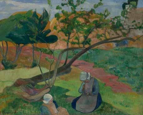


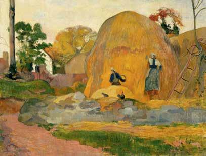


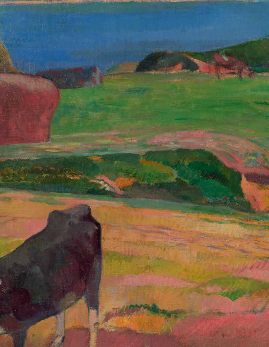


BY ANN DUMAS
Apile of paperback books is strewn on a table, an unassuming subject perhaps, yet this lively and colorful composition represents one of the most significant turning points in van Gogh’s career when, just a few months after his arrival in Paris in the spring of 1886, he fully discovered the power and excitement of color.
Life in Paris was transformative for van Gogh. Living with his art-dealer brother Theo, he haunted the cafés and bars of Montmartre, mingled with artists and, for the first time, discovered the Impressionists whose colorful paintings were a revelation that inspired him to turn his back on the somber, muted tones of his earlier paintings produced in the Netherlands. His new friends Émile Bernard and Henri de Toulouse-Lautrec encouraged van Gogh to embrace color. No less influential were the vivid and then inexpensive Japanese ukiyo-e prints that he and Theo collected in large numbers. From now on, color was paramount. In the two years that van Gogh spent in Paris between 1886 and 1888 he experimented constantly painting numerous still-lifes of flowers purely to investigate the properties of colors and the way they worked together. He was also keenly aware of the latest development in the Paris art scene, the new style led by Georges Seurat and based on scientific theories of complementary color to capture scintillating effects by applying point in small dots of pure pigment that became known as pointillism or Neo-Impressionism.
The swift staccato brushwork that so enlivens the present work demonstrates van Gogh’s personal and less constrained response to the new technique.
What makes Romans parisiens so special, however, is that beyond its obvious visual appeal it is enriched by a deeper meaning of special significance to van Gogh, his profound love of literature. He acknowledged “a more or less irresistible passion for books”1 and refers to no less that around 800 books and 150 authors in his celebrated and eloquent letters. Van Gogh’s reading was broad and deep; he could read in Dutch, English, French, and German. The son on a Dutch pastor, he was well versed in the Bible, but he was also drawn to the realist novels of George Eliot and Charles Dickens and read Shakespeare’s plays, several more than once. In Paris, he discovered contemporary French writers whose works appeared in the yellow paperbacks so popular at the time and that feature prominently in the current painting.
Van Gogh admired naturalist writers like the Edmond de Goncourt and Émile Zola in whose books he found confirmation of his intense commitment to capture directly what he saw. He read all of Émile Zola’s novels the moment they were published, explaining: “…if one wants truth, life as it is, for example… Zola in La joie de vivre and L’Assommoir and so many other masterpieces paint life as we feel it ourselves and thus satisfy that need which we have, that people tell us the truth”.2
Books appear in a few other paintings by van Gogh. An early still-life Still-Life with Bible, 1885 (Van Gogh Museum, Amsterdam) painted when van Gogh was still in the Netherlands contrasts a weighty family Bible with a yellow-covered novel by Zola, La joie de vivre Piles of French Novels, 1887 (Van Gogh Museum), is perhaps a smaller study for the present work. However, Romans parisiens, is by far the most complete statement of the theme, a prelude to the central role that color henceforward would play in Vincent’s art and an ode to his love of modern French literature.
¹ Letter from van Gogh to his brother Theo van Gogh, about June 22-24, 1880. https://vangoghletters.org, Letter155
² Letter from van Gogh to his sister Willemien van Gogh , October 1887 https://vangoghletters.org, Letter 574
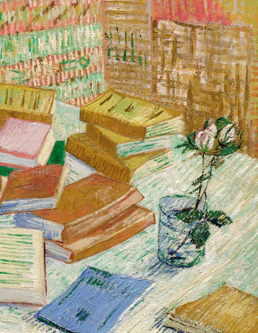


1853 - 1890
Piles de romans parisiens et roses dans une verre (Romans parisiens)
oil on canvas
28 ⅞ by 36 ¼ in. 73.3 by 92.1 cm.
Executed in November-December 1887.
ESTIMATE UPON REQUEST
The authenticity of this work has been confirmed by the Van Gogh Museum, Amsterdam.
PROVENANCE
Theo van Gogh, Paris (acquired by descent from the artist)
Johanna van Gogh-Bonger, Amsterdam (acquired by descent from the above)
Vincent Willem van Gogh, Laren (acquired by descent from the above)
Antonio Mancini, Paris (probably acquired through Julien Tanguy)
Galerie Bernheim-Jeune, Paris (acquired from the above on 6 April 1907)
Galerie Paul Vallotton, Lausanne (acquired in 1916)
Galerie Tanner, Zurich (acquired in 1916)
Dr. Georg Boner, Baden and Zurich (acquired from the above in 1918)
Private Collection, Switzerland (acquired by descent from the above)
Christie’s, London, 27 June 1988, lot 17 (consigned by the above)
Robert Holmes à Court, Perth (acquired at the above sale)
Acquired from the above through Richard L. Feigen & Co. on 17 February 1994 by the present owner


EXHIBITED
Paris, Pavillon de la Ville, IV Exposition de la Société des Artistes Indépendants, 1888, no. 658 (titled Romans Parisiens)
Paris, Galerie Bernheim Jeune, Fleurs et Natures Mortes 1907, no. 27 (titled Les livres)
Paris, Galerie Bernheim Jeune, Cent Tableaux de Vincent van Gogh 1908, no. 32 (titled Les livres)
Berlin, Ausstellungshaus am Kurfürstendamm, Achtzehnten Austellung der Berliner Secession, 1909, illustrated (titled Bücher)
Paris, Galerie E. Druet, Cinquante Tableaux de Vincent van Gogh 1909, no. 8 (titled Les Livres)
Paris, Galerie Bernheim Jeune, L’Eau 1911, no. 22 (titled Les livres)
Berlin, Paul Cassirer, Cologne, Kölner Kunstverein and Hamburg, Galerie Commeter, Vincent van Gogh, 1914, no. 98, illustrated (titled Die Bücher and dated 1888)
Kunsthaus Zürich, Ausstellung 1916, no. 197 (titled Les livres jaunes)
Kunsthalle Basel, Vincent van Gogh, 1924, no. 24, p. 7 (titled Die Bücher)
Kunsthaus Zürich, Vincent van Gogh, 1924, no. 22, p. 15 (titled Stilleben, Bücher)
Berlin, Galerie Matthiesen, Das Stilleben in der deutschen und französischen Malerei von 1850 bis zur Gegenwart, 1927, no. 124, p. 49; p. 91, illustrated (titled Bücher mit Rose)
Paris, La Gazette des Beaux-Arts et Beaux-Arts, La Peinture française du XIXe siècle en Suisse, 1938, no. 125, pp. 57-58; pl. XLIII, illustrated (titled Les Livres Jaunes (Romans Parisiens))
Kunsthalle Basel, Vincent van Gogh, 1853-1890, 1947, no. 43, p. 23 (titled Romans Parisiens)
Paris, Petit Palais, De Géricault à Matisse, chefs d’oeuvre français des collections suisses, 1959, no. 65 (titled Les livres jaunes (romans parisiens))
Aarau, Aargauer Kunstverein, Aus Aargauischen Privatbesitz 1. Teil. von den Impressionisten bis zur Gegenwart 1960, no. 142 (titled Les livres jaunes)
Lausanne, Palais de Beaulieu, Chefs-d’Oeuvre des Collections Suisses de Manet à Picasso, 1964, no. 112, illustrated (titled Les livres jaunes (romans parisiens))
Paris, Orangerie des Tuileries, Chefs-d’Oeuvre des collections suisses de Manet à Picasso, 1967, no. 101, illustrated (titled Les livres jaunes (romans parisiens))
Paris, Musée d’Orsay, Van Gogh à Paris, 1988, no. 56, pp. 13, 140, 151 and 158; p. 152, illustrated in color (titled Romans parisiens)
Amsterdam, Rijksmuseum Vincent van Gogh, Vincent van Gogh Paintings, 1990, no. 29, p. 88; p. 89, illustrated in color (titled Still Life with Books and dated winter 1887-88)
Essen, Museum Folkwang and Amsterdam, Van Gogh Museum, Vincent van Gogh and the Modern Movement, 1890-1914, 1990-91, no. 17, pp. 90-91; p. 92, illustrated in color (titled Still-life: Romans parisiens with a Rose and dated 1887-88)
The Art Institute of Chicago and Amsterdam, Van Gogh Museum, Van Gogh and Gauguin, The Studio of the South, 2001-02, no. 25, p. 91, illustrated in color (Chicago only)
London, Royal Academy of Arts, The Real Van Gogh: The Artist and His Letters, 2010, no. 123, pp. 226-27, illustrated in color (titled Romans Parisiens (Les Livres Jaunes))
The Art Institute of Chicago, Van Gogh’s Bedrooms, 2016, n.n., pl. 9, illustrated in color (titled Parisian Novels)
LITERATURE
Néo (Paul Signac), “IVe Exposition des Artistes Indépendants,” Le Cri du Peuple, 29 March 1888
Gustave Geffroy, “Pointillé Cloisonnisme,” La Justice, 11 April 1888, no. 3010 (titled Romans parisiens)
Jules Christophe, “Le Néoimpressionisme au Pavillon de la Ville de Paris,” Journal des artistes, 6 May 1888, p. 148
Julius Elias, “Das Zehnte Berliner Sezessionsjahr,” Kunst und Künstler, Berlin, June 1909, p. 402, illustrated (titled Bücher)
Kurt Pfister, Vincent van Gogh, Potsdam, 1922, pl. 25, illustrated (titled Bücher)
Gustave Coquiot, Vincent van Gogh, Paris, 1923, p. 136 (titled Les Livres ou Romans parisiens)
Théodore Duret, Van Gogh, Paris, 1924, pl. IV, illustrated (titled Les Livres)
Jacob-Baart de la Faille, L’Oeuvre de Vincent van Gogh, Catalogue raisonné, Paris, 1928, no. 359, vol. I, p. 101; vol. II, pl. XCVII, illustrated (titled Les Livres jaunes (romans parisiens))
Beeldende Kunst, vol. XV, no. 76, circa 1929, n.p., illustrated
Archibald Standish Hartrick, A Painter’s Pilgrimage Through Fifty Years, Cambridge, 1939, p. 46 (titled Romans Parisiens)
Jacob-Baart de la Faille, Vincent van Gogh, New York, 1939, no. 231, p. 184, illustrated
A.M. Rosset, Van Gogh, Paris, 1941, pl. 42, illustrated (titled Les Livres jaunes: Romans parisiens)
Carl Nordenfalk, “Van Gogh and Literature,” Journal of the Warburg and Courtauld Institute, vol. X, 1947, pp. 142-3f, pl. 37b, illustrated (titled Parisian Novels)
Georg Schmidt, Van Gogh, Bern, 1947, pl. 15, n.p., illustrated (titled Die Gelben Bücher)
Jean Leymarie, Van Gogh, Paris, 1951, pl. 29, illustrated; p. 99 (titled Les livres jaunes (Romans Parisiens))
Werner Weisbach, Vincent van Gogh, Kunst und Schicksal, vol. II, Basel, 1951, p. 41; pl. 22, illustrated (titled Stilleben mit Büchern)
Lawrence and Elisabeth Hanson, Portrait of Vincent, a van Gogh Biography, London, 1955, pp. 175-76 (titled Romans Parisiens)
Exh. Cat., London, Marlborough Fine Art, Van Gogh’s Life in his Drawings; Van Gogh’s Relationship with Signac, 1962, pp. 92-93
Pierre Cabanne, Van Gogh, London, 1963, p. 96 (titled The Yellow Books (Parisian Novels))
Phoebe Pool, Impressionism, New York and Washington, D.C., 1967, pl. 165, p. 213, illustrated in color; pp. 214 and 279 (titled The Yellow Books, Parisian Novels)
Jean Leymarie, Who was Van Gogh?, Geneva, 1968, p. 75, illustrated (titled The Yellow Books (Parisian Novels))
Marc Edo Tralbaut, Vincent van Gogh, New York, 1969, p. 202 (titled Yellow Books)
Jacob-Baart de la Faille, The Works of Vincent van Gogh, His Paintings and Drawings, New York, 1970, no. 359, pp. 168-69, illustrated (titled Still Life: Romans Parisiens with a Rose)
Mark Roskill, Van Gogh, Gauguin and the Impressionist Circle, Greenwich, 1970, p. 151 (titled French Novels)
Françoise Cachin, Paul Signac, Greenwich, 1971, p. 7; fig. 31, p. 43, illustrated (titled Parisian Novels)
Jan Hulsker, Van Gogh door van Gogh. De brieven als commentaar op zijn werk, Amsterdam, 1973
Donald E. Gordon, Modern Art Exhibitions 1900-1916, Munich, 1974, vol. I, pp. 158 and 303, illustrated; vol. II, pp. 233, 244, 493 and 828
Pablo Lecaldano, L’Opera pittorica completa di van Gogh vol. I, Milan, 1977, no. 447, p. 118, illustrated; pl. LX, illustrated in color (titled Natura morta (libri, bicchiere con rose))
Jan Hulsker, The Complete van Gogh: Paintings, Drawings, Sketches, New York, 1980, no. 1332, p. 295; p. 300, illustrated (titled Piles of French Novels and a Glass with a Rose (Romans Parisiens) and dated OctoberDecember 1887)
Exh. Cat., Toronto, Art Gallery of Ontario and Amsterdam, Rijksmuseum Vincent van Gogh, Vincent van Gogh and the Birth of Cloisonism, 1981, fig. 18, p. 33, illustrated; pp. 11618 (titled Still Life: Parisian Novels with a Rose)
Evert van Uitert, “Van Gogh’s Concept of His Oeuvre,” Simiolus: Netherlands Quarterly for the History of Art, vol. XII, no. 4, 1981-82, fig. 2, p. 227, illustrated (titled Romans Parisiens)
Evert van Uitert, “Vincent van Gogh in Creative Competition,” Simiolus, 1983, p. 74f, illustrated
Susan Alyson Stein, ed., Van Gogh, A Retrospective, New York, 1986, pp. 82, 156, 176 and 284; p. 118, pl. 38, illustrated in color (titled Romans Parisiens)
Walter Feilchenfeldt, Vincent van Gogh and Paul Cassirer, Berlin, The Reception of van Gogh in Germany from 19011914, Amsterdam, 1988, no. F359, p. 90 (titled Still life: romans Parisiens with a rose)
Jean Monneret, Vincent van Gogh au Salon des Independants en 1888 - 1889 - 1890 et 1891, Paris, 1990, pp. 58 and 60; p. 59, illustrated in color (titled Romans parisiens)
Giovanni Testori and Luisa Arrigoni, Van Gogh, Catalogo completo dei dipinti, Florence, 1990, no. 444, p. 195, illustrated in color (titled Natura morta: Romans parisiens)
Ingo F. Walther and Rainer Metzger, Vincent van Gogh, The Complete Paintings, vol. I, Cologne, 1990, p. 270, illustrated in color (titled Still Life with French Novels and a Rose)
Exh. Cat., Amsterdam, Rijksmuseum Vincent van Gogh, Vincent van Gogh en de moderne kunst, 1990-91, fig. 7, p. 72, illustrated (titled Romans parisiens, Stilleven met boeken and dated 1887-88)
Jan Hulsker, The New Complete Van Gogh, Paintings, Drawings, Sketches, Amsterdam and Philadelphia, 1996, no. 1332, p. 300, illustrated (titled Piles of French Novels and a Glass with a Rose (Romans Parisiens))
Kuntschrift, vol. 46, no. 3, May-June 2002, no. 64, p. 45, illustrated in color
Isabel Kuhl, I, Van Gogh, Munich, 2005, p. 129, illustrated in color (titled Piles of French Novels and a Glass with a Rose)
Belinda Thomson, Van Gogh Paintings, The Masterpieces, London, 2007, pl. 46, p. 55, illustrated in color
Exh. Cat., Kunstmuseum, Basel, Vincent van Gogh, Between Earth and Heaven, The Landscapes, 2009, fig. 22, p. 50, illustrated in color; p. 52
Leo Jansen, Hans Luijten and Nienke Bakker, eds., Vincent van Gogh, The Letters, The Complete Illustrated and Annotated Edition, London, 2009, pp. 38, 75 and 334, illustrated in color
Steven Naifeh and Gregory White Smith, Van Gogh, The Life, New York, 2011, p. 554
Ella Hendriks and Louis van Tilborgh, Vincent van Gogh Paintings, Antwerp & Paris, 1885-1888, vol. 2, London, 2011, pp. 502-08; pp. 84 and 505, illustrated in color
Exh. Cat., London, Eykyn Maclean, Van Gogh in Paris, 2013, fig. 24, p. 37, illustrated in color (titled Piles of French Novels and Roses in a Glass and dated 1887-88)
Walter Feilchenfeldt, Vincent van Gogh, The Years in France, Complete Paintings 1886-1890, London, 2013, p. 67, illustrated in color (titled Parisian Novels with a Rose and dated winter 1887-88)
Bernhard Echte and Walter Feilchenfeldt, Kunstsalon Paul Cassirer, Die Ausstellungen 1912-1914, Wädenswil, 2016, no. 98, p. 749, illustrated in color; p. 771 (titled Die Bücher and dated 1887-88)
Maite van Dijk, Foreign Artists versus French Critics: Exhibition Strategies and Critical Reception at the Salon des Indépendants in Paris, Dissertation, University of Amsterdam, 2017, fig. 51, p. 133, illustrated in color; pp. 141-43 (titled Romans parisiens)
Stefan Koldehoff and Chris Stolwijk, eds., The Thannhauser Gallery, Marketing Van Gogh, Brussels, 2017, fig. 40, p. 59, illustrated in color (tiled Piles of French Novels and Roses in a Glass and dated 1887-88)
Ingo F. Walther and Rainer Metzger, Vincent van Gogh, The Complete Paintings, vol. 1, Cologne, 2019, p. 270, illustrated in color (titled Still Life with French Novels and a Rose)
Exh. Cat., Frankfurt, Städel Museum, Making Van Gogh: A German Love Story, 2019-20, fig. 2, p. 21, illustrated in color; p. 22 (titled Still Life with French Novels and a Rose)
Exh. Cat., Potsdam, Museum Barberini, Van Gogh: Still Lifes, 2019-20, pp. 23 and 253, illustrated in color (titled French Novels with a Rose)
Mariella Guzzoni, Vincent’s Books: Van Gogh and the Writers Who Inspired Him, Chicago, 2020, pp. 108, 114 and 117; p. 112, illustrated in color (titled French Novels with Roses and a Glass (‘Romans parisiens’))
Exh. Cat., Kunstmuseum Basel and Oxford, Ashmolean Museum, Camille Pissarro: The Studio of Modernism, 2021-22, fig. 8, p. 133, illustrated in color
Exh. Cat., London, The National Gallery, Van Gogh: Poets & Lovers, 2024-25, fig. 84, p. 117, illustrated in color; pp. 119-20 (titled Parisian Novels)
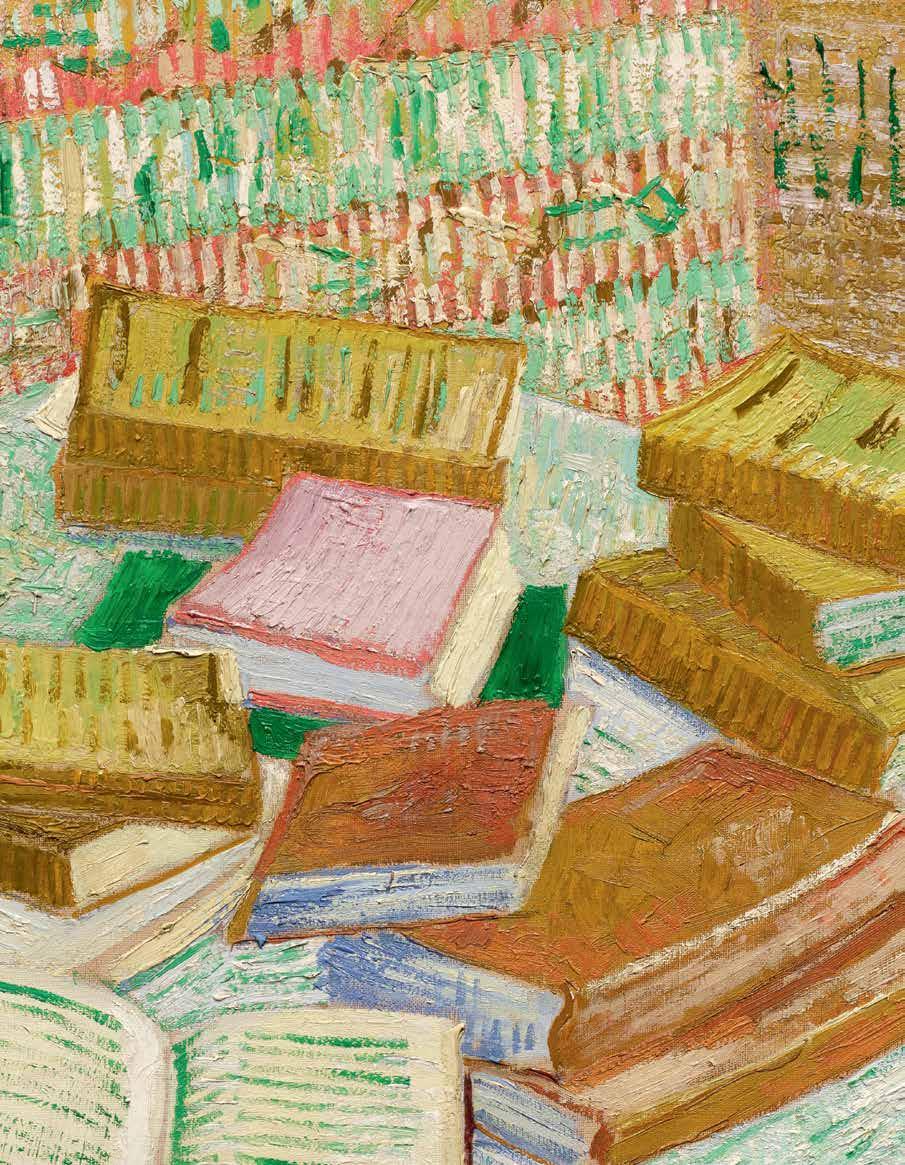

My dear Theo, do not be cross with me that I’ve come all of a sudden. I’ve fully thought about it and I believe that we will save time this way. I’ll be at the Louvre at noon, or earlier if you’d like. Please reply to let me know what time you could come to the Salon Carré. As for expenses, I repeat, it comes to the same thing. I have some money left, that goes without saying, and I want to talk to you before spending anything.—We’ll sort things out, you’ll see—So get there as soon as possible. I shake your hand.
All the best, Vincent
28 February 1886 (letter
Piles de romans parisiens et roses dans une verre (Romans parisiens) is one of the most important still lifes that Vincent van Gogh ever painted and the largest in scale to come to auction since the late 1980s. It was painted towards the end of van Gogh’s time in Paris in the final months of 1887. One of only four still lifes featuring books that the artist executed during the course of his two years in the French capital, this work is further distinguished by its exceptional exhibition history and unique combination of visual motifs as well as the tour de force application of medium. The present work is one of the artist’s most accomplished from this period.
Arriving in Paris on 28 February 1886, van Gogh wrote a note in haste to his brother Theo (see fig. 1). He had come to Paris four months earlier than they had agreed—and wanted to meet at midday in the Salle Carrée at the Musée du Louvre. The former location of the official Paris Salon, this large gallery housed one of the most important collections of artwork within the museum; at the time of Vincent’s arrival in Paris Leonardo’s Mona Lisa, Veronese’s Marriage at Cana and Rembrandt’s Holy Family hung on the Salon’s walls, tightly packed between other masterpieces.
Theo and Vincent were to live together, first in a small apartment on the rue Laval and then in larger quarters on the rue Lepic. Vincent would stay in Paris for nearly two years, departing in February of 1888 for the south of France. While in Paris his artistic practice would undertake a radical shift, embracing a vivid color palette and sharp variations in his handling of oil paint. Romans parisiens captures this pivotal moment in late 1887 where color, subject and paint handling crystallized into van Gogh’s mature style, one that would flourish in the remaining three years of his life in Paris, Arles, Saint-Rémy-de-Provence and Auverssur-Oise. It was during this period of time, from 1887 to 1890, that van Gogh’s greatest masterpieces were created, forever changing the history of modern art.
During his two-year stay in Paris from 1886 to 1888, van Gogh was introduced to the latest developments in the visual arts and to several of the most innovative painters working in Paris at the time, including Paul Signac, Georges Seurat, Henri de Toulouse-Lautrec and Émile Bernard. With the encouragement and company of his brother, van Gogh frequented the many cafés and taverns where he exchanged both ideas and canvases with this new circle. The city also offered him several opportunities to view the

critically acclaimed works of the Impressionists, whose paintings were most notably featured at their eighth and final group exhibition in 1886, though he remained, aside from select works by Edgar Degas and Claude Monet, unconvinced in their overall artistic program. Van Gogh rapidly absorbed the disparate artistic styles and techniques pioneered by the Parisian avant-garde and quickly formulated his own highly distinctive pictorial language. The shock and admiration of these once unfamiliar artists and their varied practices had a dramatic impact on van Gogh. Surrounded by artists, dancers, musicians, actors and writers in Montmartre, van Gogh abandoned the dark palette that dominated many of his early paintings in Holland and replaced it with a newfound love of color.
Before his move to France and his pivot to radically brighter tones, van Gogh first painted books as a subject in October of 1885 in his Still Life with Bible (see fig. 2). Here the artist directly juxtaposes a large bible that had belonged to his recently-deceased father with a relatively smallerscale contemporary French novel, Émile Zola’s La Joie de vivre. The yellow color of the cover of Zola’s novel was shared by many works of fiction in Paris at this time. The phrase “Les Livres jaunes” specifically denotes these volumes as modern French paperbacks; the realist authors that van Gogh so admired would primarily have been published in this format. In Still Life with Bible the Bible can be seen as representing the artist’s father

(a preacher who his son thought was stuck in the past) and the paperback as representing van Gogh himself, who was a passionate reader of realist literature. In two other still lifes that feature books, a symbolic connection between the composition and an absent person (or persons) are evident. Nature morte avec planche à dessin et oignons serves as both a self portrait of van Gogh and a reminder of his brother Theo: the Annuaire a reference to van Gogh’s delicate health at this time and the letter addressed to him by his brother showing the importance of their correspondence and of the written word. Le Fauteuil de Paul Gauguin of 1888 again uses books and a candle as a stand in for the painting’s subject, the artist Paul Gauguin (see fig. 6). Its pendant, La Chaise de Vincent avec sa pipe, depicts a less ornate seat supporting a pipe and pouch of tobacco, while in the background a box of onions bears the
artist’s signature. Here portrait and self-portrait are conveyed as still life (see fig. 5).
Of the nearly nine hundred oils that van Gogh painted throughout his career, only nine prominently feature books. Aside from the works already described above, Piles de romans parisiens, Trois romans and Nature morte à la statuette de plâtre et aux deux romans date to Gauguin’s time in Paris, while Les Lauriers-roses and Branche d’amandier en fleurs dans un verre were painted in Arles in 1888 (see figs. 3, 4 and 8). The most directly related of these Parisian canvases, Piles of French Novels was a preparatory study for the present work. It similarly places an open book towards the lower center of the canvas, a seeming invitation to the viewer as reader. “Reading was extremely important to van Gogh, as is evident from the frequent references in his letters to contemporary literature. He particularly admired the French naturalists, such as Émile Zola
(see fig. 9) and the De Goncourt brothers: ‘if one wants truth, life as it is, De Goncourt, for example, in Germinie Lacerteux, La fille Elisa, Zola in La Joie de vivre and L’Assomoir and so many other masterpieces paint life as we feel it ourselves and thus satisfy that need which we have, that people tell us the truth’” (Exh. Cat., London, Royal Academy of Arts, The Real Van Gogh: The Artist and His Letters, 2010, p. 226).
In the Van Gogh Museum’s analysis of the preparatory painting, which forms a part of their permanent collection, they have written on the subject of the viewer-as-reader “Although there is no figure in either version of Romans parisiens, they must nevertheless be seen as an attempt to depict a reader. Van Gogh adopted the indirect approach. In the first painting it is the viewer who is actually the reader, for in the foreground there is an open book. He moved it a little further away in the second picture [the present work], severing that connection, but he once again communicated the idea of the presence of a passionate reader of

novels by showing the living room and the back of a chair, which makes it clear that we are seeing the reader’s home. Van Gogh may have got his idea for the full reading table from Degas’s imposing Portrait of Edmond Duranty of 1878-79, in which the critic is seen in his study at his desk piled high with books, paperwork and prints in front of the shelves of his large library (see fig. 11). The surroundings identify Duranty as the man of letters pur sang, and van Gogh will have concluded that he had no need to portray a reader, leaving books to convey that impression, just as the drinker is suggested by the full glass in Café table with absinthe” (Ella Hendriks and Louis van Tilborgh, Vincent van Gogh Paintings, Volume 2, Antwerp & Paris, 1885-1888, London, 2011, pp. 50809). Some seven years later, Paul Cézanne would capture the journalist and critic Gustave Geffroy in a similar setting. Under close scrutiny, the shelf set directly behind the Geffroy’s chair contains a shelf of contemporary French novels in their characteristic yellow covers (see fig. 10).


In examining the similarities and differences between the present work and the study Piles of French Novels, which forms part of their permanent collection, Ella Hendriks and Louis van Tilborgh focus not only on the size of the canvas and the cropping of the scene but also on the handling of the paint, inclusion of suggestions of text on the covers and interiors of the volume, details of the wall hanging, specificity of setting and—perhaps symbolically the most important difference—the inclusion of flowers. In the preparatory oil, color and execution are handled in a more monochromatic and flattened manner, which seems to be a nod to the influence of Japanese prints on van Gogh’s work at the time. “The first version was an attempt to make an oil painting in the style of a
Japanese print. The composition is conceived in terms of discrete blocks… van Gogh combined them with a painterly touch…. In the final months of his stay in Paris he largely reverted to… the Neo-Impressionist style, which is well illustrated by the second version of his pile of novels [the present work]. In it he opted for a systematic pattern of small dashes and loose strokes supplemented with hatchings, comparable to those in Portrait of Etienne-Lucien Martin and Self-Portrait as a Painter” (ibid., pp. 506-07).
Instead of the relatively flat and unmodulated hints of background in the museum’s version of this subject, Romans parisiens has a fully developed and highly patterned wall decoration. The same patterning is found in the background of two other still lifes


from the first months of 1887, Nature morte avec carafe et citrons sur une assiette and Pot de fleurs à la ciboulette. In each of these preceding works the patterning is presented as a vertical stripe, whereas in Romans parisiens it is positioned horizontally that van Gogh then marked with vertical crosshatchings in reds, yellows, whites, and various green tonalities. The effect is dislocating and pushes the novels positioned at the back of the tilted table top to the foreground; the yellow covers at back left moving towards the viewer while the open book with what appears to be a red cover, technically positioned closer to the viewer, seems to move back in space.
The similarity in background decoration in this work and the two earlier canvases speaks to the fact that van Gogh and Theo’s apartment would have had a certain number of objects which would be used in multiple compositions, including vases, baskets, books and shoes. This is perhaps most famously the case with the white and yellow vase in which van Gogh posed many of his Arles-period Sunflowers in 1888 and 1889 (see fig. 12). Other artists particularly famous for their still life and interior compositions such as Paul Cézanne, Henri Matisse and Giorgio Morandi would similarly reuse objects, furnishings, drapery and costumes in their compositions.
As in his Sunflower compositions, van Gogh conceived the present work on a large scale—indeed it is one of the largest sized canvases that the artist used for a still life until his move to Arles in February of 1888 and embarked on his Sunflowers. “The painter’s life-long love of literature,” writes Sjraar van Heugten, “found its way into his modern work too, as in French Novels with a Rose [the present work], where it symbolizes the current era as depicted in contemporary novels but also the moments of consolation and beauty that readers found in books. Like the large painting with the four sunflowers, this substantial 73-by-93-centimeter canvas attests to the importance van Gogh afforded the still life genre within his oeuvre. Theo too must have recognized the special character of this work; in March 1888, by which time van Gogh was in Arles, Theo submitted it along with two large views of Montmartre as his brother’s contribution to the Salon des Indépendents— an initiative of which the artist wholeheartedly approved” (Exh. Cat., Potsdam, Museum Barberini, Van Gogh: Still Lifes, 2019-20, p. 21). Indeed, of the three

works van Gogh exhibited at the 1888 Salon des Artistes Indépendants (numbers 658-660) the present work was listed first below his name; the painter’s address still showing the rue Lepic apartment that he had shared with his brother Theo. On the tenth of March, 1888 van Gogh wrote to Theo “Je trouve très-bien que tu mettes les livres aussi aux Indépendants. faudra donner comme titre de cette étude: “Romans parisiens” (I
think it’s a very good idea that you put the books in the Independents’ too. This study should be given the title: ‘Parisian novels’ (Leo Jansen, Hans Luijten and Nienke Bakker, Vincent van Gogh, The Letters, The Complete Illustrated and Annotated Edition, vol. IV, London, 2009, p. 25).
The other two works included in the 1888 exhibition were sweeping vistas of the less developed

portions of Montmartre. All three works shared the impressive, energetic brushwork of van Gogh’s last year in Paris. Writing about the energy and varied applications of paint in these 1887 canvases, Steven Naifeh and Gregory White Smith describe: “The paintings… were filled with the fashionable shorthand of dashes and dots. He tried them in every size and shape: from bricklike rectangles to comma-like curls to bits of color no bigger than flies. He arranged them in neat parallel ranks, in interlocking basketweaves, and in elaborate, changing patterns. Sometimes they followed the contours of the landscape; sometimes
they radiated outward; sometimes they all swept across the canvas in the same direction, as if blown by an unseen wind. He applied them in tight, overlapping thickets; in complex confederations of color; and in loose, latticelike skeins that revealed the underlayers of paint or ground. His dots clotted and clustered, filled large areas with perfect regularity or exploded in erratic swarms” (Steven Naifeh and Gregory White Smith, Van Gogh, The Life, New York, 2011, p. 531).
While the 1888 exhibition would be the first for Romans parisiens it was by no means the last. Throughout the twentieth century, the present work


In March 1888, Vincent van Gogh exhibited three works at the fourth exhibition of the Société des Artistes Indépendants in Paris. Having already moved to Paris the month prior, he wrote to his brother confirming that this work should be included with the title Romans parisiens. The present work was exhibited. alongside two landscapes of Montmartre and its environs (see opposite).
The Present Work


“... this Bedroom is something like that still life of French novels with yellow, pink, green covers, you’ll recall....”
— VINCENT VAN GOGH TO THEO VAN GOGH, REFERRING TO THE PRESENT WORK, 7 OCTOBER 1888, LETTER NO. 707
has been included in some of the most important exhibitions and venues across Europe and North America. From the Galerie Bernheim Jeune, to Cassirer to Commeter, the Kunsthaus Zürich and Kunsthalle Basel, Galerie Matthiesen, the Orangerie des Tuileries, Musée d’Orsay, Van Gogh Museum, Art Institute of Chicago and Royal Academy of Arts, this canvas has represented the best of van Gogh’s Parisian work throughout the twentieth and twenty-first century. In the 2010 exhibition for the Royal Academy of Arts, The Real Van Gogh: The Artist and His Letters, the attention of the artist himself to a similar feeling and quality between Romans parisiens and his famed Bedroom paintings was expressed directly to Theo writing on 17 October 1888 “this Bedroom is something like that still life of French novels with yellow, pink, green covers, you’ll recall” (Exh. Cat. London, Royal Academy of Arts, The Real Van Gogh: The Artist and His Letters, 2010, no. 123, p. 226).
It is here in his words to Theo, and in his letter announcing his abrupt arrival in Paris and, again, in the countless lines he penned, sketches he made, canvases he paints, that van Gogh reveals himself. It is not just his self-portraits, which in the absence of photographs provide us with a glimpse of his physical likeness, but in his still lifes and interior scenes that we see—clearly conveyed in the Royal Academy’s exhibition title—the “Real Van Gogh.” His bedroom in Arles, his chair with a pipe, his piles of novels—these are also his self portraits, his aspects and attributes, his inner self. He represents others similarly Gauguin by his Chair, Theo by a letter, his father depicted by a worn bible, he shows he did not look just at surfaces, just at covers, but at interiors, at contents, at the meaning behind the image, behind the word. It is this depth of sight that he conveys in his paintings, that he conveys in Romans parisiens.


1830 - 1903
signed C. Pissarro and dated 1872 (lower left) oil on canvas
21 ⅝ by 35 ⅞ in. 54.9 by 91.1 cm.
Executed in 1872.
$ 1,200,000-1,800,000
PROVENANCE
Galerie Durand-Ruel, Paris (acquired directly from the artist on 12 November 1872)
Ernest Hoschedé, Paris (acquired from the above on 28 April 1873)
Hôtel Drouot, Paris, 13 January 1874, lot 60 (consigned by the above)
Galerie Durand-Ruel, Paris (acquired through Mr. Hagerman at the above sale)
Don José de Salamanca, Paris
Hôtel Drouot, Paris, 25-26 January, 1875, lot 17 (consigned by the above)
M.L. Collection
Hôtel Drouot, Paris, 20 March 1880, lot 39 (consigned by the estate of the above)
Galerie Durand-Ruel, Paris (acquired circa 1884)
Alwin Schmid, Küsnacht (acquired from the above on 21 March 1928)
Irma C. Scharff (née Rosengart), Los Angeles Wildenstein & Co. Inc., New York (acquired from the above in 1948)
Norton Simon, Los Angeles (acquired from the above on 22 March 1955)
Lucille Ellis Simon, Los Angeles (acquired by descent from the above on 24 July 1970)
Acquired from the above through Lionel Pissarro, Paris in 1997 by the present owner


New York, The Armory of the 69th Infantry, International Exhibition of Modern Art, 1913, no. 499, p. 40 (titled Pontoise)
Detroit Museum of Art, Exhibition of Paintings by French Impressionists, 1915, no. 35 (titled Pontoise)
New York, Durand-Ruel Galleries, Paintings by Camille Pissarro, 1916, no. 2
Boston, Brooks Reed Gallery, Exhibition of Paintings Lent by Durand-Ruel, 1916-17
Waterbury, Mattatuck Historical Society, Exhibition of Paintings Lent by Durand-Ruel, 1919
The Dallas Art Association, Second Annual Exhibition: American and European Art, 1921, no. 207, illustrated (titled Pontoise)
The Art Gallery of Toronto, Paintings by French Artists, 1922, no. 71, illustrated (titled Pontoise)
Paris, Galerie Durand-Ruel, Tableaux par Camille Pissarro, 1928, no. 5
Manchester, New Hampshire, The Currier Gallery of Art, Monet and the Beginnings of Impressionism, 1949, no. 16, p. 18; p. 33, illustrated (titled Bord de l’Eau à Pontoise)
Los Angeles County Museum of Art, A Selection from the Mr. and Mrs. Norton Simon Collection Honoring the College Art Association, 1965
Los Angeles County Museum of Art; The Art Institute of Chicago and Paris, Grand Palais, A Day in the Country: Impressionism and the French Landscape, 1984-85, no. 61 (Los Angeles and Chicago); no. 27 (Paris), pp. 14-15, illustrated in color (detail); pp. 179 and 336-37; p. 185, illustrated in color (Los Angeles and Chicago)
Los Angeles County Museum of Art, Monet to Matisse: French Art in Southern California Collections, 1991, pp. 2 and 34, illustrated (detail); p. 35; p. 52, illustrated in color
LITERATURE
Charles Kunstler, “Camille Pissarro,” Le Figaro, supplément artistique, vol. 5, no. 184, 8 March 1928, p. 325 (titled Vue de Pontoise)
Ludovic-Rodo Pissarro and Lionello Venturi, Camille Pissarro, son art—son oeuvre, Paris, 1939, no. 158; vol. I, p. 101; vol. II, pl. 32, illustrated (titled Bords de l’eau à Pontoise)
Charles Kunstler, Pissarro, villes et campagnes, Lausanne , 1967, p. 20
Merete Bodelsen, “Early Impressionist Sales 1874-94 in the light of some unpublished ‘procès-verbaux’,” The Burlington Magazine, vol. 110, no. 873, June 1968, pp. 33233 (titled Bords de l’eau à Pontoise)
Christopher Lloyd, ed., Studies on Camille Pissarro, London, 1986, pp. 66 and 71-72 (notes 4 and 6; titled Fabriques et barrage sur l’Oise)
Richard R. Brettell, Pissarro and Pontoise: The Painter in a Landscape, New Haven, 1990, fig. 141, p. 158, illustrated in color; p. 41
Joachim Pissarro, Camille Pissarro, New York, 1993, fig. 103, p. 110, illustrated in color; p. 111 (titled Riverbanks in Pontoise)
Suzanne Muchnic, Odd Man In: Norton Simon and the Pursuit of Culture, Berkeley, 1998, p. 36 (titled Pontoise, Bords de l’Oise)
John House, Impressionism: Paint and Politics, New Haven, 2004, pl. 56, p. 79, illustrated
Joachim Pissarro and Claire Durand-Ruel Snollaerts, Pissarro, Catalogue critique des peintures, Paris, 2005, no. 249, vol. I, pp. 369-72, 374, 392, 408, 414 and 427; vol. II, p. 203, illustrated in color
Richard R. Brettell and Stephen F. Eisenman, NineteenthCentury Art in the Norton Simon Museum, vol. I, New Haven, 2006, fig. 23, p. 21, illustrated in color (titled Riverbanks in Pontoise)
Sara Campbell, Collector Without Walls: Norton Simon and His Hunt for the Best, New Haven, 2010, no. 8, fig. 4, pp. 19 and 244, illustrated in color; pp. 20, 24, 68 and 221 (titled Banks of the River at Pontoise)
In its execution as it is in subject, Bords de l’Oise à Pontoise is a striking vision of modernity. Bords de l’Oise à Pontoise dates to the beginning of Pissarro’s second sojourn in Pontoise, a period considered among the most innovative of his oeuvre, and one which marks the dawn of stylistic experiments that would establish his standing as a pioneer within the Impressionist movement at large. The artist first moved to the French town in 1866 and would return there in August of 1872 following extended trips to London and Louveciennes. Located just 28 kilometers north of Paris, Pontoise was animated by the dialectic between the region’s burgeoning industry, and the patina of its rich history as a Medieval fortress and port town. In combination, these qualities provided Pissarro with a wealth of subject matter which he approached with an endlessly rejuvenated freshness. So invigorated by the picturesque landscape and its plethora of painterly possibilities, he remained in Pontoise for the following decade.
While in Pontoise, Pissarro assiduously dedicated himself to portraying the town’s sites of labor and leisure—a subject which was among the most favored within the Impressionist lexicon at large. The period of accelerated industrialization in the 1830s and 40s, engendered the birth of a new middle class that now had both the means and the opportunity for recreation. With the expansion of the rail transport network throughout the country shortly thereafter, the suburbs of Paris and the countryside beyond them became widely popular destinations for social activities and for escaping the clamor of the city. It was during this very period that these towns began to transform from peaceful hamlets to Parisian suburbs, their life increasingly focused on serving the capital’s growing needs. Though the approaches to the subject were manifold and varied, these bucolic towns and the activities which filled them provided the Impressionists with an essential source of inspiration for their interest in the representation of modern, daily life.


The river was an enduring visual anchor within the theme. It in many ways became an embodiment of the interplay between the old and new—the manmade and natural—which came to characterize the condition of life within the French industrial landscape. In Claude Monet’s slightly later depiction of Le Pont d’Argenteuil (see fig. 2), he presents the river as one such site for leisurely and tourist activity. While Monet depicts a moment of tranquility, the two boats in the foreground, albeit at rest with their sails still rolled, allude to the popular waterside pastimes that would usually animate the scene. Their rudimentary wooden frames are poised in contrast with the heavy, metallic architecture of the wrought iron bridge, offering Monet’s own approach to the dialectic between the bucolic and the urban.
Within the present work, the river plays something of an inverse role. Pissarro depicts the Oise River just downstream from this town, northwest of Paris, flanked by the towpaths of the river’s right
bank and the l’île Saint-Martin. Undisturbed by any signs of human activity, the water’s beautifully articulated surface becomes a mirror to, and in turn an amplification of, the natural world around it. The reflection of the sky in particular confers on the composition an expanded sense of space, one which makes actual the sensation of looking at the scene itself, rather than a representation of it. As the river recedes into the background and tapers to its diminishing point, the viewer’s eye arrives at the town itself, and to the railway bridge, constructed less than a decade prior in 1863, which links Pontoise, both physically and symbolically, to Paris and Rouen.
Pissarro engages a striking conversation between these talismans of modernization and the bucolic French countryside. The smoke stack is juxtaposed against the magisterial poplar trees, the billows of black smoke against the diaphanous white clouds, the white facades and red roofs of the houses lining the hill in the distance against the topography of the

tree line, and the fabric of the figures’ dress against the verdant greenery. Yet, at the same time, there is an enchanting sense of coexistence between these opposing pillars of modernity and the natural world. The figures seem to emerge from within the landscape, their presence a natural extension rather than an intrusion. Their leisurely amble likewise enlivens a sense of potential energy within the scene at large, one that is heightened by the staccato brushstrokes that describe the quiet water’s unbroken surface. The calm and repose of the scene appears as though in waiting for the engagement or the entrance of another life source which, upon further study, reveals itself to be the presence of Pissarro’s perspective itself.
A central tenet of Pissarro’s landscapes was the inclusion of the figure and the deeply felt humanism which it conferred on the scene. There is the unquestionable sensation when looking at Bords de
l’Oise à Pontoise that it is painted from a lived point of view, one which, by virtue of its naturalism, the viewer can place themselves within. The distinctive horizontal length and orientation of the canvas likewise opens the scene into a panoramic expanse which transforms the mode of viewership from one of distanced observation to embodied immersion. Art historian Rachel Ziady DeLue expands upon Pissarro’s inimitable ability to engage this phenomenological effect: “The viewer encounters Pissarro in his pictures not because the artist implies that his body is actually, corporeally, in them but because he, the viewer, follows Pissarro’s visual traversal, his visual touching, in the artist’s laying on and working over of paint. We feel what the artist sees, touch by touch, stroke by stroke, in pictures so narrow as to allow only this kind of presence, a kind that can occupy, press itself into, a mere slice of… nature. Pissarro’s body locates itself in the optical effects of decoration, harmonious color,

and nimble facture…” (Rachel Ziady DeLue, “Pissarro, Landscape, Vision and Tradition,” The Art Bulletin, vol. 80, no. 4, December 1998, p. 731).
Beyond the modernity of Pissarro’s subject matter, his was an approach to painting which was wholly modern in and of itself. It is therefore fitting that Bords de l’Oise à Pontoise made its public debut as part of the seminal 1913 International Exhibition of Modern Art in New York, later known as the inaugural Armory Show (see figs. 3 and 4). The landmark exhibition is widely credited with introducing the American public to the art of the European avant-garde, thereby catalyzing the emergence of modernism in the United States. The brilliant fracture of light and atmosphere into articulated swaths of color and painterly brushstrokes positioned Pissarro’s work as a forefather to the evolutions within the avant-garde which took shape following the turn of the century. When placed in conversation, as they would have been in the 1913 exhibition, one can see how the revolution in perception and representation that Pissarro ignites within the present canvas was taken a step further in the hands of the Cubists and Fauvists who followed in his wake. Bords de l’Oise à Pontoise marks a pivotal turning point in the modern idiom, the marker of a decisive moment when the artist began to free his compositions from the more static, Corot-inspired landscapes of the 1860s.


“Pissarro was experiencing a professional optimism he would not feel again until the 1890s. He was alive to the landscape, allowing its multiple realities to affect him more fully than ever before.”
— RICHARD BRETELL, PISSARRO AND PONTOISE , NEW HAVEN, 1990, P. 70
While Bords de l’Oise à Pontoise speaks to Pissarro’s distinctive approach to the landscape he encountered there, it likewise speaks to the rich and formative artistic exchange which these edenic countryside escapes fostered among the artists of the French avant-garde who lived and worked there. Pissarro’s pioneering enterprise proved highly influential to the myriad artists who joined him in Pontoise, an influence perhaps most significantly felt in the work of his friend and fellow artist Paul Cézanne. During the two years that Cézanne and his family lived in the region, the painters worked side by side, pushing the boundaries of pictorial expression as they did each other. As Pissarro himself recalled, it marked the moment when Cézanne “came under my influence and I his” (quoted in Exh. Cat., New York, The Museum of Modern Art, Pioneering Modern Painting: Cézanne and Pissarro, 1865-1885, 2005, p. 123). In 1881, returning to the region to again work alongside his progenitor, Cézanne would execute a painting of the town of Pontoise from a vantage point just further down the path that Pissarro painted in the present work (see fig. 1). As Joachim Pissarro explains, “During Cézanne’s last prolonged sojourn in Pontoise, from May to October 1881, he lived only a few blocks away from L’Hermitage, where the Pissarros resided. There Cézanne began to ‘formulate’ his idea of an artistic truth or recipe, which he continued to develop until his death. … Cézanne’s deference toward Pissarro’s early works is evident in 1881. Every work produced by Cézanne at that point appears to refer to an earlier painting by Pissarro… At the end of their relationship, Cézanne bows to nostalgia and turns back to explore the beginnings of this extraordinary interrelationship.” (ibid., p. 187)
Among the greatest attestations to the representative significance of Bords de l’Oise à Pontoise within Pissarro’s canon, however, is the cherished place it held within some of the most
esteemed private American collections of the twentieth century. In 1955 the present work was purchased by Norton Simon, marking one of the earliest acquisitions by the storied collector. It is perhaps understandable to the modern imagination that the prolific collection which Simon would go on to amass, peerless in its scope and uncontested in its influence, would have found its genesis in none other than this painting. “These early acquisitions [the Pissarro and a work by Gauguin] represented a giant leap for the new collector,” writes Sara Campbell. “Early and noteworthy acquisitions, they stayed with the collector longer than any other pictures, which gave them added sentimental value. The Pissarro also represented the beginning of a long professional and personal relationship with the art historian and Pissarro expert Richard F. “Ric” Brown, the newly appointed chief curator and later director of the Los Angeles County Museum… When Brown walked into Simon’s living room for the first time and saw the Pissarro, … as Simon’s family friend Lillian Weiner remembered, ‘Ric got down on his knees and paid homage to the fact that …lo and behold, here it was greeting him in Los Angeles, where he would never ever have expected it.’ Except for the few times [it was] lent to exhibitions, the Pissarro… always hung in the living room of the Simons’ home on North Hudson Avenue.” (Sara Campbell, Collector Without Walls: Norton Simon and His Hunt for the Best, New Haven, 2010, pp. 19-20). Further attesting to its significance for Simon, Bords de l’Oise à Pontoise was included in the 1965 exhibition A Selection from the Mr. and Mrs. Norton Simon Collection Honoring the College Art Association, the first preview exhibition held at the Los Angeles County Museum of Art, which did not open until several months later. The work remained in Simon’s collection, and that of the Simon family, until 1970. It has remained in The Cindy and Jay Pritzker Collection for over twenty-five years.
1880 - 1938 Hallesches Tor, Berlin (Halle Gate, Berlin) (recto); Zwei Badende am Strand (Two Bathers on the Beach) (verso)
signed E L Kirchner. and dated 13 (lower left); dated again (on the reverse) oil on canvas
28 ⅞ by 31 in. 71 by 78.8 cm.
Executed in 1913.
$ 3,000,000-5,000,000
This work is listed in the Ernst Ludwig Kirchner archives, Wichtrach/Bern.
PROVENANCE
Dr. Victor Wallerstein, Berlin
Dr. Walter Feilchenfeldt, Berlin (acquired by 1923)
Klaus Gebhard, Munich and Wuppertal (acquired circa 1924 and until at least 1972)
Private Collection
Christie’s, New York, 28 November 1988, lot 41 (consigned by the above)
Acquired at the above sale by the present owner
EXHIBITED
Berlin, Brücke-Museum, Künstler der Brücke in Berlin 1908-1914, 1972, no. 2, n.p.; pl. 4, illustrated (titled Hallesches Tor)
Museum der Stadt Aschaffenburg; Karlsruhe, Staatliche Kunsthalle; Essen, Museum Folkwang and Kassel, Staatliche
Kunstsammlungen, E. L. Kirchner, Dokumente, Fotos, Schriften, Briefe gesammelt uup ausgewählt von Karlheinz Gabler, 1980-81, p. 129, illustrated in color
Berlin, Brücke Museum, Ernst Ludwig Kirchner in Berlin, 2008-09, no. 92, pp. 132 and 382; p. 143, illustrated in color

“The modern light of cities, in combination with the motion of the streets, gives me new stimuli. It spreads a new beauty over the world, one that does not lie in the particulars of subject matter.”
— ERNST LUDWIG KIRCHNER

LITERATURE
Max Deri, Die Neue Malerei, Leipzig, 1921, no. 86, p. 139, illustrated; p. 140 (titled Hochbahn)
Will Grohmann, E.L. Kirchner, Stuttgart, 1958, p. 106, illustrated
Will Grohmann, Ernst Ludwig Kirchner, New York, 1961, p. 130, illustrated
Donald E. Gordon, Ernst Ludwig Kirchner, Cambridge, 1968, no. 305, p. 89; p. 309, illustrated
Georg Reinhardt, Die frühe “Brücke”—Beiträge zur Geschichte und zum Werkder Dresdner Künstlergruppe “Brücke” der Jahre 1905 bis 908, Dissertation, Universität Bonn, 1976, p. 171, note 323; republished in Brücke-Archiv nos. 9-10, 1977-78 titled (Hallesches Ufer)
Exh. Cat., Berlin, Nationalgalerie; Munich, Haus der Kunst; Cologne, Museum Ludwig and Kunsthaus Zürich, Ernst Ludwig Kirchner, 1979-80, p. 199
Roman Norbert Ketterer and Wolfgang Henze, eds., Ernst Ludwig Kirchner, Drawings and Pastels, New York, 1982, p. 237
Donald E. Gordon, Expressionism: Art and Idea, New Haven and London, 1987, pp. 135 and 139, illustrated; pp. 136-37
Thomas Anz and Michael Stark, Die Modernität des Expressionismus, Stuttgart, 1994, p. 118, note 21
Lucius Grisebach, Ernst Ludwig Kirchner, 1880-1938, Cologne, 1996, p. 80, illustrated in color
Magdalena M. Moeller, Ernst Ludwig Kirchner: Die Strassenszenen 1913-1915, Munich, 1993, pp. 37-38
Lucius Grisebach, Kirchner, Cologne, 1995, pl. 80, illustrated in color
Jürgen Döhmann and Gerd Presler, eds., Ernst Ludwig Kirchner: die Skizzenbücher, “Ekstase des ersten Sehens”, Karlsruhe and Davos, 1996, pp. 94-99, note 118
Tita Hoffmeister, ed., Werke der Brücke-Künstler, Kunst des 20. Jahrhunderts, vol. I, Munich, 1997, p. 167, note 11
Magdalena M. Moeller, Künstlergruppe Brücke, Munich, Berlin, London and New York, 2005, pl. 54, pp. 26 and 126; p. 127, illustrated in color and illustrated in color on the inside back cover
Exh. Cat., Wuppertal, Von der Heydt-Museum, Der expressionistische Impuls: Meisterwerke aus Wuppertals grossen Privatsammlungen, 2008, p. 28, note 32, and p. 118
Exh. Cat., Davos, Kirchner Museum, Ernst Ludwig Kirchner: Die Skizzenbücher, 2019-20, p. 134
Exh. Cat., New York, Neue Galerie, Ernst Ludwig Kirchner, 2019-20, fig. 7, p. 68, illustrated in color; p. 69


Executed in 1913, Hallesches Tor, Berlin (Halle Gate, Berlin) (recto); Zwei Badende am Strand (Two Bathers on the Beach) (verso) is a superlative example of Ernst Ludwig Kirchner’s 191215 Berlin paintings, a body of work considered the most celebrated of the artist’s Expressionist oeuvre. Held in The Cindy and Jay Pritzker Collection for nearly four decades, the present work is the largest among this corpus of twenty-four paintings to remain in private hands, with nineteen held in preeminent institutions including the The Museum of Modern Art, New York; Pinakothek der Moderne, Munich and Museo Nacional Thyssen-Bornemisza, Madrid.
Kirchner established himself among the vanguard of the European avant-garde in 1905 as a founder of the group Die Brücke. The first distinctly German modern artistic movement of the twentieth century, its close-knit members rejected the Jugendstil traditions that they encountered as art students in favor of a vigorous aesthetic reflective of the self-confidence of youth. In October 1911, Kirchner followed in the footsteps of fellow Die Brücke members Max Pechstein and Otto Mueller in relocating from the movement’s center in the Baroque city of Dresden to the vibrant metropolis of Berlin, first taking up residence alongside Pechstein at Durlacher Strasse 14.
Having swelled into the third-largest city in Europe under rapid modernization at the turn of the century, the German capital teemed with alluring energy and bustling crowds that catalyzed for Kirchner a profound transformation in both style and subject matter. WolfDieter Dube expounds, “Soon he was carried away by the current of the city. His artistic sensibility, always alive to the fascination of movement, was seized by the dynamism of city life. Kirchner discovered new pictorial forms unique to himself and was the first to render the feel of a modern metropolis… He discovered its peculiar, malevolently glittering attraction. Herded along with the herd, he observed its people and developed a pictorial language for

their denatured humanity, combining chronicle and allegory” (Exh. Cat., London, Marlborough Fine Art, Ernst Ludwig Kirchner, 1969, p. 10).
Just as Berlin’s vitality heralded a new phase of Kirchner’s ever-restless artistic ambition, it attracted Die Brücke members to divergent creative paths that prompted the dissolution of the group. Such autonomy—and isolation—spurred Kirchner’s dedication to rendering impressions of the city with a fervor yet equaled in his output, resulting in the most important works in his career. He later remarked,

“No other artist experienced the metropolis of Berlin, as it was in the last years before the war, so intensely, with every fiber of his being, as did Kirchner.”
— CURT GLASER, DIE GRAFIK VON NEUZEIT , BERLIN, 1923, P. 540
“[The Street Scenes] originated in the years 1911-14, in one of the loneliest times of my life, during which an agonizing restlessness drove me out onto the streets day and night, which were filled with people and cars” (Exh. Cat., New York, The Museum of Modern Art, Kirchner and the Berlin Street, 2008, p. 29). The artist ineluctably gravitated towards Stadtansichten, or urban vistas, of the sites most symbolic of a modern Berlin: squares and streets where electric streetcars, trams, and railway lines—novel technologies built to accommodate the buzzing populace—converged.
Hallesches Tor, Berlin depicts the titular Halle Gate, a major entry point to Berlin’s city center, leading to the square of Belle-Alliance-Platz and the major boulevard of the Friedrichstrasse. 1902 marked
the construction of a major railway station at the intersection of the new elevated subway line, which followed along the northern edge of the Landwehr Canal, and the Belle-Alliance Bridge. Kirchner mediates his visual perception of this setting through his emotive insight: pervading the scene is a dynamic torsion and thrust reflective of the vital energy—and precarity—of urban life. The artist uses a near-dizzying aerial perspective to create an elongated spatial depth that opens the canal and the undergirding of the viaduct into a profound expanse. This enlarged passage compresses the bridge, station and buildings on the periphery into a taut, encroaching surface that invokes the staggering density of the metropolis. In so doing, the present work radically unifies
Opposite: View of the Belle-Alliance Platz from Hallesches Tor, Berlin, early twentieth century
Kirchner’s longstanding interest in the perspectival advancements of the French Post-Impressionists with the Futurists’ fractured dissections of movement, which the artist had first encountered in Berlin the year prior (see fig. 1).
Marking Kirchner’s attentiveness to a novel form of urban beauty, the exaggerated arcs of the bridge, canal and embankment—hallmarks of a historic Berlin—counterpoise the rigid linear geometries of the modern built environment, which are rendered with a specificity reflective of Kirchner’s training

in architecture. The human presence is suggested merely through minute, anonymizing silhouettes, reflecting the individual experience of being subsumed within the sheer magnitude of the city—a mood heightened by the monumentalized pillar emblems of the elevated railway line that stand sentry over the totality of the scene.
Hallesches Tor, Berlin typifies the unparalleled expressivity of color found in Kirchner’s Berlin paintings, deeply informed by the exuberance of hue found among the Fauves and Edvard Munch.
Transitioning from the bold color contrasts of his prior output, Kirchner in his Berlin paintings developed palettes derived from combinations of two to three tertiary hues, experimenting with novel synthetic pigments and the superimposition of colors to conjure the vibrancy of the electrified city. Discussing the present work, Sherwin Simmons writes, “By extending the color of the railway’s steel framework to the stone surfaces of the bridge and the station’s facade, he emphasized the interlinked transportation system… The painting’s most unusual and beautiful feature, however, is its salmon pink and teal color harmony, the type of colors that gave rise to Carl Einstein’s observation: ‘Hardly any of the Brucke painters has
found such subtle colors as Kirchner. His yellow, his bright salmon pink charm us through their passionate elegance.’ These changes of form and color emphasize the way the viaduct tip-toes along the canal bank, with pedestrians circulating underneath it, a train moving along it, and a bus crossing the bridge. The soft, rather pastel-like colors lend the site a delicate, although clouded, beauty” (Exh. Cat., New York, Neue Galerie, Ernst Ludwig Kirchner, 2019-20, pp. 68-70).
Revealing a compositional and formal complexity hitherto unseen in his Berlin cityscapes, Hallesches Tor, Berlin reveals Kirchner’s incessant experimentation in depicting his surroundings in order to reveal inherent truths of both his lived experience
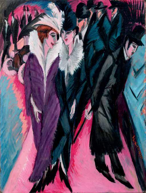

and the underlying nature of urban society on the cusp of World War I, affirming Donald E. Gordon’s assessment of this pivotal year: “Kirchner’s 1913 style unifies into an integrated dynamic approach drawing upon earlier innovations in the handling of space, mass, brushstroke, color and compositional form. The 1913 style displays a mature equilibrium in the use of this widely varied formal vocabulary. Through its often monumental achievements, better than through the vision of any other twentieth century artist, we gain insight into a desperately diseased European metropolitan society whose few remaining days are numbered” (Donald E. Gordon, Ernst Ludwig Kirchner, Cambridge, 1968, pp. 86-90). With the threat of war looming ever greater as the year progressed, the panoramic views like Hallesches Tor, Berlin narrowed in scope, culminating in Strassenszenen (Street Scenes) of street walkers strolling amidst Berlin’s clamorous crowds (see fig. 2). At once personifying the erotic
underbelly of the city and Kirchner’s own growing sense of alienation and detachment, the Street Scenes would come to be considered among the most iconic images of twentieth century art.
The reverse of the present work bears an additional composition, entitled Zwei Badende am Strand, depicting a pair of nude figures within a verdant setting and likely executed during one of the artist’s summer sojourns to the remote Baltic islands of Fehmarn or Moritzburger See. A counterpoint to the frenetic urban environs seen in Hallesches Tor, Berlin, the practice of Freikörperkultur, bathing and luxuriating with his companions and models in this remote setting, offered Kirchner solace. Since his Die Brücke period, the theme of the nude within nature formed a cornerstone of Kirchner’s oeuvre, charting his ongoing interest in the representation of the human body in its most uninhibited state through its spontaneous, joyful and unmediated depiction.


Hallesches Tor, Berlin (Halle Gate, Berlin) belongs to the corpus of twenty-four Berlin street scenes executed by Ernst Ludwig Kirchner from late 1912 through 1915. Encapsulating the charged metropolis on the eve of World War I, these works are considered among the most celebrated and recognizable of the artist’s Expressionist oeuvre. The present work is one of only three paintings from this output remaining in private hands, with others belonging to such museum collections as the Neue Nationalgalerie Berlin; Staatsgalerie Stuttgart and the Museo Nacional ThyssenBornemisza, Madrid.


FIRST ROW FROM LEFT
NOLLENDORFPLATZ
1912
21 ⅛ by 2 ⅝ in.
69 by 60 cm.
Stiftung Stadtmuseum Berlin
152 SOTHEBY’S
STRASSE AM STADTPARK
SCHÖNEBERG (STREET AT SCHÖNEBERG PARK)
1912-13
47 ⅝ by 59 ⅜ in.
121 by 151 cm.
ROTES ELISABETHUFER
BERLIN (KANAL MIT BRÜCKE) (ROTES
ELISABETHUFER, BERLIN (CANAL WITH BRIDGE))
MODERN ART EVENING AUCTION
Milwaukee Art Museum
1913
32 ⅞ by 37 in.
83.5 by 94 cm.
Pinakothek der Moderne, Munich
GELBES ENGELUFER
BERLIN (YELLOW ANGEL BANK, BERLIN)
1913
28 ⅛ by 31 ⅝ in.
71.5 cm. by 80.5 cm.
Kunsthalle Mannheim
THE PRESENT WORK
1913
28 ⅞ by 31 in.
71 by 78.8 cm.
FÜNF FRAUEN
AUF DER STRASSE (FIVE WOMEN ON THE STREET)
1913
47 ¼ by 34 ⅜ in.
120 by 90 cm.
Museum Ludwig, Cologne


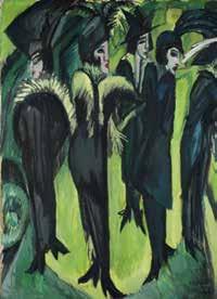
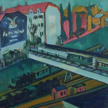


SECOND ROW FROM LEFT
BERLINER
STRASSENSZENE (BERLIN STREET SCENE) 1913
47 ⅝ by 37 ⅜ in.
121 by 95 cm.
Neue Galerie, New York
DIE STRASSE (THE STREET) 1913
47 ½ by 34 ⅞ in.
120.6 by 91.1 cm.
The Museum of Modern Art, New Yor
BLICK AUS DEM FENSTER (VIEW FROM THE WINDOW) 1914
47 ¼ by 35 ⅜ in.
120 by 90 cm.
Saint Louis Museum of Art
STRASSENBAHN UND EISENBAHN (ELEVATED TRAIN AND RAILROAD) 1914
28 by 31 ⅞ in.
71 by 81 cm.
Museum Behnhaus Drägerhaus, Lübeck
STRASSENSZENE (STREET SCENE) 1914-22
18 by 27 ½ in.
48 by 70 cm.
Art Gallery of Ontario, Toronto
STRASSE MIT ROTER KOKOTTE (STREET WITH RED COCOTTE)
1914/22
47 ¼ by 34 ⅜ in.
120 by 90 cm.
Museo Nacional ThyssenBornemisza, Madrid


FIRST ROW FROM LEFT
STRASSENSZENE (FRIEDRICHSTRASSE IN BERLIN) (STREET SCENE (FRIEDRICHSTRASSE IN BERLIN))
154 SOTHEBY’S
1914
49 ⅛ by 35 ⅞ in.
125 by 91 cm.
Staatsgalerie Stuttgart
STRASSENSZENE (STREET SCENE)
1914/22
18 ⅞ by 27 ½ in.
48 by 70 cm.
Private Collection
WANNSEEBAHN DURCH
DAS ATELIERFENSTER
GESEHEN (WANNSEE TRAIN SEEN THROUGH THE STUDIO WINDOW)
MODERN ART EVENING AUCTION
1914/26
31 ⅛ by 27 ⅛ in.
79 by 69 cm.
Staatsgalerie Stuttgart
LEIPZIGER STRASSE MIT ELEKTRISCHER BAHN (LEIPZIG STREET WITH ELECTRIC TRAM)
1914 28 ⅛ by 34 ¼ in.
71.5 by 87 cm.
Museum Folkwang, Essen
ZWEI FRAUEN AUF DER STRASSE (TWO WOMEN ON THE STREET)
1914
47 ¼ by 36 ¼ in.
120 by 92 cm.
Kunstsammlung NordrheinWestfalen, Düsseldorf
POTSDAMER PLATZ
BERLIN (POTSDAM PLACE, BERLIN)
1914
78 ¾ by 59 in.
200 by 150 cm.
Neue Nationalgalerie, Berlin


SECOND ROW FROM LEFT
BELLE ALLIANCE PLATZ
BERLIN (BELLE ALLIANCE PLACE, BERLIN)
1914
37 ¾ by 33 ½ in.
96 by 85 cm.
Neue Nationalgalerie, Berlin
BELLE ALLIANCE PLATZ
BERLIN II (BELLE ALLIANCE PLACE, BERLIN II)
1914
Dimensions unknown
Location unknown
DIE
EISENBAHNÜBERFÜHRUNG (THE RAILROAD VIADUCT)
1914
31 ⅛ by 39 ⅜ in. 79 by 100 cm.
Museum Ludwig, Cologne
FRAUEN AUF DER STRASSE (WOMEN ON THE STREET)
1915
49 ⅝ by 35 ⅜ in.
126 by 90 cm.
Von Der Heydt Museum, Wuppertal
BRANDENBURGER TOR BERLIN (BRANDENBURG GATE, BERLIN)
1915
19 ⅝ by 27 ½ in.
50 by 70 cm.
Private Collection
HÄUSER, BRÜCKE UND EISENBAHNGLEISE
1915-16
Dimensions Unknown
Location Unknown


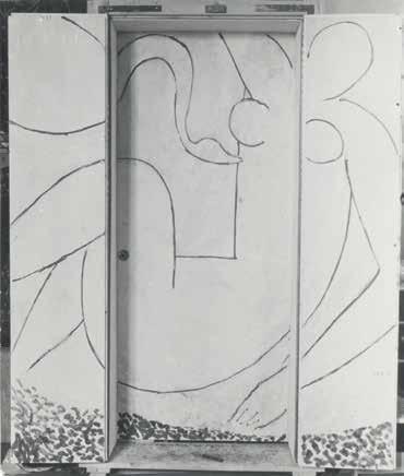


1869 - 1954
Léda et le cygne
signed with the initials HM (lower right of left panel) oil and gold leaf on three wood panels overall: 76 by 62 in. 193 by 157.5 cm. Executed in June 1944-May 1946.
$ 7,000,000-10,000,000
The authenticity of this work has been confirmed by Georges Matisse.
PROVENANCE
Marcelo Germán Fernández Anchorena and Hortensia González de Fernández Anchorena, Paris (commissioned from the artist in 1943 and until at least 1947)
Aimé and Marguerite Maeght, Paris (acquired by 1958)
Adrien Maeght, Paris (acquired by descent from the above) Arnold Herstand, New York (acquired from the above in the 1980s)
Feingarten Galleries, Los Angeles (acquired from the above)
Acquired from the above on 25 June 1985 by the present owner
EXHIBITED
Paris, Galerie Maeght, Sur quatre murs, 1958 Saint-Paul-de-Vence, Fondation Maeght, À la rencontre de Matisse, 1969, no. 25
Kunsthaus Zürich and Städtische Kunsthalle Düsseldorf, Henri Matisse, 1982-83, pl. 88, illustrated in color (titled Léda)
Stockholm, Moderna Museet and Humblebaek, Louisiana Museum of Modern Art, Henri Matisse, 1984-85, no. 71, p. 46 (Stockholm); no. 84, p. 60 (Humblebaek) (titled Léda)


Opposite: Detail of the present work with the artist’s fingerprint
LITERATURE
Léon Degand, “Matisse à Paris,” Les Lettres françaises, vol. V, no. 76, 1945, pp. 1 and 4 (titled Léda)
“Matisse: His Work and Life in the Past Five Years,” Vogue, 1 May 1946, p. 156
Alfred H. Barr, Jr., Matisse, His Art and His Public, New York, 1951, pp. 269-70; p. 493, illustrated (in progress); p. 529 (dated 1944-47)
Exh. Cat., New York, The Museum of Modern Art; Cleveland Museum of Art; Art Institute of Chicago and San Francisco Museum of Art, Henri Matisse, 1951-52, p. 8 (dated 1944-47)
Derrière le miroir, nos. 107-109, 1958, pp. 14-18
“«Sur quatre murs»,” Emporium: Rivista mensile illustrata d’arte e di cultura, vol. CXXVIII, no. 763, July 1958, p. 230; p. 231, illustrated (titled Leda)
Exh. Cat., New York, The Museum of Modern Art, Henri Matisse: 64 Paintings, 1966, p. 59
Alan Bowness, Matisse and the Nude, New York and Toronto, 1968, pl. 29, illustrated in color (dated 1945)
Exh. Cat., London, Hayward Gallery, Matisse 1869-1954, 1968, p. 52
Louis Aragon, Henri Matisse: A Novel, vol. I, New York, 1972, pl. XXXVI; pp. 282-85 and 349; p. 286, illustrated in color (titled Léda and dated 1945-46); vol. II, p. 305 (titled Leda and dated 1945)
Henri Matisse; Dominique Fourcade, ed., Henri Matisse: Écrits et propos sur l’art, Paris, 1971, p. 300 (titled Léda and dated 1944-45)
Jack D. Flam, ed., Matisse on Art, New York, 1973, pp. 10304 and 169 (titled Léda and dated 1944-47)
John Hallmark Neff, Matisse and Decoration 19061914: Studies of the Ceramics and the Commissions for Paintings and Stained Glass, Dissertation, Harvard University, Cambridge, 1974, pp. 74-75, note 48
Pierre Schneider, Matisse, New York, 1984, p. 140; p. 151, illustrated in color; p. 308
Exh. Cat., Nice, Musée Matisse, Matisse Photographies, 1986, p. 134; p. 135, illustrated (in photograph of the artist’s studio) (titled Léda and dated 1945-46)
Exh. Cat., Nantes, Musée des Beaux-Arts; Nîmes, Musée des Beaux-Arts and Saint-Etienne, Musée des Beaux-Arts, Henri Matisse: Dessins collection du Musée Matisse, 198889, p. 166 (titled Anchorena (Leda) and dated 1945-46)
Maryse Vassevière, “Les personnages-parenthèses dans ‘Aurélien,’” Revue d’Histoire littéraire de la France, vol. XC, no. 1, January-February 1990, p. 38 (titled Léda)
Lory Frankel and Ellen Rosefsky, eds., Bonnard/Matisse: Letters Between Friends, New York, 1992, p. 124
Sarah Wilson, Matisse, New York, 1992, no. 158, n.p., illustrated in color (dated 1944-45)
Exh. Cat., Staatsgalerie Stuttgart, Henri Matisse: Zeichnungen und Gouaches découpées, 1993-94, p. 27
Kenneth E. Silver, “Matisse: A Symposium,” Art in America, May 1993, p. 85
Christopher Alexander, A Foreshadowing of 21st Century Art: The Color and Geometry of Very Early Turkish Carpets, New York, 1993, p. 12, illustrated in color (titled Leda)
Annelies Nelck, L’Olivier du rêve: Matisse à Vence, Témoignage, Paris, 1995, p. 107
Yvonne Brunhammer, André Arbus, Architecte-décorateur des années 40, Paris, 1996, p. 334; p. 336, illustrated (in 1958 photograph Aimé and Marguerite Maeght’s Paris residence)
Marcel Billot, ed., The Vence Chapel: The Archive of a Creation, Houston and Milan, 1999, p. 211
Exh. Cat., Fort Worth, Kimbell Art Museum, Matisse and Picasso: A Gentle Rivalry, 1999, p. 184 (titled Leda)
Hanne Finsen, ed., Matisse, Rouveyre: Correspondence, Paris, 2001, p. 300 (note 2)
Exh. Cat., New York, The Museum of Modern Art; London, Tate Modern and Paris, Grand Palais, Matisse—Picasso, 2002-03, pp. 382-83
Exh. Cat., Dusseldorf, Kunstsammlung NordrheinWestfalen, Henri Matisse: Figur, Farbe, Raum, 2005-06, no. 216, p. 351, illustrated; p. 378 (in photograph of the artist’s studio) (titled Leda)
Alex Coles, DesignArt: On Art’s Romance with Design, London, 2005, p. 82 (dated 1945-46)
Hilary Spurling, Matisse the Master: A Life of Henri Matisse: the Conquest of Colour, 1909-1954, New York, 2005, pp. 443 and 445
Exh. Cat., Paris, Musée du Luxembourg and Humlebæk, Louisiana Museum of Modern Art, Matisse: A Second Life, 2005, p. 246
Volkmar Essers, Henri Matisse 1869-1954: Master of Colour, Cologne, 2006, p. 81 and 83; p. 82, illustrated in color (with incorrect dimensions)
Yoyo Maeght, The Maeght Family: A Passion for Modern Art, New York, 2007, p. 26, illustrated in color
Exh. Cat., Nice, Musée Matisse, Henri Matisse, Vence, l’Espace d’un atelier: Nature morte aux grenades, 2007, pp. 71, 72 and 74; p. 75, illustrated (in photograph of the artist’s studio) (titled Léda)
Claudine Grammont, ed., Matisse-Marquet: Correspondance, 1898-1947, Lausanne, 2008, p. 164
José María Blázquez, Cristianismo y mitos clásicos en el arte moderno, Madrid, 2009, p. 69 (dated circa 1945)
Exh. Cat., Le Cateau-Cambrésis, Musée Départemental Henri Matisse, Ils ont regardé Matisse: Une réception abstraite, ÉtatsUnis/Europe, 1948-1968, 2010, p. 214 (titled Léda)
Exh. Cat., Brisbane, Queensland Art Gallery, Matisse: Drawing Life, 2011, p. 314 (titled Léda)
Exh. Cat., Nice, Musée Matisse, Henri Matisse: Le Ciel découpé, 2012, p. 223 (titled Léda)
Exh. Cat., Paris, Centre Pompidou, Matisse: Paires et séries, 2012, fig. 2, p. 180, illustrated in color (titled Le Cygne and dated 1945-46)
Exh. Cat., Ferrara, Palazzo de Diamanti, Matisse, La Figura: La forza della linea, l’emozione del colore, 2014, p. 284
Claudine Grammont, ed., Tout Matisse, Paris, 2018, pp. 464-65 (dated 1943-46)
John Klein, Matisse and Decoration, New Haven, 2018, figs. 4.17 and 4.19-4.27; p. 104; p. 105, illustrated in color; p. 106; pp. 107-10, illustrated (in progress); pp. 111-13, 15960 and 256 (notes 37, 39-41; 48, 54, 56 and 59)
Eckhard Hollmann, Matisse: Masters of Art, Munich, 2022, p. 88
François Blondel, Catalogue de l’oeuvre peint de Henri Matisse, Moëns, 2025, no. 46.006, p. 564, illustrated in color (titled Léda (triptyque) and dated 1943-46)
In July 1943, Argentinian diplomat Marcelo Fernández Anchorena wrote to Henri Matisse to request a commissioned work. As admirers of modern art, Anchorena and his wife, Hortensia (see fig. 1), lavishly hosted a coterie of members of the French avant-garde during the war years at their residence at 53 Avenue Foch, in the affluent 16th Arrondissement of Paris. From 1942, the couple filled their home with works they had commissioned from their guests and other leading artists, from a set of panels by Giorgio de Chirico to a piano decorated by Jean Cocteau. They had yet, however, to have a contribution by the modern master.
Matisse spent the remainder of the summer considering the Anchorenas’ invitation to create a

painted work for the three-paneled doorway leading between the couple’s bedroom and Hortensia’s washroom. Satisfied with the detailed measurements and photographs that the Anchorenas eagerly provided, Matisse accepted the commission. The resultant triptych, Léda et le cygne, became a central preoccupation for the artist across the following three years, heralding a decisive transformation in his artistic practice in the culminating decade of his career.
Matisse was no stranger to commissioned works at this juncture: beginning in 1909 with the completion of two exultant, large-scale murals for the Moscow residence of collector Sergei Shchukin, such projects were not only celebrated as his most iconic creative achievements, but also considered by the artist to be the prime expression of his lifelong artistic ambitions. Just as he asserted in 1908, “What I am after, above all, is expression… The entire arrangement of my picture is expressive… Composition is the art of arranging in a decorative manner the diverse elements at the painter’s command to express his feelings,” would echo in his 1945 declaration, “The decorative for a work of art is an extremely precious thing. It is an essential quality. It does not detract to say that the paintings of an artist are decorative… The characteristic of modern art is to participate in our life” (quoted in Jack Flam, ed., Matisse on Art, New York, 1977, pp. 35-36 and 106).
Indeed, it was Matisse’s 1932-33 commission to create a mural for Albert Barnes’ namesake foundation in Pennsylvania (see fig. 3), his most ambitious undertaking to date, that catalyzed the most important developments in his career. In a renunciation of the illusionistic modeling that had defined his works of the prior decade, the soaring, bounding figures of La Dance—replete with bold, sinuous line and vibrant, unmodulated color— marked the emergence of both an utterly novel pictorial idiom and his revolutionary medium of paper cut-outs, thereby ushering in a new phase of unfettered artistic experimentation. Ushering in a new phase of “‘architectural painting,” (quoted in Pierre Schneider, Matisse, New York, 1984, p. 633), the
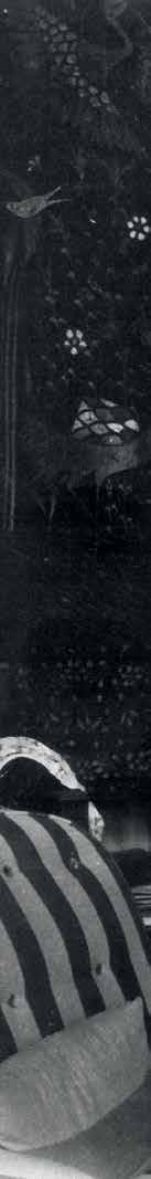

“A few days ago Picasso brought his friends to dinner; he no sooner entered the house than he said, ‘I want to see Matisse’s door.’” All Paris is holding its breath!”
— MARCELO FERNANDEZ ANCHORENA IN A LETTER TO HENRI MATISSE, 15 JANUARY 1945

artist adapted his novel artistic mode to the domestic sphere with an important commission of a fireplace mantel for the New York apartment of Nelson R. Rockefeller at the conclusion of the 1930s (see fig. 4), followed by Léda et le cygne, the defining commission of the following decade.
The door panels transited through the Occupied zone to arrive in November 1943 at Matisse’s studio at the Villa Le Rêve in Vence—where the artist had relocated in fear of bombardment at his former lodgings in Nice. Whereas the two side volets of the central door were intended to be covered in mirrors, Matisse envisioned instead to create a composition spanning these wings, thereby forming a monumental triptych that would constitute a “complete decorative ensemble.” With this arrangement in mind, inspiration for the theme of the present work burst forth: “My subject will have something to do with sleep. It will be an Antiope…,” he declared, “For a while I had thought of a dance and also a Léda with a handsome white swan [seen] flying above her sleeping form” (letter from Henri Matisse to Jean Matisse, 3 December 1943, reproduced in John Klein, Matisse and Decoration, New Haven, 2018, p. 106).
Such ardent mythical themes had proliferated in his work beginning in the 1930s and abounded in full force at the beginning of the 1940s, during which his long recovery from a life-threatening operation necessitated he channel his creative energies into his drawing practice. This included his seminal suite


of illustrations for Albert Skira’s publication of the lyric works of sixteenth-century French poet Pierre de Ronsard, titled Florilège des amours de Ronsard During the creation of this project, Matisse would have most likely encountered Ronsard’s retelling of the mythic tale depicted in the present work, La Défloration de Lède. Pierre Schneider states: “Love in itself was not a new theme in Matisse’s work…its novelty resided primarily in its intense sensuality—the sensuality of someone who had had a close brush with death and has turned back to life with new delight” (Pierre Schneider, Matisse, New York, 1984, p. 633).
Taking a hiatus from the project following the
liberation of France in August 1944, Matisse appeared by 23 December of that year to decide upon the scene depicting the central encounter of the ancient Greek myth between Zeus, assuming the form of a swan, and the titular Spartan queen. The present work thus reveals a radical reassessment of a storied art historical motif, treated before by the likes of Michaelangelo and Rubens—but most crucially by his forerunner Paul Cézanne (see figs. 6-7). Pierre Schneider asserts, “It was in [the works of Cézanne] that Matisse learned to reactivate mythology, to reinstate it as myth—the most central but also the most secret of his intentions… the mythological


themes that he treated had virtually all been handled by Cézanne before him” (ibid., 1984, p. 140).
Between late 1944 and mid-1945, Matisse executed dozens of iterations of the present work (see pp. 158-59), effacing and re-tracing iteration after iteration to explore myriad compositional opportunities afforded by this theme. Guided by his creative enthusiasm and the novel formal principles achieved in the Barnes mural, each version saw the characters unfurl across all three panels of the triptych with a masterful fluidity of line and purity of form. In a continual abstraction of form, Matisse devises varied arrangements between the serpentine curves of the swan’s neck and the recumbent, voluptuous form of Leda, with each version conveying a vital spontaneity that belies the artist’s studied process. Despite the urgings of the Anchorenas to complete the project, Léda et le cygne had morphed into a creative obsession, with Matisse at one point offering to return the money paid for the project so that he could perfectly fulfill his singular creative vision. Photographs of each successive version of this
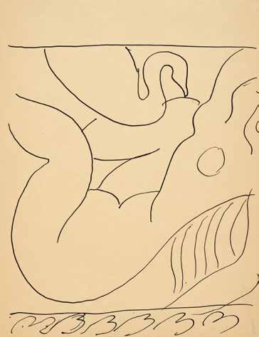


painting reveals the artist’s varied creative reflections throughout the assiduous execution of this work; this is echoed by the pentimenti of his working process that serve as temporal signifiers of his continual revisions as he painted directly upon the paneled surface.
Bespeaking the importance of this work as a reflection of his creative convictions, the artist in early 1945 brought these photographs from Vence to Paris as a visual aid for an interview with critic Léon Degand. “Let’s not lose sight of the long preparatory work which permitted [the artist] to attain this result,” Matisse declared, “It is then that one is able to give the impression of spontaneity… I work from feeling. I have my conception in my head, and I want to realize… I know where I want it to end up. The photos taken in the course of the execution of the work permit me to know if the last completion conforms more to the ideal than the preceding ones, whether I am advancing or regressing” (Léon Degand, “Matisse à Paris,” Les Lettres françaises, vol. 5, no. 76, 1945, pp. 1-4, published in Jack Flam, ed., Matisse on Art, New York, 1977, p. 102).

Despite achieving a near-final version for the work in March 1945—nearly two years after Matisse received the commission—he decided again to start anew. Instead of uniting the triptych panels through compositional continuity, he instead chose to unify them in a manner in keeping with the pioneering synthesis of form and color achieved through his paper cut-outs: through a “jazz of unrestrained color” (John Klein, Matisse and Decoration, New Haven, 2018, p. 111). Restraining the corporeal monumentality of Léda to the central panel, he covered the two flanking volets vermillion paint into which he incised
an adorning leaf motif. Louis Aragon writes, “On the panels of the outer door, foliage is painted. I have seen on Matisse’s table one or two dry leaves, such as he used to pick up every evening to study the way a leaf curls up as it shrivels, and which he must have copied countless times until it came naturally to him and in one inspired afternoon or evening he couple paint from bottom to top, as in a motionless flight, the whole of those two folding panels that open on to Léda visited by the swan…I shall day-dream in front of Léda.” (Louis Aragon, Henri Matisse: A Novel, New York, 1972, pp. 282-83). Gilding the exterior of the triptych

in gold leaf, Matisse completed the present work just days before the Anchorenas’ arrival to Vence on 6 May 1946. The artist declared that his Léda et le cygne had become “a deliciously marbled surface on which everything sang” (quoted in John Klein, Matisse and Decoration, New Haven, 2018, p. 111).
The Anchorenas arrived at Matisse’s studio in Vence to find the final result well worth their anticipation: “Your masterpiece is even more beautiful than we had imagined,” the diplomat wrote shortly thereafter, “and its extraordinary grandeur surpasses everything we know in modern painting” (letter from Anchorena to Matisse, 6 May 1946, published Exh. Cat., Nice, Musée Matisse, Henri Matisse, Vence, l’Espace d’un atelier: Nature morte aux grenades, 2007, pp. 70 and 72). Fellow artistic pioneer Pierre Bonnard equally lauded his close friend’s prodigious accomplishment, “I often think of your door decoration, which I like very much. It’s in the spirit of the large one for Barnes in America. I hope the iridescence of the central figure will remain” (letter from Bonnard to Matisse, Spring 1945, published in Lory Frankel and Ellen Rosefsky, eds., Bonnard/ Matisse: Letters Between Friends, New York, 1992, p. 125). Françoise Gilot—then the partner of Matisse’s storied rival, Pablo Picasso—later admired the work as, “a real showpiece” (quoted in Eckhard Hollmann, Matisse: Masters of Art, Munich, 2022, p. 88).
Léda et le cygne, among the final paintings executed by the artist, heralded a monumental transition to the style definitive of his late output. Swiftly following his completion of the present work, he terminated his longstanding contract with his primary dealer, Paul Rosenberg, stating that he will “let painting go for decorative works…I will be painting pictures occasionally for a long time” (letter from Henri Matisse to Paul Rosenberg, 2 June 1946, reproduced in Exh. Cat., Rome, Musei Capitolini, Matisse: “La Revelation m’est Venue de L’Orient”, 1997-98, p. 246). Matisse thereafter embarked on the monumental, decorative paper cut-outs integrated into architectural space. Such works, including La Piscine and Décoration, masques, would culminate with his final project, the commission for the stained glass and ceramic murals for the Chapelle de la Rosaire in Vence, to this day among his most celebrated and recognizable works (see fig. 3).


Among the numerous visitors who encountered the present work across the span of its execution were gallerist Aimé Maeght, and his wife, Marguerite, who nurtured the fertile artistic community around Vence and who frequented Matisse’s studio. Following the liberation of France, Aimé Maeght inaugurated his soon-legendary namesake gallery in Paris with an exhibition of wartime works by Matisse; although Maeght sought to feature the present work in the exhibition, it was not completed in time.
Nonetheless, the Maeghts’ enthusiasm for Léda et le cygne remained unabated, and by 1958 it had entered their pioneering modern art collection. The work hung in the Maeght residence at 76 Avenue Foch—mere steps away from that of the Anchorenas—where it formed a centerpiece of their apartment interior designed by preeminent French decorator and architect André Arbus. Belonging to the collection of Aimé and Marguerite Maeght for the rest of their lives, it has remained in The Cindy and Jay Pritzker Collection for forty years.


1882 - 1955
Nature morte à la bouteille
signed F. LÉGER. and dated 26 (lower right)
oil on canvas
36 ⅛ by 23 ⅞ in. 91.7 by 60.5 cm.
Executed in 1926.
$ 800,000-1,200,000
PROVENANCE
Perls Galleries, New York
Arnold H. Maremont, Chicago (acquired by 1961)
Sotheby Parke Bernet, New York, 1 May 1974, lot 9 (consigned by the above)
Modarco S.A. Collection, Geneva (acquired at the above sale)
M. Knoedler & Co., New York (acquired from the above)
Acquired from the above on 29 September 1978 by the present owner
EXHIBITED
New York, Perls Galleries, The Perls Galleries Collection of Modern French Paintings, 1953 no. 69 Chicago, Illinois Institute of Technology, The Maremont Collection at the Institute of Design, 1961, no. 75 Washington, D. C., Washington Gallery of Modern Art, Treasures of 20th Century Art from the Maremont Collection, 1964, no. 90, n.p.
Antwerp, Maison Osterrieth, 40 chefs-d’oeuvre de la Collection Modarco, 1975
LITERATURE
Georges Bauquier, Fernand Léger: Catalogue raisonné, 1925-1928, Paris, 1993, no. 446, p. 96, illustrated


In 1923, Fernand Léger wrote of how: “The polychromed machine object is a new beginning. It is a kind of rebirth of the original object” (quoted in “The Machine Aesthetic: The Manufactured Object, the Artisan and the Artist,” Functions of Painting, 1923, p. 54)(see fig. 1). In the wake of World War I, a conflict which saw the machine play a role of unprecedented proportions, Léger returned from the frontlines with an optimism about the advent of the mechanical age that stood in marked contrast to the nihilism that weighed on many of his artistic contemporaries. Léger’s vision was firmly rooted in a commitment to creating a visual language that held a mirror to this modern condition—one which equipped his viewer with a visual literacy that could be applied to life itself within the new reality of a mechanized world. There is perhaps no more poignant vehicle for his vision of a “new realism” than in his radical reimagination of the still life. Nature morte à la bouteille is a paradigm of the success he found within the genre. Léger masterfully draws out the distinction between object and subject, reconstituting the visual material of the quotidian with an economy of form, color and compositional geometry which offers a resounding affirmation of the relationship between man and machine.
Though consciously devoid of any sentimentality, the namesake bottle in many ways becomes a specter for Léger’s insistence on a human presence within the composition. Still resolutely flattened, it is the only element within the work which bears the distinctly metallic quality of Léger’s most celebrated Tubist
style—its form accentuated by the metallic grey and the exaggerated shading which offers the only semblance of three dimensionality within the composition. In this transposition of an object from everyday use into a setting apparently devoid of the human hand, and in communicating it with an acuity for the tactile quality of its plastic form, Léger allows the viewer a point of entry into the world which he lays out on the canvas.
Throughout art history, the bottle has served as a common fixture within the still life, a genre which was, from its earliest iterations, inextricably linked to its symbolic allusions to the transience of everyday life. With the advent of Cubism at the turn of the twentieth century, the still life was reintroduced as a vital mode of address, one which reconsidered objects in terms of their formal elements and so allowed for radical exploration into our modes of perception. As opposed to the precedent set by the Cubists, however, who fragmented and reconstructed the object within space as though seen from multiple perspectives at once, Léger remained resolute in his commitment to their physical, plastic qualities (see fig. 1).
After 1920, Léger’s paintings took on a more precise, static quality reflecting the rappel a l’ordre, the “call to order” then dominating the Paris avantgarde (see fig. 3). When Léger initiated his own “call to order” in 1920, it was towards a simpler, more coordinated presentation of stylistic contradictions, in which a more unified architecture provided the setting for a more explicit articulation of the relationship between man and machine. As in the present work,

the mechanical element was swiftly replaced with common objects of everyday life. Doing away with this ambiguity worked in service of the same structural stability which the reformed avant-garde sought out in their Classical revival. But where these artists rejected the mechanical aesthetic of the modern age, Léger confronted it head first.
In its earliest iteration, Léger expounded on this idea through his theory of contrasts which took the mechanical element as its starting point: “The mechanical element is only a means and not an end. I consider it simply plastic ‘raw material,’ like the elements of a landscape or a still life…,” he explained. “Instead of opposing comic and tragic characters and contrary scenic states, I organize the opposition of contrasting values, lines, and curves. I oppose curves to straight lines, flat surfaces to molded forms, pure local colors to nuances of gray” (Fernand Léger, “Notes on the Mechanical Element,” 1923, reproduced in Exh. Cat., New York, The Museum of Modern Art, Fernand Léger, 1998, p. 123). In this defection to a pure objectivity, liberated from any narrative obligation, Léger masterfully transgresses the boundary between representation and abstraction.
Nature morte à la bouteille testifies to a pivotal moment in Léger’s early creative evolution wherein he came to discover and hone the plastic qualities of color itself. Beginning with his revered Contrastes de formes, Léger endeavored to explore the potential held within the juxtaposition of pure color as a means of describing three dimensional space. The present work marks a point of maturity in this new plastic vocabulary, where pure tones are radically transformed into volumetric weights, conferring on each a sense of objecthood. The planes of color which describe the background seem to float variously on top of and beneath each other, imbued with a physical integrity despite their distinctly two-dimensional articulation. There is felt within their organization a particular kinship with the tenets of De Stijl, and with the movement’s ambition to create a universal visual language through geometry and color which speaks to the condition of modern life. At Léger’s hand, this sense of organization confers on the composition a certain architecture which, though invented and nondescript, appears to be constructed with the same functionalism, the same beauty, as he so admired in the machine.
1884 - 1950
oil on canvas
49 ¼ by 49 ⅜ in. 125 by 125.5 cm.
Executed in 1929.
$ 5,000,000-7,000,000
PROVENANCE
Baron Rudolf Freiherr von Simolin, Berlin and Seeseiten (acquired directly from the artist in 1930)
Baroness Rudi von St. Paul, Seeseiten (acquired by descent from the above in 1945 and until at least 1964)
Galerie Kornfeld, Bern, 22 June 1990, lot 9
Richard L. Feigen & Co., New York (acquired at the above sale)
Acquired from the above by October 1990 by the present owner
EXHIBITED
Munich, Graphisches Kabinett (Günther Franke), Max Beckmann—mit neuen Bildern aus Paris, 1930, no. 9
Kunsthalle Basel and Kunsthaus Zürich, Max Beckmann, 1930, no. 95, pl. 10, p. 11, illustrated (dated 1930) (Basel); no. 82, p. 9 (Zurich)
Paris, Galerie de la Renaissance and Brussels, Galerie Le Centaure, Max Beckmann, 1931, no. 31 (Paris); no. 15 (Brussels)
Copenhagen, Statens Museum for Kunst, Nyere tysk kunst, maleri og Skulptur, 1932 (dated 1931)
Munich, Galerie Günther Franke, Max Beckmann, 1946, no. 56 (dated 1930)
Munich, Haus der Kunst and Berlin, Schloss Charlottenburg and Amsterdam, Stedelijk Museum, Max Beckmann zum Gedächtnis 1884–1950, 1951-52, no. 80, p. 51 (Munich and Berlin) (dated 1930); no. 26 (Amsterdam) Kunstmuseum Luzern, Deutsche Kunst. Meisterwerke des 20. Jahrhunderts, 1953, no. 231, p. 48 (dated 1930)
Kunsthaus Zürich; Kunsthalle Basel and The Hague, Gemeente Museum, Max Beckmann 1884-1950, 1955-56, no. 52, p. 29 (Zurich); no. 44, p. 28 (Basel); no. 37, n.p. (The Hague) (dated 1930)
Paris, Musée National d’Art Moderne; Munich, Haus der Kunst and Brussels, Palais des Beaux-Arts, Max Beckmann, 1968-69, no. 44 (Paris and Brussels), p. 38; no. 41, n.p. illustrated (Munich)
Paris, Centre Georges Pompidou, Paris—Berlin: Rapports et contrastes France-Allemagne, 1900-1933, 1978, no. 30, p. 3


LITERATURE
Hans Eckstein, “Max Beckmann,” Das Werk, vol. 17, no. 9, 1930, p. 263, illustrated (dated 1930)
Otto Fischer, “Die neueren Werke Max Beckmanns,” Museum der Gegenwart, vol. I, no. 2, 1930, p. 97, illustrated; p. 98
Franz Roh, “Kunst der Gegenwart München, 1930,” Der Cicerone, vol. 22, nos. 13-14, 1930, p. 391, illustrated (dated 1929-30)
Carl Einstein, Die Kunst des 20. Jahrhunderts, Berlin, 1931, p. 496, illustrated; p. 644 (dated 1930)
Julie Elias, “Provinz-Küche,” Omnibus, 1931, p. 138, illustrated (dated 1930)
Carlo Tridenti, “Il funerale dell’Espressionismo,” Il Giornale d’Italia, vol. XXXII, 1 March 1932, p. 3, illustrated (titled Pescatore)
Franz Roh, Kunst des XX. Jahrhunderts: Max Beckmann, Munich, 1947, pp. 3-4; pl. 4, illustrated in color (dated 1930) Benno Reifenberg and Wilhelm Hausenstein, Max Beckmann, Munich, 1949, no. 296, p. 73 (dated 1930)
John Anthony Thwaites, “Max Beckmann Notes for an Evaluation,” Art Quarterly, vol. XIV, no. 4, Winter 1951, fig. 4, p. 277; p. 279, illustrated (dated 1930)
Hans Vollmer, Allgemeines Lexikon der bildenden Künstler des XX. Jahrhunderts, vol. I, Leipzig, 1953, p. 151 (dated 1930)
Hans Curjel, “Ausstellungen Luzern. Meisterwerke deutscher Kunst des 20. Jahrhunderts,” Werk, vol. XL, no. 8, August 1953, p. 125, illustrated Erhard Göpel, “Zirkusmotive und ihre Verwandlung im Werke Max Beckmanns. Anlässlich der Erwerbung des »Apachentanzes« durch die Bremer Kunsthalle,” Die Kunst und Das schöne Heim, vol. LVI, no. 9, June 1958, p. 329 (dated 1930)
Hans Martin Freiherr von Erffa and Erhard Göpel, Blick auf Beckmann, Dokumente und Vorträge, Munich, 1962, pl. 24, illustrated; p. 260
Exh. Cat., New York, The Museum of Modern Art; Boston, Museum of Fine Arts and Art Institute of Chicago, Max Beckmann, 1964, p. 50, illustrated; pp. 52 and 154 (titled The Big Catfish)
Charles S. Kesslder, Max Beckmann’s Triptychs, Cambridge, 1970, p. 20 (titled The Big Catfish)
Friedhelm Wilhelm Fischer, Max Beckmann. Symbol und Weltbild, Munich, 1972, fig. 32, pp. 83-84; p. 85, illustrated Erhard Göpel and Barbara Göpel, Max Beckmann. Katalog der Gemälde, Bern, 1976, no. 312, vol. I, p. 225; vol. II, pl. 8, illustrated in color; pl. 108, illustrated
Exh. Cat., Cologne, Josef-Haubrich-Kunsthalle, Max Beckmann, 1984, p. 58, note 24
“Zu Max Beckmanns Gemälde »Tod« in der Berliner Nationalgalerie,” Zeitschrift des Deutschen Vereins für Kunstwissenschaft, vol. XXXIX, nos. 1-4, 1985, p. 131 (dated 1922)
Günter Busch, Max Beckmann: Der Wels, Bern, 1990, illustrated in color on the cover
Exh. Cat., Düsseldorf, Kunstsammlung Nordrhein-Westfalen, Einblicke: Das 20. Jahrhundert in der Kunstsammlung
Nordrhein-Westfalen, Düsseldorf, 1990, p. 361
Karin von Maur, Max Beckmann: Reise auf dem Fisch, Stuttgart, 1992, fig. 3, p. 11; p. 12, illustrated
Max Beckmann; Klaus Gallwitz, Uwe M. Schneede and Stephan von Wiese, eds., Max Beckmann Briefe. 19251937, vol. II, Munich, 1994, pp. 129, 151, 159, 222, 374, 381 and 424
Peter Selz, Max Beckmann, New York, London and Paris, 1996, fig. 45, p. 44, illustrated; p. 45 (titled The Big Catfish)
Günter Busch, Das Gesicht: Aufsätze zur Kunst, Frankfurt, 1997, pp. 270-71, 273-80 and 369; p. 272, illustrated
Wendy Beckett, Beckmann and The Self, Cologne, 1997, p. 93, illustrated in color; p. 118
Thomas Heinze, ed., Kulturmanagement II: Konzepte und Strategien, Opladen, 1997, pp. 178 and 186
Exh. Cat., Madrid, Fundación Juan March, Max Beckmann, 1997, p. 58
Exh. Cat., Kunsthaus Zürich and The Saint Louis Art Museum, Max Beckmann in Paris, 1998-99, pp. 189-90, illustrated (in installation photograph of Paris, Galerie de la Renaissance, 1931); p. 191 (dated 1930)
Didier Ottinger, “Beckmann en eaux troubles,” Les Cahiers du Musée national d’art moderne, no. 76, Summer 2001, p. 112, illustrated; pp. 113 and 119, note 1
Richard Spieler, Max Beckmann 1884-1950: The Path to Myth, Cologne, 2002, p. 100, illustrated in color
Olaf Peters, Vom schwarzen Seiltänzer: Max Beckmann zwischen Weimarer Republik und Exil, Berlin, 2005, pp. 151, note 92, and 545, note 69
Uwe Fleckner, Carl Einstein und sein Jahrhundert: Fragmente einer intellektuellen Biographie, Berlin, 2006, fig. 138, p. 213; p. 214, illustrated
Exh. Cat., Bern, Zentrum Paul Klee, Max Beckmann—A Dream of Life, 2006, p. 65 (note 11)
Felix Billeter, Max Beckmann in der Pinakotek der Moderne, Munich, 2008, p. 343 (in photograph of the artist’s handlist)
Markus Lörz, Neuere Deutsche Kunst: Oslo, Kopenhagen, Köln 1932, Rekonstruktion und Dokumentation, Stuttgart, 2008, p. 350
Dietrich Schubert, Max Beckmann vom Vietzker-Strand zur Departure. Die Kristallisation seiner Werturteile und sein bildnerische Praxis 1904-1936, Petersberg, 2021, p. 200 (titled Der Größe Fisch (Wels))
Anja Tiedemann, ed., Max Beckmann Catalogue Raisonné der Gemälde, no. 312, illustrated in color, https://maxbeckmann.org/mb/g/312 (accessed on 10 June 2025)

Painted in Paris in 1929, after a summer in the Italian coastal town of Viareggio with his second wife, Mathilde von Kaulbach, known as Quappi, Der Wels reflects Beckmann’s fascination with the tension between what can be seen and what lies hidden. Four figures—a fisherman, two women, and a looming catfish—are arranged within a shallow, stage-like space. This theatrical construction invites the viewer to look beyond surface description and to engage with a symbolic narrative. The figures are not passive sitters but players, each performing a role in a carefully staged encounter.
Always part actor, Beckmann often cast himself in different roles. Sometimes directly, sometimes through surrogates, he appeared as clown, prophet, king, and in his Selbstbildnis mit weißer Mütze
(1926), as a sailor or fisherman (see fig. 6). Der Wels continues this performative tradition: the fisherman suggests a role for the artist, while the parasolshaded woman opposite recalls Quappi, echoing her earlier appearance in Lido (1924) (see fig. 3). The composition, playful yet enigmatic, emerges as a coy portrait of a couple, their intimacy refracted through allegorical staging.
Beckmann’s move to Paris in 1929 was decisive. Though he returned to Frankfurt monthly to teach at the Städelschule, he immersed himself in the city’s artistic life. In a letter to his dealer I. B. Neumann he declared, “Only in this way will we be able to bring our matter to international discussion and get out of this damned German provinciality” (Unpublished letter to I. B. Neumann, dated Frankfurt, 24 November 1928, Max
top:
Max Beckmann, Der kleine Fisch (The Small Fish), 1933, Centre Pompidou, Paris
Opposite bottom: Fig. 3
Max Beckmann, Lido, 1924, Saint Louis Museum of Art
Beckmann estate; reproduced in Tobia Bezzola, “Quappi in Blue”, Max Beckmann and Paris, New York, 1998, p. 22). Paris was the epicenter of modernism, home to Picasso, Léger, Braque, and Matisse, and Beckmann sought to measure himself against them directly.
Among these contemporaries, Picasso commanded Beckmann’s closest attention. The parallels between Der Wels and Picasso’s Baigneuses au ballon (1928) are striking (see fig. 4). Both stage bathers against simplified seaside architecture, with a bath shed marking the edge of the scene like a prop that masks even as it frames. From this shared device, their differences become clear. Picasso fractured form into angular abstraction, turning the body into sculptural rhythm. Beckmann, by contrast, preserved figuration and invested his characters with psychological gravity and narrative ambiguity. In Der Wels he positioned himself not as emulator but as rival, answering Parisian innovation with a language rooted in allegory, theatre, and human presence.
A constant student of art history, Beckmann engaged with the past from early in his career and continued to draw on it throughout his life. His experience as a medical orderly on the German frontlines during World War I deepened this dialogue: in France and Flanders he encountered the late Gothic and early Renaissance traditions of German and Flemish art, as well as the luminous geometries of medieval stained glass. These discoveries left a lasting imprint on his pictorial language, not only in form but in their suggestion that the visible could carry hidden, transcendent meaning.
In Der Wels, these influences are unmistakable. Figures gather with the density of Gothic horror vacui, every inch of the surface alive with meaning, while the catfish dominates the canvas with the presence of a devotional icon. Heavy black outlines recall the contours of stained glass, sharpening forms even as they heighten luminosity. At the same time, Beckmann fused these Northern resonances with his admiration for Italian Renaissance painting, where clarity of form was often the vehicle for spiritual presence.
Echoes of Piero della Francesca’s Madonna della Misericordia (circa 1460) can be seen in the composition. Like della Francesca’s panel, Beckmann’s arrangement places figures in the foreground, grouped in a triangular formation around a commanding
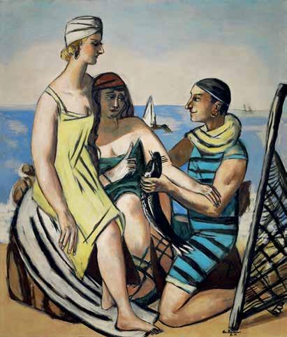


central motif. In Der Wels, the fisherman and Quappi echo the protective sweep of the Madonna’s mantle, while the fish occupies the devotional center. Here, the ordinary becomes emblematic: a fisherman, a woman, a fish, all transfigured into modern allegory. This parallel demonstrates Beckmann’s ability to adapt historical formats into modern allegories, always with the goal of penetrating the visible world to reveal the invisible truths it conceals.
At the heart of the composition is the fish itself, a recurring symbol throughout Beckmann’s career. As art historian H. W. Janson observed, it was for him a “primeval symbol of male creative force and spirituality,” uniting vitality with transcendence (Charles S. Kessler, Max Beckmann’s Triptychs, Cambridge, 1970, p. 20). In Der Wels the catfish is rendered at heroic scale, elevating an everyday catch into an emblem of mythic presence. The motif reappears throughout his oeuvre, sometimes incidental, as in Der Traum (1921), and sometimes central, as in Frauenbild (Fisherinnen) of 1948, always functioning as a bridge between the tangible and the symbolic. In his 1938 speech, On My Painting, Beckmann described his goal as penetrating “as deeply as possible into the visible” to grasp the invisible. The fish embodies this paradox, its corporeal presence masking symbolic force even as its monumentality discloses it.
In this way Der Wels connects past and present not through explicit religious iconography but through motifs charged with associative depth. The densely arranged figures recall devotional imagery, but the scene unfolds not as liturgy but as allegory—an everyday moment transfigured into a confrontation of myth and modernity. More than a still life or genre scene, the painting becomes a symbolic drama, one that resonates with the psychological and spiritual tensions of the interwar period while remaining firmly grounded in tangible form.
Through concise and inventive motifs, rendered in a luminous and rigorously structured composition, Beckmann transforms ordinary appearances into enduring symbols. His ability to generate such mythic resonance from modern experience aligns with broader currents of European art in the interwar years, when Surrealism and metaphysical painting sought to uncover hidden meaning in the everyday. Some scholars have suggested that Beckmann’s
engagement with myth was stimulated by his encounters with Surrealist circles in Paris, where he would have encountered the work of Giorgio de Chirico and Salvador Dalí. Comparisons between Der Wels and de Chirico’s Bagni misteriosi (1934) or Dalí’s Figures Laying on the Sand (1926) underscore this dialogue: in each case, ordinary subjects are transformed into sites of metaphysical tension, simultaneously familiar and uncanny. Beckmann’s painting emerges as a distinct response to the international avant-garde, infusing his figurative idiom with allegorical depth that renders Der Wels both contemporary and timeless.
By the end of the 1920s Beckmann’s paintings had achieved a monumental clarity that would define his later triptychs. Der Wels anticipates this development: its scale, density, and symbolic compression prefigure
works such as The Departure (1932–35), where motifs of confrontation and concealment expand onto an epic stage (see fig. 5). In this sense, the painting stands at a turning point, summing up Beckmann’s Paris years while foreshadowing his most ambitious allegories.
The importance of Der Wels was recognized immediately upon its completion. In 1930 it entered the collection of Baron Rudolf Freiherr von Simonlin, one of Beckmann’s most important patrons, who remained steadfast in his support even after the artist was declared “degenerate” by the Nazi regime in 1937. The painting was prominently featured the following year in Beckmann’s first major Paris exhibition at the Galerie de la Renaissance, where it was carefully chosen as part of his effort to establish his reputation among

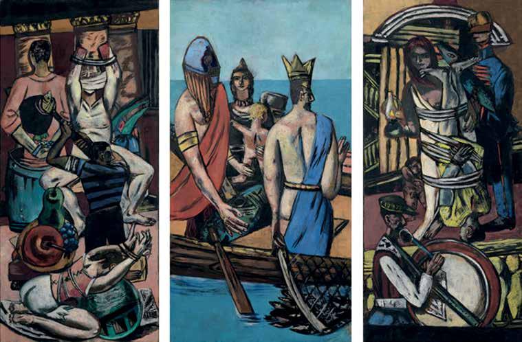
“What I want to show in my work is the idea that hides itself behind so-called reality. I am seeking the bridge that leads from the visible to the invisible, like the famous kabbalist who once said: ‘If you wish to get hold of the invisible you must penetrate as deeply as possible into the visible.’”
—
MAX BECKMANN, ON MY PAINTING , JULY 21, 1938
the authoritative voices of the French avant-garde. Since then, Der Wels has been shown widely in Europe and beyond, securing its place as one of the most significant works of Beckmann’s Paris years and underscoring its exceptional standing within his oeuvre. Today, paintings of this ambition from his Paris period are exceptionally rare, further enhancing its importance.
Seen in retrospect, Der Wels emerges not only as a masterwork of Beckmann’s Paris years but also as a pivotal step toward the monumental allegories that followed. Its fusion of past and present, of visibility and concealment, of everyday motif and symbolic charge, embodies the paradox at the heart of Beckmann’s art: the pursuit of the invisible through the visible. That
paradox is perhaps best captured in his own words to the art historian W. R. Valentiner, when, asked about the fish, he replied half seriously and half satirically: “Man originated in the sea and we all derive from the fishes, every male still has something of a particular fish about him” (W. R. Valentiner, “Max Beckmann”, Blick auf Beckmann: Dokumente und Vorträge, Munich, 1962, p. 85; reproduced in Sister Wendy Beckett, Max Beckmann and The Self, New York, 1999, p. 93).
Beckmann’s remark highlights the openness of his symbols, which move between humor and profundity, surface and depth. In Der Wels, those shifting registers coalesce in a painting that is at once personal and universal, firmly of its time yet resonant far beyond it.


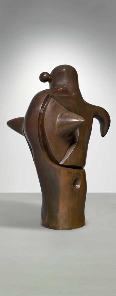

1893 - 1983
inscribed Miró, numbered 3/4 and stamped with the foundry mark SUSSE FONDEUR. PARIS
bronze height: 66 ½ in. 169 cm.
Conceived in 1975 in a numbered edition of 4 plus 1 artist’s proof; this example cast circa 1977 by Susse Fondeur.
$ 4,000,000-6,000,000
PROVENANCE
Pierre Matisse Gallery, New York (acquired directly from the artist in March 1977)
Acquired from the above on 25 April 1980 by the present owner
LITERATURE
Exh. Cat., New York, Pierre Matisse Gallery, Miró, 1976, no. 26, frontispiece, illustration of another cast
Exh. Cat., Musée d’art moderne de la ville de Paris, Miró cent sculptures, 1962-1978 Ex, 1978, no. 97, illustration in color of another cast on the cover; p. 79, illustration of another cast
Exh. Cat., Saint-Paul-de-Vence, Fondation Maeght, Joan Miró: Peintures, sculptures, dessins, céramiques, 1979, no. 306, p. 94, illustration of another cast; p. 190
Alain Jouffroy and Joan Teixidor, Miró Sculptures, Paris, 1980, no. 282, p. 203, illustration of another cast; p. 246
Exh. Cat., Milan, Palazzo Dugnani, Miró Milano, Pittura, Scultura, Ceramica, Disegni, Sobreteixims, Grafica, 1981, no. 249, p. 104, illustration of another cast
Jacques Dupin, Miró, New York, 1993, no. 406, p. 381, illustration in color of another cast
Barbara Catoir, Miró on Mallorca, New York, 1995, p. 92, illustration in color of another cast
Emilio Fernández Miró and Pilar Ortega Chapel, Joan Miró, Sculptures. Catalogue raisonné, 1928-1982, Paris, 2006, no. 333, p. 314; p. 315, illustration in color of another cast
Jacques Dupin, Miró, Paris, 2012, p. 381, illustration in color of another cast
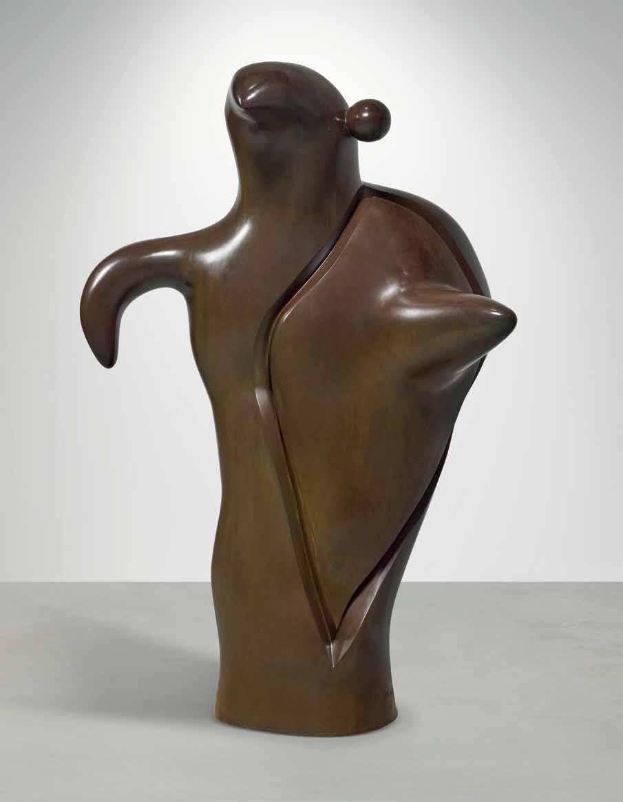

“For Miró, sculpture was a process of discovery and exploration; each bronze was merely a step along the path to poetic revelation.”
— WILLIAM JEFFETT, EXH. CAT., SOUTHAMPTON CITY ART GALLERY (AND TRAVELING), JOAN MIRÓ: SCULPTURE , 1989-90, P. 12
Writing in 1941, Joan Miró prophesied of his own practice: “It is in sculpture that I will create a truly phantasmagoric world of living monsters” (Joan Miró, “Working Notes, 1941-42,” reproduced in Margit Rowell, ed. Joan Miró: Selected Writings and Interviews, Boston 1986, p. 175). There are few works wherein that aspiration finds a more articulated form than in La Mère Ubu. Conceived in 1975 and cast shortly after in 1977, the imposing bronze makes a most wondrous transgression from Miró’s imagination into the natural world. A paradigmatic approach to the theme of the female figure—among the most prolific motifs within Miró’s painted and sculptural output (see fig. 2)—and a beautifully narrative reimagining of the French playwright Alfred Jarry’s Ubu roi—Miró’s oft-revisited creative manifesto—La Mère Ubu is animated by the lifesource of Miró’s idiosyncratic Surrealist vision (see fig. 1).
La Mère Ubu arises from the late creative wellspring largely inspired by the artist’s time in Mallorca. Jacques Dupin, the French poet and art critic, and friend-turned-biographer of Miró, marvels of the fecund period which was brought about by the environment of his new studio there: “The sculptures from the last two decades of Miró’s productive life took on a broad place and force. For Miró, sculpture
became an intrinsic adventure, an important means of expression that competed with the canvas and sheet of paper—the domains and artistic spaces proper to Miró—without ever simply being a mere derivative or deviation from painting. Miró’s approach and conception of sculpture offered him an immediate contact with a reality that, in painting, was attainable through the screen of an elaborately constructed language” (Jacques Dupin, Miró, Barcelona, 2004, pp. 361 and 367).
Miró’s sculptural oeuvre is distinguished by two distinct approaches: the first were composed of found materials, whose inherent and uncanny visual associations informed the arrangements which Miró constructed. The second were those brought to life entirely by Miró’s hand—biomorphic figures, indebted to Miró’s fascination with the folk ceramics of Mallorca and Catalunya, which were modeled in clay, enlarged and then cast in bronze. It was this second category of sculpture which offers the most contiguous and perhaps profound extension of Miró’s painterly practice. While painting remained a process of pure invention, sculpture was one of embodied creation. Dupin continues of how, “for the sculptor, what mattered was to raise an animate volume in space, to erect an autonomous plastic being capable
of emitting its own energy” (Jacques Dupin, Joan Miró: Life and Work, New York, 1993, p. 380). This sense of self-possession is undeniably felt within La Mère Ubu In her towering scale she stands with a conviction that seems a greater reflection of her own conscious mind than of the materialization of the artist. The smoothly hewn surface of her form rejects the postulation that she was constructed by the human hand, but rather sprouted from earth out of the trunk-like base on which she stands.
In conceiving of this “world of living monsters,” there is perhaps no more apt source material than Jarry’s Ubu roi. First performed in 1896, the play is an absurdist reimagination of Shakespeare’s Macbeth which, in its commentary, satirizes the complacency towards the greed and self-gratification which characterized the political class in France at the time. The opening night performance was met with riotous derision, the audience incensed by the farcical
display of actors dressed in cardboard costumes reciting Jarry’s drama, written in a dialect of slang, puns and words of the author’s own invention. The outrage and uproar was precisely the response Jarry hoped to elicit: “I intended that when the curtain went up the scene should confront the public like the exaggerating mirror in the stories of Madame Leprince de Beaumont, in which the depraved saw themselves with dragons’ bodies, or bulls’ horns, or whatever corresponded to their particular vice. It is not surprising that the public should have been aghast at the sight of its other self, which it had never before been shown completely.”
Jarry’s play was an incendiary point of reference for the Dadaists and later the Surrealists, for whom it served as a touchstone in their foray into the irrational and the absurd. In his 1923 canvas Ubu Imperator, Max Ernst conceives of Jarry’s titular character as the physical embodiments of his imperialist ambition—
his body conceived as a fortress, his head the tower, and his hands, raised as if in benediction, the only human feature (see fig. 2). The figure’s body tapers to resemble a spinning top, balanced precariously on a needle-point—a metaphor or premonition of the instability of the king’s ego. Miró variously adopted Ubu as protagonist within his own work, dedicating a number of drawings and sketches, and three suites of lithographs to the character.
Within the present work, Miró takes Ubu’s wife, Mère Ubu, as his subject. Within the play, it is Mère Ubu who initially convinces her husband to incite a revolution, leading him to kill the King of Poland and thus setting off the devolution of the drama. Once Ubu has taken to the throne, Mère Ubu—her lust for power heightened by her new role as Queen—is caught attempting to steal the treasures from the palace and in turn disguises herself as the angel Gabriel to coerce her husband into forgiving her.
Though Mère Ubu, French for “Mother Ubu”, is her given name within the play, in the context of Miró’s sculpture, it introduces a notion of motherhood which complicates the figure’s role as a woman. That complication is perhaps most succinctly visualized in the violent protrusion which seems to puncture her body. It can, on the one hand, be understood as a narrative allusion to her husband, an abstraction of the conical hat which Jarry envisioned as a characteristic accessory of Ubu. At the same time, it can also be understood as a biomorphic appendage of a kind often employed by Miró to endow potential sexual meaning to his figures. In its placement, however, along her proper left side, it also calls to mind the canonical posture of the mother and child.
It is at once a symbolic and a distinctly formal evocation of the notion of motherhood, one which was widely approached by Miró’s contemporaries working within a similarly biomorphic mode of abstraction. In Barbara Hepworth’s totemic Parent I, it is the void within the torso element which confers on the work its name. An evocation of the womb, this physical absence created by the tunneling through of the solid form likewise suggests a sense of incompleteness, a bifurcated sense of self which the state of parenthood imparts. Within the canonized iconography, the child becomes an extension of the mother, held within her arms. In Hepworth’s work the necessity of that togetherness is expressed through an extraction—the visualization of a literally missing piece. In La Mère Ubu, Miró conceives of the relationship between


mother and child as something inextricable— something physically, and in turn metaphysically, intrinsic. At the same time, it makes pertinent allusion to the female body as a receptacle and as host, even to a violent inhabitant.
This intrusion on her form is the only instance within the work where Miró’s hand is distinctly legible. From the matte patination of the surface, to the organic slope of her right arm, to the perfectly concave socket and spherical protrusion from her head, there is little trace of Miró’s intervention. Yet the deep, engraved line which demarcates her figure from the foreign presence within it records the decisive movement of his tool—a reminder of Miró’s presence within the form.
Art historian William Jeffett eloquently expounds on the phenomenon at play: “Unlike the other Surrealists, Miró situated the source of inspiration outside himself, in nature. The experience he expressed was that of receptive wakefulness, rather than of sleeping; the daydream rather than the nightmare” (Exh. Cat., Southampton City Art Gallery and traveling, Joan Miró: Sculpture, 1989-90, p. 9). La Mère Ubu stands as a striking invocation of this concept of day dream. Poised to occupy a space between the lived and supernatural, she is an animation of the signs and figures which occupy his painted Surrealist world and here make a decisive interjection into our own.


1892 - 1964 Municipal
signed Stuart Davis (upper right); signed, titled, and dated 1961 (on the stretcher) oil on canvas
24 by 30 in. 61 by 76.2 cm. Executed in 1961.
$ 1,200,000-1,800,000
PROVENANCE
The Downtown Gallery, New York (acquired directly from the artist in 1962)
Mrs. Sherman Sexton, Chicago (acquired from the above in 1963)
Fairweather Hardin Gallery, Chicago (acquired from the above in 1976)
Acquired from the above in May 1977 by the present owner
EXHIBITED
New York, The Downtown Gallery, Stuart Davis: Exhibition of Recent Paintings, 1958-1962, 1962, no. 8
New York, The Brooklyn Museum and Cambridge, Fogg Art Museum, Stuart Davis: Art and Art Theory, 1978, no. 110, p. 191, illustrated
New York, The Metropolitan Museum of Art and San Francisco Museum of Modern Art, Stuart Davis, American Painter, 1991-92, p. 87; no. 166, p. 305, illustrated in color
LITERATURE
Exh. Cat., West Palm Beach, Norton Gallery of Art, Stuart Davis’ New York, 1985, p. 24
Karen Wilkin, Stuart Davis, New York, 1987, no. 30, p. 28, illustrated in color (on the cover)
Ani Boyajian and Mark Rutkoski, eds., Stuart Davis: A Catalogue Raisonné, vol. 3, New Haven, 2007, no. 1729, p. 456, illustrated in color

With a highly innovative artistic career spanning six decades, Stuart Davis is widely recognized as one of the most influential American painters of the twentieth century. Born in Philadelphia to artistically-inclined parents, Davis immersed himself in the American modernist landscape and adopted a painterly approach indebted to consumer culture, urban life, and the American vernacular. His socially engaged body of work is deeply rooted in American visual culture, yet one of Davis’s defining attributes is his early embrace of European avant-garde ideals. He cites Paul Gauguin, Vincent van Gogh, Piet Mondrian and Henri Matisse as pioneers of their crafts from whom he adopts methods of line, color and form (see fig. 2); however, central to Davis’s own artistic ethos is how effortlessly this dichotomy between the French influence and American sensibility unfolds.
Dated to 1961, Municipal hails from the final years of Davis’s career, by which point a bold synthesis of color, mastery of geometric principles, and exploration into the New York urban landscape had become defining characteristics of his oeuvre Depicting Manhattan’s Municipal Building—designed by leading architectural firm McKim, Mead & White—the present work offers a revisitation in oil of a gouache subject Davis completed in 1953 (see fig. 3). Many of Davis’s mature works from the fifties and sixties transfigure and revise earlier compositions, allowing him to expand upon his previous subject matter across media and time. “I can take a painting I made forty years ago and use it as a basis for developing an idea today,” Davis proclaimed (quoted in Rudi Blesh, Stuart Davis, New York, 1960, n.p.).


“Davis was insistent that no matter how much his art departed from naturalistic appearances, he was not an abstract painter”
— KAREN WILKIN, “STUART DAVIS: AMERICAN PAINTER,” 1977, P. 17
As a young painter in New York, Davis’s early style reflected his Ashcan lessons with Robert Henri and inherently social realist tendencies. After exhibiting five paintings at the Armory Show in 1913, however, Davis gained exposure to avant-garde styles that both transfixed him and informed his future body of work. “I was enormously excited by the show,” Davis recalled, “and responded particularly to Gauguin, van Gogh, and Matisse, because broad generalizations of form and the non-imitative use of color were already practices within my own experience” (Stuart Davis, American Artists Group Monographs, vol. 6, New York, 1945, n.p.). Traveling to Paris to better understand the fundamental principles of European modernism in 1928, Davis applied the same fervor for illustrating New York urban living to his Montparnasse neighborhood over the course of his fifteen month stay abroad.
Davis demonstrated a particular affinity for the Cubist sensibilities of Fernand Léger and Pablo Picasso, both during and immediately following his time in Paris. “I went to the studio of Fernand Léger, internationally famous modernist painter. He showed me all his newest work. Very strong,” Davis described in a letter addressed home to his father (Karen Wilkin, Stuart Davis, New York, 1987, p. 120). The juxtaposition of geometric planes and vibrantly applied colors of his Cubist contemporaries informed Davis’s Paris period works as well as those rendered back in New York when he returned home in 1929.
Davis reemerged onto the New York artistic landscape with an eagerness to incorporate the Cubist-inspired flattened forms of his Parisian sojourn into his renditions of everyday urban life. The grid-like tendency to his post-Paris pictures is a testament not only to Mondrian’s geometric principles—whom Davis had “admired since the early 1930s”—but

also to the Fauvist teachings of Matisse (William C. Agee, Exh. Cat., New York, The Metropolitan Museum of Art, Stuart Davis: American Painter, 1992, p. 87). With its sharp edges and dynamic layering of competing forms, Municipal exudes a freedom of form and expressive application of color that reflect the profound influence of Matisse’s cutouts, which Davis had viewed at The Museum of Modern Art’s retrospective of the artist’s work in November 1951. “I don’t want people to copy Matisse or Picasso although it is entirely proper to admit their influence,” Davis believed (quoted in Exh. Cat., Washington, D.C., National Collection of Fine Arts, Stuart Davis Memorial
Exhibition: 1894-1964, Washington, D.C., 1965, p. 42). The methods of his European contemporaries undoubtedly shaped the trajectory of Davis’s later years.
The simplification of forms and powerful clarity of Davis’s 1960s paintings exemplifies the culmination of his cross-cultural artistic education and growing confidence both as a draftsman and colorist. Davis utilized a maximum of five colors in his late works, often aptly selecting “New York taxicab yellow,” as Karen Wilkin called it, for his Manhattan city scenes (Philip Rylands, ed., Stuart Davis, New York, 1977, p. 24). In the final years of his life, Davis opted for

a reduction of color and form that underscores his belief in the power of shapes and visual language to emphatically convey a broader meaning. Situated within an artistic landscape that increasingly favored abstraction over realism in the post-war years, Davis’s commitment to grounding his art in reality further distinguish him from his American contemporaries in the fifties and sixties.
Davis possessed a decades-long fascination with consumer culture, labels, and advertising. His infatuation with written language pervades both his Parisian subjects and his American scenes, further testifying to the depth of influence that bold graphic lettering and written language had on his artistic output. In this respect, many scholars of twentieth century art history cite Davis’s exploration into visual language as proto-Pop, thereby serving as a precursor to the post-war generation of Pop artists (see fig. 1). Often incorporating letters and numbers into his
strategically reduced compositions, Davis embedded facets of consumer culture into his compositions with great deftness. His incorporation of bold, enlarged lettering in Municipal and its predecessor work on paper, Park Row (see fig. 3), align the two works with one another visually while simultaneously showcasing Davis’s deep concern for the fusion of written word and fine art.
Encapsulating Davis’s unwavering desire to blend modernist principles with his increasingly urban environment, Municipal celebrates his fascination with New York’s vibrant visual landscape. From mass advertising to impressive grid-like structures, Manhattan of the 1960s possessed a vital spirit that Davis sought to capture through his simplified yet dynamic forms. It is through these densely arranged, geometric figures that Davis imparts his distinctly American approach to twentieth century painting— albeit deeply influenced by French modernist principles.

Modern Day Auction: Session I
21 NOVEMBER 2025

IMPRESSIONIST & MODERN ART
SCOTT NIICHEL
Vice Chairman
Head of Middle Market for Modern & Contemporary Art Scott.Niichel@Sothebys.com
FRANCES ASQUITH
Senior Specialist
Frances.Asquith@Sothebys.com
ZOË ZANETEAS
Deputy Head of Modern Day Auction Zoe.Zaneteas@Sothebys.com
CONTEMPORARY ART
DAVID GALPERIN
Vice Chairman
Head of Contemporary Art, Americas David.Galperin@Sothebys.com
EMILY MILES
Deputy Head of Contemporary Day Auction Emily.Miles@Sothebys.com
LATIN AMERICAN ART
ANNA DI STASI
Head of Latin American Art Anna.Distasi@Sothebys.com
EMILY NICE
Specialist
Emily.Nice@Sothebys.com
CAROLA REYES BENÍTEZ
Associate Specialist Carola.Reyes@Sothebys.com
JODI POLLACK
Chairman of 20th Century Design
Chairman of Major Collections, Americas Jodi.Pollack@Sothebys.com
MARGARET WOOD
Head of Sale, 20th Century Design Margaret.Wood@Sothebys.com
PRINTS & MULTIPLES
CHANLER RUTHERFURD
Co-Head of Sale, Prints & Multiples Chanler.Rutherfurd@Sothebys.com
SALE NUMBER N11730
BIDS DEPARTMENT +1 212 606 7414 bids.newyork@sothebys.com
Telephone bid requests should be received 24 hours prior to the sale. This service is offered for lots with a low estimate of $5,000 and above.
PRE-SALE COORDINATOR
Anjli Patel
Impressionist & Modern Art Anjli.Patel@Sothebys.com
POST SALE SERVICES
Samit Sinha
Client Accounts Receivable Manager Impressionist & Modern Art uspostsaleservices@sothebys.com
COLLECTION SALE MANAGEMENT
Melissa Cooper Head of Collection Sale Management Melissa.Cooper@Sothebys.com
Alexander Calder and Braniff International
“Braniff and Calder, a great airline and the American genius whose unique contribution to art was the development of sculptural movement in space. [...] The Whitney Museum of American Art has designated Calder as our Bicentennial artist, and will present a major retrospective exhibition, “Calder’s Universe,” in October 1976. Thank you Braniff for bringing one of the world’s greatest artists to the attention of the entire American public in such a unique and appropriate manner.”
— TOM ARMSTRONG QUOTED IN: COMMENTS BY MEMBERS OF THE COMMITTEE FOR THE SELECTION OF ALEXANDER CALDER’S DESIGN FOR FLYING COLORS OF THE UNITED STATES, 22 OCT. 1975, COURTESY OF GERALD R. FORD LIBRARY (ONLINE).
In 1983, Jay Pritzker was named CEO of Braniff Inc., successor to Braniff International Airways. At a time when the airline faced fierce industry pressures, he reaffirmed their reputation and championed their bold vision as leaders in aviation. A decade earlier, Braniff had reshaped the relationship between art and aviation. Braniff was known for their innovative approach to aircraft design, as they had previously enlisted design icons Emilio Pucci and Herman Miller to redesign their cabins, uniforms, and other branding elements. In 1973, Calder, by then one of America’s most celebrated artists, was commissioned to paint a McDonnell-Douglas DC-8 in his distinctive style of sweeping lines, bold fields of color, and dynamic motifs. The final design – characterized by its sinuous fields of red, yellow, and blue, as well as snakes, suns, and other icons – was intended to promote Braniff’s routes connecting North and South America.
The result, christened Flying Colors, was unlike anything in commercial aviation: a plane that carried Calder’s own signature instead of the airline’s. The project was heralded by a 1973 exhibition of Calder’s lively maquettes hanging in the rotunda of the Solomon R. Guggenheim Museum in New York, which captured the imagination of museumgoers before the jet ever left the ground. Calder himself painted portions of the plane by hand at Paris–Le Bourget Airport, underscoring the artistry of the commission. The collaboration was so successful that, in 1975, Braniff invited Calder to design a second livery to mark the United States Bicentennial. Flying Colors of the United States wrapped a Boeing 727 in sweeping


“By commissioning a great American artist, Alexander Calder, to create its commemoration of our nation’s Bicentennial, Braniff has managed, at the same time, to demonstrate how fruitful close collaboration between business and the arts can be. Braniff and Calder have given us a delightful reminder that, throughout history, art has been concerned with all the objects of daily life and wise business leaders have always enlisted the talent of the artist to enhance the appeal of his products and services and to impress the character of his enterprise on the minds of his public.”
— GOLDWIN MCLELLAN QUOTED IN: COMMENTS BY MEMBERS OF THE COMMITTEE FOR THE SELECTION OF ALEXANDER CALDER’S DESIGN FOR FLYING COLORS OF THE UNITED STATES, 22 OCT. 1975, COURTESY OF GERALD R. FORD LIBRARY (ONLINE).
red, white, and blue, evoking the American flag in motion. “Just as one can compose colors, or forms,” Calder observed, “so one can compose motions.” These airplanes embodied that philosophy, turning flight itself into a work of art. Upon acquiring Braniff in 1987, the following four gouaches were acquired.


1898 - 1976
signed Calder and dated 72 (lower right)
gouache and ink on paper
29 ¼ by 43 in.
74.3 by 109.2 cm.
Executed in 1972.
PROVENANCE
Perls Galleries, New York
Nahmad Collection, Geneva (acquired from the above in 1974)
Perls Galleries, New York (acquired from the above in 1975)
Braniff, Inc., Dallas (acquired from the above in 1976)
Acquired from the above in 1987 by the present owner
$ 50,000-70,000
This work is registered in the archives of the Calder Foundation, New York, under application number A06839.
1898 - 1976
signed Calder and dated 76 (lower right)
gouache and ink on paper
43 ¾ by 14 ¾ in.
97.2 by 127 cm.
Executed in 1976.
PROVENANCE
Perls Galleries, New York
Braniff, Inc., Dallas (acquired from the above in 1976)
Acquired from the above in 1987 by the present owner
$ 30,000-40,000
This work is registered in the archives of the Calder Foundation, New York, under application number A07204.


1898 - 1976
signed Calder and dated 76 (lower right) ink and gouache on paper
43 ¼ by 14 ½ in.
109.9 by 36.8 cm.
Executed in 1976.
PROVENANCE
Perls Galleries, New York
Braniff, Inc., Dallas (acquired from the above in 1976)
Acquired from the above in 1987 by the present owner
$ 30,000-40,000
This work is registered in the archives of the Calder Foundation, New York, under application number A07205.
1898 - 1976
signed Calder and dated 67 (lower right) ink and gouache on paper
23 by 30 ¾ in.
58.4 by 78.1 cm.
Executed in 1967.
PROVENANCE
Perls Galleries, New York
Braniff, Inc., Dallas (acquired from the above in 1976)
Acquired from the above in 1987 by the present owner
$ 40,000-60,000
This work is registered in the archives of the Calder Foundation, New York, under application number A07220.
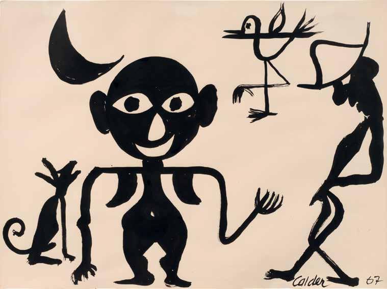

1923 - 2005
signed Soto, titled and dated 1986 (on the reverse)
painted wood and metal construction
50 ¼ by 40 ⅛ in.
127.6 by 101.9 cm.
Executed in 1986.
PROVENANCE
Gilbert Brownstone, Paris
Acquired from the above by the present owner
$ 180,000-280,000


1887 - 1965
signed Le Corbusier (lower center); variously inscribed (in the upper margins); variously inscribed (on the verso) paper collage and gouache on paper 12 ⅜ by 10 in.
31.4 by 25.4 cm.
Executed in 1948.
PROVENANCE
Richard Gray Gallery, Chicago
Acquired from the above on 17 December 1986 by the present owner
$ 20,000-30,000


1891 - 1973

Tête
inscribed J Lipchitz, numbered 2/7 and marked with the artist’s thumbprint
bronze height: 23 ¾ in. 60.3 cm.
Conceived in 1915 and cast during the artist’s lifetime; this example is number 2 from an edition of 7.
$ 300,000-400,000
PROVENANCE
Fine Arts Associates (Otto Gerson), New York
Rothschild Collection
Feingarten Galleries, Chicago
Acquired from the above on 24 September 1986 by the present owner
EXHIBITED
New York, Otto Gerson Gallery and Ithaca, New York, Cornell University, Andrew Dixon White Museum of Arts, 50 Years of Lipchitz Sculpture, 1961-62


“Of the greatest importance in clarifying my ideas about subject and form in 1915 was the Head (Tête). This was made after the moment of my emotional crisis, when I felt that in my exploration of abstract shapes I had lost sight of the human element, the relation to nature that has always been so necessary for me.”
— JACQUES LIPCHITZ
LITERATURE
Christian Zervos, Histoire de l’art contemporain, Paris, 1938, p. 305, illustration of the stone version (dated 1916)
J. Assou, “Contemporary Sculptors: v–Lipchitz,” Horizon, December 1946, vol. 14, p. 377
Maurice Raynal, Jacques Lipchitz, Paris, 1947, pp. 12-13, illustration of the stone version
Howard Devree, “Artist’s Evolution: The Development of Jacques Lipchitz–Newcomers Beyond the Hudson,” The New York Times, 6 May 1951
Michel Seuphor, La Sculpture de ce siècle: Dictionnaire de la sculpture moderne, Neuchâtel, 1959, p. 22, illustration of another cast (dated 1915-16)
Irene Patal, Encounters The Life of Jacques Lipchitz, 1961, pp. 159-61
A.M. Hammacher, Jacques Lipchitz: His Sculpture, New York, 1961, p. 37, illustration of another cast; pp. 170 and 172, pl. 21, illustration of another cast
Herbert Read, A Concise History of Modern Sculpture, London, 1964, no. 75, p. 75, illustration of another cast; p. 296
Bert van Bork, Lipchitz: The Artist at Work, New York, 1966, pp. 28, 31, and 116-19, illustrations of the wax version in situ
Petr Wittlich, J. Lipchitz, Prague, 1966, n.p., illustration of another cast
H.H. Arnason, History of Modern Art, New York, 1968, p. 188, illustration of another cast; p. 189
H.H. Arnason, Jacques Lipchitz: Sketches in Bronze, New York, 1969, pp. 6 and 8, fig. 2, illustration of another cast
Douglas Cooper, The Cubist Epoch, New York, 1970, p. 250, pl. 304, illustration of another cast; p. 297
Jacques Lipchitz, The Documents of 20th Century Art: My Life in Sculpture, New York, 1972, pp. 20, 23 and 33-35, fig. 25, illustration of another cast
Abram Lerner, ed., The Hirshhorn Museum and Sculpture Garden, New York, 1974, p. 332; illustration of another cast; p. 714
A.M. Hammacher, Jacques Lipchitz: His Sculpture, New York, 1975, no. 21, p. 172, pl. 21, illustration of another cast; fig. XXVI, illustration of another cast
Deborah A. Stott, Jacques Lipchitz and Cubism, New York, 1975, p. 273, fig. 3, illustration of another cast; p. 68
Pierre Daix, Cubists and Cubism, New York, 1982, p. 113
H.H. Arnason, History of Modern Art, New York, 1986, p. 170, fig. 235, illustration of another cast; p. 167
Exh. Cat., London, Tate Gallery, The Lipchitz Gift: Models for Sculpture, 1986, no. 310, pp. 26-27, illustration in color of another cast
Alan G. Wilkinson, The Sculpture of Jacques Lipchitz: A Catalogue Raisonné, The Paris Years, 1910-1940, vol. I, London, 1996, no. 35, p. 42, illustration of another cast; p. 215
Exh. Cat., San Francisco Museum of Modern Art, Celebrating Modern Art: The Anderson Collection, 2000, no. 166, p. 268, pl. 151, illustration in color of another cast; p. 373
Catherine Pütz, Jacques Lipchitz: The First Cubist Sculptor, London, 2002, pp. 14 and 16, fig. 9, illustration of another cast
Kosme de Barañano, Jacques Lipchitz: The Plasters, A Catalogue Raisonné, 1911-1973, Bilbao, 2009, no. 30, pp. 100-01, illustrations of the plaster and another cast
Jacques Lipchitz’s totemic Tête, from 1915, captures the human likeness with an immutable, primeval power. A pronounced forehead and strong browline conceal deep-set eyes that recall the proportionality of the ancient African and Oceanic masks Lipchitz personally collected and studied throughout his life (see fig. 1). A monolithic shaft of bronze bisects the smooth planes of the abstracted visage in the shape of a nose, while a mottled bluegreen patina and rugged texture further enhance the atavistic quality of the bust. With only two interlocking planes and few overtly representational features, the semblance of a man’s head emerges as the archetype of Lipchitz’s singular three-dimensional Cubist idiom. “Lipchitz’s Head is a complete, ‘organic’ entity,” Catherine Pütz writes, “seamlessly integrating material and content. It recalls human features and the proportions of a face, but in its expressiveness it is independent from the known, human world. It is a new object unlike any we have previously seen” (Catherine Pütz, Jacques Lipchitz: The First Cubist Sculptor, London, 2002, p. 16).
In 1909, at the age of eighteen, Lipchitz left his home in Lithuania for the promise of modernity and prosperity: twentieth-century Paris. Upon his arrival, he enrolled in the Académie des Beaux-Arts before transferring to the more progressive Académie Julian where he became enmeshed in the city’s avantgarde expatriate circle of visual artists, writers and performers. During this time, Lipchitz met the Mexican artist and fervent Cubist, Diego Rivera (see fig. 2). Both outsiders, the two young artists were drawn to the vibrant Montparnasse neighborhood where, alongside a melange of Cubist painters and sculptors, Lipchitz and Rivera became close friends and artistic collaborators. In 1913, it was Rivera who introduced Lipchitz to Pablo Picasso, galvanizing the young artist’s adoption of their burgeoning movement’s precepts.
During the first four years of his career, Lipchitz followed the naturalistic representation of GrecoRoman antiquity, producing decorative sculptures in the Art Nouveau style. But by 1914, guided by his new friends and surroundings, and later bolstered by representation by renowned dealer Léonce Rosenberg,


Lipchitz devised a sculptural equivalent to twodimensional Cubism: the radical synthesized forms extolled by Picasso, Georges Braque and Juan Gris transformed into leveled, geometric planes; papier collé and other forms of collage became layered facets of bronze, marble and stone; even the use of novel materials to enhance tactility, such as sand and sawdust, appeared in the scraped and pitted surfaces of Lipchitz’s sculptures.
The figurative components of his practice, however, soon gave way to the abstracted fashion of crystal Cubism, in which flattened planes supplanted the depth and perspective of observed reality: “I carried my findings all the way to abstraction,” Lipchitz wrote. Working briefly in this vein, the sculptor became increasingly perturbed that he had reached the apogee of synthetic Cubism and consequently “lost the sense of the subject, of its humanity…I had gone too far,” he agonized (Jacques Lipchitz, The Documents of 20th Century Art: My Life in Sculpture, New York, 1972, p. 26). Such was the state of his concern that during the summer of 1915 Lipchitz experienced a kind of existential crisis, abasing himself as more of a cabinetmaker than a sculptor. Tête
emerged as the antidote to the artist’s disorientation.
“Of the greatest importance in clarifying my ideas about subject and form in 1915 was the Head (Tête),” the artist reflected. “This was made after the moment of my emotional crisis, when I felt that in my exploration of abstract shapes I had lost sight of the human element, the relation to nature that has always been so necessary for me.” In fact, Lipchitz adulated the present form as a means of “bringing me out of this moment of despair… With this work I entered into a period almost of euphoria.” Indeed he knew that he had discovered something, “that [he] was on the right road to the realization of a kind of sculpture in which [he] had complete control of the vocabulary of Cubist forms in the creation of works where the human subject or idea was uppermost (ibid., pp. 33-34).” In Tête, Lipchitz had finally struck the balance between figuration and abstraction, an equilibrium he had been unconsciously seeking. The present cast has been part of the Pritzker Collection for nearly fifty years, while other examples reside in the permanent collections of the Centre Pompidou, Paris (plaster), Hirshhorn Museum and Sculpture Garden, Washington D.C., and the Tate Gallery, London.
1882 - 1963
Nature morte
signed G Braque (lower right)
charcoal on paper
18 ⅞ by 25 in.
47.9 by 63.5 cm.
Executed in 1912.
$ 300,000-500,000
PROVENANCE
Douglas Cooper, London and Avignon
Lester F. Avnet, New York (acquired by 1970)
Private Collection, Europe (acquired from the estate of the above)
Richard Gray Gallery, Chicago
Acquired from the above on 11 May 1981 by the present owner
EXHIBITED
Los Angeles County Museum of Art and New York, The Metropolitan Museum of Art, The Cubist Epoch, 1970-71, no. 41, p. 279, illustrated Bielefeld, Kunsthalle, Zeichnungen und Collagen des Kubismus Picasso Braque Gris, 1979, no. 135, illustrated
LITERATURE
Marco Valsecchi and Massimo Carrà, L’opera completa di Braque, dalla scomposizione cubista al recupero dell’oggetto 1908-1929, Milan, 1971, no. D3, p. 106 and 108, illustrated
Nicole Worms de Romilly and Jean Laude, Catalogue de l’oeuvre de Georges Braque, Paris, 1982, no. 127, p. 160, illustrated; p. 275


Since the development of linear perspective during the Renaissance, the Cubist works of Georges Braque and Pablo Picasso represent one of the most comprehensive revisions of spatial conventions in Western art. Their partnership began in the spring of 1907 when Braque visited Picasso’s studio at the suggestion of Daniel-Henry Kahnweiler and famously stood before Les Demoiselles d’Avignon, internalizing Picasso’s refutation of traditional pictorial organization. In conversation in 1954 with art critic and author, Dora Vallier, Braque summoned the nascent years of 1907-14, when he and Picasso together devised the principles of the Cubist movement: “At that time I was very friendly with Picasso…Our temperaments were very different, but we had the same idea...We were living in Montmartre, we used to meet every day, we used to talk... In those years Picasso and I said things to each other that nobody will ever say again... (quoted in Richard Friedenthal, ed., Letters of the Great Artists, London, 1963, p. 264). Braque likened the pair to mountain climbers, roped together in their audacious quest to upend traditional rules of artistic representation uncontested for centuries.
Braque later explained to John Richardson, “The whole Renaissance tradition is repugnant to me. The hard-and-fast rules of perspective which it succeeded in imposing on art were a ghastly mistake which it has taken four centuries to redress; Cézanne and after him, Picasso and myself can take a lot of the credit for this. Scientific perspective is nothing but eye-fooling illusionism; it is simply a trick–a bad trick–which makes it impossible for artists to convey a full experience of space, since it forces the objects in a picture to disappear away from the beholder instead of bringing them within his reach, as painting should. Perspective

is too mechanical to allow one to take full possession of things. It has its origins in a single viewpoint and never gets away from it...When we arrived at this conclusion, everything changed—you have no idea how much” (John Richardson, Braque, London, 1961, p. 10).
In particular, the still life proved an effective genre for experimentation. The multitude of viewpoints afforded by humble objects arranged on a table allowed the young artists to develop the tenants of their movement unburdened by the expectations of their peers, subjects, dealers or patrons. Braque embeds a melange of quotidian objects within the present work; rendered in deft strokes of charcoal, the handle of a mug, the stem of a bottle and the pages of a folded newspaper materialize at first glance. Upon closer observation, the handle of a cutting board, the edges of a fan and the outline of a string instrument appear—ingredients for
an evening at the Moulin de la Galette, Lapin Agile, or any number of Montmartre establishments favored by its avant-garde artistic circles.
The surfacing of the word ‘Jour,’ along the lower edge of the sheet, underscores the blithe spirit that often enriches the subtext of Braque and Picasso’s most enchanting Cubist works. A double entendre, Jour was not only the title of a popular daily newspaper, but also a play on the words le jour, meaning “the day,” cementing the work in the reality of the present moment. Despite the straight edges of the sheet, Nature morte assumes the shape of an oval, much like the tondo canvases Braque and Picasso began to employ at the beginning of the decade. Braque determined that the linear nature of cut paper was incongruous with still-life drawing and painting where the tactile space surrounding the objects was as
important as the objects themselves. He stated, “The point of my oval compositions was that they allowed me to rediscover the contrast between horizontals and verticals” (quoted in John Richardson, ibid., pl. 11).
Braque continued to work in this vein until he was mobilized for military service in 1914, following the outbreak of the First World War. A Spanish national, Picasso was not obliged to enlist and continued developing his artistic practice over the following four years. The war marked the end of an era for Braque, who was stymied at the height of his powers. The camaraderie and dialogue of the halcyon days of pre-war Cubism were now only distant memories. Nevertheless, the artistic progress made in that short period would shape the future of modern art.
The present work bears a rich history of ownership: its first known owner was legendary Cubist collector, historian and modern art critic, Douglas Cooper. Cooper began his career as an art dealer and co-owner of Mayor Gallery in London. By the Second World War, he had inherited a large sum of money and amassed a collection of over 100 Cubist works, including paintings by the movement’s four main proponents, Braque, Picasso, Léger and Gris, with a particular focus on the years between 1906-14. During the war, his art historical knowledge and fluency in both French and German were put to use in the Monuments, Fine Arts and Archives (MFAA) Section Unit where he interrogated German prisoners in an effort to recover Nazi looted art. Lester Avnet, an American industrialist and philanthropist known for his incomparable collection of modern works on paper—many of which have been donated to New York’s Museum of Modern Art—acquired the present work by 1970. Avnet avidly collected works by Braque, Picasso and Gris which hung in good company alongside paintings by Old Masters such as Tiepolo, Caravaggio and Delacroix. In 1981, Nature morte joined the prestigious Collection of Cindy and Jay Pritzker where it has remained for over four decades.


1879 - 1940
Der Mann mit dem Schnaps (The Man with the Schnapps)
signed Klee and dated 1922 1/2 (upper left); titled, dated 1922. and numbered 205. (on the mount) pencil and colored crayon on paper on artist’s mount sheet: 8 ¾ by 11 ¼ in. 22.2 by 28.6 cm. mount: 10 ¼ by 12 ¼ in. 26 by 30.5 cm.
Executed in 1922.
$ 120,000-180,000
PROVENANCE
Klee-Gesellschaft, Bern (acquired after 1946)
Curt Valentin (Buchholz Gallery), Berlin and New York (acquired after 1951)
Frank Perls Gallery, Los Angeles Berggruen & Cie., Paris (acquired in 1961)
Dr. Ernst Hauswedell & Co., Hamburg, 8-9 June 1979, lot 634
Acquired at the above sale through Alice Adam Ltd. by the present owner
LITERATURE
Will Grohmann, Paul Klee. Handzeichnungen 1921-1930, Potsdam and Berlin, 1934, no. 67
The Paul Klee Foundation, ed., Paul Klee, Catalogue raisonné, 1919-1922, vol. 3, Bern, 2004, no. 3030, p. 455, illustrated (with incorrect dimensions)

Executed in 1921, Der Mann mit dem Schnaps (The Man with the Schnapps) dates to the early years of Paul Klee’s tenure as a professor at the Bauhaus in Weimar, Germany. Established by Walter Gropius in 1919. Bauhaus was a revolutionary school founded upon the dissolution of the divide between the applied and fine arts. Gropius required Bauhaus pupils to receive interdisciplinary training, including fine art, design, and architecture, and the Bauhaus would come to be known as one of the 20th century’s most influential schools of art, gathering an esteemed roster of instructors and producing several notable pupils. Klee’s Der Mann mit dem Schnaps (The Man with the Schnapps) demonstrates the school’s primary tenets through its geometric structure, abstracted figuration, and dynamic blending of form and color.
The importance of line and its infinite possibilities is deeply ingrained in Klee’s oeuvre; he is famously recorded as characterizing his creative process as a line “going out for a walk” (quoted in Robert Kudielka et al., Paul Klee: The Nature of Creation, London, 2002, p. 53). Thus, Klee’s drawing exercises were of particular importance to him as direct expressions of this belief. Der Mann mit dem Schnaps (The Man with the Schnapps) beautifully captures the Bauhaus master’s practice of experimenting with the formal elements of his work, such as the swirling patterns of the figure’s hair or the contrast between the bold, richly pigmented strokes and delicate hatching.
Setting him apart from many of his Bauhaus peers, Klee’s paintings and drawings also feature whimsical combinations of figures and representational forms that create playful narratives, as is evidenced by the present work. Here, machine-like elements collide with the geometric forms of the man’s face to compose his arms and shoulders, while the glass of orange schnapps in the figure’s right hand and the blue fan tucked into the right side of his hat introduce contrasting color into the image and an eccentric flare to the man’s ensemble. In Der Mann mit dem Schnaps (The Man with the Schnapps), Klee melds Bauhaus principles and his own imaginative subjects in a delightfully unexpected, avante-garde style.


“Klee’s studio was like an alchemist’s kitchen. In the middle there were several easels, one chair… Everywhere paint powder, oils, little bottles, little boxes, matchboxes. Whatever he needed for painting he made himself.”
— ROLF BÜRGI, 1925, QUOTED IN STEFAN FREY AND JOSEF HELFENSTEIN, EDS., PAUL KLEE REDISCOVERED: WORKS FROM THE BÜRGI COLLECTION , LONDON, 2000, P. 186

1898 - 1986
signed Moore (lower right); inscribed PL XVI and HC 7/15 (lower left) etching and aquatint printed in colors on Arches wove paper plate: 13 ⅝ by 14 ⅜ in. 34.6 by 36.5 cm. sheet: 24 ⅜ by 20 ½ in. 62 by 52.1 cm. Executed in 1983; this impression is one of 15 artist’s proofs aside from the numbered edition of 65, published by Raymond Spencer Company, Ltd. for the Henry Moore Foundation.
LITERATURE
Patrick Cramer, Catalogue of Graphic Work Volume IV: 1980-1984, Geneva, 1986, no. 686, illustration in color of another example
$ 1,500-2,500

1885 - 1930
signed Pascin, dated 1912 and stamped with the atelier mark (lower right) watercolor and pencil on paper 8 ¾ by 10 ⅜ in. 20.3 by 25.4 cm.
Executed in Paris in 1912.
PROVENANCE
Charles Feingarten, Los Angeles (acquired by 1984) (probably) Feingarten Galleries, Chicago
Probably acquired from the above by the present owner
LITERATURE
Yves Hemin, Guy Krohg, Klaus Perls and Abel Rambert, Pascin, Catalogue raisonné, Peintures, aquarelles, pastels, dessins, vol. I, Paris, 1984, no. 185, p. 101, illustrated
$ 2,000-3,000
1808 - 1879
stamped M.L.G. Bronze; numbered twice 12/25 (on the underside)
bronze height: 6 ⅞ in. 17.5 cm.
Conceived circa 1830-32; this example cast from 1929 by the Barbideienne foundry, Paris, at the direction of Maurice Le Garrec, in an edition of 25.
PROVENANCE
Rune Swanstrom, Gothenburg, Sweden
M. Knoedler & Co., New York (consigned by the above in January 1960)
Fairweather Hardin Gallery, Chicago (acquired from the above in March 1960)
Acquired from the above on 19 April 1960 by the present owner
LITERATURE
Eugène Bouvy, Trente-six bustes de H. Daumier reproduits en phototype grandeur nature, Paris, 1932, no. 22, illustration of the unbaked clay version
Charles Mourre, “Bustes et personnages,” Arts et livres de Provence: Daumier, 1948, p. 99

Maruice Gobin, Daumier Sculpteur, Geneva, 1952, no. 22, p. 209, illustration of the unbaked clay version; p. 334
Exh. Cat., Paris, Galerie Sagot-Le Garrec, Daumier: Sculpteur, lithographe et dessinateur, 1957, no. 22, illustrations of other casts
Exh. Cat., Metz, Salle de la Mutualité, 200 Chefs d’oeuvre de Daumier, 1957
Exh. Cat., Paris, Bibliothèque nationale, Daumier, Le Peintre graveur, 1958, no. 10
Jeanne L. Wasserman, Daumier Sculpture, A Critical and Comparative Study, Cambridge, 1969, no. 2, pp. 48-49, illustrations of the unbaked clay version (no. 2a) and another cast (no. 2b)
$ 3,000-5,000
1898 - 1986
Head, Fish, Figure and Foot
titled (center right); variously inscribed (on the verso) wax crayon, charcoal, watercolor wash and gouache on paper
8 ¾ by 6 ¾ in.
22.2 by 17.1 cm.
Executed in 1942.
$ 25,000-35,000
PROVENANCE
Galerie Claude Bernard, Paris
Private Collection, France
Kaplan Gallery, New York
M. Knoedler & Co., New York and Marlborough Gallery, London (jointly acquired from the above in 1962)
Feingarten Galleries, Chicago
Acquired from the above in 1977 by the present owner
LITERATURE
Ann Garrould, ed., Henry Moore, Complete Drawings 1940-49, vol. 3, London, 2001, no. AG 42.162, p. 160, illustrated
“Drawing, even for people who cannot draw, even for people not trying to produce a good drawing, makes you look more intensely.”
— HENRY MOORE

1869 - 1954
Tête de femme
signed Henri - Matisse (lower right) pen and ink and brush and ink on paper 14 ¼ by 10 ⅝ in.
36.2 by 27 cm.
Executed in 1918-19.
$ 60,000-80,000
The authenticity of this work has been confirmed by the late Madame Marguerite Duthuit-Matisse.
PROVENANCE
Private Collection, United States Alice Adam Ltd., Chicago
Acquired from the above on 12 May 1979 by the present owner
EXHIBITED
New York, Weyhe Gallery, An Exhibition of Drawings, Lithographs and Etchings by Henri Matisse Specially Selected by His Son Pierre Matisse, 1925
Over the course of two decades, Pablo Picasso created over 3,500 unique and editioned ceramic works fired in clay. Vases, pitchers, jugs, plates and zoomorphic and anthropomorphic sculptural forms abound with animal and classical imagery, mythological creatures, playful and whimsical faces and explorations of the human figure, most notably women. Picasso’s ceramic works were rarely studied or appreciated during his lifetime. However, in recent years his ceramics have enjoyed broader recognition for their inventiveness and originality, showcased in museum exhibitions, sold at auction and collected with fervent enthusiasm. Picasso’s ceramics combine elements of his different practices, fusing painting, printmaking and sculpture. But for Picasso there was something singular about the opportunities that working with clay provided for his creative process. Appreciating the plastic and technical possibilities of three-dimensional forms, he approached ceramics as more than surfaces to be painted. Recalling his father’s work in ceramics, Claude Picasso has said:
“Working with the primal elements fire and earth must have appealed to him because of the almost magical results. Simple means, terrific effect. How ravishing to see colours sing after infernal fires have given them life. The owls managed a wink now. The bulls seemed ready to bellow. The pigeons, still warm from the electric kiln, sat proudly brooding over their warm eggs. I touched them. They were alive, really. The faces smiled. You could hear the band at the bullfight” (quoted in Exh. Cat., London, Tate Gallery, Picasso: Sculptor/Painter, 1994, p. 223).
Looking at his work, it is hard to ignore the more playful and whimsical nature of his ceramics alluded to by Claude. It has been noted that these works were made during a happier and more optimistic time in the artist’s life, after the dark years of the war.
In 1946 while vacationing Françoise Gilot at GolfeJuan in the South of France, Picasso met Georges and Suzanne Ramié, the owners of the Madoura pottery studio in the nearby town of Vallauris. The Ramiés welcomed Picasso into their workshop where the artist created three ceramic objects, a head of a faun and two bulls. While Picasso had experimented with clay almost 40 years earlier, this encounter at Madoura so captivated his interest that the artist returned a year later, sketches in hand and his head brimming with ideas. He began working at Madoura daily, completing over 1,000 unique pieces between 1947 and 1948. This was the start of a friendship and creative partnership with the Ramiés that would last until Picasso’s death.


1881 - 1973
numbered 7/300, with the Edition Picasso and Madoura stamps (on the underside)
terre de faïence platter, painted in colors and glazed
15 ⅜ by 12 ½ in.
39 by 32 cm.
Executed in 1948; this work is number 7 from the edition of 300.
LITERATURE
Alain Ramié, Picasso Catalogue de l’Oeuvre Céramique Édité, Paris, 1988, no. 51, p. 42, illustration in color of another example
$ 7,000-10,000
1881 - 1973
inscribed I110 and numbered 118/200, with the Edition Picasso and Madoura stamps (on the underside) terre de faïence platter, painted in colors and glazed
12 ½ by 15 ⅜ in.
32 by 39 cm.
Executed in 1947; this work is number 118 from the edition of 200.
PROVENANCE
Galleries Maurice Sternberg, Chicago
LITERATURE
Alain Ramié, Picasso Catalogue de l’Oeuvre Céramique Édité, Paris, 1988, no. 29, p. 33, illustration in color of another example
$ 7,000-10,000
1881 - 1973
inscribed I111 and numbered 96/200, with the Edition Picasso and Madoura stamps (on the underside) terre de faïence platter, painted in colors and glazed 12 ½ by 15 ⅜ in.
32 by 29 cm.
Executed in 1947; this work is number 96 from the edition of 200.
LITERATURE
Alain Ramié, Picasso Catalogue de l’Oeuvre Céramique Édité, Paris, 1988, no. 31, p. 34, illustration in color of another example
$ 5,000-7,000
1881 - 1973
numbered 17/100 and incised U/101, with the Empreinte Originale de Picasso and Madoura stamps (on the underside) terre de faïence plate
diameter: 16 ½ in. 42 cm.
Executed in 1965; this work is number 17 from the edition of 100.
LITERATURE
Alain Ramié, Picasso Catalogue de l’Oeuvre Céramique Édité, Paris, 1988, no. 524, p. 262, illustration in color of another example
$ 4,000-6,000

1931 - 1997
“Piazza” Tea and Coffee Service
each vessel stamped with OFFICINA ALESSI monogrammed AR, dated 1984, numbered 16/99, stamped ITALY, 925 and with Milanese maker’s mark vitrine stamped 16/99 ITALY
comprising a vitrine, coffee pot, teapot, sugar bowl, cream jug and spoon
sterling silver, glass, iron, enameled metal, copper, brass, enameled silver, quartz
vitrine: 25 ⅞ by 18 by 11 ⅜ in. 65.7 by 45.8 by 28.9 cm.
coffee pot: 10 ¾ in. 27.3 cm
Executed in 1984.
$ 7,000-10,000
PROVENANCE
Max Protetch Gallery, New York
Acquired from the above in 1984 by the present owner
LITERATURE
Officina Alessi, Tea and Coffee Piazza, Italy, 1985, pp. 25, 56-57 and 61
Robert A.M. Stern, ed., International Design Yearbook 1985/86, New York, 1986, p. 167
Juli Capella and Quim Larrea, Designed by Architects in the 1980s, New York, 1988, n.p.
“[Rossi is] a poet who happens to be an architect.”
— ADA LOUISE HUXTABLE, ARCHITECTURAL CRITIC AND PRITZKER PRIZE JUROR


In the mid-twentieth century, Braniff International Airways was more than an airline; it was an ambassador of culture. Distinguished by its sophisticated design ethos and commitment to innovation, Braniff transcended aviation to become a symbol of modern living. Nowhere was this vision more resonant than in the company’s relationship with Latin America, a region central to Braniff’s identity. The airline’s pioneering collection of Latin American art ensured that this extraordinary intersection of travel and culture would be preserved for posterity. Their embrace of modernism was a declaration that travel is, at its essence, an encounter with the new. For Braniff travel was not only moving between countries but also participating in new cultures that defined a modern hemisphere.

Founded in 1928 by brothers Thomas and Paul Braniff, the airline expanded rapidly after World War II, forging a reputation as the premier carrier to South and Central America. By the 1960s, Braniff routes extended from Mexico City to Buenos Aires. The carrier’s bold embrace of design signaled a corporate philosophy attuned to art, creativity, and the transformative potential of aesthetics.
This ethos culminated in the Braniff Collection of Latin American Art, a corporate initiative that placed the airline at the forefront of cultural patronage. The collection acquired works by leading artists such as Fernando Botero and Chico da Silva, at a moment when Latin American modernism was only beginning to be recognized by international museums and institutions. Exhibited throughout corporate offices and airport lounges, the collection wove art into the fabric of the passengers’ experience.
To fly Braniff was to step into a curated encounter with the modern cultures of the Americas. For many passengers and employees, these encounters constituted their first exposure to contemporary Latin American art, situating Braniff not simply as a conduit for travel but as an agent of cultural diplomacy.

1932 - 2023
incised Botero (lower left); incised DAB LOVE (lower right)
wax crayon paper mounted on panel
26 ⅛ by 23 in.
59.4 by 79.7 cm.
Executed in 1960.
$ 70,000-90,000
Braniff, Inc., Dallas (acquired directly from the artist)
Acquired from the above in October 1987 by the present owner
1913 - 1997
signed E. Kingman and dated 1968 (lower right) oil on canvas
35 ¼ by 54 in.
90 by 137 cm.
Executed in 1968.
PROVENANCE
Braniff, Inc., Dallas (acquired directly from the artist)
Acquired from the above in October 1987 by the present owner
$ 4,000-6,000

b.1920
signed H Hernández and dated 63 (lower left); signed Héctor Hernández García, titled and dated 1963 Colombia (on the reverse)
oil on canvas
34 ¾ by 51 ¼ in.
88.3 by 130.2 cm.
Executed in 1963.
PROVENANCE
Braniff, Inc., Dallas
Acquired from the above in October 1987 by the present owner
$ 3,000-5,000

1910 - 1985
signed C.D. Silva (lower right) tempera on cardboard mounted on panel
20 ½ by 28 ⅜ in.
52 by 72 cm.
Executed in 1963.
$ 18,000-22,000
PROVENANCE
Braniff, Inc., Dallas (acquired directly from the artist) Acquired from the above in October 1987 by the present owner


WESTERN ILLUMINATED MANUSCRIPTS AUCTION
SOTHEBY’S LONDON, DECEMBER 2025
IMPORTANT AMERICANA AUCTION
SOTHEBY’S NEW YORK, JANUARY 2026
MASTER SCULPTURE AND WORKS OF ART AUCTION
SOTHEBY’S NEW YORK, FEBRUARY 2026
CHINESE ART AUCTION
SOTHEBY’S NEW YORK, MARCH 2026
INDIAN AND HIMALAYAN ART AUCTION
SOTHEBY’S NEW YORK, MARCH 2026
CLASSIC DESIGN AUCTION, SOTHEBY’S NEW YORK, APRIL 2026


SOTHEBY’S LONDON, DECEMBER 2025
WESTERN ILLUMINATED MANUSCRIPTS AUCTION
SOTHEBY’S LONDON, DECEMBER 2025
signed and dated by Roselli on the western neck of the portolan, Pete. Rosell. La feta en malorqua en l ano Mccccxxxxvii [1447]
brown ink and polychrome pigment on a single very large membrane of vellum
23 x 36 ¾ x in.; 58.2 x 93.3 cm, variable
Executed in 1477.
£ 700,000 - 1,000,000
Illuminated portolan chart of the Mediterranean World, including the Mediterranean and Black seas, written in Latin and Catalan on a single very large membrane of vellum, drawn in brown ink with hundreds of placenames elegantly written in black or red in a small gothic book-hand, the coastlines lightly washed in green, small islands colored in red, blue, green, or black, elaborately ruled from 16 loxodromic networks with rhumb-lines of red and green, emblazoned polychrome shields and flags of many countries, 9 city views drawn as fantastic colored castles (blue, orange, green, and beige), most flying national flags, Andalusia depicted with huge green hills, 4 orange and green distance scales at upper and lower edges, signed and dated by Roselli on the western neck of the portolan, Pete. Rosell. La feta en malorqua en l ano Mccccxxxxvii [1447], written vertically so that it would be read from the west facing eastwards, nail holes at eastern edge, where the chart would have been secured for consultation.
PROVENANCE
The Martelli family of Florence, merchant princes who likely commissioned the chart from Petrus Roselli; descended in the Martelli archive for more than five centuries; sold, ca. 1968, to Kenneth Nebenzahl, rare book and cartography dealer, Chicago; featured in his Catalog 20, Rare Americana (1968), item 164, described as coming “directly from the collection of Count Martelli in Florence,” sold, ca. 1968, to Zinon C. Possis, Edina, Minnesota, sold, 1981, through the offices of Kenneth Nebenzahl, to Cindy and Jay Pritzker, Chicago.
LITERATURE
Tony Campbell, “Census of Pre-Sixteenth-Century Portolan Charts,” in Imago Mundi 38 (1986):67–94.
Tony Campbell, “Portolan Charts from the Late Thirteenth Century to 1500,” in The History of Cartography. Volume One: Cartography in Prehistoric, Ancient, and Medieval Europe and the Mediterranean, ed. Harley & Woodward. University of Chicago Press, 1987, pp. 371–463.
Gabriel Llompart, “Registro de los cartógrafos medievales activos en el puerto de Mallorca,” in Anuario de Estudios Medievales 27.2 (1997):1117–1148.
Julio Rey Pastor & Ernesto García Camarero, La cartografía mallorquina. Madrid, 1960.
Heinrich Winter, “Petrus Roselli,” in Imago Mundi 9 (1952):1–11.
cf. Mitchell A. Codding, “Petrus Roselli, ‘The Mediterranean Sea, Black Sea, and Atlantic (Ireland to the Canary Islands,’ 1468” in Treasures from the Hispanic Society Library, ed. Codding & O’Neill. New York, 2021, no. 23.


This beautiful portolan chart is the earliest of ten navigation maps signed by, or attributed to, Petrus Roselli, the most prolific member of the Mallorcan cartographic school. The Mallorcan school flourished from the thirteenth through fifteenth centuries on the largest of the Balearic Islands, an archipelago in the western Mediterranean Sea, near the eastern coast of the Iberian Peninsula. Mallorcan portolans characteristically include extensive details of cities (here including Barcelona, Venice, Jerusalem, Damascus, and Cairo), mountains, and rivers (the Nile, Dnister, Danube, Tiber, Arno, Rhône, and Guadalquivir); distinctive coloring of Mallorca (here striped in gray and black); heraldic flags denoting kingdoms (the flag at Istanbul is Byzantine, underscoring that the chart was drawn prior to 1453, when the city fell to the Ottomans; and a blue and white striped banner with a Star of David denotes Attalia, Turkey); and occasional text in vernacular Catalan as well as Latin (as with the cartographer’s inscription). The present map is so early in Roselli’s career that it does not feature the elaborate wind discs and compass roses that he used to embellish his later portolans. This early example also features the standard number of sixteen rhumb-lines, or loxodromes; it was Roselli who first increased that number to thirty-two starting with his 1449 portolan, now in Badische Landesbibliothek, Karlsruhe. Roselli was believed to be an Italian cartographer until Charles de La Roncière’s La découverte de l’Afrique au
moyen âge: cartographes et explorateurs (Cairo, 1924) established that the name Roselli/Rossell could be traced back to the twelfth century among the converted Jews of Barcelona. Catalan Jews and conversos dominated the Mallorcan school until their expulsion from the Kingdom of Aragon at the end of the fifteenth century. Roselli may have been of Italian origin or not— for a time it was speculated that he might have been a pupil of the Genoese cartographer Battista Beccario— but for cartographical purposes he must be considered a Catalan. Catalan was also well-known for the production of other aids to navigation and astronomy—and Roselli himself was a skilled compass-maker.

“Portolan charts, which appear to have originated in the late thirteenth century, as far as can be deduced from the documentary record and examination of surviving examples, gave a coastal configuration for the Mediterranean and Black seas of unparalleled accuracy for their time. Armando Cortesao believed that the ‘advent of the portolan chart … was one of the most important turning points in the whole history of cartography.’ Their contemporaries, the later medieval mappaemundi, display a view of the world that reflected theological concerns and was sometimes dominated by them. By contrast, the portolan charts encapsulate the Mediterranean seaman’s intimate knowledge of his own world. Ironically, it was the charts’ exceptional usefulness to practical men that has left a comparatively small sample for study” (Campbell, 1986, p. 67).
The Pritzker portolan chart was unrecorded until it was rediscovered in the 1960s in the archive of the Martelli family in Florence, who likely commissioned it. The Martellis were influential Florentine merchant princes and rivals of the Medicis, until the families were united by the marriage of Camilla Martelli and Cosimo I de’ Medici, Grand Duke of Tuscany, in 1570.
This portolan was designed to be used on a ship: its scale is unusually large owing to the relatively limited geographic area covered and the large size of the parchment membrane. The chart embraces the entire shorelines of the Mediterranean and Black seas, including Spain, France, Italy, Greece, the Byzantine Empire, Egypt, and Northern Africa. Because Roselli’s portolans were custom made for the client’s purpose and zone of interest, the one made for the Martellis omits the Atlantic and Baltic coasts, and most island and inland towns.
Although Roselli prepared this portolan as a practical navigational chart and not as an ornament for a nobleman’s library, because it remained in a single family for more than five centuries it survives in brilliant condition, remarkably bright and fresh.
Not only is the present example of the Mediterranean and Black seas the earliest recorded portolan by Roselli, only nineteen charts worldwide can be dated earlier and these are almost exclusively held by institutional collections. Only one other of Roselli’s ten charts has ever appeared at auction, a 1469 portolan of Europe, the Near East, and Africa deaccessioned by the Getty Museum and sold by Sotheby’s in 1988 for £165,000 ($300,000).
While the current location of the 1469 chart is not known, with the exception of the Pritzker example, all of Roselli’s other portolans are held by museums and libraries: Museo e biblioteca Guarnacciana, Volterra; Badische Landesbibliothek, Karlsruhe; Newberry Library, Chicago; Bibliotheque nationale, Paris; Germanisches Nationalmuseum, Nuremberg; British Library, London; James Ford Bell Library, University of Minnesota; and the Hispanic Society of America, New York.
This represents perhaps a final opportunity to acquire a signed and dated Petrus Roselli portolan chart—or, indeed, any portolan chart—from the first half of the fifteenth century.


Opposite top: Battista Agnese, Portolan chart of the Black Sea, ca. 1544 Library of Congress, Washington, D.C.
Opposite bottom: Portrait of Petrus Roselli (detail of Petrus Roselli, Portolan chart, 1466, James Ford Bell Library, University of Minnesota)
Landesbibliothek
IMPORTANT AMERICANA AUCTION
SOTHEBY’S NEW YORK, JANUARY 2026
A Rare and Extensive Chinese Export Imari ‘Dame au Parasol’ Pattern Part Dinner Service, Qing Dynasty, Qianlong Period, Circa 1740
清乾隆 約1740年 青花礬紅描金仕女庭院圖餐具一組
Comprising a circular tureen, cover and stand, a pair of reticulated baskets and stands, a pair of large circular chargers, five oval platters of graduated sizes, a pair of small pierced dishes, ten dinner plates, ten soup plates together with two Chinese Export Imari ‘Floral’ Pattern Punch Bowls. 38 pieces.
length of largest platter 16¼ in.; 41.2 cm
$ 40,000 - 60,0000

IMPORTANT AMERICANA AUCTION
SOTHEBY’S NEW YORK, JANUARY 2026
A Rare Large Pair of Chinese Export Famille-Rose Figures of Ladies, Qing Dynasty, Qianlong Period, Circa 1750
清乾隆 約1750年 粉彩仕女擺件一對
robes elaborately decorated in iron-red, turquoise, yellow and pink enamels
height 16 ¼ in.; 41.2 cm
$ 12,000 - 18,000
IMPORTANT AMERICANA AUCTION
SOTHEBY’S NEW YORK, JANUARY 2026
A Rare Large Pair of Chinese Export Famille-Rose Figures of Ladies, Qing Dynasty, Qianlong Period, Circa 1750
清乾隆 約1750年 粉彩仕女擺件一對
robes decorated with gilt floral roundels and floral sprigs
height 16¼ in.; 41.2 cm
$ 8,000 - 12,000
IMPORTANT AMERICANA AUCTION
SOTHEBY’S NEW YORK, JANUARY 2026
A Pair of Chinese Export Blue and White ‘Landscape and Floral’ Octagonal Jardinières, 19th/ 20th Century
十九 / 二十世紀 青花開光花卉山水圖八方花盆一對
width 15 ¼ in.; 38.6 cm
$ 2,000 - 3,000


SOTHEBY’S NEW YORK, FEBRUARY 2026

MASTER SCULPTURE AND WORKS OF ART AUCTION
SOTHEBY’S NEW YORK, FEBRUARY 2026
Franco-Flemish, circa 1500
Millefleur Tapestry with a Unicorn
silk and wool
11 ft. 2 in. by 8 ft. 5 in.; 3.4 by 2.6 m.
$ 400,000-600,000
PROVENANCE
Ambassador Myron C. Taylor (1874 –1959); With Bernard Blondeel, Antwerp, 2005; From whom acquired.
LITERATURE
P. Bertrand in MILLEFLEURS, exhibition catalogue, Paris 2000, p. 15, cat. no. 11.
RELATED LITERATURE
A. Gray-Bennett, Five Centuries of Tapestry: The Fine Arts Museum of San Francisco, San Francisco 1992, pp. 86-87; E. Hartkamp-Jonxis and H. Smit, European Tapestries in the Rijksmuseum, Amsterdam 2007, pp. 74-75.

2

This exquisite millefleurs, or ‘a thousand flowers,’ tapestry, one of the larger and most complete surviving examples of its type, represents a timeless, mythical garden where blossoms abound and creatures wander across a dreamlike, flattened plane. Stylized blooms emerge delicately from a deep blue ground, evoking the flourishing gardens of Medieval Europe, rich with English daisies, sweet violets, day lilies, and primroses. At the tapestry’s center, a unicorn and stag face each other in a serene encounter; beneath them, hares and dogs are shown in suspended motion. Above, a variety of birds –partridges, magpies, and a parrot – hover, while a fox clutches a captured bird in its jaws. Together, these elements conjure a vivid, expansive Garden of Eden.
As the scholar Guy Delmarcel notes in his seminal publication Flemish Tapestry,1 the history
of medieval tapestry production closely reflects the tastes and preferences of the ruling elites and upperclass patrons of the time. The millefleurs aesthetic exemplified here finds one of its earliest and most beautiful documented expressions in The Armorial Tapestry of Philip the Good (circa 1466), featuring the Burgundian duke’s coat of arms set against a field of ‘a thousand flowers’ (Bernisches Historisches Museum, Bern). This extraordinary example of tapestry design, both detailed and stylized, producing a mosaic effect, was popular from the late fifteenth through the early sixteenth century, primarily in Northern Europe in the region historically referred to as the “Low Countries,” which encompassed Flanders, Southern Netherlands and Northern France. However, scholars caution against attributing these works to a specific center of production without documentary evidence. Gerard
Opposite top: Fig. 2 French/ South Netherlandish (woven), 1495–1505, The Unicorn Rests in a Garden, wool warp with wool, silk, silver, and gilt, 144⅞ by 99 in. (368 by 251.5 cm). New York, Metropolitan Museum of Art, The Cloisters, inv. no. 37.80.6.
Opposite bottom: Fig. 3 Flanders (Bruges), c. 1530–45, Allegorical Millefleurs Tapestry with Animals, wool, silk, tapestry weave, 138⅞ by 157¾ in. (352.74 by 400.69 cm). Minneapolis, Minneapolis Institute of Art , inv. no. 34.4.
David (c. 1460–1523), the early Netherlandish painter known for his brilliant use of color and for carrying forward the aesthetic tradition of his compatriot Jan van Eyck, attests to the style’s appeal among the elite by incorporating a millefleurs as the backdrop in his painting Les noces de Cana, avec Jean de Sedano, son fils et son épouse (Louvre, Paris) (fig. 1).
Over time millefleur designs evolved. Though the deep blue ground remained a traditional element of the composition, weavers incorporated more diversity in the vegetation, with native European species like thistles and carnations featured alongside exotic varieties such as orchids. Animals roamed freely across the rich ground, which was often populated by human figures. These ornamental features were occasionally integrated into extravagant narrative weavings, such as The Unicorn Rests in a Garden (fig. 2) from the celebrated ‘Unicorn Tapestry’ series, housed at the Metropolitan Museum of Art, The Cloisters, which, together, depict the legendary Hunt of the Unicorn.
Each element in a millefleurs tapestry often carried layered symbolic meaning, both secular and religious. Unicorns symbolized Christ or the Virgin Mary; red roses evoked the Passion; bleeding hearts suggested divine or tragic love. In the present tapestry, the unicorn’s confrontation with the stag may refer to the original patron’s heraldry, as deer and stags were common motifs used in the armorial devices of noble families, and the stag’s juxtaposition with the unicorn may suggest the patron’s spiritual affinity to Christ. A fox seizes a bird, perhaps serving as a cautionary symbol or forewarning of evil or moral danger.
A comparable tapestry in the Minneapolis Institute of Arts’ collection (fig. 3) also features large animals amidst a dense floral ground and is considered “among the best-preserved millefleurs with larger animals.”2 Millefleurs tapestries featuring a diverse array of animals are preserved in several major collections, including the Victoria and Albert Museum in London, the Rijksmuseum in Amsterdam, and the Musée de Cluny in Paris. However, these examples are generally smaller in size and survive only in fragments, making them less striking in both scale and condition when compared to the present work. The Cluny tapestry (fig. 4), though


only a small fragment, shares a particularly close affinity with this piece in its floral design – most notably in the repeated blue, red, and white blossoms emerging from stylized leafy clusters, arranged to create a rhythmic, harmonious pattern. While the exact function of such tapestries remains open to interpretation, scholars widely agree that they were primarily decorative.3 Their rich detail and thematic resonance suggest they may have adorned prestigious interiors such as noble residences or hunting lodges, where they would have reflected the status, tastes, and leisure pursuits of the medieval elite.
Once hailed as the ‘mobile frescoes of Northern Europe,’ Gothic tapestries, such as the present work, embodied a pinnacle of artistic achievement, showcasing the mastery of weavers who translated complex compositions, luxurious color palettes, and intricate details into elegant wall hangings. Created on large looms using fine wool and silk threads, these
works required years of labor by highly skilled weaving teams. Despite their monumental scale, the resulting images often display remarkable naturalism, making even stylized or exaggerated features feel convincingly lifelike. Far from being mere textile imitations of paintings, tapestries took full advantage of their medium’s tactile richness and an emphatic patterning that we now associate with a modern sensibility; the final product offered a uniquely immersive artistic experience. Unlike the fixed nature of wall paintings or frescos, tapestries were portable, enabling aristocratic patrons to exhibit their wealth, power, and cultural sophistication wherever they traveled. This combination of luxury and mobility elevated tapestries beyond decoration—they became enduring symbols of status and identity. The present example, notable for its scale, fine condition, and distinctly medieval character, stands as an outstanding representation of this tradition.


SOTHEBY’S NEW YORK, MARCH 2026
CHINESE ART AUCTION
SOTHEBY’S NEW YORK, MARCH 2026
A magnificent and extremely rare gilt-decorated and sancai-glazed pottery figure of a bowing horse, Tang dynasty, first half of 8th century 唐八世紀上半葉 三彩馬
length 29 ½ in., 75 cm.
$ 400,000-800,000
PROVENANCE
Acquired in Hong Kong, 1987. Eskenazi, London, 12th July 1993.
EXHIBITED
Early Chinese Art from Tombs and Temples, Eskenazi, London, 1993, cat. no. 38


Skillfully molded with stocky legs, broad torsos, tender necks, and often intricate trappings, Tang horses are among the most ubiquitous and celebrated forms of Chinese sculpture ever produced. These powerful beasts, assembled from complex molded sections, originally formed part of larger collections of ‘spirit objects’ (mingqi) in elite funerary contexts and reached their zenith around the eighth century, at the height of the Tang dynasty (618–907). Through their mingqi, Tang elite sought to recreate real-world possessions in clay and other enduring materials, and bring their wealth and status with them into the next world. However, while other sculptural forms, including Buddhist guardians, attendants and camels, are also frequently attested in Tang burial contexts, no other subject has had the lasting and profound impact of the Tang horse.
Horses, particularly those bred from the fabled stock of the Ferghana Valley, were among the most important symbols of power and prestige in early China. Imported along the Silk Road from Central Asia in exchange for precious textiles and gold, by the Tang dynasty, horses had gained a reputation not just as an important means of transportation and warfare, but as true symbols of wealth and luxury. By 667 CE, the
ownership of horses had been restricted by law to the aristocracy alone, who grazed their stock in extensive stables and parks on the outskirts of the Tang capital in Chang’an (modern-day Xi’an). Known as ‘celestial’ or ‘blood-sweating’ horses, the horses of Ferghana were said to have been first discovered by Chinese officials in the Han dynasty who launched extensive campaigns to recover them. Portrayed like the present example with rigid fore-legs and stocky barrel-shaped chests, these horses represented the very peak of strength, power and speed and, as such, made fitting accompaniments to a royal tomb.
While many Tang horses display a level of sophistication in their sculpting, it is exceedingly rare to find such a degree of naturalism on a figure of this type. Unlike more commonly attested figures glazed predominantly in white, amber, or almost supernaturally in the greens and blues of the sancai (‘three color’) palette, the present horse features a striking yet simple piebald coat. With a second ironrich layer of glaze draped over the more standard amber, still visible around the ankles and neck, the horse is robed in a remarkably opaque, almost iridescent, black coat rarely so successfully achieved at scale. Combined with the selective application of

amber splashes around the neck, the figure appears as if alive, its mottled fur flowing in the breeze.
This bold naturalism and simplicity in glazing is, in turn, accentuated by more florid additions in pigment and gold, still preserved in traces after thirteen centuries. With floral designs in pink, black and red to the saddle cloth and tassels, bright green pigments around the halter and saddle, and – most strikingly – gold leaf across the straps and trappings, this decorative scheme represents one of the most visually imposing and sumptuous examples ever to come to market, exuding both splendor and naturalism in its dramatic glazing and vibrant pigmentation.
Indeed, while many Tang horses tend to lack a distinct personality, the present model appears to be unique in design, replete with characterful tenderness, and very possibly sculpted and colored after a living model— a level of customization likely limited only to the very highest echelons of society. Emperor Xuanzong (r. 712–756), for example, was notorious for his love of horses and commissioned court artist Han Gan (c. 706–783) to paint portraits of his herd. As scholar Zhang Yanyuan notes in his Lidai minghua ji (‘Record of famous painters of all periods’; 847), Emperor Xuanzong ‘loved large horses
and ordered Han [Gan] to paint the most noble of his more than 400,000 steeds,’ six of which are described by their respective colors: red, purple, scarlet, yellow, clove, and ‘peach-flower’. Compare the most famous of these paintings, entitled ‘Night-shining White’ (Zhaoyebai), attributed to the artist and preserved in the Metropolitan Museum of Art, New York (accession no. 1977.78), and another, attributed to Han Gan by the Qianlong Emperor (r. 1735–1795), depicting a similar horse of black torso, dappled mane and white snout and hooves, sold from the collection of the Fujita Museum, Osaka, at Christie’s New York, 15th March 2017, lot 509. Also compare six life-size stone stelae produced for the burial grounds of Emperor Taizong (r. 627-649) in Zhaoling, said to depict his six favorite battle chargers, two of which are now preserved in the University of Pennsylvania Museum of Archaeology and Anthropology, Pennsylvania (accession. nos C395 and C396), and the other four in the Beilin Museum, Xi’an.
Beyond its shimmering decoration, the present horse is also remarkable in its posture. At once a regal bow and tender scratch of the leg, the horse’s stance with arched neck and lowered head is exceedingly rare with only five other glazed examples apparently


published. For the origins of this design, compare a related unglazed gray pottery example of this form preserved in the Eisei Bunko Museum, Tokyo, dated to the Northern Wei period in Koyama Fujio, Chūgoku tōji [Chinese ceramics], vol. I, Tokyo, 1970, fig. 17 (Fig. 1); a pair of gray horses uncovered from the tomb of Court Official Dugu Sijing and his wife (dated 709), included in China. Dawn of a Golden Age, 200–750 AD, Metropolitan Museum of Art, New York, 2002, cat. no. 199, including one in a bow; and a set of four red-painted pottery horses with removable saddles, excavated in 1966 from Pit No. 10, Xi’an, Shaanxi province, included in Imperial China. The Art of the Horse in Chinese History, Kentucky Horse Park, Kentucky, 2000, cat. no. 139, apparently representing the same horse in four different poses, including the present bow.
Of the five other known glazed examples, no other bowing horse appears to share the present piebald coloration or gilt-polychrome trappings. Compare three, each predominantly glazed in white with sancai trappings: the first preserved in the Museum of Fine Arts, Boston (accession no. 27.2), included in Unearthing China’s Past, Museum of Fine Arts, Boston,
1973, cat. no. 88 (Fig. 2); the second sold in these rooms, 13th March 1975, lot 208, to the Matsuoka Museum of Art, Tokyo, and included in its Inaugural Exhibition, Selected Masterpieces of the Matsuoka Museum of Art, Tokyo, 1975, p. 5, cat. no. 3 (Fig. 3); and the third illustrated on the cover of Oriental Art, 1997–1998, vol. XLIII, no. 4, and offered at Christie’s New York, 16th September 1998, lot 309. The fourth known example, an amber-glazed bowing horse with green trappings, is preserved alongside an upright horse of similar coloration, in the National Gallery, Prague (accession no. Vp 4128), illustrated on the museum’s website (Fig. 4); and the fifth, decorated with a similar black glaze and dappled neck, is in the Seikado Bunko Art Museum, Chiyoda, included in Chūgoku tōji ten [An exhibition of Chinese ceramics], Seikado Bunko Art Museum, Tokyo, 1992, cat. no. 16 (Fig. 5). Finally, also compare a black- and amber-glazed horse from the Art Institute of Chicago (accession no. 1943.1136) with its restored head and neck arranged in a bow, included in Masterpieces of Chinese Arts from the Art Institute of Chicago, Museum of Oriental Ceramics, Osaka, MOA Museum of Art, Atami and Idemitsu Museum of Arts, Tokyo, 1989, cat. no. 48 (Fig. 6).


CHINESE ART AUCTION
SOTHEBY’S NEW YORK, MARCH 2026
A gilt-lacquered bronze figure of Wenchang, Ming dynasty
明 銅漆金文昌帝君坐像
height 23⅞ in., 60.5 cm.
PROVENANCE
Helen McGehee Antiques, Philadelphia, 12th June 1978.
$ 30,000-50,000
CHINESE ART AUCTION
SOTHEBY’S NEW YORK, MARCH 2026
A pair of large underglaze-blue and copper-red ‘dragon’ fish bowls, Late Qing dynasty
清末 青花釉裏紅龍紋大缸一對
diameter 24¼ in., 61.7 cm..
PROVENANCE
Helen McGehee Antiques, Philadelphia, 29th January 1980.
$ 10,000-15,000

INDIAN AND HIMALAYAN ART AUCTION
SOTHEBY’S NEW YORK, MARCH 2026
A sandstone figure of Ganesha India, Gupta period, circa 6th century
Height: 20 in., 50.8 cm
PROVENANCE
Spink & Son Ltd., London, 25th June 1982
$ 30,000-50,000


CLASSIC DESIGN AUCTION
SOTHEBY’S NEW YORK, APRIL 2026
the double dome upper section with two arched doors with later bevelled plates opening to an interior arrangement of a central cupboard flanked by secret compartments, pigeonholes and concave and convex drawers; the slantfront lower section with pigeonholes and small drawers above two short and three long graduated drawers; on later bun feet probably replaced in the nineteenth century; lacquer decoration restored
height 85 in.,; width 40 in., depth 23 ½ in.
216 cm.; 101.5 cm.; 59.5 cm.
PROVENANCE
Sotheby Parke-Bernet, New York, 27 October 1979, lot 60
$ 10,000-15,000
CLASSIC DESIGN AUCTION
SOTHEBY’S NEW YORK, APRIL 2026
the ebonised inlaid satinwood stands with three square tapering legs on castors joined by later compasses with a turned baluster stretcher
height 44 ¾ in.; total width 22 ½ in.
113.5 cm.; 57 cm.
$ 8,000-12,000
CLASSIC DESIGN AUCTION
SOTHEBY’S NEW YORK, APRIL 2026
six with cabriole legs and two with hipped cabriole legs, covered in 18th-Cetntury French Aubusson tapestry; slight variations in height
height of tallest chairs 39 ½ in.; width 22 ½ in.; depth 27 ½ in.
100 cm.; 57 cm.; 70 cm.
$ 6,000-8,000


CLASSIC DESIGN AUCTION
SOTHEBY’S NEW YORK, APRIL 2026
the vasiform splats above needlework covered drop-in seats on shell-carved cabriole legs ending in pad feet
height 39 in.; width 32 in.; depth 21 in.
99 cm.; 81.5 cm.; 53.5 cm.
$ 3,000-5,000
CLASSIC DESIGN AUCTION
SOTHEBY’S NEW YORK, APRIL 2026
with four graduated drawers on bracket feet
height 31 in.; width 37 ½ in.; depth 20 ½ in.
78.5 cm.; 95 cm.; 52 cm.
$ 4,000-6,000
CLASSIC DESIGN AUCTION
SOTHEBY’S NEW YORK, APRIL 2026
based on the model supplied to the Petit Trianon in c.1765; with a moulded Sarrancolin marble top; bearing the stamp C.SENE
height 30 ¾ in.; width 57 ¾ in.; depth 23 ½ in.
78 cm.; 146.5 cm.; 59.5 cm.
$ 5,000-8,000
CLASSIC DESIGN AUCTION
SOTHEBY’S NEW YORK, APRIL 2026
the double-sided hinged top with leather writing surface above a pull-out drawer with additional writing surface and hinged compartments; above two tiers of three drawers flanking a central cupboard; the reverse with moulded panels
height 39 ¼ in.; width 49 ¾ in.; depth 24 ½ in.
99.5 cm.; 126.5 cm.; 62 cm.
$ 5,000-8,000


CLASSIC DESIGN AUCTION
SOTHEBY’S NEW YORK, APRIL 2026
each with stamped leather handle; with a moulded oak hanging case
largest bell 3 ¼ in. diameter; height of case 15 in.; width 44 in.; depth 7 ¼ in.
8.5 cm.; 38 cm.; 111.5 cm.; 19.5 cm.
$ 3,000-5,000
CLASSIC DESIGN AUCTION
SOTHEBY’S NEW YORK, APRIL 2026
each with stamped leather handles; with a pair of later adjustable brass hanging stands on ceramic bases height of stands 42 in. 106.5 cm.
$ 3,000-5,000
CLASSIC DESIGN AUCTION
SOTHEBY’S NEW YORK, APRIL 2026
American Silver-Gilt Chrysanthemum
Service, Tiffany & Co., New York, 20th Century
12 dinner knives
12 dinner forks
12 lunch forks
11 salad forks
11 butter knives
12 dessert spoons
12 teaspoons
12 coffee spoons
94 pieces
117 oz 15 dwt weighable
3663.6 g
$ 6,000-9,000
CLASSIC DESIGN AUCTION
SOTHEBY’S NEW YORK, APRIL 2026
height 89 in.; width 26 in.
226 cm.; 66 cm.
$ 5,000-8,000


1886 - 1966
Torse enjoué
stamped with artist’s monogram and numbered V/V (on the interior) bronze height: 43 ¼ in. 110 cm.
Conceived in 1965 and cast in a posthumous edition of 5; this example cast by Rudier on 7 February 1973.
$ 800,000-1,200,000

1884 - 1950
Der Wels (The Catfish) oil on canvas
49 ¼ by 49 ⅜ in. 125 by 125.5 cm.
Executed in 1929.
$ 5,000,000-7,000,000

1892 - 1964
Municipal
signed Stuart Davis (upper right); signed, titled, and dated 1961 (on the stretcher) oil on canvas
24 by 30 in. 61 by 76.2 cm.
Executed in 1961.
$ 1,200,000-1,800,000

1848 - 1903
La Maison du Pen du, gardeuse de vache
signed P. Gauguin and dated 89 (lower right) oil on canvas 24 by 29 ¼ in. 61.1 by 74.2 cm.
Executed in summer 1889.
$ 6,000,000-8,000,000

1866 - 1944
Ins violett (Into Violet)
signed with artist’s monogram and dated 25 (lower left); dedicated Der verehrten Frau E. Reichelt herzlichst Kandinsky (on the artist’s mount); titled Violett, dated 1925 (on the reverse of the artist’s mount) watercolor and pen and ink on paper on the artist’s mount
image: 13 ¾ by 8 ¾ in. 35 by 22.2 cm.
mount: 19 ⅜ by 13 ⅝ in. 49.3 by 34.5 cm.
Executed in January 1925.
$ 700,000-1,000,000

1880 - 1938
Hallesches Tor Berline (Halle Gate, Berlin)
signed E L Kirchner and dated 13 (lower left); dated again (on the reverse) oil on canvas
28 ⅞ by 31 in. 71 by 78.8 cm.
Executed in 1913.
$ 3,000,000-5,000,000

1882 - 1955
Nature morte à la bouteille
signed F. LÉGER and dated 26 (lower right) oil on canvas
36 ⅛ by 23 ⅞ in. 91.7 by 60.5 cm.
Executed in 1926.
$ 800,000-1,200,000

1869 - 1954
Léda et le cygne
signed with the initials HM (lower right of left panel) oil and gold leaf on three wood panels
overall: 76 by 62 in. 193 by 157.5 cm.
Executed in 1944-46.
$ 7,000,000-10,000,000
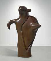
1893 - 1983
La Mère Ubu
inscribed Miró numbered 3/4 and stamped with the foundry mark SUSSE FONDEUR. PARIS
bronze height: 66 ½ in. 169 cm.
Conceived in 1975 in a numbered edition of 4 plus 1 artist’s proof; this example cast circa 1977 by Susse Fondeur.
$ 4,000,000-6,000,000

1830 - 1903
Bords de l’Oise à Pontoise
signed C. Pissarro and dated 1872 (lower left) oil on canvas
21 ⅝ by 35 ⅞ in. 54.9 by 91.1 cm.
Executed in 1872.
$ 1,200,000-1,800,000

1865 - 1925
Femme couchée dormant (Le Sommeil)
signed F. Vallotton and dated 99 (lower left) peinture à la colle on paper laid down on board mounted on cradled panel
22 by 30 ⅛ in. 55.8 by 76.5 cm. Executed in 1899.
$ 1,800,000-2,500,000

1853 - 1890
Piles de romans parisiens et roses dans une verre (Romans parisiens) oil on canvas
28 ⅞ by 36 ¼ in. 73.3 by 92.1 cm.
Executed in November-December 1887. ESTIMATE UPON REQUEST

1853 - 1890
Jardin public avec bancs à la Place Lamartine
reed pen and ink and pencil on paper
10 ⅛ by 13 ¾ in. 25.8 by 34.8 cm.
Executed in late April 1888.
$ 2,000,000-3,000,000

ALEXANDER CALDER
1898 - 1976
Striped Crag, Filled Crag
signed Calder and dated 72 (lower right) gouache and ink on paper
29 ¼ by 43 in. 74.3 by 109.2 cm.
Executed in 1972.
This work is registered in the archives of the Calder Foundation, New York, under application number A06839
$ 50,000-70,000

1898 - 1976
Acrobat, Bull, and Horse
signed Calder and dated 76 (lower right) gouache and ink on paper
43 ¾ by 14 ¾ in. 97.2 by 127 cm.
Executed in 1976.
This work is registered in the archives of the Calder Foundation, New York, under application number A07204
$ 30,000-40,000
1924 - 2005
Blanco al centro
signed Soto, titled and dated 1986 (on the reverse)
painted wood and metal construction
50 ¼ by 40 ⅛ in. 127.6 by 101.9 cm.
Executed in 1986.
$ 180,000-280,000

1887 - 1965
Cover for “L’Architecture d’aujourd ‘hui”
signed Le Corbusier (lower center); variously inscribed (in the upper margins); variously inscribed (on the verso) paper collage and gouache on paper
12 ⅜ by 10 in. 30.5 by 25.4 cm.
Executed in 1948.
$ 20,000-30,000

1898 - 1976
Puppies
signed Calder and dated 76 (lower right) ink and gouache on paper
43 ¼ by 14 ½ in. 109.9 by 36.8 cm.
Executed in 1976.
This work is registered in the archives of the Calder Foundation, New York, under application number A07205.
$ 30,000-40,000

ALEXANDER CALDER
1898 - 1976
Couple with Pets
signed Calder and dated 67 (lower right) ink and gouache on paper
23 by 30 ¾ in. 58.4 by 78.1 cm.
Executed in 1967.
This work is registered in the archives of the Calder Foundation, New York, under application number A07220.
$ 40,000-60,000

1891 - 1973
Tête
inscribed J Lipchitz, numbered 2/7 and marked with the artist’s thumbprint bronze height: 23 ¾ in. 58.4 cm.
Conceived in 1915 and cast during the artist’s lifetime; this example is number 2 from an edition of 7.
$ 300,000-400,000

1882 - 1963
Nature morte signed G Braque (lower right) charcoal on paper
18 ⅞ by 25 in. 45.7 by 63.5 cm.
Executed in 1912.
$ 300,000-500,000

1879 - 1940
Der Mann mit dem Schnaps (The Man with the Schnapps)
signed Klee and dated 1922 1/2 (upper left); titled, dated 1922. and numbered 205. (on the mount) pencil and colored crayon on paper on artist’s mount sheet: 8 ¾ by 11 ¼ in. 20.3 by 27.9 cm. mount: 10 ¼ by 12 ¼ in. 25.4 by 30.5 cm. Executed in 1922.
$ 120,000-180,000

1898 - 1986
Mother and Child XVI
signed Moore (lower right); inscribed PL XVI and HC 7/15 (lower left) etching and aquatint printed in colors on Arches wove paper plate: 13 ⅝ by 14 ⅜ in. 34.6 by 36.5 cm. sheet: 24 ⅜ by 20 ½ in. 62 by 52.1 cm. Executed in 1983; this impression is one of 15 artist’s proofs aside from the numbered edition of 65, published by Raymond Spencer Company, Ltd. for the Henry Moore Foundation.
$ 1,500-2,500

1898 - 1986
MOORE
Head, Fish, Figure and Foot titled (center right); variously inscribed (on the verso) wax crayon, charcoal, watercolor wash and gouache on paper
8 ¾ by 6 ¾ in. 20.3 by 15.2 cm. Executed in 1942.
$ 25,000-35,000

1869 - 1954
Tête de femme
signed Henri - Matisse (lower right) pen and ink and brush and ink on paper 14 ¼ by 10 ⅝ in. 35.6 by 27 cm. Executed in 1918-19.
The authenticity of this work has been confirmed by the late Madame Marguerite Duthuit-Matisse.
$ 60,000-80,000

1885 - 1930
Jeune femme relaçant sa chaussure signed Pascin, dated 1912 and stamped with the atelier mark (lower right) watercolor and pencil on paper 8 ¾ by 10 ⅜ in. 20.3 by 25.4 cm.
Executed in Paris in 1912.
$ 2,000-3,000

1809 - 1879
Claude Baillot, dit ‘L’Infatué de soi’ stamped M.L.G. Bronze; numbered twice 12/25 (on the underside) bronze height: 6 ⅞ in. 15.2 cm. Conceived circa 1830-32; this example cast from 1929 by the Barbideienne foundry, Paris, at the direction of Maurice Le Garrec, in an edition of 25.
$ 3,000-5,000

1881 - 1973
Tête de faune numbered 7/300, with the Edition Picasso and Madoura stamps (on the underside) terre de faïence platter, painted in colors and glazed 15 ⅜ by 12 ½ in. 39 by 32 cm. Executed in 1948; this work is number 7 from the edition of 300.
$ 7,000-10,000

1881 - 1973
Visage gravé, fond grège inscribed I110 and numbered 118/200, with the Edition Picasso and Madoura stamps (on the underside) terre de faïence platter, painted in colors and glazed 12 ½ by 15 ⅜ in. 32 by 39 cm. Executed in 1947; this work is number 118 from the edition of 200.
$ 7,000-10,000

1881 - 1973
Quatre poissons polychromes
inscribed I111 and numbered 96/200, with the Edition Picasso and Madoura stamps (on the underside) terre de faïence platter, painted in colors and glazed
12 ½ by 15 ⅜ in. 32 by 29 cm.
Executed in 1947; this work is number 96 from the edition of 200.
$ 5,000-7,000

1881 - 1973
Visage
numbered 17/100 and incised U/101, with the Empreinte Originale de Picasso and Madoura stamps (on the underside) terre de faïence plated
diameter: 16 ½ in. 42 cm.
Executed in 1965; this work is number 17 from the edition of 100.
$ 4,000-6,000

1931 - 1997
“Piazza” Tea and Coffee Service
each vessel stamped with OFFICINA ALESSI, monogrammed AR, dated 1984 numbered 16/99, stamped ITALY, 925 and with Milanese maker’s mark vitrine stamped 16/99 ITALY
comprising a vitrine, coffee pot, teapot, sugar bowl, cream jug and spoon sterling silver, glass, iron, enameled metal, copper, brass, enameled silver, quartz vitrine: 25 ⅞ by 18 by 11 ⅜ in. 65.7 by 45.8 by 28.9 cm.
Executed in 1984.
$ 7,000-10,000

1913 - 1997
Trigo
signed E. Kingman and dated 1968 (lower right) oil on canvas
35 ¼ by 54 in. 90 by 137 cm. Executed in 1968.
$ 4,000-6,000

b.1920
Composition with Mandolin
signed H Hernández and dated 63 (lower left); signed Héctor Hernández García, titled and dated 1963 Colombia (on the reverse) oil on canvas
34 ¾ by 51 ¼ in. 88.3 by 130.2 cm.
Executed in 1963.
$ 3,000-5,000

1910 - 1985
Jungle Hunter
signed C.D. Silva (lower right) tempera on cardboard mounted on panel 20 ½ by 28 ⅜ in. 52 by 72 cm. Executed in 1963.
$ 18,000-22,000

1932 - 2023
Girl in Garden with Butterfly and Net incised Botero (lower left); incised DAB LOVE (lower right) wax crayon paper mounted on panel 26 ⅛ by 23 in. 59.4 by 79.7 cm. Executed in 1960.
$ 70,000-90,000
THE CINDY AND JAY
WESTERN ILLUMINATED MANUSCRIPTS AUCTION
SOTHEBY’S LONDON
DECEMBER 2025
Illuminated Portolan Chart of the Mediterranean World, including the Mediterranean and Black seas
signed and dated by Roselli on the western neck of the portolan, Pete. Rosell. La feta en malorqua en l ano Mccccxxxxvii [1447]
brown ink and polychrome pigment on a single very large membrane of vellum 36¾ x 23 in.; 93.3 x 58.2 cm, variable Executed in 1477.
£ 700,000 - 1,000,000
IMPORTANT AMERICANA AUCTION
SOTHEBY’S NEW YORK JANUARY 2026

A Rare and Extensive Chinese Export Imari ‘Dame au Parasol’ Pattern Part Dinner Service, Qing Dynasty, Qianlong Period, Circa 1740
清乾隆 約1740年 青花礬紅描金仕女庭 院圖餐具一組
Comprising a circular tureen, cover and stand, a pair of reticulated baskets and stands, a pair of large circular chargers, five oval platters of graduated sizes, a pair of small pierced dishes, ten dinner plates, ten soup plates together with two Chinese Export Imari ‘Floral’ Pattern Punch Bowls.
38 pieces.
length of largest platter 16¼ in.; 41.2 cm.
$ 40,000 - 60,0000
IMPORTANT AMERICANA AUCTION
SOTHEBY’S NEW YORK JANUARY 2026
MASTER SCULPTURE AND WORKS OF ART AUCTION
SOTHEBY’S NEW YORK FEBRUARY 2026
A Pair of Chinese Export Blue and White ‘Landscape and Floral’ Octagonal Jardinières, 19th/ 20th Century
十九 / 二十世紀 青花開光花卉山水圖八
方花盆一對
width 15 ¼ in.; 38.6 cm
$ 2,000 - 3,000
IMPORTANT AMERICANA AUCTION
SOTHEBY’S NEW YORK JANUARY 2026

A Rare Large Pair of Chinese Export Famille-Rose Figures of Ladies, Qing Dynasty, Qianlong Period, Circa 1750
清乾隆 約1750年 粉彩仕女擺件一對
robes elaborately decorated in iron-red, turquoise, yellow and pink enamels
height 16 ¼ in.; 41.2 cm.
$ 12,000 - 18,000
CHINESE ART AUCTION
SOTHEBY’S NEW YORK MARCH 2026

Franco-Flemish, circa 1500 Millefleur Tapestry with a Unicorn silk and wool
11 ft. 2 in. by 8 ft. 5 in.; 3.4 by 2.6 m.
$ 400,000-600,000
IMPORTANT AMERICANA AUCTION
SOTHEBY’S NEW YORK JANUARY 2026

A Rare Large Pair of Chinese Export Famille-Rose Figures of Ladies, Qing Dynasty, Qianlong Period, Circa 1750
清乾隆 約1750年 粉彩仕女擺件一對 robes decorated with gilt floral roundels and floral sprigs height 16 ¼ in.; 41.2 cm.
$ 8,000 - 12,000
CHINESE ART AUCTION
SOTHEBY’S NEW YORK MARCH 2026
A magnificent and extremely rare gilt-decorated and sancai-glazed pottery figure of a bowing horse, Tang dynasty, first half of 8th century 唐八世紀上半葉 三彩馬 length 29 ½ in. 75 cm.
$ 400,000-800,000

A gilt-lacquered bronze figure of Wenchang, Ming dynasty
明 銅漆金文昌帝君坐像 height 23⅞ in., 60.5 cm.
$ 30,000-50,000
CHINESE ART AUCTION
SOTHEBY’S NEW YORK MARCH 2026
INDIAN AND HIMALAYAN ART AUCTION
SOTHEBY’S NEW YORK MARCH 2026

A pair of large underglaze-blue and copper-red ‘dragon’ fish bowls, Qing dynasty, 18th - 19th century
清十八至十九世紀 青花釉裏紅龍紋大 缸一對
diameter 24¼ in., 61.7 cm.
$ 10,000-15,000

A sandstone figure of Ganesha India, Gupta period, circa 6th century
Height: 20 in., 50.8 cm
$ 30,000-50,000
CLASSIC DESIGN AUCTION
SOTHEBY’S NEW YORK APRIL 2026

A Pair of George IV 18-Inch Terrestrial and Celestial Library Globes by John Smith, London, Circa 1830
the ebonised inlaid satinwood stands with three square tapering legs on castors joined by later compasses with a turned baluster stretcher
height 44 ¾ in.; total width 22 ½ in. 113.5 cm.; 57 cm.
$ 8,000-12,000
CLASSIC DESIGN AUCTION
SOTHEBY’S NEW YORK APRIL 2026

An Assembled Set of Eight George I Walnut Side Chairs, Circa 1715
six with cabriole legs and two with hipped cabriole legs, covered in 18th-Cetntury
French Aubusson tapestry; slight variations in height
height of tallest chairs 39 ½ in.;
width 22 ½ in.; depth 27 ½ in.
100 cm.; 57 cm.; 70 cm.
$ 6,000-8,000
CLASSIC DESIGN AUCTION
SOTHEBY’S NEW YORK APRIL 2026

A Queen Anne Scarlet and Gold Japanned Bureau Cabinet, Circa 1715
the double dome upper section with two arched doors with later bevelled plates opening to an interior arrangement of a central cupboard flanked by secret compartments, pigeonholes and concave and convex drawers; the slant-front lower section with pigeonholes and small drawers above two short and three long graduated drawers; on later bun feet probably replaced in the nineteenth century; lacquer decoration restored height 85 in.,; width 40 in., depth 23 ½ in. 216 cm.; 101.5 cm.; 59.5 cm.
$ 10,000-15,000
CLASSIC DESIGN AUCTION
SOTHEBY’S NEW YORK APRIL 2026

A Set of Four George I Figured Walnut Side Chairs, Circa 1725
the vasiform splats above needlework covered drop-in seats on shell-carved cabriole legs ending in pad feet
height 39 in.; width 32 in.; depth 21 in. 99 cm.; 81.5 cm.; 53.5 cm.
$ 3,000-5,000
CLASSIC DESIGN AUCTION
SOTHEBY’S NEW YORK APRIL 2026
A George II Walnut, Burr Elm and Inlaid Chest of Drawers, Circa 1730
with four graduated drawers on bracket feet
height 31 in.; width 37 ½ in.; depth 20 ½ in. 78.5 cm.; 95 cm.; 52 cm.
$ 4,000-6,000
CLASSIC DESIGN AUCTION
SOTHEBY’S NEW YORK APRIL 2026

A Louis XVI Style Giltwood Console Table, late 19th Century based on the model supplied to the Petit Trianon in c.1765; with a moulded Sarrancolin marble top; bearing the stamp C.SENE
height 30 ¾ in.; width 57 ¾ in.;
depth 23 ½ in. 78 cm.; 146.5 cm.; 59.5 cm.
$ 5,000-8,000
CLASSIC DESIGN AUCTION
SOTHEBY’S NEW YORK
APRIL 2026
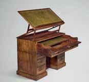
A George III Mahogany Architect’s Desk in the manner of Gillows, Circa 1790
the double-sided hinged top with leather writing surface above a pull-out drawer with additional writing surface and hinged compartments; above two tiers of three drawers flanking a central cupboard; the reverse with moulded panels
height 39 ¼ in.; width 49 ¾ in.; depth 24 ½ in.
99.5 cm.; 126.5 cm.; 62 cm.
$ 5,000-8,000
CLASSIC DESIGN AUCTION
SOTHEBY’S NEW YORK
APRIL 202

A Set of Nineteen English Brass Musical Handbells
each with stamped leather handle; with a moulded oak hanging case largest bell 3 ¼ in. diameter; height of case 15 in.; width 44 in.; depth 7 ¼ in.
8.5 cm.; 38 cm.; 111.5 cm.; 19.5 cm.
$ 3,000-5,000
CLASSIC DESIGN AUCTION
SOTHEBY’S NEW YORK
APRIL 2026
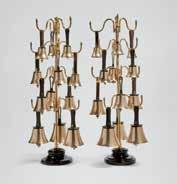
A Set of Twenty-Four English Brass Musical Handbells
each with stamped leather handles; with a pair of later adjustable brass hanging stands on ceramic bases height of stands 42 in. 106.5 cm.
$ 3,000-5,000
CLASSIC DESIGN AUCTION
SOTHEBY’S NEW YORK
APRIL 2026

A Large Japanese Bronze Model of a Crane, Meiji Period, 19th Century height 89 in.; width 26 in. 226 cm.; 66 cm.
$ 5,000-8,000
CLASSIC DESIGN AUCTION
SOTHEBY’S NEW YORK
APRIL 2026
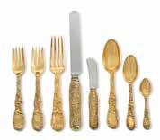
An American Silver-Gilt Chrysanthemum Pattern Flatware Service, Tiffany & Co., New York, 20th Century
12 dinner knives
12 dinner forks
12 lunch forks
11 salad forks
11 butter knives
12 dessert spoons
12 teaspoons
12 coffee spoons
94 pieces
117 oz 15 dwt weighable
3663.6 g
$ 6,000-9,000
P. 13
Image © 2025 The University of Chicago
PP. 14-15
Image: Charlie Miller / Getty Images
PP. 18-19
Art © 2025 Andy Warhol Foundation for the Visual Arts / Artists Rights Society (ARS), New York
PP. 20-21
Image: imageBROKER/imagoDens / Alamy
P. 22
Image: Serhii Chrucky / Alamy
PP. 24-25
Photograph by Manuel Romaris / Getty Images
PP. 26-27
Photograph by George Rose / Getty Images Image © 2025 Del Hall
PP. 48-49
Art © 2025 Artists Rights Society (ARS), New York / VG Bild-Kunst, Bonn. Photo by Gertrude Fehr/ullstein bild via Getty Images
P. 51
Image © 2025 Manuel Cohen / Art Resource, NY
P. 54
Art © 2025 Artists Rights Society (ARS), New York. Image © 2025 Centre Pompidou, MNAM-CCI, Dist. GrandPalaisRmn / Georges Meguerditchian
P. 56-57
Art © 2025 Artists Rights Society (ARS), New York
Art © 2025 Artists Rights Society (ARS), New York. Image © 2025 CNAC/MNAM, Dist. RMN-Grand Palais / Art Resource, NY
P. 66
Image: Artothek / Bridgeman Images
P. 74
Image: Baltimore Museum of Art / Bridgeman Images
P. 77
Image © 2025 RMN-Grand Palais / Art Resource, NY
P. 91
Art © 2025 Artists Rights Society (ARS), New York/ADAGP, Paris
P. 121
Image © 2025 DeA Picture Library / Art Resource, NY
P. 136
Images: Archives of American Art, Smithsonian Institution
P. 137
Image: Archives Durand-Ruel © 2025 DurandRuel & Cie.
P. 147
Photo by Haeckel collection/ullstein bild via Getty Images
P. 149
Image: Gift of Mrs. Ferdinand Möller / Bridgeman Images
PP. 150-51
Photograph by Waldemar Titzenthaler
PP. 158-59
Photos: Archives Henri Matisse
P. 165
Art © 2025 Succession H. Matisse / Artists Rights Society (ARS), New York. Photo: Archives Henri Matisse. Image © 2025 Centre Pompidou, MNAM-CCI Bibliothèque Kandinsky, Dist. GrandPalaisRmn / Hélène Adant
P. 166
Art © 2025 Succession H. Matisse / Artists Rights Society (ARS), New York. Image © 2025 Photo Josse / © Succession H. Matisse / Bridgeman Images
Art © 2025 Succession H. Matisse / Artists Rights Society (ARS), New York. Image © 2025 The Barnes Foundation
P. 167
Art © 2025 Succession H. Matisse / Artists Rights Society (ARS), New York
PP. 168-69
Art © 2025 Succession H. Matisse / Artists Rights Society (ARS), New York. Photos: Archives Henri Matisse
P. 170
Art © 2025 Succession H. Matisse / Artists Rights Society (ARS), New York. Photo: Archives Henri
PP. 178-79
Art © 2025 Estate of Fernand Léger / Artists Rights Society (ARS), New York / ADAGP, Paris
PP. 180-81
Art © 2025 Estate of Fernand Léger / Artists Rights Society (ARS), New York / ADAGP, Paris
PP. 186-87
Art © 2025 Artists Rights Society (ARS), New York/VG Bild-Kunst, Bonn
Art © 2025 Artists Rights Society (ARS), New York/VG Bild-Kunst, Bonn. Image: Erich Lessing / Art Resource, NY
P. 188
© 2025 Estate of Pablo Picasso / Artists Rights Society (ARS), New York
P. 189
Art © 2025 Artists Rights Society (ARS), New York/VG Bild-Kunst, Bonn. © DACS, 2025.
Photo: Tate
PP. 190-91
Art © 2025 Artists Rights Society (ARS), New York/VG Bild-Kunst, Bonn
P. 198
Art © 2025 Successió Miró / Artists Rights Society (ARS), New York / ADAGP, Paris. Photograph by Francesc Català Roca
P. 201
Art © 2024 Max Ernst / Artists Rights Society (ARS), New York. Image © 2025 CNAC/MNAM, Dist. RMN-Grand Palais / Art Resource, NY
Art © 2025 Successió Miró / Artists Rights Society (ARS), New York / ADAGP, Paris. Image © 2025 Photoaisa / Bridgeman Images
P. 202
Art © 2025 Successió Miró / Artists Rights Society (ARS), New York / ADAGP, Paris
PP. 206-07
Art © 2025 Estate of Stuart Davis / Artists Rights Society (ARS), New York. Photograph by Tony Vaccaro. © 2025 Tony Vaccaro. All rights reserved 2025 / Bridgeman Images
P. 208
Art © 2025 Jasper Johns / Artists Rights Society (ARS), New York. Image: The Art Institute of Chicago / Art Resource, NY Image © 2025 Tate, London / Art Resource, NY
P. 209
Art © 2025 Estate of Stuart Davis / Artists Rights Society (ARS), New York
P. 211
Library of Congress Prints and Photographs Division, Washington, D.C.
P. 217
Art © 2025 Calder Foundation, New York / Artists Rights Society (ARS), New York.
P. 208
Art © 2025 Calder Foundation, New York / Artists Rights Society (ARS), New York. Photo © 2025 Hans Namuth /Photo Researchers History/Getty Images.
P. 209
Art © 2025 Calder Foundation, New York / Artists Rights Society (ARS), New York. Photo: Exhibition records. A0003. Solomon R. Guggenheim Museum Archives, New York. © 2025 Solomon R. Guggenheim Museum Archives, New York
PP. 226-27
Art © 2025 The Estate of Charles-Édouard Jeanneret / Artists Rights Society (ARS), New York / ADAGP, Paris / FLC
P. 228
Art © 2025 The Estate of Charles-Édouard Jeanneret / Artists Rights Society (ARS), New York / ADAGP, Paris / FLC
P. 232
Art © Estate of Jacques Lipchitz, New York. Image: Centre Pompidou, Paris, MNAM-CCI/ JeanClaude Planchet/Dist. GrandPalaisRmn/ MNAM-CCI / © All Rights Reserved, 2025
P. 235
© 2025 Banco de México Diego Rivera/Frida Kahlo Museums Trust, Mexico, D.F. / Artists Rights Society (ARS), New York
P. 236
Art © 2025 Estate of Georges Braque / Artists Rights Society (ARS), New York / ADAGP, Paris
PP. 238-39
Art © 2025 Estate of Georges Braque / Artists Rights Society (ARS), New York / ADAGP, Paris. Image: Snark / Art Resource, NY
P. 240
Art © 2025 Estate of Pablo Picasso / Artists Rights Society (ARS), New York. Photo by Jacqueline Roque/Picasso. Collection of John Richardson © 2025 Artists Rights Society (ARS), New York / ADAGP, Paris
P. 241
Art © 2025 Estate of Georges Braque / Artists Rights Society (ARS), New York / ADAGP, Paris. Art © 2025 Estate of Pablo Picasso / Artists Rights Society (ARS), New York
P. 245
Image © 2025 Centre Pompidou, MNAM-CCI / Bibliothèque Kandinsky, Dist. GrandPalaisRmn / Fonds Kandinsky
P. 249
© Archivio Arici. All rights reserved 2025 / © The Henry Moore Foundation. All Rights Reserved, DACS 2025 / www.henry-moore.org / Bridgeman Images
PP. 252-53
Art © 2025 Estate of Pablo Picasso / Artists Rights Society (ARS), New York. Image © 2025 Yves Manciet / Artists Rights Society (ARS), New York
P. 254-55
Art © 2025 Calder Foundation, New York / Artists Rights Society (ARS), New York. Image: Alamy
ACKNOWLEDGEMENTS
Design
Eri Koizumi
Photography
Anthony Tahlier
Michael Tropea
Mark Babushkin
Nicholas Eveleight
Ben Fraker
Vu Nguyen
Elliot Perez
Pauline Shapiro
Brian Uchiyama
Color Editing
Lupe Fraker
Meridith Passabet Owsiany


Go to sothebys.com or the Sotheby’s app to find works you are interested in.
Sign up to place bids.
FOR ASSISTANCE WITH REGISTRATION AND BIDDING Enquiries@sothebys.com US +1 212 606 7000 UK +44 (0) 20 7293 5000 HK +852 2822 8142 sothebys.com/bidonline FOLLOW US @SOTHEBYS
Bid before and during the auction, from anywhere in the world.
We have provided these materials as a convenience for our clients. Please note that all lots are being offered for sale subject to Sotheby’s Conditions of Business for Buyers (which include our Authenticity Guarantee) that can be located on the relevant sale page on www.sothebys.com or by scanning the QR code below, the Conditions of Business for Sellers (which are available upon request), glossary of terms, and any other notices or announcements in the sale catalogue on the relevant sale page on www. sothebys.com or in the saleroom. Please contact enquiries@sothebys.com to request a physical copy of our Conditions of Business.