
Life Drawing


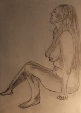
I did these whilstatlifedrawing classes in Dunfermline. I had never done lifedrawing before, so it was a new experience. I started by doing vague outlines of the body and adding in more detail week by week. After I was comfortablewith sketching the model, I started experimenting with colour. My first colour sketch was the pink and green girl laying down. I didn’t want to colour the entire body as I wasn’tentirely confident the pink and green would blend well without create smudges of brown. In the following week I decide to colour my sketch with tones of the same colour. I did this with 2 pink drawings and another with green. In my final week of classes I did colour and tonal research and was inspired by Picasso’s blueperiod.I then created a series of 2 soft pastel lifedrawings using blueand green tones. I love how they turned out as the body proportions look greatand I managed to add hair texture. If I had more time, I would have added another soft pastel drawing to the collection to make ita triptych of the blue tonal drawings.


Sketchbook


For this still lifeprojectmy theme was gambling, I collected casino related props and placed them in a set with dark material that complimented the colours of the props. My firstresearch drawing was the tonal cards which I liked the end resultof as the detail to the card pattern paid off and gave the drawing much realism.I then drew a second research drawing of a roulette wheel. I used pencil to sketch the shapeand splitthe page into 5 so I could experiment with media. I used coloured pencil, acrylicpaint, water colour, oil pastel and acrylicpointillism.I didn’tenjoy the oil pastel as itwas difficultto add detail and fine lines with such a thick media. I developed these research drawing into compositions. First, I used coloured pencil to create a bright landscapecomposition of the set using white pencil to emphasisehighlights.I then moved the props around and created anew composition. For the second composition I usesoft pastel. I really enjoyed this as this was the firsttime I had used softpastels, I loved how easy blending was and how bright the highlights cameout. Sadly I made the mistake of not setting the pastels in between and the colours began to fade away. By the time the composition was finishes thebright colours had darken and the detail was no longer visible. For my final I used acrylic and decided to emphasisethe red colours and tones to symbolisethe dangers of gambling.The final cameout amazing, it is one of my favourite acrylic paintings. i lovehow the highlights pop and the detail and reflections in the bottles arerealistic. I also think the fabric in the background adding depth helps this composition to be so successful.


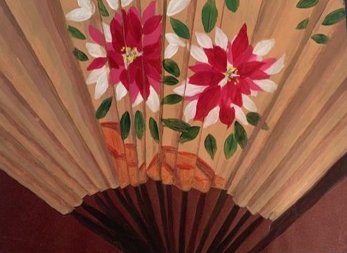
For this project, my theme was Japanesetableware. I came up with the idea after raiding through kitchen cupboards and found many Japaneseplates. I created a composition with the red and black Japaneseset and paired itwith contrasting yellowchopsticks and a Japanesefan. I found some koi fabric and somered and blue patterned fabric to add to the set. I started off the project off wi th a tonal drawing of the soya dish.I then continued with another research drawing of the chopsticks using whiteyellowand red pencil on black paper. This was a fun research drawing as itgot me familiar with the pattern of the fish fabric which would takea whileto drawin the final compositions.This is my favouriteresearch drawing as I drew the fabric with great detail and I likehow the yellowand red contrastwith each other. My final research drawing was the fan which I used acrylic painton.This research drawing was successful as thepattern was identical to the fan in front of me and I did a good job painting depth with the fan's folded creases. I started my firstcomposition a s tonal. I decided to drawmy compositions froma view directly above the composition as this is an anglethatis not often drawn from an di wanted to give myself a challenge.My tonal composition turned out great as my tones created depth well despite the difficultangle.My next compos ition was created with oil pastel. I was unfamiliar with oil pastel when I did this projectso the composition isntas successful as itcould havebeen as I found itdifficultto add detail to the fan and plates.I decided to use white pencil for the fabric as oil pastels couldn’t giveme the finelines, I was looking for to draw the fabric.For my final composition I focus on primal colours likethe red yellow and blue. I used coloured pencil on textured card. I liked how the final turned but and how well the fabric was drawn with all the detail and folds, but I personally feel the tonal composition was the most successful and realistic.


For this design projectI wanted to create a headpiece inspired by the Venus flytrap. At firstI wanted to do carnivorous plants butdecided to focus on justthe Venus flytrap.I sketched two research drawings to inspireshapes and my colour scheme. I decided to focus on the spikes seen on Venus Fly traps and made multipleprints in many colour schemes. I researched many similardesigns inspired by nature. After a few sketches of design shapes I decided to choose a Mohawk with a crown. I made multiplesheets of pink and green paper mâché and cut the spiked shapes. This created the foundation of the headpiece. I wanted to add 3D models into the design as well so I created 2 full sized Venus fly trap models with putty painted with green and pink. I found the modelling of the Venus flytrap easier than expected and create 4 more but without leaves


When putting my design together I found that the front looked very bare and unattractive.To fix this I created more 3 3D models and create a sortof fringe covering the center forehead down to between the eyebrows. This gave a nice warrior appeal to the headpiece which suits the theme as Venus flytraps are predators.To pin down the bottom of the headpiece and stop it from flying everywhere when the model moves forwards, the 3D models will hold the edges of the headpiece to the shoulders. I likehow the final cameout but I would have liked to incorporatemore of the ink prints as I printed many colour combinations and think it could have been a nice feature.

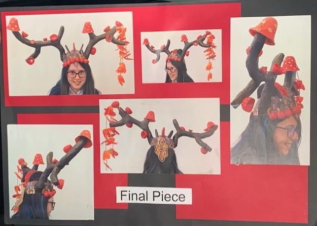
For this design projectI wanted to make a headpiece inspired by mushrooms. I came up with the idea of deer antlers becausedeer and mushroom co existand their shapealso imitates thatof a tree branch.To create shapes and samples I placed a mirror on my research drawing and drew what I saw. I then gathered a colour scheme through my research mood board as my drawing wasn’t very visually attractiveand was quite colour limited.My firstfew designs were symmetrical but once I started making the design I decided to spicethings up and cut an antler in half to create asymmetry and add some modern chic. This created an imbalanceand I had to revaluatemy design by which I added a hanging feature. This would give my design more movement and weight on the lighter side.I also noticed that I hadn’t featured a lotof the mushroom gill and would created some more samples so the design still related to my research drawing. To stop the edges of the headpiece from being bare and clean cut I put red spheres around to create a mushroom border adding more colour and depth to the design edge. Overall I ampleased with the resultof my design but if I was to continue I would add more to the back so it was more interesting and visually appealing at all angles.

For this projectI wanted to create Cam mechanical toy.I decided to base my toy design off Kirby as itwas one of my favouriteNintendo games when I was a kid.The first image is a step sectional end elevation showing how the components interactwith each other. The next image is the isometric assembled drawing with a detailed view showing the construction of the toy and finally thelast image is the component sheet with detailed views showing the construction of each component with the dimensions.The final toy worked successfully and the Kirby insidethe tree could move in and out of the tree in time with the other kirbys.


After the toy was constructed and assembled I created a 3 dimensional environmentto put it in, mimicking a child's bedroom.I chose to use bright colours likepink blue and yellowas these worked well with the aesthetic of the Kirby toy and the original game. I also added other toys such as a Rubik's cube and a miniature rocking horseto add to the realismof the environment.


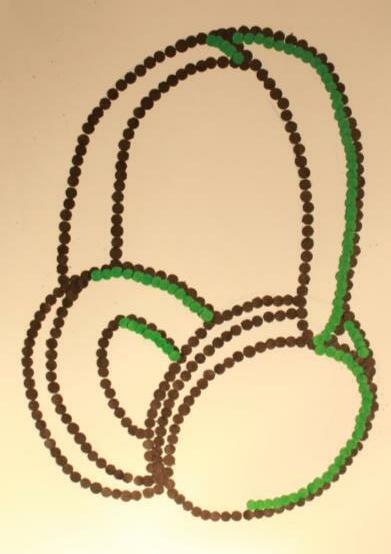
To start my project off, I did a research drawing of headphones, I then hole punched black and green dots and outlined the sketch to startoff my pop art theme. I was inspired by Roy Lichtenstein and used the dots as a tribute to his style. I then continued with a composition of a girl wearing headphones.I painted her in a Lichtenstein way with primal colours and bold highlights. I added a comic strip background behind her to symboliseher feelings trailing behind her wherever as shemoves forwards


Inspired by thermal binoculars, I wanted to use colour to symbolisethe internal feelings that one gets when listening to music.I came up with the idea after researching Andy Warhol, many printof his useopposing colours thatmimic what you see through thermal binoculars.I sketched some colour examples then painted my final. I chose the purple, pink and green tones as my favouriteout of the sketched examples were the firstand third, these colours also complimenteach other well.

After my headphone projectI was still ambitious to do more artinspired by Andy Warhol. I decided to keep with the music theme and focused on piano and singing.I wanted try printing as this was the technique Warhol often used. I carved out the pattern of a microphone on Lino and did a test print with red yellowand green. The prints cameout successful and clear. Inspired by Warhol's Marilyn collection I conducted a printusing contrasting pink, greens and yellows.The pink allowed the microphones to stand out againstthe background. I likethe texture of this printbut would have preferred if the bottom left printhad a thicker layer of ink. After the microphones I moved onto the piano, I decided to draw 4 closeup piano keys and fill each onewith different media and colour scheme. As I liked the pink and green print, my first piano was followed the same colour scheme using soft pastels.I think this piano was the most successful as thesoft pastels provided bright colours with saturated tones. My next piano was made with oil pastels and a red and black colour scheme, then a yellowand purplewith acrylic paint and finally a blueand orange colour scheme with coloured pencil.This was also inspired by Warhol's Marilyn collection.


My final composition incorporated both microphone and piano. I used the colour scheme of the green and pink piano as itwas my favourite. I then contrasted the piano by painting the microphone yellow. As the composition looked baretowards the bottom left, I decided to add a blue hand playing the piano. The media used for this composition was acrylicpaintand coloured pencil, I likehow the composition turned out, although it's not my best work I likethe colour appeal of it.


This project's theme was punk. Punk has always been a favoured music genre in my family.I choseto make the subjectmatter drums as drums area significantpartof the punk movement. I took some pictures of my friend's drum kit and drew itas my research. I then drew a tonal drawing of my friend playing the drums with torn up albumcovers stuck on. Inspired by the albumcovers I developed the research drawing and painted it pink and green with a magazine stylethat has been used by many punk bands such as the damned, sex pistols andtheclash.I liked this composition butI decided to develop itfurther. I choseto make a background of safety pin prints with a new colour scheme. Safety pins area significantstaplein the punk movement thanks to Vivienne Westwood's contribution to punk fashion and aesthetic.I found that the yellow popped out more than the green did, and the overall printgave the page arough look that suited the punk theme. I used oil pastels over the printwith red and yellow tones. I likehow the final composition turned out but if I were to do itagain, Iwould put more detail into the face as the facial features arequite cartoonish and poorly detailed.


Much likethe headphone project I wanted to use colour to express feelings through playing music.I did a research drawing of a hand playing guitar and then another with the guitar itself. I used bold highlights and shadows to emphasisedepth and allowthe guitar and hand to pop out. I developed this drawing with more colour.For this drawing I used softpastels and was inspired by the colour scheme of the sex pistols album“never mind the bollocks here’s the sex pistols”I likethis colour scheme as its bold and contrasting. I then moved onto a composition with a full person playing guitar.To emphasisefeelings through colour oncemore I switched the natural colours of the composition to more brighter and opposingcolours and keptthe background grey. This composition was successful as thecolours look as if theperson is radiating colour(symbolising their emotions) as they play.If I were to continue this composition I would add in more darker tones to create more depth and shadows.


This is my favourite and most successful photograph taken in this shoot. The facial expression the model shows is confidentand intense. The clear and closeup eye contact makes the photograph very dramatic and striking. The abnormally paleskin also illustrates thebeauty standards in many countries specifically Britain where paleskin is admired much more over tanned skin due to women at the top of olden day hierarchy painting their faces white. All though the flowers in the vasearenot seen in this composition due to the photograph being a closeup, I think the contrastbetween the yellowand pink can still beseen clearly. The strong contrasting colours fitwell with the dramatic and fearless expression of the model. I think all aspects of this photo works well together and this will bemy chosen final for this photoshoot.
Photography
This photoshoot is partof my anti stereotype photography project. The overall theme of this projectis to defy stereo types. For this photoshoot I wanted to represent a male in a feminine environment with a comfortableand confident persona. I was inspired by sandy Skoglund for this photoshoot and chose two contrasting colours to basethe shoot off of. I chosea bright pink wig for the model to wear so they contrastwith the yellow background. I did many closeup and eyelevel shoots and came to the conclusion this photograph was the most successful.


When I have sparetime, I liketo conduct photoshoots. For this photoshoot I was inspired by the reflection of DVD’s. I wanted to capture the colour reflected of the DVD's polycarbonate plastic surface.I had taken a couplephotographs earlier thatday but found the colour beam reflections showed up best when it was dark or shaded so I moved the photoshoot to the afternoon. I took closeups and further away shots to see which depth expressed the colours best. I also wanted o capture all the angles and patterns reflected. After the photoshoot I chose 4 final successful images. I likehow these photographs show different colours and patterns. I edited them slightly to add saturation and brighten the reflections appearance. My favouritephotograph would be the one above, this was taken with a long shutter speed as the lightmoved slowly to the right. This captured the reflected beam creating 2 waves.


