

Sola Awojoodu
Copyright © 2016 Sola EssayAwojooducopyright © 2016 Sola LibraryAwojooduofCongress Catalog Number: x000111000 ISBN: 1 000000-xx-0 All right reserved. No part of this book may be reproduced in any form or by any electronic or mechanical means without written permission of the publisher and author except for brief quotations in reviews or critical articles. Published in 2016 by Art 430: Typography III The Art 430: Typography III class produces books related to the history of type design. Printed in the United States of America Distributed by OJA Publishers, Baltimore, MD. Cover Image copyright © 2016 Sola Awojoodu
01 Introduction 02 The Benton Family Business 05 Morris Fuller Benton’s Brilliance 07 The Advancement of Typography 09 Need for a New Typeface 11 A Description of Stymie 13 The Evolution of Stymie 16 The Impact of Technology on Stymie 17 The Use and Purpose of Stymie Throughout the Years 19 The Legacy of Stymie and Morris Benton Contents

1. David Consuegra, “Morris Fuller Benton.” Communication Arts 45, no. 8:130 131, 2004, 131 01
Figure 1
The American Type Founders (ATF) Company was a business founded in 1892, comprised of twentythree American type foundries. This company was dominant in creating and distributing typefaces. ATF is characterized as highly influential in the world of printing and type setting. Many wellknown type designers and typefaces emerged from ATF. One fruitful individual in the American Type Foundry was Morris Fuller Benton Morris was an American Typeface Designer and the director of the Department of Type Design at Introduction ATF after his father, Linn Boyd Benton (Figure 1) Morris Benton’s work revolutionized American typeface design. A successful, prolific, innovative, and commonly overlooked designer, Benton developed and perfected over two hundred sixty typefaces through ATF.1 One of Benton’s outstanding typefaces, Stymie, was created in 1931 Stymie is an example of a solid, lasting, dependable and powerful typeface. This monograph will express the impact and success of Morris Fuller Benton and Stymie Morris Fuller Benton working alongside his father, Linn Boyd at ATF.
Though unfamiliar to the public eye, Benton lineage is recognized as one of fruitful and innovative individuals. From generation to generation, it was the Benton family business to transform and impact the realm of type, notably in the areas of typeface design and typesetting.
of typography. Benton advanced from working as a bookkeeper in Northwestern Type Foundry to an owner of the Benton, Waldo, & Co. Type Foundry. The foundry later combined with twenty-two other type foundries to form the American Type Founders (ATF) Company (Figure 2). Here, Linn was a founding director and the chief consultant.3 Linn produced and polished impeccable and timely machines for the foundry and also worked on other projects. One of these successes includes the development of a foundry typeface, Century, for The Century Magazine, owned by Theodore Low De Vinne,an American printer, author, and publisher. In no time, Linn Boyd established the first Department of Type Design within a type foundry. Soon after, his son, Morris F. Benton, joined him at ATF to work under him as a mechanical engineer. Morris sub-sequently added to the Century type family and began to thrive within ATF, following in his father’s footsteps.4
One significant member of the Benton familywas Linn Boyd Benton Linn Benton was an American typeface designer as well as an inventor of numerous technologies used for type founding. Born in 1844, Benton learned to set type around the age of eleven. He was influenced by his father, Charles Swan Benton, an owner and editor of the Milwaukee Daily News. L. Benton went on to gain an uncommon education in various fields of study due to constant relocation of the Benton family as well as his work experiences.2 Well educated in type, printing, engineering, and more, Linn Benton was a skillful asset to the world
2. David Consuegra, American Type: Design & Designers (New York: Allworth Press, 2004), 62 3. Ibid. 4. Ibid., 64. An Image of the American Type Founders (ATF) manufacturing plant located in Jersey City, New Jersey. Figure 2 02
The Benton Family Business


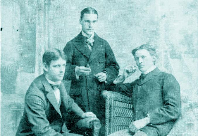
Morris Fuller Benton’s Brilliance Morris (center) alongside his classmates at Cornell.
Morris Fuller Benton was the perfect mix between organization and creativity. This can be accredited to his background in engineering alongside his career in typeface development. Graduating with a degree in mechanical engineering from Cornell University in 1896 (Figure 3), Benton entered ATF 5 Within ATF, Morris Fuller’s entire career flourished. Although Morris was not fully experienced in design, his most impressive and influential work derived from his typeface design and development. Benton was a special addition to ATF, a key person involved in the development of type design. This may have been a result of “Perhaps his employers felt that his mechanical ability endowed Benton with a systematic, organized mind. Or perhaps the young engineer displayed a creative ability. Possibly he just poked
For whatever reason, ATF reassigned Benton early in his career from his engineering duties to typeface development. This simple corporate personnel for decades.” 6 bearing the Benton name and gift of innovation, working alongside his father, possessing good work ethic, or various factors. In any respect, Benton did not go unnoticed. He was elevated into the position at ATF that launched him into his future as a key person in American type design.
Morris Fuller Benton’s main task at ATF was to consolidate the typefaces acquired by the foundry when the twenty-three type foundries combined. Furthermore, the foundry collected more typefaces, many of which mirrored one another. From text to text, a number of imperfections were accounted for by Morris, including inconsistencies in type size, design, weight, and more. The fonts existing in ATF were conflicting, resembling one another visually, yet never working as a system of order and clarity. It was Morris’s duty to bring unity and harmony to the various fonts obtained by ATF. One ingenious method of organization implemented by Morris Fuller was the use of type families. Type families consist of a range of
5. Allan Haley, Typographic Milestones (New York: Van Nostrand Reinhold, 1992), 65 6. Ibid., 64 7. Ibid., 65 8. Consuegra, Design & Designers, 64 types that are modifications of the same elemental design of a text. This way, the similar American typefaces within the foundry could vary slightly, yet join together as one without friction. The introduction of families opened the door to clear communication of typography within ATF.7 Type families also made hierarchy in typography more feasible, providing more options for those utilizing the typeface.8 Morris discovered a simple solution to a disorganized situation. Furthermore, the establishment of type families left an impression on the world of type design permanently. Designers today continue to rely heavily on type families. A type family containing numerous fonts is often more resourceful for a designer than a type family with two or three varying fonts.
Figure 3 05

• Souvenir
•
•
•
12 The Advancement of Typography 9. Consuegra, Morris Fuller Benton, 131 10. Haley, Typographic Milestones, 64 11. Consuegra, Design & Designers, 64 12. Ibid., 64-71 The first use of Century Roman in The Century Magazine, 1895. Figure 4 07
•
•
•
•
Linn Benton’s Century Roman (Figure 4), released in 1894, was well received, resulting in the demand of more variations. One of Morris Benton’s first design projects at the foundry was to revise the typeface. In 1900, Morris created a version of Century called Century Expanded to meet the requirements of the Typographical Union standards. Century rapidly became a staple typeface, with more than eighteen variants generated, including Century Oldstyle (1906) and Century Schoolbook (1924). Today, Century remains a standard text, available for use. Benton’s successful modifications made way for him as a designer in the type industry.9 Through the observation of the work composed by Morris Benton, it is clear that Benton maintained a strong balance between the imaginative and the formal. Each of Benton’s texts are the result of investigation, analysis, and exploration. This deep sense of innovation can be traced back to Morris’s childhood. As a child, Morris and his father would build toy cars together for Morris to play with.10 For as long as Morris lived, he was rooted in an environment of inventive and visionary people. Therefore, revising typefaces and originating new texts came naturally. Benton’s career was fruitful, even twice as much as that of Frederic W. Goudy’s career.11 His typefaces can be labeled anywhere from systematic, to elegant, to playful. The handiwork of Morris Fuller Benton includes the following fonts, to mention a few: (1902) Franklin Gothic (1902) News Gothic (1908) Hobo (1910) Broadway (1928) Gothic (1903) Clearface (1906) Cloister Oldstyle (1914) Bodoni Open (1918) Ultra Bodoni (1928) Engraver’s Bold (1902) Commercial Script (1908) (1914) Bank Gothic (1930-1933) Empire (1937) Shadow (1934) Stymie (1931)
•
•
• Alternate
• Cheltenham
•
•
•
•
•


hold, 1993), 352 14. Ibid. Top: Rockwell Antique Middle: Stymie Black Bottom: Stymie Black over Rockwell Antique. Figure 5 09
for a New Typeface 13.
York:
Need Philip B. Meggs, Rob Carter, Typographic Specimens: Great Typefaces (New Van Nostrand Rein
The
Slab serif typefaces are generally strong, defined, attention grabbling, and impactful. In the 19th century, European slab serifs were often used as typewriter text, as well as in printed material such as newspapers, magazines, posters, advertisements, and more.13 Around the end of the 19th century, slab serifs declined in prevalence and did not rise again until the 1930s. In a time where the use of slab serifs was increasing once again, Morris F. Benton was given the challenge of creating a new and appropriate version of the popular style. Multiple renditions of slab serifs were emerging, however, slab serifs were very familiar, repetitive, and redundant, paralleling one Therefore,another.Morris Fuller Benton generated an unprecedented approach to the call for this typeface. Now accredited to the Linotype Type Foundry, Stymie was originally created as a redesign of Rockwell Antique (Figure 5), which stood as a new version of Litho Antique, an ATF typeface released in 1912 14 Compared to the two previous typefaces, Stymie was fresh and advanced, as its characters were more precise. The spacing between the characters was tight and clear cut. While some slab serifs are heavy and used as display text, Stymie was created to be more legible and flexible. Though Stymie was based on an earlier typeface, it became a more modern and resourceful slab serif. This resulted in Stymie having a distinct presence in the 1930s, useful and suitable for its time. It was also a typeface capable of communicating the industrial image resembling the architecture of the time period in a more stylish and contemporary way.
perfectcircle liningstoriestwo straight vertical spur horizontal top serif occasionally hangs below baseline hangs below baseline no serifno noserifserif serif serif no serif no serifserifone end closed loop perfectperfectcirclecircle < perfectcircle y

Benton’s Stymie is identified as an Egyptian typeface. Egyptian types, also known as square serifs and slab serifs, are one of various typo-graphic classifications. Typefaces classified as Egyptian maintain a distinct structure and appearance. Within these typefaces, the letter-forms possess an even line weight for the main strokes and serifs that can be an equal or heavier weight than the main strokes. Egyptian typefaces also contain serifs that are not bracketed. This means that between the serif and the main stroke of the letter, there is no curved connection.15 The serifs are completely squared off, resulting in a right angle formed where the stroke and serif meet. This is where the term ‘square serif’ originates. Other common Egyptian typefaces include City, Egyptian, and Century Expanded 16 Stymie is characterized as a slab serif typeface with serifs that are equal in weight to the main strokes. Furthermore, Stymie is a structured typeface based on shapes and geometric in nature.17
A Description of Stymie
15. James Craig, Irene Korol. Scala, William Bevington, Designing with Type: The Essential Guide to Typog raphy (New York: Watson-Guptill Publications, 2006), 146 16. Ibid., 150 17. Meggs, Carter, Specimens, 352 18. Ibid. 19. Ibid. Stymie characters.typeface Figure 6 C, O, and Q are based on a perfect circle. The A has a horizontal top serif extending to both the left and right. The G has a straight vertical spur. The e is a perfect circle divided by a horizontal cross bar and has a very small aperture. Unlike some geometric Egyptians, the a is two-storied (Figure 6).” 18 11 Stymie’s characters are composed of even strokes. All the upper case letters sit on the baseline with the exception of the capital Q and J occasionally, which fall slightly below the baseline. The majority of Stymie’s ascenders and descenders on the lowercase letters have top and bottom serifs with the exception of g, j, t, f and y Stymie’s number set is composed of lining figures. Due to Stymie’s even line weight, Stymie contains no stress. The amp-ersand (&) is traditional style, however it varies. Sometimes it has one end closed loop and sometimes two. It is clear that Stymie relies heavily on even strokes, perfect circles, strong angles, precise lines, and symmetry. The typeface is often related to Futura with its modern and well-proportioned appearance.19 However, its strong serifs differentiate it from other typefaces. According to Maximillien’s Vox-ATypI classification, Stymie would be classified as a mechanistic typeface alongside Rockwell. The typeface is characterized as mechanical due to its appearance, a common look of typefaces developed during the Industrial Revolution of the 19th century. Furthermore, mechanistic typefaces are said to be slab serifs with very little contrast in design, which is how Stymie is defined.


20 By 1937, Gerry Powell designed and issued more variants of Stymie, such as Stymie Light Title, Stymie Medium Title, and Stymie Bold Condensed 21 Over time, numerous weights, styles, and variations of Stymie have been produced by the American Type Foundry, as well as other designers and type foundries, including Sol Hess, a Lanston Monotype Machinery Director. Some of the more unusual variants of Stymie consist of Stymie Elongated Ascenders and Descenders (Figure 7b),22 Stymie Open,23 Stymie Inline Title by Wadsworth A. Parker, and more.24
The Evolution of Stymie
20. Patricia Cost, The Contributions of Linn Boyd Benton and Morris Fuller Benton to the Technology of Type andsettingTypeface Design (1986), 202 21. Consuegra, Design & Designers, 70 22. Book of American Types: Standard Faces. (Jersey City, NJ: American Type Founders Sales, 1934), 58 23. The Type Specimen Book; 544 Different Typefaces with over 3000 Sizes Shown in Complete Alphabets (New York: Van Nostrand Reinhold, 1974) 472 24. Consuegra, Design & Designers, 215 7a (left): The original fonts within the Stymie type family. 7b (right): Letterforms of Stymie Elongated Ascenders and Descenders. Stymie was used as the main typeface and logotype for ATF’s 1934 Book of American Types. Figure 7 Figure 8 13
Stymie can commonly be found in multiple weights, including light, medium, bold and black. By1935, Stymie advanced to a family of eight members: Stymie Light, Stymie Light Italic, Stymie Medium, Stymie Medium Italic, Stymie Bold, Stymie Bold Italic, Stymie Black, and Stymie Black Italic (Figure 7a)
It is possible to point out slight changes within the letterforms of the typeface when compared to the original. For example, in some cases, the capital R has shifted from having a shoulder connected to the bottom right stroke of the letter, to just a straight, diagonal line. The original Stymie text contained both characters and left the choice to the designer. Over time, versions of Stymie have been used for various purposes. The type has frequently been used as headline text. From printed works to the digital era, Stymie has endured through time. The text easily became a classic typeface, evident in the public’s need to consistently duplicate and mimic the typeface over the years. Matthew Carter, a type designer, designed a special version of Stymie for the New York Times, which has been featured in the magazine multiple times as head-ing or subtitle text (Figure 9a). International Business Machines (IBM) also uses a variant of Stymie for the company logo (Figure 9b). Stymie has indubitably translated well across multiple platforms (Figure 8, 10)

9a (left): A spread from The New York Times Magazine 2011 redesign using Stymie Extra Bold. 9b (right): The International Business Machines (IBM) logo is modeled after the Stymie typeface. Figure 9


10b (right): The Hateful Eight, a movie released in 2015, used a typeface similar to Stymie Extra Bold. Figure 10
10a (left): Trump Tower, a mixed-use skyscraper in Manhattan, New York, uses Stymie Extra Bold for its logotype.


The Benton’s process of designing a typeface involved a number of steps. From preliminary research to drawing, to using the delineating apparatus, to reworking the drawings, creating a pattern plate, engraving a matrix, cutting slips, adjusting the machine, casting, inspecting, and, finally, producing the official font, this process could become lengthy and tedious. The Bentons worked hard to refine their type to the best possible outcome. The wide-range of technology produced and utilized by the Bentons made it possible for them to develop type with precision and accuracy. Linn was a greatly experienced punch-cutter. He was able to cut Century Roman and Century BroadFace, a great accomplishment of his time. The technologies used by the Bentons enabled them to produce clean, clear-cut typefaces. Stymie had a tighter fitting than the typefaces that preceded it.26 The characters of Stymie have solid form. Due to the excellent performance of the Benton’s instruments alongside their well-rounded design process, the typefaces designed by ATF are recognized as solid, stable typefaces. This explains why ATF was such a prosperous foundry, with typefaces that remain thriving today. Over time, Stymie has moved beyond the environment it was originally intended for. Though, Stymie is still used in print and accessible in desktop font form, there are also other types of Stymie fonts that can be purchased. Online, six typefaces are available for purchase in different formats. These formats include desktop fonts, web fonts, application fonts, electronic publication (epub) fonts, and server fonts. Stymie has unquestionably transcended its initial reading environment and migrated across multiple platforms used in our society today.
25. Meggs, Carter, Specimens, 352 26. Ibid. Linn Boyd Benton’s matrixcutting machine. Figure 11 16
As a mechanical engineer and Linn’s son, Morris Benton was also experienced with these machines.
Addressing the technology used by ATF, the Bentons were expert engineers. The machines used to formulate type at ATF were created by Linn Boyd Benton. Linn Benton invented some of the most important instruments used in type founding in his day. These inventions include a mould, an automatic punch cutter, a matrix-cutting machine (Figure 11), self-spacing type, a type dressing machine, an automatic type caster, combination fractions, and more. The machine Benton is most acknowledged for is the automatic punch cutter machine, which cut special punches for the foundry. He is also popular for his matrix-cutting machine, which cut matrices and brass punches.25
The Impact of Technology on Stymie

A comparison of the two different uppercase Rs Stymie uses. Figure 12 17 straight, diagonal leg curved right leg
The Use and Purpose of Stymie Throughout the Years
As previously stated, when creating Stymie, Morris Fuller Benton initially intended for the typeface to serve its purpose as a modern version of a European slab serif. During that period, Stymie was to be used generally in publication.
The versatility and adaptability of the printed text can be viewed in the American Type Founders’ Book of American Type, published in 1934. It is evident that, in production, Benton assessed the typeface and ensured that he could construct a slab serif that could be used frequently on one page without becoming too weighty and overbearing. Benton successfully completed this task, yet he may not have realized the significance of his typeface in the eyes of others. Despite the fact that Stymie remains able to serve Benton’s intended purpose today, Stymie has also gained more strength, potential, and momentum. The typeface may not always be used in the same context in which Benton intended, but, for a type that has been in use for about eighty-five years, Stymie has prospered more than what Morris Fuller Benton may have initially imagined. Not only is Stymie available to be used on multiple digital platforms, but also, if seen in print today, Stymie is usually used as a display text such as headlines and Linotypeadvertisements.nowoffers Stymie for purchase. There are six typefaces in the Stymie family produced by Linotype including Stymie Light, Stymie Medium, Stymie Bold, Stymie Black, Stymie Bold Condensed and Stymie Black Condensed. Within the bold, black, medium condensed, and bold condensed types the uppercase R has the curved right leg, while the other two faces have the straight, diagonal leg (Figure 12)


Stymie, a slab serif typeface created in 1931 by Morris Fuller Benton for the American Type Founders Company, is one of the foundry’s enduring typefaces. Still used today for numerous purposes, Stymie is a typeface durable enough to experience the constant changes within America’s society and remain standing strong. With its symmetrical nature, perfect rounds, accurate angles, one can determine that the design process of this typeface was rigorous, yet rewarding. Through Stymie’s crisp, firm, and clean design, an effective Egyptian typeface was created to serve its purpose in its day. Yet, the design of this type was executed in such an excellent way that Stymie still remains purposeful today. This can be attributed back to The Legacy of Stymie and Morris Benton Morris Fuller Benton (Figure 13) and the quality of work he invested into his type design at ATF Benton’s education and experiences caused him to become a type designer completely aware of his design. He knew what was appropriate and necessary for each of the typefaces he designed. Benton played a key role at ATF. Without him, the American Type Foundry would not have the outstanding career it did. Furthermore, type design in itself would not have as great an impact without Benton’s brilliant contributions. The Bentons were fit to influence the world of type and, as a result, American type is perpetually reaping the benefits.
19
Morris, hard at work, workiing on a new machine. Figure 13
Searching for Morris Fuller Benton: Discovering the Designer through His Typefaces. Chicago: Sherwin Beach Press, 2011. The Type Specimen Book; 544 Different Typefaces with over 3000 Sizes Shown in Complete Alphabets. New York: Van Nostrand Reinhold, 1974. Book Design, Cover Design and Typography by Sola Awojoodu Produced using a Macbook Pro and InDesign 6.0. Typfaces used are Stymie Light, Stymie Bold, Stymie Black, Futura Light, Futura Light Oblique, Futura Medium, Futura Medium Oblique. Art 430, Typography III Margaret Re, Instructor 20
Book of American Types: Standard Faces. Jersey City, NJ: American Type Founders Sales, 1934 Consuegra, David. American Type: Design & Designers. New York: Allworth Press, 2004. Consuegra, David. “Morris Fuller Benton.” Communication Arts 45, no. 8: 130-131, 2004 Cost, Patricia A. “Linn Boyd Benton, Morris Fuller Benton, and Typemaking at ATF.” Printing History 16, no. 1-2 [31-32]: 27-44, 1994. Cost, Patricia. The Contributions of Linn Boyd Benton and Morris Fuller Benton to the Technology of Typesetting and Typeface Design. 1986. Craig, James, Irene Korol. Scala, and William Bevington. Designing with Type: The Essential Guide to Typography. New York: Watson-Guptill Publications, 2006. IMAGES Benton, Linn Boyd, and Theodore Low De Vinne. DeVinne on Century Roman. 1914 Book of American Types: Standard Faces. Jersey City, NJ: American Type Founders Sales, 1934 Cost, Patricia. The Bentons: How an American father and son changed the printing industry. Rochester, NY: RIT Cary Graphic Arts Press. Matt Willey. “New York Times Magazine, Redesign.” 2011. “Midtown Restaurants, Bars & Shopping | Trump Tower NYC.” Trump Tower NY Titlow, John Paul. “Can IBM’s Mountain Of Data Fix Your Email Nightmare?” “The Hateful Eight Font.” Fontmemecom. 2015.
Bibliography Haley, Allan. Typographic Milestones. New York: Van Nostrand Reinhold, 1992. Meggs, Philip B., and Rob Carter. Typographic Specimens: The Great Typefaces. New York: Van Nostrand Reinhold, 1993. Shen, Juliet, Roger Black, and Carl Montford.
Printed PrintedBaltimore,Commonvision,byMDon100lb cardstock
