2 minute read
The Use and Purpose of Stymie Throughout the Years

from Stymie Monograph

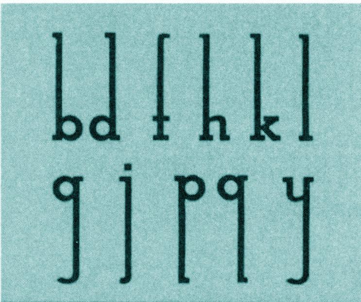
Figure 6
Stymie typeface characters.
Advertisement
A Description of Stymie
Benton’s Stymie is identified as an Egyptian typeface. Egyptian types, also known as square serifs and slab serifs, are one of various typo-graphic classifications. Typefaces classified as Egyptian maintain a distinct structure and appearance. Within these typefaces, the letter-forms possess an even line weight for the main strokes and serifs that can be an equal or heavier weight than the main strokes. Egyptian typefaces also contain serifs that are not bracketed. This means that between the serif and the main stroke of the letter, there is no curved connection.15 The serifs are completely squared off, resulting in a right angle formed where the stroke and serif meet. This is where the term ‘square serif’ originates. Other common Egyptian typefaces include City, Egyptian, and Century Expanded. 16 Stymie is characterized as a slab serif typeface with serifs that are equal in weight to the main strokes.
Furthermore, Stymie is a structured typeface based on shapes and geometric in nature.17
C, O, and Q are based on a perfect circle. The A has a horizontal top serif extending to both the left and right. The G has a straight vertical spur. The e is a perfect circle divided by a horizontal cross bar and has a very small aperture. Unlike some geometric Egyptians, the a is two-storied (Figure 6).” 18 Stymie’s characters are composed of even strokes. All the upper case letters sit on the baseline with the exception of the capital Q and J occasionally, which fall slightly below the baseline. The majority of Stymie’s ascenders and descenders on the lowercase letters have top and bottom serifs with the exception of g, j, t, f and y. Stymie’s number set is composed of lining figures. Due to Stymie’s even line weight, Stymie contains no stress. The amp-ersand (&) is traditional style, however it varies. Sometimes it has one end closed loop and sometimes two.
It is clear that Stymie relies heavily on even strokes, perfect circles, strong angles, precise lines, and symmetry. The typeface is often related to Futura with its modern and well-proportioned appearance.19 However, its strong serifs differentiate it from other typefaces. According to Maximillien’s Vox-ATypI classification, Stymie would be classified as a mechanistic typeface alongside Rockwell. The typeface is characterized as mechanical due to its appearance, a common look of typefaces developed during the Industrial Revolution of the 19th century. Furthermore, mechanistic typefaces are said to be slab serifs with very little contrast in design, which is how Stymie is defined.
15. James Craig, Irene Korol. Scala, William Bevington, Designing with Type: The Essential Guide to Typography (New York: Watson-Guptill Publications, 2006), 146. 16. Ibid., 150. 17. Meggs, Carter, Specimens, 352. 18. Ibid. 19. Ibid. 11