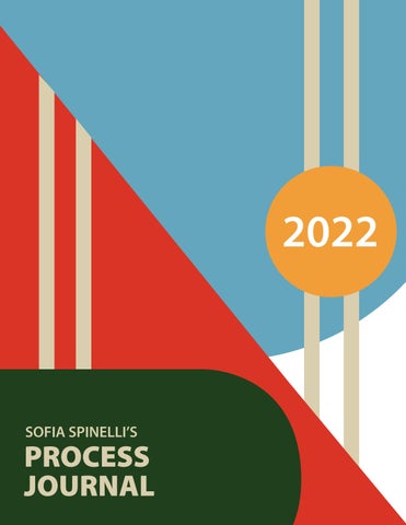
SPINELLI’S
PROCESS JOURNAL 2022
2
3
ww Statement of Intent
SVAD
4
The need to create has always been an overwhelming force in my life. I have always had things I wished to say but very often not the words to say it. Finding art has been what has connected me to the world. Communication isn’t always easy but through art so much can be said without the use of words. I found the importance of art at a very young age. Bringing what I see so vividly in my head into the world is what I hope to continue working on through at USC. The Graphic design and illustration program here is what I hope will be next step to pursuing a career in the arts. I want to contribute to making a more inclusive and accesible world. Graphic design is the medium through which I hope to achieve that goal.
5
Sofia Catherine Spinelli
6 1 2 3 Pages 8-13 Pages14-19 Pages 20-25 4
7 4 5 6 Pages 26-31 Pages 32-35 Pages 36-39
8
PROJECT 1 “SNIPPETS”
9
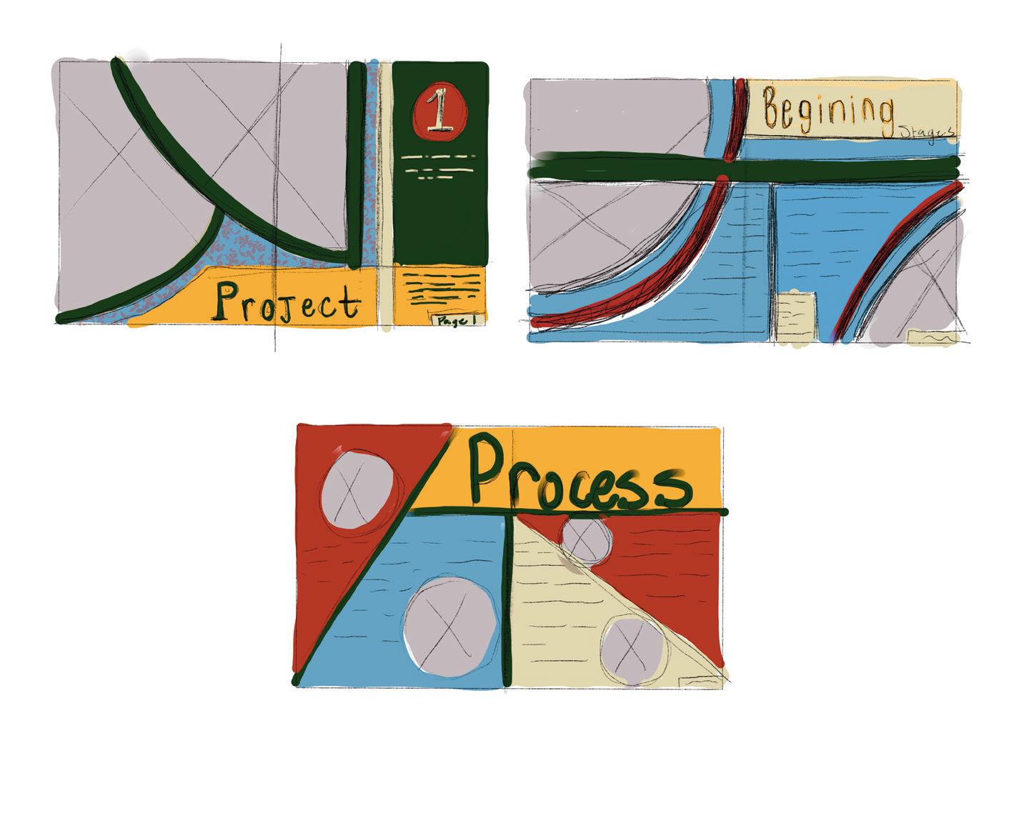
Process
10
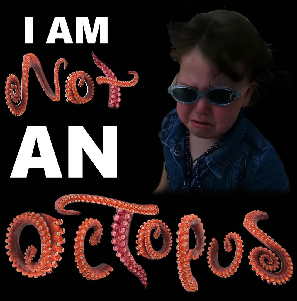
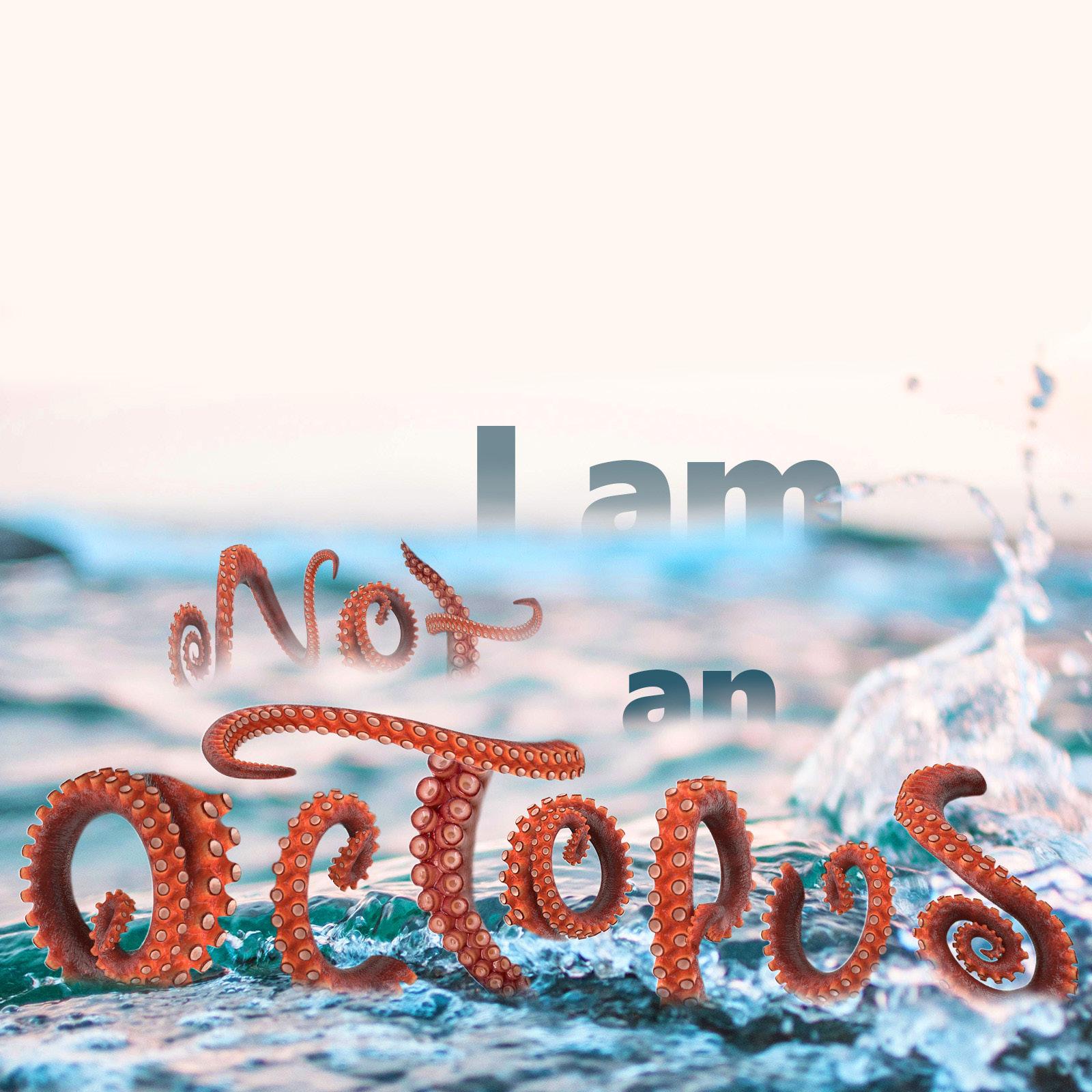
The leading motivation for this snippet was something my younger sister had said when she was young. My mother was instructing her on the tasks she needed to complete prior to playing and after three or so tasks my sister yelled teary eyed, “I AM NOT AN OCTOPUS!” My original direction was to incorporate my sister as it was her that said it. Although the composition seen to the left didn’t resolved so I decided to approach it in a different direction.
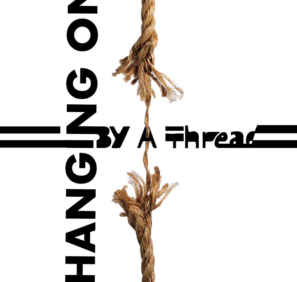
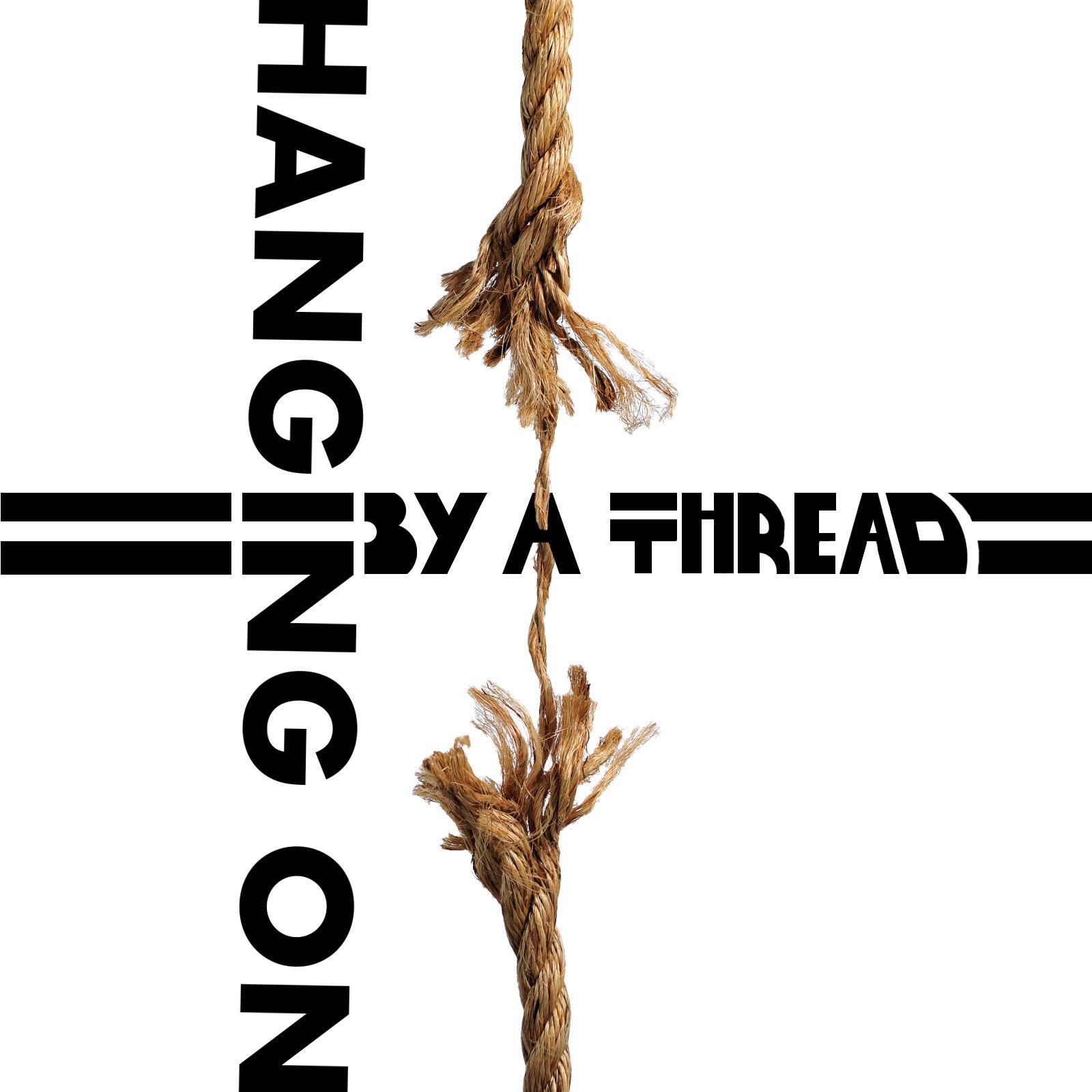
While walking to class I over heard a conversation where an individual expressed that they were,”Hanging On By A Thread” after not sleeping the night before. I decided to turn that into a graphic of a frayed rope about to snap. The tension created by the rope captured the feeling of being at the end of endurance. I decided to make my own text face for the horizontal portion of the phrase and the vertical portion normal text.
11
12
Going into this project originally I wanted to utilize illustration to create my snippets, as it is something I am most comfortable with. However, now that I am in college I really want to push myself in as many ways outside of my comfort zone. I thought of a few different ways in which I could apply these techniques and landed on creating a unique typeface using octopus tentacles to fit the theme of my first snippet. However laborious I found myself really enjoying manipulating the tentacles to identifiable letters. As I started my work on my second snippet
FinalI decided to create a more simplistic design that drew as much attention to the focal point of the frayed rope. Although, after putting text on top of the image I felt that it needed something more. So
I drew over some of the original text font and made my own with the brush tool.
13
14
15
PROJECT 2 “Typograhpic Abstraction”
Process
Going into project two I wanted to develop imagery that retained aspects of letter form but altered the readability. One way I attempted to arrange my composition was by overlapping each letter over one another. What I found with this, however, was that each composition became dominated by black positive space and lacked the white negative space to balance it out. After adjusting each letter away from each other and visually balancing the piece something still felt off. By separating the letters it made the readability very apparent and obvious. So after playing
with different techniques I finally landed on the pathfinder tool. By making two copies of each letter I wanted to overlap I was able to use one from each pair to cut the letter below, thus creating a black and white overlap effect.
After placing my letters and applying this technique I was much more pleased with the results.
16


17 Design 1 Design 2 Design 3
18
Final

19
20
PROJECT 3
“GREAT IDEAS POSTER”
21
Process
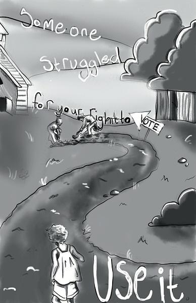
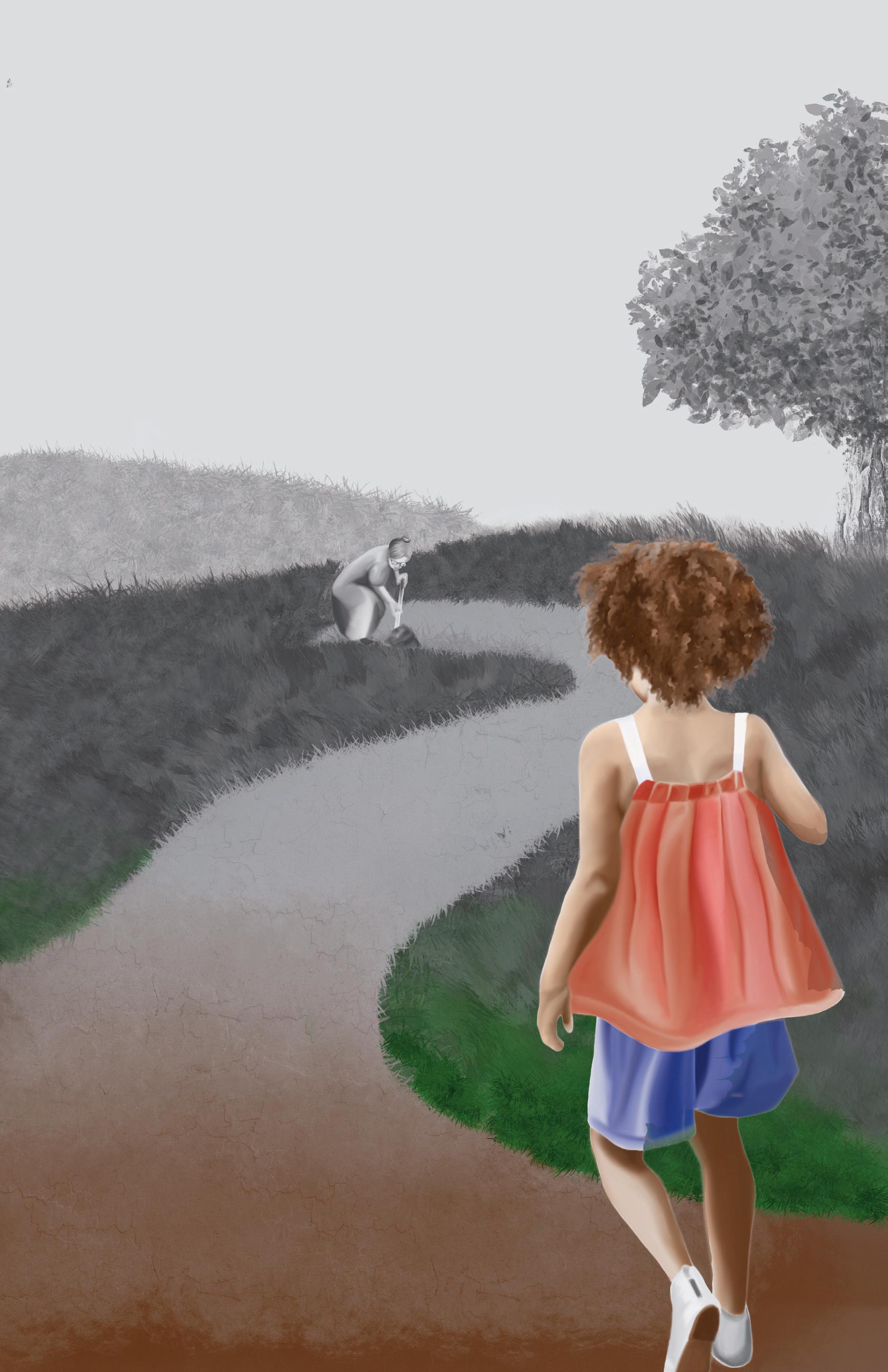
For project three I decided to utilize a quote by Susan B. Anthony and expand upon it with a visual that didn’t describe the quote exactly. After experiment ing with a handful of concepts in my thumbnails I landed on a mix between two. I wanted to use the idea of two individuals paving a path for someone on their way to vote and having historical figures in the piece. So I illustrated both Fredrick Douglas and Susan B. Anthony paving a path for a young girl in the foreground. At this point in the process I have yet to develop the full illustration, what I have now is just the sketch. I plan on elevating the overall
quality but maintaining its overall feel. I would
like to still keep it in grey scale but include color in the foreground to express hope and opportunity in future generations and their ability to vote.
Additionally I would like to further work on my arrangement of typography, I’ve improved it but I would like to add shadows and other aspects to connect it to its surroundings.
22
23
Original Sketch Refined Sketch
Final
24
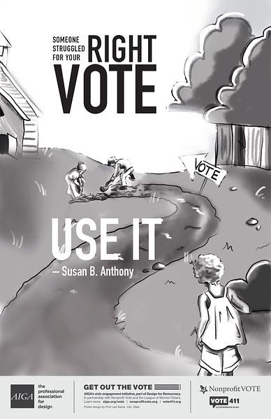
SOMEONE STRUGGLED FOR YOUR RIGHT VOTE USE IT
25
– Susan B. Anthony
TO
Poster design by Sofia Spinelli, Fort Mill, South Carolina
26
PROJECT 4
“LOGO”
27
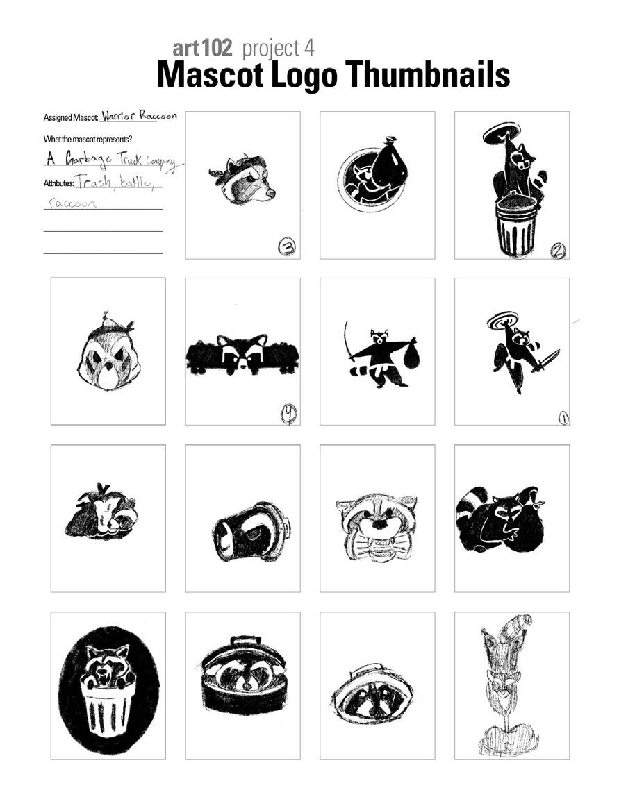
Process
Coming up with the purpose of my logo was definitely the most indecisive part of the process for me. After much consideration I finally landed on a waste management company. Aside from being a common connection(trash and raccoons) it also provided the opportunity for easily recognizable items. I decided to play with the idea of a stealthy raccoon that stole your garbage and went from there. I wanted to include a dynamic pose, a symbol of trash and a weapon. I proceeded by using the logo matrix to combine these elements and once I generated enough ideas I continued working them out on my
thumbnails. Some captured the overall feel better than others and those were the ones I decided to refine further. Seen to the right are the designs I chose to continue with.
28
29 Refined Marks Sketches
4
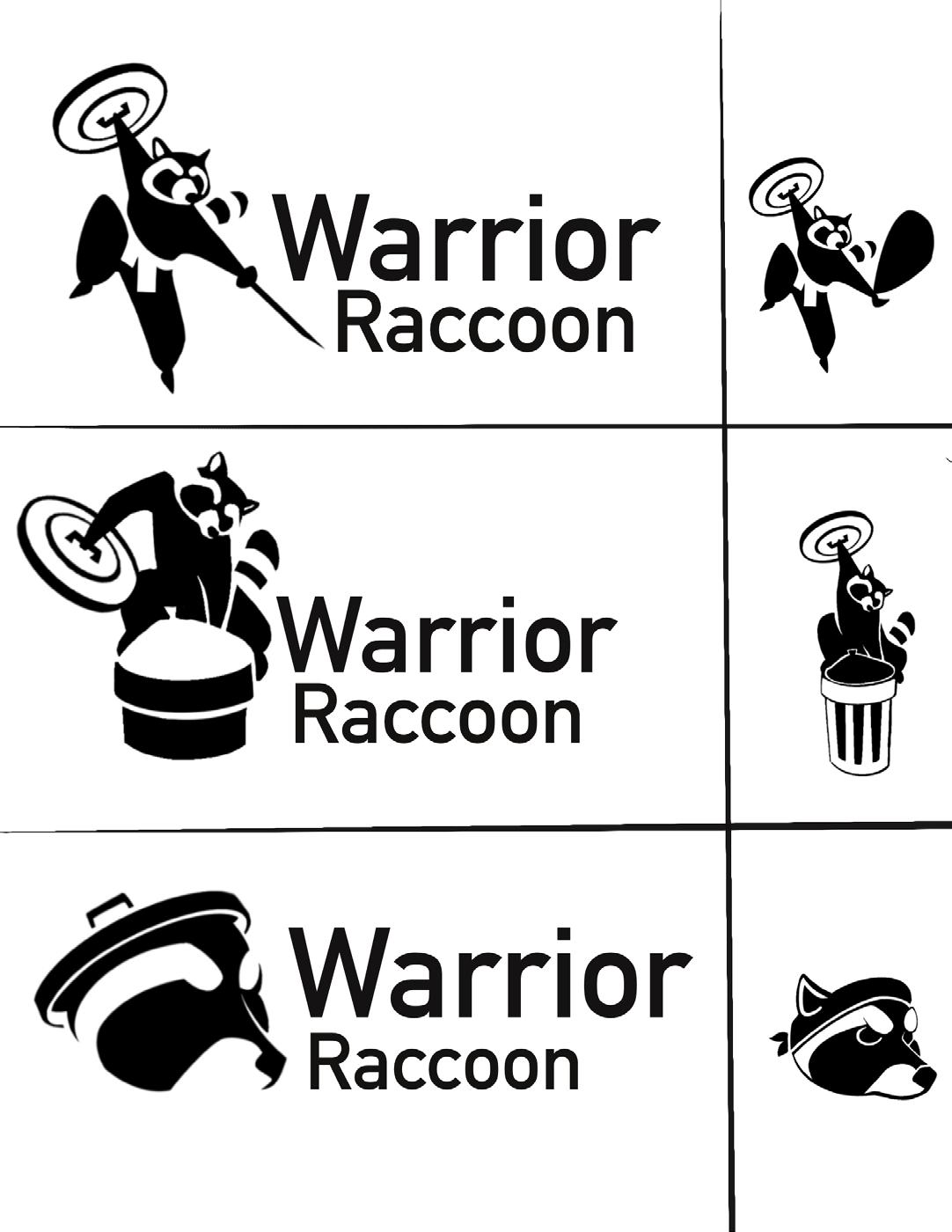
Mascot Logo
SOFIA SPINELLI ARTS102-001Warrior Raccoon(left), Waste Collection
Concept statement:
The logo represents a waste collection company that prioritizes stealthy and reliable garbage collection.
The use of closure around the face of the raccoon assists in keeping the design clean and is more visually engaging. The lower type is bent to fit the shape of a badge which furthers the idea of dependability and duty. The lack of color places further emphasis on the logo being a raccoon which are commonly recognized as being black and white.
Warrior Raccoon (right), Waste Collection
Concept statement:
The logo represents a waste collection company that prioritizes stealthy and reliable garbage collection. The use of linear continuity through the arm draws the eye to each of the identifying objects in the design, the trash lid and the sword. The typeface is primarily focused on being easily read so the font choices reflect simple and clear shapes. The lack of color places further emphasis on the logo being a raccoon which are commonly recognized as being black and white.
30 Final
arts 102 project
31
32
PROJECT 5
“SYNTAX AND SEMANTICS”
33
FinalIn terms of layout, balance was definitely what consumed the majority of my time. Applying what I learned with the ruler made this process much more controlled and consistent throughout. The length of the text was also something I had to consider when balancing the overall look of the document.
I used the tracking tool to slightly adjust each paragraph so that the number of lines each paragraph occupied matched with one another. As for the images I had to pay special attention to scaling them all to be uniform but all the while keeping the proportions in tact. In addition to size I also kept in mind the orientation of each mug and which way the handle faced. I ended up having the two on the left facing the left and the two to the right facing the right. I found that this made for a more symmetrical composition of elements.
34
Syntax (visual elements & relationships)
Simple white mug with text reading, “World’s Best Boss.”
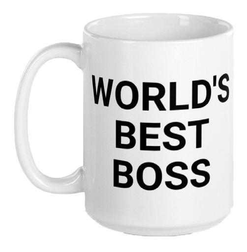
The font is a black sans serif font that is written horizontally across the mug. The text occuppies a majority of the front. The mug has a smooth and lusterous finish. The handle is placed centered on the side of the cup and can be easily held. The lip of the mug is wide and easily drank from. The proportions of the mug are balanced and standard for mugs.
Semantics: Denotation (specifics)
Vessel>Mug>Customized Mug> Boss Mug
Semantics: Connotation (associations) Cooperate America, The Office, Business
Semantics: Expression (feelings) Pride, Confidence, Sentimental
Presence (contextual)
Lots: Church Little: Office
Syntax (visual elements & relationships)
Round tri colored mug with text across reading “Gone Fishin’.” The top and bottom of the spherical portion of the mug are red while the middle is white. The mug is representive of a fishing bobber. The bottom of the mug depicts blue water and serves as the foot of the cup. The handle is small and placed at the top near the lip of the mug and is not easliy held. The lip is small and awkward to drink from. The proportions of this mug are unique.
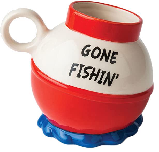
Semantics: Denotation (specifics) Vessel>Mug>Themed Mug> Fishing Mug
Semantics: Connotation (associations) Retirement, Leisure, Hobby
Semantics: Expression (feelings) Humor, Happy, Fun
Presence (contextual) Lots: Aquarium Little: Tackle shop
Syntax (visual elements & relationships)
White and garnet colored mug with a gamecock and text reading, “Carolina Grandparent.” The word Carolina is a top the word Grandparent and both words are below the illustration of the gamecock. The inside, bottom and handle of the mug are garnet while the body is white. The exterior of the mug’s walls are slightly curved but still proportional. The handle occupies a large portion of the side and is easy to hold.
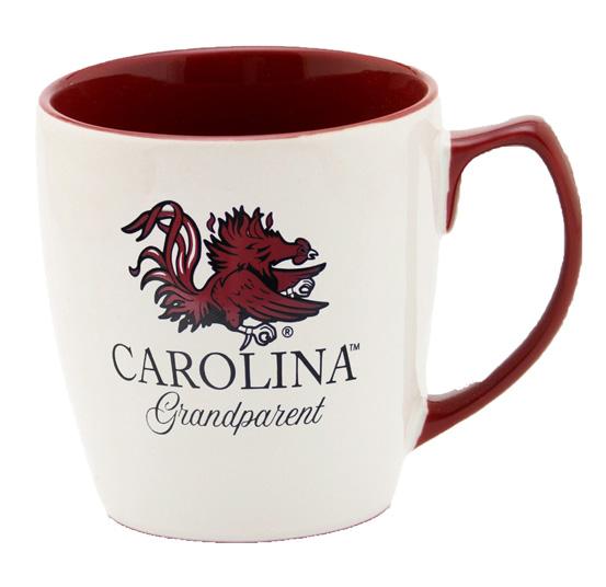
Semantics: Denotation (specifics) Vessel>Mug>Themed Mug> Sports Team Mug> UofSC Mug
Semantics: Connotation (associations) College, Football, Grandparent
Semantics: Expression (feelings) Pride, Happy, Calm
Presence (contextual) Lots: Clemson gift shop
Syntax (visual elements & relationships)
Large green vessel with a handle. On the front there is a creatures face grinning and to the side is a tail in the shape of a handle. The shape is organic and wider towards the bottom and throughout the exterior is a wrinkle like texture. The handle is wide and easy to grasp. The lip is awkwardly shaped and hard to drink from. The overall proportions are different from standard mugs and focus primarliy on representing the character rather than the ergonomics of the vessel.
Semantics: Denotation (specifics) Vessel>Mug>Themed Mug> Star Wars Mug> Jabba The Hut Mug
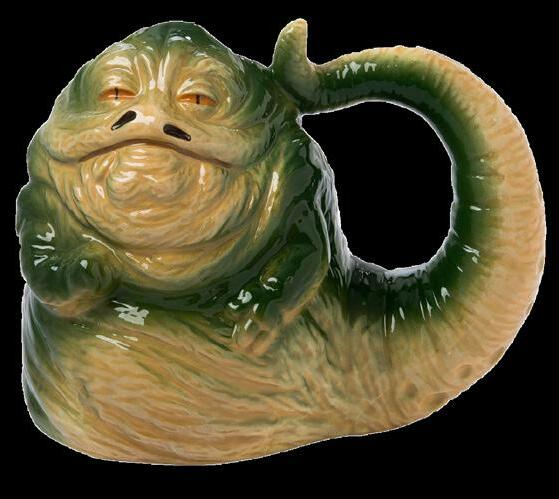
Semantics: Connotation (associations) Nerdy, Sci-Fi, Retro
Semantics: Expression (feelings) Humor, Nostalgia, Casual
Presence (contextual) Lots: Funeral directors office
35
36
PROJECT 6
“PROCESS JOURNAL”
37
Process
For my process book I wanted to create a visual design that would express myself in this moment without overpowering the work I made throughout the semester. The geometric design is my attempt at show casing what I know about visual balance. The colors are from my current understanding of color Theory.
38
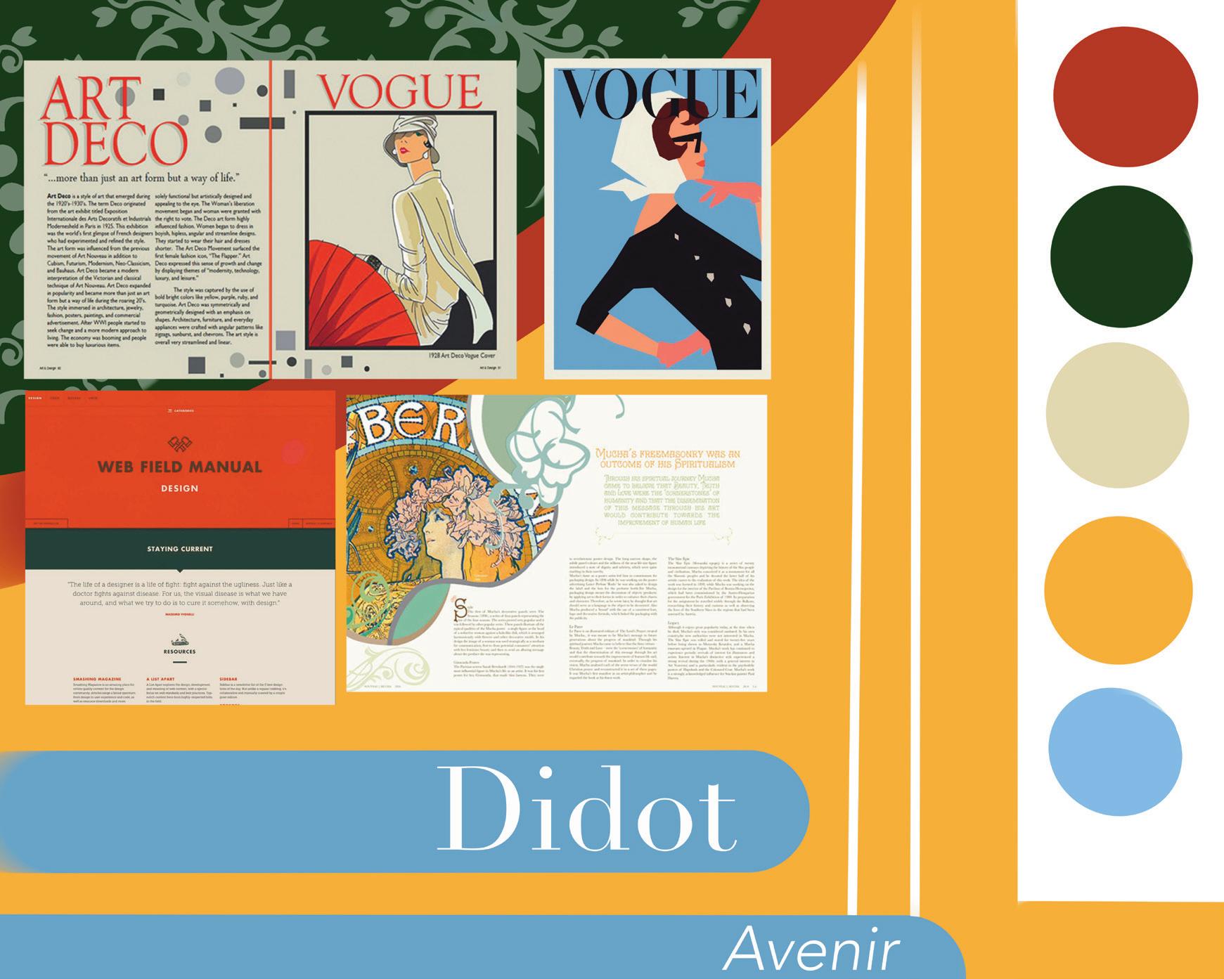


39 Mood Board Layout Sketches
40
41 Sofia Spinelli Arts 102 Professor Chi University
2022
of South Carolina Columbia SC