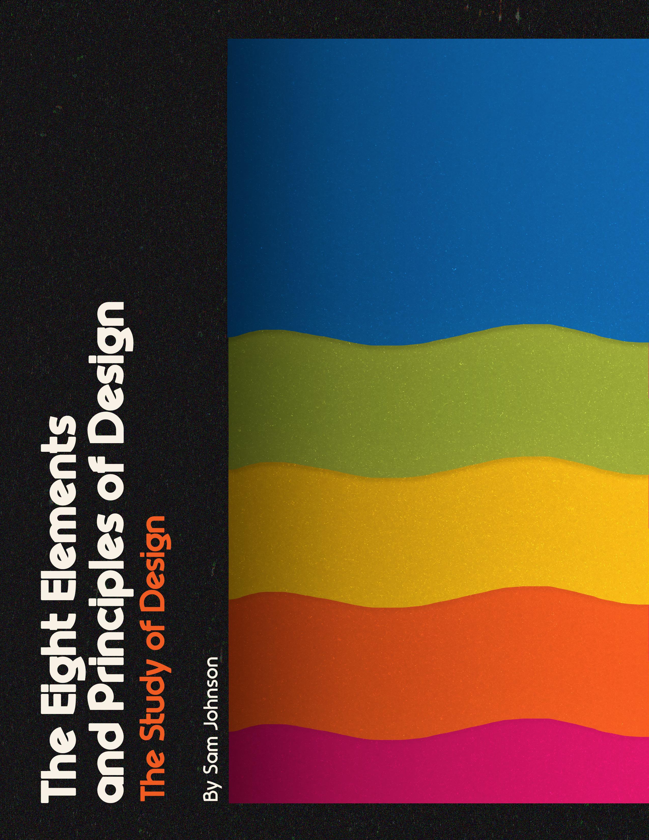

My name is Samantha (Sam) Johnson and I am 21 years old. I am currently a part-time student at Mount Wachusett Community College working towards the Graphic Design Certificate. For this project, I have chosen a 70’s Nostalgia style trend, mainly focusing in on the Polaroid aesthetic.
With a single stroke of a pencil (or a computer mouse) you can call this element into play. You can then manipulate the mood of your design or organize your page, depending on the kind of line you’ve drawn and its placement in your format.
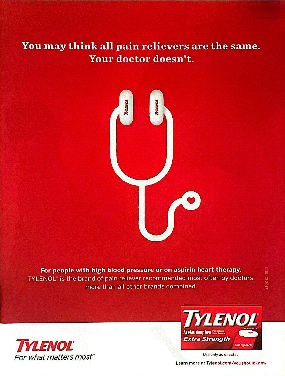
The client in this example was Tylenol. Tylenol is a company that produces pain relief medication. Specifically, they are known for their distribution of acetaminophen, a common pain reliever.
The target audience for this advertisement seems to be older people with heart conditions. Typically, older people tend to have difficulties with their heart such as heart disease or high blood pressure. Also, older people tend to have more aches and pains, causing them to be in need of a good pain reliever. This advertisement gets across the message of their product not only relieving pain, but also being better for your heart health opposed to other pain relief options.
• Creates images, letters, or patterns
• Assists in creating a line of vision (directs eye movement)
In this advertisement for Tylenol, the designer used the element of line in their design to create an image and to assist in creating a line of vision. The element of line is used to create a simple image of a stethoscope in this design, which is a medical tool associated with checking one’s heart health. It was utilized this way to be quickly understood by the audience. The designer’s intent was to catch the attention of the viewer with a simple yet recognizable image that resonates with them and makes them feel cared for. A stethoscope is something all people have seen, but people with poor heart health may have seen even more due to being at the doctors office more often. They will then associate that image with the feeling of being cared for, as they are also cared for by their doctor. The audience may respond well to the use of line as the main design element due to its simplicity and how easy it is to understand. The line used is thick and curvy, making it inviting and soft. With those combined characteristics, the design is very effective and captures the intended audience.
The element of line is also used to assist in creating a line of vision for the audience. The image created by the line is emphasized by being large and bold in the center of the page, drawing attention to it. But, once the viewer’s attention is captured, their line of vision will be guided from the two Tylenol pills at the top of the image, to the heart at the end of the stethoscope simply by the line that connects them and brings the image together. This actually connects the two elements of this advertisement together in the viewer’s brain; Tylenol will associate with their heart or their heart health. The element of line shows that Tylenol works in tandem with the heart health of the audience just by assisting to create a line of vision for that audience.
The client in this example was Leigh Bardugo. Bardugo is an author who primarily writes fantasy novels. Based on the cover of the book, she also is a #1 New York Times Bestselling Author, which could raise the stakes for the designer.
The target audience for this book seems to be avid dark fantasy readers. The age range doesn’t seem too specific, but the dark elements of the cover seem to indicate it is a book for young adults or adults, not children. Snakes are usually a symbol of treachery or evil, which are complex themes that appeal to adults rather than children. Many fantasy books are known for having many twists and turns in the plot, and the image of the snake alludes to that for this book. The target audience enjoys that aspect of fantasy and is excited by the image of the snake, whereas children may be frightened by the image.
• Photos and illustrations create shapes through the actual form/shape and content of the artwork.
• Shape sustains the viewer’s interest
• Shape helps the viewer understand the concept
• Shape is leading the viewer’s eye through the design
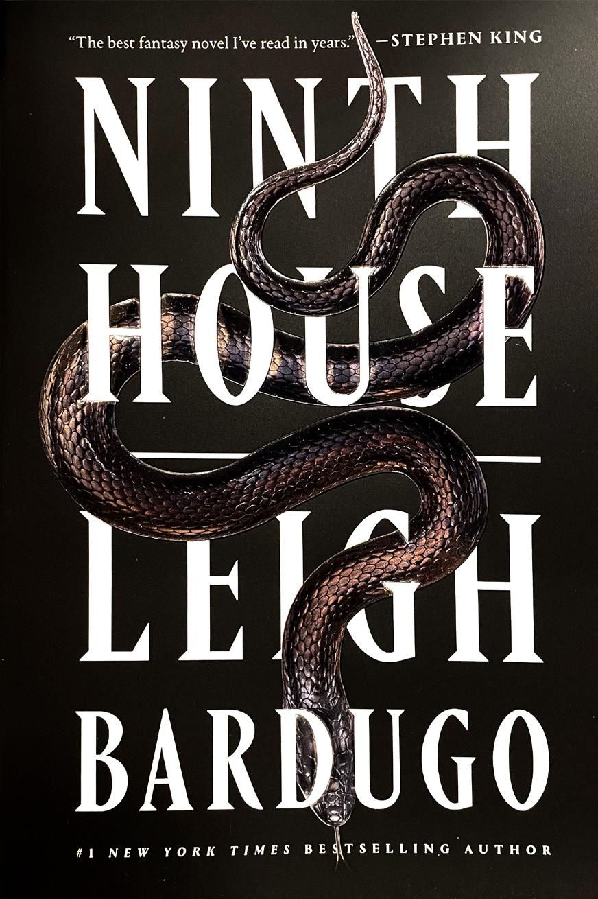
In this book cover for Leigh Bardugo’s Ninth House, the designer used the element of shape to create shapes through the type on the book cover, to sustain the viewer’s interest, to help the viewer understand the concept, and to lead the viewer’s eye through the design. The designer used shape on the book cover to create a shape of a snake that flows through the type. The snake was utilized this way to allude to the plot of the book, which follows a girl investigating secret societies on a college campus. The intent was to tell the audience to expect twists, turns, betrayal, and treachery in the book with the intertwined nature of the snake with the type. The expected audience reaction would be for them to pick up the book. It is expected this design will peak their interest because of the message they received through the use of the element of shape. The design is effective because the simple symbol of the snake is able to communicate such a vast yet intriguing message to the intended audience.
Through the element of shape in this design, the designer also sustains the viewer’s interest. The cover created for this book is anything but busy, and that is due to the use of shape. A simple yet intriguing design might peak the interest of the intended audience because there isn’t too much to look at. The shape of the snake is expected to grab the attention of the viewer due to its connotations, and because it is recognizable.
The designer also used the element of shape to help the viewer understand the concept. It is clear the designer knew the audience would be informed by their use of shape. The symbol of the snake alone has so many different implications for the plot of the book, but intertwining the shape with the type on the cover only further amplifies those implications. The designer’s intent was to catch the eyes of avid fantasy readers who are looking for those classic fantasy elements that the symbol of the snake alludes to. The intertwining snake makes the audience feel excited and finds them wanting to know more about the book, so much so that they pick it up.
The viewer’s eye is led through this book cover design by the use of the element of shape too. The designer made the decision to make this snake span the entire cover and intertwine with the title and author. They made this decision to guide the eyes of the intended audience to read the title and author of the book. If the symbol of the snake and its connotations weren’t enough to grab the attention of the viewer, the actual shape of the snake will act as their line of vision over the cover where they will learn more about the book. The audience may find this cover to be easier to look at and read because of the clear guide through the type. With the shape not only helping guide the intended audience through the type but also relaying information about the plot through symbolism, the design seems to be quite effective.
Shape is another element that can be used alone or in conjunction with line and type to help communicate a design concept. Shape can be defined as any element that’s used to give or determine form; defined as a closed form or closed path. Shape can exist as a design element all by itself, without the aid of line or type. It is two-dimensional and measured by width and height, and is created by lines, color, tone, or texture (or any combination of these.)
Texture can be defined as an object’s visual or tactile surface characteristics and appearance, or as something composed of closely interwoven elements (such as a woven cloth). In graphic design, texture is most often used as a secondary element to reinforce an idea, rather than a primary element to communicate a concept. However, it is a powerful addition to your design because it can add depth and interest to an ordinary flat design. Especially in the world of computer design where the effort to design a usable interface often leads to flat color or white backgrounds, the skillful use of texture can add a new dimension to your design.
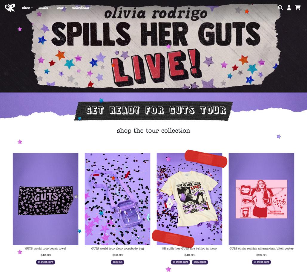
The client in this example is Olivia Rodrigo and her team. Olivia Rodrigo is a young, popular singer/ songwriter. Her style and aesthetic are often admired and replicated by her fans. Tickets to see her on her current tour for her sophomore album, “GUTS”, are extremely sought after, so much so that she has continuously added on more tour dates. Olivia’s team runs her website, which is made to promote her music, merchandise, and tour. (https://store. oliviarodrigo.com/pages/gutsworldtour)
The target audience for Olivia Rodrigo’s website is the same demographic her music resonates with: teenagers. Olivia creates relatable love and heartbreak songs that resonate with young girls who are going through or went through a similar situation. Her brand thrives off the idea of being relatable. Her songs range in topic, from missing your toxic first love, to feeling like no matter what you do you will never meet the societal standards of pretty. Teenagers, especially teenage girls, feel seen and empowered by the music she releases.
• Create a particular mood or feeling
• Reinforce or support the concept of the design
The designer of Olivia Rodrigo’s website used the aspect of texture to create a youthful feeling in their design. There are multiple uses of texture in this design, including paper, marker, pencil, tape, bandages, glitter, stickers, leather, and polaroids, all examples of visual textures. These textures work together with the other design elements in the composition to create a youthful, free, creative, and scrapbook adjacent mood for the website. The designer’s intent was to grab the eye of fans of Olivia Rodrigo and her music, who are mostly teenagers. Using these specific textures in the design connects the website to the viewer the same way Olivia’s music connects to her fans. The average viewer feels seen and empowered by the design because it is recognizable and nostalgic, because youth is something that all people experience.
The paper, marker, and pencil textures have the audience recalling how they would doodle in the margins of their paper in school. The tape, glitter, sticker, leather, and polaroid textures have the audience making a mental scrapbook of their teenage years, whether they are still in them or not. The bandage texture has the audience considering the concept of healing. When accompanied by the already established youthful mood, that translates to a message of healing wounds left over from your teenage years, something a lot of fans of Olivia Rodrigo seek from her music. The designer absolutely nailed this use of texture.
The use of harmonious textures creates a sense of unity within the design, establishes movement within the design, and contributes to the balance of the design. The use of texture also creates a focal point on the website: the tour. In the most texturized areas of the design, you can find information about or merchandise from Olivia’s current tour. Textures like bright red bandages and contrasting smooth and rough textures catch the eyes of the audience, and they immediately are informed in some way about the tour. Overall, the designer’s use of the aspect of texture was extremely well done and supports the themes fans are familiar with when it comes to Olivia Rodrigo and her brand and aesthetic.
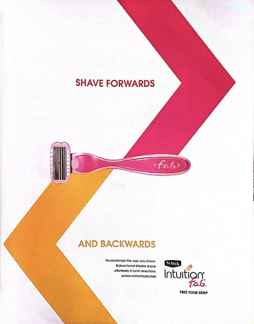
The client in this example is Schick, a company that designs and sells personal care products and razors.
The target audience in this example seems to be busy women who shave, possibly mothers. The pink coloring in the design tends to usually be found on products or advertisements targeted towards women. The concept of shaving back and forth, which is a quicker, more convenient way to shave, implies the audience is in a rush. Motherhood is most commonly associated with women who are often busy.
• Symmetrical balance reinforces the message— serious, conservative, sophisticated, stable, elegant, etc.
• Creates a mood through visual weight and the impression of force within the design
The designer of this razor advertisement for Schick used the aspect of balance in their design to reinforce the selling point of the product. At a quick glance, a message is relayed about Schick’s razor: it can shave forwards and backwards. This is relayed by the image of the two arrows pointing in different directions. The arrows in this design create symmetrical balance. The symmetrical balance of the arrows reinforces the message that Schick’s razor is stable, elegant, and will provide an even shave regardless of the direction you’re moving the razor. This use of balance leaves the audience feeling reassured that this razor will give them the results they are promised and are hoping for. Symmetry being used to communicate this particular message is very powerful because the connection between visual symmetry and physical uniformity in self care is a very easy connection for the audience to make.
The repetition of the arrows and balance of the arrows and the negative space create unity in the advertisement design. The balance of the arrows also creates emphasis on the image of the razor at the center of the design, making it the focal point. Overall, the designer used the aspect of balance in this advertisement design was clever. It reinforces the message about the razor that Schick was advertising while also visually aiding the viewer to discover the focal point of the design through emphasis.
Imagine yourself sitting at one end of a teeter-totter at your local park: you with the seat you occupy on the ground and the seat across from you empty and lifted off the ground. What kind of weight is required in the opposite seat to balance your weight evenly across the beam? The logical answer—and probably the first one that springs to mind—is that a person of equal size to you would properly balance your weight. However, that’s not your only possibility; for instance, couldn’t two persons, if each weighed half your weight, likewise balance you if they both were to sit at the other end of the teeter-totter? Of course.
Contrast is an especially important principle in graphic design, and a crucial tool to communicate an idea. It is also one of the most effortless principles to put into action. As soon as you add any element to a blank page, no matter how subtle, you’ve used contrast.
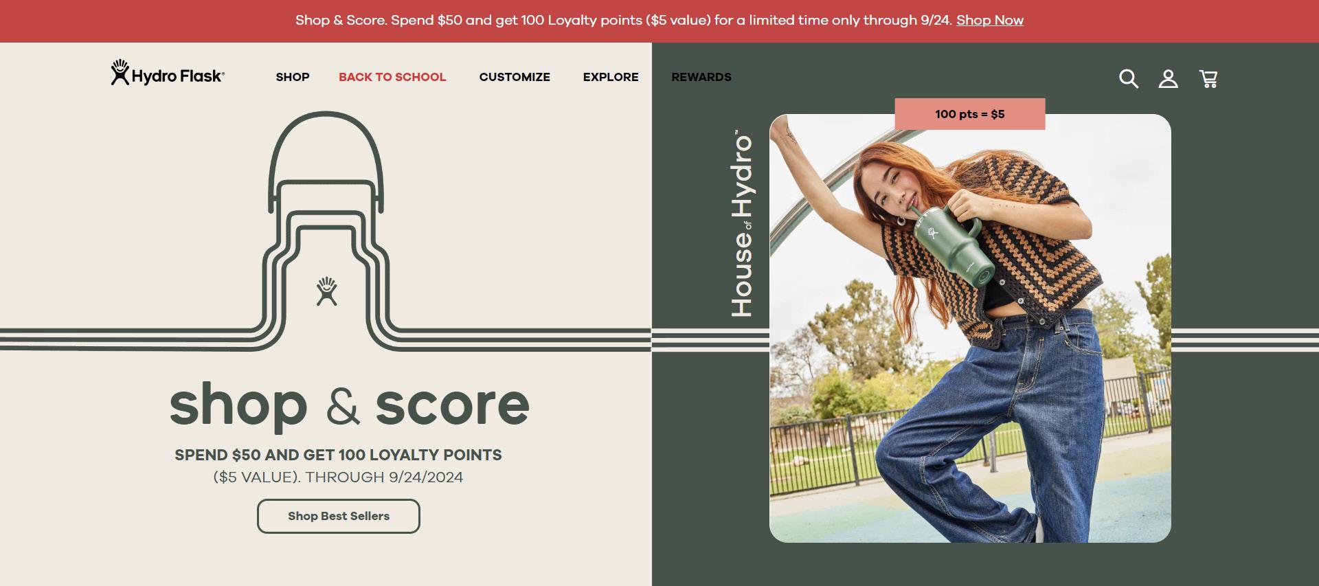
The client in this example is Hydro Flask. Hydro Flask is a company that designs, creates, and sells insulated, reusable water bottles. (https://www.hydroflask.com)
The target audience in this example seems to be frequent shoppers, specifically hip young adults. Their website is advertising a rewards program for their brand, in this case, the more money you spend the more points you receive which in time can buy you more products. A new customer who is trying out their products for the first time wouldn’t be included to join a rewards program with the company just yet, but someone who frequently shops with them would. Also, it is currently trendy with young adults to collect reusable water bottles in different brands and colors and personalize them with stickers and such (the Stanley trend). Hydro Flask seems to be targeting those collectors in this rewards program offer, since they would be frequent buyers. While collecting reusable water bottles may be hip, what is also hip is modernized, simplistic design themes, which is what they decided on for this website. This further indicates the target audience to be hip, young adults who are frequent shoppers.
• Create a clear visual hierarchy and a focal point
• Emphasis through placement (placement of elements in the top left, center/middle of the page, or foreground)
• Emphasis through contrasting colors, values, shapes, texture, and/or typography
The designer used emphasis in their website design for Hydro Flask through contrast and placement, which creates a clear visual hierarchy for the audience. On this specific part of the Hydro Flask website, contrast can be found in the colors. First, the majority of the composition is a dark sage green contrasting with a creamy white. The main part of the graphic is split in half, one side green the other side white, and the opposing color also exists on both sides. The bright, creamy white color immediately grabs the attention of the viewer and becomes a focal point in the design. Having the white bleed into the darker green section draws a line of sight for the viewer from one side of the screen to the other. Secondly, at the very top of the website there is a bright red bar with type. The coloring of the bar immediately contrasts with the calming cream and green colors of the rest of the design. This is another focal point in the design due to the alert mood that comes with the bright red color. The Hydro Flask website also uses emphasis through placement of the design elements. Again, the bright red bar at the top of the image is a focal point from this use of emphasis, simply because the viewer’s eyes are drawn to the top of the website. The viewer’s eyes are also drawn, however, to the left side of the website because of emphasis through placement, which is the creamy white side of the design. The use of emphasis through contrast and placement contributes to the design’s effectiveness by showing the audience exactly where to look first on the website. It creates a visual hierarchy in the mind of the audience and makes it easier to comprehend every part of the design and, ultimately, everything on the website.
In this example, the client is Taylor Swift and her team. Taylor Swift is an immensely popular singer and songwriter. She is currently promoting her most recent album, “The Tortured Poets Department” and her world tour, “The Eras Tour”. (https://www. taylorswift.com/)
The target audience in this example are Taylor Swift’s fans. Taylor’s fans vary in age and gender, but they all love the singer and her work. Taylor and her team are using her website to inform her fans as to what she is up to and how to engage with her. Whether it is through buying merchandise, watching her new music video, or getting tickets for her next tour date, all can be found right on the homepage of the website. Plus, to tie it all together, everything is promoted in the same aesthetic which is the same aesthetic as her new album. So, just by quickly glancing at her website, you are already informed of her newest, current “era”.
• Creates a visual rhythm with distinct repetition and variation of elements
• Uses similarity (like elements, line, value, texture, color, type, direction are used)
• Uses proximity (elements are near each other; clustered together to form visual relationships)
• Shows correspondence (visual connections/similarities in the design elements across a family of pieces or pages such as stationery—letterhead, business card, envelope, mailing label, book jackets in a series, multipage/campaign advertising, websites)
The designer of this website for Taylor Swift and her team uses unity through rhythm, similarity, proximity, and correspondence. Taylor’s website is used to inform her fans about what she is currently up to and shows them how they can get involved. From buying tour tickets, shopping for merchandise, and watching her latest music videos, you can do it all from just the main page. Since there is so much information on her website, the designer’s task was to keep it from being overwhelming for the audience, and they did just that through the use of unity.
First, the designer used rhythm to create unity in the composition. You will notice the three boxes filled with merchandise towards the top of the page, which is almost mirrored at the bottom of the page by the three suggested music video thumbnails. This creates a pattern that is similar enough to create rhythm and harmony within the design, but different enough that both sections of the website will catch the attention of the viewer
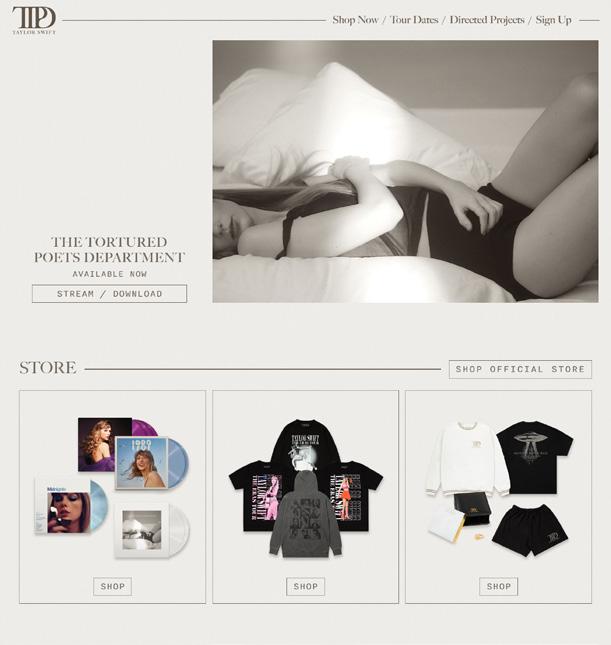
Second, the designer used similarity to create unity within their design. Taylor’s website uses a very basic color scheme of grays, blacks, and whites. It also primarily uses the same font for almost all of the typography. All lines are long, thin, and delicate and all shapes are conventional, neat, and rectangular. This similarity makes the design pleasing to the eye and easy to comprehend, and it simultaneously promotes her music. The designer of Taylor’s website changes its aesthetic to match that of her newest album, or “era”. So, clicking on Taylor’s website and seeing the unity in similarity between not only all the elements on the page, but also between the elements and her newest album creates an enthralling, interactive, and unified experience for fans and casual listeners alike.
Next, the designer used proximity to encourage the unity within the design of the website. The designer purposefully chose to neatly organize their composition by placing objects together so the viewer perceives them as a group. The music video thumbnails at the bottom of the design make a fine example of this. The viewer will know they are all music videos because they are all the same size, shape, and are organized in a straight line one after the other. Same with the merchandise slightly higher on the website; each bundle of merchandise is contained inside a box, all boxes are the same shape and size and are all organized in a straight line. The designer’s use of proximity ensures the viewer will know quickly and easily what they are looking at on the website.
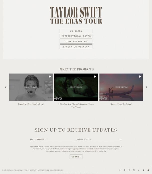
Finally, in their design, the designer used correspondence to create unity. Although unseen from a single screenshot of the homepage, all of the pages on Taylor’s website correspond with each other by using the same themes and aesthetic, like using the same font, color scheme, lines, and shapes. For example, the top bar of the page where it says her name, has the logo for her newest album, and has the titles of the different menus you can click on, appears there at the top of every page of the website. This use of correspondence in the composition creates structure for the viewer; they know what to expect on every page and therefore know how to navigate through easier.
Overall, the designer did a fantastic job creating unity within their design for Taylor Swift’s website. The use of individual principles of unity, such as rhythm, similarity, proximity, and correspondence, truly come through in a powerful way by working hand in hand to create a solid foundation for the composition and an overall recognizable, collating website.
Unity is the underlying structure of a design. Think of a house: it begins with a foundation from which everything else is built. If your foundation is shaky or poorly constructed, nothing will sit solidly in the rooms above. Unity is important in a design to make everything feel as though it fits together. Repeating elements are also important in design campaigns containing multiple formats so that they in turn fit together. When a company commissions a print campaign or website, the intent is that the viewer should always recognize the identity or product being sold, whether it is a print advertisement or a website.
Color has the power to override value. Color defines the intent of a design, the feeling, and the structure. Warm colors can make the viewer feel a range of emotions from warm and fuzzy to tense to angry. Cool colors leave us feeling relaxed and calm Viewers respond to color in part based on cultural and social influences, but color is very subjective and based on personal preference.
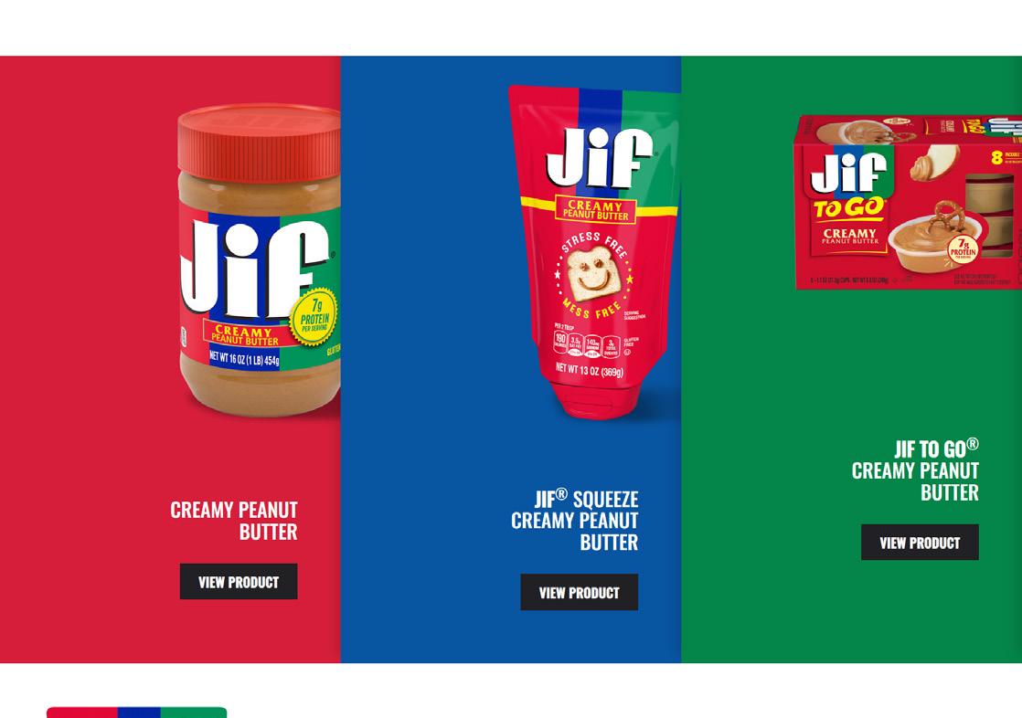
The client in this example is Jif. Jif is a company that produces and sells peanut butter and similar products. They also create recipes using their products for their consumers to try. (https://www.jif. com)
The target audience in this example seems to be foodies or people who like to cook/bake. On the website, there are many visuals of peanut butter and dishes you can make using peanut butter, such as sandwiches and snacks dipped in peanut butter. Also, there is a lot of use of the color red which is commonly used in advertisements for food or restaurants.
• Sends a specific message/meaning to the audience (historical, natural/organic, cultural, regional, religious, influential, etc)
• Provides unity and balance throughout the design
• Creates harmony (a satisfying balance or unity of colors; pleasing to the eye)
The designer of the Jif website used this aspect of color to create a mood for the audience, to send the audience a specific message about the product(s), and to create an overall harmonious design that is satisfying and pleasing to the eye. In this composition, you can find many uses of the colors of the official Jif logo. These colors include bright red, cobalt blue, and slightly bluishgreen. In color psychology, warm colors (such as red) convey messages of happiness and are generally stimulating. Warm colors are often used in relation to food because of this. Knowing this, the designer chose to primarily use red in their design. Red specifically is known to represent energy in a composition. So, in just the use of red alone, the designer is telling the viewer this website is about food packed full of energy. Cool colors convey a relaxing mood with messages of harmony and reliability. The designer used this to their advantage and amplified the feeling of familiarity when it comes to Jif peanut butter and its iconic colors. Specifically, blue conveys trust to the viewer. In this design, the designer is telling the viewer they can trust this product and this company. Furthermore, green specifically conveys health. The use of green in this design pushes the message of Jif peanut butter being healthy for you, which would encourage viewers to continue consuming this product.
The use of these three colors is important for a few reasons. Firstly, red and green are complementary colors, which immediately creates harmony within the composition. Secondly, having blue divide the two complementary colors creates almost a triadic relationship between them. This means that, together, they create both visual contrast and harmony, as well as a focal point. Finally, because these colors are bright and recognizable as the Jif logo, the design is automatically pleasing to the eye because the brain doesn’t have to work as hard to figure out what this brand is, it already knows from the basic colors.
In this example, the client is Blumhouse and the other creators behind the movie Five Nights At Freddy’s. Five Nights At Freddy’s started as an indie horror game and was last year transformed onto the big screen by a well-known horror movie production company known as Blumhouse. The movie and the game follow a ChuckECheese rip-off pizzeria who’s animatronic characters are possessed by the ghosts of children who went missing in the 1980’s.
In this example, the target audience of the design seems to be horror fans. Horror fans vary in age and gender, but it is safe to exclude children younger than ten. The design is dark and menacing, which are themes that would likely steer younger audiences away. Also, fans of horror games may recognize the established gang of animatronics displayed on the poster from the original game. This alone may peak their interest enough to go watch the movie.
• Creates a strong mood or feeling/emotional response
• Creates value contrast (high-key or low-key value contrast)
• Creates movement and direction (high contrast to lower contrast areas)
The designer used value in their design for the Five Nights At Freddy’s movie poster to create a strong mood, high-key contrast, and movement within the composition. The use of value in the poster generally creates a menacing, frightening mood for the movie. The creation of mood in a movie poster is so important because it expresses to the audience what the genre of the movie is and, in this case, the poster encapsulates the horror genre perfectly. This is due to the use of value in the poster.
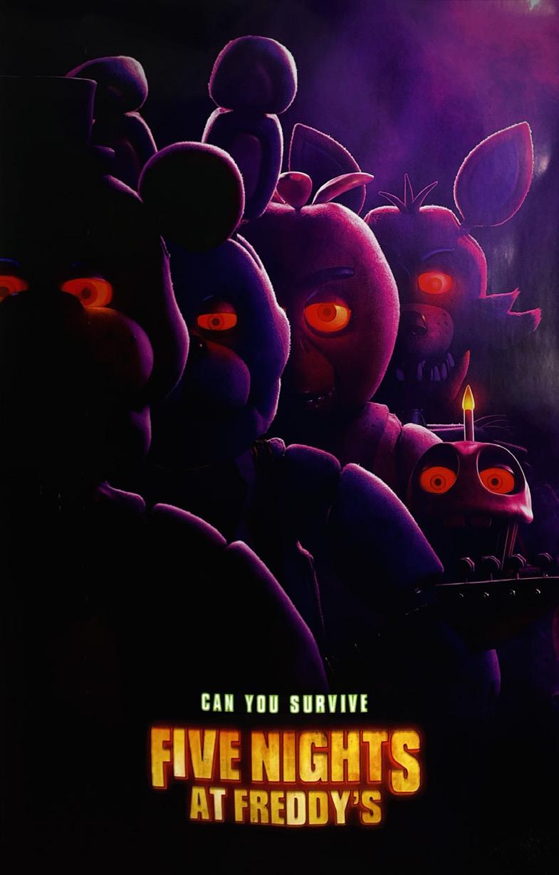
The designer used high contrast value, or high-key value, in their composition, which creates excitement, dramatics, and also a focal point. The focal point of this poster is either the bright yellow typography at the bottom that displays the name of the movie, or the red, glowing eyes of the animatronic characters. Both of these bright colors stand out to the viewer due to the dark shade of purple used for the majority of the background. Wanting the title of this movie to stand out makes sense; fans of the established game will come to see a movie that shares the same title. The designer’s intent when also making the red eyes a focal point of the poster was likely to grab the attention of horror fans who are not familiar with the game. The contrasting red eyes tell us something is amiss with these seemingly friendly characters. The implied evil will likely spark the interest of your average horror fan.
The overall darkness of the poster encapsulates the dark themes of the movie. The audience can expect the movie to be dark as in dim lighting, dark as in tragic or dreadful, and dark as in moody or grim, all common aspects of your average horror film. The dark tones of the poster also make some of the details harder to make out, which creates a mysterious mood and keeps the viewer wondering more about these characters and the plot of the movie.
The designer also uses value to create movement throughout the design. Due to the value in the composition, the viewer can imagine an imaginary light source. This illuminates certain elements in the poster more than others and does a great job in this specific composition in creating a 3D look to the animatronic characters in a 2D environment. The light source comes from a dramatic side angle which illuminates the sides of the animatronics in such a way that they look more realistic, as you can see the nostalgic texture on their designs just enough. Realism in a horror movie poster automatically makes the viewer more frightened.
The light source in the poster also reveals a smokey texture around the animatronic characters. Smoke effects amplify a mysterious and moody environment. Due to the value in the poster, the viewer can see the movement in the smoke, which makes the poster feel even more realistic and in turn scarier.
Overall, the designer did a great job using value in all its different forms in their poster design for the Five Nights At Freddy’s movie. They created a very captivating and eerie mood and environment, high-key contrast to dramatize the concepts, and movement to amplify the realism within the composition, thereby heightening the horror.
Value is lightness or darkness of an object or color. Value exerts as a powerful influence on a design, creating mood, depth, and contrast.