AYUSH SINGH
This portfolio contains the design work of Ayush Singh
Works/Portfolio 2024
Bachelor of Architecture Rensselaer Polytechnic Institute
singha16@rpi.edu 413.231.3190
This portfolio contains the design work of Ayush Singh
Works/Portfolio 2024
Bachelor of Architecture Rensselaer Polytechnic Institute
singha16@rpi.edu 413.231.3190
Fall 2024
Comprehensive Design Studio 1
Critic:
Adam Patela
New York City, New York
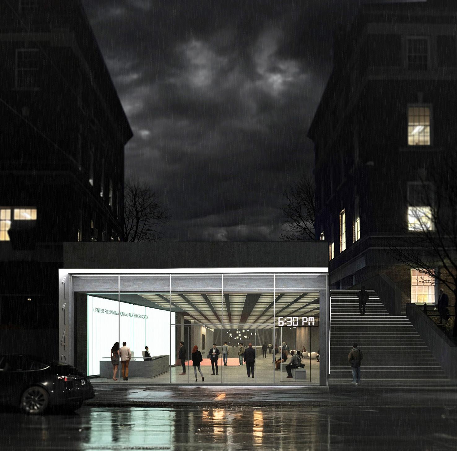
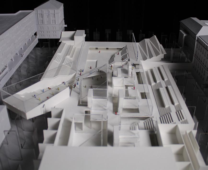
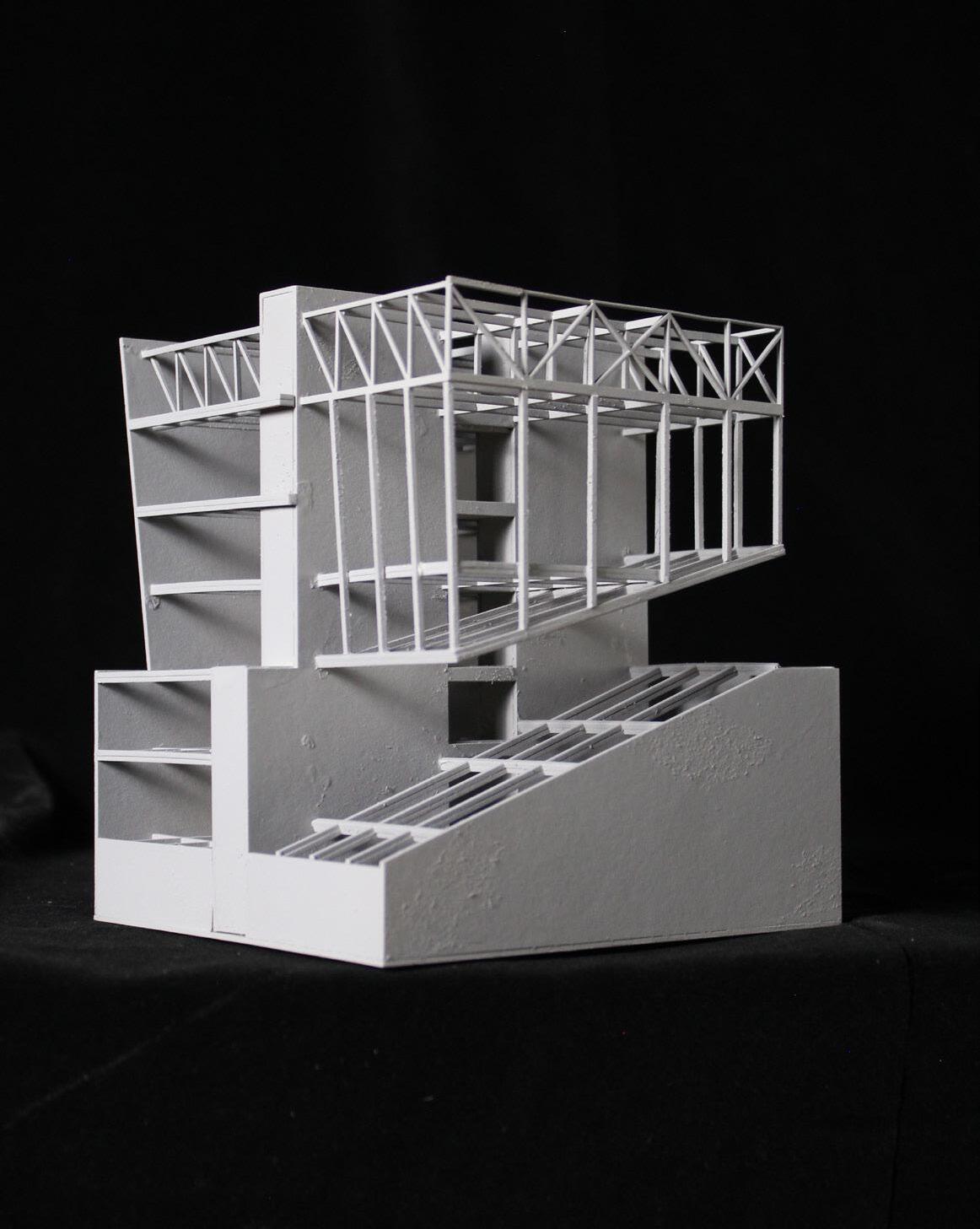
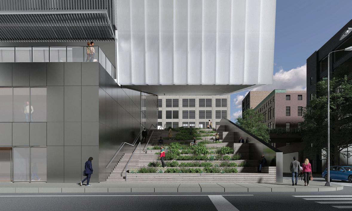
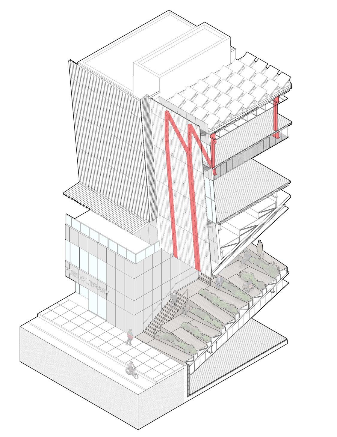
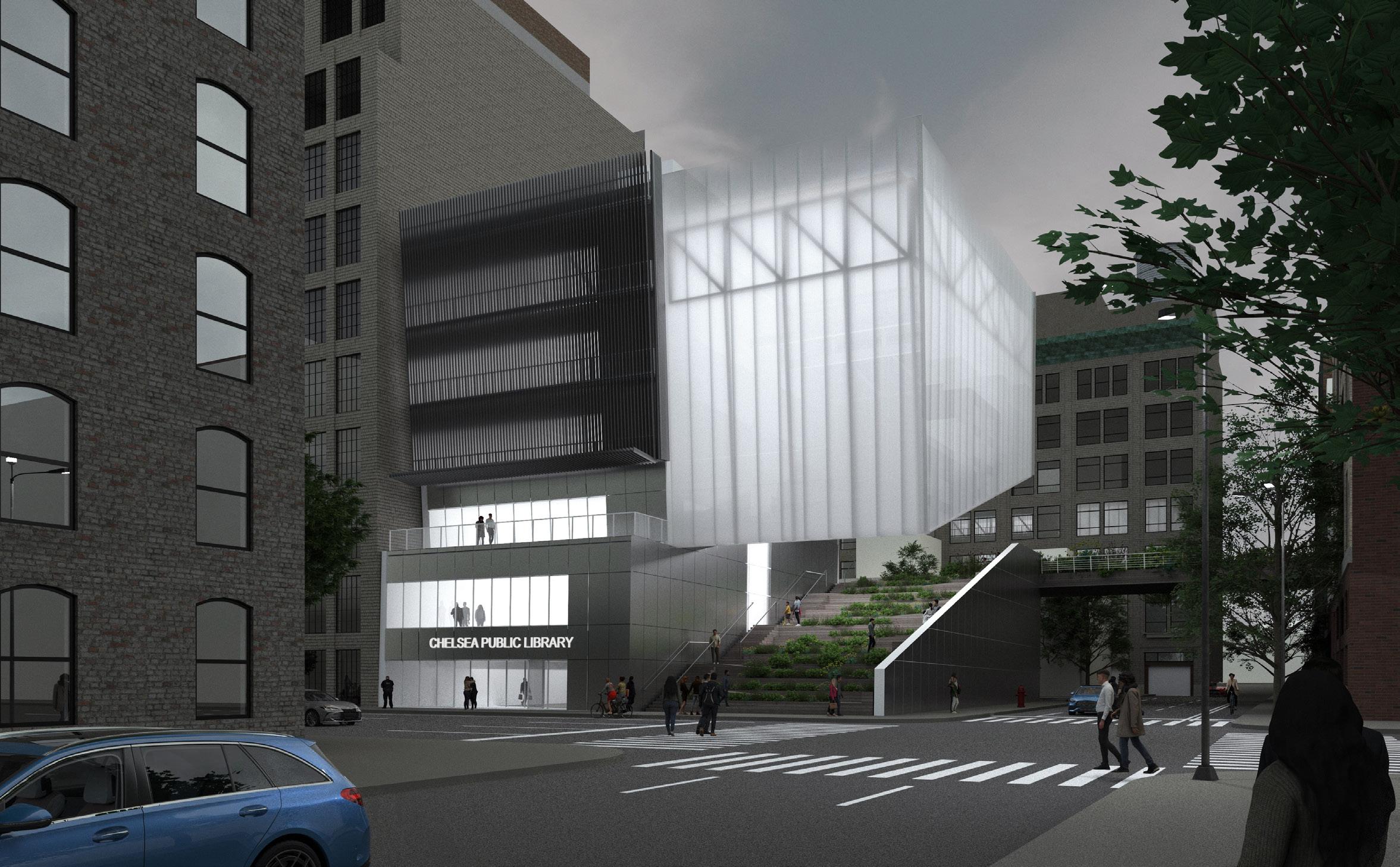
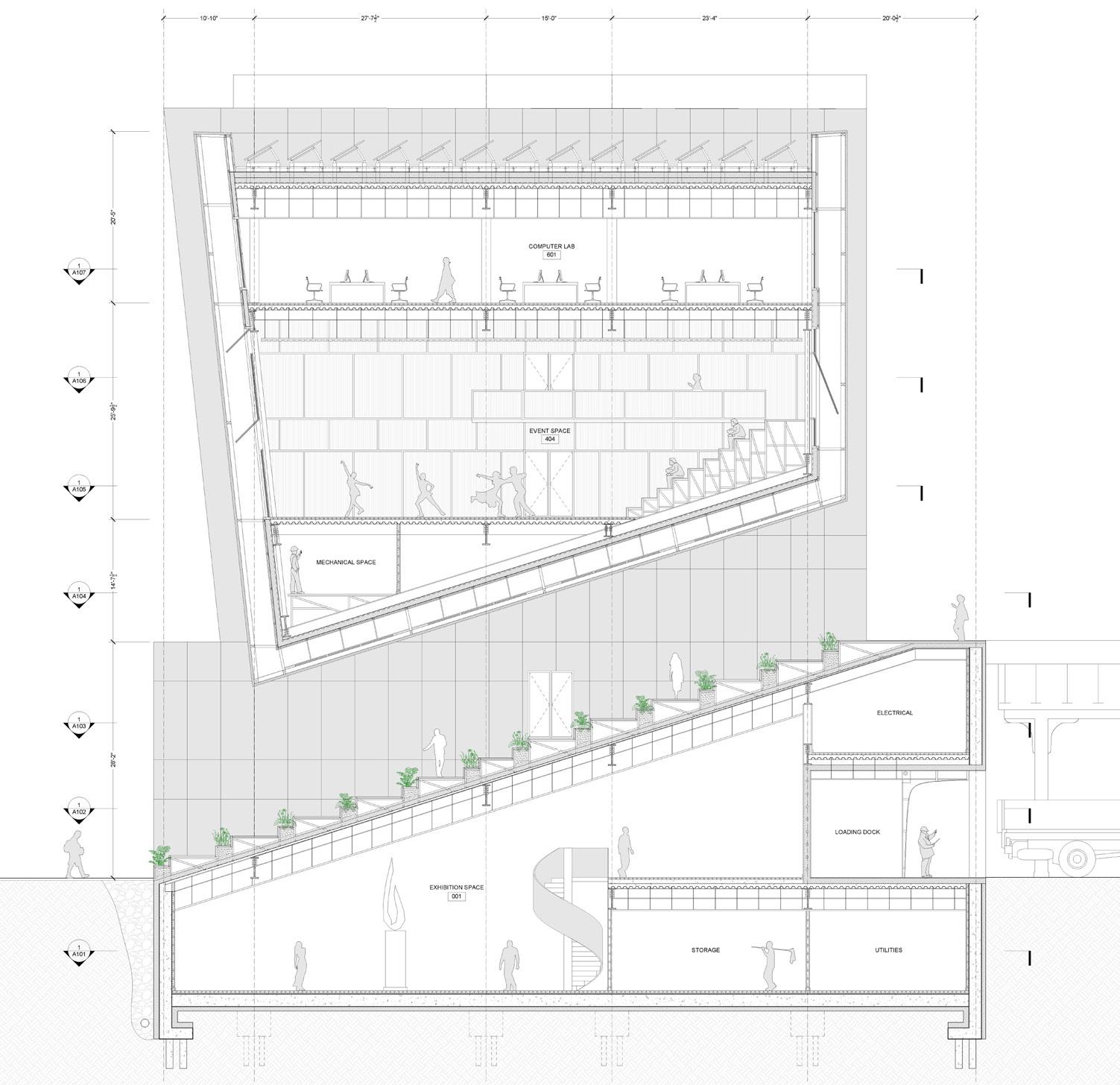
The high line in New York City acts as a point of relief in an otherwise congested city. I wanted to take this same effect and expand on it. The main massing move is a large connection between the high line and 10th Avenue to create an extended ramp system for people to engage with. As a result, the overall parti of the project becomes these two disjoint volumes; one anchored towards the party wall and the other in suspension.
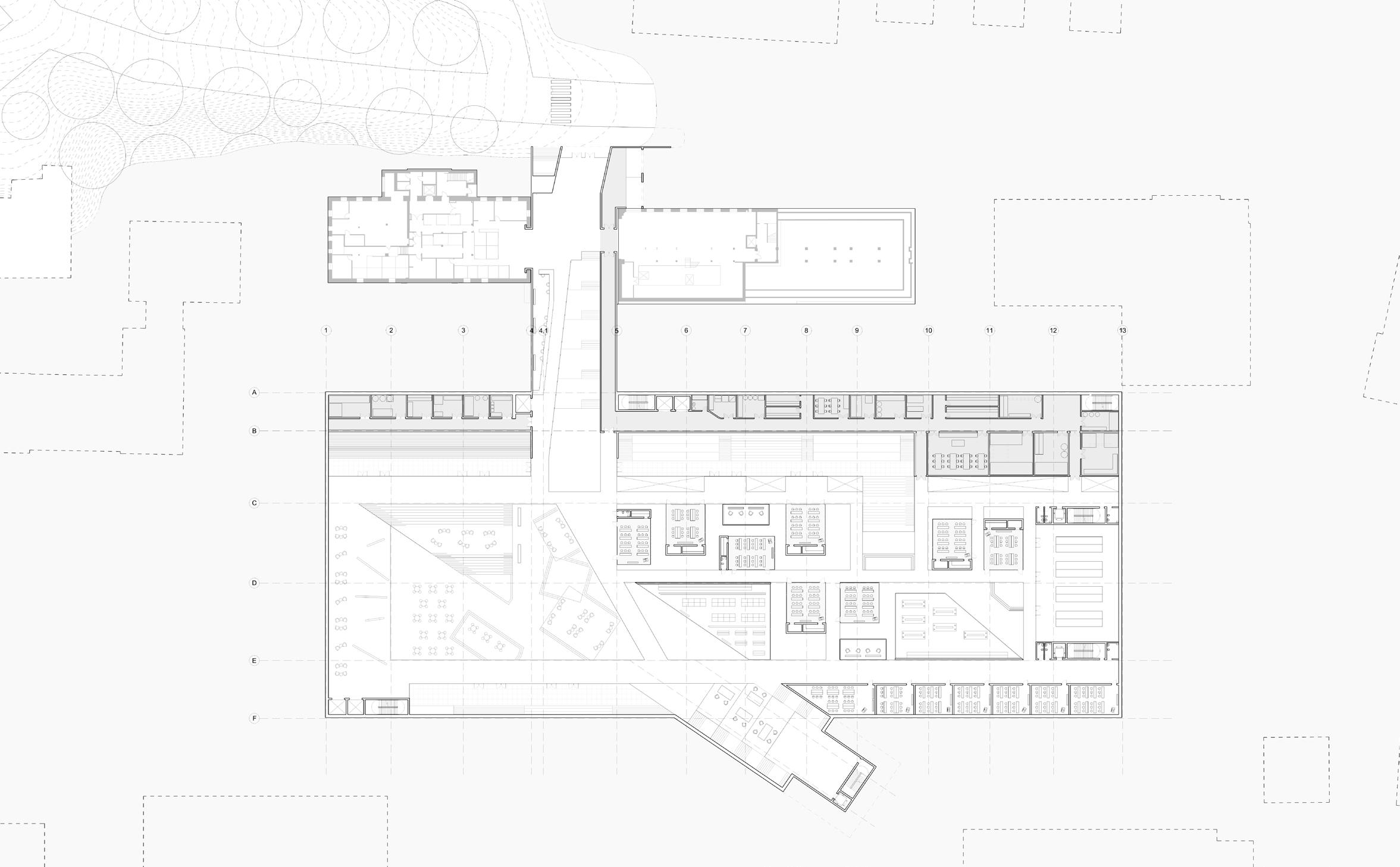
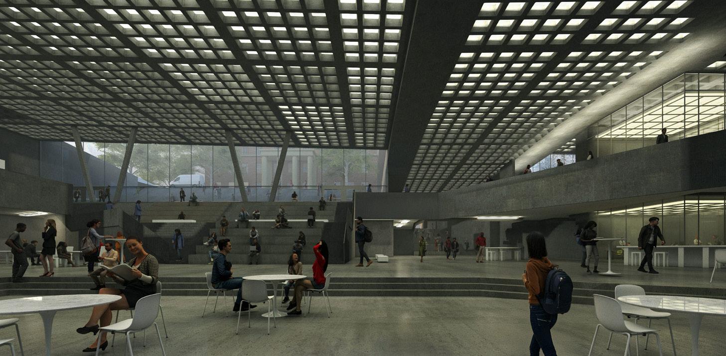
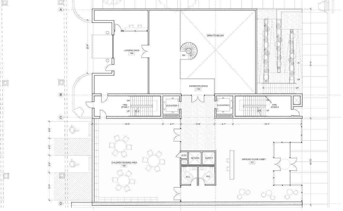
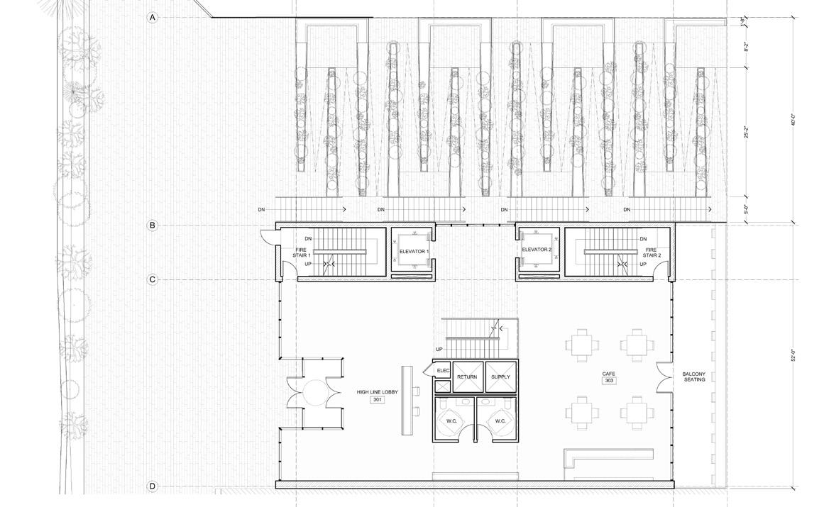
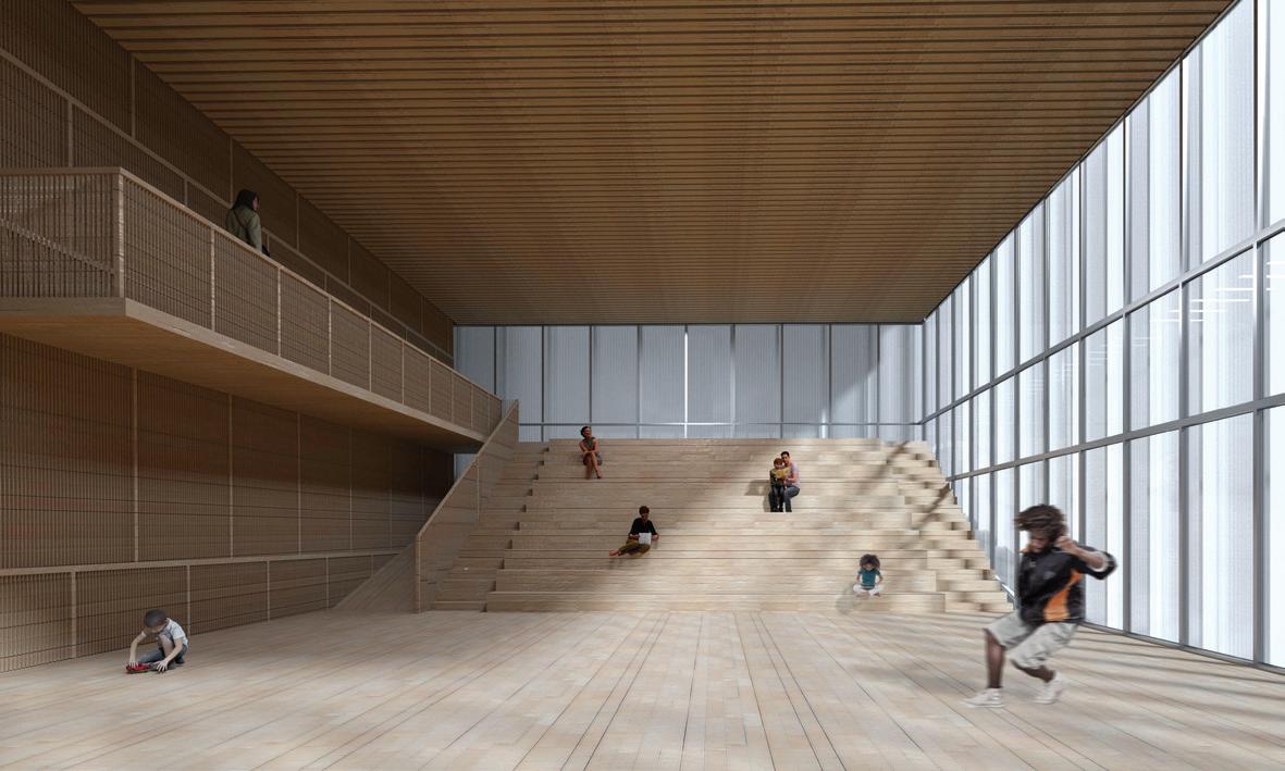
Program is arranged with the utility and storage spaces in the basement. The ground floor consists of a children’s reading area with the exhibition space adjacent to the loading dock. The high line level shows the full ramp system with benches and stairs alternating on each end. The upper floors are the main auditorium and library spaces. The auditorium space is a versatile space where seats can be brought out for a formal event or they can be removed to create an organic living room space.
Structurally, in order to support the 40’ cantilever created over the ramp. A series of four trusses extend the whole width of the building. To support these trusses, the main stair and elevator cores of the building are placed in the center axis to allow for majority of the load to be transferred through the core walls.
I wanted the facade to return back to my parti about the anchored and suspended volumes. I interpreted the anchored volume as darker and heavier so it is covered in these aluminum sawtooth strips. The suspended volume is lighter with channel glass exposing the structure in that area. Overall, I think the project is about the relationship between the exterior move to create the ramp and how that affects the spaces above. There is a clear relationship between the ramp and auditorium spaces in regards to structure, materiality, and program which were the spaces of main focus for this project.
Architectural Design Studio 5
Professor: Hseng Lintner
Partner: Emily Zheng
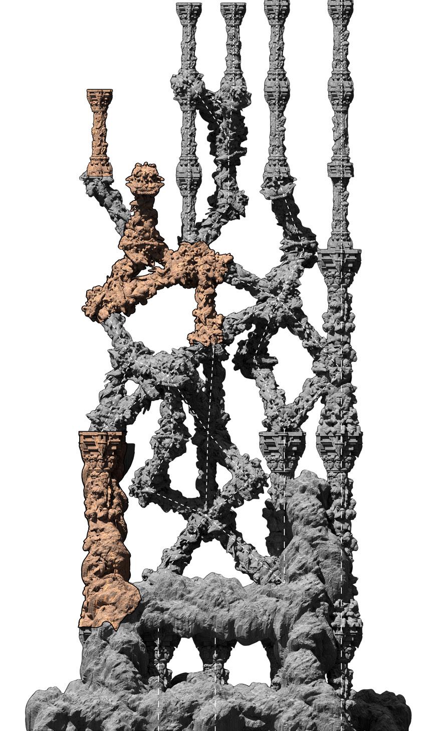
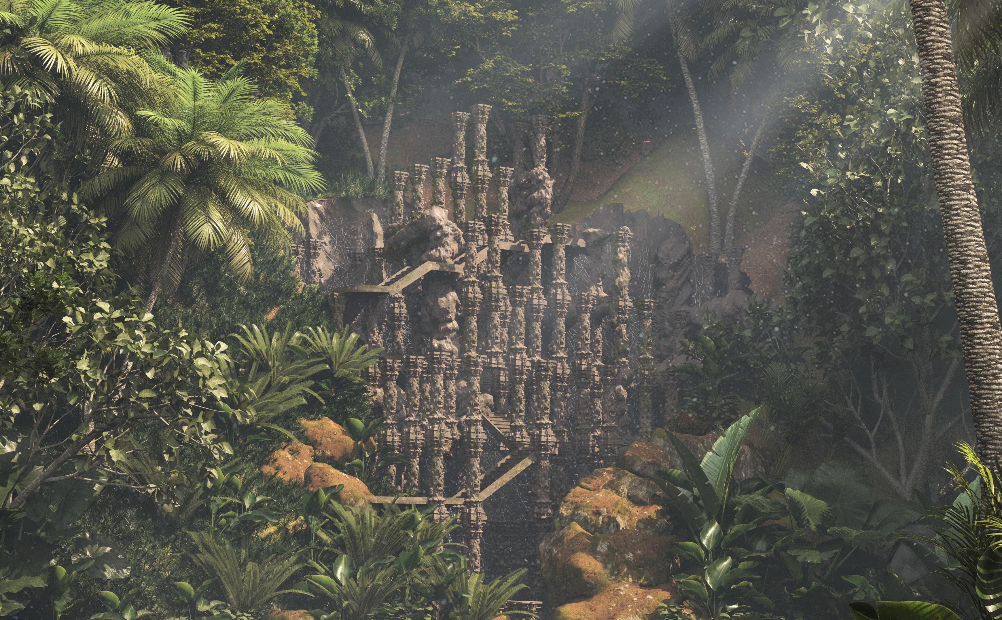
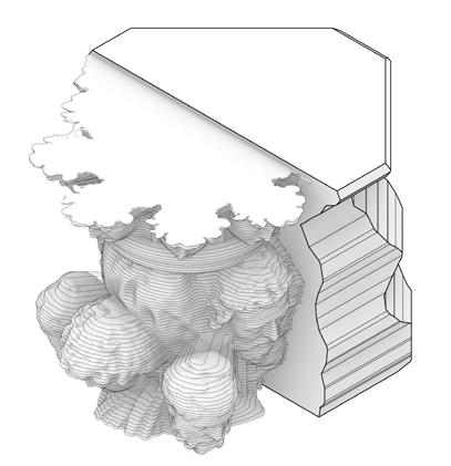
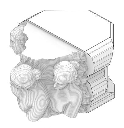
Our process began with the analysis of the English Landscape Garden. Our assembly of columns is a folly due its purpose of being strictly decorative. When studying ornament, we looked at Hindu Cave Temples. Ornament is not treated as a texture or pattern but by depicting religious or historical scenes through the use of iconographies and figures.
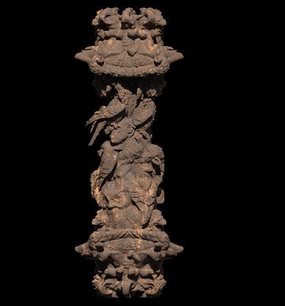
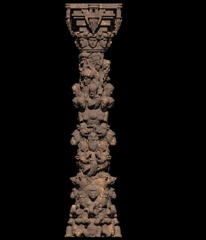
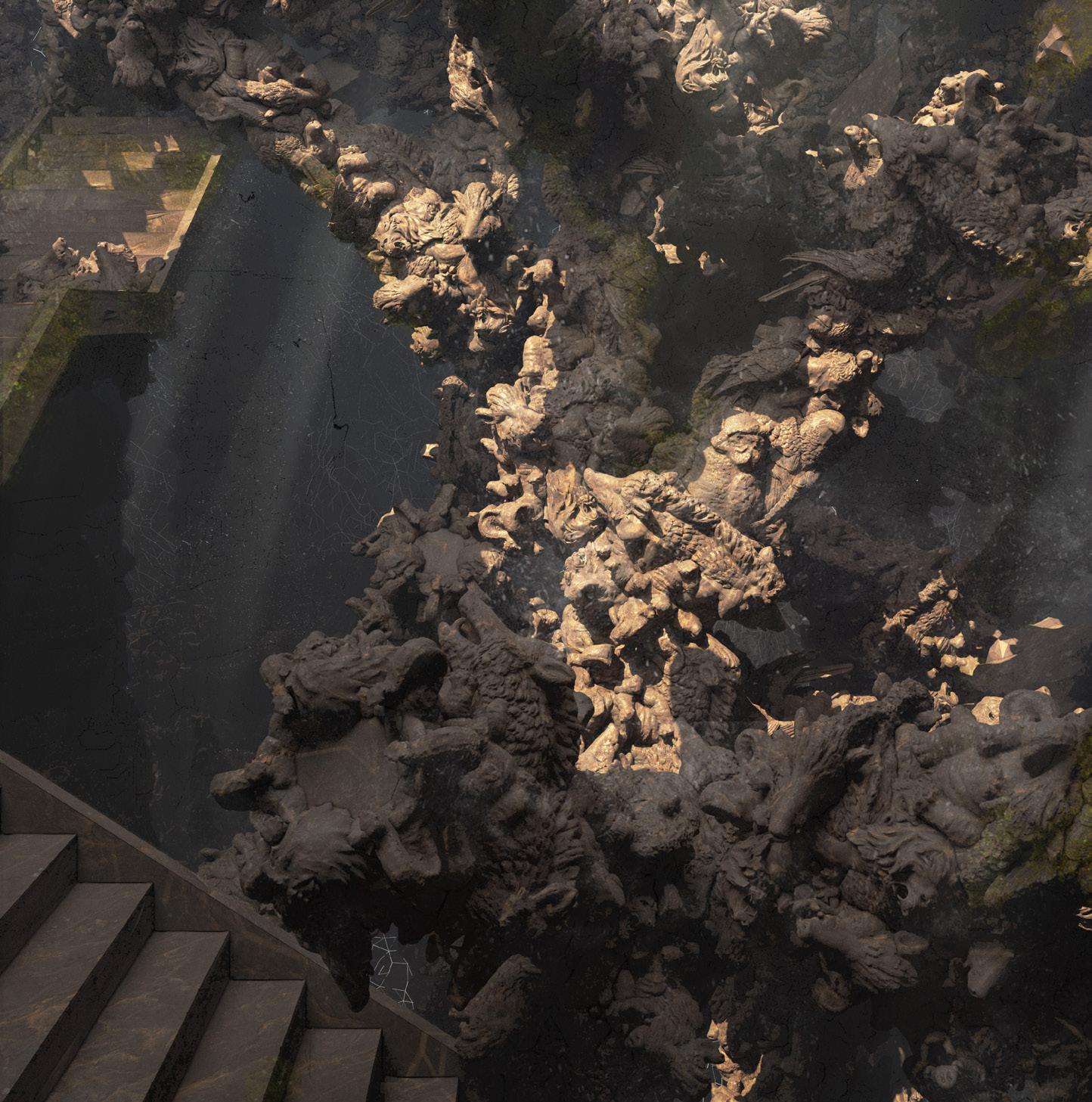
This led to the design of our columns. The first is the human column, composed of human faces into the column substructure. Next is the animal column which lacks a substructure as the animals form the entire column. The final column is the hybridization of the two forms of ornament. Making use of both the human and animal forms. This column shows the tension between the two forms of decoration. The traditional human faces which have been seen in Greek and Roman columns is now being taken over by a new form of ornament; animals.
Regarding the assembly of the columns, the organization reflects the type of column. The human columns are arranged in only a vertical formation to reflect the traditional order of the column. Meanwhile, the animal column occurs in a free flowing form at oblique angles to break the traditional column grid. The hybrid columns begin to be embedded with the rock of the cave and almost looks to be uncarved from the rock in certain areas. A viewer would be able to use the stairs to travel down the assembly. However, the disruption of the columns occurs with the depth of the assembly so the viewer is only able to make it so deep.
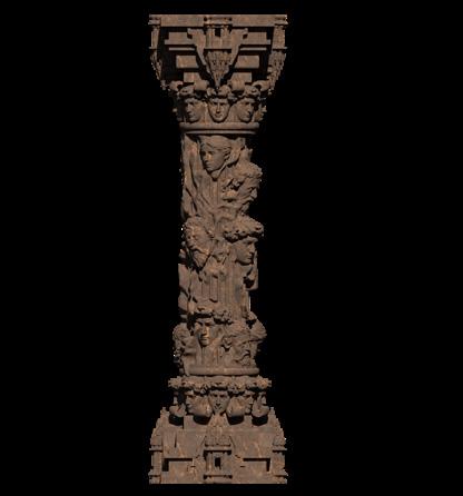
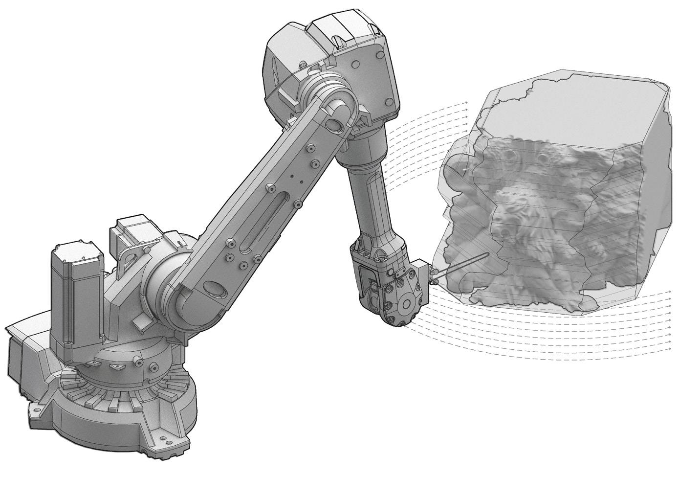
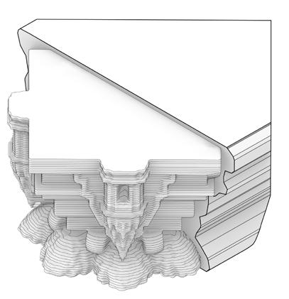
A main task of the assembly was to model a column at full scale. We modeled our hybrid column embedded in the rock. Through the use of a robot, we carved foam using a hot wire tool in order to bring our designs to life. Our columns were then showcased in Troy.
Architectural Design Studio 3
Professor: Gustavo Crembil
Catskill, New York
The objective of this studio was to add a small gallery space to the historic Thomas Cole House site in Catskill, New York. The gallery will consist of a few of Thomas Cole’s landscape paintings. My proposal was placed on a slope as the roof line blends into the slope. The overall slope of the site is towards the west side of the campus. The roof line reflects the landscape of the site. The placement also completes the circulation path around the campus connecting the paths between the main house, old studio, and new studio.
The parti of the building is a rectangle that has been cut by oblique cylinders. The curved areas that have been subtracted signify a difference in material. The curvature of the cylinders determine the cuts in the site design, the floor plates, the stair case, the benches in the site and so on. A main element of my design is this external glass screen which acts as a facade system.
It also acts as a protective layer which protects from immediate weathering. It also helps regulate the temperature inside the building. The screen is composed of frosted glass where the glass at the ground floor is translucent and the second floor has transparent glass.
The interior of the building is quite conservative. One would enter into the lobby and navigate through an open floor plan into the gallery space. The lighting and stairs in the gallery are determined by the same curvature that subtracted the massing. The curved stairs lead to the cafe space which is a mezzanine level. The cafe depicts a view of the Catskill mountains as Thomas Cole would have seen it and painted it. This view is also shown on the roof where one could walk from the middle of the campus onto the roof and to the edge where they would achieve the same view as the cafe. The viewer can look through the eyes of Thomas Cole.
Longitudinal Section Cross Section
Spring 2024
Architectural Design Studio 6
Critic: Gustavo Crembil
Partners: Nico Munoz and Giuliana Cinat Cordoba, Argentina
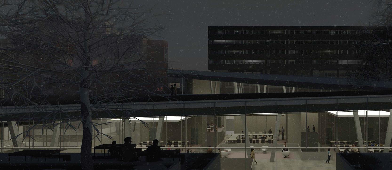
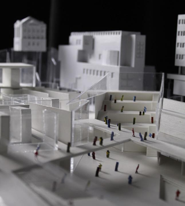
When analyzing the growth of a city, it is important to focus on the historic centers where people tend to occupy more space. For Córdoba, this historic center is Plaza San Martín. The urban intervention we propose is developed on the block located on the north side of the plaza. This block contains the San Martín Gallery, a public pathway carved beneath the existing block. As a result, outdoor spaces are inverted within the block. Our proposal uses the original gallery pathway as an access route to private and semi-public spaces.
The two central cores of the building are positioned at the weaker points of the gallery. These cores support a lightweight steel frame system on which the housing units are located. The housing units are placed within the steel structure using a crane positioned on the western core. Metal sandwich panels would be transported to the site via semi-trailer trucks. The panels would be
assembled into modules on-site, where the crane would lift each module into the frame. As a result, the building will reflect the growth of the city center. Residents would enter through the gallery and be transported to their specific floor. A series of bridges would lead to shared courtyard spaces through which residents would access their homes. By creating a building that hovers above the existing roof-line, semi-public spaces begin to extend into the areas beneath the apartments. These spaces include restaurants, cafés, bars, and shops.
The apartment units themselves are designed to reflect the demographics of the people living in Córdoba’s city center. Individual units are intended for those living alone. Shared-bedroom units are designed for students. Larger apartments are designed for couples, while multibedroom units are designed for families with children. Apartment units can be modified based on the catalog.
Spring 2022
Architectural Design Studio 2
Professor: Stefan Svedberg
Troy, New York
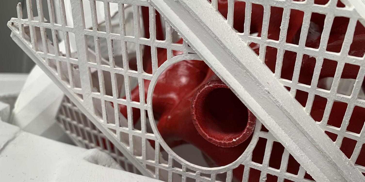
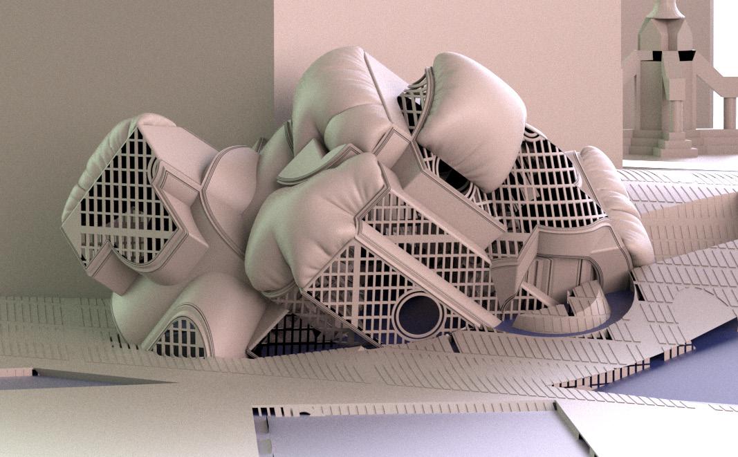
For this studio, we were tasked with creating a pavilion space by the Hudson River in historic downtown Troy, New York. After observation of the site, I wanted to play off the existing Korean War Memorial adjacent to the site. However, this pavilion is a literal abstraction representing the horrors of war rather than a memorial.
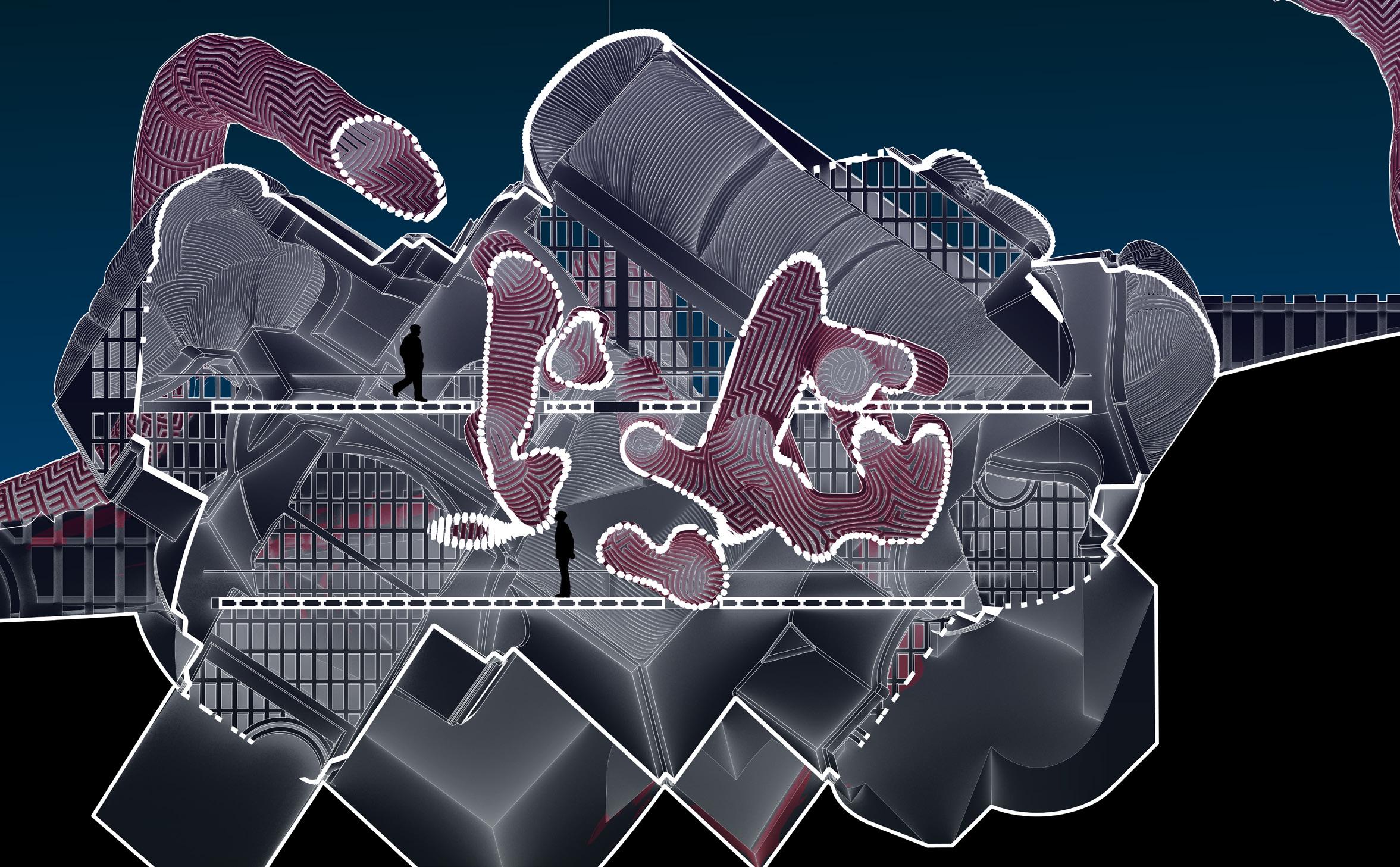
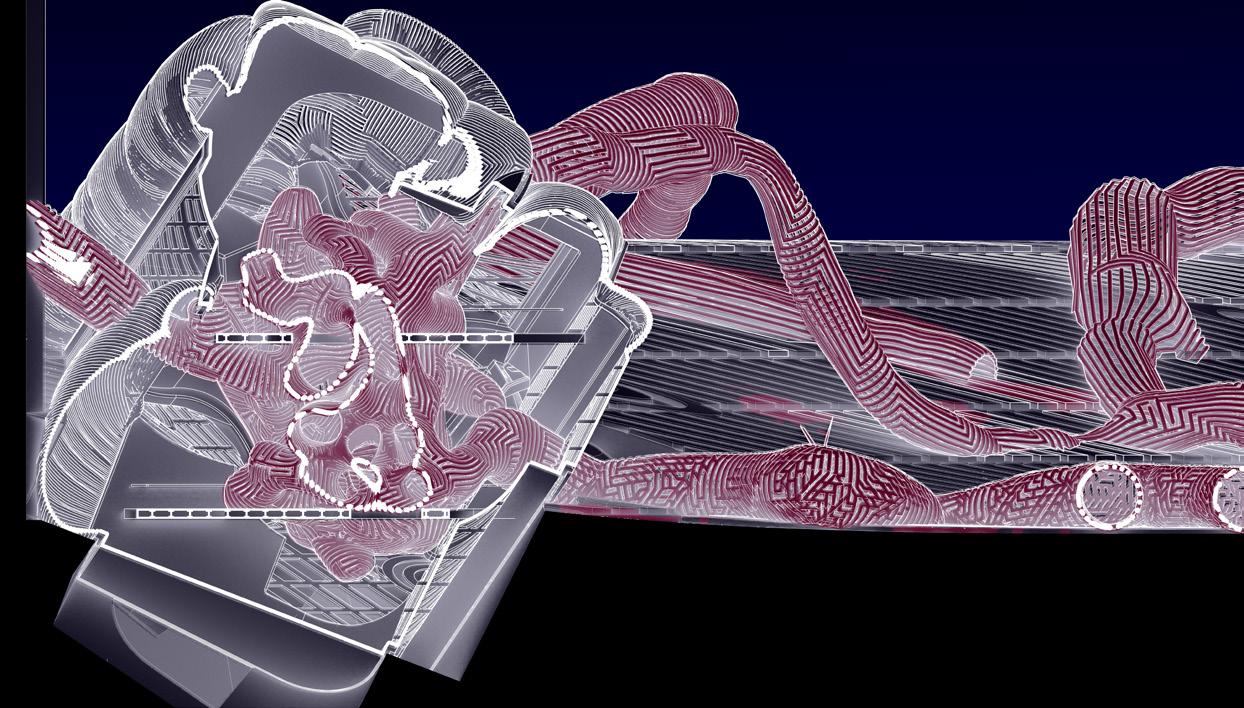
It is composed of two main geometries: The exterior cage and the interior pipes or what I called intestines. The intestines are bundled on the interior of the cage. However the cage is unable to contain the intestines as they spill out and effect the rest of the site. This represents how often times we think of war as a contained idea that does not effect us or society but war can spill out and effect society in various ways. Regardless of how much we try to think of war as an isolated idea, the consequences affect the rest of our communities on a local and global scale.
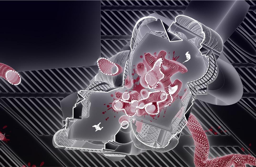
Inspired by the work of Anish Kapoor, the intestines are depicted as gruesome with a red color and red splatters on the floor plates and the ground. This represents the realities of war and how it is a gruesome and horrific experience that can harm peoples lives forever. The point of this pavilion is for people to be horrified and nervous of the grotesque consequences war can have not only on an individual but also on a community and society as a whole.
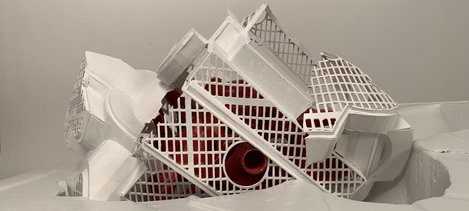
The way one would inhabit the space would be to enter through one of these pipes and land on the main floor plate. They would be able to approach the intestinal bundle on the interior and touch it, with the risk of receiving a sticky red residue. The architecture in that way becomes interactive and the meaning becomes that much more apparent where people are able to interact with the architecture.