SILAS OWITI PO R T F O L IO 3
2021 3 SILAS OWITI PORTFOLIO 13 Bloom Tissue Crown Paints 45 Fast CardioCasa Buena 68 Broadways Bread 3D Visuals 2 NCBA LOOP 7 Logos PAGE05PAGE09 PAGE07 PAGE15PAGE17 PAGE16 PAGE13PAGE14 List of
Works
Clients [Some]


4 SILASOWITI PORTFOLIO
Case #01 1 BLOOM TISSUES
Campaign: LetsTalkDirty
While many shudder at the thought of a small spill or a speck of dust, Bloom welcomes it. With soft, strong and absorbent sheets equipped to take on whatever mess comes at it and at the heart of the brand is a promise to sanitize and refresh, leaving users feeling clean and confident, and their surfaces fresh and free from spills & dirt.
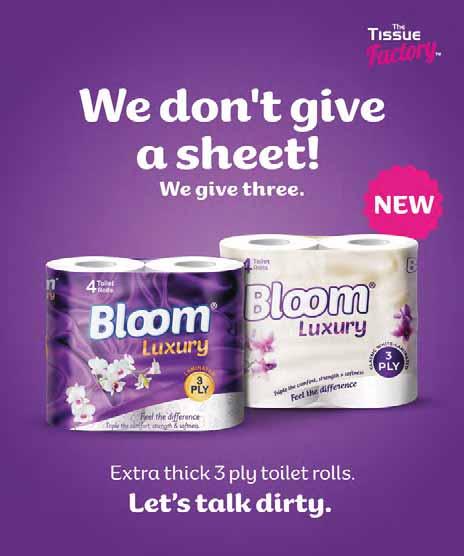
BUT…To get clean, you have to get dirty!
TALK DIRTY TO ME

With this idea, Bloom is going beyond the boundaries of textbook functional communication by expressing its promise and purpose in a bold way.
Through personification and humorous language, we’re demonstrating Bloom’s readiness to tackle spills, smudges and everything in between in a way that’s sure to be memorable, capture people’s attention and create conversation.
Client’s name : Tissue Factory
5 SILASOWITI PORTFOLIO


6 SILASOWITI PORTFOLIO
Case #02 2
NCBA LOOP BANK
Digital / Video Creation & Editing
NCBA Loop is a digital bank and I was tasked with creating minimal and creative visuals and video for social media.

Client’s name :
NCBA BANK
7 SILASOWITI PORTFOLIO


8 SILASOWITI PORTFOLIO
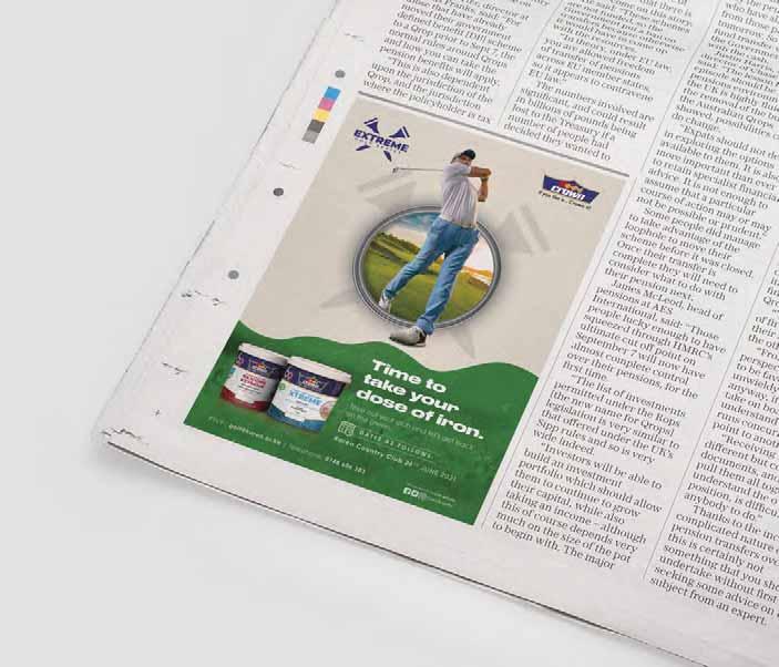
Digital / Print / OOH
Working with kenya’s No.1 paint manufacturer, I was tasked with creating digital, pring and out of home visuals to aid in showcasing the brands comprehensive range of paint products and, provide valuable insights and technical know-how to the consumers from project planning, interior design, colour scheming or product selection to purchase to after-sales support.
Client’s name : CROWN PAINTS PLC

9 SILASOWITI PORTFOLIO
Case #03 3 CROWN PAINTS


10 SILASOWITI PORTFOLIO


11 SILASOWITI PORTFOLIO

12 SILASOWITI PORTFOLIO
Case #04 4 FAST CARDIO
Branding
Is a wellness & consultancy firm aims to provide an Entertaining, Educational, Friendly, Inviting, Functional and Innovative experience of uncompromising quality that meets the health and fitness needs of our community
Client’s name : Fast Cardio & Fitness

13 SILASOWITI PORTFOLIO
Case #05
5 CASA BUENA
Casa Buena Sangria is a refreshing fusion of wine and tropical fruit notes that deliver a perfectly balanced and easy-drinking experience.

The brand offers affordable accessible ready to drink wine sophistication to tap into a consumer who is looking to get into the wine category but finds it complex.
Client’s name :
14 SILASOWITI PORTFOLIO
KWAL OOH

14 SILASOWITI PORTFOLIO
Case #0
OOH
Client’s name :

14 SILASOWITI PORTFOLIO
Case #0
Client’s name :
Case #0
KOTEX SOCIALMEDIACAMPAIGN
The Kotex #PeriodOrNotSheCan is an annual campaign that seeks to recognize and award women’s accomplishments as well as drive conversation around period stigma and the barriers they cause. I used Kotex key elements (brandmark, she symbol, typography, photography and brand colors) to design visuals that reflected the tone of the campaign (Celebrating Triumph ThroughOdds)

Client’s name :
15 SILASOWITI PORTFOLIO
KOTEX
Client’s name : KOTEX

S I A S OW W I WI T I T F O L I O

SSIASOWWIWITI TFOLIO


SSIASOWWIWITITFOLIO
Client’s name : KOTEX
Case #0
Logos


Ideation & Creation

16 SILASOWITI PORTFOLIO
WHIPPED CREAM REBRAND
Whipped body butter company “Whipped” required a rebrand of their existing logo and product packages. I came up with samples that mimicked movement (whipping motion) that also embodied African patterns/ textures.
Client’s name : WHIPPED
15 SILASOWITI PORTFOLIO
Case #09-B 9


15 SILASOWITI PORTFOLIO Client’s name : WHIPPED ••• ••• ••• ••• ilil� iiiiIJ ii11IJ iiiiii I ALMOND WKIPPIO RICHBODYBUTTER ALMOND lnrichedwt-ShN8vtlel"ond£,ient,oOils 259 Iiil!llll'IDl IllalIIl'il !I!.ill\1111 25gIIIIlffl11!1 �]�]i] �]�]i] �]�]i] �]�Ji] ElliottErwittSnaps € loremipsumdolorsitamet, consecleturadipiscingelit,sed doeiusmodtemporincididunt 111111111111 ,!] 111111111111111 111111111111 ,!] 111111111111111 111111111111 ,!] 111111111111111 111111111111 1!:I Ill111111111111 111111111111I■,!] 111111111111111 111111111111 !] 111111111111111 111111111111 !] 111111111111111 111111111111 !] I11111111111111 111111111111 !] IIll11111111111 111111111111 !] 111111111111111 :ni·�F\SI-ITONB()(J��--;,-----------• 111111111111 ,!] ,!] 111111111111111 111111111111 ,!] ,!] 111111111111111 111111111111 ,!] ,!] Ill111111111111 111111111111 1!:I ,!] Ill111111111111 111111111111 1!:I ,!] 111111111111111
Client’s name : WHIPPED

15 SILASOWITI PORTFOLIO
Case # 0
3D Visualization
Modeling, Lighting, Rendering
Storage Cabinet


17 SILASOWITI PORTFOLIO


18 SILASOWITI PORTFOLIO TV
Module


19 SILASOWITI PORTFOLIO
Tub
Bathroom


20 SILASOWITI PORTFOLIO Access Door Panel
THANK YOU “Design is nothing but a humble understanding of materials, a natural instinct for solutions and respect for nature” -BV DOSHIFeedback? Email me at silasnowitt@gmail.com or Reach me on 0701 348 063
