University of Georgia (UGA) Health Center
ATHENS, GA, USA


How can we bring UGA spirit across campus?

When the University of Georgia (UGA) Health Center initiated a major renovation of their three-story facility, the goal was to create a space that not only met functional needs but also reflected the university’s esteemed academic reputation . By focusing on brand identity, color theory and cost-efficiency, UGA aimed to enhance the environment for students and faculty alike.
The Health Center, like many university buildings, had not seen significant updates since the 1990s. And just like many colleges and universities, shrinking budgets and time constraints are a given, not an exception these days. Through the implementation of flooring and paint upgrades, UGA refreshed the space without extensive structural changes.


Traditionally, the iconic UGA “Super G” and Bulldog logo are reserved for the university’s athletic facilities.
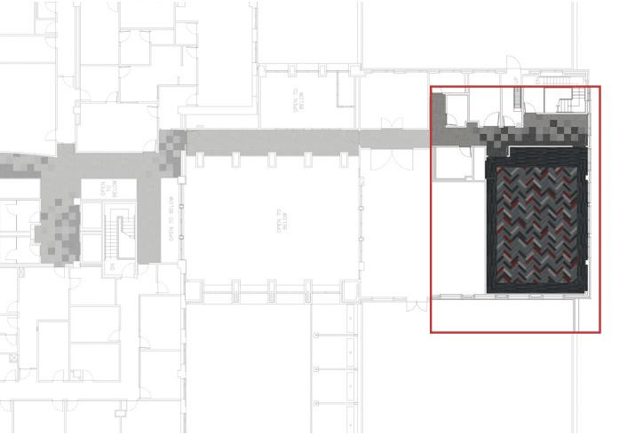
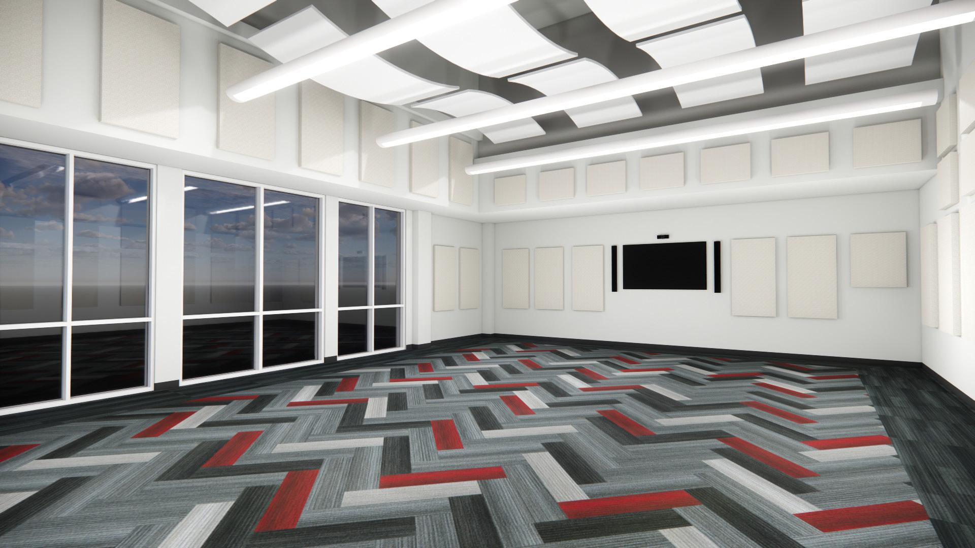
Recognizing the importance of a subtle yet powerful representation of their brand across all areas, Facilities Manager Donnie Smith collaborated with Shaw Contract to integrate the university’s brand into the Health Center. The aim was to express UGA’s branding in a design-forward way that didn’t rely solely on the school’s logos.
Through thoughtful pops of their three iconic colors, the renovation captured the spirit of UGA without overwhelming the space with overt branding.


This attention to brand identity provides students with a sense of belonging on campus outside of the athletic facilities.


Focusing on paint and flooring not only accelerated the renovation timeline but also resulted in considerable cost savings—due in part to Shaw Contract’s free in-house design services, StudioOne™.
UGA also bypassed the need for a lengthy bidding process thanks to the state contract approval. The streamlined process ensured the project was completed under budget and ahead of schedule, providing the Health Center with a fresh new look in a fraction of the time.




Understanding the psychological impact of color, UGA embraced a design that prioritized the wellbeing of its students and staff.
While the university’s official colors incorporate reds and blacks, they opted for a palette that promoted calmness and healing within the Psychology Suite.
Using color theory, the design incorporated soft greens, blues and grays—colors known to evoke security, comfort and calmness. This approach not only differentiated the Health Center from other campus facilities but also created a soothing atmosphere conducive to health and healing.


By
working closely with Shaw
Contract and utilizing the design expertise of StudioOne™, UGA transformed the Health Center into a space that not only reflects the university’s values but also supports the well-being of its students.


