CONTI GOLF
Shane Conti
Conti Golf
GVD 335 Spring 2026
Shane Conti
Conti Golf
GVD 335 Spring 2026
The target market for Conti Golf includes younger golfers between the ages of 18 and 40 who are looking for something different from traditional golf brands. This group includes both men and women with middle income levels who enjoy golf but don’t always connect with the sport’s formal and conservative image. Many are casual to intermediate players who value style, personality, and self-expression just as much as performance. They are often influenced by social media, trends, and modern design. Conti Golf is aimed at people who want to stand out, have fun, and bring a more energetic and rebellious attitude to the game.
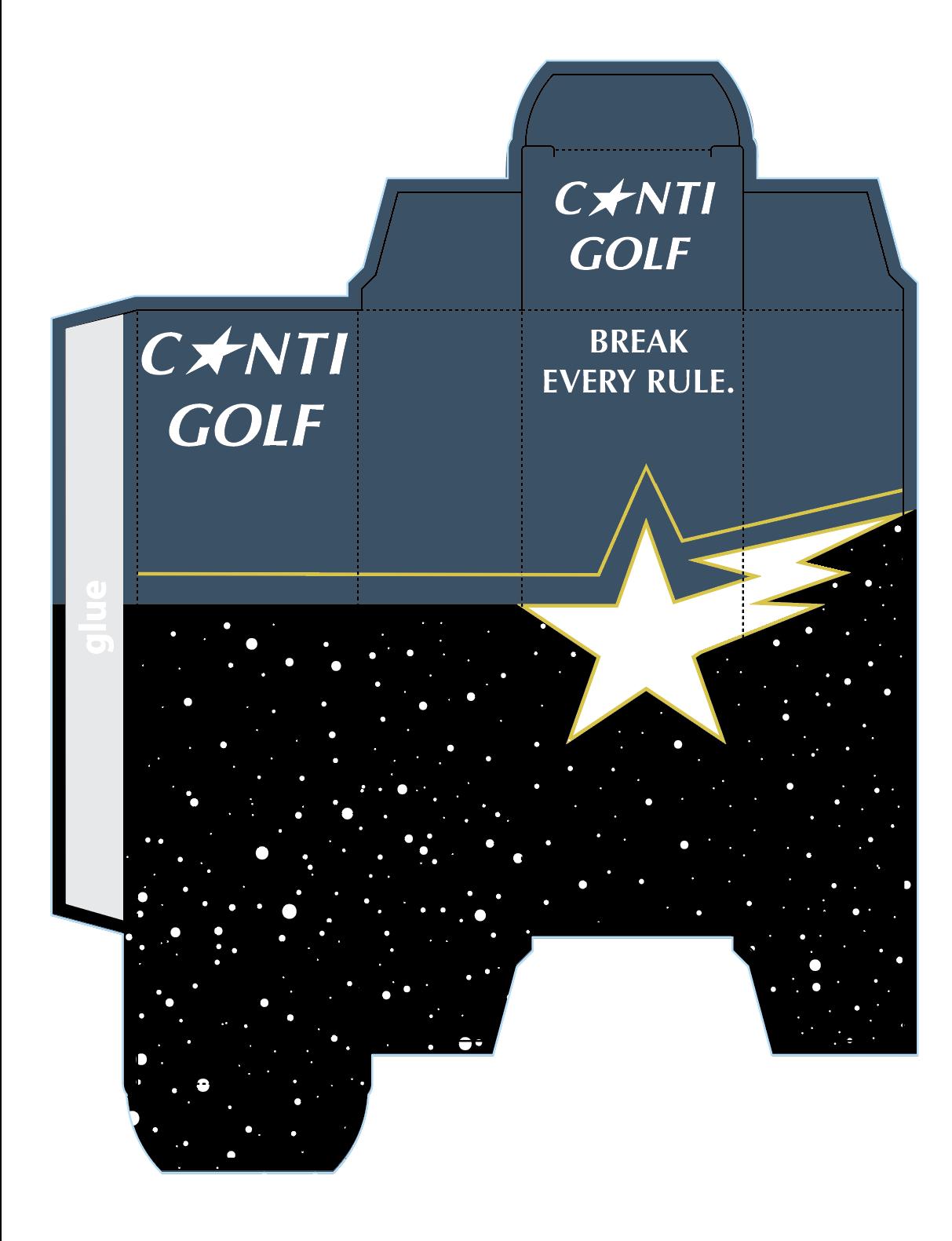
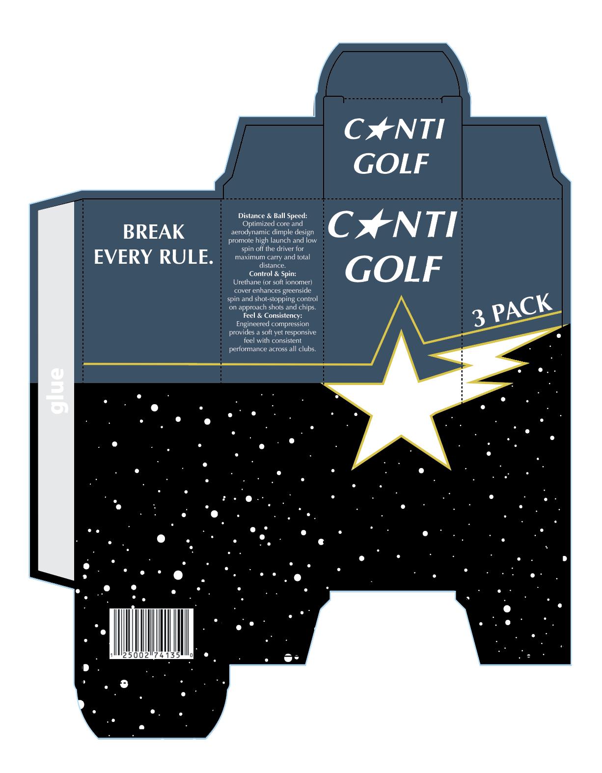
Conti Golf aims to design a new line of golf balls and packaging that challenges the traditional and conservative image of the golf industry. Instead of following the clean and classic style of existing brands, this project focuses on creating a bold, modern, and rebellious identity that stands out. The design must communicate performance and quality while also expressing energy, individuality, and confidence. Packaging should be visually striking, using strong graphics and contrast to grab attention. The goal is to attract a new generation of golfers and position Conti Golf as a unique, disruptive brand in a market that often feels outdated.
Research for Conti Golf focused on understanding competitors, packaging trends, and the needs of different golfers. Brands like Titleist focus on premium performance and clean, professional packaging, often using simple colors and minimal design to reflect quality and trust. Noodle, on the other hand, targets more casual players with fun, colorful, and eye-catching packaging that stands out on shelves and feels more approachable. Callaway combines both styles by offering modern, sporty designs that highlight performance features clearly. Research showed that packaging plays a big role in attracting buyers and communicating whether a product is premium or budget-friendly.
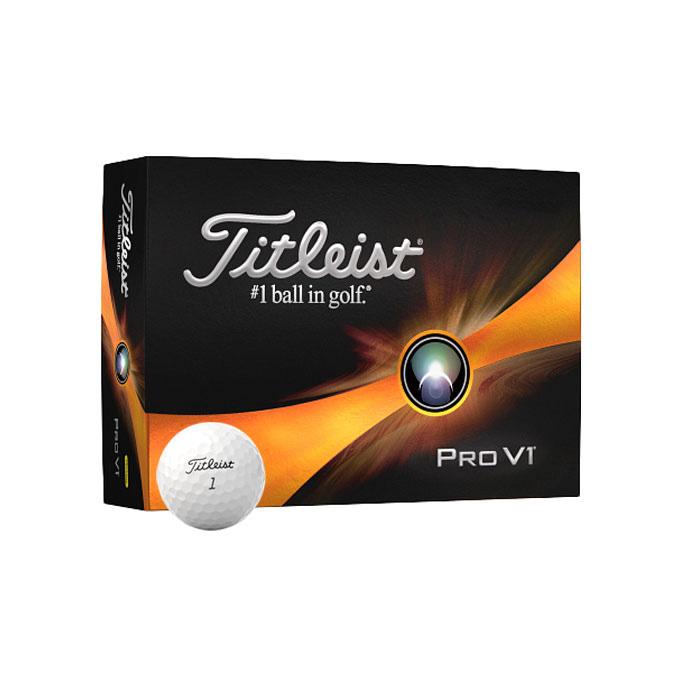
Clean, simple design with mostly white and black colors, giving a premium look.
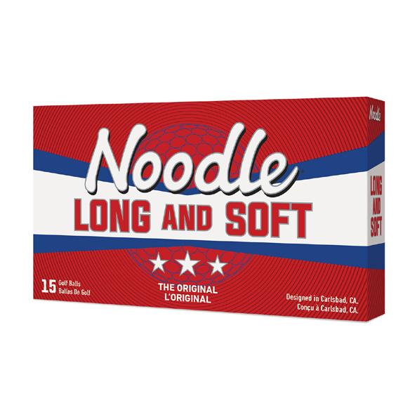
Bright colors and playful graphics make the product feel fun, affordable, and easy to approach.
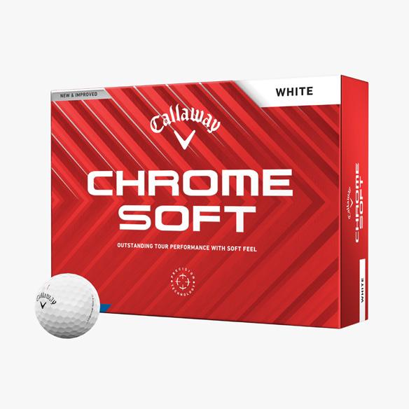
Bold branding layout help highlight performance features while still looking high-quality.
The main idea behind Conti Golf’s design is to break away from the traditional, rule-following image of golf and create a brand that feels bold and rebellious. The logo, a star with a zig-zag, represents energy, movement, and standing out from the crowd. My creative strategy was to design packaging that feels dynamic and expressive, using sharp shapes, high contrast, and strong typography instead of soft or classic styles. I explored ideas like angled layouts, graphic patterns inspired by motion, and designs that make the product feel fast and powerful. These sketches helped develop a concept that is modern, eye-catching, and appealing to a new generation of golfers.
The Conti Golf packaging design presents a bold, rebellious identity that moves away from traditional golf branding to appeal to a younger, more style-conscious audience while still communicating performance and quality. The design was pushed to feel more dynamic and edgy by increasing contrast, adding sharp geometric patterns, and refining the typography. Ball speed and control details were also added to make the packaging more informative and useful to the consumer. The black and neon color palette and star-and-zig-zag logo represent energy, precision, and individuality, while the layout keeps everything clear and modern. The final comp shows how the design stands out in a real-world setting and reflect the concept from start to finish.