Products. Ideas. Opinions.


US 03
�NTRODUC�NG SKETCH
Welcome to the third issue of Sketch, a publication from Allermuir and Senator.
Sketch is a forum to showcase new ideas, trends, opinions, and products from Allermuir and Senator. Two completely different brands but with one vision to create innovative products for the workplace.
In each edition we'll take a creative look at all the different ways we work, and suggest ideas, improvements, small hacks, big changes, all to help inspire you.
Introduction
�N TH�S �SSUE
04
Workplace Furniture
Discover the 10 principles of positive workplace furniture, curated by Adrian Campbell.

Introducing Bastille 10
Bastille by Allermuir is a seating family with a minimalist, yet luxurious aesthetic. Designed by Patrick Norguet.

Introducing Framed 16
Framed by Senator is a highly customizable modular shelving and storage system.
Framed Settings 18
Four downloadable Framed settings that will make your office or workspace more inspiring and productive.
Meet Plum 24
Say hello to Plum by Allermuir, a characterful seating collection designed by Mark Gabbertas.
Allermuir Showcase 28
Camira have selected Plum by Mark Gabbertas to showcase their latest fabric launch, Main Line Twist.
The Social Office 38
The Social Office is our way of showcasing our latest agile and inclusive-driven products from both Senator and Allermuir.
Re-manufacturing 46 34
We talk about re-purposing and re-using furniture for a major financial institution.
Our Top Picks
Things we've been watching, reading, listening to, and have been inspired by.

Introducing Furow 50
Furow by Allermuir makes adding plants to workplace and hospitality interiors easy.
Introducing Kin Quickship 56
The Kin Quickship Program is madeto-order, giving you exactly what you need, when you need it.
Around the World 60
We conclude this issue of Sketch with our 2022 global recap.
Contents
Showcase
Principles of positive workplace furniture.
The best workplace furniture design isn't built around the workplace. It's built around people. Your working environment is largely defined by the furniture within it. So, improving your workplace furniture is the quickest, easiest, and most cost-effective way to transform the space you work in. Discover the 10 principles of positive workplace furniture, curated by Adrian Campbell.
Consultant

04 Showcase
Adrian Campbell, Workplace Design
 Prevolv Inscape Showroom / Fulton Market, Chicago
The modern workplace can take many different forms. But at the heart of it are people. Individuals. Start with them, not the space.
Workplace
The average cost of a desk space in an office building over 10 years is £150,000 (2018, London). And the average UK salary over 10 years is £344,730 (2018, London). That’s an investment of over £500,000 in the person and the space they work in.
So the cost of the furniture you provide is going to have a disproportionately positive or negative effect on your investment in people and space.
With salaries and benefits comprising around 90% of the operating costs of any typical large business, even modest increases in productivity arising from better working environments can have a significant impact on the bottom line.
Open-plan office environments are considered to offer workplace productivity benefits because of the opportunities they create for interaction and knowledge exchange. But what about individual work? Do noise, distraction and loss of privacy significantly affect an individual’s productivity?
Desks are structural, rigid, and more akin to the architecture of the building, but workplace chairs should be designed to support the people that use them. Their mechanisms should be built around human bone and muscle structures.
Style is good, but substance is crucial.
The desk is a highly effective tool, often greatly undervalued. Some may regard desks as things that simply keep the paper off the floor. But that is to ignore their potential.
Most of us spend at least 60% of our working day using desk height surfaces to think and concentrate. Chosen, placed, and used wisely, a desk can transform how well we work – and with it, the productivity of an entire workplace.

06 Showcase
01. Workplace furniture is not about the workplace, it’s about people.
03. Workplace chairs should work like, with and for the human body.
04. Open-plan is a solution, not the solution. 05. Don’t under-estimate desks.
02.
furniture is the most cost-effective way to improve your space.
Royal Mail / Islington, London

Workplace Furniture 07
Unity / Calgary, Canada
AXA / London
Workplace furniture has become technical rather than human. If you want to move to a space best suited to your needs the furniture and setting must make the purpose obvious. Technology should allow the space to be engaged with immediately, without frustrations and time delays. The furniture, workplace and its environment must be based on human and social need. People should come first.
When we stand, we move more, have more energy and engage more – all of which keeps us focused. When we perch, we’re transitory, there for a short time and have to use different body muscles. When we sit on a task chair our muscles are not strained and we concentrate and focus. When we relax, we open the diaphragm, so we breathe better and become physically more open as our arms fall away. When we recline, we spread our weight over our whole body. We become more reflective and literally have a different outlook.
How we hold ourselves, change position and move can have a significant impact in the workplace. Especially if we are allowed to do this comfortably and at will.
Why would you sit on one chair in one space for the whole day at work? It just doesn’t make sense.
Think about all the spaces you live in at home. You have a kitchen to nourish, a lounge to socialize, a bathroom for solace, and a bedroom to relax. Then think of the many and different seats you sit on at home and all the ones you use when travelling to work or when you’re out and about – sitting in a coffee shop, at a restaurant, in a bar etc.
Mix it up. Variety works at work.
Increasingly, technology allows us to work wherever we want. Yet ironically, rather than choosing to work at home, most of us prefer to go to the office. And once we’re there, we choose to make it look and feel like home. Workplace furniture should help us do that.
There are as many ways to design a workplace as there are workplaces.
To design is to ask questions. Would you prefer to design a workplace that is more formal or informal, or combines both? Does your workplace furniture lean more towards stimulation or banality? Do you prefer collaborative or focused workspaces, or a mixture? Etc...
08 Showcase
06. Workplace furniture should adapt to people, not vice versa.
07. Many seats make light work.
09. Let posture work its magic. 10. Workplace furniture can create a positive, productive space.
08. Workplace furniture should make you feel at home.

Workplace Furniture 09
To request your personal copy of It's all about me, please contact: marketing@thesenatorgroup.com
 Designed by Patrick Norguet
ıntroducıng
Bastille
Bastille is a seating family made up of a dining, lounge, and bar stool with a minimalist, yet luxurious aesthetic.
The collection was designed specifically with hospitality environments in mind although with the increased merging of interior styles in corporate and hospitality markets the collection could easily transition across both.
11
Bastille
Introducing


Everything all in the palm of your hand. Anytime. Anywhere. allermuir.com
showcases new ideas, trends, opinions, and products from Allermuir and Senator. Subscribe today to have your next copy delivered directly to your inbox.



Products. Ideas. Opinions. 01 Products. Ideas. Opinions. US 02 Products. Ideas. Opinions. US 03 Subscribe here
SUBSCRIBE Sketch
�NTRODUC�NG FRAMED
Define your space.
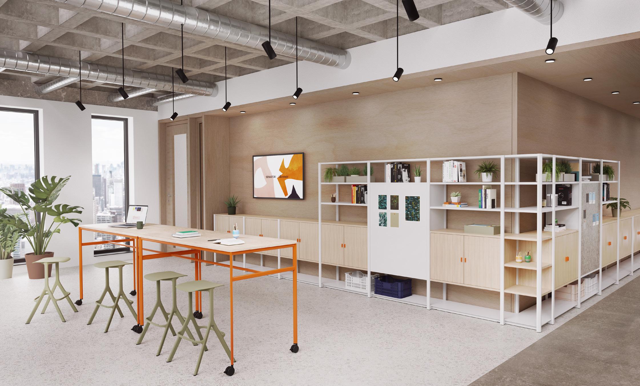
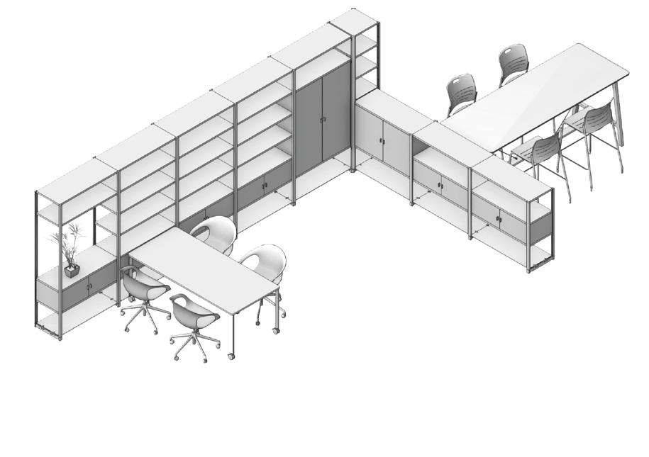
Framed is a highly customizable modular shelving system which can be configured to transform any open plan environment into more inspiring and productive spaces.
Through the use of division Framed can maximize open plan floorplans by creating small teams, mini neighborhoods, collaborative nooks, or walkways, increasing productivity, and decreasing proximity, to enable spaces that are more personal and intimate to the team or user.
16 Product Focus – Senator


Configuration One Downloadable Setting 18 Dedicated focus and collaborative spaces can work within the same proximity when Framed is used to create visual separation. Focus Product Focus – Senator Products shown (right): 1 × Framed Configuration with Module Cupboards and Planters, Shelves and Whiteboards 1 × Pailo Bench 4 × Ousby Chair


19 Use Framed to create not just visual but acoustic barriers that enable users to identify their own space. Brainstorm Products shown (right): 1 × Adapt Wall 2 × Framed Configuration with Shelves and Module Cupboards 2 × Circo Chair 1 × Pailo Table Allermuir product used: Famiglia Chair, Kin Chair Configuration Two Downloadable Setting Settings – Framed
Acting as a functional but also aesthetic divide, Framed can create division between work and more social breakout spaces.


20
Lounge Configuration Three Downloadable Setting Product Focus – Senator Products shown (right): 1 × Framed Configuration with Module Cupboards and Shelves 2 × Adapt Wall Allermuir product used: Conic Table, Mayze Mobile

21 Through the use of whiteboards and pinnable boards Framed can be used as a backdrop for all your creative ideas. Present Products shown (right): 1 ×Framed Configuration with Module Cupboards and Shelves 4 × Jonny Stool 1 × Play Table Allermuir product used: Kin Chair, Silta Table Configuration Four Downloadable Setting Settings – Framed


PlumDesigned by Mark Gabbertas.
Plum has a simple aesthetic that masks the complexity of engineering required to make it appear so. The lounge chair, with or without arms, uses a series of inviting pillow-like structures that allow the internal structure of the chair to be hidden. These contoured forms, defined by a pinched seam, meet and lightly kiss.
24
Product Focus – Allermuir

conversation working reading

26
Product Focus – Allermuir

27 Introducing Plum
 Plum by Mark Gabbertas
Camira launches Main Line Twist
Camira have selected Plum by Mark Gabbertas to showcase their latest fabric launch, Main Line Twist.
Made from nature for sustainable interiors, Main Line Twist is a new take on tweed which complements the refreshed and expanded color palette of Main Line Flax for effortless textile pairings. A blend of pure wool and harvested flax creates these multi-tonal, inherently flame-retardant fabrics, rich in warmth and texture.
29 Camira Fabrics
Main Line Flax
Originally launched in 2015, Main Line Flax has been one of Camira's most popular textiles since its introduction. In celebration of its enduring appeal, 24 new colorways have been introduced to create a palette of 57 shades.

Main Line Twist
Woven from a blend of pure wool and harvested flax, Main Line Twist is a tweed effect textile with a beautiful, rustic appearance. Multi-tonal yarns create a fabric with impossible-to-define color detail.
30 Allermuir Showcase
Paired, effortlessly
Designed to work together, the color palette of Main Line Twist reflects shades found in Main Line Flax, creating easy textile schemes. Plum’s pillow like forms and pinched seams were the perfect choice to display the new fabric pairings.


31
Camira Fabrics
Allermuir Mix Tape

33 Playlist Turn up the volume with this playlist curated by Allermuir, guaranteed to send good vibrations your way.
Smoke – The Smile
– Tame Impala Age of Consent – New Order All I Want
LCD Soundsystem
Ray – Beck
Mall & Misery – Broken Bells
Arcade Fire Wide
Parquet Courts
Moon – Nick Drake Set the Ray to Jerry – The Smashing Pumpkins
Move to the Country – Bill Callahan
Making Friends,
Stranger – Purple Mountains Click below to listen...
Playlıst The
Borderline
–
Gamma
The
Rebellion (Lies) –
Awake –
Pink
Let's
She’s
I’m Turning
showcase
Re-purposing and re-using furniture for a major financial institution.
A few minutes’ walk from Central London, 134,548 sqft of office space for a major retail and commercial bank has recently been converted into a collaborative haven for over 2,800 highly mobile workers.
We spoke to Chiara Cantilena to tell us more.
34 Showcase

35 Re-manufacturing


36 Showcase
The project fit-out overseen by LOM, a UK based Interior Design and Architect practice was given the brief to enhance the workplace for the hybrid worker, however more importantly, the solution had to be carbon efficient to meet the bank’s strict sustainability targets.
This transformation needed to foster a sustainable workplace that maximizes employee comfort and wellbeing, while being a catalyst for the ever-growing need for in-person and virtual collaboration.
However, to make this solution truly sustainable required more than just replacing the existing furniture with new — it needed to be more hands on, and ultimately think different — to hit the banks sustainability targets we had to re-manufacture 1965 desks.
We caught up with Chiara Cantilena, an Associate at LOM, who was the lead architect on this particular project, which achieved a SKA Gold accreditation. Chiara pays particular attention to user experience, collaborative work and interaction spaces and how they contribute to communicating corporate identity and values.
What was the brief, and can you tell us about the approach you took and what inspired your approach to re-purposing existing furniture?
CC The client asked us to rethink about their current office space and ways of working in the post pandemic and explore ways of re-purposing, re-using, and up-cycling their existing furniture. The re-purposing program was underlined by a strong sense of responsibility and desire from the client and LOM to do the right thing and extend the lifespan of what they already owned.
Was getting people to return to the office a key factor of your brief?
CC It definitely was. The re-purposing program went hand in hand with a radical re-think of how the office is used and how it can become a catalyst to encourage return to work. The up-cycling piece was integral to the return-to-work strategy as the spaces had to look fresh, appealing and representative of company values but with a strong underlying sense of environmental responsibility. An acknowledgment of people’s need for more flexibility on office days shaped the response to the brief.
During the early stages of the project, how did you break down the design process?
CC Strategic space planning and environmental considerations defined the early stages of work. This was followed by in depth auditing of the spaces to verify how much and in what measure could be reused and what components could become part of a library of parts to draw from to create new settings and spaces. The collaboration with The Senator Group was instrumental as it allowed us to bring an element of reality and sense checking to the early reuse ideas. The team at The Senator Group was able to prototype for us very quickly and effectively so that we could test products with the client and tweak where necessary.
Taking into account the possible changes within worker’s moods and behaviors, how did you overcome the transitions within the cultural shift of new hybrid working routines?
CC The spaces were designed to accommodate a range of needs and behaviors. From areas that allowed maximum flexibility to shape project areas on the basis of team needs to nooks for calmer and more secluded work. A higher than normal number of booths and pods were provisioned in knowledge of a continued and growing requirement for hybrid digital and conventional meetings.
37 Re-manufacturing

38 Showcase

39 Re-manufacturing

40 Showcase
Can you describe how you delivered agile and innovative breakout areas?
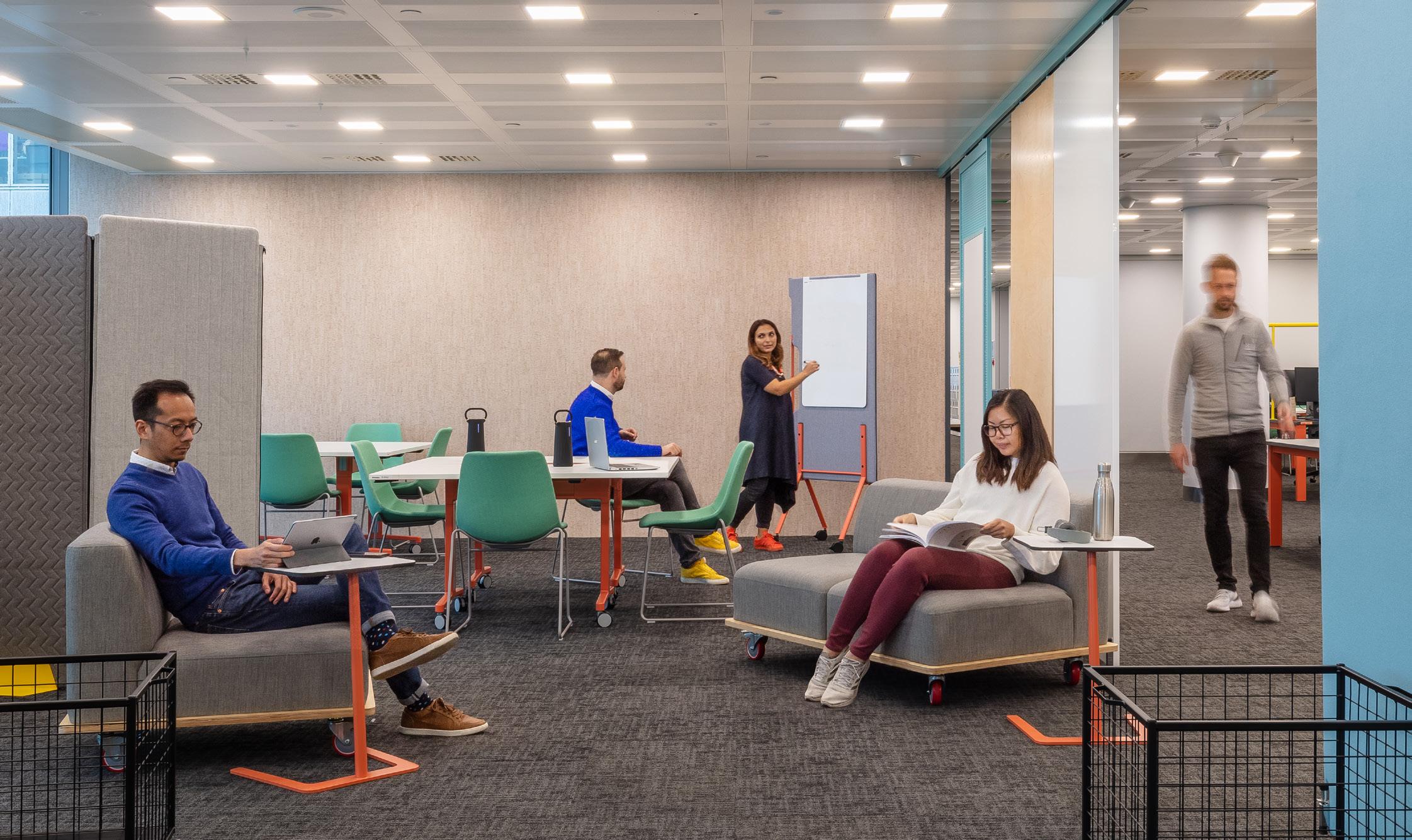
CC Breakout areas, also referred to as ‘Landing zones’ were developed closely with the client and The Senator Group. They were meant as a three-dimensional expression of the company’s branding. A fresh and versatile ‘macro object’ sat in close proximity to new refreshment facilities. These sculptural dividers were designed to offer support for varying concurrent activities. One-to-one benching and cafe style tables supported by white boards on one side, communal tables that could double up as informal, small group meeting tables supported by technology on another and an internal semi-open niche for informal conversation in a more sheltered, library-inspired mini living room. These breakout spaces were intentionally built around tea points to recreate the comfort and creative buzz of a coffee shop.
Were there any challenges you had to overcome during this project?
CC The reuse piece was challenging mostly because the construction industry is collectively still getting up to speed with the environmental challenge and buying new is still the easiest avenue. A considered and careful reuse and re-purpose of spaces and items that looks to minimize the embodied carbon of a project impact is still relatively uncharted. Many processes are yet to be streamlined. Having approached reuse so extensively on this project, has given us a real sense for the scale of the environmental challenge and how much the industry will have to get up to speed with new processes and challenge stale practices.
As we progress into post-pandemic workspaces, do you feel it is important to re-manufacture redundant furniture?
CC I think it will become essential as the world’s resources are finite and we need to acknowledge that recycling or giving old items to charities may not always be possible or feasible moving on with some of these sectors becoming saturated. The furniture industry will have to start designing in end of life in a way that is actually practical and would allow to effectively break an item into its component parts that can all be re-purposed or modified to create something new.
What trends were you inspired by?
CC We tried to stay clear of trends as we wanted to deliver a space that would stand the test of time and age well. We were inspired by principles of modularity to support future reuse and change of function. The color palettes were a fresher ‘zingier’ take on the corporate primary and secondary colors that added a lot of freshness and vibrancy to the work areas and landing zones. Color was used in quite a functional way to help modulate the space and create intuitive transitions.
How would you describe the results of the collaboration between yourselves, as the Architects, and us as the Manufacturer?
CC The Senator Group were always open to exploring our ideas. There was a fair bit of development required and The Senator Group team had a very proactive approach to all the challenges that were directed their way. From re-thinking how components were used to testing new and different materials, we had very open and practical workshops. The Senator Group team were immediately sold on the challenges, and approached all complications creatively. I can’t think of a better way to face head on the reuse challenge. Creative intelligence and a measured approach to logistics.
41 Re-manufacturing

We want to introduce you to The Social Office. The Social Office is our way of showcasing our latest agile and inclusive-driven products from both Allermuir and Senator across the globe.
The challenges for every organization remain the same, how can you align people, and space efficiently, to maximize productivity and culture — it’s just now there’s a common goal — towards flexibility with a higher emphasis on quality through collaboration.
To help you seize this opportunity we’re ready with our latest designs, and innovations, each one focused on social inclusion...

The Cove
The perfect place to meet or retreat. Mote is versatile, reconfigurable, and designed for meeting, learning, focusing, or relaxing. Add screens for more private, secluded spaces. Without screens, Mote creates more inclusive, social, and transitional spaces.
Products shown: Mote, by Senator. Talon Table, by Senator.

44
Mote 120° Angled Ottoman, Single Seat Sofa and Ottoman with Rear and Side Screens. The Social Office
The Forum
As we transition from the traditional fixed desk office into a more open, collaborative, and informal, working style, so have our everyday working requirements. Play is a solution that enables users to store, divide, meet, and work, in any way they deem fit.

Products shown:
Play, by Senator. Adapt Wall, by Senator. Scholes, by Senator.
Play Storage
2 Bay Cupboard.
Play Tables
Mobile Work Table.
45
The Social Office

46 The Social Office

47 The Social Office
The Breakout
Silta is a premium high table designed for breakout spaces, ad-hoc meetings, or a place to simply perch and connect. Silta’s industrial design expresses an aesthetic more suitable to a new generation of workers.

Products shown:
Silta, by Allermuir. Kin Stool, by Allermuir. Crate Divide, by Allermuir.
Stool
48
The Social Office
Kin
Silta High Level Table 84˝ × 36˝ Design by PearsonLloyd.
The Hub
A design that doesn’t dictate your creative direction. The Mayze seating collection has gone mobile, available as single, two and three seater on casters giving more freedom than ever before to push the boundaries quite literally. Partnered with Crate Mobile each product is engineered for commercial or public spaces that require flexibility on demand.

Crate Divide
Products shown:
Crate Mobile, by Allermuir. Mayze Mobile, by Allermuir. Sunda 2, by Allermuir. Host, by Allermuir.
49
The Social Office
2 High, 4 Bay, Storage.
Things we love
OUR TOP PıCKS
Things we've been watching, reading, listening to, and have been inspired by.
50
Entertainment
Hot off the press.
We've been reading Inside, At Home with Great Designers, a collection of the homes of sixty celebrated contemporary global designers and decorators.

Through the headphones.

Scratching the Surface, a podcast about design, theory, and creative practice.

Through the speakers.

Untitled (Black Is) by Sault, a British music collective that make a mixture of rhythm and blues, house, and disco.
Best of the box sets.
Bad Sisters, a comedy thriller series streaming now on Apple Tv+.
51
Our Top Picks


www.senator.online
the new Senator website.
discover every product, symbol, image or product specification, manuals, asset packs or graded fabric.
Introducing
Easily


Framed by Framed In Action Video Framed Specification Video Watch Now Watch Now
Introducing Furow
Furow makes adding plants to workplace and hospitality interiors easy.
Use the circular planter to create a focal point in otherwise awkward spaces and soften strong linear architecture. The mobile rectangular planter effortlessly divides zones and provides a moodboosting lush backdrop.
54
Product Focus – Allermuir

55 Introducing Furow


Styling your Furow
Style your Furow planter with dried grasses in autumnal shades and winter whites that will last and look good all year round.


Available in Black or White Steel, or Timber.
Bastille
Furow planter in white.


Scabiosa pods.


Various dried pampas grasses and Miscanthus.
Amaranthus.


Teasels.
Spear palm leaves. Bull rushes.
Lounge, designed by Patrick Norguet, in Camira Regent Claridges.
59
Furow Design by Allermuir Design Studio
Kin Quickship
Kin, designed by PearsonLloyd.
Get What You Need. When You Need It.
Whether you’re furnishing a new office, café, conference room, or breakout space — the Kin Quickship Program is made-to-order giving you exactly what you need, when you need it.
60 Kin Quickship

61 Kin Quickship
brochureOrderyournowat allermuir.com
WallStreet by Agile inspired possibility.
WallStreet In Action Video WallStreet Specification Video Watch Now Watch Now


Around the World. 2022 Global Recap.


Clerkenwell Design Trail, London.
Clerkenwell Design Week, London.


64 2022 Global Recap


65 2022 Global Recap
NeoCon, Chicago.
Orgatec, Cologne.


Join the conversation Connect with us on Instagram and keep up to date with the latest products and ideas. @allermuir / @senator_social
Where to find us
United Kingdom
The Senator Group, Skyeside Drive, Altham, Accrington, Lancashire BB5 5YE
What
Sketch is a forum to showcase new ideas, trends, opinions, and products from both the Allermuir and Senator brands. Two completely different brands but with one same vision to create innovative products for the workplace.
Allermuir and Senator brands are part of the The Senator Group.
is Sketch? Join the conversation Instagram @senator_social @allermuir
can view and download all the
this
by
North America Corporate Headquarters, 4111 N. Jerome Road, Maumee, Ohio 43537 Issue Downloads
www.senator.online www.allermuir.com You
settings in
issue of Sketch
clicking the button above.


 Prevolv Inscape Showroom / Fulton Market, Chicago


 Designed by Patrick Norguet


 Plum by Mark Gabbertas


