
2025 design direction
TABLE OF CONTENTS Welcome to the beginning of your new brand identity for Glacier Lily Event Design!
I am super stoked and honored to be working on this rebrand with you!
In the following pages, you will see your brand’s potential begin to come to life–through both words and imagery. As you flip through and digest the information, keep the following questions in mind:
Does this accurately reflect Glacier Lily Event Design as a brand What do I like and what do I not like in terms of color palettes, typefaces, design style, etc. Is there anything missing that is integral to the brand and must be reflected within the design and brand identity What would I add? What would I take away? What would I modify?
All feedback will ensure that we head down the right path so don’t hold back :
Enjoy!
THE VIBE
A page dedicated to capturing the vibe of Glacier Lily in word .
Questions to keep in mind: Do these words capture the essence of Glacier Lily? Are there any missing? Are there any that you would like to remove with regard to setting the vibe?
A page dedicated to capturing the vibe of Glacier Lily Event Design in words.
Questions to keep in mindDo these words capture the essence of Glacier Lily Are there any key words missing Do any of the chosen words not align or need not be highlighted here?
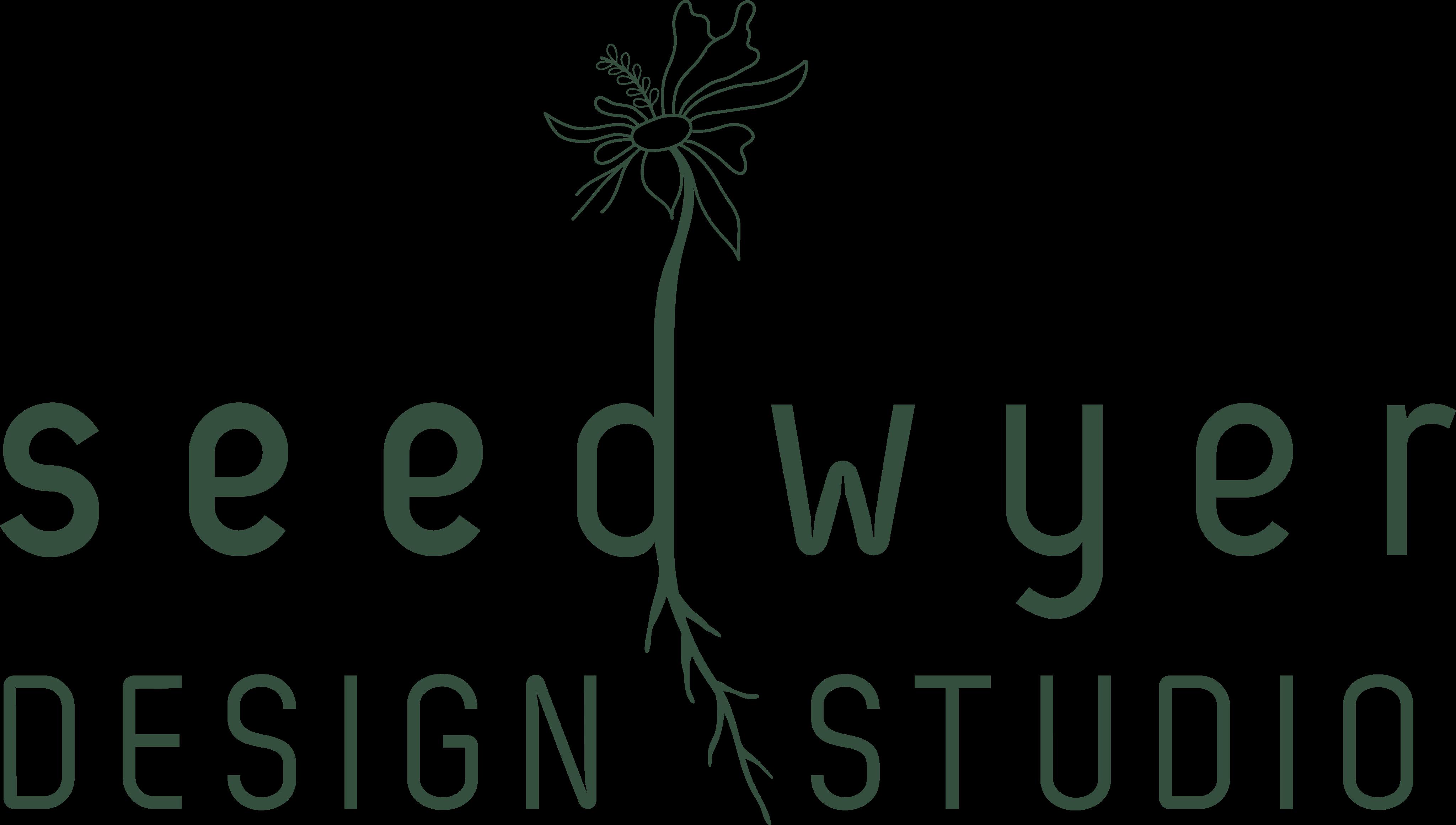
GLACIER LILY EVENT DESIGN
T RGET DIENCE
nderstanding Glacier Lily’s target audience is key to ensure we design a brand identity that will appeal to the intended individuals.
The Glacier Lily client values simplicity and harmony over extravagance, prioritizing meaningful moments, naturally beautiful settings, and personal connections. They have a vision for their wedding (or event) but need a professional to refine the details and ensure a seamless experience. With a budget- conscious mindset, they seek understated elegance–a celebration that feels effortless yet thoughtfully curated.
DESIGN DIRE TION
The design direction is comprised of three design boards that each set a unique tone for Glacier Lily’s potential brand identity.
When you look at the boards, you will see and feel the essence of the brand through the color palette, photography, typography and illustrations.
Pay attention to what piques your interest. Which components match the brand identity you are looking to create for Glacier Lily and which do not? You can choose which direction (A, B, or most aligns with how you envision Glacier Lily. With your direction chosen, note the elements you would like to keep as well as ones you might want to add or delete. Elements can be combined and swapped between the three design directions.
DIRECTION
Design Direction A embodies a bold, modern, high- contrast aesthetic that eleganceconveysand a timeless nature for Glacier Lily.
option for contrasting font weights + styles to add dimension and balance


editorial style, personalized moments make for playful, creative, and intriguing marketing


Block print or hand-stamp design style with a bold yet minimalist floral motif mimics what you might see on a wedding invitation itself
black and white sandwich and dominate the color palette, accented with neutrals and gold, creating a luxurious and grounded, warm feel. personalized, hand touches that feel tactile and organic


light-weight, sans serif, uppercase typeface(s) to create a clean, bold, and simple, yet delicate energy
DIRECTION A
The key insights to Design Direction A.
ease – essential qualities for a seamless wedding or event experience.To add contrast and a touch of warmth, a more fluid, organic font could be introduced.
block print style adds a timeless, artful quality,Glacierreinforcing Lily’s personalized approach to planning.
The editorial-stylecapturesphotography a cool, effortless energy. The candid feel reflects the intentional personalization that can be expected when working with Glacier Lily – every moment will feel uniquely yours.
seamless blend of handcrafted organic details with refined contemporary design
DIRECTION
Design Direction B captures the modern yet rustic aesthetic with a contrast of boldness and subtlety. This direction is incredibly warm and comforting from its color palette to its raw ties to nature.
organic, flowy design elements echo the untamed beauty of nature that feel effortless and natural rather than rigid or overly polished


strong yet muted, earthy color palette provides an elegance that is both grounded and elevated


photography that emphasizes a deep connection with nature creates a rustic, intentional feel, grounding the moment in something timeless and organic


photography that focuses on the natural elements to create warmth
DIRECTION B
The key insights to Design Direction B.
A heavier font finished with raw, organic edges is contrasted with a lighter, more structured typeface creating a dynamic balance between unpredictable moments and thoughtful intention.
Organic design elements are bold yet fluid, creating a strong visual impact through movement and the use of negative space. The natural, hand-drawn style evokes a sense of authenticity and flow.
natural elements cultivates a warm, inviting,groundedand atmosphere.
photography that emphasizes the botanical elements of a wedding and nature that creates its own unique color palette
DIRECTION
Design Direction C embodies a soft, romantic, and nature-inspired aesthetic with an emphasis on delicate details, organic textures, and an ethereal quality.
high emphasis on botanicals and natural elements throughout the events


bold linework that is intricate yet simple
a unique color palette that reflects the colors you might see in a field of wildflowers
hand-drawn illustrations and delicate linework handwritten fonts with a balance between weights, case, and flow


DIRECTION
The key insights to Design Direction C.
Handwritten fonts bring an authentic, personal touch to the brand. The contrast between font weights, as well as script and structured typefaces, creates balance and dimension, guiding the eye through the design. bring intentionality to even the smallest moments.
NEXT STE S
take time to sit with each portion of the design direction
peruse pinterest, unsplash, or any other resources for pictorial references if there is any feedback / edits that can’t be described in words capture any and all feedback (edits, modifications, additions, subtractions), comments, and uestions
let me know when you are ready to discuss the feedback and we can set up either a call or in-person coffee meeting!